Transcripts
1. Welcome to Class: Since it can feel overwhelming, there are so many buildings,
details, windows, rooftops, and
architectural elements that it's easy to feel
stuck before even starting. But the good news
is that convincing city scales don't require perfect perspective or
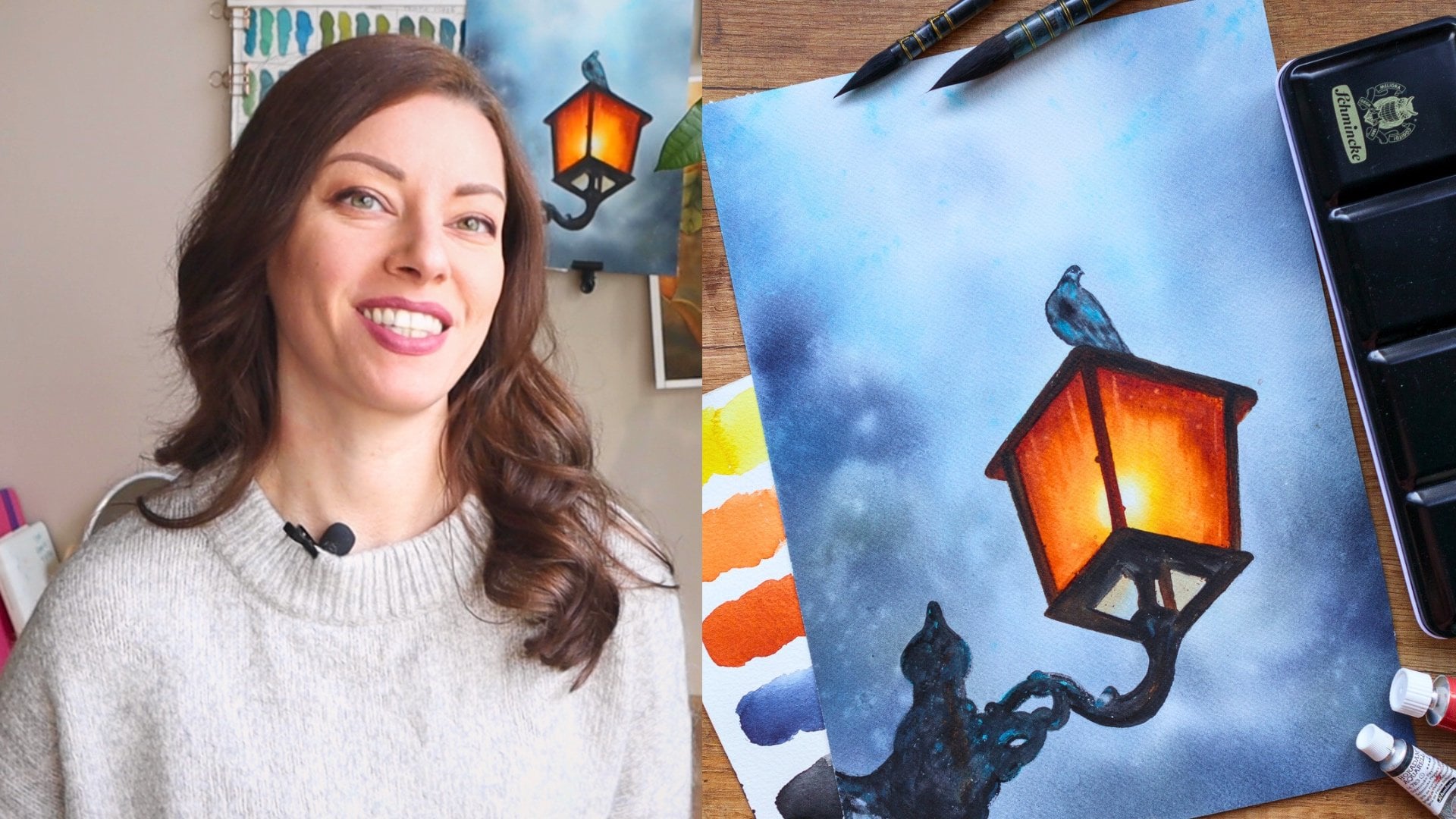
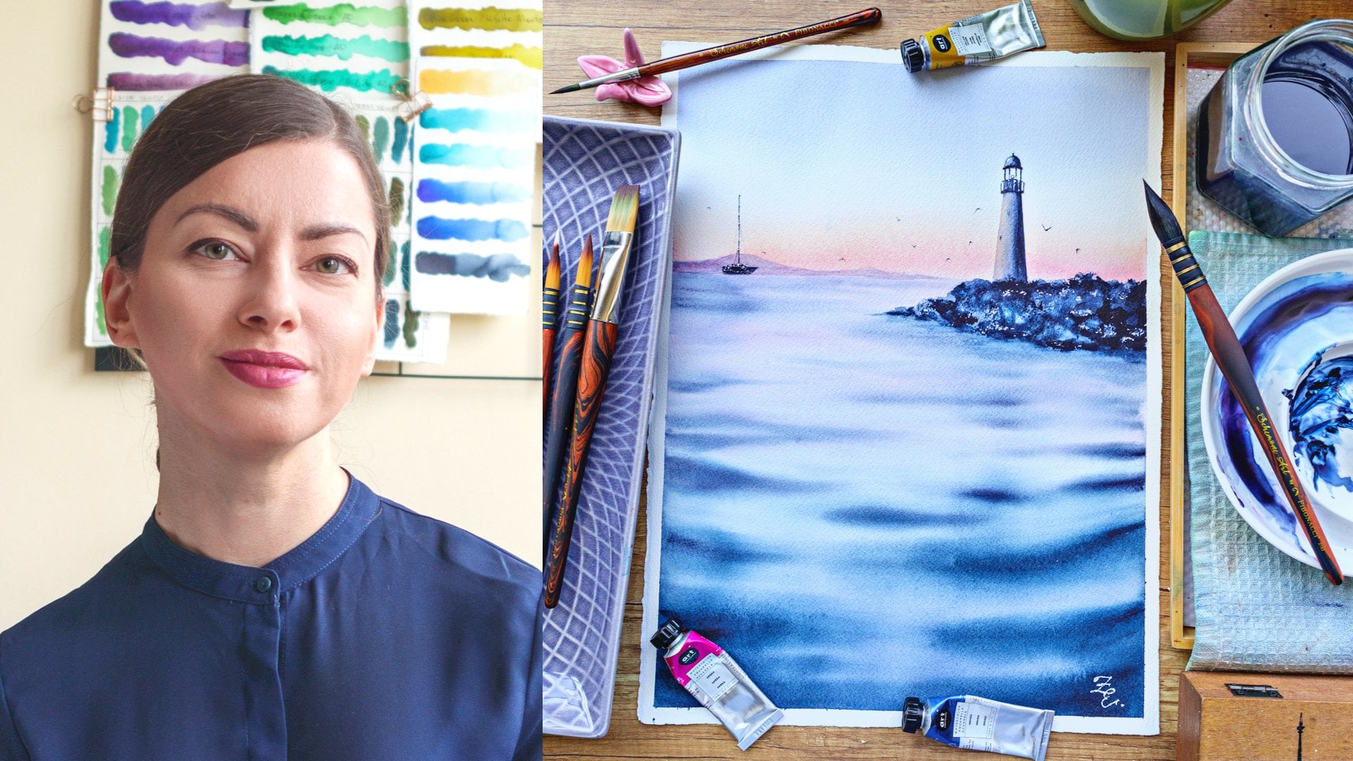
draw every single detail. Hi, everyone. I'm Elina
Watco artist and teacher. In this class, we'll paint
atmosphere called Cctscae while learning how to simplify buildings without
losing realism. I'll show you how to
approach it scenes in a simpler and more intuitive way by focusing on three key ideas, atmosphere value and
selective detail. We'll talk about how to
decide what to simplify, how to create depths using
aerial perspective and how to use edges and
contrast to guide vis. Then we'll apply these ideas
into step by step projects. The first project is modi
monochrome Eiffel Tower scene. We we'll focus on atmosphere and suggestion rather than
precise architectural detail. In the second
project, we'll paint Galata Tower in Istanbul
at Golden Hour, where we'll combine
warm color harmonies, imp fed buildings to create
a vibrant cityscape. This class is great for
artists who already has no watercolor experience
and won't feel more confident painting
architecture and city scenes. So if cityscapes have ever
felt intimidating to you, this class will show you a much more relaxed
and enjoyable way to approach them.
Let's get started.
2. Class + Project Overview: Take a quick look at what
you're learning in this class. We'll start by talking
about the real challenge of six caps and how to avoid the overwhelm that often
comes with complex scenes. Then we'll go through a simple decision
process that helps you approach any six
c with more clarity, how to choose focal point, what to simplify, and
where to add detail. Next, we'll look at
aerial perspective and how it hells
created using values, edges, and detail rather than complicated
perspective rules. We'll also briefly talk about
believable perspective and a few simple observations
that help buildings look convincing without
needing technical drawings. Then we'll explore edge control, which is one of the
most powerful ways to guide the VRs in wat color. After that, we'll move
on to the projects. First project is
the Eiffel Tower scene where we'll work with a limited palette and focus on atmosphere
and simplification. The second project is called Tower Cityscape
where we'll combine warm golden hour colors with more detailed focal building
and simplified surroundings. By the end of this class, you'll have to finish
Cityscape paintings and a clear strategy for approaching architecture
and at color. Let's begin with the materials and the colors for
use in this class.
3. Materials: In this video, we'll go over the materials that I'll
be using in this class. You don't need to have
exactly the same materials. I'll give you some options
and recommendations, starting with the paper, as this is the most
important of all supplies. I highly recommend that you use 100% cotton paper for the
projects in this class. Will allow you to implement all the techniques
I demonstrate, while cell walls paper is more
limiting when it comes to painting time and the
techniques you can apply. If you still decide to
use cell walls paper, just keep in mind that you
may get different results, and some of the techniques
might not work as well. In this class, I'll be
using this blog by meden. It's 100% cotton
paper and 300 GSM. Size is 12 by 9 ", but you can use whatever format
you're comfortable with. I quite like this paper as
its quality and performance are comparable to some of the top watercolor paper brands. I will tape it to this plastic. Cutting made with the
help of some paper tape. This one is by supervision art, but a regular one from the hardware store will
work just as well. As for the paints, there will be a separate video where I'll go over the colors and give you some options for substitutions. So make sure you
watch the next video. Or now just know
that whatever set of colors you have I love
to use will work. This is my ceramic
palette filled with my favorite most used colors. It's quite large, but I find it very comfortable
to paint with. You will also need
some white cash or white acrylic paint for
one of the projects. Next, are the brushes. These are the brushes that
I'll use in this class. First, let's have a
look at these tree. These are by Princeton and
come from their landscape set. The set also includes
a liner brush, but we won't be needing
it for this class. If you don't have
these exact brushes, make sure you have a large
brush to cover big areas, a medium sized brush, and a smaller one for details
and small adjustments. Next, you'll need a synthetic
flat brush that we're going to use for
lifting and scrubbing. This one is biting trato, but any brand will do. The important thing is that the bristles are stiff
and not freight. I will also use smaller
version for smaller areas. If you're not familiar
with the lifting ends, scrubing techniques,
don't worry. There's a dedicated
video for that, right after the colors video where you'll learn
more about them. And last to the brushes is
this hag brush by Jackson. I'll use it to blend colors whenever I need
after transitions. If you don't have such a brush, just take whatever big
soft brush you have, but keep it dry
throughout the class. Don't use it for applank paint. Keep it aside and use it
specifically for blending. The blending technique is also included in the
techniques video, so if it doesn't make sense now, it definitely will
after you watch it. You also need two jars of water, one to rinse your brush, and one for whenever
we need clean water. Spray bottle is optional. I use it to activate my paint. You can also spray some water on your paper if it dries too fast. Cotton or paper towel, I love to use both, but
either one is fine. And finally, a pencil
and eraser for sketches. I'm using soft eraser and a mechanical pencil
with a 0.5 B lead. And that's pretty
much everything you'll need for this class. Head over to the
next video to learn more about the colors
you'll need. See you there.
4. Colors: In this video, I'll go over the colors we'll be
using in this class. I'll show you the
exact colors I'll be using and also suggest
some substitutes. The most important thing
to remember is that you don't need to have
exactly the same colors. You can always adapt the palette using what you already have. For the Eiffel Tower project, we actually need just one color, but it should be
a very dark one. A great option is paint gray. When it is concentrated, it can look almost black, and when diluted, it has
a beautiful bluish tone. Another good option is Indigo. You could also use black, sepia, or any other color that becomes very dark when concentrated. In my painting, I'll
mix paints gray and indigo together
to make the color a little more interesting, but you can absolutely complete the project using
just one dark color. For the second project, we'll start with the warm mooring sky. For my orange, I'll mix Npples
yellow and pearl orange. I like this combination because my orange on its own is
quite bright and fiery, while Nebels yellow
softens it and creates more pastel
and dreamy look. You can absolutely use
whatever orange you already have or mix one yourself
using yellow and red. Try different combinations and see which mixture
you like the most. I also like to add transparent yellow to the orange mixture
to make it brighter, warmer and more luminous. The next color I'll
be using is Opera. I'll use it together with the next color on the
list, Royal blue. If you don't have royal blue, you can use ultramarine or
another blue and mix in a small amount of white quash to create a similar
lavender tone. When these two are
mixed together, they create a beautiful
lavender shade, which we'll use for the
clouds in the second project. We'll vary the ratio
between the two colors so the clouds look more
natural and interesting. We'll also use the
royal blue on its own for some of the architectural
elements in the painting. I will also use the
laser in crimson, but again, mostly in
combination with other colors. And the last color on the
list is permanent brown. This one is reddish brown, but you can use any
brown you already have. If you want similar
reddish tone, you can simply mix a little
red into your brown. In the project, we'll
combine a seran crimson, permanent brown and Naples yellow to create soft brick
color for the buildings. So these are all the colors that we'll be using
in this class. Take a look at your palette and find the colors that
are closest to this, or simply choose colors that help you or
create a similar mood. In the next video,
I'll demonstrate a few important
techniques that we'll be using frequently throughout
the class. See you there.
5. Techniques: Class, I'll use a few simple watercolor techniques
repeatedly. If you're already familiar with them, you can
skip this video, but if not, here's
a quick overview to make sure you're all
set for the projects. These techniques
are a big part of my approach to
painting cityscapes. They're not strictly necessary, but I find that they really help elevate the final
look of the painting. The first technique I want
to show you is blending. I use blending a lot
for the background, but it can also be applied
to any element that you want to merge seamlessly
with its surroundings. I'll start by applying a
few separate color spots that I'll blend
in just a moment. There are different ways
to blend in what color. And if you already have a
preferred method, that's great. Here's the approach I like to use after applying the colors, and while they're still wet, I take a large soft brush. It's very important that the
brush is completely dry. I like to use this hairbrush, but any large soft
brush will work. I gently glide to brush over the colors to blend
them together, start with the lattice color, and gradually move
toward the darkest ones. You can blend in
different directions or make small
circular movements. As the brush picks up
paint and moisture, wipe it on a napkin
before continuing. Try not to press too hard to just move gently
across the surface. This technique works
beautifully for background, but it's also useful
for blending clouds, softening the edge of trees or any element that you want to merge naturally into
the background. Highlight this dry before
showing you the next technique. The next technique is glazing. Glazing is applied on dry paper over an already dried
layer of paint. It can be used to create subtle color shifts or
add additional depth. To demonstrate I apply a layer of color
over this dry area. Then I wash my brush very well. And with a clean,
slightly damp brush, I soften deg this of the new layer so that the
transition becomes smooth. I like to make such small circular movements
while doing this. Glazing is very helpful
when you want to slightly adjust the
color of an area. For example, if I want this section to appear
deeper or darker, I can simply apply another
transparent color on top. Again, I soften digest until the transition
becomes seamless. The last technique is lifting. For this one, I use a flat
brush with stiffer bristles. Just like glazing, lifting is
also applied to dry paint. I wet my brush, wipe the excess, water on the towel, and then gently scrub the surface
of the dried paint. This reactivates the
pigment and often allows us to lift some of the color, creating a highlight. The result depends a lot
on the pigments and colors lift very easily while
others are more permanent. That's why a brush with slightly stiffer bristles
works best here. A very soft brush usually won't be able to leave
the paint effectively. I use this technique frequently
to soften dry edges, especially when
painting architecture. For example, I can gently scrub along the
edge of a building, and the hard line
becomes softer. It's also very useful for straightening slightly
crooked lines. This allows us to
paint more freely at first without
worrying too much about perfect edges because we can refine them later once
the layer is dry. We'll practice all these
techniques during the project, so don't worry if some of these feels a little
abstract right now. You'll see them in
action very soon. And one last thing, before we dive into the main
part of the class, in the next video, we'll
talk about the sketches.
6. Sketches: Let's talk about sketches. You can find the sketch
in the reference photo in the download
section of the class. There are a few ways
you can approach them. One option is to download or
simply open the images on your screen and
recreate the sketch the way you usually do
for Watco paintings. The other option is to trace the sketch directly
onto your What C paper. What approaches have their
strengths and weaknesses. If you create the
sketch yourself, you practice your
drawing skills, and you get familiar with
the shapes, proportions, and structure of the buildings
before you start painting. There's also a sense
of satisfaction in completing the entire project
completely on your own. The downside is
that if you're not very confident with
drawing architecture, the inaccuracies can change the final look of the painting, and it takes a lot
of time of measuring and drawing if you want
to do it correctly. That's why perceive scapes, I often prefer tracing. I don't consider it cheating. We're artists, not artict. My goal is to start with a
clean and accurate sketch, so I can focus entirely
on the painting process. Other thing to keep
in mind is that Wat col paper doesn't
handle erasing very well. No matter how gentle you are with a Wat color
pencil and eraser, the surface can
eventually get damaged. In an ideal world, I would sketch on a
regular drawing paper first and then transfer the drawing using a light board to keep my W color paper thin. But in practice, I'd
rather spend that time painting and developing
my what color skills. So for projects like this, I usually trace the sketch directly over the
screen of my Mbok. You'll need a darker room, maybe a bit of paper tape
to hold your paper in place a pencil linear screen
set to maximum brightness. You can also print the sketch or the reference photo and use the Suni window as a light box. Just that method that
feels right for you. There is no word wrong here. It's your process and painting. The goal is to simply start with sketch
that allows you to focus on what color techniques we'll explore in this class.
7. The Real Problem With Cityscapes: Cityscapes can feel
incredibly confusing. I know I avoided them for
quite a while precisely because of that overwhelming and not knowing where to start. I always felt that you almost needed an architectural
education to paint them. But once I started exploring
the topic more seriously, I noticed something interesting. There were many seescape
paintings that I thought were absolutely beautiful,
atmospheric and convincing. And when I would closer, many of them weren't
technically precise. Perspective was
sometimes slightly off. The lines weren't
perfectly straight. Many of them were even
painted free hand. So I started asking myself, what makes these
paintings work so well despite not being
perfectly accurate. What I discovered is
that what makes it escapes convincing is not
architectural precision. Much more important,
are things like atmosphere values and the
way we guide the view side. Atmosphere is created
through colored, soft and hard edges, and through something
called Terrell perspective, which we'll talk about
in the next video. It's less about following
strict perspective rules and more about how distance affects
the way we see objects. Another important factor
is value accuracy. Recreating the scene with believable light
and dark values, soften mother is much
more than getting every angle or architectural
detail perfectly right. We'll practice value accuracy in the Eiffel Tower project
later in the class. And there was one more thing I noticed in the paintings
I admired most. They simplified the scene. None of them tried to
recreate every single detail. They weren't photorealistic. They were paintedly expressive, vibrant and al and this is actually great news
for all of us who feel overwhelmed by the amount
of visual information as it seems not having to
paint every single car, window or lamp post
is incredibly free. So the question becomes, what should we simplify
and what should we keep? Help answer that. I use three simple questions
whenever I approaches scape. What is my focal point? The focal point is the area of the banking where you want
the viewsi to go first. It's usually the
most interesting or visually dominant
element in the scene. You can often recognize it immediately in a
reference photo. It might be a landmark
building, striking shape, strong contrast, or
a unique element that stands out from the rest. In today's project, for example, the focal points are very clear. DaffleTwer and the Gaut Tower. Everything else in the painting
supports those elements. Once you identify
the focal point, it becomes much easier to decide what to simplify and
where to add detail. The second question is
where will I simplify. You are absolutely allowed to simplify and omit elements
in your paintings. You are the artist. You decide
what stays and what goes. In general, it makes sense
to simplify anything that doesn't carry important
visual information. For example, in this painting, I simplified the
texture of the wall. I didn't paint
every single brick. I also painted the trees
in a very loose way, focusing mostly on the color
and on the contrast between soft distant shapes and sharper form elements
to create depth. What matters here is the
atmosphere of the scene, the ramming window
and the lamp post, not the exact number
of bricks around them. In this painting, I simplify the buildings a lot
omitting many elements. This helped keep the painting fresh instead of
overcrowded and overworked. Instead, I focus on the colors and values of the
reflections in the water, which made the scene believable. And this one I simplified almost everything
except the cathedral, the cathedral and the sky are
the stars of the painting. So the surrounding buildings are painted much more loosely. Good rule of thumb is this. Anything that is
not the focal point can usually be simplified. The third question is, where
should I add more detail? This is usually the focal point. But even here, detail doesn't mean perfectly
replicating reality. Often a few outplac
marks can suggest detail without actually
describing everything. Hard edges, stronger contrast and small texture marks can also suggest complexity
and naturally draw the Vs. For example, in this painting,
the most detail is around the window
and the lamp. They are not hyperrealistic, but stronger contrast and stronger edges make
them stand out. In this one, I
focus the detail on the gondola and the reflection
on the water surface. The buildings are simplified, which guides the viewers to what's important
in the scene. And here, the cathedral receives the most attention because
that is the my subject. So to summarize before
starting a cityscape painting, ask yourself three questions. Where is my focus or what is
the style of my painting? What can I simplify and
where should I add detail? Focus, simplify, emphasize. These three decisions
make the whole process much clearer and much
less overwhelming. We'll apply this thinking in
both projects in the class, so you can see how it
works in practice. And now as promised,
let's look at aerial perspective
and how we can use it to make our CDs capes feel more believable
and atmospheric.
8. Aerial Perspective: License will look at one of the most important tools for painting believable set
scapes, aerial perspective. El perspective is simply the way distance affects
how we see things. But objects are closer to
us, we see them clearly. They appear darker,
sharper and more detailed. But as objects
move further away, the atmosphere between us and
those objects softens them. They become lighter,
less detailed, and their edges appear softer. This is something
our eyes naturally understand when we look
at the real world. We can use the same principle in our paintings to create a
convincing sense of space. In what scapes,
perspective is often more important than perfectly calculated linear perspective. Even if the angles of the buildings are not
perfectly precise, if we control the values, edges and details, the scene
will still feel believable. There for simple cues,
we can use to create. Closer objects are darker, closer objects have
sharper edges. Coser objects show more detail. And distant objects are lighter, softer and simpler and
often in colder colors. Let me show you a very
simple demonstration. Imagine three rows of buildings. The buildings in the foreground are darker and more defined. Their edges are sharp, and we can see more details. The buildings in the middle
ground are a little lighter. The edges are slightly softer, and the details are simplified. And the buildings
in the background are the lightest
and softest of all. Their shapes are simple and
their edges are blurred, the color lean more toward blue. Just by changing value
edges in detail, we can create a strong
sense of distance without drawing any
complicated perspective lines. This is exactly the approach we use in the projects
of this class. The focal points will have stronger contrast and
clearer detail while the surrounding buildings
will become softer and more simplified as
they move away from us. In the next video, we'll briefly look at linear perspective and how we can use it
in a simple way when painting buildings. COA.
9. Linear Perspective: This lesson will talk about linear perspective
and it scapes. And it can sound intimidating. Many people immediately
think about complex rules, vanishing points and grid. But when we're working
in a atmospheric style, perspective doesn't
need to be perfect. In most cases, it just needs
to be convincing atmosphere call values and soft touches often hide mold perspective
and perfections. So if a line is slightly off, it rarely ruins the painting. And let me prove it to you. When I showed you
earlier this painting, did you notice that
the perspective of this building is
off? Probably not. You were most likely looking
at the boat, the sky, and the reflection and glance really quickly over
those distant buildings. Instead of focusing
complicated perspective rules, I like to keep just a few
simple observations in mind. Rule number one is vertical
lines, stay mostly vertical. Buildings rarely lean
dramatically to one side. So when painting architecture, try to keep vertical edges, mostly straight up and down. They don't have to be
perfectly precise, but avoiding strong tilt will make the structure
feel more believable. Rule number two is repeating
elements get smaller. 20 design mele event repeats into the
distance, for example, Windows lamp posts,
boats or buildings, each one becomes slightly
smaller than the previous one. Our eyes expected this change in scale and it
naturally crested. Rule number three, plants
narrow as they move away. Things like streets canals, rooftops or rows of
buildings appear wider in the foreground and gradually narrow as they move
into the distance. You can see this very clearly
in scenes like this one. The canal is widest,
closest to us, and gradually becomes narrower as it approaches the
bridge in the distance. You don't need to
measure anything. Just observing this narrow
effect is usually enough. You may also notice
that many lines in a scene seem to move toward the same direction
in the distance. For example, the
edges of rooftops, the rows of windows or the sides of the
buildings often appear to slowly angle toward
the same point far away in the horizon. Sometimes it helps if you draw these lines first and then
start filling the buildings. It removes the guesswork
of what should be the tiltor where exactly
to place the next window. Important thing to remember, perspective is just one of the many tools we use to
create livable space. But as we discussed in
the previous lessons, Earl perspective, Focon plays an even bigger role
in what color. Sofa edges, lighter values, and few details in the
distance can create depth even if the lines are not
mathematically perfect. In the project for this class, we'll rely mostly
on atmosphere and simplification rather than
strict perspective rules. One last thing before we move on to the project
textion of the class. In the next video, we'll discuss how edge control can make a big difference in how our cityscape look and
feel. See you there.
10. Edge Control: Lesson, we'll talk about
edges and how controlling them can help guard the
RSI in your painting. Edges are one of the most powerful tools we
have in watercolor. They help us decide
where the R should look first and which parts of the scene should
stay more subtle. A very simple rule
to remember is this. Hard edges attract attention. Soft edges, create distance, and lost edges
create atmosphere. Let's quickly see
what this looks like. For the small demonstration, I'll paint the same
simple shape three times. First, I paint a rectangle
with sharp hot edges. All the borders are
clearly defined and crisp. This kind of edge
immediately catches the eye and feels very present
in the painting. Now I'll paint the
same shape again, but this time, I'll soften
the edges slightly. I'm just using a
down brush to blur the border a little bit. The shape is still visible, but it feels calmer
and less dominant. And finally, I'll paint
the shape one more time. But this time, I'll let one of the edges disappear
into the distance. This is what we call
a vostage instead of clearly separating the shape
from its surroundings, that just blends into
the space around it. Step of edges is very useful
when we want to create atmosphere or make something
feel farther away. Now let's think about how
this applies to set scapes. Usually the Rs you want to emphasize like focal building or lamppost store
architectural feature will have stronger values
and clearer edges. Meanwhile, buildings
that are farther away can have softer edges
and less definition. This helps create this and keeps the painting from
feeling too busy. All stages are
especially helpful when painting miss distances of light because
they show parts of buildings to gently fade
into the atmosphere. So instead of outlining
everything sharply, try thinking about
where ones clarity and where one softness. These simple control
pages can make a big difference in
how usage cape fels. A you'll see, this technique is often in projects
of this class, especially when we want
certain objects stand out while others disappear
into the background. In the next section, we'll start applying all these ideas, simplification,
aerial perspective, and edge control in
our first project.
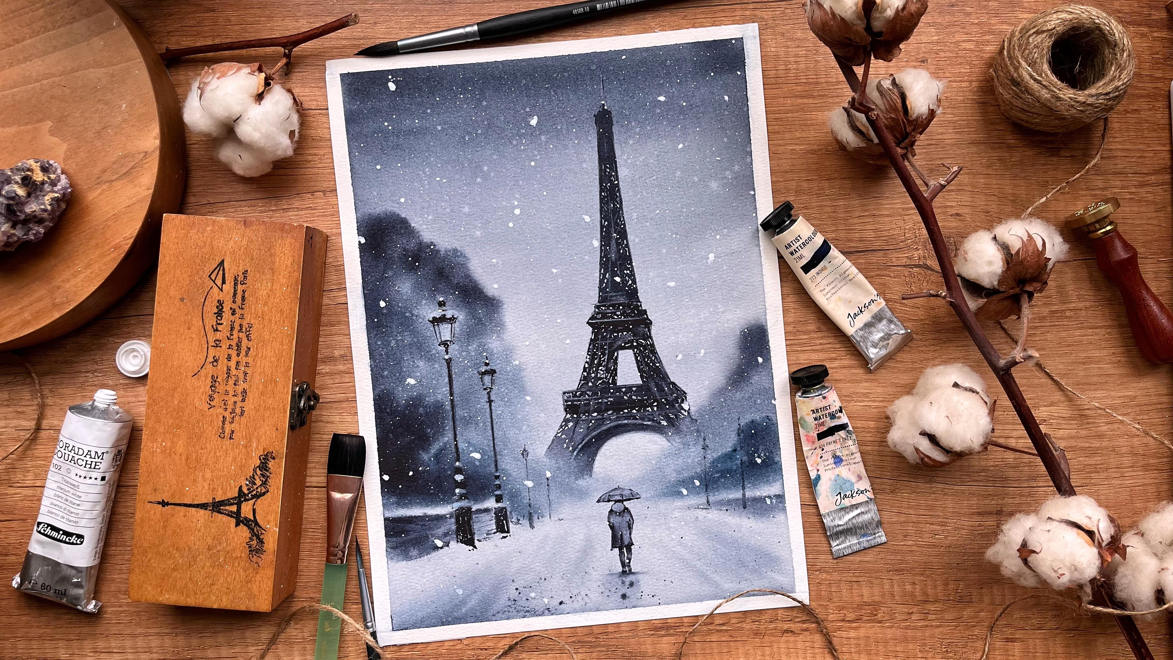
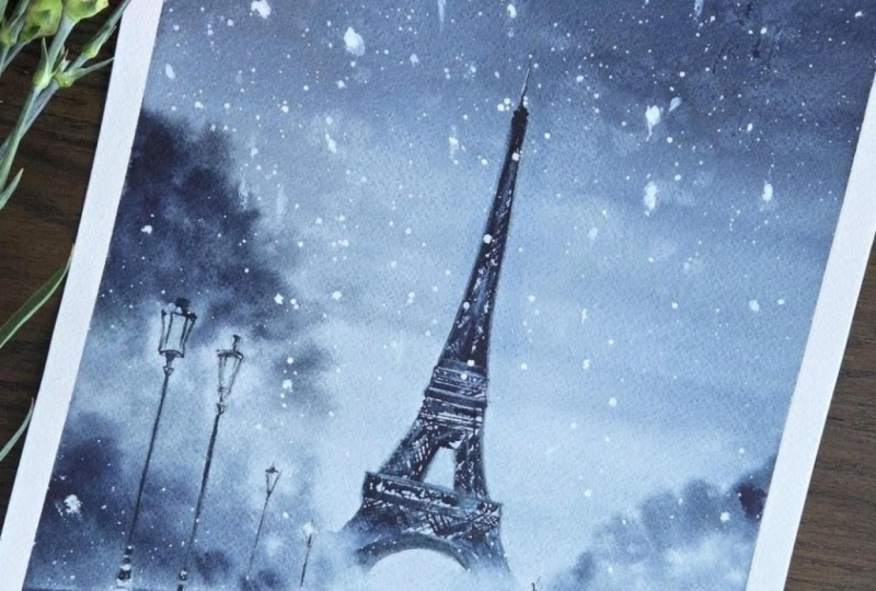
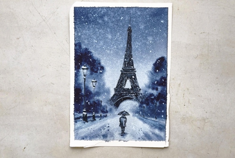
11. Project #1: Eiffel Tower: Welcome to the first
project in this class. Today, we'll paint this
Modi moonochrom scene. We'll focus on atmosphere and simplification of
the focal element. By using just one color, we can concentrate
more on the values, and this helps a lot
with achieving realism. We'll focus not only on
how to paint each element, but also on why we're
making certain choices, especially when it comes to values, edges, and
simplification. Let's first discuss the
planning of the scene. This is the reference photo
that inspired the painting, and this is my first
attempt at painting it. You can see here that I removed
the cards on the right. I didn't feel like they
added anything to the scene. Instead, I decided to mirror the elements from the left side, so I added the same lamp
posts on the right. Now let's look at the project
painting from this class. Notice that here I shifted
the composition slightly, moving the tower to the right. This eliminates the
repetitiveness of the elements on the right and creates more pleasing and more
organic composition compared to the centered one. Central compositions often
feel more static and formal while of
center compositions create movement and
feel more natural. By adjusting the crop here, I achieved two things. I removed the repetitive and
less engaging right side of the reference and made the
composition more dynamic. Another thing you might notice is that in the word painting, I added the trees and branches along the side of the bridge. Later, when I analyze
my work I realize they didn't add much to the
overall feeling of the scene, instead, they made
the painting feel slightly heavier and
a bit overworked. So for the second attempt, I decided to simplify. Since simplification is
the theme of this class, I prefer this version. It feels lighter and fresher. I also simplified the
footprints in the snow. This way the foreground balances nicely with the
heavier values in the upper two thirds of the painting and gives
the eye place to rest. I cropped a bit from the
bottom area as well, especially in the final project painting because it didn't
carry much information. And of course, the main thing is the suggested
detail in the tower. Notice that I didn't paint
it very realistically. I didn't add every single beam. Instead, I painted it in a way, that's just just
enough structure for it to be understood
as realistic. Now let's take a quick
look at the values. If we observe the
reference carefully, we can see that
the lightest area is the snow in the foreground, so we need to keep
that area light. Then comes the sky. The mid values are for the
eiffel tower and the trees. The darker elements are the
lamp posts and the figure, which are also the most
detailed parts of the painting. We'll keep that in
mind while painting. And of course, we always have the creative freedom
to make adjustments. If we look again at the
first painting I created, you can see that the
tower is much lighter in value compared to the
project for this class. That makes it feel further
away and more covered in mist, which works beautifully
for the atmosphere. For this project, though, I decided to make it
slightly darker first so that you can clearly see
how I painted and second, to add a bit more contrast and visual strength
to the composition. Of course, feel free to paint it either way. Both
approaches work. So that's it for
the planning part. Now let's start painting.
12. First Wash: Let's start painting.
I've prepared my sketch. Notice that I drew the tree
outline with the broken line. This one is more
delicate and less noticeable once we
add the paint on top. The lamp posts, the bridge, and the person can remain
more heavily outlined. We'll paint those
with darker values, so the lines won't be visible. And at the same time,
a clearer outline will help us see better
once we begin painting. To simplify, I only
outline the main shape of the Eiffel Tower and add just a few lines to indicate
the curve of the beams. The rest at free
hand with my brush. I'll remove some
of the graphite, especially in the tree area and a little bit on the tower. Next, let's tape the
paper to the board. I start by taping the top
and bottom sides first. My board is slightly
smaller than my paper, so I have to turn it
and fold the tape. It's a bit tedious, but
if I use my larger board, I'll run out of filming space. Now, let's tape the side. I tape about five millimeter on each side, maybe
a little more. It's important to press the
tape firmly onto the paper. We'll be using a lot
of water and we don't want the paint to
seep underneath. So on my fingers, round the edges, and
press it down well. I also place the tape under the board to create
a slide flow. This way the water
and paint will flow downward instead of forming
bottles on the surface. Now, let's begin by
watching the paper. First, I spray it
with my bottle. And then I add more water
with my flat brush. It turns out I didn't
wash my brush very well, so I get a slight brownish, but it's very pale, and it won't affect the painting once
we start adding colour. This step is very important. We're setting the foundation
for the first wash. If we rush it, we
won't be able to take full advantage of the
wet and wet technique. Take your time, make
sure the paper is evenly moistened with no
dry patches, no puddles. That way you can
paint confidently, knowing the surface will hold moisture long enough for you to create those soft edges that add so much to the
mood of this painting. While the paper absorbs the
water, I'll prepare my color. I'll use a mix of
indigo and pins gray. I don't want to use just pins gray because it
can feel too flat. I want a subtle bluish nuance, so I'll mix the two to
create a dark muted blue, almost gray, but not quite. Of course, you can
use just one color if you prefer indigo, sepia, pains gray or even black. I prepare a thick mix here. Then I quickly dip my brush into my water jar to dilute
the color slightly, and create a lighter mixture. With the paler version of
the mix, I'll paint the sky, starting from the top, I move the brush horizontally while gradually moving downward. Now I wash my brush
and gently drag the color down to create
a smooth gradation. I didn't mix the paint
on my brush very well, so I get a few streaks,
but that's fine. We'll soften them in a moment. I ranse my brush again, and now with almost just water, I cover the rest of the page. I'm even going over
the snow area. Yes, it's white, but it still
carries a bluish nuance, and we want it to feel
integrated into the scene, leaving it completely white
to what look disconnected. I wash my brush
thoroughly, wipe it, and use it to smooth out those streaks moving over the entire page
from bottom to top. We can darken the upper part slightly with some
of the thicker mix. Let's not forget
an important step, wiping the tape after
applying the skywah. This prevents any droplets
gathered there from flowing back into the painting and
disturbing ours mo gradation. Let's make the sky even more dramatic by darkening
the Pereira further. You can also tilt your board. Gravity will pull the
pigment downward and help create an even
smoother transition. I'll absorb the droplets from the bottom of the
page with tan brush. And that's it for the
sky and the background. Next, while the surface
is still white, we'll paint the tree to achieve
those soft flurry edges. I switched my size eight brush. I my brush with the mix and gently press it close
to the pencil lines. I use circular motions to
suggest the tree crowns. I repeat the same
on the other side. I'm dragging the
color along the edge while still avoiding
the lamp post. And now with my
soft tin dry brush, I'll spread the color. This creates a misty effect and enhances dial perspective. The trees appear to
fade into the distance. A lot more pigment where needed. For example, this
area feels to pale. I paint carefully
around the lamp. Close to the snowy
edge of the bridge, I add darker color so the snow
can stand out against it. I do the same on
the other side and connect the shapes
slightly in the middle. Let's quickly work
on the foreground. I had a darker stripe at the very bottom to
frame the scene. Then I paint a few
lines following the direction of the road to
suggest movement and death I add a few more darker spots here and mix the
additional paint because this area needs stronger contrast for
the snow to stand out. Same on the other side. Let's also paint the side
railing of the bridge. Here, I'll emphasize
the snow even more by deepening the
surrounding area. I use my hair brush again
to soften certain sections, so everything feel cohesive. Not like separate patches of color layered on
top of each other. Now, is a great time
to add some splatters with clean water to suggest
snow flakes in the distance. It adds smooth atmosphere. And as a final step
for the stage, I splatter some darker paint in the foreground to suggest
texture in the snow. With a tick mixture and
the tip of my brush, I drop in some color for
the figure's footsteps. And congratulations.
You've successfully completed the first
stage of painting. Let it dry completely, take a short break, and in the next video,
we'll paint the tower.
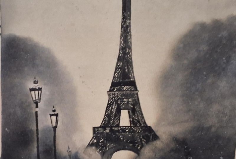
13. Painting the Tower: My paper is now completely dry. I've removed the
tape from underneath the board since I don't
need the slope anymore, and it's time to
paint the tower. For this tape, I'm using my
long round sized for brush. I'll reactivate the mix
we used for the sky. I'm adding just a little water, so it's not as pale as before. It shouldn't be very
transparent and it shouldn't be very thick
either, something in between. These are our mid tones. If you'd like a
softer Mr. Effect, you can go one or two
shades lighter than mine. For this upper section, I'm using slightly macy strokes. I'm not trying to perfectly
replicate the reference. I'm just suggesting
irregularities in the structure. Then I continue by filling
in the overall shape. My pencil lines
are still visible, which makes it much
easier to follow along. Try to work relatively quickly. You don't want the paint to dry while you're still
working in the same area. And if you get a slightly
crooked line, just leave it. We can adjust later if needed, but aim to follow the
pencil lines as a guide. Now I'll start making
the sel white more interesting by suggesting the
beam pattern of the tower. First, I outline the section. Then I add a few crossed lines to hint at the grid structure. I take a bit more paint
and drop in some spots here and there to break up
that flat unified look. These little variations add complexity without needing
to paint every detail. And I continue, again,
outlining first, then a few suggestive
grid lines or not spacing them evenly or
making them identical. That irregularity actually makes the structure feel more
natural and less stiff. Then some regular spots
to break up larger areas. There is not recorder. Think of it as a rhythm
rather than a formula. Imagine you're
painting on a timer. It helps you focus on suggesting rather
than overthinking. And in a way, you're on a timer, the paint is drying, so be quick but stay
loose and playful. For the middle
section, I'm using more spots because in the
reference, it appears darker. On the sides, we see more
sky between the beams, so I use more crossed lines. Here is where one
structural element ends, and the next begins. Let's quickly finish
this section, adding a few more spot so the pattern doesn't
look too predictable. Take a small pause here,
the back if you'd like. If something feels repetitive
or too structured, this is a good time to
soften or adjust it. Now, this area in the
reference is darker, so I'll switch to a
slightly thicker mix of pinscrap. I
drop that in here. This section here is quite dark, so I'll block it
in more solidly. Connect the shapes,
add in a few lines. Again notice, I'm not
being overly precise. The lines are slightly varied
in thickness and spacing. That variation
keeps the painting alive loose and stress free. I just this shape slightly, and continue with
the next element. Online first, can
lift your breath occasionally to keep the
lines expressive and lighter. Here we start seeing a bit
more structural clarity, so I add some horizontal
beams as well. A few cross lines. And don't forget to
small irregular spots. Repeating on the other side. Here we have an elongated
rectangular shape with smaller squares inside. We're seeing the tower
slightly from the side. So it leans a bit just a gentle suggestion of linear perspective,
nothing too technical. I add more squares inside and a tiny X in each one. Then the central line. And we're almost ready. I'll darken this edge slightly. Add a few crossed
lines to break it up. As we move towards the mist, I make my mix a bit more watery. The structure should gradually soften as it disappears
into the atmosphere. This is where aural
perspective comes into play. I outlined this small section. Another I won't get a chip. Continue the main vertical line. At a horizontal beam. If you may see cross lines. Now I'll carefully paint the arc. So small spots. And here you can see the arc of the opposite
side of the tower. I connect it gently
with a few marks. Now with a clean down brush, I'll blend the tower
slightly into the mist. Oh. I press gently to create soft smudges
and lift a bit of paint. This helps the tower
dissolve into the mist. I soften this edge here. Pressing the brush lightly in a few areas while
the paint is still damp creates a subtle smudge and makes the structure look more complex and atmospheric. So final touches
wherever it feels too predictable or
too structured. I'll fix this small
antenna at the top. And that's it. You did it. We now have the structure
and Mtons in place. Let this layer dry completely, and in the next video, we'll has the contrast and bring
everything together.
14. Elevating the Look: NthlTwers not quite
finished yet. And this video will
left some more color and soften the edges to
elevate the overall look. I'm using a stiff synthetic flat brush and some clean water. I have my napkin nearby. I'll tilt my board slightly so my hand can move freely
and comfortably. I dip my brush in clean water
and dab it on the towel. The brush should be
damp, not dripping. First, I'll start by
softening the outer edges. Notice that I'm
not pressing hard. I'm barely touching the surface. That gentle moisture
is enough to reactivate the pain slightly
and smudge it just a bit, so the tower doesn't look too sharp against
the soft background. This also helps smooth out
any slightly crooked lines. The result is very subtle, but for me, it makes
all the difference. I use this technique
all the time. Now, let's leave some paint along this line to
suggest a separate beam. I light go over the area. And we'll repeat
on the other side. First I think around the edge, Then lifting a little
inside the sauet. We can also lift along some of the cross lines to
emphasize the structure. Here I'm further softening the edge that disappears
into the mist. This enhances the
al perspective. The tower should gradually
dissolve into the atmosphere. Now I lift some wines from the interior
of the silhouette. I add this mostly in flatter
areas where not too much is happening or wherever I notice a distinct beam in the
reference, for example, here. This is one of my
favorite parts of the process. It's
very forgiving. There's not much you can ruin, and it's incredibly satisfying to reveal small highlights. It adds depth and complexity
without needing more detail. You can also use this
technique to soften any areas that feel too
sharp or too structured. Let's emphasize these
beams a bit more. A a few smudges here. This section looks
a little too neat. And here we can clarify
the arc on this side. While softening the one in the bag to push it
further into the space. For finer lines
and smaller areas, I'll switch to a
smaller flat brush. Just tiny touches
here and there. As a final step, I want to define the arc area
slightly more. I'll take some of our
mix slightly diluted. And as a gentle shadow here. Then I soften the edge
so it blends naturally. You'll notice I'm often adding a shadow next
to a lifted highlight. That contrast helps the
highlight to stand out. And that more than enough,
I think it looks great, and most importantly, it wasn't a complicated
or rigid process. It was relaxed,
playful, and forgiving. There's room for
movement, adjustment, and even small mistakes, and that's exactly what keeps what color fresh and expressive. Now we'll paint the lamp post, see you in the next
video when you're ready.
15. Painting the Street Lamps: Welcome back. In this view, we'll paint the street once. I'm taking my size
four round brush and preparing creamy
mix of paint gray. With the tip of my brush, I start from the top. I'm using short
loose brush strokes. My goal isn't to replicate the intricate iron work exactly, but to suggest the general shape and painting quickly and
without overthinking, just capturing the
impression of the structure. Right now I'm only adding
the dark parts of the lamp, sos keeping the areas where
we see no interference. Those later areas will
stay unpainted for now. These thin lines are painted with just a
tip of the brush. Here, there's a
small oval shape. Then the post
continues downward. Another decorative element here. And now straight line. The section appears covered in snow in the reference
so skipping it. The next part is slightly wider. Then skip again, and at another small
segment of the post, these are almost
shaped like cupcake. And finally, the widest
section at the bottom. Since I'm using thick paint, I need to roll out
my brush often. You can also leave a few
tiny specs uncovered. That can suggest texture
or bits of snow. And that's it for
the first lamp. Now the next one
is further away. So according to
their perspective, it should be lighter and
slightly less detailed. So I'm adding some
water to the mix. I repeat the same process, but simplified even more. I'm focusing only on
the general impression. Set the intention to paint it even faster than
the previous one. That naturally
simplifies the shape and keeps your strokes loose. Again, I keep the
covered with snow. For the last lamp on this side, I add even more water
to the same mix. And I quickly paint a very simplified version
of a lamppost. And here just a
few dots and short lines to suggest there's
another one in the distance. And the same on the other side, just dots and small marks. The viewer's brain will
automatically read them as lamp posts because of the repetition and their
placement in space, we don't need to
fully describe them. Now keep everything consistent
with our misty atmosphere. I'll soften the heard
outlines of the lamps, just like we did with the tower. We don't want them
to look pasted on top of the background. They should feel like they
belong to the same space. Turn your board if needed, so your hand can move
comfortably in a straight line. Using an embr gently,
go over the edges. Don't press too much. We're not trying to lift all the paint, roughly as much the outlines. And this also helps straighten slightly uneven lines and
smooth irregularities. It's such an effective
technique that sometimes it almost
feels like cheating. I lightly go over
the distant lamps. They don't need much. For the closest
one, I'll switch to the small flat brush for more
control in smaller areas. Now we can lift some paint from inside the lamp to
suggest the glass, just gently scrub and
then blot with towel. This is also how we'll
create the snow on the post by lifting the paint instead of
adding white on top. The effect is very
soft and natural, and it matches the
mood of the painting much better than
using white quash. Et's repeat the process here. In this area, I should have left a bit more
space for the snow, but that's okay.
I'll try to lift it. And we also see some
snow gathered here. I scrub carefully trying not to disturb the darker
sections too much. And the same for this one. The other lamps
are further away, so they don't need as
much attention or detail. I'll just soften
them slightly more, and we're done with
this part as well. Now it's finally time to add our tiny person
with the umbrella. See you in the next video.
16. Painting the Figure + Finishing Touches: Okay, let's finish
this painting. Once again, I'm using my Randaz four brush and
reactivating hour mix. This time we need thick paint. As mentioned earlier, the
man with the umbrella contains the darkest
values in our reference. He's also the closest
element to us, so he should feel crisp
and more defined. Even so, we'll still suggest the details rather
than overwork them. Let's start with umbrella. This section here is
darker than the rest. So I begin by
filling in that chip Then I gently drag some
of that pigment upward. If you look closely
at the reference, you'll notice subtle shadows
across the umbrella. The dragging motion help us suggest them without
painting every fault. I slowly add darker spots wherever I see deeper
shadows in the reference. Now I wash my brush and wipe it. With just the tip I gently
smog those darker areas. This softens the transitions
and create volume. And this is the approach we'll
use for the entire figure, placing shadow first,
then softening them. Next is the here. We don't see much of it,
but it's clearly dark. So I add a small
concentrated shape here. Then the hoodie is lighter, so I outline it loosely
with the tip of the brush. I start adding shadows to the coat the same way
I did with umbrella, glancing at the reference, identifying the deepest shadows, and marking them
with some spots. I rinse and wiped my brush again and go the rail once more. Then the hoodie. And I been softening the
shadows on the coat. Here it needs a
little more depth. Now, I don't want
the figure to look as flat as it does
in the reference. In my painting, I'm slightly
exaggerating the contrast, making the shadow darker. This increases visual impact and helps the figure
stand out because the eiffel tower already has strong contrast
against the peel sky. The figure needs to
match that strength. If we painted it with
very soft values, it wouldn't feel consistent with the overall mood and
structure of the painting. So here stronger contrast creates harmony with the
rest of the composition. Now I continue with the
lower part of the code. Then the legs. Don't paint
them perfectly straight. Notice the slight
bend in the knee. Google your brush a little to suggest faults
in the trousers. That's a tall
irregularity at realism. I usually start thinner and gradually build up the
shape until it feels right. Let's add a few more
shadows. Then after them. Here I'm adding a shadow with just the leftover
paint on my brush. The umbrella looks slightly
too transparent now, so I'll go over it again
to deepen that value. Some final touches. I feel like adding
a few extra spots to make the foreground
more interesting. With the same dry brush, I add small random
textures here and there. Nothing specific, just
some random spots. Now let's soften some of
the harsher edges here. That's it for the figure. All that's left is the snow. I'm taking my white quash and squeezing some onto my palette. It seems to have
separated a bit. I add a little bit of water. Let's start with some sweaters. I'll add a few
delicate ones first. Now, thick, thicker guash,
for larger snowflakes. Try to keep them random
and unevenly spaced. Don't overdo it. Just a few well placed
platters are enough. If you weren't able
to lift paint from the lamp posts earlier
to create snow, you can use the white
quash to add it on top. And that's it. Our beautiful moody
para scene is complete. I hope you enjoyed painting
this one as much as I did. And when you're ready, I'll
see you in the next project.
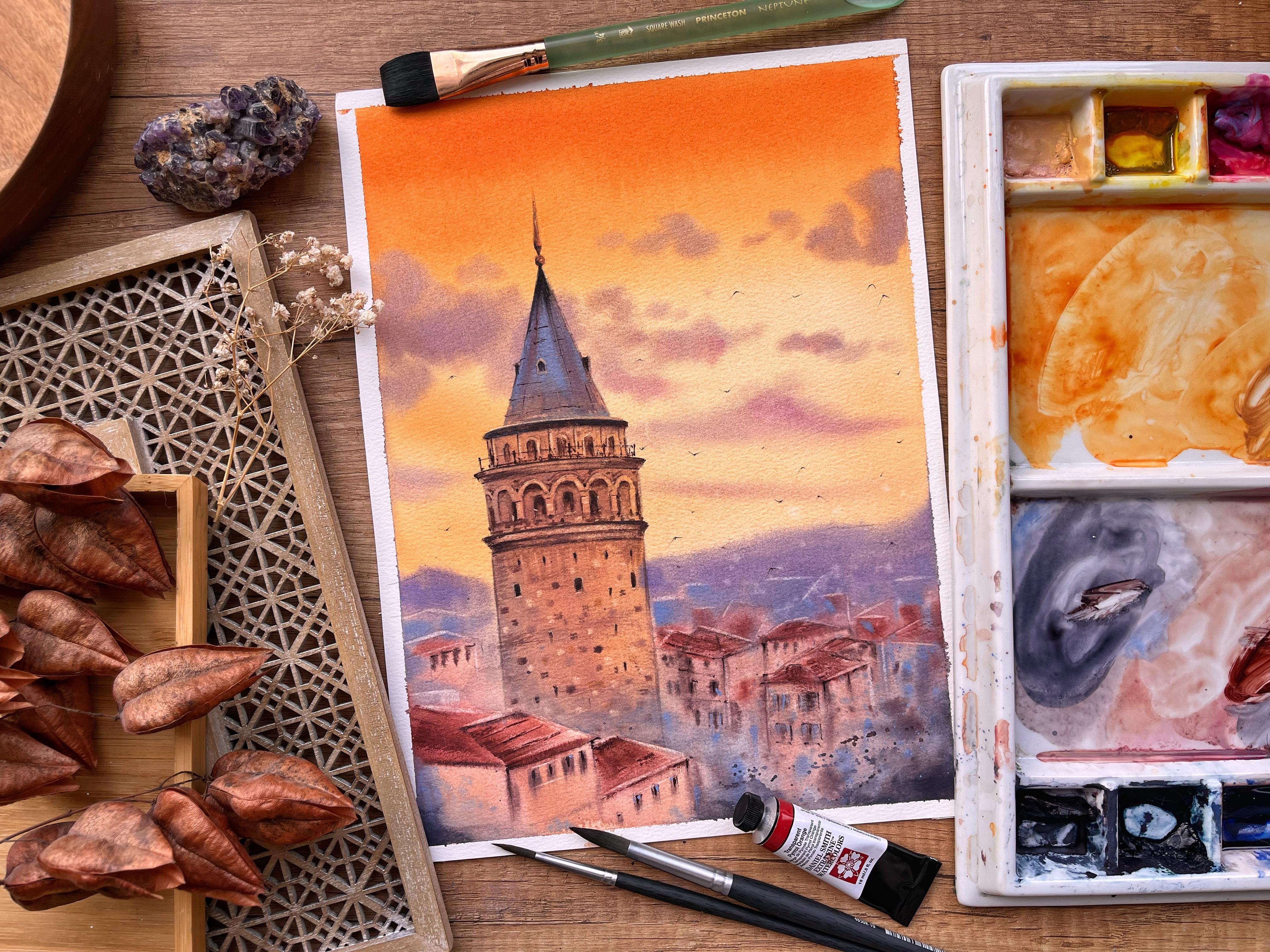
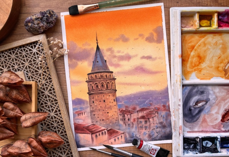
17. Project #2: Galata Tower: Welcome to the second
project in this course. Today, I will paint Galt Tower in Istanbul at Golden Hour. It is a very beautiful
and peaceful scene, and the color palette makes
it look bright and appealing. For this project, we'll
focus on creating harmony and atmosphere
through the use of color, simplifying the buildings
in the background, and painting architecture with just the right amount of
detail without overworking it. This is our reference photo, and this is my first attempt at painting it about a year ago. What worked well here
is the general mood. As well as the level
of simplification of the smaller buildings. What I thought could
be better is that the tower looks a
bit overworked, too heavy on the details, which makes it feel cartoonish. Another thing that
could be improved is the color palette of
the blurred buildings, as this one is too cold and dark and doesn't match the mood of the rest
of the painting. And if I'm being very picky, I would say that the clouds
here are too opaque. Which takes away
from the realism. And here's the project that
we'll paint in this class. You can see that
here the clouds are a bit lighter, more
airy and wispy. The city is lighter and warmer, matching the sunset atmosphere, much better and not distracting
from our focal point. And the biggest
shift here, I think, is that I added fewer details and less
definition to the tower. Spent well as time trying to
recreate the Rnking granny, and I think the result
is much fresher, more interesting, more painterly and polished version
of the tower. So how did I decide what to
simplify in this painting? Looking at the reference, what is it that
you notice first? My guess is that first
you notice the sky, the colors and the
atmosphere it creates. So that's why this will be
one of our main goals today. Recreate that sunset atmosphere. Painting the sky is one of our priorities as it sets the stage for
the entire painting. The other thing that
draws your attention first probably is the tower. That's the focal point of
the photograph, as well. It is the tire of the scene. So this is where we will focus
when it comes to detail. The small buildings
and the mountains in the distance are supportive
elements in the scene. They don't carry as
much importance. If the houses had
red or blue roofs, two or ten windows. If they were smaller or bigger or had more
or fewer chimneys, that wouldn't change the
impact of the photograph, as long as we have
that peachy sky and the beautiful ancient tower. So these are dire
that will simplify. We'll paint them faster
we loser trucks, fewer details, and
less color variation. If that sounds good, then
you're ready to start, let's meet in the next
video for the first wash.
18. First Wash: Let's start painting. I
have prepared my sketch, and I will erase
just a little bit of the pencil lines around the
roof. The rest I'll leave. And again, I will place my paper tape below my
board to create a slope, starting the same way by wetting the entire
sheet of paper. First, I spray some water. And then I'll use my flat brush. I have the same issue with the tinted water as in
the previous project, but again, that's okay. We'll use stronger
colors in this project. Again, I make sure my paper is evenly moistened by going
over it multiple times.
19. Painting the Roof: Your paper is completely dry, you can start
painting the tower. I take my round size four. I'll use it for the spare
that's on the top of the tower. In the reference, it has
this warm golden color. So I reactivate some
of this orange. You can take some
of that dusty pink as well or even mix them. And with the tip of my brush, I paint this spare like element. It's quite delicate, so you'll need a smaller
brush for that. And here we have a small bow. I leave a small highlight
uncovered to create volume. And on the left side,
there's a shadow, so we can drop some of
that darker brown there. Again, just with the
tip of the brush. Okay. And that's it for this part. For the roof, I switch
to my size eight. I take some royal blue. We see in the reference
this blue gray tin color, but I want to create
a brighter painting, and we use this color already in the clouds and for
the city background. So let's continue
using it as an accent. So we kind of
exaggerate the color of the tower to make it more interesting, brighter,
more colorful. I apply it in the
middle at first, then I start spreading
it little by little, getting closer to
the pencil lines. On the right, I'll leave some space for those
warm highlights. I wash my brush, take some
of that dusty pink mix, and I'll apply it
here on the right. You can also use
orange for that. And for the very
tip of the cone, notice how dark it is
in the photo reference. So taking some paints gray. I add it to my
brown to warm it up a little, and I'll add it here. Feel free to use a smaller brush for this section
for more control. I wash my brush
again and wipe it, and now with the damp brush, I'll spread the color. This gives me more control
and more naturals. And let's finish the roof. I go back to the pinkish
brownish mix. I add it here. You can drag some lines like
that to emphasize the shape. I'll finish with
some raw blue here. So We can now drop in some pink orange or brown spots while
it's still wet. Again, dragging that
color up towards the tip. Let's mix a stronger color. I'll take some molyzarin
and permanent brown. I'll add some strokes with it. And for the base, let's switch
back to a smaller brush. It's quite dark
in the reference, so I'm taking paints gray. I add to its own brown. And I carefully
paint this element. I leave a small gap between that and the rest of the roof, so the color doesn't bleed and at the same time,
there's a highlight. We can deepen the shadows here. Only on the left side. Here as well. M. Also, there are these small structures here like windows.
Let's add them. For this one, you can wait
until it's dry if you prefer. And let's leave it
like that for now. We will add more
details to it later. Take a break, and next we'll paint the
walls of the tower.
20. Painting the Tower: This video, we'll add the
first layer for the towel. I'll use my size eight. I'll mix again some of
the pink soft prawn. I'll take some lazarin
So naples yellow. That's probably too pink, so I add more naples. Again, I apply the color
in the middle at first. Notice again in the
reference that the color changes to a colder
version on the left, then warmer on the right. So mix some of that
raw blue into it. Add it on the left. And at the bottom, as well. You can drag some wines
like that, as well. And then I wash my brush, and I'll spread the color here until it reaches
the pencil lines. And again, some
lines from left to right to show the
roundness of the tower. We can even drop some orange on the right to emphasize
that warm glow. Next, I'll switch to
my small flat brush. If you don't have one, just use a smaller brush like
size four or similar. I mix a dark brown. And while it's still wet, I'll paint some
separate stones or bricks showing the walls texture and
suggesting complexity. Make a lighter version of this color and add some
more with that as well. Let's try with
some Napos yellow. So orange. We're using different colors to make it
look richer and more complex. And now we need to let it dry and then we'll come back
to add the details.
21. Details: In this video, we'll add
the details to the tower, all those features
that make it distinct, but we won't be too
rigid about it. Remember my first attempt that looked overworked
and cartoonish, we'll keep it light and fresh. With my size four, I'm
taking some brown. Add it to my pens gray here
to make it darker and colder. I wipe the excess on my napkin, and I start working
from top to bottom. First, I'll add the details around this small window here. I add something like a
triangle at the top, then it goes down like that. Now, let's add some of
those lines on the roof. In the reference,
we see that it's made of many, many
small elements. But if we add all of them, it will look over
detailed and heavy. So we'll suggest those
with just a few lines. Very light and thin, kind of wavy, imitating the pattern that we
see in the reference. Adding some smaller dots
to suggest complexity. And let's continue downward. Here we see a series
of arched windows, and some wines between them, let's start with the lines. Thin white strokes. It's not necessary to
reach all the way down. And then for the windows, I'll just fill in very roughly the shapes that
I drew with the pencil. I'm not filling them entirely. We'll polish those
later, but for now, try to work quickly and not dwell on the same
spot for too long. Then we see this element that forms something like a balcony. I keep working with the
same brown based care mix. Here we see another line. And there's also a rail link, so let's add it quickly. First, I add the vertical wines. Very thin wines. You can leave
them slightly unfinished. And then connect them. And now I'll just add some dots
and spots to suggest more elements here without actually painting
anything specific. So texture here with
the same dry brush. And let's move on to
the next section. Still using the same mix. Here again, we see a
series of windows, but these are framed
with some arches. Let's start with windows. Painting them in the same
way as the ones above. Now for the arches, I'll outline
them roughly from below. Adding a darker spot
inside each one. And then I wash my brush, wipe it, and with the damp
brush, I'll soften ditch. Dragging the color
down a little bit. And now, I'll use this
pinkish mix to fill in the rest of the
inside of the arch. And also outline
them from above. Mm. Now with down brush,
I'll often doing those, making them softer, not as sharp against the
soft color of wool. With dark brown, we can suggest
some of the elements here on the columns and dropping some shadows in between the arches and a
little bit above them, making them more distinct
without outlining them fully. Defining the columns
a little bit more Some final touches. And let's move on. Here again, there's a similar element like the one above. I add
the lines first. And then some textures and shadows with whatever
is left on my brush. Again, some dots, spots and lines to suggest
more elements here. We see in the reference
that there is something, but it's not very
clear what it is, so it shouldn't be in
our painting either. And that's more than
enough for the section. Let's mix some more of
that brown paste gray mix. Add those small openings here just with touch of
the tip of the brush. There are few larger
ones as well. Some more of the smaller ones. So was to chess. And we're ready with this part. Next, we'll polish it a bit. It's my favourite part of the process. See you
in the next video.
22. Elevating the Look: This video will
elevate the look of the tower using the scribing
and lifting techniques. It's an optional step, but
it makes a big difference. It's often hard edges and
straighten scroked lines, and it can also bring
back some highlights. As a result, your
painting will look more polished, fresh
and interesting. I take a clean napkin
and my small flat brush. Again, I will work
from top to bottom. I start with this
element on top. I scrub around the edges
to soften the lines. For the roof, I'll switch
to the larger flat brush. I washed in clean water,
wipe the exes off. And I glided alongside
the edge here. And you can also lift some
paint from the inside, creating some more of those
lines to suggest the pattern. Again, not everywhere, just here and there
to keep it fresh. Here we left a tiny cap so we can try to
create a highlight. Depending on your
paint and pigment, you might see a
different result. Some pigments are easier
to lift than others. Going back to the
smaller flat brush, I will work on this
small window here. Adding a highlight will
make it stand out more. I've used this brush a lot, so it's a little
bit freight now, and I can't be very precise. So it's time for a change, but for now, I'll
have to make it work. Scrubbing and lifting really messes up the bristles
of the brushes. Going back to the element here, I go over the highlight
again to make it brighter. And here below to soften dg. Then we can soften these lines or create a highlight
next to them. With a smaller brush
I'll soften the windows, same as I did with the larger
ones in the previous video. And I can try lifting a
highlight around them. Thanks to the frayed bristles, I can be very precise, but still I'm able to
show some highlights. Switching to the larger
brush for the next element. I soften the texture
a little bit, making it look more
like a shadow. For the arches here, I will try and lift some
separate spots that can suggest lighter stones just here and there to
make it more interesting. And, again, switching to the larger brush for this part here. Let's also work
around the edges. It's often them and
straighten the lines. And finally, with a small brush, we can lift some paint again to create lighter
stones or bricks. Let's first soften
those darker spots. I'm just mching
the paint lightly. Adding a small highlight here. And now for some bricks. I really like this effect. So we're not painting
every stone separately. We're suggesting
the structure of the wall by adding just a
few with different values, and that's enough to
create that visual impact. Okay, now it needs more touches, and the tower will be ready.
23. Small Adjustments: This point, I'm standing
up and I'm looking at the tower carefully to see if
anything needs improvement. I take my small flat brush and I reactivate some
of that brown here. I want to add a little
bit of it around the lifted highlights
on the smaller windows. This will make them
stand out more, very lightly just
here and there. It's more about adding
spots than outlining. While I'm at it, I go around
the Binger arches as well. I feel like the outline of the tower here is
a little bit lost, so I add more definition to it. Touching up this part here as it seems a little
blurred as well. Some shadows on the
sides define the shape better. So more bricks. We can also add
some texture to it. I switch to my size eight. I reactivate some
of this mix here. And with the dry brush, I go over it like that. We can try with a
darker paint as well. And if you weren't able
to create highlights, you can use a pack paint to add them like Naples
yellow, for example. You can use it to
outline the windows. Add some spots with it to
suggest different elements. And overall, just play with it, add it whenever it feels
suitable and make sense. I'm not seeing now
that this line here needs some strengthening. And that's it for the tower. Next, we need to
work on the CT a little bit to make it
look more convincing. See you in the next video. I
24. Painting the City: Now next to the tower, the city looks a
little bit washed out. So let's add more definition to it and mix the dark brown again. With the semi dry brush, I'll much this color onto the
windows of the buildings. You can drop it in like that. Or also outline them to create the illusion
of wooden shutters. We can also use this color to add the shadows
below the roofs. Don't make anything
too distinct here. Lift your brush off a name, work with unfinished lines. Remember that this
part serves as a background that supports
our focal element. Once we add the deeper shadows, we can create some highlights again using the
lifting technique. We can use it to
define the roofs. I suggest some buildings
in the distance as well. I'm just randomly
lifting some lines to create the illusion of more
buildings further away. We won't be adding windows
or anything too specific. Those highlights will serve as a suggestion of something
more happening here. But because it is further away, we can't see what exactly. I'm going over this
a here too much, the paint and sof tan
do look a little bit. Next, we can add
more color spots. I like to use royal
blue for that. I take some tick paint. I add some spots with it, and then I smooch
them with my finger. We can also use it to create the illusion of colorful
wooden shutters. So splatters with
different colors. We can also make the tower disappear more seamlessly
into the city. I take some watery royal blue. I add some spots here with it. And now with a down brush,
I'll just blend them. And now it looks much better, and we're almost done. Just some final thes left.
25. Finishing Touches: Tats on birds do make the
scene more alive and dynamic. I'll mix again some of
that brown pins cream mix. With a semi dry brush and
the very tip of my brush, I paint some squashed shapes. Don't make them too
big or too distinct. Paint some with the wings up and some with the wings down. Paint them in different
sizes and unevenly spaced. Istanbul has a lot of seagulls, so it's almost mandatory to add them to any Istanbul escape. Add as many as you
like. Birds always make the scene more interesting. That's enough for me. This line seems a
little too dark to me, so I'll glaze on
royal blue on top. That's better. We can drag it down
here and there, too. You can also create
a vignette like effect at the bottom
of the painting. I take my sees it and
some paints gray. I'll mix it here
to soften it up. You can use brown as well, and I'll add it in the corners. With the damp brush,
I'll blend it. Adding a few more spots. Some spotters. The next improvement
will be for the roofs. They look a bit
washed out to me, so I take some permanent
brown, mix it here. And with the semi drip brush, I'll add some color
to the roofs. Not covering them entirely, just on smudges here and there. If your brown is colder and
you want a brighter accent, you can use burnt sienna, red Tucker, or even some orange. So lines. A little bit on the
distant houses as well. And And finally, this part here looks a little messy, so
let's clean it up. Much better, right?
And we're done. Congratulations. You've made it. Such a challenging project, but such a beautiful
and satisfying result. I hope you enjoyed painting it, and I'll see you
in the next video. We will wrap up the class.
26. Wrapping Up the Class: Congratulations on
completing the class. I hope this project
help you see that CD scales don't have to be
complicated or intimidating. By focusing on focal points,
simplification, atmosphere, and edge control, you can create convincing and expressive scenes without needing
perfect accuracy. For your class project,
I'd love for you to share one or both of the
paintings. We created together. You can also try applying
the same approach to a different city reference if you'd like to
experiment further. When you about your project, feel free to share a bit about your process or any challenges that you faced along the way. I always enjoy seeing your
work and giving feedback. If you enjoy this class,
I really appreciate. If you could leave
a quick review, your feedback helps
other students discover the class and let me know
what you enjoy the most. And if you'd like to see more of my WC process or tutorials, you can also find me on
Instagram and YouTube where I regularly share
painting, videos, and tips. Thank you so much for
painting with me, and I'll see you
in the next class.
 Elina Zhelyazkova, Watercolor Artist