Transcripts
1. Introduction : [MUSIC] Wow, all of
the year has gone by, it's Christmas season again. I've always found it
more meaningful to give gifts that
are personalized. It is a way of expressing
your love through putting in the time and effort in
creating a special gift. However, in the
business of life, most of us have
limited free time. That's why I thought that
the holiday card class with easy-to-do yet elegant
paintings would be a good idea. We'll create meaningful
gifts and at the same time be able
to showcase your art. Last year, I launched a 12-holiday watercolor
cards class, which a lot of you enjoyed. This year we're going to
do part 2 of that class. It is going to be a series of quick and easy projects where
you will use watercolor, white pen, gouache, and
gold watercolor paint. [MUSIC] Hi, my name is Joly and I'm
a watercolor artist and online art educator based
in the Philippines. I have been painting
for about nine years already and I've worked with
different famous art brands. Art revolves around painting
loose watercolor flowers. I love how I'm able to make a creative interpretation of
nature and put it on paper. Here on Skillshare, my class
is focused on breaking down difficult watercolor
techniques into easy steps for beginners. In this class, you're
first going to discuss the materials
that we need. Next, we're going to do some
color swatching and color mixing to achieve
the colors that we will use in our projects. You will learn basic
watercolor techniques such as, wet on dry, wet on wet, bleeding,
splatters, among others. These will be useful in creating our projects and in your
future paintings as well. Here are the seven holiday cards that you will be creating. This class is suitable for beginners or
experienced artists. So let's pick up our
brush and start painting. See you in class.
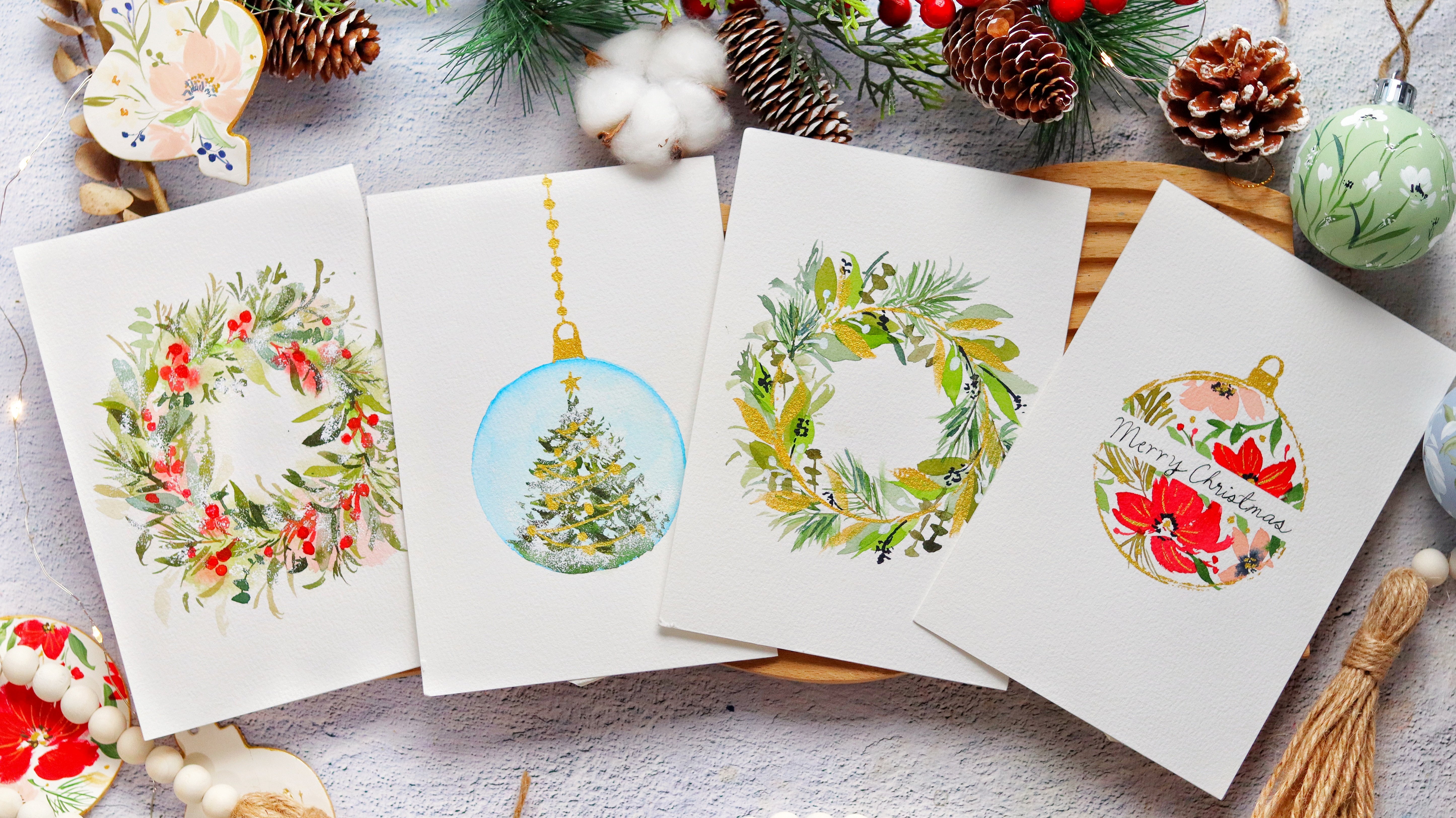
2. Class Projects Overview: [MUSIC] Hi, welcome to the
class projects overview. Let's check out
the paintings that you will create in this class. Now, let's check
out their projects. The first one is going to be this beautiful Christmas
tree ornament. This is a very simple
project where we paint triangles and just add
some designs on it. Next, we're going to paint
this Christmas bubble, is a minimalist design with some green and gold
leaves inside. I also added that gold ring
for the sparkly design. Next is this Christmas
tree in a pot, so this tree is quite popular here because it's space-saving. It's a small Christmas
tree that you can put on your table instead. You can definitely play around and change the sign of the pod. Next, we're going to paint
this half foliage wreath, so I added this
minimalist wreath so that you can write a
code in the middle. Perhaps you can also
customize it and just write the name of the person that you're
going to give this to. This is one of my favorites. This is a hand-painted
ornament inspired card. I would love to someday hand paint my
Christmas ornaments, but for now, I'm already
happy with this holiday card. You can even cut
out the shape and hang this on your
Christmas tree. I personally like
the vintage feel of the color combination here. Next, we have a
Christmas tree stocky, so I wanted this to be
a bit more cheerful, so I chose the red color. Of course, the class is not
complete without flowers, so I added some flowers
and pine needles. Now, for the last
project is going to be this beautiful snow
globe that I'm so excited for you guys to try. This takes about 15 minutes
to finish, but don't worry, you will definitely
enjoy it and you will learn different
techniques as well. That's it for our projects. I hope that you will enjoy all of them and
that they will be meaningful holiday cards that you can give out to
friends and family.
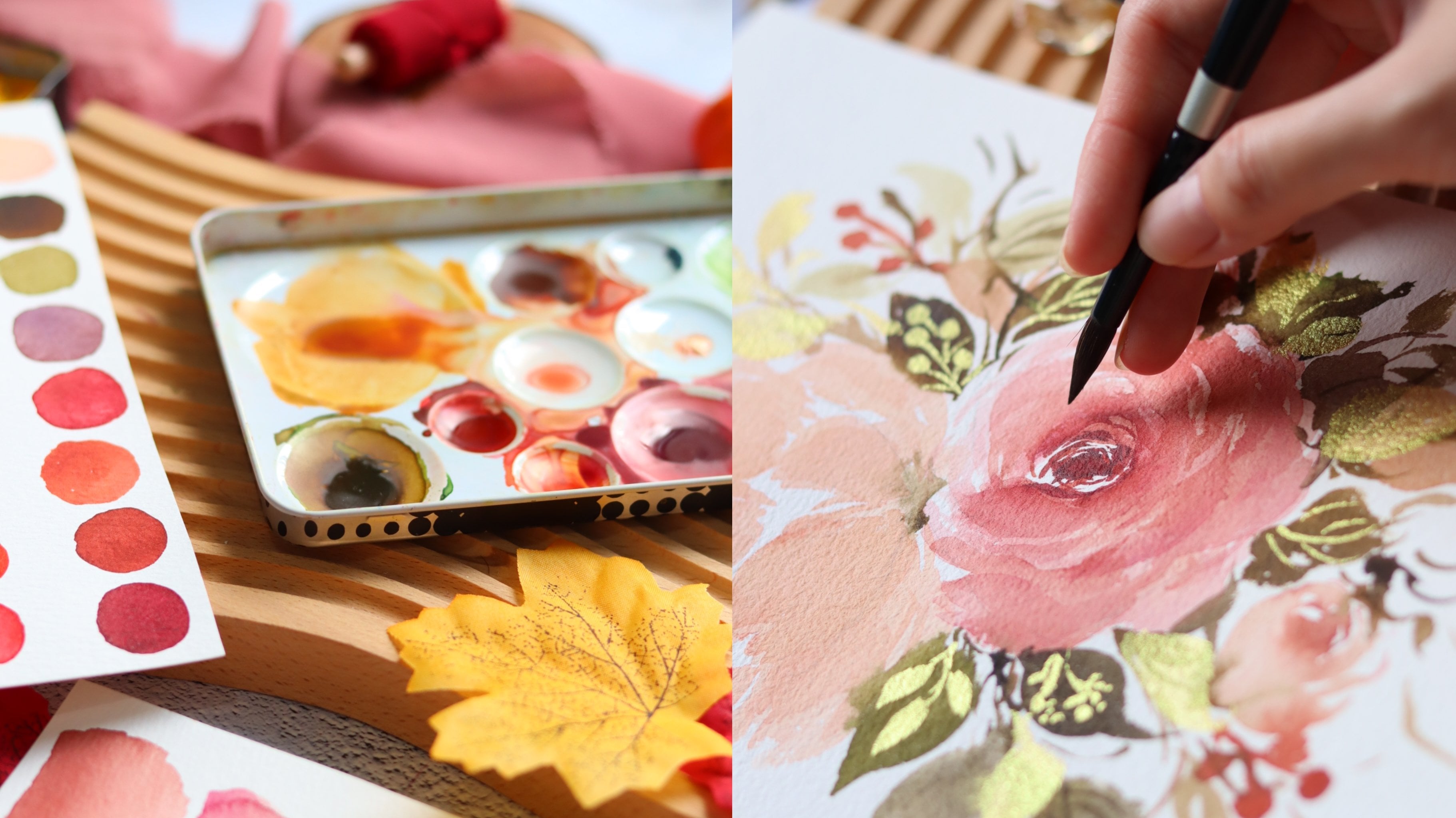
3. Materials: [MUSIC] Let's talk
about the materials. I'm going to start
with the brushes. We're going to use silver
brush black velvet. Because we're going to paint
smaller holiday cards, we're also going to use
a smaller size brush. We're going to use size 4 and 6. I really love these brushes
because they're very pointy. Even if you load them
with a lot of water, they can still maintain
the pointy tip. But of course, feel free to
use other brands as well. Let's now move on to paints. I'm going to use Shinhan PWC. If you've been following
me for a while, you'll know that this is
one of my favorite brands. These Korean artist great
paints comes in tubes only, so I would pour it into smaller half bands
just like this so that it's more
convenient to use. If you like painting small
to medium-sized paintings, I would suggest
doing this as well. You'll see the list
of colors that we'll use in the class
in the next video. Next, we need a mixing palette. I'm using just this
watercolor tin. This is the lid of
my watercolor tin, and they love the little
wells in this mixing palette. You can also use
ceramic palette, or this is one of the
popular ones right now. It's a resin palette. If you don't have these, a regular plate will do. For our gold paint, we're going to use the edger pearlescent
watercolor paint. I use the golden set. You can see different
shades of gold here, which I really love. They even have some bronzes
and I really like gold color. You can, of course, use
other brands as well. A gold watercolor paints
should settle well on the paper and when you
rub it with your fingers, you can see that it will
not transfer on your skin. That's just a tip for you if you're looking for a gold paint. All right, let's
move on to paper. I'm using this postcard
from Etcher lab. It's also watercolor paper. It's 100% cotton, and it's cold press. The size for our projects
is 4 inches by 6 inches. You can definitely grab other paper brands
such as the Baohong. This is also an
artist grade paper and 100% cotton as well. You can simply cut
it to a size that you prefer for your
holiday cards. For a loose watercolor painting, I suggest using cold-press paper because it handles water better. You'll see that you have
a little bit of texture on the paper which helps
it absorb the water. We're also going to use
white pens for our projects. I'm using the Posca Acrylic Pen, but definitely you
can use other brands. I love using these white pens because they're very opaque. Using white pens
also makes it easier to paint some smaller details. Let me show you a
sample project. This is one of the project where you
will use the white pen. Another alternative
is using a gouache. I'm using the brand Holbein
and it's in permanent white. We're also going
to use this to add some white details such as no. Next, we need a water jar and also tissue paper to block out the excess paint in our brushes. Lastly, we need pencil. Any pencil is okay, I'm just using an irregular
mechanical pencil. Then next we also need
just any round object. I'm using a masking
tape right here. We're going to use this to
outline the snow globe. I'm really excited
for you to try out this project. That's it. That's all we need
for the class. Let's now move on to the
next video where you will learn how to mix colors. [MUSIC]
4. Color Mixing: [MUSIC] Now let's
swatch the colors that we will use in the class. I'm going to start
with Crimson Lake. Now, this is a beautiful,
deep reddish-pink color. Next, we have permanent red, we have Burnt Sienna,
and Raw Umber. Let's now go to our greens. I'm going to use Hooker's green and Sap green in the class. Hooker's green is a more
intense green color compared to Sap green. Let's watch some Burnt Umber. This is a deep brown color. Next, we have Sepia. This one is a really
dark brown color that I also love to
add to my greens. Next, we have this neutral
color called Payne's gray. Next is Prussian blue, and after Prussian
blue we are going to swatch Cerulean blue, you can definitely use other
blues in your palette. This is just a guide for you. Lastly, I'm going
to swatch indigo, which is one of my
favorite colors as well. You can see that it's more bluish compared to Payne's gray. Now that we are done
with the swatches, I'm going to just
quickly show you some color combinations that we're going to use in the class. Right here I just mix Hooker's
green with Prussian blue. We are going to produce a very
beautiful and bold color. This will look a little
bit bluish-green. We're going to use
this color for this hand-painted
Christmas ornament. Let's move on to
the second mixture. This is Hooker's
green and Sepia, so these two colors will produce a mutant,
deep green color. This is also one of
my favorite mixes if I want something more mutant, you can definitely play
around with the value, you can make it darker or
lighter just by adding water. This is also the same mixture that I use for the pine needles, so right here I'm just
going to do a simple demo. It's best to paint those slides facing in different directions. I'm going to rinse
my brush and try to paint some lighter strokes. You can find a more
in-depth tutorial of pine needles in my previous
holiday Skillshare classes. Next I'm going to show
you how to tone down that red color so I have here permanent red with
Hooker's green. We're going to mix
these two colors. Just make sure that
you don't add too much green or else it
will look too dark. This is a very
beautiful maroon color. You can use this to also paint the flowers so that it's
not too bright red. Let me just paint
some simple berries. You can see it's
a deep red color. Now let's try to paint another
set in this permanent red. You can see a huge difference. The maroon color gives
a more rustic vibe, while the red berries give a
happier and cheerful look. Let's move on to. Cerulean blue. We're going to add
different blues to Cerulean blue just to show
you what it will look like. We're just going to mix first Cerulean blue and Prussian blue. Now, let's swatch this, also you can see
that we have toned down the color of Cerulean blue. Next, let's mix Cerulean
blue and Payne's gray. This is going to
be a darker color. Next, we're going to
mix it with Indigo. Indigo is more on the
blue side compared to Payne's gray and you can see
that mixture right here, that it has more blue. It's really interesting
to see how mixing these two colors produce
just different blues. You can definitely use this guide for painting
our snow globe. For the snow globe there's a part right there where we will paint snow and we're
going to use Indigo. You can also use
Payne's gray but I'm showing you here that just
by adding more water, you can achieve a
really light color. This still looks a little dark. I'm going to add more water. Now let's try to just
simply swatch it. I think that looks a lot better. If you don't have
Indigo or Payne's gray, you can just add black to any of your blues and then dilute
that in a lot of water. That's it. Let's move on to the next video
where we will learn some watercolor
techniques that we can apply to our
projects. [MUSIC]
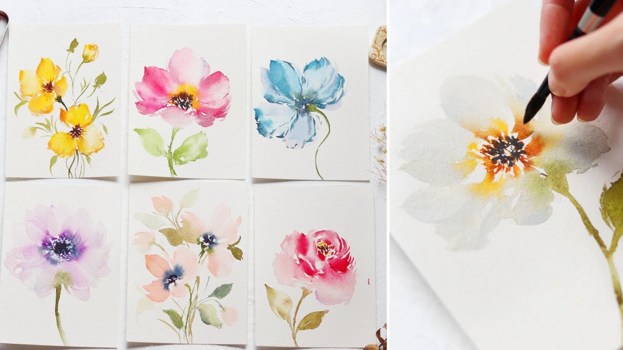
5. Watercolor Techniques: [MUSIC] In this video,
you are going to learn different watercolor
techniques that you can apply to our projects and also through your future
paintings as well. To start, I would
like you to divide your paper into seven sections. For reference, I am using a
seven by 10 inches paper. Some techniques are
going to require drying time in order to save time while
waiting for it to dry, we are going to skip to
a different technique. That's just a heads-up for you. Now let's dive. Let's
start with a wet-on-dry. It just means that our brush
is wet and the paper is dry. Just pick up any
color that you have in your palate and
start painting some petals or just try to
scribble some brushstrokes. With a wet on dry, the shapes will appear more pigmented and they have a
finer or a sharper edge. This is also a good way to
practice your brush strokes. You can try to sway your brush, create
different markings. Now let's go through
layering with gouache. In order to save time
let's paint this circle here and use any
color that you want. Just make sure that it's
really dark and quite opaque. I wanted to paint this first
so that it will be dry by the time we get onto this
watercolor technique. Later on, you will layer
this with gouache. That's why it's important that the base layer is already dry. It doesn't have to be
perfectly around and don't worry if there are imperfections,
that's definitely fine. That's also one of the advantages of
layering with gouache, you'll be able to cover
up your mistakes. This looks good, I'm just
going to wait for this to dry. Now let's move on to wet on wet. Wet on wet means that the paper is wet and then the
brush is also wet. For this exercise,
just draw a triangle. I'm going to fill
it in with water. Next, let's grab any
color that you want. I'm going to use a sap green. The wet-on-wet technique
gives you a softer look. You can see right here as
I paint the green parts, it looks very soft and
it looks feathery. I can also add a darker
color right here. It will blend well with the base green color
that we painted. You also don't have harsh lines when you're painting
on a wet paper. Now let's do another
triangle right here. When this one dries, we're going to add
some gold details. To save time, I'm
going to do some of the shapes in advance. You can definitely try to
paint it in another color. I just did it in a green color because I want this to look
like a Christmas tree. Let's move on to bleeding. I'm going to use
hookers green with CPI. You can use other
green colors as well. Just to better visualize
this technique, we are going to use
this for this ornament. With bleeding, usually, there's a darker color
and a lighter one. You can see right there, there's a bleeding from
the dark green color. Let's paint a eucalyptus. These are just some oval shapes that will look like leaves. I'm going to start with one. Next, let's rinse our brush, and then just tap
the excess water. I'm going to paint the same
oval shape right here. I'm going to lightly
touch that green leaf. You want to be quite careful
because you don't want the colors to be
all over the place. I'm just going to try
and spread that out. You can definitely do that. Now let's add another leaf. I'm going to grab a
really dark color and paint another oval shape. Your case is try to paint the main shape first
and then lightly touch the tip towards that
lighter-colored leaf. You can see the bleeding. You can also do this with your other leaves
as you're painting. It's a nice way to give more depth to your
floral arrangements. Before we head on to the next
technique called splatter, let's do the base first. I have here just a round
shape and I'm going to fill it in with a lot of water. Next is grab any blue
color in your palette. This will serve as the
sky and you want it to be quite dark because later on we're going to add a splatter technique and we're going to add some small specks
of white snow. I'm just going to try
and spread that out. You can leave the
bottom white so that it looks like a pile of snow. With a clean brush,
you can try to swirl around the
color to mix it, or you can try to lift some
colors if it's too dark. Grab a darker color like
Payne's gray or indigo and add it towards the top portion
of this round shape. Let's wait for this to dry and move on to a
different technique. We're also going to do
some fading technique. If you have been watching
my classes for a while, you would probably be
familiar with this. We are going to use it for our Christmas tree and I just have here hookers
green with sepia, but any green color will do. Just scribble some small lines and I'm going to slowly
build this Christmas tree, making sure that
there are white gaps or white spaces
in-between each layer. This really helps in avoiding
it being too overcrowded. Next, let's rinse our brush and just
tap the excess water. I'm going to try and
fade away these strokes. Lightly touch the tips of each dark stroke
and try to blur it. You can see that it's
starting to look softer compared to what
it looked like before. That is the beauty of fading. You can make things look softer. Let's move on to
another technique. This is layering with gouache. You can see that we already have this base round shape
and it's already dry. I'm going to use the
whole bean white gouache and you want
it to be really thick. Let's paint some simple
five-petaled flowers. We're going to use
this technique for the hand-painted
Christmas ornaments. When you're layering
with gouache, you want the base to be dark so that the white
gouache will pop up. Right now I'm trying to scatter the petals all
around this shape. Some can be just one petal, some can be only three. Sometimes the gouache will
dry lighter than expected. If that happens, just
wait for the gouache details to dry and
then we can go back in to add another layer. For the next technique, we're going to add
some gold details. I'm just using the
gold paint from my extra lab watercolor set. Now I'm just going to
add some small dots in the center of these flowers. This is completely optional. Next, let's go through this triangle that looks
like a Christmas tree. You're just going to
add some smaller dots as a gold embellishment. I wanted this to have a
minimalist look that's why I'm adding only
small dots of gold. This is the project where we
will use the same method. You can see just
small dots of gold, which makes it
look more elegant. Now we're going to do
the splatter technique. Now, don't forget
to cover the areas where you don't want
some splatters. Now let's coat our
brush in gouache. Make sure that it
also is a little bit runny so that when
you tap your brush, you can create these
nice splatters. This will serve as snow
in our snow globe. You can definitely apply this technique to other
paintings as well. Right here I'm just tapping
my brush using my finger. This really looks good. I think that we can
try to play around. I'm going to use just
this dark color. You can use Payne's
gray and indigo. Let's just paint a mountain. Now I want this to
look a little bit imperfect so you don't really
need straight lines here. Just try to wiggle your brush
to create some texture. This is an impromptu painting, so we're not really going to
paint this in our projects, but you can also do
this if you want. Now let's wait for this to dry and while we're
waiting for it to dry, I'm going to grab
some white gouache, add some snowy
effect on this tree. When you're adding some
snow effect on the tree, make sure that you add the white gouache
near the dark leaves. You want the white
part to be on top and the dark color to be underneath. These are the more
dramatic effect. Let's add some snow
on the mountains. I'm just going to dab my
brush and tissue paper because I want to use a
dry brush technique here. Let's start at the
top and just go down. I'm going to try and
scribble some thin lines. I want it to be
really imperfect. This is really just
something I'm doing for fun. I hope that you'll also
enjoy this quick project. We're done with the techniques. I hope that you enjoyed
the lesson in this video. I think you guys are prepared
for bathing the cards. Now let's move on to
the next video [MUSIC].
6. Christmas Tree Ornament: [MUSIC] I'm so
excited for you guys to try out the first project. We are going to paint
our interpretation of Christmas tree ornaments, so I'm going to start
with triangle shapes and then we are going to layer
it with some gold accents. We're also going to
use a white pen and add a lace detail. Let's start. I have here my postcard. It's four by six inches, and I'm using a regular
mechanical pencil. Let's draw three triangles. You can draw more if you want, and you can place them
any way you want. I do suggest that you draw them facing in different directions, so you want some of the triangles to be
a little bit tilted. That will suggest movement in your painting instead
of it being too stiff. For the first triangle, we're going to paint a really
dark and rich green color. I'm going to mix Hooker's
green and sepia. We want a really bold color. I'm going to try and
swatch this first. When filling out an area, I personally find it
easier to do an outline first and just fill
in the middle part. But when you're doing
this technique, you do have to be quick
because you don't want the outline to dry fast. You still want to
be able to blend the outline and the
color on the inside. If there are imperfections, you can always go back
and try to fix it. Right here I'm just adding some more volume
on the left side. When I drew the triangles, I did it freehand
without using a ruler. That's why the sides
are not really even, but it's really fine with me. I do want it to
look as natural as possible and if there are
imperfections, it's okay. We can always try to cover it up with another layer of
gouache or gold details. Let's move on to the
second triangle. I'm just using water here. I'm going to let that color bleed into the second triangle. You can see that the
second triangle is really light in color. There's a little bit of
green in my brush left. That's why it has
a tinge of green. I think we need a
little bit more color on the second triangle. I'm going to grab
some sap green and just going to layer some color on top of it while
it's still wet. There's too much water
in the second triangle. Let's try to blot it out. Use your brush and blot out
the excess moisture with a tissue paper and then just absorb the excess
water in the triangle. That's how you troubleshoot the puddles of water
in your painting. Now let's move on to
the second triangle. I'm using sap green for
the third triangle. For our project here, we're going to paint triangles in different
shades of green. That will make it look
more interesting. I'm just adding a
little bit more of that sap green to make it pop. You can see we
have a dark green, we have a medium green, and we have a light green. You can also add a dark
color in the corners of this triangle that will
give it a different effect. But, of course, it's
optional and we're just trying to
experiment and have fun. You can even add
salt if you want. Salt will give it a more
interesting texture. Now let's add some modern beads. I'm going to use raw umber to
paint these brown circles. Next, let's use burnt umber and add another circle on top. You can definitely use any
brown color in your palate. It would be best to use two different types of browns just to make it
look more interesting. Another suggestion is
to use gold paint. You can add some gold
beads right there. Now let's paint a trunk
for each Christmas tree. I'm going to use burnt umber. Just paint a rectangular shape at the bottom of this triangle. It's best to add this detail when the triangles
are already dry. I think we're good. Now, let's add some details. I'm using my Posca acrylic pen. When you're adding
a second layer, makes sure that the first
layer is already dry. I'm going to start with
two parallel lines. Next, let's add some
scallop shapes. What I'm going to do
here is I'm going to do a lace pattern, but you can definitely add different patterns on your own. Then we can try to layer
another set of scallops here. It will make it look
more intricate. Now let's add some small dots. For the center, we are going to do
some zigzag marks or you can do X marks as well. As a filler, I'm going
to add some small dots. I really want this to look even in the interior
I'm going to add clusters of three dots. Again, you don't really
need to follow this part. You can, of course, look for other lace patterns that might be easier for you. For the second triangle, I'm going to add
some gold accents. Grab your gold paint now. Make sure that you get
a really thick mixture. I'm going to add
some small dots. I wanted this to look
a bit more minimalist. We're going to add
these small dots on the right side
of the triangle. It's a really simple method, but it's so beautiful. Now for the third triangle, we're going to use
a white pen again. You're just going to
add some simple swirls facing in different directions. The possibilities
are endless when it comes to painting on
these small triangles. You can definitely
play around with different strokes
and also shapes. I'm pretty sure that
you'll be able to create your own version
of this project. Now if you have some rhinestones at home or maybe glitters, you can also add that to add some bling to your
holiday cards. I don't have those materials, but I do have gold paint. I'm going to use that to add
some sparkle to this tree. We are almost done. Let's add some gold strings. I'm using my gold
watercolor paint. Just to add some movement
to this painting, I'm making sure that I'm
painting some curvy lines. On the lower right
side of this project, there's a white space. You can add some letterings like merry Christmas or other cause. But since I'm not going
to write anything here, I'm just going to add a gold string just to
fill in that white gap. Lastly, let's add
some small dots just to add some sparkle. But if you want
it to look clean, you can opt not to
add these gold dots. We are done. Congratulations for finishing
your first project. I hope that you had fun. Don't forget to upload it in the project gallery
section of the class. I really love the sparkly
details on this one. Let's now move on to the
next project. [MUSIC]
7. Gold Leaf Ornament: For Day 2, let's paint this minimalist
gold leaf ornament. This project was inspired by clear Christmas balls with
some eucalyptus on the inside, and I thought that
I would paint that, but with some gold in it. This is a very
quick project that you can finish in less than
10 minutes so let's start. First, we need a round object, so I'm just using my tape here, and we're going to
trace a circle. My paper is still 4-by-6 inches so it's a
really small postcard. If you have a bigger paper, you can paint several of
these Christmas bubbles, we are going to
paint eucalyptus, and you need the hooker's
green and sapphire. We're going for a
deep green color that's a little bit muted. For the first leaf, we need it to be really dark. This is the same leaf that we
practice in the exercises. Let's start with a small
stem and then paint an oval shape to attach to it. Next, let's rinse our brush and paint another oval shape so we want this dark color to
bleed into the second leaf. You can press your brush
onto the paper and let the bristles fan out so you
can create a broader stroke. Now let's move on
to the third one, I'm going to start with
another dark color. Again, I'm letting it bleed
into the second leaf. Try to vary the sizes
of the leaves as well. Now we're going to
add a little bit of this Prussian blue
into my mixture, just to give it a bluish color. Now let's paint another
leaf over here. You can see that
it's lighter now. As we go towards the
top part of this stock, we're going to paint
smaller size leaves. Now let's add just
a small hook on the top part of this
Christmas bubble. Later on, you can add a string. Now let's do the outline
of this Christmas bubble. I'm going to use gold paint. You can use other
colors as well. Don't worry about
the pencil marks. We will be able to cover
that with the gold paint. You don't really need to paint the ring in one sweeping motion. You can do it little by little. It can be quite nerve-racking to paint this ring freehand. You can always do it little by little if it makes
it easier for you. Also, if it's not
really even it's fine. You can go back
and try to fix it. Another option is to
use a flat brush. It may be a more stable
option when painting lines. But I decided to use a
round brush since some of you might not have a
flat brush right now. Let's do this cap part
of the Christmas bubble, I'm just going to
fill that in with some gold and add a hook. This already looks good. Now we're going to layer
it with some gold accents. Going to paint a
small oval shape here and layer it with
some of the leaves. Next, let's vary the style. We're going to paint
just the outline of a leaf shape with some
veins on the inside. Then we can paint another leaf, but this time we want it
to be quite transparent so you can still see
the leaf underneath. We're going to do the
same gold pattern on the other parts of
this eucalyptus stoke. Just make sure that you do it alternately so that it
doesn't look too crowded. Next, let's just paint a really thin string
of gold right here. We have here Prussian
blue, I'm going to mix it with the green color
in my palette. You're going to thin this
down with a lot of water. We really want this to
be quite transparent. I'm going to do a glass effect. You can see the
white areas inside this Christmas bubbles
are going to fill that in with this blue paint. We just want it to
look very subtle. I'm adding this color to give it more dimension so that it
doesn't look too flat. We are done. That
was an easy project. You can also paint the
ring a little bit thinner if you want this to
have a daintier look. Now let's move on to the
next project [MUSIC]
8. Christmas Tree in Pot: [MUSIC] For our third
project, we are going to paint this Christmas
tree in a pot. I've been seeing
this style in a mall and I really wanted to buy one, but then I just didn't have the time to sort
out space at home, so I just decided to
paint it and maybe I'm just going to hang
this painting on the wall. Let's start. I have here again
my four by six inch paper, and we're going to start
drawing a small pot. You can draw any
shape that you want, you can be creative with it, and on top of that pot we
need to draw a triangle. This will be our guide
for painting our tree. It really helps if you have some guide when you're
painting certain objects. Let me just prepare the
greens that we will use. I'm going to grab
some sap green. Next I'm going to
mix Hooker's green and sepia so we have two colors. One is lighter, one is darker. I will start with
the sap green color. This is quite diluted, and just using a tapping motion creates these organic strokes. I'm going to start at the
top of the tree and I'm going to go down layer by layer. You can see that I'm
also leaving spaces in-between my strokes and
then also trying to vary it. Some will look like small dots, some are longer strokes. What we're going to do
here is we're going to lay down just our first base, which is a light color and after which we are going
to add a darker mixture. This is a slightly
different style from the exercise that we did with
just the fading technique, but I still wanted to show you guys different
approaches to painting a tree so you can try and figure out which technique
works better for you. Now let's grab our
dark green color. This is Hooker's
green and sepia. While the base is still wet, I'm going to add
this color and I'm mostly going to add it
underneath each layer. That's because this
is going to be the shadow of the tree. Now let's just continue tapping our brush grading these
beautiful markings. Let's try to fade away this area so you
can try to do that, mix different
techniques together and that will make it
look more interesting. I'm also trying to tap some strokes towards the
edges of each layer. You can see that it
looks more wispy. Towards the bottom
we're going to add more darker strokes, so the tree is looking good now let's move on to
painting the pot. I have here a very diluted
mixture of burnt umber. Now let's try to
fill in this pot. I'm going to do just
a quick outline, and after which I'm going
to fill in this space. We need to do this quickly because we don't
want the outline to dry up before
we add the center. Now for the top
part of this pot, you can see I'm trying
to wiggle my brush and I'm not making
a straight line. That's because I want just
an illusion that some of the leaves are over the pot. Now let's add some shadow. I'm going to use
some burnt umber, but this time it's more pigment, and I'm going to add this
while the base is still wet. You want this color to blend in with the base color that we did. If you want a dark pot, then this is already good, you don't need to change it. But I figured that I wanted it to be a little bit lighter. Now I'm trying to leave the color just to make
this part lighter. I didn't want to edit this part out because
I wanted to show you that sometimes you can still troubleshoot if you
made a mistake. Now let's grab our gouache
and make sure that you have a really thick and pigmented mixture in your brush. We're going to add our snow, so my tip is added
near the dark areas. It's also better if you put the snow on top and then below is the darker leaf or the
darker part of the tree. That's because you
want an illusion that there's a shadow. I'll just try to use the
tip of your brush and try to wiggle it to create
these organic strokes. Now it's time to fix
the shape of the tree. I'm going to grab
hooker screen and sepia again and you can see
I'm trying to add some really small strokes
towards the edges of the tree and that's because we want to add some movement
to this painting. You don't want it
to look too stiff. You don't want it to be
just a perfect triangle. You want a little bit of fluff towards the edges of this tree. It hits a little difficult
to explain that, but you'll see the
difference as I'm adding some strokes
towards the sides. Now I have here permanent dread, but you can use other
colors as well. I just wanted to add
some Christmas bubbles. I'm going to paint with a really thick and
opaque mixture because I want the
red to pop up. Just try to add a few
Christmas bubbles. Don't try to overload this
with a lot of ornaments, because we're still aiming for a minimalist style
of Christmas tree. Now the pot is already dry. I'm going to grab burnt umber. This is a darker mixture. We are going to add
a simple ribbon. It might be easier for you if you can use an ordinary pen, you can get a colored pen or even a color pencil
to draw this ribbon. But if you really
want to paint it, you can just try and use a smaller size brush so
that you have more control. Next let's add our
rim to this pot. I'm just going to grab
some burnt umber and we're going to paint just
a really thin line. After that we are going
to rinse our brush and just fade away this stroke. I'm going to fade
away the bottom part. It's now time to add a
little bit of sparkle. I'm going to grab some
gold watercolor paint. Now let's paint
some gold bubbles. Try to put spaces in between these gold dots just so that it won't look
too overcrowded. Now if you want more contrast, you can grab dark
green color and just add some more strokes just
to give it more depth. To be honest, I find it
quite therapeutic to add these small strokes because you're doing a
repetitive pattern. Right here I'm trying to extend some areas just to
make it look prettier. We are done. You can definitely change a lot of things
in this project. Feel free to be creative and
just add your own style. Now let's move on
to the next video.
9. Half Wreath Foliage: [MUSIC] For our fourth project, we're going to paint this clean and simple half-wreath foliage. To make it a little
bit more festive, I'm going to add some red and
white berries. Let's start. Just as a guide, we
are going to use our pencil and draw
a letter C-shape. This will be our guide
so that you have a general idea of where
the leaves will go. Now let's mix our greens. I'm mixing Hooker's
green and Sepia. You want that dark mixture. Next, we are going to mix
sap green and burnt sienna. This is going to be
a lighter color. Let's use this for
our first leaf. We're going to paint
rounded leaves. Just paint a loop and
fill in the center. After that, we are going to
paint another leaf beside it. I'm going to make it
a little bit darker. For the next leaf,
I'm going to paint using just clean water. The color will come from
bleeding from the darker leaves. Just let the colors flow
into this clear leaf. Let's grab another green color. I have here, burnt
umber and sap green. You can see that I'm
letting it bleed into the clear leaf. Now I'm going to
slightly lift off that paint because it
looks a little messy. We're going to stop
with the leaves and we're going to add some red berries I have
here just permanent red, but you can use any
red in your palette. I really wanted some
bleeding effects. I'm going to add the
berries near this leaf and just let that color
bleed into the leaves. Now let's add some more leaves. This is a little bit lighter. It's still burnt umber and sap green just
with more water. This will look
still a little bit awkward with some spaces
in between the leaves, but that is definitely okay because we are going to
add some fillers later on. The red berries bled into
the leaves too much. I'm going to just lightly grab that color so that it
doesn't look too messy. Towards the tip, we're going
to paint smaller leaves. Let's move on to the lower half. I'm going to do just
the same pattern. Just use any green color
in your palette and paint a loop and fill in
the center with some color. You can always go back in and fix the shape
of the leaves. When painting a leaf it's really important to change the value. It just means that some of these are darker,
some are lighter. It makes the painting
look more interesting. It doesn't look flat. Let's grab some permanent red. I'm going to continue adding some berries while the
leaves are still wet. I'm hoping that some of the berries will bleed
into the green leaves. Now let's add some
darker leaves. This is Hooker's
green and sepia. Again, we're going to
paint smaller leaves towards the tip of this wreath. To make it look more organic, you can add some
stem sticking out. This is already dry. I'm going to layer it with
some more round leaves. This time I'm using
a translucent color is the same burnt umber
and sap green mixture. You can use other
greens as well. Just make sure that the
mixture is light in color. That's because you still want to see the leaves underneath or you still want to see
the first layer leaves. Now by layering the leaves, it will make your wreath
look even fluffier. It will give it
more volume and you will get rid of the
awkward white gaps. I'm just adding some
more berries right here, just to balance out this wreath. Now let's move on to
adding some gouache. You can see that some of the lease doesn't
look that good, but don't worry, because we can cover it up with
some white gouache. I'm going to layer it
with some white berries. That will help cover up some
areas that you don't like. Also, I suggest that when
you're adding berries, these white berry should have a dark background so
that it will pop up. You can also try to play around. You can add some white veins instead or add some
smaller flowers. Also, feel free to rotate
your paper so that it's easier for you to paint
at a certain angle. Now, just to add a little bit of highlight to the berries, I'm just going to
put a small dot. It's looking really good. Now I have here gouache, I'm going to mix it with
a little bit of that red to create a pink color. I'm going to use that to
add some more berries. I love the effect of
these pink berries. It definitely given extra
character to this half-wreath. I think that it's
really nice to add that subtle hint of pink. For this project,
we're not going to add some gold anymore. I think this already looks good and it looks
very minimalist. Now what you can do is to add
just a coat in the center, or maybe just put Merry
Christmas or happy holidays to make it
look more complete. That's it. Don't forget to share your work in the project
gallery section of the class. I'll see you in the
next video. [MUSIC]
10. Handpainted Ornaments: [MUSIC] I am extremely
excited for this project. I've always wanted to paint
my own Christmas bubbles, but for now, I'm pretty happy with painting Christmas
bubbles on paper. Join me in this project. The first thing
that we need to do is to draw the ornaments. You can definitely be
creative with this, or you can paint just simple
round shapes if you want. For this project, I'm going
to start with an oval shape. I'm going to do another
oval-shaped below it, but this time I'm going
to make it pointy. Then you can just try to erase
that line in the middle. Just so that this
ornament is not lonely, we're going to add
another ornament behind it and I'm going
to make it simpler, is just going to
be a round shape. We need a really dark base, and I'm going to mix Hooker's
green and Prussian blue. You can go with just
a single color. You can go with just Prussian blue and that's definitely fine. The reason why we want a dark background is
because we're going to paint some white gouache
on this Christmas ornament. In order for that
color to pop up, we want a dark background. Let me just swatch this color. It looks lovely. It's muted, bluish-green color. Now we're going to do a
wet on dry technique here. I'm just going to
fill in this space, and you can fill it
in however you like. You can do an outline
first or you can paint some broad strokes to go
from one end to another. We're not going to be
super strict about this because we're going to layer it. If you have made some mistakes, is definitely fine. No pressure. I just really wanted
you to have fun painting these simple projects. For this part, I'm going
to do it slowly because it's a little difficult to
fill in such a tiny space. We are done. Let's
wait for this to dry. You'll notice that it looks
a little bit lighter here, but that's just because
of the lighting. In person, it's
really still dark. Now let's just grab
some white gouache, and I'm going to use
my size 6 round brush. We're going to paint some
five or four petal flowers. Let's try to paint some quick strokes and
also various strokes. You can see that sometimes
I'm just painting lines, and sometimes I'm
pressing my brush really hard so that I can
create a broader petal. It's also very
important to leave some spaces in
between your strokes. Let's add one more flower. You want some good spacing
in-between your flowers. You don't want it to
look overly crowded. For some of the flowers, you can paint these
three petals. You can paint even just two. It doesn't have to be the same. For this flower, I'm going to paint it like it's on its side. We're going to paint
three-four petals and one small oval
shape right there. You can also add some
small petals towards the sides of this ornament. This is looking really
dainty, I love it. Now let's grab our gouache
and add some green. This is just leftover paint. This is probably sap
green and burnt umber. You have this beautiful
muted green color, and we're just going to paint some simple leaves
beside the flowers. It's better to paint some really quick
strokes so that you have the nice wispy leaf. It looks a little light. I'm going to grab
some more paint and just paint on top of the leaves, give it a second layer so
that it looks more opaque. Now let's grab our gold paint. I'm going to add some small dots in the center of the flowers. Next, let's paint
this cap right here, and also a hook. Now for the second bubble, I'm going to be using this muted green color
and add it right there. I love how these two
colors compliment each other and that
they're both muted. I'm excited to be able to paint these hand painted
ornaments in real life. Another idea is to cut out the Christmas ornaments
as you're going to paint, and you can try to put that on your
Christmas tree instead. Now, let's wait for this to dry. Once it is already dry, we can start adding
some white gouache. I'm still using
my white gouache. This time, I'm going to paint some really cute
four-petal flowers. You want it to look
really dainty. I want the details
to be quite small. Also because the pattern on the first ornament
is already big, we don't want it to compete
with the other ornament. I'm going to keep the
second one simpler. Now let's grab our
gold paint and add some gold accents to
this Christmas ornament. I'm going to start with
the cap and then a hook. Now let's add the string. Just paint a straight thin line. Before I forget, I'm
going to add some bling on this green
Christmas bubble. Let's add some small gold dots. Then you can also go back into
the first ornament and add a second layer of gold if you want that gold to
be more opaque. We are done. I hope that you
enjoyed this project. You can definitely try it
out in different colors as well and also add different
kinds of flowers. I hope that you
enjoyed this project, and I will see you in
the next video. [MUSIC]
11. Christmas Stocking: [MUSIC] Welcome to
our six project, and this time we're
going to paint a Christmas stocking with
some florals on top of it. First we need to draw a simple
stocking or a simple sock. I'm going to start with this rectangle shape and
then draw the foot area. Don't worry about pencil lines. You don't need to really
erase everything because you're going to paint this
stocking with an opaque color. We are sure to cover
these pencil markings. First, we need to
grab permanent red. I'm going to make
this really opaque. It means that there's
more paint, less water. We are going to leave that
rectangle part above alone. We're going to paint
on it for now. Going to start right
here at the bottom and just slowly fill it
in with this red color. Now if you want to use
gouache, it's also fine. But right now I'm going
to use just watercolor. Now, if you prefer different
color of Christmas stocking, like blue or green, you can definitely change it. I just really wanted a more
cheerful holiday card, so I chose red. While waiting for this to dry, let's move on to
painting the flowers. I'm going to grab
crimson lake and paint a five petal flower here. I'm also going to make
sure that I will not paint on that rectangle part. That's going to be why
later on so I chose this color crimson lake
because I don't want it to be the same shade as the
Christmas stocking. Now let's add a
simple pine needle. I'm going to grab sap
green, paint the stem. Just a very thin stem
and add some really thin leaves facing in
different directions. It can be overlapping as well. Now let's add the four petaled
flower here so I really wanted this to be just
a simple composition. Next, let's do another
one that is on its sides. I'm going to rinse my brush and just paint some more petals. Now I wanted some petals to
be lighter, some are darker. Now let's grab some
Hooker's green or you can also still
use sap green or any green in your palate
and we're going to add a stem through these flowers, add some tiny leaves. Try to vary the shape and size of the leaves in
this mini bouquet. Next, as a filler
we're going to paint some smaller red flowers. Just simply tap your brush onto the paper to create these
petals like strokes. You can use just a tip of
your brush to do this. After that, we're just going to attach it to the main bouquet. Let's add some stems. This pine needle is
already dry this, let's try to layer it. I'm going to use
Hooker's green and CPS. This is a darker color and now let's just add
that to our pine needle. I'm going to paint some
really thin strokes facing in different
directions as well. Just to make it more balanced, I'm going to add
some pine needles on the left side as well. You can do something
small just like this. It doesn't have to
be the whole stock. For the white portion of this Christmas stocking
I'm going to make burnt umber and ultramarine blue to create a neutral color. But if we don't want to
mix simply use Payne's gray or you can use
indigo as well. Just make sure that
the mixture is really diluted so that it
doesn't look alike. Let's add some darker colors towards the sides of this area. The flowers look a little flat right now so what we're
going to do is we're going to add a center and I want it to be really
dark so we're going to use indigo but you can use Payne's gray or you
can even use black. It's now time to add a
little bit of bling. I'm just going to add
some gold berries. Now let's add a pattern on the
Christmas stocking itself. I'm going to be mixing
Hooker's green and permanent red so we want this
to be the Cameroon color. Now we're going to paint like
a half circle on the heel and on the toe area of
this Christmas stocking. It's just a design. Once everything is dry, you can add some white details. I'm using my posca acrylic pen. Now let's add some
small lines to have it look like stitches
on this stocking. Now I'm going to just draw two parallel lines and in-between that we can
draw some zigzag shape, add some small dots. In this part of the project, you can definitely
create your own pattern. Just do whatever works for you. You don't need to exactly
copy what we're doing here. Next we're going to
do some snowflakes. If you want a more
in-depth tutorial, I do have a snowflake project in my previous holiday classes. You might want to
check that out, I really love the pattern. You can add some
small dots as well. For the finishing touches, you can extend some branches or maybe add some more feelers Then now we can add a little
bit of gold berries over there and add some details in
the center of the flowers. Then I think we're done. This is a really lovely
and cute project, and I would really
want to paint it again in a different
color combination. Now let's move on to
the next and also the last project which is a
beautiful snow globe. See you in the next
video. [MUSIC]
12. Snowglobe: [MUSIC] Last public is
going to be special. It's also going to
be a little bit longer compared to the
previous projects. But I'm sure that you will
enjoy making this one. Let's start. For our snow globe, we need around object, we're just going to trace it. Right here I'm using
just my masking tape. Next we're going
to draw the base. I'm going to draw over the
bottom part of this circle. We're going to paint a
wooden base that's layered. Later on you will
see what that means. Right here, I'm just
drawing the second layer. After that we're going
to do the third layer. Next we're going to
draw some curved lines. It looks like a football. It might be difficult to
imagine what this is for now, but trust me, it is
going to be useful, is going to be our guide. That part will be
the snowy part. Then right here, I'm
just trying to scribble some lines that will be a guide for painting
some pine trees. I don't mind if there are pencil lines right
now because I will be able to cover that up with
the pine trees later on. Now let's grab some
Cerulean blue. We can add that little bit
of Prussian blue as well, or use any blue in your palate. That's completely fine. Now we want this to be
a really thick mixture. Let's start with the top
part of the snow globe. I'm going to do just
a simple outline. It doesn't have to
be perfect for now. I will also be leaving
some white spaces or white lines that will
later on be reflections. Let's just add some
more over here. I'm using just the tip of my brush to create
these strokes. Next, let's rinse our brush and then just slowly
fade away this stroke. As I'm doing that, I'm still leaving
some white spaces. Just leave it as is, don't worry about it. Let's spread the color right
here on the left side. You can see I'm leaving
that white line over there. I also left a white
dot and that's okay. Now let's rinse our brush, tap the excess water, and I'm going to fade
away this part,. What we want is the top part of the snow globe is going
to be quite dark. Then towards the center, you want it to be lighter. Little by little, I'm trying
to fill in the snow globe. I'm using just a
tip of my brush. You can see that they really
left that the white line intentionally on the
sides of this snow globe. All right, so there's
a small smudge right here which
I'm going to try to erase by adding some more
water and rubbing it in. It seems like it's not going to come off, but that's okay. Now let's just continue
to fade away this area. Make sure that the center
is going to be light. All right, so now
I'm going to add some indigo to my blue mixture, and you want this
to be quite dark. Let's start painting at the top. I'm just going to
paint a line first. Next we are going to
spread this color. We do want an intense blue color because we're going to
add some snow effect. For that snow effect to pop up, we need a dark background. Now let's grab some
Prussian blue. I'm going to add that color towards the second half
of this snow globe. You can see that we're doing
it from darkest to lightest. With a clean brush, you can do one sweeping motion
just like this, so that all the colors will
blend out beautifully. Now with the tissue
paper, I'm going to blot out this area, make it a little bit wider. I know it doesn't
make sense for now, but later on you will see
that this will give a back lit effect on the pine trees that will paint in this area. You can use your brush to
fix some areas as well. Let's paint the snowy area. I'm going to add just
water in this part. Next you can grab Payne's gray, make sure that it's really
diluted and just drop that in. You can see that there's a
soft effect going on because the paper is already wet when
we added the Payne's gray. Now we can add a little bit of Payne's gray on the top part, and that will suggest some
more snow in that area. Just make sure that you leave
some white spaces as well. All right, now let's
move on to the base. I'm going to use burnt umber and we're going to paint
layer by layer. I really wanted this
to be quite loose and I'm going to intentionally
leave some white spaces. All right, so we are done
with this first layer. Let's add some more
on the second layer, I'm going to leave
a space in-between the two layers to suggest
that they are separate. The bottom most layer is
going to be the widest part. Now while this is all still wet, we can grab a darker burnt
umber and just drop that in, let it blend in with the base. Again, you just want
this to be really loose and just not too stiff. That make it look a
little bit more dramatic. We can add some Payne's
gray or add some indigo. For this part I actually
added too much Payne's gray, but I'm going to show you
how to troubleshoot that. Right now, I'm just trying
to rub my brush onto the paper and try to pick
up that excess paint. Make sure that you
have a clean brush. I'm just going to layer
that with more burnt umber. But as I layered it even more, it became even muddier. Sometimes that really happened. What I did was I just tried to pick up the
excess paint again. When that happens, try to troubleshoot it right away
while it's still wet. While waiting for the
base to become dry, I'm going to move on to
painting the pine trees. This is just Hooker's
green and sepia. We need to paint three trees and I'm going to
start with the center tree. This is going to be the
tallest one and I'm going to use just
the tip of my brush. Just lightly tap it
on the paper and making sure that there are
species in between my strokes. You can try to also
wiggle your brush a little bit to create
more organic strokes. Just take your time when
you're doing this pine tree. If you remember earlier, we blotted out this area, we wanted just a
whiter background and because we did that, you can see right now that
the tree looks like it's backlit or that there's
a light behind it. Now let's move on to the tree, on the left side is
going to be shorter. It will look like one tree is in front and some
of the trees are at the back and that will
give it more depth. Let's do a close-up video, I'm going to do the third
tree and I'm just going to tap my brush to create
these nice organic strokes. Now, re-rinse your brush
and tap the excess water. We're going to try and fade away this part to make it
look more seamless. It feels as though they are blending in with the background. I don't want this
to look too stare, that's why we're trying to
soften the bottom part. To add contrast,
you can, of course, add the darker color towards the bottom
part of this tree. While waiting for that to dry, let's move on to the base again, and I'm going to
use burnt umber. You can see that the color here, it looks really light so we want to bring back the color, I'm going to add a second layer. With watercolor don't worry if you've messed up the first time, you can always go back and
fix it with a second layer. Now, let's add a
little bit of Payne's gray on the right
side of this base. But if you don't want
to add this color, you can simply just
add burnt umber. To add the highlight
on the base, I'm going to use my dry
brush and just pick up the paint on one
side of the base. Let's go back to the snow part. I have here just Payne's gray, I'm going to just paint a line and make that
more pronounced. This part will give
us an illusion that this is the front
part of the snowy area, and then you have the
backside as well. It creates more depth
when you do this. It's now time for my favorite
part which is adding snow. I'm using just white gouache, and make sure that the paint or the mixture is a
little bit runny. Now, we're going to
cover some areas, I'm using just tissue paper, you can use any scrap paper. We're just going
to tap our brush to create the splatter effect. You can also use your hand and try to flick
the brush instead. I guess this is one of
the most satisfying parts of painting the snow globe. I really enjoyed adding
the snowy effect. Now we want to add
some reflections. You can add some
lines or you can add some rectangular shapes
just like this and it will be easier to
do this if you have a reference photo of a
reflection on a snow globe. Right now, it doesn't make
sense if you see it up close, you will appreciate more if you look at the snow
globe from afar. We can also add some
small dots if you feel like you need more snow in some areas and of course, we need to add some more snow
details on the pine trees. You want to add the
snowy effect on top of the leaves because when it snows the snow fall on the top part of the leaves. We're actually almost done, I decided to add a
little bit of sparkle. We're going to add some
small gold dots on the pine trees and that's because I wanted just
a little bit more sparkle, but of course, it is up to you if
you want to add this. Another idea is to
paint the base gold, but that's of course optional. I think we are done. I hope that you
enjoyed this project even if it took a little
bit longer to finish. It looks very
pretty and even put your initials in the base
part of the snow globe. Let's move on to
the next video for the conclusion of this class. [MUSIC]
13. Final Thoughts: We have reached the
end of the class. Thank you so much for watching. For our project, you
can choose among the paintings that I have
demonstrated in the class, or you can create
your own composition. Just remember to have fun while painting these holiday cards. I hope to see your projects in the project gallery
section of the class. Just take a photo of your
painting and upload it there. Now, let me show you how
to upload a project. You are most likely going
to be in the lessons tab. Just simply move to the left until you see the
projects and resources. Just tap on that and then tap on Create Project to upload
a photo of your painting. Once you tap on that, you can see project title,
project description, and then you'll see image, you click on that to
upload your painting. At the same time in the
projects and resources section, you can see the resources
area over here, and that's where you can see
the photos of the projects, which I will be uploading so that you can
download the photo, save it in your phone, and use that as a reference when you're
painting the project. You can also tag me
on Instagram and use this hashtag so
I can see your work. I will be very
grateful if you could leave a review of
the class and follow me on Skillshare so
that you'll be notified every time there's a new
announcement or a new class. If you want to learn
more watercolor florals, I invite you to watch
my other classes. That's it, I hope to see you in my next class. Bye. [MUSIC]
 Joly Poa, Watercolor Artist