Transcripts
1. Introduction: When winter holidays
are coming up, I think it's always nice
for us creators to be able to add a personal
touch to our gifts, and watercolor cards are
a great way to do this. Hi, my name is Francoise,
and a few years ago, I left my job to become
a watercolor artist.] Since then, I found that
my core passion lies with teaching, thanks
to Skillshare, and sharing my
experiments to YouTube. Fast forward to
today and I get to host watercolor workshops and weekly classes for beginners
in my local community. Watercolor cards can be really easy and fun to make,
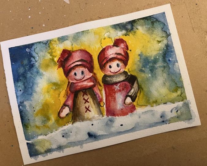
and that's why in this class, we're going to paint a doll illustration
on a folded card. First, I'll show you what
supplies you can use, we will then mix colors
and prepare the sketch. I will walk you through each stage from painting
a dreamy background and snow to making our
dolls with cute and slightly realistic
with just a few strokes. There will be plenty
of tips along the way and my advice to know this illustration and gather the confidence to
paint more of them. You can take what
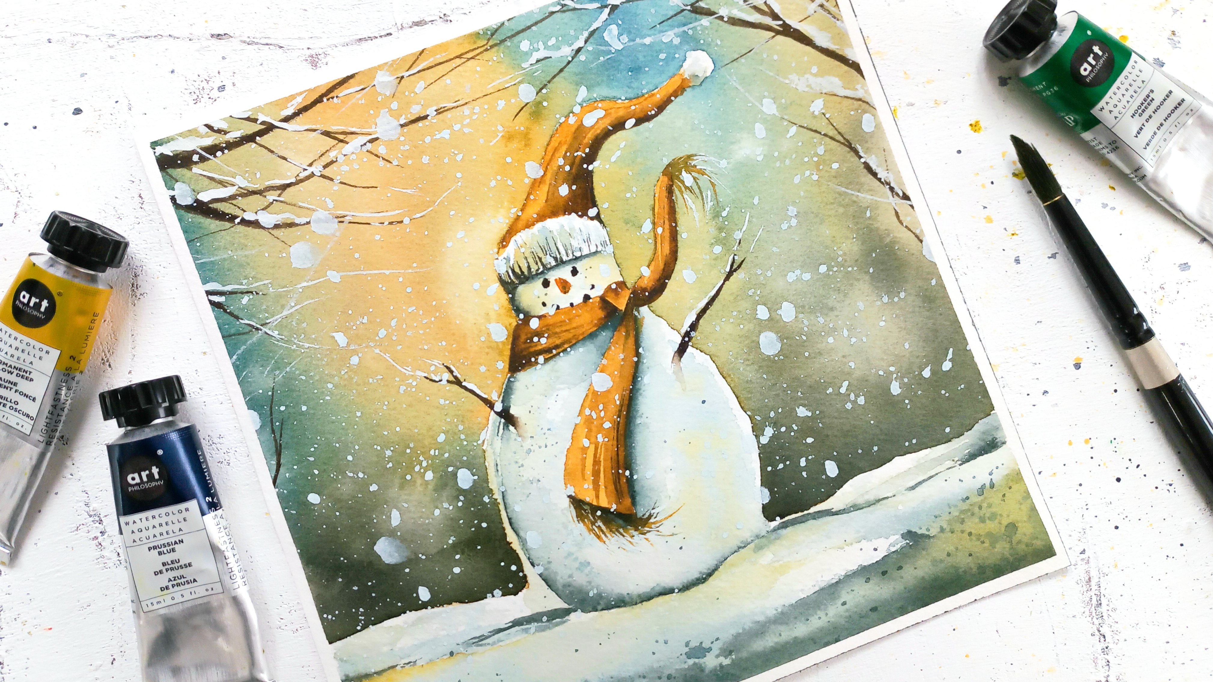
you learn here to make more winter illustrations like this snowman,
for example, that I've painted for a
previous Skillshare class. The best is that there are no
rules for watercolor cards. They can be square, rectangular, or you can have
them fold or just let them stay flat and use as a regular
painting to decorate your home after the holidays. We can also keep them, use them as a
beautiful ornament for a dinner party or turn
them into a cute tag. The choice is all yours. I think this class is ideal for someone just
getting started with watercolor because both supplies and colors are very basic. The sketch is easier
to draw even when you think you can't draw and I've made the process as simple as possible so you
can follow along, learn some techniques, and practice your watercolor
at the same time. Let's not wait any longer
and let's get started.
2. Class Project: [MUSIC] Your project for today
will be to create a cute watercolor card using the techniques
demonstrated in the class. Remember, there are no rules. You can change the
format of the card, use the techniques
that I'm teaching here, and apply that to
another illustration. So feel free to be creative. To help you move throughout
the class easily, you can download a list of
the supplies as well as a reference photo and a photo of my painting in the
Resources section. When you're ready, just
snap a photo of your art and download it to
the Projects section. We're ready to get started
so meet me next where I look at the supplies
we're going to use. [MUSIC]
3. Supplies: In this lesson, we're
going to go over the supplies you will need to paint our cute watercolor card. First watercolor paper. I picked a size of
ten by seven inches since we will fold the paper
in half later and end up with a five by
seven inches card. I prefer and recommend 100
percent watercolor paper, a cold press type. But you can very well use the watercolor
paper you already own as long as it is thick
enough like mine, so we can use it as a card. Mine has a weight of 300
grams per square meter and it works well once folded. You will need a large
piece of any paper or cardboard to protect the top of the card
while we paint. At least two
paintbrushes will do. I like a variety myself. But for a project like this, a large round paintbrush
for the background and a smaller one with a pointed
end for the dolls will work. If you have an extra
one for the dolls, one that's not too
large, it's even better. I always try to use simple
colors in my classes. So if you have a basic
watercolor palette, you're all set. I like one that comes
with the mixing trays. Otherwise, plan on a
mixing palette too. Our colors for today are
blue, yellow, red, and brown. That's it. I'll show you how to mix
them in the next lesson. The drawing part will be
easy, so don't worry. You only need a very basic
pencil, ruler, and eraser. We will need masking
tape to hold the card into place
while we paint, and also create these pretty
white borders all around. Plan on two or three
paper towel sheets or a piece of fabric mainly to soak up excess water
from the pain brushes. Two jars of water are always
helpful in watercolor, one to wet the paintbrush
and the other one to rinse. To paint the highlights
and the snow, I recommend white gouache, and since there are little
dolls in our painting, a white gel pen will
also be very helpful, if you have one. But you can always
use gouache instead. I like to use a heat gun or a hairdryer to speed up the drying times between layers. If you have neither,
you can wait for your painting to
dry between each step. I think we're all
set to get started. See you in the next lesson.
4. Sketch and Colors: To prepare for the painting, first, we're going to locate the middle of our sheet
of watercolor paper. There are five inches
on either side, then we want to add tape, so it starts below the line. This is because we will tape the card all around to paint it and we need this white
frame to show all around, so make sure to plan
for it on all sides. When this is done to
keep the card clean, you can add a piece
of cardboard of paper on top of the area
we'll not be painting. I'm going to mix my four colors and I like to start
with a lighter one, so I'll start with yellow, then red, then blue,
and finally brown. You can see I
picked basic shades and it's okay if yours
look a bit different, if you're using tubes,
pens, or even bottles. I add enough paint
but also water in order to get a creamy
mix, a bit like milk. We want the paint
to show when dry, that's why I don't add
a whole lot of water. If I did, it might look very
pale when it dries in paper. But we also need the
paint to be liquid enough that it will float
easily on paper and then it will be
easy to paint with. Don't forget to rinse
your paintbrush every time you switch colors. I started with a horizontal line towards the top of this sheet, it will help me remember where I want the dolls to end, this means the hash
one go past this line. Same with the bottom, this is where the snow will be. To make sure the dolls are properly centered on the sheet, we can also split it
into four equal parts with one vertical and
one horizontal line. Let's draw two circles
of the same size and it's okay, they're
not exactly the same. We're spacing them out equally on each side
of the vertical line, and the bottom of
each circle lays on top of the horizontal
line we just drew. This is the dolls heads. Now we can draw their clothing and it's a very simple design that looks like an
unfinished triangle. I make it stop on
the bottom line since there'll be
snow there later. Let's draw the hats. These starts before each
circle ends because we need to imagine part of
the skull is inside the hat. I invite you to design
the hat as you wish. I like that mine are
a bit different, so my painting looks more
realistic in the end. Let's draw the scarf. The scarf actually turns
into arms and hands, which makes it dry and
looks so nice and cute. We're going to define the
snowline a bit better, so it looks like it's passing
in front of the dolls. Finally we can add the hair. That's it, I'll see you
next to start painting.
5. Background and Snow: There are several ways to paint a background and
snow in watercolor. To make it fast and easy, I find the best one is
to do it on dry paper. If you're a very beginner, I recommend to watch
this lesson once before painting to know what to expect. You need a paintbrush to
apply the paint fast and a second one to get rid
of possible harsh lines, whenever the paint starts to dry faster than we need it to. I prefer to work with a pointy
paintbrush because it's easier to get the areas
between both dolls. We're going to have to work
quickly to avoid harsh lines. That's why my other
paintbrush is clean but wet and ready to fade those
drying lines into the paper. Notice I'm working
section after section. Otherwise, it will be very
hard to avoid harsh lines. I also started with yellow because the next color is blue. It's a stronger color and I don't want to muddy
my yellow with it. So this is the safest way to go. Let's keep going quickly because we want both yellow and blue to still be wet once we've finished covering up
the whole background. The advantage of this technique is
that it will help us get vibrant colors
after they dry, and we can also outline
the dolls very easily. It's best to keep it for a small paintings
like this one now because on a larger sheet, it will be better to
wet the paper first. Now we end up with
two distinct colors. To break that monotony up, the trick is to
overlap these colors. Certain associations of blue and yellow will
turn into green, others like mine,
into a muddy tone. To avoid this, you can
either add color with your paintbrush directly with as little back and
forth as possible, just drop yellow there
like I'm doing right now. Or another way is to use
the splattering technique. First with yellow. If you notice the paper turning white where you add splatters, it means there's
too much water in your paintbrush and
you would need to add yellow paint to your mix. It's okay to leave
those white marks, also known as cauliflowers, since we're painting
a snowy landscape. I'm adding water drops now, for instance, to get
this effect on purpose. It works well in snowy scenes. You can see how that excess of water pushes the colors away. Now I'm finding we need to break up the
monotony in the yellow parts. So let's repeat the splatters, but this time with blue. Try and avoid the dolls. While this dries, we
can paint the snow. Have two paintbrushes
ready again, one to add paint, the other to get rid
of any harsh lines and get a softer
look for our snow. Let's apply a blue directly
at the bottom of the sheet. Now you can soften the
hard edges as you wish. Remember that when we
soften harsh edges, the paintbrush is
never dripping wet. You can dab it on a paper
towel to make it just damp. My paintbrush is a bit dirty from the yellow paint,
but that's okay. It's one of my main colors, so it helps tie up the snow
part to the background. I add a bit more blue here so we get some variety in colors. Dark parts at the bottom, a very bright paper
white part on top, and softer blue
strokes in the middle. It gives an impression of shape. White parts will be
the curvy areas, while the blue ones suggests
either a little dips in the snow and the snow
being closer to us, like it is the case for the
bottom of the painting. These small details gives a simple painting
a lot of depth. Let's make sure this is dry before we
get to the next step.
6. Base Layer on Dolls: Now the background and now we're finished
we can tackle the doors. We'll take it step-by-step. Be sure you can get
similar results as mine. We're still using
two paint brushes with the same
technique as before. Applying paint on one hand and softening harsh
lines with a clean and damp paintbrush
on the other hand. The main difference here is I switched to smaller
paint brushes. That's why it's nice to
have a variety if you can. Painting skin is
easier than you think. Dilute your red mixed
with a lot of water until it looks
like a light pink. We're going to apply that
on the faces of the doors, repeating a round shape, and to make it look like it, I apply the color on
the edges mainly, and they fade the hard lines
with the other paintbrush. Only the center of the
circle stays white. Think of it like the
areas in the circle that are located towards the top of the head
and towards the ears and neck are receding
away from us. Well, the area where the
nose is, is a protruding one and it's a bit closer to us. That's why it should
be a lot lighter. We're going to do
the exact same thing for the hands then dry
the paper completely so we can keep on painting without the paints
in the clothing, bleeding into the phases. For the hats we'll use a
Christmas Eve version of our red, which means it's
the original mix, the one with more paint. It should look like a
bright and cheerful red. I'm still using the damp
paintbrush technique, just so we end up with
several tones of red hat and not one solid and
boring tone of red. Just like what I was
telling you about snow. It's a detail, but it makes the painting look less cartoony. If you want, you can add a few extra lines to suggest strands of wool
finishing the hat. For the girl's hair, you can mix yellow and red to make orange and add that. I always like to point out how we don't need many colors at all to paint anything and you can see
it's the case here. Thanks to color mixing. For a change, I'll add a little bit
of brown in the dress, you can mix in a darker blue. It will make it a bit
darker if you had a lot. Otherwise, it will just
help tie this brown to other parts in the
painting that are blue, not something we noticed
looking at a painting, but it really helps
with color harmony. On the reference photo,
the dress was gray. In that case, we would
have had to use black and dilute it with
a lot of water. But I preferred to use brown
instead for more warmth. Let's repeat this
with the scarf. I'm adding more paint here because this is the inside
of this car, so it's darker. Add pigment here makes if you need the color to
look more opaque there. You can see how this is turning
into a very cool painting and I'll see you in the next
lesson to intensify shadows.
7. Shadows: In this lesson,
we're going to add depth to the dolls with shadows. You could call this a
second layer on the dolls. I'm still working with
my two paint brushes. This time we're adding change through color and
we will add more brown to contrast
the previous colors and create that
impression of shadows. Let's add brown directly
all around the face, exactly like we did before. Just make sure you add
the shadow color on the edges so the previous
layer is visible still. The idea is to end up
with a variety of tones. The light paper, white area
in the middle of the face, the light skin area
from the base layer, and the shadow area immediately beneath the hat and
towards the plates. For the hats and other red parts in the doll, we can mix brown to red
to make a darker red. Don't forget to fade the hard edges with
your damp paintbrush. You can add a few lines with a dark red paint to suggest
texture if needed more. This is also a good technique to create texture in general, so one area doesn't appear
too smooth all over. I forgot the hands earlier, so let's add a shadow
there with brown. A little bit of dark red in the
plates make them look nicer too, more finished, and you can add lines there as well to create
a hair texture. To add shadows to
the brown parts, I suggest add enough
blue to your brown paint so it starts looking
noticeably darker. Blue is always a great color
to make other colors dark. I want to give a
little more shape and depth to the hands and face, so I'll add this mixture too. As you might have noticed, the nice thing about
working in layers is you can always tweak things
little by little. With a dark tone of red, so that's red and
brown mixed together, I keep going and then
emphasize the hat and scarf. The shadows look good to me, you decide to stop
when you're satisfied. That will vary with each person. We're ready to add
a few details, so see you next.
8. A Few Details: It's time to add details. To emphasize the
idea of texture, you can use the dry
brush technique. Dip your paintbrush in
paint, and then dab it on a paper towel to get
rid of most of the paint. If we want to add a texture
on the hat, for instance, we can hold the
paintbrush horizontally, close to the paper,
and gently brush it. If your paintbrush
is dry enough, you will end up with a few lines and the greater the
paper showing through. If not, you need to
use the paper towel again and remove a bit
more paint and water. Let's add cute crosses on the dress with that
version of our red that has a lot of pigment and little water because we
really want that to pop. With brown, I'm increasing shadows and texture everywhere. This is not a must in
your painting process, you don't have to refine
shadows as much as I do. I like to do it for
realism, but we could make do without and keep the
painting as it was. I mentioned earlier
how, with blue, you can create very dark colors. Let's add pure blue
paint to our brown mix, and it will turn into a very dark color that
looks like black. I use that to paint the eyes, and actually you can't really tell that's not black. We'll need red
again for the lips. I suggest you try this or wait because we're going
to add water nearby. Wet the paper with
pure water just a bit next to the
corners of the lips. Add some red in there, and that will make those
cheeks look nicer. I forgot to paint the boy's hair earlier and we'll
still have time to mix yellow and red to get an orange tone once more
and apply it there. We can add brown, too,
to create shadows. Here's a nice trick to brighten up colors in the painting. When the paints are dry, it can glaze more colors on top. For instance, if I want
to make the hats brighter because maybe they're looking too turned because
of the shadows, I can glaze plain red on top and instantly you can see how that makes that whole
area look brighter. Same for the brown dress. It's a bit turned since
it's brown, so why not add a tad of yellow there since
we have it elsewhere. Let's splatter a
little bit of blue on the snow to add texture there. To make it more of a
part of the painting, we'll add some yellow
and fade parts of it to avoid harsh lines. We can think of it as
a subtle reflection of the sky colors and the snow too, and it really helps to
tie everything together. This is it. I'll meet you next to final highlights
on this painting. Make sure it's dry
before we add them.
9. Final Highlights and Snow: We're going to start adding
highlights to the dolls. I prefer a white gel pen, but you can dilute a little
bit of white gouache and use that if you prefer. The idea here is to add
just a few lines here and there to brighten
up the dolls. We don't want to overdo it, and if you notice it
comes out too harsh, you can always use your
fingers to soften that. Let's add more crosses on the boy's clothes this time. Now we'll use white gouache, it's very convenient
to paint this now. The key for nice
splatters is to add enough water to the
paint but not too much. Don't worry, you
can easily tell. If your splatters are huge, then you need more
paint, either tiny or they don't come out at all, then you need more water. Once you have that, try and add them everywhere and overlap them
on the dolls too because we want an
effect of snow falling, so we need to add
some on the dolls. With snow I like to add bigger
flakes with a paintbrush directly as a way to
finish the painting. To make this snow line
look more realistic, you can even use pure
gouache directly from the tube and tap the
paintbrush in places. For a natural finish, I keep fading harsh
lines even with gouache with a clean
and damp paintbrush. It's time to remove the
tape and fold the card. I like this ruler
to help me fold the thick wall of the paper,
is really convenient. You can fold the paper
in half entirely and you've got yourself a card. You can see how
easily it will stand because the paper is so thick. I hope you enjoyed this project. Please share with me and other students in the
project section of the class and I'll see you next once
more for final thoughts.
10. Before You Go: Thank you so much for taking this class with me today. I cannot wait to see
what you came up with and to hear about
your experience. Remember you can share that
with me and other students in the project and resources
section of the class. You can also leave a review to let potential students
know what to expect. For more, you have the option to follow me here on Skillshare and get all class
updates and emails. For extra tips and motivation, you can follow me on YouTube and Instagram under
the new name, Painting and Chocolate. Have lovely winter holidays and see you next time.