Transcripts
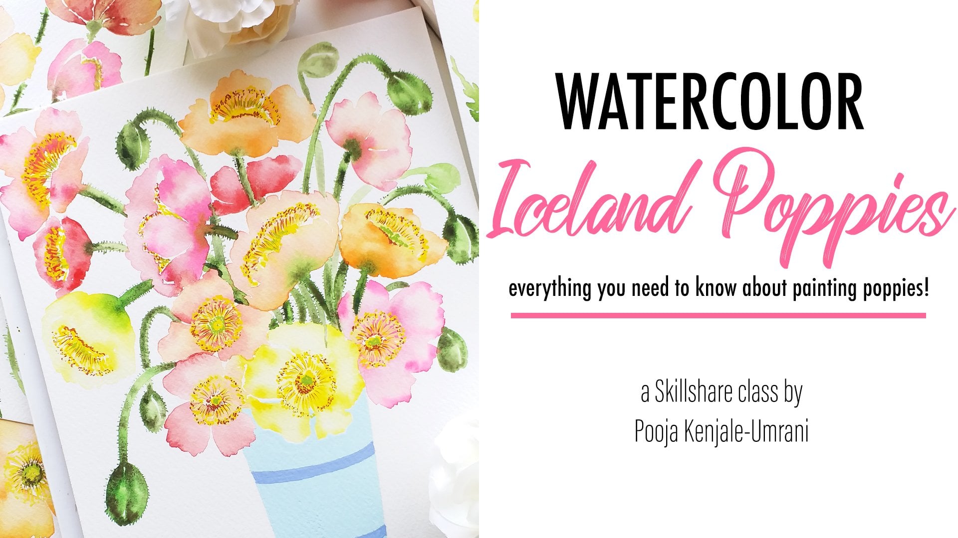
1. Introduction: Hi, I'm, I'm an artist and an art influenza and art educator. I started my watercolor journey about 3.5 years ago. And since then I have been practicing my craft every single day. I post my work on my Instagram account known by the name by the lakeside out Studio. I absolutely loved painting watercolor, Florida's n leaves. And I have a lot of skin check Gauss's covering these topics. But in today's class we are going to explode a topic that I've knotted exclusively covered before. Okay, as cheesy as it may sound. But today we are going to paint blush pink, romantic bouquet. How many blush, pink row spacings, soft being glide pink. You are going to explore all the shades of pink in today's class. After the Explorer mappings, we will enter into a practice session in which we will paint all the news elements of the bouquet. This class is going to be quite relaxing and soothing. And together we will enjoy every single brushstroke and make the most of this being ten of b. This clause is suitable for beginners and you can jump straight into the class and paint your beautiful version of the book. All right, then I can't wait to get started. Let's dive in and paint the town, think. Oh yes. Don't forget to upload your project and the project gallery below. So I can have a look at your beautiful work. Also, if you like this class, please do consider leaving a review so this glass can reach maximum students. Okay, let's get started.
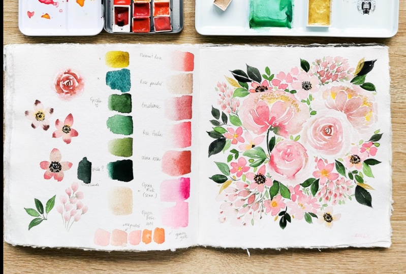
2. Art Supplies: Let's look at the art supplies that we will be needing for today's class. All we don't need too many corners, obviously because we are painting a blush being bouquet. So we are going to have a limited number of corners because it's set color palette. So let's look at those colors. I'm going to be using the base two dreams pilot from art philosophia. This valid has teamed beautiful shades of pink. This is a very soft, subtle pink, which is very close to flesh things. Then there's a darker shade of pink, which is flashy and very paste a knee. And then this is called shade, which is close to adapt coping. It is, I would say, a mix of opera mapping and crimson, but not under neon side. It's quite Easterly and soft. So these are the three things that I'm definitely going to use. Other than that, I have my custom bonded. And there are a couple of shades on this valid, which are quite nice. So I'm going to mix these when I'm mixing my pings just to build about a variation in the sheets for the flowers. So the first one is the Oprah Book from Daniel Smith, extra fine watercolors. It's a beautiful bright neon pink color. And it looks absolutely beautiful to add pop of color in a bouquet. And I'm going to use a bit of crimson. This is Alizarin crimson from Centralia. And then I'm going to use nafta might modelling from Daniel Smith, extra fine watercolors. It's a beautiful shade off mid-range book. I would also call the shade or to go on the eastern side. It's not at all bright and it's a very beautiful muted module, which I think looks really nice and contrast with a bright pink. So these are the three things are mushrooms that I'm going to use for my custom valid, and for the greens. I'm going to use Sap, Green from mission goals and green apatite genuine from Daniel Smith. I know my well is looking empty right now, but it's just that I used up all the color and I haven't got a chance to refill this well, but yes, I did have kinda in this well. So these are the two green style use. And other than these two greens are also use a better under sea green, which is also exhausted right now. I need to replenish this well do and am gonna Green from its emerald green, but it's GNI, genuine from Daniel Smith extra find watercolors. So these are the four shades of green that I'm going to use two. In the leaves. So those are the colors from my custom banded. I build on that. I am also going to use this beautiful drawing from when surrendered John, it's golden color. You really need to shake this bottle a lot before you can actually use it. So the pigments settles down at the bottom or the powder. So you need to shake it and allow the solution to mix with the pigment. So I have used this girl ing at the end. And I'm going to talk more about this when we actually get to the point of using it in our class. So for now, let's just keep it aside. If you don't have this Golding, it's completely okay. This is something optional. I thought that the girl would look really beautiful with blush pink color palette. And that's the reason I thought of adding this to this to the bucket. And let's come to the brushes. Now. Further brushes, I'm particularly going to use my all time favorite, which is the Bronstein heritage 4-0, 5-0 series, round number six. Then I will also use met June round two and heritage Round Zero to do the small leaves and the center of all the flowers. And I'm also going to use a couple of brushes from the well British series 12 and maybe afford to work with the gold ink. I usually use different set of brushes for garage and watercolors. And I also thought that it would be a nice idea to use a different brush for the gall ink. Just don't gaze to powder settings and to the bristles of the brush. So from Brazil, a separate branch for that. I also like to have the Neptune series around six from the travel CDs. I really like to have this branch handy because those fresh makes the most beautiful needs. That's my observation. If I want to make really fluffy and fallen leaves are usually switch to this brush. So I'm going to keep this as an option too. So that's for the brushes. And for people. I'm going to use electrical apart from art philosophia, This one is eight inches by eight inches. So I'm going to use a square arrangement to paint my final bouquet. And we are also going to need some extra sheet of paper to do our warm-up elements, so the size does not matter. You can either paying to your final book a square-shaped Paypal or a rectangular people. It all depends on you. So this is the paper I'm going to use today. We are also going to need two jars of clean water. 12 rings your pins, and one Turing's your green and gold may be a clean dish. Paypal, to dab your brush and remove excess water from your brush. That's pretty much about the art supplies that we are going to need today. I think we've gathered everything that we need and we can get started.
3. Paint Swatches: Okay, so in this section of the class, we will try to Swatch all of the things that we may want to use in our main bouquet. So let's try to Swatch all the beings in a line. And also when we are mixing things by painting the main bouquet, I will be telling you the exact shade Nimes as much as possible. But please note that all the shades that I will be using in the main bouquet are derived from this switching section that we're going to do right now. So even if you feel that you are not able to understand a particular shared or not sure how to mix it. Please refer back to this video and that should give you a clear idea of worksheets we are mixing. So let's try to get down our beings on the paper. I'm first going to swatch the things that are in the art philosophy's based in dreams palate. So this is the lightest pink in this pilot. So let's watch that. As I mentioned, this shade of pink is very close to flesh. It's a beautiful beekeeping. That's number 41. I'm just going to write it. Moving on to the next one, which is number 40 from the beast and greenspan, It is a beautiful soft drink. That's number 40. Before moving on to the next one in the back, I wouldn't say that this is a good mix. And crimson. But I feel that on the camera a bit wrong, then it does actually, but it's very fresh and bite. Okay, moving on to the pings and my custom bonded, I'm going to swatch of wrapping from Daniel Smith. This is ready, bright and saturated. Compared to any other pink. That's the next one is Alizarin crimson bay close to. Okay, moving on. The next one is a beautiful shade by Daniel Smith. Nafta. So when you walk down, the scala creates beautiful the steady blush pink. I do. It's quite a complicated name that I'm trying to earn a shared that I'm trying to say here, but that's actually what I feel about this Gallo and amping thing. It's just too beautiful, it's dusty. And it has a hint of move toward a bit of Porter's pink. It's just this perfect muted colors that I think is very good to have a new band, Rudolph nose as well as landscapes. So this is the iBook on now. And then. Didn't that I will be using. Let me also swatch the greens now that we are switching all the colors that we're going to use today. So let me just quickly go ahead and Swatch stub greens. So that's Sap Green. From mission goals. Moving on. I'm also going to use a bit of green apatite genuine. I've watered it down quite a bit. But let me see if I can get a darker value here. So that's green apatite genuine from Smith. And I'm also going to use a bit, oh, she died. Genuine. Beautiful, emerald green. They're quite like it. So these are the three sheets of green and all the things that I will be using in the class or in the main bouquet are going to be mixed into each IDO. Most of the times I will be using all the three pings from the base still dreams ballad, along with nafta line middle and opera mapping. So when you mix lack Dillard mushroom and opera pain, it gives a really beautiful shade of pink that me just try that. If you wish to have both of these colors in your palette, I would highly recommend it. Both the colors are equally beautiful. But I also make it a point to never really use the operand paying all by itself because it makes my Florida so quite saturated and bright. That slant the brightness level I usually use in my Florence. So I need OK wrapping most of the times to mix it with my other reds and measurements. That's exactly how I use this pink. I, I seldom use it on it's own all by itself, straight from the tube or from the pan. So that's the usage of that column for me. Now, I have mixed up wrapping and after my maroon together. Let's watch two or may be. So it creates a beautiful rose madder or a deep Rosie shade. I think my camera is making it look a bit warm, but it's actually quite nice on the paper. So that's one sheet I will be mixing a lot while painting them in mean bouquet. Nothing wrong. Let's also try to, makes one shade of beach Carlo, which I may use in the center of the peony to bend the battles that are in the center. So let's just try to mix a shade of peach color. I'm using a bit of wrapping my brush clean, and then using a very small amount of consol yellow medium from Daniel spit, just a bit of it. Mixing it with the pink. This is still a bit orangey, so I'm going to add lighter shade of pink from this ballad Just a bit, a bit. And they go, oh, I have this beautiful beach ecology, which I derived by mixing the three colors. Pink, yellow. You can use any shade of Chrome year notice one is Han saw yellow medium from Daniel Smith. And the second or the middle pink sheet, which is number 40, from optimal soft v. So I'm just makes these three colors together. To make this BCCI caldo. If you want, you can add little bit of yellow to it and see what happens. It just gives you a slightly warmer beach cannot. So something like this. We may need these two shades while we're painting the center of the pier near the center betters. So these are pretty much all the shapes that we will be using today. So just have this Scala bandit ready to mix before you start painting in the next section. That way you build, waste less time in finding your things and then try knowledge and mixing it again and again. So these are very basic shades of pink and I'm sure you'll be able to makes something similar to this if you don't have these exact sheets. So once your ballot is ready to move on to the next section, and we will start warming up by painting some news elements of the book.
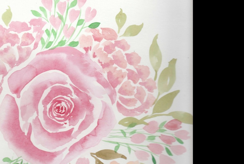
4. Warm-up Roses: In this lesson, we will practice painting some loose elements that we will be painting in the main bouquet. So let's begin by painting a rows. I have made a bit of nafta, my maroon and overlapping. Let's start from the center. And as we move out, we will increase the size of the patterns. I'm making. C-shaped curves that are very close to each other. And between every segfault, I'm leaving a very small wide gap. It's okay if Tibetans touch each other. So you will get beautiful color bleeds. At points where I think that my brush is drying out. I'm making sure to dip my brush into water. We dilute the color of it, and then continue making bigger, C-shaped Gabe's. As I'm moving out. The darkest value of Socolow will be in the center and the lightest will be on the outer edge. I'm using a size six brush to paint the rows. And once you are sure about the size of the rows, you can paint the lightest patents being the last ones. And just add some finishing touches to the outer edges by painting very light buttons. Now, the size of my rules is fixed, so I'm just going to go back, take a darker value on the brush and just to add on the inner side of the pectins and let it bleed. So it gives some benefits to the rows and it does not look flat. Overall. I want my rules to know clearly Pei's still and not so bright. So I'm not going to add too many calories or too many saturated values. I'm just adding a bit of nafta mind maroon in the center to give a bit of contrast, allowing it to bleed into the patterns. Having some shadows with the dark. Ok, I know. Rinsing my brush, dabbing it clean, and then just merging out although harsh edges. And that said, our first rules is looking all right. It's not necessary to be very perfect about the petals and the bleeds. When you're painting a ruse, the naturally bleeds and the color mixing looks really nice and organic. So dawn to work too much with your flower. I will demonstrate one more base still colored rows. This time I'm using the darkest pink value from art philosophy's based dreams palate. I just mixed a lot of that Godot into the initial nafta mind maroon and Oprah wrapping. Just mixed a brighter pink. It's not necessarily that you use the exact shades of pink that I'm using. But tried to find this comfortable shade of pink by mixing a couple of reds and brings together, find that optimum based column. And then you can dilute that color by using water to give you additional sheets or values. So I'm just showing you a slight variation in the base still follows the amount of variations that you can bring about. So the standard amusing a slightly but I doping than the earlier one. But still keeping the overall look of the rules very paste and flashy. So I'm using the exact same steps that I use for the old rules. Using lighter most values on the outside. And then going back to the center to add some values. While painting a rules, make sure that your wrist is moving freely. Don't hold the brush too tight. Make sure that you're able to wiggle it around and just use the natural movement of the hand to make the strokes. And that's it. So we have our two roses to warm up roses which you can paint along with me.
5. Warm-up Filler Flowers, Buds, Leaves: In this video, we will practice painting some other elements of the books, such as the fill of flowers and leaves. So let's start with the basic five petal flowers and tried to paint really soft blushing. Think floras. So for that, I'm mixing lots of photo. I added lots of drops of water to the existing beams that we used to paint our roses. So I'm just diluting that Kahlo with a lot of water and adding a tinge of opera to give it a soft in key blush. So once you have that soft shade of pink ready, start by drawing. Lose battles. I'm still using my size six round brush. So I'm making these back and forth brush strokes that are quite fluffy and take. So just pull your brush in the outward direction, starting out from the center and then pulling your brush out. So try to make these really perfectly imperfect buttons. And then once you have those five petals in place, we will just mix a slightly darker shade of crimson or nafta might maroon, whichever you like, and just dropping a hint of color from the outer edges of Tibetans. And because of force, Claire is wet, the Dhaka value will instantly start leading. I'm also adding a hint of yellow around the center. So it will create a soft BCCI Carlo, which will merge with the existing pink color. So if you want, you can add some more darker values to enhance the flower for though, it all depends on you how dark or light you want your book to look. So I'm just trying to experiment tour as I'm painting. So in your warm-up elements, try to get a feel of the callow and saturation level, the amount of brightness you want in your bouquet. That should give you an idea of how exactly you want your main bouquet to look like. And that's the intention of painting these warm-up and elements. Let's move on and pinned one more, five petaled flower and see if we can add any variation, the stein. Ok, so I have my five petals in place. I'm just mixing of bright pink color from the art philosophy's to dreams palette. And just dropping that Kahlo from the outer edges. And using a soft, moist brush, I'm just going to blend it ever so lightly with the forced wash, some rinsing my branch. And then using the same in Canada dynamics told Leo. So I'm going to draw some bloodstains time from just making these small brush strokes and making to brush marks that are separated by a small white gap in between to draw the bytes. Tried to pin these birds in a bunch. So they will look nice together and make your bouquet look follow. And then just dropping in a darker value at the base of each bird, netting it bleed into the first wash, merging everything nicely. And then I'm switching to a small size round brush. Maybe a size one, size two. It should be good enough to draw the stems. So I'm just mixing some green condo and extending stems from all of the but allow the green color to slightly blend into the to give to the buts. Okay, so next we are going to paint some leaves that mixing some sap green and green apatite genuine by Daniel Smith. And I'm just going to be in some warm-up leaves now. So if you've taken my class, 20 types of watercolor leaves before, you probably know the drill of how I paint the leaves. So there are two strokes that I'm putting together to make the leaf. We started out from one side of the leaf. Pointer brush, drag it and then release making a point, and then repeat the exact same steps on the other side while leaving a small white gap. So let's try to paint a couple of leaves that are pointing in different directions. And the ones that are of varying sizes. Some small ones, some big ones. So this is the generic shape or the January style of leaves that I'm going to be using in this bouquet. So practice a couple of leaves.
6. Warm-up Peony: So in this section we will practice to paint a side facing peony and to pain that. I'm going to start by mixing a couple of things. The first few sheets of things are going to be from the art philosophy's based in dreams Ballad. This palette has three shades of pink. One is very light, which has a bit of flesh tend, shape to it. And the next two things are quite right and a student, so I'm just going to use a mix of all of these three pings to paint the peony in addition to the opera pink that I have on my custom banded. So let's start by mixing the lightest shade of pink from the base to dream span it. So I'm mixing the two things together and diluting it with lots of water. So that's going to be my forced wash. I'm just keeping all my sheets ready. The second sheet is going to be a diluted shade of pink. Colored in itself is very bright and neon and gallo. So I definitely don't want that. So I'm mixing it with lots of water. And I'm also going to use a hint of yellow in the center of the peony. So keeping a shade of yellow radius when. Now let's start by painting the front. Veterans of the peony. The peony is going to be facing sideways. So think of being doing in a semicircle arrangement. I'm making the same backend for brush strokes that we used earlier to paint the five petal flowers. But just arranging the same patterns in a side facing manner. So I'm going to keep some of Tibetans tin and some of the petals Fuller. So when I'm drawing the petals on the left and the right, extreme left and right. I'm going to make sure that those patterns are tenor. And now I'm drawing the back buttons. So they are going to be slightly less in height because they're hiding behind the front buttons. So just trying to paint a second layer of petals makes sure that you're not holding the brush very tightly because that is going to restrict your movement. So hold your brush very loose and a little at the back. So that will help you to make quick soft brush strokes. And as you can see, while I'm talking, I'm making these brushstrokes really quickly. So the moment I was done with the back buttons, I added a hint of yellow in the center. Then I went back and added the second shade of pink that we mixed, the lighter shade of opera pink. I just quickly added that at the base of Tibetans. And now I'm working my way on the third level of patents at the back. So when you're painting appear Ni, You have to be really quick. The best way to achieve this is to keep your shades ready and have a plan of how you want to layer your petals. So once you know that, once you think about that beforehand, it will be a lot more easier and simpler to paint appear n0. So it's very difficult for me to match my painting speed and the way I'm explaining. So as you can see, a MALDI having my sheets ready, I have a plan of how, how I want my B you need to look like. So watching this video maybe once or twice will give you a definite idea of how to approach painting appear Ni. So if you feel overwhelmed with this process, I would ask you to watch this video again because it's shorter than real time. And maybe the second time you'll be able to match the speed, my painting speed along with my explanation and probably come up with a better peony. So try to paint lose peer needs a couple of times before you actually start reading the main bouquet. Because every time you bend appear neat, it's going to look different. And it's impossible to have the same flower every single time. So make sure you practice a couple of them. And I'm also adding a hint of yellow in the center and letting it bleed into the pink. To meet your peony look very soft and fluffy. Makes sure that there are no harsh edges and you don't use the color from the tube or the bind directly onto the flower. Tried to dilute every shade of being just a bit. So it looks more blushes and on the based on site. And then once I finished with all the patterns, I just quickly added a green stem and allowed the stem to touch the peony so that there is a slight blend of colors, which looks very beautiful. Okay, so moving on, I have mixed a bit of black color. And using that to work on the center of the 25 petaled flowers. I'm just holding my brush perpendicular to the people and making this really crude. And making sure to not apply a layer. So just keep that in mind and make some dotted action. And then I switched to a small size brush. And I'm going to work on the statements around the center. So making these really soft strokes around the center, painting a ring of strokes. And you will see that adding these details will instantly left the way your flower looks. So just add these details using a small size round brush. Like so. I'm just adding some dots around the statements. Not being very particular to go in a circle, but just doing it in an imperfect Mano. Let's take a closer look at all the warm-up elements VP entered. So we have a couple of ruses. Some filler flowers, birds, leaves, and a side facing peony. So all these elements put together is going to build our main bouquet. So we're just going to arrange these same floor levels in different angles and compose our bouquet.
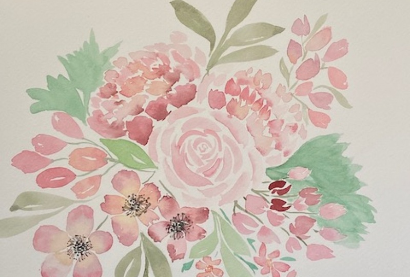
7. Main Bouquet P1: Rose+Peony: So let's begin painting our main bouquet. To paint this bouquet, I'm using a slightly different size of people than what I used earlier for the warm-up elements. The sense an eight by eight block called pressed block by art philosophic. So I'm going to paint my book a square format. If you don't have a square shaped people, it's completely okay. You can be into a bouquet either in the landscape or portrait mode. So don't worry about the shape of your people. That's not really going to affect what we are been tamed. Or the composition will still remain the same. Even if you have your people held in portrait or landscape mode, if it's rectangular in shape. So keeping that in mind, let's start by painting somewhere near the center of the people. So I've already started building out a rose using the exact same steps that we used earlier to being doubled rules in the warm-up session. I'm using maximized maroon and a bit of Crimson to pin this rose. I started out by painting smallest c shaped curves in the center. And then as I was coming out, I increased the size of the curves and started diluting my condo. And once I am okay with the size of the blum, I'm going back to add some darker values on the inner side of the patterns. But I'm not going to work on each and every battle. I wonders rose to look very subtle and soft. And just making sure to soft and although harsh edges. So that's pretty much about the first rows. Okay, now moving on, let's make a couple of shades of pink and start painting. Aside facing peony. For this, I'm starting out by mixing a wash of light, being color from the base to dreams ballad. And in the corner you will see that I'm mixing a shade of pink and yellow and trying to mix a beach. Colored shade. I'm sorry that you're not able to see the exact shapes that I'm trying to paint and that little corner. But it's a good mix of light being opera pink and hint of yellow. So that's how I worked on my beach Carlo, like I showed you or Leo in the column mixing video. So if you want, you can go back to it to see the exact shapes that I mixed. And then I'm also mixing the two other pins in the base two dreams ballad, I'm just keeping them ready. So when I actually start painting the peony, It's going to be a lot faster. So let's start by painting the front patterns using a very light worshiping Carlo. I'm not going to be using and your flipping colors directly from the pan or the tube. So always remember to dilute any color that you decide to use, especially in this blushed themed color palette. I am being very mindful and careful about adding the Bedouins. Because every pattern will decide how my peony is eventually going to look in the end. So I'm taking small parcels to make some additional sheets. On the right side, you will see that I mixed a very diluted shade of opera Ping. And I'm using that as a blending tallow. If you think that mixing so many things together is overwhelming, then don't worry, you can start out with just two shades of pink, a lighter shade for the forced wash of the petals, and then a darker shade. To add some variation in the battles. Here I'm using about three to four differentiates of beings that we practiced mixing earlier. So I'm adding a couple of light overlapping petals. Then I'm switching back to the peachy pink color that I've mixed. Now, this bank has a bit of yellow in it. So the center pedals. I'm trying to do a little peachy. And then again, I'm switching back to painting lighter petals on the site of the peony, on the right side of the peony. And now I'm loading my brush with a darker value of pink and just adding a hint of condo near the base. Let's add a third layer of petals using a light wash of pink. Using the peachy color again, to walk on the petals that are near the center. So because its side facing, we won't be able to see the statement or the details inside the peony. So we're just going to add a hint of yellow around the center buttons. And just mixing all the colors nicely, making sure that I do not leave out any hard edges. Ok, so that's pretty much how does beanies can look.
8. Main Bouquet P2: Filler Flowers + Peony: In this section of the class, we will paint a couple of five petal filler flowers and one more side facing peony. So let's make our colors and see how our composition turns out to be. I have mixed a variety it soft shade of magenta and being together, I mixed two bit of overlapping and added some crimson color to it. And using that color in their diluted form, I'm painting a five bedroom flower, exactly similar to what we practiced earlier. And placing it right below the rows and very close to it. So make sure that you don't leave too many wide gaps between your flowers. We want the composition to be tightly arranged. So make sure that the flowers that you've been are close to each other. On the forced Walsh, I just added a tinge of yellow colour towards the center and a bit of the darker shade of magenta. Other dynamics on the outer edges of Tibetans. Blend your colors with a soft, moist brush. Don't be very harsh. When you're blending the colors. Just glide your brush raise smoothly. So you do not take the paint off the people. That's a very important factors that you implement while building water, kind of Florence. Now let's move on and please one more, five better fellow flower, just above the first one that we just painted. And this one, I want to be overlapping with the rows. So I'm sending one of the petals behind the rules to give a feeling of overlapping. And using the same shade of magenta. And think, I'm blending the condos on the petals. One more. I taught a composition of three 5-bit and flowers will look a lot better than just having two of them besides the rows. So I'm just going with my gut and adding this told flower, which is slightly overlapping. I'm using a bit of nafta might mushroom on top of a light shade of pink and just letting the colors version to each other. Let's move on and paint the second. In our composition, I just moved to my block around and made it upside down to make it easier to being this peony. So whenever you're painting a side facing peony, tried to find an angle from which it will be easier for you to make the brushstrokes required to paint the buttons. I want your hand to move freely when you're painting the petals. So just arranger people accordingly. And before I placed my peony, I just thought of adding a leaf between the flowers and the peony. Just to have a hint of fresh green between the two sets of flowers. I'm just making sure to be confident about this arrangement. So taking a boss and looking back at your composition is always a good idea. Take a minute or so to think how you want to please your flowers. I always recommend that, that you go slow and just put in a thought before you start painting every flower. So I'm using the exact same steps that I used to paint the earlier peony, using a couple of different shades of pings, some lighter ones, some darker ones. Drawing smaller back buttons. Using a hinge of magenta pink that we mixed earlier. And now working on the third layer of the bag petals. If you need a couple of times, you will realize that you will start working faster. And you won't have to take as many policies to be into puny as you would. So practicing to paint the puny will make a lot of difference. The faster the more natural and organic your flower will look. And that's exactly what we want. Just adding.
9. Main Bouquet P3: Buds+Leaves: Let's go ahead and in some bytes, I'm going to paint a bunch of bytes together to cover the area between the PEA and NEA. And the field of law was in pseudo finding one or two bites. A whole bunch of ten to 15 bards always looks beautiful and lush. It fins up a space very nicely in a bouquet. So just making sure that I include a lot of them in this wide gap. I'm being spread out. So I'm just using different values of pings to make these quick brush marks. It's been a few more, little bit more to the existing shade of pink. And I'm being slightly bigger full of flowers that look like tulips. I'm just painting a bigger version of the earlier bots and filling up the whitespace on the other side of the book. Adding crimson is really bringing out of aviation in. So I'm just thinking if I need to add more bytes. Just painting some finishing touches to the earlier peer n0. And now using a shade of green column, I am going to pain stems for all the birds. Because the birds are still wet. The green callow will start bleeding into the bugs, and that's exactly what we want. So adding the stems instantly making the butts look really nice. Let's add stems on the other side. The smaller but okay. Fainting some stems behind the 5f button flowers just to keep the arrangement connected. Mixing some green. I'm using undersea Green from daniel Smith, extra plane watercolors. And let's start painting some leaves in our bouquet arrangement. So we will start painting leaves variable. We want to fill up the whitespace around the flowers. So let's start adding leaves on the outer perimeter of the bouquet and see how our composition comes together. Adding a couple of leaves around the flowers and the peer, nice. And while adding leaves, I will be moving around my block quite a bit. Just to take a complete angle into picture of how the book is going to look from various directions. So make sure that you're holding your people from different angles and try to visualize your booking. And accordingly add leaves. So I'm being very impromptu, but still very mindful about how and where I'm placing the leaves. At the same time, I'm bringing out a slight variation in all the shades of greens that I'm using. So right now I'm makes a bit of Prussian Blue and do emerald green juice to make slightly cooler shade of green. So try to use about two to three different shades of green that will complement the pink flowers in the bouquet. So I'm just making some emerald green leaves. Adding leaves is a very slow process because we don't want to add a lot of foliage which will take the attention away from the flowers. So be careful about how you're placing your leaves. Also tried to include leaves of wearing sizes. We want a few big leaps of US, small ones, a couple of medium shaped ones. If you notice that the kind of stroke or the kind of leave that I'm trying to draw is the same. It's just the variation in size and color is making them look different. I'm still using my size six round brush to paint all the leaves. Every leaf that you add is going to enhance your bouquet. So don't stress too much about adding leaves. Make it a fun process and try to balance your bouquet. And now I feel that instead of adding more leaves, I need to add a couple of fellow flowers around the peony because I just noticed that the arrangement was missing. Some delicate little flow routes around the big size peony. So I'm using this contrast in size, small white flowers versus the big puny. I think it will really bring out the way the peony looks, pleasing some smaller flowers around it. So I just quickly added these three small flowers and now I'm adding a couple of leaves around them. I'm using the same shade of embryo Green. I think the exact name of the shade is genuine from Daniel Smith. That's the color that I'm trying to use as emerald green here. Okay, so I think the addition of these little flowers and leaves is looking quite nice. I'm just adding a few stems. So they look connected to the main bouquet. Okay, so that whitespace, new BMI is nicely filled up. Adding some missing stems and leaves around the smallest size, but the green is adding a beautiful contrast to all the pink flowers. And I think the bookie is now coming together. So I'm just taking a moment to take a look at everything and see if I want to add anymore foliage. And I think a leaf or two around the top peony is certainly going to look nice. So just making these quick strokes to painter leaf. Okay, so it looks like all the elements are in place. Let's see what we can do further.
10. Main Bouquet P4: Adding Centers: Okay, so now that all the elements are in place, let's work on the center of the flowers. So the front-facing flowers are though finner flowers. So let's try to beamed their centers. I usually keep that part towards the end. After I finished painting all the flowers. And then I decide if I want to paint the CentOs yellow or green or brown or even black. So once all the flowers are in police, I just visualize that which Kahlo will complement the book, The Best. And as per that, I'd make my decision on what condo should be the centers of all the flowers in the bouquet. So in this case, I taught adding a nice black and Greece and double really popped the flowers out. So I'm just using a size two round brush to paint some stippled dots in the center. I'm not going to paint a wash of black Cano, but I'm just making this really rough, crude extra to walk on the centers. And then I'm switching to a size 0 brush to work on the statements which consists of filament and the enters. So I'm just drawing these really small, thin brush strokes that are very delicate around the center. I'm leaving a small white gap, or rather just a gap between the center and the statements. And making brush strokes with a very light hand. To paint the statements. Let's be into it for the third flour as well. And as you can see, it's instinctively lifting the mood of those flowers. They are really popping out. And because of the prominent centers, it's really adding a dimension to the entire gay. I'm now being deemed the anthro dots around the filament. Not being very perfect or particular VM pleasing the dots. But I'm just going around in rings and adding small dots around. We don't want the Center and the statements to cover most of the petals. So make sure that you're adding bold details, but not covering the flower will get them. Okay, so that's pretty much about painting the centers of all the front-facing flowers. And then I'm just using some green condo to add small stems to both the pianist. And that's about it. In the next section, we are going to play a little bit with gold color and see how we can enhance our bouquet.
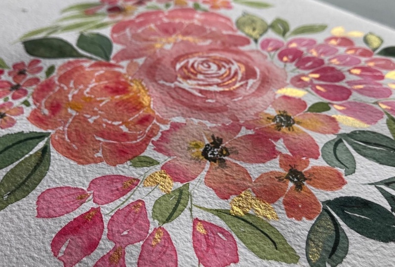
11. Main Bouquet P5: Adding Gold Details: To add final details to the book, I will be using the Windsor and Newton drawing Inc. in gold Carlo. It's a beautiful shimmery ink that's just very easy to use. And it gives a beautiful blaze after drying. So I'm just going to use a bit of this. You need to shake the bottle a lot to make sure that the ink is tardy mixed in the solution. So before if you have this ink and you plan to use it, make sure that you shake the bottle very well. And I'm straight away going to dip my brush into the bottle and start using it. To draw the statements of the 2pi or nice, I'm just going to add gold details in the center of both appear needs. I'm just stippling in the center. Now there are multiple ways to use this ink. If you want, you can pour a little bit of this ink into a banded, or you can order it into the lid of the bottle, or even straight away, use it from the bottle by dipping your brush. So it all depends on the application and the way you want to use the ink. I generally use both the ways. Initially I put little bit of income, the bandit, and now I'm dipping my brush into the bottle directly. Dipping your brash straightaway into the bottle will give you a lot of pigment and income underbrush. I'm using a size 0 round brush. So I'm adding these dogs behind the first layer of patterns of both the PNAS. And then I'm shifting to a size four round brush. The one I'm using is the Princeton relevant bridge round brush. And I'm going to dip this brush into the bottle and draw some leaves around the bouquet. To balance the use of gold color. I think I need to shake the bottle again because looks like the pigment is settled at the base of the Barton. So I'm just going to give it a nice shake and use it again. It's quite fluid so you don't have to add water to this ink. I'm just adding small leaves around the existing leaves. You can also overlap them on top of the watercolors. That should not be a problem. This step is completely optional. If you want to, you can just stop right at the water condos and not add any other medium to your book. But I thought this would be a very nice fun twist to the book. And I'm really liking the results. I think the blush pink looks really nice and with the gold. Okay, I think that's pretty much what I wanted to do with the Golding. And let's take a closer look. And I think it looks absolutely beautiful. Slide please. The variable that our goal details. And it's really making the painting look complete now.
 Pooja Kenjale-Umrani, Author of MODERN WATERCOLOR WORKSHOP