Transcripts
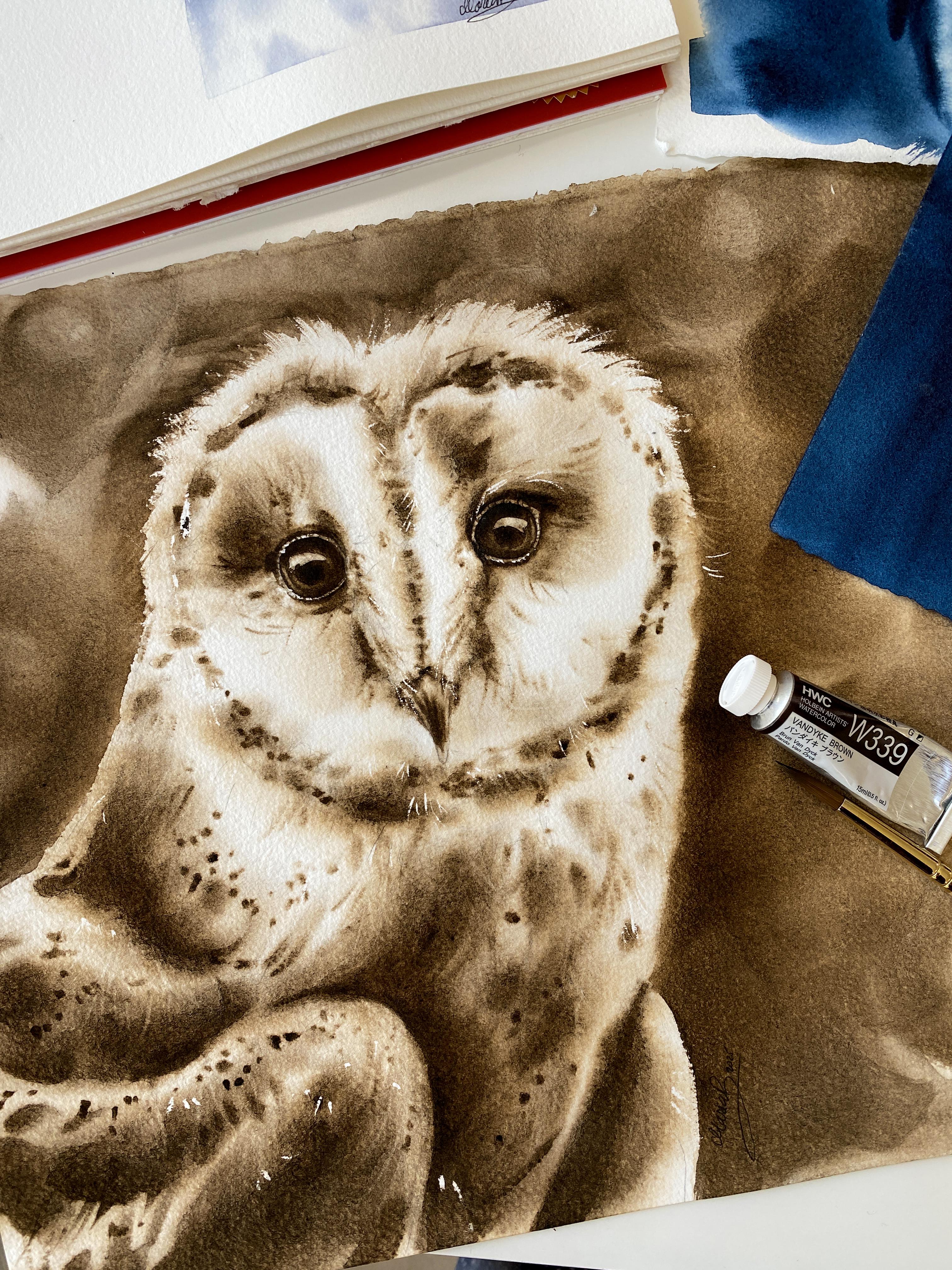
1. Intro - Monochrome Birds: Ever tried painting
birds with watercolors, but something fell
like it was off. The feathers were overworked. There was not enough contrast or there were too
many hard edges. Are you struggling
with color values? Don't worry. I know
exactly what to do. Today I'll be teaching
you how to create smooth layers and a nice
contrast using only one color. The reason this class focuses
only on using one color is because you can better
concentrate on color values, contrast, and then the balance
between life and shadows. The key in creating
a good contrast is knowing where to
place the shadows. But also how to balance it out with the light so you
don't lose the light. So what will help is
using that one color and determine first what are the
values of that one color. And what makes it easier with
watercolors is that all we need is to add water
to that one color. My name is Maria Raczynska I'm a watercolor artist and teacher, and I have been teaching
how to paint with watercolors for
almost ten years now. I have taught
thousands of students across the globe how to
paint with watercolors. I have a lot of experience as a watercolor teacher especially with the techniques such as
wet-on-wet, lifting colors. One of the keys in
my teaching is also teaching how to layer an
object using undertones. I will teach you how to create a good contrast
in your painting, how to discover the
color values of that color that you'll
be using or any color, how to layer feathers, wet-on-wet without
overworking the areas. So where you don't
need to focus on every single hair or
every single feather, how to net work on
so many details, and how to capture the
overall look on your object. Oh
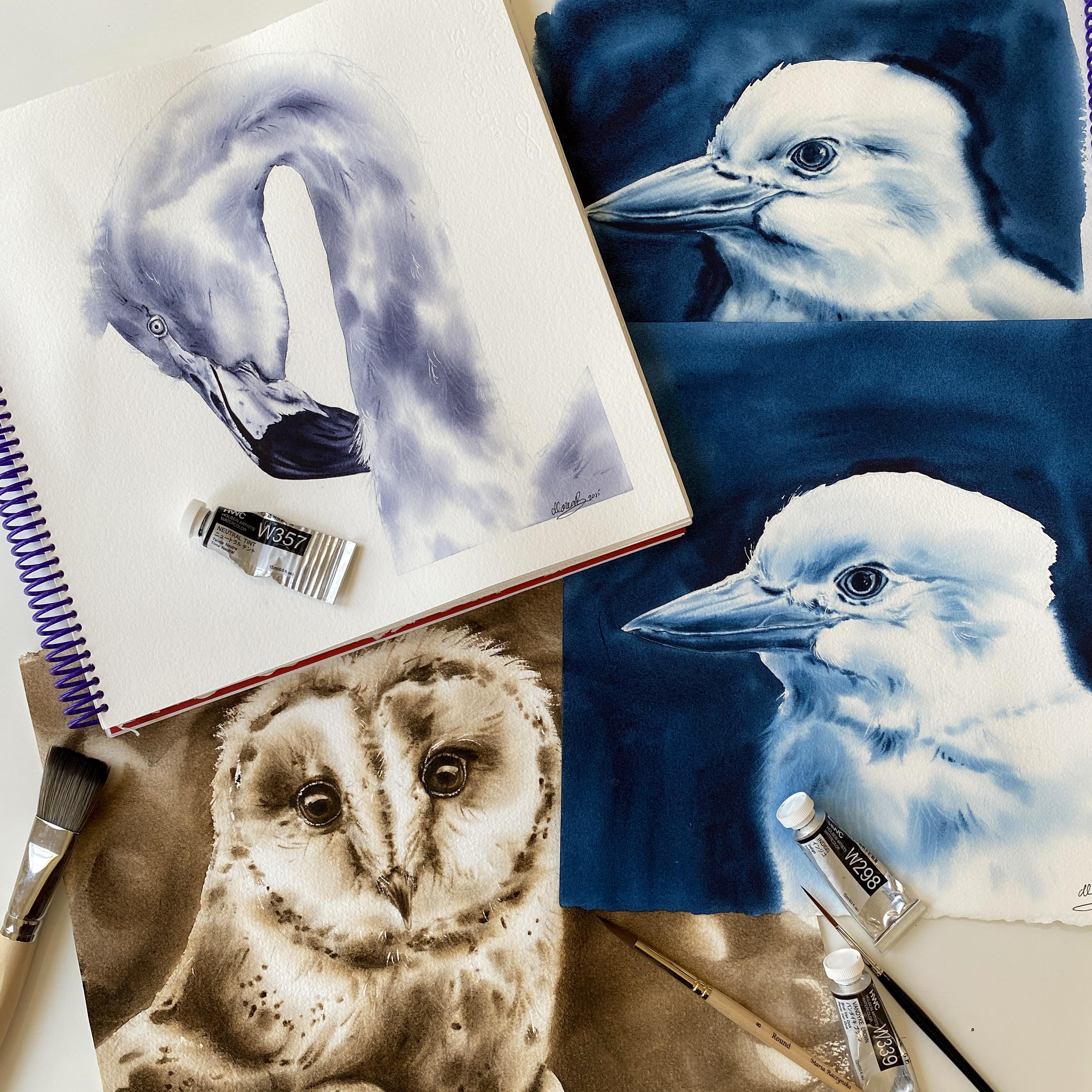
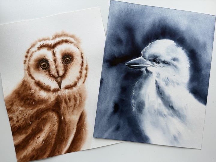
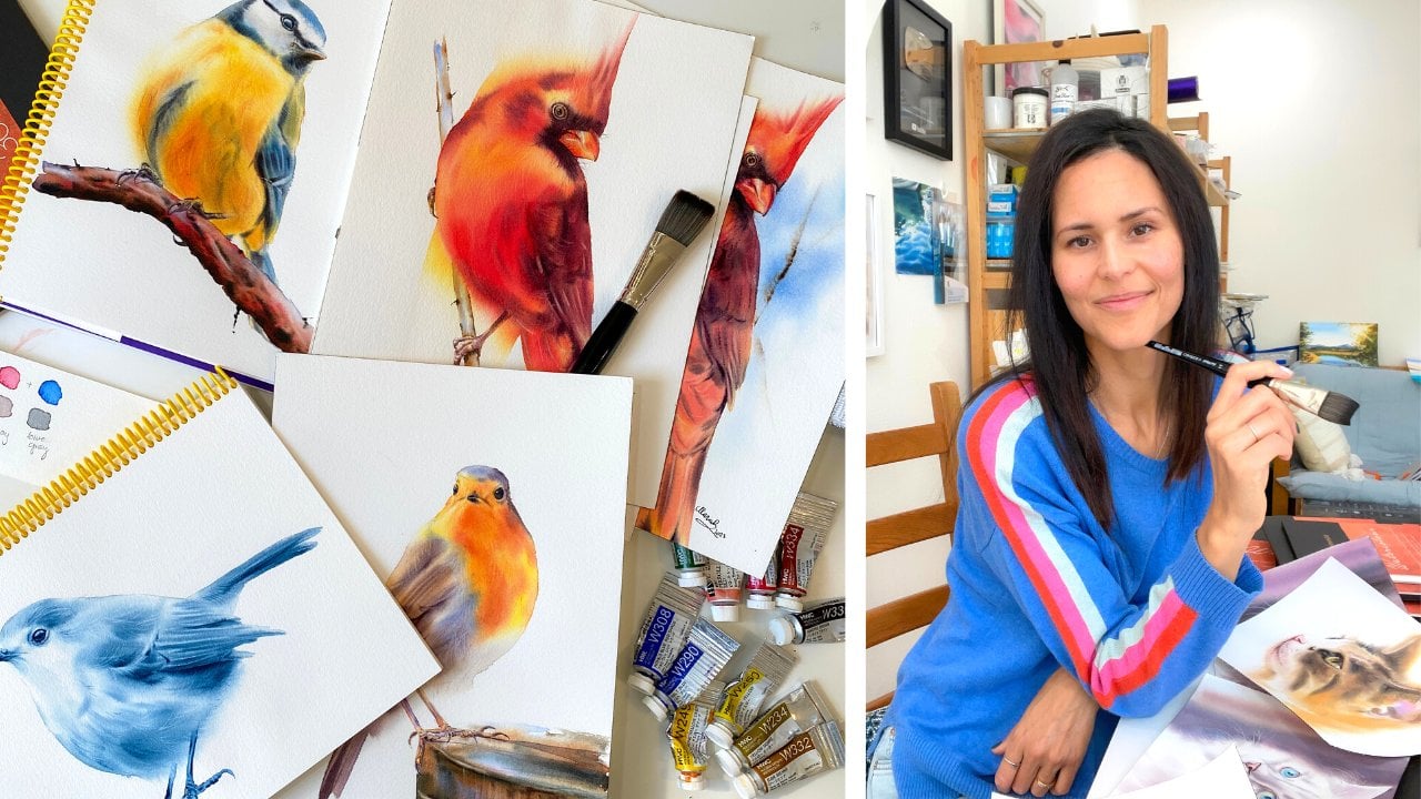
2. What is This Class About?: There are three
different projects in this course, three
different birds, and each is unique in its own way with distinct
feathers and overall build. However, the idea is the same to avoid overworking
those feathers, layering them wet
on wet and using proper color values to
create the right contrast. I always try to
simplify things and put myself in the shoes of a beginner because I
once was a beginner, too, and I did not know the difference between wet
and wet and wet and dry. I will teach you how to create stunning lifelike birds
using just one color. So let's do it.
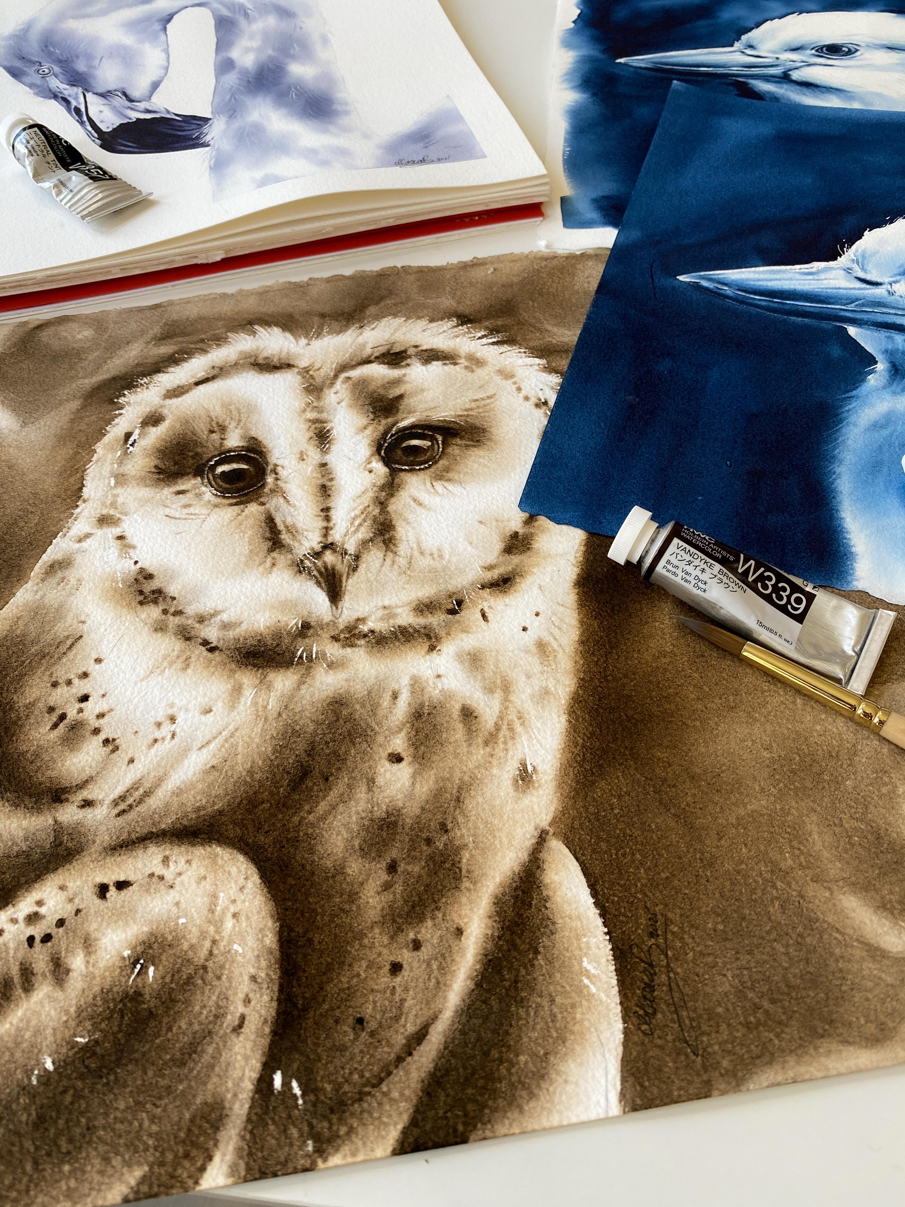
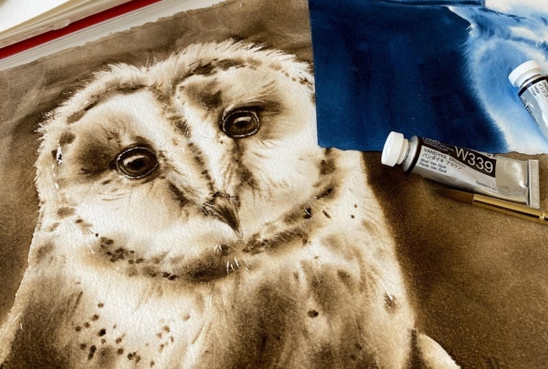
3. Art Supplies: For the art materials. I recommend using 100%
cotton, watercolor paper. Your best bet at this
point will be arches. I used to paint with
honeymle decollection, but the collection was changed. So now the paper is
a little too smooth. However, if you have that paper, I suggest you flip the paper and paint on the back side where
you have way more texture. Way, the paper
won't dry as fast, and you have a
texture that you need to create a nice texture
over your subject. As far as watercolors, you don't need to use the
same brand as I paint with. I do recommend hobein
because those are the paints that I've learned how to paint with watercolors, and I absolutely love
them and recommend them. But you can use any
colors you want. We're going to use here
Indigo, neutral tint, and and brown, but feel free
to use any other colors. You can go with the red. You can go with the blue,
different blue, fallow blue, red
sheet, for example, another great color
to lift colors. Just make sure you
can lift colors, test it out on the side. Also, we'll be
creating color values of each color so you know
the lightest values, the mid tones, and then the
darkest values of that color. As far as other materials, I recommend a small towel to wipe your brush on,
which is essential. A paper towel for
additional lifting, three smaller jars to dip your brush in water
to clean the brush, just so you have
three right there and you don't have to step
away from the paper. A plastic palette but if you don't have it,
don't worry about it. You can just use
regular dish plate. A good light with a day light. So the idea is to
have light coming from here and here plus the
lights in your ceiling. For the brushes, try using softer brushes because whenever we paint with stiffer brushes, it's very easy to lift colors as you're applying the
colors, the layering. So with softer brushes, it's just more
delicate, in a way. Now, stiffer brushes
are good for details and then lifting colors.
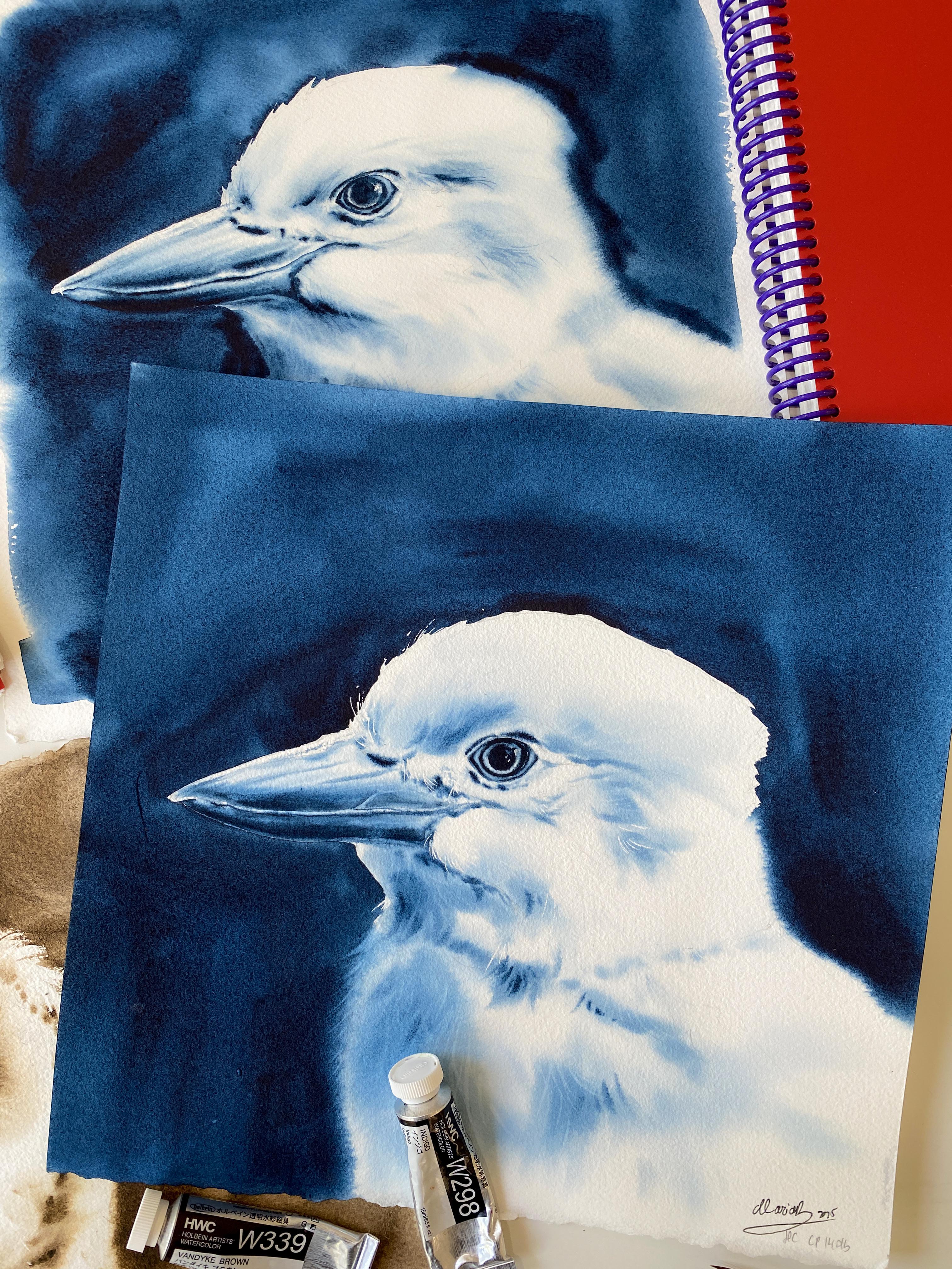
4. White Kookaburra - Intro, Masking Fluid/Wax Stick: Hi friends. Welcome
to this class. We're going to paint
this bird in monochrome. I did a test piece, and I'll show you in a
second what it looks like. First things first, I have a loose sheet here
a watercolor paper. It's 11 by 11 and the reason I removed it
actually from my journal. This is actually the journal.
This is the test piece. I removed it because
I want to show you how you can gain more
time to apply colors wet-on-wet when you
wet the backside of the P for two and
that's what we're going to do in this class. Whether you have that sheet in the pad or a block or journal, try to remove it, then what this is right here
is a plastic sheet. I took it out of a
frame basically. So whenever you buy a frame for your painting and I suggest
not to buy with the glass, but this is the
plastic PVC sheet. You can use this
sheet for painting, and it's really so useful. It just gives you so
much more time to apply. Colors wet-on-wet. So you wet the back
side of the paper too, and you do it first
for 2 minutes, and then you flip the paper, and then we wet the front side, but we'll get to
that in a second. We are going to paint
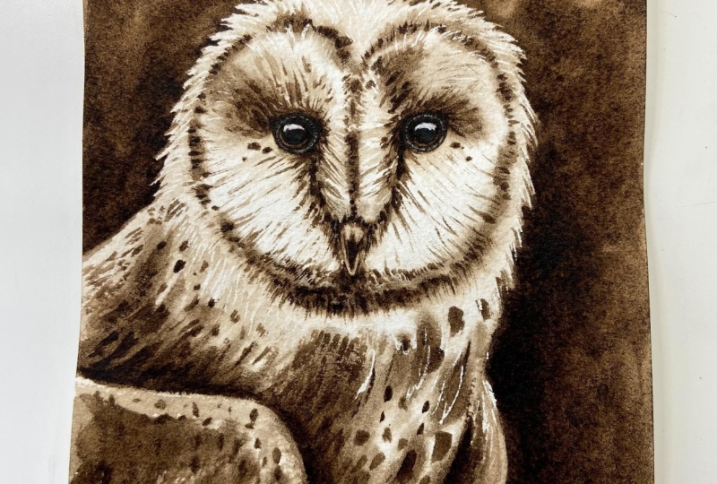
this bird in monochrome. What does it mean is that we're going to use only one color. I choose Indigo just because
it's the most common color, I'd say, it's a darker
blue. It is dark blue. But you could go
with fontak brown if you want to or some
other shade of blue, but I want Indigo just
because it lifts easily too. It's a very rich color. Again, it's a very common color, most likely you have it. What we're going to do is again, wet the backside first and wet the front side of the paper. And when we wet the bird, we're also going to
wet the background. At this point, we don't need to worry about
colors bleeding toward the background from
the bird because the background is
darker than the bird, maybe except for the eye, but the eye is going
to be painted later. We're going to paint it
later. But first thing I suggest doing is actually using masking fluid
for watercolors. I didn't use it here
in my test piece. This was painted super fast. I should have added in
another layer, maybe. But it's just the idea just to show you what we're going for. To use masking fluid, I suggest to apply it,
let me grab a brush. Like, somewhere here, I
didn't use masking here, but I think it would
be nice to have finer lines for the hair
over here, maybe over here. So we'll get to
that in a second. If you prefer, you
can use a wax stick, but it wouldn't work
well for the hair. I did use a wax stick. Over here, over the beak. I generally prefer
actually wax stick for areas like you see over the beak where
it's much lighter. I'm going to use a little bit of a wax stick just to show you
if you have a wax stick, and I'm just going to
apply it, right here. And I just press slightly harder on the paper to apply
this wax stick. So one more time I'm
going through here, and you want to have a
point on this wax stick. So you might have to sharpen
it or something sometimes. This one I bought it from
Hobby Lobby in the US. I'm not sure if you can find something
like this in Europe. But it's really fun to have it. I use it for seascapes
too, by the way. I think that's all I'm going
to use it for this part. Now, again, if you don't
have it, that's okay. You can just use a brush. Brush you don't care about
because masking fluid will damage your brush. I dip the brush in water, and then I just grab
a little bit of wax. I'm sorry, the masking fluid, and I'm going to press
it like this against the neck of the bottle just
so it's a flight of brush. If you didn't use a wax stick, then you would apply
it right here. Otherwise, for the hair. So like right here, just to
go over the background now, this is a little
too thick, so I'm wiping my brush on
the toe actually. I want it to be fineer
then over here. So it's like I'm barely touching the paper
when I apply it. This is a rigger brush, but a rigger brush I really
don't care about. And it's because masking fluid will damage your
brush eventually, if not the first time,
maybe the second time. The key is to really
clean your brush, right away as soon
as you're done. So let's say I want to apply
maybe a little bit here, whatever you say,
like the brightest, whitest hair, single
pieces or just the hair. Let me see here maybe.
Oh, you know what? Why we apply a little bit of masking over the eye just
because we see a little bit, like tiny highlights
there, the highlights. I'll make it easier. And then back to here maybe a little bit. Not too much. Next thing, I actually need to clean the brush and I suggest
you clean it too, and then we can start
wetting the vapor. Coming back to this test piece. So what happens is we
wet the paper, backside, front side, everything, and then we start applying
colors toward the bird. We start with the latest
colors I mean colors, the tone of value of Indigo. So we go like here,
a little bit here, just very little of the paint
and we let that to bleed. This is a water to milk
like ratio at first. Then we go for the mid tones
and the darkest tones, basically, and it's
all about the beak and applying colors
toward the feathers. What will happen is
everything Well, some paint will just bleed
toward the background, but it's okay because we will
add the background later. So that will be our second
layer, technically. And then when we
add the background, you will see how were you create right away,
this nice contrast. Now, what happened here is
I also wedded the bird, just so this would be
like a softer edge. I added way more color, ended up adding way
more color here. Actually, I the reference
image through Photoshop, and that's when I
was playing with the colors to create that
monochromatic version. And the first one was
really highlighted. That's why it's so light here. But for this one, I just basically left
it black and white, and I added like a
blue tint to it. So that's the correct version that we're using in this class. Anyway, when we add
the background, so here we have a hard edge, but then if you don't
want a hard edge, then you have to wet a
little bit of the bird too, but we'll get to
that in the class. First thing is to wet the paper.
5. White Kookaburra - Wetting the Paper: Try to use a larger brush right away because you'll
have more coverage. You can see the full sheet
of a paper right now, but that's because the
bird is just here. So as long as you can see the
bird, that's wet the paper. I am using a large brush. This is a 50 flat wash
brush by Casaneo. At first, like, you might as well just
have a lot of water. And the back side is
just the backside. So now, if you've never used
a sheet like this before, the plastic, the PVC, and you're using it the first
time for the first time, you'll see how nicely like the paper just
sticks to the sheet, and you are not dealing
with any buckling. So that's why it's
just going to be really awesome
experience for you. And I've been doing this, like, sometimes, using this method of wetting the
backside of the paper. But it's just I
don't know. I became super fast at painting, but then I have to remind myself that it is easier
for you this way. And no matter what, I
have more time too. To apply all these colors. It's just something
that we can use in landscape paintings or
overall like animals. We're going to wet this
for another minute. I'm just going to keep
the camera going, recording just so you can
see everything in real time. What will happen is your paper now will start
buckling a little bit. That's a good thing
because now you know that you have enough of that
water into your paper. Now you're going to flip
the paper and basically, it's a glue almost right there. Perfect. Now we're going to
start wetting the front side, and then everything
will become nice and flat just because of that water
and setting the backside. So we're going to wet this side for two more minutes
2 minutes backside, 2 minutes or 3 minutes
the front side. You just want that paper to
be nicely and shiny wet. Now, in the meantime
as we're wedding, we might as well dilute some of this indigo with water and I'm just placing a little more
of it and there's my Indigo. It's just one color.
It's thicker, creamy paint, and then something that's more diluted with water. Even if you pick up other
colors for me, that's okay too. I'm pretty good
here, pretty ready. Just one more time.
What I'm going to do actually is grab
a paper towel. Just to get rid of the water
from around the paper. All this. I don't need
that much water around. I want more time just going
through just to make it flat. Now, I'm going to
grab, let's see. Coal brush, I guess.
I like to work with a flat brush or coal brush.
You know what, flatbush? This is my flat 24 Songbird. You want to have a
soflater flat brush, not oval or anything like that. Actually, a soft flat
brush like this. We're going to go for a
water milk like ratio, and this is my Indigo. So just something like this
that's pretty nicely diluted. I'm so used to mixing
colors on the paper, but now I'm just
using one color. I'm going to grab a
little more water so it's more like
water like rate. We're going to go
for the mid tones. I want you to squint your
eyes when you look at the reference because when
you squint your eyes, you see a larger
contrast, actually, what you see is less
details. That's what I want. Somewhere here, we
have some color, go for the lightest
tones that you see, just a little bit of
a color here, here, the darkest parts are on
this side, basically. But squinting your eyes
will help to overdo it. We don't see the bottom here. It's just a sketch. We can
add a little bit here, here, and let that pay to
bleed right now to spread. I'm actually going to
grab a little more water. So more water even more water. I want this to be way more diluted with
water on this part. If it's too much on your brush, wipe your brush on the towel
because that can happen too. Suddenly you have too
much of that paint with the water on your brush and it's harder to
control things. This is I'm going for the
lightest areas first, and it's a line here in a way
the feathers are divided. But this side right here
is the darkest part. Don't worry if the colors
bleed toward the outside again because we're
going to have the background anyway
that's darker. So I'm going to clean
my brush, actually. This is just a clean wet brush, and let's play with
what we have spread it. This is a clean brush. And in the second,
we're going to start working with
the mid tones. This is like the lightest
tones you can see for now. And you don't need to have,
color everywhere, okay? So remember that. And then clean your brush
the flat breast. Grabbing my oncol says
four. So something softer. If you don't have a
quill, maybe like a round 14 because you want
to have a larger brat. And let's do the same thing, but milk like ratio for the
beak, let's go over the beak. So somewhere here,
this is the bottom. So I just don't have
much paint on my breast. That's why the paint is
not spreading as much. But what we should do is grab a little bit
more of the paint, actually, to make it more
like water milk like ratio. And that's what it is now. And just go with a
lighter value first. And at first I grab way
too much, that's fine. But what I want you to do is just grab a little less, okay? So something like this, now grab with that same brush,
thicker paint. Wipe your brush on
your toe a little bit if it's too much water. Something that feels more like
half and half and just go toward the top or the bottom
of the top part of the beak, just to add more color there. This is all darker on the
bottom, if that makes sense. Then let's grab a milk cristia say at first of this Indigo, and I wipe my brush
on top because I feel like I have too
much on my brush over and I want a little feel a bit damp brush a little bit on the brush feels
a little more damp. This is why I have a
little more control. Now, be careful with
making it too damp because as soon as
your brush feels damp, then you are actually
going to start removing water from your paper. You dry out the paper and you don't want
to do it too fast. It is a good thing, the
damp brush technique. I just depends at what stage that all the
stages are good for that. During the process
of painting, right? So here we go. Now, I do want to keep this
light as light as possible. So what I'm going to do is grab some of this heavy cream like ratio of this Indigo because
this is all the same color. So we're not using any
other color, Indigo. And then let's go for these darkest spots.
But you know what? I need way more and
I actually want this to be still a milk
like ratio over here. All this because it should
be darker, right this. The left side is darker. Then we have this part,
but it's mostly this. Just go for the midtones. Whenever you see the mid tones, that's where you want
to add it and like
6. White Kookaburra - Layering Part I: With your eyes, when you're
looking at the reference, kind of like designate
an area actually on your paper that's
going to be the side that's going to be lighter
and should be the right side. So again, coming back here, here and then all
this is darker. When you travel around, you're not just focusing
on one area of the bird, it's actually good because you keep your paper wet longer. Now, this is a little
too much here. What I'm going to
quickly do, and this can happen to you too. What I suggest doing is
cleaning your brush, wiping on a towel well, and just spread it a
little bit with it. But you don't want too
much water on your brush. Use that paint from here
and just spread it. In the second, we're
going to start using more a heavy cream top only, and we're going to play with that to add
the darkest tones. And that's pretty good already. I just don't need them much. So this is a damp brush. To make a damp brush, just squeeze it between
pieces of a towel. This is a paper towel so
it's not my favorite, but it's probably the
easiest to show now. It's just a damp brush, and you just going to pull from the areas where you
already added some color. And when you pull, you are
drying the paper to a Y. It's not a surprise.
So you want to do it more toward the end before you're going to
apply the darkest tones. This is a damp brush. I'm just pulling over the areas where I already added colors. Now I'm going to grab that
same brush, it's a damp brush. On the tip of my brush, there's creamy Indigo, and
I'm going to go right here. It's like I squished it
and now I have a point here and just some areas. This actually should be done with a smaller brush just a y. Grab a smaller brush
around two maybe. To have the most control. Now I have trash
outside my window. Maybe a little
loud for a second. But I can't stop recording this because now we're wet
paper and everything. This is a creamy paint
and I'm just going to add it some areas here that I see the mid tones
still in the darkest tones. This is where I added actually
mask and I can see that. And then again, this
is a squished brush, so it's a dam brush
and I'm just adding more color toward these
darkest parts that I can see. And keeping the left side
as light as possible. You got to ask yourself question too in between,
do I have enough? Because it's very
easy to overdo this. It's fun to apply colors. Sometimes we keep
going and keep going, but like, Okay, I already have enough,
so I don't need more. Then the beak, definitely
more over the beak, a dam brush with that
Indigo, and then the bottom. Because the bottom
needs to be way darker. Then right before
here just to pull it. Again, you can grab
a smaller brush and be much easier,
I promise you that. I'm going to clean
this brush and I am going to grab
a smaller brush. That's going to be a let's
see what I have and here. Round three Songbird. What you're going to do is
grab creamy paint from here. This is what I call cream top ratio between
water and paint. Creamy paint on the tip
of your smaller brush. We have areas around the eye. It's like the the lids or
just the shadowy parts. You want that creamy paint because that will give
you the most control. The paint won't spread, but
also gives you nice contrast. Now, we don't need to
go for the eye yet, but we could add a little bit of that creamy paint since it's not spreading anyway that much, just in some areas. Then grab again that creamy paint because you
might have to refill your price and then just grab it on the bottom of
the nostril there. Then just like we added masking here and
it will be really nice once we remove masking
because if we add a little bit of that
creamy paint here, that'll give us
really nice contrast. Then actually, I'm
going to go in between here because I didn't
add enough of the color. Then there's lines
when you look at the reference over the beak. Then this is still wet
and if it's still wet, it should be wet if you
wet at the back side too. Just go again on
the bottom of it. I'm going to grab more
of that creamy paint, just to add more paint on
the bottom of the beak. I don't have to do much later. We do have to lift too,
or we don't have to. This is a choice, it
would be nice to lift color as well. The Indigo. Now with that creamy
paint just continue adding it toward the darkest
ears that you can see, which would be here,
something like that. You can of course,
go over here as well because we do see
some darker spots. With that same brush, it's like you're mimicking the shape of the hair,
basically, just loins. Just a little bit,
stick to the left side, so it's not too much
on the right side. We're trying to keep
the left I'm sorry, the right side as
light as possible. And just add a little
bit of the hair because we don't need to
show ever all the detail. Whenever we paint something, it's not that important. You want to capture the
overall of your object. You don't need to make it unless you're going for super realism, you want everything to
look super realistic. Okay, that's different. But if you're like me, you want it to have that
feel of a watercolor. Still that watercolor
and you don't need that much
realism, basically, everything line to
line, dot to a dot, then you just capturing the
overall of your object. So I'm tempted to go back here. Now I still have that
Indigo on my brush, but it's less of that
and it's a damp brush. Now I can go
underneath the areas where I applied the wax stick, it's underneath those areas just because I
don't want the top of the beak to be too light. Although the contrast
would be nice to have any.
7. White Kookaburra - Layering and Lifting Color: A little more of
that creamy paint. And right underneath
where we see that line between the top and the bottom part of the beak. That's where we can apply it a little bit of
that creamy paint. So now we have a larger
contrast, just like that. And then we can use some of that paint to go down a
little bit because we have, almost like a cheek, right?
Something like that. Might as well add
that. We're just working with the
color values here. That's what it's all about
when you paint something. Well, in general,
with everything. But now, especially we're painting a monochrome,
it's different. It's easier actually
because again, we're not thinking about mixing other colors. I'm
cleaning my brush. What we could do is grab
some of this a heavy cream of the Indigo and maybe
because this is still wet, just add a little bit of that blue so we have a first layer. Toward the eye, just
a little bit toward the iris and pupil. But there's a lot of,
like, lighter areas. That's why it has to
be like the paint needs to basically spread. But we have a little might as well add a little
bit of a color. With that cream top,
go toward, like, the inside of the eye a little
bit just to separate it. It's just such a
perfect timing now to do this because the
paper feels damp. To me, it feels damp and it's perfect timing to separate some of these parts of the eye. We're not going for
the whole thing yet, but it's just easier, and this is going
to be our pupil. What we need to do is lift
colors. Again, it's an option. You don't have to lift colors if you don't feel
comfortable yet. But you would grab
a rigger brush. This is my rigger Songbird. And when the paper feels damp, like here, that's the perfect
timing to lift the colors. So I'm going to show
you other areas. So I chose Indigo
because it really is an easier color
overall to lift. Not all colors lift easily. Now, I don't have enough almost color
here, right to lift. But here, you can still
lift, and it's about timing. The best timing to
lift colors is when the paper start to
lose that shine. At first, the paper is shiny wet, you see all
the colors, right? But then the shine goes away, and that's when you want
to kind of start lifting, but the best timing is actually when the
paper feels damp. And I'll make close
ups and all that. And I just pull it.
I pull the brush. Rigger brush is my
favorite to lift with, which is why I created
this brush overall. But it's just pulling, and it's like you're pressing
and you're pulling it up. And you want to do it
with a tip of your brush, but sometimes I use the
full head of the brush too when I want to create like longer strokes
like here, for example. I press a little harder to lift. But you always want to
clean your brush first, wipe it on a towel,
and then you lift. If you don't wipe your
brush on a towel, you will create a bloom. That's just a guarantee. So here, I'm just going
lift a little bit. Now, I don't want to
do too much lifting, and that can easily take away from your painting because then it just
looks overworked. But this is a little
bit of a creamy paint on the tip of my brush, and
actually, it's too much. I wanted to add a
little bit more here, but I don't know if
I'm okay with it. Maybe I'll think about
it. A little bit of that creamy paint but very little and it's the brush is not even perfect anymore. Let's see. Let's add a little bit tuple hair if you want
to. Maybe just like this. If you want to add some hair, individual hair, brush strokes. But very little and with
the tip of your breast, it's almost like you don't have much paint on your breast. Now wiping my brush on the towel again because I
want to lift a little more, wiping it again
or dipping it in, dipping it in water
first, wiping it on a towel next and
then lift colors. Now, you can also do the
same thing with the beak. Let's say something
got covered too much. I'm just going to
create a couple lines. So for example, a lot of
times I don't use masking, I don't use wax stick. I lift colors. That's
all. That's all I do. And you can do it.
That's the thing. For example, over here, there are these scratches
over the beak. Again, I don't
have to always use the masking or wax stick. I can just lift
colors like this. Once you master the lifting, everything just makes sense. It's like, I really don't need wax stick or masking fluid in a lot of situations, not all. Because again, you can
create these lines, the wider lines that we see
just by lifting colors. Lift a little bit here,
and then lifting of course is helpful whenever
we add too much pain. Here I should have
this area lighter. I'm just going to
l I relift again. I clean my brush,
wipe it on a towel, and I go back to relift it. And what else? Maybe here.
I'll relift this part. You can basically do
so much when you lift. It changes the whole
outcome of your painting. And once we have the eye, also everything will
just kind of pop. It will look so pretty. We're going to leave it. Just from time to time, make sure this doesn't
get completely glued onto the board. So just come back to it and
make sure it's, you know, not glued one time, one time ago, actually, not
one time, a couple of times. I was using a 90 pound
watercolor paper and it completely glued
itself to my glass top table. So that can happen. Okay? So this is a thicker
watercolor paper. I've never had a problem
with this. Alright, let's walk away from it
and let it dry.
8. White Kookaburra - Wetting Paper/Background: All right, friends, let's
add the background. I'm going to show you
again my test piece, what it looks like. It it pre wedded some parts of the background
because that gives me more time to apply
colors wet-on-wet. Now, the most important
thing to mention is, I have a hard edge here, I only wetted the background
here, the background here, but here I also wetted the birds some colors would be
toward the feathers. Did the same thing
here. So here I stayed on the
outside of the beak, but here I went over the bird. So you can decide which areas like feathers you
want to keep soft, or if you just want to
have full control 100%, you just don't wet the bird, but only wet the background, and then just apply colors toward the background
only wet-on-wet. If you do want the soft edge, I'm going to show you
actually in this video. So what you do is
wet the background, but then you go now let's
say wet this area too. But then when you apply
colors toward the background, you want to stay
away from the bird, I'd say, like this much. So basically, if you see the
line here, that's the bird, you would apply
colors up to here, but heavy cream or
even cream top like ratio and you would wait
until the paint settles. I'm sorry, the water gets
absorbed deeper into the paper. So the paper feels
almost like damp, and that's when you would
add the color here. Because otherwise, too much pain will bleed toward the
bird, but you know what? It's easier to explain while I'm demonstrating than when
you just see this. The first thing, please have
your colors ready to go. Actually it's just one
color, right? So Indigo. Let's dilute some of
the indigo with water. There's my Indigo. Actually,
I want more of the Indigo. That's not enough. And I do want this
to be heavy cream, cream top, like ratio
between wood and paint. I don't want the paint to feel like water like ratio
or something like that. That's way too diluted
paint with water. So again, this is a
thicker paint now, and that's what you
want on your palette. Okay? I'm just going to clean
the breast on need this. Next step is to wet
the background. I'm just going to
use this flat brush, da Vinci casinel because
that's the well, not the whitest one I have, but it's a soft brush. When you wet now, you don't need to wet ten times
or anything like that or going over it multiple times because it's basically, we're not going to
spend that much time painting the background. It's just so you have some
water in the background and that's just to
give you more time to apply colors before
there's some blooms. Because if one area
of the paper dries faster than super easy
to create a bloom. Here I'm just going to
with the background first, and then I'm going
to show you in what areas I'm also
wetting the bird. But here, I got to be careful because I don't want
to go over the beak. We do want that hard edge here, and I do want hard edges
here where we have the fur, and I'm going to go in with a brush to make it easier later. So I'm not going super
close yet toward the bird. And then let's see. The reference shows
like this kind of but this will be the area where will
go in a little bit, not as much probably
as in my test piece, although the test piece, why too much pain bled toward
the bird is my fault. Hundred percent. I just added the color in this area too fast, so the colors started
bleeding too fast. So you have to wait
until the paper feels like it's about to lose
that shine I want to say, because right now,
when you wet it, the paper is nice and
shiny wet, right? And that shine slowly
starts to go away. When that shine
starts to go away, actually, it's perfect timing to live colors, as a
matter of fact. But that's when you
want to get closer. Here, this is going to be
area where I do want some of that bird to be wetted too. But for now, I'm going
to go one more time. Now, if you want flat paper, add some water on
the bottom there, so the paper sticks. I'm going to do
it one more time. I just want some water
there, so it's flat. Otherwise, it's buckling too
much and I don't want that. As a matter of fact, you
can also wet the backside. I'm doing this to
flatten my paper. It's nice and flat so it's
easy to add that background. Now it's flatter than before
and that's what I want. Going to go one more
time over here. Oops, I just scratch
the paper a little bit. I don't like that. This happens every
time with this brush. It's because it has, like,
this metal parts the hair, the fibers are thinner
than this part, and I have this
problem every time, and I want to, like, remind myself, but then I forget and I see
the scratch here. It's okay. You see it too. It's like I love the
brush, but gosh, every time I just have the
same problem over and over, just scratching my paper. Anyway, I'm just going to
wet a little bit here. Because you can see those
scratches for sure. It's like a dent on the
paper. I've wetted enough. Now I'm going to show
you. I'm going to go inside the bird
here because that's the area where I want the paint or I want to have a soft edge. That's what I want. Softer edge right here, and then the same thing
here. No everywhere. Now, when you go over
the painted areas, you have to be very gentle
and you need to use a softer brush so you don't reactivate the
colors very gently, very softly with a softer
brush only when you go over. I don't want this part here. Again, it's buckling. So
again, if it buckles, just wet the backside, make sure it all
stays nice and flat. So the paint doesn't
flow in a weird way. I should have just done
this from the beginning, but I didn't think it was
going to be buckling as much. Alright.
9. White Kookaburra - Background Applying Color: I'm ready to start
applying colors. So what I'm going to do is
grab my flat 24 songbird, and then I'll work with
my quill, as well. My lung quill says four. So I actually want
a thicker paint, like a heavy cream ratio
between water and paint. I do like how dark
the background is. Now, this is a little too thick because you also want some flow. So I'm not looking for
chunks at this moment. Paint. I do want heavy cream. It's just that if I just go with a cream top, it's
a little too much. I do want the paint
to still spread. Here I have to be super focused
because this is my beak. But now you can see
what a beautiful contrast because we kept
the beak on top lighter. And we can see that pretty
contrast right away. Now, I also have
these feathers there, and I'll get to
that in a second. First action, I'm going
to just add color here. And I'm following with
my eyes like, Okay, the beak is like this, and then it kind
of cuts through. Like this. I'm not
going to go here yet. That's because the color would just bleed too much
toward my bird. I'll push it through here. Now, what I can also do, what would help is just get rid of some of that
water now from the board or the sheet because that'll come back toward my peeper
and create blob. Just a little bit, basically
the outside water. What I want to do is
grab my long size four. It's a long cool size four. I'm going to grab the same
paint, so heavy cream. This is where you begin
shaping the hair. You go and you want
to have a fine point. That's important too. You can actually switch between brushes and you can see that that's my masking fluid.
That's my masking. I'll keep going and just watching looking at the
reference constantly and looking at the hair and just figuring this
out, how I want that. And following, of
course, the sketch. I have a nice shape of the bird, more of that heavy cream
ratio and just keep moving. You see, I stopped right there, so I can use my
softer pointier brush so I can shape the hair. And of course, I need
thicker paint here too. So this will give you
the most contrast where you have the white
feathers of the bird, and you just keep moving. And then up to here
because then I'm going to be very close to the area where I also whited the bird, which actually does feel
like it's the amp already. But then I want
to come back here and you can see the
scratch right there. My goodness. It's just so annoying
because it happens every time I can't tell you how many scratches I have on
papers just because of that. I love the brush and I use it because it's a softer brush, but every time I
scratch the paper. Anyway, so this is
the area that again, I wetted the bird as well. Now, before I go here again, I'm just going to go back here to make this a little more even. I do need a little more water because the paint on my palette feels too thick and then just to fill the
background again. Now, sometimes it does
feel like we need to add second layer toward
the background and if you do, that's fine. But here's the
thing about adding second layer because I should
say that about indigo. Indigo, it's a stainy color. The problem with
adding second layers, you would literally reactivate
everything you added here. I actually don't recommend it because it's not a light
background. It's indigo. With indigo again, it's just too lifty the collar
just lifts too much. Now I'm going to squeeze more indigo because I just ran out. I'm going to get closer toward the feathers probably here, the areas where I
also wetted the bird. So I am in a hurry a little bit. This is heavy cream actually cream top,
more like a cream top. And you can see the paint is not really spreading as much. So use a creamy
paint at this point, and get closer, feel it out. So as you see the paint
is not moving as much. The key is to wait. So you wait to add this paint a little later
now I made a mistake here. I went too close.
This was the area, so I'm just going to have
to lift a little bit. But here, I'm okay. So as you see this cut
through a little bit, so, yes, I do have to. I'll take care of that
in a second by lifting. I didn't want to
lift, but now I'll have to lift because otherwise
it kind of looks weird. And then grabbing more
of this creamy paint. So this is my indigo,
just creamy color. And then this is still wet. So I'm just going
to go through with this creamy paint very
gently, very gently. It doesn't have to
be like, you know, perfectly covered
and stuff like that. So it makes kind of sense
that if it's darker here, then I will add a little
more color that indigo. But here, I'm going to
have a soft edge, right? And another thing you can
do is use a dim brush. So first of all,
before I show you, I have to clean this
brush because otherwise, I'm just going to
have that indigo.
10. White Kookaburra - Adding Background/Lifting Color: So you would grab. In this case, you would grab
like this is a mop brush. It's a dry brush, and
you would just go along, but you have to kind of get
rid of that water if you feel like there's any
water on that brush. So normally, I show like a damp brush technique,
but in this case, because the color is so intense, I prefer to use a dryer
brush like this over here. For this area right in here, I do need to use a stiffer
brush. This is my round eight. I'm just going to
basically lift. I'm cleaning the brush,
wiping on a towel. And I'll keep lifting, but the brush has to be you just have to make sure
it's a damp brush. Wipe it on a towel.
That's why it's better to use a towel than just some
paper towel, what I mean. So I'm just using my
regular towel here. I'm going to keep lifting.
Because otherwise, it just makes no sense. I want to make sure my
bird has a nice shape. And to prevent the paint
from bleeding back here, I can also add a
little more water, which can cause a
bloom this way, so you have to be careful too. But now I got the
shape back here. When you paint the bird, when you add a background, just be careful when you shape it, look at the reference because here I cut down a little bit. Stuff like that,
it's no big deal. It doesn't matter that much. But proportions are correct
and things like that. I think that's enough
of this lifting colors and it's nice that we have the masking
because that shows there. Now, the background is
going to dry uneven just like here unless
you add second layer. But again, I do not
recommend adding second layer with indigo
in the background. I don't because it
lifts so easily, you're basically
going to make mess. It's going to be very messy. So it would work maybe with some untick brown
if you just used a different color in general
for painting this bird. So I'm just wiping it, so no paint water bleeds back toward the
edges, but you know what? It doesn't matter again
if there's a bloom. It's okay. This for now is done. We could paint the eye now, but I'm just going to stay away from it since it's so wet. One more thing actually
you could do is grab a rigger brush, just FYI. And with the rigger brush, you could lift toward
the background. So, of course, the
paper has to feel like it's almost like damp, like almost blast the shine. And these are the areas
that do feel like it, right immediately next
to that the edge here. So you could lift a little
bit just to add the hair, the touch, the soft
touch or the soft touch, the soft hair.
That's what I mean. So you just lift, but you have to keep cleaning
that brush because, again, you're picking up
such an intense color. It's a great color to
work with, but again, very easy to lift, very messy can get messy too. So that's why I don't recommend re wedding and adding
that second layer. Not with this in this situation, painting a monochrome like this. So yeah, you can just lift if you want to,
like, a little bit, keep cleaning your breast,
wiping on a towel. Until you feel
like, that's good. The same thing here although I added such here's the thing. If you also add a
heavy cream cream top, which is right here, that makes it harder to lift too because you have
to press harder with a brush and it just can get really messy. This
is a little easier. Whenever you lift
with this color, particularly especially
with this color, it's easier if the
layer is lighter. The value is a
light to mid value. This is dark value, so it's harder to lift. We use heavy cream
cream top like ratio. I think for the background,
this is great. It works. Of course, it's not
going to be even and I'm okay with it just
by looking like this. I actually like how this
is unfinished here. You might want something like
this, too, it's up to you. The next step is going to be painting the eye and
then darkening the beak. Let's walk away from
this and let it dry.
11. White Kookaburra - Second Layer Beak: I friends, so I would like to add another layer toward
the bottom of the beak. What I want to do is actually wet very gently because again, it's indigo, but it's not that dark of a value
compared to this. I'll still love the colors when I rewet this very quickly, but it won't be as bad as if I was rewetting
the background. I am holding a round two, I'm sorry, eight
brush, golden tube, which is a softer brush
and I do recommend having a softer brush very gently
with a softer brush. Well, that's way too much water. You just want to go in.
That was too much water, by the way. A now, it's better. And just like we see going in, but we don't need to add up
everywhere because we have some veins or veins,
not veins, scratches. So something like this, again, you don't need to do it
like a couple of times. Just one time basically
would be probably enough if you got that ratio, right, that water on your brush. Now I'm going to grab cream top. So it has to be creamed up like ratio between water and
heat of the same color, indigo, and we're going to apply it mostly
toward the bottom. Because it's a creamy paint, thick paint, cream top, you see it's not
spreading as much, creating that nice
darker contrast here. A little more of that
color on the tip of my breast. I just
want to keep going. Whenever I see those darks, it is right underneath here, this area, actually,
it should be lighter. I guess this part is
the lighter part. I can go right underneath here. Make it a little
darker, not everywhere. I went a little too far here, but this is the
most important part right here to make it darker. That's the contrast. Now I have a nice fine point, so I'm going to come
back here. There you go. I'm going to clean this brush. So one thing you
can do is use that DM brush just to go through because this
is still nicely wet. And you can still
wait and lift it, by the way, if you need
to grade those lines. Now here, do I really
want that line? Not as white as it is. So I'm just going
to use my DM brush. The tip of my DM brush just to go all the way to the bottom, just to push it
down a little bit. I just don't need
it to be as white. I do want that lightness
because I want to contrast between this
and this darkest part. I'm actually going to exaggerate it compared to the
reference image. By the way you can
see that scratch here from the flat brush. Next step, let's do
the same thing with the top. I'm looking here. I'm going to wet it here very
gently with a softer brush. Avoid this little area it looks like a
scratch over the beak. A natural scratch, not me from
using a brush. Like here. And the same thing, I'm going
to grab this creamy paint. And what is or where is that darkest part?
It's right in here. So creamy paint so you have the most control on
the tip of your brush. You can also grab around
two or three brush. And as close as I can
get but not too close, I want to leave that
area later overall. I'm going to get to this
scratchy part here. I'm just looking to
create a contrast. The rest will be done
with a damp brush. Just want to spread
a little more here. All right now I'm going
to clean this brush, clean it, clean water. It's just a damp brush. I'm just going to go next
to it and smooth it. So here is that little scratch. Well, I could have done
a better job here, but well, it is what it is. And then just a clean brush
and soften this from the top. If you feel like this
is too much white, then you just use that damp brush to pull it
down a little more. With that dam brush.
But make sure you don't lose that
light here on top. All this is a beautiful light. We need to keep
it the way it is. This is a little too too white, is, I'm just using a damp brush. Let's move on toward the eye.
12. White Kookaburra - Eye Painting: For the eye let's
grab smaller brush. What we're going to do
surprise you actually, we're going to wet
the whole thing. We did use masking fluid. We're going to wet
the whole thing we're only going to well first, we're going to work with
a milk like ratio to let some of that
indigo to spread. But then we're going to
jump to a milk I'm sorry, cream top like ratio,
the heaviest ratio, just so we have
the most control. First, you just
want a little color overall so the eye
is not so light. I do watch first, I'd say, because you want to know exactly what you're
going to be doing and what could happen if there's too much color,
bleeding and so on. So for this part, I'm just grabbing a little
bit of milk like ratio. I just want a little color
so it's not so light. And just dropping it, letting
it bleed here and there, because the white
doesn't work here as much because we can
see like shadows. Something like this, I just dropped a little bit of color. Now, this could be you might
be already okay with it, having the light values
from the first layer, but mine was a little too light. The next step will be to
grab this creamy paint. It literally is a creamy paint. There's a little bit of water. I'm not grabbing indiga
straight out of a tube. This really is a creamy paint, but with a little bit of water. The first thing
is not the pupil, but it's actually the area here, which is the iris, because
we have this part. You're using creamy paint, so you have the most control. Now, I have to go back and grab more creamy paint because
as I'm touching the paper, I'm actually picking up water. That can quickly become
more a half and half ratio, which would be too diluted
with water to paint. Then I can go here too. That's the pupil. Again, I
have to pick more paint, pick up more paint with my brush to make sure it's
all creamy paint. The paint does not spread
as much and then I'm hoping I do have these areas from the masking still there. Then this part, it looks like it should
be a little darker. I'm going to get closer here. Then we do have
the masking there. Some areas like I do need
to make it a little darker. Let's see, over here, for example, and then I'll
use a damp brush as well. I just looking for
the darker spots. And I'm going to
clean this brush. And this is just going to
be a damp brush, right? So that means I'm just going to let some of the
color to bleed. But it's a damp brush.
I'm wiping it on a towel. It's just that I want the color to bleed in some of these areas. Like, for example, over here, this is too dark. I'm sorry, too dark. It is
darker in the reference, not dark enough in my
painting, on my painting here. So I'm just letting the
color to bleed a little bit. And let's see over here, And it looks like the pupil
could be slightly bigger. I'm going to add a
little more color. The paper still feels damp. That's why I can do
this. But now it feels more closer to what I
see in the reference. And another thing is
this should be darker. So this was creamy paint, right? Might feel strange, but you just want to use a damp
brush and let that to bleed a little bit toward the middle toward the inside. Now after this, if you feel
like this is a dam brush, if you feel like things are still there's too much contrast or you can add more color and just let
the color to bleed too. Again, for example, I'm going
to give you an example. I'm grabbing more
of the cream top. I do feel like this should
be a little bigger. Some of these eyes can be really complicated just a little bit. And here, this is
just a damp brush. I added color and then I'm just leaving a
little lighter area.
13. White Kookaburra - Removing Masking Fluid: The last thing technically
would be to remove the masking fluid and I can't do that because I just
finished painting the eye. I love this part. I do like those hard edges here, and then I do like
how it's softer. In this particular painting, I feel like we would
be okay even if we had hard edges
all the way through. But that gave me an
opportunity to share with you how you can go
about keeping soft edges, creating soft edges instead of having hard edges
here everywhere. This is exactly how I go about
in most of my paintings, whenever I paint something furry and a lot of times
bird feathers. This where you see two
different techniques. First, we're painting the bird, we're adding the color, starting with the latest areas. We're building it by
adding more dark darks, but darker values, same color.
Creating more contrast. So we're working with
light and shadow. And then we're adding
that background. And when we add the background, everything changes, right? Suddenly we have this painting of a bird, like it's there. So here again is my test
piece. It's very similar. I'll tell you again, honestly, that I prefer this version
because of the background. It's so unfinished. It's so watercolor like. So if you like
something like this, then don't go all the way
to the edges because I think it's kind of nice that we have a little bit of white here. And then there's the white bird, which creates a contrast again. I feel like the last
step again is to remove the masking fluid. I'm sorry, masking fluid. I do have this pickup
cement eraser, and even though I
can't touch this, I can touch this area. Now, be careful when
you remove the masking from such a dark area overall. This is indigo. Again, my experience
with these colors, it can easily smudge. You might you just have
to be careful so it doesn't smear anywhere that
paint when you remove it. I just removed it from here. I think I place some of
it here. Maybe over here. But again, remind
yourself where did you What area you just
finished painting? Because next thing
you're going to go over the eye and it's like, no, I just smeared it. I have a little bit
here. The thing is that I finished adding the
background yesterday. That's why I'm confident with removing masking
from these areas. I have to stay away
from the big here, and then the eye, of course. But other than that,
that is pretty finished. I love how we have the
white from the masking, single hair pieces, and you
can also remove sketch lines. I do that very often
with this eraser. So it's Sedler It's
like a pencil version. And here, I just simply
remove the sketch lines. Sometimes it's easy,
sometimes it's not. It depends what paper I'm using. But generally, this one is okay. Thank you so much for your time. And, of course, let me know
if you have any questions. I'm always curious
to know if you like the class and if I was able to teach you something new and if you feel more comfortable
with wet on wet.
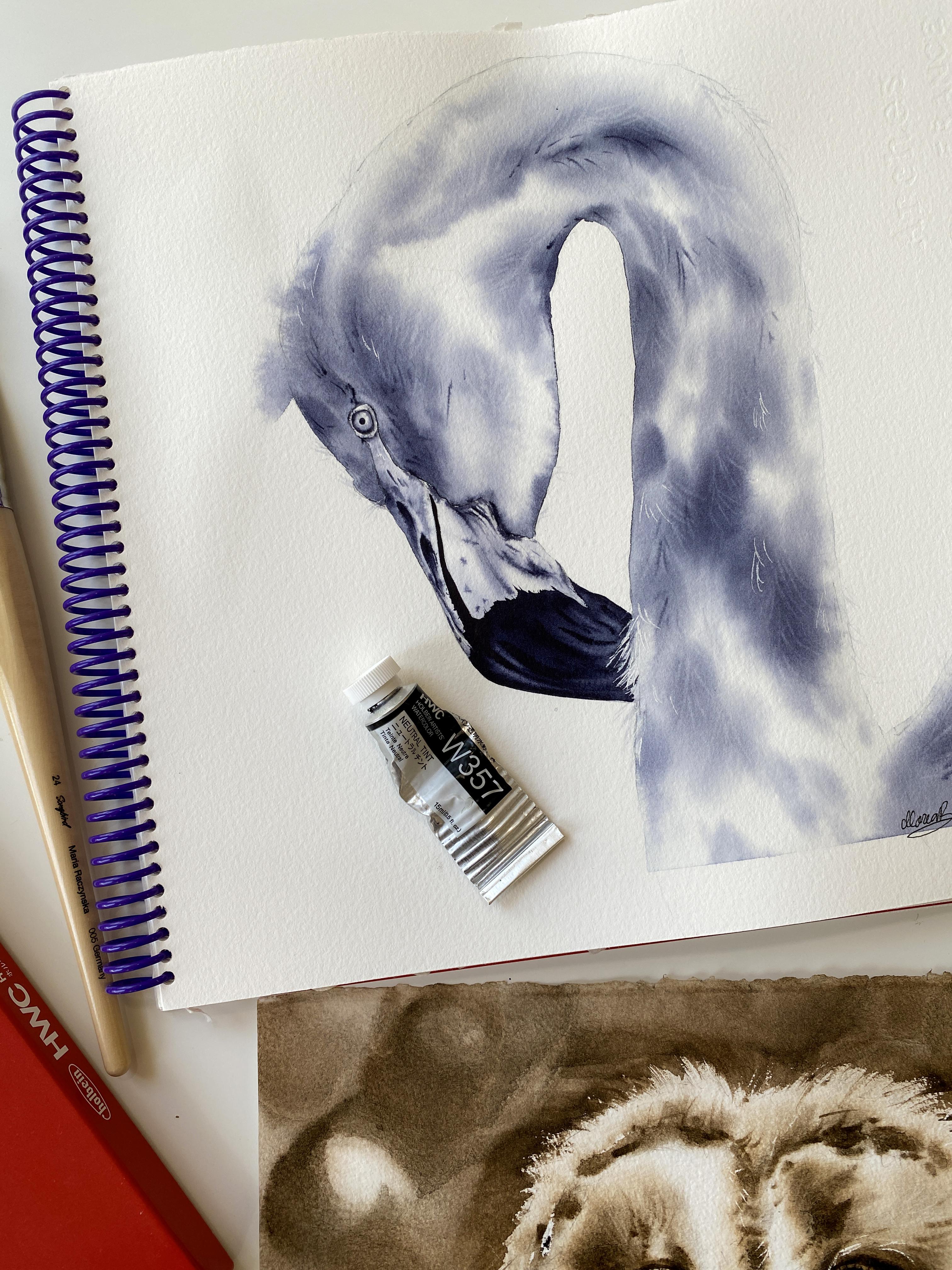
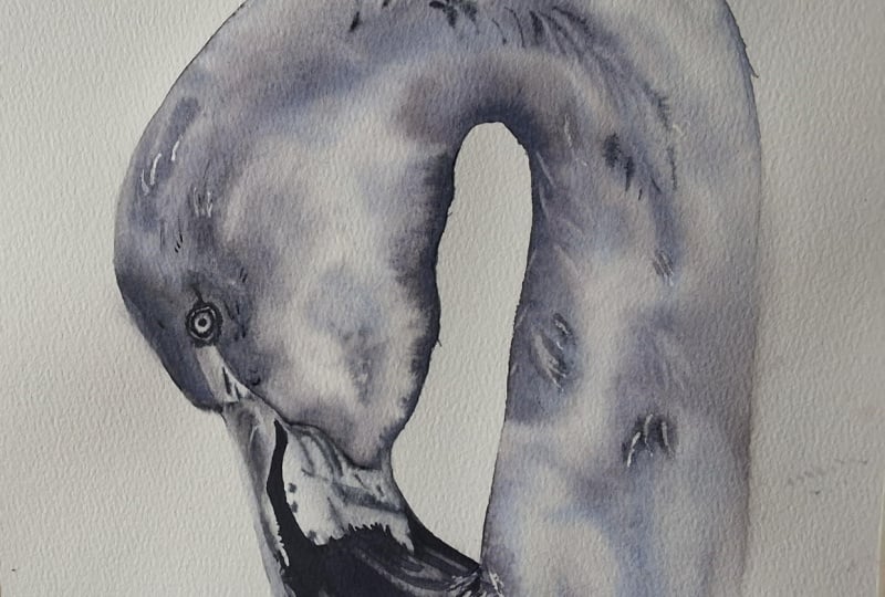
14. Flamingo- Intro/Applying Masking Fluid: Hi, friends. Welcome
to this class. So we're going to
paint a flamingo, and we're going to do it in
monochrome with one color. I'm choosing neutral tint. Another choice, great
choice would be indigo, but I'm going to go
with neutral tint since my other class is
already with Indigo. So neutral tint is kind of like a I don't
want to say gray, but it's kind of like indigo, but more toward black color, but with a tinto of purple,
if that makes sense. This is a color I used
to use all the time, and then I phased out as I basically started
using more and more of the indigo and then ante brown. Also what I was trying to do is limit my color palette
so it's easier for you. So how we're going to paint it. The first thing is to apply actually masking fluid
for water colors. Let's do this
because then we have to wait for the
masking to dry anyway, so we might as well start
with this process right away. So this is my rigor brush. I use rigor brushes
to apply masking, and this is just a brush
I don't care about, but you want to have
synthetic brush, whether it's a small round
brush or a rigor brush. What I like to do
is dip brush in water and then I just dip it in the jar and I use the neck of the bottle
just to flatten my breast. It would be better to
have a smaller size, but this is fine too. We do I want to apply it? Actually, over the feathers
like the single hair, what would help is here. This is the area,
so that's where the flamingo is buried in there. So be nice to have this
little touch here. This, by the way, is the
Arches watercolor paper. I did apply some washi tape. It's only because when I wet it, I don't want to go
over because this is my watercolor journal. It's one thing,
but also I want to have a sharp edge here, like a hard edge,
straight line basically. I don't want the paint to go
over underneath the sheet. What else? Maybe a little spot for the
highlight inside the eye, maybe right side and maybe over the lid just a little bit because that will give
us something right away. Then you want to look at the reference and
just basically over, you see the lightest
single hair, maybe here. In this one, right now, I don't feel like I want
to add a background. I feel like we should just do the flamingo and
that'll be fun to do it like this since
the other classes with the background, of course, feel free to add the background and if you
want to add the background, I suggest to do it the same way as I showed you in
the other class. The only thing is
you would have to keep the flamingo over lighter. When you add the darker
background, you see the contrast. Because if we go too
dark with the flamingo, then we have to keep working on that background to
create that contrast. On the right side,
it's darker here, for example, that would
be a nice contrast, but we have to make
sure that we leave enough light on this
side, for example. I'm just going to pick couple
other areas where I want to add this he detail, maybe, let's see, there's some more highlighted
parts over this part here, the skin, maybe a
little bit here. And then let's see
the beak alone, there's a nice
highlighted line here. I generally don't really
apply it to areas like this. It's more about this fuzzy here. I'm going to clean the breast
and when we come back, we can talk about the process.
15. Flamingo - Wetting Paper: So the first part is about
wetting the flamingo and also, we're going to designate
an area in the background where we're okay with the color to bleed toward the background. Now, if you're painting
the background too, if you're adding the
background, the process is going to be in
the other class. You're just going to add
the entire page, the paper, and then you're
just going to focus on applying colors only inside of the flamingo and
it's okay if the colors bleed. But specifically in this class, I'm teaching you how to just apply the colors
inside the flamingo. And then let some of these colors to bleed
toward the background. Let's just pick a spot. Let's say I want the color
from the flamingo to bleed, maybe not here because
this is a nice highlight. But let's say like COVA here. I'll wet this part of
the background too, and this is a
darker area anyway, so some color will
bleed out there. This way, it's
just going to give it a nice look to a painting,
and you can decide, too. You can just focus on wetting only the inside too
if you want to. So Grammar clean brush. This is my flight 24 songbird. And I'm just wetting it. As for the eye, I'd
actually suggest to not wet the eye and the beak just
because they are lighter, this part is lighter and
then the eye is lighter. And that's because we want that contrast and we are going to be working
with this one color. But still, we just want to make sure that not too
much color from here, which is a dark area bleeds over toward the lighter
part of the beak. We're just going to stay
away from the beak, which is pretty much how I paint the flamingos in general. But yes, you could wet
everything too if you want to. It's just there's
always options, and I feel like it would not be fair if I didn't tell
you, like, Okay, you can also do
this or you can do that because we decide, it's your artwork,
so you decide, on the splutters
and this and that. So for here on this
area, for example, I can go inside the
beak too because I'm going to be painting this
part of the feathers. That's because this part
of the beak is black. So I don't care if any color from the neck goes over
toward the beak, that part. The part that's black. And
then here very gently. Now, I do suggest
using a softer brush, flat brush too, it's just so
much easier to apply colors. Another thing is when
you use a stiffer brush, you might find yourself
picking up colors from the paper as you're applying the colors so that can
happen very easily. I haven't started wetting
the background yet, whatever I want the color to bleed toward the background too. And I decided to
stay away from here only because this area
is so much lighter, so it's not like much color
would bleed there anyway. This is a different
paper that I painted the bird. This is arches. The other one was
on the old version of the I believe it was
the Hyme lady collection. Paper with texture. So here, I'm just going to wet a little more. I don't want to go over. Actually, this is the area
that I am going to go over. So I'm just going to let some water here in
the background. And I do need to grab
actually a different brush. My long coil size four, just so I can go, like, closer toward the
beak like this so I don't go over with a flat brush. Because when you have a point, it's just you have so
much more control, right? So might as well
use my long quill. So right now you
see the everything. I'm not zooming in until we are painting the
Big or the eye. I just want you to
see the everything, not just like a one part. Because when you apply colors, it's so easy to get you
focus just on one spot, and you have to travel
around the whole thing. Like, you can't just
focus on applying colors in one area.
That's my philosophy. Like you have to move
around because number one, you keep the paper wet longer. In number two, you kind
of see the whole thing, like the contrast
in a better way, the light shadows
is so important. Oh, another thing is, so make sure you wet
the backside of the paper too if you need more time to apply colors
because that will help you. That will give you
twice as much time. So if I'm going to
do this, let's say, in 25 minutes, and then the paper will be too dry to
continue applying colors. If you wet the backside, you're going to have 35 minutes, so it's worth doing it. I'm just not doing
it because it's I'm painting in
the journal right now and I'm just
used to it, I guess. I do feel like I have
a tint of a color and that's because I was
painting this other bird. I thought I had clean water, but now I'm confused. It doesn't matter
because I'm going to be using neutral tint. Now, please take a moment
to dilute your color with water so this
is my neutral tint. This is the neutral tint. One of my favorite colors, but I don't use it as much. I'm going to go one more time. Just one more time.
One more time. I'm actually pushing the water over here in case I have too much and I do have
a little too much here. Just going to grab it in a way. Actually, I'm going to stick with my long well for this one.
16. Flamingo- Layering P1: What I want you to
do is really look at the reference image
and see where you see the lightest values, the value of that
shade, the gray. Let's grab a little bit of
a water milk like ratio. You want this to be really
watered down actually at first because you do
want the paint to spread. So overall, like I'm
going to go over here, for example, add
some color here. And if it doesn't feel right to use something like round brush, you might want to go, you know, for the flat brush,
that's fine, too. So this needs to be more
diluted with water, and that's like the overall, like, where do I want
that color, right? So here, this is for sure, like the darker area here. Might as well just
add some color to keep things wet longer. But I got to be careful
how the paint spreads and all doesn't become too dark. Also thinking like,
I am making it a little darker just because I'm not planning to add
the background. That makes a difference too. Here I have these feathers and then again letting here
to go in a little bit. You don't want to
place this color of your choice anywhere
everywhere I'm sorry, I meant everywhere because if you place the
color everywhere, then it's just going
to become too dark. You want to think about it, lightest areas,
the darkest areas. I'm going to grab a
little more water and I'm going to come back here, but I'm trying to
still keep it lighter, but doesn't mean that it
has to be super light. That's because I'm not
adding the background. I feel like I didn't dilute
it properly. See chunks. This head area is
for sure shadowed. I'm using the tip of my brush, the edge of the brush
to go closer toward this edge here in a second, I'm going to grab a heavier
ratio of water and paint. So even though I
wetted the background, not much is bleeding out. We can always add
more water toward the background. If you want to. Then this is milk like ratio. Here's the thing, something that sometimes it's
hard to understand. The longer you paint, it's been a couple minutes. Now I have to start
adjusting the ratio between water and paint because
the paper is not as wet as it was a
couple of minutes ago. It's not just the same. It is still wet, but
it's not the same. Slowly, I'll have
to start decreasing the amount of water in my brush. So it's going to become
more like a heavy cream in a second and cream
top and stuff like that. We'll get to that.
First, I'm just going to release a little more. Now, let's remember, too, that with watercolors,
they always dry more pale. Then when we first
see everything, it's a little darker, but everything will
just dry more pale. Like not as dark unless
I go creamy paint. So now what I really want to do is actually switch
to a smaller brush. I'm going to try
to add more color here and wait till the very
end that's important too. Don't give up too early or never because you have to wait once the beak is there and everything
just won't make sense. So now I'm going to grab something that feels
like a heavy cream. That heavy cream
maybe half and half. Something between. A little heavier ratio and
I want to go here. This is not working, so I need heavy cream because
I don't want the pain to spread as much as it was
just a couple of minutes ago. Now I'm looking to have
more and more control. Now, when I apply
this heavy cream, I don't want it
everywhere, right? So basically with my eyes, I'm scanning the areas
in the reference, like, Okay, what is where
do I see the darkest tones? And that's where I'm going for. That's what I'm going
for, to add these colors. I need the contrast, and I'm using a quill brush, but it has a fine point. So try to have some
foam like this. Round brush to is fine, of course, softer
brush, ideally. So ideally a softer
brush and you're just going for these mid to
darkest tones basically. I will have less
time than somebody. If you wetted the backside
of the paper to just FYI. That's just the
choice because you can always wet the
backside first. It's not something
that you can't do. You can decide if
you need more time, go for it because
I'm going to be done very quickly
with applying colors. Another thing what helps me in general is squinting
my eyes, actually. So when I feel like I'm adding, I'm focusing on too
many little areas, and I'm not capturing
the overall. Then I need to squint my eyes, so it's kind of
like I see less of the details and more of
the overall contrast. That makes sense. Something
my mom has taught me. She's an oil artist, but the
same principle applies to any painting or drawing or crayons, whatever
you're using. So I feel like this is good, and I want to show
you a little trick. It's called the damp
brush technique. So if you've been for a while, then you know it already. But it's such a great technique because you can make
things so much smoother. Okay, so I'm going
to clean the brush. I'm going to show
this to you quickly. There's two things I'm
going to be doing with you. One is that damp
brush technique. So what you do is squish this brush between two
pieces of a towel, basically. So it
looks like this. Now, you can just go into pool, but here's the tricky part. It doesn't work if your paper feels damp already,
it's not going to work. You're just going to
start lifting colors. You have to do this
when the paper feels nice and wet,
still shiny wet. I call these the stages. First, you see that the
paper is nice shiny, wet and then that shine
slowly starts to go away. That's the time to lift colors, and it's too late to do
this damp brush technique. When do you do that
damp brush technique, when the paper feels shiny wet? Now, this paper, this is Arches, is not as amazing as that old
version of the collection. That was my most favorite. It's just different. This one is gelatin. The other one was plan face. But it does make a difference. It makes for sure a difference, smell for sure, but performance. So I do feel like I just don't have the same
feel, but it's still okay. It's still doable. So
whether you're painting on arches or some other
paper, you'll be okay.
17. Flamingo - Lifting Color: They say, as long as you
have this 100% cotton, but not all 100% cotton are
good too. That's the thing. But I'm sure you're used to certain paper as long
as it's not cellulose. This is a rigor
precise two songbird. What you want to do next is
actually lift the colors. Lifting colors helps
a lot because we create even more like it's just when you lift colors
versus adding masking, with masking, you remove
the masking and then you have hard edges and
bright white paper. But with lifting, everything
looks more delicate. So as I'm talking, I actually need to look for
the areas where I can lift. This is all too early. The
best time I get to lift colors is when the
paper loses that shine. So it feels kind of, like, damp. And this is a little
still shiny wet. I just have to wait
probably a minute. What I could do in the
meantime is grab like a creamy paint on the tip of my brush and go right above the eye and just have
some more shadows. I actually should have maybe wetted this part
too, but I didn't. F Y, you could wet part
of the skin here too. Then by the way,
just keep adding maybe more darks closer toward the beak because that's
our contrast right there. And you can also add some hair detail through the neck area not
too much because something like
this can be easily overdone and it doesn't look as natural if you add too much of that the single do hair detail, in any case, too
much is too much. This works because
the paper still feels wet and what I'm
doing is I'm just using creamy paint and looking for the areas that are
for sure wet and I'm just adding the quick
hair line here and there. I don't want too much again
because it doesn't look good if it's too much,
but just a little bit. You can tell where I had more a creamy paint and the paper was a little dryer. A
little bit here. Doesn't actually look as good, so I'm going to move on
to another area here. Then have less paint
on my brush now. Maybe I can go to
a couple areas, but be your own judge if it's
too much, it's too much. The most important
thing is to actually lift I do feel it's
a little too early, but what you want
to do with lifting. You're going to clean
your rigor brush, you're going to wipe
it very well on a towel and once you wipe it, you're going to
start lifting, but you just have to
make sure there's no extra water on the brush because that
will create a bloom. With lifting, it's
all about timing. So it's that moment when the
papers start to feel damp. When it's damp,
that's perfect time, but a lot of time it's too late. We don't have enough time
because our painting is large or we have
so much to lift. Another thing is, consider
the color you're using. This is Holbein, so I
know Holbein very well. I've been painting with
this brand for eight years. I know very well the colors
and I know that indigo is very good for lifting
and neutral tint too, but not all colors
are good to lift. All colors are easy to lift. And also it depends
from the paper. It really depends because some papers will
sell those papers, in general, they
live very easily, but they live too easily, and it just doesn't look soft. I got to hurry up
actually as I'm talking because I
won't lift anything. So I'm just choosing areas
that are a little darker, for example, here, and
I'm doing this also on purpose so you can see it. I might not look as
pretty in my painting, but that's because I
want you to see where I lifted and how successful I was in some of these areas
with lifting because of the timing and the color I
chose and the paper I chose. Here is a little too late. I'm still lifting a little bit. The most successful,
I'd say was here, I think here because
that's where I started. So if you go to darker areas, you're going to see the
lifting very easily. And obviously, if I lift here, you won't see anything
because this is all white. So that's the thing.
Now, another thing. If you're adding the
background, again, keep this lighter overall, just so you don't
struggle with, like, contrast when you
add the background. So I feel like I'm almost done here because for this part, because I just don't have
enough areas to lift anymore. And I don't want to over lift either. So here's another thing. If you lift too much, then just the painting
looks overworked. It doesn't look good. And
I've done this before. Like, I have lifted too much,
and it just did not look.
18. Flamingo - Creating Fine Lines: Another thing what
you can do is you can grab a very diluted paint. We're only working
with neutral tint. You dilute the paint with water when you flatten your brush, so it's very thin. What you can do is since I'm not adding the
background here, you can add a little hair detail with something that I call
this water like ratio, the paint is really
watered down. Then you can go out here to so you can also wipe your brush if you feel like
you have too much paint, let's say, and you can
go back and just add it, not everywhere again because
it just doesn't work well. But for example, the areas
where you didn't like, let much paint to go in, like, next to these edges, so you
can go out a little bit, especially if you've
used masking. So I use masking here. Now, if I remove the the
mask oops I went too far. If I remove masking from here, you just won't see anything because it's white paper there. But if I go over
the masking area and you remove masking,
you will see it, and then you want
to pick some of these spots that are
going to be much lighter. It's just a small detail. I like this moment when
I apply the little hair, especially when I not just flaming those
other birds, too. It's just fun, the fuzziness. But you have to be comfortable
with the rigor brush. So if you've never used the rigger brush
before, it's possible. Especially if you're
new, that's okay. You just want to practice on the spare sheet of
a watercolor paper. Just say if you're
really comfortable with these little brush strokes
because with a rigor brush, like, you really, you're barely touching the paper very gently. Everything is super gentle. Like, so like here, you can barely see that
I'm leaving any marks. It's just a little bit. I do want that hair because I
don't have background here. I just want to make
it look more natural, the hair, the neck, all
that, just a little bit. And it's very light, so it's not going to
really do any bad. I'm not going to do any
bad to my painting. This first part is completed. The next step is to work. On the beak, what we're going to do is wet the entire beak, and then we're just going to focus actually on
the lightest part. So we don't have to technically
wet the entire beak, but we still want
to go in toward the black areas because
it doesn't matter. They're black anyway,
this part of the beak. And so we're just going to focus on this first part
and then the skin, and then we can paint either, we can paint the eye, and then we'll come back
for the third part, which is just adding the
black part of the beak, and that will be it. All right, so let's walk away
from this and letter dry.
19. Flamingo - Painting the Beak: So now we're going to work on the beak and all the
skin part, okay? What I want you to do is
have two brushes handy. This is my round threesome bird. It's a smaller stiffer brush and something softer
with a fine point. Okay. Smaller brush because it's kind of like
a smaller area, although I could probably
use my long quill as well, just for quicker water
application, my work as well. So something like this,
something like this, and a smaller brush would
be ideal right now. So I'm going to try,
actually, with this brush. But let's talk about how
we're going to paint it. So what we're going to
do is wet all of this. Including the black parts. Actually have a tinted
water, but you know what? That's okay because I didn't get new water. That's
what I'm trying to say. But it's okay because
all of this is going to be darker with
this one color anyway. But what you want to
do is wet the beak, but we're only going to focus on the plant colors toward the whiter parts and then that skin. We're going to add
the black parts later so we don't have
to worry about it. We can go all the way
actually to here, We always want to we more
than we need if we can, of course, because you never know how far
you're going to go. I was saying about
the smaller brush. I'm probably going to use the smaller brush
to apply colors by round eight golden two, softer brush with a fine
points or something like that. If you can use for
the next part. And now we're just
going to apply colors toward the whiter parts. We're going to apply
lighter values first, something that's more like
water milk like ratio, very small amount on your brush so you have
the most control. And then for the shadows,
we're going to use heavy cream to cream
top like ratio. But the paper can't be too wet, so we just have to be careful. It's all about the ratios
between water and paint. Now, make sure that you're not neutral tint is diluted
with water already, but not to the excess, you don't want it
just to be runny. It needs to have a
thicker paint here and then something that's
more diluted with water. So you always want to make
sure that you can grab this heavy cream or
cream tub like ratio between water and
paint. So almost there. Alright, push the water a little bit away. I don't
want too much water. Now I'm going to grab my round eight gold two,
dipping it in water. And at first, I'm going
to grab something that feels a little
more water, actually. More like water, milk.
This is more like milk. Milk like ratio. So it is all
of this is darker overall, but we can't make
it too dark, right? You kind of have to squint your eyes and see
what is darker? Like, these feathers
here or this part. So this is lighter. Then if you need to have something
thicker than go for, like, a half and
half like creation. This feels like a
half and half what I have now on my breast. But I do want to add a
little more color here. What you want to
do is actually not have too much paint
on your breast and water just a little bit. So the milk like ratio
or half and half. And actually here in this area, this is nostril, But
above the nostril, I should have a highlight
and I already went too far. That's okay. I'm just
going to lift the color. I just have to remind myself that I need
to lift the color. Now I want to go back
to this milk like ratio because this is a little
darker, not that arc. Again, I'm diluting
color with water. I wipe it on a towel
if I have too much on my brush because I don't
want that much paint. Again, the reason we
wet it this so we don't have to try to stay away
from it and everything. We actually don't
want hard edge here. We want to create
a hard edge when we add the black
part of the beak. So you can use a smaller
brush, too, of course, if you feel comfortable, but with a larger brush,
you have more coverage. And it's not like, Oh, we have so much time to
apply colors, right? Wet on wet. This will
dry pretty quickly because we're not wetting right now the backside of the paper. It's a little more
color on the top here. Maybe this part, and we
have the wrinkly parts. We can do a lot actually
when we lift the colors, too, for these parts. Something like that, it's a little different
than the reference, but it's okay as long as I
have contrast, light shadows. So those are the darks and
then a little bit here. And then I just
have to keep an eye on how the paint is
spreading overall. I can just drop a little bit
of a color here, leave it. Okay. Watch how
the paint spreads, and then right away, think about the areas
you're going to lift. This is a damp brush. I wiped it on a towel very well. I'm just going to smooth this. Smooth it around a little bit. And then I'm going
to grab actually my smaller brush,
the round three, just to add a little thicker
paint toward a couple areas. So this is my round
three songbird, and I'm dipping it
in water again. And this time, I'm going to
grab like a creamy paint. So creamy is like right here. That's the creamier,
even if I want creamier. There you go. Just on
the tip of my brush. I'm not painting the
black part again. I'm just going for
these darker parts, which is like, for
example, the nostril. So for sure, it needs to be creamy paint so the paint
does not spread as much. So that's the nostril. Now,
if I want somewhere else, I wipe my brush on my toe because I feel like I
have too much paint, even too much paint now. It is still creamy paint, but I'm going to
go for this area right here, which is darker. And actually, this part, right underneath the feathers
should be darker, too. And then I can't forget
this, but this is already a little too
dry, this top part. So I will have to do
something like this, add color, then I'm going to
grab my other round brush. This is round two, and just use a damp brush to let
that to bleed down. So just water. I have a
shadow. Now let's continue. What else would I
add some shadows, between the wrinkly parts, and this should be a little
darker too, right there. Overall, we have shadows, we do need to add some dark. This is the cream top ratio. And what you see is the
paint is not spreading much, and that's because again, I'm using this creamy paint
on the tip of my brush. The paper is not as wet anymore. So everything is like, okay, I just have way more
control, basically. Then just to divide these lines. This is complicated for me whenever I sketch
things like that, which line is here, which line? Okay. So the overall, always think just overall don't stress to have everything
exactly on the reference. So here, just adding
those shadows, then there should
be a little darker. It looks like. This really is the time that I
should be lifting. If I can drop this,
I'm going to drop it, but I want to play some spots. It does look like there's spots. I should have a little more of these wrinkly lines like here. Flamingos are so
much fun to paint. Like every time I
work on the beak, I feel like it just
makes me so happy because it's just so fun to, like, lift and do these
wrinkles and stuff like that. It's just something
about flamingos. Course, I'm not gonna
paint them all the time because you're
gonna be so bored by it and subject. I'm going
to clean the brush. This was a little too
late just have y. That's why it's kind of like
on the border of being, like, wet on wet and wet on dry. But I'm going to actually
use the same brush around three to lift the colors. And one of the areas I was talking about is this one here, left of the nostril. And it's actually
not bad at all. But if you need to
lift and go for it, I actually want a little
more of the color because this does look darker. It should be darker.
And actually, it's a little late because
the papers too dry, but it's going to use a
damp brush to spread it. And then I do need
to work a little bit here on the cleaner line. So I'm lifting colors with
my round three brush, and the reason that works is because the paper feels damp. So the paper feels damp and that's the best time
to lift the colors. Again, depends on
the color you use, not all pigments
left equally and as well like a indiga or neutrotin I'm
grabbing a little color, more color actually
just to place it there. Just keep that in mind, so
you don't get frustrated. Because it'll be fun
to do a flamingo with pink colors or pink
color only like red. But maybe the brand that you
use does not lift as well. I chose like something that
should work for everyone. I don't want to do too much.
I think this is pretty good. We're going to leave it
and then we're going to come back for the black
part of the beak. Now let's focus on the eye
because eye is important too.
20. Flamingo - Eye Painting: What I want you to do is grab maybe slightly smaller brush. This is my Round two
songbird as well, and you're going to wet inside the entire
ball here of the eye. We're going to apply colors
wet on wet, of course. But I want you to start with a very tiny amount of paint
on the tip of your brush, maybe even heavy cream because it is a small area and
you have the most control. What you will do is apply that color away from
the pupil area, and then there's
the lighter parts. We're going to apply color
away from the pupil. And then once this
settles a little bit, we're going to grab
cream top like ratio on the tip of our
brushes and you're going to apply that creamy
paint only along these edges here around the eye. I think I aplied mask.
That'll be our highlight. First of all, you don't
want pattles of water. Nicely Shiny wet paper. Perfect. Then let's grab heavy cream of
this neutral tint. If it feels too thick, grab half and half a small
amount of paint. You might experiment also with the milk like ratio to
start something lighter maybe because I wipe my brush on a towel and it does feel
more like a milk like ratio. Again, you're staying
away from the center. Overall, clean your brush,
wipe it on a towel. Make sure you leave
plenty of light there. You can use a damp brush now to move it around a little bit. But then you're
going to grab this creamy paint on the
tip of your brush, cream top like ratio. You're just going to apply very quickly before this dries. So around this so the
shadow for the iris. And let that color to spread. You want that color to
spread toward the center. So you do need to do
this fairly quickly. And if you feel like you
won't have enough time, then just wet the paper longer. This is a damp brush, and I'm just helping you to
spread a little more. And that's pretty much
it for this part, but we do need to add the pupil. Now, if for some reason, you added too much paint, just lift the center like this, you're going to rub rub toward
the pupil area around it, and it's going to lift
the colors. Okay. Next step once
this dries will be to paint the wrinkly
part around the lids. And yeah, we're just
going to do that, but we have to wait
for this to dry first. All right my friends,
let's finish the eye. I am zooming it
onto the reference, I can see it up close. I'm holding my around
two sb details. It's a smaller brush
with a fine point. First thing I want to do is
actually just wet the lid. I'll probably reactivate color next to it too, which is okay. It's just the lid should not be this white, so paper white. Then just a little
bit on the tip of my brush that same color, so the neutral
tint we're working with and apply it
but not everywhere. Just pick couple spots. Then if you can wipe your
brush very well on a towel. And grab the creamy
paint just on the tip of your brush and just add it maybe
on top a little bit. Whatever you can spot
the darker areas, that's where you want
a little bit of that, but it needs to be applied
while this paper is still wet, like this area, and it should be maybe over the lid the wrinkly parts.
It's too late for me. I definitely didn't
wet it long enough. But I'm okay with it. I
don't like these lines here, so I'm just going to soften
them with a dam brush. Now, let's grab
something that feels like milk like ratio, but on the tip of your brush, we're going to paint the pupil. So steady hand, place your hand, your wrist on the paper, and then just work
with your fingers in a way like you're
holding the brush, right? And then you're just
going to go in a circle. And add it very quickly. You don't want the
paint to be too thick. That's why more like
a milk like ratio. It's even better just to start
with a water like ratio, and then you just add
later even more paint. Like a heavier paint,
to fill it up. It's just a little dot. And that's it for the eye. So now we can do the
rest of the beak.
21. Flamingo - Finishing the Beak: So now we're going
to finish the beak. What we're going to do is wet
this part, the black part. And now we're going to
apply colors without wet. And then we're also going to wet a little bit
of this part two here because this is the part
of the beak that's black. We're going to apply colors like a heavy cream like
ratio, water and paint, and we're going to try
to keep these areas later kind of staying
away from them and just watching how
the paint bleeds over. So this is my round
eight golden one, so it's a stiffer brush than
the other one I was using. I'm using this one
because I feel like I'll have a little more
control in a way going here. Says water. So water water. Then all this way more
water just to wet it. I don't want puddles
of water again. I just want nicely wetted
paper and pay attention to, like, all these little shapes. Now, when it comes to hair, all this hair, we're actually going to leave this up to here, and then when we start
applying colors, we're going to go
in a little bit, just so we can create
that fuzziness there. Otherwise, we can't really tell where we go with just water. So one more time going through, I don't want this to
dry too quickly on me. Like this is already dry. So I got to go back, revisit. Go. All right. I'm going to grab
this heavy cream and start right here and just let you see how
the paint is spreading. Slit that to spread
here, just like that. These are the darker areas. You can go in a little bit
because it's not perfect. It's nothing it's like sharp. It's like you have these
parts going in a little bit. It's only this is like
the smoothest all this. So let that color to bleed. Watch how it's spreading, how everything is
spreading and just use the tip of your
brush as if it's like a pencil in a way. That's why it's important
to have a fine point. And then let's pull it all the way which I press
harder with the brush. Now, this part should
be a little lighter, so I'm just going to place color here next to
it because this is the part that's between the two pieces
of a beak. More paint. This is the darkest. Now
I'm going to grab like a heavy cream just to
place it like right here. And as you see, I'm not
placing it like everywhere. Again, I need different
tonal values. I wipe my brush on a towel. This is when I have
to hurry up a little bit because the
paper will dry fast, and I do want to go in here. So I'm kind of going in like this because of the
hair, the fuzziness. Just go in the bird
is digging into the feather,
something like this. Now, I'm wiping my
breast on a towel. What I'm going to do is actually squish it between
pieces of a towel. This is just a damp brush
and wiping it again. I'm not cleaning
it, just wiping it, just a damp brush
to go through it. Then if I want to go
a little more here, but I think it
looks pretty good. The next step is if I need to lift colors,
then I will be. I'll just stand guard here. Well, what I could do is
add a little more color here and just pull a little bit. Pull it away a little bit. Like you have paint
on your brush, but it's heavy cream, not much. The brush feels pretty damp, and then you're just
kind of pulling. Just as you see,
nothing's perfect here. And then maybe over
here too, actually. This should be like
a harder edge. Oops I went a little
too far, and it's okay. I'll leave it as if it
was supposed to be there. Same thing here.
Some hard edges are definitely needed for
this. Well, let's see. Be a little bit,
like a duct here. This shouldn't be like perfect, so I'm just going
off a little bit. And I think that's pretty good. Next step will be to grab creamy paint on the tip of
my brush, the same brush. And just like we
see there's lines. So we're going to
add these lines as well. A little heavier. So we're creating
different values of this neutral tint, basically. There you go. And then, of course, we
can also lift colors, which is like in between the top and
bottom part of the beak. Something like that. I'm going to clean my brush
and I'm going to wait a second to show you in
case I have to lift. But it is pretty dark to beak and doesn't seem like I
need to do much more, but I will watch just because I could
definitely lift a little bit, maybe just a little bit here, but it's just a little too wet. In this area, let's
see another area. For example, maybe
here, you would press really hard
with a damp brush. And then over here,
just pressing a little harder then those areas next to that line that goes in between
the top and bottom part, just to lift tiny
bit more right here. That's it. Then we just
have to remove masking.
22. Flamingo - Removing Masking Fluid: All right, friends,
first, I'm going to actually remove the washi tape. You have an idea why I
placed the washi tape. Well, number one, I
didn't want the paint to bleed to wear the inside
of my sheets, right? And it gives it a
nice finish in a way, but I'll see if I
have an example to show you what it would look
like if you didn't do that. I guess it's not
in this journal. But next thing is to
remove the masking fluid. I can't remove it here yet
because I just painted it. But here, here, maybe here. Just whatever I
applied it except for here because
it's still too wet. And then, of course,
we have the eye. So I'll get back to
this part later. Maybe I can do a
little bit here. But don't chance it because you can easily smear the paint. One more thing I like
to do is use eraser. This is like I use
like a pencil eraser, but I like to remove some
of the sketch lines. It just makes it a little cleaner in a way,
the whole painting. So you just have to make
sure the paper is 100% dry. So if you feel like
it's still wet, don't even bother because you will destroy your
painting very quickly. It just makes it cleaner. I just like the way it looks. I do have This is neutro
tint from this color. It's kind of like a line
just the way I wetted it. But, for example, I didn't need any of the
sketch lines here, right? So now we here too. All right, friends, so
our piece is finished. Here's a couple more notes. Like, let's say you don't like these white areas after
you remove the masking. One thing I do is
I use a wet brush, so you don't want
too much water, just a little bit of
water. You can go over it. What this will do is
reactivate colors next to it. You can go through it a little
bit and see what happens. If you have enough color, great coming off
from the other side, or you can grab a little color and just go over it and it's not as paper white anymore. That's it for this one. Of course, let me
know if you have any questions and
feel free to comment. I'm looking forward to seeing your work. Thank you so much.
23. Owl - Applying Masking Fluid: Hi, friends. Welcome
to this class. We're going to paint
an owl in monochrome. I am going to use one color, which is untak brown. What we're going to do
first before we talk about the process is we're going to use masking
fluid for watercolors. I'm going to use this one, Sine blue bottle or blue
masking fluid. I'm going to apply the masking fluid toward
the most highlighted hair. So this is my brick or brush the brush I
don't care about anymore. It's just damaged enough
that I'm just going to use it to apply
masking fluid. I dip the brush in water, and then I go for the
masking and then I kind of go against the neck of the bottle just so
I don't have too much. I really don't want
to have a lot of the masking, just a little bit. I kind of squish the
brush too in a way. Although I have a lot of
chunks here. There you go. So for example, I
want to add it here, this feels like rough
actually watercolor paper. I thought it was cold pressed.
Well, when you have rough, that means you're going to
have more texture, more bumps. You might want to have tiny bit more of the masking if
you're using a rough. I do suggest using
a cold pressed, which is the easiest
to work on the paper. I'm just going to add a
little bit of that here. It's definitely a rough
watercolor paper. For some reason, I thought
I grabbed cold press. You want to go toward the background here just because we are going
to add background, and it would be nice to
have that hair already. We are going to create the hair, single hair anyway when
we add the background, but this way, we're
on the safe side. We have extra
individual hair pieces just in case we lose too
much light, let's say. So you just want to
go very quickly. The way I apply the masking, I try to barely touch the paper very gently,
very quick strokes. So for example, here, this is right above the eye. So yes, if you're
using a cold press, you're just going to have easier it's going to be much easier for you to apply masking
because you won't get stuck in it's almost like
dry brushing when we do. Apply the masking
over rag paper. Let's see. I see highlights
here and from here. So whatever you feel like you want to add some highlights. And when you look
at the reference, compare the reference, I guess, or just look at the reference.
I do have a test piece. It's just I use a
different color. But you see there's chunks
that look so much lighter, which is the cheek
areas, I'd say. This is where we
could definitely use some of the masking. Don't want to go crazy with it because it just doesn't
look as natural. But just enough, maybe here. Let's see. We can go
a little lower too, whatever you see the highlights, maybe some dots and more here. I feel like I need more water, but I think maybe I'll
be okay for this part. Here, this is all highlighted. Of course here as well. Grab tiny bit on the
tip of your brush too, and maybe over the lids, maybe a couple of dots we can
leave there because that's highlighted as well.
Same thing here. I would be just nice
to have highlights. Now when we wet theowl, we are going to wet the
entire howl basically. We're not going to skip the I or anything like
that or the eyes. We're going to wet
the whole thing, start with the
lightest tones for the color value you can think of that color that you're using
after creating the swatches, you will see the lightest
values of the color, and I'll explain everything, of course, in an
additional PDF file. So you'll see
everything. So by now, you would already see
it as we're doing this. So we would be
using the lightest color value to start with, which means you would dilute your color with a lot of water. Well, I can't say it this way because then you think it's
going to be puddle of water. It's going to be
something that feels like water to milk like ratio. At first, you want
the paint to spread. But let's focus on this because I don't want
to jump around too much because that's too confusing when we're
applying just the masking. A couple more areas. I actually pressed a little
harder with a brush like this so I have a
little more whites. This is a little maybe
too much, but okay. As you see, I'm not
too bothered about it. I worst comes to worst, let's say I apply too much, all I have to do is just
wait til it dries and I have to wait for this to dry anyway
before I start painting. Then I can just
remove the masking if I felt like I goofed
up a little bit. All right. I feel
like this is good. Next thing for you is
to clean your brush. You never want to
let that masking to dry unless you're ready to say bye to that brush
and throw it away. This is just the masking
fluid. I'm going to clean it.
24. Owl - Wetting Paper: The next step will be to squeeze
color onto your palette. I have my butcher palette here. This is just the Vandek brown that's all I'm going
to use for this class. The next step will be to wet the paper. How are
we going to wet it? First of all, you're
going to flip your paper. You're going to the backside
of the paper for 2 minutes. This will help you
you have more time to apply colors wet on wet because by wetting the
backside of the paper, you will keep your paper wet longer and that's
very important. Especially that you're
learning and you really need that extra time
to apply colors. You're going to wet the backside and I'm going to show
you in a second. And then we wet the front
side for like two, 3 minutes. Make sure it's all nice and wet. Of course, you might
ask questions like, Okay, can I just
submerge in water? Go for it if you
want to go for it. The thing is, if you
submerge in water, it's a little becomes
more difficult. You have all that water, right? With the brush, it's
easy to control it, and then I can just wipe with a paper towel like the
sides of my board. This is a PVC plastic board, and in the PDF file, you can see all the
details about it. Because you do want to
have either something plastic or you want to
have a glass top table. Next step is once this is all
dry and this is pretty dry, I'm going to flip the paper like this and I'm going
to wet the backside. At first, I am going
to use a lot of water, don't be shy with water.
Just add the water. This is my flat 650. The bench casino brig. You want to wet the back side. So wetting it. For 2 minutes. I'd say 2 minutes is good. Once you feel that paper
starts to buckle a little bit, that actually tells
you that the paper is pretty wet so you can flip it. Like this. Okay, and then you're going to start
wetting the front side. So again, lots of water. Wet it for two, 3 minutes. And this will give you
twice as much time to apply colors wet on wet. Now, I can tell
something's wrong with my watercolor paper. This was an older sheet. If you ever see clear here, that means it's
lacking on a sizing. So I'm just hoping that the middle is okay,
but it should be fine. But I can tell
this paper is bad. This is honeymal.
Decollection rough and unfortunately,
it's already spoiled. Something happened
to it, I guess. Find out once I apply colors, but all I care about is
to have nice flow here. Water water. In the meantime, what you can do is
dilute your Vandek brown or whatever color you chose for this part for this painting. You just dilute it with water. You want something
that's something that's more diluted with water and then less
diluted with water, something like heavy
cream to cream top. Now back to wetting
again, a little more. This paper stays wet longer. That's from my jar.
So softer brush, and we will begin with
a softer brush as well, painting, applying the color. I'm going to place this
on the side and I'm actually get rid of
some of this water. Although it's not that important because I'm only going to at first focus on the bird,
not the background. One more time, I'm
going through. No padles of water,
absolutely no paddles. Everything needs to
be nice shiny, wet. Nicely wet paper, but
no paddles anywhere.
25. Owl - Layering: Now, grab a flat brush. This is my 24 song bird. What are you want to
grab is something well, first of all, dip your brush
with water so it's not dry. Something that feels like water to something water
like Rs, I'd say. Start with that. Grab
a little more of that. Now, focus on the lightest
values that you see, which is, for example, around the eye on top of the eye there. We are going to work
on the darks later. We don't need to do this
right now, go for the darks. I'm grabbing a
little more water. I do want this to be more
I'm sorry, water like ratio. Again, I'm grabbing the paint, moving it around here,
water like ratio. Here is a good example. This is a very light area, lighter values, looking for the lightest values
and overall a base. Be first of all, you do want in this first part you do want the paint to spread. Now, too much
spreading is not good. If it's spreading too much, your papers too wet, like you have ptles of water. Number two, too much water.
Be careful with that. Number three, you don't want overly loaded brush either.
Be careful with that. Now, around the eye again
because that's where I see the lighter values and
then this little thing, the feathers, it's
around the face, we want some of that here. Now in this class, we will
be also lifting polars, and we use masking fluid. With a masking fluid, great. We will for sure have
some highlights. But with lifting,
it's nice to it's just like you're creating
softer softness, by your lift colors to
add more hair detail, but it's like that softness
that you can't achieve with masking fluid
because we all know when we remove the
masking, what happens? Everything kind of just
becomes like a hard edge. So I'm just going to make
sure I have focus here. So yes, you create hard edges just by
removing masking fluid. Not your fault, it's just
the nature of masking. So I want to add more color
around the beak here. I feel like it's
a little darker. And I was trying my test pieces on a
completely different paper. I've never actually painted
on that paper before. It's the meten paper, and it's promising but not
for something like this. I'd say maybe I'll try like
a landscape or something. It's a stiffer paper,
stiffer than arches, reminds me of the Bahong
watercolor paper. Very similar. Just too stiff
for my techniques. Overall. Everything I'm doing
is kind of soft, softer, softer
this, softer that. So here, a little
more water or paint. But now I'm going to
go for the midtones. Now, do I want to continue
with this brush? Not really. I'm actually going to
switch to my quill brush because of the shape of the
strokes that I want to see. So here I'm cleaning
the flat brush. This is my long quill
sized fbush song bird. What you want to
do at this stage, we've been painting for
probably 5 minutes. You want to start
grabbing heavier ratio. I'd say a heavy cream is
good, but feel it out. It all depends how
wet your paper is. Where do you see the mid tones? Well, for sure here, let's
add this heavy cream. This is a heavier area overall. We can start shaping
the face more. Now, heavy cream, you don't
need to go for cream top yet. Cream top is great.
Heavier ratio when you want to have
a lot more control. The problem with the cream top is that it will dry your
paper out too fast, just not having enough
water in that paint, and then you start
rushing, right? So you want to go with something a little lighter heavy cream. I call it heavy cream.
I'm referring to dairy. I'm going for
literally the darkest, but also mostly focusing
on the midtones. I I'm still having
enough water where this will spread, will
continue spreading. So the darks. Actually I'm
running out of my Vanda brown. It's one of my top
colors, and yeah, I always somehow run out of it on my palette doesn't
matter what I'm painting. Here, the midtones
and then of course, we have the darks,
but we are not going for the darkest values. We are not going for that yet. So let's just focus here. We can still add color
in those darkest areas. It's just we're not
adding this creamy paint. That's a transition, right,
part of that transition because you start with something that feels water
milk like ratio. And then gradually you decrease the amount of water in your paint on your breast. So this is a little more
paint because I ran out of it. I do want more water. Overall. This is maybe
too much water, actually. Let's know this is
definitely too much water. See, I can tell just by
feeling it so this is better. That's the wing here, and then we're separating
the body here. All this from this wing. So I do need heavier. So what I need to do is
squeeze more paint and keep it not too creamy, but heavy cream.
This is perfect. So why I have this palette
is this huge pale. This is one of the reasons
why it's because I test the ratio actually
here a lot on the palette. And you know what? If you ever consider buying the
butcher palette, I think it's one of the best
investments like long term. Like, I've had this
one for years. So here's the sad news. Big pump, so hobn
owns these palettes. But the person that was
making these palettes for Hobein unfortunately
doesn't do them anymore, basically, the
production stopped and there's only 200 of them
left, these palettes. If you can still
get hold of one, oh my gosh, that would
be the best thing. There's no palette like
this one on the market, and I'm telling you truthfully because I've tested
dozens of them. What's significant about this
one is that it's plastic. And the paint doesn't beat up. It's very nice and smooth. It's the same as
if you squeeze it directly from your tube,
it doesn't change. Anyway, these are mid
to darkest tones. Now, I did wet the backside, but paper is still
drying, no matter what. Now this is between heavy
cream to cream top. This is where you will find yourself having the
most control actually, because the paper is still
shiny wet on my end. This is losing the
shine, but it's okay. It's still wet enough, but it's about to become
damp almost, not there yet. But this is when you
start to feel like, Hey, I'm really having like
a lot of control now, the paint is spreading but
not as much as before. So go back toward
your darkest areas. Start using this creamy paint. If you've achieved
enough of that contrast. Contrast is between
light and shadows. You want to make sure that
you leave enough later areas, just like we see in
the reference in the cheeks and overall
feathers here and there. We started with the watermlk like ratio because
we want the paint to spread because we don't want the paint to sit in
one place either. But then you decrease that
amount of water in your paint, it becomes more
like a heavy cream. Now this is creamy paint. These are the feathers of
the wing. I do want to show. I want to show they're
definitely darker. Here, for example, this is on the tip of my
breast, this creamy paint. I'm just going to keep adding it because I'm creating
a darker value just by using this creamy
paint on the tip of my brush. I went from water to milk like ratio I skipped
the half and half. I went to heavy cream
and then cream top. Now it's cream top. You can tell the paper start to
feel really damp. I still have time. Only
because I wetted the backside. That's why it's important to wet it so we have
more time overall. Now I'm going to switch
in the second to a rigger brush just to show you you can do so much more
with the rigger actually. I just want to add enough. This is a faulty paper. I don't know if you
can see this part, but it looks clear, translucent. It should not be like this. Fortunately, the middle
section is fine, but something happened
to the edges. If you ever see that, just throw the paper away
or you know what? Complain to the company
where you bought it from because they should
give you a replacement. I don't know what
happened to this one. I have so many papers.
I can't recall. So I can't really
point point to that, like, Okay, what really happened here? Did I get it like that? But if you ever see that, yeah, you don't want to paint on
that paper because it's like all this effort of sketching and everything, and
then next thing, it's just not even your painting is just it's not going
to be your fault, and you might blame yourself, but I don't want
that to happen to you because it's not
you, it's the paper. So a little more
of that cream top
26. Owl - Adding Details: You go. And sometimes it happens. Like, I used to think
that honey Mele, because they're
plant based, right, they would never have,
like, a faulty paper because I used to find faulty
papers with arches a lot. But then Honey Mule
also has faulty papers. Yes, something happens
to the sizing. Either they didn't add
enough or I don't know, something happened to it
during the production. But anyway, I'm just going for these a little I'm going back here actually because
these are the mid tones. I feel like I didn't add enough. In the second, we're going
to use a rigor brush. If you don't have a rigor
brush, don't stress over that. You can use a small
brush, for example. I'm cleaning the brush. This is my favorite brush. This is my rigor size too. I use this brush to lift
colors but also add details. I actually have to
squeeze more paint. There's one more
thing you keep doing. Actually, I should show
this to you first. You would squize your brush between pieces of
a towel like this. You want to create a
damp brush like this. Now, I'm sorry, damp
brush technique only works if the
paper is still shiny wet and I want to show it to
you before this is too dry. What you want to do is pull on the areas to create
softness to add softness. Let's say here the
paint spread too much. I'm just pulling it gently. To redirect the stroke sometimes and just pull it so it's softer. And this is a magical
technique that really works very well when you paint birds because of
the feathers, right? Well, not just birds,
okay? That's not true. Also cats, dogs, whatever you have fur, that's
just the feathers. But as you see, I was
able to soften things. And kind of control it more and pull it even too more because maybe some areas
are too light, right? I do like the contrast, but I don't want it to
be too light in a way. It's a little more here, maybe. I can just borrow some paint from here and just keep pulling. But this is what will actually speed up
the drying process. So you want to time it well when you're done kind
of with the first part. So this is my regular brush
again my favorite brush. I'm going to grab
this creamy paint. So as you see, this is
literally cream top, but it's too creamy, so
I need a lott of water. So cream top like ras. Now, whatever you see, you could add individual
darker brush strokes. That's the timing because
the paper is almost damp and also the areas where paper feels
damp, add it to. Now, we have an al with
these little dots. Well, let's add
those dots as well, let's not forget about
this around the face, how nice this looks and let's
add some thicker paint. This is something that
I call cream top, cream top ratio between
water and paint and pull it too to create
these nice brush strokes. Go back here. Even though you see white, mostly white, you
still want maybe a little bit of that because
that will look nice. And remember this is an artwork, so it doesn't have
to be exactly as we see in the reference unless you're going for
this hyperrealism. That's different
different style, and yeah I don't do that. I just do the realistic
enough but lose looser style, something that's
not overwhelming, so I don't have to
do all the details. I have to hurry up. I definitely don't
have enough time to do all the little areas. This is when I'm going to
close my eyes for a second. And look at the
whole thing again. What's missing is these
little dots again. I want those dots, but I
also want to pull away from this because of
those nice feathers. I just want to make sure you
can see it. There you go. All here. And here. I'm just going to ignore
the problem with the paper. I think the painting will
be okay because again, my issues around the
edges and overall, I don't see problem here. It's just something happened
over the edges there. Here, cream top like ratio. From now on, remember, all you use is creamy paint, cream top like ratio
between water and paint. When you grab that thicker paint cream top on the
tip of your brush, you pull it to mimic the
brush or the feathers, the single hair strokes. This is your chance if you're missing the contrast, that's it. This is when you
would add more paint. For example, a missing contrast here and a missing
contrast here, creamy paint goes here. And then a little bit here.
But I can play more with it. I do have time just
to add more paint. Now, you don't want
to just leave a chunk of paint there either.
That doesn't work well. You want to That's why even
though I say cream top, you still grab a little
bit of water and very gently just go around and add a little more
color where needed. Last thing is to lift colors. I do forget sometimes I get sidetracked with
something like this. Next thing is like,
Oh, I didn't lift, and then I don't
have that softness, right that I really was
looking forward to. Well, we have to remind
ourselves there's no way back, once you once the paper is too dry, you
can't lift anymore. Unless you're using
a cellulose paper, and you would not achieve the same effect if it's
a cellulose paper. So yes, it's easier to lift, but the lifting is not as soft. So here, I'm just going to
add a little more hair. A little here and maybe here and I literally
start lift thing. So we are going to add
background anyway. And you don't have
to add background, you don't want to.
That's another thing. I do want a little
more color here. So this is cream top, just to separate all this wing, it needs to be like a darker
value, so creamy paint. Cream top. Okay. Now, let's focus on left, okay?
27. Owl - Lifting: Clean your brush,
the regular brush. Now, with lifting,
it can be tricky. First of all, not all
colors lift easily. Ante brown is okay. Whenever you see the
paper feels damp, that's actually very
good timing to lift. I see some areas that
I can lift here. I think you can
see, but not areas dry the same as fast or the
same speed, I should say. I actually want a
little more paint here. It should be a little
darker around the eye. Once we add the eyes, everything you notice,
everything just pops. Like, it looks so pretty. But you have to be patient and don't give up until
you're done with the eyes. Means you have to wait
till the very end. Cleaning my breast again, this is the trouble area
here of the papers just bad. But I'll still try
my best to lift. Best time I need to
lift colors is when the paper feels like it's damp. Here's what always helps
to understand the process. First, you see shiny wet
paper because you tied it, you painting, you adding
colors, all shiny wet. Then that shine slowly
starts to go away. Sometimes that's
when I start to lift colors because I have a lot
of lifting to do, right? The best timing is
actually when that shiness just disappeared and that's when you start
lifting over here, for example, you start lifting. A lot of times
lifting doesn't work. First of all, if we do it too early and then if
we do it too late. Actually, it's the
same timing as when you apply salt
for that best effect, although we add salt at
different time because we can also add salt when
things are really wet. It's just the effect
is different. Maybe it's not as comparable. But you really want
to first of all, I suggest practicing on the side first because with lifting, you really want to
know that timing. You don't want to practice
on your painting, especially if you already like
it so much and next thing, the lifting doesn't work out. You don't want to
get frustrated. Practice beforehand. The best color to
practice I always say is indigo. It's a good pigment. What I was talking about
what timing doesn't work. Also, it depends on the pigment. Some colors do not
lift well at all. Of course, it depends
on a watercolor paper. Some papers are
very hard to lift. And on some papers, you lift almost like too
much, it'll be too easy. Cellulose papers, great for
some subjects to paint. But the lifting is
just different. Okay, here, for example, what I'm trying to do is
actually lift the wing areas. I'm pressing harder. I'm actually
flattening my brush. Another thing is, if I
haven't mentioned, lifting. You always want to clean your brush, but also
wipe another tol. What I'm trying to
do is round eight. I didn't do a good
job shaping the wing. What I need to do is
actually lift here. This is my round eight, golden one brush.
It's a stiffer brush. I'm using my stiffer
brush to reshape by lifting my wing because
I didn't do so good. Here it goes, I clean my brush, I wipe hotel and
I lift the wing. Now, is there another area where I missed on that over
here, maybe a little bit. Then back to my rigor brush, lifting again, maybe here. Again, different timing, because I started
with the face first. So these areas are
almost like too damp, some areas, but this is
still shiny wet there. A little bit. I
might have to wait a minute or two because this
is still a little too wet. Pro sometimes you
walk away and you get really sidetracked and
then you forget to lift. So we just lift a little bit. I wonder if you can see
this how different this is. Well, anyway, that's
the faulty paper. That's okay. It will still
look good because I can tell, like, the way colors
absorbed here. Like, the paper absorbed
the colors here, not so good, but you know what? It's fine. Unless
I said something, it's hard to really notice. But anytime something feels off, like, you're used to the paper, you know the paper by heart
and something feels off, then yeah, just basically I would ask for replacement
of a block or pad. And you're doing them a favor at a company because, you know, maybe it's a whole batch that something
happened to the paper. So they need to know right away. So I'm just going to
lift a little more. Again, wiping my brush
on a towel and lifting. I don't need to, like,
lift everywhere. Just to add a little
bit of softness. This is a good area here, but it's a little too dry
or not too dry too damp. Alright, you know what? I'm
just gonna leave it. Alright. When we come back, we're
going to focus on the face. So let's walk away from
it and let it dry.
28. Owl - Eyes P1: Hi, friends. Now let's
take care of the eye. What I'm thinking is
when I look at the eye, first of all, we
see the highlight, highlight here and
highlight there. So right away, that tells me, okay, I am going to at
least have two layers. The first layer is
going to be all about that light highlight, the colors of light
value that we see in the highlight when you look at the
reference, right? Now, there are also lighter
values when you see the iris. So let's say this is the iris. I guess that would be the
iris, wouldn't it be? It's hard to tell.
It's all dark. But let's just say
this is the iris. There's also this
part is much lighter. So with this first layer, let's focus on the values, the color values
that we see over here and the highlight
and then over here. And then we're only going
to wet the entire eyeball. So no lids here that we see on the
outside, only the eyeball. So actually, the best way
to explain is by doing it. So here's my round three
brush songbird details. I'm actually going to
switch to size two. I like the size two
better for this one. I'm just going to wet it. Now, whether you wet the entire paper or you
wet a smaller area, you actually do want to
spend some time wetting it. You don't want to
do it for let's say 30 seconds because the
paper will dry too fast. Now, it is summertime when I'm recording summertime
in California. Well, it's hot, just like normal, but it's
a little hotter. The windows open. If you feel like you need more time to apply colors, just
close the window, for example, make sure you don't have AC going and
stuff like that because that will dry
your paper faster. So just FYI. I always
have to think about it, how hot is it outside? Of course, it's going to
get hot here in the studio, but is it worth keeping
the window open with that fresh air coming in here and just drying my paper
actually went too far here. You need to think
about all of that, and what I do is just basically spend
more time wetting it. It's been a minute. Now I'm
looking at the eye again. I do feel like I should
use a larger brush. I'm actually going to go
back to my round three. Just more coverage this way. Because it is drying
as I'm watching this, it's drying pretty fast. All right. Now, I'm going to grab something that
feels like milk ratio, and I'm just going
to go actually away from the highlight
might be surprising. I just want the paint
to bleed over there. I just want to go close, but see what happens. I don't want to make it
completely dark, this highlight. I just wanted to
have a light value, but also placing
color around it, maybe leave a little
bit of paint in there just so you don't
lose that highlight. Now, don't worry too much
about it because first of all, if it feels too dark, everything will dry more pale. Number two, we will be
adding all these darks. Now I'm actually going to
grab the darker values. We're going to be
adding darker values, so everything there'll
be a nice contrast. It's just you don't want
this part to be too dark. Now, I have on my
brush heavy cream. I'm actually going to
go with a heavy cream just to go closer toward the edges because all this will bleed toward
the meadow anyway. I'm going to wipe
the brush because I also was talking about
this highlight here. I do want some color in there. I don't want this to be
completely paper white. That's not what I want because then it
doesn't look natural. Here's the idea what helps to think when you
think this way. When you apply this color, you don't want to just cover the whole thing with even tone. You never want to
do that. You want different values
through the eyeball or anything you're painting. You don't want
perfectly covered area, you would do with a
pencil, for example. No, you just drop the
paint here and there. You watch how things
are spreading. This is the heavy
cream and I'm just going towards these
darker areas. I'm not trying to
create the darker layer that we see the dark values. I'm not going for that yet. I just keep adding. I know this is going to
be two layers at least, but at least we see the different values here and everything will start coming along much quicker with the second layer actually
because of this. Now let's look again at the highlight. Is
there enough color? This is still wet? Maybe I can slightly add a little
bit here, but that's it. Now with that same brush, grab milk like ratio of
that Von Dike brown, and this is what
you're going to do. You're going to go
on the outside. This is the lid. You're going on the outside, you're
adding the color. We're going to do
this. Then grab quickly a different brush
because it'll be faster. This is just a clean brush
and you're just going to let that color to bleed toward
the feathers on the outside. We're going to do
the same thing here. This is the milk like crisio
I actually need more. You have to do it fast because
you don't want this to dry before you're done. This is the wet
brush, my size too. I'm just adding
darker values here. I do see the same thing
should be done actually here. Just a little bit, and then
the darks or I'm sorry, the water on the brush. Just water. All right. We're going to move on
toward the other eye right here. Same thing. We're going to wet it first, my round three, looking
at the reference, wetting the eyeball
only, not the lids. I have a drop of
water, that's okay. I'm just going to
quickly pick it up. It was on the outside. Now, wetting the inside. So wet it for a minute.
It's the same thing. It's we see the same
highlight there. Maybe it's a little
lighter on this side. Wet it well. No puddles of water, same thing, because then you lose control. I do sometimes paintings where I do leave those bottles of water
like the loose paintings, for example, flowers
or I painted the seahorse or humming birds, that's on Patrin if
you're interested. But it's just different. Right away from the
start, you decide, I'm going to paint
it differently, different style,
different technique. That's different.
But if you want to this is my regular
style of painting. If you go in for
syphon like this, more control, softness,
smooth layers, no blooms, then you really want to pay attention to how to wet the paper and I
went on the outside, how long to wet it, how it
is and no bottles of water. All right. Then the same
thing of milk high ratio, Bang Brown, of course. I'm going to start right here. Again, I'm going to
hug the highlight, go around it and see how the
paint bleeds over there, maybe a little bit there and a little more paint on my brush, whenever I see the darker areas, but I'm going on the
outside of the highlights. Just watching how
things are going to take over around
those highlights. Because if you're
using small brush, smaller amount of paint
on the tip of your brush, you have more control too. If you feel like
you're losing control, and you need to
adjust the ratio. You need to go a little heavier. Heavy cream is fine too. I have too much
pain on my breast, so I wipe my brush on a towel and I'm going
back here actually. Now, heavy cream only if
I want to add some darks, but only the closest
toward the outside there. I do want this highlight to be pretty light but not too light. I still will be light enough. This is heavy cream. Heavy cream, just
on the outside. I'm building it up
already like this, but there will be another layer. The and just remember, it depends what paper
you're using too. The effect will be
different, right? It all it means what paper. Now, let's grab some of this milk like ratium,
let's go on the outside. So this one looks like
it's way darker here. I actually touched
this. That's fine. This is still wet. Super easy though to create
a bloom just FYI. So cleaning my brush, and I'm going to have
to keep an eye on it because this will dry faster. What I can do to make sure
I don't get the bloom is grab creamed up raiumJ
place it right here, that paint will stop
it from blooming. Just continue. And then more
of that milk like ratio. Just keep going
upward like this. Just like I see the darks, clean the brush or use different
brush and then let that bleed when you add that
clean water. Alright.
29. Owl - Beak P1: With the beak, we're
also going to wet it just like we wetted the eye. Again, if you're
using a cold breast, which I really recommend
cold fast watercolor paper, it's going to be so much easier for you because
you won't have as much texture with a
rough watercolor paper. First of all, I'm using
a granulated color. Vanda brown by hobn
is granulated. And so it kind of shows more and paint
spreads more anyway. So it's kind of like you're dealing with these
two things, right? So if you want to
have an easy way of applying colors
and everything, not to worry about
the paint spreading more and not see the
granulation as much, I do suggest using cold press because you will see
more of the granulation on a rough watercolor paper. So it's good and
bad, right? It just depends what we're
painting, what we want. I would totally go
for cold press, but somehow I grabbed
this sheet and I didn't look that much at it, I guess, when I
started sketching, and I'm like, Oh, I guess it
is a rough watercolor paper. Anyway, I'm going to wet it
up to these feathers, hair, the single hair, we
have used the masking, so we're going to have
some over as well. Guess what? After we paint the eyes, the finish painting the eyes, and then we finish
working on the beak, then we're going to add the background and that'll
be it for the owl. All right. I feel
like this is good. Now, here this is
very important. What we're going to do is
use a little bit of a milk like ratio to keep
it all nice and wet. But we're going to right
after use creamy paint, so we have the most control
because we're going to use the dark value, well, or I should say it's heavy
cream to cream top like ratio, only in the darkest areas
that you see the values that you see in the reference
of that peak, right? That's where you're going
to apply the next wash. So I'm going to
show this to you. Please watch this first. So I'm going to grab quickly
milk like ratio. Just going to drop the paint. Areas. So we have some shade
of that brown in there. So it's not just
like paper white. Now, this is important. You're going to grab cream top like ratio between water and paint of that Vandek brown or whatever
color you're using. And you're just going to apply it toward
the darkest areas, which is right
underneath the hair, but you're going to
follow that pattern. So it kind of looks like
this. But you know what? You might have to keep
grabbing the paint because as you touch
the wet paper, the paint dilutes with water. It gets diluted with water
and becomes more heavy cream, then I'm sorry, heavy cream and even goes down
to half and half. So keep grabbing that
fresh paint, cream top. And go for the darkest
areas that you can see. This actually should
be much later. I went too far here. I'm
okay with it, but just a Y. You want to stick closer to what you see
in the reference. So this is all later and
then goes like this. The reason you see the paint is not spreading and I
have a lot of control is again because I'm using
this creamy paint, right? It's called I call it cream top like ratio between
what and paint. And you can go I
guess this way too, because it's kind of rounded, so we want to show that as well. So again, if I'm going
to add any more pink, it's only creamy paint
on the tip of my brush. Just creamy paint. Here. It's going to look this. All this is darker overall. Alright, I don't
want to do too much. Now, if you do feel like you maybe lost control,
you lost some lights. Then you're going
to lift colors. So it's a little
early, but I'm going to lift a little bit here
and wiping my brush on a towel a clean brush and
just lifting it over there. And the same thing,
great in here, just to lift tiny bit and
then maybe lift it here. You shouldn't have to wait as long to lift because, again, this area is so small and I'm actually going to grab a little more
of this creamy paint. Even too creamy. But I just want to make
sure this is dark. Yeah, that last stroke is a little too strong.
So this is a damp brush. Just go to kind of
dissolve it a little bit, not dissolve it,
but, like, spread the paint. There you go. Alright. I feel like I do have to wait
for that eye to dry. So what we could do is
actually at the background.
30. Owl - Background P1: Number one thing I want you
to do is have your color. So I'm gonna squeeze my
andike brown onto my palette. I want you to squeeze it. It's probably not
enough, actually. I feel like I always
use more than actually squeeze of
this specific color. Then I want you to dilute it with water. I have
some already here. You want to have,
like, something that feels like heavy cream in a way, and then we're going to
dilute it a little more. Now, there's two ways you can add the background, of course. You can do it wet on
wet or wet on dry. I'm going to show
you like wet on wet. But partily wet on dry, I should say, partially
wet on wet wet on dry. Why is that? First of all, we're going to create hard edges in some of
these areas because that will look nice to have the hard edges
around these feathers. A friend of mine, Eugenia,
you might know her. She's a watercolor
teacher artist. She gifted me this brush. If you have a Chinese
calligraphy brush, actually, it's pretty
good to use it. I'm going to use my other brush. But this would be a good
brush to create that hair, basically not go all the way in. I'm not used to this brush. I do think it's great though. That's why I'm just going to
use my quilt brush overall, and I'm going to
use my flat brush. There are areas that we
can keep soft and smooth. The feathers, the fur there's no fur but
the feathers, right? So for example, if we want
this side to have softness, now we're going to
also wet the awl. But when we apply color
next to the owl like here, we're going to have to
be very careful and do maybe heavy cream cream top
like ratio, right here. We have to be very careful. Now, I would love to
have a highlight here. So when you look
at the wing here, it's highlighted and I kind
of lost the highlight. What will help is actually
staying away more and just pretend like there's
no sketch line and I'm just going to make it a little bigger
or wider the wing. This way I can have
a nice contrast. So that will be a
hard edge here. But here, I'm going to show you how you can just I'm
actually going to do it now. Going to wet this part
of the background and then you're going to wet part
of the out. You know what? Once I'm done with the
overall wetting a little bit, then I'll show you more
of how I go inside. The reason I'm not
going inside again, I don't want to reactivate
the color right away because then I just kind of like I don't want to go over it again
if I need to rewet it. That's the point. Now here, I'm just going to wet this part. The background here. I remember, I have the problem
with this paper, so it's not going
to look as pretty as on your paper, for example. I do have some kind of
faulty paper here. Anyway. Just going a little closer, but then I'm going to get really close once I
have paint on my brush. You're pre wedding it. You
don't have to do too long. You're doing it so
you have more time to apply colors so there's no
blooms in the background. Now, I was talking about
wedding part of the owl here. So we're going to
go on the inside, and this is the part I was
talking about to keep soft, for example, to create softness. So I'm going in a little
bit, just a little bit. But when I apply color,
I'm going to be away. Now, this is my flat
brush 24 Sobird. Please pay attention to values. The background is darker. What makes it darker is because
let's say these parts are lighter and so we're going to make the background
next to the hair. I'm just going to do it, I
guess with a my flat brush. Is the value of the background is going
to be darker next to the hair and that will make it or help to
create a contrast. That's how we're going
to create a contrast. But whatever we have water here because this
is wet on dry the closest I get toward
the feathers. But here, this is
all wet on wet. I'm going to have
lighter values. You can do circles for the bouquet as well if you want to. Then here, I actually should
make it all darker here, I should grab creamy paint right here just to create
a larger contrast. So you just following
like this around the owl. And then, again, for
the nice feather, you can grab a
record brush or that calligraphy brush if
you might have it. Usually people that follow me on Instagram also follow
Eugenia, and she's amazing. She's an amazing
watercolor artist, and I admire her work and what she does,
mostly see scapes. So here we go inside
a little bit. It's dry brushing almost. If you don't like it, then
you wet part of the Al too, which I'll show you here just to have softness
everywhere there. Now I'm going to dilute
a little more color with water because
this is too heavy. I'm going to go here. Just to continue with
the background here. Again, the same thing going in and you don't want to
cut down on the awls, you have to be very
careful how close you get. But here, this is the
area I was talking about. We wetted part of the owl, you're going to have
creamy paint on the tip of your brush just so the paint
doesn't spread too much, and that's how you're going
to create that softness. Then here, I'm going to go
stay away a little farther.
31. Owl - Background P2: I'm talking about how I
lost the highlight here. So that's my chance to stay
away a little bit, like this. And this way, I
have a highlight, right? So you can
do it this way. Now again, you want some
bouquet, you can go in circles. My paper again, is faulty here. I don't know what the effect is going to be like
once it dries, but it's not going to be as pretty as if the paper was okay. So more of the color
here on the top. I actually need to
dilute it with water. Again, going in, dry
brushing almost. What is dry brushing partially. Then that fuzzy hair, I'm using my uncal site too, just going in inside
toward the inside. That looks fuzzy, It's not
like this everywhere though. But I want to have the same kind of shape of the owl. I
don't want to lose that. Once we add the eyes, everything will look
so much prettier. So wait till the very
end because I can see that with my students
like halfway down, I don't like the painting, there but then because you force
yourself to finish it, you're like, Oh, that's
what was missing. The contrast. Or when
the eyes come in, that's when everything pops. Like, it looks beautiful. So you got to be patient with
yourself when you paint. Okay, so here it goes a little
more of that heavy cream. I like this to be a
little darker, for sure. You can always add
a second layer to the background if you
feel like you must do it, but as long as we
have the contrast, for example, this part
needs to be darker. Contrast the biggest
contrast you create is when the area of the Owl
here is so much lighter, and then you add
something so much darker. That's the value that you need a darker value next to something that's
highlighted, right? And that's how you
create a contrast. So you can keep working on it, keep adding the color. I'm going to grab a little more. I'm actually going
to create that little Bouquet ish
effect if I can. So I'm scooping out like
leftovers on my color. Which is again,
the Vandyke Brown. The reason I chose actually
this color is because I did a monochrome course in
my old teachable school. I used to have a
different school and then I started Maria's
watercolor Academy. The other one, the other one. I basically gave up on it
because of the platform, so Teachable is just not a
good platform for teachers. And I closed that one
because they just made some rules and they
start charging a lot. It just made no
sense to keep it. So I kept my Maria's
watercolor Academy, which is more important
valuable anyway, because those are the newest
courses and stuff like that. The other one had courses
from 2017 and 2018, and my techniques changed
because you know, I'm all about wet-on-wet
and lifting colors. So more creamy paint, and I'm actually
scooping leftover because I think it could look really nice if we
add some of that low ke, go and circle circular motion and just keep working
on that contrast. So, one other thing you could do is actually lift colors toward the background
for the hair. Let's see if I can
show you first, I'm going to clean the brush,
both of these brushes. So basically, if you want to keep if you need to
add more contrast, if you need to create
more contrast, what you need to
do is keep adding that creamy paint while
the paper is still wet, even when the paper
still feels like damp but still damp,
you can still do that. So this is too dry, but I could definitely add more color here, but I
feel like it's okay. Like, I balanced it out already, so I'm not going to worry
too much about adding or creating more contrast by
adding more and more color. Now, this is my
record to Songbird, and what I was talking about is you can still go
toward the outside, but the paper needs
to feel damp. So I'm just going to have to
take some close up photos. But you can go out
to add some hair, and I have a class, actually, it's on Petrian. It's a dog. I think
it was, a lab. I was painting a lab, and I think what I did.
I remember it. That's a class from 2021 maybe. But it's one of my
popular ones and I love it. I think that's
what we're doing. We're adding the hair like this, going into the background
and lifting colors. It's a little hard. Again, it depends what color you're using. I have a hard time lifting here. I was able to lift
on the inside, but it's a granulated color. I'd say if you do it with
India, you'll be fine. You'll be fine. Because here
I have a hard time lifting. Another thing is it's actually hard to lift colors whenever you add it cream top ratio
between water and paint. Because you have this
thick layer of paint. That's why. So here, I'm able to lift a little bit. But other than that, this is
how we create that softness, and the paper is not that good, but I'll show you in my other examples from this course and you'll
see that softness. It's the bird with the blue
background with the Indigo. So for now, we're
going to walk away from this, let it dry, and then we're going
to finish the ice and maybe we need to add
some more toward the beak. I feel like I could
have another layer.
32. Owl - Eyes P2: I my friends. Let's
finish the left eye. What I want you to do is
look at the reference, and you can see it
on a computer screen now as you're
watching the class. But I really want
you to if you can zoom in separately on a device, just so you can see
really up close the eye. We're going to focus
on a highlight. What we're going to do is grab a water actually milk
like ratio of that color, and we're going to add it
around that highlight. Then more water or we
can just pre wet a little bit just so
we have a flow. But the idea is to
avoid this highlight. So we're just going
to have a hard edge, and everything will be kept
with a light value at first, and then we're going to start adding like a heavy cream to cream top just to darken it up. So first thing is to have your color ready to go and I
don't have it ready to go. So I'm just going to typically
dilute it with water. So here it is. I wanted to maybe have a little flow but have a thicker
paint right there. From my heavy cream
to cream top. Now, I am actually
going to pre wet a little bit just
so I have a flow, away from the
highlight and this is only the inside of the eye, eyeball, the entire eyeball. Even the highlight
here on the left side, just pre wet it a little bit
just so you have a flow. But don't get too close
toward the highlight. But now with that
milk like ratio, you are going to start
getting really close, and this is how you're going
to shape that highlight. It's not exactly what I see
in the reference, I guess. I was a little too fast,
but you know what? It does not need to
be exactly the same. You can shape it
however you want. Just make sure it's big enough. Simple like this,
there's a highlight, more of that milk like
ratio. Let that spread. This way you going
all the way around. Then I'm wiping my brush on my towel so I don't have
too much of that water here. Then we're going to
start adding, let's say, even creamy paint, cream top right away so we make it darker. I'm going to grab
this creamy paint. There's still a little bit
of water so it's not like it's paint straight
out of a tube. I'm going to go to
the top right away. It does feel pretty
thick, that's okay. Just keep applying it and
let that spread to spread. Don't go next to
these highlights yet, wait till this settles a bit, so it becomes a
little more damp. You don't want to
cover just before the whole thing entirely
with that same value, right? So let's just move slowly and I guess we have the iris
somewhere there or there is, but it's so hard to separate it all because
it's just so dark. But somewhere here, we have a highlight and might
actually have to lift. I already can't tell because I'm losing
the light over there. But here, I want to go with this heavy cream cream
top right in there. Now I have the iris separated and then
this is all darker. We don't have a ton of
time, so we have to just work it around
a little bit faster. But here, this is
the darker line. Again, I have a highlight here, I'm going to do a better
close with the I just FYI, so you can see
everything better. Just going around. Like this. Then
we see something, it's not just plain black or we are creating
values on the inside. So, I'm going to wait
here and I'm going to lift a little bit right
here because right here, it should be a nice
highlight and I lost it. There you go. Now, if I want to make it
darker on the outside, I'm going to grab
a milk like ratio. I do want it to be
a little darker. I'm going to apply it
and then quickly go back with the water. Cleaning my brush, and this
is just the clean water oops. I apologize for that. I hit
the camera. Here it goes. This is just water. I'm letting it to spread
toward the outside. What I can also do is grab very tiny amount of
that milk like ratio. I just connect, just like
we see the wrinkly parts. Just so it's not so white. Go through. As long as you have a small amount of paint on
your brush, you'll be okay. No poles of water.
So you don't want a milk or I'm sorry,
water like ratio. Milk like ratio is okay. So here's our eye. I do have to keep an eye here because I do
want to lifting it. Now, it's a little
too early to lift. I'm going to pause for
a second the video, and then I'm going
to come back in like a minute to show you that
I'm going to be lifting. Alright. About a minute went by. I'm going to so I dipped
this brush in water, but I wiped it very
well on a towel. And this is where
I want to lift it. It will take me a couple
of times to do this. Wipe my brush on a towel, lift. But I do want that highlight just like I see it
in the reference. And you can see it, too. So lifting. So again, cleaning my brush, wiping it on a towel, and then lifting. And I'd say, like, even here. Little highlight
there. And then yeah, we have a highlight here, but I already have enough
of that light. Now, we're going to go
work on the other eye now. Same thing. So we're going to just pre wet a little bit away
from that highlight, only the inside of the eyeball. We're going to pre lifting
it I'm sorry, pre pre weed. Pre weed, a little bit, so we have a flow, but don't get too close
to the highlight yet. Now grab this milkoration pretty good actually and then start going really close
toward the highlights. Again, just like before,
you're going to shape it now as you're getting closer.
You see a hard edge here. Then here we go. It's looking the same as the other
highlight. Same shape. Then I'm releasing more of
that Bond brown, the paint. There you go. Now I
want creamy paint. So again, it's not like a
paint straight out of a tube. I still want water in it
when I say cream top. I'm starting from the
top, just like before. This is like the darkest area. If you need more in depth, just eye course, like I
have very, very in depth, specific just about painting animals eyes, not just the bird, but the dog and there's
I think a tiger, a cat. So we have all that. It's in my other school. It's Maria's watercolor Academy. It's not on Patron,
although on Patron, I do have a couple
of classes, too, but the one at Maria's
watercolor Academy, that one is like six classes
inside of one course. So if you're my student here
and you're not on Patrin, then just email me and I'll share a promo code
with you for half off because all my patrons do get half off any
course you see there. But if you're a student
here on Skillshare, I'm happy to give
you promo code too, so you can take that course. So, okay, so I lost the
highlight here. Same thing. I'm just going to lift it. So again, you're not
applying this heavy cream, like everywhere
just to cover it up because you want to
create different values. So this is pretty dark.
I'm going to grab a little more of this creamy paint
just from the top here. Not too thick, because
I don't want, like, creamy paint. Like, not creamy. I do want cream top like ratio, but I don't want, like,
paint to sit on top of it. I want it to be
diluted with water. Still diluted with water. I just have to make sure
this is darker overall. There's going to
be my highlight. I'm just going to have
to lift those areas. Now, grabbing some
of this milk like ratio and just going
to go around the eye, just like before, basically. Then we're going to clean
brushes and this is just water. Let that to bleed. I did grab a lot of water. That's okay. I just want
this paint to spread. Just to make sure I don't
reactivate too much. If I want to make it
darker on the outside, then I'm grabbing creamy paint again because this should
be a little bit darker, let's say, more contrast. Let's say, add it here. It's much darker. I
actually like it. Maybe I'll have to go back to the other eye and do the same
thing. I don't know yet. But we'll see when I zoom out, you see the overall and it's important to
always step back, and this is just a clean brush. Step back just so you
can see the overall. Actually, I forgot. I want to also add on
the tip of my brush just a heavy cream ratio
just to pull through. We have these lines
just like we see over the lids wrinkly parts. So might as well do
that now while we waiting to lift if
you need to lift. Waiting to lift now.
33. Owl - Eyes P3: I wait a minute. I'm going to start lifting just
a little bit here. It's a little early because
it's still shiny wet. But there's also a lot of paint, so that's why it looks shiny. So that's what I'm
going to start now. So just a clean brush. And lifting mostly this
is the important one, actually, all of it. All of it. So around. So this is
the highlight I missed. This should be a little bit
lighter on this side, too. But overall, as long as I
have different values here, and there's some highlights
that we can clearly see. I'm okay. So this
is just a backup. If you lost the highlights,
you can always lift, but you just have to
pay attention to, like, how the papers dry so you don't miss
out on that timing. Now, with a clean brush, I'm
actually going to go with a super clean brush in through here because this is
a little too white. So just a damp brush, reactivating colors next door, basically, just because
it was too light and I didn't think it looks that good when it's that light. Just a damp brush.
Alright, let's work a little more on the nose.
34. Owl - Beak P2: Problem is it's not dark enough. So what I have to do is
rewet it very gently. Normally, I say rewet
with a softer brush, but it's a small area. So naturally, I would
use a smaller brush. So this is still my round two. I just have to be careful.
When you have a stiffer brush, it's easy to reactivate colors. So just be careful.
And when you wet, don't do it too long because you don't want to reactivate colors. And we don't want that much
time anyway because we just want to add paint
with this creamy paint. Or the cream top like ratio. Gosh, I guess I'm having a
hard time talking today. Well, this is my
second day recording. So yesterday, I did most of it, but now I'm coming
back to finish it. So it's like a
happy feeling like, Oh, I'm almost done
with this class. So I can start recording
something else. So I'm just adding creamy paint toward the
darkest areas that I can see. Actually, I'm going to go
on the outside here too. I feel like it needs
to be a little darker. You know what? I like it, but I need to soften it a little
bit with a dam brush. I feel like this might be it. Well, let's zoom out.
I'm going to zoom out and we do need to
remove masking anyway.
35. Owl - Removing Masking Fluid: So now that you see
the whole thing, I hope it makes more
sense when you see your whole painting instead
of just focusing on feathers, once we have the eyes and we work a little
more on the beak, then everything makes sense. Now, sometimes there's
not enough contrast, so what you want to do is
rewet the areas and just add another layer.
I'm okay with this. I have bright lights just FYI just because
I'm recording classes. So everything looks
always brighter. The paper is super bright white, and sometimes it doesn't
show, true values. But here's my a
pickup cement eraser. This is what I use to
remove the masking fluid. Now, if you're ready
to remove the masking, well, double make sure
the paper is 100% dry. If it feels damp, you're
going to rip the paper. Basically you're
just going to damage your painting so
it's not worth it. Stay away from the
beak, the ice. We just finished painting
it unless you're doing this part the next
day, then you're okay. Now, when you
remove the masking, sometimes the areas
from the masking, once you remove it, they
look too bright white. This is when I use a
softer brush and I kind of go over to reactivate
colors next to it, and that kind of leads
some of the color over, and then it's not
so bright white. Other times, what
I would do is yes, re wet those areas and if not enough color
gets reactivated. I basically use a little bit of a color on the brush
and just go over, but I always wet more than I need just so there's
no hard edges. If there's area, I can show you and I almost
went over here, and I was just talking
about not to touch it. I can't touch the beak,
it's freshly painted, and I also can't touch the eyes because we just finished
painting it too. But again, we move
this masking from other areas over the body here. Then we have some feathers. Was there interesting
painting on this paper? Actually, there is a paper, meten Medan watercolor paper. It's a stiffer paper. I'm
gonna show you my test piece. I'm not, like, excited
about it that much, but it's so much
better than, like, Canson Excel or
anything like that, better than some of
the other papers. This is not, like, perfect. Like, I can see a huge difference,
right, in performance, but it's still better if you're looking for something
more affordable. Because papers are
very expensive. Another thing is, go for a pad. Don't go for the block
if you want to save money because pads
are always cheaper. So that's it for this class. And as usual, please let me know if you
have any questions, leave a comment,
post your paintings. Love to see it. So thank
you so much for your time. And yeah, let me know if
you have any questions.
36. Conclusion: You have just completed
this course and you have learned so many new techniques.
Let's summarize this. You not only learn
how to properly wet the paper and apply
colors without wet, but also how to use proper color values
to create a contrast. You learned how to paint with just one color. Congratulations. Please don't forget to share your beautiful paintings
in our community, and please keep an eye
out on upcoming classes. The best way is to subscribe to my newsletter on my website. Also, I have another school on Patriot If you would
like to join me there. I post a new class every Friday. And don't forget to follow me on Instagram and then on
YouTube. Thank you so much.