Transcripts
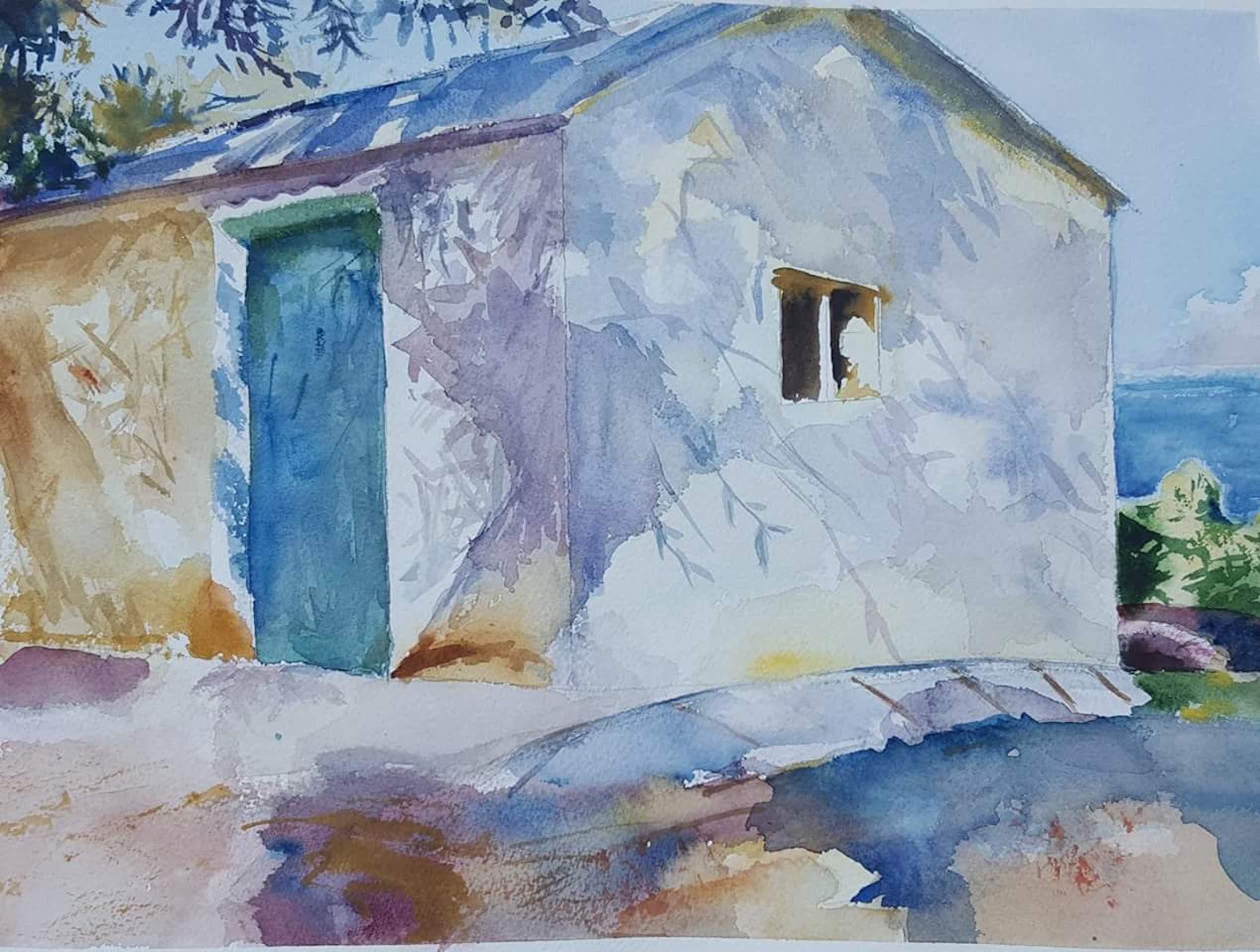
1. Watercolor Layers preview: wait a little bit of interest on to lead the eye into the painting from the left hand corner. How everyone and thanks for taking the time to pop by and check out my lesson. I really appreciate it. I've devised this lesson for beginning. It's going to be eternal study. We're really gonna be using two colors. Sometimes try to make slighter colors by adding white. Why, that's okay. In some circumstances, I want to show you how the wonderful transparency of water colors collaborates with the paper that's underneath. Um, painting is a language. Its official language on just starts in a language you could probably learn to recite a poem, say, in French on it would probably sound really correct and musical. But would that mean that you're fluent in French paintings A bit like that as well? You could copy on follow your tutor step by step on, make replica off their painting on you do so replicate their style on. It wouldn't necessarily mean that you know how to pay. My objective as an instructor is to give you the skills so that you can become fluent in painting so that you can elaborate your own concepts in your own painting, so I hope you'll join me in March. The lessons I teach you. More advanced tricks and tips, but this lesson I've made it really simple. There are no white highlights that you have to worry about living in. Even though it's simple, I think you'll come away, learn it's really useful things. Indirectly, you're learn about perspective, about tone on why to get the hang of using different consistencies of pain. It's a really useful skill to pick up. So follow me over to my lesson on I'll see you there thanks again.
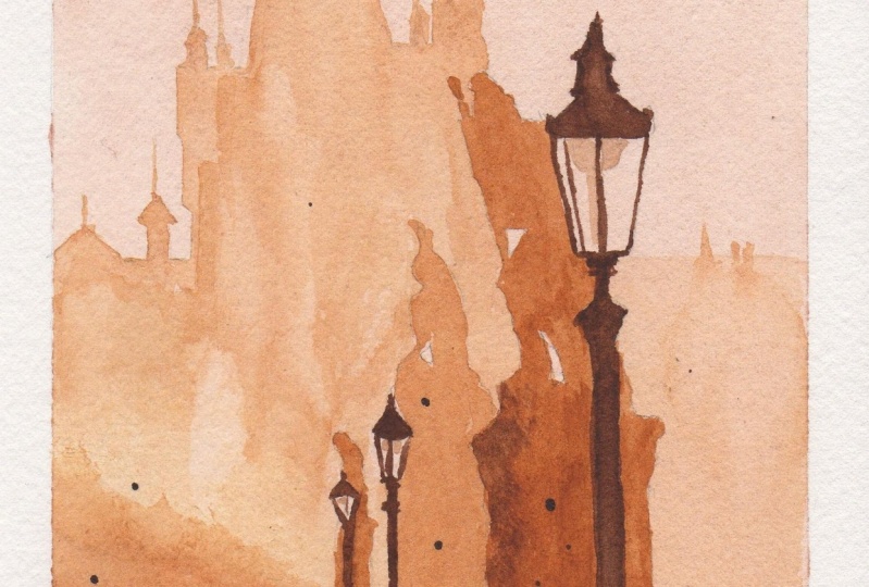
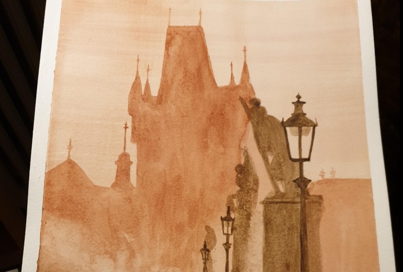
2. Watercolor Layers Pt. 1: on. Welcome to this lesson. I've decided in this lesson to do an exercise to exaggerate the concept of using layers. And what color on DSO This photo that came across has thes really distinct layers. So I'm going to do some with just two colors on. I've already drawn up. I'm gonna car and raise a little bit here because it's so going into the mist, so I don't want a hard outline. Otherwise I'm gonna lose the effect that I'm looking for. So I'm gonna leave that really faint If you don't feel confident drawing by freehand, you can trace the subjects with graphite copy paper, not carbon copy paper, but graphite on DSO. You could even do this exercise with simple shapes. Andi, let's get straight down to it. Two colors I'm going to be using ah, raw sienna and burn number of a handful of my usual brushes here that I've already used this morning. Ah, big square A mop small screw up My lovely dagger a rigo this bamboo calligraphy brush on my soft round brush. These rule dampen the moment, but you can see what types of brushes they are anyway. So the first wash we're going to be doing is the background wash, of course, which is the lightest so I'm going to do is mix a very watery raw sienna and go over the entire a sheet of paper, which, by the way, is a 600 gram called sheet of Fabbri on Artist Eagle. I had dirty hands, but never mind. Hopefully, it won't shop too much. Let's get on with it. So some mixing up a really watery roll sienna hair I want it to be like a week T Week. Tin England Recall Gnat's Pee hers. Just to give you an idea, it's really, really quite week. I don't want it to Dr Start Off with otherwise. Otherwise, all of my colors or my tones will be out of the proportion. I have my board propped up on my reference photo here handy. So let's get started. You can follow me step by step board. Just watch through and then have a bash on your own. It's up to you. Try mix enough paints that you've got enough to go through the whole wash. Otherwise you might not get the same tone. Don't forget, the darker colors are going to go over this so it doesn't really matter where you go. And I've chosen this photograph because it doesn't have any white highlights that you need toe leave out so you can actually go over the whole sheet. So that's why we want to do Onda. I want that to dry off slightly because to get that misty effect in the background, I don't want to do wet on dry. Otherwise I'll get hard edges. On the other hand, if I do wet into wet, then I won't get any definition of the outlines. So it's got to be just stamp, so I might, you know, tip the board up. Use gravity to help you. Andi. I'm gonna tip it upside down a little bit because it's slightly lighter in the middle, then at the top. So let's see that runs down on, and the way you can tell whether it's wet or just dumped is you look at it against the light on, and if it's still glistening, then you know it's too wet just to paying the board even more. Make it run down. It's not running down very much because the paper is so absorbent. But just a little bit just to see if it makes any difference to back up the right way. Now why, That's drawing off a little bit more. I'm going to mix the next layer, which is gonna be the same color. Still my rule Sienna, but a little bit more deeper in tone. So it's gonna be a little bit more then some gonna have a little bit more pigment, little bit less water in there. Andi, I'm going to get in the finer details with my small rigger brush On. That way, I could also test to see weather. It's the right consistency. Just having a look to see. I think that it's dry enough soon Find out that there should be. Doesn't seem to run too much, - going to use the same brush on going to start in the middle, just in case it runs out too much. Gonna feel to see if the paper is drying off or not. Seems to be okay. Quite a world to find inch, but I don't want a hard edge somewhat about that running down. She used that strain up this edge where I couldn't get in without big brush dried Now I quite like the way that some you can see it. We can't concede that something's there. Buts. It's not a perfect outline. This is really just an exercise. Paper is quite expensive. How are we going use this small squirm? Oppa's? Well, I want to dry that brush off. I was just rinsing it out. Could get quite good points on these little square mops because they were originally brushes for calligraphy. Just keep having a look at my reference photo just so that the art line is a recognized boy . Outline. This is a photograph of Prague back to my big brush on just really just coloring in this large shape. Look for the large shapes. Governor, All of this, any white pieces is just this scrap in the leg. It's the same color as the sky Andi. Another pace just in hair somewhere soup. It might be OK than the rest. Just really almost straight over. Could leave the lumps because I could always go back to those on there are slightly lighter , and I'm going to stop that this straight line here cause I'm gonna do that afterwards. I also got this line here to do. We're awfully there. Probably a couple of chimneys in there somewhere. But my little screw him up just to break up that line, I leave that other mark. Okay, so there's a bit of smoke there. One not smoke, but missed. So I'm gonna make it a little bit light on by stopping off here. I'm just put it in a little bit more. The spies Just a tiny bit. So a stub off approximately. I can see that Missed And see if we can get that Mr. Effect. This is the time to do it. Whilst the paper is still moist while this is still moist, going to go back in the bottom area of them, put in some more pigment so well mixed with where I took off the pain and hopefully give that sort of smoky effect on die also took off part of the other column. So I'm gonna put that back in. When's use the biggest brush that you can get away with a job that helps keep your painting loose and take out a little bit. Ground the back here as well. Contrast with the structure still wet enough. Moreover, hair again. But my stature back in a tiny little bit more pigment while it's still wet. Okay, some cereal while it's still dump, I'm gonna drop in a little bit of thes darker colors. This here so that it can expand and melt into the other color. I'm gonna go over this anyway in a second, but well, it's still dump. I can see bits and pieces here and there. I could do now little bit hair as well. What's enough? Just during this, because it's still dumb.
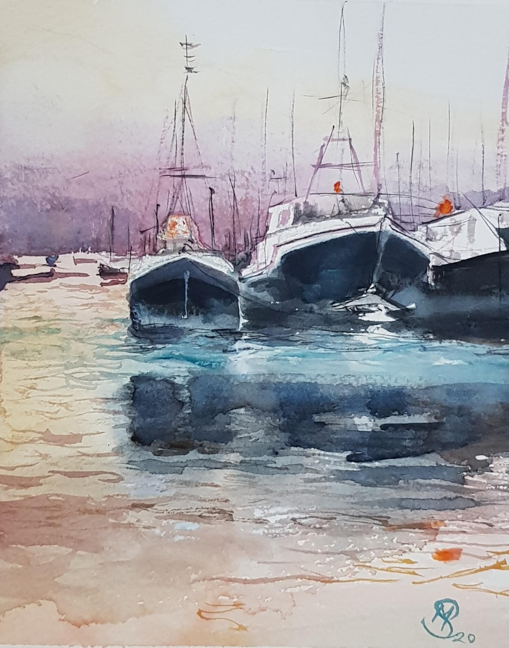
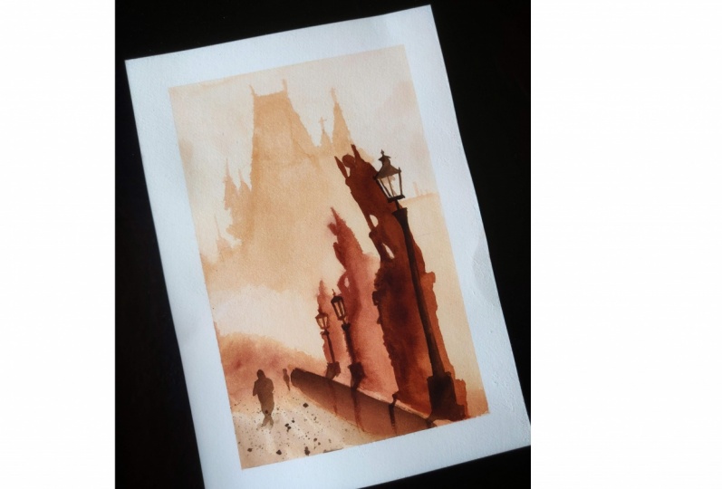
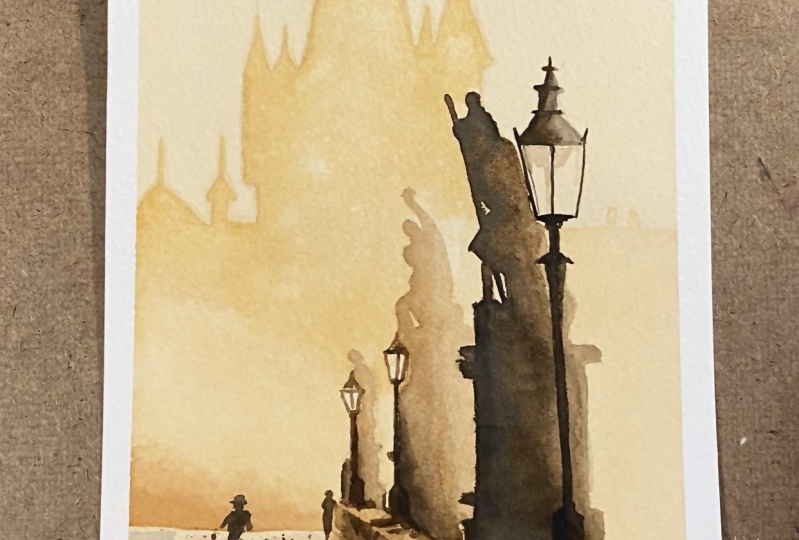
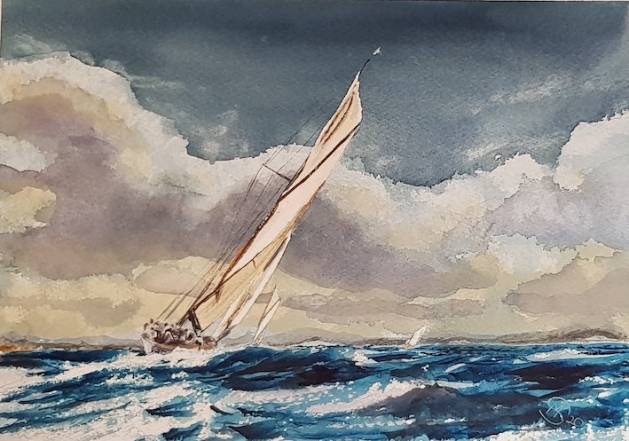
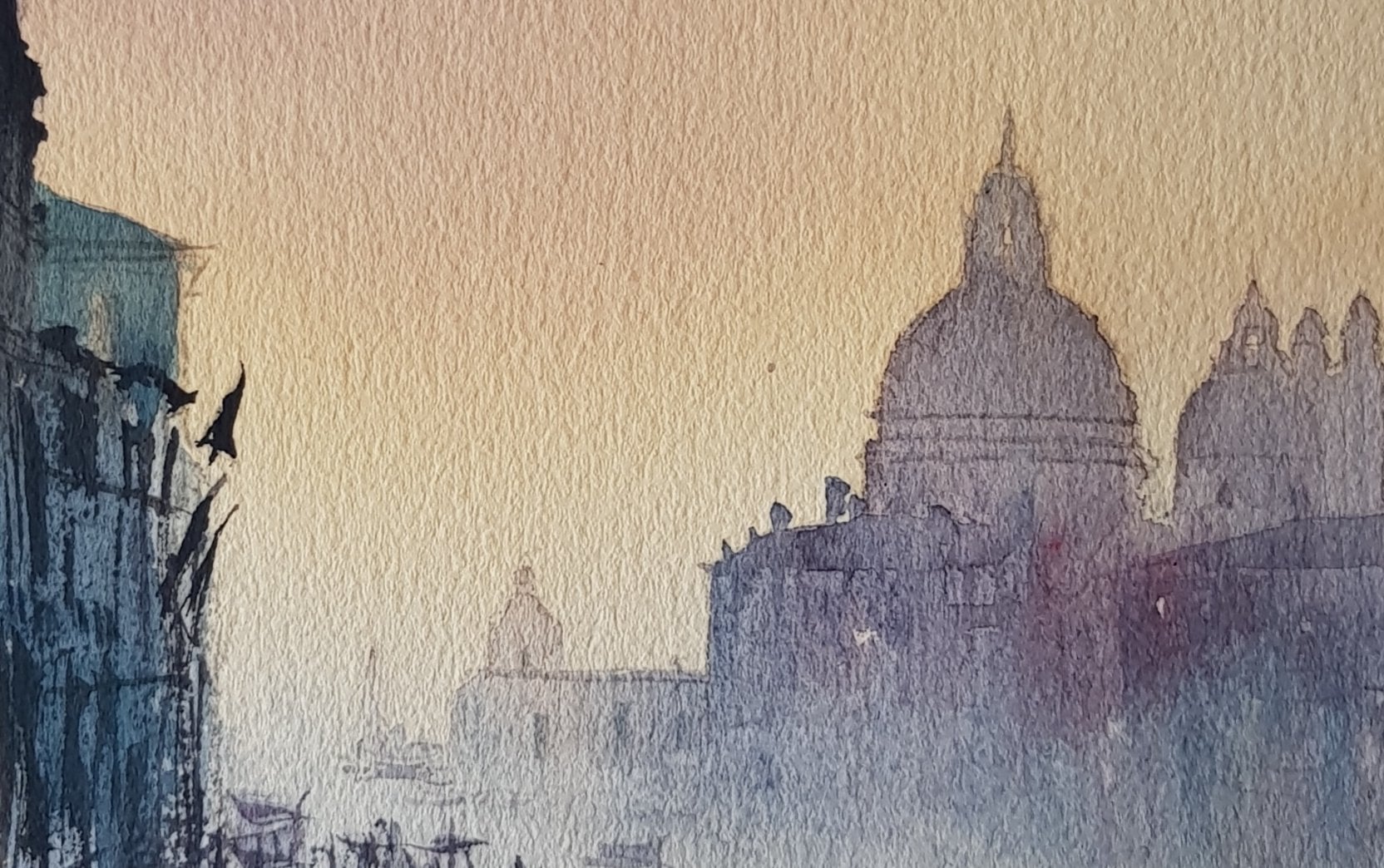
3. Watercolor Layers Pt. 2: I'm gonna do thes slightly dark tones here. Andi. I'm going to add a little bit off burnt number to some Santa. The one in the background Just gonna be very faint. So still very week. Really Very watery. Still a little bit dumb. Start with this one. I don't want a photographic copy. I'd like it to look as if I was there when I painted this. It's more really like us. Quick sketch. Take some off. Now this one should be dry enough. Skip that lump outlined. Just avoid the light apart, Caesar to draw. When you have a photograph for something, the same sizes, the paper you're drawing on. I've done him a little bit too far up, but it doesn't matter. Two slipped in it off. Dab a bit off Here, make it look a bit brighter coming from behind because I have the silhouette of the other one in front. So you make stand out a little bit more. I took too much off. No, sir. While that's where I'm going to drop a bit have been number into the corner hair underhand doing that while it's where is going to run Andi Mingo with the other color myself could do the bridge with some. Um Well, little bit. Don't, sir. Don't to look too flat. So a little bit more some places and others just that sort of half of a dry brush stroke makes you look a little bit like the Kabul's that are going to be there could also do this now I could do the other statue, you know, go over the whole statue with a quite weak but, um, ball. And then I'm gonna have a small pigment on top of it. Quite a good outline. I don't wanna go into the lump. - Now . That's where I'm gonna drop some more pigment into the areas. It's in the shade. Or should I say is a silhouette isn't really shade using the point. I need some new brushes, So thanks for your support. Everybody greatly appreciated. No. No, but to dog still wet. So should expand, mingle with the other color on the other side. Got to get just the right amount of water. Otherwise, the water's gonna run into the darker color instead of mixing. It's actually going to make it lighter. Bring out a bit further. Glam pose bid last thing a little bit more in here. Stock hysteria. What? It's still wet. And even though it's a cigarette, it's not a whole block of black. It's different textures in there. I don't want this lamppost too dark. I presume this is a person. While that's trying, going to do the foreground, so different textures. I don't really want to start drawing every single little star, and I'm just gonna squint. Remember to squint every now and then just put in some texture, really another wall overhead. I'm looking to Jordan Andi, A little bit of our the humble top trump end little. It's flashes little dots of color, Aunt. Now it could do some spot a ring around that. Quite a thick Micks job of the two colors. Andi, I don't want it to go everywhere, so find a way of masking off. You have to use masking tape. Yeah, Now, if I wasn't trying to keep this with just two colors, I probably used blue or purple, some other type of color. All we want is a little bit of interest. So everything doesn't so flat on to lead the eye into the painting from the left hand corner. If that. Do you really want that? Left No mind. I could do the slump one my chin and thinking about what to do next. Just quite pale to dog. Get more water. Just tip More water should be OK on. Don't do this other one as well. A bit more color. Slightly dark, huh? On def, His dry conduce that figure this well, I think I'll do him with my little dagger brush. Just washing. This can remember color had on there, right? So try make him look as if he's walking the shoulders. Islam one way the hip. See other win bigness walking. It's not too much detail in him anyway. Well, actually make him slightly lighter at the bottom. - Put in a little bit more texture on this war, lifting off with some clean water. Now for the lump post use. Why Bamboo brush? This is the darkest of all. So I want some really dense paints not so dense that it just looks black andare Probably go on the left hand side and them drag it across with some water and see just one last thing probably they need to do. And that's to put in some darker turn in there. Andan. The other lump. There are a little bit too light, and I could lift that off. It was still staying it just enough. It's gonna put slight shadow around the feet of the man. Very slight. It's I got hardly any color on here. It's just water, really. Two stark in this part. I don't touch it anymore. So I think we're done. Take off the see what it would look like in a frame. Yeah, so thanks for joining. May I hope you learned something from this lesson. I'd love to see your efforts as well. If you want to leave anything in the discussions, then be really pleased to have a look at your work. Thanks for supporting. May Andi, please leave a review. If you've took the time to actually watch through this lesson, I really appreciate it. So searing my other lessons. I have one on a little bit more advanced lovely sailing boat. That looks difficult, but actually, if you follow the lesson, you might be surprised that you can also paint the same subject. Andi, I was painted a really nice scene of Venice eso that tourists for an intermediate level, probably, but have a bash anyway, I noise try again on Did you learn by errors? More than anything else. So the more you paint, the better you get.
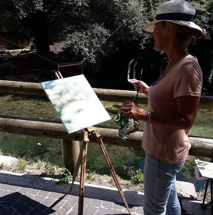
 Michelle Smith Watercolor, Watercolor Artist-Sommelier in Rome