Transcripts
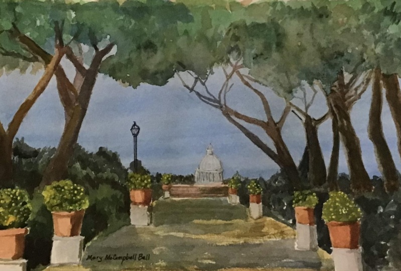
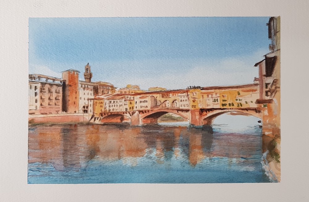
1. Introduction to my 'Painting Rome' Lesson. Join me!: What colors we use by artists before cameras were invented to record what they soul so that they could use those as studies for their main paintings. Once they got back to the studio, we've got paint him planet today. But the thought process is the same. You should plan your painting ahead and these stages can be used for any painting that you do. So join me in this lesson and I'll guide you through our completed painting of a view in Rome, which I'm sure you will love it soon. View of St. Peters from the Jue De Ni De Lian Xi in Rome. So just imagine that you're sitting with me and we're painting the view that we can see from the park.
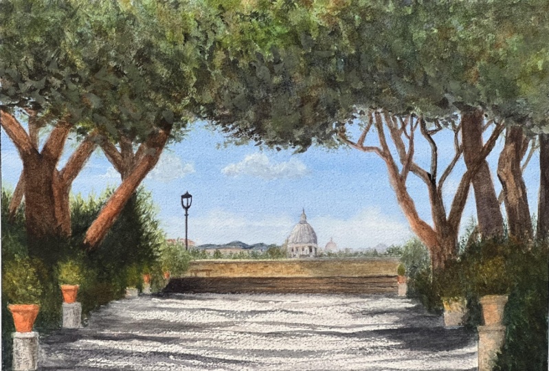
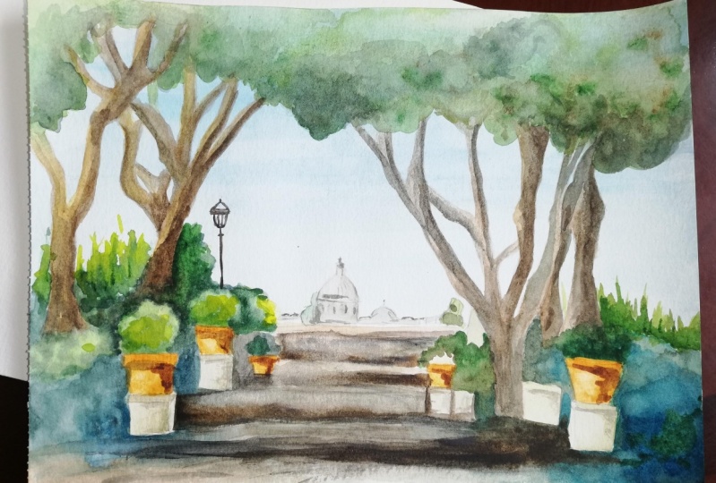
2. Painting Rome The first wash for the sky, and putting in some mid tones on the trees: Hey everybody, thank you for joining me in another lesson. Today we are going to be painting row. Here's my photograph, my reference photograph. It's severe. St. Peter's Basilica from the Jacobian in Delhi around. So just tried too much in that you're sitting with me in the park and painting the view that we can see. I only have three brushes, so I'm going to be using this soft round brush, flat round brush for the sky. Then I'll mainly be used in this little square, a mock pits of size three by Rosemarie. And I've also got this rigor. I'm only going to be using this for the lamp posts, so don't worry if you haven't got one of these, you can I'm sure you can find some other brush to paint in the lamppost right at the end. Let's get started. First of all, let me tell you the paid part. I have sheets or quarter sheet of arches, 300 gram semi rough paid part, and I've taped it to my board already. I've already drawn up the major outlines of what I want to paint. If you followed any of my other videos and you know, by now that are usually prop up my board at about a 3040 degree angle. This way can see the shadow here on my palette. I've got my usual pilot. It's quite dirty at the moment, but that doesn't matter. Some colors wrong there, but I'm gonna need anyway so I don't always clean off my pilot. It would be quite a waste of colors. So we're going to be mixing the blue for the sky. I hardly ever just use colors straight from the tube off from good debt. Colors for skies of Kabul, Lou, and also may be very watered-down ultramarine. The sky in Rome is typically lovely in blue. I'm going to mix my own blue and just play around for the different blues I've got on my pilot until I'm satisfied with the type of life, God, and because I haven't got any space on my palette and you were clean. I'm going to be mixed in the sky color in this little plastic dish. First of all, I'm going to put in some cobalt blue straight up the tube. I haven't done it yet. So just put in some water on it now and I want to mix it in that I didn't small water. Move that over here. Paint underneath his dry erase. Some are going to get to this really bright Kabul. Different makes, paints vary in the actual color that you get. So that's why it's good idea to get to know which company actually makes the type of colors that you like. Here I am just putting all my Blues in, so there's a mixture here. Sorry, like this at the moment, but we'll get there eventually. And little bit of Prussian blue, something down here. So I can indigo. Don't forget that color is going to dry lifestyle on the paper. You could even not have a blue sky. You might decide to have more of a sunset, purpley color. This one. For a bit of turquoise throughout tomorrow. It's nice to let yourself be messy. Sometimes. I mean, we're so controlled in part the funding, being creative, painting, to actually be able to do things a little bit messy. And this is turquoise. Athenian hack, right? Has got a lot in there. And I want to make sure I've got enough to cover the whole sky. Cathy, I've got enough in there now. Now what I'm gonna do, I'm actually going to, so my board up around the other way to do the sky. And I'll tell you why I'm doing that in a second. Johnny counter I need at the moment is my blows. So don't worry about not being able to see my palette. I'm going to just keep my brush wet, beef up some of this blue. And I'm going to go straight across from what is going to be the horizon line. All the way across. I'm going to pick up the blue, which is darker. So this is on dry PayPal. And you can see it's running down there. While it's still wet. I can still go cross it. Covering up those little white marks. The reason I've got it upside down is because I want the darker color to run down. So that when I turned up Ramya way, the sky at the top is going to be darker. So I don't like that strike there. So I'm going to go across so I'm just going to let that run down a little bit more of hair to get rid of that strike. Wanted a little bit darker down the bottom here. I'm leaving that a little bit. I don't want it to dry off to march, but I'm just going to let it run down a little bit more. Give it a hand with gravity. Get it to run down. And don't forget, there's going to be trees painted over a lot of buzz sky. So the part I'm most interested in is the middle part here. So I think I can turn that back up the right way now. I've turned my board backup papers dry really quickly, so I better hurry up and lived off some of this branch. I've actually had to put some water on your brush to try lifted off because I'm pushing the papers Dr. Wild's 71 camera backup, but I'm only putting it in the middle because that's going to run out. Otherwise over the edges. Let me put in the middle to try and avoid running out. Beyond the drawing. Done this straight away instead of messing around with my camera, then it would have been just lifted off with the paper towel. Just lifted off. So if you're quick enough, when you do this, liftoff, the color. Just using your paper towel rather than 19 the water to your brush. That's what I've had to do only because my paint had dried. Anywhere else and reflections I might take some off hair as well. Just where it's darker is already quite light down here. I know another place I would like to take up some of the blue is overhead. So I'm just gonna put in some there, lifted off quickly so it doesn't cause too much love bloom. Again, as I said, if your paint is still wet or still dumped, then you can do that without adding any water. Just usual paper towel. Now I want to make some green for the trees. Got some various greens on my palette already. I'm just going to put in some different green ten courseware that white is underneath. It's gonna end up being a little bit lighter. Which is, was the whole idea. If you want to paint loosely, we do that is by not holding your brush as if it was a pencil. You don't know how to brush as if it's a pen or pencil. Further down the handle that where your brush marks are going to be much less contrived. See where I took the blue or the green is little bit lighter. So it's gonna look a little bit of light reflected onto the trees. Some of this is going to be darker and I'm going to put in that dark while the underneath Layer is still really quite dumb. So now I want to add to that some of this Sienna. I'm not going to draw every single pine needle and I'm just trying to make different areas of different colors. Going to keep working at my reference photograph. And squint just to see where the darker areas are. Got some CPU which is even darker. And because Fiat and not even to the burn center, for example, I'm going to get a very dark green. Green is one of the colors that you hardly ever have to buy. You can always make such lovely green on your palate. So just stop in on, and that's going to run in the other colors. Cpr, then CNR underneath here. So those colors and mixing together. And just representing the train ticket, you view a painting from a distance. So it's the largest shapes that you want to concentrate on. No-bid Payne's gray here, blue. Over here as well before it dries. These Mediterranean pine trees, umbrella Pines, their nicknames. They're quite flat on top, so that's where you get a lot of shadows underneath. And here I don't want such an obvious and regular edge. So I'm just going to put in a couple of little dots, irregular dots, just random. I'm looking at my reference photograph just to have an idea of what the darker areas are. Just mix in some Payne's gray with CPR. Make it a little bit darker. And because the paper's still wet. Now we're going to run in together nearly down. Even a little bit dark costs which make it.com just might can the papers very wet. So it's actually going to dilute itself on the PayPal. I would say that this is quite a creamy consistency at the moment. And here as well, pains brain that she'll get a little bit of blue. Prefer the blue to the gray. You can't really tell where one tree begins, one end. So that's the idea you want to make. The shapes merge and then the painting will look less. Betty. And another thing I prefer to do the whole painting altogether. So you should, starting from the top to the bottom, you paint him will be much smoke cohesive. If you paint the whole painting as a whole, rather than a bit hair, a bit there. And just painting a little section at a time.
3. Painting Rome Moving down, we start filling in tree trunks and plants: I'm going to do now clean my brush. So I'm mixing here. This is for me an orange on top me and reds. And I want it quite watery, but I still want it to stain the paper enough space so my pellets or just find a little place where I've got something. I'm hoping this is the right consistency where I took off. These highlights. I want to put in my orange. These pine trees have the most amazing orange colored bark that when the sunsets and the light hits the bark, they really are orange. So I want to recreate that type of effect. So here we go. I've got my paint on my little square up. I've got a feeling this is going to be a little bit to dance, but let's have a look. And it's too dense. So I'm just going to add some more water to that. This is a color that if you get it too dense, then It's a completely different effect because it's quite opaque when it stands, but it's nice and translucent when it's the right consistency. I don't have to worry about where the shadows are at the moment because I'm going to do those afterwards. But I'm calculating, I am remembering the light in the photograph is coming from the left, so shadows are going to be on the right. Just clean my brush because i took some green off with Detector. Five left the blue underneath, then it would have been obviously a completely different color. Right up to the edge. Computing summit parents. Well, it's not in the photographs. Look how much I'm managing to paint with just one of my brush. It's because you're squirrel was so perfect for doing details whether fine point, because the body here holds an awful lot of paint. And this idea, when you're painting, to always use the largest brush that you think you can get away with using. It makes your painting a lot. And I want some of that overhear as well. Need to load when Bashir try and keep the same consistency as before, even though this branch is quite darker. But I just want to know that I have the orange highlight. I'm gonna set my reference photograph every now and then. When you have your head in the paint tonight there sometimes you can sort of lose track of the lines. And why painting or of the tree, even though I'm going to be painting dog over the top afterwards. I will have wet paint underneath. So if I add another column, it will mix together. Just trunks. To get them. To do this, I've got to make sure that the paint underneath so just slightly damp, but at least I know it's not going to run out of the boundary and it's gonna stay where I wanted to. Okay, so now to those tree trunks, I'm going to add some brown. It's quite a ready Brown even in the shade. So I've got some burnt sienna CPR and I've put it over that green that I had to underneath them. And I'm going to have a little bit of Payne's gray. So let's see, this is the right color. And I'm gonna drop pen bits, the orange, but it's still gonna be in places where I want to keep. Some of this will end up being a dot count because the trees are almost against the lights in the sky. Well, now I want to keep in the right place. Because this is a little bit a little bit left. So obviously afterwards just wanted just to stop doing something this brush and drag it across to because I know whitish gray gravel. So if I just drag across, then hopefully get that type of an effect. Now, homeless start filling in some of the biases while I've still got this orange color in the pots. So I can pick some soft brush if I think it's too dark grey with some white in it, to give an idea of the volume of the stone here. There's not a lot just enough to stay the pulse. So afterwards. So imagine this now, the paint underneath is still can hardly see this photograph. I'm just being very rough. It can dry my brush brush and cross back. Just a gray color. Just makes him whenever I have on my palette, steps.
4. Painting Rome The Foreground: Mixing some at some yellow. We need to saturate that a bit. So I'm gonna add some CPR and Payne's gray. You don't need black on your palate. Unless you go to Venice, then you will need black. But you can make your own black by mixing all of the colors that you have on your palate. So if you were to mix an ultramarine and a burn on bar, you would get almost pitch black depending on the make of the brand of the pain. But generally, that's enough to suggest black does matter if these running together. Actually, I don't want too much detail in that area. There are things you can't pick out in the photograph. So it really doesn't matter if the soul just mangoes in together. This is the focal point of the painting. These areas. And so more hair. And while I've got this very dark color, I'm going to add some other shadows in here. You probably see that pulled lie under these trays. So see if we can get that sort of an effect. Okay, I could even do it like that or I could color the whole thing. And then just flipped some of which I like better. So let's do over here as well. Little bit darker here. Let me little bit more brown in there I think is to green in all different colors is gonna really make it look a lot less flat. I'm going over a lot of the painter painting before, but in what Kelly do, the dark colors at the end. But the lowest pay something of what you put on first underneath their defect as well of glazing obviously, Ruby Payne's gray. Various points. Because all these columns running together. As you know by now. No, I don't like that hard edge. So I'm going to just clean up my brush and drag the brush down the middle. And that way some of the orange is gonna come through. So I need that color as well. On the other side, I want quite straight lines. So because I've left that light green underneath that when I put the dog running, it looks as if the light's hitting. So, um, I add small dark. Afterwards. I'll stand back and have a look to see if it needs to be done. So now we're gonna do some negative painting round till you've probably wondered why that was not. Well, most of that is going to be dark at the back, which will make the plants in the pots jump out a bit more. So I've got a sort of a blue hair. Sort of a blue, I've gotta blue here. And I'm going to put small enhance, make it even darker. Just various spots hair and had some of this Sienna to the blue, dark green. And do the same over here. Doesn't have to be exactly like the photograph. We're given an impression of what Stan. Try not to leave white outlines around your objects. Rushes to dry. Just grab some brown. It's mixing together until I get the dark green I like, but still quite a bright grain. So I've still got quite a lot of real arena and just put it in the plants, just make variation of the greens in the plants. Some may sound a little bit wrong. Color needs more red in it. Denote some hair. K sum. Now, this line across here, the submitter green trees in the distance, hen small umbrella pine trees. And just put those in Mark got the grain handling and just put in some yellow highlights on top. This is quite a yellow, white. And yellow. Plants in the shadow has, so we're not gonna see much detail, but I don't want to change. The tone is going to be the same time. Dark enough hair. So you do smocks with some sky. Between it. Like this, then is going to be more realistic. Quite a dense color here because paper underneath is really quite wet. If the pink diaper on top is tuple tree, it's just going to push the color par. I wouldn't wet enough so that the colors mix together, but not to wear, that it creates too many blues. It's a little highlight. Now, a dark gray. Just to do the steps have put the lines on fast. Then not really clean my brush, but just take off some of the color and then drag cross. Still be up to see a little bit of the line underneath. Just enough to give an idea that there are some steps. Now this part of the war, the same column. I haven't drawn in every single detail that's in the fight graph. Ok, so now leads us to things. The buildings and the shadows in the foreground.
5. Painting Rome Darker areas and final touches: So first of all, the buildings now this is where I'm gonna use white. I'm going to clean my brush with the same brush. And I'm going to mix an opaque gray, purpley color. Because the dome of St. Peter's and the church there has a certain weight to it. So it's obviously going to be opaque. I look at my reference, anywhere else I can see a little bit. So I want to add just random. It was important to get the outline of the DOM. Correct, because otherwise you're not going to recognize it. Now. Makes various colors together. So I've got y, so I've got some burnt sienna. I've got a little bit of pains grand and little bit of blue. I'm just going to put in drops him. Just where I had the shadows underneath the details. Little bit.com on the brush and just mix it together. Very pale color. So again, this is just an opaque gray color. I'm gonna need some more Wi more dense is going, depends. Withdrawing to get rid of the dot-com, OK. Get more white. Looking at my referenced by its graph. Can use come going to let that dry a second because I need to put in some details. And this small trees as well amongst those buildings. Just going to put some green in the distance. A lot of trees in rhyme. Now what I want to do is the shadows here in the foreground. So snow black kids, not brown is no. Blue. Shadows are often a blurry, purpley color. So I'm going to mix colors and see what sort of a dark color I can, I can get. So what if I mixed live? I've makes some CPR. That's quite a good color, maybe a little bit more blue. So let's see what this looks like. Some cleaning some shadows. Obviously, I'm trying to keep the ones that are in the photograph because they're objects that a casting shadows across straight from this dock needs to be a little bit.com. And under the chair doesn't have to be a continuous line of claim abroad as well. At some point you stop even looking at your reference photograph and just do what seems to be looking right on your painting. Stored in dark shadows. And so I've added a little bit of red, which is actually Alizarin crimson. So I've got a dark purple on my brush. I'm not really satisfied with the color of the dome. I'm going to make it a little bit more of a very, very powerful and opaque highlights on top of that. Covering up the pencil marks. So really a good idea to fit around too much. It's best to get them right breaststroke, right at the beginning, but it doesn't always happen. As soon as the final result is something you are pleased with, then does matter if you have to tweak a little bit at the end. And you probably know by now if you've followed me that I don't mind using y. I'm not purest as often say. John Singer Sargent. He used white, put in highlights or who's good enough for him? Well, I've been called Change brush. Once I get a brush, my hand contaminated. Now the last thing is just using some. Here I am holding like pencil because I'm drawing the brush. Just want to stand back and think I'm going to stop. Quite dense. Paint underneath is still going to mingle just to break up and dominant. And just to make it similar, but a little bit of blue over here as well. Let's see. We need to do is take off. You stick it down. Then you get this nice clean. Your painting. Thanks again, everybody IP light the finished product and it forward to the next.
 Michelle Smith Watercolor, Watercolor Artist-Sommelier in Rome