Transcripts
1. Introduction: Are you learning watercolor, but find it to be confusing
and causing anxiety? You try to follow all the rules, but can I get stuck in
knowing what to paint? Well, I've created
this class for you. I'm Tammy K, and I'm an artist, an art teacher, and also a mental health
therapist working in Arizona. I love to paint loose florals, loose landscapes, and even
sometimes some loose birds. Because of my mental
health background, I love to mix self care in with my painting just to help
you guys learn to relax, enjoy, slow down,
and really learn the process of being able to paint without that
fear and anxiety. So I recently published
some classes on loose florals on scale share and you can find
them in my profile. One of them mixes in concepts on how to let go of
perfectionism in your art. And the other one is to relax and find joy when you paint. So I teach watercolor
across a number of platforms and
across social media. And one of the things
I hear a lot is that students aren't sure how to
paint outside the rules. You need the rules so that you can learn this tricky medium. But then it can be hard to let them go and no
one to break them. Then the question
is, what if you don't actually know
the rules yet? So in this class I've set out to teach you
guys step by step, those tricks and
techniques that I have learned along the way in
my watercolor journey. After that, we're going to put all the things
together that we've learned to create a loose and beautiful
watercolor bouquet. So this is what you'll learn. Why paint with watercolor, palette and brush care, Swatching, water control
and color mixing. How to hold your brush types of brushes to use and they're marks And also
watercolor washes, textures and leaf and
floral brush strokes. So this class is
for beginners who would like to learn
the watercolor basics. But it's also for the
experienced artist who may want a
refresher on the basics and also want to
learn how to loosen up and really just create
outside the rules. So as you practice the exercises
and the final project, I really hope that you get a new sense of creativity
and confidence. Excited to venture
out on your own, forgetting the rules when you
don't need them so you can experience your own success.
So let's get to it.
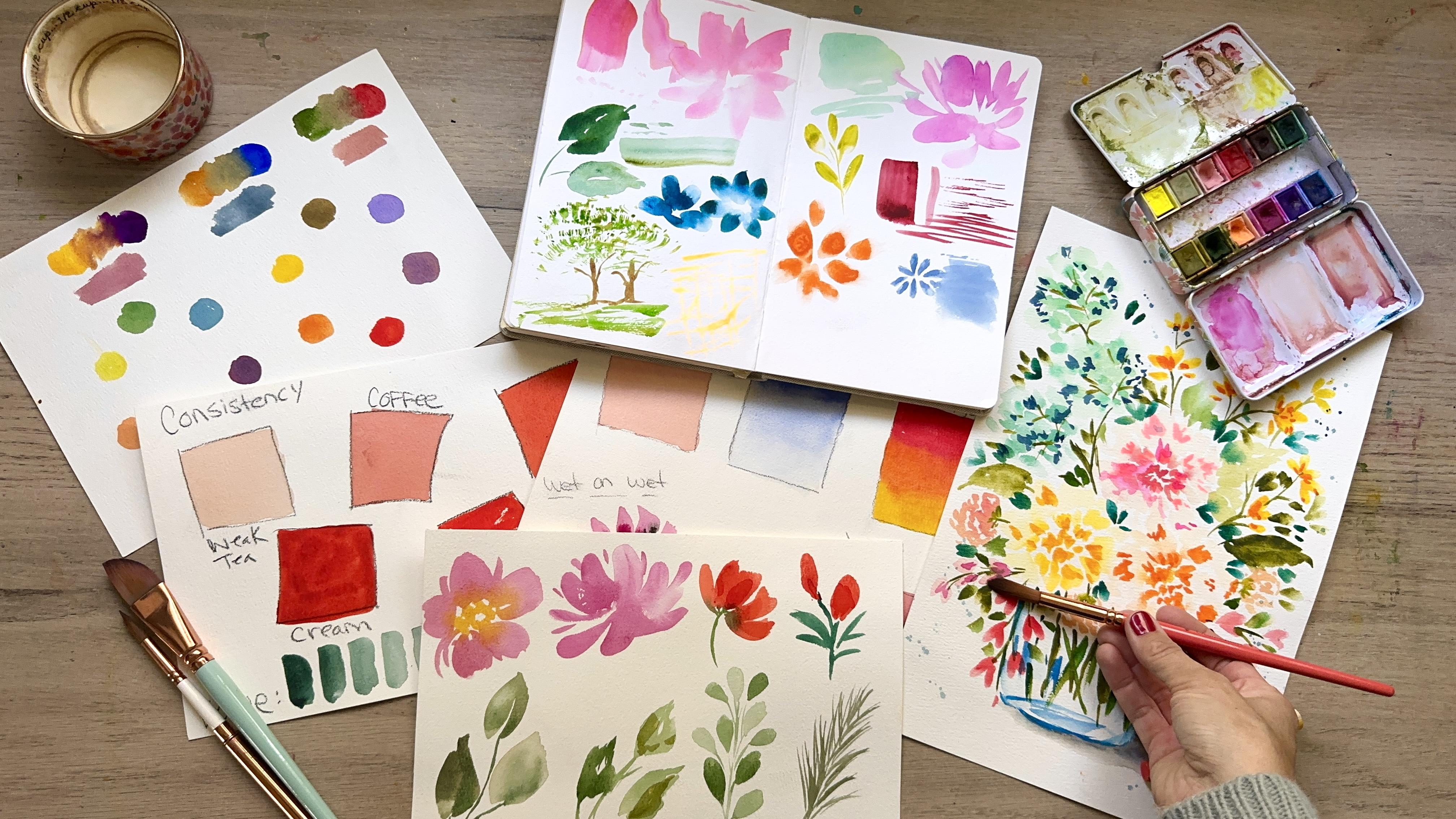
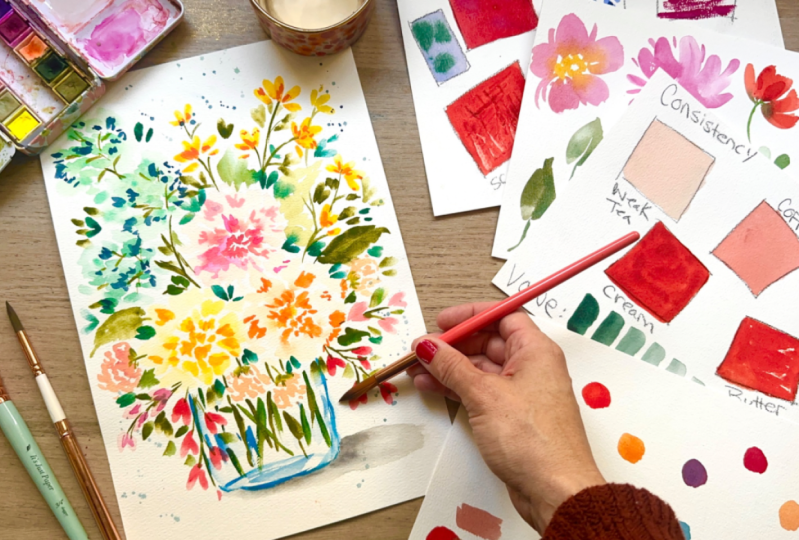
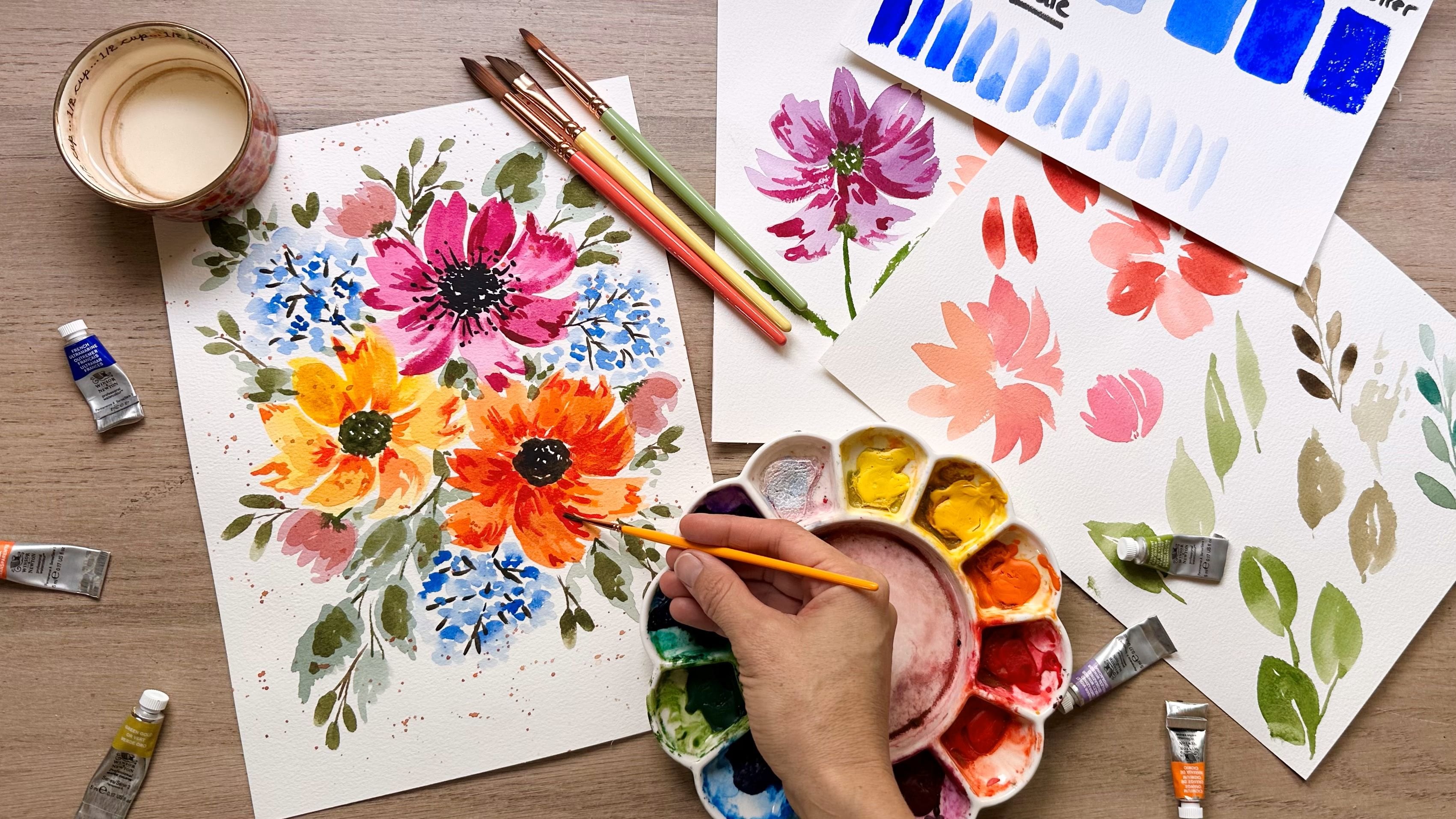
2. Your Project: For our final project,
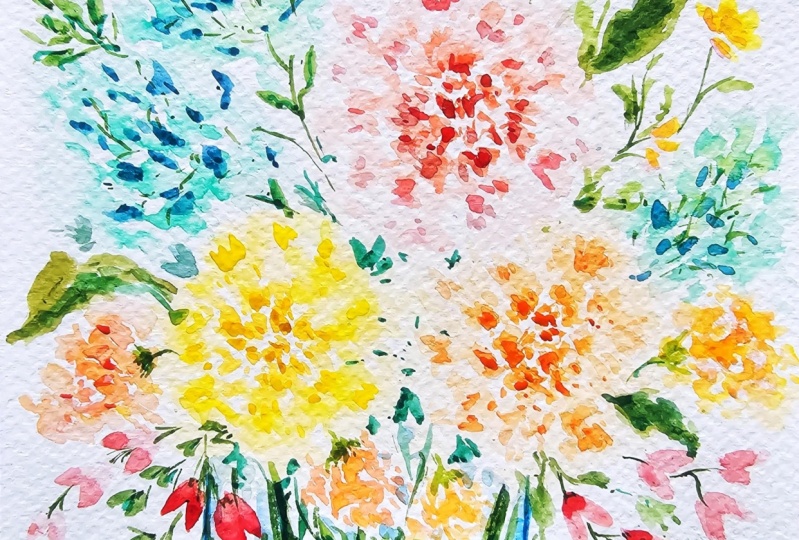
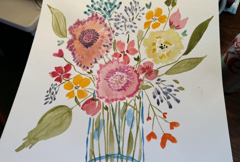
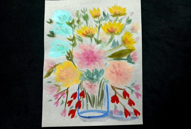
you'll be creating a loose and vibrant watercolor bouquet
with lots of depth. Like this one right
here, you'll be using the techniques and tips
that you've learned in this class to build
up this composition. You will learn to build up a loose floral bouquet with
base layer of focal florals, filler florals and
stems and leaves. Then you'll be adding
in texture and shadow by using the
wet on dry technique, which is also called glazing. Then finally, you're going to be venturing out on your own in the final piece as you get
to choose the variations. So during this class,
you're going to learn the following
self care concepts. How to loosen up to create from your own experience
and intuition. And how to know when to follow and when to
break the rules. So for your final project, I'm going to be looking for
the following two things. First of all, as always, I'm not looking for perfection. I'm looking to see that
you did the exercises, you did the project,
you completed it. And the second thing is I
want to hear your story. Were you able to
relax and enjoy, and did you learn
some new things? Were you able to loosen up?
How was your experience? So I chose this project for you for the following two
reasons. First of all, because florals, in my opinion, are a really great way to start venturing out on your own once you start to
feel comfortable. And also creating this
simple floral project is going to help you
build your confidence, which will really encourage
you to continue to paint as you move forward
with your watercolor journey. When you're ready, please
upload your project to the project gallery so that
we can give you feedback, cheer you on, and just overall support each
other as a community. So in the next video,
we're going to be talking about the supplies that
you need for this class.
3. Supplies Needed: When it comes to the supplies that you need for this class, I will give you some
ideas of things that I use and what types
are out there. But the bottom line is to use what you have. All
right, friends. When it comes to paint, we can go very simple by getting a palette
that's already made, which has these little
half pans in them. And that's just good to go. You spray it down just
like it's sprayed here. And you reactivate the paint. Or you could purchase
little tubes of paint. And then you fill up the well of an empty palette and allow
that to dry for 24 hours. And then take your spray bottle, spray it down and you'll reactivate it and you can
start painting with it. Of course, you need
a spray bottle to reactivate your paint. It's just going to make your
life a lot easier that way. When it comes to paper, it's nice to have a large
piece so that you can do your bouquet and then
whatever papers you want. For the practice exercises,
it really doesn't matter. This is a Canson sketchbook and it is a very
inexpensive paper. It's really great for your
practice exercises and it keeps everything together
with this ring binder. And then I've got
the professional cotton paper for my bouquet. Now you can use this
for everything. You could use this
for everything. But the point is
that you use what you have and you don't
stress about it. So when it comes to brushes, I like to have three
different sizes available. I've got my number 12 round, my number six round, and this is a 100. But you can get a number
two just for the details. So the larger, first
layers of color, the washes with
the larger brush. Then for more details, you do the medium brush. And then for the tiniest
details you do the small one. Now when it comes to your water, it's good to have two things. Like for example, two jars where you can do your warm
colors and you're cool just to separate and keep your water nice and
bright instead of muddy. Or you can do
something like this, which has the two
wells built in. And last but not least, I
always have a paper towel. So when I'm using my brush and get some paint on my brush, I dab And that helps me
control how much liquid, how much water I'm going
to be putting on my paper. So in the next video, we're going to learn why we should even water color paint.
4. Why Paint With Watercolor: Why should you even paint
with water color for me? One of the things
is that it calms your nervous system when you are stressed out, filled
with anxiety. Being able to do something with your hands that's tactile, and that also gives you something tangible
that you can show. What you've done is a beautiful and
rewarding thing to do. It helps you to see the
world in a different way. It changes the neural pathways. If you're spending a lot of
time in your stress hormones where you're thinking
about trauma and the bad things
that have happened. It gives you a
beautiful reprieve from that world just to focus on something that is
exciting to create. Then also, we have to
talk about dopamine, because dopamine is the hormone released when we are doing
something pleasurable. And when we get that
dopamine reward, it helps us to want to do
that same activity again, later on it reinforces
that good behavior. So if you're spending
less time in your stressful part
of your brain and more time in the pleasure
part of your brain. You're allowing your
brain to heal and slow down from some of the things that
have happened to you. And I've heard some
people say before, well water color just
seems too hard to learn or I'm not a creative person, so I really can't do it to that. I would say it's
all about practice. If there's anything in
life, music, gardening, studying to become a lawyer, these are things
you need to do and practice to learn
these abilities. It's not something
that just happens. In the next video,
we're going to learn about watercolor palette care.
5. Palette Care: In this video here,
we're going to be talking about palette care. And it's definitely a lot
easier than you might think. I get the questions
over and over of, do you wash your palette? Can you use the paint
over and over again? Does your palette get too dirty? But if we take really good care of our paints in our palette, we can end up using
it for years. Here are some of my tips. As you can see, I have a
variety of palettes out here. I did show you that it's very simply a spraying down situation and then you
reactivate your paint. Whether you have a
palette that you filled in the paints
the way that they dry, it's going to be the same as these half pans here
that were already filled and placed when I purchased the palettes,
spraying them down. And I've got my brush here, I just grab the
paint that I want. For example, this tiny
little palette here. It's going to grab a little bit, I like to swirl around so that I can really mix that
water in with the paint. If I just swipe off the top, I'm going to get a little bit
of a colored water there. But if I really swish around, I'm going to get some
good thick color, then I can just take my paper, whatever I'm using
and add that there. Take off some of the water, get a little bit lighter value, take off more water,
rinse my brush, and just have some fun
play in your sketchbook. Now, demonstrating here, I've got my warm
colors and my cool, so can see I'm not going to mix them together and
get the muddy colors. But say, for whatever reason you don't have a lot
of space like here. I wanted to add
some red in here. But this blue in this screen,
it's going to make mud. I can just simply clean that out a little bit
with a paper towel. And I did mention that I
don't clean my palettes. You can if you want, but
that paint is still good, but you could always
wipe off something. If you feel like you
need some extra space, add in your red and
you're good to go. Just keeping in mind the
clean up is really up to you. But I think most
people can agree that this is paint we can
keep using over and over. And it's still going to be
good for a very long time. Now, I will talk
to you more about water control in one of our subsequent
water control lessons. I hope that you feel encouraged that palette care can be simple. In the next video, we're
going to put our palette to use and we're going to talk
about swatching our paint.
6. Swatching Your Palette: In this video, we are
swatching our palette. And it can be really
fun to do because you get to see all the
colors and the values, the lightness and the
darkness of those colors. Which can get you
excited about creating your own color palette for whatever painting
you're doing. All right, so when it comes
to swatching your palette, there's very few things that come close to how
relaxing this can be. I'm going to grab by number 12. I'm just going to start grabbing some of
these colors here. What I like to do is grab
some concentrated color, Then clean my brush, I dab it, and then we just start
to spread that out. And now you can start to see the different values
developing there. I like to go really intense with that cream consistency and then we get really light when
we add that water in there. If we keep our warm
colors together, then we're going to
blend them and mix them, and they'll meet in
the middle and create some interesting
blendings there. Let's do some orange. This is such a fun,
relaxing thing to do. And then you start to learn
about the different values, the lightness and darkness
of different colors. I'm not going to do
all of them today, but I encourage you
to try this with all the colors that you have and just see how
beautiful this is. Together, it's creating
a little piece of artwork that we weren't
necessarily planning on today, but we're just playing
and having fun. And you can see some of that paint and water pushing
other paint and water away, put some green in there.
We'll start with that. And I don't really
have a rhyme or reason to how I'm doing this. I'm just playing and letting
those colors naturally mix. And I'm not worried
about it can be such a relaxing thing to
experiment with your colors. Sometimes you'll get some
interesting color mixing that you didn't expect. For example, I'm going to
go ahead and attach these together and then they're
doing a little bit of mixing and creating a fun
little color in the middle. If you ever feel stressed about this procedure, please
don't remember. This is as hopefully
relaxing as we can get. You're even creating a pretty
art piece out of this. All right, let's add some
of that darker blue. I said I'm not doing
all the colors. There are some others
that could have added in. For example, doing the
black and the brown. But for the sake
of this exercise, we're just trying to keep
it really pretty bright. In the next video, we
are going to be talking about how to hold your brush.
7. Holding Your Brush: The way in which
you hold your brush really informs your
painting style. Do you hold your brush
really close to the tip? Do you hold it really
far out like this, or are you a mid holder? Next, we're going to talk about that hold and how that
affects your painting style. So when it comes to holding your brush, it
depends on the brush. It depends on what
you're painting. I have several brushes here
I want to demonstrate. So, for example, this
large brush here, I don't, I don't use
this for watercolor. I have used it one time. It's not my go to I'm
just going to like triple dip here basically. And I'm holding the brush, it's got this flat part here, just holding it loosely. Look at how fun that is, right? And you can kind
of go thin marks. I feel like I kind of hold it like when I'm holding a fork. Then I've got this
really long handled Filbert brush for watercolor. I don't need to handle so
large, but the brush is great. I usually hold it in the middle. The closer you are to
the tip of the brush, the more control you will have. If I'm wanting to do like these really controlled petal marks here that in I'm able to make
some details and just really have a lot of
control with the movements. Then if I want to go loser and I go towards
the middle there, all of a sudden, you know, these movements
are a lot looser. And loose could be good if
you want loose florals, but can also make you
feel a little stressed. Because you can't control
the brush as well. I prefer to hold it right
there in the middle, especially with
these brushes too. I've got a 12.16
same type of thing. You could hold it
at the tip and it's going to move and flow more. And maybe those are the kind
of marks that you want. It just depends on
what you are trying to make at that moment and
what your comfort level is. I don't really think about it. My hand just tends to hold the brush wherever it
feels comfortable for me. And of course, we've
got this little tiny detail brush as well. Same type of thing,
going really detailed, making some leaves that I want them to be just ever so perfect. And so I'm holding
it at the tip. That's not usually
how I paint for me. I like to hold it in
that middle section, so you're going to
have more wonkiness, You're going to
have more movement and you know, that's okay. Just connect those here. And that's how you
hold your brush. So now that we've talked
about how to hold your brush, we're going to talk about how
to care for your brushes. So they last a really long time.
8. Brush Care: So just like pallet care
seems like it's intimidating, but it's actually quite simple
also with your brushes. It is pretty simple as well. And if you take really
good care of them, your brushes will
last for years. So let's get into that part. I've got two waters here. Just to demonstrate
what my brush. Grab some paint, We'll
go with this blue. All right. So you
got a dirty brush. What do you do so you can clean
it in your well of water? Or if I have a faucet, I will let the water run in my hand and then I just swirl
it around and clean it. It should be clean
at that point. And then all I do is I simply reshape the
brush just like this, so it has that nice point. And I let it dry just like that. Ideally, it would be
nice to have them dry upside down like this
if you have a holder, but it's not necessary. You don't want them to dry like this because the water will go into the feral here
and loosen the glue. And then you're going to have a brush that's falling apart. If you can care
for your brushes, this simply, they will
last you four years. You don't need to
use harsh soap. This is all I do, and it
works really well for me. And now we're going
to talk a little bit about water control, the thing that gets
people really tripped up.
9. Water Control: Okay, so let's be honest. Water control is a
difficult subject to talk about and to learn. And I get this question a lot. How much water to
paint do I need? And I'll be honest, it depends on what you're
trying to paint. So today we're going to be
doing two different scales. The first one is a value scale. And you're going to be
able to see the darkest of that color going all the way to the lightest
value possible. The second thing we're
going to do today is create this paint
consistency scale. And we're going to talk about
that really watery mix of paint and how you can add
pigment to create a darker, darker version until you get to the thickest amount
of paint that you can possibly paint on a paper. Let's get to it.
That's a lot of peas, that was a lot of peas in a row. I've got my number
12 round brush and I'm just going to grab some of this paint
that's already on here. So we're going to make
a weak tea consistency, so it's going to be
mostly water and just a little bit of
pigment here mixed in. And this is going to be
for those basic washes, so we'll just start
adding that in. It's very transparent. Take off the hair if you
have any very light. Don't worry about perfect eyes. I always trying to
remind you it's not important to do things
perfectly. All right. So now we're going to
take some more water and we're going to start adding
a little bit more paint. We're going to have
a deeper color here. This is going to
move on the palette still like the other one did, just a little bit darker. As you're putting
that in your square, you can readjust it if
it's not dark enough. That's looking pretty good. We have a lot more color here, a lot more vibrancy. All of a sudden,
he's starting to see this color come in to be more intense like
the original one. The other one is just like
a really light version and it doesn't really
look like it's related. All right, now
that's our coffee. These are what I would use
for those basic first washes. Now we're going to
grab some more paint and we're going
to look for milk. Now, milk, it's a bit thicker. Adding more paint
still moves a bit. Pretty good on the palette. And it's got some nice vibrancy. So we are not doing
this with precision. Look at that gorgeous
color. I love that. We are just looking for,
trying to figure out how much water to paint to do
the things you want to do. So with milk, I
would start to use this for that second
layer of color. Once everything has dried, adding in the shadows and textures, it's really beautiful. Going to grab some more
water, grab some more paint. We're going to go
with the cream. Now cream is going
to be very thick, that it's really not going to move too much on your palette, but it's also going to be able to be spreadable on your paper. You can see I'm just
swirling my brush, grabbing a whole
bunch of that color, and it's really not
going to move too much, it's very opaque. All right, so there's my cream. I can really see how
thick this is here. And this is also that
consistency that I would use for the textures
and shadows guys. I know that my lines are walk, if it bothers you, you can
always measure out your lines. I'm just trying to get
us to practice in a way or we're not going to be
stressed about what's going on. Okay, so just easy going. Putting down the paint,
not worrying too much about that final result. Now this color is not too
much darker than this one. If you want it to be darker, you can always add in more paint. But I can definitely see that there's a difference
here in the opacity. And I'm going to
rinse my brush for the last one I'm
going to dip in here. I need a little bit of water in my brush just so that
I can move around, grab the thickest
paint possible. And then I'm going to
take my paper towel and I'm going to dab my brush
to get some liquid off. And you're going to start
to see some dry brushing happening where there's very little
liquid happening here. And we're going to get the skipping of some of
these areas of the paper. It's very thick, it
doesn't spread very well, but it's going to be really
nice for things like texture in a landscape,
that kind of thing. We also want to do a value scale going from lighter to darker, and I'm going to
demonstrate that with this beautiful
turquoise, teal color. I'm going to grab my
cream consistency here. Still spreadable. It's going to give us that
thickest amount possible, the darkest color possible. So we're just going
to make a mark on our paper with that
beautiful color. Then we want to show how
we can start to lighten. Value is referring
to the lightness and the darkness of a color. So we're just going to
dip into the water, squeeze you off the side, and we're going to
make another mark. We're going to keep doing that, not a lot of science to this. Just play as we do this, you'll see we're getting rid of a little bit of paint every time we add a little more water, creating a lighter
and lighter value. It's a whole bunch of fun. You can start to see how
your values are changing. Just with this little progress, this little process here,
we're getting really light. We won't be completely clear because my water is a
little bit tainted. But you can get the idea of how you're able to change up those values
with water color. All right, in our next video, we're going to be talking about the color wheel
and color mixing.
10. Color Mixing: So this topic can be
really daunting, honestly. There's like a lot of
methods out there on how to mix the perfect colors,
the perfect palette. Remember, I'm all about leaving that perfectionism behind and just playing,
enjoying the moment. Within that, I'm going to
talk about the color wheel. Today we're going to
create two different ones, one with warm colors and one with cool
colors. So confusing. Let's get into it so that it's not confusing any
longer. All right. So today, friends,
I want to teach you some color mixing basics. And instead of making
it complicated, we will try to make it
as simple as possible. Normally, we try to separate
our warm colors, reds, oranges, yellows,
from our cool colors, Greens, blues, and purples. And we have our primaries,
which are the red, blue, and yellow, which all colors come from
those three mixtures. But did you know that the warm colors also have
a warm and cool version? The cool colors have a
warm and cool version. For example, we've
got red over here. If it's closer to
that yellows side, you're going to
have a red orange. If it's closer to the blue side, you're going to
have a red violet. And vice versa with
all the other ones. I wanted to show you guys how to make a color wheel
that's pretty simple. That is made from warm colors, the primaries that
are stemming more from the warm side
versus the cool side. Let's just go ahead
and get into it. We're going to start
with our warm red. We've got this nice
warm red right here, and we're going to make like a little bit of a
circle blob right here, not worrying about perfect. That's our warm red. And then we're going
to do our warm blue. So I'm going to mix a
little bit with the blues. I've got a basic blue here. If I want to make a warm blue, then I'm just going to grab
a little bit of my purple which has retinant to make it a little bit warmer than
what I have on my palette. This is not scientific at all. At least the way
that I'm doing this, this is going to be just for
fun in a little experiment, just to see what we
can come up with and how we can mix things
and how they look different. All right, and then I did
my warm red, my warm blue. And then I'm going to
want to do a warm yellow which is my cadmium. And I simply dip into that and add that on my paper as well. All right, so now we're going to do a little bit of mixing. So I've got that cadmium
yellow already on my brush. I'm going to mix a little bit
of that in with my orange, red to create a really
vibrant and bright orange. We'll add that right here. I'll just add it
right out here to our little color wheel. That's a gorgeous
color right there. All right, if I want
to do my green color, I'm going to mix this purply blue with that really
bright yellow. What I'd like to do is just
grab some of that blue, bring it over and mix it
together with that yellow, and see what we come up with. It's making a muted
color, isn't it? Wow, look at that is
definitely not green at all. I mean, there is green, right
as we keep adding this in, but it's a very muted color. We'll add that one in as well. If we were to add more yellow, we could brighten that
up just a little bit. Again, these are not 50 50
mixes and I'm just going to, sometimes you don't
get it quite right. So let's go ahead and take
this one that has more yellow in it, we'll add that in. It's just an odd
color, isn't it? Adding a little bit
more blue in there? That's pretty muted. So these two reacted in a way that's maybe the most pleasant. It's not bright like this, but it is a variation when
you mix those two together. Okay, And then we'll take
some of that purply blue, and we'll mix that together over here with the orange color, orange, red, a little
bit more blue. We have our purple. That's pretty subtle as well. So we've got some bright orange
here. Really muted here. A bit of a muted purple as well. Maybe a little more red. You can change that
up. Again, I'm not trying to be
perfect with this. Nothing is 50, 50, but we're just experimenting
to see what these colors do. Let's go ahead and do
the opposite of that. We're going to
have our cool red. I'm just grabbing my cool red, and I'll make my little circle
over here, circular shape. And you can see how different that is to this one over here. Now we're going to take
our blue again this time instead of adding purple to make it
more of a warm blue. We're going to mix in a
little bit of my turquoise, which is a bluish green. We're just going to add
that in just to change up this blue that we have be, cause it's important to
see how different colors, different shades,
different mixes affect other colors
when you're mixing. This is just for fun. I'm not going to be too worried
about the combinations. Sorry, that got painted
off screen there, there is my new blue that I
mixed and I'm going to grab some of my lemon yellow and
add that also to my paper. Let's see the combination we get when we do this cool red and then we start to mix in a little bit of that
cool yellow color. I'd like to start here and
gradually add in more of my color until I get a
mixture that I like here. It's definitely more subtle. It's a nice orange. Is not as intense, but
still really pretty. We'll add that to our
color wheel here, and that'll dry about
one shade lighter. Now we're going
to take our blue, we're going to add
our cool red to it, and we'll see what kind
of a purple we get. Oh, that's really
nice burgundy color. You can see we're
playing around. We're not taking
anything too seriously, not taking ourselves seriously. The world is playful and fun. A little more blue
in there makes it more of that color right there. A little bit darker,
similar to that in a way. The last one is our green. We are going to mix up. Let's do that greenish blue
again for our cool blue. Then we're going to
mix in some of that lemon yellow and
see what happens. That's really bright. Look at that bright green,
That's wonderful. I love that color.
Definitely more intense than the first one here. The last thing I
want to talk about would be complimentary colors. If you look at the color wheel, the colors that are
opposite, red and green. And then we have
yellow and purple, and then we have
blue and orange. Those look really good together, Red and green, they complement when they're
next to each other. But if you mix them together, they're going to create mud. Let's take some red, we'll just put that on the palette
like this, beautiful. And then we've got some green, and they look so nice
next to each other. But what happens when
you rinse your brush and then you just try to mix
them together a little bit. All of a sudden you get this
muddiness in the middle. Right? There you go. But if you were to
take, for example, a lot of red and just
a little bit of green, you can utilize that combination to mute your red
down a little bit. But it's still going to be
pretty interesting color. For example, put
that right there. It's muted down.
It's not muddy yet, because you have
added a little bit, just to desaturate a bit, we'll added some
blue right here. The opposite of the color
wheel would be our orange, grabbing some orange,
adding that in next to it, They look really nice together. Then you grince your brush, dab it, not too much liquid. If you try to mix
these together, you're going to see that
same effect of muddiness. Okay? But if you were to, let's see, Take the orange, blue color and then a
little bit of orange, a little bit of orange
mixed in it's going to desaturate and still create a
color that's really pretty. All right, let's do one more. The last two that are
left, we have purple. Do a little bit of purple
here on our paper. Then the opposite of
that would be yellow. I'll des grab my academy.
I'm yellow right now. I'm not worried about
whether it's cool or warm. Just playing right now, cleaning my brush, dabbing it. Then if we mix these together, we definitely see a lot of muting happening when
we meet in the middle. But if we take our purple color, we add just a tad of this
yellow just a little bit. We have a muted purple. Muted colors are really nice. For example, if
you're painting in the fall and you want
a nice fall palette, this is a simple way
to do color mixing. Hopefully this makes sense and it can be a fun little
practice for you to try. Now that hopefully,
we've simplified this idea of the color
wheel and color mixing, we're going to talk a bit about watercolor techniques
and washes.
11. Washes and Techniques: When it comes to creating
background washes, such as in a sky, a landscape, or maybe a background
in a floral painting, there are several different
ways that you can create this nice
light wash of color. I'm going to show
you those right now. There are several washes
that we can do to add some interest in
creativity to our paintings. First is a flat wash. It's just very simple, just that really thin
paint, weak tea, or maybe you're using
a coffee and we're just going to put that
same consistency, that same value all
over our space. Maybe it's just a flat
sky that we want to create or could be
really anything. That one is simple,
done and done. The next one is a graduated. I like to use a nice
dark blue to start this out because we are
going to create a sky. We would start with
a very dark amount, a dark value of this color. Then we're going to
start rinsing our brush, and we're going to try
to bring that paint down as it starts to get a little bit lighter
with that water. And then rinsing
your brush again, just like how we did with
the value scale now, we hardly have any paint there. Some of it's going to run down, but we have the dark that
starts to get a little bit lighter and lighter until it goes to very light or
nothing at the bottom. The last wash is called
a variegated wash, and we're going to start
with a nice red color. Let's just think of like
a sunset, for example. This one is not
about value changes, but it's actually more about just going from one
color to another. Like maybe an Hombre
situation or maybe Hombre, the values as well. I don't know. Al right, the way variegated is
the official name. Now I'm going to rinse my brush. I'm going to grab some orange and make sure it moves around. And now I'm going to add
that to where the red was. Continuing down
and just going and transitioning from that
red to the orange color. Filling that in
cleaning my brush. And then the last thing
is grabbing some yellow, pretty thick
concentration of this. I want it to really show up. I am somewhat staying in
the lines or trying to, you know, we can be a little civilized some days, sometimes. All right? And then you've
got that transition from red, orange to yellow.
For the last two. I want to talk a
little bit about wet on wet versus wet on dry. Wet on wet, We're
going to grab some of this pink color here, a
little bit more water, and then let's make it
a little bit lighter then I'm just going to make
a flower, dabbing my brush. Just take in the brush and
swooping some petals around. It's okay for the same value. It's okay if they change. They're different.
That's all wet. While it is still wet,
we're going to take more concentrated
pink and I'm just going to poke in that color
and let it spread out. That is the wet,
un, wet technique, just adding some
interest and texture while things are still
wet. I'll rinse my brush. I'm just going to
grab some black. Now, just to stipple in a
little bit in the middle. Some of this might spread as it touches the
wet. That's okay. That would be the
wet on wet technique versus the wet on dry technique. The wet on dry,
we're going to do a little bit of
glazing for that. I'm going to grab my red, pretty light value of red. We're first going to put that on and then we have to let it dry, wet on, dry. These are interchangeable. You will see in a moment with water color why it's
so interesting. Because when you have
two layers down, if you allow them to dry, they're not going
to blend together if they're both wet
like this one will. But that bottom color is still going to influence
the top color. Okay, so now I'm going to
grab some green and I'm just going to paint
over that first layer. As we do that,
you're going to see now red and green are
opposite on the color wheel. When you were to mix them
together as wet paints, they're going to
create a muddy color. But if you do the glazing,
you're not going to get mud. But you're going to get a muted version of the bottom color. You can see because we're
using really light values. You can see, you can see
right here where there's the green and then
where the red is. And then you can still see some of that red
coming through the green. This is glazing. It's a
fun and unique technique. If you don't use something
that's going to make mud that's opposite
on the color wheel, Then you're going to
enhance whatever colors down that first layer versus muting it down,
like in this situation. So now that we've talked about some techniques for
watercolor washes, we're going to start
learning about watercolor, leaf and floral brush strokes.
12. Leaf and Floral Brush Strokes: Leaf and flower shapes can be
daunting and difficult too. But we're going to practice some easy and simple ways to do them, just as a nice little
warm up as we're getting ready for
our final project. When it comes to
floral brush strokes, a beginner might think, okay, to do a petal, I need to actually paint out
that petal shape. Which you can, Adding
a curve shape. Adding a curve shape, right? And making that petal
just like that. We can take off some
of that value and do another one that can
be a pretty flower. There's nothing wrong
with that at all. Add a little bit more paint
here, but just getting those, all the perfect size
and shape and machi match and all that can be a little bit
daunting, stressful. All the things we can just add in a little bit
of a yellow middle. Two, of course it's not just all that white space and
let it just mix together. I like to use a brush, like a Filbert brush
that already has that roundedness and
it's just going to make life a lot easier
for me because I don't have to draw in those
shapes for this flower. I'm holding it loosely, I'm just adding in
a petal like this. And then I'm twisting the brush, adding in a side, little facing petal, taking
off some of the paint. Just curving things around, making them really
light and loose. Moving my brush so that all of the petals are starting
from the outside, coming in. Then all of a sudden I've got this really beautiful floral. And not a lot of effort,
I love a Filbert. For that reason, we can take our original brush and
I can show you how I like to do a side
facing flower. So I'll just grab this. One is my favorite color
for making poppies. We're just some shapes using the belly of the brush to inform the
shape of the flower. And look at how easy that is. Take some green, connect
that with a stem, let that flow, and
that's totally fine. Okay, If you wanted
to do a simple bud, grab some of that same paint. I would just take the
belly of the brush, press it, and press
it over here. And you can make this one
thicker if you'd like, just for a bigger bud. And then just take
your smaller brush, grab any green that you like, and you can add in your
stem, just like so. And even a little bit of a leaf or something
like that as well. And very simple, easy way
to create some nice buds. When it comes to some
simple leaf shapes, I'm going to grab
my green here and just a little bit of red to
chill out that green color. I'm just going to
take that brush. I actually like a lot of water. I'm just going to do a little
sea curve shape like this. Draw it out slow one
on the other side. Then let's take off
a little paint. Let's do a second
one right here. And then a third one. Of course, we're going to connect that all together
with a thinner brush. Just a little bit of a line here that was too little
of paint, little. Then we can connect here, then here, and over here. That's a very simple
way to do a leaf. Since I've got that
smaller brush, I'm going to grab
this turquoise color. We can use the belly of the brush to help
inform our leaves. I'm just going to angle it, I want it to be
rounded, so I'm going to have this belly
be at the top. And I'm just going
to pre, I'm going to press and press like that and I'm just going to keep going up a
little bit farther, like a fern maybe situation. Then we can do the same thing
with our larger brush too. A little bit more
concentrated paint. We've got a bigger mark here. Take off some of the paint, squeeze you off the side, Lighten up our value, take off most of it, dab, boop. Then we'll take our
smaller brush, once again, we're just going
to put a line up the middle and connect
everything together. Leaves can feel
complicated and daunting. But with a bit of practice, not only are they soothing, but you'll figure it out. It won't be too hard any longer. Everything is about practice and being patient with yourself, Taking your time,
it'll come to you. All right? I hope
you enjoyed painting leaves and some floral
shapes with me. Now we're going to start
working on watercolor textures.
13. Paint Textures: All right, so for textures in
your watercolor paintings, that is typically done in
the second or third layer, or fourth fifth, whatever amount of layers you want to do, although you can do them as
your first wash of color. And it's going to give you
some depth and some shadow, especially in the florals
that we're painting today. There's really a lot of
options when it comes to this watercolor
medium and how to create these textures
in your compositions. I'm going to teach you six of my favorite ways to add texture
to watercolor paintings. The first one is
creating blooms. I'm going to grab some of
this beautiful red paint. This is something
that people think is a mistake that
beginners will make. Where you will take your
lovely watery paint, you will add it to
whatever you're painting. Again, guys, I don't worry
about staying in the lines. If you need to measure out your squares before you
do this, go right ahead. But using them as
a rough guideline. And see I went over the
line, it is what it is. All right, so we've got
this lovely thing here, and then we're going to
grab some more paint, and then let's say
this isn't dry yet, we're like, I just
want to keep painting. So we go ahead and do that. And then we add in some
more watery paint here. All of a sudden we're
going to start to see these little
blooms coming out. What's happening is that first paint is being pushed
away by the second paint, and when it dries, you're going to see little
cauliflower shapes. To me, it's a fun texture, I actually enjoy it, some people don't, It's
a preference thing. I'm actually going
to do a second one here with some lighter paint because I feel like these colors are so similar.
I can see the bloom. But it's going to be harder
to show up on camera, just we can do a second example, grabbing some more paints
and a darker color. And we're just going
to add in right here, you can see those blooms are forming, pushing
everything away. The next one we're going
to do is stippling. And you could take a big brush, you could take a small brush, and I'm going to grab
some lovely dark blue. I'm just going to make these
little dots, for example. You can use this
in the center of a flower texture on a wall, really for whatever you'd like. Tiny dots, light pressure, bigger dots, heavier pressure. Then you could even take a larger brush and
do the same thing. Let's just use the
same color here. Now I'm going to have
some larger spaces I can press down more. This is the idea of stipling. It creates some pretty texture
and some fun little marks. All right, to do dry brushing. Going to grab our color, really thick paint like
we've done before. Just find that
butter consistency, dab on your paper towel and
start to make your marks. And you're going to see
all this beautiful texture because your brush is
running out of paint. It's quite beautiful. That's it, That's all that one
is for scraping. Let's see, Take a color, let's take this orange, red. We're going to fill this in. Scraping is just
what it sounds like finding some type of
object I like to use, like a credit card or
something similar that can be really helpful to make some beautiful and
fun marks as well. First, we will fill this in. Just take your trusty scratching tool and
you can just start to make some interesting texture
and lines through that. I've got some black
paint on there, that's why that's showing up. But just another way to
add in some texture to the ground or maybe some
grasses in a landscape. If you press really hard, you're going to scrape
some of that paint away. Splatter is very simple
in that you just take some pretty runny paint on
your brush and you tap it. I probably won't stay within
this box and that's okay. We're always looking for
ways to just relax and enjoy and not worry
about perfect splatters. A fun little texture
thing to add, especially when you're
making florals. The last one is adding
salt for texture. So I'm going to paint
the space here, let's try an orange. Get that paint on there. When we add our salt, the salt is going to
do similar things to what you get
when you do blooms. When you're adding extra paints, like a lot of paint or
water on a wet surface, a wet painted place, it's going to push
away that pigment and that water and create these cool little
textures and blooms. I've just got a regular
pink salt here. You can use any type you want. And you just put that on
there, allow it to dry. And then I will show
you this in a moment. Well, in a few moments
when this is all dried up. Okay, so this is dry, we can take off the salt. I'll just show you the
texture that's left behind. It's quite a lot on there. All right. Everything
has been scratched off. You can see there's some very interesting texture on there. If you were to use a darker
paint and then add salt, you would be able to see things a lot
differently as well. Sometimes the salt will push
that paint a lot and leave a very light version or value of the original darker
value that's there. Now that we've worked on these basic techniques to
build up to our painting, the final project is here, and we're going to start
off with our focal florals.
14. Final Project: Focal Florals: Your focal floral will be what
the eye focuses on first. It's typically off
centered to give a bit more interest
to your painting versus smack dab in the middle. And I usually like to use a paint consistency of
weak tea or coffee. So we're going to
spray this down. I'm going to start with
my number 12 round brush. This is the composition
that we're falling. But because we're
supposed to push the rules and figure out
when we want to break them, when do we want to change them? We're just practicing
that today as you know. I'm just going to
grab some of this peach color and I'm going to double load it a little bit of this other peach or
this other pink. We're going to start
right in the center, which is another rule
because usually you're supposed to put them to the left or to the
right of the center. And we're just going
to go for it today. Why not? Because we can, breaking the rules as we're doing
these little scrubby marks, we are doing like a marigold. I'm not trying to cover
up all that space. I like to dip, take off some of the paint and leave some
white space in between. Just makes for some very
interesting petals. We're just doing
these scrubby marks and working pretty quickly. Not worrying too much about it, but just going in the middle,
you can do those things. Just play, And you might
find some techniques that you hadn't considered before when you do
stuff like this. Let's do a second one. We're going to do one
here and one here. We'll get this nice
yellowy color go in, same type of thing,
little scrubby, scrubby marks, just like that. Just going in that circle, eventually going
all the way around. You can press with the belly of the brush too and then dip, lift off some of that paint
dab and continue on your way. These focals, they're just fun and different
than the original. So you can really play around. Now if you want to do
different colors than what I'm doing, certainly go for it. Of course, you can copy
what I'm doing as well. If that feels more comfortable, I'm going to grab some orange, and we're going to do
this one more time. It's not too orange. Let's
grab a different orange. I'd probably grab the
same yellow. There we go. I haven't seen pink
marigolds before, but we did them because
you can with art, you don't have to
follow everything. There you go. Just scrubby, scrubby marks, letting that paint spread like
water color does so well. And then you've got those
little light marks too, with white space in between, so you can see the different
petals that you've got. All right guys, Next it's time
to add our filler florals.
15. Filler Florals: With our filler florals, the idea is to fill up some of that white space in our bouquet. And to add some
more interest with some different shapes and different colors and
also different sizes. All right, now we're
doing the filler florals. Here we've got our composition just broken up into
different sections of color. One of the rules is that we
should be able to zigzag through different colors because our brain lights
go back and forth. We've got some yellow here, we've got some yellow here, but we can also group those colors and it's
going to be okay. So we're just going
to play with that. And you can see we have
these evenly distributed, but that doesn't mean that
we have to do it like that. So I'm going to get the
medium size brush number six around and I'm going to grab some of this really
beautiful yellow here. I'd like to do some
larger flowers, some longer flowers
I should say. And I'm just going to take the belly, just
like we have here. And I'm going to
press down just like so to create those floral marks. And then I'm going to
do some more here. And then of course, we will
use our green to make some stems to lighten it
up a little bit, maybe a few more over here. Even that way is fine too. While I'm doing this, I'm giving you permission if you
want to change up some of the colors or where you put things in the composition
or the shapes, the sizes of things,
be my guest. This is your turn where you can start to experiment and
enjoy that process. So now I'm going to choose blue, but I'm going to go with
this lighter blue here. Maybe this aqua, it's
a mixture of those. I'm going to start
by just adding, taking off this little hair, tiny little marks here. Because I do want to then spread this out with
some clean water. And I want to do several here. So I'm not following that composition rule that's trying to distribute color
here, here, and here. So that if there's blue here, then there's blue here,
then there's blue here, and you zigzag through. We're breaking those rules because we are advanced
enough, right? We've been practicing that. We know somewhat
what we're doing, what we'd like to do,
what we'd like to see. And we're just not going to
stress about those rules. I'm cleaning my
brush, dabbing it, and then just spreading
some of that color out to create lightness
and darkness. Guys, now we're grabbing some
of that red color. We're going to just take the
belly of the brush and just create some interesting
little marks going downward. And then we'll connect
things with a stem, taking off some of the paint. These are like little heart
shapes guys. Pretty simple. We'll do some of that
over here as well. We'll see over here, just to have a lot
of fun, this part, the belly is creating
that rounded top. If I were to do it this way, we'd have a pointed tops. All right. So we're going to leave that for now like that, but I do want to do
some lighter ones here. It's like, it's for Valentine's. You guys, let's do some peach, peachy florals as well. The peachy ones, We're just
going to do little marks, that's really pink scrubby
marks, just like that. When you work fast, you don't overthink and you can
just put those marks down pretty quickly and hopefully
enjoy that process. A little scrubby mark here, do some dots, some Abs, and one more right here. I think that'll be it
for the fillers for now. Let's see how that goes. Okay guys, in the next video, we are going to be putting in our lovely vase and our
stems and our leaves.
16. Vase, Leaves, and Stems: Our leaves tend to be in those cooler shades of
maybe blue, gray green, if our blooms tend to
be in warmer colors, not always, but
that's going to give a really nice contrast between
the warm and the cool. Then of course, adding in
these lovely filler parts is going to create a
nice composition with our bright florals
that we already put in. Finally, adding in a
simple vase is going to keep the attention on the florals and
that the vase itself. All right, now it's time
to put in our vase, which I'm really excited about. I'm going to follow
basically what's here. We have a variety of blues. Just grabbing various ones here. Mixing, dabbing my brush. So we're just going to go
around where the flowers are because this will be the flowers are
just draping over. We're just going
to curve around. This is sketchy vase. Okay? I'm using
sketchy techniques like this just to
roughly sketch that in, just like I would
if I had a pencil. And then I'm going to
clean my brush, dab it, and just try to go along the
edge of where I've painted. This is I'm going to do a little bit of a
rounded shape here. This is the bottom of the vase that you can see
through the glass. We'll add some stems later
to make it really fun. Then I'd just like to add a few more blue marks
here and there, reflections in the glass. Whatever you'd like
to do, you can paint it all in
if you prefer to. It's also an option
while we're at it. We're just going to do a
little bit of a shadow. I'm going to say lights
coming this way. We're not being too technical
or anything like that, but I'm just going to add a
little bit of a shadow from behind just so that our vase
isn't like just floating, floating on our paper. And then I'm going to take some darker gray and
just pop that in, especially right
behind where it's the closest to the vase. Clean, damp brush. Spread it out, just like that. Now you can take a dagger
brush or surround brush, and then a really skinny brush, you can do the stems with me. And this one has a
really nice skinny part. It just makes it easy to
do all the connecting. All right, so I've got my
nice green color, dabbing it. I'm just scrooching
this a little bit. I'm going to start connecting
things with my stems. Now my stems, I like
them to be sketchy, and I like to arc those thin stems out and over
to the flower. We're going to do
another one here, then it's going to
come up like this. Let's do a third one, all right? The main one right here, and then the little
guy right there. And I like to put some
little other stems. Maybe we can do some more
flowers or some leaves here. We need something coming
out over here as well. There we go. Grab some more of the green for these
guys over here. Then over here we
have a main stem. These guys just curve
over and connect. All right, do the
same thing over here, connecting everybody to that
main stem. Nice and easy. And then this one is definitely draping over our vase,
But that's okay. We can still connect
everything nicely. Just like that. All right, and then let me
roll up my sleeve. Then here we've got
some stems that can be a little bit thicker
so you can press down if you want like that. And then this one is going
to have some type of a stem happening in there. And then you can do some little, tiny little branches
if you want to criss crossing where things
are connecting inside the beautiful blooms, which are just a bunch
of tiny little petals, tiny little flowers hanging
out, doing their thing. Add a little bit of
that in there too. But again, be very loose. This is not something technical. We're just playing,
grabbing some of this really
light green color. And then with the sap, just double dipping on my brush. We're going to create
little connectors where these flowers
connect with the stem, just like that. All right? Connecting those together with some nice lightish green
marks. Really pretty. I don't know what kind of flowers there are, but they are, but they look like
clovers in a way, to me, just the shape
that they have already. I love using a dagger
and watery paint because I can just start to go in there and start to like scrub some
leaves onto my paper. Let's get a few more scrubby
little leaves on here. This is just one of
my favorite ways to do leaves that
take off some paint. We're just trying to fill
in some space, right? Just making these little marks. Just dabbing your paper
and they don't have to be perfect in any way.
They could be smaller. You could double dip your brush. You can just do little dabs like that just to fill in some of the white space there and play. Just have it be a
fun experience, you go to a number six round. As we continue with
the painting process, I want to experiment with just doing some leaves like this. Little tiny marks like
we did with the flowers. They are great little fillers. They just really help with any of those spaces that
needs a little bit extra. Just like here, we've got some places where we
can add some leaves, simply they don't have
to look a certain way. We do want to enter
stems before we move on, I'm just going to add some in. We can connect them from the top fatter
ones, thinner ones. We can even make them
different shades of green. Some of them could
have some dry brushing happening because we're running out of paint on the brush, criss crossing thicker
th. That's good for now. Okay, our composition
is almost done. The next video is going
to help us learn how to create some texture and some
shadow in our floor bouquet.
17. Texture and Shadow: This texture and shadow creates really nice dimension that helps your floors pop off the page. For this texture and shadow, I like to use either a
milk or cream consistency. And this texture
just helps to take a painting from
flat too fabulous. And then in the
end we're going to add just a little
bit of splatter. I'm actually going
to grab some of my fluorescent pink
because why not? This is where we can really get these flowers to sing, to shine. And so you grab the colors that you
like that sing to you. We could do some thicker lines here and some thinner ones too. Just really depending on how much texture you want
to add to this floral. I say less is more. Let's just move on
to the next one. I'm just grabbing darker values. You want it to be
really dry, to not wet. I dab my brush darker
values of the paint, whether it's the same color
or a different color, just to add in some really
pretty texture and shadow. And you can darken up the
center too, if you'd like. But again, sometimes
less is more, so I'm just going to
keep it like that. Pretty simple. The yellow, the yellow is doing pretty good. Scrub, scrub, scrub,
dab on my brush. And I'm just going to add
a few more marks here. Just makes it more of
an interesting flower. Dabbing it and then just adding little dabs,
little tiny marks. A few little big marks
and then some tiny marks. You could do a different color. You don't have to stay
within that warm family. Do what makes you happy
with your paintings? I just want to go
with a little bit of blue for these guys. Some tiny marks, sometimes a little bit more
on one side than the other. It's going to look really
cool, really interesting. But I'm holding the
brush really loosely and just sketch sketch, creating some fun textures. I do like the sketchy look. I've been saying that a lot. Grab a little bit more dark. Now we're adding some
dimension and defining some things that weren't quite defined before that first layer. And you can even just do like a bunch of different marks
here, kind of going around. And last thing I want to
do real quick is just add a nice little splatter
to our composition. So taking some blue paint
and just tapping my brush around to create some
beautiful, magical textures. So as you can see guys, there's similarities to
these two compositions, and yet each one is very unique. So I hope that you took some
creative liberties with your composition as well and made it unique,
made it your own. And I'm really excited
for you guys to upload your final projects to the
project gallery so that I can see how you decided to either follow
the rules or in some cases, break the rules and
what that looked like. And most of all, tell me what
your experience was like, guys, because that's the
most interesting part to me. Okay guys, we have finished our final project.
I'm so proud of you. And in the next video, we're going to talk about
how to keep going from here.
18. How to Keep Going: We have learned
so much together. The next time you
sit down to paint, here are a few things
to keep in mind. First of all, if you don't
know how to do something, first, learn the rules, then. Second of all, once you know how something works,
use your intuition. For this case, example
would be taking a reference photo and changing some things as
you feel comfortable. The last thing to keep in mind is to follow your intuition. Paint with your heart.
In the next video, we are going to hear a little
bit of my final thoughts.
19. Final Thoughts: All right you guys,
you've done it. You've finished my beginner
watercolor course and we've even painted that beautiful,
loose watercolor bouquet. So here are some
of the things that we learned in this class. We learned about
ways to take care of your palette
and your brushes. So we learned to work with
paint consistency and value textures, brush strokes. We even learned about
different types of watercolor washes. We've learned about how
to hold your brush, what brushes are out there, and what are the
marks that they. We've also learned what
the watercolor rules are, so that we know how to manage
this really tricky medium. And then we learn
strategies to help you work outside the
confines of the rules. Basically, when to follow
them and when to break them. So this is what I hope for you. I hope that you can feel
confident now that you know about all those little pesky
rules, to be able to paint. Not only consistency with
confidence and just knowing that you can start to break out of the rules and to know
when to do it and when not. And what I really
hope for you is that you're not going to feel
stressed painting anymore. You're going to be
relaxed and calm and be able to find joy no
matter what you're painting, no matter what you're learning. And also, please leave my class in review so that
other people can read it and understand what the class was about and
what your experience was. Thank you so much for
being here with me. I really appreciate it. Happy painting,
happy mental health. And I'll see you soon
in the next class.
 Tammy Kaye, Artist and Mental Health Therapist