Transcripts
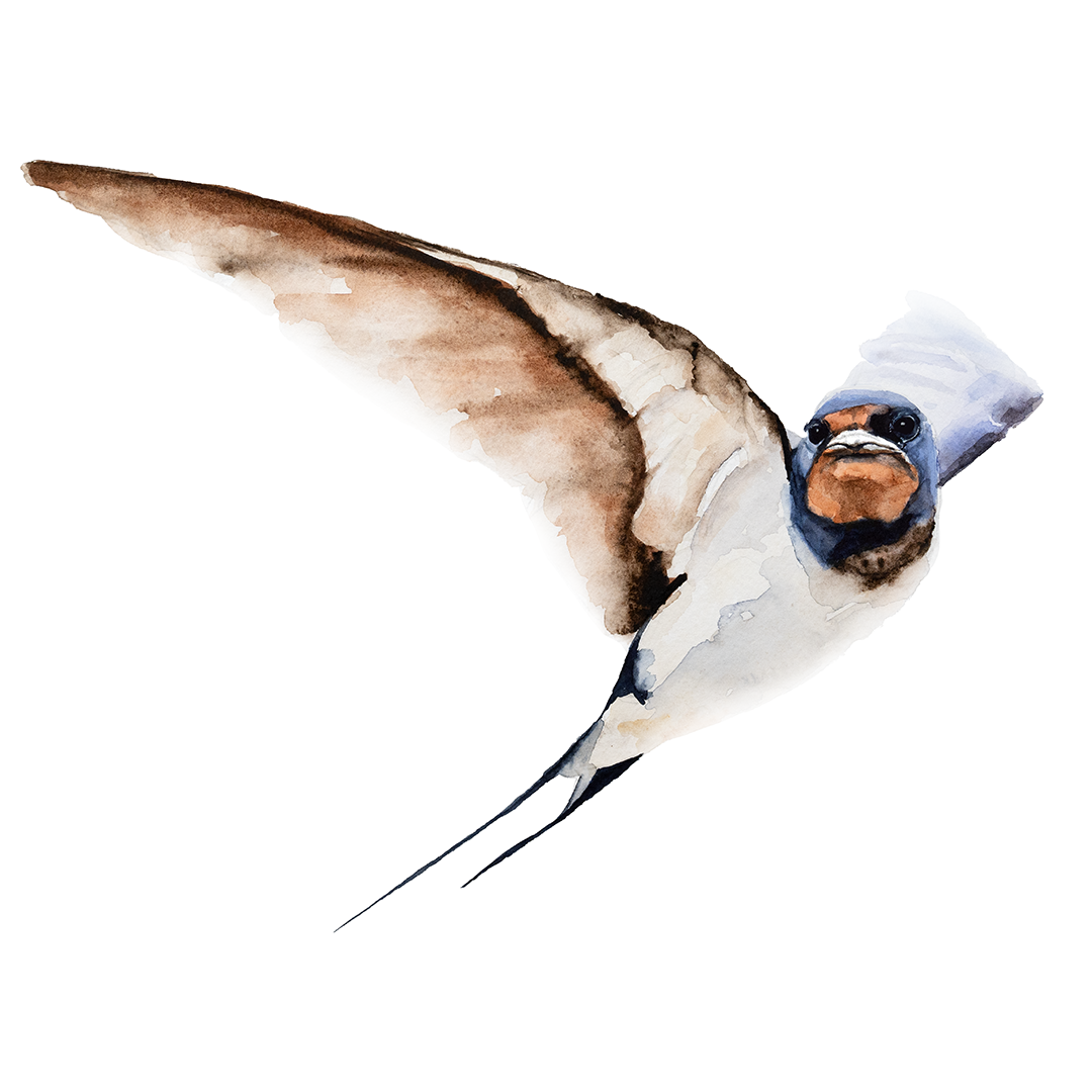
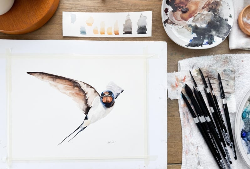
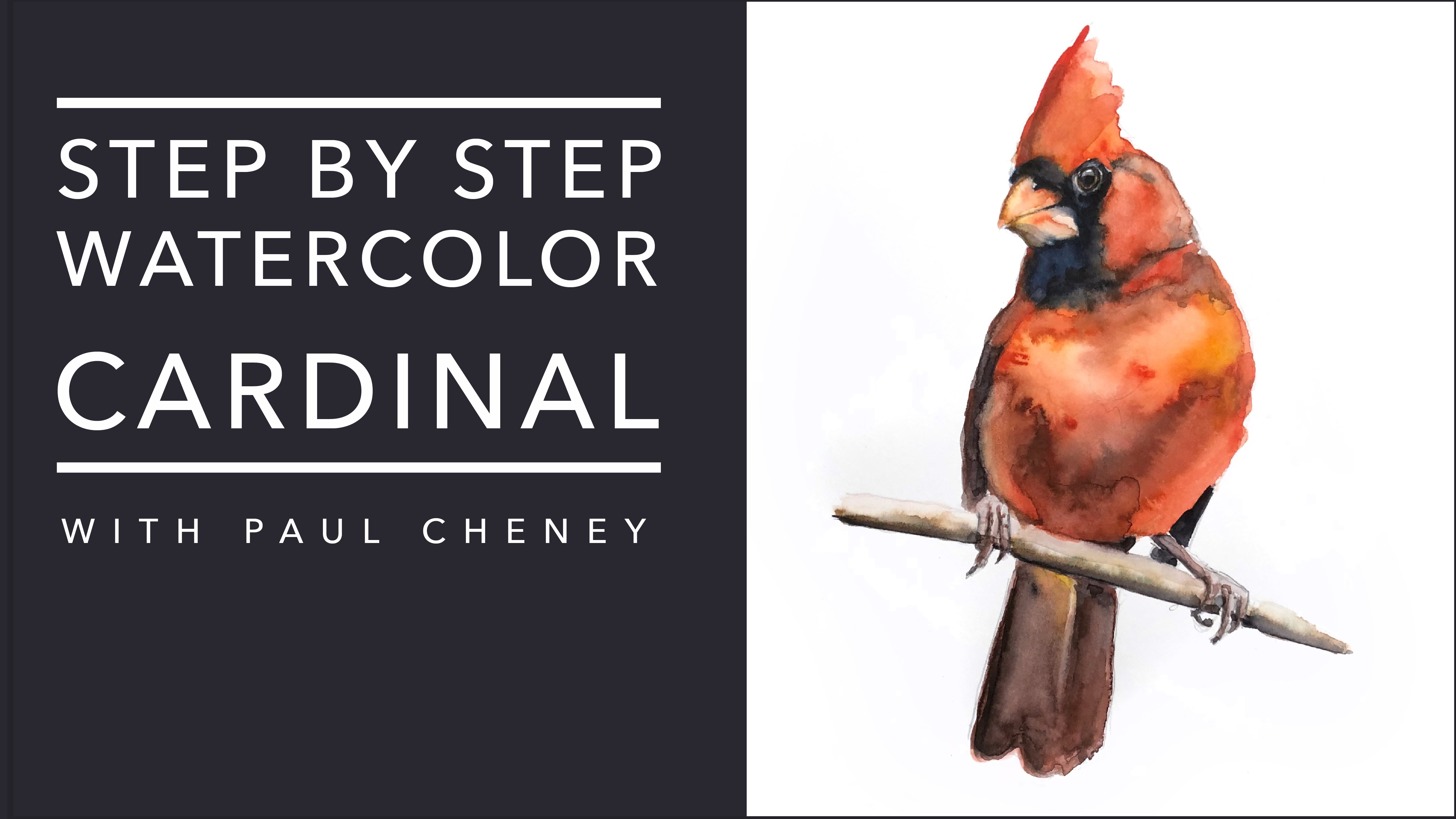
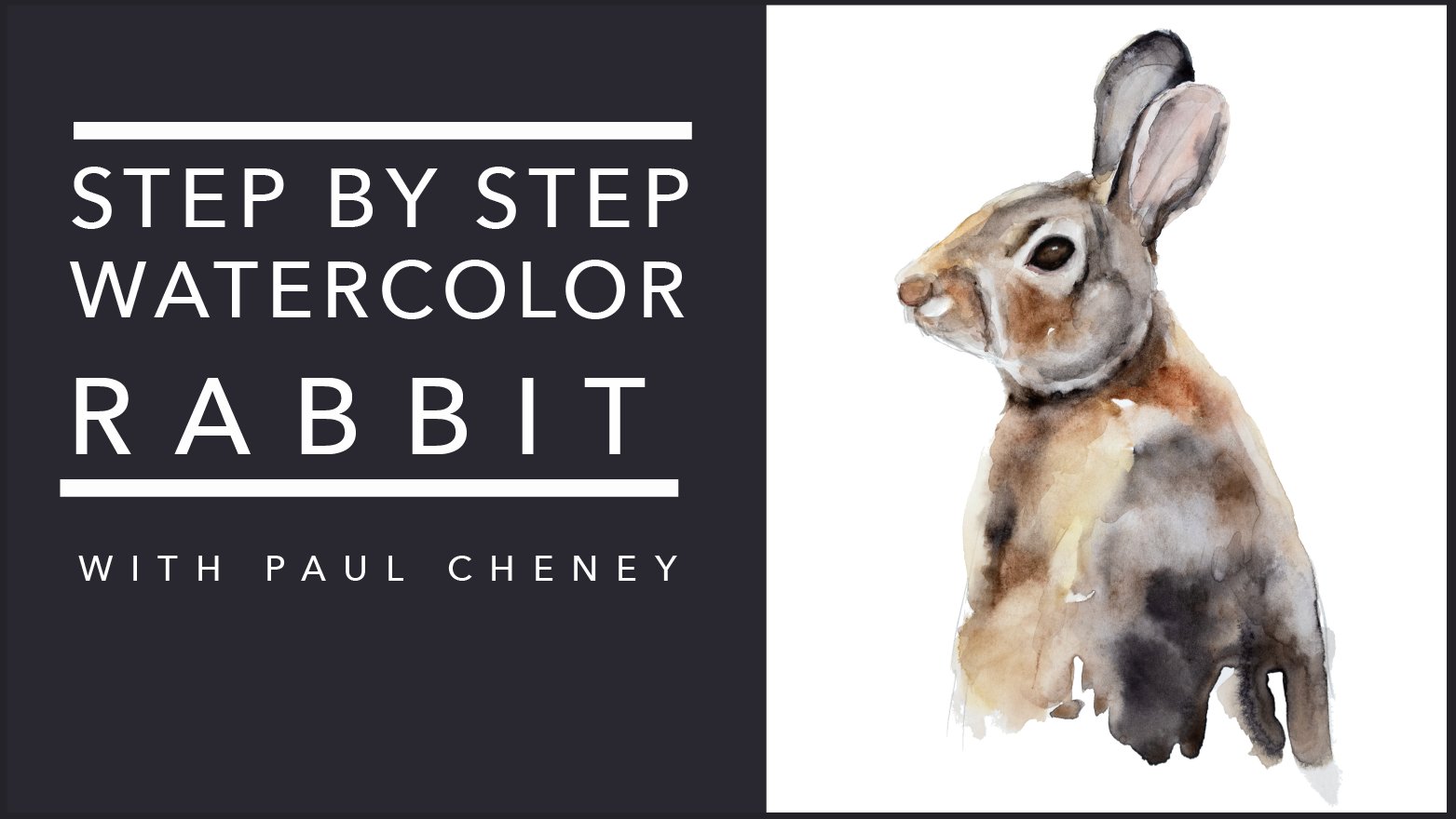
1. Introduction: Hello, welcome. My name is Paul. I've been in watercolor
painter for almost 15 years. Today. I'm going to teach you how to paint
this tree swallow. This is a great painting
for intermediate painters. However, if you're
a beginner painter and you want to
take a crack at it. Don't be afraid. It's a great
way to learn new things. As with all my projects, you don't need to
know how to draw. I provide you with a
simple outline that you can just trace onto
your watercolor paper. Along with that, there
are two reference photos. One is a high resolution photo
that we will paint from, and another is the finished
high resolution image of my painting that you can use as a roadmap to see
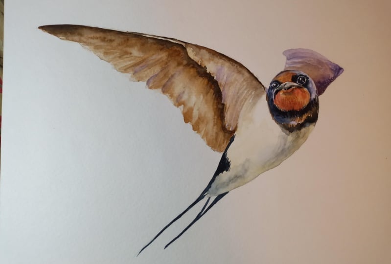
where you're going. We start this painting
with nice big, clean washes of
watercolor and pink. And we gradually
work our way up to the finer details which makes
this painting come alive. I'm very happy with how
this painting came up. And I hope that after
you finish this project, you can say the same thing
about your painting. And when you're
done, please make sure you've posted
under the projects and resources section so that
you can help inspire other people and I can give you feedback about
your painting. I really appreciate you being here and taking this course. It means a lot to me. It's very inspiring
and it makes me want to keep on painting
and doing more.
2. The First Layer: So to get started, the first thing we're going
to do is we're going to establish some base
layers on our painting. And so we'll start with
the light area in here. And that is kind
of an off white. It's not paper white. So if you look at the background in the
reference picture, that would be paperweight. So there's quite a
substantial difference in the value between those two. A light, lightest value
area being in here, the dark is being over here. And then I would say the
third over here and it's got some sepia kinda echo,
sorry, burnt sienna. Burnt sienna, color orange. We'll just say orangey
color in here. We'll leave the
orangey part to later. We'll leave the top
part till later. And for now we're just
going to establish the basic shape of
this area in here. And we're gonna
do that by laying down an off-white color. Off-white. What do we
use for off-white? Let's go over to our
palette and see. My favorite off-white color is, I think it's the only one
actually is buff titanium. I usually add just
to warm it up a bit. I'll add in a bit of raw. We've got raw sienna
or raw umber here, one of those to put it in link. I'll put a picture of the
tube in the video later. I always forget. I always
get that one mixed up. Underneath. We've got a bit
of a darker area there, so I'll use some
probably neutral tint. I've already got some mixed
up here in full disclosure. This is my second
time doing this or one-and-a-half times
doing this painting. The first one, I forgot
to hit the record button. So here we go again. Alright, so I'm using my
squirrel hair brush here, holds a lot of water,
a lot of pigment. And I'm just going to do, I'm not going to
stress about this. We don't want to be
drawing this on. We're painting this on, and we're watercolor
painting in particular. Watercolor painting is water, is very loose, it's very wet. My brush here has a
fine point on it. If yours doesn't,
feel free to use a smaller brush for
this section up here. But we've got this
off-white color kinda runs along the top there. I weighed too much water up
the top here, comes down. We can mix it in
underneath there. I'm using a
water-soluble pencils. I'm going to try and
be careful that I'm not diluting that too much. Lots of water on here to keep these areas and I send light. But again, they're
not paperweight. They're just slightly off white. Nice and easy. Number you're doing this
because you enjoy it. So try to keep the stress
level to a minimum. And just enjoy the fact that watercolor is so loose
and so easy to put down. Break up the values here by dabbing in a little
bit of a darker color there. I'm gonna grab some
of this neutral tint very little because it's a very intense
C That way too much. But dilute that down a bit. And we'll bring some
of that in over here, keep it down towards
the bottom area. And now we've got it looks
like some darker yellow. They're a bit a darker
yellow over here. And maybe a tab up
here just for fun. I think that will suffice. That is not, That's pretty much the gist of it for
our very first layer here. So I got neutral tint in there. I'm going to lift that
out. This area up here. I will get later on
and I'll define it with a lighter brush. You can do it now if you'd like, but I'm just going
to leave it for now. I'm going to grab
a paper towel and dab some of this out here just to lighten up
the bottom part. Always make it darker, but it's harder to
make it lighter. Same thing up here. My neutral tint spread a bit. This area got wet. Oh, there we go. Okay. We don't need to worry
about anything else. Because actually this
area down here, alright. Say we don't need to worry
about anything else because we have defined our basic
first layer shape. So we'll let this dry. And just in full disclosure,
when I say let this dry, I'm going to dry it with a hairdryer or shut
my camera off, come back and it'll all be dry. If you're gonna use a
hairdryer, I recommend one that has a heat and an air setting. The reason being is if
you put a lot of air on, you see these wet paddles
here and I start blowing. It's going to be
all over this way. I can just use the heat and I'm holding it up about right here and just lightly moving it
over to audit audit audit off. And we'll come back and
it'll all be magically dry. And we'll move on
to our next layer.
3. Painting The Wing: So we can see our paint
is now dry and all it's done is it's given
us a very simple shape, a loose basically
what we're looking at is a pile of dried water. Okay. And I'm saying
that because I want to I want to reiterate over and
over and again as much as I can to keep this simple. The simpler you keep it, the more looser paint
is going to be, the more drawing in
detail which we're gonna do detailed stuff in the
end where it matters, where we're making a
connection with the bird. And that is in the
face and the eyes. That's where we're trying
to bring that home. And by keeping the rest
of the painting loose, we're actually helping that more make that connection
with the painting. If the entire painting
is very detailed, well then it takes
away from that. I mean, not all he can, but I find it does. And it also makes the painting less enjoyable to
do and to make, I love like not knowing exactly what's going to happen when you're putting your paint down. So we're going to do the same
thing for the next layer. If we look at our wing, we've got some lighter
areas down here. Like in there. It's not going to be
painted exactly like this. I basically put in these shapes, so I know the direction
of my brushstroke. That's all I'm gonna
be worried about. I'm definitely not going to have a detailed wing thing going on here. I don't
want to do that. It will be the same
up here, except of course it will be
a different color. So the first thing
we're gonna do is we're gonna do just
like we did here. We put down like a very
light base layer that we will put another layer over
top to give more definition. So now we're going
to put a base layer down here for the
lighter colors. So we've got to figure out
what's that lighter color. Well, I just happen
to know that it is burnt sienna, watered down. Now, we could add in
some yellow ocher, raw umber, whatever you
wanna call it raw sienna. But for the most
part we want to keep it nice and loose and same. I didn't mention this brush in the introduction. Just
looking at the painting. And I just, you know, it's just easier to
use bit smaller. I guess I'd use the smallest
brush that you can. And this is mainly for these edge areas along here like that. So I'm just going along and I'm defining the
shape of our painting. So really I'm just see how
loose this is going on. This down here is the area where this matters the most, where it's the lightest. So I'm adding more water. This is a sable hair brush, Kolinsky sable hair brush. And it holds, again, just like a squirrel
hair brush holds a lot of water and pigment. So you can actually be
a little bit smaller. I'm going to go
right at the edge because that's dark anyways. And same over here,
it's very dark. We can add a little bit of sepia in if we want at this stage
because it's dark anyways, and we're going to
define it later. And it just helps us know where stuff goes once
the paint dries. Because if I lose
my pencil marks, I won't know what shape
those wings are going. And actually, you know what? Since I'm such a rule breaker, I might actually just
try to put an even more as this crazy while it's still wet
on the first layer. Do the old wet on wet. I love these names
that people make. I mean, essentially, I
guess that's what it is, but it's funny. Because while I
paint wet on wet, I paint however
it works herself. But you do you woo, that
was a lot of pigment. Know where that came from. Okay, so now I want to not have, I want to define
these areas here. I don't want it
to be just fuzzy, blurry blending into each other. So I got clean water. What I'm doing is
I'm adding in some, again, another fun
word, some blossoms. What does the blossom
doing is it's taking the pigments which are imagined little
grains of sand, which what they are
essentially it's dirt. And those are, you're putting water and it's
pushing those pigments out. So we can see it happen
here when we do have that in there and it
pushes those pigments out. When it dries, it's going
to give us a sharper, like more of an edge up to our painting and it
has a nice effect, I think. I agree, but another different
brush I hadn't mentioned here in exactly the same
brush, but at number two. And while I got this going on, I'm going to grab, so this up here and
I will do this. Edge is going to bleed all over the
place if I don't. Now we've got the
hard line in there, so I'm just gonna
clean water that out. You know what? Well, I
started at now, here we go. Okay. So we'll go along here and
we'll do this edge up here. So I've got some sepia now. And what I'm doing is
I'm going along when I mentioned in the
class description, watch the video first. Because if you're going to go along and keep
bright up with me, it'd be like, Oh,
he's I do this. Oh, and then he
changed his mind. He did that. There's so much that happens when you're
painting loose like this. A lot of it you
just kinda gotta, you have to make it
up as you go along or else it doesn't look great. So here you can see I've
tried to put my water in, but that has already
dried that fast. So I've got to watch
that area there and put in a little bit. There we go. We'll bring that down
there and we'll just leave that like that for now. We'll let that dry. Sorry. We're gonna
now that I said that, just want to bring this up a
bit higher into that area. Okay. Now we're going to let
it dry and we'll come back. And we will add in another layer to this and do some more definition
on the body, will do all the brown
areas first and then we'll come back and
do the top area.
4. Painting The Second Part Of The Wing: Okay, so our painting
is now nice and dry. And let's take a look
and see what we've got. I like how this looks up here. I like how these pigments
kind of pulled up here. And they by
themselves have given that impression of what that texture looks
like in our bird. Now, here we've got
one of those blossoms. I kinda like that,
but unfortunately it's gonna get covered
up because I think we need to have more value
coming in along there. Well, we definitely do up here. I'm not sure 100% that
I want to change this. I know that there's
some wing bits in there and the
original picture, but I kind of like how it looks, nice and light. So we'll
see how that looks. So I think what
we're going to start with is we're going to mix in some burnt sienna,
maybe burnt umber, and we'll see if that makes
it dark enough by going over top of this and still
gives us that warmer color. And then we're just gonna
do this area up in here. So I'm going to come along
here and I'm gonna put in some paint along
this area up here. Then with a wet brush
and clean water, I'm going to slowly
pull some of that down. Well, not slowly because
we want to do it before the paint dries. The other thing that I just noticed is that our wing here. So this comes down like this, or a wing here. We made a bit of a boo-boo. Show you a little trick here. What we can do is
called lifting. And I'm using a synthetic
brush or a brush that is already well-worn, that some clean water on it, not soaking wet because damp. And I'm pushing
those pigments down. Now we're getting that
shape does two things. When we do that. One, we make
the shape the right color, but those pigments
have to go somewhere. Some of them, of course,
yes, go on the brush. We're the ones that don't
get piled up along here. We had more pigment down
here that'll be really defined and would actually define our edge already for us. The other thing we need to
do is bring this up here. Just, you know, getting the
right shape in the way. Okay, so now let's
move on to that. So what we're gonna do again, we're going to mix up
our color over here. I think we're going to use burnt sienna and
burnt umber together. So burnt umber for the darker value and burnt
sienna for the warmth. And we're gonna go over top
of this that we've got here. Then we're going to
use some clean water and we're going to try
and pull it down and give the impression that their
feathers will then take some burnt sienna and
we will put it up here. Define these shapes here. Okay, and this little up here, just for color and consistency, maybe a bit down here. And then that'll be
it for that layer. And maybe that'll be
it for that section, the whole entire section
of the wing. Okay. So let's grab some burnt
sienna, put it in over here, and we're gonna grab some
burnt umber up here, mix those two colors
in nice and rich. Lots of pigment. You can tell that's a good quality
artist grade paint. When you can keep
them on the palette, you don't need to always
take them out of a tube. That's just a waste of paint. I never let cover this up. I always leave them like this. They're good quality paints. And I get a very saturated
pigment like that is a darker value is
you're gonna get, and I didn't not out of a tube. We're going over top here. You can see we've pretty much nailed that color,
which is great. Lehman little section there. Now I'm going a bit slow, so I may have to, what I'll probably have
to do is over this again because it's going to dry. And then I want before it
dries, I won't get enough, won't get those wing
shapes and that I want grabbing some of that paint when I
put it in up here. So what happened is it's blood in here a little slow,
but that's okay. Some clean water now.
But it down here. So we're doing it
a bit differently because this is already dry. I put in some clean water and we'll just do the
wet on wet thing. Just need more
pigment than water. It might have a very
interesting effect. I also think that it's
not gonna be dark enough. So while it's still wet, I am going to add in
some sepia up there. I like how that looks. So I'm going to soften these
edges up a bit. Very nice. Now I think it's gonna be great. We'll grab some of our CPU
up here with a finer brush. To come in here. It's important you have more pigment than water or else it will blossom. Blossom again. Remember that means you're
pushing the pigments away. We want them. Sometimes
that's what you want in this case, it's not. We can always soften
this up later if your paint is already too. If your edges too sharp here,
don't worry about that. Hopefully we got enough
water in there and we use a dryer brush now and
grab some of those. I'm just dabbing along that
edge to break that up a bit. It's tiny little bit of water. I don't want to push
the sepia color down is pulling some of this down and some
of that wing shape. So we've added the
darker value down there, and this is very dark down
here and comes up in there. So look at that, how
rich that CPAs there, which are fantastic,
they end up, you end up with your
favorite colors. Mine, it's sepia, indigo. I love ochres. I love
the warmth of them. I think to from back in
my high school days, from painting in oil paint. And it was all about earth
tones and such like that. You're softening
this up a bit there. I think I'll leave
that like that. Okay. Now, we need to take just plain
sepia with water it down. When to add in a bit. My raw umber there. Forgive me if it's not need
a lot more water than that. And now here, come down in here. I touched this a little
bit so that it bleeds up. I'm not going to worry too much. Just putting this on and then diluting it with clean water. So I don't get too
hard of a shape. He's areas in here, it does very well. Those two values kind
of bleeding together, touching those down
here and that way they'll soften up on their own. Again, clean water. Now here. So here we've
got our shapes in here. Are wings are defined. So kinda goes a little
softer than not. They're softer than
that on this side. Then that does enough to kinda give the impression
of what we want. I'm going to grab
a little bit of neutral tint there on my brush. Just trying to get the
values to match here. Now, now that I said that, something to keep in
mind is I'm looking at this and for the
sake of this class, mainly not 100%, but mainly so that it
doesn't confuse people. You can use like
when I say value, what I'm talking about is
how dark that areas. So e.g. in here, if I use like blue, but it was the right color. And but it was right value, sorry, but the wrong color. It doesn't matter. In this kind of painting. Because it's, the value is
more important than color in, when it comes to like, recognizing objects and
subjects and whatnot. Some of these are, feathers
are broken up in here. So I'm a little bit of
water on my brush and I'm just gradually touching
some of these areas. I'm I'm not holding onto my
brush very tightly at all. Very loose. And not helps. Keep my painting lives
here in our picture, this value up here
in our paintings. So I mean lighter
than the picture. So I'm going to add
some clean water. I'm just touching either side or the darker areas are there. And bringing those up in here, there's a darker area there. Because that's what it
really nicely kinda blends in nicely there. Push some of this
up along there. While we're here, grab some indigo and what
is our integral? 0, nice and wet,
good. Squirt bottle. Bit more. And we doing. Now we're going to grab
some of that and we're just gonna do these
areas down here. I chose a new it's a bit
warmer than what's on there. Um, and don't be afraid
to come up into the wing and bringing those two
colors together there. Try and get a nice
rich blob of that. There we go. Flick it up a bit to give the
impression of the feathers. They're very fine
line along here. Whoops. This way, I think When you're basically putting on
a big blob of dark color, don't be afraid
to take your time and kind of sketch it a bit. It's not because it's
not going to show any it's not going to show the layers underneath
because it's a solid color. Bring some of this up here. Obviously look at
how dark that is. We're getting close some
of the errors now I think what we're gonna do next
is we're going to do the, the blue purpley
area around here. I think we're gonna do
it in two sections. We'll do the wing
part here first. Let that dry that way we
don't have to worry so much about bleeding when
because it has a very different right. So we don't if we, this
is wet and then we start painting as a darker blue and then that blue
runs into there, then we lose that separation. We want to have that, That's a very important
feature in this painting. So we'll do this part first, let it dry and then we'll
move on to the face. And we will then do the just touch ups
and then we're done.
5. Painting The Back Wing: Welcome back. So very happy with how
this is all dried here. It looks fantastic.
Don't think we will change much if anything at all. As I mentioned, we're going to come up here and we're going to put a base layer of
this color up here. That color, there's kind
of a purple color if we come over to the palette very similar to what this is here, had previously mixed up. So to make that color, I had some carbons, all violet and a little
bit of fallow blue. Getting the right color, although it doesn't
really matter. You get the right color. Ish. There we go. That's good enough. If you had to happen to have, Let's color ultramarine violet. That's pretty much what
that color is right there. So that would be a great
alternative to use for this. But again, mix a blue and a red, you'll get the purple
that you like makes this carbonyl violet
and blue diluted down. Be careful with the
carbons all violet. It's a super, super,
super intense pigment, very dark, much like
indigo in how it reacts. So you'll need a lot of water. Again, this is our base layer, so we're just
defining the shape. So keep it super, super simple. Don't stress about it. Get the goods on the paper. So this is on a
little bit darker than I thought it would be. So I'm just going to
dilute that a bit and use some clean water
while it's still wet. It's already
starting to dry. I mean, that must
be very dry in here and just very light color. And I'm going to
try and erase these pencil lines while I'm at it. That's about that for that. I'm just going to
push that for a bit because it's I switched my brush because my
other brushes are real hair brush and
expensive sable hair brush. And if I were to have used
that and pushed against it, I will ruin the very fine, super fine hairs and I
have to buy any brush. I don't wanna do that. Okay. So that's it for
that. That's all I want you to do for that is just very light wash on
there to define the shape. Whoops, I made a boo, boo. I'll just change the
shape, but there we go. And good. Okay, So let that dry. Once that's dry, come back. We will do another layer
on here and a darker, darker area around there. We're not going
to bother putting maybe we'll mostly how it goes. We're going to put a darker
area around the face. To be mindful, you've marked
out this little area down here underneath where there's like sepia or brown in color. And then we will
use indigo up here. And then of course we'll
figure out some kind of orange color up here
underneath the beak. Make sure your beak is well-defined so you
know where that is. And then we'll come back and
we'll see you in a minute.
6. Painting The Head and Back Wing Second Layer: Welcome back. Didn't take long to dry, especially because
I use a hairdryer. I went to clean my water. That's another thing I
wanted to remind you to do. Keep your water clean. Your water is muddy. It will make your paints muddy and do everything you can
do to help yourself along. So I went along and I outlined by beak a
bit more just because it's such a funny angle
that I wanted to make sure when I'm doing this
that I'm not actually getting paint in the wrong area. So I'll do the same with
this orange area here. I'm just gonna make sure I can see that all nice and clear. Up here around the eye. We've got a white area and
I've kind of darken that, the black spot there and we're going to have darker areas
around the eye up here. But for this area up here, basically, we're going to keep
all these areas out here. Paint around it with blue. We want to leave a bit of white around the eye there that
we can fill in later. Let's move over here
to our palette. Brush, brush. I've gone down to a,
what do we got here? Number two, getting
really small army. But if you look at how big these areas are versus the brush. Plus, this is a very
high-quality brush that holds a lot of water
and a lot of paint. So try to use the best
quality brush you can. One that'll hold
enough water and paint that you can get all
the way around without having to come back and end up with lots of streaks and things. You want a nice clean layer. So this around the
head is bit more blue. So if we go back here to
our purpley color here, we can just add
some blue to that. And I think we're pretty close. Might not be dark enough once we get it on the
paper, but we'll see. So let's just start in an area where it's going to be darker. Then we can say, okay, see how light that is. That's great for up here. And it actually is a little bit more purple in it than that. Again, it doesn't matter.
It's more about the value. So if yours is more blue, more, more, more purple,
Don't stress about it. I don't see how that looks now. Now we are using this area as a little test area because
we're going to paint over, it's going to be
very dark anyways, so it doesn't matter. I think that's pretty good. It's a bit, it's a bit more. Purple are ready red color
in the finished example. But for now, we'll do this. I am going to do
the whole thing in this color and then I'll
add in some more later. This brush is even a
bit small I think. But I've already
started. So here I go. Again, try not to worry
too much about about it. Of course, you do want to pay more attention in
the finer areas. I'm going to try
and leave a small highlight area around the head that we can see in our painting. I guess I shouldn't be humming, should I grab some clean water? This area up here? Push that down a bit. We can come underneath
here if we want, because it's going
to be darker anyway. So if it overlaps a bit, It's better than it
non-overlapping. I'm going to grab a
little bit more. Violet. This area over here. Just trying to bring this
color up a bit more. Usually get really close when I'm doing details like this. But I'm also at the same time
trying to keep my big head out of the video. Sacrifices we make. I'm going to grab
some of my indigo and mix it in there
because I want to start getting into this
darker area now and I increase the value of it. Still wet so it's
bleeding nicely. Don't worry about
how it connects with the with the white area there. We'll get that later. Play. This is wet enough that it
bleeds. You have pin does. Perfect. Okay. Okay. Stop. Now this up here above her eyes got kinda like a
little helmet look to almost put that in there for now and
we'll soften it up later, just so that I know where
I'm going with everything. A bit more detail there. Okay, Now I'm gonna go
straight on indigo. I'm underneath here. Whoops, are straight on. Indigo needs a
little bit of water. Okay. Now let's get cleaner
brush off. So it's damp. We don't want it to be too wet that were
causing big blossoms. Just want a damped so that we can some of these areas in
here to blend a bit better. We need to have these
values are important because they're the shadows
underneath the head. Makes the head stand out more. Helps us get ahead. See what I did there. Get ahead. Don't get ahead of yourself. Okay. Let's make some of
these two colors together because we
wanted to get them. Another area that we
don't want to forget is this area over here. So we'll grab some of
our blue, but more. There it goes out violet,
crazy, crazy violets. And keeping in line with
that white line is there. To keep that separation. We'll just make
this shape in here. Now. It does have some brown along the edge there
where the wing is. So we can always put in
some sepia if we like. I think I went too
close to lie in there. A bit cooler color up here. And so clean water, we're going to dilute these same time. We've got that. We can come up here
and put in some of these shapes to define our wing. Very light. Don't want to overdo it. You don't need to put in
all the details that are in the original picture there. Just enough. Okay. So now what do we got going on up
here on top of her head, it looks a little wonky. I know there is more
white along there, but I don't think it's going to look right if we don't put in the right amount
of detail there, it's gonna be two muddled looking in and on people trying to figure
out what's going on. We want it to be pretty clear. Okay, I'm going to grab
some of that sepia, mix it in here. Again. To find
this area in here. It looks a little more winging. Barely touched that in there. Okay. Let's let that dry. And then actually
before we do that, let's put a layer
underneath here. So let's grab some of
those color from before, some of our CPM mixture
color there because that is definitely underneath here. Then it's kinda like
it's we're going to use the cp over top of it. Sorry, our burnt sienna is
what we're putting on now. Then we will put the
sepia around it. I actually while it's still
wet to get that same look. We'll do it right now. This will help it bleed in C, It runs up in there when
we start touching it. We want a nice dark
value for this. And I think we need
to bring down the top of our dark area. There are indigo was
a little bit more. So it looks weird. Weird. Good to put another layer on to
darken it up anyways. So what this on, let it
touch ever so slightly. And then we'll make a touch
more by grabbing more of our burnt sienna color. And they will blend together. In some of that blue. They're trying to close up
some of the gap in there. There we go. I think that a bit laid
out together a bit more. Whoops, I forgot this
whole area up here. Fill that in right now. I think we need a bit more
definition over here. Starting to dry enough
that we can add that in. I think what we'll do is
we're going to our wing needs to go because if I made
a bump in an over here, but I think it needs to come out this way just a little bit more. So I'm going to try. They don't have too
much pigment on. Yeah. I'm going to try and just ever so slightly grab a little bit of there we go. Just wasn't looking right.
7. Adding The Orange And Underbody: Okay, so we've got achieved
our goal down here. I think we've got
a good definition. It's going to come out a
lot more once we put in our our orange area. So let's move on to
the orange area. Let's go over here to the
pallet and see what we got. So basically, this
is cadmium orange and I think that's
probably fine. Base layer. We're just going to
fill that in the same thing we did before. Let's put on a light wash layer. Well, we may do this all
in one go. We may not. We'll see those areas. So that's definitely too
light for everything. However, it's I think
adding a bit of yellow, like you call it yellow ocher, which is actually a raw sienna, but it's pretty much
the same thing. Okay. That in there, watching
out for the beak. Again, just fill these
areas in best we can. Grabbed a larger brush,
mainly because of patients. Don't worry about touching
the other areas so much it'd be nice if they leading to
look a lot more natural, especially where
the darker colors are, they should pick up. You can see it's starting to
come up there underneath. Now, remember a smaller brush, and I think we can probably
use some of the mixture of sepia and burnt
sienna that we had. Just add in. Again, our values
here, darker shapes. So there wasn't a lot
of paint on there, so that dried really fast. So I don't want lines like that. I'm just wet my brush. Now I'm going around diluting it and add in a bit more medium and maybe even a bit
of or that burnt sienna there. That's
nice and wet. So let's colors are
bleeding nicely. This is important
because this is a shape. I've lost my pencil lines, so I'm just going to wing
it. And that's okay. I quite often paint some
practice called direct painting, but I don't have
any lines at all. And it's a great way to learn. Just go at it. Don't worry whether you're
painting works out or not. You're not trying to
create a masterpiece. You're just trying to learn about how the paint
dries and what happened, defining your shapes and values. Anyways, my point was, you do end up losing
your pencil lines. If that's something
you've practiced, it comes in really handy. It's important that we keep
these lighter areas light. So what, we're
going to have to do another layer there to
define that properly. If we don't, well, then it's going to look
really funny like we need to have those shadows
where there are shadows. Not to mention it as a character that came down there like that, you need a bit more dark
coming along the bottom here. There we go. This is definitely not dark enough. I'm just going to grow. It's certainly not that dark. Back over here to the
palate and darker color. I mixed in some sepia
and burnt sienna. There. There we go. That's what we're
trying to accomplish. Almost be a little bit darker, but I'm not going to
worry about it for now. It looks like he's gotta
go t going on there. So now here is a great
example of a value working, not being correct because over
here it's not that bright. So we'll leave this
in a bit more. There we go. Just pushing the
pigments around to get the darker areas where I want them and the lighter
areas where I want them. I think we can leave
that like that. Now. We can then go
basically we've got our eye and some darker
areas and the beak. Because these areas are
so small and so tied together in this paints
wet, it's going to bleed. It's going to look messy. So I'm going to leave
it. And I will. Let's put on our final
layer here on the chest. While we're here. For that, we've kinda
got a cool color. I'm going to clean off. I need some palette space here. So I'm gonna go back to our, our first get the orange
off my brush. Not orange. It's actually a kind
of a cool shadow. So we'll take our buff titanium. And a little bit
for the coolness. Just a dab, not too
much of indigo. So that'll give us
kind of a greeny, cool color that's going
on underneath there. There we go. That should do the
trick nice and loose. Right up and touch. And they're trying to get
those colors to bleed into each other so it
looks more natural. Now there's different of course, different lights and dark
in here. We'll get to that. So we just spreading it around. See where it all goes,
what goes where? Smaller brush, a
bit more. Indigo. Find this area down here. Again, we're touching
the other colors there. You get them to bleed in. So you don't have these lines. It's going back-and-forth
over top of them there. So we get the shadow that we
want without all the lines. Adding that blue in there, I'll indigo some
character interests. Just tiny little
bit. Not too much. Same thing up here. Now we can see we've got our
light is coming along here. You can see are the areas that the light is hitting there. We've got our shadow down here. It's working out really nicely. How many some burnt,
burnt sienna there? In touch up in some
of these areas. There we go. I think we do need a bit more density in
here, a bit more value. There. I like it. Okay, I'm going to try this
quick. We'll come back. And when you do the eyes, potentially the beak, the beak is basically
just going to be shadow. So I think we'll do the
eyes first and then we'll see what's left with
that little white area. And we'll very carefully
put that beacon.
8. The Final Details: Okay, nice and dry, great shapes in here. I'm not crazy about this, these little lines that
I flicked in there, I like the looseness
of everything else and I think that kind
of contrasts a bit much. Not going to stress
about it too much. I've zoomed in a bit here so we can see what
we're doing more. And I may do some more in the
video here we're going to try and now do art.
We're not going to try. We are going to paint our eye. And basically if we look at the eye there in the
picture, look closely at it. What defines quite
a bit of the eye is that white line that
goes around it. So we have essentially a dark
area up here on our face. And I'm going to leave the white line quite large
because we can always go in, but we can't, well, we can actually cheat
and use gouache, but ideally we don't, we may end up doing
that and that's fine. But it's easier if we
leave that space defined. What everybody likes
to hear, Whoops, is going around very carefully. There we go. Now let's see, we've got this giant
eyeball, doesn't it? So now we're just going to, we're not going to worry about that reflection in the eye because I think it's
too distracting. I'm going to leave a
little area there. I think that works. I'm going to leave a white
line all the way around. I'm just going to eyeball.
It looks really funny. So if you get this big blob
in there and it's like, well, that doesn't look
right where he's looking. We will put it in
later with gouache, so let's just fill that in
and not worry about it. One less thing to
stress about. Okay. I know what you're thinking. It looks funny. It does, doesn't it? This
area a little larger. Now, now that we've got our
one line or we can just go around and continually make it a little bit smaller
and a little bit smaller. Actually, we'll leave
it like that for now. Let's go over to the other eye. And I'll explain later
why we're gonna leave it. I think we went too far. Here are white line. We went too far
over this way and it should come down more here. So I'll just fix that later. Making little mistakes like
that are great because then they're not a fixed them. I'm gonna move that line, put it back in after
I just think the I was looking a
little funny there. Okay. So leave that like that for now. I know the eye it looks funny. That's okay. We're
going to fix it. Let's come on over
here to our beak. I'm actually, let's
leave the beak for now. Okay. Let's leave the beak and
let's just finish her hair. I'm gonna get some
of that paint off. Now are basically
the clean water and I'm just touching
this edge around here. I want that to bleed out. I don't want it to be, you know, it's kind of a
gradual little hill that goes around that I there. At the same time we can
touch this white line and loosen the overall like huge
like whiteness of that area. There we go. Dark inner shadow here a little bit and
make it more gradual. Will all make more sense
once the beak is done. Now, Should we are going
to go onto the beak. Sorry about that. We'll just use some sepia
and a little bit indigo. Not very much paint
on it or disk. Gradually going to very tricky to see what's
going on here. And I'm just going to
make this line underneath trying to find the
shape of the beak. Here we go. He's got, sometimes
it's good just to grab your pencil and see
there's the point. What's the point? Then? I don't want a line that
comes along with that point. There we go. There. Now, that point looks like a point because it's got a dark shadow underneath it. So let's grab some indigo, or basically just tracing very lightly over that
line that we did. The darker value. And the reason we did
that is it's just easier to fix any mistakes
or something like that. If we've got a less
color than more color. Now I know, you know, these aren't we don't want
these hard lines in there. Right now. We're just
defining the shape of that beak because it's a really important
part of the bird. And I think if we don't
get it bang on right, it might make our bird
look really funny. We don't want that. My head is not in the painting. But if it is, it is sorry, But there, I'm happy with that. Not crazy about the eye, but we're going to fix it. Just looks ginormous
and oddly shaped. What we're gonna do actually have an idea on how to fix it. We're going to fill this in and we're going to come
back and we're gonna touch it up with gouache. And all will be, well. Gouache is an opaque medium, basically opaque white paint. And with it, we can add
in some highlight areas. It's going to grab this brush here and push this down a bit. Part of our I rescue mission gives her head a bit more shape. Remember we mentioned
before it's what that weird little helmet look. Golf. Okay. It's almost got parked
down the middle. It looks like there and
asked what else we need. We need to put a shadow
underneath our eye here. So we've just got
Indigo for that. We've got one under here too. Okay. We're getting there,
We're getting there. Find this a bit more. So what we need to
do is we need to bring down line over here. More are white line and we're
gonna do that with Gouache, tube of gouache studio. Gosh, it doesn't matter what brand is basically just
thick white paint. This one is by Lucas,
which is actually a German company, I believe. And they actually make very good watercolor paint as well. Here we're looking for
trying new paints. I've got Daniel Smith here and it just happens to
be readily available, but I've been trying
Lucas paints and actually my cadmium yellow light
is Lucas and it's great. They have big giant
tubes. I'm just dabbing. And I'm going to put in the highlight area there. There we go, Look at that. Now we can put some down
here along the bottom. Here is there. Now all of a sudden their
bird is looking at us. Marvelous magical stuff. There we go. Very happy with this. I think. If I don't mind saying so
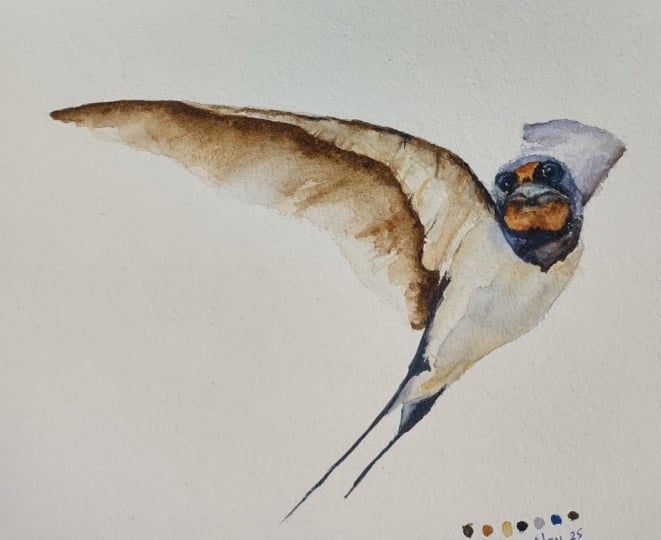
we are pretty much done.
 Paul Cheney, Teaching watercolour and digital painting