Transcripts
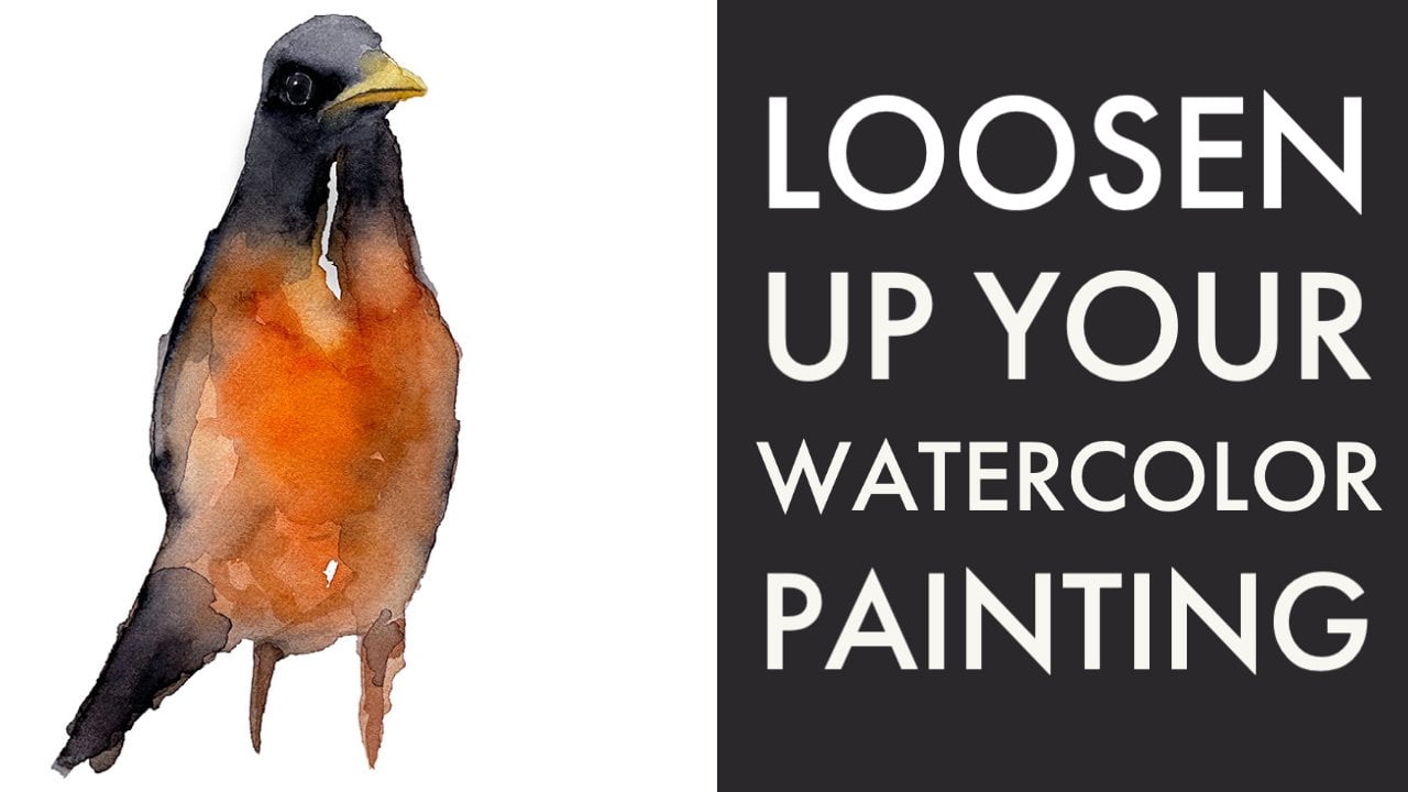
1. Introduction: Hello everybody. Paul here. Today we're going to paint
this watercolour Hummingbird. Yes, watercolour
Hummingbird, I had to look. This is a painting is done
in just three layers. So why did we do it
in three layers? Again, in an effort to loosen up our watercolor
painting style and to stop us from
overworking our painting, we limit it to
just three layers. Once you have that
limit in place, when it says, Okay, you're done at the third layer, you're done. You can't just keep
mucking about with it, making like streaky lines
and ruining your painting. This is a fantastic painting for both beginners or anyone just wanting to loosen
up there painting style. Follow along, enjoy
the painting. And when you're
done, make sure you posted in the Projects
and Resources section. Thanks for watching and
enjoy your painting.
2. Materials: Let's talk about our materials. The paper that I'm using
today is Fabriano Soft Press. It is in-between Cold
press and hot press paper. It's not a lot of tooth
very easily drawn, very easy to move
your pigments around. It's still not as easy to
lift as hot press paper, but it's not as deepen whatever you want to call
that in hot press paper. Not a lot of tooth. The tape that I
used of tape down my paper width is the
brand is called frog tape. And there you can see it there. And the reason I use that as it does the least amount
of damage to the paper. I always make sure I press hard on around the outside
of the paper, but not on the paper. I don't want to really get
that gummy on the paper. I drew my drawing or outline, basically the same thing
you're gonna be using with a fabric castle
Water soluble pencil. The idea here is that you
don't have to erase the lines. The brushes I'll be using
are the large one is a squirrel hair brush
made by Da Vinci. It's real hair, holds a
lot of water and a lot of paint will be doing our
first layer and that one, the second layer we will
do with this synthetic. This is basically the
same type of this. It's an oasis series 400. It's a mix of synthetic
and real hair. It's an older brush,
but I can use this to like do some pushing and
pulling or whatever, and it's also rather large. The final details will be
with the small round brush. You use whatever
brush that you have. Don't overthink that. Tried to keep it simple. Try to use the largest
brush that you can to fill in any areas. So always like that sort of
a general rule of thumb, use the largest brush
you can that helps you carry more water and more paint that way
you're not leaving. You're not drawing and
sketching with watercolor. It's a wash of water
that dries on the paper. So think of it
more like a mop on a floor versus like how
you draw with a pencil. If you had to fill this whole
thing in with the pencil, you would have to make
lots of little lines and little bits
with a Watercolour. The idea is you can put
this whole wash on. So we worked down into smaller brushes and
smaller brushes. Paper towel here to control how much water
I have my brush, I have water, and that's what
goes in watercolour paint. Will slide this over. We'll take a look at
the palette here. This is a ceramic
palette that I bought on Amazon made by a company called, are not made by imported, probably by company
called median me ten, I'll put the name
in the video by paints on here are
Daniel Smith paints. I will list the
colors that I use. I'm not sure what
I'll use just yet, but I liked this palette
is got a nice big area. The wells are nice and large
like for larger brushes. But use whatever you
have. This is ceramic, so it allows you to see how the paint dries on the palette. You can also use a dinner plate. You could use a tile
that you get from someplace like Home Depot
or something like that. Got a few extra little bits
of paper towel here in case I want to fix a
mistake on my paper. My little squirt bottle here. I use this to go
around before I paint, which I'm gonna do very soon. And I rewet my pigments with it. I guess if I wanted
to wet my paper, I could spray it
on the paper too, but I never really do that. So yeah, that's it for the
materials time to get painting
3. Getting Started: The main goal in this
painting today as well, obviously to paint
our hummingbird, but it is also to do it in
a maximum of three layers. So why three layers? Because what I see a lot of a new beginner painters is a lot of streakiness and
a lot of over working. So I'm trying to go back lately and think about the
things that I learned when I was learning
painting that helped me get past those problems. I guess. One of the biggest ones is not
overwork your painting, keeping it loose,
keeping it simple. So limiting the amount
of time that you have on the painting
and limiting the amount of layers that you have on the painting or two great
things we're gonna do. Our first layer will
all be all one wash. It's not necessarily wet on wet, but we'll be painting with
wet paint into wet paint. Wet on wet is when
you wet the paper and then you put the water
or the your paint on. Sorry. But we're not doing
that. This is dry paper, but I will have a wet area here and a wet area
here in a wetter here. And they will touch, the
colors will blend and they will smoosh around. And then we'll look at
how that was done when we're when it's all dry and I'll show you what it looks
like when it's dry. Learning how your paint dries is a really important step in
understanding watercolor. So that's why one
of those reasons why I always tell people, try to stick to the same
materials over and over again. Don't switch up your
paper and your paints and all these things
because every time you add a new variable, it makes it that much harder. So first thing we'll
do is we're going to tape down our painting. If you've watched
my other videos, feel free to skip ahead of this. You do not see me
apply tape the paper, but I like to tape my
paper down to a board. I mentioned in the
materials section, I use full sheets of paper. It's the cheapest way to do it. And yeah, when you buy a paper like in a
block or something. So essentially all
you're getting is the same paper, exactly
the same paper. Glute. All the sheets
are glued together. So I would rather just have one big giant sheet
of paper that way I can make my paintings
any size I like. So there I'm ready now. So I've put my drawing on
with my water-soluble pencil. This probably won't all come out because I was
pressing rather hard, which pushes the
pencil into the paper. So my painting may have some lines in it
at the end of it. But that's okay. I will see you in a minute
and we will start painting
4. Painting The First Layer: As I mentioned in the
materials section there, we've talked about all that
and that we're using and whatnot trying to get
some shadows over there. We're going to use
a large brush here. I'm using a squirrel hair brush. Use the largest brush or the
best brush that you have. We're going to start with
our first layer is basically going to be some of
the colours here. They're not going to be
overly powerful, are potent. I'm going to leave a white area, a little tiny bit of
space around the wire. These two types of feathers
meet because I want to be able to control that if I were using hot press paper, I could easily push this down, but with this paper
it's going to catch and grab and I will lose
control over that. So for the wings, I've got some remnants of
some paint here on my paper, but I want to just keep
them kinda neutral. So imagine if you are
mixing like a red, green, and blue together. If you mix to the right
way, you'd get a brown. Alright? So I've kinda got a greeny
brown here on my palette. Not a lot of color. I'm not really worried
about the color so much. It's more of the value
like how light or dark it is that is a bit on
the brown or green sides, a warm that up with a
bit of brown there. I just want a nice
loose area there. I don't want to have to worry. I don't want to I don't
want it to be like a solid dark color
because there are supposed to be
transparent right there, fluttering there, flying around. You can see those
little kinda streaks in there like in the
areas around here. Or we get those. So that there is pretty
much what I'm going to do for the wings for
the first layer. So you see how simple
and easy that was. I'm going to lift some
of this out of here just because I want to apply
a bit more intense paint and I don't want it to dry, fly all the way over
into down there. You'll see what I
mean in a second. For this area up in here, we've got a bit more
blue there, I guess. So. One thing was a good
quality paint is great, but they are also very potent. Lots of pigment in there. Okay, So let some of
those go in there. We're going to let this
dry for a little bit. And as it starts to dry, we're going to pull
some of these down and streak them out like this so we can do
it now I guess. So you can see we're getting
those lines in there. So this paint is just
sitting on the paper like in those little puddles and
I'm just moving it along. You can control it to an extent. So here I've got this
puddle kinda coming up in here and the paints
doing whatever. Nice thing about these brushes, like a mop brush
like this as well. You can literally
mop up the paint. See what that is. So imagine
this is like water on the floor and I'm
just mopping it up. Roll it a bit. There we go. We've got our paint
mopped up there. Now I can have a bit
more control with that blue color there. Okay, so we can leave
that like that. Now let's go over
here and get some funky bright green color. I don't know exactly what is, but I wanted to be bright and
I want it to be powerful, like it is on this. Our bird here. See how potent that
is. Some greenery. We can dab in some other colors. If you're not comfortable, use a smaller brush
in this area. Don't feel the need
that you know, you got to use a big brush. Sometimes it's
easier just to have more control and take
it a bit slower. But I'm, my goal is to
keep it all in one layer. As I mentioned. And wet paint. Not so much worried about
what the colours are there and grab some Phthalo
Turquoise here yet. But this along the back
here, stop at the top. So have a bit more darker value. I'm gonna come. You can see how much pigment
there isn't there and sticks really well
to the, to the paints. I will put a link to
whatever greens these are. I don't know, I was taught
my head that I'm using, but now let's see how
because it's wet, those colors now are
sticking together. So clean off some of that paint, grab some clean water. I like those watermarks. All about the watermarks. Grabbed some of that
Phthalo Turquoise dabs, some of that and
they're so clean water. Some of that in there. I just wanted to keep
this nice and light up in the top areas there. Okay. Now we're going to
darken that down a bit. Maybe a little bit of indigo and they're not crazy about how
the shape is on the drawing. I'm going to fatten my
bird up a bit here. I just took some Indigo and
download it and now I've got clean water. Dabei not in Student want to go
on and beak there. Some Phthalo Turquoise up here. There's lots of
different colors, so feel free to change
yours and mix them around and whatever you like. There's no right or
wrong way to do this. Well, I guess there is. If you're it doesn't
look like a Hummingbird, well then you did
something terribly wrong. But for the most part,
there's no right or wrong. Okay. So here I'm going
to try not to touch the back wing because I want
to see that hard edge there. So I'm just leaving that
little space around there. There's some browns
and stuff in here. Then I'm going to pay
attention to where those are. I think there's some more
Turquoise color up here. I'm watching out for
where those white areas are there and painting
around those. Pull this down here. Okay. Now there are some
brown areas there. I'm gonna grab my
smaller brush for these because why not? It's right there in front of me. I mean, I use some burnt sienna and a cutting a little bit and actually
it's a bit darker. I'm gonna grab Sepia. Sepia is always one of
my favorite colors. When I was a photographer.
Sepia prints were a big thing. Okay, coming around here, I want a bit more
value in there, those lot of water down here. So try not to
overdo it too much. Remember where those white areas are there and it comes
up here around the eye. I will. Let's see how when
we're painting now our colors, they're
bleeding together. They're coming in all nice
and wet on wet there. And now we have more
control over them. We're almost done
our layer here. So we're going to
leave this wing down here for our second layer. We don't want to get these two colors and I
want to keep those separate or else they
will bleed up into that and there'll be
kinda wishy-washy. We can do our beak now. So for our beaker, I'm going
to grab some cadmium red, medium hue, whatever
you want to call it. And I'm going to bring
this beacon here. I'm just gonna go one layer on the bottom
and I'm going to leave it. I will show you why after we just want to establish that there
now because remember, this is because
we're doing it in three layers and we don't
want to go over that. And if it bleeds into
the other color, so be it looks cool. It's all about looking cool. Okay, so that's gonna
be our first layer. I'm going to come back in a
second after I dry this with my hairdryer and we'll
show you what it looks like all dry and you can see how the colors all
blend together.
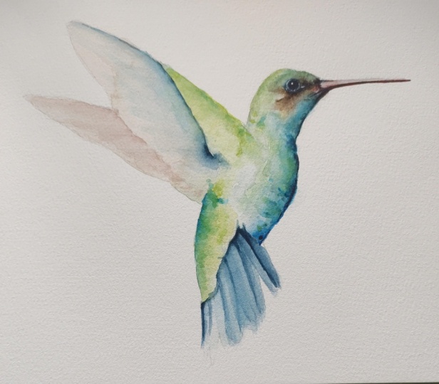
5. Reviewing The First Layer: Alright, a painting is dry. Let's see what we got. Here. We have our first
layer is all nice and dry. Now, we can look
at the colours and we can see how they've
all bled together. So that's what I was
referring to about the wet on wet paint. Not wet on wet paper
but wet into wet paint. So you can see here
like how these colors, like our base layer,
which is defined, our shape, they won't
kinda bled together. You can really apparent here
and the browns and stuff. This area in here is where we had that
big puddle of water. It pushed all the pigments out so there was
just too much water. But that's fine. We can repair this area
here and our second layer, we've got a really nice
foundation for the wings, so we can put in a little
bit more blue under here. And while it's wet, we
can bring that out. And if we wanna do
the same color like that ready colour under
here, we can do that. And we're going to put our
feathers on down here. And then we're going to bring
up our base layer here. There is in the
reference picture, there's kind of a line
that comes around here where the shadow areas. So we'll probably leave this area in here and up here just as a
base layer for now, but we'll put another
layer on down here. We're going to be careful
to avoid not blending it in here between
these because we want to define this
area and these areas as separate because they clearly are in the reference picture
and it'll look weird. Otherwise, I will put
our eyeball into, and then we'll also put
in the top of the beak. That will be our second layer.
6. Painting The Second Layer: Okay, So I think the
first part we're gonna do here is we're going to do that top
Green bit there. The part that we had
too much water from our big water blob and we're
on our second layer now. So it kinda comes starts when
it started up around here. We're going to bring
them brush down and we will come down like this. I'm just putting it on
however, haphazardly. And we're going to put this on, define that shape up there. Get some clean water now
because it's lighter down here, but we still want to
see those feathers. We still want to see
that pattern there. So we're going to
just define that. This will bring it a
little bit forward here. I know I said I wasn't
going to touch this, but I think I'm going to put
a little bit of those Flexi, kind of highlights in there. One thing that you will learn or have learned probably
by now already. If you watched my other videos,
I tend to say I'm gonna do something and then I do something
completely different. That's just the nature of
watercolor painting though. Where we get these different. You see something,
say, Well I'm gonna do this and then something
happens to the way the water dries and then you end up doing a completely different. So I've got some Cadmium
Yellow Light and a bit of that green
on my brush here. And I'm using that
just to define a few of those areas there. Nothing too crazy. We're going to let as that's
drying a little bit, we're going to move down here. And I'm not sure exactly how I'm going
to tackle this yet. It's got, I'm going to
say we've got Indigo, which is pretty much what
that colour is there. I'm going to try and not use too much water on my brush
because I want these to be, I want them to come
from underneath here. So I'm going to start by
just defining where they are willing to try not to
be too streaky with it, but just get them
they're just like that. I hope that makes sense
as to what I was doing. I just want a bit more water. I'm going to grab some favorably
which is a bit brighter. Onto the next one there. We can define where the
shadow areas are after. For now we'll just get
these done up here. Go back to the darker one
to find this area here. Dabs on that darker
color up there. Okay. Thanks. Those in the other two colors mixed together and I'm
trying to do as well. It's all wet and see, I've got that hard line in there because it dries really fast. Which is okay. That's why we're not
using a lot of paint. So now you can see
because it's on a dry, this one here has bled
in to the other side, which we didn't really want. But this one here got
to dry too quick. I'm just going to grab some
more of the dark color there. And I think some
darker area over here. So as these start to dry, we'll come back and
we'll do another, another run at this in a minute as this paint
dries a little bit. So we're kinda doing
everything in timing. So up here we're going
to put some blue in, but I want to wait until
this dries a little bit before I put that in so that those two colors
don't bleed together. And then I want these
because I want to have some definition in there. I don't want them to solid
lines because they're not. So we want to have a shadow area there and
the shadow area over here. Each one has that
shadow line down it. Soften those up a bit. Now we're going to grab
some of our Phthalo. Turquoise. Yes, Turquoise. We're going to come over
here to the bottom. We're going to put
some of this in just like we did up
at the top there. Careful not to touch that edge. Right all the way up there. Right up underneath
her beak there. And we can make some
of these hard edges. We can make some of
them soft edges. They don't dry on
us. We can do that, which has already
started to dry. It's all about the timing. That's wet not work
all of a better. Doo, doo, doo. Okay. We'll let those dry now. Let's see, and what we're
like up here, not too bad. Okay, so we're going to grab some bluey color here, whatever. I'm just grabbing
old paint that's on the palette, really matter. Now we're going to try not
stick your hand and your paint when you're doing this. And we'll get this area underneath here.
It's kind of dark. And wanted that hard. I want to get this
pretty wet too because I want to be able to use it to bring down these
other areas here like this, up here, come up Clean water to soften
that up a little bit. Breakout with some
of those edges. Okay. Now we've got a bit more dark area up
here where that muscle is, like this arm kind
of thing there. I'm just dabbing in a bit
more Indigo in there. If you want to bring that
along the back edge here, you might want to use a
smaller brush for this. Probably should be, but you get the idea of
what we're trying to achieve there now
hopefully you can see that what sit easy. And there we go. Try not to overwork it, but OK. Now that's
pretty good. Alright. I'm not going to
touch the bottom wing because I want to
keep that separate. We can see we're
dry down here now. Come back, grab
some of the Indigo. See what color that
edge is on there. And we're just putting
in the shadows. Keep that edge a bit
hard because it is. And so now you can see we've got that feather a look there. But because it was
just starting to dry. Now I'm kinda messed
mine up here a bit and I'll just make it up as I go because it
was starting to dry. Now we got that hard edge that we want for
the shadows that makes it look like they're
actually feathers. Okay? So if you need to add
this point before you go ahead and do
this stage, go back, see what it looks
like so that you know what the paint
is going to dry like. I hope that makes
sense. And I'll soften this edge up here a bit. Okay? Alright, good. So we've got some
definition there. On our third layer actually will do a
little bit right now. I'm going to darken up
this top area up here. Now you'll see some like the paint colors aren't
exactly the same. As I've said before
in other videos, it's more about the value. So I'm trying to just
get some shadow and definition here. There, just to give it a bit more of a
three-dimensional shape. I'll put a little
bit more Indigo, I think underneath here
using my small brush. I'll show you in a second. Right down under
here to show like these are coming out
from underneath. So that is a shadow
there, right? And it's not a solid line like these do come up in their
feathery kind of things. They're just add a
bit of definition. We don't want to overdo it. I'm not crazy about how
dark that is down there. Just lifting some of that up but some big blobs of water in. There we go. I don't want to take
away from that edge. I think I'll do the
same thing up here and my little will
call this the armpit. Just give it a bit more
definition along that edge. I'm just using
Indigo as a shadow. Well, it's still wet. While I'm at it. I'll take
my brush and come along. Now let's come over
here to our beak. Basically just clean
water on your brush. I'm just wetting
into the bottom. Now the eyeball over
here to the eyeball, I'm gonna try not to stick my
giant head in the picture. I still get close
enough to see it. We're gonna make a
half-moon shape like this. Come around all of zoom in and the video touch that they're printing another layer of this brown up here
to get more definition. I'm going to bring it up now
that I've got my eyeball in, I can see where that
little white line is and I just want a little
bit of a hint of it. I don't want it overpowering
and so much so that, you know, it's as big,
glaring white area there. Okay. So I've just grabbed
some Phthalo Blue, Red Shade. Same thing, just adding
in another layer here, even going a bit more interest. Let's see where the blues
are in the picture. And I'm dabbing and
adding in water. Now for our eyeball, that should be dry
enough now that we can just touch around
with clean water. Let that little
half-moon shape fill in. Underneath. I don't know if this
is dry enough yet. But underneath here I want
to and just define that with a little bit of a dark line. Bring an eyeball out more. In, adding a bit more indigo to make it darker if
it's not dark enough. To beauty of this color. This is pretty much black. Well, so we have a few areas in here where
we've got some definition. Alright, let's come back and see how it looks
when it's all dry
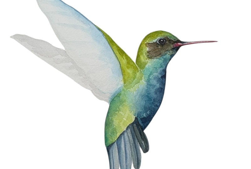
7. Reviewing The Second Layer: Let's take a look at
our second layer here. That's all dry
now, to be honest, I quite like how this
painting looks and I would be happy
leaving it like this. I'd like a little
bit more highlight, specular highlights, which is a specular
highlight is like a refraction reflection of the
light off the paper there. Other than that, I'm
pretty happy with how the eyeball looks. I would like to darken
this area here just a tiny bit just to
bring the eye closer, like everything we can do
to get the I in there. I really like how the
back part here kinda came together with that Phthalo
Turquoise and a bit of green. I think the head is
a bit light up here. So I think what I'll
do is I'll add in a little bit of that up in here. And perhaps a little bit along the back edge
of the wing here. And very, very light. Some lines down in here. Not too much, so I don't
want to take away from it. We could darken
this up here more. However, we don't want
to compete with the I. So in the real life picture, the bird, you can
have those feathers. But ours isn't a
real life picture. It's a painting, it's
a representation of, so we can make it
however we want. And I want the viewer to come
to the, I like a portrait. So those are the
final adjustments that we're going to make. And then we will say this
painting is finished
8. Painting The Third Layer: Okay, So the first thing we'll do is we're going to tackle, we're gonna put some of this here that we've got
going on up in here. So I've zoomed in so you
can see the final details better and not on the palette. So hope that's okay with you. And mixing in some of that bright green and some of that
Phthalo Turquoise there. And I'm just dabbing along. It's not the same
color because it's a mixed, but that's okay. We're just going to make this
here a bit more defined. Again, we'll just
touch some clean water along the edges to
break up so that the not too hard edges
there grabs same color. And we're gonna come
up here to the head. And we're going to follow along this line here where you can
see it in the picture there. There's definitely
kinda like a little cap almost of color
that goes on there. Bring that down there. There. It just ties out
in a lot better. I think. There we go, a little
bit along the back here. Nothing too crazy. Dub, dub, dub. Some clean water, soften it up. Right TO what else? I said we're going to oh, yeah. We're going to add a
little bit of dark around the eyeball. I think I'm what I'm
also going to do is make the eyeball just
a little bit darker. I'm going to grab some
straight up Indigo as saturated as I can get it. I'm just gonna put
another layer here. That's what else we
said we were gonna do. We're going to make a little highlight
area and the eyeball versus just tone it down just a little bit. It really brings the focus and more on the I
and it gives you like a connection
there a bit more. And now we had this dark
edge underneath here. Just dab, dab. I'm just touching in. I just want to see a little
bit of shadow in there. Bring this in a bit there. So I'm just almost like taking an arrow and pointing
it out the eyeball. That's what we're,
we're trying to do, but by using darker colors there just to draw your
eye in their a bit more. I don't want any hard edges. I just want it a little bit
darker, a little bit more. Why did not want to do that and it didn't
not have enough. Whatever you want to
call it, it didn't have too much paint there. So now that I is
really standing out, we'll put a little
bit of shadow down here just to highlight
it even more. There. Now we really
brought that eyeball home. I'm going to mix
some of this red and the red from the beak
with a little bit of indigo. Just darken this up a little
bit more underneath there. Again, just adding some contrast gives us more definition. We can do the same
under here if we want. I know I said I wasn't
going to want are you doing this back
part along here? We can add in a little bit more, but I don't want that hard line. So be quick to get
the water on there. Oh, that was the I think we're going to put it in some very light very, very light. Brownie red. So I will grab some brownie red. I'm mixing a little bit
of the red from the beak and some of the Sepia and
lots and lots of water. Lots and lots of water
keeps it in late. Touch some water and narrative. We just kinda said, Hey, this is the bottom half
of the wing there. I'm what I'm doing right now is I'm going over top
of the pencil line. Just try to take
some of the pencil line lines that I
have it in there. Remember at the
beginning I told you how the pencil line was very dark. What else? A little few final Touch Ups. I'd like a little bit
like definition in here to show there that
there's a neck there. Make that fall off a little
bit more gradually there. I think I'll do that with
water instead of paint there. I like that a little
hard edge there. And yeah, I think our bird is pretty close to being then
maybe a little bit more. Another some bluey green here. I know you can't
see the palette. But again, this is
value not colour. I just wondered a bit more
darker color in there. To define that. You can see when
I'm putting it on, on basically dabbing the brush. And then we're I don't want
to have to hard of an edge. I take my brush over
here to my water. So you Here's the water. Stick it in. Then I'm just touching along
the edge there. Like that. I have got some pencil
lines down here that I will erase afterwards, but I'm quite happy with this. I like this. I
will dry this off, take a picture of it and show
it to you in the finale.
9. Final Touch Ups And Review: We're all dry now. And I'm very happy with
how the painting looks. I didn't know that there
was an area in here where we kinda got filled in. There is a little white line in there and I think
that will help, again, kind of like the arrow
pointing towards our brush. So I've got my Gouache here, Gouache, Gouache, whatever
you want to call it. Basically it's like really
cheap white acrylic paint. That's watercolour paint
essentially with chalk added to it or some
kind of thing. And what I'm gonna do
is I'm going to dab very carefully on here, just a few little areas there. Now, if for example,
let's say you didn't have enough or you
messed up your eyeball. You can use this to
plop in the eye. There may not brighter.
Whatever you like. Well maybe there was a
spot on the beak, right? Like just very subtle.
Nothing too crazy. Well, it's still wet.
I think this is a bit bright up here, so I'm just going to dilute
that down a little bit. I just got some clean
water, my brush, just dabbing it, trying to make some bit of
the brown in there. I wanted to highlight
area there, but I don't want
it overpowering. I think that worked well
to achieve that goal. Okay, So now what
else do we got? The only thing I want to
point out here is our layers. Look at our layers here,
look what we have. So here, right here
is our base layer, okay, This is our
very first layer. Remember, we will
go back. Let's take a look at that picture now. This is our base layer, here's our second layer. And here we've got
123 layers there. Now, this one we did
at the second layer, so it's a bit conceiving, but essentially we did three
layers of painting. But what you want to have
if we don't do that, we don't break
down those layers. We lose this. This is the subtlety of
Watercolour, those marks there. This is one color on
top of another color. That's the layer when
you overwork it, when you keep going at it
and you keep pushing it, that's what makes it mud, and that's what makes your
painting look overworked. This is a key lesson and
loosening up your painting. I hope you liked this video. I like making it and I look forward to making
another one, please. Don't forget posterior
are finished artwork in the Projects and Resources section so that I
can comment on it. Thanks again for watching
and I will see you soon.
 Paul Cheney, Teaching watercolour and digital painting