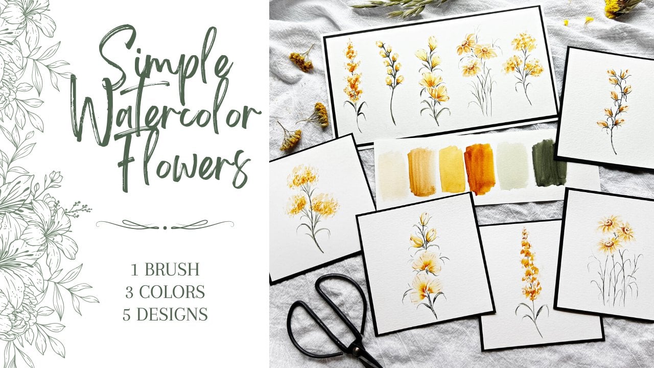
Transcripts
1. Intro: Hi, I'm Jen of DJ
Sweeney designs. Welcome to my home and
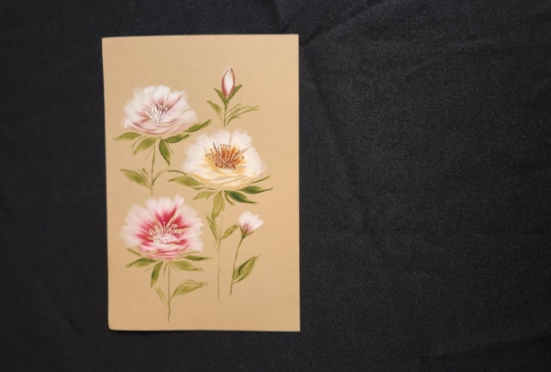
welcome to my studio. Painting these autumn
florals on this craft paper. Really probably something
I love to paint them most they just pop
right off the page. Let me take you
behind the scenes and show you what you're
going to learn in class. I show you all the supplies
that you will need. There's really not that many, but do make sure you have
some white gouache on hand. And our color palette
is limited to just a few beautiful
fall time colors. Of course, I have some
handouts for you as well. The Stonehenge paper is my favorite and that's what
we'll be using in class. We'll start off by learning my basic flowers with
that smile stroke. And then we up our
game and learn some larger flowers with new brushstrokes
and new techniques. And I do show you how to
correct those mistakes that we sometimes
making or paintings make this large floral
composition from start to finish all videos
or in real time, so you can see everything
that I'm doing. We also make this really
cute mini composition. And at the end of class, I will give you some ideas
for your class project. Okay, so grab your supplies and I hope to see you in class.
2. Class supplies: Alright, for class,
grab your brushes. I'm going to be using the
best D fountain wedge brush, the size ten and the 16. If you have a
Princeton petals brush or a Ruby sat and
triangle brush, those are totally fine to
just grab the larger size. And I have my Daniel
Smith paint here. For the most part, we're gonna be dipping into
the Quinn burnt orange, Indian red, yellow ocher, this Permanent Alizarin crimson. Maybe this guy here. What is the name of
this? Go with ICT. Maybe brown ocher will go with brown ocher.
That's easier. White gouache, whatever
brand you have totally fine. Payne's gray or in this
I've got James Grey. I'm not sure how much will
be really using that. So don't feel like you need
to run out and buy that. Two of my favorite greens
straight out of the tube, Holbein green, gray, and then Winsor and
Newton perylene green. Your palate. Some tissues or paper
towels or Tp a rag. The paper I usually
use arches but Canson, I'm going to just use
that a little bit today is we're practicing. But the main star of the show is this Legion Stonehenge
craft paper. I just love this paper now
it's not watercolor paper. So we have to adjust our
pigment and our water to this. But obviously you'll see
that throughout class. But I just love using
this craft paper. I have bought some other
craft paper at Hobby Lobby. It's fine too. If you have that, again, it's just gonna be a matter of adjusting your pigment
to water ratio. I have my water jars off to the side if you can
print your handouts. Great. If not, we're
obviously going to go through this
step-by-step in class, but I do recommend at some
point, print those handouts. I think you'll
really enjoy those. Scrap paper if I didn't
say that already. And whatever else
you need to paint. So, alright, I'll see you
over in the next lesson.
3. Set up: A little bit about how I do my setup before I
actually start painting. Even before that, let me do a
quick review on this brush. This is the one I just love, I use all the time. Notice this yellow stripe here. If you've taken my
classes before, you know exactly what
that's all about. So this is the wedge
portion of the brush. You can see this
nice long tip here. You turn it this way in here is that wedge portion, alright? When you see this
stripe like that, I tend to call that
belly up position. Meaning if I'm
painting and you see this stripe and I don't
say my brushes belly up, you'll know that
the wedge portion is facing up towards my face, up towards the camera. Typically, I'm painting like this and I don't
always say belly down, okay, this is just the normal, natural way to hold this brush, almost like a pencil. But there's plenty of times
that when I'm painting, I'm flipping this guy back
and forth all around and I don't always say
what position I'm in. And that gets a little
confusing sometimes. So anyway, this stripe when you see it facing
towards the camera, the brushes in the belly up
position if you don't see it. And I'm just painting like this. Obviously its belly down. This is the most natural
position to hold your brush. This is an unnatural position, but you can still
get some really beautiful strokes this way. Okay, So that's the size
16, there's the ten. Let's do this 1 first here. So I typically work
straight out of tubes, put them in my palette, but I grabbed this palette. It's a whole lot
easier to use this. When I'm loading just
the tip of my brush. We're going to do double loading all throughout this class. So what I mean by that is I'm loading the brush
first with pigment. And then I'm just using this tip to drag through
the edge of the paint here. I'll show you that in a moment. But it's really sometimes
a lot easier to use it this way as
opposed to getting all your paint out
into the palette. And then you've got
that big chunk of paint off to the side and
your dip in the tip in there. Sometimes I just want
super concentrated pigment and I just go straight
in into the pans here. So I take my spray bottle, give him a good spray. You can see the white that I've used and how
much I've dipped and drag my brush through this
Quinn, burnt orange here. Really a great color. I love this. I've switched it out, but it also comes with this
color chart as well too. And it tells you, which is really helpful, the pigment color family that tells you on if you
can see that, sorry. The light fast rating, if it's granulating
are not transparent or not so super helpful to have. Alright, let's put that off
for the side for a second. Prep this with some green. That's the green
gray by Holbein. Here's our perylene green, really dark rich color. I'll put a little
bit of Payne's gray and I'm gonna put you over here. And our white gouache, I'm putting that in the middle. Xian want you to see how I'm
really loading my brush. All right. And then I've got my water
jars off to the side. But what I typically do is
just I had a little bit. We're not going to use
these greens right away. Alright, let's start. Oh, this to a fun little tip
I heard in class one time. Just to use a sponge. This is just a soap dish
got off Amazon for like $2. When I'm rinsing my brush. Sometimes a lot of
times I'll tap it onto my towel or I'll tap it on
to this wet sponge here, which is really helpful too. That's off to the side. But I want you to
be able to see, especially as I'm
tapping my brush, because this brush
holds so much, a lot of times I have to tap this wedge portion just a little bit onto my towel
and then dip it into the second
concentrated pigment. Alright, but I'm getting
ahead of myself here. Here is the legion craft paper. I've got a couple pieces
of scrap paper I usually tucked underneath my towel. Let's move this nice new
sheet out of the way. I want to talk you
through quickly some of the basic strokes.
4. Basic florals: When I talk about
the basic flower, I'm talking about a
three petal flower with a smile stroke. Okay, what the heck
does that mean? Well, let's talk about that. First. You saw me put some water into my white gouache and I am
just rolling my brush. That looks pretty liquidy, so I'm going to pull in a
little bit more pigment here. This is where you
really have to give yourself time to play
around and figure out which consistency you
like if you want a brighter white or
a light or white. Alright, but we're just
practicing right now. The way I'm going
to load my brush, I am just gently
rolling this around, getting my bristles all loaded. So that is just sopping wet
right now I can even see that there's a lot that came off my brush and drag
it off the edge, Tap it a little bit on my rag. And then I go straight in here, dipping that tip into the concentrated
quinacridone, burnt orange. Now I'm not always
great about testing it. Sometimes I go right into my, into my piece that
I'm trying to do, That's probably not
the best advice. You do want to see what
your brush looks like, how it feels in your hand with all this pigment and
water on it. Okay. So you can see right now the tip is pointed down
towards my belly. That yellow stripe is
down towards the paper, so his belly down. Okay. I'm holding the
brush way back here, not down on the feral. I want a little bit more
movement, looseness. So the farther back you hold it, the more loose it's gonna be. Very basic flower. I'm going to land my brush, keep it there, and
just wiggle it around. Okay, There's the first petal. Now I know just by how my
brush feels that I have enough white and enough
orange in my brush. I'm gonna come
over on this side, land my brush, wiggle it around. I can already see I'm
losing some orange. They're not a big deal. You can always go back in, get a little bit more. Okay? You can tell my point
is always right here. That's where I'm
heading with my brush. Land the brush. It's fixed onto the paper, gently wiggling it around. Now I still feel like I've
plenty of water and pigment in my brush might be different with like an Arches
watercolor paper by now, I probably would have
run out of that, had to dip in my water or fill it back up with
the bleed proof sorry, the white gouache
or the bleed proof white and dipping it
into the pigment. But I feel like there's
enough in there. How I do that smile stroke. Tip of my brush is pointing
out towards nine o'clock. My hand is resting on the table. Sometimes sometimes
I leave it off the table to depends on
where your comfort level is. Basically, I'm using this side of the brush onto the paper. I'm pushing it into the page. Okay, so I just land my brush. Usually start where
this petal is, maybe in the middle, maybe a little off
about, I don't know, a force of the way in from the outside doesn't
have to be particular. And I just land my
brush and sweep it. Okay. So right here you can see, you'll get to notice these
wedge brush strokes. There's my tip right there. This part right here
is the wedge portion. And I've pushed it in and
basically come right off the page that you
can leave it alone, walk away, say, Yeah, I got a great flour,
it's awesome. And move on. You can get a little creative
and a little daring. I just dipped my tip back into the orange and do
another stroke. Gives it a little
bit more dimension. Obviously that
stroke is smaller. This is where you want to be
careful and not overdo it. But I tend to just
go in sometimes and do a few more
whimsical light strokes. Okay, Let's do that again. Rinse my brush completely. Get back in my white,
my white gouache. Rolling my brush, can drag
it off the edge here. Tap it on here. Let's try some Alizarin crimson. Can you see that dividend there? You can see how much
I've just really use that by just
dragging that tip. Right along the edge. You can see the pigment
on my brush hopefully. Okay. Did you see I choked backup on my brush going to land my end. This is just muscle
memory for me. If you want to start with
this petal fine or this one, I tend to start with
the middle pedal. Land my brush, keeping it fixed on the
page and move it around. Now right here you can
see I had a little bit too much of watery
white on my brush. Not a big deal, but that I'm just pointing
that out to you. Okay. I may have needed to dab my
brush a little bit more. Not a big deal. We're not gonna get so
particular about this right now. Okay? My point is coming back
towards the center. Land my brush. Brush stays on the page. And I'm basically wiggling, going up and down a little bit. As I make these petals, I can dip back into my red. Do a quick smile stroke. I do like how that's
bleeding right there, a little bubble right
there. Let's pop you. And then we can do
another stroke. Okay, should have left
that little bubble alone. Not a big deal. Alright, let's do another one. Rolling my brush,
dragging it off the edge. Let's do this. Let me show you
if I just rolled my brush, lifted it, did not dab it, get into my Alizarin crimson. And then try this again. Look how much that
just bleeds way back. That red on my tip just
flooded the back of my brush. Okay. That's not a bad look. If you're going for
that look totally fine. My brushes definitely saturated enough to get all these strokes. Okay. I could probably do, I just dipped into the red again and again because this
is not watercolor paper, home-free with getting
a lot of strokes down. Okay? Not bad. Again, if
that's the look you're going for, just be aware. If you really saturate your brush and you
don't dab it off, you're going to have all
kinds of explosion here. Okay? Again, really knocked out
at all, kinda like that. Okay, let's just do it on the white paper just
for comparison here. Still getting in my white. And as you add water to this, don't forget to pull
some more pigment out. Flopping around
loading the brush. I'm not really sticking
it into this palette. I mean, I'm just real
light with this. Drag it off the edge, Tap it a little bit. Let's head into this Indian red. Just drag and right across. Other than what I've
sprayed in this palette, there's no more water in there. Sometimes I start here
to move it around. Sometimes it meaning here five o'clock or
maybe six o'clock. Okay. That's just how
I normally do it. Whatever position of comfort for you is going to work, do that. Land the brush,
wiggle it around. Always pointing
back to the center. Couple light whimsical
strokes might be hard to see, but there's obviously
the white behind there. Something you could do for fun is outlined
just a little bit. So you can see the
definition there. Okay? If not, you
don't want to do that. You can always get
back in and do a little bit of a center while your tip still has
some pigment on it. But these really soft
edges on the back, I think are so beautiful. Let's do that again
on this white paper. Dragging, tapping, dipping. That's the name
of the game here. Let's get into this brown ocher. I don't use it too much, but it's it's a nice fall color. Let's see what we
get. Probably really hard to see this on
the white paper. Alright, comparing it to this, where they just pop
right off the page. Dragging, tapping, dipping. Didn't think I dipped
enough in here. Sometimes you need to add more water or dip a
little bit further. I'm going to go right
over this petal. Kinda matches the craft paper. Really pretty and soft. Okay, So if you can just take a look at this for a
minute and think about if you were doing a
big composition, you had these nice
soft autumn florals. And then he had bam, this big one here
that's really bright pink because your
brush was too wet then it's like a little
bit too much drawing the eye into this one where you want to keep
it nice and soft. Okay? Alright, so that is
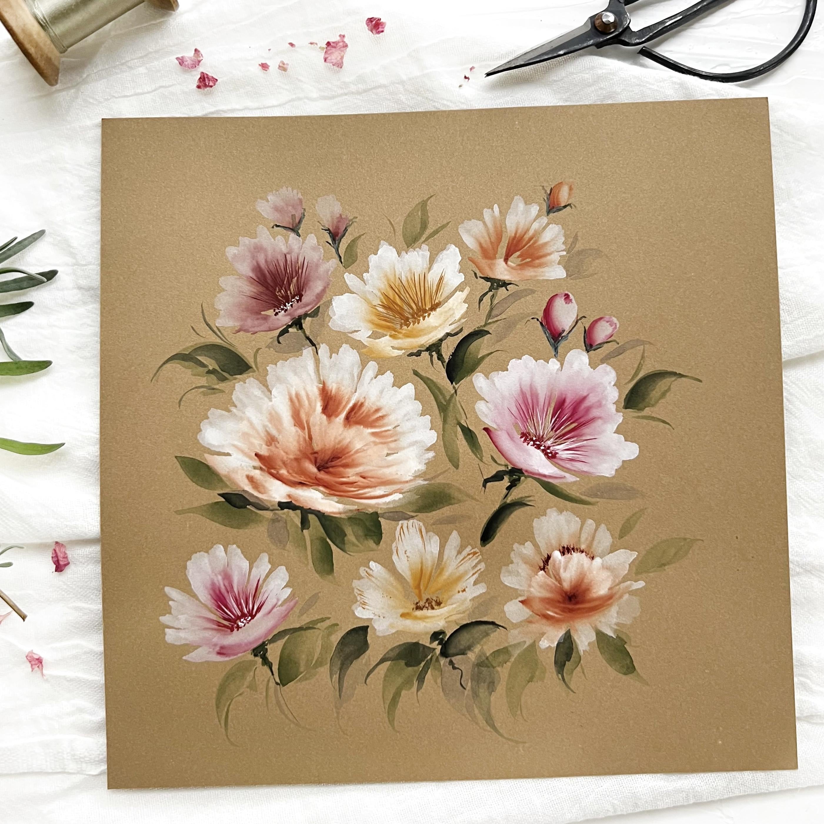
the basic floral. Let's go ahead and move on to
some of the larger florals.
5. Large single florals - Part 1: Alright, for the larger florals, we're going to start off doing pretty much
the same thing, but I'm gonna get a lot
looser with my brush. And in your handout you'll see where I talk about
bouncing your brush. Let's move this out of the
way for just a moment. So I've got my size 16. Going to load my brush
exactly the same way. Need a little more
water in here. Back-and-forth, flopping it in the white gouache and pull it out a little
bit more pigment there. Okay. Dragging it off the edge. Tap on my sponge this time
to see how that works. Alright, let's get into, Let's do this Indian red, dragging it through
concentrated pigment, starting the same way. Now remember, this
is where I kept my brush fixed to the paper. Okay. I did not take it off the paper as I was
wiggling it around. Now we're gonna
get a little crazy and wiggle that
brush and bounce it. Okay, same position. Land my brush. I am just kinda jumping
and bouncing off the page. You can already see the
difference here, okay? Because that red
is already moving back a little bit into my brush. Literally coming off the page. Just kind of bouncing. Okay, this is where
you get these really fun, cool looking strokes. I'll even do that. Let me dip into this. Again here. This Indian red. Like that's a lot. And then I'll do the same
with the smile stroke where I might just kinda
wiggle it in there. Okay? Now that looks like
a lot and sometimes it is so I can dab off my brush. And you have a little bit of
wiggle room with this paper. So I'm just pretty
much using what is on my brush and the paper and
gently moving it around. The caution is, and I'm
preaching to the choir on this. This is where it can get
really too much and you start, oh wait, I want to add
a little bit here, a little bit more, a little
bit more, a little bit more. And then before you know it, that pretty flower is all. One blob. Doesn't look terrible. You want to keep your
florals open and airy. The fix for something like this. Getting back in that Indian red. It's really not even
dry all the way yet. But if I have this area down
here a little bit darker, I'm just using the
tip of this brush, feathering it out
a little bit more. I can give this flower some dimension and save
the flower, basically. Okay? So even though you might
have a blob there, there are some ways
to make it work. And that's getting back in and darkening it up in
one spot down here. Because the way this
flower, what I'm, I have no idea what the
name of this flower is, but it looks like a flower. Okay, So you've got all
these little petals here. You've got some in
the front and knees. It's really hard to tell, but like if I would do
that smile stroke again, you can see some
flowers or petals that are basically laying
on top of each other. Or they've not fully opened yet like they have
in the back here. I might totally be
making that up, but that's what my eye sees. Okay. You can totally
leave it like that. Or what I'll do sometimes for these larger, larger florals. Once this is dry, Let's see, I'll get back in. This is that Indian red? Just the Indian red. And I might force
the eye to think, Oh, there's the
center of the flower. Maybe even couple of
little lines where I'm forcing the
viewer to look there first and then to the
petals on the outside. Now this one I really
do like I would walk away and say stop
overworking it. So that one, I can
live with that one. But I have had plenty
of blobs before. Okay. Let's try this again. The bouncing. Take some time. So I just rinse my
brush off in the water, tapped it on the towel. I do that sometimes because I'm not always the best rents are and then it might be full of green or orange or
pink or whatever. I have a safe guard there. Flopping my brush around, dragging it off the edge, tap a little bit out on
my sponge or my towel. Let's try. Let's do some of
this yellow ocher. See the white, you can
see the yellow, okay, if you start to hold
your brush like this, that pigment is gonna go down. So you want to work a
little bit fast too, okay? So I'm going to choke
backup on my brush. A little bit more. Light, loose bouncing strokes. I'm slowing down a little
bit so you can see. Okay, I didn't get
quite enough that yellow ocher need a
little bit more there. A little bit more. Sometimes what I'll do
once these three are done, I'm gonna go down this way and do it again, these
three strokes. Sometimes I do that
just to play and see what kind of flower
I'll come up with. Sometimes I'm surprised
and it looks great. Other times I'm like,
Oh absolutely not. That's not terrible. I could live with
that if it was in a big competition for
totally live with that, and I would just leave
it alone at that point. Like this one had
a center there. This one I feel like is
more closed up that it's not quite open enough
to see the center. Okay, Let's practice
another one. I will assume that you're
going to have all kinds of practice pages
full of blobs that you're trying to
correct? I know I did. Like I said, sometimes it works. Other times it's like, okay, no one in the world
is going to see this going in the trash. But that's what
practice is all about. And it's really
learning to manipulate this brush and hold it at an angle it in a way
that's comfortable for you and loading
it correctly. So there's a whole
lot going on here. All right, let's try. Let's do this Alizarin crimson. Now, I'm dipping the
tip like maybe about, well, this looks like it's
about the whole tip here. That again, you'll need
to play around with depending on how bright
you want that center. All right, we're going to
bounce and move again. Now this was pretty full
because you can see that pink, that red going right
back into the white. And I'm fine with that. Whatever. Look,
you're going for. Now here, I'm going
kind of fast, but I'm doing a couple of quick smile strokes,
very whimsical. Sometimes I leave
this center open. Sometimes I start to fill it up, but that's where you
want to be careful because you can
really overdo that. So I'm going to
walk away when take my own advice and
just walk away. I'm going to do one
like that again, I know that was pretty fast. Rinse my brush and
do that again. These are really just a lot
of fun to make because you're just bouncing and color
and trying to fill it in. And it's like, wow,
really pretty cool. And they get big. I love these two. But then these have
some really fun shapes and character to the petals. We haven't even added
the greenery yet.
6. Large single florals - Part 2: Alright, the white, I'm
fully loaded there. Let's do. Let's try. Let's get back into
this burnt orange. Alright, point down at my belly. Land. Bounce. Okay. This is just muscle
memory for me, this shape right here. I tend to do that all the time. That's good. And then
that's not good because I'm stuck in
something like this. Okay. So sometimes I'll
play around and I think, well what happens
if I do the same? Down here on the bottom, where you've got like a
flower going up this way, the petals going up here, then you've got some
lower down here. Like Wow, maybe I like that. Maybe I don't. Let's just quickly
add some smiles, strokes, try to correct it. Then there's too
much going on here. There's too much of this,
these bottom petals. I might dip back in
that orange and try to cover up that space. But leaving this the
dark part where I want the eye to really go first. As opposed to leaving this open. I'm closing up that center. Feel like that's not too bad. I couldn't live with that. This is where I think. How much more do I wanna do? Because right here you can see the
differentiation between these back petals and these front petals here.
I'm rinsing my brush. And just like this one here, I can get just in the
burnt orange and force the eye to look at
this as if it's the center of the flower. That's pretty, I like that. Okay, so that was
the burnt orange. You can also take the
tip and go into maybe an Indian red combined
some of these colors. Okay. It might be
hard to see that, but to have some
contrast is always good. Same with this one here. You could get back in your concentrated white
and ever so slightly, and maybe couple of white
dots in the center. Okay. Could do the same thing here. If you wanted to add
this for your center, that would be super pretty too. Could also take a white pen. But sometimes it's
just easier since I have the brush in
my hand already. However much or little
you wanted to do. Add a couple little
dots down here. You could add the dots
on the top randomly. Pretty fund at
different centers. Still feel like this
is not balanced well, but the paint is still wet. So let's do a few more here. Alright, let's try the white. Just for fun. Flopping my brush. Tapping the wedge part. Let's get into, Let's
just do the Indian red. Okay? 0 is about five o'clock. Can see how far
back I'm holding. We could even hold
it back farther, way back here on the handle. Land. Bounce. That looks a little bit of starburst. Going to reload this, making this up as I go here. So hang with me. Okay, I feel like I want to close that up a
little bit more. Couple smiles, strokes. Just gives a nice soft edge. I think this will look pretty
and a big composition. Back in this Indian red. I haven't gone back and my wife just getting back
in the tip here. The tip in that Indian red. Kind of a funky looking flower. But see, I'm trying to make it better and it's
growing by the moment, which isn't terrible, but I feel like we're getting to the point. It's being overworked. But this is my safe
spot to go back into this area and try to
darken it up a little bit. Okay, Now picture that in a big competition
with other florals. Or let's just play around, Let's get into our green gray. And then maybe we wanted to just add some whimsical leaves here. Okay, something like that. I still feel like this
part is too big here. So if that would dry, no, it's not totally dry now, but once it is dry, might get back in
that Indian red. Define some of these
lower leaves, not leaves. I keep saying that lower petals that haven't quite
opened up yet. So I tend to go back and forth with the
pigment and I'm like, no, I don't like that. Let's see if we add
some more white. Give that a little
bit more dimension. Could do all kinds of things. Maybe get into this
perylene green. I want to darken up
this base a little bit, even if I love this
bleeding here. So don't be afraid
to play with. Okay. Let's do just a few more and
then we're going to work on some compositions and
add that greenery.
7. Large single florals & buds - Part 3: I think you're
getting the hang of it, loading your brush, dabbing it, dipping it in to
the concentrated pigment, just dragging that
tip across the pan. Choking back on your brush, landing, bouncing and skipping. Smile strokes. And see I'm just being
a whimsical there. Okay. What did we get
in? I was there, yes. Back in that maybe
darker down here. I don't know if you noticed. I automatically went
down to the feral. I want a little bit
more tighter control down here with some of
these smile strokes. Rinsing my brush. Now I would let that dry. And then I would definitely
do a center like this, perhaps, probably with
the alizarin crimson, maybe some black. Okay, but just for fun, let's just add some greenery. For this. Right now I'm just
using the tip, leaning that brush
into the page. Very soft, very whimsical, just adding some contrast
right now, okay. One other thing before we
do some composition work, let me show you how I
do some floral buds. I'm going to put my 16 down, grab my ten. Again. I do the floor buds two ways and you'll see that in
your handout as well. Flopping my brush
into the white. Sounding like an old
record by now, tapping it, tipping into the concentrated
pigment is the Indian red. So two ways I do that. I don't want to
turn it over yet. So I can do just like
one pedal stroke. That can be a button. Okay. The other way, if I'm holding might
see where my thumb is supporting the
finger on the feral. My hand is on the table. Point is about seven o'clock. I'm going to just push
that into the page. Almost do like a C stroke. Okay. And then I
just take the tip and fill in what I think needs to be
filled in for button. Okay, super simple. You can pretty much make
these whichever way you want, because once you
add some greenery, little thick, that's
going to look like a bud. I think. Hopefully you do too. Now here, I didn't say it
but its belly up. Okay. So I'm using this
maybe the first fourth of the tip of the
brush upside down. And I'm just pushing
that into the page. However much greenery you
want to add around there. Sometimes I hate to cover
up this spot here because it's got that nice
color right there. But sometimes then it
looks like it's just kinda sitting in that little
green bud area. So it might try to get a
little more green up in there. Now this is a perylene green. I like wavy little
stems and greenery too. I just, I love that look. I'm just using this brush
like a pencil almost. There's a yellow stripe. It's a little long for a bud, but just to show
some contrast there. So do go up a
little bit further. So you can really delineate
that that is being held and it's not just plopped
right into the greenery. So if you really look
at a bud closely, the greenery does go way up, but I tend to just
be a little more, a little more safe because
I liked the look of that of that flower, the button. A little more like it's
being held in cradled. Okay. So then a tip I give a
lot to as if you're like, oh, that's just too dark. I went way too much too fast. You know, you want
that contrast. So I would dip into my white. Maybe just lighten
it up a little bit. You can go back and forth and play with it until you're happy, but try not to obsess about it. Preaching to the choir again. All right, so let's, let's play with this one
for a minute and let's put a center in there so I can get back in to the alizarin
crimson dragon. My tip across that pan. Don't want to put my hand
right in there, but let's see. Same way. Start down here. My hand is fixed on the table to give me a
little bit more control. It's not super wet right now, so I'm rinsing my brush. Going back in there. Little better. I'd rather go to light at first as opposed
to some big blobs. Sometimes they go a
really long with these. Other times pretty delicate. Just depends on the mood. Can maybe add a few
little dots in there. Again, signifying the center. Make it a little bit more
concentrated down there. Okay. Something like that. Alright, I think we're ready to move on to the next lesson.
8. Bouquet - Part 1: Alright, let's work on some
composition now that we've learned some of the basic
florals, that bouncy florals. Let's put this together. I do want to apologize
to for that last video that was so blurry on
some of the parts there. The camera was picking
up on my tip here and I know better than
that when I was filming. So my bad, I'm going to
try something different. Hopefully, fingers crossed,
it's going to work this time. Alright, let's
start with the 16. I'm gonna get a little
more water in here. We're going to make a
big floral to start with using the burnt, what is that? The burnt orange, quinacridone. Burnt orange. Alright. And I need a practice page just to
see how often I use that. Alright, dipping
the tip in there. Let's start it over here. Choking back on the brush. See I got my practice page
and I didn't even practice. Alright, Get back in here. Alright, we're going
to start the big floral over in this area here. Sorry, this is about a not quite a ten by
ten, maybe 9.59. I kinda down just mainly
so you can see better. Okay. Whatever size you
want to do is totally fine. Alright, choking
back on the brush. We're going to bounce
a little bit here. I'm gonna get back
in that orange. See it coming off the tip a little bit faster
than I wanted to. Okay, Another way to
do a bigger floral. Remember how I went
in inside of it? We can also go on the
backside outer side of it. Okay. I can just play around with
the stroke. Sometimes. I can see the flower growing
right before my eyes. I want to actually close
this up a little bit more. Want this dark down here. And I'm keeping my
brush a little more fixed onto the page this time. Alright, walk away, walk away. Okay, I'm going to
let that go for now. Now, I lied, I see this
little spot right here. Okay, now I'm going
to walk away. Alright, so rinsing my brush. Alright, Next, let's brighten
that up a little bit. I'm going to get any
Alizarin crimson. Let's have one. Let's see, we'll
put one right here. Trying to use these
bouncing strokes a little bit more often. Back in the crimson. Okay, let's leave that one alone now I have
plenty in my brush, so I once worked on
a couple of buds. I just dipped it back into
the Alizarin crimson. And let's get a bud right here. Okay, there's a C stroke. We can add a little
bit around the sides. Okay, I don't want
to do too much. Okay. Let's do just do another
smaller one right next to it. We need to let that dry. We're going to have greenery
and some other things in our fall floral bouquet. So we're just building
this as we go. Alright, next up, let's try. Let's do some yellow ocher. Let's see what we can get. Better tests. This one. The yellow ocher, can be a little unpredictable
sometimes. That's not too bad. All right, I'm rinsing my brush again. Pulling some more pigment
in as you need it, drag it, tap it, and let's get that yellow ocher. Go down here, angle him
a little bit different. Now, I'm gonna go up here. I'll leave him a
little more open. Get back in that yellow
ocher pretty quickly. I'm just filling this one up. I made these smile
strokes a little too big. Not a problem now.
9. Bouquet - Part 2: Alright, I'm gonna get
back in that yellow ocher. Actually were being brave today. I said this guy is a
little unpredictable, but these fall colors
are super pretty. So we've got one
facing this way, here's this way, that way, just a fun, fun bouquet. Be a little more
cautious on this one. Okay, works for me. Let's rinse our brush. Let's get back in. Let's try some Indian
red this time. That is such a pretty color, very, very rich color. So be careful with that one. I don't want it too close
to this pink one here, so I'm gonna put it up here. Okay, Let's do, I've still got plenty of
white on my brush. Let's get back in
there and the tip. And then let's see, let's do a bud right here. What we'll do a bud this way. One here, two little sloppy on that one. So I just kinda got in there and stopped it up with my brush. I dabbed it on my towel
and then soak some backup. I forget sometimes this
is not watercolor paper. Alright, I'm gonna do
a little bit more of the burnt orange
look and fall time. I feel like that was
a lot too bad there. Going for a little bit
different look on this one, trying to get some
petals down here. Using that smile stroke. Darkening it up a little bit. Tell you what, let's just
go all in on this one here. Again, you have some time to fix some things if you
want while it's still wet. Just try a little bit
more white to light. Really want to get
some white back here because my goal is to do some of these
dots like this one. We could still do it, but I'm gonna get a
little bit wider. Concentrated white
on my brush. Dab it. Get in the burnt orange. Let's just see who
that could work. Hoping some of that soaks in. Now, wipe that out of there. Trying to work a little
fast because this is wet here of course. Tone this down a little bit. Alright, At the risk of like totally making a big blob there, I'm going to walk
away from that one. I think it was salvaged. Hopefully. Maybe this
one I wish would be a little bit darker, but that's okay.
We've got brighter. In some areas you don't want
everything to be the same. Let's see here. We're almost ready
for some greenery. So we got 12345678910. So we're even tend to
work in odd numbers sometimes I'm just trying to look where we might
feel something in. You've almost got an
S curve this way. We've got space here and here. We don't want to
fill it all the way. Okay. How about we go
for one more right here? I think this one's
pretty bright. So I'm actually going to go
back in for this color here. The quinacridone, burnt orange. I could change out
my brushes too. I've just used the size 16. I get lazy with that sometimes and just stick
with the same brush. We could go down to a six or
an eight to do them smaller. But you can see by
using one brush, the variety that we can get. Alright, tapping it. Orange. Keep that one little. Okay. All right, we
need to let this dry all the way
and then we'll get some centers in there
and some, some greenery. But looking good so far.
10. Bouquet - Part 3: Alright, Is this was
drawing, I looked at it. Any thought, you know, I'm a little worried
about this space here. That's gonna be a
lot of greenery, like this guy is pretty big, so I need a fair amount here. But then we've got
this one here. So I think I want to add
another floral here, and then even maybe
a bud up here. And then we'll do
greenery, I think. All right, Let's
just give it a shot. So I will get into the alizarin crimson for
this flower down here. Remember he wants
some large, medium, small, different size florals. And your composition could soften this
while it's still wet. Just a little more smiles
strokes with the white. Essentially lifting
that off there. Now as it dries, I could do another little white
swipe of a stroke there. I do like this one a lot. Okay. Let me do a little button up here to the burnt orange. I'm just going to leave
that as is for now. Before I forget, let's see. We can get back in there. It looks pretty dry. Okay. Easy enough. We'll just leave that right. Walk away, walk away. Okay, let's get some
greenery in here. So I've got the green,
Greg perylene green. I've got Payne's gray here, or Jane's gray in the palette. We're just going to
see how this goes. Now you want to start lighter? I tend to do that
with the green gray. And that helps me as I go lighter and I'm just
throwing down the green. It helps me see it
come alive sometimes. I honestly don't always have a composition in mind that
gets me in a ton of trouble. Sometimes I do sketch it out, sometimes other times I'm like putting it down and the
greenery and go on with it. You kinda need to
paint intuitively sometimes and just learn
to see things as you go. Not an expert at that,
but I'm learning. Alright, so the way I
like to start these, I tend to do here. When I'm looking at this flower. It's going up this way. So I tend to look here and
here is where my center is. And I tend to just go
ahead and put in a v. That's just helping my
brain see certain things like, I don't want to put the v here, that's totally off
where it needs to be. So I start at the center
and come straight down. Now, I may eventually
just cover up that area, but as I go, That's what I need to see. I don't do it on
everything sometimes what I'll do here on some of these big flowers is
just go ahead and land. A couple strokes. Could do the same with
this one. Down here. Greenery, you can get
out of hand width two. So you want to be careful. Just because this guy
is a big one here, I do want to get some
of these in right away. Then be careful where you put your hand. All right. Once that's in, then I can
kinda see where I need to fill in floral or
leaves. I'm sorry. What I do sometimes too, is just do a little bit of a scribble right
underneath there. We're going for
whimsical look here. Does not need to be perfect. Of course you want your
composition to breathe too. I'm not looking for this to be a bunch of flowers with
stems coming down. It's just basically
a composition with greenery around it. So I'm just filling in
random spots right now, trying to look at it as I go and we still need
to do some centers. There's a million
and one ways to make leaves with this brush. And now I'm not doing a ton
of explanation of the leaves. I've done that in
some other classes. But what is the easiest? Get another paper here
of just practice. When I'm doing random oldest use these
flowers for an example. And see where the
yellow stripe is. Where my point is. A lot of times I just lean
into the brush and come off and then get back in
there for a second stroke. Even just little
taps of the brush. You're indicating greenery. What I like on some of these here is just where
the wedge portion is, kinda snuggle it right up
to the end or the bottom there and just
squeeze it in there. Now, it doesn't even look like these are connected sometimes. And that is totally fine. Again, we're giving
the impression of greenery around a bunch
of beautiful florals.
11. Bouquet - Part 4: Just one little stroke
like that can be a leaf or second stroke. And then I tend to do just some whimsical
marks around the leaves, sometimes to around the
larger leaves there. I don't know if I want
to put one there yet. So again, this is
all the green gray. I haven't even done
any contrast with a perylene green or even the blue. Let's go ahead. Let's just do some of that blue. It gives a nice dusky color. So this one is the Payne's gray. Way too dark. That would totally
overpower this. And I just want a hint and I could have
started with this. But sometimes what I'll
do is I'll actually do this color when I'm done
with the green gray. So that's the Payne's
gray and then out of here, the genes gray. Let me show you what
that looks like. A ton on my brush. So not a whole lot of
difference there. Okay. So let's see. It's almost like you
don't even see it. But all of a sudden
your eye goes, oh wait a minute, what is
that light color there? And it's really pretty trying to watch my hand and then getting in that
tight spot there. I'm going to just pull some of this James Grey out
for some reason. I feel like I like that
one a little bit better. I had some on my brush. I didn't want that much. I just dumped my brush into the water to take some
of that pigment off. Okay. Let's see. Don't want
to close up everything. We're getting pretty full here. See where else could we go
with that little bit of blue? To feel like you
don't like something. Get in there with some tissue, dab it out a little bit. It's not too bad there. Let's extend that
one a little bit. This is looking a little too
uniform down here for me, but we'll get some perylene green and add some
contrast there. Again, this is super
concentrated, super-rich color. So you definitely
want to test this. Too dark. You do want some dark. Always have to have some dark. Sometimes I go back over
the same leaves I've done. Other times, I'll do brand
new ones, which is preferred. Now this, I want to get a
little darkness under here. That darkness is going to
counteract with that white. They're highlight that a bit. Still trying to watch
where I'm putting my hand. Just let some of the
stems show here.
12. Bouquet - Part 5: Maybe if we do a leaf because see a lot of these are
pointing down this way. I'm feeling like I'm
being pulled that way. So let's just try. That should work a little bit. Not super happy with
that, but that's alright. I'm happy with a lot of the
other, other stuff here. You can just build up one side of your leaf for some contrast. Alright, let's stop with that, let this dry and
then we'll get back in and add some of
these centers here. We want to build up these, you know what,
Let's do that now. Sorry. Let's go ahead and do that because
some of these are just not quite as
dark as I want. I want to give it a
little movement to, so I'm just using my brush
and really just wiggling it. Just the very tip. Some squiggly lines. May or may not add some white to this than some of these
are a little bit darker. I tried to over correct
it and then they get too dark and then I go back
and forth, back and forth. But alright, well, let's
walk away for a moment, let this dry, and then
we'll add the centers. Alright, let's go ahead. We'll get into this one here. Kinda just get some burnt orange on my tab now, switch to attend. Don't really have to, but whatever you feel you have better control over
or control West. So I'm going to add just a
few little dots, same color. Just to pull that IN. I do like how this
flower ended up. So sometimes overworking it or when you feel like
you're overworking it, there's a little
bit of a benefit. Other times, hot mass. So take your chances. I say just trying to feather
this out a little bit here. Alright, let's leave that
looking, looking, looking. Let's go ahead and do that. Same one here with the lines dipping into my Alizarin
crimson, just the tip. That's pretty blobby. Let's try that again. Alright, let's give it a shot. It feels pretty dry on my
brush, but that's okay. I'm just going for
a subtle look here. Then flipping it over. And again, it's just kinda dry, but I'm just tapping some of
that into the base there. Okay, leave that one alone. We could actually do
that same one down here. Let's see what's left on my
brush a little bit more. You don't have to do a
center on every flower. Totally your call. Sometimes these petals, a lot of times these petals just look really pretty
by themselves. Okay? Another way
that I will highlight these petals is by just doing a little bit of
lines instead of the center. Do it down the pedals. Let's try that with
the yellow ocher. You can grab a detail
brush if you wanted. For this too. I don't
have that right by me. But I'm just going to load the tip with the yellow ocher and we're just going
to give it a shot. You want it a little drier. So I'm really trying to work it here because it's
dry on my brush. I'm trying to avoid
some glossiness. That a word labialis, just something like that. Leave it as is. You could add even a
little more character or brushes still dry, but just a couple of dots
on some of these petals. Okay, well, let's
leave that one go. Let's get into this one here. That's still, you know what,
that's the yellow ocher. Let's go ahead and use this brown ocher for a
little bit of contrast here. That's super concentrated. Let's see what we got with that. Yeah, pretty thick. Get some of that off my brush.
13. Bouquet - Part 6: You could do yellow ocher
and the brown ocher. You could even do
some Indian red. Be careful with that
one though again, it's super, super rich. Couple of dots down
at the base here. Let's leave that one go. I think what I wanna do is just add a couple of dots in here, not any of the lines, but I am going to use
that brown ocher again. Just tiny little details. Really gives the viewer
something fun to look at. Okay, let's let that go. I'm feeling like I want to add a little bit of white
dots on some of these. My eyes just bounce all over the place and
sometimes that's good. Other times it's not. I need to be patient. Sometimes do one
thing at a time. If you do too much
white here, easy fix, just wait for it to dry and get back in with the same color. Let's be brave and see what a
few white strokes might do. It's okay if I ruin this one
because it's just practice. All right, Let's do that down here. Just a few. Alright, let's do some up here. I think I might just
leave that one as is this one I'm going
to leave as is. Alright, in the Indian red brushes feeling a little dry. I'm just trying to avoid
the lobby, the glossiness. I'd rather go slow.
Get the look. I want having to do
it several times as opposed to just a big
glob going on the paper. It's pretty subtle. Let's add a couple
little dots in there. Alright, let's try to lighten up some of these
areas by the buds. A little bit of white. A lot of it's going to soak
right into your pigment. And sometimes unless I was doing this right
in front of you, you might not even notice that I was trying to
clean it up a little bit. But just since these
are so little, I don't want a big dark
spot right underneath them. So it looks like he's
just kinda sit in there. So I'll pull that up
a little bit. Again. Don't wanna get overly
obsessive about these, okay? Because those honestly are
not really what the eye is. Can first, you're going
to see this one and then dance across the page
a little bit, hopefully. Okay. Alright, last few touches on this and
then we'll move on. I am going to add a few little white dots
to this one up here. Ever so lightly. And then I think I want to add a little bit more greenery here. This is just such a big floral. I'll go light, but
right underneath here. Just want to fill
that in just a bit. I really can't even see that. But I think to what I wanna do. Now, you know what I
think I'm going to leave it alone. Leave alone. I keep telling you to
walk away and don't obsess over the little details. So I'm gonna do that. I'm going to walk
away looking at this things I would possibly
change in the future. This floral I really like, but maybe angle it this way. You always want movement
in your compositions. Again with these
leaves down here, not the worst in the world, but maybe change the direction
up a little bit more. I love the colors. Love this craft paper. Love how we've got
some different sizes. They are going in different
angles and we've got an odd number of the buds there. Let's see, 12345678910111213
altogether. And then your array of
greenery. I think we're good. I think we're good with this. Hopefully, you've enjoyed this. We're going to move on
to one more project. And then it's all
up to you to do your class project and get
that into the project gallery. If you have any questions, I meant to say this in
the very beginning. Always e-mail me, DM me, I love to hear from you and I love to help you
problem-solve too. Alright, I'll see you
in the next lesson.
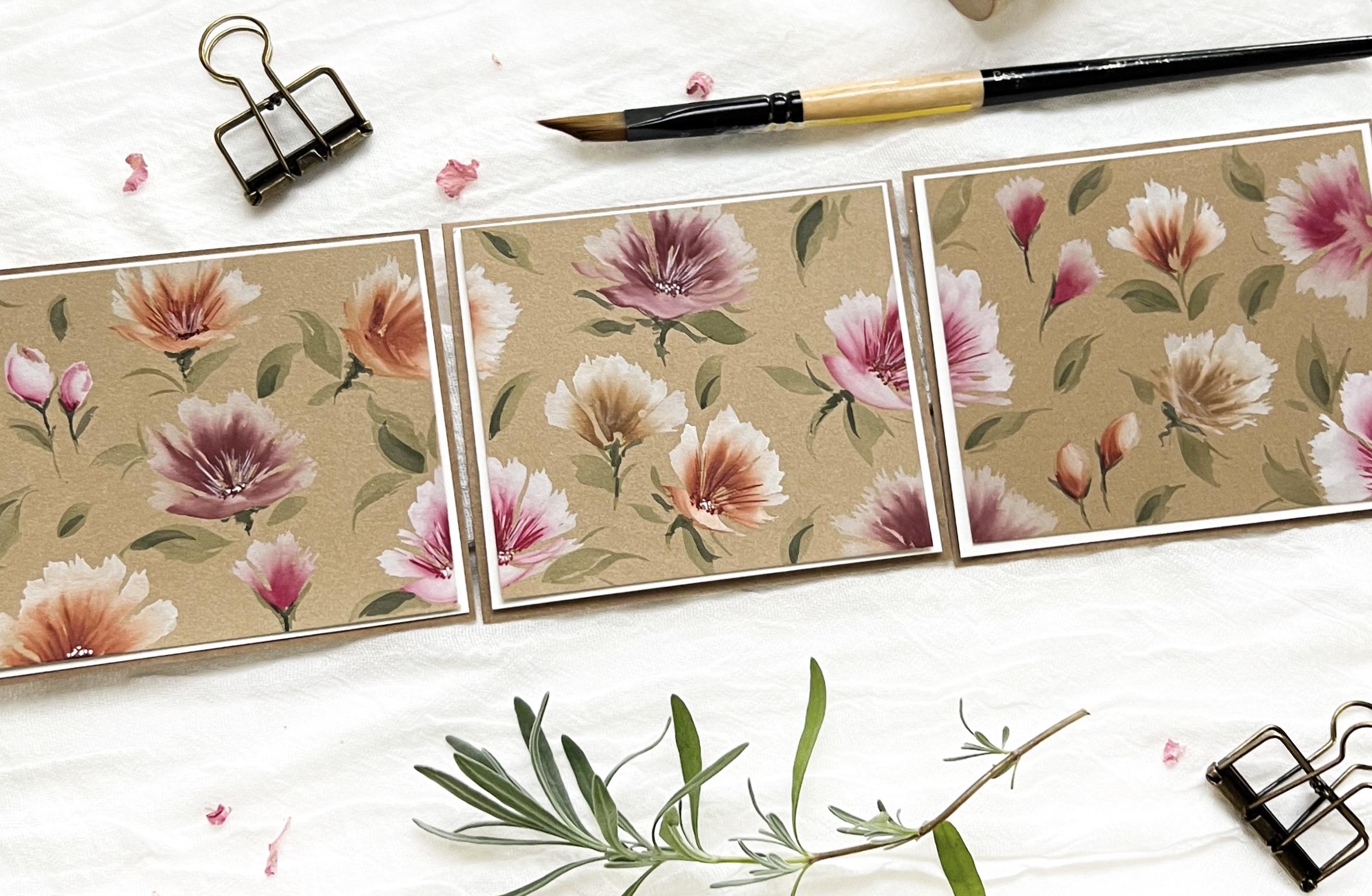
14. Mini composition - Part 1: Alright, we've
been painting big. Now we're gonna go small. We're going to use
the same florals. But I thought it would be fun to do a composition like this. I love to do these try pieces, whatever we call them,
three equal pieces. These are roughly
3.5 by four inches. Did those on purpose
because I have a frame that I was going to put
those in to show you. But whatever size
you want to do, three equal pieces, that's
the goal right now. If you wanted to keep it one big piece and then cut it into thirds
when you're done. Totally fine to do that too. Okay, So what I'm gonna do here, I need to get some more
white gouache in here, running out of that. And then we're going to
quickly do these florals. I want you to work on
some speed with these two sometimes as I do
these, I overthink them. But we want to get past that and paint intuitively, have fun. Okay. Probably need to re-wet my paint to know that's
off-camera right now. Alright, I've got my size ten, flopping it in my white
gouache as usual, dragging it off the edge, tapping it on my
sponge or the towel. And let's just get in some
Alizarin crimson here. Not even going to test it. We're just gonna go for it. I could tape this down, but I'm just going to hold them. Okay. In and out. That's it. Move on
to the next one. I've got this white
paper under here too, so the paint doesn't get on
the mat that I'm working on, but you don't have to do that. Get a little more water
in this white gouache, thin it out a bit. Flopping my brush. I'm sorry, you can't see that. Dragging it, tapping it. Let's stick with the alizarin
crimson for a bit here. Bouncing and tapping. Quick, carefree smile strokes. Okay, now this being smaller, we don't have a ton of
room to work really big. And that's okay, that's
kinda the point. Just want to get
these florals down, we'll do a little bit more
of the alizarin crimson. See or just go in
random places here. It's gonna be a fun little
composition when we're done. And I think I still
have some in my brush. And then do a couple
of little buds. Get back in the
alizarin crimson. I'm going to go
right back in there. Right on the side. Wasn't quite dark enough. And then taking
my tip does kinda drawing in little
bit more detail. We'll leave it alone. Let's
go for the burnt orange. I'm going to leave
it just like that. Turn my paper. We're going to rinse my
brush a little bit dry. You could work on
these one-by-one, but I'm just trying to do
some of these edges first. I feel like I make
it more difficult for myself sometimes. Alright, still in the orange. Let's come down here. We could possibly try. Let's close this up a
little bit more here. You know what, I'm going
to leave that like that. I don't want to
overwhelm that side. Let's do a couple of buds right down here. Okay. Back in the white. Let's go for some Indian red. Just testing that
one because that one is the one that's
pretty concentrated. Let's go right up here. A little bigger one
here. Rinsing the brush. We'll stick with the Indian red. And try not to overthink these. Jumping and skipping,
bouncing. All of the above. Try to stick one here. Feel like there's a fair
amount on my brush. Let's see what happens. Kinda fizzled out on
me. That's alright. Since that's fairly dry there, I'm gonna get back in the white, back in the Indian red and
get right back in there. It's kind of a cool looking one. You need to flip your paper. Let's stick with let's get
into this brown ocher. That one I'm just going
to leave just as it is. I feel like I have enough
white in my brush, but I'm going to dip back in, drag my brush across
that brown ocher. Well, let that one go. Oh, there's another little
bubble. That's all right. Not a big deal. How about I kinda
wanna get back into this burnt orange
again, Let's do that. Remember, we got to
add our greenery. We're getting there, Let's rinse and do some more of that burnt orange up on
this panel here. Let's see what happens
if we go over this, but I wanted to brighten
it up a little bit. We'll do that, that'll work. Let's try. We'll get back in the
alizarin crimson. Couple of little buds. I think when it got
a little bit here. Stick with the
crimson on that one. Bigger one on that side. All right, we're about
ready to add some greenery, just looking to see if we want. I think I want to extend
this one a little bit. See how this goes. Number orange. Alright, now, I
think we'd better start adding some greenery.
15. Mini composition - Part 2: Alright, let's do
the green gray. These, I think I'm
gonna do one at a time. I'm not really crossing
over the middle just yet. I have some leaves coming
off the side down the top. I don't want to
cover this too much. So I'm kind of going
on the outside first. Squeeze a little
one right in here. I'm just going around
looking for some open space, but mindful that I don't
want to cover everything. Knowing that I'm
gonna get back in there with some dark green too. Sometimes these little
buds can be super playful and you
don't really need to do a whole lot with them. Just like this.
Some random leaves in your pattern,
totally fine too. All right, Let's see
what we got here. Cute like in this one. All right, let's just do a couple of random or
random leaves here. Alright, now we need
to let these dry. Actually look really pretty dry. Let's get some perylene green. I need some contrast. Now these are awfully little. So we wanted to just
start cautious. Definitely not a bold painter. But the florals are
the key, the greenery. It's really just your accent. But remember just
underneath some of the, the bottom portion
where you want to just really highlight that area. Couple little squiggles.
All you need. Luckily, this paper
does soak it in. So don't feel like, Oh my gosh, big mistake. Probably not. Yeah, I can see on the
side it looks like it's already soaking in a little bit, but there's contrast there. Again, it's pretty little. Don't need too much. Just making little marks over the leaves that
are already there. All right, let's work
on a few centers here.
16. Mini composition - Part 3: Let's get back in the
alizarin crimson. Some of that off my brush. All right. These
are pretty subtle. I'm just that's what I want. Let's do a couple little dots. Let that one go. Let's see, Let's do
this right here. Looking for some other places
for the alizarin crimson. I love doing the ones
where it's split. Think that's pretty cool. Well that's way too much. Good thing I tested. Now it's too dry. Trying to find a
happy medium here. Next one up, Let's
do the burnt orange, a couple of those. And then let's do
this one up here. I'm gonna leave these
alone. I think. Don't need to get in there
and mess with all of it. Okay, I do wanna get
a little bit more white on this smile stroke
down here. Let's see. That was the brown
ocher, wasn't it? Alright, just going to leave
that alone. Indian Ren. It's pretty dry on my brush. Now I can get some
dots down here. My brush wet again
in that Indian red. Let's try some more. That's pretty subtle,
but that's okay. I'm going to leave
it leave it alone. I really need to do is
get some more water here. That's really gloppy. Try to make it a little
easier on myself. I can't really see the lines
on this one. That's okay. Really don't want to destroy the integrity of some
of these petals. Okay, well, let's try to brighten this up with
a little bit of white, few little dots there, same with this one too. Then we're about ready
to call it. I think. Give a little hint
of a center here. Trying to get some of the
white off because I wanted to do a few white strokes. We're getting there.
We're getting there. Now I feel like I lost the
burnt orange dots on this one. So let's just get a
little bit more in there. Pretty cute. I'm liking this. Alright, few more white, white strokes down here. Alright. Should we call it? I
think we should call it. Alright, let's let this
dry and then I'll show you how we're going to
finish this project off. Alright, here's the fun part. Last thing I did was I cut. This is just Canson and then another piece
of craft paper. I have some tape. Do it a whole lot
better than that, but I would just
mount these together. Forgive me, I can't
really see Exactly. Okay. Then this little frame to be better if it
had glass over it. But just to give you an idea for a project and some super fun, cool things to do with these
florals and craft paper. How cute is that?
I mean, lovely. I think that is so cool. Hanging in a bathroom
and bedroom, a little girl's room,
something like that. Very fun, very fun hangout in the next lesson because I want to show you a few more things that I've done with
these florals and craft paper and give you some ideas and inspiration
for your project.
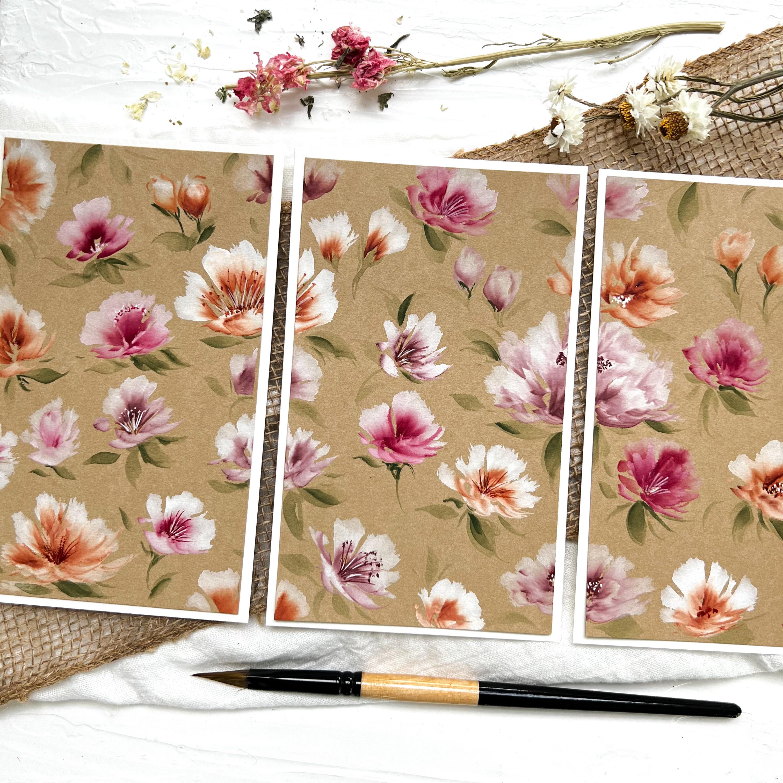
17. Class Project & Inspiration ideas: All right. My friends, I can't say thank you enough, but
thank you. Thank you. Thank you for being here
and choosing to come to class and learn
these florals. I hope you had a blast
and I hope you'll just take what
you've learned and make all kinds of
really cool stuff. Definitely tag me on Instagram. If you do any of these florals, if you're not on
Instagram, totally fine. Send me an e-mail. I would love to see
what you create. So whatever you wanna do for your class project of the
bouquet that we did in class. The triple project here, I don't know what we
call that triple, triple something or other. I did another one like that. It was a bigger a bigger one which I really
like this one too. I just feel like that
should be wallpaper. I feel like I really like that. Okay, three equal sizes there. Then of course we
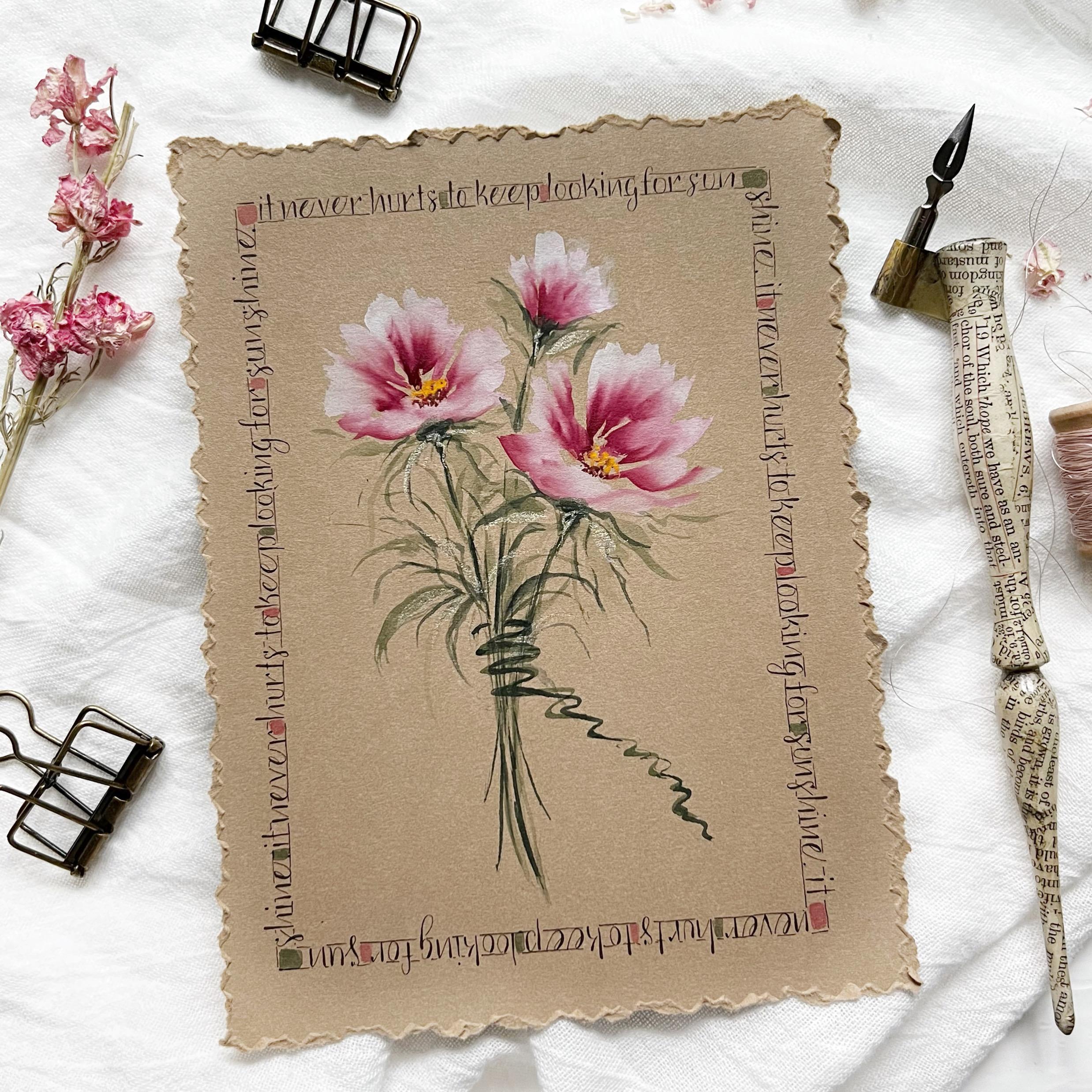
have our envelopes, lots of fun to do on envelopes. Walnut ink. This one here. We get all worried and flustered when we have
little blobs in that. I actually I had one
blob and I was like, Oh, are you kidding me? But I kinda made some extra blobs because I'm like, okay,
that's kinda cute. That's kinda fun. Vintage
looking, old-fashioned looking. I like it. Okay. So a couple of florals on
craft paper envelopes. Depending on which
envelope you get, some are easier than
others to work with. They're all, in my opinion,
pretty much the same. I didn't have a whole
lot of trouble with the paint water
ratio with these. But a lot of fun to do that. Little gift tags could make a ton of those that
would be so much fun. Gift tags, name tags,
things like that. Different standalone
pieces with a border with some whatever
kind of quote, anything like that
that you want. But there's so much you can do with Kraft paper
in these florals. I just think the color is amazing and outstanding
and so much fun. I hope you enjoyed
this class too. So please, like I said, let me know how I can make
these classes better for you. I do want to serve
you in this way. I just, I really enjoy it and I just have so much
fun doing this. So have a great day, happy painting and I hope to
see you in future classes.
18. Bloopers :): Hi, I'm Jen. Was that orals? Staring at the camera? Hi, I'm Jen. Just take my class C. I'm going to paint this and
it's just awesome and fun. And strokes. Know what? Painting these craft floral. Hi, I'm Jen. Why so loud? Lord, have mercy.
 Jen Sweeney, Watercolor, Calligraphy, Cycling