Transcripts
1. Intro: Hi, I'm Jen. Welcome back to class and welcome
to my studio. In this class, which
is under an hour, you don't need many
supplies at all. And you'll have learned
five simple floral designs that you can use with so
many other art projects. Let me take you
behind the scenes and show you what class is all about a brush. Three colors and paper
are all you really need. We use yellow ochre
Quinacridone gold in undersea green. No worries. If you don't have
these exact colors or brand, just use
what you have. You'll see each floral
from start to finish. As I explained my process tips and techniques along the way, a thumbnail of each design is within frame to
use as a reference. All lessons are in real time, no videos are sped up and no
background music is played. During the lessons, you can easily substitute a
round brush if you don't have a wedge
or a triangle brush. All artistic levels are welcome. Some knowledge of water color in the wedge brush is helpful. At the end of class, I do a few touch ups and show some options for
your class project. Grab your supplies and
let's get started.
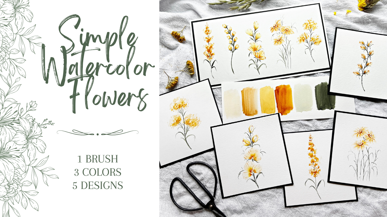
2. Supplies needed: Not many supplies are
needed for this class. I've got my palette with
only three pigments on it. Yellow Ochre, Quinacridone
gold, and Undersea green. Three of my favorites. These are Daniel Smith, but
don't worry about the brand. If you don't have
that, just grab whatever yellow and green
that you prefer to use. I have a towel to
dab my brush on. I'm going to be using the
size eight wedge brush. Whatever wedge or triangle brush you have would be just fine. Even a round brush would work just fine for these designs. As for paper, I'm going to
use Canson watercolor paper. Feel free to use
whatever size you want. I went ahead and cut mine
down to four by four. Just a little bit easier
for me to work on the smaller size paper when I'm teaching. I think that's it. Well, water jars, obviously,
that's off to the side. Then whatever else you
need for painting, feel free to grab that and I will see you in
the next lesson.
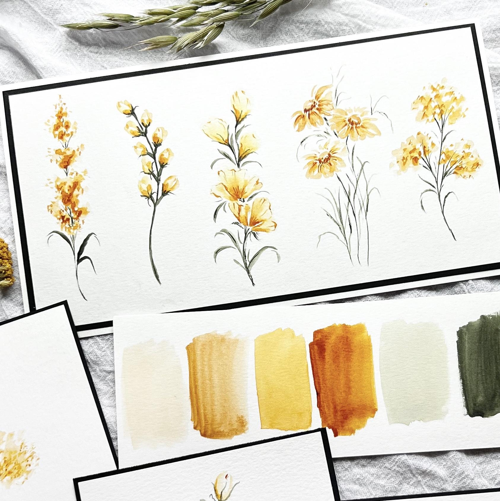
3. Color palette - So pretty!: Let's take a quick
look at these colors. Starting with a yellow ochre, really soft, warm color. Then when we get a whole lot more concentrated
beautiful color, the quin gold, really
vibrant color, can even go a lot
lighter than that. But let's look at how
concentrated it can go too. I want to be careful
when you're adding your concentrated quin gold
that is quite striking. And then the same really
with the undersea green. I love this color, but when we go really dark, it goes really dark and
even go darker than that. All right, Beautiful
range of color. So let's get going
on our flowers.
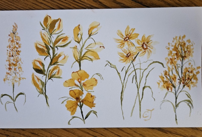
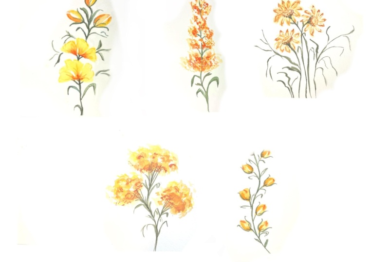
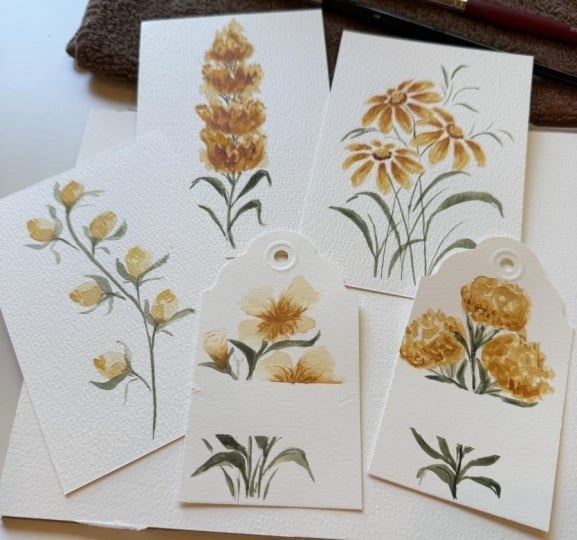
4. Floral design #1: All right. First up, this fun little
quick rendition of a filler flower getting a little more water
into my yellow ocher. I want that pretty
light to begin with, swishing my brush back
and forth in there. Now it's going to look
like I'm doing this really pretty quickly
and I am because you want to be loose with this
tap some off on my towel. Use my little finger as a guide as I go up
and down the page. And then I start at the top, I'm just dropping in pigment, pushing it into the paper. Try not to overthink it. That's it for the first pass. I'm going to dry my
brush off on the towel, get a little bit more
concentrated yellow ocher. Still trying to work fairly fast because this
is still wet here. Brushes belly up, dabbing
it into the wet pigment, trying not to go over
what I just did. Okay, leaving that white space
there, rinsing my brush. Now I want to get
into the quin gold. I actually want a little
bit more concentrated. I'm going to get another
quick dab out of the tube. My brush is already wet. I'm rolling it around in here. Again, dab it off a little bit. Same way, the brushes
up, belly up. I'm just loosely tapping
in some of that color, being mindful not to
cover what I just did. Okay, We're going to call it a day on that one for the moment. We're going to get in
there with a green and add a stem and a few leaves. These flowers come
together quite quickly. When you don't overthink it, add a quick stem, a little bit of a curve, fill in some of
those white spaces, trying to add a couple
little extra ones that go off to the side. Give it a little bit
of character there. Try not to overthink that too. All right, let's get a
couple of leaves in here. So I'm using the tip for this. Let me pull back a little
bit so you can see it. Sling the brush, come around. My brush is a little dry. What I like to do is where
this little open area is here. I leave that open and then just add another graceful
little swoosh of the brush. We'll do it on this side too, right under that
curve, come back in. And I just love that
little open area there just catches the eye and
it just looks super cool. Now, there's a big
contrast here, because obviously I had
more pigment on my brush. I'm just going to come back in and go right over
what I just did. One more little one there. Let's turn that one too. All right. Easy peasy. For the first one, I'm not
going to add any more leaves, but I think I do want to add a little bit more contrast
with that quin gold. I'm cleaning my
brush really well. Make sure you do that
once you've got green on it and then you go
back into the yellow. If you haven't cleaned it all
the way, it's a hot mess. Just pushing a little bit
more of that quin gold in just for added contrast. So even pull out a couple
little random dots just for another
area for the eye to catch and pick that up. We could fiddle around
with this all day, but we don't want to do that. No fiddling allowed as
I sit here and fiddle. All right. We're going to
call it today on this one, if you wanted to add a
little bit of splatter, that's always fun too. But I'm not going to
do that right now. All right. We'll move
on to the next one.
5. Floral design #2: I'm going to start
with the stem on this one and make
it a little bit thicker than we did
for our first one. I'm using the side of my brush that just at the tip there I go, make a curvy stem. Then I'm going to
get back in and add a couple little offshoots where we're going
to place the buds. 1234567. Okay. That'll be nice.
That's an odd number. Odd numbers are
more eye appealing. All right, cleaning
your brush really well. Dabbing it off. We're
going to get into our yellow ocher.
Rolling the brush. Now my stroke for this one, what I'm going to do, I'll
make it really large on this. I'm going to lean the
brush into the page. Lift and pull it around. Come right back and
do another stroke. Do that one more time, make it a little bit darker, just giving the
impression of a bud. Says actually the
stroke I use a lot of the time for a leaf,
but I'm going up, lean the brush in to the paper, come back to that
starting point and come around and I leave a little bit white space in
the middle there. First layer is going
to be lighter. Tap your brush, get
the excess off. I'm not really even
touching the green. It doesn't matter if you do, but just so you can
see what I'm doing here and the brush
pull it around, do the same for each
little area here, then they don't all have to
be exactly the same. Okay? All right, so this
little spot right here, even though it's going to
make us have an even number, I'm going to add a
little offshoot there. So what we can do, we'll add another one here to
get our odd number back. Okay. I better test
this really quick, make sure it's not green on me. Okay, I turn the paper to just make it easier for me. Okay, there's our
cute little buds, but they're looking
a little flat, so I need to add some contrast. Sticking with my yellow
ochre, but more concentrated. Rolling my brush in there. You don't need much being a little dramatic about it here, but I'm rolling it in
that concentrated area. Then I'm just getting back into the very beginning
part and just adding another swoop,
add some contrast. Don't overthink it, we'll see if my brush can hold all of that
pigment for each one. And I think we got it. We do, Okay. Where the quin gold comes into play is just a little tiny, almost like a little
C at the top. At the top of our bud. I'm just going to make a
little notation there. Okay? It's not that much different. This yellow ocher is already
pretty concentrated. There's not a whole lot
of difference there. Okay? To know what we got to do, it looks like they're
just hanging there. We need some greenery around them to pretty much
hold them into place. Using the tip of my
brush, it's belly up, The yellow stripe is
facing up towards my face. I'm just using that
tip to come around and hug these flowers
or these little buds. I know I'm already going to strengthen my stem and
make that a little bit darker because right now these little offshoots
are thicker than the stem, and I don't want that. Once I get the two little
swiggles around the buds, then I might go back
in and add one. Right? That one already did
the middle there. Just to add another, even though we added that
extra swoosh of yellow ochre. Adding that extra green in there just looks like it's
holding the flower bud. It's not just sitting in that V. So get it really concentrated
and then I don't want to do this whole stem in dark green stems look really
flat if it's just one color. If you go outside the
line on your stem, that's totally fine and actually preferred just looks
more authentic that way. Again, this is so small. At the end of the day, nobody's going to call you
out on, oh my gosh. Your stem is so not straight and it's got all
these squigglies on it. Don't worry about it. A couple a little more squigglies
to add some character. Send that one out at
the top a little. That one got a little
thick. That's okay. All right, cleaning
my brush really good. I want to get back
in this quin gold. I'm a little curious to see if it'll make any difference if I darken this even a little more, maybe define that
shape a little more. This is where I risk
overworking it. Okay. Didn't change a whole lot but I think we're going
to stick with that. I'm not going to fiddle
around with it anymore. We're good to go on this one.
6. Floral design #3: Okay. Our next one we're going to have a
couple of the flowers that are very characteristic
of this wedge brush. Rolling it in the less
concentrated pigment, dabbing it, dragging the tip. Let's just practice
this one here. Really pretty light on the back, but that is okay because
eventually we're going to get in with the tip of our wedge and come around and do some fun little highlights on these petals for this one. Okay, so let's start over. Yellow ocher, dab it, drag it. This is almost dry here, so I'm just trying to get some of that wet
area. All right? Let's see what we got here. This one, I do this three times. Okay? Let's do that again. All your petals do not
need to be the same. In fact, variation is key 123. Okay? I'm going to go ahead and
start with my greenery here. Before I do those other buds, what I like to do a
couple of ways I do this, just a little bit of
curve around the top, then I like to just pull
in three areas here. It's more like just a flower
that's starting to open. I'm making this up for sure. There's a couple different
ways that I do these flowers, but this one's smushed in there. But sometimes I like to just add three little stems there. All right, then tell you what, well, I've got
green on my brush. Do a couple leaves, just like we've been doing. We'll do more, but let's get some of these
buds in here first. It's about the same
as we did before, but on a bigger scale. But let's double load this one. I want that to face back to my stem because I'm going to have to
eventually connect them. Now, these are probably
a little bit wet, but we'll be very careful. Tell you what, let's
add a couple of leaves. We'll give it another
minute or two to dry. If there was some that
would bleed back, not the end of the world bleed back on these
little buds here. I'm just taking the
tip and I'm following that bud line. Is that a thing? Bud line, I don't know, but
just a tiny little lines. We'll eventually
get in the middle there like we did
with the other ones, but a very light touch. We'll start to darken
this up a little bit. I have just a few more. A lot of times I will get in and just do a couple of these. Just really light
organic looking marks. Okay, but you don't
want to overdo it. Definitely done that before. I still want to darken
up some of this stem up here we have a little bit more defined like
a V area under these buds, just darkening down one side. All right, I'm going to
clean my brush really well. So we're going to
dip the tip into the quin gold and do a little bit of
highlights around here. Still pretty dry up
there, but that's okay. That's what I want. Dab some off brushes, belly up. Then I'm just going to squiggle around some of these petals. I don't want to lock
because I think the petals look great
like this as it is. But sometimes it's fun to get in there and do
something a little different and add some
of these highlights. I'm definitely not
highlighting every part of the petal just enough
to catch the eye. The faster you go, the better I'll do the same
with these little buds, just a little
indication at the top. Then I'll come in and do maybe a few little contour lines just to highlight
them a little more. While I have just
fairly dry quin gold, I can get back in that center, gently push it into my petal and make it even
more concentrated. This is another area that
we could really over analyze and Ok, I
don't want to do that. Maybe add a little
contrast on some of these. Soften this one. I'm just going to
pull this down. It looks like it's just kind
of stopping in a weird spot. All right? We can continue
to over analyze this, but we're not going to do that. We're going to leave this alone and move on to the next one.
7. Floral design #4: Making little daisies
or daisy like flowers are just too
fun with this brush. Getting into the yellow
ochre, dabbing it off. I'm going to do three
quick ovals for my center. Now, if you weren't really
sure about your placement, you wanted to grab a
pencil for this part, Totally fine, but
we're just going to go for it here using the brush
in a belly up position. Add a center there, one on this side, then right about here. Let's do that. This yellow ocher, I don't have a ton on my brush right now. And that's okay because
actually I drive my brush, I want to lift out even just
a little bit hard to see. It's already light as it is. I don't really need
to lift that much. Actually, getting
into the quin gold, I'm going to just use the tip. And.in, some areas, on
the base of these ovals, another area that I'll
do is sometimes add a half circle to indicate that there's another
little circle within the circle of this. This will be an
area where we come back and definitely
darken up later. But for now, I want
to add a little bit. Okay, That's good enough
for now on our centers, rinsing my brush, drying it off. Now my first pass on these petals is going
to be pretty light. Let's just double check
what we have here. Okay, It's going to look pretty
light on camera probably. But the way I do that, I start typically on this
side of the center. And I'm going to use this part, the top side of the tip
and the side of the brush, It's almost like the
leaf strokes that I do, but just lean into the paper, I believe you can see that I'm basically just going around
drawing in the petal shapes, pushing the brush
into the paper. First pass being pretty light
shorter petals on top here. Just because of the
position of this daisy, I'm going to have some
crashing in of flowers here. But that is okay. We'll be able to define
those petals a little bit more once we add some
of our highlights. As those petals are drying, we'll work on our center
a little bit more. Make a darker with each pass, but using less, less paint. Okay, let's get back
into our yellow ocher a little bit
more concentrated, and highlight some
areas of these petals. Let's double check. Make sure it's not too dark. We don't want it too wet either, so your water color
will dry lighter. So don't forget that part. I'm not going to
do too much here. We've already got some
crashing of flowers there, which I'm totally fine with. But this one, I just
want to pay attention to keep these petals on the
top of this one here, a little bit smaller
and lighter. Okay, I'm good
with that for now. We'll highlight these even
more in just a moment, but we're going to get
into our greenery. Now, a simple way that
I like to do this, we're picturing this is a
couple daisies out in a meadow. And you've got
some of this wavy, flowy grasses, leaves around it, just keeping it loose and airy with the centers and
where our stems will be. What I like to do, split right through where
that center is. Here's your center. My stem is going
to come this way. For this one, it's going to
come basically down here. Now, these stems will get lost eventually as we do
all of the greenery. But try to pay attention
to where your stems are sometimes because it is so close you can't
always indicate that. But that's a good start. But as you watch, as we do this, if we don't darken these up, then they do get lost in there. But at the end of the
day, not a big deal. Here's the fun part
where I take the tip of my brush and then I just
start doing some wiggly, wonderful, twisty,
turny little grasses. Keeping it loose,
keeping it airy. Not overthinking this, adding
some more crossing over. Now let's darken up
some of the stems. Even try to make a little tiny V shape to indicate even more that
that's where the stem is. This one's crashing
right into the petals. Not a big deal though. All right, now it's time to highlight even more
on these petals, but not too much. Right at the base of where
it's coming from, the center, letting that really
soft yellow ocher still shine through
on the bottom. We're almost done with this one. It's so tiny, we want to be really careful not
to overwork it. And I feel like I'm getting
super close to that. We're going to go even
more concentrated. If I would pick another
color to highlight that, I would do like an Indian red. I've done that before. That's a pretty one even. Spa is a nice one. But since we're just working
with three colors today, we got to pay attention to how concentrated and how
light we can get them. Just trying to define this
oval a little bit more. It's going to help
pull the eye in. The darker this is, the more it's going
to highlight around it because of the contrast,
the lighter petals. Okay, The last little bit, a few more around
some of these petals. Okay, let's call it on this one. We could be here all day. Remember, we're not
here to fiddle. We're here to make somewhat loose little flowers and filler flowers and
just have fun with it. All right, let's move
on to the next one.
8. Floral design #5: All right, Our last one is
very similar to the first one. I'm going to start
with the stem, but we're going to do a lot
of the pushing and smshing, and dropping, and paint
like we did the first one. All right? We want a
nice gentle curve. Then we have an offshoot with a couple little extra
fern like strokes. Okay, good enough For now. It's our place marker where
we're going to add the yellow rinsing my
brush really well. Get into the yellow ochre. I'm not going to dab too much off because I do want a
fair amount of paint. Belly up brush position
start dropping in. It looks like a hot
mess to begin with. That is okay. No worries. Since that was the main one
that had most of the paint, I go back into that, pick some up with my brush and then disperse it through
these other two here. Okay, we can get
back in the yellow ocher a little bit
more concentrated, then lightly tap in
some more color. Luckily, this is still wet. I'll go outside the area a little bit just to
pull the eye outward. Okay, I'm going to leave that alone with
the yellow ocher. I'll get a bit of
quin gold in there. Still wet so it's giving
a good little bleed. I don't want to do too much, that's a strong color. I want to leave this fairly
light drying off my brush. I'm picking up the paint and then dispersing
it a little bit more of what's already
on the paper here. Just keeping in
mind these shapes. Okay, I can tell it's drying
a little bit in some areas, but then we and others, if I keep adding
the quin gold here, it's going to just bleed and be really too dark down there. So I'm going to leave
that alone right now. Let's see. I can get in on some of this
green and darken that up. I'm coming just down the
left side with this tip. It's going to give
me some contrast between light and dark. It's a little hard to see. I'll do the same with these
little green areas too. I'm not going to
do anything with the green that's
up in the yellow itself because we want
that to fade out anyway. All right, let's add a
couple little leaves here. You could just leave
it just like this and not add any
additional leaves. But we'll add just a few, maybe a little off
of these right here. All right. I'll leave that
alone with the greenery. But I will get back in now
that it's kind of dryer, we'll see how it goes. I'm just using a
really light hand but just getting some
more dark areas, mainly on the underside. We just want some nice contrast, just tapping and dropping it in. We're about done with this. One can add maybe
a little bit more, some of those random dots kind of hanging
out on their own. All right. I think we'll
call it on this one.
9. Don't miss! Final touch ups & Project ideas: Okay, before we get into our healthy critique
of our artwork, what I like to do a
lot of times with these little cards is just
use some black drawing paper, black card stock,
a little bit of crafters tape and just
mount it to that. I tape all around, all four sides down the middle, give it a good squeeze. You're good to go. You can
drop that in the mail. You can write on the
back and white pen or something you can do like we
talked about, some splatter. You can write a little
thank you down here, all kinds of different things
you can do with these. But in looking at these, like I said, if you
just step back, give it a day or two, look at your artwork and decide if you want to do
anything further. I will. A green pen, this will be a white pen
en a jelly roll pen. If my greens are too dark or just too flat and I don't
have a lot of contrast, I will take this pen. Already done it a
little bit here, didn't film that part, but I just do a
little few swipes of the white to give it
some nice contrast. You may not even notice that when you're
looking at something, but to me, I know I did it and I feel
better about doing it. Okay. That's one way to help. I would even do it. Now, if this was purple or blue, it would show up a
whole lot better. Maybe it would be like a lavender sprig or
something like that. If I have too much
purple, too dark, concentrated purple,
I would take this white pen and just
make some dots over it. Okay. Even here like we
did when we made this one, this one was a little
more concentrated. Again, I'm splitting hairs here, but I could just lighten that up just with a few
little swipes. Like I said, you might
not even notice it. I could do it on this one. This stem, as tiny as it is, I can see a little
bit of contrast there that I really like. But then getting in, doing a little bit more. Okay, this one here, I might darken up
this green stem. Let's just do that
a little bit here. This is also the part where I think I want to do
something and correct it, and then I just blow it and
I ruin the whole thing. But just because this looks
a little bit flat to me, with not a ton of contrast, just getting in,
especially the stem area and darkening that a bit. Sometimes I go right
down the middle of the leaf and only do one part
of it and not the other. I'm running out
of green up here, but I keep reconstituting it, but I'm just trying to
be super duper careful here and not go overboard. Okay, while I have the
green on my brush, I'm looking around at
some other ones here. This is what I'll
do sometimes too, when we were highlighting this one and just
using the quin gold, you can actually
get a little bit of green on your brush and
really darken up that center. Be careful with that though, you don't need much. That's one option. Since you've already got
green in your composition, go ahead and tap it in to your center and it's
going to remain cohesive. This one potentially could add a little bit more
concentrated quin gold on some of these areas here. After it's been fully
dried just a bit more. It really was fine
without this extra. But since it's practice, let's just play around
and see what we get. These are so helpful to
keep on hand whether you like them or you don't
like what you've done and take notes on these. If you're like, well
that was way too much, don't do that next time or don't do the
highlights on here. We could even maybe
add a bit more here as you do each pass. Remember it's going to be more concentrated
and less area you're going to cover, okay? So I'm going to take
my own advice and stop fiddling with
these. All right? I have one more thing I
want to show you and then that'll be it. All right. One idea for your
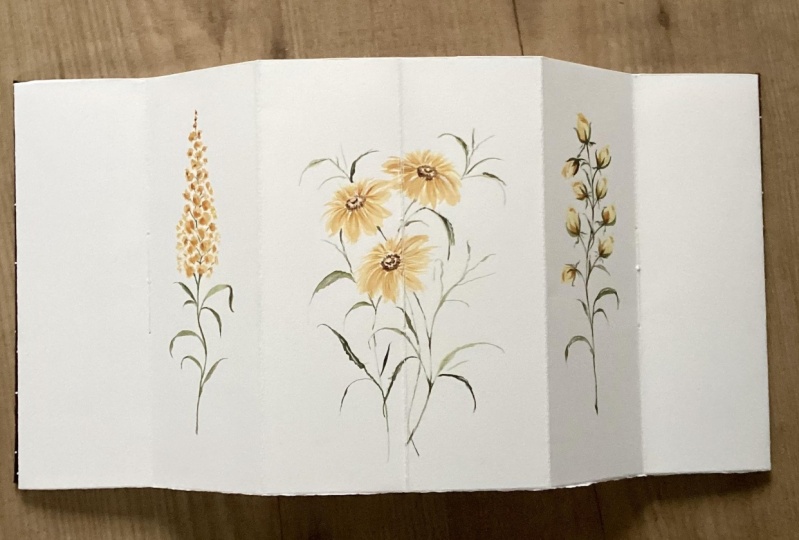
class project is to do all five designs on one piece of paper.
I really love this. This was actually one
I did a while ago when it was the catalyst
for creating this class. I love that there's only three colors and you
get all kinds of varieties. And of course, you
could make hundreds more with these three colors
in different flowers. Whether we know what
the flowers are, we make them up, whatever it is. Okay. But this like, I didn't say this was on
an old piece of paper too, that I just did
this and I thought, wow, that really turned out. I take the crafters tape, I usually get closer
to the sides, and I pay a little bit more attention when
I'm doing this, but you get the idea, this will be a double
mounted piece of artwork. It's the same paper, the Canson drawing paper, I'm about running out of taper. This one, we'll see
if it makes it all right. I love that. I might trim that
a little bit more, but nobody needs to know This was actually a
scrap piece of paper that on the underside was something
I started that didn't turn out, nobody knows, right? Cards, envelope liners, you can make a
collage out of these, so many fun, different projects, and I can't wait to see
what you come up with. Thank you so much
for being in class. I'm thrilled that you were here. I'm just so grateful. If you have any questions, please feel free
to reach out and I will see you in
future classes.
 Jen Sweeney, Watercolor, Calligraphy, Cycling