Transcripts
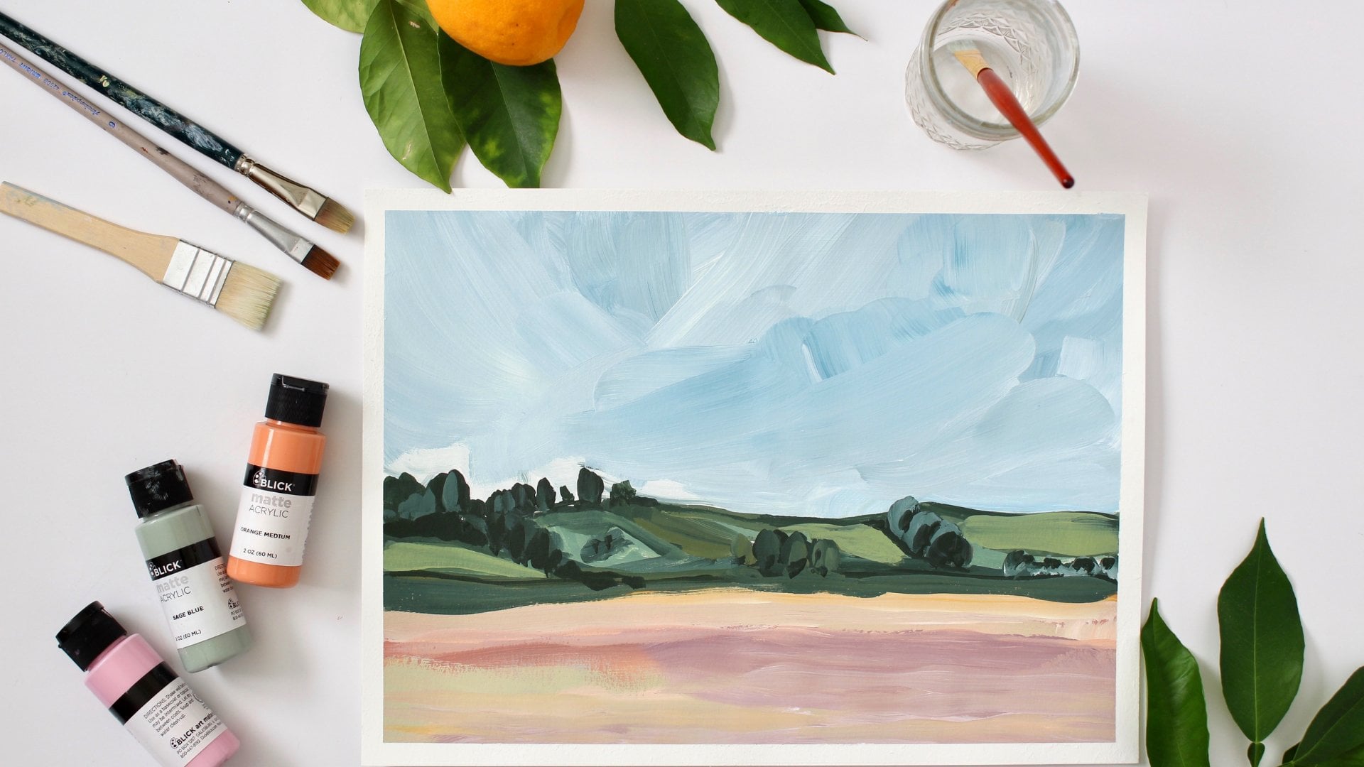
1. Intro to Drip Trees: Hi, I'm Karen. Welcome to my studio here in Southern California. The skill share today is all about creating a landscape. Many people pick up a visa, paper or canvas. I mean, I teach people all the time and they're afraid to get started. So we're gonna do something really easy. It isn't as complicated as you think. And it's gonna be so much fun. This is a spring abstract landscape. Then we're gonna do a fall one. And this one were actually using metallic paint, which is really fun. I don't know if you can see the shimmery. I'm hoping you can see all the shimmery from the metallic. We're gonna talk about the foreground, middle ground and the background. To create depth for these two paintings, you're gonna need watercolor paper or Bristol board Watercolor paint, acrylic paint in quite and metallic colors like gold, bronze, silver. You'll need different types of brushes. You'll need a liner, brush some salt. It could be just table salt and you need a skewer, or you can use the back of your brush to create the whimsical lines on our trees. You will also need a palette or a paper plate for mixing. And at the end of all of the instruction about painting, I've added a foetus content. How did skin your painting into photo shop and then you can and you're painting to society six. So hit and roll and let's get started.
2. The Differece Between Acrylic & Watercolor paint: of all the metallic paints that I have been using our acrylic base paint. The acrylic acrylic is like a plastic. You know, we're mixing watercolor and acrylic, and we have to be really careful how we do that. It's okay to squirt out acrylic onto a paper plate. I use paper plates because the acrylic paint dries and it's like a plastic. It's okay to mix acrylic paint and water color paint, but you don't want to put your acrylic paint in your watercolor trays. Watercolor is so much different than acrylics. Water color It could dry, and then you can reuse it. But if you put acrylic paint on top of your water color, and then you know this plastic film will be all over your water color palette, and then you can use your water color palette anymore.
3. Step 1 Creating A Good Drip : first thing we're gonna do is we're gonna load up our brush with color and lots of water. I chose dream, but you can choose any color you want. Too many times when I create this type of painting, I create two or three of the paintings with the dots on it. So if one painting and I don't like it, then I already have the drip part of it ready to go. You want to load up your brush with lots of water and lots of color, and I'm just, ah, blotting mawr color onto the page. I'm now changing my color of an ad pink. I want you to see how I am adding Mawr and mawr color and dabbing mawr water and color on their water color, depending on how warm the air is or how warm the day is. Your watercolors gonna dry pretty quickly, so you want to make sure that you have lots of water and paint on your page. So when you get to the part where you're dripping, there's actually something lift on one of the dots that you created in the very beginning. Like the green, the green was 1st 1 I did. I'm going to make sure that I have lots of water and paint on that. I'm gonna speed this up to show you how to drip. This is super simple. We're gonna pick up the page, so it's completely vertical. So when the puddles of paint start to drip, they strip straight down off the page. Sometimes you have to shake it a little. Sometimes, if the water color has dried a little, you will need to get more paint and added while the pages vertical. In this skill share, we're going to create two different paintings. We've already done a drip painting for spring. We're gonna do a drip painting for fall or autumn on my watercolor palette of mixed up a gold color. And I'm mixed up a a maroon color, and I've mixed up a blue color and I'm going to create drips with the autumn colors for our mountain landscape.
4. Step 2 Spring Trees: now that we have created some good drips for our painting. Now we're gonna use acrylic paint to create texture, limbs and organic shapes within our treats. I'm going to be using the back of the brush to create these perfect little circles or dots . This is just adding pattern and shapes and interest to our drip trees, dipping it in the white paint. We can also take the back of the brush, create long skinny branches what I am doing as I am taking the paint brush in my hand and I'm rolling it in my fingers to create these branches. Another way to do it is to take just a skewer and break the skewer so it's not so long and use the tip of the skewer. Just create these branches. So then they're not perfect. It's kind of fun to make him where they're not perfect. You just kind of spend spin it, roll it back and forth to create these really fun, organic looking shapes. I am going back and forth and alternating between a paintbrush and a skewer and the back of the brush to create some organic shapes. So another thing that you can Dio is use a cork and you're just gonna kind of it's kind of uneven and you kind of just stick it in here, kind of a fun wayto have some texture. Another way you can do it is taken old sponge and there's two different size to the sponge And as long as the sponge is dry, then you could pick up a little bit of the paint and give it a different type of texture. It's fun to create, do things that are a little different than just straight painting. So something else that I'd like to do is this didn't come all the way down. It kind of blended in. So I'm going to go back with watercolor and I'm gonna add that. So what I think I'm gonna try to do is start from right here and see if I can't get enough of my brush to kind of drip it down the page. Sienna lined up my brush to figure out where I wanted to put that puddle. I'm dipping back in and getting war on my brush. So then I have a puddle. So there you go. You have that tree now goes all the way down to the ground. So while that's drawing, we're going to try a different color scheme, and then we'll come back to this color scheme and add some background.
5. Step 2 for Metallic Fall Trees: people have asked me, What would you do with metallic colors? I have several different colors of metallic. Any acrylic metallic paint will work, but this is what I'm using had two or three different brands. There are, you know, Deco art has ones that are called metallics, and so that's what this is. It's kind of a bronzy color, and it's right there. And then this is also metallics, Madeco art, and it's more of a gold metallic. Okay, and then the other brands that I have another metallic that I had is craft smart. I think that craft smart and gleams. I think both of those are at the Michaels. And then there's also these. These are actually puffy paint, but I've also used them not as puffy pain of actually scored. It'll mountain painted with them before, and they come in all kinds of colors pink and teal and purple. And here are the here is a blue and purple and then that bronzy. So some other colors that I have So we have a silver and then we also have kind of it's kind of the same color. Is this, uh, this bronze e? But this bronze is more of an orange color and then this bronze it has more pink in it, so it's a little different. So let's get started. This is the fall version of the painting that we did earlier. What? I would do it doing the same thing as I did before with the white. Instead, This time we're gonna go in with Bronze. What you want to try to do is pick a color that is opposite of what's on here. Like if this right here is dark, you want truth? Choose a light color to go on the dark. And if you wouldn't want to put this on here, you'd want to do a different color. Just so it'll stand out a little more. So let's see how that works out. I'm going to take this one right here, which is kind of that yellowy gold color, and I'm going to put it on here. We're basically doing the same type of things we did before. If you saw the other demo and you're just pulling up the stick of paint to create different lines of the lines are your branches in your trees so you can do it with a stick like this is just a skewer when? Well, crazy right there. But that's gonna fund. This is a great application to use metallic paint. Some of the trees will have more paint than the other ones, but that's okay. As you can see, I am putting the silver metallic paint on the dark blue tree so it will show up better. If I put the silver on the gold tree, it will not show up as well. Contrast is important. All right, so another way we can do it is you could take a sponge like I talked about earlier. One of the bronze colors that I have has a lot of pink in it, and that's what I'm going to use for the next tree. I'm picking up paint, but I'm only picking up a little bit. And then I'm gonna dab it onto the paper plate so there's not as much pain on my sponge, so it will create more texture, fun, little texture, kind of like it going over the edge is like that's kind of fun like that. That's cool, one of what that bronze would look like me, but that bronze in there. I love this color. Looked a pretty color. It's very full oriented us for sure. Remember when you're using the back of the brush, you know you're run out of paint really fast on one side's. You're gonna have to twist if the twisted around to get the rest of pain offs. You're twisting your brush around to get all the pain off, and I'm rolling it in my fingers and that. It's also kind of what a branch looks like, which is kind of fun. You have to go slow. I twisted around to create a a fun little branch in your tree. I like the dots. I think I'll go back in with this relief pretty color and do dots. Now we need to let this dry, and then we'll add the background.
6. Step 3 Spring Trees Background: Now we're going to work on the background. We're going to start at the bottom, and I think it'll be fun. Teoh put a lot of pain on the bottom, and then turn it upside down and let it drip the opposite direction. We are going to start out with the green and I have mixed up, Um, not just green out of the two, but I put some yellow in it. So it's a yellow green, a lot of green in here. And then I think I'm gonna do some reddish or some of the pink color pink and maybe some yellow. And there rents my brush really good. And go into the pink, get a whole bunch of pink. And sorry about the video. When I created this video, didn't realize that I cut off the bottom of the image. So I'm gonna fast Fords. You can see what I'm talking about. Lots of paint on here. So then when we turn it upside down, yeah, it's gonna bleed into each other, see how touched it, and it's all gonna it's all gonna run in together, which is gonna be fun. So you're getting lots of water on your brush and you're getting it on the paper. Then we're going to take it, and we're going to turn it upside down and watch it run. And of course, it ran. Not exactly what I wanted it to. So I want more runs. Had a tendency to just run, like, one time one streak. Uh, you can see what I did. Okay, clean up my puddles and okay, then I'm gonna go back, and I'm gonna add more color to, like here and maybe some red and kind of start blending some of these different colors in to each other. So I'm kind of creating a the landscape in the background, you know, like, where's the horizon line? Let's say the rise in line is right about there. Sometimes I just add water. I go from my water container and add water straight onto my paper. Then I go get color and add the color too. The water that's already on the paper. We're gonna just go in here and blend in these colors. So we have a background, I'm going back in and getting more color and adding it to my backgrounds. So now we've gotta let this dry and then we can add, you know, more plants and things on top of it, most the time when you were working in watercolor You put on a light shade first, and then you add color on top of it, and then you layer into you get to the darkest value that you want to have for your painting. And this is what we're doing now as we're gonna let this dry and then we're gonna add layers on top of this painting to give it depth and interest.
7. Step 3 Metallic Fall Trees Background: The next step in this painting is to add the background. Usually I go in with a background before I do the metallics. And I didn't this time. But we do need some sort of background pills or something in the background. So I'm gonna go in here with water and just a little bit of paint on my brush and try to figure out where I'm gonna have what I want these this background. Okay, so I'm gonna start putting in some color. In most landscape paintings, you have the foreground, the middle ground of background. The trees in this painting is going to be the four grand. We're also gonna add some different bushes and things like that will, which will be in the foreground. The middle ground is what we're painting right now with the Orrin G color as you paint a landscape painting and it goes back in space. Whatever the mountains are, are behind or above the orangey type hills that I'm painting right now. Um, the more you go back in space, the gray er the hills will be the You have all this atmosphere between you and whatever those hills or mountains are And so we're gonna add gray to the mountains that are behind these orange mountains in this fall landscape, right? So now continue to bring in color down here. So I'm gonna add some streaks in here, so it kind of looks like there's trees in the background. Something else that we can do that would be kind of fun, as we're gonna add a lot of color and water at the bottom of the page. And then let's turn it upside down so we can go back in here. And that's a mixture. Little streaks, maybe some little grass. Or so as the paper is drying, I am adding layers and layers of more color to add more interest, because river, there's a fall picture so the grass probably is golden or it's brown at this point, maybe even have Cem rusty colors. I'm adding a few more mountains, and then we'll start on the sky. We got to differentiate between the sky and and the mountains back here in the background, so I'm gonna put in a little bit brighter sky kind of scrub around on the paper. You can see pick up the color, and they had a little purple up here. So since I've added purple here, which really makes it pretty who that's really pretty putting a purple in there, I think you really need that extra color that really did. That was nice. Good call at a little purple. We're going to let this dry before we add the finishing touches.
8. Step 4 Spring Trees Finish Background: All right, we're back again. We are going. Teoh darkened the bottom of this up a little bit because we're gonna add flowers and stuff on top of it. And then the top up here needs to be sky. I want to try to keep everything kind of in the same color scheme or color palette. So we're gonna make a sunset up here. So then, that way we're seeing with the same color how it but the first part were just mainly adding water to wet the paper. So then when we put the color on there, it blends more evenly in our sunset. It will be fun. Toe have a variation in the color. So we're gonna do yellow on one side. We're going to do orange on the other side while this guy is still wet. I am going to add some salt to give it some texture, and then we're gonna let it dry, and we're really pretty much done with the top of this painting. So while this guy is drying, we're going to go down to the land, the bottom of the landscape, and we're going to darken up the colors. Run. Add another layer to darken up the colors or maybe even two layers. So then, when we go back with our acrylic paint to create the bushes and flowers, then if the background is darker than the white flowers and bushes will show up, better will, You know, contrast has a lot to do with that. You want a darker contracts in the background because you're gonna have lighter flowers and leaves and things in the foreground. So I'm going to go back in with my reds and pinks and something that I don't do often, which I'm going to do a little bit. I have black, which I don't almost ever use black, but I'm gonna take black, and then I'm gonna go in and get my red. I'm trying to get the maroon color, but you don't want to use too much blacker. It just goes black. Now I'm adding another layer of green over the green in the center of the page that I had already painted green before. They're kind of to even I would pull this up some. You know, when you look at hills, everything, they're usually not, even though this I'll of the salt so if you put the salt on it and the salt make it separates the color from the paper. It's really pretty. So we're gonna let this dry, and then we're gonna come back one more time, and we're gonna put in the rest of the foliage in the everything in the bottom.
9. Final Step 4 Metallic Fall Trees Details: everything is now dry. Now we need to go back and finish this up with some other bushes and or maybe some other plants down here at the bottom tips and tricks here, there's something we can do. This is just a skewer that I got. You know, we were made s'mores or something outside, and I got these for the s'mores. And so what I'm going to do is to make a straight line. I know people say I can draw Start line. That's OK. You don't have to. You can use a stick. What? I What you're gonna do is we're gonna go in. I'm gonna do this with the silver, put paint all the way down the stick like that, and then you can go in here and just put it down. There's your line. So we're going to do several of these. The other way of looking at this is, you know, most plants are organic looking. They really aren't straight. So what? We're gonna go in and we're gonna create some leaves on our plants. I'm just taking my brush, and I'm just It has a tip on it. Do that. And we're just adding some leaves and then I may add some silver down here is gorgeous metallics. I think blue looks really good with that silver. So what? I think I want to dio get this blue again, which is a combination of blue and black at, and I'm gonna add some of that down here. Just so it goes with the silver. It really looks pretty with a silver event turned out really fun. Sometimes it's fun to mix the watercolor colors that are in the background with the metallic paint in this area. Right here I took silver, and if you can see the shimmery silver color acrylic paint and I took this blue color out of my watercolor palette and I'm mixed it on a paper plate and I'm putting it onto the palette and then I'm getting, which is this is acrylic metallic silver and getting the silver paint, and I'm mixing it in. And that's where we came up with these dark colors that air in these flowers. And the next step is I'm gonna mix the yellow gold with the copper color to come up with a mixture of the color, and that's what I'm gonna use in the background for some texture and bushes. I tried to use the yellow gold, but it didn't really show up very well cause we didn't darken the background enough. What I'm going to do now is go in and get the copper color and use that instead. We can grab the sponge, We can add texture with a sponge, and we can overlap. But we already have if he wants. We have texture on one side of the when you put a little bit of texture on the other side. So if the texture looks a little harsh, you can always go back with your paintbrush and kind of mute it with a little bit of water . So then it's not so harsh. When you're painting a painting, you want to make sure that you balance the painting. If you put blue on one side, you're gonna wanna put blue on the other side. If you have the silver on one side, you want to put silver on the other side, I'm saying with the copper and balance the painting up. Sometimes when you're painting a painting like this, you have to just stop painting before you go, too far, and I think this is done. I really hope you guys enjoyed the fault trees, and I hope you enjoyed combining acrylic and water color and how you can mix them to create a wonderful fall picture.
10. Final Step 5 Spring Trees- The Details: So the next step is we're gonna add Mawr foreground. Remember, we talked about foreground middle ground background, so we've already got the middle ground in the background. So now in the foreground, we're gonna add some bushes, some flowers and maybe some little skinny trees with leaves on or whatever you want to put in the foreground. We're gonna use acrylic paint we're gonna be using White have this paintbrush. The bristles are a little bit longer than a normal brush. Normal brush, as you can see, has a shorter bristles. Many people call this a liner brush. There's different links of liner brush is that you could use. But this is what I'm using to create a this versatile bush. I'm rolling the brush in my hand. So then the lines or not completely straight bushes or organic. A lot of times they don't have straight lines, and you could have to make sure you go back and get more paint. When you put the paint brush down, there's plenty of paint on your brush. Another thing that I'm going to do is go in and add water to this white acrylic paint. So then it's a little thinner. It's not pure white, and they'll be a little more faint in the background. I also have this green. This is all acrylic paint to put some white paint on the other side of the plate by the green. Take the green paint, mix it so it's even lighter. We're gonna add some water, so it's nice and thin, and I'm going to add this other little bush. Once I have the stems in here for my bushes or flowers, I'm going to go back in with a different brush that it has a tip on it. Lightly put the tip down so the marks on your page are leaves. And remember that the more water you add them were transparent. Your leaves and bushes will be. We want a layer, all of the bushes and trees to give the illusion of distance and depth. So something else that we can do. Make sure you rent your brush really, really well. I'm gonna pick up some water color pink paint, put it next to the white. We're gonna mix the white acrylic paint with this watercolor very light pink, just to give a little variety. I'm just adding a few dots in the background. Maybe this is a littlefield of white flowers in the background I talked about in the other painting. We want to make sure that that you don't overdo your painting. You know, at a point you just have to say, Wow, it looks great. I'm going to stop here. Something that you could do is you can always create another one. So here's a different painting, but it looks a lot like the one I just created. There are parts of each painting that I like better. I really like this part much better than this part. But then, you know, I also like this part better than this part. I really hope you enjoyed this abstract landscape. It's a little mixed media hope. You learned a lot about mixing watercolor and acrylic paint and applying it in layers to create a really fun landscape
11. Bonus Photoshop: Both of the paintings I created are 11 by 15. My scanner is on Lee an 8.5 by 11. So I had to scan the top part of it, and then the bottom part of it, and then we're gonna put it together. Info shock. We are in a photo shop. Here is the top of my painting, and there's the bottom of the painting. I'm gonna have to rotate them, obviously, match up, go up to image. I cut that part off. Sorry, I don't image you go down here and I'm just gonna rotate the whole thing. It's gonna be clockwise, and then I'm gonna go back to the other one, which is the bottom half going to go up to image and go down to rotation and do counterclockwise. And now I have two halves that I need to put together. So the first thing you need to do is obviously make one or the other larger would go to image in the menu, go to chemist size and the height has to b'more I want in. So these will arrow show that it's gonna go that the heights going to go in the vertical. That's what I want. I need it to be quite a bit larger, but I don't really know how large it needs to be. I'm gonna put in. I'm just gonna add a one to the front of it. So then it'll be quite a bit larger. Then I'm gonna go back over. I'm gonna grab the top. I'm gonna grab the top half of it. Select all Copy. I'm doing quick keys, and then I'm gonna do command V, which is paced. And here is the top half of my painting. So now I have to pull it down and even it up, so it matches, and that's getting really close. I don't know if you can see that this done here looks a little different than this up here . You see that? The bottom half is whiter than the top half. This isn't even, and this isn't even so I've gotta move it over. So now I have to go into the top layer image and I'm going into adjustments and I probably go through the levels. I use levels lot, the levels across, trying to match it up pretty close. It's getting pretty close here, but it's still kind of gray. No, only exactly know why it's turned out like that. But to get this to blend a little better, I always go into my A race tool. I choose the soft blend. Let's go to like 200 pixels and kind of even this out. So it's still not perfect. Maybe the saturation. I had a little bit of saturation. Let's go up to images. Go in here to saturation. Maybe it just needs to be a little more saturated. The nice thing I'm gonna do is go, and I'm in a crop. So there's two ways to do this. I could crop this off over here, or I can add more paint. And I think I'm not gonna crop. Think I'm gonna add more paint? So the way I add more paint, it's called a clone stamp tool. I use it a lot while he needed on the soft round, and then I'm going to need to bring it up to 200. So then what I'm gonna do is come over here and where I want to clone this whole side over here, and I'm gonna do come down a little bit and then I'm going to clone and go up. Take this. I'm close down and you kind of have to mix it up. So it looks like it's natural like this is not natural. Go again and kind of do something with that. So it looks more natural, naturally, the way you would paint kind of go off side and it's all scanned in. It looks really good. I can't remember if you have to have a tiff file or a JPEG file for Society six. Here I am in my Red Edge Studios account here for society six. I'm not going to go through the whole part of how to sign up for society sick, and I'm going to add a new artwork. See, Yes, I own it. I own all rights to this image. Once you have the file size that you need and upload it to society six. Then you can go in and create your products.
 Karen Brake Barge, Artist, Illustrator, & Graphic Design