Transcripts
1. Introduction: Watercolour is a
wonderfully diverse, fast, and portable
medium to paint with. In this class, you will learn the basic
watercolour techniques, some FUN textures,
and most importantly, how to combine them
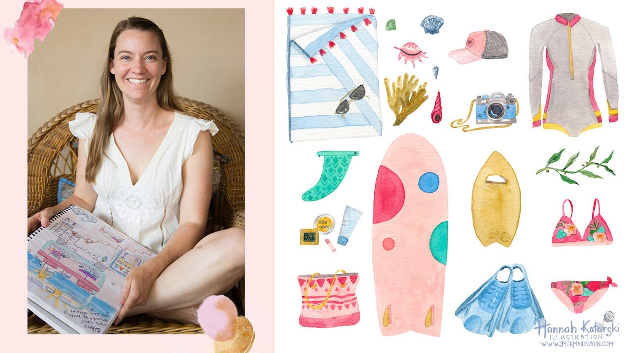
all in a painting. Hello, I'm Hannah, the owner and illustrator behind mermaids
coin Illustration. My app can be found
on greeting cards, jigsaw puzzles,
books, magazines, clothing, and products
across the world. And I make these designs
with watercolours. In this class will create an ocean-inspired
seashell taxonomy using just three colours and supplies you'll
have at home. You'll learn all the basic
watercolour techniques to keep painting
with confidence. The textures we create in
class can be applied to other projects to add depth to it, illustrations
and paintings. You will learn wet
in wet layering, incorporating Mixed
Media, how to paint, shadows, colour mixing and more. This class is a must-watch for beginners and perfect to get you in the
watercolour mindset, if you're an acrylic
or oil painter, join me for over an hour
of jam-packed tuition, featuring step by
step instruction, I share all of my
tips to help you troubleshoot problems and
improve your technique. The cost is pre-recorded
so that you can have ongoing access and can
complete it in your own time, but still get
teacher feedback and support ready to get started. I'll see you in class
2. Materials and setup: To get started, you're
going to need to download the template from
the Projects section. I've saved it as a PDF so
that you can print it out and then use it to trace
onto your watercolour paper. You can download
your template from the Project section and
printed off on A4 paper. And then to transfer your
design onto watercolor paper, you need to have this behind
your watercolour paper. And although it's quite thick, if you match it up, you can either hold it up to a very bright window and then
trace the design through. You can even get your watercolour
paper and hold it up to your computer screen or tablet and trace through if
you don't have a lightbox. Here is mine ready to go? I've done my pencil lines quite dark so that you can
see them on camera, but try and keep yours
as light as possible. And you'll notice that I've
just done the outlines. I haven't done
every little detail because we don't want that
pencil line showing through. Here's an example of what a finished product
is going to look like. And I'll take you step-by-step
through the Project. We're actually going to move
around the page quite a lot. So we'll start with this big spiral shell and
then while it's drying, we're going to work on
something else so that we can work quite efficiently. Materials that you're
going to need. I like to keep it quite simple. So a couple of round
watercolor brushes, they can be synthetic. I like to have a double
zero for small details, I find that really does
make a difference. Something like a number to and then up to your preference whether
you like to work big. This is a number four
and this is a six. We're working on
quite a small area, so I don't like to get
any bigger than that, but it's up to you. I've got an eraser for erasing
our pencil lines as we go. We're gonna be using
three colours today. If you want to paint
along with me, then these are the
ones I recommend. Otherwise interchange it
with whatever you like. I've got a turquoise here. This brand is at
spectrum that Winsor and Newton also does a
really nice turquoise. There have been on
the pricey side, but there's not really anything
else that you can use. Instead, they just have
that special quality. I've got indigo and raw sienna. Later on, we will also
need some sort of what. You could use, white ink like
this, copic, opaque white. You could use India ink. You can use Gouache. Any type of a gouache
doesn't matter whether it is acrylic or designer gouache for this because we'll be
adding it on top at the end. If you don't have
those products, you can also use a white gel
pen or a white posca pen, but it's totally up to you. I have also got some water here. Later on, we will
have cotton tips. These are Plastic Free and we will also be using
some hand sanitizer. I'm sure you've got that
handy and some salt, just plain old table salt. The paper for this project, I'm using watercolour paper. You could try using
mixed media paper. I like to have something
that's around 300 GSM. That's the weight and
thickness of the paper. But given that we're not putting a huge
amount of water on, anything above 200
should be fine. To start off with, I am going to add a little bit of my three colours
to my palette. And we are limiting
our palette to just these three colours
plus some white. And then what that
does is we end up with a really nice cohesive
composition at the end. You'll notice that I've
got some green on here, but we're going to mix that green from the colours
that we've already got. So everything is going to
blend in really nicely. I'm going to start off
with this shell here. And there's lots of different
ways that you can do this. You can use a kneadable
eraser or a normal eraser. You can use watercolor pencil or colored pencil to trace your lines so that
they blending. I like good old-fashioned
lead pencil or I can see the lines and then I just lift out some of that lead
when I'm ready to paint. And then I will
sometimes lift out or I'll erase any leftover
lines at the end. That's how I like to work. Let's mix our paint
3. Flat Wash: We're going to paint
this shell here first. The technique that
we're going to use is called a flat wash. The aim of this is that
the color goes on nice and evenly and it dries and it looks nice
and flat at the end. In order for this
to be successful, we need to mix up
a wash of color, and we need to have
enough to cover the whole shape so that
we're not mixing as we go. Otherwise, we end up
with blotchy areas. I need to have enough and
I need to make sure that it's dark enough
or light enough, or whatever I need so that I have the right
color the first time. There's no problem with testing your colors and
swatching them before you start. You don't have to just guess and intuitively know whether
it's the right consistency. You can see this is quite
watery and I've got my large brush
because I'm going to be painting in a large area. I am going to start I'm left hand so I'm going to
turn this over and I'm going to work
from right to left, and I'm going to
start at this area, and then I'm going to
pull the color across. Just get that tiny bit in there. When I see you beginner students
painting in my classes, one of the big things
that I notice is their lack of attention to the edge of the shape
that they're painting. So I think they're concentrating so hard on getting
the color down nice and smoothly that they forget
that they need to have a neat outline
because that's what's giving definition to the
form that they're painting. Nice and slowly, just drag the color along
and then fill in. You can see here that
this leading edge is wet. We call this the bead. If you want to avoid your
paint getting blotchy, you want to keep
that bead there. You want to keep the
leading edge wet. Otherwise, you end up
with sections drying and then you're adding more
color on and more water on. That's when you end up with that pigment and that
water washing into an area that's already wet and that's how it ends up
getting weird and streaky. When we're doing a flat
wash, we want to avoid that. Okay, you can see really
clearly there that's wet, but it's not flooding. There's just a small
bead rather than it being like a huge
bubble of water. So you can see I mixed up my wash before I started
painting so that, again, I don't have anything
drying while I'm sort of midway through
what I'm painting. Okay. Paying attention
to the leading edge. You will notice as
well that I didn't outline the whole shape and then fill in the center like we do in primary school when
we're coloring in with pencils and texts. Because what that does
again is you end up with an outline that dries and then when you
go to fill it in, you've got this edge
around the outside. So in order to avoid that, and we go from one side
to the other. All right. So I'm going to
leave that to dry. Now, you can see this is
already losing its shine, and so we know that that is
pretty close to being dry. Was this edge here
is still shiny. Yeah. When it loses its gloss, you know that it's getting dry, but I'll still leave
that for a few minutes before I put my hands all over it. See the shine. When we're learning
with watercolor, it takes a bit of
practice to get the color on really smoothly. It's a bit of a catch 22 because you want
it to be smooth, but you haven't
had much practice, so it's hard to get it smooth. There's a tendency to go
back in at the beginning now and to get your
brush and to start trying to smooth things
out while it's wet. But my best advice is that you just need
to leave it alone. Let it dry because
adding more color in now is again going to make
weird blotchy shapes. Now, later on, we are
going to try and do blotchy shapes when we do
one of the other shells, but for now, this aim is
to just do a flat wash. Next one, while we're
doing our flat wash, let's have another
practice at it, and we're going to
do the same wash over here, but using
different color. I'm raising my lines. I am going to mix up my raw
sienna into a nice puddle. Again, I want to get
that prepared before I start painting so that
I can just go for it. I've used paint out
of a tube here today, but you can use
paint out of a pan. It really doesn't matter.
The process is the same. You need to have some
sort of palette, whether it's aermic plate or a dish for sauces or whatever, and you need to mix up a
wash before you get started. If I imagine if this is
my palette of paint, if I'm dipping into that, then the color is going to
get thicker and thicker. If you see here, this is
much darker than this one. We want to avoid changing the saturation of the
color that we're using, and we do that by
mixing a puddle. All right. Same process. We're not going to outline. We are just going to get
started, pick a spot. You can tilt the
page if that helps. Pay attention to that
outline to the edge, making sure it's
nice and smooth. You want to glide, your brush. Then we just pull
the color along. Nice gliding motions. Okay. You notice as well,
I'm not painting with the very tip of
my brush like this, and I'm also not bending
and using the whole brush. I'm using the top third to
half of the paint brush. Right. I'll finish this off, and I'll meet you in the
next technique class.
4. Wet in wet: We're aiming for similar finish, except we're going to have darker pigment on one side and
lighter on the other side. Minds down here,
I'll bring it up. Again. You need to mix
a puddle of our indigo. I'm going to start
with a light wash across the whole of the shell. And then while that's still wet, I'm going to drop in
a thicker Wash at the same color on one side to create a bit of
dimension and shadow. I don't need a huge puddle
because this is a small shell. Check the color. I
think that's okay. So again, pick a side to
start at nice leading edge. Glide all the way down. With smaller shapes, it is much easier to keep that bead and to keep it wet because
you can work quite quickly across the whole shape. If you feel like this is just
a little bit too fiddly, then you can always swap
to a smaller brush. Sometimes I have two brushes on the go at the
same time so that I can do all of the
little details with one and then I swap out to the bigger brush
for the big areas. Alright, so that is
still wet and shiny. And to take a bit of this, just make another Wash
that's a bit thicker. You don't want to take
this paint straight out of the tube because it ends up being quite
streaky and thick. And you lose that translucency that you get with watercolour. Alright, so I'm
just going to dab that along one edge like that. And I think it's
going to run fairly nicely because it's all wet, but I want to pull it
this way just a bit more. Now because this is still wet. I can smooth out that
line a little bit. But if it was starting to go mat and it had lost its shine, then I would just
need to leave it and tweak it. Once it was dry. We are going to leave
that for now. Let it dry. With watercolour. We work
in layers quite a lot, so we let one thing dry and
then we move on to the next. We're going to move on
to this carry shell. And we're going
to do a technique that's called wet in wet. So what that means is that
we are dropping one colour, in this case, this yellow ocher. We're going to drop that into another color that is
already wet on the page, so that is the turquoise. In order to do that, we
need to work quite quickly. Otherwise, if they,
turquoise is dry, it's not going to
be wet in, wet in, anymore and the colors aren't
going to blend together. Now, if you've
tried this before, there's different
amounts of wetness. If it is too wet, then it all just runs together and it makes
a different color. We want it to be wet, not, not so that there's
a huge bubble of water on top of the page. In order for this to work, we need to be prepared. So we need to have our
colors ready to go. Our second color
needs to be mixed because if we lay
down at Wash U, that first color, and
then we pause while we mix up the second color. What you'll find is
that that first wash is dried and you're not going to get the result that you want. In order to mix
the second color. What I have found is that it's better to have
quite a thick, saturated puddle of your second
color in order to mixing. If it's too watery, you tend to just lose the, lose the effect. Okay. We're going to fill in
the central section later to give it a shadow at
the opening of the shell. But for now, because we're
going from light to dark, we can just paint right
over the top of that. And then we can whatever with
the dark color afterwards. I can still see my pencil
marks to know where the other Wash is going
to need to go lighter. Again, you can take your
paper if you need to help the color around a
little bit more. I'm gonna do some wet in wet
here in terms of dropping in the darker color of the same
color into the first Wash. Working quickly, clean my brush and dab
the moisture of that because I don't want
to be diluting the Wash that I've made here. I want that to be quite
thick and saturated. This is a little bit wet
still for my liking. I want it to just dry
ever so slightly. Still be shiny that just
a little bit less wet. It takes some experimentation
to get wet in wet, right? And to understand how
wet the page needs to be and also how much
colour to drop in. You might find that you want
a smaller brush for this. You don't want to have a brush that is completely drooping. Otherwise you'd just
be introducing way too much liquid onto
this small space. Let's have a test. Because we're making a
spotted cow carry shell. This is quite a good technique
to start off with in terms of just dropping
dots onto the page. When we are doing other
types of wet in wet, sometimes it's a bit
hard to control. The shape. Dots is gonna be really
appropriate for this. Because this is wet
and the paper is dry. You say that this color isn't
bleeding out anywhere else. It's just going
to stay contained within the shape that we've
already wet, which is great. I think I can have thicker. This is a bit wet now. You say because
this is very wet, this is spread out
a really long way. Whereas if you're dropping your paint onto a Wash that's
already started to dry, you don't get as much spread. But then if it's completely dry, you don't have any
spread at all. So that's the fine line. It's worth having a practice
to get that balance right. I've just mixed a
slightly thicker Wash of my yellow ocher so that
I can drop that in here. And again, we'll have a
little bit more definition. We both spots that started to dry that isn't
bleeding anywhere near as far. Alright. I'm going to leave that
there and try not to put our hand in it while
we let it dry. As you can see here when
we're dropping when we're doing wet in wet and we're
dropping wet color in you. We're not really
soft, fuzzy lines. So you don't have any
sharp definition. Everything blends really
nice and softly together. Alright, moving on
to our sea urchin. We're going to do this one
here with indigo wash as well. Then we're going to add some texture by
dropping in some salt. Again, we need to do
that while it's wet. If the washes down and
it started to dry, the salt isn't going to
react with the paint at all. There won't be
enough water left. So I've just moved to a
slightly smaller brush because this is a small space. But my puddle ready. We just sort of working
monochromatic lead to keep this quite simple, but you can feel free to add in additional colors
if you want to, if you'd like this
wet in wet technique, then you can add
in another color. Again, this is going to be
the opening of the shell, so that will be darker and we're just going to
paint right over it. And then we'll add
that in later on. But once it's dry, then we'll be working wet, wet on dry rather
than wet in wet. Snake that up. Again, you can say
that I'm using the brush and I'm
flattening it down to drag the color using
about half the bristles. My brush is at a
45-degree angle, rather than being vertical, which is when we do details and it's not flat
against the page either. So it should be comfortable to hold up that edge to cover my pencil lines. Wash my brush. Now, that's still nice
and wet and shiny. I've got a little bit
of table salt here. I have used, I tried
using rock salt, but I find that the small granulated
soap tends to work best. Now, rather than
putting it everywhere, I like to put a bit in one spot and then a few sprinkles
somewhere else. Okay. I can see already that that is sucked up
quite a lot of colour, which reminds me that I
often like to make it quite saturated when the,
when I'm using soap. But this is still wet so we
can drop in some more color. What I'm thinking is
that I'm going to imagine that they light
is coming from this side. And so we have some shadows on the coming from the
bottom right of the page. That's why it's
darker over here. And we've added some
darker tones this, so I'm going to
drop that in there. Then the bottom here, I'm on I think it a
bit more color in. There we go. And you can say that
is starting to dry and looking a bit less
shiny through the middle. That's done enough
and had a cup of tea. And this one here, because it's quite cold
and wet where I am today is still not fully dried, but you can see the
texture that it's created from the salt. So it's quite interesting lines, this is the wet, so it
needs to be really, really dry before you
wet the salt off. Otherwise, the paint underneath the salt ends up
getting smashed, which is, It's sad when
you've done all that work. The next thing we're going
to do is actually Mixed to about colours
together so that we can paint next shell up
here and we're going to make a nice mid
green light enough. My lines mix some yellow
ocher with some turquoise. See what we get? Oh yes, that's nice. We're going to do another
wet in wet technique, but we are going to go
instead of using two colors, we're going to use
a color and then water for the other side. So I'm going to drag this color
down one side of my show. And then I'm going
to bring water in. On the other side. I'm going to leave the
little folded back part of the show so I can paint that later on and not have
it blend together. So that in a bit I'm going
to paint wet and dry. All right, so yeah, that's blending and
I'm going to follow the shape of the shell
because we know it's rounded. So making little soft
U-shapes just to pull that color along like that. Neaten up a little bit. Colour will just blend out to
wherever is wet on my page. This is still wet
so I can go in and just tweak these lines. But remember if it
started to dry, you need to leave it, right? Then I'm going to paint
this section here. Once the rest of it is dry
5. Second layers: We've done lots of things using one color and putting it
all alone in one layer. But in order to get some
depth without watercolours, we want to get some nice sharp defined shapes and lines on the top of this. Sorry, this is where
we're going to go with our second layer and start
adding some details. I'm going to change to one of my smaller brushes and make
sure that I've got a nice, slightly thicker Wash
than what we had here when we're layering one
color on top of the other, It's nice if we work light
to dark so that they, it shows through
the start off with, I'm just going to create
some shadows along the show to give
some more dimension. Again, pressing the bristles
and then lifting them. As I get to the end. So flat and lift
pressure and lift, pressure, lift and then just tiny little
using the tip there. And so up here as well, we're going to have the
shadow around like that. And just a little
one around the rim. Alright, we're going to
add details onto that, but we'll let that dry again
first because we don't want that or blending in and bleeding with what
we've already done. So you see the pattern here, layer on, let it dry. Next section, let it dry. I wanted to fill this shape in and I'm using
my darkest color, my indigo, to fill in this. In fact, we're going to get fancy and we will have
quite a lot of indigo. And then some turquoise as well. Because the inside of the shadow inside the shell
is obviously going to have a reflecting the color that's on
the outside as well. I think that'll be okay. Move my page so I
don't make a mess. I like that. That's nice. Small brush just so that I can keep track of the outline here. Really focusing on the edge. Now, I don't want my
width turquoise to be touching that new darker color or it's going to
bleed in together. Alright, get a
little bit of this and just tap it in here. As that dries, it'll hopefully create a really nice shadow. That layer is done. Well, we've got the indigo on our brush. We're going to go into our carry shell to paint
that center opening. Alright, nice small brush. Good. And we weren't a
nice thick wash of indigo so that it is nice and dark and it's covering up the previous layers. Too much water on your brush. Just nice and controlled. Putting this on nice and
thick so that I can't see the yellow through. Here. We are starting to
take some shape now. He can move to a really, really tiny detail brush
or otherwise stick to a number too if
you've got a nice point. And again, we want a really
quite a thick wash here. I'm just going to
make a small puddle. Make sure it flows nicely, but that the color
is nice and dark. Now they shells have got such
beautiful markings on them. It's like they almost
have writing on them. It's worth looking
at a reference image and then making up
your own thing. Now, to get the nice
detailed marks here, we've got a thick wash, just a little bit of
paint on a brush. We don't want it dripping. And we are going to have
our brush more upright, more vertical like this. Not pressing down with
the bristles because you can't really get any details. If you're if you're
bending the bristles, if you have trouble getting
really detailed lines, the other thing
to remember is to use a really light pressure. And the clue to that is that you shouldn't really be bending. And if your bristles
are bending, like I was saying,
not to do them, That's because you're
using too much pressure, just pushing down too much. If you find the paint
isn't coming off without you really
sort of scratching, then you need to have a wet or Wash and a slightly wet brush. Just keeping it really
simple here with some dashes and a few lines. Say if you can just really
lightly drag the brush, I quite like the look
of the broken lines. Have a slightly
thinner Wash and Matt have dramatic a
line across there. When that dries, we can add
some more details on as well.
7. The Starfish: We are going to do wet
in wet and then we are going to get
some hand sanitizer. And we're going to see
what happens when we did that in again, when we're working wet in wet, we want to have a
reasonable size brush and we want to have all of our washes pre-mixed so
that we can drop the colors in without anything drawing. I'm going to make the center of the Starfish quite a dark navy. And then make the tips. I've got my turquoise in and
it's nice and wet still. My indigo is premixed
and ready to drop in. I'm going to start
on the inside. And then slowly
bring that bead and that colour out to
touch the turquoise. But I don't want to be
dragging the turquoise around. So gradually working
in each direction, keeping the bead wet at
each of those five points. Remember, we don't
want too much water on the page that we
don't want it slushy. And this is where we bring
those colors together. Again. Putting them together
just to kiss like that. And then hopefully
they'll work their magic. Can give it a bit of help. The reason we're doing
this is so that we have a nice soft blend
between the two colors. Not a sharp line. So still really
wet so I can push and pull the color
around a little bit. Once it starts to dry. I won't be able to
do that anymore. I had left my selfish
to dry a little while because I have
found that when adding hand sanitizer
because it's water-soluble, that if you're paint is to wet, the paints that have
comes flooding back in as a hand sanitizer evaporates. So it's still shiny. But there's, the water has
sunk into the paper now, so it's not sitting on top. I have got a cotton tip and I'm dabbing that
in my hand sanitizer. Look at the magic. I'm going to dab that quiet
gently onto my paper. Now, I want some of these
lines to be even smaller. I wonder if I can
use the back of my paintbrush to make
some smaller dots. So it does. What it does is
the alcohol repels the water and it pushes
the pigment out. But if it's too wet, then as time before
the alcohol evaporates and then the water runs back
in for the gap was filled. I've got a tiny eraser here and I think maybe
that might be good. Let's see. If it will still work
on the turquoise, which is relatively dry now, I'm just going to
keep an eye on maize and add a little bit more in, in any places where the paint
has started to run back in. But I quite like that
texture, that effect. Cool. Once that to dry. Of course we're going
to go in and add some more details using now
our wet on dry technique. If you're enjoying the class, I'd love you to take a second to labor review because it helps other students find
the class to banks
8. Third layers: Now we can come back to the
details on how spiral shell. Now, if you're not sure
if the work is dry, you can lightly touch it with a finger and if it feels cold, then it's still a bit damp. And that means you don't want to be putting another
layer over the top. But if it doesn't feel cold anymore than your right
to put you next layer on. Alright, so we're going to
add some nice dotted lines and some stippled lines to follow the shape of
this curved shell. Again, working
monochromatic color using the same color on top. Slightly thicker
Wash than what we had for the original flat Wash. And tend to surround. Keep my hand out of my wet work. We don't want to just
do straight lines across this shape. The paper might be flat, but we don't want to
give the impression that the shell is actually
three-dimensional. So that means that we want to follow the curve of the form. You can use the
template as a guide. If you're having
trouble with that, you're not sure how
to curve the shape. I'm gonna do some lines that are just straight lines
and some that have dots. Super light pressure. And if you're having trouble
making a nice fine line, just remember to keep
your brush more vertical. Me. Go. I'm going straight over
this shadowy line. I'm layering on top of it because we want to give
the impression that that's a shadow that
was a bit dark. Just blocked my brush and
soften a bit of that off. My brush again. Soften some of that office
just a bit too dark. Minus gentle organic curves. Please. Runs here are
going to have less of an S shape to them and more of just a gentle, gentle curve. I might even change to the
super fine brush for these. Just the tiniest amount
of paint on your brush. And now using arrays
doubly, sick, turquoise. This one I can give the
sensation of the grooves, the packers that happen
either side of the opening. This show, this one is dry now, so we can go back
in and don't even more details over the
top of those lines. Let me go to recap. This one here is mostly
done now carry shell. We have used wet in wet to
drop color into the turquoise. And then once it was dry, we've put in the definition
for the opening of the show using wet on dry. And we've added in
the little pockmarks. For this little show. We have done a flat Wash, and then we've added details, again using a fine brush with
darker paint and wet on dry Our first shell that
we started with, nice flat even Wash. And once it was dry, we added a few shadows
and then we let that dry. And then for F third layer, we've done these textured lines following the shape of the form. And we've added in some shadow into the hole inside the shell in the opening. For our scalloped shell, we've reserved some
of the white of the paper in order to have
white showing through. I'm still waiting on the
salt to dry on this one. So we'll come back
to that at the end. And for Starfish, we have used wet in wet to just blend
these two colors together. So we have nice soft, soft blends and we've
used hand sanitizer here, salt on the sea urchin. And now we are going
to move back to adding details onto our
two curved shells. So we're just going to add in some details with a
pencil on this one. I'm going to use the
pencil to do some shading. And then also to do
some, some shapes. Sometimes you can get some
really nice effects by using a contrasting colour, a colored pencil over the top. And then sometimes I
think it's really nice to have the the shade, the exact shade
that you need that. So there's that little one done. For this one here. I want to use a felt-tip marker. I wanted to use
something that was blue. This is what I'm using, but you can also use gel pens. I find they just clog
up for me all the time. I don't know what that is
about, how I use them, but they don't seem to
last very long when I use them over
the top of paint. Some of these are waterproof. This one is waterproof
and fade proof. So that means that
you potentially, you can put this
color down and then you can go over the top
of it again with paint. But just check that they say waterproof or do a test
on something else. If you want to do that. Again, I am making
my line curved so that it gives the impression that the shell, shell
is three-dimensional. I'm not do some dots
up here as well. Yeah, I'll let that dry for a few moments and then I
might go in and shade. I'd love to have a dark pencil, but I don't know if I have one. That's a really good match. Maybe we'll say, have
a think about that. Alright. Now, everything on this show is dry except for those
last dots that I did. I, For this one, I want to go in with some white highlights
9. Third layers continued : As I mentioned before,
we can do that with ink or we can do it. We're the Posca
pen or a gel pen. I do find that using a
gel pen or a Posca pen, it can sometimes be quite a
yellowy tinge to the watt. So for that reason, I
like to use an ink. A lot of people really liked
this brand, the Copic brand. I find it dries out a lot and
an end to add water to it. So the India ink is my
preference, or a Dr. Ph. Martin's liquid
white watercolour that tends to be
quite opaque as well. Yeah. The other
option, of course, is white gouache, which is
my my other preference. Tiny brush. I'm not going to
dilute this ink. I'm just going to go straight in because I want really
good coverage. Okay, that is that we can dilute this
white down a little bit and then use it over the top to create like a, like a reflection as well. I like to do that with
a bigger brush though. Normally. I could do that on this one to need to think again about where the
light is falling so that you get that sense
that it's consistent, the reflection is consistent. Now, some of these materials are water-soluble
and some are not. Once they're dry, they're dry. This one I can just work with. Don't want to start dissolving the color that's underneath and reactivating
the watercolour. Going to leave that there. Let that dry, That's
still a bit cold. That's still wet. We'll leave everything for a few moments
and then we'll come back. Now, we are really close
to being finished. And let's add some details onto the Starfish now to give
it a bit of contrast, got my number to
size brush again. And I going to go in very gently with the
soft pressure of pressure. Seen a lot of Starfish
that have these kind of raised almost horns on the top. And so that's what
we're going for here. I'm putting circles around them, but I'm not closing the
circle is in fully. I just think it makes it
look a bit more organic. And these ones down here, we don't have any of
the hand sanitizer, so I'll just create a circle. A few 3D lines. There we go. Try not to put my hand
in it like I just did. You make a mistake like that? You get a plain brush, you give it a gentle scrub, and then blot it
with a clean rag or clean funnel or
a piece of tissue. If it's near
something else that's already wet and then you want to leave it until that
has fully dried. So see here, I've
got something that's splashed and I can actually just rub it
and soften it off. Sometimes it depends
on the pigment. If it's a particular
type of color, they're called staining pigments and they don't tend to
come out as easily. Whereas other ones
will lift right off. Just depends. I think
that this colour, because it's opaque, it's probably going
to be more effective. They, we're looking at that. In this instance. You could always
mix a little bit of white gouache or even what, watercolour with your color just to give it a
bit more opacity and to help it stand out more. If you are interested in in that and other
techniques like that, then maybe check out my class combining watercolour
and gouache.
10. Seaweed: This still isn't quite dry. So what I wanna do is put in some seaweed and then we'll come back to that to do the
finishing touches. Before we finish off by
adding some shadows. We need to make some nice
greens for our seaweed. And we obviously
want those greens to be Mixed from a colours
that we're using. We don't want to go and pick another grain out
of our palette, which then doesn't
really look very harmonious with what
we are painting. If we can mix a color
from what we've already got them,
That's our best bit. Just reactivating these
with a bit of water. More yellow in there.
That would have been, I haven't put in a very
faint line for these. And I really love the look of wet in wet when you're doing, say wait to drop in some color into the leaves to
make it look more organic. Now while that's wet, can drop in some more color, even some indigo in there, and that is all going to
blend really beautifully. Now for this one, I'm just going to do a little oval teardrop shaped leaves. Keep it nice and simple. And we're looking at
the negative space on the sheet and where
they might fit in. I think one could go here. And then there's often
a little growing tip. Again, if there's something
that you don't really love, best to just let it
dry and then you can either lifted out
or go over it later on. I want to put a little bit of indigo on these so
that it can blend in. Say I'm just using the tiniest
amount so that doesn't flood the whole shape
like that there. Let that dry. For
this one down here. I'm going to make that more
of a bluey green, green. There we go. I find it really helps to
look where you're going rather than watching
the paintbrush. Let's in there, drop a bit
of this dirty green in. Just to help it all. Looked like it belongs. Slightly different
shape for this. See, wait, I want to
do feathery leaves. If you don't feel very confident in free handing
those shapes, That's okay. Just really lightly pencil them in to give yourself a guide. And then you ready to go. You can say that I'm
outlining the shapes where as I told you at
the beginning of the class not to do that. I find that when you are doing something free hand and
you're working very quickly, it's okay because it
hasn't had a chance to dry before I have finished
filling it in, so it's fine. Alright, drop some
turquoise in here. And I'm gonna do some
stocks here for a little. I didn't know what they
call it or say buries. The fruit that you
get on the seaweed. Me go, I'm happy if there's
a bit of blade here. So a little oval shaped fade, I'm going to leave a little
bit of white in there. Another one here,
often have a tiny, tiny stem poking out of the top. And here's another one. I want to drop a little
bit of indigo into this and let that blend. Alright, last piece of
seaweed up the top here. We're gonna do similar colors to what we had done the bottom, maybe add a little
bit more indigo in just so that they're
not exactly the same. Filling in the negative space. This is all looking
quite nice and unified with all three color,
color palette. I quite like it when
they start to blade. So if I pull that they're in that color will bleed in
there, which is really nice. A little bit of this or
even a little bit of grain maybe in today's much. Going a bit of grain. In there. We're going to let them dry and then we can
add a few details. Maybe we might use colored
pencils or otherwise we can use our watercolours to
add some details. There
11. Final details: My urchin is dry at last, and I have scraped very
carefully all of the salt off. And so it's done some quite interesting things
because remember we added some more pigment
here while it was wet, and it hasn't really
bled up the sides. So that's interesting. Because we're going to add some other layers over the top, I think that's
going to work fine. I really wanted to share this
technique with the salt. However, I think
there'd probably be other more appropriate
applications for it rather than
this sea urchin. It's proved the
point. All right. So very thick dark
wash here before the little opening at the top
of the urchin. All right. So that is lovely and thick. We want to make this object
look like it's curved. So that means we don't just do straight lines across the
circle. We need to follow. I've dilded this bit. We need to follow the
curve of the shape. Now, I've diluted this
just a bit because I want it to blend in a bit, and then I want to do
another layer on top. We can even get a
clean damp brush and just soften one edge like that. When I first started
painting with watercolor, I found this start
really perplexing. But essentially, if something
is damp or if it's dry, you can get a damp
brush, not a wet brush, but a damp brush, and you
can just soften one edge. But you need to
be careful not to scrub too much if there's
something underneath. Otherwise, you end up lifting the color that's
below. All right. That is looking a bit
more realistic now, and then all that
texture is sort of starting to blend
into the background. Now, while we wait for
that next layer to dry, I really wanted to just
add a little bit more to this shell shape here because we added
the pen on the top. I think that we can
just go back in. We can try that
softening technique again. A few more shadows. Let's pull that color out. There. Again, we can either have a sharp
edge on that color. Or damp brush and just work it. We've added pencil. We've added gel pens on top. We've added white ink. We have worked wet and wet. We've worked wet on dry. We have used hand sanitizer
and we've used salt. We've reserved the white
in the background. So all of these techniques combined are the
basis for watercolor. So once you have
these techniques down packed, you
can combine them, however you like, in order to create any
sort of composition. It's generally just
a combination of these techniques that I
have showed you here. While my paint was drying, I actually went and put pencil marks on the edge
of this starfish as well. And depending upon how much
detail you want to add in, you could get a
colored pencil and go in really lightly
into this shell too. I just want to go
down the edge of some of these shapes rather
than coloring them all in. So I want to be adding something additional rather than
just going over the top. Bit of shadow in
there, I reckon. Yeah. It's not the
perfect matching color, so I don't think that
I want to do too much. Perhaps, just a few U shapes just to add a
different kind of texture. There we are. Okay. Another thing that we can do is a little bit of a shadow, very, very light shading with
this pencil on one edge. Here we go. Now that the seaweed is dry, I want to do some
details with a pencil. With one. They're super quick. That's what I love about pencils is we're so used to using them that it's really easy to just whip them
out, and, you know, there's not the same
color mixing or you know, the finesse that's required
with a paintbrush sometimes. So it can be really satisfying to just
go in with a pencil and create the marks that we're much more
familiar with making. And then, of course,
you can sort of blend and shade things until, you know, forever and
ever. There we go. So that's colored pencil
on both of those. And then if we go
to this one here, get my small brush, and we can go in and do
veins with paint as well. All right. We are on the home stretch. So the last thing I
want to do is add a few more details
onto the sea urchin. So some small circles, getting smaller
towards the bottom. Just to give it the right
amount of contrast. If you've been enjoying this
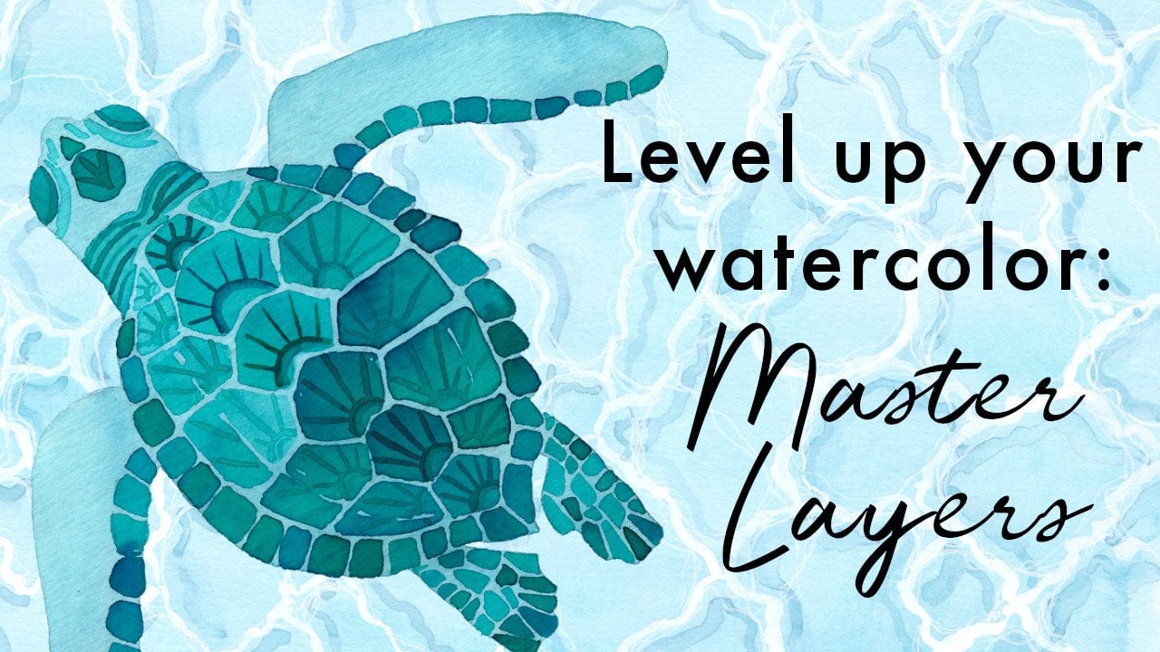
class and you'd like to dive deeper into layering
with watercolors, I really recommend my
master layering class where we paint a sea turtle and do some other
really great activities to really nail this technique. We want really dark colors down here. Here we go. Essentially, that is
our taxonomy finished. But in order to just give it
a little bit more dimension, we're going to mix
up a neutral gray so that we can
create some shadows. When I started painting
with watercolors, I always felt really nervous
about creating shadows. So we're going to do that next.
12. Creating shadows: All right. To paint shadows me
want to make sure that any areas that
we might be going to touch are dry so that we don't have our shadow
bleeding into our work. And we want to create
a neutral gray. So the way that you
do that is by mixing two complimentary
colors together. I'm just pull out
my color wheel. Handy dandy Calloway. Mix two complimentary
colors together. That's a complimentary
colors are the ones that are opposite each other
on the color wheel. So in this instance we
would have turquoise, turquoise and an orange, red, or yellow and blue. So that's convenient. We've got an indigo
and an orange color. So these are
opposite each other. So we're going to
mix those together. And then the thinner, the Wash, the lighter gray will
be, chuck it in here. So we've got our raw sienna and a bit of indigo that's
still looks a bit green to me. And we want to go for
something that's sort of in the middle, mix that in. I don't want it to
look too blue and I don't want it
to look to green. Test it on a swatch. Just a little bit more blue. There we go. That is looking like a gray now. Sometimes if you mix this color and it's just a little bit off, it might be that you need a little bit of the
other primary colors, so we've got blue
and yellow here. It might be that it needs
a little bit of red in it sometimes to get a really balanced gray if the two colors you mixing and
exactly opposite each other. But I think we can
work with this. And I'm going to add
quite a lot of water in because I want a
really subtle gray. I don't want it to be trying to decide whether I need more, maybe some more yellow in that. We spoke earlier about the
light coming from this side. And so this side of
things being in shadow. So we want add shadow to be on the bottom right of
all of our shapes. I've mixed my neutral gray here. Let's start up the top here. I'm going to imagine
that we have got a blobby shadows coming
in on one side. Now, you can just make
this up or you can use some shells and setup a lamp or look at the light so that
you can get it just rot. Sometimes we have
a little bit of shadow on one side as well. Even if you don't get your
shadows like 100% accurate. I think that our brains
kind of make it work. And it really adds
a lot to painting. Sometimes when you actually look at what shadows
do look like, it's really surprising how
big and walk today are. Much more, much more
so than you would think when you were
imagining a shadow. So I'm moving just the
tiniest hint of lot, a little bit of white paper between some of those
just to make it easier rather than risk activating the paint that
I've already got on. There. We go. This one here, I'm
going to go from there and drag this
all the way down. And you want to be just
sort of thinking that your shadow is coming
at the same angle, hitting all of these
shells in the same way. In reality, objects that are higher are obviously
going to have a throw a longest shadow and ones that are flatter and
closer to the page. But already, I mean, that's just making such a difference. Okay? Since whenever shells
we end up with a pretty crazy large shadow that we are going to
make it up a little bit and type or it just so that it mirrors the
shape of the show. You could get really detailed with shadows and you could have different tones and shadows
and drop other colors in, use your wet in wet
technique in the shadow, which is really nice, especially when the colors
that are separate. But we're just going
to keep it simple. And, and do that. Okay, this guy is going to
have a rounded shadows. This one is going to taper
out and get slightly wider. Yeah. So a little bit
of artistic license, definitely on all
of your shells. Bottom-right. So
we're going to have, this is going to
cast a shadow there. And then this is going
to cast a shadow. And then we're going to get
a shutter here on this side. Then maybe just ever so
slightly a shadow here. You can decide what
works for you. Maybe there's a swatch
shadow here. I don't know. What is really FUN is also putting a shadow on the seaweed. I think that's really lovely. What I like is to
give the illusion that it's not sitting
flat on the ground. And so they shadows is
actually going to be offset from the seaweed. So you can be
really a little bit loose with this bottom-right. Them, right? It's nice when the shadows
aren't necessarily connected to the
shape. Like this. Here we are with
our last shadows. So remember we're going
down on the bottom right. That means shadow
on this side. Here. Underneath. I really like this.
This view here like offsetting the
tip of the life to show that it's not you're
not slush the paper, then there's a bit of
dementia, dimensionality
13. Recap and project: Looking back over our project and what we have accomplished, we've used a range of different techniques to
create our show taxonomy, which is also a lovely
reference document for when we want to try
different techniques out in our watercolour
paintings. So we started off here
with a flat Wash, getting the color
down nice and even. And then working in
three layers using wet on dry to create the texture. And then we came
in at the end with ink or out diluted gouache too. Create a little bit of a
SHA1 on there with a shell. We put a flat Wash down again, and then once it was
dry on the next layer, we did tiny details
with a darker, thicker Wash of paint, using a smaller brush
and light pressure with the tip of the brush
to create those details. Over here we dropped
our coloring and then we worked wet in wet, dropping in the raw sienna to create the little
blobs of color. They're spotted textures
on the carry shell. We let that dry. And then on the next layer, we went in and added
the opening to the shell and the
tiny texture marks. And then when that
was drives where we added a little bit
of Shayne to that. With these two shows up the top, we also worked wet in
wet after a fashion by blending the colors
in the middle with water, blending
into colour. And here, putting down a light wash and then
dropping a darker wash. But just on one side, we added color pencils here. And then we worked with gel pens or felt tip markers
on this one over here. We also added white
highlights to this shell. Instead of using white
paint for this shell, we just reserve the
white of the paper by making sure we
lift areas unpainted. We added salt to our sea urchin, and then once that was dry, we added in some details to
give it some dimensionality. We finished off with our
Starfish by adding dabs of hand sanitizer to
the almost dry paint to give those little
bleached out areas. And then we added some details with wet on dry and
some colored pencil. And then to finish off, we Mixed different grains using F three colours
that we had already. And we dropped in a little bit of color to
make that interesting. And we finished off by
mixing a nice neutral gray and creating shadows for
our beautiful artwork. I hope you enjoyed the class. Don't forget to upload
your project into the Project section and ask any questions in the
Discussion Area. I'm always happy to help
with any curly questions or material suggestion
that my other classes to continue your
creative journey, I take to watercolour
and design basics, as well as painting
with gouache. There's also free resources on my website to keep you
inspired, Happy painting
 Hannah Katarski, Illustrator and Painter - MermaidsCoin