Transcripts
1. Let's Illustrate a Flatlay: great fun to illustrate and versatile addition to your portfolio. They're a great way to showcase your style and a flat lies, a nice option to present a cohesive collection of icons. I'm Hannah, an illustrated based in Western Australia, and I'll be taking this portfolio. Build a class flat life fun Icons are everywhere on packaging, on grating cards in magazines and Children's books. What you start to look for them, you'll see them everywhere. Icons are often the basis of repeat patterns, like those found on fabric and can even inspire ornaments and toys. In this class, you learn how to generate ideas for a collection of themed icons and how to make them look like they go together. You will learn how to create a strong composition as we arrange your icons into a flat by. We'll dive into colors, games and trends in a big way to look for some options to strengthen the look of your work . And of course, we'll look at the process of painting your icons. This class may be short, but it is mighty. It has something for you, whether you're a beginner, just starting out on your painting journey or you are an illustrator looking for inspiration. For your next portfolio pace, you can complete the class using watercolor as our demonstrate. Or you can use quash acrylic illustrator procreate Whatever your tool of choices. Travelers, a popular theme for surface design. And so we'll be creating a flat lay inspired by your ideal holiday adventure. So start daydreaming. Make your packing list and let's go on an adventure.
2. Your Brief (The Project): for the class project. I have developed a fan brief for you to respond to, so the brief is illustrate. Your ideal holiday adventure work must be composed in a pleasing flat lay, displaying a range of thematic icons that could be used for product decoration. The illustration will be used on a grating card and tote bag. Incorporate on trend colors that support the story as a bonus extension to the project. Leverage the illustration by incorporating the icons into a repeat pattern that could be used to bolt fabric, stationery and packaging.
3. Materials: While the focus of these class is on illustrating with water color, you can respond to the brief with your chosen materials and your choice in media, so I don't want to make things too complicated. If you're gonna be working with me using watercolor, I want you to choose a couple of your favorite brushes. I tend to work with some round brushes. I have a size six and then a one and a zero, which in my current favorites, you're going to need a pencil and in a razor and then your choice of paints. This is a Cramer watercolor set in pastel colors. This is my Windsor and Newton Cotman, Siri's paints. You can use liquid watercolors or true paints. It doesn't matter. It's what you're comfortable working with. Then you're going to need something to mix your paints in. It can be a simple as a plate from the op shop or a watch dinner plate or a palette. You'll need watercolor paper. I really do like the Kant's and brand, and I like to work with 300 gear Seine because it's nice and thick and it won't warp, and I don't need to tape it down onto a board to work with it. Finally, you will need loads off white copy paper or printer paper or a notebook so that you can schedule of your ideas and you know it's down and not feel like you're wasting your precious.
4. Planning & brainstorming: before you even pick up your paints, you need to pick up your pencil and do some planning, I know, but it's really helpful to do some brainstorming before we get to work on the outside. When everyone I'm responding to a brief, I start off with picking out the keywords from the brief so that I make sure I got all the information I need. And then I'll start to do some free word associating around the thing or that the k words that I've been given. So firstly, you need to decide on your same. It could be anything. The brief is for an adventure flat lay. But if it's a holiday, it might be that your kind of adventure is are going on a cooking expedition. It could be hiking. It could be a yoga retreat. It could be an art retreat. It could bay skiing. I love surfing and camping, so I've decided that my adventure is going to be a winter adventure around a camping surfing trip. Okay, once you've done that, you need to jot down your packing list, write down everything that you can think off for now, anything that you might need to take and then start associating that and stuck to extend it . What would other people need? What? What are some things that people associate with this kind of holiday? All right, so for my serving trip, I'm thinking I'm going to need my wet suit. I need my surfboard and need a swimsuit. But what else is fun? I case. So I'm gonna be camping. I'm gonna have a tent that could be really fun. Or I like to drink Nice hot tea after I've been for surf. So I'm gonna maybe under oath. Erma's. What else do you need when you're camping? All right, um, matches torch. Maybe it's not like I'm going orienteering, but people associate maps with camping, so maybe I might want a map and a compass. What else? What else? It's cold. So some nice willie socks, a beanie, nice boots. So you just sort of try to extend it as far as you can, And at the moment, you might not use all of these, but it just gives you a really good at least to start from. Don't worry if you don't know how to draw them yet. Next step Time to select and refine from our packing list to the things that might become our icons. I'm for 8 to 12 items. 12 seems to be the number that works for May and keep your list because you might need extra things to feel get, and you can come back to it later. Now have a look. Select from your objects. Which ones interest you the most and which objects Tell the story. Before I even start to contemplate my composition, I sketch out my icons. This helps me to not only understand how to draw them, but also helps May to practice doing them in a number of different shapes or a number of different perspectives to say what will work and also to then be able to get a big picture view to decide how they might or jigsaw puzzle together. As you're sketching, you might find that some images some icons just aren't really working in the context of the rest of the icons. And this is a really good time to find that out out. Rather than after you've started painting, you might need to go and look up some reference images for some of these icons to understand them. Maybe. I think I know how a tent looks, but when it comes to drawing it, I find that actually, I don't really know how it looks at all. Here I am sketching a wet suit and want to make sure that the proportions air right where the same lines go What sections of fabrica they actually made out of? It's also good to ask yourself here what perspective is going toe work? Well, do you want to sketch all the images from the same perspective? Do you want a two dimensional front on view? Are some of them going to be sketched side on or what about a 3/4 view? So this is where looking at reference images can really help you to answer some of those questions for yourself. What do socks up like when they're not actually on a foot? I tend to find I spend the longest time on this phase of the project. Once you've got a collection of icons sketches that were happy with, we're going to talk about composition in the next class before we begin placing the icons enough flatly
5. Composition - theory and tips: We're now at a point where we need to consider a composition, and I want to cover the principles of a placing flat lay. The rule of thirds is a guideline to help you compose your image. The principle behind the rule is that the image is more dynamic or visually interesting when objects are placed along the thirds or at points where they intersect, as opposed to centering objects. While this idea can be applied in any scenario, it can be easier to use on rectangular compositions than on square ones. Remember, it's a rule of thumb, and rules are made to be broken. The goal is to produce an interesting and balance composition. It might bay that a man dollar star composition works with icons radiating from the center . Let's look at an example split roughly 2/3. You can say that I have kept the focus away from the center asymmetry at interest, and there's also a balance of large and small objects across the composition. It could be important to keep the objects to scale, for instance, close all about the same size and small things portrayed smaller than larger objects. Using a grid layout, I actually found it useful to spit my image into rock quarters to help me plan that lie at . And then I split these into smaller sections. The crosshairs remind me to avoid the center, and this approach helps me balance negative space. In this monochromatic example, you can say I placed the largest objects first. Then I used a grid layout to place icons focusing on parallel vertical elements to create rhythm are more casual. Option is a scattered layout, and orderly greed might not be your cup of tea. Consider a scattered layout that breaks all the rules. Nothing is on the same access. Nothing is parallel, but the repetition of shape and color provides a sense of rhythm and cohesion. We're aiming for a happy medium between balance and chaos. Interesting enough to hold your attention but still pleasing to the eye. We have covered a lot so far, so let's recap. We talked about the rule of thirds using a grid layout and considering vertical and horizontal lines, balance of different sizes and consistency of size, asymmetry for interest, using negative spice and balancing chaos and balance and placing your biggest objects first . Rhythm and contrast are also important in achieving a placing composition. Rhythm helps the are to move or bounce around the page. A repetition of shapes, patterns or color helps to create a rhythm as the I jumped from one object to the next and also makes things feel like they belong. Look again at this example. What color catches your eye? Perhaps you say the dark pink spot on the surfboard. Notice how your eye, then six at the dark pink on the other icons, but hopes you're right to move around the page and to discover the details within the illustration. While rhythm and repetition hope to unify, contrast, sustains interest. Consider contrast through colors, light and shade, negative and positive space textured areas and plain areas to get all these icons in the right spot the first times A tall order. So I'm not gonna try. Instead, create a number of thumbnail sketches to test out my ideas, get the scale of objects correct and perhaps find some surprising ways that the icons were slopped together. Create between 2 to 4 thumbnails. Then pick the one that you like best or patch of final, designed together from your favorite elements from a few. Ah, thumbnail is a small rough drawing to help you explore ideas quickly back to most Spring Beach flat life, so I can show you how blocked in the icons I started with the largest ones. First, they spread out. Next, I find homes for the medium icons, mentally balancing potential color choices and trying to place similar shapes, like the hand plane next to the patent bikini. Lastly, I feel the remaining negative space with small icons. This provide flexibility as they could be grouped or composed into their own. Mini agreed. Here, the two thumbnails I drew for my camping surf trip. The project for this class. Let's get to the one on the right first, and then I refined it to create the one on the left. Initially, I thought I'd like a large central text, and then I decided to move that under the surfboard. I had trouble positioning the Sox. The triangle from the tent left some weirdly shaped negative space. I tweaked the map to make it raid. Better pardon the pun and figured out what a campus should look like with a composition I'm happy with. It's time to sketch it lightly onto my watercolor paper. It could be helpful to measure up. Agreed to help position objects. My advice is to get it right here if you're sketched. Proportions of right painting is a breeze. He is my final skitch on watercolor paper. I noted in my thumbnails that the clothes were in a consistent size, so I've rectified that. I moved the boots in front of the surfboard and I finally found a spot for the Sox. Next up color.
6. Colourschemes to avoid overwhelm: your color skin convey the difference between a good pace and a great pace. So how do you do color? Well, some people just seem to have a good eye for color, but there are also techniques that you can use to help curate your color choices. Head down to hardware store and snag yourself a pile of paint. Sample cards collect neutrals like grays and browns, as well as the colors that make your heart sing. Trying at groupings of different paint chip cards is an easy way to audition combinations is the cards usually have three or four hues of the same color. You may find that you're more likely to select a wider range of lights and darks for your callous game. To keep it simple, select four colors. One should be a pop of color. Then choose a light neutral and a dark neutral neutrals don't have to be graze here. My top and bottom cards on my neutrals, The light pink is my pop. I wanted a contemporary Christmas callous game, and here the colors applied on my Aiken's. Now the brief requires an on trend callous game. This is actually doing you a favor because having a choice of everything in the rainbow can be overwhelming and this narrows it down. So where do you find color trains, then what? Pantone is a really great resource. They bring out a range off colors every year. You can also look at shutter stock, and you can even Google fashion color trends. I went with the Pantone colors for the year, and I painted myself a K so that I can quickly mix them for future projects. Remember the paint chip cards? Well, I pulled out the ones that match the Pantone colors, and so I've got a 2020 Pantone color kit that I can look at and I can use to curate color combos, knowing I'll be working with water colors here. I've chosen some light, medium and dark tones of particular colors as I'll be diluting the paint to get a range of radiance, remember to incorporate some neutrals and both lighter and darker tones There still limitless combinations. How you choose to combine the colors will reflect your aesthetic and style. So let's look at this in practice before we apply it to our project. This is the color scheme that I chose for the spring surfing flat light that I've been using as an example. He can say where I have switched out the color scheme to make sure that it goes together and I'm happy with it. I used my color key to make sure that I can consistently recreate the colors, and this is what it looks like once it's been applied to my composition. I've chosen a lot of colors, but a few of them are Grady INTs. I wanted the color story to say springtime, so I have chosen pops of yellow and that turquoise jade. I also had to think practically about how I wanted to portray colors like the sea sponge and the wouldn't hand plane. If we analyze this color scheme, we can say that I've chosen pink and blow with some contrast ing pops of yellow and jade with some light and dark neutrals. Another fun and sometimes challenging color selection technique is to select a monochromatic color scheme. So you pick just one color in this instance pink, and you were also allowed to use neutrals like watts, maybe some graves or blacks. It could be really find it could be cohesive and very eye catching, especially when it's seen at a small size on our portfolio or on something like an instagram feed. The composition is cohesive, and the icons appear unified because of the repetition of color. So we have looked at using paint chips to come up with colors. We've looked at how to do it fairly complex color skin. We've also looked at working monochromatic. Lee, on another option that you can consider, is working with a complementary colors game. So this is where you select colors from the opposite side of the color wheel on your so can incorporate neutrals in this instance as well you can. You can break the rules. It could be whatever you like here. I've chosen red violet and grain, and I found this was a really good challenge to force May to use non realistic colors for the icons within the composition. Next up, I'm going to decide on the color story for my winter adventure Flat light, and I'm going to switch the colors ready to paint
7. Project colour story & paint alchemy: the colors that you select doing more than just look good together. They all sort of ICA mood and they tell a story. So with my winter adventure flat like I wanted to feel like a winter callous game, I wanted to feel kind of crisp. I want to use some cooler colors, and I wanted to really support the icons, the thermos and the Ugg boots and the bony to reinforce this message you can see here. I've actually got some cool blues, and even the orange red color has got some cool tones to it, along with a cool gray. This is where I pull out my trusty color mixing K, and I start to feel my palate with these colors so that I can get ready to paint. I'm going to start with these blues working with the darkest color. First, I'm mixing some into go in with some ultra Marine for my palate. I found that these were the color that works. Of course, if you've got a different brand of paints and a different selection of colors available, you are going to need to do your own experimenting to figure out how to match the couple pissed for my lighter color. I'm working with a cerulean blue on. I feel like this is a pretty good match straight out off the pallet and then just diluting that with water to make the lighter tint. Next up, I'm mixing the tan color using some yellow polka and just a touch off indigo just to darken it down. And I'm using a blue that is already in the composition, so that just helps with the cohesion of the color. Yellow is next, and I'm using cadmium yellow, or Gamboa is here, and I want to mix big enough wash so that I have enough to get through my whole painting without needed to come back and then mix the colors again for my neutral gray color. I've actually found that my ivory black diluted right down is the right kind of color that I want yet happier that next up I'm going to mix this tricky plum colored purple, and I'm using my cadmium red and my violet color just getting the right proportion of each of those to get the color that fits for May. Next up is that cool rust red color. So I'm using cadmium red again, the same as I used for the plum. I'm adding a little bit of CPL end to dull it down. What I'm gonna do is use a little bit of that violet again. So that's not quite right. But I get the combination right. Mixing my colors from the same vice colors helps to make everything cohesive. Yeah, happy with that now, Next up is my pinks. I'm mixing in my permanent rose with a little bit off that cadmium red deep again once again, just hopes. Tie everything together. Make sure that the colors are saturated enough so that I've got both are diluted and a more saturated version of the same color to work with just adding a touch of the indigo in there just to cool the pink down a little bit. And lastly, I need to mix my two grains. I'm using a tube paint of hooker's green and an olive green to get these right, and then I'm just gonna add a touch of yellow into the lighter one just to brighten it up and give it a bit more contrast. We are ready. We have done so much work to get to this point. Remember how we started with their packing list? We've sketched out icons. We've drawn thumbnails. We've decided on a color scheme and mixed our paints. Well, it is finally time to get into the painting.
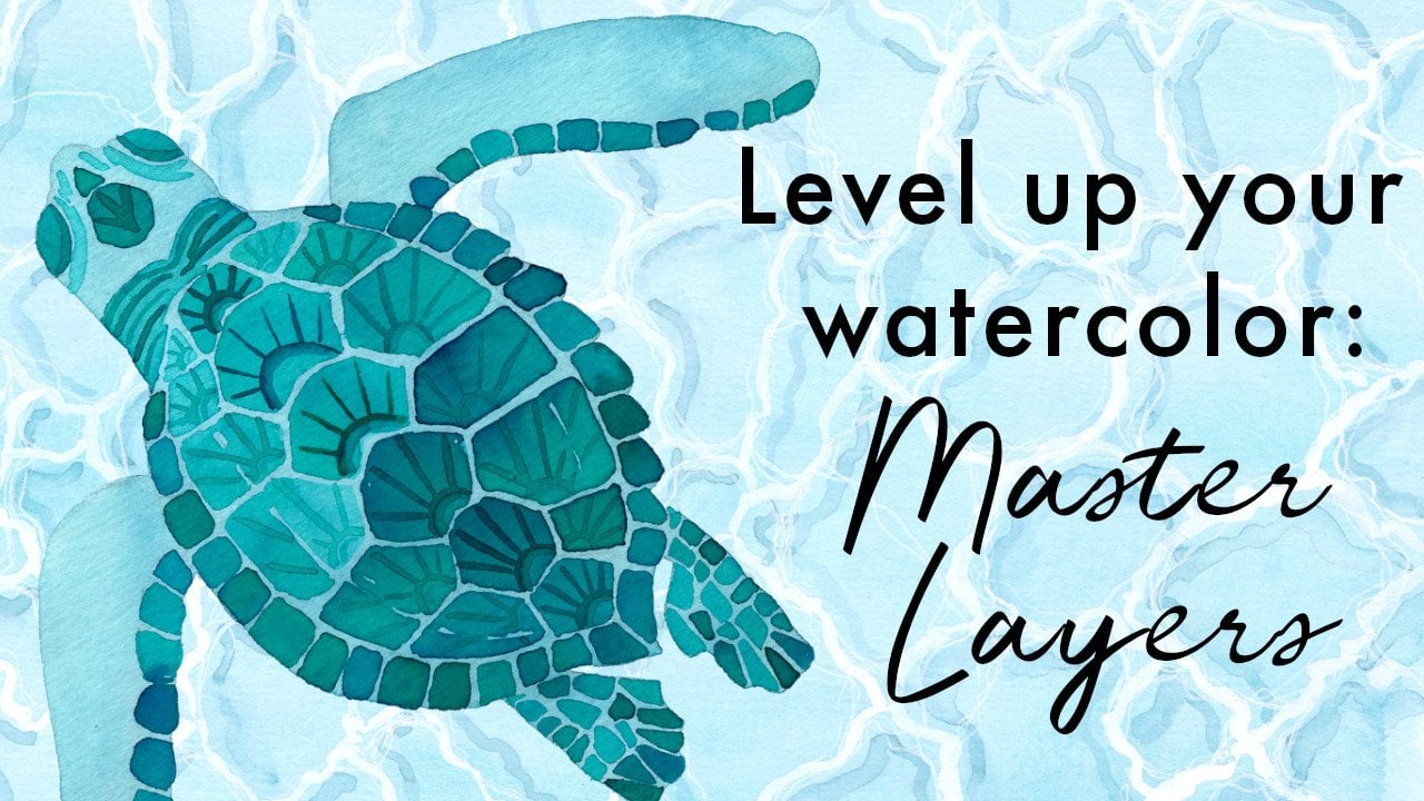
8. Painting the project: planning and the preparation for a flat light. And we're up to the painting part at last, and this is where we don't want things to go pear shaped. And now I want to share with you my process for painting the flat. Les, I want to show you how I work in layers and also how I work around the page. Applying color are systematically so that they end up with a really nice, balanced and cohesive artwork at the end. I'm so excited to finally be painting this illustration on. I start by making a mental map off the colors that are used for the biggest icons. And once I've got those in place, I'm going to let the colors evolve for the rest of the small icons. I want to achieve a sense of balance by making sure that the dark colors a sort of evenly represented across the flat light and also that you know the colors in the color scheme referenced in a number of places, achieving that rhythm that we talked about in an earlier lesson that it makes your I move from one spot to the next, connecting those colors. So I've said enough with my wet suit. And while I'm letting the navy blue color dry, I move on to another icon, and I'm using negative space here to create a tropical print on the bikini with water colors. You know, we tend to leave the white showing through rather than adding white on later. However, that's perfectly fine. If you want to work with white ink, I really like to raise my pencil lines as I go. I know that you can work with carbon paper or you can use watercolor pencil that then sort of gets incorporated into the work. But for May, I like the level of detail that I can get with a lead pencil and the ability to arise for his watercolor pencils. You know you can incorporate them, but you kind of rice then later. So if this is the way that I prefer to work, Navy layer is dry now. So I'm going in with Jason areas on painting in this pump color, so with water color. If you want nicely defined sharp lines, you need to wait for an area to be dry before you paint next to it. Otherwise, you end up with colors bleeding into each other. When I'm working with teeny tiny areas and doing data house and line work like this second layer that I'm applying here for the same, you need to make sure that you don't have a lot of paint on your brush in order to avoid flooding the area. So for small details small, brash and also not a huge amount of paint, I'm aiming for really even flat washes over a lot of these areas of the wet suit. And if this is something that you struggle with and perhaps check out my mastering layers class with the say turtle on the cover image, Alright. So I've started with some of my big icons that I already know what color I want to use. And then I'm gonna be moving around to try and make sure that I am balancing my main colors from the color scheme with my contrast in colors, I don't want to get halfway through and realize that I've painted everything in my popping contrast color and haven't really represented the pink or the blue that I've selected. So I let the light pink area dry before I've pointed the purple once again, Who do you let the Dyson areas dry? It took me well over two hours to paint this whole illustration over a number of sittings. As I have small Children, I've spent it up up to between four night times for you. Just to give you an idea of what I'm doing without having to work every brush stroke, I decided that this wasn't quite dark enough, so I wanted was drive out of the second lion with water colors. You work from light to dark because of their transparent nature. You can't go in and put a lot of color on top. Now I'm starting to work around the page. I've identified that with my map. I wanted to have some blue and grain on there, and I've selected the pink that I got on the surfboard in the other corner so that the eyes gonna bounce from one side to the other e often working this way where I work on one section and then while it's drying, I'll move somewhere else, and then I'll bounce back to the other side. So, really, it's a jigsaw puzzle on Do you know, doing a lot of work in my head while I'm filling in the gaps and trying to problem solve colors for things that an obvious choice. Also icons that could be a number of different colors. I sort of want to decide what is going to be next to them or adjacent to them so that I can pick a different color rather than having a collection of pink icons all in one corner of the artwork, you see that my style tends to bay quite flat and quite precise. But of course your icon should reflect your style. And if you like toe work looser or with more wet on wet techniques or more blending, then that's that's great. You really want these icons to impart a sense of all of your style. So this is the third layer on the baby. I'm adding some texture now again, in my mastering layers class. I have a process that I explained that's called wash, Define Patton and line on. This is the way that I teach. Explain about using wiring for border color, and that's how you build up the design and the texture over a number of different liars. So I'm coming back in with the 10 color that I used on the compass on. I really wanted to The jacket today, one of those sort of 10 ones with the sheepskin lining, I sort of felt that that had a really nice retro vibe. It's really starting to evolve now, and I'm aiming for each of my main colors. Teoh here in three different places on the design to help with the balance. Even here, I'm making the little needle on the compass in the rusty red color that I'm gonna use elsewhere. And I've chosen a purple for the bony pom pom to match with the surfboard. If you're new to this, you know a lot of the icons can just be one or maybe two colors, and it's it's still gonna work. It's just about doing a little bit of problem solving and working on it like it's a jigsaw on a second layer. Here on the court is that cool sort of rust red color that I had uninterested time mixing, and I'm using that for details on the coat because I don't have a huge opportunity to use that yet. So it's all just about putting down a layer letting it dry and then building out bit by bit with a slightly darker layer on top. Here I am adding a final layer of some little data lines and some shadowing just to give this last bit of definition. It's the same gray that I used on the wet suit. I decided to make the Sox multi color just to help connect the colors game. And you see here that I've got the pink on the socks and that you get that bounces from the surfboard to the socks and then up to the baby. So it helps to create that rhythm through the design that the pink on the socks dry right. Some of my lines and then I add the next calorie. A lot of these icons will only have a single layer, but then some of them might have three or four, just depending upon the complexity of the object and how I've chosen to draw it. I don't want to paint these boots at the same time because I didn't want the color to be blading across them. I wanted to be able to really delineate them. I had to do it, get some reference images to decide how I wanted to paint this thermos. Once again, I wanted a bit of a retro vibe, and so I've gone for an illustrated pattern on the thermostat rather than just painting it one solid color, I think that that provides are really nice balance between the solid plain icons and then some icons that can be a bit more decorative, detailed again, adding some shadowing. So now I'm out to the tent, and I left this to last because I wasn't really sure what color I wanted to use about looking at my color scheme. This rust red is the the only color, but it hasn't really been represented yet. I've referenced it in small places, and so through a process of elimination. That's how I've decided that I use this color for the tent. I'm going with blue feathers to help balance the colors across the page, put down the first layer to define the the walls of the tent, and then once that's dr at its and patterning over the top. - Now , an initial layer for the inside off the tape a the tent. I really wanted to make it look inviting and cozy And so I've decided to paint like a patent. Do they cover blanket? And I'm leaving some negative space so that I can fill in with a coordinating color once it's dry and a second layer on the back of the tent. But I didn't quite feel that that worked for May. So once again, I let it dry while I feeling the blanket. I needed to take a little bit of time out to put some greenery around the place. And I've come in with a little bit more color to create that sense of shadow and to help communicate that that is actually the inside of the tent and to sort of show how the mattresses curving. This is what we've got so far so I can take stock. Make sure that the the composition is sort of still in line with the color scheme that I've decided on, and this is gonna help may toe complete the last few icons I try and I, Mazza said, toe, have the cake colors in three different places to sort of help it feel cohesive. You can see there have a pink in the blue, and the tan are all quite balanced across the page, so trying to decide what to do with this camera, I don't want it to be Navy because it's right next to the wet certain. That's quite a strong pull for the I. So I'm thinking maybe a paint that pink because that's going to work. I think that that color is off on the two corners. I don't want the torch to obey the same color as the camera. And I think making the torch blue is on a worker because it's close to the map in that coffee cup. So I decided again on that rust color here, just toe reference that once more on pink for the camera, I'll be letting the pink area dry and then coming in with some shadowing and black day tiling as well. So again, working in about three layers, do you when you create your project, I would love to read a few words about the media that you've chosen to create your artwork with a swell as your callous game and including your thumbnails as well, because that would be beneficial for other students to say how you've refined your design to and here's the finished flat. Les, I hope it spin a useful exercise for you. Watching may go through my process of problem solving and applying the color. I hope you've enjoyed this portfolio B with a class. I hope that it's giving you an insight into my process and that you've been able to take some tips and techniques away that you can apply to your own creative process. I look forward to seeing your projects in the project section or on Instagram. If you've got any questions, just ask them in the discussion area and out reply there. Happy painting.
 Hannah Katarski, Illustrator and Painter - MermaidsCoin