Transcripts
1. Introduction: Watercolor abstracts have
become a really fun, favorite art supply that I
love to play with lightly. I've done several
different abstract classes and the watercolor ones I keep coming back to and
I keep playing with new supplies and new
techniques and new directions. This class is all about that, playing with some new supplies that I've never
played with before. In this kind of respect, I'm going to be playing with
some watercolor pigments, dry pigments that we
splash into our piece, and I'm also going
to be playing with metallics and just
seeing what kind of fun, a little abstract
pieces that I can create inspired by a
piece of art that I purchased from an artist
that I think does the most beautiful
work and while my pieces look
nothing like hers. The piece did get me so
inspired to come and play with abstracts using the
different supplies that I'll show you
that in class. I talked about what
inspired me in that. I want you to look around at different art and artists
that you admire and see, what if they done in the
pieces that you find fascinating that
you kind of want to explore and play with yourself. We talked about
that a little bit in our inspiration video, and then see what direction
that inspiration drove me. It would be very
interesting to see if you look at different pieces and
things that inspire you. What direction does
that take you? It's not your goal to
duplicate what you're looking at or to replicate anything
that another artist is done, but I too love to look
at the things and be inspired by supplies and
technique and color. For this class, it manifested in these beautiful abstracts with metallic elements that shine really beautiful in the light. I'm Denise Love and I am an artist and photographer
based of Atlanta, Georgia, and I have been a full-time working artist
now for more than a decade. I like to split my time between art stuff and
photography stuff, and it just kind of gives me a creative break when I
moved back to a different, back and forth to the
different mediums and I love to create fun
workshops like this. I hope in this class, something that you see is going to inspire
you if you choose to work with the same type of supplies that I'm showing you, or you veer off into your art supplies and
you're like, okay, today I'm going to
experiment with this item that I've
never used before. That's fantastic. That's
what I want to do. I want to inspire you to look at things
and think, okay, what can I create with this item or these items
or this inspiration, or these elements that I
see that looks so amazing. In this class, we're
going to look at a few new materials that are new to me that I'm
experimenting with, and then I want to see
what you're creating after you watch the different supplies that we'll be using. I'm really excited to
have you in class, so let's get started. [MUSIC].
2. Class project: [MUSIC] Your class
project today is to play an experiment and test out new supplies or some
things that you've got in your art cabinet that you've not
played with before. In this workshop,
I was focusing on powdered pigments,
watercolor powder pigments, and metallics, and that
metallic could be acrylic ink, it could have been
some metallic paint. There were lots of
choices that I'm giving you in class to show you what metallics you
might be trying to use and find and experiment
with and see what you love. In this class, I want you to play with some new materials. If it's not the ones
that I'm showing you, then play with something you've got in your
cabinet that you've not experimented with
before and create some fun little
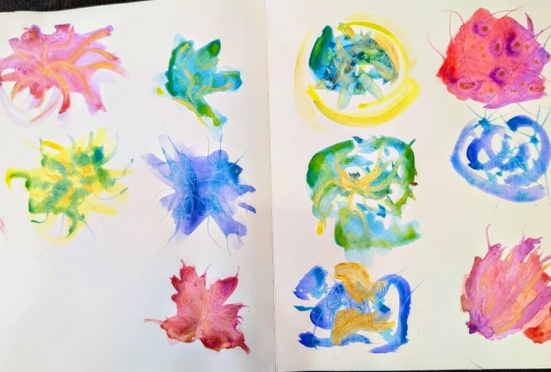
abstracts with those, and I want you to come up with a little series of small ones, preferably several
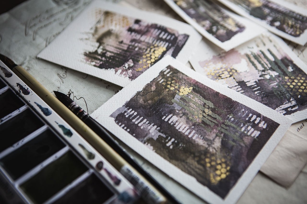
different color tones. I've done pink and orange, I've done another colorway with some purple added in
and some fun metallic. I've also done fun blues. I'm showing you lots of different colorways that I experimented with here in class, and I want to see you experiment with some colors that interest you and just see what is it
that you can come up with, and I want to see one of
your little collections, and I want to see the
bigger piece that you came up with
after doing those. Once you've experimented
with lots of colorways and you've played with your supplies
and you think, here's the one I really love, and for me it was this one, then I want you to take those techniques and
those supplies and those colors and create a pair of larger
ones for yourself, and just experiment and see what it is that
you can come up with. I'm really excited to
have you in class, I can't wait to see the
ones that you create, definitely come back
and share those with me and I'll see you in class. [MUSIC]
3. Inspiration pieces: [MUSIC] I want to talk for a moment about what
inspired this series for me. I've done a lot of
abstract watercolors, but I like to keep on
doing them and playing in different supplies in different mediums and
different papers. What inspired this little
abstract series for me is this piece of
art that I purchased. I purchase a lot of
art and I make a lot of art and photography. I just love incorporating different ideas into my
own art and appreciating the beautiful pieces that
other people who have created self frame and hang them in my house and
just be inspired. This piece was created by an artist in Italy, Aunia Bohn, hope I pronounced
that correctly, and I believe she makes
her own colored inks. This is probably a lot of
stuff that she created herself and then created
this beautiful piece. But what really inspired
me were the colors. Love this pretty soft blue
color, this aqua tone. That's one of my very
favorite colors. Personally, I have a lot of
this decorated in my house. I have a sofa this color. Funny enough, in my art though, I don't tend to use
a lot of that color. I do go for blues and greens, but I don't get that
nice grayed-down blue that I see here
that I really love. There's a little green in here. I love the brown. I love this pretty brown
that fades into the gray. She's used a lot of
little salt sprinkle here in this bottom part. There's a little bit
of collage elements in here that would be fun
to experiment with. Then the part that
really grabbed me, that inspired me the most is the metallic pieces on here
that shines as you move it. I like that there's a color value range from
very dark to very light. To me, this looks like when
you stand back from it, it looks like the sky and some mountains and a waterfall
coming into the lake. Maybe that's not what it was
but when I have this propped up on my mantle before I
take this off to the framer, I like to set stuff and look
at it for a little while before I take it and have
it framed and hang it. It started looking like a waterfall to me and
it was just so pretty. This is my inspiration
for the little abstracts. I'm not trying to
copy what she's done. I'm not trying to copy another artist's work
when I'm creating, but I do love to be
inspired by techniques and colors and things like the
metallic bits that inspire me. Because this piece
inspired this collection, I just wanted to show it to you and hopefully you think
it's as beautiful as I do. [LAUGHTER] Just to give you an idea where that inspiration took me
before we begin painting. These are pretty little pieces
that I painted before I even decided that I was going
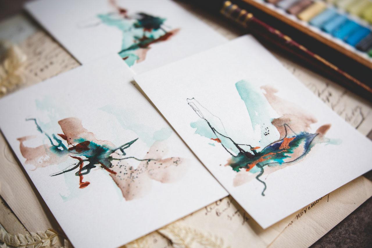
to film this for a class. This was the blue and brown that inspired me from that piece. You can tell here that
they look nothing like the pretty abstract landscape
that, that piece is. They're own little
abstract pieces. But what I took from
that inspiration was I liked the blue, I liked the brown, and I liked the metallic bits. You can see the little metallic
parts shining in here. I created this little
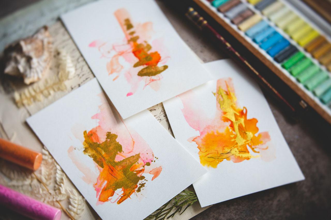
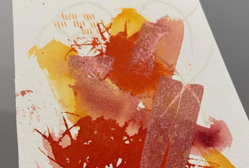
series on that inspiration. Then I started to play with other colorways because
for some reason I am just so thoroughly enamored with pink and orange that
I thought pink, orange and gold would
be really beautiful. These are on a point that I'm actually very
happy with them, but they are also at a point that you could then go and add more marks and other elements
to this if you wanted to. But sometimes simplicity
and knowing when to stop when something's already so beautiful
that you're like, I love this, maybe stopping
before you ruin it. [LAUGHTER] But another element here is I like to
do a lot of these. At the same time, look how pretty that
gold is on there, and create like this is one
of my favorite right here. I like to create a
whole little series. When I was creating these, I did them like a set
of six and I find it nice to do something
like a set of six. Look how pretty this one is with those colors and that
metallic bit, so pretty. I find if you do like a
whole little set of six, then you're less precious
with your marks. You're less precious
with your movements. You're more likely to
be like [inaudible] and then now move to the next step and you're
not stopping and thinking, is that perfect, did I get
that in the right place, did I get that in
the wrong place? You're not hung up on some of the things that we
get hung up on if we're just doing one at a time. I want to encourage you to do a little set when you do these. I also experimented with
some other colorways. Here is a different set
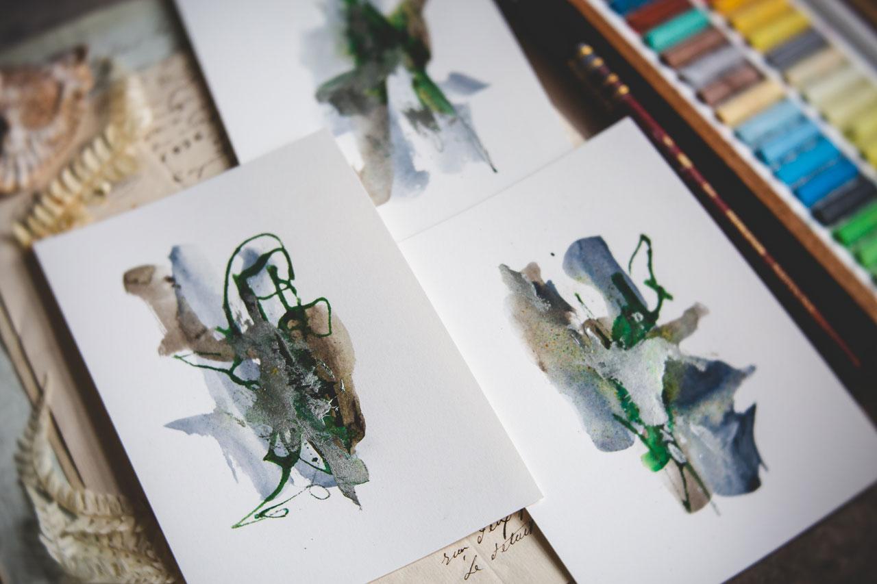
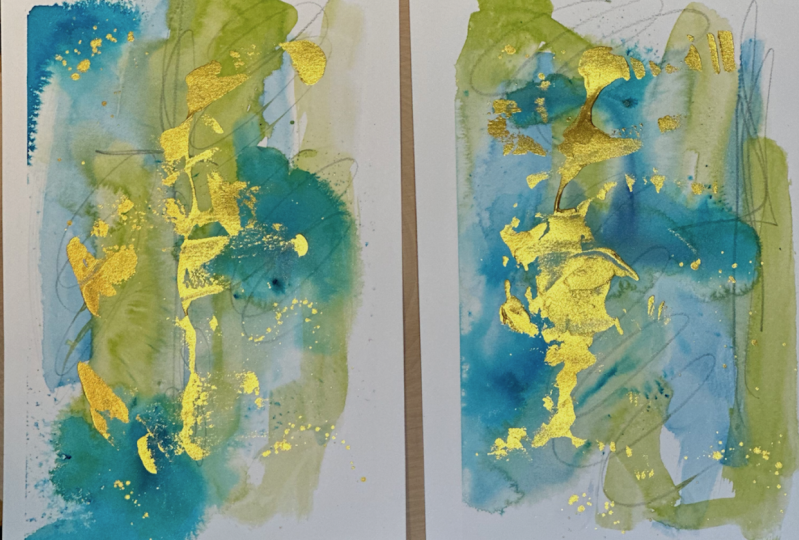
of pink and reddish, and the pretty copper. I also was playing with a
green and a gray and a silver. You can see the
silver bits in there. Let me tell you some of these by the time you get to
adding the metallic, the metallic bit is what really finishes it off and
makes them so pretty. Here with the blue and the
green and some silver. I just wanted to take a moment, show you where the
inspiration started and what got me excited to try
to play with metallics, pick up some different supplies
that I have not played with in some other
classes before just to give you an
idea and give you the courage to maybe experiment with some of your supplies. Because in this class, I'm experimenting
with pigment powders on top of watercolor, on top of the metallic, and so we really get some
fun pieces when we're done. Hope you love where
the inspiration started and where the
class for me ended up and I can't wait to see what pieces that you're
going to create after you watch this [MUSIC].
4. Supplies: Let's talk about the supplies that we'll be using in class
so that you can then see an idea of what you might
want to do your project as. I'm going to talk
about paper first. I experimented with a
lot of different papers. I experimented with a really
lightweight crescent paper that mostly was for ink
pens and stuff like that. I don't like the
way the watercolor sits on the paper,
but it did okay. If you've got any type of mixed media paper rather
than watercolor paper, you can certainly start there. I also used some cotton
paper from Choosing Keeping. I like this paper a lot. It's got a nice texture
on, it's lightweight, it's got a pretty deckled
edge here on one side. But for this project, it was not my favorite and I did not really love the way
the piece turned out. It was not smooth enough and I didn't get the look
that I wanted overall. Then I was playing
in my sketchbook. We're going to play
in our sketchbook a little bit because
I like to flesh out color ideas and things
like that in my sketchbooks. This is moleskin in an animal. These are both 110-pound
cold press paper. I do like cold press, and if cold press paper is what you got then definitely
experiment with that. But my very favorite, after experimenting with all the different paper choices, my very favorite
was a hot press, 140-pound, 300 gm paper. I'm using the arches because that's what I happened to have. Use whatever 140-pound hot
press paper that you'd like. I do find that the better
quality papers give you a better quality
overall finished piece. But it doesn't really matter. Just get some hot press, 140 pound is a
really nice weight, and then start experimenting. This was my favorite
paper on these projects. I'm using hot press 140-pound. This is a nine by 12 pad. What I'm doing in class is
cutting it up into fours so that I can then
do lots of fun, smaller pieces to create a
whole little collection. Then if I needed a bigger
piece, then, of course, it is available and ready for me and we could do a
bigger piece in class. My advice on doing
larger pieces is for the smaller piece I'm using a paint brush like
this Princeton tin. If I were going up in size for a larger
piece of paper, then I would go up in size, say for instance like a number 6 Neptune versus
the Number 10 Neptune. The bigger the paper, the bigger the brush. Is what I have figured
out works best for me. If I'm using a
little bitty brush and a big piece of paper, I get frustrated because the piece does not end up
doing what I intended, the marks stay small. When they get larger, they need to get larger. I'm using a 140-pound
hot press in class. I just love the smoothness
and the way that it creates our
overall piece for us. I'm also using my favorite
watercolor paints. I have a lot of different
watercolor paints, I have Daniel Smith and I have some scenario that
I've collected. My favorite is the blue-green in the color palettes and the
oranges and the pinks. But also have a selection of
paints that I have handmade. To be honest, I'm probably
going to show you how I created the
pink and green set, and then I may play in a
blue and brown set too. But because I'm making some of these for me to maybe frame, I'm going to play maybe
in the handmade colors. I do have a class on making your own watercolor paints if
you want to check that out. There is also a really
easy way to create watercolor paint with
just some pigment, some pre-made gum arabic,
my Winsor Newton, a little bit of
honey and you can make some watercolor
very quickly. I'm also going to be using
some type of metallic. You've noticed in all
of these pieces we have this really pretty metallic
element that shines as you move your piece of
art or you move around it. I really love this
gold paste that I got in my art box
subscription that I get. I googled gold mica paste type, and it actually
comes up on Amazon. I like it because it's got a little tip that I
can direct where I put it and then I can take
a palette knife and smear the gold around
on the painting. I may be using this gold paste, but on lot of these pieces, I've also used the Liquitex Ink. I've actually ordered for
myself several other of the inks because I love
this rich copper so much. These are some Liquitex
Acrylic Ink iridescent colors. Comes in silver and gold
and copper and browns. There's lots of colors
that these come in and these work fantastic for this
project. That's a choice. You could also,
if you wanted to, for the metallic element, use some of these watercolors that are metallic.
You can try that out. Or you could use cheap
metallic acrylic paint, which with silver in
these blue pieces. Here's one of them that
has the silver in it. That's exactly what I have used, is this cheap pot
of metallic paints. Just so you know, even though I'll be using one particular one
or what have you, tons of options there. Don't feel limited. Or if you can't find what
I happen to be using, the name of the game here on these little abstracts
is to experiment. You could also too use some
of these calligraphy links. Those are really
pretty metallics. I have several of those, not really using them in class. For this, that would be a perfect choice for
these metallics. Now that I've thought
of it, I may use it on these projects that I'm using on my sample
pieces I was playing in, but these are really pretty too. These are the Winsor Newton
and they're usually over there where your
calligraphy supplies are. The other thing that
inspired this class was, I got some of these
watercolor powders. They are really
cool. They came in the art box subscription. I'm like, "How fun are
these going to be?" A lot of times what I would
do on all of these really, I would pick two colors
of watercolors say, pink and orange, and then paint those on there, and then add a splash of
some type of pigment powder, and that's what made this
vivid orange in here, and then the metallic on the top and some little scribble
mark making in there, and look how pretty these are. It was the perfect opportunity
to play in a new pigment, I use this orange
watercolor powder in that one right there. It was the most fun chance to play with something that I really don't play with enough, this is a pretty color too, I may have to pull it
out it's like a red, I actually have lots
of little powders in my stash art supplies
that never come out. Just to give you an idea, there's color burst powders, and so I've used this
turquoise on one of these pieces and it was
rather bright and I was like, wow, that was a surprise, but it was a fun surprise, that as the pieces dried, I'm like, "Okay,
I'm liking that." That was a fun chance
to play with those, I also have some of these ink fusions which are
colored stains, which to me, it's about the same as these and it's about the
same as these, I mean, all these things
do the same thing, it's just a colored pigment, and I bought these years ago, and they're fun to just splash
some type of color onto your piece and it balloon out into something fancy and fun. Then I've also randomly, don't even remember
where I got these got some Jacquard products
procion MX dye, and I used this
aquamarine and it looks it is like an army green, but I used it on
one of these pieces and it was this vivid blue, I didn't quite understand, that the powder color was not the color it
was going to be, and so that vivid teal that popped out was like,
"Look at that." That was pretty cool, so I don't even know
when I bought these. They're in this drawer
over here and I thought, hey, it's a powder,
let's give it a try. This is the perfect
project to do this with. The other thing I'll
be using in class it's going to be a little
palette knife, I like to smear the metallic part a
little more organically. Got some watercolor brushes, I'm using a big piece
of graphite to do some mark-making in to smear
some of that color around, you can use mechanical
pencil or you can use a regular
pencil if you don't have a great big
fat graphite thing, this is one of those things
I have, and I'm like, why do I have this and
where did it come from, and it probably came in
our box subscription, which is why I like
getting that every month, it's a random bit of things
that I didn't pick out, but when it gets
here and I've got something fun like this
gold paste in it, I'm like, coolest thing ever, I don't know that I ever would
have even discovered this without that or this big
fat piece of graphite, but this is the
opportunities that I used to pull some of these fun
things out an experiment. Simplifying it down here, we need two pretty watercolors. We need some type of
pretty powder that we can splash into that to
give us a third color. You might look at
different pigment powders that are at the art store, and just think, what can I do? You don't have to, it's just an opportunity
to experiment and explore something you might
not have played with before, hot press paper and then
some type of metallic, whether that be an
inexpensive acrylic paint, or a metallic watercolor, or this Liquitex acrylic
iridescent inks, so you've got lots
of choices there, this fun gold Mica paste type
which I did find on Amazon, so it is available, and I think it's a
calligraphy ink to be honest, but it's a nice thick
acrylic type feel to it and it makes the most
beautiful color on here. I didn't look to see if
there were other colors. Maybe I want silver, maybe I want bronze, or
maybe I want copper. I didn't find any other
color but the gold. More I to have to search again and see if something
magically appears, but you have lots of choices. Couple colors a watercolor, maybe a pigment to sprinkle
in if you want to try that, some type of metallic
and something to do some mark making boils
down the supplies, even though I showed you lots of different options that
you could consider. I'm pretty excited about
creating some more of these because these are really beautiful and I'm wanting
to play quite a bit. One other thing
that I just noticed that I used on this
that I definitely want to use some more before I close up here is a little
set of some oil pastels. I have lots of pastels. I have these great big
soft, chalky pastels, which are my favorite
thing to use and really my favorite
thing just to sit over here and stare at, took a picture of this as its own little piece
of art because it's so beautiful but I like
pastels and those are little Sennelier a half
pieces of the soft pastels. This is a random
pastel set that I got that's an antique and it
was like 30 box on eBay, and it's a Guitar pastel set in its own little wooden box and it had all
these colors in it. These are more like
an oil pastel, they're not the
soft chalky ones, these are more like the
little bit harder ones, so I'm probably going
to use a few of these because they're new
to me and it's exciting, and all the colors
are so beautiful, and it doesn't take
a lot to just get a little mark in there to add to the excitement
of your little piece, but it's just enough and there's enough fun colors in here that I might want to
use some of those, so if you're interested in
fun antique art supplies, definitely check out eBay
because I have found some fantastic things in a pretty wood box for
not very expensive, that are still usable, or you can just use your
own pastels if you've got some recolored pencils or
the neocolor too crayons, again just giving you some
more options that are all going to do a similar thing, give you a little
bit of a color burst and still be pretty
in your piece. Again, little few
more options there. I can't wait to see what
abstract pieces you create, these are so exciting
I can't wait to put some of these up and
have a little set framed, so I can't wait to see
what yours look like, so I will see you in class.
5. Supply Play - Testing Out Colors And Marks: Let's experiment with some of our supplies
in this video. I like to experiment
in my sketchbooks and see what is it that
we can come up with? What colors are we going to end up with when we're painting in our regular stuff and I want to see what it is that
we can create today, so I'm looking for here we go, looking for my paintbrush. I'm just going to go ahead and lay a little bit of color in here and experiment a
little with some colors. I've got some of the colors that are handmade that I really love. For instance, I know that I'm always going to love
pink and orange and in some of the stuff
that we do in class, I'm just going to
tell you now they'll probably be my very favorite. You can make your
own pink and orange, just like a cadmium
orange and maybe a rose. Rose matter maybe mixed
in with titanium white, so you can definitely
experiment here. This is cadmium orange by Daniel Smith and
that rose opera, that's what I was thinking. The rose opera might be
basically the identical color and I believe the rose operas are sennelier and the rows opera is
one of my favorites. It's got some really pretty
vivid tones and colors. I also like the raw earth
green and this raw sienna. The raw sienna is Sennelier. The other one is Daniel Smith. Those just came in big
collections and at some point I've
separated out what I thought was some of my
favorite colors as I used them and so definitely
do that if you're like, I love this color
when you're using it, pull it out and add it to like a little favorites
collection for yourself. Then you'll have a fun
little go-to set of things that you like and you
want to use over and over. This one is a green and
a blue that is ones that I made as green. I'll just go into the blue
because I like blue and green. Blue and green are
right up there with the pink and orange that's
some of my very favorite. But again, we could
probably go back to this raw or green and have almost an identical color
there and get a paper towel. I don't want extra drops
hanging out at a drop of water. Sometimes the water will sit on your paintbrush and
you just got to be careful where it's
then going to drip off. This one is chromium
green oxide. Let's give that a try
out, very similar. Looks like there's almost maybe a little green gold and my favorites so if
we go in there. This one right here
is almost identical. This one is something genuine. Color 190 might be
serpentine Genuine. I can't actually see
anymore what that says but it's a very pretty green and it looks almost identical to the paints that I've
handmade and that's a Daniel Smith
color so if some of these colors that I handmade
I'm using in class, here's the store I bought. That'll get you almost
the exact same colors if you decide you love them. Let's see, is there
anything else that we want to try out here and normal color samples
I want to just see, this one is all see red gold. That is a bright, weird color. It's almost like green gold, which is a bright weird
color but look at that with this one which
is mayan red, that's a Daniel Smith color. The OSCE red gold, I believe is Daniel Smith. If you look those up
and they end up being sennelier then just know
it's one or the other. We're trying to tell you
the correct one and I'll apologize if I sneak
their own name out there. Let's see what this is. We've got viridian,
so that's a green. It's awkward green color? This is where you want
to start playing, experimenting, and
deciding, do I love it? Do I not love it? Let's
see what this is. This one is burnt
sienna number 10. This is really pretty and
it looks really similar to our inspiration piece of art that I showed
you to begin with, with this pretty blue, some of these browns
even like a little gray so if we refer back to
our inspiration colors, we might play and we can mix different colors if
you love to mix. Your watercolors on a separate
palette and come up with new colors that you love
then that's great too. This is like a purple.
Let's see what this is. This is a really light purple. This one is ultramarine
red so Daniel Smith one I believe and that's a really
light transparent purple. I don't know. I don't want to play with something so
light and transparent. This is where you can figure
some of these things out. Let's see what this is. Here we've got Tara Verde. That's very interesting. I want you to experiment with all your color ways and decide, what do I want to try out? Now I actually
want to experiment a little bit with
these pigments, so I'm going to maybe
try this turquoise. This is a color burst
turquoise color. If you can't find you can
just tap some of this on this one and I do have a
little spray bottle in class. I'm mostly using my paintbrush, but you might consider having
a spray bottle handy and spraying those colors and just seeing what they do
because they're going to mix, they're going to
swirl, sometimes they're going to separate. If you don't want
them to separate, then that's when you
might add the water with your brush and let it
do its thing and dry. I would resist if you could, let's try this lime green, I would resist taking a heat gun to these pieces
because part of what makes this so much fun is letting the water color run and do its thing and not
speeding that process because it's going
to miss out on some of the movement and transformations that
it would normally be making if we do that. Let's try out some of these. These are procoin dye. This is brights Garland, this is a Jacquard product. These may be some fabric dyes, I'll tell you later in class. I don't even remember
when I got these and I tried one of these, this one right here and let's just try this one right here because I want you to be
as surprised as I am. Look at the color of that. It's like a army green
kind of shade and I'm going to put just a tiny bit on here with my little knife. The name of this game is very small amounts and
then watch what that does. It's crazy. It kind of mixes
up and turns into color that looks like this turquoise
that I used on this one. See, we move out. This has different color, little crystals in it, and the colors just
change and are surprising and new things that maybe you
weren't expecting. Look at that, that's cool. Also, have some of
these fun and fusions. Here's a terracotta. Let's do terracotta. I've got a little lid
that's got a hole in it, so I can actually put the hole in it and
I just type it off to keep them from getting
moisture in them. But you can also
just take the lid off and do like I just did with the other and scoop
a little in there. But we can just do this
right here and see what we get with those. Look at that. If you google
watercolor pigments, you might come up with some
other things that I haven't heard of or that are available now that
maybe weren't before. A lot of these I've
had for a while. It's very interesting. What inspired the use of these are the art box
that I got this month, and I got these little
watercolor powders in that box and so I'm
actually going to look at sketch box and see are
there other colors? Google watercolor powder and see, what else could there be? Because I got these
pretty colors, orange, and great turquoise,
and navy blue. I also got in that box another
one called color sparks, watercolor powder, and I
haven't used this one. I've used that orange one. Let's just see, this one
looks more like a red. I'm just put a
tiny bit on there, maybe spritz it with a
little bit of water. If you're going faster, look how pretty that color is. If you're going fast enough that your water colors are still wet by the time you try
out these pigments. Great. I was not going that
fast obviously. Look at that. If you do it like a drop of water and then you tap
some powder in there, look at how the
color balloons out. That's really pretty. I don't think I'm going
to like that one. I don't end up using that one
on our projects in class, but I do like this, this is bougainvillea, which I think that's
a red flower. All right, so let's
come down here. Let's just add a little
water to our piece. If it's all dry, you can use your little
squirt bottle for that and I probably should have done
that on my projects in class. Here's where we're learning. What can we do different? What do we want? Look at that color
and then let's see. I have milk paint samples, but I don't know if that's
going to do the same or not, but all in the spirit
of testing it out, let's put a little
water there and let's put some of this
milk paint on here, because it's a powder, it's
a powder that you actually add to water and
it makes no paint. But let's just
experiment with it. That was way too much pigment. But maybe it will
look interesting, because it's a milk paint it's already going to
work with water. Look at that. Milk
paint is kind of matte. You do it, you paint with
furniture a lot and it looks very muddy with that terracotta color
and that terracotta, it does look like
part of a clay pot. If you've got note
paint samples, because these are little
note paint samples from sweet pickins. This run like, I would say 650 for probably a bag of pigment and they're
fun to paint with too. You don't have to use just
artists paint things. You could use something like furniture paint and other
things from the paint store and just experiment with all the different fun types
of things that are out there. Let me just squirt a
little water on this one and maybe we'll try
this navy blue. The navy blue and
I don't know how it comes off on camera, but the navy blue looks
like turquoise to me. But the turquoise one is actually a little more green. Look at that. Then
while they're wet, I want you to take
this moment to experiment with your
mark making tools. In class, I end up using this little graphite
thing and I like moving stuff when the
pigments wet because then you move the paint color
around so that's fun. You can also experiment
with just a pencil if you don't have a great big piece of graphite like that,
pencil's fine. I do a lot of things
with mechanical pencil, so you could take this chance to just do the mechanical pencil. This is just a 12B, it's a very bold regular pencil. We could use some
of our art pencils. We could also use
our stabilo pencils, I have a bunch of the
marks of stabilo. I like the black and the brown, but look at how
different that mark is. That mark actually shows up very vividly and you still
actually see the mark in there compared to the
pencil marks which move the paint around and
you don't get as vivid a mark there so that's very interesting and
exactly why I want to experiment with
different supplies here in our sketchbook. Here's a white one and
see what the white, completely different
than the black or brown, we're actually not going to see the marks nearly the same
as we do with the dark, so the whites, not
the best thing. I also have some of these oil-based pencils and that's fun because
it's kind of a brown, but it could also move
some paint around. Let's see, what else do we got? Wouldn't do any pin on
this at this point, because everything still wet and drying and doing its thing. If you have real big
puddles of color because the sketchbook
is not quite the same as working on thicker paper because
this is 110 pound, you could come through with your cloth and soak
up the puddles. I've got flowers on
the mind I think. Then that might dry
a little faster, you can also add
some pattern into your water color if you
want to wrinkle it up, and then stamp it out and see what pattern that
would create for you. Lots of fun things that you
can do at this point to say, oh, I like that, oh, I didn't like what that did. This is our time to
experiment and play. All these, I was most surprised by the
bougainvillea color by the TCW stencils.com is what that's got on that label,
this color sparks. I'm definitely going to
go and take a look at the different colors
here because that red there really reminds me of this watercolor
that I like so much, the Sennelier rose opera. It's in that color but it gives you a little
different, it'll sit on top. I really like these that
I got in the sketch box because they come out very vivid and on some of
our finished pieces, let me just show
you like this one. That vivid orange that's matte
and gives a pop of color, that's these and so I want you to do your
little experiments here. What supplies are
you considering. After it dries, we can come back and
play with our metallics, so I'm going to
pretend that it's dry.
6. Supply Play - Adding Metallics: [MUSIC] Enough, strong enough. It's going to be a
little different. Completely let them dry
and then come back and experiment with the
different metallics. I'm actually going to put
my metallics over here to the side because I want to
see what they do and decide, do I like the thickness, do I like the way
it moves when I do it with a palette knife? Let's just see. I've got the yummy gold paste that
I use throughout class. I also have some metallic paint and now I wish I
had more of these. This is just cheap craft
paint from the craft store, but it does work just like
that paste and seems to be a similar thickness and it's just as pretty and works with great
with a putty knife. I might go back to
Michaels and looking at the different
metallic paints. [LAUGHTER] I also absolutely love these liquitex
acrylic iridescent inks. You'll see there
are not as thick. That's interesting. It's not as thick, but they are really
pretty in some pieces. Let me just see some of
these little samples. This was the gold and see
how pretty that shines. You could also, which
I did not do in class, you could also do
the gold leafing and the silver leafing
instead of paint. But I wanted to keep it to
paints instead of working with glue and those sheets. This is that copper
and you can see, it's not as heavy as the gold, so it's a little more
transparent and I'm getting some bleed through of the
yummy color that was under it. I love that effect, it has its place. Here is the silver
acrylic paint. You can see that's
a nice thickness. We have a tiny bit of bleed,
shines really pretty. That was a different option. I've used the
silver on this one. I just like that when you say different bits of
light shine on stuff, I like that shine. It's a little different than anything I've done in the past, and I like that extra element. This one, I left it
a little thicker and it's nice and vivid. Here's that copper again, and again not as vivid, but still an interesting
touch as you move around a piece and you
see that light hit it. Super fun. I want you to experiment with the different
metallics that you have. The other metallic that
I have that I mentioned in one of the videos, maybe the supply video, is this acrylic ink,
metallic stuff. Now, this stuff is not
nearly as thick and you have to continue to shake
it up to even use it. [NOISE] make it a dry brush and then as
you're using it here, just going to stir that
up with the brush. There we go. This stuff sits on the bottom
and then you can see it's very transparent when we use it in a
scenario like this. I just had a bunch
of dry pieces. But look at the difference
there, it's still shiny. It works really
good for dots and lines and little mark-making, but I'm not sure that
it's going to do the exact thing that
I want it to do here. Another thing I mentioned are some of these
metallic watercolors. We'll go ahead and activate
these a little bit. [NOISE] Got blue
with my water there. Sorry. This is good
and activated. These are fine tech
pearlescent colors. That's another option also, and it's like that ink, the calligraphy ink, it's
that same thickness. It's not thick like a paste,
it's more translucent. If I were adding that into, say, this piece here, it's going to dry and I'll
see a little bit of shine, but it's going to show the colors underneath
it through it. It's a different type
of look when it's dry. Just interesting, the
different effects that these create and the
different things that you might be looking for. This might be nice as maybe
the base color on your piece and the slight shimmer could
add some interest being one of your base colors rather
than the top metallic color. But just choices. I like having choices. Trying to give you
some choices and some alternatives if
you don't have or can't get or aren't around some of the supplies that I happened
to be playing with today. It's all about experimenting with some of the supplies
that you can get a hold of and figuring out
what you love and how can you create a really fun
collection from that? Because some of
these are super fun. Like I love this set
here with the blue and the lighter tan color. I really, really love
the very first set, so I'm trying not to throw
these down on the floor. But the pink and
orange and gold, I love that whole set. Every one of these I think
are just so beautiful. That's my preference if you're looking at them
and you're thinking, that is what art is all about, it's about figuring
out what excites you. I get so excited when I see some of these finished pieces, but it might not excite you. You might think, that's so ugly. But that's individual opinions. It's like, don't
worry about what everybody else thinks about
what you're creating, create for you, get excited about your
pieces for yourself. When you get that moment
that you're like, I love these, and you
want to show it off. Who cares if everybody loves
it or doesn't love it? It's about enjoying the process, creating from your
authentic self, and figuring out supplies that are fun that you
want to create with. That's what I love doing. I like experimenting. I love getting the
monthly art box, finding things that I
certainly never would have come across any other
way, and now I'm like, this might be my favorite item, ever.[LAUGHTER] But
how are you going to discover that if
you don't play and experiment and
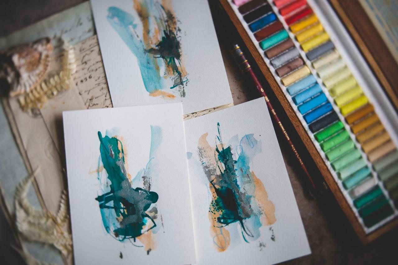
figure things out? I really love the way
this one turned out. That one, I like those,
the green, the blue, and that darker shade
that's in there. Tell me if you
think I'm wrong and it may come off a
little different. This is navy, [LAUGHTER] but it's got
a very green tone to it. To me, navy is very
dark, like Payne's gray. It's that dark grayish-blue. This is more navy to me
in the finished piece. But anyway, just wanted to experiment here a
little in our sketchbook, figure out colors, figure out what mark-making
piece that you like, figure out what metallic
piece that you like, and then start creating your little pieces from the things that you've discovered here in
your sketchbook. I'm looking forward to seeing
what little abstracts and the colors you pick and choose and make this time in class. Let's get started. [MUSIC]
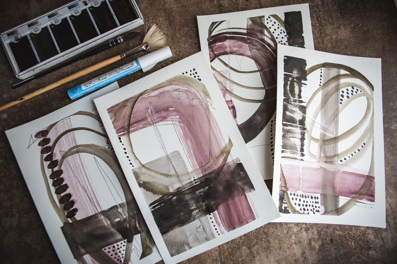
7. Starting A Small Series: [MUSIC] Let's go ahead and
start a little project. I'm going to do in sets
of six personally, and I want to do a couple
of different colorways. I want to go ahead and
get these started. This is how I'm going, and you can do this in your
sketch book if you'd rather. But this is how I'm going to experiment and play with color. The first set I want to do, I'm going to use
some colors that I made that are just
pink and orange, because I love mixing
pink and orange. I'm going to dip it in my water. I'm going to just roll my brush around in one color on
each piece of paper, and then I'm going to do it in the next color on
each piece of paper. Then we're going to have
two watercolors on here, and hopefully they're still wet, and I can then squirt
a powder on here. If you want to start off
with wet on your paper, you can have discovered
if I started off with, I get a little different
texture than if I start off basically with
the paper dry. This is the hot pressed paper. All six of these are going
to be the same project. They're going to be
the same series. [NOISE] But I want them
all to look different. I find if you'll work on several
pieces at the same time, then you'll get a variation. You'll be a little looser, and we'll get some color
differences that we're not likely to get if we just get a one piece and
then we get stuck. Then I'm going to immediately
go into this pink that I like and just get some of
those colors on there. What I like about this particular set of watercolors is the
granulate really nice. I don't know why the pigment
that I used to make these, what is the difference? But they granulate in such
a beautiful way that I think that's part of
my love for them. [LAUGHTER] The faster you go, the simpler you keep it, the better these turn out, I believe in my experience
here working on some of these. I just opened it and
splattered powder everywhere. [NOISE] I actually want to see if I can clear a little that powder off
or whatever I just did. [LAUGHTER] You've got to be real careful opening
these powder ones. Then I'm going to come back
and dip some water in here if I don't have enough
water on here to make this really do what
it wants to do. Again, I'm rolling the brush
around to a little bit. I don't want to just dab it
on there and then think, I didn't mean to do that
or something like that. I want it to be a
little more organic. I'm rolling that brush again instead of just
dab it and stuff. Just my own personal preference. This is looking pretty wild. But now what I'm going
to do is set it to the side and let
these completely dry. Some more pink on this one because I don't
want to touch them. I want to let them do their
own organic thing and resist going back and continuing
to add stuff if you can. That one didn't end up with any pink that I
can actually see. I wanted it to be pinker. But now I'm going
to set these all on the floor and let
them do their thing. Even though at this
point I'm thinking, do I really like any of these? By the time they dry and
I added the metallic to the previous
pieces that I did, I was like, I love all of these. Don't get discouraged at
this spot right here. Let's go ahead and put out the next six and do
another color way. I'm actually going to do
another orange [LAUGHTER] and pinky color and then I'll go into a different
color because I want to use some colors that you
could actually get a whole. This is aniline, rose madder, and this one is cadmium orange. I thought it might be fun to try these in one of these sets. I'm just going to get
the orange on there. Again, I'm going to
roll the color around. One thing I noticed with
this hot press paper, there is a right side
and a wrong side, and I believe on that first set, I used the wrong side, which is why we got that
granulation, bubbly up look. Even though it's
technically the wrong side, I like the way it granulate it, and you might experiment with
both sides of the paper. I like this rose opera
because it's vivid. Look at this one right here. Look I'm going for, I want to know vivid. I want some excitement. I want to see the movement. Then let's take some color. How about this color
burst in the orchid, which is not a color
I've tried before? These you just
lightly scored out. But it's very unpredictable. [LAUGHTER] How do you know
what you're going to get? Very unpredictable. Again, I'm going to add some
extra water in on these, look at that color.
Oh my goodness. That color did so crazy stuff. That's like a real vivid. Well, look at that. I Like the light,
I like the dark, I like the white paper, I like to see where this can go. You might just drip some
water in on an area that has some powder and
just see if it'll spread and do what
you were thinking. Then we're going to set these
to the side, let them dry. This may not be my
favorite set. We'll see. [LAUGHTER] For this third set, I think I'm going to use our inspiration piece
that we started out with, and I'm going to try raw
earth green and a raw sienna just in the inspiration
color palette from that first piece of art that I was
showing you inspired. Look at that, inspired me to play and
create this series. This is a pretty color and
this is the raw green earth, and think that is, see, there is aniline or
a Daniel Smith color. It's number 181, I believe. I think that might
be Daniel Smith. Some of these, the
simpler the better. I have to remind myself
that over and over. Keep that in mind for yourself. The simpler the better. Don't overwork it. See, that's like the perfect
shade right there from that landscape inspiration,
beautiful piece. This is why I want
you to go fast. Don't get stuck on one piece. Roll that paintbrush around and see how you can get those
colors to interact. [NOISE] You know what? Something I didn't do
all these other pieces, so we might pull those back out after I go ahead
and color squirt these. Let's see, what do we
want to use on this? Here's a pretty navy in here. Maybe I'll do the navy. I'm just going to
try to tap a color. I'll till tiny bit of this
color out in different spots, and then hopefully it'll help. You wanted to do its thing here. Let's just try this
with the cisplatin, some color down instead
of laying in color own. We can do that. Look at that. This is more like a turquoise. Did I use that
turquoise? Maybe I did. [LAUGHTER] But I use the navy, but that's a turquoise color. Let's just see, did I
use? I swear, I did. I swear I used that
other one we'll see. This thing says its navy. Let's see the difference in this and the
turquoise powder. This is why I like to work
in sketchbooks, some, because you figure out
what these colors are going to do before you
get to your art piece. Look at that. The
turquoise is more green. That's why that one looks
more turquoise to me. But how interesting is that? Keep a little couple of
pieces of paper here to experiment with so that when you're in doubt what a
powder is going to be, especially [LAUGHTER] like this one where I
thought it was going to be this green and it really
was a vivid turquoise. If you doubt what color it
is that you're working with, don't have that might turn out. Definitely have this sitting
around to experiment with. I'm going to go back on
my other two collections and smear my color around. This is a little bit while like this great big
piece because it's moving color in addition
to doing some marks. Again, I'm just as
organic as I can, not wanting to spend too
much time on one piece. I want it to not look like I stopped and did
something on purpose. Now I'm ready to dry. I'm going to get my
other two sets back out and see if I can still mark, make a little bit
with my crayon, my piece of graphite [LAUGHTER], and then we will let them dry before we add any metallic
or anything else to it. I'm actually going pretty
fast on these pieces. But like this one, it's actually almost dry. When I come back and
add some marks to it, I'm going to get more marks rather than smearing of paint. But this one is still very wet. I still want to come back
and put the marks in there. This will give you a good idea of what the marks
would look like, added after the fact or while you're still working
with some wet paint. You might try that
both ways yourself. But one dry before you put marks and then do
one while it's still wet and just see the
difference that you get in those techniques because
this one is really cool. I think I'm going
to like that a lot. Suddenly grabbed the third set and we'll put some marks in it. You got a third set back out. These are still somehow
wet, you can see here. I just move some of
this paint around so you can tell like all
three of these sets. I'm doing fairly fast. I'm moving fast enough where
I could talk about it. Set them over there, come back to you and there
are still wet ink on it. Just decide, you want
yours to dry and then you want to mark make
through a mother wet. I like to mark my film waller
wet. Just my preference. I don't know if I'm
going to love this particular colorway or not. But my mother loved purple. I guarantee you she would have really loved this color way. [LAUGHTER] It really
funny and interesting. What colors attract us then
what we end up loving. I'm going to let all
three colorways dry, and then we'll come back
and add some metallic. [MUSIC]
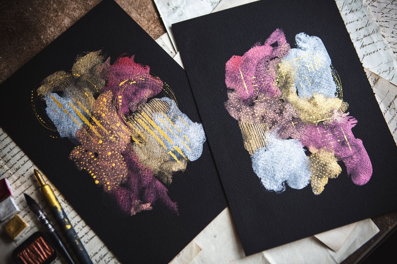
8. Finishing Off With Metallic Touches: Now, these have all
completely dried. I went downstairs and
just took a little break. Now, we can look and say, which direction do we
want these to go and do we love pigment? First take a look at some mark-making before we get into
adding some metallic, some of these out of the way. Again, for mark-making, you can use some nail
color to crayons, you could use pencil,
graphite, anything. That's things interesting. You can definitely
use any of those. I'm going to use
some pastels because they're new to me and
I'll play a little bit, and we'll just see what
we can come up with. I'm really loving this
yummy magenta color. It does seem a little bit
lighter when I use it, so it may just be the
outside that looks so yummy, but I did think that
maybe we'll just come in here and add some marks
and some interest. You can just count us, see, what is it that
you want to add. I like adding some uneven lines, but you could add in
different shapes. I like dot satellite dashes. We can come over here
and do some lines. This is also a great chance for you to use your posca pens, which I don't think I cover
those in the supply video. The posca pens are some of
my favorite art supply. This is the perfect
opportunity for, especially for like a white
paint pen to come back in and maybe do some dots
or add in some shapes. I do like dots. Perfect opportunity
to come back and just pick some spots to randomly do some dots
or lines or shapes. Don't forget your posca
pen if you've got some of those perfect time for those. Because these are part
of the same series, I want to do a little bit of the same thing
on each of these. I don't want to make more all completely different
from each other, I want to match like that. When I was putting this
bright orange powder, these are called sketch box, signature orange
watercolor powder, a truly magical medium that plays well with all wet medium, made up of multiple pigments that blend to create
the final color. You can probably google either this and get this from
the sketch box or maybe google watercolor powders and see what fun choices
are out there, but I love the watercolor powder and they are magical, you know, as we were putting that on there every single time
I've used those, I've thought, my goodness, I'm not going to
like this or not? But I love it. That little vivid orange dries mat on every single
one of these. It has really just
made the difference. When I thought, am I really
going to like these? Now I'm looking at him, I'm like, I love these. I want to keep more a
little more simple. I am going to stop with
the little bit of pink, even though I added
some lines and that, that was more for demonstration
than anything else. Now I'm going to use this gold mica paste type in brilliant gold ink,
water-based pigment. I have found this on Amazon and I actually
ordered myself another one, like this one wouldn't enough. But I thought I love it so much. Maybe I will want to
use it over and over. But I got tail you in the supply video and you get a piece of
paper out that says a little bit of liquid
at the start there. I'm just going to get
us started. Here we go. Like I told you in
the supply video, if you can't find
this or don't want to use this or what
have you. It's fine. Use some metallic acrylic
paint that works great. I'll probably use
this on the blue one. You could use calligraphy, gold ink, that would be great. I really like these
Liquitex acrylic inks. I'll probably use
this on one of those that in the other color way. But I like this
stuff whole a lot. I've actually ordered myself
some other iridescent colors in this Liquitex.
You have choices. You could also experiment with metallic watercolors
if you wanted to, you don't have to
use acrylic ink, you can definitely experiment
with other metallics. You don't have to
use metallic at all, but I do feel like the metallic is what sets
these off in the end. I'm just going to squirt a little bit of this
on each of these, and then I'm going to take my palette knife
and move it around. Just a little bit there. I wish I could get
this in every color. I hate that it's not available on other shades. Now I'm just using a nice
skinny palette knife. I am organically
moving that around. Look how pretty that is. Then I'm going to
do that for all of these other ones to
get my final piece. You can do this any
way you want, really. I have just found that this is what made these
so exciting for me. Look at that, that
little extra on the top, pulled the whole thing together. It was the extra bit that I
was like, oh my goodness. See, look how pretty that is. Your choice on that, what you want to try there. Well know that less is more, you don't want to overdo. But sometimes more is more, take that with a grain of salt. I am just making those
organic. Look at that. Then if it's too thick,
don't worry about it. They dry and then add thickness
adds some pretty depth. This collection, I'm
super thrilled about, almost as thrilled for this as the original set of orange
and pink that I did. Now, I have like
12 that I can pull a little series together
from like I really loved this one right here. That one is personal
favorite on this. This one doing some fun stuff. I love this one. I
just love these all. We'll set these down
and let them dry. I'm going to go ahead and call this set done because this is exactly what I was
wanting and then let's go ahead and look at
one of the next colorway. Here is the next colorway. I don't know if this colorway
will ever be my favorite. The last colorway with the
blues, I particularly like. I think what I want
to do is use copper, iridescent rich copper here in the liquitex on this set because
it got the orange in it. I think I'm going
to use the silver, cheap metallic paint
for the blue set. Let's go ahead and
see what we got. What I like about this
is it's a stopper so you can squeeze
paint up into it to then squeeze out or
I can just get it on the outside of there
and mark it up. Like this. Just get
it where I wanted, like that and then I'm still going to take
the palette knife, just like I did with the
gold and smear that around. Now the interesting
thing here is some of this metallic powder blended
in with that. Look at that. All right, so let's go ahead and get us
some of this dipped on here. I'm going fast. I don't want to think
too hard about this. I just want to get
some in there. Faster you go, the more organic it looks, the more you might
like it later. Look at that. I like
that with this on top. The thing I think
that was really not my favorite about this is
the darkest color is on top and on some of
these it was almost overwhelming but look
how pretty that is with that copper on top
and then there's even some of this purple
coming up through. Look at that. That's very
interesting on that one. I think I used too
much on that one. This is why I like doing
a bunch at the same time. If you have one
that you're like, okay, I don't love that one, you can still make it
a set of four or five and give up the one that maybe
you weren't loving. This one's got some pretty
purple mixing into. This might be your
exact favorite colors versus the colors that I
thought were my favorite. We're all different in
that way. Love that. I'm really loving this one here with the way that
purple is meshing in. That might be my favorite out of this one because of that. Out of there, I'd say at least have a set of two that I love. I call up those two. This one I don't know about. I may have overdone
it with the copper, but we need to let these dry. So I'm going to set
these to the back. I'm going to call this set. Good to go. I have
several in here. I think I'm going to like. I like maybe these
four the best. I've got a nice
little set of four. If you do all six or
eight or whatever, you can then weed
out the one or two that you're thinking
I didn't do that or it's too much or this one might dry and
then I'll change my mind. It may be my favorite when
it's dry, so we'll just see. I'm going to call
this sit, good to go and let's get
to the next one. All right. Now this one
is actually exciting. Something in that
metallic powder, the watercolor powder
that I put on this. I'd like a pretty
purple shine through. It's a really
interesting undertone and it didn't come out
and every one of them, but it came out in this one. Look how pretty this two will be together if I hung
them by the set. So I'm going to do the
silver with this one. I'm using my little
skinny palette knife and basically what I want
to do is get some of this paint on the palette
knife and I'm going to mark this up the
paper a little bit, place it and then come
back and spread it because this stuff is a
little bit thicker paint. I don't know if it's
because it's older. Maybe it was thicker already. It's nice to make a line up
here and then we'll come back and we'll spread
that out some. Then just see, now that we've
got some of it on here, we'll just really organically
see if we can get that to move in some ways. That's what I want right there. I just want it to look
a little different. I wanted to do some
pretty little marks out there and then
when we get it in the light we
can see its shine. Look how pretty
that is and I like that I kept a little purple bit, which I'm going to try
to do this one too. Yeah, look at that. See.
Those two are pretty. All right. Very pretty. You can see how using
a piece of art or something that you find really beautiful on Azure inspiration. How you can then create some really beautiful
pieces of art yourself, of your own. Even though we were completely
inspired by a piece of art that I got from an artist
that I was collecting. The pieces that we ended
up with look nothing like the original inspiration
piece and that's the purpose. I don't want to
copy a piece art, but I'll certainly want to take some inspiration
from it and you'll see our original piece
had the metallics and it had the pretty
blue and the browns. The piece I ended up with looks
nothing like my original. But if I hadn't been
inspired by this and the colors and the
metallic parts in it, then I never would have created something like this for myself. So this is a pretty
set. I love these two. I think these two might
be my favorite framed up. So we're gonna let those dry and I'm going to call this set done. This is the time to, to just decide, are you going to add anything else in there? Did I want to add
any of the pastels? Maybe I could add
some pastels in here. Now that I'm thinking
about it, I might do that. I could come back
and add some lines. Just get a little
extra in there. Not something that's so obvious, but maybe as we get closer, then we're like, Oh, we'll get the extra
detail in there. I want to be organic. I don't necessarily want
to move the silver ion. I want to add one extra
little touch here. I just want to add a touch to
each one so that as a set, they're still very cohesive.
There we go. I like that. Okay. Then before
you overwork it, you might set it to the
side and look at it for a while and decide like it. Do I love it? Do I want to
try these colors again? Do I want to do it bigger? I like doing this size
because then that makes it easier for me to decide
later compositions, colors,, what I might
want with a larger piece? With that being said, I'm going to call this set done. Let's go on to our big piece.
9. Creating A Larger Piece: [MUSIC] I thought it would be fine just
to experiment and do after you've done several of your smaller
collections and you've played with your colors
and you've decided, okay, here's what I
love and here's what I don't love and here's
what I want to try out. Thought it would be fun to try out a bigger piece with
your favorite color. My favorite colors
are of course, [LAUGHTER] the
orange and the pink with that vivid
orange powder on it, so let me find that
vivid orange powder. Here we go. Then the gold on top of that so bigger
piece of paper, I'm going to try with a
bigger brush and I still want to keep it organic
and I might do a set of two because
I think everything works better in collections when you are not trying to [NOISE] think too hard because you're only doing
one and you're like, Oh, I'm going to add one
I don't want to ruin it. Let's do more than one and so I'm actually going to do two. Let's do two [LAUGHTER]. I've got two pieces of paper. Let's just move this right here. I'm going to try to be careful not to splash the powder in the wrong place and I feel like when you're
working on more than one, you are more likely to move fast and not worry a whole lot about where
your stuff lands. Again, I'm kind of pouring
on my brush and just getting that different
kind of look to it and then I'm going
to go right into the pink and I can
tell you already, these are yummy, yummy,
yummy [LAUGHTER]. Telling you pretty,
pretty, pretty. All right, so I actually
think I'm going to like this one
a little better, but we'll see. We will see. All right, let's work
a little bit fast here and get some of this
crazy orange powder over here. Probably good if you open
and close your powders off of your piece of art and if you get
anything on the paper, don't hit it with your hand, but like you can
hit it with like a dry, clean paintbrush. Just if it's before you add water or anything
to see if you can lightly get that off where you intended because I
actually do want this to look pretty when I'm done
so I'm trying to be careful. Look at that and these
big fat Neptune brushes, man, they carry the water like nothing else telling you
it's a great brush. Let us clean that up. We will do some mark-making. Don't forget the mark-making. I totally forgot on those
couple of small pieces but come out here and see what she can do mark-wise
[NOISE] Then when we put our metallic on top, really finish these
off nicely like that. Now we have our
bigger set [LAUGHTER] ready to set to the side and dry and we'll see what we get. So I'm going to let this sit
overnight I want them to dry naturally resist if you can, using a heat gun
because you really, when you get it drying too fast, you stop it doing some of the fun variations and stuff like the blooms
and the separations, you prevent some of
that stuff when you dry it too fast and so resist if you can and if you have any water grips that you don't want on there, like pull those off
early and then if you have any spaces
that had a powder that did something
funny then we can come back in with a tiny
bit of color if I need to. Like there was a
little powder there. This is why you don't want to keep coming back and overworking but that's actually a really
pretty with that extra. Maybe I'll do that over
here too, so they match. Oh, that's pretty. All right, now I've got that where the powder
bit was on there. Let them dry for a while. Resist, resist, resist
using a heat gun. You want the watercolors to do its magic like this right here. I don't know what that
right there is doing, but it sure is pretty and
if we heat gun to all this, we'd miss some of
these things that the watercolor is
naturally going to do. We'll come back and look
at these when they're dry. Oh yeah, check it out. Now this is dried. I like that vivid
orange powder in there and I'm definitely
going to use the gold color. I could've had some
cheap gold paint that would have been fine too, but I'm going to add
some golden here. I'm also going to take
this moment to decide, do I want to add any
little marks on here, I think I do look at
this pretty color. Add just a few
little marks in here and little tiny bit of extra interests as you
get close and you look. I just love this colorway. It just makes me insane. I love it so much. That's fine. I just wanted
to touch so let's go ahead, so put some gold in here. We're going to go right
up this right here and then this one I'm going to go right
up that way there, and I'm probably just going to use a little bit bigger
palette knife because again, little bit bigger, couldn't
use the skinnier one but let's just go ahead with
this and see what we get. Look at that. That's pretty and you can decide
how you want to go up if you want
to do like I did, do a line all the way up and that's where
you want your goal. You could do that.
You could look at our inspiration piece art, and see how on here, it was two or three
different spots of something metallic. You can spread that out
and do something more like that if that was
inspiring to you. But I think on these, I really like it being
part of the larger piece. I'm not doing a landscape like what was on
the other piece. I like it kind of following the movement of the
piece I was creating. Look how beautiful that
is, this is insane. All right, here we go. Check that out. I love those. Beautiful, I like how
the watercolor bit its own little
pulling and you see the pieces going around it. I like the gold. I like the little
marks in there. I like that it shines. I like that I have a pair
that I could hang together. I like the vivid orange
pieces that pull your eye and adds a little extra drama in
there, really beautiful. That was pretty fast. These are actually
pretty fast to create. We could paint these up, paint a whole series of them, let them dry by the time we're working on
like the last piece, the first one might be dry and then come back and then add our little finishing touches and call that good and look
how pretty these are. I hope you give
some of these a try in many different colorways, like a lot of the different
colorways we were looking at with
the smaller pieces and then pick that
favorite smaller piece into some larger pieces with it. I can't wait to see what you're creating here for
your large piece, and I'll see you back in class.
10. Final thoughts: [MUSIC] When there's
a fun class, I know I've done several of the watercolor abstract classes, but it truly is like the
thing that I enjoy creating. I love coming back and
experimenting with different supplies with you
guys and just look into see, you know, what can
we create today? What can we do different? What can I play with that
I've not tried out before? What fun color ways can we create things with and
get excited about? Hope you enjoy the
little techniques that we're doing in class, whether you decide to play
with watercolor pigments or metallics is definitely up to you if that inspired
something for you, that inspired something else, like my original inspiration
art piece that I showed you at the beginning of class in the
inspiration section. If something like
that inspired you to try out some of your
supplies in this class, then that's very exciting. That's exactly what
the purpose was for. I hope that something page your interests and
that you decide to play with some supplies
that you haven't tested out for in this class. I hope you come up with
some great pieces. Definitely come back and
share those with me. I want to see your
post in your projects. I can't wait to see them. Thanks for being in class with me and I'll
see you next time. [MUSIC]
 DENISE LOVE, Artist & Creative Educator