Transcripts
1. Introduction: Hello everyone, I'm Denise Love. Are you ready to embark on an exciting artistic
journey that combines the world of metallic
watercolors with the captivating depths of
black watercolor paper? In this class, we will dive into the world
of abstract art, unleashing your
creativity and revealing the stunning potential of
these unique materials. Together, we will discover the incredible versatility
of the black paper. Understanding how
it's dark background can enhance the luminosity, and the brilliance
of the metallic use. We will experiment with different metallic
watercolors and pins, explore layering, and blending and
mark-making techniques that will add depth and
texture to your art work. By the end of this class, you will have gained
a solid foundation in creating dynamic abstracts, on black watercolor paper
with metallic watercolors. You will have the
tools to express your unique artistic
vision as you craft radiant compositions
that shimmer and reflect with a
captivating allure. I can't wait to see what
you end up creating, so let's get started.
2. Class Project: For your class project, I want you to
experiment and create some abstract paintings using metallic watercolors on
black watercolor paper. This project will allow you to apply the techniques and
concepts that you've learned throughout
the course while expressing your own
artistic style. Get ready to unleash
your creativity and craft a radiant
masterpiece that showcases the brilliance and reflective qualities of
metallic watercolor.
3. Supplies: Let's take a look
at the supplies that we'll be using in class. We're painting on black
watercolor paper for this class. I'm using Stonehenge
Aqua Coldpress in black. Fifteen sheets in this pad. It's 140 pound and it's
10 inch by 14 inch. This comes in smaller sizes. I like the bigger
paper because I cut it up into other sizes, but pick whatever that you
think you might enjoy using. I don't think that the black that I have found comes
in the heavier weights. It seems like the 140 pound
is the standard for black. It's not as many options. I like the Stonehenge
because it's 100% cotton and I have decided that I just love working on
the cotton papers. It gives you a little
more work time with your watercolors and paints that you
put on top of it. I like the way that it
reacts to the paints. It's a very nice quality paper. I'm using this. There are several different
brands out there. You can go with a student grade. I've got some black paper
that came with my sketch box. It's by Van Gogh. It feels a little bit
lighter with less texture. I'm sure it's just as nice, but it is a
lighter-weight feeling. It just doesn't feel
the same as this one. Just personal preference there. For the different projects
that we're doing today, I do end up mixing
other things on top. But I decided after we create a color swatch sample
of all the things that we're doing and the pens
and things that we have, then I could look
at this and say, I love how these
Stoneground ones work versus the Logitech versus, I think that's
Logitech, Finetech. Logitech is electronics. The Finetech versus
the Kuretake colors. I was really glad to have this as a reference sheet because
now that these are like dry, I can see just how
beautiful these are. Why can't you see something
with the gold on gold, with all the shades
of just the gold? That would be super cool. Then these are
regular watercolors. I did test out, what's a metallic look
like versus a regular. You can mix and match
and change things out and try your different
pencils and pens. I also tried out some oil pastels and
different fun things. I've got some great
stuff that we did today on black paper. I ended up really loving the fine tech
pearlescent colors. I have six different colors
that I could choose in my collection just because
I have randomly gotten these in one of my art boxes
that I get every month. I've always thought, what am
I going to do with those? But I actually love these
and I use them all. I also like the
Stoneground Paint Company. Their metallics were
absolutely gorgeous. I'm using this, which is another one that
came in my art box, but you can look at
their different options on the Stoneground
Paint Company site. But they're beautiful. Then also showed
you Gansai Tambi, which is the Kuretake
ones I love so much. They have three different
pearlescent sets that you could paint from. That's the set. This is the gold-on-gold set
I thought was so pretty. Those also turned out
exceptionally beautiful. This right here is the Finetech, these are the Stoneground, and these are the Kuretake ones. They all really nice
here on the black paper. Then I also showed you
a couple of options on metallic pins in class. I don't know that
I actually used all of these or any of these, but we sampled them out and
they are really beautiful on the sampler page of pen
marks and stuff that I did. I have another stuff
hidden from myself, but I have another sampler
page where I was drawing and scribbling and just figuring
stuff out early on. I really love both
these sets that I got. This is the Staedtler brush
pen set in metallics, and I also got an inexpensive
Sunshilor metallic pen set. It comes with lots
of colors than it. These are super fun. But when I got
around to actually creating these gorgeous prints, my favorite was my gold ink, which is my Kuretake
gold Mica ink. But you can use any gold ink or paint that you might
be interested in. I also liked using black
pen as dots and stuff. I love the little addition of some matte paint or
the oil pastels. I love the way that looked. Then I had some
metallic acrylic paint that I used through a stencil. While I have all these options
that I mentioned in class, I ended up not using the metallic pens as much
as I thought I would. I liked my regular gold and my gold that I turn to just because that's
the way I create. I think I went back to, what can I do to make
this beautiful for me? [LAUGHTER] Pull out the
different options that you have. You might like one little
set of metallic colors, a few metallic
paints in your set. Then I used an acrylic
metallic paint for my silver. That turned out absolutely
beautiful here. On this piece you can see the silver dots shine
really beautifully. You've got some
good options there. Then I was painting
on the landscapes. I was using my Winsor & Newton number 4 calligraphy brush, which I love. Then the other one I was using my Raphael zero SoftAqua mop, quill brush. I love that. Then some black
favorite pens and my favorite gold and
a couple of stencils. I like the StencilGirl stencils, I like the Crafter's
Workshop stencils, and Tim Holtz
Collection stencils. Some of these may or may
not still be available, but those are some options
that you can go look for. That's basically
what I'm using in class to create the
beautiful pieces that we create today. I'll see you in class.
4. Color Testing & Swatching: I thought we would
start off by just giving this watercolor
paper a test out. This is the Stonehenge, black 140 pound cold press watercolor paper
that I'm testing. All this blackwater color
paper seems to be 140 pound and I don't think I had
found anything heavier. But it's a nice weight. What size is this? This
is 10 inch by 14 inch. I like the bigger
paper because then I have the opportunity to cut it in half and make smaller
sizes out of it. While I plan to make abstracts that are
with metallic colors, I thought we would
give this a test and see what all the
different metallics look like and what other ones we could maybe just test
for a moment to see, do they even work? How do they look also? I've got lots of
different things to test. I'm just [NOISE] spritzing them with water
to activate them, just so that we have something ready to
go pretty quickly. The metallic colors
do seem to be a little harder than the
regular watercolors. They do seem to take a little extra moment
where it's getting ready. Over here, I've got
Fine Tech colors. These are pearlescent colors. They are a really nice
quality of metallic. I thought it would be fun
just to swatch them out. Then as they dry, we'll know what we have. I've got several of the
colors here that came in, I think, my monthly art box. That's why these are all in
separate little containers. Look how pretty that
one is. Oh my gosh. What I like about these
on the black is that metallic does tend to
shine really nicely. This is fine tech
copper and golden rose, and then this one is crystal
gold and this one is mint, and that one that
was so vivid right there is blue silver, so that's appropriate,
and dark teal. That's the six colors that
I've just put on there. What you could do after
you do this sheet is take a metallic pen or a white pen and write
what these samples are. This could be your swatch
sheet going forward. Also have some of these
stone ground paints. They are three, I think, metallic colors that I
thought that we could try. Look at that white. Because all of these
colors that I have seem to be just a little bit different. They react different and they're
going to look different. Look at that one. Definitely, the Stone ground Paint Company. This was another sample set that came in my monthly art box. Now I'm thinking, maybe I
should take a look at getting some of these. Love those. These next ones
that I'm going to color swatch are
also pearlescent. I've got Gansai
Tambi pearl colors, the gem colors, and
the starry colors, because they're all pearlescent. I love these again,
Gansai Tambi watercolors. They are very reasonably priced. I wouldn't say that they are super fine like maybe
some other brands. They are not the
super high fine, they're more of a medium grade, I would probably say. I could be wrong on that,
but I feel like they're more of a medium grade paint, but the colors and they're a little different binder
than regular watercolors. I'm just obsessed. I don't care if they are a
medium or student grade paint. Look how pretty these
pearlescent ones are. If you like it, use it. Whatever gets you excited
about painting, go for it. See now these are
the gem colors. Because the things that get
you excited is what's going to get you to your
table and painting. Look at that green.
[LAUGHTER] Think of all these like that yellow one
is a little bit color me. But other than that,
these are pretty pretty. You can see how these are
really standing out on this pretty black paper and
given us lots of choices. These are the starry colors. I like how they've made each of these little boxes a different
color because then it's easy to stick back in its sleeve without me thinking,
what was this? [LAUGHTER] I do like
all the shades of gold. While I'm not writing under
each of these as I'm going, I'm filming it so
I can always look back on this and write
down what I did. [LAUGHTER] It's
probably better if you write down as you
go on what you did. But look at all those,
those are amazing. It's going to be interesting
to see how these dry. Now, just as a comparison, let's try a regular watercolor
paint. Look at that. These are the Gansai
Tambi Art Nouveau paints. It's very interesting. You can see the black
come through it. Let's do this darker color. It is very obviously giving me plenty of pigment and
color on top of their. Love that. What we could do now that I
can see those work so well, what we could do is mix solids and pearlescence
for different looks. You don't have to
do all pearlescent. I find this just super interesting that
that works so well. Those are good. I thought
maybe we could get out a regular watercolor
if you've got, say, some Daniel Smith colors
or something like that, maybe we could try
out some of those. This is Sennelier. I'm going to get a different
color. Here we go. This is sennelier, but this is a Chinese orange. Always fun to just see what is a regular color going to do. Is it going to lead right into
the black and not show up? But that one gave me
quite a bit of color. Now, I do see something that's very interesting with
those Kuretakes. I see him drawing and granulating quite
significantly up there. Look at that, see all that granulation we've
got going on with these colors that I just did I find that very interesting, that it's granulating
and we can really see it where I can see it less
obviously on the metallics, but I'm sure it's
probably doing that. Let's just pick another color. This is a Daniel Smith
serpentine, great, genuine, going to say green because the agreement
serpentine genuine. Just going to grab
a little bit of that color on the
tip of my brush, and maybe a little more. Depending on how much
water we've got there, some of these are
going to just sink right down into the block. If you pick out a color palette that you think who
I think I'm going to love these and
give them a try out. That's how you're
going to figure out what's going to
work or not work. That's very interesting there. I also want to see what pens are going to be
really good with these. I also have another black pad. This I got my sketch box, but it's the Van Gogh
black watercolor paper. It's got a different feel
than the Stonehenge. I can definitely tell
that this Stonehenge is a super nice quality
and then this just feels tiny bit less. Look at that. This is the Staedtler five
metallic brush collection and all that was a pretty Rose, got the gold, got the silver. Got a white and we got a blue. I don't think that
white was metallic, but it was very interesting. We know why it's going to work. Posca pen. Oh, yes, posca pen. Perfect. I've got some
posca pens over here. Let's see if I've got any
color down to the end. Oh, yes, here's a Posca pen. Oh yeah, look at that
colored Posca pen. Really nice. I've got the white obviously because
always have whiteout. Nice, so posca plus
one for posca pens. Also, I love my gold ink, so I've got some
gold ink over here. [NOISE] Let's just test
some gold ink here. I'm going to definitely have the pretty coldness go and
because I like the circles, I like little dots. That's going to be
perfect on the gold. I also have this in silver. Could get that silver out. I'm positive that silver
would look good also. Here's a speedball,
silver, close enough. Here's the [inaudible] silver. [NOISE] Look at all
these yummy colors. These are looking really good now that they're getting dry. I'm giving them some
time to dry there. Yummy what the silver too. Now as those dry, we'll be
able to see how much they sink down into that color there. Just wipe my pen off here. Then I also got a
little cheap set, Sunshillor metallic
pen set 12 colors. What I liked about this
was the color range and just for fun, abstract drawing. There might be a moment
when you're like whew, I need a green or oh yeah, see, these are nice. Here's a different green. Oh, that's more like a
blue-green that's so pretty. Then a blue, so
definitely a plus on this little tiny
metallic pen set, you could also try some
of those Jelly Roll pens. Those might work out
goods so that's a plus. What about a watercolor pencil or some of your
favorite pencils? Let's just try a
watercolor pencil because I got some out here. Now see, those actually
are super nice. Let's put some water on
it and see what it does. Pushes it back down
into the black paper. What I'm thinking there, that pushes it way back down. What I'm thinking there is, it could be your mark-making, maybe some lines and stuff. Maybe you've got the ink tints or some of your
pencils like that. Pencils definitely, yes. But when you add water, they definitely push
back into the black so that's interesting to know. Now I want you to color swatch, sample anything that you happen to have got with
the black and just see what does it look like
on there? Did you like it? Did you not like it? Is it going to be part
of your projects today and just see how did these turnout look, how
pretty these are. Now, I've got a plethora
of mark-making things. I can use solid or metallic in the watercolor and get
some interesting effects. Then what I want to do is put the watercolor down
and draw on top of it. Mixed media always
like to create. But I definitely I'm
going to add that we swatch things out
as we get started. These are really pretty,
those are Logitech ones and those are the stone ground ones. These are beautiful. I actually want all of these stone ground
ones, that's so pretty. Then these are super pretty and some of them granulate
a little bit more like I can see the black really
coming through on this one here more so than I can
on some of the others. But I like the way that
these look when it dries. I just like the
look, these are more glittery. That's
very interesting. I think that's why I
like the difference. These are more glittery. These are more
pearlescent. I love that. What a great collection of yummy ones that
we can play with. I want you to sample
everything out, see how it looks on the black, how it's going to dry out because these are getting drier. I can see more of the
black coming through, which might be the
look that you're going through or
it might not be. So very interesting to know
this going into creating. I'll see you in the next video.
5. White Paper VS Black Paper: I thought it would be fun
for us to do a test of the same metallic colors on white paper
versus black paper. This is just a piece of that Stonehenge paper
that I've cut down to the same size as a piece of some 140-pound
Hahnemuhle white paper. I like to use that,
it's cotton paper, so both of these
are cotton papers and we'll get some good
results hopefully. We'll be able to see
what's the difference in putting the
metallic on the white versus putting the metallic on the black and I thought
it would be really fun to maybe do gold on gold
abstract so I'm using the Gansai Tambi starry colors
that I've got over here and I've just put a
little bit of water in each of these
to activate them. They seem to be a
little harder than regular watercolors
the metallics do, so they really do
work better if you go ahead and spritz
some water in here. What I like about
the shades of gold, is there are so many shades
there that I think we can get a really
pretty abstract set. I just thought I'm
just going to go up the line and just
make a pretty little abstract like we do on one of our other projects
in class and I'm not worried about composition
and stuff at this point. I'm more concerned about
testing out the differences. But usually, when I like to do color tests and sampler
tests and stuff like that, I like to do it as a
little sampler painting because then I can see real-world application
basically and I can see, do I like it, did
the colors mix, I'm I going to enjoy
creating with this, is it going to make
something that I'm going to like rather than just a color splotch
like we did? I did a sample
swatch where we made the samples but that's
not really exciting. It doesn't show you how all
the colors are going to react with each other and
this way I can see like, what am I getting, how do they react, do I like these paints, do they mix with each other? I like creating
fun samplers and I can already tell you such
a big difference here, just from the white
to the black, you almost can't even see some of these colors
on the white, whereas on the black
they were like, wow, but on the black, you do see the black
shining through it, so the color shifts, so the color stays more
true on the white. But on the black it
really is dynamic. Look at that color, the way that's working with
that black shining through. That's very
interesting experiment and really will get you to
see like do I like the black? Do I like the way it reacts with the color and what it's doing? I'm just working my
way up the line. The darker these gold get, the more I can finally
see them on my white. The color changes slightly
here on the black paper. But man, this is
looking pretty good. Stuck that in the wrong one. Let's get that dark
one. Here we go. I like that, red gold on that paper there. So interesting. I'm just pushing it around, not worrying too much
about what I got going on. I'm just trying to see
how does this work? How am I going to like this? Is it going to dip
into other things, does it granulate, do I like what it's doing? It's looking pretty
cool on the white too. [BACKGROUND] Definitely,
an argument to play in the metallics on white and
black. What do you think? [LAUGHTER] I like that where I've got some
extra little lines there, that's cool. You can really see all the differences in
these golds on the black. On here, it just looks like maybe varying shades of
yellow, but on here, it's actually looking
like it's going from silver to a medium
goal to a red gold. I can actually see what
these differences are. That's pretty cool. [NOISE] There we have 1,2,3,4,5,6 of these
shimmery colors. These are fun to work with. It definitely helped that I
wet all the colors first. But check this out. We're going to have
to let this dry and then we can come
back and compare the two and see like
on this light one, can we even see this
lightest pearl color? I don't know, but I
do love this one. But this is so vivid
and beautiful too. I'm going to let
these dry and I'll be right back. These are dry. Look how vibrant that is. It looks like I
have painted with metal on this black paper. That's crazy how shimmery and metallic that looks
on the white paper. It's a whole lot more subtle. It's very beautiful
in its own way, but you don't get
the feeling that we actually painted with metal. I see bits and parts in here
that shimmer and shine, which I'd really love to see in some of my abstracts
moving forward. I'll definitely be
pulling some of these colors out and
maybe incorporating them. But it's nothing like the metallic sheen
that we're getting on, the black, the depth, and color that show
up and it looks like real metal that we've painted
with, is just amazing. Then you can save
these as examples or you could go ahead and play with some of your metallic
pins and just see what would it look like
if I drew in this, I'd put dots or put texture
into our little samplers. I like turning the
little samplers into pieces of art and it's the perfect way to play and test out what you plan to draw, and make marks with because it's not like a
piece that was important. It was a piece that
you were playing with and so this is
just a little gold pen, but look what the extra
little dots do in there. I love that extra little detail. Now we can add in fun details to our pieces as we go
and just to see, what does that look like on
the white versus the black? I feel like on the white, it looks a little more ordinary. Just like any other
mark-making that I would do. It just looks ordinary. But this is still
such a pretty piece that I definitely love it. [LAUGHTER] But this
is like, wowza. [LAUGHTER] What I want to do
with some of these now is to maybe make some
little samplers of the different
colors and just see what we've got going on there. So I'll see you in
the next video.
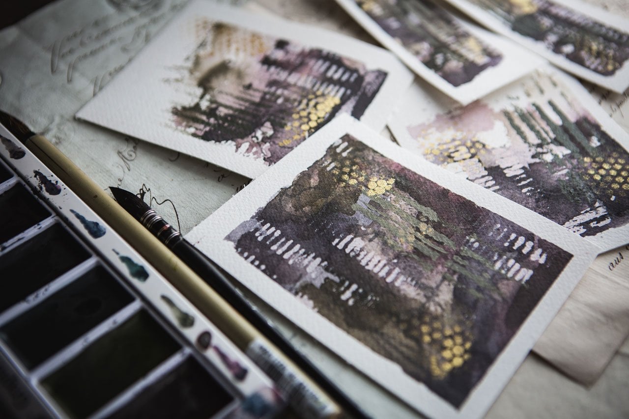
6. Small Color Samplers: In this video, let's make
some little samplers. I want to do this to test out color and decide on
a color palette, we can test out marks with
our different mark making tools and just see what
is going to work for us. I've just taken a big piece
of that Stonehenge paper and just cut it into thirds
and then cut that in half this way to
get little pieces, and that gave me a little piece left over because I wanted
these to all be the same size. These are about four and a quarter inches wide by
five inches the other way. That left me with
the bottom one inch strip left over that I can use as my little tester. I already have my color
swatch that I did. I can look at this
and think, well, what would this look
like if I combined this color with this
color with this color. I can pick colors based on this, and I like being able to see the differences and
how much black shows through like on these
pretty Stone Ground colors, they're a little more solid, whereas these Fine Tech colors, they're a little more
glittery and granulated, and the Cure Turkey colors, they're a little bit
in-between that they're like a little mix there and
they're very shiny. All of them are very shiny. I really love these
Stone Ground colors, I feel like I need to go visit their site and see
what else they've got. I've only got these three
samplers that came in our box. Then the regular
colors I can see just sink down into
the black paper. That might be interesting if I'm looking for a certain effect, if I wanted to do say some of
this with the glittery blue and just see how that would finish out
for a piece of art. But I think for this
particular exercise, I'm going to stick with the
shiny ones on the black because that's when I'm
playing in currently. We can just see what are these going to look
like as I use them. If I've got these pretty
Stone Ground colors, I've already put
some water on these to just activate them. Let's just see if we put
some of these colors down, what we could end up with
for a pretty little sampler. Then this will help us get
to our larger projects where we're picking colors and deciding on
mark making tools, then we can decide, what do we want to
use in this project? I'm loving that. I've
also got the golds, and I know we did the
whole little gold project right before this. I might look at some of these
other colors and just say, what do I think I want to mix? I also got the Fine Tech
colors up here at the top. I've put some water on those, let's just see maybe if we do
something with these blues, be careful with anything
that's on your fingers, it will show up on
this black paper. [LAUGHTER] Fill in that green, maybe this blue, and I'm just going to let these then have a little bit dry time, with maybe this gold. Then we can come back and practice with some mark
making and just see what do we end up
with? I like that. Let me put a little bit
of this lighter color right there. Look at that. It'd be interesting
because I'm working right up next to each other, do these blend together? Do they sit separate? These are blending a little bit. These are sitting separate. They're not really bleeding into each other like
a regular watercolor. That's also very
interesting to see what it does while it's
drying. Let's try. I really love this
color right here. Let's try this color right
here. Look at that color. Maybe I can mix that with
some of these golds. We don't have to stay in
the same paint palette. These are drawing
out a little bit when I pull them
my water on these. [NOISE] Then what if I did even this darker shade of gold there in that
set we just got, we'll just do this a
little bit of like gold. Look at that. That's pretty [NOISE] That one's got a future. What if, maybe if we try, let's do like this green, and then maybe we can
do blue and green. See now that's very vivid there. Look at that. What
else do we want to do? Maybe let's try this
blue from the Logitech. Let's mix some brands. Just depending on what you have, just play and figure out what do I have,
what might it do? Maybe if I do some
mark making in that color, how would that do? [LAUGHTER] Now that
we got that started, let's just do a little
mark making in there. That's pretty cool. I do like that a little
bit right there. If you like it enough, you could come back to one
of these others and say, what if I did a little
mark making right up here, like what if I took this
gold, will do that? Saying this is cotton
paper so look at that. This is staying
wet a lot longer, and this is the time
to play and practice. Look how super granulated
this is getting as it dries, and then it completely dries, so you don't see that
separation as much on the color samples
because it looks like it's drying at
different layers there. But that's interesting
to observe that. Let's go with these little
pretty coppery colors and see what we can get. You know what, maybe we'll
mix this copper with this Stone Ground
red one over here. Look at that. That's
pretty yummy. Look at that. We could, let's see which
one we want to do. Somebody told me on
one of my videos, they like seeing the colors
in the frame which I always try to put the colors in the frame so you can
see what I'm doing. But they like to try to guess,
let's go with this gold. They like to try to guess what it was I was going to pick. Oh, look at that now that
did bleed right into there, which I didn't expect because it's not doing it so much on some of these others, but check that out. That made a really pretty not
touch that anymore like it. They like to try to guess
what I was going to pick. I thought like a little game. [LAUGHTER] Let's see. So these colors here are
crazy, but you know what? Let's just try it. Let's just see what
these give us. I'm not a yellow person at
all, but you know what, just for samplers, I want
you to do 100 of these. I want you to do
as many of these as it takes for you to be able to observe color palettes and figure out what is
it that you like. Let's come back with this pearl. To get you to what we're going to be doing in
our larger projects, I want you to have a whole lot of little sampler
pieces like this so that we can figure
out what the colors do? Which ones do we like? I don't want you
to get to the big project and then be like, let's start discovery now. I want you to discover
it at this stage. Try very hard to remember what you did in each of your
pieces so you can be, I love this and maybe flip
it over and write you did on that so that
you could do it again. I know you might not have the collection of metallics that I've managed to
gather over the years, that I really have gathered
these over many years, like these Finetec ones came in different art boxes and they went into the drawer
because I was like, I love matte gold better. [LAUGHTER] The stone ground
one came and I'm like, how pretty are those,
then they went into the watercolor drawer and then I didn't pull them
back out until this class. Now I'm like, why did I do that? These are amazing. So try, just pull out
whatever you've got. You don't have to have
15 different kinds, and play and experiment and drop color into these and
see how they blend, and if they bloom out like
this one, they bloomed out. That was pretty. That was these colors here. Well, it was that
one and that one, but that gold went in
there and then just started going right out
and doing fun stuff. [LAUGHTER] I know
I love this one, I know I love this one. Holding out judgment on
some of these others. I'm not having high hopes
for this one at all. This one I'm like, it's
too much blue and green. Maybe it needs some gold
or something in there. But this is fun. This is how you discover like, what do I love? Then when you get more
of what you love, you could actually
do more of that. Then mark make on
them and then be, here are the marks that I love and the things
that I want to make. Let me let these dry
and then I'll be back. These have dried and just in case you're wondering
which ones of these are my favorite, I ended up really loving out of this set the ones where I
use the Finetec colors, pearlescent colors and
the stone ground colors. These two, I used the Finetec
and the stone ground. These I used the Kuretake ones. While they're
beautiful and super metallic and they look like
I've painted with metal, like this one right here, you can't tell that I used
a yellow and a green. It just went into a
whole big silvery blob. This one is real pretty, but it's again, real subtle and I can't see the
differences as much. I do like this one though. The blue and the
green seems to have retained the color more. The blue and the gold, and light blue has
retained a lot of color. I do think though, these two to me, really look the
most interesting. They have the pretty shine, they've retained all that
lovely color in there. Or maybe it's the
colors that I like out of these two versus the others. Because I believe this one
used some Finetec color, which is probably why I'm still seeing the vividness
of the blue. If you don't have any
metallics at all, that's maybe the ones
that I would look at first before the Kuretake ones. These are going to be
really pretty worked into pieces like we did
on the white paper. Seeing the pretty shimmer, because they do have
that pretty shimmer. I think that's going
to be the pieces, the colors that I save
for abstracts that I do like this with other colors
and maybe gold worked in. But as far as what looked best
as little abstracts here, I like these better
on that paper. Super important lesson here, because now I can see these
three are a little more, I don't know, they're
just not doing it for me. That might be the look
you're going for. It's not the look I'm going for. This one was pretty vivid. I do like this one, but I love these even more so now we can look
at this and think, does that even need
anything else? Because it's amazing. What would we add to that? I've got metallic pens and I've got different things here
that we could play in. I've got these little
metallic brush pens that I think are really pretty. We can come back in now and do lines or dots, decorations. I've also got my gold ink. That would be a
really good addition. Because with this one, this is the time to
mark-making play. But some of these are so pretty, they are little pieces
of art in themselves. With this one, let's just
do a little bit of gold. This my gold mica paste. It's the one that I
love to use the most. You definitely don't
have to do anything with the gold ink
if you don't want. But I just want to see
because I plan on using the gold ink in my future
art pieces so I want to know what is the gold ink
going to do and look like on this black paper in a little
abstract that I'm creating. How is it going to work for me? This is the time to
figure that out. These are the little experiments that you want to try and be like that worked out or
that did not work out. I want you to know before
you get started that if your piece is going to
end up looking like this because of those
colors you picked. I want you to know
this beforehand. I want you to not discover that when you're almost done with
the piece and you're like, no, not what I was thinking. [LAUGHTER] Fun. Personally I like dots. I like thin lines with
little dots on it. I like extra little
dots going out, and yes, I'm doing
the gold on the gold, but I think because it's
different materials, you're still going
to be able to see it hopefully just lightly, as an extra little perk
as you get closer. I love that. We come in here, look what we could
do, check this out. Let's check this out,
go with me here. Hang on. Let me wash out my nib. I don't want that
gold ink to stick in my favorite little dip pen. What if we did black? I'm just picking a black
pen that I've got up here. You can use those Finetec pens. I've got little Kuretake pen. What if we came back with some black dots
or lines or marks? We could very easily add some black decoration and
then it will almost look like that black paper was coming through in different sections. I like it. Look how
pretty that is. It's like the little
black just came through the metallic and just
added to that look. I love that. I can even come back up here
and add a little bit of black just so that
it wasn't all in one place if I wanted to. Do I want to do that? I can come back with some black dots. I think I like black dots. Look at that. Just enough. Not too much. I don't know if you
can see this, but as I'm looking up in the little camera thing so I can see what I'm showing you, it's almost like
there's a face and some white hair
coming off that head. [LAUGHTER] Do you see that? [LAUGHTER] Now I'm never
going to unsee that. [LAUGHTER] That one's
pretty though, I like that. Now I'm feeling like some
decoration here on this one. We could just come through and do some
different stuff if we want, we can come a little
stitching around the edge, pick a color to do the
stitching look how fun that is like a little stitch
at the edge, I like that. That's fun. We could do
that more than one place. I like to do it in
more than one spot so it's not hanging out there by itself unless I didn't like it then [LAUGHTER] I was watching what
you're going to get. Sees like a little part
of a butterfly wing right there almost, and I think I love the gold. We could do golden
something different though, like I've got this gold pen. This is the time to experiment but I almost love this so much. Do I want to do it in
something different or do I want to try the same old? This is the moment
to experiment. If you're scared,
because I'm scared, do it when you don't like [LAUGHTER] and see
what would that do? See, I don't know if
that's vivid enough, that's not as vivid as the
vivid one that I love. Is it vivid enough? Would it do what
I want it to do? I don't think it will. Definitely I have one or two that maybe you don't
love and then you can experiment like this on it because you can do
different pens, let's see what this pen does. See now, that pen almost
disappeared in there. These are good lessons.
What about silver? Now, the silver is
really vivid but I don't think I want to
use silver on this one. Maybe I want to use
silver on this one. [NOISE] That's pretty. Then I can come back in, add some little dots. I don't know if I love
that one but it's fine. Maybe we can do some
lines through it. It gets easier once
you decide that maybe the piece is not a keeper. [LAUGHTER] Then
you're like, oh what? Let's just get bold now because it's not
the important one. Then you start getting brave because this one I'm
like, oh, it's a keeper. Before I jump into
all the things, maybe I want to solidify
some of my techniques first, here's a pretty gray. Whatever your most
favorite sampler is, set that to the side
and when you really got your techniques down
and you're like this is it, then pull the favorite ones out and finish those as
little pieces of art. Look at that. You might
surprise yourself, and in the bold decisions that you make with the
pieces that you're like, this is not a keeper,
you might think, oh wow, I just turned into a keeper look how
cool that worked. You might turn your
less favorite ones into your most favorite
because then you got bold and brave instead of
being afraid to ruin it. This is what I love
about stuff like this. We discover stuff
that we're like, oh, that worked out and I
didn't even think it would. Like this one is turning out
better the more I add to it. It's pretty green here, we could come back in. Now I'm trying
different marks and techniques and playing with different shapes just
to see, do we like it? Is it a shape or a mark? Let's do circles that we might want to use on
a piece going forward. You might discover
interesting marks that you're like, oh, let's start using this one
in our art. Look at that. Super fun. Look at all the fun little marks now that
we've got on that one. This is the most
exciting for fun wise. These two are the most
yummy for keepers for art. I'm going to go ahead
and do my favorite. I didn't discover something
new there, which is fine. That's why I do these things. But it did help me
solidify that yes, I want to do this gold on here and I like circles
that's my own thing. You're welcomed to
whatever your thing is. This is how you discover
some of those do to that, whatever your thing
is. Look at that. That's a pretty stuff. I love that. Two
of these I love. This gives me an idea
for another project. Thinking in my mind that it's going to lead me to
somewhere new in a project. But check it out, so
we've got two that are art in my opinion. One that is art with fun marks
and playing and exploring. A couple of these that
for the moment I'm not going to color
and put stuff on, but we can finish them out
because you can see how much more different they are when you've got
pretty marks on top, because some of the fun of abstract is the layers
that we're creating. I'm so loving this
whole set right here so I feel like we need to do something with this pretty
pink and gold feel there. Then these are fun just
as the exercise of figuring out colors and adding marks and just seeing
what do these do? This is my junk piece
to test stuff on. Pick one that's going to be
your junk piece to test, pick one that's going to have all your fun marks and
things that you love, and then pick one
or two that could be little pieces of
art that you're like, oh yeah, these are beautiful. I hope you have fun with the
little tiny samplers for color testing and
mark-making and figuring out where do you want to go
with your bigger pieces. I'll see you back in class.
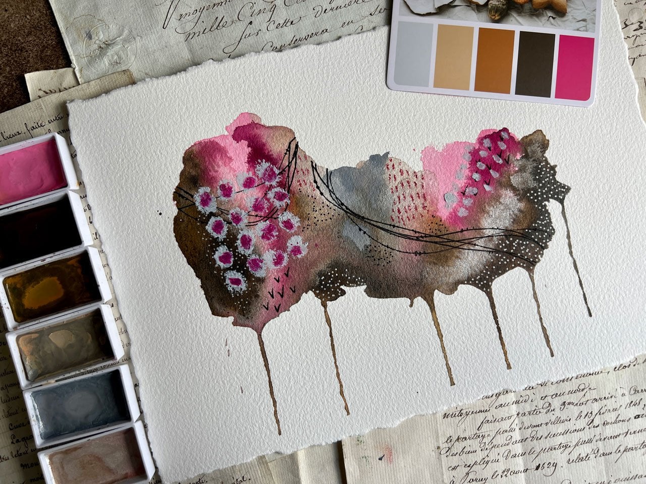
7. Shimmering Abstract Set: For this first project, I thought it might
be fine just to do some random abstract
things that I like to do. Just something that you enjoy. Thought maybe let's
start with this little Stonehenge set, because from that sampler set, which we can pull that back
out, they're almost dry. I really liked
these three colors, and then I might then pick out one of the other
colors that I really loved. Like I love these three up here. I love these couple colors. Let's start with
those three because I think they're my very
favorite out of here. Then we'll go from
there. I'm thinking like I'm going to do these
a little bit random, like I do a lot of my
abstract work and just create in the same way I
generally like to create. We'll just see what we get. It's all about experimenting
and learning and just figuring it out and see do we get anything we like or not. I'm not worried about the outcome at this
point because I start all my art out with the thought that I can cut this
up [LAUGHTER]. I can cut this up and make it into lovely collage pieces, I can make it into some
junk art, stripe collages, so it takes the pressure
off in my mind. If I'm already thinking, not a big deal, I'm getting my water out so
it's a little bit closer. I'm already thinking
not a big deal, I can cut this up. It like releases some of that
pressure in my mind that maybe we normally are giving
ourselves and it gets me past white page paralysis. It starts me down
the path of creating a freeing way that I didn't
really do when I was younger. Let's go with this larger
tech. What was this? This is golden rows
because I liked the difference in that
color versus these. Look how pretty this is already. Oh my gosh, look at that, still a big thing
of this over here. Let's get a little more of that, and I did have all these down. These are still down from our sample sheet that
we just created. I did let it go ahead without
water soak in and let it be getting a little softer
if you just go with these dry and you don't
activate that paint any. I don't know. It's real hard to get that
metallic out of there. They seem to be a
little tiny bit harder than regular watercolor. We haven't got very far yet, and I'm already love in these. Good choices. We're going to
have let this dry. I'm going to let this dry
and we can mark-make on top of it and just
see what we get. I'll be right back. Our pieces are dry and now I'm excited to do some creating. I am feeling like I want to do one of
my favorite things, [NOISE] which is
some gold details. I'm going to use my
Kuretake gold mica ink because I love the way it looks. All these pieces, I feel like this will work
out really nicely. I'm just going to now mark-making doodle and
fill in and finish off in ways that I
think are going to make these pieces complete. So that could be dots. You could refer back to some of your favorite
mark-making techniques, you could do some dots, you could do some lines, you could do all interesting
mark-making on top. This could be finished
for you at this point. You might like, I love that, but I do like making
some lines and dots and things on top of this, and so that's exactly
what I'm going to do. I've just got my
Kakimori brass dip pen because it lets
me do my circles. I'm just going to see like
what can I fill in now. Feeling like maybe some dots. We'll just go with the flow. You can mark-make on
top of watercolor with just about any supplies
that you own we could do. Of course, I'm working opposite the way I
should be going. I should be going
this way and I'm going this way, but that's okay. You could do pastels, oil pastels, you
could do pencils, you could do posca. I mean, just get creative
here with your mark-making on top and finish off your piece in a way
that just delights you. I really love that, definitely think that these are shaping up to
be super beautiful. What if we take our favorite
like a black pen and do some black areas just as
something interesting to say, maybe the black is
shining up in here. We need to get creative
with some of this. Just think like,
what could I do here that's different than
what I normally do. I'm using a paper I
don't normally use. How could I make
that interesting? Opposite of what I
might normally do, it's when you do
stuff like this, you're like, wow, look
what I just discovered. Check out that black
line, I love that. Good one. Be real
careful not to put your hand down on something
that you're working on. I do have my very favorite five-gallon
paint bucket stir stick lets you get from
the paint store. I lifted up on one
side and then I have a spot to put my hand
down because man, you see how I work
the wrong direction. I don't know why I do that, but this is what can
save your pieces. Look how pretty
that is, love that. Oh my goodness, these are
getting like super exciting. Good ones. This is a good
paint day [LAUGHTER]. I love how that black
just looks like it's shining up through
that metallic. Oh, nice. You're going to,
whatever your abstracts, whatever you're thinking you
might want to color here. You might want thoughts, you might want
different line work, it's all up to what feels
good when you're painting. Oh, look at that, so pretty. Oh, yeah. I like putting
things in more than one place. If I've got lines in one place, maybe think of two or three
other spots that could go. That way it's not
like a single element it's being pulled together
throughout the piece. Then you don't have to do all of one color with this pattern. You can split these up, like if you see in here, there's like some
natural divides we can come through and just put a pattern or a mark in part of that emphasizing
different parts of it. Like now that I've said that, I'm almost thinking
like what if we have some just very pretty
subtle black dots coming through right here which
would be completely opposite of the gold dots
that we did right under that. On your sample pieces where you're testing colors and stuff, you might make yourself some test sheets with color and
different marks as ideas. I like dots, I like circles, I like stencil
work. Oh, stencils. We could do some
gold stenciling on top of something like this. That can always be fun. Get creative with this abstracts just because
we're working on black paper and we
have a different dynamic than what we normally would see
with white paper, don't let that scare you. This are looking pretty
beautiful right now. You're going to get to a
point where you're like, doesn't need anything else? Do I like it just like it is? What else do I want to do to it? If you're like, I don't know and I don't
want to ruin it, feel free to stop right there. Set it to the side,
live with it, think about it and then two years from
now you might be like, oh, this is what that need. If you get to that point, come back and add to
it at that point. I'm almost thinking
that we could perhaps do a tiny bit of
stencil work on here. I like Punchinella which is a circle stencil and I could add a little
punchinella in here. I also likes a few
other stencils that I've got that are
just fun mark-making. Just to add some excitement. Let me go grab some. I like to get stencils from
the Crafters Workshop, StencilGirl and Tim Holtz, Stanford's anonymous collection. I like getting different
stencils from these companies. These may or may not
still be available. This is the halftone circle, it's one of my favorite. This one is the
crafters workshop and it don't have a name on it, but it does say TCW456S and
this really fun one too, I love it also StencilGirl Products and
it's corrugated lines. I think that's really beautiful. Now I'm thinking, what could I add that'll give me one
extra element of dimension. I'm feeling like they use little lines which
you could mimic. If you have, say like an old gift card or
an old credit card, you can mimic these lines by putting paint on the
edge and doing that, so that could be one option. That's very exciting actually. Or we can put
something on top of this and I'm feeling like
maybe just some gold. I'm going to use my
favorite gold paste, which is hard to come by. Pick whatever your
favorites are. This is my Kuretake
gold mica paste and the ink is pretty
easy to find and sometimes the paste
is hard to find. Pick out your favorite
gold acrylic paint to do something like this with. But basically, I just come
back in and add some details. I don't stick strictly with the stencil the
way it's created, I don't just do a
great big square. I like to come through and organically put some lines and stuff and then just see. Look how pretty that is? Probably, the final
element that I needed. Let's come and do a
little bit of that right down here in
this pink and I think that will be the finishing
touch I was looking for. [LAUGHTER Oh, my goodness. So pretty I wanted to come
all the way down here. Let's just get this
last little corner here. I want this too. See now I definitely think
that is a final feel. I actually want some of this
over here in this blue. You can mix your stencils too. You can lay it on
top of this again. I didn't get down
in there very far. Let's pour some more paint out. I don't know what I'm going
to do when I run out of my favorite little paint
because it's hard to get [LAUGHTER] and I
show it to everybody, so then they go buy it
before I get it all. Let's see. Oh, see
that right there. That is gorgeous. We could do them as a pair. Whatever we did over here,
we could do over there. That might be one way to do it. Or we could do
something a little different over here and see
which do we like better? I'm feeling like for
the sake of learning. This is so gorgeous. We could do a different color, we don't have to do a metallic. We could pull out
some paint and do it, but I'm feeling like the gold
were all into the bling, bling here on our project today. Let's just ride the bling wave. [LAUGHTER] Let's see here. Look at that. Let's come down a little
further right here, so pretty. Let's just take it
right down right there. See, look at that. Totally finished this for me. Holy cow, totally did it. Let's just peel the tape and
see what we ended up with. This is just the big piece
of paper that I cut in half. That's why I've got
them, two of them here. Now I've never peeled
tape off the black. If I peel this off and it looks like it's going
to tear my paper, I could take my heat gun, keep the tape as I go and that'll keep my paper
nice and fresh. I think I might do that. [NOISE] Just to show you how
nice that looks, as I started to pull, you could see right
here on this side, it was starting to pull the
paper and I could see it. But as I ran the heat gun down, you can see we did
not pull the paper off with the rest of that. If you start to pull
the tape and you see it pulling parts
of your paper, just heat that tape
up as you go along, as you're pulling that
off and that will save your piece because there's nothing worse than getting
like the most amazing piece of art out of this and
at the very end, totally ruining it by
tearing your paper. Trust me, I've been there. I think I'm going to do that.
I'm going to pull the tape. There we go. You see I just put the heat gun right where I was about to pull the tape
and the heat gun is hot, you got to be careful not
to burn your fingers. But look at how
beautiful these are. These are gorgeous and
now we can look in other directions
like do we like it better this way? I do. Now that I'm looking
at it because I've got the circles here and
then the circles have the lines coming
from it like they're going down. Look at that. Let's look at this one. Do we like it? Which way
do we like it? Oh, that's nice there too. Feeling like that is it. I hope you enjoy doing a random abstract with
some mark-making. Get creative with your marks and your paints that you pull. You don't have to
have the colors that I've been working with. I just want you to
get creative on some black paper and just start thinking outside the
box and thinking, what can I create on a different substrate that I
would never normally pick. I'll see you in
the next project.
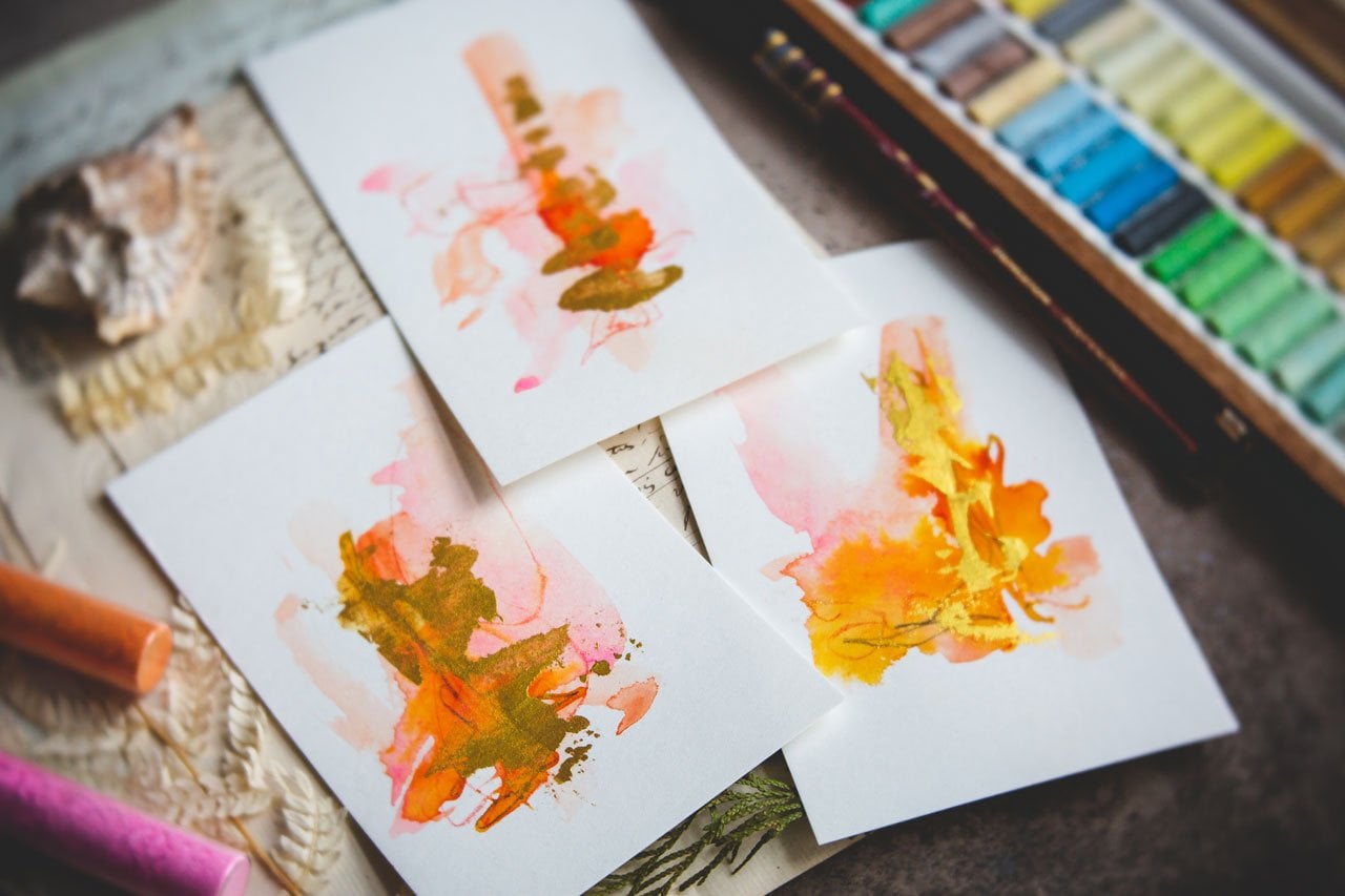
8. Shimmering Abstracts Planets: In this video, let's
do something a little different and fun and let's maybe do something
that could be like the planets and outer
space [LAUGHTER] I'm thinking loose
interesting circles that could be like planets
and I just want to get it started just using my Raphael number 0 soft Aqua
quill brush and I really liked in our samplers
this color way that we had here and I may add
even this pearly color here. I've got these three
fine tech colors and the three stone
ground colors, I don't know exactly what these
colors are beyond golden, this pretty rusty color and
this pretty purple color. This is copper fine tech, crystal gold and golden rose. I've already just wet
them down so they've started to get activated and I'm going to just do some not perfect circlely
planet look in pieces out here and then the
rest of this can be outer space so I'm
feeling we could do is then we could add in stars and marks and different fun things to add to what we've created. I'm going to just get this started and I'm thinking
dip other colors in it and let them run and do their thing and then
when they're dry, we'll just see what
did we end up with. Then once you've got a couple
of plenty shapes out there, you could always come back in here and add some further back. We could add some stars. We could just do some
interesting formations, little larger pieces out here if we wanted and
then after these dry, we could come back in with
our ink and pins and do more. Super fun. I'm actually going to let
this dry for a bit and then I can come back
and add stuff on top and just see what do we get. I'll be back. Before this
gets completely dry, I'm just sitting
here looking at it, I think what I want to do is put a little bit of gold paint on the tip of my brush and do
some pretty little splatter so that it really is like outer space and stars
and stuff rather than just the big clumps that I
created and I think that would really add to the
interests of our piece, because now it really does
look like outer space. Fun. I'll be back. These are mostly dry. There's one place that's still wet but I don't want
to stop it up with anything because I don't
want to have a divot there of color or a
spot where it looked like I wipe something
off because it's black paper so try to resist, soften things up if you can. I think because I loved on our sampler
piece, the gold circles, I'm going to pick gold
circles on this and gold stars because I liked it. I'm just using my dip pen, this the kakimori brass
nib dip pen and I love it because it lets me do circles
with my gold dip ink. That's fun. See
now just did that. What if I were here, I did this. [NOISE] I love this. It is so pretty. [NOISE] If we're
thinking outer space, we can pretend this is
different moons around it and this is little
rings around it [LAUGHTER] could just pretend
all fun little stuff. Then in the little
rings we've got stars, fits right into my liking to put little dots or pearls
here on my gold lines. Just makes it even more lovely. To keep my hand off of
parts that are wet, I'm going to use my paint stick. This is a paint
stir stick like for a five-gallon bucket from the paint store and
it's just I don't know. It's like two feet
long. It's a good size. Then I can hold it
up with one hand and lean my other hand right on it right where I
want to be working. I'm not touching anything
that I just did since I tend to work the
wrong way [LAUGHTER] I don't know why I do that, but I do it every single time. I want to work this way
instead of this way. At this point, just go with the flow and get a stick
to rest your hand on so that you're not
smearing any of this yummy ink work that
you're adding to your piece if you're working on top of any area that is going to have
anything still wet on it. Look how pretty that is already. Super pretty. You can do other colors. We can take this time. I like the delicateness of the ink and so you could
choose to work with all inks. You can work with the pens
if you like the pens. I also like we did in
our sampler piece, maybe adding some black
pen work to our piece, and you can do that with any favorite black
pen that you've got. I've got some Posca pens. I've got just black
ink pens for drawing. I've got the Pigma pens, whatever your favorite pen is. Now is the time you can
come back in here and add other fun stuff like we could come over here and we could outline
these little white, whatever spots that I added
with the silver watercolor. We could do something like that. We could do lines, we could do marks, so it's fun, different. If I could come over
here and do pick a little space where the watercolor is a
little different, and you see some
natural separations, and we could do some line
work, through those fun. Line work is really
fun, and I like that. I'm doing it in
black because it's like the black is showing
through from the back. But you could do
that in any color. You could do it in white. You could do it in gold. We could definitely pick our gold ink and
do it in the gold. This is a fun project to do
on white paper also just fun. Circles like pretending
like it's planets feel. I do like that right right. I feel like I could get away
with some of that over here. I really like where
I have this going. Then what you want to do is just mark make to the
point that you're like, Look, we got going
here. I love this. I wish I had done
something different here. Let me add something here. Let me do something there
feeling like a fun little real slight black lines would be fun, so I'm going to add
that as an element. I like that these
are real subtle, so they're not like super obvious and you got to
get close and be like, oh, what is that in there? Just another element to add into our piece for me.
I'm loving that. We could even come out here and do like we did with the goal, we could do black circles and is it going to
be super obvious? No. But can you see
it just slightly? You actually can
[LAUGHTER] and I like that implication that
there's more out there. See now I'm loving this, and once you get to the point that you've got
all the marks and doodles and interesting things that you think you
want to put in there. Then we can peel the take
and take a look at it. You can live with
it for a while. You can add more
stuff to it later. You can play. We could even maybe add some other little
marks in here with our markers just as extra little interest
points, and then peel. I've got mine taped
down because I did want a little tiny bit
of a black edge. But you don't have to do that. You could do it
without tape down, but I wanted to a
little bit of an edge, and if I've lost
the edge because I dried some of it, that's okay. But we could keep
just mark-making and doodling until we're okay, I feel like this has done, and I actually like all the
yummyness notice I've got going on here with
my gold and stuff. [LAUGHTER] This was
a fun painting day. Then when you think,
I like where it's at. Let's take a look at it. We can peel the tape and
just see what we got. Totally looks like we got some very pretty sparkly
outer space going on here, and if you don't want an edge, you don't have to tape it down. I just like taping stuff down and having like a
little finish to it, and if the tape is
pulling on your paper, heat the tape with a heat
gun that will release it. I did such a tiny edge that
I'm not worried about it. Look how pretty, oh my gosh, and then look at it
sparkle in the light. You feel like it's a
really pretty outerspace. Just fantasy painting that
we've got going on here. I hope you enjoyed this project. This is actually super fun. I love how these turned out
as you get a little closer, you can see more details, and as you pull it back, some of the details blend in and make their
own little patterns. So I hope you enjoy
this project. I can't wait to see your
fantasy outer space of planets, and I'll see you back in class.
9. Shimmering Abstract Landscapes: For this next project, I thought it would
be really fun to do a atmospheric
triptych landscape. I'm going to give
it a try out with my favorite
landscape-making brush, my Winsor and Newton Number 4
calligraphy brush because I want to make it look like it's
atmospheric a little bit, not predictable and just see
what we can come up with. I've done this technique with my regular Kuretake watercolors and with my graphite colors, and it turns out so
beautiful that I thought let's do a metallic
on black set. [LAUGHTER] I am
going to just make sure that you got a little bit of spray
bottle to wet stuff down, and let's just think about this. Do we want a bright,
vibrant landscape? I'm not feeling that, I'm feeling like
maybe a gold on gold. We could use the same
exact colors that we just used in that other
set that we did or, go with me here, what
if we do like a set of these fine tech ones that
I have got over here. We could do like a copper
landscape with some gold. I'm feeling that one actually. Or we could do
like set of blues. But I think maybe
copper and gold, so let's just see
what we can get. Let me just activate
those with some water. The metallics seem
to be a little harder than regular watercolors so you do need to
go ahead and let that sit for a second as
you're getting started. These are the fine tech
pearlescent colors. I've got the copper
and golden rose. After using these now
I feel like I need some more colors,
[LAUGHTER] crystal gold. Because that first project got me so excited that I'm like, let's paint a million
things, they were so good. I like that the
little containers that these in are bigger too because I like to get my whole brush just
roll that around, get lots of paint on that brush, and then I'm going to
do just on the side, starting out, getting my
little landscapes started. I've just picked this
middle color to do that. It's not the darkest color, it's not the lightest color, it's just in the middle there, and it might be a good
color for the sky. I'm treating these like maybe I'm in the mountains
and I'm looking out over the mountain range
and it gets lighter and brighter and real pretty
as it goes further back, and that's how I'm
thinking when I create these
abstract landscapes. Feeling like we're off
to a good start already, let's go with this
darker color up here. I'm just going to lay that
color right in with it. You could try the regular
watercolors on here too. I just was really hopping
on the metallic wagon after doing that first set
that came out so amazing. [LAUGHTER] Look how pretty
this is, oh my Gosh. I've never played on black watercolor paper till I came up with this idea
and I was just like, I'm going to go for it,
we're going to do it. I've played a little bit with these after I came up with
the idea and I'm like, oh my Gosh, amazing. Now I'm just like obsessed. But like for years and years, I don't play on colored papers, I normally work with white
paper and go that way. But sometimes, you know what? A colored paper can
get you outside that comfort zone and get you creating in new ways that
you didn't think of, and so I love that about
playing with a paper like this that you might
not ever have tried before and it works just like a regular
watercolor paper. It's not like you've got a ton of things that you
got to learn to go with it. Look how beautiful that is. These colors almost look
a little purply to me, so I'm thinking
after this dries, we could do some
interesting stuff on top, maybe in shades of lavender
or purple, I don't know. I'm feeling like it
started out good. Let's let this dry and then we can do some mark making on top. This is dry or it's dry enough. I do caution you about
using a heat gun on these because you
don't want the heat to release the tape like I showed you in the
last video that heat releases that tape
because then you don't want your watercolors
seeping up under the tape. I did walk away and make myself look the other way for a bit and let
that dry naturally. I do recommend you let it
dry naturally if you can. Now, you just have to
decide, is it done? Maybe it is done for you. Do you want to add
some yummy marks and some other things on top? Maybe I do because I think layers are what make
these so interesting. I think I'm going to
go ahead and pull out my half-tone stencil
circle which I love and we can
decide at this point, do we want to add any
color on top of this? Because in the spirit of trying new things and
being a little different, we can definitely put some
things on top of here and I'm thinking we can
do regular paint. Like if you've got
some acrylic paints that you like and you think, that would mean an
interesting something on top, you could do that. If you've got some
metallic stuff like paint, or you could use acrylic paint. We could come back in here with some charcoal maybe
on top because nice and muted or we could
do some soft pastels on top. We could just come back with some acrylic paint on
top in the right color. You know how I
told you this look like it had purple in it? We could pull out maybe
a purple and see, do we think maybe
we can fit that in, I'm not really feeling that. Just look in here at some paint options in my
drawer that's beside me. See now that's a really
pretty dark blue, but I'm not sure. That's a really pretty dark. See now this paint would have been good with that blue set, but I don't think for what we're doing that's the right one. Some of these paints here are metallic so I could forgo using my favorite ink and
very easily use a pale gold metallic
acrylic paint. I've got several
metallics in these. These are the matte
acrylic paints. But look at this gold, I've got several different
metallics in those. Here's the silver. I just tend to gravitate towards my favorite gold because every time I use it, I
love what I've done. [LAUGHTER] That's how you get into what some of your
style is going to be. Look at all these metallics, you could do anything like that. That's an option. So many options. What do we want to do? I really love the
halftone stencils, I'm feeling that we're
definitely going to do that. What do you think if we
do that in this silver? I will step outside
my own comfort zone [LAUGHTER] and use a metallic that's different than the
metallic I always grab. But when you find
your favorite thing, you're so happy when you're done creating and it
turned out fantastic. Let me move all these
little watercolors out of my way and we will
put some gold. Silver. This is metallic silver. Whoa, too much paint. [LAUGHTER] Oh well. It wasn't coming and it wasn't coming and then there it was. [LAUGHTER] I'm feeling
like the halftone circle, this is such a good. [NOISE] I'm using a
dry artist sponge. These are little circle sponges that are called artist sponges. I like to use it dry with a little bit of paint on there
and then just go for it. Look at that. Whoa, it's very
psychedelic in the feel. I feel like I need
another row of circles down here.
See there we go. That is super-duper cool. Really wasn't expecting how much I was going to like that. [LAUGHTER] Good one. Maybe
I'll do that over here. Since we're doing
a little triptych, we'll just go ahead
and go for it. Look how pretty that is. Let's put some on here, but maybe not as much. Just let it be part of the
set but not identical. See, now that I'm loving, I love this little line almost
that we got in that one. That was a good pick. [LAUGHTER] That was super fun. Put too much of that out, but that was super fun. Now you can decide, do you want to take
any of your pens, make any marks, do any dots. I did like the black
dots on the black paper. I'm wondering if I picked
the black Posca pen. Let me find the black
Posca pen. Here we go. That one's a brush. That's not what I want. [NOISE] I like the [inaudible] but the [inaudible]
pen has a very fine line. [NOISE] There we go.
Yes, there we go. I want a bigger dot, I think. Just because it's
what I'm feeling. Then you could just strategically
make some marks, dots, and lines just to see
what can you get. I did pick one color
to do these black dots in because it's a triptych
that we kept going, keeping that color going in that line of stuff just because I thought
that might be interesting. That's super fun. I'm
loving where this is going. Now, do we need any gold
or do we need black lines? What do we need to take it
to the next level for us? Just step back and
think about that. What else are we
looking for here? I've got some oil pastels. I'm wondering if we
come in here with maybe some oil pastels and add some interesting marks
just as a variation in texture and in sheen because
these are not shiny. What do we think of that? I actually have that
little pad of black. I could test it
out and say, well, what is this even going
to look like on here? It's definitely
going to give me, say, that lighter
color in there. I can either do some
interesting lines. That might be
something I could do. This is my little horseshoe,
this is my little strap. Maybe I could do some
interesting lines or I could do a pattern of
dots or something, that might be something. What do I do here? I'm feeling like just a pattern in here. What you could do is if
you've got three of these and you've got one that's
my least favorite, perhaps, you could be like, let me do this one on the
least favorite and that way I don't do it on the other
two if I don't love it. [LAUGHTER] But I actually
like all of these. Look how cool that
looks, actually. I'm thinking that's
pretty fun. I like it. Let's go ahead and just commit. I like that it's
not shiny so it's going to give me a
variation on that. As the light hits it, it's all of a sudden going
to be [NOISE] not shiny. [LAUGHTER] Oh yeah,
see I like that. Because I'm using these
to finish them off, I will spray this with a
light coating of the oil, Fixatif by Sennelier, because I'm going to need
to fix this oil pastel so that it does not
stay wet forever. [LAUGHTER] See now, I'm
really loving that. I'm almost wondering, would I
love another color on here? I've got the gold. I could come back
and do something else just because I love it. I like that right there. It doesn't have to be a lot, just a tiny bit, as a fun little element, but you're like, oh, what
is that going on there? You got to get close to
even look and see it. I love little surprises
like that in my pieces. I'm loving this.
These get better and better for me when you get these layers
and you're like, oh, I love this. Super cool. I love that. I'm pulling these out of this little 24 set of
Sennelier. I like it. It's got enough colors
in there to be like, I can pull from this and
get some interesting stuff, but it doesn't have
so many colors that your overwhelmed
and feeling stuck. I'm really loving that. Do we want any other lines or marks? We could come back in here
and play with something dark, if we're thinking, I don't know. If we play with a graphite
pencil or something, then we could add
some lines in there without committing terribly
and being like, oh, it's just an extra element
that you see if you get real close and you could drag it
through the oil pastels. That totally made me happy. I'm going to do that again [NOISE] because it breaks up those pastels
too, I like that. Just a little scribble. A little scribble on
your art. Always happy. Super cool. [LAUGHTER] Now do you need any black in
there? What else do you need? I'm feeling pretty
good about this. I think what I'm
going to do is peel the tape and let's just
see where we're at. That doesn't mean that you
can't do anything else to it, if you're looking at
it and you're like, oh, needs another element, after you get it peeled, but it is nice at some
point to be like, it could be done, let me
peel the tape and look. I'm going to peel the
tape. I'm going to use my heat gun to
heat the sides and stuff so that I
guarantee I don't tear my black paper off. [NOISE] Look at these when we get that tape
peeled. Holy cow. Look at how good
that turned out. As we can see that
shine in the light. I don't know if
these come across on film the way they come
across in person, but oh my gosh, they are so pretty. Now that you've got them
separated from the triptych, now we can decide, do we want it in
a different order than what we originally made? That's always fun to
look at and say, oh, I like this order or I
like that order better, but holy cow, check out
how good these look. I think that I'm actually going to call these
finished at this point. Also, if you didn't go to the very top or the very bottom, you could choose to trim
that if you wanted, but I actually love these
just like they are. Look at how beautiful. I hope you have fun
with this technique. I can't wait to see
what you're creating. Definitely come back and
share some of these with me and I'll see
you back in class.
10. Final Thoughts: As we conclude
shimmering abstracts exploring metallic
watercolors on black paper, remember the incredible journey that we've taken together. You've discovered the magic of metallic watercolors
on black paper, honed your skills and
embraced your creative voice. Carry these lessons forward, continue exploring, and let
your art shine brightly. Keep creating and may your artistic path be filled
with endless inspiration.
 DENISE LOVE, Artist & Creative Educator