Transcripts
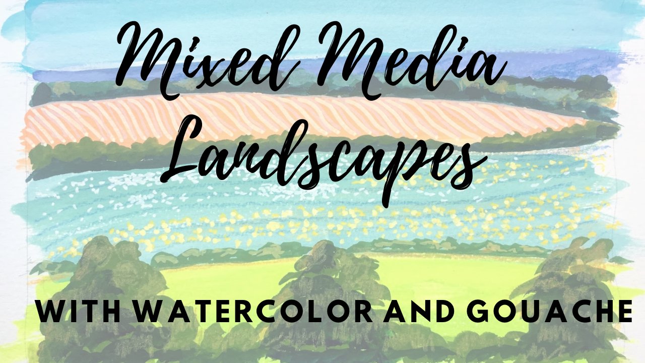
1. Introduction: Hi everybody, I'm Amy Stewart. I'm a writer and an artist. In this class, we're going to paint really vivid, bold skies in wash. What I love about using gouache to paint skies is that you can layer and blend and really get vivid bright color combinations. I'm going to show you how to treat guage more like watercolor, to get light washes for clear skies, but also as backgrounds for something like a sunset. And then we're gonna do some dramatic daytime and sunset skies and work on blending and shading to get convincing cloud shapes that still reflect your own style. I'm going to also show you how to use watercolor as if it's squash by mixing tube watercolors with white gouache. So this is a great trick for watercolor painters who want to take this class because you're only going to need that one tube of white gouache. And also if you're a wash painter, but you happen to have a color you really love and watercolor, well, guess what? You can just mix a little bit of whitewash into that color and bring it right into your gouache palette and into your painting. So that's what we're gonna do. And then we're also going to use ink and paint to just add a little bit of landscape or horizon to help anchor the painting. Give a sense of where you are. That's the plan for creating really beautiful bold skies. So all right, let's get started.
2. Project & Supplies: I'm gonna give you my photos to work from in this class, but I hope you'll dig out some of your own pictures or just sit in front of a window and paint the sky you can see from wherever you are, it's really great to just do this from life. Whatever images you decide to use, I hope you'll post your paintings in the project area so I can see what you're working on. And of course, let me know if you have any questions as you go. Okay, now let's take a look at supplies in terms of paint. I'm going to give you a supply list and I'll tell you the colors that I'm using. But really any basic set you have will be fine. You can make, you can make whatever work for this class. In terms of paper, I'm going to recommend that you actually use real good watercolor paper for this class. And the reason is we're going to be putting a lot of water on the paper. And the higher-quality the paper, the better. So oftentimes when I'm taking a class, I'm tempted to use cheaper materials because it's like just a class. But I actually think to really try this out and learn it and get it, you should go ahead and use pretty good paper. So a watercolor block, I think is ideal. And the reason I like the block is, but it's glued down around the sides. So it's not going to work so much when you put a bunch of water on it. And I like to use hot press because it's smoother. But whether you use hot press or cold press is up to you. And if you don't have a block like this or you don't want to use something like that, you just need to make sure that it says water color on the paper. It really needs to be paper that's specifically for watercolor. This is a more inexpensive student grade pad, but I like these, I use them a lot. So something like that. Anyway, you're doubling a new paper. Any paints, I'm going to give you the list for paints. You'll need a pencil and an eraser just to kinda do a tiny little sketch of whatever's happening at ground level. But we're not actually going to be doing much drawing at all in this class. And then same thing for the landscape or skyline or rooftops or whatever at ground level, you could do that with paint if you want to. But if you wanted to be a little more mixed media about it, you could come in with markers, colored pencils, whatever you like to use. I'm going to be using this current talky brush pen. This, I bought this at a Japanese bookstore, but you can get them from art supply stores. And I also a lot of times used my Pentel pocket brush pen, so I'll put those in the supply list. That's a suggestion if you want to try him out. And then for brushes, ordinary synthetic brushes, probably whenever you have will be fine. You're gonna see me using a bigger soft brush like this just for brushing water on the paper. And then I am going to use these. These are Princeton select brushes and they're filbert. So they've got this rounded head and I think this is nice for sunset. You can get some nice round organic sort of cloud shapes. I happen to have a minute 106, but you don't have to be that precise, just you're going to need some brushes and that's really all we need. Let's get going.
3. Using Watercolor and White Gouache: This is a sped-up demo to show how you can kinda sorta turn your watercolor set into a gouache set and do these sunsets. So the first thing I'm gonna do is a watercolor wash in the sky. So clear water going on here. And then I'm going to drop in some, some watercolor or whatever blue you're using. I'm, I'm, I'm I've got a little turquoise and Indian thrown blue as well at the top and turquoise at the bottom. And I'm picking it up with my paper towel down by the horizon, so it's real light and I'm also leaving some white space on the paper where the most intense cloud colors are gonna go. So I'm not doing the entire sky. I'm leaving some white. If I was doing this with all goulash questions pretty opaque and I can just put the clouds right on top of the sky. But since I'm mixing wash and watercolor together, there'll be a little more opaque, but quite as much. So all of everything you see here's watercolor except for the white. So I'm taking whitewash and I'm mixing it in with my orange and it's making it more opaque. It's also making it kinda pastel. That is just a fact. I'm obviously I've, I've let the paper dry completely, so the sky that I put down is totally, totally dry before I start. The thing is that if if the watercolor underneath is still a little wet, then the pigments more likely to mix with what you're putting on. So I'm mixing white with some quinacridone rose to get these pink tones. And kind of just, you know, I'm looking at the sunset, I'm looking at my photo reference. I'm wanting to keep this kinda loose and kinda fun. But also just paying attention to how the sky actually works. Like it's orange or toward the horizon and pinker as you get up into the sky. There's, there's some purple That's on top of the clouds, but not underneath them. There's some light, light yellow down by the horizon. So I'm bringing that in, mixing in yellow and white together and just kinda layering these colors on. So the, the white using, using the whitewash is giving it some OPAT, some opacity. So it's making it possible to get more coverage out of these colors. Now of course, you're mixing in white, so it's going to get lighter in color as you go. That's just a fact. But in this case I took my purple and sometimes I'm adding back in some blue or some quinacridone rose and just kinda mixing with that, trying to get an interesting mix and bring in this purple color. So you can see I left that big white area and it's nice because I can put down, I can put down these brighter colors in wash. And it's not going to blend at all with the sky color underneath because there's not a lot of sky color underneath. And just sort of trying to unify all these by mixing some of the orange with some of the purple, which just unifies it a bit. And now I'm taking a damp brush with it has no paint on it at all. And I'm just blending some of this together a little bit just to soften the edges somewhat. So that's just a little bit, a little bit of water on a on a clean brush. We'll, we'll soften up some of those edges and make them look a little bit more, just a little bit more cloud-like. This process has a lot more control to it than or well, I mean, if you're painting with just watercolor, obviously you can paint with watercolor in a way that gives you a lot of control as well. But this isn't like a wet into wet process where things are moving around a lot like the thing about gouache is you put it down pretty much stays where you put it. It doesn't move around on the paper like watercolor does. So now I'm mixing some white gouache with my sky colors and just kind of places where I felt like the sky needed a little bit of a boost. So now this guy is sort of a mixture of pure watercolor. Also some watercolor mixed with gouache. And this is really up to you how far you want to go with this. I'm going to I'm going to, I'm going to keep work in the sky colors in on top. And again, this is something you can do with gouache, like you can get the sunset colors in. And then you can come back and layer the sky on top. And they might blend together a little bit. I mean, as you add a damp layer on top of a dry layer, the two are going to mix. You will get some color mixing that happens there, but it's sort of fun to play around with. So if you're, if you're a watercolor artist who never works in wash, it might be fun to go out and get that one tube of white and just do some of these sunsets are some of these skies and just sort of experiment with how it's different if you have wash. Now, I left this very brushy you'd like, right? Like you can see a ton of brushstrokes here. I mean, this is meant to be a pretty quick, lively sky. It's meant to look like a person painted it. So it's not, these clouds are not perfectly, perfectly smooth and perfectly blended. But I think it makes for a very fun, lively kind of experience. Also gouache changes a little as it dries. So light colors tend to get a little darker. Dark colors tend to get a little lighter. So in this case, now that it's dry, looking at it again and just kind of touching some things that you can keep layering like this, which is one of the fun things about it. Always being careful and mix some white in so that it's not pure watercolor. It's definitely watercolor with quash. But, but yeah, it's kinda cool. You can give you sort of keep playing with this as much as you want. And go back and forth, lightening things up, adding more intense color here and there. And just have fun with, with what you're seeing and how you can kinda, kinda make that happen on the paper. I'm just bringing in a little bit more darker purple tones there. But that's it. That's gouache and watercolor combined.
4. Blue Sky Wash: The first thing we're gonna do is just a very simple wash. So whether you're want to do this and I'm gonna show you in a wash, but if you want to do it in watercolor, It's going to be basically the exact same process. So I'm just making the lightest little marks down here for the horizon line where these trees are. You don't need much in terms of a pencil drawing, you really don't need anything at all. You can probably paint that without the benefit of a pencil drawing, but I like to put it there just to sort of remind me where I want the ground level to be. So okay, the first thing we're gonna do is we're just going to get the paper wet with clean water. And you want enough water so that there's a good even sheen on the paper, but not so much that the water actually petals. So I'm just sort of look at it, how the light's hitting it, and just seeing if I've got enough water on there. This is going to really vary depending on your climate and just the room you're in, the humidity, it can really be pretty different. But anyway, I'm just going to use a big brush and get that on there. And then I'm going to use cobalt blue for my sky. And a little bit of cobalt turquoise near ground level because the sky can sometimes go a little bit more greenish turquoise near the ground, like the light gets a little more yellow, but let's start with a more intense blue. Near the top. There it is. And I'm I'm mostly I went to very watery mixture. So most of you are doing this in guage. Some of you may be doing it in watercolor, but for those of you who are a painting and wash your pre-tenure, almost pretending that it's watercolor, you know, you're getting it on. I'm very lightly. And it's getting more watery as I go down because the sky is getting lighter. And so I'm making it lighter by using more water as I go. I love the way this is looking. I think this looks very accurate, but I'm going to dip into this turquoise a little bit and mix it with the cobalt blue, combine them so that it's not too abrupt. And then at the end I want it to be very watery. Down here at the bottom, I'm going right on top of the landscape and they're going to meet in the middle. I've got one little spot here That's didn't have enough water on it. Okay, this to me looks lovely. Now I will show you one trick. This is certainly if you're doing this in watercolor, this might be helpful, but even for you guage painters, notice how much of this you can blot up. So where I see these big cloud shapes, the widest part of these cloud shapes. I'm just taking a dry paper towel and I'm just experimenting with lifting up a little color. We're going to put white down on top, whitewash down on top. But sometimes just picking up a little paint will pave the way. And actually it's kinda beautiful, like it looks sort of, I really think it looks sort of cool. Just the way that looks, you have to do that. It's just something to experiment with just to understand your materials a little better. But this is it. This is our first step. And if you were doing a blue sky with no clouds at all than just putting down that blue wash is all you need to do and you're ready to move on with the rest of your painting. But we're going to let this dry for a minute and then come back and start doing the clouds.
5. Blue Sky Clouds: Let's get into some beautiful cloud shapes. So for the clouds, I've got permanent white, also called titanium white. And I'm using a filbert, which is kind of a rounded tipped brush. This is a number 10. But use what seems right to you for the size of paper, you've got your subject matter. And I'm blocking in these clouds and just such a loose, a really loose free way. And I know that the blue underneath is going to bleed through a little bit. So I have a pretty thick mixture. I'm not I'm not wanting there to be too much white in my mixture. And this is always the question with quash is like how much water you're using and how do you control the water. So I'm barely touching the water with my brush. I don't want there to be a big pool of water on my palette for this part, like there was when I was doing that wash for the sky a minute ago. This time, I just want to add enough water to make it gives it that lovely, creamy consistency that gouache has. And I hope you can also see that I'm kind of using this scrubbing motion. You know, I'm sort of doing this. And what I like about this is that it gives a certain texture to the clouds. So it's kinda fun to play around with. And at this stage, you really can play around because we are going to come back in and work on these a bit more. So this is not the end of your clouds. So feel free to be experimental and playful here and just see what you can get. Now as we move toward the horizon, you can probably see that the clouds are getting smaller. And so that's one of those things that it's easy to see in a photograph. But if you're out working from life, you tend to get so caught up in what you're doing that you can lose a certain sense of perspective. So remember that even if you aren't quite seeing it or you're not quite sure that if you make the clouds smaller as they get toward the horizon, it'll be a little more believable. Now, this is probably a little bit hard for you to see on camera because there's a very subtle difference down here between the sky color in the clouds. I could have gone with a little more of an intense sky color, but I really just liked the way it worked out. The first go round. And the thing about galoshes, if you're happy with how it looks, even if it wasn't just what you were aiming for. Just roll with that. Because if you go in and start trying to correct, I mean, of course this is true for watercolor as well. If you go in and start trying to correct, and I want to add I want to take it with this. Sometimes you can mess up what was so fresh and lovely about it in the first place. So these clouds will become a little bit more visible once we start adding in some gray at the bottom. So I'm coming back up here. This has had time to dry just a little. And it is, you can see where the blue of the sky is bleeding through. And that's okay. I mean, I kinda like that because these clouds are grayer on the bottom. So I'm just sort of coming back in and adding a little bit more white to the brightest areas. But I kinda like the way we've suggested, very loosely suggested the gray underneath. Now before we get to that gray, this is a cool little, little trick that I like to do. I'm going to take a tiny bit of yellow ocher, really just the tiniest little smear, that's all you need. You could probably also use something. You might be able to use our raw sienna for this, or a quinacridone, gold or some sort of yellow that really has a lot of orange in it. I'm going to take the tiniest bit of this yellow ocher and mix it into the white even that's, this is going to be so subtle that you can hardly see it on camera and that's what you want. So it's really like I barely touch my brush into that yellow ocher. I could have just dipped it right into the tube and not even squeezed any out on the palette. But you need to be able to see kinda what I'm doing. So this is just the tiniest bit of yellow ocher. And I'm want to add a little bit. It's making for a creamy kind of white. And I add that into the body of the clouds in just a few places. Because if you really go out and look at clouds on a sunny day, you can't see it so much in this photo. But if you look at clouds on a sunny day, you will see that there's really kind of three colors to them. There's white and there's gray wherever the underneath part of the Cloud is. And there's the, there's the littlest hint of yellow where the sunlight is just affecting it particularly. And so I like, that's another thing that I like to kind of exaggerate a little bit and just knowing that it's there, even if, like in this picture you don't exactly see it, but just knowing that it's there, I like to go ahead and drop it in a little bit. So I just, I love the way that looks actually. It, it really gives these clouds some life and a nice sense of realism. So now what I'm gonna do is think about the gray under side of the clouds and I need a little more white for this. It's very much the sky blue like that is very much the color we want to use. There's a bajillion, different ways to get a gray. You might have a graded wash on your palette or a gray watercolor if you're doing this in watercolor, and white is the only wash you have. But you may have a gray watercolor, you may have black. This is just a Honestly a cheap student grade. This is Reeves Gouache. The last little bit of it I have from a starter set that I bought once. I'm going to use such a minuscule amount of it that I don't even care that it's not the world's greatest squash. I'm going to barely, barely dip into it. So here's my white. I'm going to get some of the blue from the sky. Just a little like you'll be surprised at how little you need. It's going to dry darker. So I want something that's so light. The tiniest bit of black, like I really just took the minimal amount I could. I'm being so cautious about this. Start out to light and add something darker if you think you need it. Like this to me on my palette looks incredibly light, but as I start to put it down here, I know it's going to dry a little darker. So I'm going to trust myself and put this down and see how it looks as it starts to dry. So I'm just looking for these grayer areas. I think I do need a little bit more. I'm going to bring a little more blue into my mixture. I'm going to put some up here. I can already see it changing a little as I go. So that's cool. But as I work my way down, I will want a lighter mixture because the most intense grays are kind of these bigger clouds up near the top. And then they get a lot less intense as they go off into the horizon, the colors get quite a bit lighter. So I'm just, I want these to be not transparent. You know, I want a real opacity to happen here. So I'm just sort of scrubbing that in. I really like the way it looks. Scrubbing it in there, very cool. And then as I come down here, like you can't, the clouds are so close to the sky color because I did have this very, very light sky that you almost can't see the clouds, you can just see the gray that I'm dropping in. But there's a plan, There's a method to the madness, so more is about to happen. So just, I'm just sort of dropping in using just the edge of my brush and dropping in this gray shape, I can see where the white of the clouds are, even if you can't see it on on camera. There's also some gray streaky clouds that are often the backgrounds that are kinda just drifting around. And it just sort of suggest a few of those just for fun. Yeah. Okay. So this is still drying, so I'm not even going to get in and really touch it quite yet. I'm going to pick, I'm going to bring a little more white up in here. What I hope you're getting out of this is that guage really does change as it dries and you've gotta be prepared to just do a little bit of layering and have a little fun with it. And kind of enjoy the unpredictability. It's not, it's not that it's unpredictable, It's just that it does change as it dries. And so just knowing that that's its quality, that's its characteristic, you can predict it, you can totally count on it. But, but just knowing that that's kinda how it works. So now I'm going to go back in. I do know that I want to hit that gray color a little harder in that one big cloud up near the top. And I definitely want to make sure there's plenty of blue in it because it's totally picking up sky color. Even if it looks really great to you on your monitor, just trust trust yourself. No. Oh yeah, that's beautiful. Know that there is a lot of blue in a gray cloud that looks so neat. Probably looks really abrupt to you the edges of it, but we're going to come in and smooth that out in just a minute. I'm just so happy with that. That's exactly what I think I needed there. Cool. Okay. So this is the, this is the process to get to this point. Now, there are, I'm going to I'm gonna go ahead before we move on to the next step, I'm gonna get out a little bit more of my permanent white, and I'm gonna get a smaller brush. So this is still a filbert, but it's smaller. It's a six. And I'm going to dip into this white. And I'm just going to put a bit more white. And a few places where I really want it to stand out. Yeah, this looks good. And you might think, well these look kinda messy. But we're, we're gonna come back in and just a second and kinda smooth them over. So the reason that I'm able to just kind of like go in here and make big messy brushstrokes is that I know what's coming next and what's coming next is that we're gonna do some smoothing and blending of all these brushstrokes. But I like this phase, I like that. It's just you can be really free and spontaneous with them. With your brush strokes and really have fun with it. Yeah. Okay. That's great. So I've really come back in. As some of these clouds have dried. I've dropped in more white in a few places. And okay, we're gonna do a little bit of blending in the next step and see where we are.
6. Blue Sky Blending Clouds: For this next stage, it's not necessary for you to wait for your gouache to dry. What I'm doing is I'm just coming in with a damp brush and blending some edges where I think edges need to be blended, or where I want to see colors integrated with each other a little bit better. So I'm really just pushing paint around on the paper. But since gouache can be reweighted and reworked a bit, you can do this while it's still wet. You can do it when it's dry. It's not going to make a huge amount of difference trying to drip water on your paper like I just did. You want your brush to be damped so you want to dip it in your water, but then blot it with a paper towel so that you're not spilling so you're not really spilling water on your paper like I just did. Don't do that. So I'm just looking for opportunities to do that kind of nice blending of colors. You don't have to do it everywhere. There might be places where you're perfectly happy to see a little bit of a more of a solid line. And that happens in the sky like there's definitely areas in the sky where clouds form a pretty flat line or there's pretty obvious divisions between one part of a cloud and another. So that's okay. There might be places where you want to just work it into the sky color because clouds have very amorphous boundaries. And so now I can, I can sort of coming here with this gray and I can both work it into the Cloud that it's a part of, but I can also work it into the sky a little. So this is what I was saying earlier about like don't worry too much if you're putting down some brushstrokes that seem a little too hello, too much like a brushstroke to you because you have this opportunity to come in and kind of work it, work it back and forth and work it into the sky and change the shape just a little, move things around. I'm pushing the gray up into the body of the cloud a little bit here and there. And I went to fuss over this too much. Like really, I mean, this kinda looks fine. This is great. The thing about a sky is you want people to take it in all at once and just see it as a sky. You really don't want anyone focusing on any one particular Cloud like don't get so hung up on how any one particular cloud looks that it starts to be overworked as compared to everything else you wanted to all be unified in terms of how detailed are not detailed it is if you paint in a certain style and your styles maybe more whimsical, more of an Illustrator style, more of a plein air painting or a kind of style. You want it all to work together and be kinda of a piece. And so to me what that means is don't overwork it like don't spend forever on this. Just spend a few minutes kind of, you know, working colors into one another. In a few places where you think that helps these to be more believable as clouds, more convincing clouds. And, and once you've got it, you're ready to move on to the landscape.
7. Blue Sky Landscape: What I'm gonna do now is just put in a very, very simple landscape, which it really does help. I mean, it's kind of obviously grounds the painting it shows you where you are. I'm going to, I've got leaf green here. If you have a light green color like this, It's great to use. I'm going to mix a little of this yellow ocher in just to make it more of an earthy, kind of almost like an olive tone. But what you could also do is you could take sap green or some kind of dark green and mix a little yellow in. But you're looking for this kind of iridescence or are not iridescent, but this kind of What's the word chartreuse easy. Kind of a Chartreuse almost. And I'm just brushing it across like that. Does nothing fancy about it. Right up to the horizon line there. I think that looks great. For these trees. I'm gonna go back to my small filbert. This is my size six filbert. And I'm going to, I'm going to come into this sap green. I could mix it a little with this and kind of lighten it up a bit. But I think that things that are against the sky, against the horizon, they tend to be pretty dark. So and this is just super loose Zuber laid back and you don't have to get fancy with it. I did make some little pencil marks to show where the trees are. I didn't even have to do that. The one thing I would say is don't space your trees evenly. Look for ways to clump two or three things together and then have a little space. I mean, you can see that that's what's actually going on in this photograph. But even if it's not for some reason like your paintings, your design is going to look better. Your painting is going to look more natural if you let things be kind of uneven. Now this looks pretty great. I would just leave it at this and call it done. So this next little bit that I'm going to do is really extra. I'm going to dip into my black since I have it out on the palette and I like the simplicity of using the fewest colors possible. But you could also take a deep dark blue like oppression blue, or a dark, dark brown like a burnt sienna or something like that. Mix it with your green so you get a super dark color that still has some green in it. And then I'm just going to do the lower parts of some of the trees to kind of suggests that there is that the lower, the lower parts are in a little bit of shadow. And if you look closely at this photograph, you'll see that that's what's actually happening. So again, I'm being super casual about it and I'm not doing it everywhere because they're sort of in different spots. And then I'm doing the suggestion of a view tree tribes. This is, this is really a lot. You really don't need even quite as much, but I think it's sort of fun to do. I like the way it looks. And that's it. That is our landscape with clouds in the sky. And I think it really captures it and you really get the sense of the sunny day and these big fluffy clouds. And that's what you want. So there it is.
8. Sunset Sky Wash: This is a really great picture, postcard kinda sunset with palm trees in the front. And I've already done a very light pencil drawing. And all I did was I put in the horizon line and some, some lines where the palm trees go, but I didn't even do the tops of the palm tree. So this is the simplest possible pencil drawing and you can obviously get away with no pencil drawing at all if you want. So I'm doing another water glaze. So I'm just brushing clear clean water across the paper. I'm using a big soft brush and trying to make sure that I get a pretty even coating of water. I want to work pretty quickly here because there's water is going to dry. So once again, I'm going in with my cobalt blue. I'm looking for a pretty watery mixture. It's not as super dark, intense sky. And starting at the top, it really helps to have the paper wet because it means that you don't get so many lines. If you paint with gouache, you know that sometimes when you're trying to do a big area, you can get these frustrating brush marks and lines as it dries. And so it really helps if you've got some when you're trying to cover a large area like this, it helps if you've got some water down first. But of course this sky, we want it to feel light and transparent like that just makes sense for a sky. So we're also not putting the gouache down very thick. And that helps keep those lines from happening. Now I'm really just coming in with water and there's no I have not really added any paint to my brush. Just a tiny little bit to keep that color going as we move down. And you can see that there's a place where this transition happens, where the sky is almost white and then it transitions to yellow. Now you might be wondering like why isn't in green right there? So I had to look this up. The reason it's not green right there is that there's actually, well, there's apparently, there's not as much of a kind of a green. There's not as much green activity in the spectrum, but also the blue is very dominant and very active and it's sort of covers up the green so we don't see it as much, but we do see the yellow when we get down towards the horizon. And then as you bring it up. And by the way, this is lemon yellow that I'm using right here. And as you bring it up, I'm just wanting to to to meet but to not turn green. So I'm really just coming in with clean water and you can even pick up a little bit of paint. So you do get that almost band of white right there, which really does happen with these skies. And this looks pretty complete to me. I'm going to maybe just pick up a little bit of this, some of this yellow. But it's okay for this to be pretty intense. We are going to be putting a lot of orange on top of it, but it's okay for that to be a pretty intense color down by the down by the horizon line. And I'm just looking to see if there's anything else I want to change. I feel like there's a little bit too much of a line here. I always hesitate to go back in and mess with gouache sky too much because it starts to look like you fussed over it. But in this case, I just brought in some water and blended it a little bit and maybe got rid of that line some. But I would say if you end up with a little bit of a brush mark or a line in your sky, It's almost better to just leave it because we are going to be coming in and putting some clouds on top. So you really won't notice it once it's done.
9. Sunset Clouds: Okay, now for the fun part, we're going to do these wildly colorful clouds. So what I have done on my palette is I've got that same yellow, which is lemon yellow. I also have a color called gamboge. It's just like it's a yellow with a lot of orange in it is all it is. And honestly, if you mix orange and yellow together, you'd get something pretty similar and maybe that would be fine too. And then some white. So I will be bringing white in. If you're doing this with watercolor and you just have that one tube of white gouache. This is where you're really going to see how you have your same colors that you love in watercolor. And you add a little bit of that white gouache to it and you get such nice opacity. You can really come in on top and have a lot of fun with this. And so I am just going to be kind of mixing these. I also have some permanent rows. Something like a quinacridone magenta would work as well for that. I haven't gotten into that color yet, but it's there waiting for me. So down close to the horizon, do you see how it's much more orange and then it gets more pink as it moves up into the sky. So I'm sticking with my oranges. But there are some light oranges that are almost like a Schubert orange. And so that's where being able to mix that white and really helps. And I'm just putting this down and letting these brushstrokes look like brushstrokes at this point. I'm not really worried about creating these perfect wispy cloud shapes. I am going to come back in and blend all this later. So right now, I'm really just trying to react to what I see. And putting down the brush strokes where I think they belong. And want to be sure and leave some hints of that yellow showing through because I think it's neat to be able to see the difference between the color of the sky versus the color of the clouds. So I want to be careful that I don't get too carried away and cover all of that up. Even though in the picture there's quite a bit of it covered up. Now here is that permanent rose. And like I said, something like quinacridone magenta, maybe it would be cool as well. But you can see that when I mix some orange into it, I get a very pretty red. So I don't have a read on my palette, even though there are some clouds in the sky that look pretty red to me. I'm just doing the mixing the permanent rose with some orange and some a little bit of white. But also if you have a read you like, you can use that as well for sure. And you can see that I'm getting this nice red color that's I think really matches fairly closely what I see in this photograph. And these are, I'm using my filbert brush and I'm using it a lot on the side. So i'm I'm sometimes I'm laying it down flat, but sometimes I'm using the edge of it because I don't want quite as big a brushstroke. So what's happening is as we're moving up, we're getting more into pinks and reds and eventually purples. And so you see that range of colors happening starting at the horizon line with the yellow and orange and moving up into pinks and oranges. And I think it's important to kind of be aware of like, what colors go where in a sunset. So I'm going to Bringing some lighter colors in, I can see places where it's, some of these clouds are lighter underneath. And that's the other interesting thing too. When you look at a sky, It's like are the lighter parts of the clouds underneath or are they on top? And that might kind of change as you move around. But that's just an interesting thing to observe as you're doing this. But this is really kind of, you know, this is just a very meditative process of just really looking and letting your brush react to what you're seeing and not being too worried about the outcome at this point. I mean, if you're looking at what I'm painting here, you might be thinking, this sounds like kind of a weird painting. But once we come back in and we sort of blend these cloud shapes, you'll see what a difference that makes. So before I move too much into pinks and purples, I'm just looking for any other opportunities where I maybe want to lay down that lighter color here and there. But that looks pretty good. Some brighter, I've got a mixing some some lemon yellow and some new gamboge to get a yellow that just leads ever so slightly towards orange to go along the bottom of some of these clouds. And you can see that this is right where the sun's really hitting them and they're kind of, there's, there's kind of lit up there really glowing from underneath. And I just want to capture a little bit of that here in there as well. So I'm looking for opportunities to maybe lay in more of this orangey yellow glow that is different from an orange that's mixed with white and looks more more past Delhi. Okay, so now I'm going back to my permanent rose and mixing in a bunch of white. And you get these gorgeous pink so as you can see. So I'll let some orange come into it. You know, I want this whole sunset to look very unified, like it should be really obvious that this is a very unified palette. So let's just see how this looks. I'm going to drop these pinks in more or less where I see him in the sky. And a little bit of that blue sky will come through. Keeping your gouache mixture pretty dry. We'll keep the two layers from intermingling too much, but I actually don't mind if they mix a little bit because it creates kind of an interesting purple which is legit and something that you see in the sky. So that's good. So I'm just looking for places where I might want to know. Where do I see a little bit more that there's a little bit up here in the corner. I'll drop some of that in and you can kind of expand some of these shapes like we don't have to copy this photograph exactly. In fact, over on the left there's some very, very light clouds that are almost a white, and I've decided to just let those be pink like the rest of the painting just kind of for expediency sake and more than anything. So now I'm taking some purple and I'm mixing this purple in with the same orange that I used in the sunset, which gives me a grayer version of purple, something that moves a little bit almost towards brown. And this is the cool thing about painting sunsets is that you see how if you need a neutral, like if there's an area in your sunset That's kind of a grayish color. One of those sort of murky in-between colors where you're not sure what it is. Make that color by mixing the other colors in the sense that like it's such a peer or exercising color mixing. And so down towards the horizon, there's just this hazy intermediate color that is purple, but it's kinda got some gray in it. So I'm really wanting, I'm really wanting the neutrality of that and I am going to bring some white in. The the, this is all still thinking about that kind of a haze along the horizon. There is the water as well, which is obviously reflecting the sky. So it's going to be very close to the same colors in the sky, but I'm just looking for opportunities to kind of drop that those purpley clouds in where I cm. Yeah, that looks about right. So you can see like it's a hint of purple but it's not like purple right out of the tube. And so really working that orange into it really helped to neutralize it some, and then of course also a little white to just, to just lighten the color because they're not super, super dark clouds. And again, you can do as much or as little as you want. You don't have to do it exactly. You don't have to make an exact copy of the photo, but I'm just sort of looking for opportunities here in there where I want drop in some more of these and still you can see how much these just look like. I'm just laying down random brushstrokes like it is at this point, not super realistic. Once we come in and do some more blending, you'll see how these colors come together, but I'm really just sort of putting them where I want them on the page. I mean, I do think that this kind of thing looks really cool because it definitely looks like something that I made. Like you can really see the brush strokes and you can kinda really see the artist's hand at work. And I think that is absolutely not a bad thing, but we are going to come in and make these look more cloud-like. So I'm doing this same thing where I'm taking this purple and I'm kind of blending it with orange. I'm sorry, this is a little bit off camera, but I'm basically just doing these same blends of purple with a little orange and a little white here and there. But I wanted a few notes of kind of that darker. There's a little bit of a darker purple and a few places and I just want to make sure that I've got that. So that's, that's most of our sky color. Maybe a few little floating elements along here. Even these I could have I could have left that out and I think they would have been fine. But just any little places where you want to get these little, these clouds that are just kind of just little wisps and barely drifting along, but they do make a bit of an impression. Can drop some of those in. And that again is that same mixture with some purple and orange and just a little bit of, a little bit of white. So now I'm taking some light. I'm getting into that same purple mixture again. And I'm going to come down here along the horizon line. And there's, you know, there's that little bit of a hazy purple color along the horizon line. But then I want it to blend pretty seamlessly into the water and I'm not going to get so hung up on the idea in my head that this is water like this is like a big gazing pool that's reflecting what's above it, obviously. So I want all those same colors. I want that pinks and oranges and purples. I want it to be really light. So I put a tiny little bit down in the paper and went, Oh, that is to dark. So I'm coming in with a ton of white. I would, I would start with way too much white. And you can always add more color later. But if you start to start out too dark, it can be hard to correct that even with quash, which is pretty opaque, so tons and tons of white with just little bits of the same color that's in the sky. And then I'm just kind of suggesting these purple lines just to show like the SAR for a little bit of an uneven surface on the water, but I don't want to get too hung up on that. I mean, you don't want people focusing on on that as being too detailed. So just a few little lines to suggest that it's obvious that were at the beach because we're looking at palm tree. So I think it's going to be real obvious that this is water. And I'm just going back into some of these purple mixtures with purple and white and a little bit of orange and just sort of getting the shoreline like everything that's not going to be trees. I just want to make sure that I've got that in because I'm going to, I'm gonna come back and I'm going to do these trees with ink. And so I just want a nice backdrop for the, for the trees. Bringing in a few little lighter colors. And trying to just have these nice horizontal lines that go back and forth and just sort of suggest, suggests the way that water looks. This is actually looking pretty good. And just a little bit more along this shoreline. I'm really kinda just fussing at this point, but I want to, I want to just make sure I've got a nice even horizon and I think we're good.
10. Sunset Blending Clouds: What we're gonna do now is a lot of blending and softening of these cloud shapes with a damp brush. So I'm dipping my brush into water and then I'm blotting it off on the paper towel so it's not just dripping wet. And I'm coming in and I'm just scrubbing with it. And by doing that, I can create some nice soft edges, some nice transitions where I want him. And the places where I'm thinking about these transitions are between the cloud and the sky. Some clouds obviously gets sort of wispy around the edges and just sort of disappear in and nothing. And there's places where you want that. There's places where a cloud can have a pretty hard edge against the sky. And so maybe you don't want so much of that. So it's not something you have to do everywhere, but it's something that you can do here and there to give that sense of wispy Venus, but also within a cloud shape, you might want to sort of blend two colors together. So in a cloud that transition from say, orange to red or from pink to purple is going to be very pretty soft and gentle. So this is a way to work those colors in together and push them around on the paper a little bit. And even kind of changed the shape of things somewhat. And I try to stick with one color at a time so I don't accidentally bring a color into one area of the sky that I didn't want there. So I started at the bottom where everything's very orange and yellow. And then I move up into these reds and I'm sure to clean my brush off before I start on a new area. And this cloud that I was working on just then, one thing about it is that I had dropped in that kind of fiery orange, yellow color at the bottom of the cloud. I'm not touching that because I really like the way it looks. So this is just add, just to point out places where some places you really want to do some of these blending, but other places you don't, and it's fine either way. You can also at this stage, dip back into your colors. If you feel like there's a color that you wish you'd emphasized a little bit more or whether you just need to rethink a shape a little bit. So like I'm picking up a little bit of extra pink here and just pushing it around and a few places where I think it needs to be lighter. And I just want a little more, a little more of that shape. Now, I am going to, I am going to show you how you can come back in and push some sky color into these shapes as well. So that's coming. And when I'm thinking about where I want to do this blending of where I don't. I'm also mindful that I am going to be bringing a little sky color back into these clouds to, so that's another opportunity. And one more thing I want to point out about these clouds. You can see that there's usually a direction to them. Like they tend to be moving in a, maybe in a diagonal across the sky like these are, it's sort of like they're starting in the upper left and they're moving down towards the lower right. And so I'm with my brush strokes here, I'm trying to be mindful of that, that sense of direction. Because I think that's part of the sense of movement that really makes, can really make you feel very alive. So these clouds tend to always look like they're going somewhere. And I guess that's because they are right. So this is a case where I dipped back into my purple mixture is I wanted to lighten it a little bit, so I brought in a little more white in a few places. And up here is where I'm thinking that I'm going to come back in with some sky color, so I'm not going to really overwork this. I will soften these edges up a little bit, but I know that I'm going to do some, I'm going to do a little bit extra with the sky up there, so that's coming. And just kind of blending these pinks into the purple so you get some nice soft transitions between the pink and purple, I think can be really effective, really nice. So you can take as much or as little time as you want to sort of mess around here like already these, there's some interesting transitions and there's some softer edges that gives everything kinda more of a dreamy, cloud-like quality that I like a lot. There might be a few places down by the horizon line where it makes sense to do some of that blending. I almost don't want to touch it too much. I think it I think it kinda looks pretty good down there. But this is just a chance to kind of go over everything and see if there's just anywhere here where you might want to make a, make a few little changes. Now, I said that we are going to play around the sky color, so I'm bringing in a clean palette so I've got room to work and you can see what I'm doing. So now I'm bringing back some white and I'm going to bring back this the sky color, the cobalt blue. And I'm going to try to mix a color. I don't want there to be too much water on my brush, so my brushes damp, but it's not too wet and I'm just testing it. Like I'm putting a little bit down here to say like That's about right. And actually I think I got it pretty close this first time. So I'm bringing in a thicker sky mixture. So, so where my sky has been very, very transparent wash, I'm now bringing in a more opaque kind of guage like texture where it's a thicker premier mix. And it is just a little bit, it looks a little bit darker right now, might lighten up a bit as it dries. Sometimes darker colors can get a little lighter while like colors, gouache can get a little darker. So, so we'll see how it does. But I actually think a little more of a dark blue up on the horizon line like that, or a pie in the sky away from the horizon line is good. And so I'm bringing in some more white as I come down. And I'm really using this to cut into these cloud shapes and really change the, change the shape by laying in sky right on top of the cloud shapes. And I'm not gonna do this with the whole sky. I'm just going to play around with it a little bit and just see if I like it and see if there's places where I think that helps with some of those shapes, I'm being careful to blend. So I'm doing the same thing with just a clean, damp brush to blend those variations and sky color together. But I really think that looks pretty cool. So getting back to my Cloud, my Cloud palette as opposed to my sky palette, I was going to try to come in. So I've got a darker purple here that I've mixed some of the permanent rose with and a little bit of orange, which gives me that kind of a brown color. Not quite brown, but, but, uh, just a more neutral purple. And I just want to maybe come back and emphasize that in just a few places here, continuing to play around with these shapes and just make them look more cloud-like and less just like one big random brush stroke. So this kinda going back and forth, this is what I really like about gouache, this sense of building up layers and that there's some texture and some depth, and it's not just a flat blob of color. So I really like working this way. It's a lot like how I work when I paint with oils and I think it's some, you just get really beautiful textures and some, some kinda nice little surprises with the paint as well. And what I wanna do now I've got some dark green and sap green or olive green and I've mixed a little bit of orange and a little bit of purple in it. So again, colors from the sky. I want to keep with my same palette and I just want to suggest this really dark. There's just some grass down here along the shoreline before we get into the trees. So I'm just going to put this down at ground level and then the trees will come in right on top of them. And this doesn't need any level of detail at all. It just needs to be a dark color that is just enough green in it as just sort of suggests, this is like a, this is like a lawn or the system. This is some grass. And then I know that everything I'm going to do with the trees is going to come in on top of this.
11. Sunset Ink: It's so much fun to draw. A palm tree is like this. I'm going to use a current talky brush pen. It has black ink in it. Pentel pocket brush pen is another favorite of mine that I use a lot. You could use a marker if you have a black marker with a flexible kind of brush tip. Or you can do this with paint and it can be black paint or it can be just a mixture maybe of the dark green and purple and and a little bit of red to just get us super, super dark blackish brown. But what I love about doing these with any kind of, any kind of a brush. So whether you're using a small brush and doing it with paint or whether you're using a brush pen like this, is that palm trees just really lend themselves. You know, this brush shape is just sort of perfect. And I'm not trying to get super detailed, so I'm not going to try to go in and suggest every single palm frond because you really can't even see it. I mean, you really have to look very, very closely and really enlarge this picture to even be able to see anything like that. Instead, I just want the general shape of these trees and I'm noticing how they're they're really thick and dark, kind of along the bottom. And then they had this very definitive shape along the top. So I'm just moving along and I'm doing the ones at, at ground level first. And something to really notice when you're, when you're doing something like this, you have a row of trees is like what, what is happening with the height of the trees relative to the horizon line or the land or whatever else, or the trees getting higher as they come towards you. So is there like an angle to the line of the trees or are the tops of the trees exactly straight? So remember that trees also exist in perspective just like buildings do, and that you can kind of map out the upper and lower lines. The trees planted in a row like this will follow. And this is true for trees in a park setting like this is, or also for like street trees, any place where trees are very deliberately planted in a row, you can really map out the tops and bottoms and make sure that you have them. I'm going at the right height. But also the cool thing about a brush pen like this, as it would be pretty easy to adjust if Review found that you made some of your trees too short, it's kind of not too hard to just come along and just make them a little taller. So this is definitely just meant to be kind of very, you know, very spontaneous and fun to do. One thing I'll point out about these brush pens is that you get a different mark. If you, depending on the direction that the brush goes. So if you start in the center of the tree and flick the brush outward versus if you start outward and flick the brush towards the center of the tree, you'll get a different line. And now I'm doing the trunks of these really tall palm trees. And you'll notice here too, like I started at the bottom and I worked up. But I'm going to I'm going to show you the other way as well. And so. Just playing around with that and getting to know your materials. Well as a good thing to do. Now for the tops of these palm trees, I also want to be mindful about height. I wanted to be varying heights. So I am looking at the photograph and I had done some pencil lines and I can still see those pencil lines. You might not be able to see him but but I can still see where they are. So I am trying to follow those because they're visible. But the thing, in addition to thinking about the heights of each of these, is to really notice the shape. And where do you see? Because they're all shaped a little different. The tops of the palm trees are all shaped a little different. And where do you see kind of a whole clump of dark color altogether versus where is there a lot of light coming through? And every tree is going to be a little bit unique in that way. But in this case, I'm noticing that most of them, the bottom half is pretty there's usually a pretty good clump of darker fronds at the bottom half of all that foliage. So just, just be very observational about that so they don't end up looking too much like a match set. You want to model a different. And some of them, I'm noticing, it seems like there's sort of one long branch and minute. And then the palm fronds are kind of at the end of a longer branch and other times they're clustered around the centers. And i'm I'm also just trying to pay attention to all that stuff like what is really the growth habit of these things? How do they work exactly? And sometimes you'll be in an environment where they're all bent one direction from the wind, like the prevailing wind always blows in this one direction, so they're all kind of leaning. So that's another cool thing to just sort of try to observe. So I'm just going to keep going around and creating these little shapes. Another thing with palm trees is that sometimes they're real dark right in the center. So just noticing like where's just the weight of this plant? Now I'll start at the top and work my way down. And it's kind of easier to get the skinny little top, the top part of this trunk. If you do start with your brush pen at the top and work your way down because usually you're starting with just the very tip of the brush pointed on the paper. And as you move down the brushes kind of fanning out and getting a little thicker. So anyway, that's just more about kind of trying out different ways of using your materials and just knowing what they do. So in some cases, I've really lost track of where those pencil lines work. It was pretty unnecessary to draw those in the first place because I can't even see. But as much as possible. I'm trying to still follow this. Follow the pattern I see in the photograph. And there's an example of where you can see like I think that the, I think there's like a little I don't even know what to call this. I don't know what the botanical term is, but like there's a little branch and then the palm frond sort of comes out from that branch. So I'm just trying to make that shape, but also be mindful of how how they are dark in the center. And also one more thing I could probably talk about palm trees forever because I do enjoy drawing them is remember that they're not a cross-section, right? So some of the palm fronds are pointed right at you. And so you're not seeing them all on their side, some of them you're looking at from the front or the back and that's where you get those areas that are just dark where you can't really make out any little individual shapes. So that's something to be mindful of. Two, you're never really drawing a tree, any kind of tree. You're never really drawing them in profile because It's a, it's a, it's rounded like the shape of it, if you were to look at it from above, is actually quite round. It's like a sphere. And and so it's good to just be mindful of that as you do it. So this one, it's a little taller. I really liked the differences in height and I like the way all this black looks against the sunset. It's so great. It's such that like end of a, end of a fabulous day, drinks on the terrorist. Picture. Really fun to paint. So let's see. I almost feel like I could just stop here, but I do want to get this one in. And this is pretty pretty much the tallest one, I would say in the group. Once again, I'm just looking for ways for it to be different from the others, for them each to be just a little bit different. And I'm not getting hung up on too much individual little detail here because we are looking at these kind of from a distance. But I I will go back and see if there's anything that looks like I could just sort of very lightly maybe feather out some of these shapes and just a few places kinda suggest more of more of the shape of it. And then also I'm just looking for places where maybe I want to add a little bit more of these kinda darker, heavier shapes in the foreground, which is always great in a drawing. I'm always looking for an opportunity to have kind of kind of darker, heavier shapes in the foreground are towards the bottom of the image. It has this way of like inviting you in and directing your eye that I think is really great. And this is it guys. Here's our sunset.
12. Desert Time Lapse: Here's a real quick sped-up demo just to give you another chance to think about how this process works. So I'm coming in first with my pencil and I'm just sketching in some of the main shapes. I do my wash of water and then I start putting this sky down, blue at the top, yellow at the bottom. Try to blend it in the middle. And once that's dry, I'm way in in the orange, I see a lot of orange and so I want to lay in a lot of that orange color. And then I'm mixing it with a little more red just to get some darker tones. And then I see some pink and the upper part of the sky. So I'm bringing in some paint. I'm also lightening up that orange. I just changed my mind about it. As it dries, it's hard to tell with something so sped up, but, you know, things are drying and the colors are changing. Sometimes I'll layer on a lighter color or a darker color. Just going back and forth. There's some purple down towards the horizon, and of course, some purple colors in the sky as well. So I'm bringing those in everywhere I see him and some lighter, more lavender tones. I'm also noticing this kind of like off in the distance, the land. There's kind of a purple tone there. And now that it's drawing, I'm coming in with just a wet brush and I'm blending some of these clouds together. So that's just a wet brush, no paint on it. Just to get a little bit of a blending and softening of shapes. And I'm bringing in a little more sky color and put in some of that back in on top and a few places where I just want to see more of that sky color come through. And now the landscape is real dark. It's pretty much backlit. So these are dark, dark tones. Just a little bit of a sense of kind of a desert type of landscape. And these shapes off in the distance are almost black. I mean, I'm doing, I'm mixing some brown and black together, but they're pretty dark. And I realized right away when I do this, I've made a mistake and that they're all the same height and they're not the same height in the picture. And of course, it's more interesting if there's some variety there in and it gives you a sense of a distance. So I do that a few more little touch ups. And that's basically it. This is how this would work with this kind of a desert Sense8 scene.
13. Final Thoughts: I hope you enjoy doing these really dramatic, colorful guage skies. What I love about gouache for skies is that you can have transparent washes and then let those dry and put on more opaque layers of really vivid colors. And of course, the thing with washes that the colors can lighten or darken as they dry. So sometimes you really do want to come back in on top and add some brighter highlights or some deeper, darker, richer colors. And I think that process of layering is creative and interesting and even kind of meditative to do. But remember, the thing with these squash skies is that they definitely still look like a painting. You know, you're not aiming for photo realism here. You're aiming for something that absolutely looks like it was made with a paintbrush by an actual person because that's the thing that shows that you were there, that you're the one making this sunset. So go ahead and make your marks. Let those skies really be an expression of your style and how you like to paint. All right, Well, thank you for joining me. I hope you'll take a look at my other classes and also come find me online. I have a website, I sent out a newsletter. I'm on Instagram and other social media, and I would love to stay in touch with you. Thank you so much.
 Amy Stewart, Writer & artist