Transcripts
1. Introduction: Hi, I'm Amy Stewart. I'm a writer and an artist. In this class, I'm going to show you how to make mixed media animal portraits. This is such a fun way to capture the personality of any animal you know and love, whether it's your own cat or dog, your neighbor's chickens, a giraffe you met at the zoo, or just any animal that you have a lot of affection for. You can use watercolor or gouache in this class. I'll mostly be demonstrating gouache, but I'll talk you through how to take the same approach with watercolor. The focus in this class is going to be on using measurements and sometimes grids and negative space to get the drawing exactly right. Because no matter what animal you're doing, you're going to have to pay attention to their unique features and unique proportions to make sure you get everything right. There's no one hard and fast rule for drawing animals. It's really about looking at structure and shape, and light and dark. Once we have our drawing right, we're also going to make a color map using colored pencils. You can use regular colored pencils or water-soluble for this class. I will demonstrate both and I'll show you how they work, particularly for watercolor artists, before we get started. I just found that mapping out the colors ahead of time will let me make sure I've got all the patterns and markings on their fur just right. It's also a fun way to warm up and get really familiar with your subject before you start painting. When I say a portrait, I'm talking about the picture you might think about when you think of a family portrait. It's either going to be just a head and neck, maybe shoulders, or a full-body pose where the animal is looking right at the camera. I'll show you examples of both. We're going to really pay a lot of attention to light and dark and where the shadows fall because that's what gives your subject volume and shape. Finally, right at the very end, we'll use some mixed media like colored pencils, markers, paint pens to just add a few final details and texture right at the end of the process. This is a really fun and whimsical approach to making a portrait of an animal in your own style. I think once you see this technique, you'll be able to make portraits of all your favorite animals. Let's get going.
2. Supplies: I'm going to give you some of my photos to work from in this class, but I hope you'll gather up some of your own photos of animals, paint your friends' pets, and try out all these techniques with animals that you really love. Please post your paintings in the project area so I can see what you're working on. Of course, let me know if you have any questions. You can just post those in the discussion area. Let's look at supplies. Now in terms of painting supplies, you can use either watercolor or gouache for this class, and I'll give you a list of some suggested colors to use. For paint brushes, I'm going to be using some filberts which, have a round tip. This is a 10. I use this one a lot, and this one's a six. I might use a big square brush, a flat wash brush sometimes especially for getting in large areas. This is a half-inch. Then sometimes, I'll use these little water brushes because they have a very fine tip and they're very nice to work with. You might want a very small brush to get in a few little details. Anything like that will be fine. Obviously, a pencil and an eraser for doing our preliminary drawings. We're going to be doing some drawings in colored pencil. Whatever kind of colored pencil you have, feel free to just play around with. Most of the colors that we're going to use are like basic animal colors. I mean, I'll give you a list, but it's going to be a lot of browns and oranges and yellows because those are the colors of the animals. You can use either water-soluble, like watercolor type of pencils or non-water soluble. I'm going to do a little demonstration of both. You can see and make some choices about that, but would be great to have a few colored pencils. I'm going to use some acrylic paint pens a few times to get in little details. This is a Uni Posca acrylic paint pen. It's fun to have one or two of these just to touch up little things, just another type of mixed media. Markers would also be great for this class. Whatever you have in the way of markers, feel free. Then for paper, just make sure that you're using paper that says that it's for watercolor because we are going to be putting some water down. Mixed media paper generally isn't heavy enough. This is a great student grade watercolor pad. I use this a lot. As long as it says that it's for water, you're good to go. Generally, I use hot press or smooth watercolor paper because I like the way that looks, but if you have cold press, which is a little rougher texture, that's fine also. You can see a complete list of supplies that I uploaded, but I think that's everything we need in order to get going.
3. Colored Pencil and Watercolor Demo: In this class, we're going to be doing some sketches with colored pencils to map out where the colors go and then painting on top of that. If you're doing this class and Gouache, your paint is going to completely cover up the colored pencil. But if you're doing it in watercolor, it's not going to completely cover up the colored pencil. We're looking at the different types of colored pencil options that might be available to you and how they react with water, so you can decide what you want to use. Here's what I've got. On this side, I have colored pencils that are not water-soluble and I just put clear water down on them. I have these which don't have a brand name on them, so I'm sorry, I don't know what the brand is, but it doesn't matter just whatever color pencils you have at home. These are called plain. It's just a set I happen to have. If you put water down on these, you see that a little bit of pigment smudges around, but for the most part, the lines are still right there where you left them. However, with water-soluble colored pencils, the lines really fade and melt away. Here are some Derwent Inktense, colored pencils, and I also have some other Derwent colored pencils that are just, they're basic watercolor line. I've tried both of these. I didn't really scrub too hard. You can definitely still see the lines a little bit so they don't take the lines away completely, but we're not going to be using plain water, we're going to be using watercolor. Now let's look at what happens when you put watercolor on top of these. Here's just a couple of different Derwent colored pencils. I'll try using this, so that's yellow ocher. Then this is red oxide or transparent red earth. Then maybe I'll put down some Daniel Smith neutral tint over this black. Let's just see what we get as this dry. These are water-soluble, so there are meant to really fade away when you put water on them. These are not water-soluble and those lines are meant to stay put. I mean, even though a little bit of tiny little bit of pigment runs, for the most part, they really stay put. Let's put that down here. There's more of that transparent red earth or red oxide depending on the brand you use. Then I'll just go ahead and do this same Daniel Smith neutral tint. I'll put that down here. Now we're going to let this dry for a second and come back and see what they look when they're dry. Everything's dry and what I hope you can see here is that you definitely still see the lines underneath watercolor when you're using non-water soluble pencils like these are not meant to melt or fade away, when you add water with the water-soluble colored pencils, these lines mostly disappear but you know what, not entirely, I can still very faintly see them. Now I think this can be a cool look, so I don't know that there's anything wrong with that, but I'm just letting you know that if when we get to the next video and you see me doing these color maps of where the colors fall on our animals, just keep in mind, you can draw the shape without making little scribbly marks inside of it. You definitely don't have to do that. If you really don't want any lines at all to appear underneath your watercolor, then just draw the outline of these shapes as we do them. You can color them in, like this and the line really won't show at all because it will somewhat melt when you put water down. But also it's only around the edge if you do a ton of scribbly stuff like what I just did here, a little bit of that probably is going to show through. If you don't like the look of that, then I would say whether you have water-soluble colored pencils, or whether you have regular colored pencils, that just drawing that edge is definitely the way to go about this. Keep that in mind and then the one last thing I want to mention is that we are going to be coming in at the end and doing some colored pencil on top because it's a great way to add some texture. If you're going to be getting your art supplies out and playing around with this and deciding what you want to use and what you don't want to use. Then another fun thing to do is just make some little marks on top of some of these little swatches and just see what you think of them, see which ones you like, and what it looks like to do a variety of different types of marks on top of the paint because that is something we're going to be getting into as well. We're going to use colored pencils both at the beginning of the process, but then we're going to come back to it at the end of the process. I hope this helps you think through your options with watercolor and let's get going.
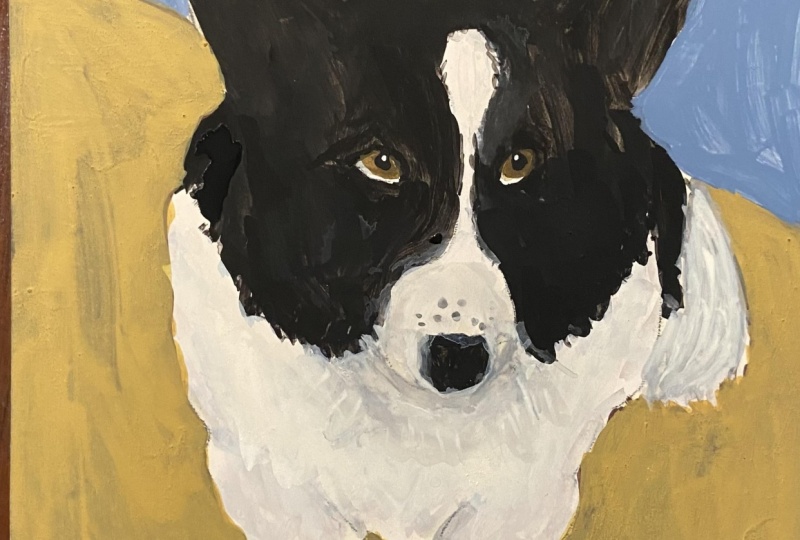
4. Dog Pencil Sketch: I printed this picture out and drew a very simple grid on it, just the center lines horizontal and vertically, and I suggest you do the same. A very simple grid like this is a great way to approach an animal portrait, where you know you're going to be working from a picture because probably the animal is not going to sit still for you anyway and the shapes are unfamiliar. Your dog might be very familiar to you, but the particular pose, it's just sort lot to work out. By gridding it, you can immediately compare where things fall relative to these horizontal or vertical lines, and it's very easy to see whether you're in the right place or not. What I'm doing is I'm just looking one square at a time and being mindful of where things fall in that square in terms of the center line, like right there, I'm just looking at where is this in the center of that square. I'm just going around and building the basic outline of this animal by focusing on where things fall relative to the grid, like how much empty space is there to the left of this dog's ear? Have I got that right? Where do these curves in the dog's body fall on that line? Do I think I have that about right? What you're doing is you're making little marks. I'm making a series of pretty straight lines here. Well, I'm just looking at where things fall next to one another and next to this very simple grid. I'm trying to just mark, okay, where does the face meet the body for instance? I made that little mark, you saw me pick up the paper just to show you where I made that little mark. Where does the line of the body break out from the line of the face? Again, the reason I think it's helpful to have a grid with these things is that every animal is a little different. It's hard to come up with a set of universal rules that are true for every dog you might paint or every creature you might paint. It can be helpful to map it out like this. I also want to say that this is something that a lot of artists are doing this in their head. Even if they're not marking this grid on the paper, they're always measuring, okay, that's the very center of the image. What is on that center line? What's above it? What's below it? How much space is there off to the side? Even when the grid is just inside your head and it's not visible to anyone, it's still a way of mapping out the image and figuring out where to put things. I'm taking my time and going slow here so you can see my thought process as I'm comparing the image. I'm bringing it over so you can see it in the camera but like where is the bottom of the dog's rear end right there? Where does it start to come in and I see the legs? I'm just really drawing straight lines too. I'm not so concerned with the curves or showing any kind of detail. I'm really just making a series of straight lines that just map out to me like where are the paws relative to the bottom of the image. I chose to do this as a square image so that you'd have a really easy time dividing it into just four quarters and going, okay, what exactly is inside each of these four quarters? I'm looking at like where does the paw line up relative to the ear? Does that seem about right? I'm always measuring one part of the body relative to other parts of the body. Is the paw more towards the center of the drawing than the ear is? Things like that. Where are these two paws relative to one another? One is a little bit more forward than the other. So I want to make sure that there's that little bit of difference as well. Then also figuring out like that back paw that you can see, where does that fit against the front leg? Because in the photo at least, it looks like that back paw is emerging from the front leg in this one particular place. I want to be sure I really have that sense of where is it, and where is it relative to the rest of the dog's body? I'm making little adjustments as I go. Of course, it's very important that you always have an eraser in your hand. You plan on erasing, the whole point of the pencil is the eraser. That's why we have pencils. So these are not mistakes, these are adjustments. You're responding to what you see, and you're thinking it through, and developing a little mental map of this image. That is the whole point. Now that I have the basic exterior parts of the dog's body, I'm going to start working on the interior a little bit. The tongue is right in the center here. By the way, this is Ada. I should have introduced Ada. She's my friend's corgi, and they very nicely offered this photo so we could all draw Ada. Ada's tongue is what is found in the center of this. It's easy to position that. I noticed that the nose is a little off-center, it's not right in the middle of the picture because Ada's head is turned slightly. That's helpful to be able to see. These are the things that if you are a little bit off, it can look very strange, so having this little bit of a grid is super helpful. I'll also say that a grid is not something that's just for beginning artists. I know lots of very sophisticated artists who are professional artists, it is what they do for a living, and they totally use grids. So don't feel like this is a crutch that you have to get away from at any point. Remember too, that even when you're out sketching from life, you can mentally impose a grid and ask yourself what's in the center, questions like that. Now I'm looking at the eyes and I want there to be a straight line across the eyes. Of course, if the head is tilted a little, it might be a diagonal line, but it's still straight. I can see that it starts at the bottom of the ears. I've put a line just above that. But now I also want to know where does the inside of the eye start relative to that center line? How close to the center line do I see the starting point of the inside of the eye? The reason I made that horizontal line just above it was so that I could designate where the top of the eye goes. Now I'm looking a little more closely at the ear and wanting to be absolutely sure the ear is in the right place because I'm depending on that ear to tell me where the eye starts. It's all a question of let's make sure we get one thing right, and then we can place everything else relative to where that one thing goes. I have a lot in place now. I've got the nose pretty much in place, I've got the mouth, I know where the eyes are. I've done the little white stripe that she has down the center of her forehead because that also is not right on the center line. So I want to make sure I've got that right. I'm just measuring the eyes again and also measuring the width of Ada's face, and how does that compare against the paper, the negative space on either side of her face. That would tell me if her face was a little too wide or a little too narrow. By doing that little measurement, I've decided that I made her face a little too wide and I needed to make it narrow. The way that I noticed that was by looking at the empty space next to her face and seeing that I didn't really have enough empty negative space as compared to the photograph. That's the other cool thing about this grid is being able to see the negative space and use that as well.
5. Dog colored pencil: What I'm going to do now is, I'm going to use colored pencils to make a little map of where the different colors go on this painting. I'm going to be using gouache. This is mostly going to get covered up because gouache is pretty opaque. If I were doing this with watercolor, then these lines would show through and I actually think that's cool. I intend for these to be mixed media, so it would be fine with me if the lines I make now show through the paint. You could also use water-soluble colored pencils, which would melt when you paint with watercolor and they would disappear even when you're using a transparent medium like watercolor. But the reason for doing this is to really think through where these colors go and to make sure that I've really got it right before I jump in and start painting. I'm starting out with a black colored pencil and I'm just trying to mark out the area on her that is more or less black. The light hits her coat and so some areas look a little bit gray because of the shine on the coat but this just gives me a general sense. These markings are complicated, but you do want to get them right, especially if you're trying to make a portrait of a particular animal and someone's going to look at this and it's their pet or they're really going to recognize this animal. The markings can be very distinctive and so I want to have taken the time to really think them through. I don't consider this at all to be wasted time. It helps me to paint quickly and also to paint accurately. The thing about gouache is that you can make some corrections, but it's easy to make something look overworked. If you want it to look really fresh and spontaneous, sometimes it helps to not be spontaneous at all and to really put the time in. I'm just drawing this in and I will color it in a bit more as well, but for the moment, while I'm still figuring it all out, I'm not going to color too much in. I'm going to look really carefully and really think about what parts of this face are black and what parts are definitely not black and I'm going to leave room for other colors to go there. I'm not going to do anything like detail with the eyes at this point. That's something that can come later. But at least outlining them to remind myself, she's got black right around her eyes and so I want to be sure that I've got that exactly right. Now I'm just doing the same thing on the other side and of course her face is turned a little bit, so I've got a different view here and I can see different markings. It's a little bit of a mental gymnastics to try to draw the negative space in a way, just trying to get the black shape and not to touch the sections that are brown or yellow. Inside the ear, there are definitely darker areas. I'll use a different color for part of that, but I can at least mark off generally where the darkest parts of the ear are, but also noticing where it's not so dark and where it is these lighter gold or brown colors. I want to be sure I leave space for her eyebrows, they're very expressive, so I want to make sure I've got that. There's a little black around her mouth, her lips so I'll get some of that in, be sure that I see it. Just looking for where her face is separate from the rest of her body, like where does that all blend together? I can go ahead and draw in the nose, just this little black shape and just make sure I've got it positioned right and I know what goes there. That gives me a lot of the black areas. Now, I'm coming in with brown. You don't have to be super precise with your choice of colors here, as long as you're just generally in the right neighborhood. Most dogs, most animals, there will be some pink on the insides of their ears and in this case it would be pretty dark pink just because of the shadows. But I'm not worried about matching colors exactly. You don't have to have a set of 300 different colored pencils and try to get exact. In this case, I'm really just trying to make little notes. These are just like I'm just leaving little notes for myself about what's where. I'm going to use this yellow ocher, well, I call it yellow ocher. But anyway, just a dark yellow colored pencil. I don't know what the name of this color is. But here I'm just coloring in the yellowish parts of the ear and I've decided I'm going to go ahead and grab a pink. Again, this is just a very generic sort colored pencil to do the inside of her ear, just to remind me that there's something else there. It's not a perfect match, but it does just tell me like, don't forget to come back here and drop in a little bit of this pink color. You can see how this is starting to be a pretty weird-looking drawing. It does look strange when you do these color maps and you get these very obvious areas that are delineated, but it's all scratchy colored pencil. It can it can look a little odd, but that's okay. The point is that you're making notes for yourself. I find that doing this process, it doesn't take long, it just takes a few minutes. It's taken me a little longer here because I'm trying to be very deliberate as I'm filming to make sure that it's exactly right. But it does give me a chance to think about the colors, so that when I go to paint, I've already thought this through and the painting is going to go pretty quickly and the colors are going to be fairly accurate. Because I've had a lot of time to think it over as I'm doing this process and just looking really closely at the image and responding to the colors I see. It's just such a helpful process. Let's see. There's a little bit more of these gold tones down here near her legs. I'll go ahead and mark those areas as well so I make sure they don't get missed when I start painting. There are some darker, shadowy areas we're going to want to get into, but I'll just mark off her paws a little bit with that. Now I'm going to use this gray to express the shadow areas. Again, it's not a perfect matching color. I think the shadow part of her body has a lot of brown or gold tones in it between her coloring and the beach that she's sitting on. Those colors are definitely reflected in what you see here. But I'm just using gray to communicate that to myself and I can also see gray where her lower part of her face comes up against her body. There's a little bit of a shadow that's cast there and I'm really going to want to emphasize that because that's part of what helps to explain her shape a little bit. That's going to be very important. I'm just doing some scribbly lines, where I can see darker bits of fur that are expressing these shadow areas and looking for where do I see them on her body. The thing about an animal that is white or has white fur somewhere is you don't want it to be one solid black or white. Because the white is picking up a lot of colors around it. I'm trying to just designate, well, where do I see the shadows being cast and where is it definitely not white, but it's a grayer color or a darker color of some kind. I'm going around and just trying to notice all of that, filling in a few little bits where I see some of that gray coming in. This is actually, it's all looking pretty good. I'm going to do her tongue. Of course, around her mouth, her lips, her tongue, I'm going to use this pink for that. Just the same very generic pink. It does not have to be a perfect match. I've got that in now. Now, I will just color in a little bit more with her body. I'm also watching as I do this and thinking about, well, there is a little bit of light being reflected off here. There are places where I'm going to want to notice that. I'm not trying to get really great coverage. I'm just doing these scribbly marks like now. But I'm more certain that things are pretty much right. I'm going to go ahead and color this in and you can see where I'm noticing more stuff as I go. I'm noticing, "Oh, there's actually more brown markings around her face, around her eyes." I want to be sure I get that just right. I'm putting that back in as I go and I'll just fill this in very roughly. Like I said, this won't be visible at all underneath gouache. But if I was doing this in watercolor, and these lines showed through, I think it would be very cool. It would add a little bit of texture and you definitely want texture when you're doing an animal. Because it's fur, and you want a way to express that it's fur without drawing every little hair. That would never work. So it's cool that there's even other ways to do that, and this would be one way to do that. That's looking pretty good. I'm just double-checking the shape around her face a little bit. I can see where her fur comes out a little bit to the side right there so I want to make sure I show that. Of course, I can also change my mind once I start painting. Now I'm going to drop in the eyes. You never see the full circle of the pupil, because the eyelids cover part of it and in this case, her upper eyelid covers part of that circle. I'm looking at her eyes and I'm looking at, "Well, how much am I seeing of the whites of her eyes?" Which are actually gold, they're not white. But how much of that do I see within the shape of the eye? There's also a reflection in each eye, which I'm doing in gray, just so I remember that it's there and then the rest of it in black. She comes to life as soon as you put the eyes in and a little bit more of the dark, her eyelids. She's really starting to look like herself. This is actually a pretty good start and once this is done, I think we're ready for some paint.
6. Dog painting dark colors: Sometimes it can be hard to know where to start when you're painting. So whenever I'm in doubt, I always just start with the darks and I move from dark to light. It's nice to just get that decision out of the way and that's just what I'm going to do. I've got black and I've got burnt umber and yellow ocher and white. That's all I have done on my palette so far. I'm probably going to have to bring in a few more colors, but that's enough to start with. At this point, gosh, I mean, in some ways it's almost like a paint by number exercise right now because I've made all the decisions about where the color goes. Basically, I just have to put that color down where I made my little map and decided it was going to go. Obviously, I'm being careful and I'm really thinking about exactly. I'm looking at the reference picture and making sure that this is really where this paint ought to ago. I'm free to change my mind still at this point. I could always deviate from the little color map that I made. But what's nice about this is now I can really just focus on that brush strokes. I can focus on making sure that the consistency of the paint is what I want. The thing with gouache is that you're always mixing it a tiny bit with water in order to get a mixture that's still rich and creamy, but is a little more watery than how it comes out of the tube and that's what makes it lay so nicely on the paper. Because I've already made all these other decisions, I can really just think about these few questions about making sure that my brush strokes look the way I want them to and that the paint itself looks the way I want it to. But the decisions about where the paint goes, that's more or less been made for me. I'm leaving a few areas unpainted here on Aida's face because there is a little bit of gray color where there's some reflections, where the light hits her along the top of her head. I'm noticing that as I go and I'm deciding to just leave some areas unpainted so that it's easy to come back in and put that black in. It's really fun to see how quickly she starts to come to life when you're doing this. Just getting up in her ears and being mindful of the fact that there are a lot of darker areas in her ears, but I'm just getting the parts that I'm pretty sure are pure black. This is black right out of the tube, not mixed with anything. I want to make sure that that's really right. Just looking for other opportunities. Where else do I know this needs to be, any little places where I might want to lay down a mark. I like using this filbert brush on animals because it's curved so you get these nice rounded shapes. But also I can turn it on its side and get a pretty fine line. Both of those things are nice. I'm not super concerned with the contours of her body being real smooth because I know I can come back in and refine some of that when I put a background in. I haven't really made decisions about exactly what I want to do with the background anyway, but I know that's an option. I also know I'm going to want to add some texture and more of a sense of fur but I'm going to do that later. Right now I'm just blocking in this shape. Here again, with her body, I'm mindful of wanting to leave some areas unpainted where I can come back in with a gray and just barely suggest that this reflection of light hitting her. It's not super obvious, but it does give her body a little bit of a contour to it and makes it not just seem like a flat black shape. It's what makes her seem a little more three-dimensional. That is all coming later. There's a little bit, you can see a little bit of black fur on the other side there just peeking through. I just want to check and make sure that I've got a pretty good first pass here with the black paint. I think that's looking pretty good for now. I also want to point out I didn't really erase back the grid and I could have definitely. I know it's going to be pretty well covered up. But if you ever have any concerns about that, remember that you can always erase back that grid because you don't need that anymore. But the thing is I've already put colored pencil on and I don't want to lose too much of my colored pencil mark. Now I'm taking the black and I'm mixing it with a little white to get a gray. There's a lot of different ways to get a gray, but this is easy. I already had black down on my palette and it's a dark gray, it's what you might call a charcoal gray. It's not actually a huge difference. It's not meant to call too much attention to itself. Just a little bit to show where the light hits is all I need. I'm just laying that in. I can always come back over it and add a little more black if I think it's a bit too much. I'm just looking really closely at that photograph and just seeing like where do I think this light is landing on her? Yeah. That's pretty good. We will come back and refine. The other thing too. Remember, this is mixed media. We are going to be adding like colored pencil marker, so you don't have to get every little detail. You don't have to be 100 percent done with an area in paint because we are going to have this final last step. Once you've done a few of these, you'll have a better sense of I think I'm going to leave that for pencil. I think that would be a really cool thing to do later. I'm not going to get caught up in trying to make it perfect with paint when I know that I can come back later. Same thing with her body here looking for where I see little bits of light hitting just a bit. If she was in real strong sunlight and real strong shadow, that would be much more obvious. You would really see these much lighter gray patches and maybe even closer to white. You can get these highlights that are really blown out. It's always good to use those opportunities when you have them because that's really what will make your subjects look really three-dimensional. I'm going to go ahead and get that nose in here while I'm still in my black and gray mode. It is nice to just work one color at a time. Of course, I'll go back and forth, which is great. But it's nice to be real focused on just one color and really go over the whole painting and think about where you need that. The top of her nose is lighter in color because the light's hitting it. That's another example of a little place to add a little sense of dimension. It's always good to do. There's a little bit of a darker color around the edge of her big smile. I'll put that in. She's actually looking pretty good already. But one thing I can do next, so as I'm moving from dark to light, the next would be the brown. I've got this burnt sienna, burnt umber, just any kind of dark brown like that will do. You can mix it a little with the black. I want all the colors to feel very unified in the paintings. A little bit of extra mixing like that is a good thing. Now I'm bringing in a little bit of quinacridone rose for the areas that are pink. Almost any red that you have, a cool red, will turn towards pink when you add white to it. I'm just mixing it in with a little bit of the brown just to get that sense inside the ears where the skin is really thin and you always see a little bit of red in the ears. This is true for people as well. There's usually reddish highlights in the ears. That's useful. Since I have this pink out, I will do her tongue. At this point, we will have really done most of the darks. I mix the quinacridone rose with some white, but then I just want to gray it down a little. I just want to knock it back some. I added a little bit of the brown, a little bit of the yellow ocher, just a touch. Try it out first on her lip, see how I like it. I'm going to lighten it up just a little, add just a little more white. But I would rather this tongue be too neutral and feel like I need to come back over it and add some brighter colors as opposed to making it just too colorful and crazy. I want it to look very natural. I think that's a pretty natural-looking tongue. Then it's lighter around the edges. This is another one of those things that just helps give it a little bit more dimension and not just seem like a solid block of color. I am going to add this sense of lighter color around the edge. Try to get that just right. I can do a little bit more with the tongue in colored pencil. There's a line down the middle of her time that would be good to get in, and I'm going to save that and do that later. I just need to get the major shape in and we'll take a quick break and move on and do all the light colors next.
7. Dog painting light colors: We've done the darker areas. Now we're going to move into some lighter areas. I am just using yellow ocher and white, and maybe just a touch of the brown to do these gold colored areas. You could also use something like raw sienna. I'm going to bring a tiny bit of orange in just to push it a little more toward gold. Something like new Gamboge, or any other golden yellow color you have, might also help you bring some richer golder tones in. But you don't have to get too fancy here. This is not a color where we want to call a lot of attention to it. It should still be a pretty neutral color. I'm just coming in, and here again, I've got this nice little map of where all the colors go, so it's not hard for me to figure out what to do next. I've solved all the problems and at this point it's really pretty smooth sailing. I'm keeping an eye on the picture, making sure there's nothing that I want to refine or that I got just a little bit wrong because this is my chance to fix it. This is my chance to make all these corrections. One nice thing I should say about doing an animal portrait like this is that it does tend to be a limited palette and sort unified palette. You can mix a little of every color and every other color, and the painting feels very unified when you do that. That's just a nice thing. Ears are a funny thing. They're so particular and they're so odd. That is true for human ears and animal ears. They're a little odd, and I want to get them right, but I also don't want to fuss over them so much, but it's the only thing people look at in the painting. Like you want be able to glance at the ears and go, "Yeah, those are ears" and then look away again because the focal point is usually really on the eyes. But it's a little bit of an odd trick because there are some funny shapes in there. What I did with the ears is just these three major colors, this dark pink, and the black, and the yellow ocher. I'm going around everywhere else and just following the little map that I made and dropping those colors in. Then just looking for any other opportunities to bring these details together around the face. It's going to be time pretty soon to really get in and do all the really small stuff. But I like to leave that. I don't want to do that too soon. I want to give it a little time, I want to get the big areas in, and then come in and do all the tiny little details. I always resist the temptation to get the eyes just perfect at this stage. Now I'm mixing a gray, and I've just got a mixture of black and white and a little bit of yellow ocher because I was mentioning that some of these gray tones have a lot of yellow in them, and it's from the ground that the dog is sitting on, and just the colors in the fur. This is where, by putting these grays in, it really helps the white areas to not just be one big block of white, and to have a little bit of shape and a little bit of sense of light moving across. I'm not at this stage worried about making anything look like individual hairs or individual fur. I'm just not doing those kind of details. I'm marking it out. It has a very paint by numbers feel too right now. I'm just blocking in these areas where I see the gray. I can go back and forth. I can bring in a little more black, I can bring in a little more of the yellow ocher, whatever I think it needs. It is nice to have varieties and grays for sure. Now I'm bringing in a little more white, but also just a little more yellow, and pushing into that gray, going back and forth. This is something you really just play around with, and it is the nice thing about it being a pretty simple palette, is that I can just moving back and forth between a limited range of colors here and trying to just get the right mixture. That for underneath is pretty good. I'm going to lighten it just a tiny bit and just go in here and get the under carriage area. I would rather be too dark and come in on top of it with some white and lighten it up just a little bit. I'm not afraid of being a little too dark. If anything, you want some bold choices with your values. You want your darks to be dark, your lights to light. You really want it to be assertive in that way. I'm going around and I'm emphasizing that area where the head is casting a tiny bit of a shadow on the body. I'm trying to get that in and think about what areas of the legs and the paws really ought to have that darker color. Any part of an animal's body that's touching the ground, there's going to be a contact shadow between the animal or any object. This would be true if you are painting an apple, where the thing touches the ground will be a little bit of a shadow. That shadow will very much have the color of the ground in it. You can see that the ground is this very yellow ocher color also, so definitely that contact shadow is important. Now for the white, I'm coming in with pure white right out of the tube. This is Winsor & Newton permanent white, so it's a titanium white, which means it's very opaque. If you get a white that says that it's zinc white, then that means that it's more transparent. Well, transparent is not what I need here. I'm looking for coverage. I do have some little pencil marks I want to be sure to cover up. I'm just looking for good, strong assertive color. Zinc white can be nice when you're doing a lot of blending and you want a little bit more transparency, but that is not what I'm doing. I'm just going to go in. I'm going to drop this white in everywhere it needs to go. This is the last of the big block in colors, and I'm going right over any of my lines. I'm just starting to look at refining just a bit. As the white is coming into these shadows, I want to be a little bit more thoughtful about where it's white, where it's shadow, what fine levels of detail I might need. There's this white area on top of the nose, and then that little white stripe going up her head. We want to be sure and get that just right. At this point, I am starting to think a little bit more in terms of details because this is the last paint color to go on, and where it goes and where it doesn't go is deciding a lot of things for me, is creating a lot of the definition. I've got that white stripe. Now I'm just going into the lower areas of her body where there's less of this bright white, but there's still some. In this case, I am using really pretty unmixed. This is just a white right out of the tube. I know that if I needed to be a little darker, I might still come in on top and add, and gray it down a little bit or knock it back a little bit, but this is all getting pretty close. I'm just going to pull out another brush here. Now I've got a smaller brush. This is also a filbert, but it's real small. I think it's a four. Now I'm starting to get into a little bit more detail, and so this is a good time to move down to a smaller brush. I have a mixture here of just yellow ocher and that brown to do what we would call the whites of her eyes, even though they're not white. They're pretty gold in color. I decided the brown was a bit much, and I'm just doing the yellow ocher. This is where I really do need to pay attention to that shape. I want to emphasize again, when you're doing eyes, that while the pupil, the dark part or the darks of the eyes are round, you're not going to see the entire shape because eyelids are going to cover it up. In this case, it's her top eyelid that cuts off the top of that circle, but we do see the bottom of that circle because her lower eyelid does not cut it off. That's just because of the expression she's making and the fact that she's looking up and so forth, and so you really want to try to get that right. Now, if this painting were any smaller, I would not even be doing this with a paintbrush. I would save this for after everything is dry and I would do it with a marker or a little ink pen. Always remember that you have that choice. You don't have to do everything with paint, you can leave some things. But in this case I think I can get it. I've got this tiny little filbert brush. I'm just using the edge of it or any little spotter type of brush, anything really, really small is what you want here. I'm coming in with the black and I'm doing her eyelids just what's immediately around her eyes. Being very careful, just going slowly and really trying to look and make sure that I'm painting what I actually see and not just what my idea of an eye might be. Some of you may be wondering, well what about a little reflection, a little hint of light in her eyes? I do have these gray color that I put in when I was in the colored pencil stage, and I left some of that in. I have that. But also if I wanted to do a real bright white little gleam of light reflected in her eye. I would do that with a paint pen later, a paint marker. I'm not even going to think about that right now. But if you were to want to do that with paint, I would literally have that be the last thing you do. Make sure everything else is right because you would not want to have to go rework that once you've done it. I'm just really watching for what are the colors right around her eyes, and just making sure that I've got those in. But we're definitely now into the details. Now I'm going to be going back and forth between the darks, and the lights, and everything, and just trying to get all these details right. She does have some browner and golder tones of fur underneath her eyes and also above her eyes, and a little bit off to the right. Now I am making some brush strokes, that are more like little lines. They're more meant to represent fur or little hairs. But at no case am I going to get into individual little hairs, but just more of a suggestion of some texture, so a tiny bit of that.
8. Dog painting background: I'm going to take a break from doing all the detail and go ahead and get the background in. There's a couple of reasons why I want to do this. One is so that the background colors can be integrated a little bit into the painting, and also so that when I do finally get into doing finer fur and hair type of details, the background is already in and those can go on top of it. I've gotten the lower half of this page wet with basically just dirty water. I just didn't clean the water because I knew it was going to be more or less the same color. Now, I am going to use the color that I see in the picture. You don't have to, this could have been turquoise, it could have been anything. It'd be totally fine to change it, but I like it. I added a little bit of gamboge to my mixture, which is a yellow, gold kind of color, just to change it a little bit. But in this case, I thought the fact that the background color was similar to a color that we see on her, it is actually cool and there's not so much of it that she blends into the background. So if anything, I think it's what helps accentuate some of the gold tones in her coloring. But I would recommend to you, if you think of these as portraits and you can have fun with background. You can do fanciful colors, you can do stripes and patterns. The one thing is it's important to make sure that the animal looks like she or he is sitting on something, like is on the ground. There's going to be a horizon line here. If I had just painted one solid color in this whole background, it will just look like the animal's floating into space. But in this case, there'll be a horizon line in the background, it'll be clear like there's ground and then there's sky or something. Also, I'm doing these shadowy areas where I'm mixing in more browns and I'm getting that around her feet and wherever her body touches the ground, I'm making it a little bit darker so that it's just a bit more obvious. By the way, putting down a wash of water, even if it's dirty water as mine was out of the jar, that will make your paint go on a little bit smoother and it'll make for a more even application of gouache. But I don't so much care about that. I don't mind seeing little brush marks, I like it. What I'm doing now is I'm taking a little ultramarine and I'll try to move my palette around so you can see this. I'm going to skip that stretch of red behind her, I just think it's too much for the background. I want a really simple background. I'm just going to do this grayish-blue color, that's the sea and no one looking at this will know exactly what it is. It could be the sea, it could be the sky, it could just be a wall. It won't really mean anything to anybody, and that's what I want. I want a really neutral backdrop that supports the image and helps it and looks good, but isn't so crazy that you get caught up looking at the background and you're not looking at the animal. The focus here is the animal and the focal point of the animal is its face. Usually, with any living creature, we look right into their eyes. The eyes are the focal point, everything else has to support that. I'm doing this kind of watered-down mixture of black and white and ultramarine to get a bluish-gray, which I think contrast and pairs very well with the gold or brown tones of the lower part of the background. It vaguely looks like the beach in the ocean, which is what it is, but it also could be just anything. I also want to point out, it's nice that these are a little bit different in value. This is a light gray. I don't want them to be exactly the same in terms of value either. I didn't worry so much about putting a water wash down because I'm happy to have these uneven little brush marks, but you can do what I'm doing here in a few places, which is just coming back over with a wet brush and just cleaning up any little stray brush marks that seem a little odd. Seem like they might be a little off and I'm integrating the background and the foreground by just mixing a little colors right where they come together. It's totally fine to do. Bring one color into the other like that is a tried and true technique for those backgrounds, so feel free to do that. Just a few places where I feel like I want it to be a little bluer. I like this cool blue tone to contrast with the warm tone of the lower part of the background, so I'm just bringing in tiny bit more.
9. Dog Paint Details: Now that I have a background, I'm going to come back to Ada and do whatever finishing touches I see that need to be done. These are opportunities for me to come in on top of the background, where I want little tiny details, and also marks that look more like hair or fur. I know it's hard to see on camera, but I'm trying to come in and use my brush in such a way that I can not so much get just a really smooth area, but more little hair-like brushy shapes. So I'm just coming straight down on the paper and just basically using the fact that the brush is going to separate a little bit and make that texture, and using that to my advantage there. Remember too, we're still going to do a little bit of colored pencil and a little bit of marker, whatever the mixed media you want, so this is not your last chance to refine and put in details. I also want to emphasize that my goal with these portraits is not photo realism. I'm not trying to exactly copy a picture, because we have a photograph. What's the point of that? My goal is to make something that looks like I painted it. So I want to see brushstrokes and I want to see pencil marks, or marker lines, or whatever. Knowing that, changes how I try to finish this off. I'm not going to be so obsessed with trying to match this photo exactly, as I make decisions about what to do and what not to do. It should definitely look like a thing that was painted, and I think you can see that with how I handle the background. It looks like I painted that. It's not meant to be an exact copy of the beach where Ada was. Something else that I'm doing here as I go around, and to just clean up little details, this is your last chance to make any little fixes, is that I'm also just coming in with a damp brush and blending a few shapes. That's another thing you can do, and you'll see me do more of that in just a minute. I'm refining some of these areas using a small brush when I need to. I'm back to my little Filbert, which I think is a number 4 Filbert. I want to re-emphasize the black around the lips and just make sure that that's real obvious and that it looks like her. This is a chance coming back in with a smaller brush to make some of those little fixes or just little additions, places where you might have painted over, a bit of detail that you want to clean up, and also, there's just areas where there's maybe more white showing through from the paper than I want. But a little of that is fine. Again, it tells you this is something that I painted, and I painted it on paper, and you can see the paper. That's totally okay. I'm just going around here and looking for opportunities to add this little bit of the sense of fur, little bit of some unevenness between these shapes so that it looks more like what it is. I'll go in and just mark out where her toes are in a little bit more detail, but as I'm doing all of this, I'm mindful that I can still do some of it in colored pencil or whatever as well. I'm going to take a larger Filbert brush, and I'm just cleaning it off right now, but this is where I'm really going to come in and just very gently unify some of these sections. This is just a damp brush that does not have any paint on it, just a little bit of water, and I'm just softening edges and merging these two colors together. It's a nice thing about gouache, is that it is re-wettable, so you have the opportunity to do this, and it makes for some nice painterly textures. You can see that at this point, I'm getting rid of that paint by number of fact a little bit and having these softer transitional areas, which I could do by just mixing up that particular color of paint and laying it down right there. But I can also do it just with a damp brush, just come in and push those two areas together, like right there underneath, merging the background color a little bit with her body in general. You can do as much or as little of this as you want. I'm probably fussing over this more than I need to, but I tend to do this when there's a camera rolling. This is probably more time than I would normally spend. But this is really your chance to just go around, look at everything real closely, see what you think of it all. Another thing, by the way, that I tend to do at this phase, at some point, when I think I'm getting close to being done, is I'll take a picture of it and I'll just walk away from my painting and look at the picture on my phone. A lot of times I'll notice something right away jumps out at me, that I haven't noticed the whole time I've been looking at it. So this would be a really good time to do that as well. Walk away from it, take a break, get it out of your mind, snap a picture, go look at the picture, and maybe see what you notice. I'm coming back in with a smaller brush and a little bit of white paint and trying to make some of these marks that suggest fur. Again, this is all about edges. It's all about the boundaries between one color and another, and edges are so important when you paint. It's one of the last things I think about because I think that's just the way gouache is, is that you can block in your major areas and you can really think about what do I want these edges to look like, and you can do that near the end. I think gouache lends itself to that. This is my opportunity to go around now, think about edges and think about the fact that I want these jaggedy edges between some of these areas of color that suggest fur, but also some areas are really sharp, and some areas you really can't see that at all. Going back and forth between those two things is great, There's a tiny little bit of pink above her nose, and this is something with animals. There will be areas where their fur is more thin and you can see a little bit more skin showing there. I just dropped in at tiny little bit of that, and I'm noticing that some of my grid, some of my pencil mark, you can really see right there across her tongue. As long as I have the opportunity, I'll just add a little bit more paint and that will cover it up. I'll come in some of these areas where there's white or these gray colors and I can just add a little bit. The fact is nobody will notice. Especially once we do our mixed media, nobody's going to notice one stray little pencil line. So I'm not too worried about it, but there are opportunities to just cover that up a little bit. A little bit more blending of her fur into the background too, which is again, about softening her shape to make her look like a soft furry animal and not just such a hard shape, but also leaving, you notice that her body, that black area of her body is quite smooth. Her fur lays down really flat, so I just want to be sure to leave that. I'm just going in and touching up a little bit, like in the ears, do I want a little bit more of that pink in the ears, because I do like the way that pink stands out and just introduces another color. As long as I have some of this on my brush, I'm just going to go in. I'll do a little bit of the shadow areas. I'm just blending that a little bit more so it doesn't look so super sharp. Remember too, it's really easy to get so focused on one little detail and you forget that nobody is going to even notice this. No one's going to look at it. They're going to be looking at the dog's face. So don't get too hung up on making it all perfect. I say, as I go over and over this in just tons of detail. But anyway, I'm still using little brushes. I'm just going to add a little bit more of a sense of hairs from yellow ocher and white, and just pushing it up into the black areas to suggest the direction that the hairs move. But overall, this is looking pretty good, and I think, ready for the next step.
10. Dog Mixed Media: Now I'm going to come in on top and do some mixed media. This could be colored pencil, it could be markers, it could be paint pens. I will say if this isn't your thing, if you're like I don't like the idea of scribbling on top of my painting, then you definitely don't have to, and you can still get some of these fine little details with a paintbrush and with your paints. It's not necessary. I think I like the playfulness of a lot of different media. I like the textures I can add, but also I like the sense that it feels like a drawing. I like the way that looks. Since we did this layer of colored pencil to begin with, we already have some colors out that are pretty much right. Those are the colors that I'm going right back to. I'm starting with this yellow ocher and definitely making little marks that suggest fur. Although it's hard to see on camera, you do get this little sense of this extra added texture when you do that. It can also be a way to soften up transitions between two areas. You can do that with pencil just like I was doing it just with a damp brush. Also with this yellow ocher, I'm adding a little bit of the glow from the background, the surface that the dog's sitting on. I'm adding a little of that. I'm also being mindful of wanting to really get a good sense of light and shadow. I'm just coming in with a black colored pencil now and doing little tiny bits of line work here and there. I don't want to overdo it, but you almost can't overdo it. It's super fun, I think, to show all this texture. I think it really makes it look lively and makes it look like something that's made by hand. You can see your hand all over it, which I think is great. Also by going around the edges too with colored pencil, if you feel like there's an awkward feeling between the background and the main subject, like they look a little to cut out from one another, this is a good way to ease that. I'm coming in with my dark brown and giving a little bit more sense of shadow, but also just coming in between the background area and foreground and just doing a little bit of blending and just make it look a little more natural. It's a fun thing to play around with, I think. I like introducing a little bit of scribbly line work into the ground area, into the background as well because it just unifies it. I'm going to go in on the nose. There's a little tiny bit of gray with the bottom of the nostril, you can see a little tiny highlight. That's a cool thing that I can add with a gray pencil. This is a dark burgundy color that I'm just going to use for the tongue. I can see this darker color right where the tongue meets with the mouth. Then, of course, there's that line on the tongue. I feel like I have to include it. I mean, I don't want to get too crazy detailed with this tongue, but I also don't want it to look wrong. It's a fine line between. Let's not obsess over this, but also we want it to just look accurate and natural because this is what dogs do; they sit there with their tongues hanging out of their mouth. You just want that to look right. Now I'm going to come in with this gray and do more super obvious scribbly lines to suggest the fur. Here again, this is all a matter of taste and what style you're into. This is just my style. This is what I want. I want you to see that I scribbled on it. But that's up to you. You can also be a lot more subtle with it than I am. I mean, I'm just doing thick bold lines here, but you can do much more refined. Really sharpen your pencil and be really precise with where every little line goes. But I think this is really fun. I'm going to be sending this to my friends, Ada's owners, who very kindly let me use this picture. What I hope is people would come over and see it. It's going to be real obvious like, oh, a friend of yours did this. This is obviously someone who knows you and knows the dog, and made this for you as opposed to, I don't know, something that almost looks like it is too refined to have just been like a quick little friendly portrait. But it's up to you, how you want that to look. Now with a paint pen, this is an acrylic Posca paint pen. I can add more lines. I can refine any areas where I think I need a little more white but maybe I just don't feel like dipping back into my white paint or it's just such a small area that I want that little bit of extra control. I have these in ivory and white. The ivory's nice when you don't want things to be too bold. But sometimes you do want the white. You really want to be able to show a bright highlight here and there. I'm going to come in and make more little marks that suggest fur here and there with the white paint pen. Sometimes if there's some little line somewhere, something awkward that you need to cover up, then this is almost like whiteout. You could actually use it for that. But I'm really just interested in these little suggestions of fur whatever other little details I can see that I want. You can see that I'm going back and forth. I mean, I'm going back and forth between colored pencil and marker and paint pen and just kind of whatever I think I need. There's a little bit of white around her mouth that I left out and I think it's just easier to get that with paint pen than going back into paint. I'm just drawing right on top with my ivory paint pen to get that white around her mouth and work little bit of shadow shape into it. I don't want it to look too drawn on, so I'm trying to just integrate it a little bit with what's around it. Yeah, that's good. It looks more natural. Also, doing all this stuff with colored pencil, I don't think of this as corrections. This is definitely adding more of a look to it. I'm not doing this as a way to fix mistakes. If all I wanted to do was just make little corrections, I could do that in paint. There's no reason to do that specifically. Oops, I broke my lead off there, but I'm just making it a little darker underneath her where I think I want to see just a bit more of that. I mean, at this point, I've done plenty. I could totally just stop here. I think it looks great. But I'm just going to keep playing around with it just to give you a sense of what more you could do. Now I'm with my white Posca paint pen and really pushing this idea of showing the fur, showing some of the hair. I'm really just going to draw a ton of them in. You can see how this look and see if this is something you like. You can definitely be more subtle than this. You could also do this with a real fine paintbrush and just white paint. You don't need a marker for it. It looks like a marker. I want it to very deliberately look like that, like I came in with a marker and really drew on top of this. Just a lot more on the fur there. Then underneath, I'll add a bit more of that sense of fur, but I'll use the ivory color because it's a little bit darker underneath. I'm changing up between the white and the ivory depending on which part of her body I'm working on and how much light or shadow is right there. I did also want to mention in terms of getting some idea for underneath. There is such a thing as a white colored pencil. You can add a little bit of detail. It obviously isn't as much as what you get with a white paint pen, but you can lighten things up and suggest a little texture there as well. Now, one thing I left out were her whiskers. She's got like three little tiny whiskers here, and I'm doing these with a brown colored pencil. This is definitely the very last thing you would want to put on, would be this kind of detail. So I'm just looking at where these are. I want this to be very subtle, but just dropping those in is the last thing I need to do. I think she's looking pretty good here. I'll come back in and just hit a few more little shadow areas, but that's it. There's Ada.
11. Cat Measuring: I'm not going to draw a grid this time, but instead, I want to show you some other ways of looking at how to map out your drawing. One is, make sure the dimensions of your photo match the dimensions of what you're going to draw. This is five-by-seven. That's what I cropped it to and I've got a five-by-seven outline drawn here, and that way the proportions will all be right. Even if you have a reference image that prints out larger or smaller, the proportions are right. The other thing is you're going to see me do this in just a second, I'm going to really note is where along here does this line start? What is the angle of it and where does it end up? That is a really important line just for establishing where everything goes. Same here. Where is this line relative to the center? Even though I don't have a grid, I can eyeball it. That's an important line. There's also this inner, that I will get in roughly as well. Then the other thing that you're about to see me do is that I'm really going to be paying attention to the negative space. Here's a shape. What is that shape? Then what does this shape look like? Making sure that's right and then even this really big shape, it's important, if I can see how far over, where does the cat start relative to the edge of this image, this area. This is a shape, and if I can keep my eye on this shape, it's going to help me get the cat right. The other thing that I'm going to be doing is really measuring one part of the anatomy against another, and an important one is always the eyes. If we don't get the eyes right, we're in a bit of trouble. I'm going to look at where is the ear? That's where the ear begins. What's happening there? It's just about where the pupils of the eyes are. Where does the ear begin over here? Just about where the pupils are. Knowing that is going to help me to position the eyes right, to make sure that they land where they're supposed to land, but even just noticing where the eye begins and where it ends. If we look at where the eye ends, it's pretty close to inside the ear here. Where does this eye end? Now the ear is turned a little bit, but you can still get the idea. Knowing where those are relative to another feature that might be a little bit easier to get right, that's so helpful. A thing about eyes in general, I think this is true for cats, it's true for humans, so the image that I've printed out, this eye is about a centimeter long and then there's about a centimeter between the eyes, and then this eye is about a centimeter. In other words, the gap between the eyes is about one eye width. Those are the kinds of things that are going to help me as I get started drawing.
12. Cat pencil drawing: Now that we've thought a little about how to eyeball these proportions, let's try it on the actual drawing. This is coming down the stairs. The bottom of the stair here is coming down really low, and where is this relative to the centerline? Let's save that. Looks like it's about the center. A little bit below there. I'm double-checking this angle. I think that's about right. I'm going to show you a trick for just drawing straight lines if they make you nervous. Of course, you could use a ruler here, but you can also make little dots, and then you're just connecting the dots and sometimes that's easier for your hand. Some people would also advise just go really, really fast, and you can usually get a pretty good line if you'd move fast and don't think about it too much, but this is just another option. There's a little lip of the stair right here as well. I want to be sure to get that, and then I want to look at this. Again, there's the center. It's definitely off from center, but maybe not all the way over to 25 percent. Is it about there, and then there's this one? I'm just going to look at these proportions and see if I like it. I think it's more like right about here. I'm going to take it here and just bring that line down. I don't have to bring it all the way down, and then there's this line right there. That's good. Oh, wait, this comes all the way down. I'll just go ahead and get that. Great. I'm starting to look for the space that the cat takes up, or more importantly, the space that he didn't take up. The bottom of the tail seems to be right about there, and then I really want to look at where does the bottom of these paws start relative to what's happening off on the side? It's right about the bottom of the paw. It's right about here, and then here's the tail come in here, and it comes pretty far over back up here. I'm really thinking about that space as well. That's about where the bottom of the cat is. Where's the top? I want to have a sense of where I'm headed. One thing I notice here is that there's this big rectangle with nothing in it. That's cool because if I can just mark that out for myself about what that is, I know stay out of this area. There's nothing happening there, so that's useful. The cat's ear is very conveniently almost exactly in the centerline here so that's also really helpful. By the way, if you get confused about where the center of something is a thing you can do, I'm going to make a line where I think it is, and let's see if I'm right. I can use my pencil or anything. I have a measuring tool and just go like that and say, does that work? Actually, it doesn't. The centerline is actually a little bit further over. Maybe it's about there. That's about right. You're just having the distance. If you do something like that, it can tell you where you want to be, but this is good enough. As long as you're in generally the right place, you're usually in pretty good shape. We know the top of the ear needs to hit about there. There's the curvature of the head, and we know that this year gets over into the wall over here. It's doing something like this. We know this is the top and we know that's the bottom. We just got to get there. This is pretty straight up and down. Continues to be straight up and down, starts to curve a little bit. This line which is really like the neck, I'm really interested in where this is. It also happens to be right where the nose falls. I want to be sure that I get that right and maybe it would be helpful to just say, well, here's that rectangle. It's above that. I think it's right about here. This is where the curvature of the body comes in, so that's helpful to know. But also, it's right where the nose hits and that's going to be really useful in a minute. Well, I feel like I've got that shape just about right, and it also this negative space looks about right. Then it curves in, and then the ear angles out right here. You can see already, the first preliminary marks I made, I'm totally going to change. This is all about just getting in here and getting to know the subject, really exploring it in pencil. That angle, I'm watching what that angle looks like, and then what happens over here. It comes down starting to curve out. Then when it gets to this line, it starts to come in, and it curves out. When it gets to this line is again right about where you start to see. It's hard to see in the black and white photo, but it's easier in the picture that I'm giving you to download. You can really see where the head is versus the body. Then the legs come in pretty high up. We've got this area that's body, and then the legs are pretty high up. I'm looking at like, where are these legs relative to everything that's happening here? I want to say even just looking like there's a rectangle and that gives me some sense. This rectangle right here gives me a little guidance as to where the leg starts. You have the leg starts there, straightens out, comes down. I'm feeling maybe the paw needs to come down just a tiny bit more, but I don't need to decide that right the second. I've already got a pretty good outline here. At this stage, what I would be doing is I'll be looking at this negative space like how does that look? How does this look? Is everything about the right distance from the edge of the image? I'm pretty happy with everything I've got so far. I will go ahead and start to drop in some more details. There's a lot here that I want to make sure I get right. Right where the tail comes in, this is where I see the space between the cat's two legs like that, and then this is at an angle. Want to get that angle. This is a pretty big shape right here, and it's an important anatomical feature like where this leg comes into the body right there. I'm going to make sure I get that distance right, and that's going to be an important marking to just make sure that I have that marking just right. It's darker right there. I also wanted to check this width compared to that. That's pretty wide right there. How did I do? That's pretty good. I might continue to play with it. I've got plenty of opportunities to mess around with this a bit more. I decided that the nose lands on this line, and I know that the nose is in the center of the cat's face. I'm literally just going to draw a triangle right there for now. That's good. I want to think about the cat's eyes. Where does that fall? This is one of those cases where sometimes it's good to have a ruler and just go, where do I see this exactly? It's well below the bottom of the ear. Below where the ear comes into the body. I think right about there. Just really looking at it very closely and trying to make sure I feel like I understand all these shapes. I think this is about right. I feel like maybe the top of the head comes up just a bit more than what I've got. About these eyes where the ear starts, that is right in the center of the eye and that's super-helpful. I'm going to put the pupil right there. Then this, I'm noticing the ear comes in. There's the top and there's this, and then there's this other line of the ear coming in. Let me just erase. I've got this worked out in my mind, but I want you to be able to see it too. There's the ear at that angle, but that's the outside of the ear. The inner part of the ear, it comes in just a bit. Cats have these funny, their eyes start down real low, so the corner of the eye is really down at the bottom of it. This is something that I might decide I need to redraw a couple of times, but it's like a sharp angle up, and then it levels out. Over here, it's flat, and then it takes a sharp angle up. It's a weird shape to get just right. I've worked this out like angle up, straight across, and then down here, straight across, angle up. They're obviously very squared-off shapes at the moment. I think they're a little too big, but I feel like I've got a reasonable placement happening here. That looks very cartoonish, but it's okay for now. This is basically the drawing, and we're going to have an opportunity to refine this and rethink it a little bit as we go. But we have the basics in place now, so let's get on to colored pencil.
13. Cat Colored Pencil: I really love this part of the process. I think it's so much fun to just map out these colors and just have one more opportunity to really consider the drawing before I get going on it. If I were doing a watercolor, I would have erased back the pencil lines a lot more. I'm really leaving the pencil lines so you guys can see them. Normally, I would just get them erased back so that they're very faint and I can really just barely see him. But obviously, the whole point is for you guys to be able to see what I'm doing. So that's what we're going to do. I'm just getting in very lightly, very loosely, just getting in the background. This part is less important to the overall process because it's going to be so easy to paint. There's not really a lot of question about exactly what's going on there. So it's not a big deal, but I just want to drop that in. As I'm doing it, I'm taking one more chance to really look at the angles of everything and where everything fits against the background. I got this gray pavement going here. Then this step, it's just a muddy brick color. I'll put that in. But what I want to do, and I could have done this in pencil, but it's pretty easy to do at this stage, is I want to just make a note of where that shadow falls. Here it is, and then it comes up right there, about even with the cat's eyes, and down here, remember that shadows are attached to the thing that's casting them, so it's like it's attached to this bottom paw, and it comes up and it goes over and it comes up just a bit here, but I think I'll just enclose it. I think I'll just close all that in. So this is where the shadow area is, and that shadow is going to be so important for helping to give this all a good sense of depth. I'm just going to lightly color it in so I remember this is all going to be really dark. Now, what I want to do is, I want to really get going on making sure that all these facial features are right where I want them. This is my chance to rethink anything. I'm not going to start with the face. I like to start somewhere else. Start with something that I'm maybe a little bit more sure of. One thing I'm going to do is, on my image, I'm going to measure the distance from this distance here to where the top of the leg is, and where does that land on the cat? From the bottom of the paw to the top of the leg, just hits the eye. That's how it looks on the image too. Those measurements, I'm always double-checking and redoing those. I can see here that the bottom of the paw is white, so I want to leave some white there. I'm just using a yellow ocher colored pencil for this first little bit. That is white, this is a light orange yellow. This is very light colored fur right here. Then, there's another little white area that's pretty gray that's right there. I'm just going to follow the leg up. I just wonder if maybe it comes out a little bit more. Then, I want to follow this white patch. I really want to know exactly the shape of that patch of white and make absolutely sure I'm confident in that shape. I think that's going to be a really important shape. As long as I'm doing that, I'm going to go ahead and jump up here to around the face, and I'm going to just notice where the white patch above the nose begins and ends. When I do this, this is a really good time to double-check this because eyes are so important and we all look at eyes. This eye is about a centimeter and there's about a centimeter in between, and then that eye is about a centimeter. That's how they should be spaced. It just so happens. I just measured it and that's how I found that out, is that on this cat and on all cats, there's one eye width between the two eyes, which is just how it is in people as well. We've got that, and it comes underneath the eye and it comes out and it comes down a little bit and up. That is how it looks on the photo and I'm pretty sure it's going to be the same on this side. I'm pretty sure, even though it's in shadow, that the same thing, more or less, is happening over here. I can't even quite see it, which is fine, but I can make that assumption about it. Well, that looks silly for the moment, but let's keep going. I want to get the very darkest part of the shadow on the cat's face. It's really important to notice there's light around the eye. This is super dark, and I'm going to color it in. Then, there's an angle above this eye and up into the ear that is also dark but not as dark. I'm gonna do this also in this dark brown. There's a pretty dark little shadow that's being cast by the ear right there. That's great, to be able to get that in. Then, the inside of the ear's pretty dark. There's some lighter hairs that are noticeable, but I'm going to hold off on that. I'm just going back and forth between these different orange and brown pencils. It's not so important exactly which one I use. I am trying to remind myself of the colors, like here I can really see those gray hairs. They're white, but they look gray in the picture. Then here, I see some markings that I want to not forget about. Then I think I'm just using this orange of course in no way it matches the cat's fur, but it just tells me like this is the basic color of the cat's fur. Then there's definitely a lighter area around the eye right there. Then it gets real dark coming down right here and across the eye. It's pretty dark. There's like this whole shadow happening right here, which is great. That's going to really help give a sense of the light moving. Then there's a shadow that comes off the nose and goes this way. This thing is especially useful for figuring out where the white areas are going to be that you might want to preserve. Those of you who work in watercolor, you're very familiar with the issue of needing to save some paper for the white areas. It's useful for that too. This shadow comes down like this and it's right there. Then it's underneath the chin. I'm basically forming the chin by just following what the shadow is doing. It comes back up, comes out pretty far and again, but right in the middle there, meets up here and there's a lighter sense of shadow here, darker right there. Like that. That's pretty good. Then there's a light area here. This is like right below a cat's ear, Their first thin right there, so it's a little bit lighter. Then I see another marking I really want to make sure I get. There's some markings right here. There's one under the eye, this one. Then I'll use this orange again. I know that orange is not a perfect match. It's way too bright, but that's okay. I know what it's for and I'm going to be covering it up mostly anyway. This comes right down to the eye. I'm going to come back and do a little more detail with these eyes in a second. I'm leaving that alone for just a minute, but I'll come back to it. Really the whole half of this nose is in shadow, so I want to get that. Now, the underside of the cat's chest is also in shadow. You see how the white part comes out like this and goes like that. But all of this is in shadow. This bit of white fur right here is shadowing. I'm putting some gray on there. Then I didn't draw in this other little back paw right here, which is white. But I'll go ahead and do that right now. I could have just used a colored pencil for that, but anyway, just showing you. Here's that. Then here I'll just lightly color all this in with orange and do the markings in a minute. I'm just going to loosely, lightly do all of this. Then I'll use this darker red. There's a shadow being cast by that leg as well as just the markings on the cat, at that. This for me it's just so helpful to go, okay, these are the areas of light and dark like now I'm just noticing this darker area right here on the leg, but that's also a very dark cat shadow. Then another thing that's happening here is part of the cat's leg just blends with the shadow. I am going to go ahead and just emphasize that a little bit and go back markings. I see a little bit, this cat has a tortoiseshell pattern, but it's not real, well-developed. Which is okay. We can emphasize it a little more if we want to. Then along the tail, there's like a big stripe right there, and a big stripe right here, and one right here. Then otherwise, the tail is light in color. I'm going to do just a little yellow ocher right here just to remind me that it's lighter. Then I'll move into this orange back here. I also want to really, really emphasize how dark this shadow is. That's important. That there's a convergence of all the shadows right here around the tail. There's always a little bit of a contact shadow where something touches the ground. The tail touching the ground creates a bit of a shadow as well. Now, I left the face a little bit. I'll go ahead and just mark in a little pink right there. You don't need to do that much. Then for the eyes, I'm going to take a super dark brown. There is a dark color around the eyes and I'm just going to draw it in. Some animals will have a real dark lid but also a lighter lid and you can see them both. Also, some animals have a white highlight that is shining off part of the lid, but I don't see that here and I'm just taking any green pencil and just make it a little bit of a mark right there. This, of course, I'm going to come over all of this and paint. It's fine. If it's not perfect, I'm going to have another shot at it, but really this is looking pretty good. I feel like this is giving me a lot of information that's going to really help me paint. I see a few little gray marks in here that's going to be really useful just for the texture of the fur to get those. But I think otherwise we're in pretty good shape. I think that's about it. Let's get onto paint.
14. Cat light washes: Before we get going on the paint, I just wanted to show you, I decided that I needed to make a couple of adjustments. One is that there's this dark shadow that comes in pretty far. It's just about even with the end of the cat's eye, and so I'm bringing that shadow and a little more. Then the other is I realized that this ear is too far over, it really should be right in the center. I just drew it in the wrong place. I'm just going to come in and actually redraw it where I think it goes. Let me make sure I get this angle right this time. It's a little bit more of an angle like that, and then it comes down here. Then that's going to bring in the outside of the face just a little bit, and then this angle here will look right. That's the thing that I had noticed wasn't looking quite right. Fortunately, I'm doing this gouache and it's easy enough to make that change. If I didn't feel I could make that change, like if I'm doing this in watercolor or something and I just think I can't make that move. I would have just rolled with it, it's close enough. It looks pretty good to me, but I know that I can come in and cut off that little bit and that little bit with my background color. I'm going to go ahead and do that when I get to that point. But we're not at that point yet. What I'm going to do here is I'm going to start this painting differently than I did the last one, just to give you options. This way of working is about building up layers like what you would do in a watercolor portrait. I'm going to start. This is a bright lemon yellow, it's really a little too bright, but that's okay at this stage, I just want some pure pigment. I definitely don't want to mix with any white because I want a nice clean wash. This is very thin. There's lots of water in my mixture. I am going to come in over that ear a little bit and just start to mark that as an area that I'm going to reshape some. Thought about redrawing the whole thing, then I thought, "No, I want them to see that you can still make little corrections even at this stage." So I decided to leave it in. I usually do. I've done two or three different versions of this. I always do a few different versions and then pick the one I'm going to stick with. I decided that I'm going to stick with that one even with those little adjustments because I think it's good to see the adjustments. That's a very thin layer. I'm not concerned. I'm not going to worry right now about this blue or the gray. That's not a big focus for me at the moment. I'm mostly interested in the cat and then the background. The next thing I'm going to do, is I'm going to take some yellow ocher because this is pretty close to the cat's color. New gamboge or raw sienna, any golden yellow color would also be fine here. You could also, if you just love to paint with really bright colors, you could just do it thin down orange. Why not? I think it would be cool actually. But what I'm doing is I am looking at my photo carefully again here because I know that this is really my chance. I want to make sure that I like the shape of everything. I'm just doing a very light wash of this color. It's okay if you don't get exact perfect coverage, you can leave little bits of white showing through. But the reason for doing this is to take the white of the paper out of the equation, so that everything you lay down from here on out is going to be a very definitely built up layer with this underneath it to support it. Let me get some of this color in around the face. But I'm not paying attention to values, I'm not really worried about light and dark. I'm not really worried about patterns on the face, none of that. I'm just dropping this in very much like a base layer. I'm trying to get this new revised shape of the ear. I don't actually know how this is going to come out once I get the background on it. I'm taking a little bit of a risk doing this one for you guys, but I think it's good to see. Also over here, this very dark area, I just want to drop that in. Now I've stayed off the white for a reason. If you're doing this in watercolor you are leaving the white because you know that you've only got the white of the paper to work with. If you're doing this in gouache, you know that you can come in and put white on top of other colors. But what I'm going to do right now is I'm going to take my white and just do basically a wash of white. I'm going to go ahead and put it down, but I'm going to be pretty thin with it. This is a water down and it's going to go right over the areas that I marked in shadow as well. But I can see right through this. It's a thin enough layer that I can still see my pencil marks, I know where all that shading belongs. I'm not covering it up so much that I can't see these little decisions that I made before. But it is letting me just designate what areas are important to preserve as white. Then I am going to go ahead and do the same thing right around the face, and right around that eye. Just a thin layer. What I'm going to do for just a little bit of background color, again, it's just very minimal. I'm just going to take a little cobalt turquoise, almost any blue, you could just brush right over here. It might be tempting to mix a gray color to put down here, or maybe a reddish color for right there. But what I'm going to do for this, is I'm going to go ahead and use this same yellow ocher. The reason is there's a lot of sun hitting this, and so I think that as base colors go, it'll help to have this underneath, and if I put a gray on top, I think this will show through in a really pretty way. It is the same color that I put on the cat, and I know I'm going to come in on top of it. That's the first step, is putting down a base layer like this.
15. Cat light tones: I'm going to continue now with building up layers from light to dark. A lot of times I like to work dark to light. I think part of the reason for that is that I started off as an oil painter and oil painters very often will work from dark to light. But watercolor painters tend to work from light to dark because you got to build up layers to get those dark colors. There's arguments for both with gouache. One of the reasons why I'm starting with a lighter layer this time is there so much white on this cat and I want that white to stay a really clean, bright white. I thought, well, I don't want to put in those darker grays and then be layering white on top of it. I think I'll just go with lighter colors first and see what I think of that. This is yellow ocher just mixed with some white and this is pretty close to the lightest areas of this cat's fur. I'm going around and I'm first looking for opportunities where I can put it down and it's pretty close to the final color that we're going to see. Now I can go right over my pencil marks that I made earlier because I can still see him and I know I'm going to be painting on top of this when I get a darker color in. Where else is it really quite light? Right up here around the eye is a very light color. I can see it right there also. What's so great is that of course I know where these. I'll put this down and then come in and put darker colors on top of it. I know where these colors appear because I spent some time doing it with colored pencil and so I'm pretty comfortable with where things are. I'm going to go ahead and do this whole area of the face, I think I've decided and then I'm going to darken it just a bit and I'm working in some gamboge, which is a beautiful golden-yellow color. Maybe even just a little bit of orange. It's going to be brighter than what I really need, but as a underlayer could be really interesting. I get this in. That looks pretty nice, I can go ahead and do a layer like this over here and knowing that I'm going to come in on top of it. Again, this is about building up this color. That's what this approach is about. If you're starting with your lights and building your way to your darks, then that's what you're doing.
16. Cat medium tones: The next thing I want to do here is work on the darker areas of the fur. Now I've got some burnt sienna here. This is the burnt sienna. I've got some burnt umber, which is much more brown right here and some black. Then this over here is red ocher. I'm not completely sure if I'm going to need it, but I decided to get it out anyway, it's a great color. I am going to take some of this burnt sienna and mix it with the yellow ocher that I've already been working with. I want all of these colors to be really unified. I'm definitely going to be going back and forth and always mixing into my previous mixture. So that everything looks like it's all of a piece. That's very dark. That's more like the darkness of some of these markings. Let me dial that back a little bit, and bring some gamboge into it. A little white and some orange. I don't want it to be a real pasty color and that's always the danger if you work too much white in, it can be a very chalky color. That, I like. I'm going to go ahead now and define the edge for myself, knowing I can come back and change it. I'm going to be putting in a background and I'm going to have some flexibility there, but try to just define an edge and look for where are the really darker areas, not the darkest. I'm trying to work my way up. That's why I'm being careful about where I put this because I know that darker colors are going to come along I think there. I'm not going to really get into the markings yet. I want to save that. Little more orange, little more new gamboge maybe right around here. Then for sure, the top of the cat's head has this darker color that may be a little too dark, I'm going to take that back some with some white. Maybe work into my yellow ocher a bit more. Yeah, I like that. It is true that there's a certain chalkiness to it. But then again, that's what gouache wants to look like. So why not? Let it look like what it wants to look like. Coming in on top of these lighter areas is cool too because the two layers of color are going to blend. You'll get a little bit of natural mixing that happens on the page, which I like a lot. I'm still being pretty loose with brushstrokes and stuff because I know that I will come in with some mixed media. I'll add some colored pencil and stuff back on top, I know that's coming. I know that I'll do a lot of refining in my last step. But I am trying to be more opaque at this point. I don't want one watery wash on top of another one. There's only so much water that this paper can really take for one thing and for another, it's just not necessary to do a million light, thin layers. I mean, at some point we can really get in here and start building this up. I'm using this small round filbert, this is six. I could definitely use a bigger brush right here, but it's in my hand so it's the one I'm using. Just a little bit more around the tail so you can see how I'm still being pretty loose with brush strokes. I'm not trying to get real precise just yet. Keep that. Feel like there's more I can do with leg there. Again, trying to keep the color pretty light and the colors are changing, every time I mix and put down a mixture it's a little bit different. This is a little bit more yellow, but I like that. I think that's what makes it interesting. We don't have to just limit ourselves to an exact mixture of four or five colors. You can play around and change them up just a bit. Haven't put any markings down on the cat yet. I'm going to go ahead and work my way around to this dark area because it's feeling very ill-defined without it. I'm going to take some of my burnt umber but even mix some black into it because this is the darkest area on this cat. That is so dark, maybe that's too much. That just looks a little too black. I am going to trust my first instinct there with the burnt umber, and yeah I like that better. Just put down burnt umber. Now I really want to look at how and where it meets up with the eye because I'm aware that this dark dark shadow does not come right up against the eye. I'm also aware that there is a shadow right here, but it's not as intense. There's a little light triangle, and I just covered it up. I didn't mean to. But with either gouache or watercolor, you can come back and lift things up. I'm just going to show you how because you'll do the same thing. You will put a brushstroke down and realize you didn't mean for it to go right there. I just barely lifted it up, but that's enough. I'll be able to put that lighter color down on top right there. There's that real dark area and there's some of that as well. I see it up in the ear. I'm going to worry about the grayer part of this ear later. Just want to get that in. Then also, the same burnt umber in this little triangle area right there. This is where I'm redefining that ear. I'm saying that it comes down here. I'm hoping that change is going to work out okay, slide right there. I'm going to go drop back in that. This is really a bright spot. Some white and some yellow ocher. It's like a triangle. Comes up and comes straight down right there. That looks pretty good. Then also, it's super light right there. Around the eye, it's a little lighter. You can see how you can really spend forever just playing around with these super subtle color changes. I don't want to get real into all these markings yet, so I'm not going to spend too much time on the head there, but I do want to finish up with these shadows now that I'm into some darker colors. This shadow, it comes down in here, it comes down below the eye. Just a little bit. Then part of it's gray because it's falling on the white fur and I haven't gotten into any grays yet, so I'm not going to worry about that right this second. I'm going to come back to it. Where else is it really dark on this orange fur part of this cat, right there, right up in here. You could say that this is more of a black or a super dark gray color rather than the dark brown. But I like the way the dark brown unifies everything we've already put down. Then I guess I'll go ahead and mark that area as well at this point. This is actually off to a really good start. Now I want to get into more with the whites and the grays.
17. Cat grey shadows: I'm going to put down another thicker layer of white and really be sure that I know right where it goes, right where I want it to be. I know that I can get a little more detail right around the eyes there with some markings in this white. I'm not going to worry about that so much, that's not my main concern here. I'm going right over the little markings I made for the mouth. I might just come in and do that part with colored pencil or something. Then I can see that the chin's just a little higher than where I drew it, so that's a helpful thing to figure out right now. That's something that I can deal with in this next stage. I'm also not going to get into thinking about creating the appearance of fur just yet. I've got a good thick rich mixture of white, and I'm just going to make sure that there's a good layer of it on there. Then I'll start coming in with the grays. I've allowed a little bit of yellow ocher to creep into this mixture, which warms it up just a tad. So if you think your white is just too stark, then add a little drop of a yellow and I would suggest something like a yellow ocher that's really really warm, but it's the tiniest amount you can imagine. It's really just a minuscule amount. By the way, if you're doing this in watercolor, one tube of white gouache can be really fun to play around with. I know you're used to just leaving the paper white for white areas, which is great, and it's one of the wonderful things you can do with watercolor. But it is fun to just have this one tube of white to mix with and just play around with. That's just a suggestion. This is the place where you would give that a try if you wanted to try it. I feel like I've got a good layer of white down everywhere. I've now had a chance to put two layers down. The one I did initially, and then this one just now. Now I'm going to start mixing some grays. As always, there's so many ways to mix a gray. Generally, if you were to take a brown like this umber and you were to mix some ultramarine with it and maybe a yellow, like yellow ocher and just keep going back and forth with colors like that, you would get all kinds of grays. Now, I've got some blackout right here already. So I'm just going to mix mine with white and black, but certainly it's not the only way to do it. If I want to warm it up a little bit, in other words, push it closer to brown, I can always come in and grab some of these other tones that I've mixed up and right away that's so much warmer a color and I think that makes sense. So I'm going to go with that. I want to start somewhere easy. I'm not going to start up by the face, I'm going to start down here in the legs. I always recommend this, whenever you're in doubt, start on something that's ever so slightly less important. Do some work on the background, do some work on, if you're doing a person, some easy part of the drawing, like work on their pants or just something that you know you can pull off and work your way up to the more critical areas like in this case, a face. So that's exactly what I'm doing. Now I am being a little bit more thoughtful about these brushstrokes and have the sense of fur. I want the brushstrokes to go in a direction that makes sense. So I'm trying to look at the direction that the fur goes. I'm not going to do every single little gray shadow in the fur just yet. I'm going to, again, I'll work my way up to that. I did want to go ahead and mark out because I felt like I made this cat's chin a little too big and that it's actually more like here. So see even after I've done in pencil and I've done colored pencil, it's like the more you look, the more you'll start to see stuff like that, and that's great, that's the whole point of this. I think I need this to actually be a little darker. I want to get this side in. So it's like part of the shadow is orange and then it goes to gray where we're on the whiter. I like the way I'm getting some markings that look like fur right there, that's great. That's just the brush being a little bit dry and I can get that nice look. Now there's a gray line that comes down the side of the nose right here. Then it comes over here. It's hard to tell, but I think it gets a little bit lighter in this sort area. So I'm going to let that happen. Something like that. Now, I'm going to lighten this up. I'm going to start looking for just a few places where I maybe want to suggest fur as I'm suggesting these shadows. The purpose of this gray is more to give a sense of the outline of some of the clumps of fur that basically cast little shadows on themselves really. I don't want to do too much. I would rather do too little and decide later to come back. That's probably more than I should have done. So I'm going to stop there. As long as I do have some white sitting out. Bring some of it in, right there. Then I am going to go ahead, see about filling out that shape over here just a bit. I can come back to this. It's actually looking pretty good right here. We've got all of our lights and darks pretty well established. I will come up here and just drop something in, very casual, no big deal. Just drop something into the ears without really trying to get into hair or anything, but just to get something in there. Then there's a tiny little bit of shadow that travels right down the center of the nose. Let me see if I can get that. It's a small detail. But it would be nice to try to get it just right. This business of the inside of that eye in this dark shadow, this cast is something that I really want to get right. I will get in and deal with this eye more in the next step, but I want to stay away from details first and just get this down and then we'll move on from here.
18. Cat background: The next thing I want to do is I want to get the background in, and the reason I'm stopping here to put the background in is that as I get more and more into details, I'm going to want the edges of the cat to stand out against the background. If I wait and put the background in later, then it's going to seem like the background is on top of the cat. We don't want that. What I'm doing is I've got some lemon yellow here that I put down earlier, and I'm just mixing it with some of my gray because this is a knocked back gray color of yellow and I really like that. You certainly can change the background color. If you want to put this cat against a pink wall, or a purple wall, or whatever you want to do, with a very simple portrait like this, you're always free to play around with different ideas for the background. I said earlier that I've left a lot of my pencil lines in so you could see them, and I did, and I'm not taking them out, I'm just leaving them, if it helps to orient you. But what it means is that some of these pencil lines are going to show through probably just a little bit into my finished painting here. That's okay, because I'm just doing this as a demonstration for you. But this is just another reminder of why you will want to erase back more than I have probably. I really want to pay attention to the shape of the cat at this stage. Any changes that I decided to make to the proportions of the cat, this is the time to really double-check them and get them right. I'm just looking very carefully. It's okay if I smear the paint a little bit. I can come in later and clean up some details. This is where I want to change where that ear falls. Now I'm [inaudible] look real carefully and make sure that I like the shape of the head as I've ever so slightly restated it. It's a small thing what I did, it was a little shift, but I think it puts the face into better proportions. By the way, I'm not super concerned with this background being a very even wash of color. Because it's like this funky old wall, it's probably been painted a million times and whatever. If the color looks a little uneven and you can see the brush strokes and stuff, I actually think that's in the spirit of the wall that's behind it. If you were looking for a very smooth application of color behind your animal, then I would say, get your background wet again first. It was wet for a little while because we do that first passive color on it, but it has since dried. If you just dampen it a little bit, you'll stand a better chance of getting a real even application of color. Well, I'm pretty happy with that. Again, I am going to be coming in on top of the background when I'm really doing finishing touches on the cat. That's good for now. Then this doorway makes a turn and we get into a darker color so I'm taking the same yellow, but I'm mixing a bunch of yellow ocher into it, and then I will just go pick up some black which is just going to gray it down. I think that looks pretty good. I think that's a pretty good shadow color. I don't know for sure until I get it on there and just see how believable it is. I think that's fairly believable as the shadow color there. Here again, I wanted to go slow and be careful and really get a good sense of how happy I am with the outline of the body. Now, I'm going to be coming back in with a really dark shadow right here. I'm going to have yet another chance to really define this. I'm putting this down knowing that this area is actually going to be almost black when all is said and done, so that's plenty for now. Now, I'm going to switch my palette over. I've got a little bit of that turquoise of that little extra strip of the doorway there, that's blue. I do like that and I want to use it. I'm going to take some white off my other palette, and I'm going to mix it in here as a starting point, put a little bit more down. But then I also really want to gray this down as well. In fact, I'm just going to add some cobalt blue to it also, I don't want it to be quite that turquoise. It obviously doesn't matter. I'm not trying to exactly copy it, I just want something that's close. But I want to gray it down, so I'm going to go grab some black that I've already got out here and see if I can just get a blue that's very subtle and really pushed more towards gray. I think that's pretty cool. This is a little bit grayer than what's in the picture, but I really like it. That I think is a gorgeous color. I would like to paint a wall in my house this color. I want to lighten it some closer to the top. This is where the sun is hitting it and then it gets down into shadow down there, so that's fine. I actually like the skippy texture of the brush and leaving little bits of what's below it showing through, it looks cool. I'm just going to leave that just like that, knowing again, that there's a shadow shape that's coming in on top. I'm going to put that away, and then for the pavement, there's the pavement, and there's that little step. Actually I'll grab some white and some gray off of here. This is again, this idea of, keep your palate unified. Anytime you can mix one color into another, everything feels very connected. I'll pick up some more black, but I definitely want this to be a very warm and quite yellowish gray because it's really being hit by the sun. I don't want it to look too close to the color of the cat. That's pretty good. Maybe lighten it up even more, I'm just going to add some more. This is good, I like this. I switched over to my flat brush, which is the brush, really, that I like to use the best for this. I had a filbert in my hands. Sometimes I just got a brush in my hand and I can't put it down, but this is the better brush for these background areas, I think. Nice. There is a background in, and then there's this area that's the step, which is ever so slightly red, but really slight. I'm just going to get into some of my reddish brown colors that I'd already mixed up and put this in, but I don't want to overthink this, this is not something you want people focusing on. There it is. That's all it's going to be. I will go ahead, continuing to work on the background, and get this real dark shadow area again. Let me see. I've got a lot of black here and I have some brown. I don't want it to be black. Definitely, we're having a little brown in and I want this background color that I've put down to show through, that's part of the goal here. It goes like that, and then it comes up here. Let me just do this part first and see what I think of it. It comes all the way down and it connects with the foot. Now, I want to be mindful of, there's going to be areas here where it's hard to even distinguish the background from the cat. The dark is part of where the cat's body just transitions into that shadow. I've got an idea about that, I'll show you in just a second, but let me just finish. I would like this to have a little bit of that blue in it, the shadow. I'm going to actually come over here and grab some of these bluer tones out of my other palette. That's not dark enough. Let me get a little more black because this is a very dark area, and as it dries, I might decide I need to come in over it and add even more dark color. We'll see how it looks when it dries, but for the moment, put that there. Then it comes off the cat, comes up the stair right here, and it goes across. That's going to change as it dries. One last thing I'm going to put down during this phase is I'm going to get a little bit more of my burnt umber. There's an area here on the cat's leg where you really can't tell, are we looking at part of the leg or are we looking at part of the shadow? Which I love. Anytime you have that thing where they're just running together, that's really fun. I'm just dropping in some more of that brown color that could be the cat. Also another thing I'm noticing that I'm going to do as long as I have a mixture out here that's still got a lot of black in it is that I do want to come up here and just get a little bit more into this shadow. But this will be part of the details that we'll really do next. That's pretty good. We've got something down for the background and now we can focus on more details on the cat.
19. Cat final touches: This is actually feeling pretty complete to me and especially because I know that I can come back in and do some markings and stuff with colored pencil if I want to, but I'm going to keep going with paint. We're going to call this finishing touches. I'm mixing up the same colors. This yellow ocher, the red ocher, the burnt sienna. I'm going to start thinking about these markings and trying to get the color of this just right. I'll keep mixing in with the orange that I've got. That orange is so bright, but you mix it in with some of these other colors, particularly the burnt sienna and it's just beautiful. I love this. It's subtle but I'm going to stick with it for just a minute and see what I think. Because I think it's very true to the cat's colors. I'm just looking for like where do I see some of these markings? I'm not trying to be real committed to a very specific pattern. I'm going to make some pretty loose markings knowing I can always come back and do more, but it's getting to the stage now where it's harder and harder to take things away once you've added them, so let's see. Where do I see this stripe? Put that in there. There's one right here. Now, I am trying to suggest fur, so I'm going back and forth and letting their hairs on my brush suggests the hairs on the cat a little bit. I'll come here underneath. There's always going to be a darker area where it's coming in contact with the pavement and so forth. That's a little dark, let me lighten it up. I can see a lot of my pencil markings and stuff showing through still because I did do everything so dark. But honestly, I like it. There's a nice texture to everything that I know probably isn't super visible on camera, but I can see looking up close at it and I really like that. Those look pretty good. Now I'm going to come up and I'm going to see about dropping in some of these markings around the face. This is the Number 6 filbert, and I'm mostly using it on its edge. Actually, this is just about trying to observe and see where do I see these marks exactly? Speaking of pencil lines, some of the pencil lines that are in my background actually look like they belong there. It just looks like the smudges on this wall. It's actually worked out okay. That's looking pretty good. I feel like I want to darken at the top of the head a little, but not too much. I'm just going back into my orange mixture, my yellow ocher, and try to get a slightly darker color. Yeah, that's pretty good. I can also just mess around with some of these tones with colored pencil as well. Trying to be mindful of that. I mean, I think that's actually looking pretty close. Just checking other areas where I might want to do a little touch-ups. One is, I'm going to come back in and get a little bit more of my gray mixture. Where I want it is right here. This leg has a little shadow being cast on it and I want to get that shadow in. It's also a very warm gray, so I'm bringing in some almost oranger tones here. I think maybe it comes up just a little more. I don't want to overwork this. You don't want a million little brush strokes. It's better to just obviously if you can say it all with a few big brush strokes, that looks great. Then I will restate that darkest area. This again, something I could also save and do with colored pencil is I could come back in here and darken that up again. That's the fun of mixed media. I will go ahead. I'm going to take the tiniest drop of red and do that little pink nose. I don't need much. That is way too much. Get a bunch of white, and the tiniest drop of red. Then if the pink seems too candy pink, then just mess it up a little bit by dipping it into some of these other mixtures that are probably already on your palette and it'll just neutralize it a little bit. I'll drop that in. I will do the rest of the features of the lips there. Well, maybe not. I was saying I was going to do it with colored pencil, but why don't I go ahead and do it with gouache. This is a really small brush. Too nice for things like this. This will let me get into some detail. Just trying to get back to my gray here. Because what I want to do, these shadows need to connect and that shadow needs to touch that nose. I'm putting it over a darker color, that little bit of shadow. As it dries, it's going to blend with it. I'm not going to fuss with it right now. I'm going to wait and see how it blends together as it dries. I said I was going to do the mouth. It's just a gray, so I'm going to dip into my black mixture over here. Maybe bring a little white into it. I want to start out quite light. I'm just treating this like a pen. There we go. That looks fairly cat-like. I will be adding whiskers as well. That's coming also. Now that I've got that in, it's a little goofy looking. Hang on. I can pick a little of that up. I can also come back in and make little tiny spot corrections with white gouache or with a white paint pen. Now that I've got that in, I think I'm seeing that the orange pattern is a little bit in the wrong place here. It needs to come in a little bit more. That's actually pretty close. I think I'm just going to leave that. Now that I have this little brush in my hand, I don't want to suggest too much fur around the edge here because a cat's fur actually does lay down pretty good. There's no reason to get into extraneous detail where you don't need it. I'm going to suggest a little bit of a texture there. Maybe a little bit up and down here. Now I'm just looking for little areas where I might want to suggest a tiny bit more detail, suggest the direction of the fur just a bit. Not too much. I don't want to put this everywhere. But really this is pretty close. I think the last thing I'm going to do, I'm going to come in with a dark brownish-black. I've got my black and I've got my burnt sienna. I'm just needing to darken up this eye. This eye is very much in shadow and I can definitely do quite a bit with colored pencil on the eyes. I like doing little details like that. I have an extremely watery mixture of that brownish-black and I dropped it right in on top of the eye. That was only colored pencil. That was just a little green-colored pencil right there. I think it looks quite believable. I mean, I think it really looks like it's in shadow and there's a white line under the eye that I'm going to do with paint pen because I so fine. But I think this is looking pretty good. I'm just going to go back to a slightly bigger brush. I'll get my 6 filbert. I'm just going to look for any areas where I want to soften up the transition. Right there, that needs to be a little softer. This I think can be a little softer. Be sure you are coming at this with a clean brush. I could soften up this edge a little. Maybe even that edge needs to be a little, oops. What did I just say about come in here with a clean brush and somewhat in the fur, I'm not going to go crazy with this, but to a certain extent with the fur, I can come in here. I can even get some white on my brush and come in here and just suggest this fur texture. That's nice. Any place I want to blend it, I'm just looking at these areas and quite as dark as I made it out to be so I'm lightening that up a little bit. Looks pretty good. Don't overdo this. Don't fuss over it too much. If it's a little bit wrong, but it looks really confident, that's always better. Play around with this just a tiny bit, but I don't want to overwork it. I want a better transition right here where the gray of the fur goes into the gray of the wall. I'm just going to see if by getting a little bit of watery gray mixture on my brush, I can just make those two seem seamless. I think they do. Now that this has dried, this area here, I do think I need to darken up this whole shadow just a bit. Not too much. I mean, it's fine. It totally reads as a shadow, but it seems like it's very dark down here. If I can darken that up a bit, I will maybe along here. I think this cat is looking pretty good. I think I'm ready for some mixed media.
20. Cat Mixed Media: Now that everything's dry, I'm going to come back with some some media and just see what I might like to tweak here. I like these white colored pencils sometimes for adding little details. They don't always show up as well as I would like them to, just seeing what I can get here. This is one of those things that might not show up well on the camera, but it actually works okay for getting little details in those whiskers. You can also put it on top of a color and lighten it up, like I could use it down here in the tail, for instance, where there's this lighter sandy color. That's interesting. I like this scribbly texture. I like making all these marks and leaving a real obvious sense of something being hand-drawn. If you're not crazy about that, then of course, you can skip this phase, but I think it's a fun thing to do. I'm just going to go back and forth here, I've got gray. blue looks nice, actually. It contributes to the sense of shadow, but it's a different texture. I like the way that looks. Sometimes you can just sharpen up an edge a little bit, that's a nice thing to be able to do at this stage. There are a few places where I realize I really need to define these little paws a bit better. That's all right. With these markings, I can come in and soften them and add a sense of fur just a bit. Also totally optional. It's just a different look, it's just a particular style and it's not meant to feel real, perfectly finished or refined. I want people to see this sense that I came along and colored on it. That is part of the look I'm going for, I mentioned that this is a good way to come in and do little details around the eyes. I'm not actually going to paint that green eye, I like the way it looks with just that little bit of colored pencil. It's very subtle, but it even accidentally, I even managed to get, there's a white highlight on it. I'm just going to make the pupils a little more open, but otherwise, I'm going to leave it, I feel like it looks pretty true. I feel like that's a pretty true cat expression. I'm just going to let it be that. I can come in and color in the shadow a little bit. Again, these are all just optional little things to explore. I can more establish a boundary right there. Then with the paint pen, ways that you can use the paint pen, this is the ivory that I'm showing you at first, which is a little bit more of a yellowish color. I can definitely come in and suggest the fur, but if you do too much of this, I think it just starts to be a bit much, but a little bit of that can be very cool. There is this highlight right around the eye. I like being able to get this in, right there. I think that helps. I could just draw in a little highlight in this eye if I didn't otherwise have it. Then I do want to get in the whiskers of course because cat needs its whiskers. Am using this white paint pen to draw these in. If you're not sure how your paint pens going to work on a surface like this, then definitely do some little test swab first. I'm going to go ahead and draw them in real bright on this side but then I'm going to knock back some and make them seem more like they're in shadow, but there's a few on that side. Then what I'll do, I might let it dry for just a second, but what I'll do is I'll come back over it with a gray marker and just knock it back into the shadows a little bit more on the side. Just blend it just a bit. If you don't have a gray marker, you could do that with paint as well. It's fun to play around with a little bit of gray right there. Speaking of markers, if you had an interest in this, you could definitely come in with markers and do some of the patterns. I don't have the exact right color for that. I think I mentioned earlier that I might come in and really work on this shadow and make sure that it's dark enough. I can do that with a marker. Any of those things. Then I'm going to come in there. When I added that white, I think I added a little too much white, so I'm just going to fix that just a bit. But I really like the way this is looking, there's not too much here I would change. I'm tempted to just see what happens if I put in the hair in the ears there, that looks fairly believable, and I like that. I don't think there's too much more here that I want to do. I think there's lots of little tweaks that I could make, but I'm pretty happy with how it turned out. I'll just say that if you're not thrilled with your white areas then a thicker version of one of these paint pens is something you could use to come back in, but I would be careful of not making this area too scribbly. You might be better off coming in with just a layer of white paint if you really feel you need it. But it's at the stage where the less you do the better. Sometimes it's nice to go around the edge with a colored pencil and just soften the texture a little bit, I think I like the way that looks, but that's really it. I think we're done. There's our cube cat.
21. Giraffe time lapse: This is a greatly sped up time-lapse of a giraffe. I wanted to include this just to give you one more chance to look and see what that process looks like, and to encourage you to go find your own animal models to work from. In this case it's not a full body portrait, It's just a head and neck. I think these make great portraits because it's how we take photographs of people. Very often it's a head and shoulders type of portrait and so it's really fun to do these with animals. As always, I'm just getting a preliminary drawing in where I'm always measuring one thing against another and also looking at where everything fits into the box, which this happens to be a square. Where everything fits in that square and how it all lines up relative to the edges of the paper, and the edges of whatever image you might be working from. I'm also using a ruler to make sure that the nostrils and the eyes are straight across from each other. Now I'm coming in with my colored pencil and I'm doing this little map of all the colors, and it gives me a really good chance to think through what I'm looking at. I noticed that there's areas of strong light and dark here. I know I don't have a picture to show you, but you'll still get the idea. I'm working with the lighter areas and the darker areas, where are the shadows falling? I'm just using some basic colors that I have in order to delineate some of that. I would not expect anybody to go out and buy particular colored pencils to be able to exactly match what you see in an image. I'm using a purple on the inside of the ears here because I do see a different light in the really dark shadows of the ears, but it's not exactly purple. I'm just using the colored pencil I have that's close enough. I'm putting the pattern on the giraffe in last once I'm sure that all the other features are in place and I'm happy with where they are. For any animal that has a pattern like that, I recommend that approach. When I come in with paint, I'm just going to work darkest to lightest. That's always when in doubt, when you're not sure where to start, going from dark to light is always just an easy way to begin. In this case, I'm using a mixture of black and some dark browns like burnt sienna and burnt umber, and a little bit of purple actually inside the ears and for some of those shadows. Now I'm getting into some colors that are more like a red oxide or a red earth type of color and an orange gamboge, which is a very golden color of yellow, and yellow ocher will also be really useful here. No white at this point. Even though I'm moving from darker into lighter colors, I'm not yet doing anything that requires white until now. Now I'm mixing in yellow ocher with some white and continuing to mix it back into all the other colors I've already used so that the palate stays unified. I'm always trying to make a little bit of everything in every color just to bring it together. I'm working on the darkest part of the patterns first and then getting a little lighter, I want to see some variety in all those markings because the way the light hits and just natural little variations, they're not going to be this solid blocks of color. Just trying to have a little bit of variety with lights and darks as I go here, and I'm using my brush on its edge to try to suggest this sense of hairs along the back of the neck. Although I know I'm going to be putting in a background, and so some of those finer markings just aren't going to survive the process of putting in the background and I will be coming back in more with that. Now getting some pinkish purplish tones for the shadowy areas inside the ears. One thing about doing ears like this is you really start looking at them him you realize there's so much going on. There's little hairs inside the ears, there's dark shadows, there's different little anatomical features, and on one hand you want the ears to look right, but you don't want them to be so crazy detailed that they become the focus of the picture. It's always a fine line between wanting to get things right, not wanting to overwork them. Finally, my last, not quite last but step in the painting process, is going to be to drop in the white, which is pretty much pure white out of the tube with the tiniest bit of yellow ocher mixed in so that it's not too terribly bright. Now I'll just go along, and do some a few little areas where I see that I could use some highlights or some lighter colors. In a few places or may be lost the dark, so I added a few more darks back in. Then for the background, I'm just putting a blue background in. I like the way this turquoise blue looks with all the oranges in the giraffe's body. My choice of color is entirely about a nice-looking color scheme and not about the real natural environment that might have been around the giraffe. Of course, it helps the giraffe's heads are up way high, so it makes sense that you might see in against a color that looks like the sky. But that's really not the reason I chose that color. I chose it because I liked the combination of the two. Think about that as well. When you're doing animal portraits, you can put a pink backdrop, you can put an orange backdrop. Think about what is a color that you like that goes along with the coloring on the animal. I'm just blending a little here with a damp brush, softening a few edges. Any little touch-ups like that, places where I maybe need to add a little more dark or a little more light, smaller details. I'm going around and doing all that now, and the reason I did the background first was so that some of these details can come out over the background. That's the reason for going back and getting that in. Now, finally colored pencils or markers or paint pens, whatever you want to use here. I think it's fun to add some details that have just a different texture and a different line work to it, than the paint. But this is really just a matter of personal preference. If you like the way these scribbly, sketchy lines look, then have fun, do a bunch of them and develop your own style. But if you like it just with the paint, then of course you can just leave it like this. But I'm going over it with markers and paint pens, adding a few little highlights here and there, and really just trying to bring it to life and make it look like something that was hand-drawn. I definitely want my personality and my sensibility here. I'm not trying to make an exact reproduction, I'm trying to really make it my own. That's it, there's our giraffe.
22. Final Thoughts: That's it. I hope you had fun, and I really hope you've made some very memorable portraits of your favorite animals. I would love to see what you made in this class, so feel free to share it. If you want to post them on Instagram, then please tag me so I can see them. I also think these portraits make great gifts as little frameable works of art or just a greeting card. It's also even if you're just doing them for yourself, it's a really fun project to fill a sketchbook just with animal portraits. If you take a little book and just do an animal on every page, you'll learn so much and you'll gain a lot more confidence. Now as you go forward with techniques like these, remember, the fundamentals of making a good drawing are so important. If you take a little extra time to do some measuring, look at negative space, maybe make a grid, you'll get all those features in the right place and everything else goes so much smoother after that. Remember to notice how the features line up, like where do the eyes line up with the ears? How long are the legs relative to the rest of the body? You can make those simple measurements with a ruler or just by holding up a pencil, but it really makes a difference. I hope you found it useful to do this process of using colored pencils to work out your color scheme ahead of time. It's a really simple form of sketching, but it means that when you start to paint, you really know what you're doing, and you know when you do paint, whether it's gouache or watercolor. Remember, there's a lot of value in undoing a few layers where you start with a more transparent wash and you let those colors dry, and then you build up layers as you go to get more vivid colors and to really get in those darks. Now, finally, don't hesitate to use mixed media supplies however you like to add texture, to put in little details like whiskers or a little highlight in the eye, or just to sharpen up lines or create subtle transitions between colors. I really love the look of different layers of materials that show the artist's hand at work on the painting. It just makes it so personal and so much fun. Well, thanks for joining me. I hope you'll take a look at my other classes and also, come find me online. I have a website, I send out a newsletter. I'm on Instagram and other social media, and I would love to stay in touch with you. Thank you so much.
 Amy Stewart, Writer & artist