Transcripts
1. Introduction: Hey, everybody, I'm Amy Stewart. I'm a writer and an artist, and for about 10 years I also raise chickens, and they were completely part of the family. So it made sense that after a while I had start to paint like family Portrait of My Chickens, and I found that I really liked painting chickens against, like, a very simple backdrop, the kind we used to have when we got our school pictures taken. So that's my style. I do like a head and shoulders portrait. The chickens actually have shoulders. I guess they dio. So I do a head and shoulders portrait where the chickens air posed almost more like people . And I feel like you get a real sense of their personality when you do that. But for this class will also do more of a full body portrait as well, so you can portray your favorite chicken in all her glory. We'll start out by doing a light pencil sketch, and then we'll add Inc and then water color. But I'm also going to show you how to do this style in gua sh. And you could really take this whole class in either watercolor or go wash or do a mix of both. I'm gonna also talk about how to take really great chicken photos of your own toe work with , but I'll give you some of mine as well, so you'll have those to practice. And by the way, this glass would work well for any kind of bird. If you have a docker goose or ah, parrot that you've always wanted to paint, now's your chance. I would actually love to see any kind of bird portrait you want to create with the ideas in this class. All right, let's get going.
2. Supplies: the supplies for this class are really simple. But before I show you those, I want to talk about your choice to do this classic wash or water color. If you want to do the whole class and watercolor, you're good to go. Just join in on the wash demonstrations and just do him in watercolor rather than wash. You really won't have to change your approach that much. On the other hand, if you'd like to do the whole class in gua sh I do have one suggestion for you. The 1st 2 chickens I'm going to do involve inking the drawing, putting, doing an ink drawing and then painting. But the challenges that with gua sh you're going to cover up most of that ink. So if you want to do go wash for everything, I would suggest that you either skipped the ink stage entirely or add some inclines in at the end after the pain is dry. And for that you could use ink. You could use acrylic paint pin. She could use colored pencil. All of those things look great on topic wash. So feel free to experiment with that and I want to give you one little hint if you like to mix water colors and wash like I dio so I don't paint often enough with wash to keep a full airtight palette of squeezed out wash pain all the time. What I do is I squeeze the paint out into a palette like this when I'm ready to paint. And if I have any leftovers, I Adam, to this really messy pallet, we'll show you this. It was really messy pallet and these really messy cups where they totally dry out. But if he sprints this with water and get wet again, it does come back to life. You won't get the full, creamy, rich mixture that you do and you're using wash right out of the tube. But I like I'm getting these wet and dipping into these pots of dried wash just a little here and there to punch of my watercolors. So that's how I work with him. But do you do this with either one? I'll show you how to use both. Now let's look real quick at our supplies. Um, I talked about a pallet. You're gonna need one of those. Um, I'll give you a list of the colors that I'm using in both wash and watercolor for water color. And this is my travel, pal. It. But I always use it when I'm at home. So you're just gonna need a basic range of colors, but I'll give you a list. You're gonna need a pencil and eraser. I use a HR in HB so hard lead to do really light lines in one of these need herbal gum erasers comes in really handy. Actually, when you're trying to erase fine details for brushes, you're going to see me use a flat brush to do backgrounds. But that's up to you. This is ah, half inch flat. I'm also gonna use, like, a 10 round brush for some things, and then I'm gonna get in kind of small. This is a six, and this is a two. So there's a few places where I'm gonna want some little fine details, so I'll do that for brushes. Ah, you're gonna need some pens if you want to do the ink apart. So, um, these air waterproof And these were just waterproof pigment liners there drawing pins. They're very inexpensive. Disposable pins there just cost a few dollars and I would get a fine line one. This is a 10.3 and then a heavier boulder one. This is a 10.8 and I'm also gonna be using a brush tip pen. So this is the, um, Faber Castell Pitt artist pin, and it says S B On the end, it's a soft brush pan. You get beautiful inky darks with that so you could use those. What you're going to see me using in this class are some fountain pins. So I'm gonna use my platinum carbon ink pin for the fine lines. These have Ah, what approved ink and a cartridge that just pops in and pops out. So I'm gonna use that for the fine lines. I love this pen, and I'm gonna use the Lammy safari for more medium, bold lines. And I also have waterproof ink in here. This is the Lammy converter. So I have platinum carbon ink in here and I just fill it up. It works like a syringe that you twist. So you just put this down in the bottle of ink and twist and the plunger goes down and comes back up full of ink. It's very easy to dio And then I'm also gonna use the pen tell pocket brush pin, which is just another version of a brush pin. It also has an ink cartridge. Oh, this one's almost empty and in cartridge that snaps on and off. So those are the kinds of tens I'm gonna be using. And then for paper, I'm gonna be using hot pressed watercolor paper, hot pressure, cold press. It doesn't matter. What does matter is that it says watercolor. You definitely want to use paper that specifically for water color because we're gonna be putting a lot of pain in there. And this papers designed to really holding Okay, that's what you need. Let's get going.
3. Chicken Photography: If you want to take your own photos for this class, let me tell you, it is tricky getting good pictures of chickens. They generally do not like to sit still and look at the camera. After 10 years of keeping chickens in my backyard, I probably really only have a few dozen truly great photos to work from. So here's my advice. First of all, be sure you're at eye level with the bird Now. You might have a chicken that likes to jump up on a chair or a table or a porch railing, but otherwise you're gonna need to get down on the ground where they are. Second, Set your camera to burst mode This lecture camera. Take dozens of pictures in quick succession and you'll have an easier time catching that one great pose. Third, try to get them in really beautiful sunlight, so you'll have strong highlights and really great shadows and forth. You're trying to get him with their heads up, and chickens really like to have their heads down there, always searching for food so you might actually need to enlist. The help of an assistant is gonna like stand nearby and hold up treats. And with any luck, they'll sort of stand up. Teoh, Reach for a treat. One last idea I have about photographing chickens is to go to the county fair on guy. Actually, I live in Portland, Oregon, and we even have a chicken beauty contest here. Every year the chickens are in cages, so you might get bars in your photo. And the lighting isn't always great. But we're gonna work from a couple of pictures. I've taken at county fairs and chicken beauty contests over the years, and you'll see that even with those impediments, those pictures can totally work as well.
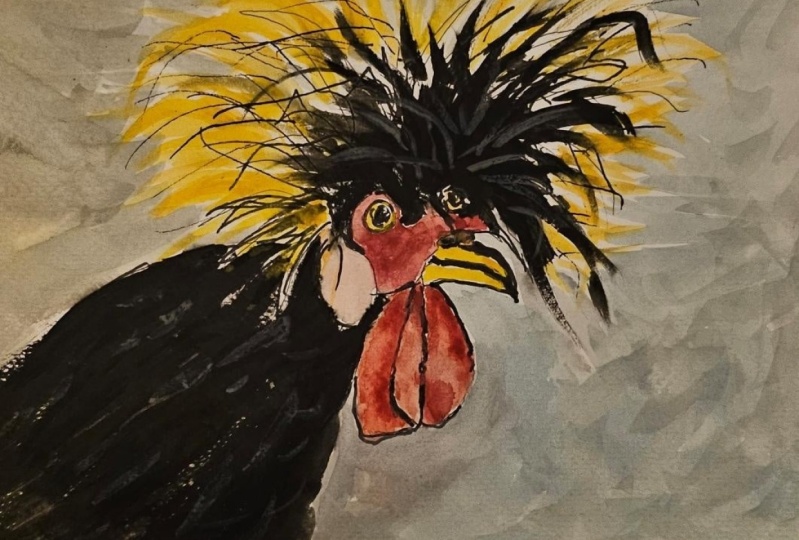
4. Blondie Pencil: we're going to start by doing a pencil drawing of this beautiful chicken that I saw at the county fair. Um, waiting for her beauty contest to begin. I guess So what I'm doing is I'm starting by looking around the edge of the frame and just trying to judge where the chicken's body comes into the to this square to this box that I've drawn. So not halfway, as you can see, if you just sort of imagine where the halfway mark would be horizontally and vertically, vertically, the chicken's body doesn't quite come in halfway. But once I get that in, then I can start from there and I'm doing the wattles. Um, and just constantly judging, like, how big are they and where are they placed in the square? You can see me lay in my pin down there to just check where it's placed. Um, you know, in terms of where the center line is, So that's kind always. What I'm doing is I'm looking for the center line, and I'm just checking how far things come over. And, um, getting one shape right is just all about putting it, putting it next to the shape that's next to it and just sort of seeing how, where does this fit? It's almost like putting a little puzzle together. So I got the beacon, and now I'm just working on the rest of this, some little bit of comb above the above, the beak and the bit of skin that just surrounds the I. And getting this I write is all about checking from left to right and seeing what all it lines up with. So I'm always just rethinking, like, how does one thing fit against another thing? And, um, you know, it's really important to have an eraser in hand because we're always making little adjustments, and that's the whole point of using the pencil. There's absolutely no reason to use a pencil if you're not also gonna erase. So think of this as a two part tool, the pencil in the eraser and you're gonna use those together. So I'm just working on that shape and then drawing in where I think the eye goes. Course I'll have another shot at this when I get into ink, but that gives me a pretty good sense. And now for the fun part, which is you know all these crazy feathers on the top of this chicken's head. So I'm just drawing in first the areas that are black and I'm trying to see those black feathers as one shape and just sort of block that in. I want to make sure that I give it enough room and that its proportion right in comparison to the size of the chickens face. So I'm lining it up with the beak and, um, just blocking that in. So that's the black area. If the rest of the feathers weren't there, that's what it would look like. And then these other feathers. I'm just going to sort of come down with just quick lines to suggest where they are. I obviously don't need to do too much work here because I know that I'll come back. I'm looking at how those, um, feathers lineup. So they kind of almost form a straight line on the left and, um, just sort of following the photograph and trying to block out generally where they go and how much of the frame they fill. This is a five by five box that I've drawn, by the way, So that's the size that I'm putting this in and you know, already this chickens kind of coming to life. I'm just double checking their proportions in the face. Any kind of face is always going to be a focal point. People are always gonna zero in on a face. And even though you can't see it very well, there's a tiny little bit of the other eye that's visible. So I'm just kind of making a note of it because I'd like to put that in, if possible, without making it too obvious. But getting these proportions just right is important. Pour chicken looks a little crazy right now. I'm double checking again. Um, my center lines and where things fall. I don't want to do anything as formal is make a grid. But I just want to be in the habit of measuring with my pencil and just having a sense of where things sit in space. Because if you get to where you can do that comfortably than you can do it anywhere, and any time you're out sketching, you'll have that ability. All right, well, here is our pencil sketch.
5. Blondie Fine Lines: The second thing I'm gonna do is come in with a fine line. So this is, um this is a very fine line waterproof pen. And I'm basically just drawing just enough so that I can go ahead and erase the pencil and I'm continuing toe. Look at the drawing as I do this, and to add a little bit to the to the line work. So if if the surface is uneven, I wanted to be uneven. If it's really straight and sharp, like the B CAS, then that's how I want it to look. But, um, the goal of this is really just to put in the bare minimum so that I can feel confident with what I've got. And I can erase all this pencil and have a nice clean line to begin with. And by putting in these fine lines, you're really helping to have a variety of different line weights in your drawing, which I think is really important. I think it makes it look really interesting if you have something lines and some thicker lines. As you do this, be sure you're continuing to look and Teoh rethink what you've got because this is Basically your second attempt at doing is drawing. And so you should be seeing new and different things as you go. Like I'm gonna get in a little bit more detail about the I, and I'm continuing to kind of rethink exactly where it's placed. Um, I am just drawing in sort of the boundaries of where the feathers or black and then for the lighter color feathers. I'm gonna be pretty just simple with them. They're just going to be very simple light lines that will kind of give me something to go on next. You can see I'm continuing to measure with my pen. Like I'm always looking and thinking about how all this lines up. Um, these feathers on the side stick out in a very particular way, and I wanted to be sure and get those, but these were just single lines. At this point, I'm not drawing any kind of feather shape. I'm just getting the general proportions of them and the directions they go because I'm going to do most of this in water color. That's really, I think, the best way to handle the feathers. So I've done that little bit of thinking and now I'm just coming in and erasing the pencil . I do have to wait just a second for the ink to dry, but assumes that's done. I can get in there. I'm erasing all the pencil and a little bit of the box. I drew around it, and I'm ready to go with more pen.
6. Blondie Ink: Now I'm coming in with my Lammy safari pen, which is more of a medium weight, and I don't want to put this everywhere. The point is not to redraw what I just drew, but just to look for darker areas where I wanna make something a little bit bolder. But definitely leaving some of those fine lines is an important part of this. And as I'm doing this, I'm again looking at texture. So anything that's like like the waddle on this chicken, there's definitely sort of, ah, uneven texture to it. So I want to really emphasize that, and this is just a a chance to bring more details toe light and add a little bit more of a darker edge. So there's not a strong light source on this chicken, but you can kind of imagine that there is an Imagine that there's always a darker side in a lighter side, Teoh anything and so looking for opportunities to just sort of emphasize where something is darker is what I'm doing right here. And so I'm going over kind of the shape of the of the waddle above the chicken speak and thinking about some of these um, little lines around the eyes again, not wanting to get too fussy here. But also, just remember that, you know, any time you have a creature with an eye, people are gonna look in its eyes, Way can't help. That is human. So it's important to get it right. So take your time working on that, and, um, get filling in some of those details as we go. All right? I'm gonna look at the, um, just a little more detail around the eye. And this is just about getting in any little other features that look like they could use a little extra emphasis. Um, again, Maybe, maybe a little bit darkening up the this sort of black area and some of the feathers as they come out of the chicken's head there darker in the center. And here I'm actually making what I would call feathery lines. Normally, I would say, never do feathery lines like make bold, assertive lines. But in this class, we're literally drawing feathers, so you might as well make some feathery lines. It's actually totally appropriate in this class. We're gonna come in and do more of this with watercolor, but, um some of those little fine details. There's so much easier to get with A with a pen because you've got you've got a much finer point to it, so I'm just kind of looking at these feathers and adding in what I can.
7. Blondie Brush Pen: I'm gonna use my pen. Tell pocket brush pen to fill in most of the black areas. I love being able to do a really deep, inky black, and I like thes kind of feathery strokes, which are very useful for when you're doing feathers. And I like that I can leave little bits of white to show through, and I might come over with with paint and do a little bit of water color that drops in just a bit of a of a slightly different color in with those black feathers. But if you don't have ink or you don't want to use ink for the step, then go ahead and get your darkest mixture of black paint, whatever that's gonna be, Um, some people use a mixture of ultra Marine and burnt sienna. Um, I have Daniel Smith neutral tent, which isn't really intended to be used as a black, but that might be what I use me with a little something else mixed in with it. But anyway, go ahead and get your blacks in. So I'm basically just doing the feathers, just looking at those areas and using very feathery brushstrokes to do it. Not worrying about little bits of white showing through right now. I mean, I can always come back and cover some of that up later if I want to, but I can't take it away again. And so there is this little bit of an eye that you can see there, but I mostly covered it up. It's really meant to be just barely a suggestion. Ah, and a few feather shapes flying out because you can see that some of them have that little bit of black in them. So I'm just emphasizing some of that in a few places. Um, looks pretty good. Just gonna get a few more details in here. This is all about really making the darks Pop, because it gives gives everything a very three dimensional feel. There's also some black in the beak, and this is something I also might otherwise do it with paint, but I decided to go ahead and do it with ink. Since I've got it out. And now I'm using this pocket brush pin just to kind of darken up some of the more shadowy areas again to give a little more depth in a little more dimension, make it feel, um, a little bit more three D. There is kind of some little shadows around the eyes, so just getting that and will be ready to move on.
8. Blondie Watercolor: Okay, let's paint this chicken. The color palette is pretty simple. I've got pyre, Allred, and I'm mixing in a little Naples yellow, which kind of lightens it up just a bit. What I want is to get a sense of a little bit of a color change between these two, um, wattles, that are hanging down below the chicken's beak. So the first thing I'm doing is just sort of working in this lighter color. But you're going to see me go back to this over and over again to try to kind of work out a way to really see some differences there. So that's spiral red. Um, I'm using a real fine brush for all of this because it's all detail and it's almost all just drawing, basically. So I'm just dropping this in and letting it move around that while the papers still wet, trying to keep it dry, where that little fooled is but otherwise just trying to work a little more red in. So you get that intensity and you get a sense of these transitions in color and shading. But I wanted to be very natural. I really wanted Teoh. I really wanted to transition very easily. So for that reason, I'm doing this while the paper still wet and just just letting that paint move around the way it wants to someone's. You can also come in with a dry brush or a paper towel and pick a little bit up to try to keep it where you want it to be. I'm getting into some transparent earth right now, just toe kind of dark in it and give a little bit more of a shadow color. So I'm mixing that in with some red. So I get basically just like a nice dark red. And that's for these really deep, dark shadow areas, right around here and again, with the paper still being a little wet. I can get some some nice flow of the pigment on the paper, which is really nice, and I think it looks more natural that way. So OK, getting those details in trying again to hit the shadow. I might wait till it's tried a little bit more and come back and do a bit more on that. I'm just picking some up with a dry brush just to get that get that variety and color that I'm going for. And this again pyre. Allred. I'm not getting too fancy with a lot of different kinds of reds. I'm just trying to get this sense of, like the the waddle, this coloring around the face around the eyes, and there's quite a lot of variety in there. But you know, there's there's really only so much detail that I'm really going to get into. So, um, as I get closer to the eyes, I'm trying to have little changes of color because it's sort of like it is sort of like different skin right there. Chicken looks kind of crazy at the moment with that big the big white eye staring at you. All right, Um, this is quinacrine own magenta, and it's a little too. I mean, I guess it's just a little too magenta for what I had in mind. I'm mixing that with some red and trying to just very lightly get this. Get this other. I guess that's I don't know if that's also a waddle. I don't know if it's part of a near I wish I knew my chicken anatomy a little bit better, but I'm just trying toe get a little bit of color on that. It looks very white in the photograph. But, you know, one of the problems the digital photography is that sometimes things were really more blown out than they are in real life. So I do want to get some color on that. And I'm just still kind of messing around with, um, getting some variation in this area. Probably I'm overworking at this point, but, um, I just sort of got sucked into trying to get a few more details into that little face. Clean this off, and so this is new gam bows and, um, and also pirouette orange. And I'm really just experimenting with this point. So here's a little yellow Oakar. These are just sort of three different options for yellows bringing in some transparent earth to just see what kind of variety I can get and for the beak. So we know there's some black color in their chickens beaks. If you really look at him, they can thinking officer of a lot going on. So definitely this is a good place to just oversimplify. But, um, yeah, something like yellow Oakar, um, will probably work right there. Now I'm bringing in a little bit mawr orange to do the eyeball. Chickens, for the most part, have these orange eyes. They're really beautiful, but I just needed a way for it to try to do that. I'm also just suggesting that with that other I So just that tiny little hit of color right there to kind of suggest that that's what's going on there. All right, so the face is looking pretty good at this point. Um, now it's time to start thinking about these feathers. I'm still going with the same mixture of yellows, and I'm really just drawing him in. So this is why this kind of brush is really helpful is that you can just get these kind of quick lines that really are, in a way, very feathery. Now, if you look up very closely at this photo, you'll see that you can actually see a lot more detail in these feathers. But that is definitely not the point of a drawing like this. So I'm just moving quickly and, um, dipping into different mixtures just a little bit to get some variety in those yellows. But basically a yellow Oakar is fine um, something like a new GAM bows would also be right. And this gives me another chance to just look also and reconsider where I had place those with the pen. Because I'm not obligated to follow the pin lines. I can add things and sort of ignore them. And I think it just makes the drawing look a little more lively. And it has more movement if you're kind of doing that. So, um, just kind of checking that these feathers are going everywhere. I want them to G. O. I'm mindful of the fact that I am gonna be putting in a background and these feathers is a very tricky shape to get a background in behind it. But I think we're gonna be able to I think we'll be able to manage that. So now I'm dipping into Daniel Smith's neutral tent, which is very, very dark and mixing with a little transparent earth and a little This is ultra Marine, Um, but so they said, this is what I was talking about earlier about, like just mixing a black. So this is what I'm doing to kind of mix a black that's got a little bit of color to it, A little more vibrancy. And so now I'm going over those black feathers and all those places where I let a little white show through the ink. If I paint over those now, you get just this nice little. It's very subtle, but you do get a nice little bit of color, and I think it unifies the painting also to have watercolor on top of the ink so that everything you know, it's all a watercolor. So part of the reason I'm doing this is just to kind of bring all the elements together. I've kind of got to go in and cut away from where those feathers are, and, um, just any little opportunities that I can drop in little extra bits of shadow. This is definitely a good time to do that. And now that the faces dry, of course, I can't help myself, but just to fuss over it a little bit more So at this point, I'm just trying to get a little bit darker, circle around the eyes and really look at what's going on with the face and seeing if I can add in shadows where I see him maybe a little bit more of a shadow color down in the down in the wattles, basically where they meet and kind of cast a shadow on one another. So once I get those dark colors in, it's just a matter of kind of blending them and making sure that they make sense visually. Um, brightening up the coma little This is all just fussing I should lead. I should totally leave it alone at this point. But if you're like me, it's sometimes hard to just let go. All right, So now I've got surreal yin and shadow Violet, and I'm mixing those up to do this kind of neutral backdrop color that I really like and I'm coming in with. This is a pretty big brush. I mean, this is Ah, a 10. I think it's a 10 round brush, so I'm having to come in and kind of cut away those feathers and then the other trick to this is working pretty quickly because if the if any of this background color starts to dry , I'll get sort of an obvious line where the where the paint has dried. So I'm doing two things at once. Here I'm both trying to manage, getting in between those feathers and making a realistic looking background and also trying to really keep moving so that so that the pain doesn't dry as I go, and so that I can keep. I always have wet paint to paint into, and part of what that means is making sure you have enough on your palate at once, and you don't have to stop and do too much mixing. Fortunately, this is a pretty simple mixture. It's just like I said, its shadow violet and a little civilian. And I'm also just pulling from some of that little just pool of black that I made earlier and just mixing that in. I don't mind if the background changes colors somewhat as I g o. In fact, I like that because it looks more like what, Ah, what a really background would look like rather than just having a random block of color. So it really is almost like this. Chicken has gone to a portrait studio to have its picture made, which is definitely the kind of the look I'm going for and also just, you know, by leaving the background out. The emphasis is on the chicken and not the background, which is where you want it to be.
9. Abigail pencil: This is Abigail. All my chickens were named after first lady. So this is Abigail Adams. Golden lace wine dot Andi, I love this picture because she's totally posing right here. She just had She was beautiful chicken. She's no longer with us. I'm sorry to say she was a beautiful chicken and very elegant feathers, and I really want to sort of capture that she she had a She had a very elegant personality , I would say. So. What I'm doing is once again, I'm looking around the edges of the picture to try Teoh to try Teoh, establish where she's comes in and out of the frame on the right and the left there. So I'm just getting in the basic shape of her body and you see me. I keep holding my pencil up to just double check where she is relative to the center line of the, um, picture and also what lines up with everything else. So, like the, um, the comb is sticks out further than the sort of wattles do. And so I'm just working on trying to get the shapes right. And also to make sure that I've got her beak where it belongs in the frame, Um, relative Teoh the position that her body is in. So it's just all about kind of checking one thing next to the thing that goes next to it and just trying to get all these basic shapes where they belong. I don't want to get to detail tall. This pencil is going to get a race. So this is just about working out what goes where and as always, I'm concerned about the I. I definitely want to make sure that the eye is in the right place, So I'm constantly double checking to see what it lines up with. What is it next to, um, to make sure that I get all of that just right? Because even with the chicken, you know, um, most of us have never probably raise chickens, and so we might not notice if a chicken's faces a little bit off. But I think we just sort of fundamentally recognize when a face is out of proportion, even if it is a chicken
10. Abigail fine lines: Okay. This is the past where I just go over it with fine lines. And once again, I've spent this up to double time because I think you have a pretty good idea of how this works. One thing I'm noticing is that in my pencil sketch, I didn't quite catch how her neck comes down in the foreground and the rest of her body is behind. But there's a real obvious shifting color right there, so I want to be sure I get that. And also, um, I'm using kind of broken lines here. There's light on her comb, so I'm gonna be looking for ways to communicate that, um, so I don't want Oh, I don't want a real harsh, obvious line just getting in these details. I'm pretty happy with where I put everything in terms of the beak. Um, chickens do have a little knows they have little nostrils right there. So I went ahead and drew that in, um, and just getting all these little details, I will forever keep rethinking this I as much as I can. So I left that pretty loose so that I can come back to it, and that's really all there is to this stage. I'm just gonna erase and erase most of the box I drew around this and be ready toe, move on to pen.
11. Abigail Ink: I've spent this one up a swell because you're gonna see me gettinto working on these feathers and it can get a little bit repetitive. I think you'll be able to figure out what I'm doing and try it for yourself. So this is the Lammy safari pen that gives me a little bit bolder of a line. And here again, I'm looking for opportunities where I can add in a darker line because it's the darker side of something or it's in a little bit of shadow. But I don't need to do this line everywhere, and that's something to be mindful of. Like let's some of your finer lines show up as well. There's not a ton of opportunity for that here, but it does give you a little bit of a different feel. This is kind of my last chance to rethink these eyes. Eso a little bit working on that, um, getting that all in place and just whatever other little details around her face. But that's it for that pen. Everything else that I need to do at this point is with the brush pin and now and thinking in terms of these feathers, which have this very particular pattern on them were like the the ends of the feathers air tipped in black. And I'm gonna go ahead and do that whole pattern with EQ. If you didn't want to do it this way, then you can also do this with black paint. Just like I talked about with the last one. I would recommend that you do the other colors first and let them dry, and then come on top. In this case, I'm doing it in the opposite direction. I'm going ahead and I'm getting all this, um, detail ing with the feathers down first and then I'll paint on top of it. You know, watercolors pretty transparent. So, uh, uh, this color will all show through, and once again, you can make feathery lines. You're actually drawing feathers. So I'm just looking very closely at the pattern of the feathers and also how thick or thin those lines are. You can see that they get a lot thicker as you move down towards the bottom of the frame, basically in the front of her body instead of around her head. And I'm doing this V shape, but I'm also really looking at how the V shapes connect with one another. So when you're doing something like this, you want to avoid the temptation to just kind of fall into a trance and make the same shape over and over again. So I'm really looking at How did these feathers out of the shapes of them kind of change as as you go, Um, where are there? Areas where sort of the darker feather seemed toe like clump up or come together more and form kind of a darker area. You see that sort of in the lower right of this picture. Um, but also, just how did these connect with one another? But I'll also say I'm not spinning forever on this. I mean, you're getting the sense of the kind of chicken she is and that kind of pattern that she has. But, um, I'm not gonna just obsess. At least been hours on every little feather, right? I'm trying to give a general sense, but I want your idea to keep moving. And as I have said before, you know, with any painting of an animal, you're always gonna be looking at the animal's face. So everything else that's happening here is just like supporting characters. This is just a little background, but but really wedded Supporting is is the face, which is what we're gonna look at. So back here in the background, you can see that there's light hitting her. So the black is a little lighter and one way a minute handle that is by just making it thinner. And I think it just sort of again takes your eye away. You don't want to be looking at kind of that that back part of her body. It's not our focal point. So I'm going to do sort of minimal work back there and keep it thinner so that your eye isn't drawn to it. Any other little opportunities toe add in some very small, um, feathers, and also just to drop in little shadows where I see him around the waddle around. Um, I think that's what year I don't know if we call those ears. I wish I knew. But anyway, just looking for these kind of darker areas where I might want to emphasize something a little bit more and you can see how that already just kind of makes it pop. So just fill in those details and we will paint
12. Abigail Watercolor: I've spent this one up to double time because so much of what we're doing is similar to the last chicken. It's just a little bit different in terms of the light and some of the shading. Because Abigail is in really good light here. I want to be sure and show that. So I'm definitely just deliberately leaving some areas white where I see the light hitting her now. Digital cameras air funny. This way they can make something look completely white. That maybe isn't really quite that white. So I might come back, but I'm gonna let that dry. This is pyre. Allred, with the tiniest little bit of quinacrine own magenta worked into it so that it's a little bit pink. But I want that variation. So the color on her face is a little different from that, uh, waddle that's in front and the one in back a look even even more different from that dropping in a little bit of dark up near the top to try to reflect that shadow and then just picking up a little bit of color down lower. And here again, I'm just mindful of the fact that there's kind of these shadowy areas. And I want that because I want that sense of depth. I mean, that's what keeps keeps this from looking just like more cartoony illustration. So you can see that other waddle that I put in the lights coming through and it makes a little more orange. So I worked a little pyre, all orange in that time. Um, and I like that little bit of variation. There's some darker pigment, kind of right around her eyes, and I'm just sort of watching and letting things dry a little bit, getting in there and doing what I can, but I'm probably gonna come back to some of this trying to drop in a little bit darker color some Liz Aerin just to give shading up around the comb. And also again in these upper areas of the, um of the Waddle is well, just to get that get that little bit of difference in color, I think that really helps. I think it really makes a difference. So this is pie RL orange and new gambo sh And I'm just going in and doing her eye her orange. I I love it. The chickens have orange ized. I think that really helps bring her life to get that detail right. And now I'll go for Yellow Oakar and just get in some of this beat color. In reality, there's kind of a lot going on with that beak. There's some grey. There's some whiter, almost kind of like pearly colors and even a little bit of pink, but I don't want to overwork it, but I'm just gonna drop in some yellow car and then come back after it's dry. Um, and think about that a little bit more. So now I've got this yellow Oakar with my brush pin, and I'm doing these feathery breast strokes and leaving lots of white space coming in, sometimes with some transparent earth mixed in with the yellow Oakar. To get thes shadowy areas, you can see that it's darker and also kind of a richer, um, orange color right there. So this is a little pirouette orange that I'm working in where I can see it. I love being able to have this kind of variation. It's good to have some variety and not just cover the whole area with the exact same color . But now I'm going back to the yellow Oakar. It really just depends on how the light's hitting her. Exactly and again. That's sort of the goal here is to be able to show some of that, and this is really a place where you can make those very feathery breast strokes and go ahead and leave a little white space. You can always come back in if you decide you've left too much, but I'm trying to emphasize that orange color. And as it's drying, I'm just going in and dropping in a little bit more and then just cleaning often area so I can get the lighter colors as we move into the lower part of her body and then also the parts that are kind of like behind her neck. So I'm using new GAM bows. I'm using yellow Oakar, Um, and just trying to really watch where the light hits. So this is basically just a wet brush with very little on it that I'm using, almost like just using dirty water basically back there to get the lightest parts and to really be able to demonstrate how the light is, um, moving across her. So filling in some of these light areas around her head, and I'm trying to leave some white paper just for that kind of highlight of where the sun is really hitting her. We'll see if I managed to keep that white, Uh um, And so I've got some amount of color around her body, and now it's really just a matter of going around looking for areas where I can refine something. So can I sharpen up some of these shadows? And it's always kind of a dance going back and forth like I really want to add that in. But I also have to blend it naturally, and it's the paper dries that can sometimes be a little more challenging. So just play around with it and see how far you get. I'm dropping in some neutral tint here, which is a little too dark, so I, right away, kind of pick some of it up with my brush. But I actually like that little bit of drama, and then there are more lines in her face, so I'm I didn't draw those with pen, but this is more about just trying to get a sense of depth and texture on her face. as much as possible. And now I have mixed up a little bit of grey so I can go into her beak and add that color, which is nice, because it's a cool color and everything else about this picture. So far, it's been very warm colors, so anywhere I can kind of get in some of that, Um, and with a white paint pin at a little gleam in her eye.
13. Abigail background: Okay, I've spent this one up because, um, we're really just getting in here and doing the background. So what I've done is like mixed ups Impression blue, some shadow violet and, um some Daniel Smith neutral 10 to get a good dark blue. I want to give her a nice dramatic background. So she really pops against it, especially with that light on her. So the trick with this is, of course, Teoh. Keep the background wet and keep it moving across the paper so I don't end up with a solid lying anywhere where this background has dried. So I'm just moving around an order and being kind of careful with those edges and getting it in just as quickly as I can, And right away, I'm wishing this was darker. Eso, uh, I'm sort of just filling in with a little bit of just trying to even it out. But what I'm gonna do here is I'm gonna bring in a lot more of that neutral tent and more pressure in blue as well. And while it's still wet, I'm actually just going over it with, um, an even darker version of the same mixture. Now I could have waited for this to dry, and so definitely that's always an option. If you're trying to go darker, just change the sense of it a little bit. But look at that beautiful, dramatic background. I think that's perfect for her.
14. Ladybird Pencil: once again, we're going to start with a pencil sketch. And this is Ah, Ladybird. She's a before Pickton. This is one of my chickens and I love the way the light hits her here. It'll be really fun to paint, but so the first step is to just get this overall body shape, right? And the way I'm doing this is really looking at where various parts of her body line up with, um with the center points. So how far off center is that tail area? I was just kind of laying down my pencil to double check that. And, um and where's the horizontal cental center? And where does where the various parts of her body fit there. So you're almost just sort of making a little grid in your head. Of course, you could make a grid in real life too. One thing I want to mention about this picture is that Lady Bird is only standing on one leg here, and that's just something that chickens dio for whatever reason. But I'm just gonna fake it. I'm just gonna put another little leg next to that one. That looks exactly like it. I don't think anybody will really notice. Um so that way people don't just stare at that thing and go, What's wrong with that one? Like a chicken with her face. I'm not gonna worry about a lot of detail. I'm just trying to make sure that it's all basically in the right place. Chickens have a surprisingly small face compared to the rest of their bodies, so I'm just kind of checking the scale and making sure that I've generally got it right. This is one that we're gonna be doing completely in paint with no ink. So I do want to really get things where they belong because there's not gonna be any ink toe help guide me later. This is kind of my one shot to really get it right. And you just want to make sure that you've sort of, um, checked out the various parts of the body. In other words, that the tail and her wing and sort of her her belly or her undercarriage all look separate . And I'm mostly gonna erase back these marks, but leave very light pencil that I can pain on top of. So I'm just sort of double checking everything erasing and getting ready to paint
15. Ladybird Gouache: we're getting straight into paint. And if you don't have gua sh you can absolutely do this with watercolor. I'm just starting with yellow Oakar. I did work a little bit of white into it, but if you're in watercolor, you're just going to start with a lighter wash of yellow Oakar. Of course, the difference is that with watercolor, you've got to be a little more protective of your light areas. But this is generally gonna work for you, Justus. Well, so I'm making very feathery brushstrokes, which really works when you're painting a chicken and I'm looking at the darker areas that are in shadow and I'm gonna leave the lighter areas and do those next. I first want to make sure I really get this established. So, um, I'm keeping it really simple. I am leaving plenty of unpainted areas so that I can come back in and get a little bit different colors in there. You can always add more later, but you can't take away. So, um so leave those opportunities. And this will help, too, if you're doing it in watercolor, leaving some areas. So in case you want a lighter color, I'm mixing in with some white and getting a lighter version of this yellow Oakar and picking up just a little orange. That's a cadmium orange, Um, just to bring a little bit more color into it because she's not beige. She does have. There is sort of an orangey light there, so I want to be able to pick some of that up. And I'm really just looking very closely at the pattern of these feathers and looking for opportunities where I can have some variety and some some lighter colors. Um, and this is one of the things that's so wonderful about quashes being ableto layer like this and even layer lighter colors. But again, if you want to do this in watercolor, just start with the lighter color and bring the darks in on top of it, and you will have really a lot in a lot of ways, the same effect. So I'm going even lighter now, bringing in even more white and with the yellow Oakar. It is kind of a beige color, so I want to bring in something a little lighter. So I just brought in a little yellow, and this will just saturate the colors a bit more. Um, you know, in real life that's it's always hard to tell from a picture, but in real life, before Pinkston is a is a very golden color. So I want some of that sense of gold, and I want that sense of the light hitting. So I'm bringing in just a little hint of yellow to make it more saturated and continuing to just use these very feathery strokes and to really look closely at the pattern of the feathers and just working my way around those areas that aren't in total total bright light . Another thing I'll mention here is this is another one of these pictures where the lightest part of her is really blown out and is completely white. And that's what the digital camera does. It's not really what your eye does, so I would never want to leave those completely white. I'd always want there to be some color in them. If I was doing it in water color, it might be a very light wash of Naples yellow. And here it's gonna be a very, um, light mixture, a lot of white with just a little hint of yellow into it, and I'll keep going back to the white and trying to keep it very light. But as you can see, it's definitely some color. It's not quite as blown out as it is in the photograph, Um, and I'm looking at those whites as kind of one big shape and really trying to think about it that way. She looks kind of cool at this point. You get this almost like paint by number effect at this stage, but it really does show you the really obvious differences between the darker parts of her and the lighter parts. And that's also one reason why I love to take pictures of chickens in sunlight so that I do get that and you really get a sense of her form that way. So now I'm working in a little bit of red Oakar because there's thes darker areas, just some shadows. You'll see where I'm going to go for that. It's under her wing and kind of where her tail feathers meet up with her body. And also there are some just darker, shadowy areas in that in that picture, sort of the darkest, um, the darkest shadows in and among her feathers. So I'm working those in, and you can do the exact same thing. You could totally do this with watercolor as well. Just maybe some transparent earth to darken up a mixture with yellow Oakar and get those darker colors in, but then blend them so that they don't, um, they look natural. It looks like a natural transition from dark to light. So with wash, it's OK if it's dried a little bit because you can still come in on top and kind of just knock it back and blended in and make it look a little more natural. Um, and watercolor. It's good to do that while the paper still wet so that you get that nice you get that nice blend. All right, so getting in a few more details around her face, this is something where I've really got to just slow down and and watch carefully because I'm not going to get another shot at this. So this is ah cadmium type of red with a little white mix tend to get a pinker blend, and, um, I'm just coming in, and I don't want to treat these details as to precious because it's a really small part of the painting, and I don't want it to look overworked compared to anything else. But you know, any time we're painting any kind of face, we tend to get a little tight and, uh, and we want to just get it just right. But there's like there's her comb and there's a little bit of Waddell and just the skin, the reddish skin around her eyes. And so I'm just trying toe. Suggest all of that and have it be accurate without having it be to too tight and too detailed coming in more with yellow Oakar to do the beak. Now we've seen this before. A chicken's beak can be a lot of different colors, but again, I don't want to overcomplicate this. I don't want to get into putting four different colors on that tiny little thing that you just look like. One quick breaststroke that obviously reads is a beak and ah, and really makes sense. So now I'm getting in and thinking about that. I I'm just putting in a little circle for that, and, um, I just reached in and got a tiny little black straight out of the tube. I just dipped the brush into the directly into the tube to get the tiniest bit of black. To focus on that I and I'm just touching up a few little details anyplace else. I could see that I can use a little bit of red. But now what I need to think about are those legs. So this is gonna be some orange and some yellow Kerr and some white. And if you if you look closely at the picture, you know, um, chicken's feet are this kind of off white fleshy color, But where the where it's enlightened shadow. You can see it's lit up and it's kind of this pinkish orange color. And I wanna work that in a little bit to her body as well. Like, I want that to be very unified, so I just dropped a little bit more of that in. But I'm gonna keep the feet very, very simple. And, um, I'm coming in with a smaller brush just to do the white side of the legs. And it's almost hard to even see that pain going down because it's so close to the to the white of the paper But when I come in with the background, that'll pop a little, and I definitely don't want to get into details with the feet. Nobody is really going to be looking at the feet. You want him to be there and looked generally right. But, um, I'm not gonna I'm not gonna get into a lot of details. So at this point, I'm just looking for ways to make it pop a little bit more. I'm working in little bit more orange and yellow just to bring more color into her and to make it a little bit more of a vivid painting. So I'm looking at the photograph, which is already kind of quite saturated. So it really is emphasizing those those oranges and trying to pump up the highlights by bringing in some more white and just looking for any place where I can have more of a contrast between light and dark, anywhere where I can just emphasize the shape of the feathers a little bit more or just integrate some of the transitions between light and dark. A little bit better, like I'm looking and I can see here that along her wing there's actually a little bit more visible kind of feather pattern. So I'm adding that in. But then coming in with a little bit of white to just, um, just make that transition make a little bit more sense. These are all just very small details at this point. I mean, it's it's really looking good the way it is, So just, you know, play around. That was a little bit of orange around. I at this point, I'm really just playing around and seeing what kind of details I want to change as it's drying. So, um, I've decided to come in a little bit darker on her face, touch up a little bit more around that waddle, which I really should leave alone at this point. But I keep I keep going back and trying to add a little bit more whites. Where I see it and leave some of those darks just helps to bring her to life a little bit more and make her look a little bit less flat. I mean, I don't want to looking like a cartoon character, right? So by having that light and shadow, she really comes to life
16. Ladybird Background: Okay, so now I want to give Ladybird some kind of background and what I'm gonna do it first. This is that little container of dried out gray paint that I was telling you about earlier . I just make some white into it, and I want to create a line for, like, the ground as if she's standing on the ground. This is gonna be almost like she's on a stage. So we don't really see a line like this in the, um photograph, but I'm so I'm kind of just winging it here. I'm just creating ah, very light grey. Kind of just It's intended to be very neutral sort of background for her, and this is gonna be the ground that she's standing on. I'm using a flat brush to do this. I wanna work kind of quickly so that, um the pain doesn't dry in it all blends well together, and I'm mindful of needing to get those sharp edges around her feet. So I'm just being kind of careful to get in there and get all that right. But basically, the idea is just to create that space. Now into that saying, gray container mixing up some ultra Marine with a tiny little bit of, ah, of a green. So it's ultra marine blue, and I've got a little tiny bid of a, um, fellow turquoise. I also have an emerald green that would work for this, but basically a little bit of green into blue with a whole lot of gray to create a very dramatic backdrop for her. And the trick with doing this is toe. Just try to its cut in around the edges. It is gonna look a little carved out at first, so you'll see in a minute how I work to integrate the background a little bit more so it doesn't look like such, um, hard edges around her body. I mean, she's chicken their feathers, they're very soft. And so you want to be ableto convey that softness. Um, so this is just a matter of trying. I messed up her beak a little bit there. I made her beak a little too small, and this is what can happen when you're when you're cutting in a background like this. But, um, I'm just I'm just going around the edge, filling this in and trying to be as careful as I can to give a nice edge all the way around her. Um, the best way to do that is to kind of make little feathery marks that look, maybe not too different from, you know, feathers. So you can see how I'm brushing and going downward. It's not always perfect. I've sort of carved out a little too much of her right there. But I'm gonna come back and work on that. I would have I would have come back and worked on it a bit, no matter how great this edge had been. Just toe, um, give a little better sense of her shape. So we'll let this dry and then we'll come back to it.
17. Ladybird Finishing Touches: if you do this in water color, it is of course, not so easy for you to come back in and rework these light colored edges. But then again, if you didn't watercolor, you probably didn't paint right on top of some of these shapes to begin with because you have transparency working to your advantage. But what I've done is I've taken some white with a tiny little bit of yellow ogre, and now that this is dry, I'm just coming over and kind of cleaning up my edges and making them look softer and a little more feathery. You can actually see the background and the four grounds blending together a little bit, and I don't mind that I actually, um, I think that's more like how it looks in real life. There's not these kind of real harsh edges, especially again for something like a chicken, where there's feathers and so there's more of a softer, more gentle border between the chicken in the background. So I'm just coming around these edges and, um, making these kind of looser, more feathery breast strokes and not worrying too much. If the background in the foreground are kind of overlapping and blending together. And I'm getting this kind of gray where the two of them come into contact. That's totally fine. Of course, now that this is dried, I can't resist going around and just fussing with it a little bit more. I've got all these colors out there already mixed. It's it's hard to just stop working on this, but mostly what I'm focused on is just, um, making sure that I like the shape of her against that background, adding in some white highlights where I can. So I'm continuing to just mix a very, very light mixture of white with the tiniest bit of yellow Oakar and bringing those highlights in because that's really the drama. That's really sort of what makes this pop. And so I'll just keep going back and forth, work on the feet a little bit and get some of the white highlights more visible right there . And then, of course, speaking of these feet, I need to get that shadow. So I'm just bringing in some grey and I can't see a shadow. If you look at the picture, you get a general idea of how the shadow is falling. But um, you really just can't tell exactly. So I'm taking this gray and I wanted to be a little warmer, so I'm mixing it with some of that red okra that I had, just so it won't be a riel, flat, plastic looking grey. I figure, you know, Lady Bird is this golden color, so there's gonna be sort of some warmth in the shadow. That's just because the light is is hitting her and moving past her. And I also just wanted to be different. So I'm just having to wing it. I'm looking at the picture, and I'm looking generally at where those shadows fall. But I'm not trying to make a very exact, accurate shadow where I'm really thinking about her exact body shape and the angle of the light on precisely how they would fall. I want this to be loose and look kind of like an afterthought. It's not something people are supposed to spend a lot of time looking at, so it should just be there to kind of support the idea that she's standing on some kind of a surface and that there's light hitting her. And as long as it accomplishes that I'm fine with it, and it's definitely not something I want to overwork too much. Um, and you know, these things are all so much easier to see once it's dried a little bit. And that's just a thing with quashes. It does help. If you can take just a second, let everything dry, come back to it and see what you might want to touch up while you still have all these colors out on your palate. So I'm just trying to get the little s bit of shadow in those legs. And now, because it's impossible to resist doing this well, it's all out there. I'm just going to go back in a little bit. This is that yellow Oakar and also the orange trying to get just the right watery mixture of those. And I'll just come back in and see if there's any other little details I can fix the beak. I had kind of chopped off her beak a little bit with the background, so I'm gonna come back in and make a little quick fix to that if I can. The thing is, of course, once you start fixing something, you have a tendency to mess it up again. So I'm right away realizing up. I don't want to overwork this too much. No one's going to notice if the beak is just the tiniest little bit of an odd shape. I'll just try to get this as much as I can back the way it was, and then and then leave it be after that. So that's just a little bit of orange and yellow Oakar and white on the beak. And then I'll come back in. There's just a few places around her face where I can make a few other touch ups. So let me just show you and this is really you know, this is really extra. This is really something that just totally unnecessary. But I'm mixing up a little bit of pink for in her face. If I look at it very closely probably closer than I really should, I can see like a little white highlight around the edge of her comb. Or maybe it's not even white. Maybe it's more pink, But again, I think I think, working that in sort of with the background, it really sort of helps. Aiken redefined the shape of it a little bit and also just kind of make her look again a little less flat. So it's not quite as cartoony feel and she really comes to life a little more. So I'm just re emphasizing the lights and the darks that I can see in her face and in hurt comb and Waddle, and that's pretty much it. That's Ladybird.
18. George Pencil: this little chicken is in a cage at a state fair. So, um, we're gonna have to just try to ignore those bars, but it's not as hard to do as you might think. So I'm starting out as usual. I'm looking around the edges of this image to see where the shape of the chicken's body comes into the frame and trying to get that in the right place. The angles really tricky here. I mean, I love this. I love the kind of attitude this chicken has with its head cocked to the side like that, like it's very suspicious of me. But it's tricky to get that angle just right. So I'm just, you know, by starting out getting the overall body shape right. I'm in looking at how every other little shape works against that bigger shape. So I'm looking at you know where do the wattles fit in relative to the rest of the body and also double checking where it fits in the center line. So occasionally you'll see me sort of turn my pencil to the side, and I'm just sort of checking to see horizontally and vertically. How is it centered and as I'm working on getting these shapes in the right place, I can immediately see the problems like this White. I don't know what this other waddle is called. I need a I need to brush up on my chicken anatomy a little bit better, but But whatever the white one is, um, it's really sort of right next to the rest of the chickens. Waddell and I had it in the wrong place. So this is why we do drawings. And that's why we have an eraser. Um, this is how it's supposed to work, that you just sort of adjust and readjust and reconsider and recheck how everything fits next to everything else. So once I get those three, once I get the body established and then I get those three bits of anatomy, those three wattles or whatever, and then I can put the beacon. And so I'm working from bigger shapes down into smaller shapes and just feeling like if I'm sure of where those are, then I can probably get everything else more or less in line, and I keep checking and double checking and triple checking the angle of that head because it really is it's basically pointed right into the far corner, that frame there. And so I've got to keep kind of aligning that. And I'm also looking at how the eyes lineup like, because you can see you can actually see both eyes, even though you can only see a little bit of the other one. So I'm really looking at, like all right, what's the right angle on those eyes? And the more a check it, And the more I look at it, the more I just keep making different decisions about it. So, um, you know, I didn't stop and redo this. I decided to just leave this one the way it was, because I want you to see that this is what the drawing process is all about. It's about. It's about trying things out and making little adjustments as you go. In this case, I really am more concerned with making sure that the drawing is just right, because we're gonna go directly into paint. So it's not like I'm going to get another shot at this in ink. So I really want to get the shape of this comb right, because I know that it's there's some light hitting it. And so there's, like, light parts and dark parts to the comb, and I'm definitely gonna want to get those with pain. So I'm just checking it over and over again to make sure that I've got all that in the right place. The feathers kind of change color. So I'm just gon back down to the body to just kind of establish where those color changes happen on the feather. And I'm just looking at like, Okay, the edge of the comb, what parts of the body does that line up to? So in every case, I'm just sort of re looking at how does one thing fit next to another thing and what are the angles on all these things is the kind of stuff you sort of can't check enough while you're still in this pencil phase. Because getting this right is really what's going to make the whole painting work. Once I know these shapes are in the right place, I just have a lot more confidence with the with the painting. So I'm going back over the face just a bit and, um, erasing and correcting as I go once I'm pretty sure I've got it right. I'm gonna very, um I'm gonna erase most of it, but I want to leave just enough so that I can still see it when I paint. I don't want any of these pencil marks really showing through the paint, so just knock it back some, and let's get ready to get into paint.
19. George Gouache: Okay, We're gonna paint this one in gua sh. But also, this is another one where if you want to do it in water color, you absolutely can Just remember about protecting your lightest areas, cause with wash weaken, go over something with a lighter color in watercolor. You're not gonna be able to. What I'm doing here is I've got a mixture of just black right out of the tube that I mixed a tiny little bit of red into warm it up and just to make it look different from, you know, black right out of the tube. I always start with the biggest areas. First is kind of a warm up. It just gets me more familiar with the drawing and gives me a little more confident so I would never jump right into the face. I would always get these biggest areas done first. And, um, I sped this up because I'm actually painting pretty slowly. I'm really thinking about these as each individual brushstroke being like each individual feather. Now, over here, I just make some white in to get a great color to show that little spot where the light is hitting the chicken and these were the kinds of things that are so important for making this bird feel like there's some dimension and some and some depth. If you're doing this in water color, what you might be doing is taking a blue, like possibly a civilian blue and mixing a little tiny bit of brown into it to get it to get a nice gray color that you can drop in there. But with wash, it's generally always about just adding a little white. So, um, I'm just trying to fill in the shape of the body here. And then as I look around, I can see that there's there are some feathers that seem tohave some black, kind of underneath the more yellow feathers. So I'm looking for places to put those in, and I know that I'm gonna cover him up a little bit. And again, this is like a cool thing you could do with quash, and you'll be able to do this a little bit with watercolor to if you put in some darker colors here and let him dry and then came over him with a pretty thick mixture of yellow Oakar, just like I'm doing here with the wash, you would actually cover that up a little bit, even in water color. But, um, yeah, so this is pretty much a straight yellow Oakar at this point, and I'm looking for those darker areas, and I really am kind of looking at each individual, um, feather and just seeing where the light hits. And where are those feathers lighter and where they darker? I'm also thinking about the shape of the bird, and I'm wanting these brush strokes toe act like contour lines so that your eyes going in the right direction and and the the roundness of the bird is obvious from the direction that the brush strokes are going. So really, look at those feathers and look at the look at the lines and the curvature and try to mimic that with your breast drugs, because that's what's gonna really give this bird some shape. So now I'm coming in with the lighter colors and, um, just mixing in more and more white quash to get these areas where either the light is actually hitting the bird or just it's a little, um, lighter. So on both sides, actually, I can see some lighter feathers. And I'm working my way around to the far left area where it looks in the photograph. It looks just completely white now, in reality, if you were standing right there, you would still see kind of the yellowish color of those feathers even though the light's hitting him. So I'm trying to strike a happy medium. I don't want to just leave the paper completely white right here. I want I want to put something down. If I was doing this in water color and might just be a little tiny bit of something like Naples yellow or else really just, um, you could do that in water color. You could do it with yellow joker, but just lots and lots of water. So just very little pain at all. So I've kind of established the general shape, and I'm just looking for opportunities to bring in some more color. So I got some just straight yellow, and I'm adding that into my mixed because where the light is hitting the chicken, you get these more saturated, richer colors. And also I just want some variety. So I'm looking for opportunities where maybe I can add in just a little more yellow to give it more of a glow and less Just the kind of beiji color that you get is your mixing yellow car and white. And also, I'm using a really small brush here because the cool thing about doing this is a five by seven is that we're pretty much life size. This is pretty much the size of this chicken, more or less so, I'm looking for a brush that really is just about the size of those feathers. So I think, um, you know, you're gonna be switching back, maybe between a four and a two to really get the shape just right, Um, a little more just pure white around. I don't know what this thing is called. I don't know if it's also a waddle hurt. There's another name for it, but basically it's this white whatever it ISS anatomical structure, right by the chickens here. And my white is still pretty wet. But I'm just dropping in a little bit of gray, and I know that that gray's gonna move around a little almost like it would if I had water color. But I wanted to be just very subtle. You just can see the light hitting in a particular way and a little bit of a shadow color, so I don't want to overwork that. But I also don't want it to be just a solid white blob, and there's little bits of feathers around the head. And so I'm doing a lighter, more white in the mixture with that yellow joker to get that, and now it's time to work my way up to the face. So I'm just mixing in some white with some of my my red just like cadmium red. And I did bring a little bit of a lizard into it just to get the color of pink that I want . So I'm starting out by just doing these lighter pinker areas where there's lots of light hitting and moving kind of slowly and carefully here, you know, sort of no chance for do overs with some of this going around. The eyes all work in closer to the shape of the eyes. I go so I'm kind of starting around the outside and then just moving in a bet, and you can see where light is hitting the outside of chickens. Waddle and I'll fill that end. But then I'll also come in with a darker color when I'm ready to really, really hit that with a much darker color. I Now that I'm looking really closely, I can see where the feathers are on the chickens face, and I want to make sure I get all those in the right place. But now I'm coming in with a little bit deeper, richer color, making sure that things air dry. So this is that area on the on the comb where you can see the light pink and you can also see the dark pink. And I'm just wanting to kind of emphasize that really show both of those things to give that sense of death. And I'm just looking for any opportunities to lay in a little bit of darker color on top of the lighter color. And if you're doing this in water color, you would do it exactly the same. Of course, you get that. Get that lighter color down and come in with the darker color. That's kind of the way to do it. Um, this other waddle is more in the background, but it also it's almost like it has light moving through it. So it's an orange is your color. So I'm gonna kind of play around with this and try to get I went there to be this obvious difference between the two. So it's just a matter of sort of working in. I've got a lot of a lizard in there on my brush. I'm just trying to get that sense of depth. Um, and just the shadows, the shadows air quite reddish on that part of it. Chickens anatomy. So I'm just looking for a way to make that work and will probably go back and forth with it a little bit just to tryto try to blend so that I don't have really sharp lines, but that also, it just looks convincing as kind of an area that's half in light in half in shadow. So all right, a little bit more around the chickens comb. And, um, now I'm looking at the beak. In this case, this beak is mostly gray and white. So, um, I'm just going to mix in with some of my, um, black that I was using earlier with some white to try toe try toe, get that sense of the way lights moving across it. And this is something else where kind of going. I'm trying to go slowly and carefully because it's gonna be hard to fix if I get it wrong. I don't want the beak to be too long or too short. Um, it's pretty close right there. So I'm gonna let some of that dry. I want to get that orange color around the eye. It's kind of hard to see in this photograph, but I know it's there, so I'm gonna just drop that in a little bit of orange for that other I which you can't really see. But I just want I just want to get a tiny little bit of that in. Now I can come back and work on the shape of the beak a little bit more. I just let it dry for just a second, and I can add in some more white. And I'm just trying to really look carefully at the shape of that beacon, the photograph and tryto you know, it's copied as best I can. I'm gonna add a few more highlights and just going around this other whatever we're calling this thing, this other waddle or whatever it is right next to the chicken's ear and maybe emphasising those shadows just a little bit more with some grey. So this is a lot of just kind of moving back and forth. I mean, the chicken looks pretty great right now is it? Is. So this is just about like what other small changes can I make now that it's dry and I have a better sense of what all the colors look like? So I'm bringing in a little bit more of that, those black feathers that I can see in a few places, but I will. I will not those back a bit more. I'm mixing in a little bit of red Oakar with my yellow Oakar to get this darker. It's a real dark shadow right there, and I really I really want to show that. I think these are the kinds of things that can really bring a new image toe life and keep it from looking kind of flat and cartoony. So, um, I'm just looking for chances toe work in some darker colors there and blend them, so come back over with my yellow Oakar and try toe. Just try to blend that in and make it look natural. And I'm gonna come kind of on top of where I did some of those black strokes, Um, because it's almost like they're hidden by other feathers that are on top of them. So I'm just trying toe blend all of that and to get a good sense of that and again continue to make strokes that are the shape of the feathers. And that looks like the feathers that's so important now, with a tiny little bit of black dropping that I other I over there, which really immediately kind of brings it to life like that that immediately sort of sort of makes the face pop. That's always kind of great to get to that moment when you can, when you can get those little details in and they look just right. So, um, try not to overwork it. I'm always going to go back and fussed with things like this. Now I'm picking up a little bit of pure white and trying to drop in the little gleam in the eye, and that is so important. Always, always look for an opportunity to do that. And if you're if you're doing this on watercolor and not wash if you it's so hard to leave that little fleck right there just as white paper. So if you're struggling with that ah, white paint pin is always great for adding in those tiny little details like that, Um, I'm hitting the highlights on the comb a little bit more. I just want to really brighten that up and get that. Get that Since a light. Of course, that makes me also want to add more of that same sense of light. I'm just comparing the way the light looks on the comb versus how it looks on the Waddell and trying to make sure that those makes sense relative to one another. And that's pretty much it. We're ready for a background.
20. George Background: I sped this one way up because I think you know what we're doing here. I'm just putting in a background and I decided to go a little greener for this one. So I've got a mix of Ultra Marine. You could use Meridian in here. I used a color that I have called emerald green. Um, and I mixed it in with that cup of kind of leftover gray pain just to knock it back. So I wanted to be neutral, but I thought it would be nice if it leaned towards green. Just a very deep, very neutral kind of greenish blue. So I'm using my flat brush again. I'm working quickly, but I'm going in pretty carefully around the edges and trying to make kind of feather like strokes that look pretty natural. But I know that I'm gonna want to come back and touch those up a little bit once everything's dry. So I'm just trying to even out the color as much as possible. Um, I am making sure that things were just dry enough that I can start toe work into him, and I'm just going to come around the edges and just look for places where I can make more of a natural looking transition between the foreground and the background. And this is my last chance to try toe fix anything that looks a little odd. So I'm just kind of going over things one more time. But mostly I'm just looking around the edges. This is a place where I tried to touch it up, and I keep. I keep working more of that not quite dried background color in which actually isn't such a bad thing. It's always a good idea to have a little bit of your background color worked into your painting somewhere. It can make it look more natural, but I'm just touching up the shape of the beak after I went over it with that background color and looking for any other little opportunities toe. Make everything with more cohesive and a little more natural, and that's it.
21. Final Thoughts: Well, congratulations. You're an official certified chicken portraitists. Now, I hope you had fun, and I would really love to see your painting. So please post them in the project section. And also be sure to post any comments or questions you have in the discussion area. I will pop in and answer those. Um, I teach a lot of other classes here on skill share on both art and writing. So check those out and feel free to come find me online. I'm on Instagram. I have a website. I send out a newsletter I'm easy to find and I would love to stay in touch with you. Thanks so much.
 Amy Stewart, Writer & artist