Transcripts
1. About The Class: Have you ever
wondered how to paint soft muted gouache landscapes inspired by the vintage
masterpieces of great artists? They want to paint with
impressionism and expressiveness. Hello, I'm Bianca ala. I'm a watercolor and goch
artist and educator. I'm also a Skillshare
Top teacher. I work with brands
like Era Studio, Silver Brush Limited, Schminka, Arkon Mounts, and all
about art international. I truly believe that
painting is for everyone. Over the years, I've taught thousands of students
across the world, and it's my purpose to inspire people to discover and pursue
their creative passion. In this class, we'll unlock the secrets of vintage
tile painting and learn to create
stunning landscapes infused with
nostalgia and charm. We'll look into the
distinctive characteristics of vintage art from its
soft color palettes to its intricate brushwork. You will gain a deeper
appreciation for the elegance and simplicity
of vintage style paintings, making it timeless and unique. You learn how to select
and mix colors to create harmonious compositions
that capture the essence of
vintage landscapes, and we will explore a variety of brushwork techniques
from delicate to bolt manipulative strokes
and learn how to use them to add depth and
dimension to your paintings. To apply your new
found knowledge, I will guide you turn
an ordinary photo to your own vintage style
guh landscape painting, whether you're a seasoned
artist or a beginner, This vintage style guash
landscape class offers a unique opportunity to
learn and grow as an artist. By the end of the
class, you will gain all the necessary
skills and confidence that you need to turn
any photo inspiration into a captivating painting. Get your gash paints ready
and let's paint nature.
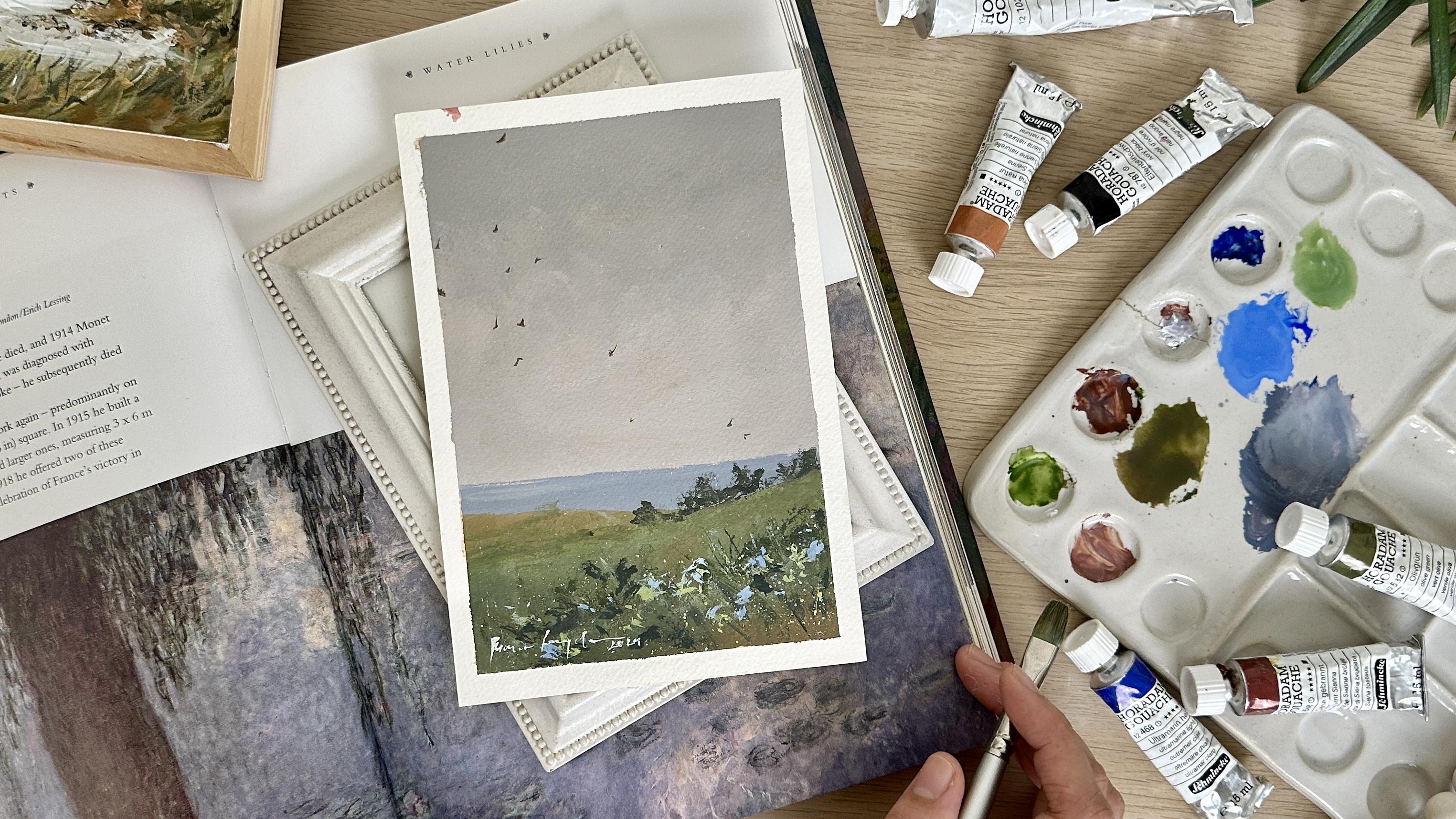
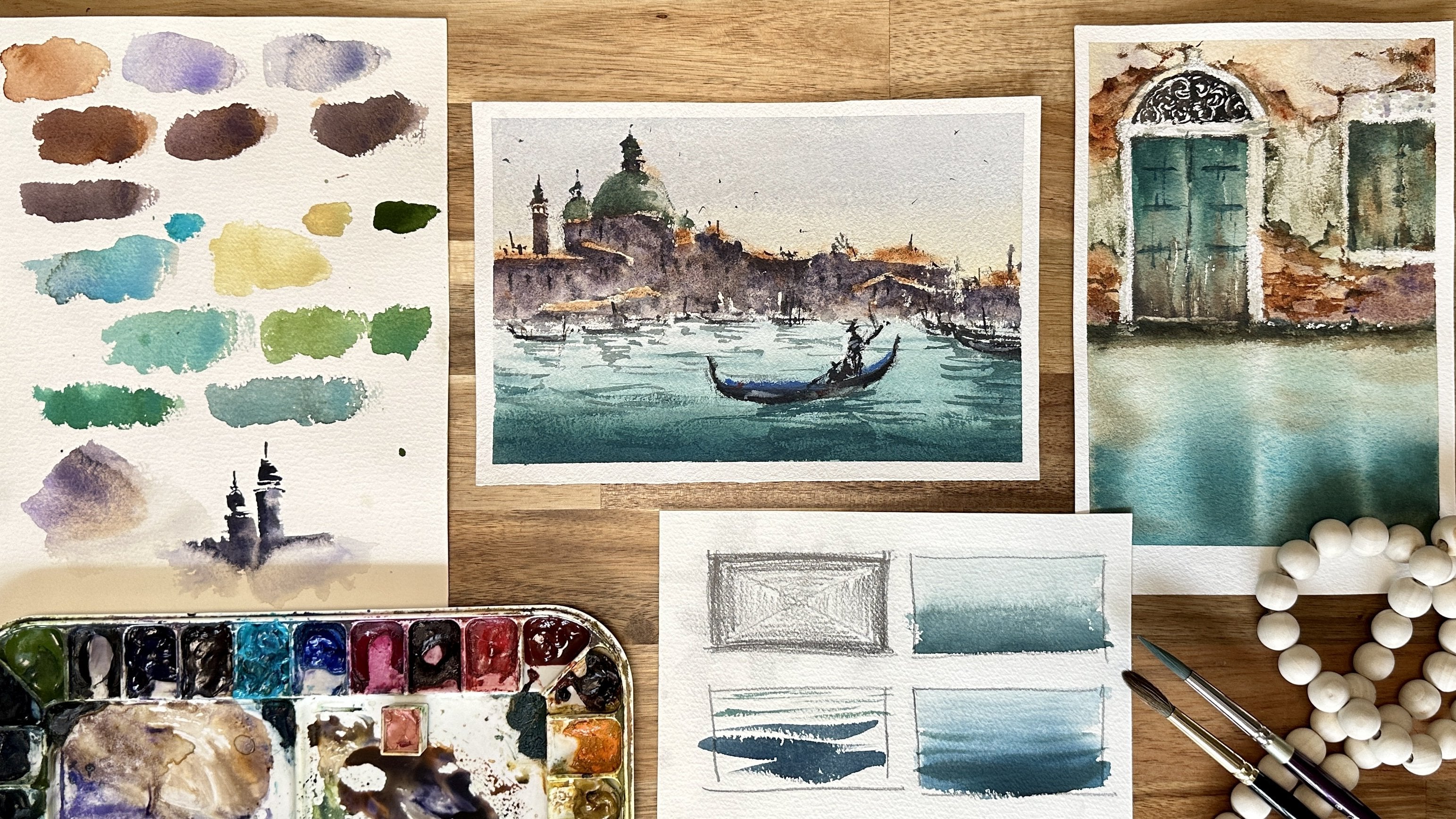
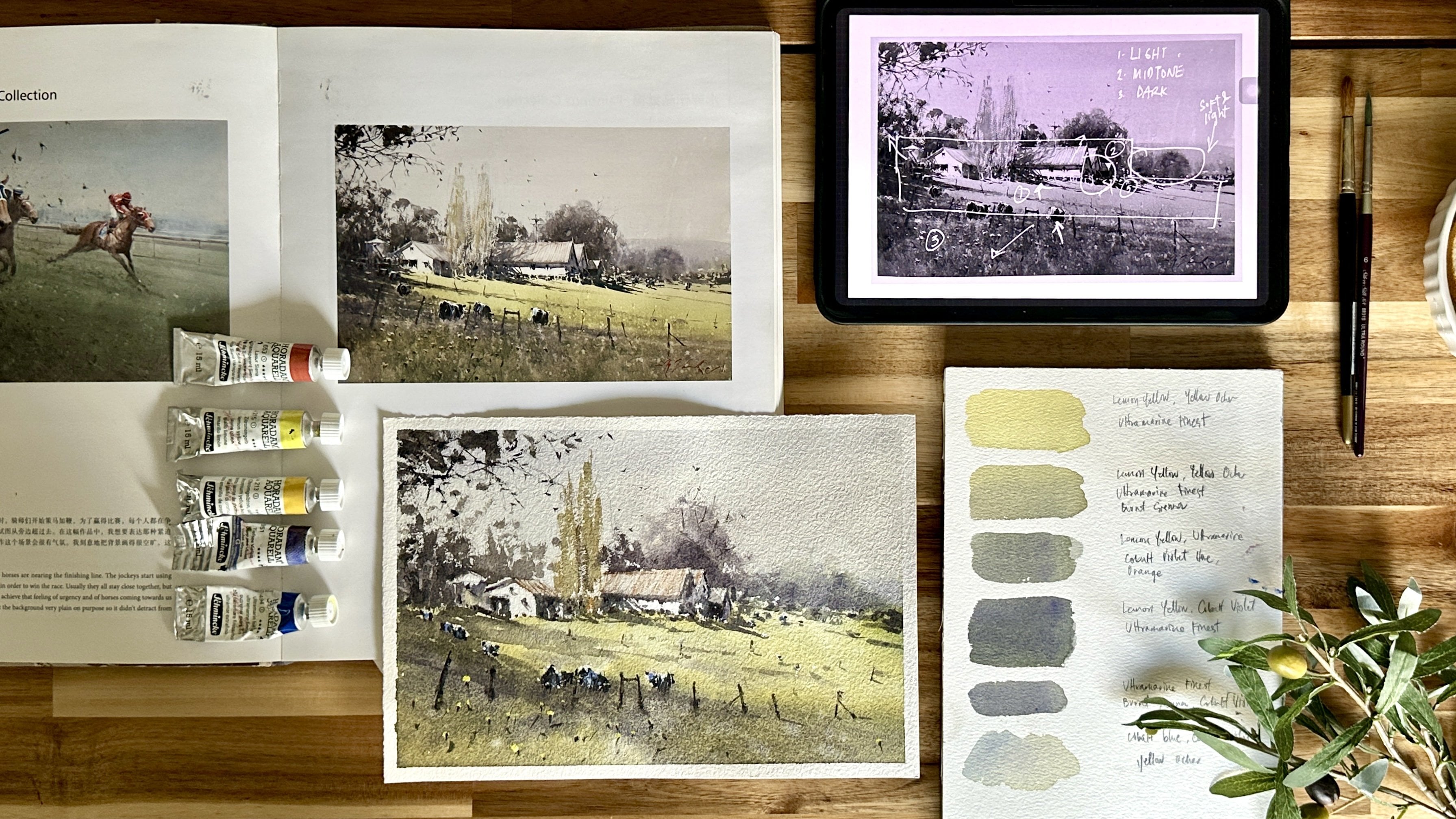
2. Materials: Let's take a look at the
materials we need for the class. Let's start with our primary
medium, Gach paints. Guash is known for its opaque
and vibrant qualities, making it perfect for creating
vintage style artworks. For this session, we'll be using a palette of carefully
selected colors from Schmika. These are titanium
white, ivory black, ultramarine light, raw henna, burnt senna, and olive green. These colors will allow us to achieve a range of tones and use from warm earthy tones
to cool blues and greens, essential for capturing the essence of
vintage landscapes. You will also need
a mixing palette for mixing and
preparing your colors. Next up, are trusty brushes
from silver brush Limited. First off, the silver
crystal pointed oval brush, size three fourths for
painting big washes. You can use any big size flat
brush as an alternative. I also use silver white
bright brush size ten, for painting them
gash landscapes. Then I have the silver
silk 88 round brush size two for creating both fine
details and broad strokes. Additionally, I'll be using the silver silk 88
goat mop brush, size 38, for scrubbing
and blending colors, adding depth and texture
to our paintings. Now, let's talk about
our painting surface. Today we'll be using
Bauhong cold press paper known for its excellent
quality and texture. It's 100% cotton
paper in 300 GSM. However, you're welcome
to use other papers such as hot press paper
or cellulose paper, depending on your preference. To ensure paper stays
flat and secure. You'll need masking
tape and a sturdy board to hold the paper in place throughout the
painting process. Lastly, we'll need a
few additional tools to complete our setup. Two cups of water for
rinsing our brushes, a tissue paper for blotting
excess water and paint, a pencil and eraser for
sketching our composition, and of course, plenty of
enthusiasm and creativity. And there you have it.
With our materials all set up and ready to go, let's learn more about
vintage style landscapes in the next lesson.
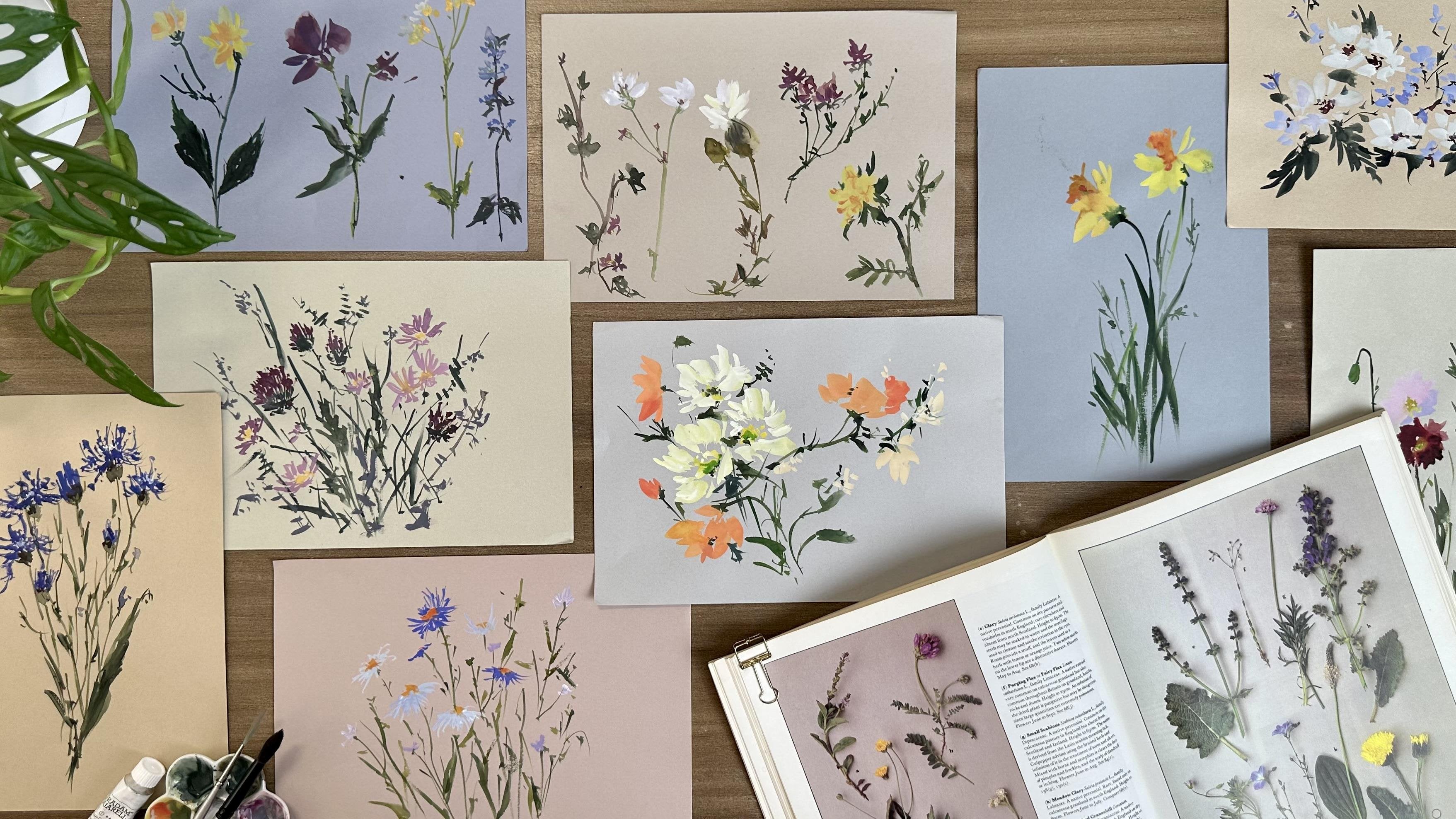
3. What is Vintage-Style Painting : Classical, simple, lovely. These are the common
characteristics we find in the romantic paintings
from the 19th century. Looking at the masterpieces of great French artists,
particularly Claude Monet. His works feature beautiful
pastoral scenes and capture the simple moments
of everyday life in an impressionist
style of painting. By observing his works, let's look at the two
primary characteristics we can apply to evoke nostalgia
and charm to our paintings. First is soft muted colors. Vintage inspired
paintings often feature a muted color palette with tones that appear
faded or weathered. Colors may lean toward
sepia, pastels, or earthy tones, contributing to a sense
of age and nostalgia. So the question now is, how to create a muted shade of color with a limited
color palette. Creating soft muted colors
involves blending colors with complimentary or
neutral tones to reduce their intensity and create a
subtle understated palette. Complimentary colors are
opposite each other on the color wheel and
when mixed together create neutral or gray tones. By looking at the color wheel, the complimentary color
of violet is yellow. Complimentary color
of blue is orange, and complimentary
color of red is green. For example, instead of
using just olive green, mix olive green with its
complimentary color, which is burn henna from the red family to create
a muted green color. Earth tones such as raw shanna, burnt henna or raw umber can add warmth and depth
to muted tones. Try adding a small amount of an earth tone to
your color mix to enhance its muted qualities and create a organic natural look. Varying the ratio
of each color in the mix gives you a lot
of interesting shades. Another way to create soft muted color is by
gradually adding white. Adding white to a color
lightens it and reduces its saturation resulting in
a softer, more muted shade. I do this mostly in
painting details and highlights like flowers
and grass bleeds. Start by adding a
small amount of white to your base
color and gradually increase the amount until you achieve the desired
level of softness. Lastly, you can also blend
your base color with gray. Mixing a color with
gray can help to de saturate it and create a
muted tone down version. I do this color mix
for a muted sky. You can use gray paint
using bnena or ena in blue, then add white to it
and experiment with different ratio to achieve the desired level of mutedness. As you mix your colors, periodically test them on
a scrap piece of paper or canvas to see how they look together and make
adjustments as needed. Soft muted colors add depth, richness, and a sense of
harmony to your artwork. Don't be afraid to experiment with different combinations and proportions until you find the perfect muted palette
for your painting. Now, another important
characteristic we can observe in vintage style artworks
is hand crafted details. Vintage inspired paintings
often showcase and intricate brushwork and texture
defects that add texture, depth, and visual
interest to the artwork. Claude Monet as a
prominent figure in the impressionist movement, employed a variety of brushwork
techniques to capture the beautiful effects of light and atmosphere
in his paintings. Here are the two
characteristics of Monet's brushwork observed
in his impressionist work. First is loose and expressive. Monet's brushwork is
loose, expressive, and gestural, conveying a sense of spontaneity and
immediacy in his paintings. Rather than meticulously
rendering every detail, Monet focused on capturing the overall impression
or essence of a scene allowing his brushwork to suggest rather
than define forms. This approach lends his
paintings a sense of dynamism and energy as if the scenes are in the
constant state of flux. For example, instead of drawing every tree you
have in the picture, create an impression of trees by manipulating your brush
to create bod textures. Same thing when creating
texture on the sky. Instead of painting it with
a flat horizontal stroke, paint the sky with
gestural marks like short and quick
diagonal strokes. Second, this directional
brush strokes. Monet's brush
strokes often follow the natural contours and
forms of his subjects, whether it be the
ripples of water, the sway of grasses, or the play of light on
architectural surfaces. These directional
brush strokes enhance the sense of movement and
vitality in his paintings, inviting viewers to
immerse themselves in the scene and experience the
transient beauty of nature. To apply this in
our class project, as we paint the grass and
flowers in the landscape, create directional
brush strokes, imitating the natural
flow of these elements, as if they are being
swept by the gentle wind. The same thing when painting
tiny elements like birds. Observe the movement of their
wings and the formation of the birds in the sky to create a natural impression
of these elements. There are a lot more unique and beautiful characteristics we can find as we dive deep into
the classical paintings. But for now, let's apply these two important elements in creating sense of
nostalgia and charm. First is soft muted colors, and second is hand
crafted details represented by loose and
intricate brushworks.
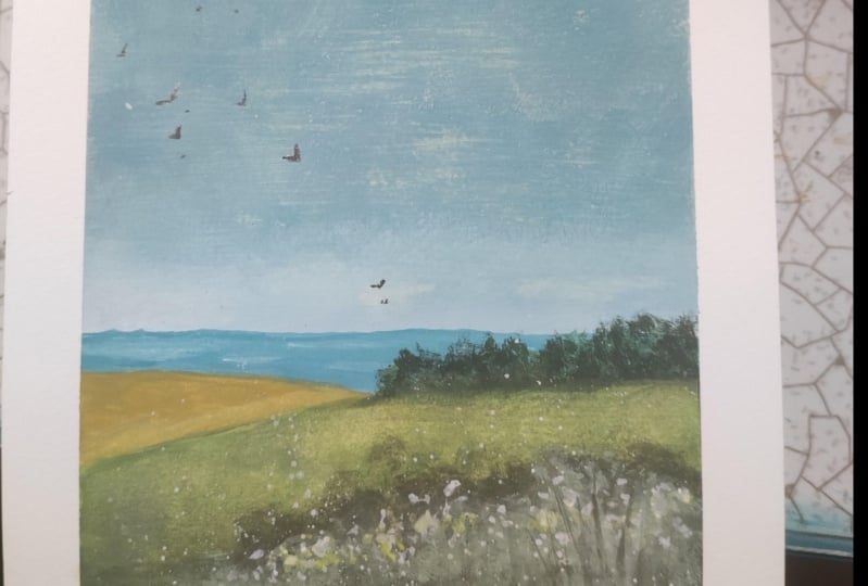
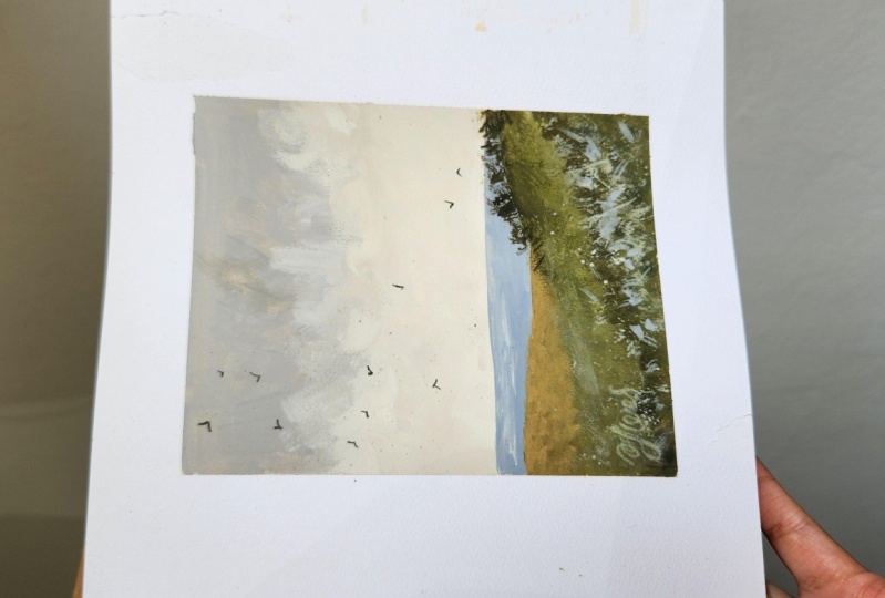
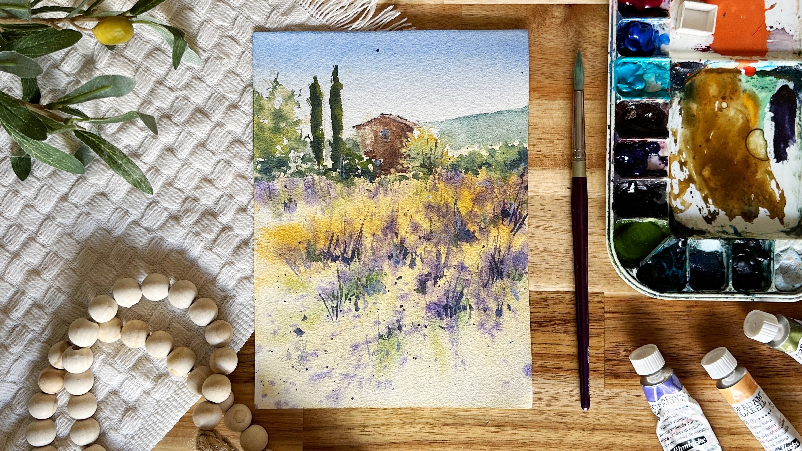
4. Class Project Part 1: Painting the Base Layer: Prepare your paper by taping
all sides with masking tape on a board to secure it and to create a nice clean border. Let's begin by grounding
our paper using a flat brush with a
thin layer of raw sana. Grounding is the technique of painting the paper with a
thin layer of warm tone to help create a
sense of continuity between all the colors we
will use in the painting. This also helps
brighten your work. When you ground your paper, paint the paper completely. Notice how thin the layer is. I keep on adding
water to my mix to achieve this very
light consistency. Again, we ground the
paper with a warm tone. Once you've covered
the paper completely, let it dry thoroughly
before drawing your sketch. Our sketch is pretty simple. First, draw the horizon line in the lower third
part of the paper. Then let's draw the slope of
the mountains and maybe add a few strokes here
in the foreground where you'll place the
grass in other details. Now, let's prepare our colors. I start with a color of the sky. I take white, raw
Shena and a bit of blue to create a
grayish blue color. I try to get the balance
between blue and Raw Shena to achieve a nice muted
shade for the sky. It's normal to take a
little bit of time mixing colors and finding
the perfect shade. Just enjoy the process
and you realize you learn more about each color
as you practice mixing. I paint the sky with a
full horizontal stroke. Then I transition to random diagonal strokes
to cure in the fragment. I gradually adjust the tone to a lighter one by adding white, as I approach the horizon line. Notice that my strokes
are very organic, and as much as possible, I avoid flat strokes, so the sky won't look
boring and flat. This is exactly what I'm
talking about when we observe the natural characteristics
of vintage style paintings. First is the use
of muted colors, and second, is the use of
organic brush strokes. Here in the middle
part of the sky, you'll notice that my tone
is getting much lighter, and the movements and organic texture we
creating in the fragment. Here we can also see the
benefit of grounding. The warm undertone helps create a subtle warm shade
in the sky and helps create continuity in the transitions among the area. Now, let's just complete painting the sky
fragment and create a crisp line to separate
the sky and ocean fragment. I notice that the paint here in the middle portion
seems too light. I add some more paint then
using a blending brush. I lightly soften the edges to create a seamless transition. Now, let's the mix for
the water fragment. I get blue and bird shanna and mix them to my left sky color. I use the edge of the flat brush to create
a nice crisp stroke. Then I do little downward
strokes to drag the do. Let's fill the entire
water fragment with color carefully. Oh Here I'm using a single tone of blue. Then let's add a few strips of white to create a sense
of light in the water. Now I take Rosana and olive
green to paint the landscape. I start with a brownish
shade of color as my base. As you paint this, make
sure that your tone is darker than the water fragment to create an atmospheric
perspective. Then, avoid painting this
fragment with a single color. I like doing color play
by adding a bit of green and raw henna in my mix
as I paint the other area. This helps your painting not
to look flat and boring. Now, let's paint
the foreground with an even thicker mix of paint. I add white and olive
green to my previous mix. I always use my
previous mix to create color continuity and harmony
between different fragments. I start with horizontal
strokes using the belly of my brush
to create a crim edge. To fill in the
fragment with color, I paint it with random
diagonal strokes, just like what I did on the sky. Now I add a bit of black to my green mix to create
a slightly darker tone. As I in a darker tone, I try to blend it well with my layer for a
seamless transition. If you feel that the colors
are hard to apply on paper, simply add a few
mount of water on your brush to help
it glide smoothly. Next, to paint this
area closest to us, I will transition
to a warmer tone by adding more rhen and a
hint of black to my mix. Keep the consistency really thick and opaque to
create dimension. I take my blending
brush to soften some color transitions and
blend in colors together. We can take a pause from here
and let the layers a bit before proceeding
to the next step. M
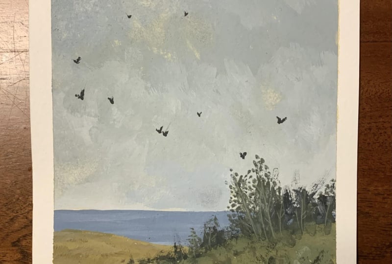
5. Class Project Part 2: Finalizing the Painting: The next part of our
painting process is painting the landscape
elements like trees, grass, flowers, and some birds
to finalize our artwork. This time, I will
use my round brush to paint all details. Still using my left over
green and brown paint, I add black to them to get
a rich, dark green color. To paint the trees, focus on
the general or big shape. Press the brush hard and do some rubbing strokes to create
organic and loose strokes. Now, to connect the
trees to the landscape, so they won't look like
stickers posted on top. I use my blending
brush and gently rub the base paint to soften it and connect it
to the landscape. Next, let's create
texture and more details here in the foreground as a mid layer before
we add the flowers. I start with random strokes here in the lower
right side part, and I take my scrub brush
to soften the edges. I repeat the process of
adding layers then softening the edge until I achieve the kind of depth
I want to have. I think this is the beauty
of using wash medium. We are free to add
multiple layers until we arrive to
the desired result. Now, I'll take white mixed with green to introduce light here
in the foreground. I do the same process of adding rough strokes with
my round brush, then soften the edges
with a scrubber brush. This is a painting
technique I love to use to keep the painting look
loose and expressive, since we are trying
to create texture and elements without being
particular on all the details. Now, let's slowly
introduce impressions of light colored
flowers using white. I put a few dots of white
paint as flowers first. Then I add splatters
of paint for a nice and loose spread of
colors within the fragment. Since the splatters
are too tiny, let's enhance the
flower fragment by dabbing some more strokes. Here I'm using white
mixed with blue to create connection between the landscape and
water fragment. Let's finalize the foreground
by adding some hints of white mixed with a bit of green to paint some
flower highlights. You may splatter this
color in the field and also dab a few
highlights with the brush. I will also add some
strokes around the flowers of great contrast and
make them out even more. Don't have to do this for each
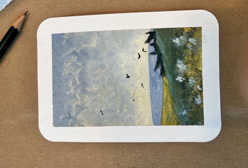
and every flower you have. Just do it on selected ones. Let's complete the painting
by adding a few strokes to enhance the slope of
the mountain a little bit. I'll also add tiny
birds in the sky using a muted brown color to
complete the position. I suggest to differ the shape of the birds and
to paint them in a horizontal pattern to
make it look more natural. Let's write the
painting completely before peeling off the tape. And don't forget
to sign your work. This is our final painting. Please do share your work in the project section so I can
see what you've created.
6. Final Thoughts: Congratulations on
completing this class. As we reach the
end of the course, encourage you to paint your own landscape and share your works in the
class project section. And also appreciate
it so much if you would leave a review and share your thoughts
about the class. Your feedback helps me create even better learning experiences
for you in the future. I'd love to see your creations, so share your masterpieces in
the class project section, and let's celebrate
what you have created. I also invite you to take
my other guash classes. He out Escape to nature, a beginner's guide
to Gach landscapes. In this class, you will learn a wide range of
gauche techniques, and as a final project, you will paint two
stunning landscapes. Another class I do recommend is Sunset landscapes with Gauche, master layering and
blending techniques. This class you will be
practicing a variety of exercises to improve your blending and
brush control skills. As a final project, we'll create a beautiful
landscape painting, highlighting a dramatic sunset. Lastly, guash for beginners, paint flower field with
bouquet background, where you learn
techniques to paint stunning flower field
with soft bouquet effect. Remember, painting is
a lifelong adventure. Keep exploring and
experimenting, paint to inspire and
paint from the heart, see in my other classes.