Transcripts
1. Welcome To The Class!: Hello, everyone. My
name is Will Elliston, and I'm thrilled to welcome you to this watercolor
painting class. Today, we'll be working on creating a vibrant and
refreshing still life, featuring colorful
summer fruits. The transparency of the glass, the varied textures
of the fruits, and the interplay of colors
give it an illusion of complexity when actually the
process is quite simple. We'll learn how to
create depth and realism with different
tonal values, and you'll discover
how to choose and mix colors for a balanced,
vibrant composition. I've been a professional
artist for many years, exploring lots of
different subjects, from wild life and portraits to cityscapes and
countryside scames. I've always been entranced by the possibilities of watercolor. But when I started, I had no idea where to begin
or how to improve. I didn't know what
supplies I needed, how to create the
effects I wanted, or which colors to mix. Now I've taken part in many
worldwide exhibitions, been featured in magazines, and been lucky enough to win awards from well
respected organizations, such as the International
Watercolor Society, the Masters of
Watercolor Alliance, Windsor and Newton, and the SAA. Watercolor can be overwhelming
for those starting out, which is why my goal is
to help you feel relaxed and enjoy this medium in
a step by step manner. Today, I'll be guiding you
through a complete painting, demonstrating a variety
of techniques and explaining how I use all
my supplies and materials. Whether you're just starting out or already have some experience, you'll be able to
follow along at your own pace and improve
your watercolor skills. If this class is too challenging
or too easy for you, I have a variety of classes available at different
skill levels. I like to start off with a
free expressive approach, with no fear of
making mistakes as we create exciting textures
for the underlayer. As the painting progresses, we'll add more details to bring it to life and
make it stand out. I strive to simplify
complex subjects into easier shapes that
encourage playfulness. Throughout this class, I'll be sharing plenty of
tips and tricks. I'll show you how to turn
mistakes into opportunities, taking the stress out of
painting in order to have fun. I'll also provide you with
my watercolor mixing charts, which are an invaluable tool when it comes to choosing
and mixing colors. If you have any questions, you can post them in the
discussion thread down below. I'll be sure to read and
respond to every think he post. Don't forget to follow
me on skill share by clicking the Follow
button at the top. This means you'll be the
first to know when I launch a new class
or post giveaways. You can also follow me on Instagram at Will Elliston
to see my latest works. By the end of the class, you'll have a beautiful painting showcasing your improved
skills in tone, texture, and color harmony. Let's get started.
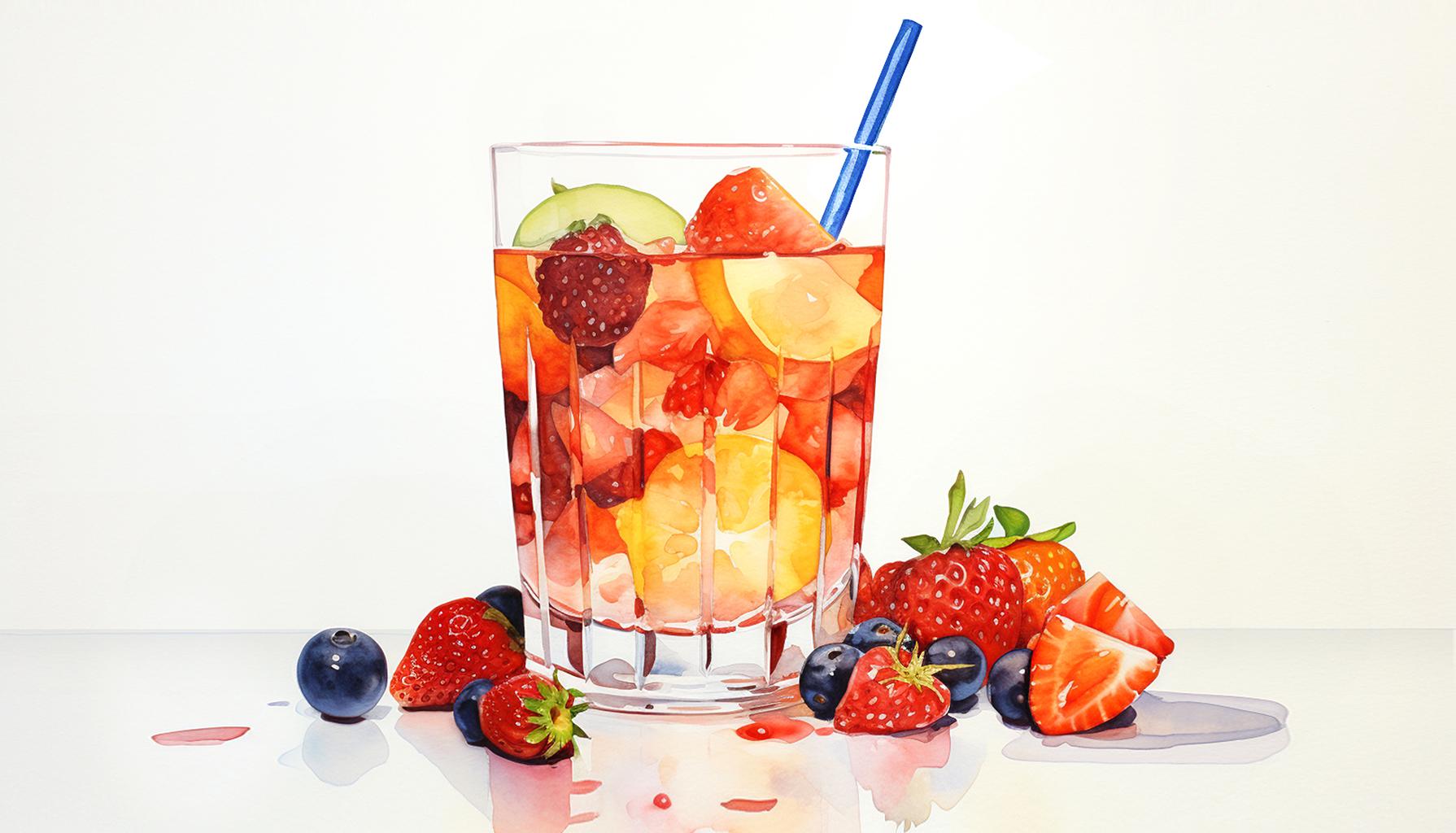
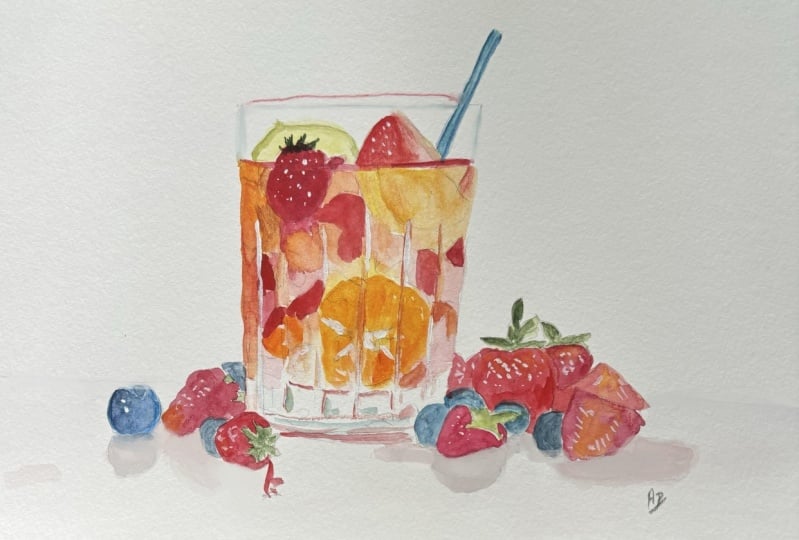
2. Your Project: First of all, thank you so
much for choosing this class. I deeply appreciate you
joining me here today. So we're going to paint
a vibrant still life featuring a glass filled
with colorful fruits. This subject is perfect
because it offers a wonderful balance of
simplicity and depth. It makes an ideal subject
for exploring watercolors full potential and for
practicing essential techniques. You can really follow
your own creative path and have fun with the process. I've planned out
a simple step by step approach you can
follow along with. But if you're
feeling adventurous, you can add your own
individuality to it. In the resource section, I've added a high
resolution image of my finished painting
to help guide you. You're welcome to
follow my painting exactly or experiment with
your own composition. As we're going to be focusing on the painting aspect
of watercolor, I've provided templates
you can use to help transfer or trace the
sketch before you paint. It's fine to trace when using it as a guide for
learning how to paint. It's important to
have the underdrawing correct so that you can relax and have fun learning the
watercolor medium itself. Whichever direction
you take this class, it would be great
to see your results and the paintings you
create through it. I love giving my
students feedback. So please take a photo
afterwards and share it in the student project gallery under the project
and Resource tab. I'm always intrigued to
see how many students have different approaches and how they progress with each class. I'd love to hear
about your process and what you learned
along the way, or if you had any difficulties. I strongly recommend
that you take a look at each other's work in the
student project gallery. It's so inspiring to see
each other's work and extremely comforting to get the support of your
fellow students. So don't forget to like and
comment on each other's work.
3. Materials & Supplies: Before we start the painting, let's go over all the
materials and supplies I use. Having the right materials can greatly impact the
outcome of your artwork. So I'll go over all the supplies I use for
this class and beyond. They're very useful to have at your disposal and will make it easier for you
to follow along. L et's start with the
paints themselves. And like most of the materials
we'll be using today, it's a lot to do
with preference. I have 12 stable colors in my palette that I
fill up from tubes. They are cadmium
yellow, yellow cha, burnt sienna, Cadmium
red, sarin crimson, ultramarine blue, cobalt blue, cerliu blue, lavender,
purple, Vidu black. And at the end of the painting, I often use white guash
for tiny highlights. I don't use any
particular brand. These colors you can
get from any brand. Although I personally
use Daniel Smith, Windsor and Newton,
for Holbein paints. So let's move on to brushes. The brush I use the most is
a synthetic round brush like this escoda pla brush
or this Van Gogh brush. They're very versatile, because
not only can you use them for detailed work
with their fine tip. But as they can hold
a lot of water, they are good for
washes as well. They're also quite affordable, so I have quite a few
in different sizes. Next are the mop brushes. Mop brushes are good for
broad brush strokes, filling in large areas and creating smooth
transitions or washes. They also have a nice tip that can be used for smaller details. But for really small details, highlights or anything
that needs more precision, I use a synthetic
size zero brush. All brands have them and
they're super cheap. Another useful brush to have is a Chinese calligraphy brush. They tend to have long bristles
and a very pointy tip. They're perfect for
adding texture or creating dynamic lines
in your paintings. You can even fan them
out like this to achieve fur or feather
textures as well. And that's it for
brushes onto paper. The better quality
of your paper, the easier it will be to paint. Cheap paper crinkles easily
and is very unforgiving, not allowing you to
rework mistakes. It's harder to create
appealing effects and apply useful techniques
like rubbing away pigment. Good quality paper, however, such as cotton based paper, Not only allows you to rework
mistakes multiple times, but because the pigment
reacts much better on it, the chances of mistakes
are a lot lower, and you'll be more likely
to create better paintings. I use arches paper because that's what's available
in my local art shop. A water spray is
absolutely essential. By using this, it
gives you more time to paint the areas you
want before it dries. It also allows you to
reactivate the paint if you want to add a smooth
line or remove some paint. I also have an old rag or t shirt which I used
to clean my brush. Cleaning off the paint
before diving it in the water will make the
water last a lot longer. It's always useful to
have a tissue at hand whilst painting to
lift off excess paint. Also, you never know
when an unwanted splash or drip might occur that
needs wiping away quickly. I also have a water dropper
to keep the paints wet. When you paint, it's
important to have them a similar consistency to what
they're like in the tubes. This way, it's easier to
pick up sufficient pigment. A hair dryer is useful
to have for speeding up the drying time and controlling the dampness of the paper. And lastly, masking tape. And this, of course, is just to hold the paper down still onto the surface to stop it sliding
around whilst painting. Also, if you plan on
painting to the edge, we'll allow you to create
a very crisp clean border. And that's everything
you need to paint along. I encourage you to experiment and find out
what works best for you. Now, let's get ready
to start the painting.
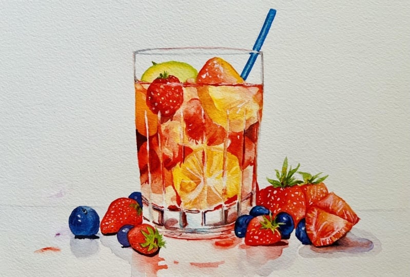
4. Sketching It Out: This does come across as a complicated painting and
something difficult to draw. But as always, if we break
it down into smaller steps, we can make it a
lot more simple. I'm starting off with
a horizontal line about one fifth of
the way up the paper, and I'm just doing
light strokes to imply some berries or fruits and a rough
outline of the glass. It might be difficult to
see the lines because I do at this very first stage, use light lines myself. And I can barely see
them because I want to rub these particular
lines out later. This is just to map
everything down very lightly. Of course, I'll include
the tracing template, which will help you
speed things up and get things more accurate
because at the end of the day, this class is about painting
rather than drawing. Drawing is a whole
other thing to practice on if you want
to become a good artist. But if you just want to practice the painting aspect and end
up with a nice painting, you can just use the
tracing template. Now that I've laid
everything down with a very light line, I can start going back
over some of these areas. I'm marking now some
of the highlights, the reflections on the glass. With this light lead
that I'm using. Or at least it's a
dark lead that I can press lightly to
achieve a dark line. It means that it doesn't affect the paper.
I can rub it out. If you use a light lead, you have to press harder and it actually affects the paper and
it's difficult to rub out. Now I've switched
pencils and now I'm using a harder lead
where I can go in with a finer point and
really clean up the lines and add details to the more general simple shapes
we just drew in before. And I just go back and forth, try to make corrections. I think I'm mainly going
to paint strawberries and blueberries
in this painting. Now, depending on how
much precision you want with your
drawing and painting, you can spend as
much time as you want really finessing over the details going
back and forth. It doesn't always need that. Sometimes having
some details left out adds to the mysterious
nature of watercolor. But if you have the patients, you can was put as much effort into adding
details as you want. But there's no pressure
to do that if you want to have fun exploring. So I'm painting the curve at
the top of the glass here. And just where the straw is, I'm trying to get the
angle right to match it. Then just at the top here, there'll be a little
bit of refraction from the way the light
distorts through the glass. I'm being quite abstract with the fruits and shapes
inside the glass. Now, I'll of course, finish the drawing
up and scan it in, making it available for tracing. But I think for the footage, let's move onto the painting now and I'll come back to you with
a fully rendered drawing.
5. Starting The Painting: With most of this painting, I'm going to be using my
number 12 synthetic brush, which you can find
out more about if you watch the materials
and supplies video. But before we pick
up any pigment, I'm just going to take water, as I've done on this left side, and just underneath this
line that we've painted, and pre wetting the paper, and I'll do it on the
other side as well. Just because I want to have
a slight gray background for where this hypothetical
table might be. I'm going to have
most of it in white. In fact, all of it is
going to be white. I just have to ground it with
some kind of light gray. Subtly, I'm going to mix
a bit of this black, dilute it, so that it's
a very light gray, and maybe add a bit
of coolness to it, a bit of blue, just so that it's not a bland neutral gray, and apply it to this wet area we just made
and Over this blueberry, I'm quite happy to overlap it, but I'm going to go as
far as that strawberry. I don't want to take the
vibrancy out of that strawberry, and we'll do the same thing
on the other side too, just taking it as
far as the fruit, not overlapping there and
just bringing it down. Making sure it's a nice clean, even wash, not
much text on here. We want it to be barely
visible by the end. Of course, this
will dry lighter. Darks often look darker when they're wet
than when they're. Once you're happy
with that stage, you can get a hair
dryer and dry it completely or we can move
on to the next stage and be careful not to
touch this wet area. We're going to be starting
with cadmium yellow. Taking a little
bit of that there. You can see on the
edge of my palette. And I start with yellow because it's the
most vibrant of the colors, and I'll be going back and
forth between yellow and red, and both of those combined
will make a nice orange. As you can see on the drawing, they are quite abstract shapes. There's a few lines there, curving lines, swirling lines, and I'm basically going to just improvise a bit with
tones and color. Using the lines as a guide. You can have the final
reference image at your side to make sense of what I'm doing because some of these
reflections of the glass, I'm trying to
preserve the paper. Now if you want to do a
easier way of painting this, you can just paint straight
over these lines and then come back at the end with gash. But I'm deciding to do most of it with the
brush without gash. So I'm trying to preserve
some of these lines. It's easier to have reference when you have my
final painting to the side. So if your screen is big enough or if you have two devices
like a mobile phone, you can have the
video playing on one of them and maybe even print out the final
image of the other one of the reference image. Now I'm applying
a bit of cadmium red into this wet yellow, so it has nice soft, smooth transitions and mixtures. Whilst it's very wet like this, it'll have a nice gradient. There'll be no hard edges. Keeping it very diluted
at the bottom here. I can do most of
this painting with this same number 12 brush because it can hold
a lot of pigment, but it still has
a very fine tip, so I can use it for details. The only thing we might want
to use a different brush for later on are the small
little reflections at the top of the glass or the little tiny highlights that we'll use with
guash at the very end. But it's good practice to
try using a bigger brush and trying to make use of
its full versatility. Using it at an angle when
you want to have thicker, wider strokes and using it with the tip being perpendicular to
get very fine lines.
6. Using A Tissue: With various parts
of this painting, I'm going to speed up
the footage because it actually makes more sense
seeing it speeded up. If I played at normal speed, it would be a bit too slow and it would be difficult to see the context of where I'm going because it doesn't
look connected. You can actually see the
watercolor flow a bit faster. You can see what my
mindset is planning. Bit more clearly. When every thing slow down. If I'm thinking of
things in terms of 5 minutes or 10 minutes, it'll be difficult to see that far in the future
when you're watching it, but if you see my
speeded up footage, you'll see the
watercolor blend a bit better with how I want it to. Even when I watch
the footage myself, I find it very insightful
to see how the watercolor reacts with time because time is an important
aspect of watercolor. Seeing it from a different
perspective is very useful. Also, this painting requires
quite a few details, which doesn't necessarily
mean complicated details, just maybe a bit
more time consuming. So speeding up the footage
so that it reaches an hour and a half is much more palatable
to watch, I think. You can see I'm continuing
looking for different areas, using the pencil lines for borders and just going
back and forth with different colors of red and
yellow, different tones. I might apply a thick
stroke of yellow and then wash it out
with a bit of water to bring the tone a bit lighter, and then I might do
the same with a red, add a bit stronger red and
bring it out a bit lighter. Or maybe I might add yellow and then transition it to a red. I'm doing a mixture
of all kinds of combinations between
thicker pigments and more diluted pigments and a mixture of different
hues and colors. You can see in these
smaller areas, I'm using the tip of my brush, so I'm angling it a bit more
perpendicular to the paper. And so far, all I've used
is biu red and pium yellow, and of course, they come
together to make orange, so we've actually got three
colors we're working with. Even though we're
only using the two. If you see my
palette on the side, I've got a couple of reds. I've got abu red, and I've got alizarin crimson. C abu red is the vibrant one. It's a more opaic, and alizarin crimson
is more translucent. Translucent colors often look darker on the palette or applied thickly because the
particles are so small that when light
shines through them, they disperse and
absorb all the light, whereas opaic colors have thicker particles and they actually reflect the
light a bit more. You can see in my palette, the opaic colors are the brighter ones and the darker ones are
the translucent ones. So I'm starting to apply some very bold red
up at the top here. I'm not sure what fruits
these are at the moment. I'm just having fun experimenting
with different tones, different colors,
different textures. My original idea was to have strawberries
and blueberries. But within the glass,
it's a bit more abstract. I don't know what's
going on there. But it shouldn't really matter at the end of the day as long as we're creating something
that's visually exciting. We don't have to get specific
with what we're painting. Really, what I think
is going to be exciting about this painting is the reflection of the glass.
7. Painting The Leaves: Oh. I have a tissue
at hand to dab out some of the pigment and watercolor if it's a bit
too strong in some areas. In this section, I'm just trying to preserve that white line, the reflection of the glass. The other ones, I
decided to go over because I don't want
to be pure white, but this is just
the first layer. We'll come back and we'll
create bolder tones later on. I'm just checking to see that gray bit we painted
before is perfectly dry so that we can start painting the fruit on the table
next to the glass. I'm mixing a green and I'm mixing it not by
using my viridian green, which would seemingly
be the most obvious, but actually using cadmium
yellow and cerlian blue. I just think it's a
bit more natural. It's a bit more organic green. I'm using this green to paint the leaves of
the strawberries, naturally be the only
part that we have green. I might paint the straw
green or possibly a blue. I'll decide that a bit later on when we've got all the
other colors added in. Maybe I'll have a bit of green fruit in
the glass as well, but at the moment, I'm just using the
screen to paint in the strawberry leaves. This takes a bit of precision
using the tip of the brush. Although you can still see I'm just using the same
brush, same large brush. I add a bit of yellow
into some of these parts, yellow ocher, for example, to keep a nice bit
of variety going on. It's not just the same
green blocked out, but we have a few bits
of transitions going on. Adding a bit of veridan
green in there, and you can see it's already
a bit more artificial. But I think I do want
a bit more variety. So you can see going
from left to right, these leaves all have a slightly
different green to them. These are quite abstract
shapes as well. I'm trying to keep them natural and organic looking
by making them asymmetrical. I'm trying to make it a bit odd, some of them are quite thin, some of them are long, some
of them a bit thicker. Trying to keep it a bit random. But of, I had it sketched out
to begin with to guide me. If you've used the tracing
template that can help you help guide you. I'm painting these
leaves before the red of the strawberries because
it's a lighter pigment. I always try to paint
light before dark. If we painted the red
of the strawberries, then it would be a bit more difficult to
paint these on top. As a general rule
with watercolor, we paint light before dark. But there are times when
we can break that rule. Sometimes you'll see
in my other classes, I use dark pigment
straight away, and I use that dark pigament to spread out the pigament
into other areas.
8. Painting The Surface Reflections: I'm adding a bit of yellow
inside of the leaves. So there's a bit
more of a transition going on in the middle. Now I'm taking my
caving in red again, and even though we haven't
painted the strawberries, I'm now painting
the reflections of the strawberries onto the
table onto the surface. Because again, if we're
painting light to dark, the reflections will be lighter, so that's why we're
painting them first. This is just cadmium red. Maybe with a little bit of
alizarin crimson in there, but that's a personal choice. If you want to keep it simple, there's no need to add a lizarin crimson if
you don't want to. Now I'm taking a bit
of cerlian blue. This is to paint some of the highlights or the
reflections on the glass. It takes a bit of time because we're gradually building up these details rather
than doing it in a of all and one go. It's really good practice
for our observation skills. We're studying how this
glass works with highlights, reflections and distortions
caused by the glass. We're paying attention to where the light source might be and how it interacts with the glass. With this area in particular,
we're using small, controlled brush strokes to indicate tiny little
reflections and refractions. We're using a mix of different
colors we might see. So even though we
haven't used blue yet, I'm adding that in there because it might be reflecting
the blue sky above. It might be reflecting
the blueberries. It's not just white,
but of course, having the background as white does make it a lot more
simple because if we had, let's say, a bit more of
a obscure background, then we'd have to think about
how that reflects as well. Because of course,
glass is transparent and we would have to paint the background
through the glass, and the color should be visible, but just slightly
muted by the glass. One of the most
important aspects to be aware of when
painting these things, these details are the sharp
edges and the blurred areas. Because glass often has both sharp edges
and blurred areas. And of course, for
the sharp edges, we have to use the
point of our brush to create that sharp edge. But then if we want
a blurred area, we have to use a more
softer approach, just a damper brush to
soften those edges. For a lot of this shadow work, I'm applying a bit of
blue in here because even though there might not
be a blue in the strawberry, The blue adds a bit more
interest than just a gray and blue mixed with
the red, makes a purple. It just makes it a
bit more dynamic. Creating a few random
reflections here, but of red, a very pale wash of red, again, by having the final
painting as reference on hand, you can see what I'm
trying to because it can be a bit confusing
whilst watching this, knowing what I'm or aiming for. On this right hand side, I'm having shadows overlapping. So I started off with
red, then a gray. Of course, this purple
looks a bit gray as it is. It's just a more colorful gray.
9. Starting The Blueberries: Now, I just used a hair dryer to completely dry this shadow area. Now I'm going in to
paint the blueberries. I'm pre wetting the area, the circle, so that there'll
be a soft edge everywhere. Apart from the border,
everywhere inside, it will be a nice even flow, so I'm just pre wetting
this area right now. Then I'm going to take
some cobalt blue, and dab it in there
just to get started. We can mix these
colors on the paper. We don't need to
use our palette. And using the brush just
to take it to the edge. Like I said, there's
no hard edges on here. Take some alizarin crimson, mix it with cobalt blue
to make a nice purple. Dab it in there. Because we know that it's all wet already, we don't have to be
worried about a hard line because it's just going to
melt away and blend out. It's dabbing the pigment out
of my brush onto the paper. I'm not completely
filling the area, though. I'm allowing some
areas a bit lighter because there'll be
some reflective light hitting the base
of the blueberry. This is seran blue now. Because when you
look at a blueberry, it's not just a solid
blue or black or purple. There's a whole different
thing going on there. There's some textures
going on there. I'm trying to indicate that
change of tone and color. It's all roughly the same
tone actually at the moment, just a mixture of different colors of the
blue and then the purple. Now we're going to
go in a bit heavier. I've mixed pure purple from my palette with
a bit of black, added a bit more
blue to get it to the cooler side and now I'm
just it in there bit by bit. Try and create the, the circular form, the
sphere of the blueberry. I'm sorry that my hand
is obscuring the view. It's difficult to
I need the tip of the brush to gently allow
the pigment to flow out, and that means holding it
perpendicular to the paper. But you can see there, I basically dabbed a
bit in the middle, da a bit around the outside, and there's this ring going along the middle that
is a bit lighter in tone. Now, there's a little
blackberry blueberry rather just hiding
behind this strawberry. We're now working with
quite dark tones, the darkest tones
we've used so far. I always like it applying the darkest tones
in the painting because it then gives me context and reference to
the rest of the tones, how far I should go with
the rest of the tones.
10. Painting The Strawberries: And you can see how that dark next to the leaf of the strawberry actually makes the leaf look quite light now, whereas before, it looked
like a dark pigment. Now that we've applied a
dark pigment next to it, we've actually made it pop. Now I'm going to paint, instead of painting the blackberries, I'm going into the red
of the strawberries now. Now that everything
is dried around it, especially the leaves, we can start painting
the strawberries. Again, just using
the same Caban red. We're going to have to have
a bit of finesse around here when painting
the leaves because we're going to have
to get the tip of the brush and go
in between each of the leaves and very
carefully paint around them. Of course, you could use
masking fluid if you wanted to. I tend to leave masking
fluid out of my demos, my demonstrations, and lessons because not everyone has it, but it is a useful
thing to have. But at the same time, it's good practice with precision
painting things like this. Although it doesn't take
a lot of mental energy, it's not mentally
difficult to do. It really helps the mind
relax almost because you still have to concentrate
and it's very meditative. It's quite therapeutic
because you can just go and enjoy and just
fill in the little gaps. In a very relaxing way and
it helps your mind shut off to everything else that's
going on in the world, and it's very you can
take your time with it, and it's a very
peaceful thing to do. It really brings you to the
present moment and makes you concentrate
because, like I said, it's not mentally
difficult to do, it's more physically demanding. It requires your mind to
control the movement of your hand and gets
you in touch with your own actions
and physicality. I'm just using a tissue just to pick up a bit of the red from the top
because it's a bit too much. Rolling up the tissue
into a fine point and just scraping it along and
dabbing it in certain places. You'll see when I move my
hand away what it looks like. Subtle, but it creates
a nice soft edge. It reflects the
light that could be bouncing off the top
of the strawberry. I've got a bit of
orange here, so again, mi that cadmium yellow into that red makes
a slight orange. Painting the strawberry next
to it with that orange. Taking a rid of a
lizarin crimson and blending it
with that orange. I'm trying to make
the most of the reds. We've got a warm red on the orange side and
then a cool red with the sarin crimson side. Using the tip of the
brush to make sure we don't go over the edge
of the blueberry. Now, the strawberry looks like
I've put details in there, but that's just the reflection of the light bouncing
off the camera, which does actually
look quite effective for the highlights that you
would see on a strawberry, and we'll do that a bit later at the end once it's all dried off. Again, using a precision to paint the leaves
of the strawberry. I have to be careful at
the top of the strawberry because I don't think it's
fully dried up at the top. I have to get a hair dryer or wait for it to dry completely.
11. Playing With Different Consistencies: Thicker pigments, of course, dry faster than very wet ones. So I just clean my brush, make sure there's
no liquid on it, and I used it to suck out some of that extra
pigment at the top there. Again, to create a highlight, adding a bit more
yellow in there to make it a bit more warmth to
add a bit more warmth. Adding another
shadow to the right. Now while I'm waiting for
all that to dry and go back into a few more details
on the glass reflections. You can use the reference, the tracing reference to
make sure your drawing is correct because these are quite specific highlights and reflections and refractions. You can also look
at the final image of the painting as reference. There's not too many
little details here. They're not that
specific actually. But when they come
together at the end, they'll be quite powerful. It's just making sure that
you paint to the right edges. These vertical lines that you see in the
middle of the glass, they all have to be connected
one way or another. Or not necessarily connected, but they have to be in
line with each other. But you can go back and forth, especially at the end
with guash or Guash. You can really
emphasize the lines. On this edge, on the left, I'm really adding the
vibrant pigment now, going back with a second layer, using that cadmium
red as a base, and then again, influencing
it with the yellow. Of course, you could experiment
with different colors. If you prefer a
different color scheme, I'll be excited to
see how you can adapt it to your preferences. Maybe you want to have it more emphasized
with yellow than red. Maybe you'd want
green and yellow. Maybe you'd want blue and red. Again, I'm speeding this area up because there's lots of
times when I'm pausing to think and it takes time using the tip of my brush to fill out
some of these areas. You can still see
everything that I'm doing. I'm not doing anything
particularly technical. I'm just filling in gaps, painting in numbers
in a detailed way. And It just takes time, so I figured speeding up would
be a bit more beneficial. I occasionally clean my brush and suck out some of the pigment in other areas
to correct my tones. You can see now I'm
being a bit more careful about leaving
those reflections, those vertical lines in
the middle of the glass. I'm being a bit more careful
not to overlap them now. It takes a bit of time and
concentration to figure out which areas to paint and
which areas to leave. But if you have my
reference image again, it should help guide you. As you can see, I'm going
all over the place. I don't necessarily paint
in a particular order. I jump around from the middle of the glass
to the blueberries, to the strawberries,
to the reflections. So I'm painting out
the blueberries again, and this one on the left dried a bit lighter
than expected. It very often does
with dark pigaments, they often dry lighter
than they look. So I'm adding a bit more just
to correct the tone of it.
12. Starting The Shadows: Now I'm going to start painting the shadows
underneath the fruit. And I find shadows, in particular, you can be
adventurous with color. With watercolor
painting, and using colors can be very subjective
rather than objective. You can be very free
with what you use. It's a bit more personal
and expressive. It doesn't have to
be a precise match. We can choose whatever we want, whatever is personal to us. The magic of watercolor lies in its transparency and its
laying capabilities, and by varying the amount of dilution of paint and the
amount of water used, we can achieve a whole
array of tones and effects that are impossible to replicate in
any other medium. This fluidity allows for more spontaneous expression and encourages experimentation. This interaction
between pigment in watercolor is very
unpredictable, and because of that, it can
yield surprising results. Unique results that other
mediums just can't. Colors blend and bleed into each other in a very organic way. We couldn't even plan or replicate that in
another medium. The textures mimic the
complexities of nature itself. This unpredictability
is something that people who love
watercolor really embrace, and it's not seen
as a limitation, but as an opportunity to
embrace the spontaneity and really enhance and harness
the medium's beauty. Watercolor really does go
beyond technical proficiency, because successful
watercolor paintings, they rely on the
artist's ability to harness intuition
and emotion. Colors are chosen not
just for their accuracy, but their ability to convey
mood and evoke feelings. Warm tones might evoke feelings
of nostalgia and comfort, while cool shades might suggest
serenity or peacefulness. The interplay of
light and shadow, especially when painting
reflections like this, can be achieved through
careful laying and blending. They add depth and
dimension to artwork. I think watercolor is much more personal than oil or acrylic. Those have their strength
in other things, but there's something
about watercolor that really transcends the
boundaries of realism, and it really explores
emotions, moods, and more personal
interpretations of the world. Like the fluidity and
unpredictability of the colors allow artists to really create compositions that resonate on
a visceral level. They can be so
captivating to viewers, and it really invites people in to connect with their
artwork in a unique way. So instead of mixing pure black, I'm adding a lizard crimson
there and ultramarine blue. And I'm just painting
underneath there. It doesn't matter, it's
not completely dry because it's okay to have
that soft edge at the bottom. But it's where the shadow
connects with the reflection. I use my finger just
to smudge it a bit. I'm not afraid to use my
fingers every now and again, just to create the blending. There's just a little line at the base of this glass that
I just want to emphasize. So I'm mixing a very dark red and with a lot of precision, just painting that
thin red line, and also in the middle of the
leaves or the strawberries.
13. More Blueberries: So now, I'm going
to start painting the right hand side
strawberries with a very strong, vibrant
cadmium red. Being very careful to get a nice little edge here
on the side of the glass. Implying a little strawberry in the background behind the glass. But actually, I think I'm going to paint the blue
braises instead. I come back to the
strawberries later, so I'm just going
to mix a purple using seran blue and
a isarin crimson. If you've already got
a purple paint tube, you can go straight there. I made sure the
paint on the glass was first so that it
wouldn't spill out. There's two blueberries here, so I'm just painting
them both the same time. I'm not going over the edge
of the other strawberries. You see how sometimes you don't have to follow the rules because I'm actually painting
dark before light here. The blueberries are going to be darker than the strawberries. Before earlier on the class, I said that I paint
light to dark, but in this particular case, I think I can get away with it. There's no reason. Having to be careful not to go over the lines here for the
leaves of the strawberries. We do a solid wash
of a pure color, and then we can start messing
around with the tone. I'm sucking out a bit of the
pigment there to make it a bit lighter on the top to
help give a feeling of form. Do that to the other one too. It just makes it feel
more, more volume. It's not flat anymore. That's all it takes to
create a bit of volume. Wet or wet, taking away
some of that pigment, and it gradually
gets a bit thicker. Putting a bit more
blue in there. Now you can start influencing
some other colors to it. I quite like the idea of this cerlian blue
coming through. Serlian blue is my favorite
blend of blue, actually. And then there's another
blueberry right here. I'm going to go straight
in with the cerlian blue. And then in that darker, more purple blend
into it on top. With these blueberries,
I've actually had the speed of the footage
put back to normal. That you can see what it's like painting at normal speed
because a lot of this painting has been sped up and just for you to get an idea of how
the water actually reacts, I thought I'd put a bit of
normal speed footage in there. So you can see how there's nice. Apart from the edges, there's a nice soft
blending going on. With the strawberries, actually, there's not much
blending at all. It's all a solid red color. There's a bit of
orange going on there. A little influence of
different tones, too.
14. More Strawberries: I'm starting this
strawberry with pure yellow because I want a bit more of an orange strawberry going on. And the real special thing about these
strawberries will be at the end when we
add the highlights because they're very tiny, they're very shiny fruit, and that means there's a lot of strong reflections of
the light on there. So when we come back with the
white gouache at the end, it'll really add a depth
of realism to them. Now, before the blueberries
are completely dry, I'm dabbing in this serian blue again because as it was drying, I felt like it was
getting a bit too light. I wanted a bit more blue, and we're going to add
a bit more tones later, but for the time
being, that's fine. Now I'm going to be very careful because I've used the hair
dryer to dry the blueberries, and it's okay if I touch the edge now. It's
not going to spill out. You've got to make sure if you ever want to
have a hard line like I have here with the strawberries against
the blueberries, you have to make sure it's completely dry, so it
doesn't spill over. I use the hair
dryer just to make sure it's a very hard line. And again, with the strawberry, it's just a block of
red at the moment. We don't have to worry too much about the tones of
the strawberries. We'll add a little
bit of a highlight. For the most part,
is just a solid red with a little bit of
lightness at the top. And we'll, of course, a bit of a shadow at the bottom later. Going back to the
strawberries at the top, we can start filling out all the way down to
the blueberries. No, I apply fi
pigment in the middle and then use use a bit of
water to spread it out. A. And also this orange. I want there to be
a hard line there, so to be very careful
it doesn't spill out. I made sure it was dry. Now I'm going to pre wet this
because these strawberries, these last two ones on the
left, are sliced open, and they have a nice wet and
wet soft texture to them. I'm just going to pre wet
it and a little bit of orange soothe in there,
a little bit of red. Put a bit of cadmium yellow in there to turn
it into an orange. And then for the time being, that I'll leave it like that. Now, I'm going to start
doing some highlights on the left because while I'm
waiting for those bits to dry, I may as well carry on with
the rest of the painting. So I'm moving to a
smaller brush now, number eight, I think it is, and I already have
white in my palette, so I'm getting a bit of that. I'm just dabbing a few dots, just a couple of dots where the reflection of the
light would bounce off and create these highlights. You can see, I'm just
dabbing a few dots. On the strawberries,
maybe I'm adding a few more circular highlights, loop highlights.
Just a few dabs. And it just gives the illusion
of a very tiny surface. Trying to evenly
space them as well. And then while sticking
with the same brush, I'm going to clean
off the white end with a bit of a darker pigment, I'm going to go on
the bottom and add a few shadows. Very subtle.
15. Layering More Details: Sticking with the
same small brush, I'm going back over
to the other side before it's completely dry. And with that bit of
red, we picked up. We're adding a few more
details onto the glass, emphasizing that
highlighted line. Using a tissue to correct
some of the tones, softening some of
the harder lines. Thinking a bit more about edges, where I want there to
be a soft edge and transition and where some areas I want there to
be a harder line. These straight lines on
the sides of the glass. They're usually
quite solid colors, so they're ever going
to be all white, all mid tones, or all dark. That's what makes
them stick out. Just taking my time, making
sure I'm not overdoing it, and I'm trying to be economical with where I place
these details. They're only little things, but they take a bit of
time to plan out. Now moving back to
this strawberry, while it's wet or wet, you can see me dab
the brush in there, because I've sped
up the footage, you can see how it spreads
out softly like that. I just have to keep
on going back and forth because I have to
wait for it to dry again. So I'm going back to
the left, adding again, another layer, a
darker tone on there. As I said, the shapes inside this glass are very
abstract, actually. Apart from a few areas, you can't really
explain what they are. I can see that there's a
citruus fruit in there, but really the distortion
of the glass helps us and allows us to be abstract without being direct with
what we're painting. Adding a bit of a
lizard crimson there. I don't know whereabouts
you are in the world whilst you watch this or
whilst you paint this. But certainly, for me, whilst painting this, it makes
me want to have a drink, a nice refreshing drink. It's particularly hot
where I am at the moment, so that's why I
chose this subject. Now at the top here, I'm
going to add a bit of green. The green that I already had
in my palette from mixing seran blue and um yellow. I'm going to start
off with it being a bit a bit more yellow, and then we'll add
a bit of green on. So once we fill out
the area with a wash, we can start manipulating
it by adding more pigments. By dabbing this
green up at the top, it can start blending
its way down as it gets lighter and
lighter towards the bottom. Needs a bit more vibrancy, so I'm going to add
a bit more yellow to it just to make it
pop a bit more. You can see there are quite a few things that
don't make sense, for example, next to the straw. There's a big red fruit
that turns into a lemon. I'm just going to add
a bit more red to turn it to orange to try and make
sense of that a bit more. It still doesn't
completely make sense, but it's fine with me. It still has a
appealing aspect to it.
16. Sliced Strawberries: We can get away with
things like that. Due to the water color, nature. Now, with this strawberry, I'm using the same red, and just going along painting little segments or sections. So this one isn't a block of red and a bit of yellow there, and then going back into it with pure water
just to soften it out. It's a bit too strong, though. I'm sucking out some of
the pigment using a tissue and we can improve it even more later on with the
white paint, the white. Remember this
footage is sped up, so I was having to
wait a bit more to wait for it to dry a bit so that I could add a bit more definition
because of course, if it is too wet, this paint, especially
the white paint will just bleed out too. You have to wait for it to absorb into the paper and the
water to evaporate a bit. So that here have a
bit of a harder line. And now that it's dried up at the top there
where the green is, I can do a second layer
there with a bit of a darker green to
emphasize the peel. I'm really not sure
what I'm painting here. Maybe it's a lime or
a slice of apple. It doesn't matter actually. I just It feels right to have a bit of green
there because we've got a bit of green with the
leaves of the strawberries, but there's nothing else on the other side of the
painting up at the top, so it helps balance it out compositionally
by adding a bit of green Going back to
the strawberry there, just to emphasize a bit of
it while it's wet on wet, so I'll soften itself out. Mixing a very dark
piment here because now is the time to go back
to these blue berries, now that it's drier and starting to paint the
darker tones into them. So like usual, we're
using a heavier pigment, and then we'll go
back into them with a bit more water to soften the edges and
spread it out a bit. Whilst we're at it, we can paint the shadows underneath, too. We've moved to the smaller
brush for this last part of the painting because
we've finished with all the major washes now
we're only really doing details and more fines. We don't need to rely on
the big brush anymore. We can start using
the small brush. So I'm going back and
softening some of these edges. Now, figuring out what to
do with these strawberries. The strawberry above
here is another slice. But to make it a bit of
a darker slice to make that front slice pop a bit more. I have to make it a bit
darker at the top here. Going back with a white to add that te the texture
of the sliced strawberry.
17. A Raspberry: Now, I think I'm going
to add a raspberry here just because it's a darker. We need a dark color up here and a cool red is a nice balance
a nice balance of tones. It's really good practice doing these abstract
things because we're not limited with what we're actually painting because
we're using abstraction, but it gives us a good opportunity to
practice edges and tones and experimenting with variety without actually
being that realistic. It is, of course, it's got a sense of realism in this painting because of the
reflection of the glass. But if you look at
what's inside the glass, it is actually
quite abstract. J. Be careful on the edge. Then there's a little rim where the water meets the glass. It gets a bit darker and creates a nice dark line on the
surface of the water there. Its tiny little details that
if you observe closely, you can see them and small little lines make
a big difference. Adding a bit more red to
that strawberry at the back. All the main elements
are down now. We're just trying to bring
the painting together, tie it all together now
by increasing the tones, adding the darkest darks
into the equation now. Of course, inside this glass, there could be blocks
of ice that even more. I'm using the white guash again to add the highlights
to these strawberries, and you see just a few
white lines, a few dots, a few curvatures, add a
pop of realism to it. Now to paint the side of the
glass very carefully going up a very thin line of blue, a grayish blue. Very thin. Using the same pigment,
but a bit lighter, just run the brush over on the bottom of the rim again with a very thin line where
the pencil markings are. Because of course,
we're going to rub these pencil lines out at
the end of the painting. And just finish before
we reach the straw. I think it's a bit too
dark on the left there, so I'm just getting a
tissue and dabbing away. Now we can go to the right
hand side and same idea. Maybe adding a bit more warmth
to the gray on this side, painting to the very edge. It's an important part of
the painting to get right, even though they're
very small lines. Take your time to get it right, and just this little bit here
connecting it to the straw. And then I'm going
to clean my brush and get a bit of red, make it a lot more
red rather than gray, not pure red though, and on the top line, the top edge of the rim, going to paint this line here
because this is going to reflect the red fruit
from the glass. And just paint up until
that straw right there. We're not painting the straw. We're leaving a
little gap there. Then we can connect it with the gray and let it
blend out into that red. Maybe have a bit darker
on that pack line.
18. Finishing The Painting: So you can see those thin
lines have a big effect. And now I'm mixing, I'm going to paint the straw now and I think I'm
going to have it serian blue in the end because
that's my favorite color. And I think it just adds something nice because
it's my favorite color, but you can paint the
straw your favorite color. And to add to the illusion of
realism to paint the straw, we're leaving a little
bit of gap where the glass is at the top,
the rim of the glass. Now I'm going to go to this obscure bit of
fruit at the top, which looks like a slice of
water melon that turns into an orange underneath the water and add a bit of yellow to it. Just because I like the mix of red and yellow and
orange that it makes. I've got a bit of white
mixed in with that yellow, and I'm just going over some areas to create
a bit of high lights. Go back to this deep red. Emphasize this yellow slice in the middle,
this orange slice. Again, going back to
these fine little details that are very small, but just have to
get a bit right. Making some of these highlights pop because I've lost a lot of these lines
of the reflection, so I'm just going back
to bring them out again. Pure white. And now I'm going
to go back to the straw. And I'm using that same cerlian, but darkening it
with ultra marine. And that blue in the middle of the straw at the moment
will be a high light. So I'm going towards the edge to make it
pop in the middle. And just where it
reaches the top, I'm painting a little strip
of blue that goes out a bit. Again, because it's distorted by the reflection of the glass. You can paint this straw, whichever color you want,
purple, red, yellow, green. I like blue, so I'm
painting it blue. Then leaving that white gap and continuing it on to
the top of the straw. It's going all
around the outside. Bringing it down to the bottom. You can see how
the reflection of the glass changes the
angle a bit of the straw. Softening a bit with
a bit of water. Then using a tiny bit of tissue just to draw
out some other that excess pigment,
soften the line. Then now that there's not
so much water on there, we can go back of some white and really make that highlight. Now I'm going to go underneath that rim of glass there,
with a bit of black. And he's in the white. Ms with a little
bit of ami yellow, and adding a few dots
to this raspberry. Go back to these lines to really make the
reflections pop. It's always better to come back at the end with this
white wash than to be too precious with your
washes at the beginning. Just go back and forth from
your reference image of the final painting
to how your painting is now and just to see what
differences there are, whether they're subtle or not. It doesn't have to be
perfectly matched at all. I just that's how we
learn by observing and seeing what
difference there is and how we could have
done things differently. Now, with this painting
in particular, we have to rub out
the lines, but first, dry off the painting completely
with your hair dryer, and then take the putty
rubber and rub out all the lines to really help
make the details clear. And that's the painting done.
19. Final Thoughts: Welcome back, and
congratulations on completing this
still live class. I hope you enjoyed
the process and are eager to put your new found
skills into practice. The beauty of this
subject lies in its simplicity yet
captivating nature, allowing each of you to infuse your personal creativity
into every brushstroke. Throughout our time together, we've delved into the
fundamental elements that define a successful
watercolor painting, tones, textures, and colors. By mastering these, you
will possess the tools to create paintings that are
not only visually striking, but also deeply expressive. I encourage you to continue exploring and experimenting
with watercolors. Whether you choose
to follow the steps outlined or venture into
your own artistic journey, remember that the joy of painting lies in the freedom
to express yourself. Remember, watercolor painting is not just about technical skills, but also about expressing your creativity and
personal style. I encourage you to continue
exploring, experimenting, and pushing your
boundaries to create your own unique
watercolor masterpieces. As we come to the
end of this class, I hope you feel
more confident and comfortable with your
watercolor painting abilities. Practice is key when it comes
to improving your skills, so keep on painting
and experimenting. I want to express my gratitude for each and every one of you. Your passion for watercolor
painting is so inspiring, and I'm honored to
be your teacher. If you would like feedback on your painting, I'd
love to give it. So please share your
painting in the student project
gallery down below, and I'll be sure to respond. If you prefer, you can
share it on Instagram, tagging me at Williston, as I would love to see it. Skillshare also love
seeing my students work, so tag them as well
at Skillshare. After putting so
much effort into it, why not share your creation? If you have any questions
or comments about today's class or want any specific advice
related to watercolor, please reach out to me in
the discussion section. You can also let me know about any subject wildlife or scene you'd like me
to do a class on. If you found this class useful, I'd really appreciate
getting your feedback on it. Reading your reviews
fills my heart with joy and helps me create the best
experience for my students. Lastly, please click
the follow button up top so you can follow
me on Skillshare. This means that you'll be
the first to know when I launch a new class
or post giveaways. Thank you again for
joining me in this class. I look forward to future
classes together, keep practicing, and until
next time, happy painting.
 Will Elliston, Award-Winning Watercolour Artist