Transcripts
1. Welcome To The Class!: Hello, everyone. I'm Williston, and today we're dalving in to the captivating world of painting falcons
with watercolor. Falcons with their
majestic beauty and intricate details make for an ideal subject to explore the versatility and
expressiveness of watercolors. Throughout this class,
we'll not only learn how to capture the essence
of these magnificent birds, but also delve into the core principles of
successful watercolor painting. We'll focus on mastering
the full spectrum of tones, from the subtle play of
light to the deep shadows, as well as creating
a rich variety of textures from soft details
to bold dry brush effects. I've been a professional
artist for many years, exploring lots of
different subjects, from wildlife and portraits to cityscapes and
countryside scams. I've always been entranced by the possibilities of watercolor. But when I started, I had no idea where to begin
or how to improve. I didn't know what
supplies I needed, how to create the
effects I wanted, or which colors to mix. Now I've taken part in many
worldwide exhibitions, been featured in magazines, and been lucky enough to win awards from well
respected organizations, such as the International
Watercolor Society, the Masters of
Watercolor Alliance, Windsor and Newton, and the SAA. Watercolor can be overwhelming
for those starting out, which is why my goal is
to help you feel relaxed and enjoy this medium in
a step by step manner. Today, I'll be guiding you
through a complete painting, demonstrating a variety
of techniques and explaining how I use all
my supplies and materials. Whether you're just starting out or already have some experience, you'll be able to
follow along at your own pace and improve
your watercolor skills. If this class is too challenging
or too easy for you, I have a variety of classes available at different
skill levels. I like to start off with a free expressive
approach with no fear of making mistakes as we create exciting textures
for the underlayer. As the painting progresses, we'll add more details to bring it to life and
make it stand out. I strive to simplify
complex subjects into easier shapes that
encourage playfulness. Throughout this class, I'll be sharing plenty of
tips and tricks. I'll show you how to turn
mistakes into opportunities, taking the stress out of
painting in order to have fun. I'll also provide you with
my watercolor mixing charts, which are an invaluable tool when it comes to choosing
and mixing colors. If you have any questions, you can post them in the
discussion thread down below. I'll be sure to read and
respond to every think he post. Don't forget to follow
me on Skillshare by clicking the Follow
button at the top. This means you'll be the
first to know when I launch a new class
or post giveaways. You can also follow me on Instagram at Will Elliston
to see my latest works. So, let's get started
with learning fun and exciting
watercolor techniques and how we can use them to paint your own elegant
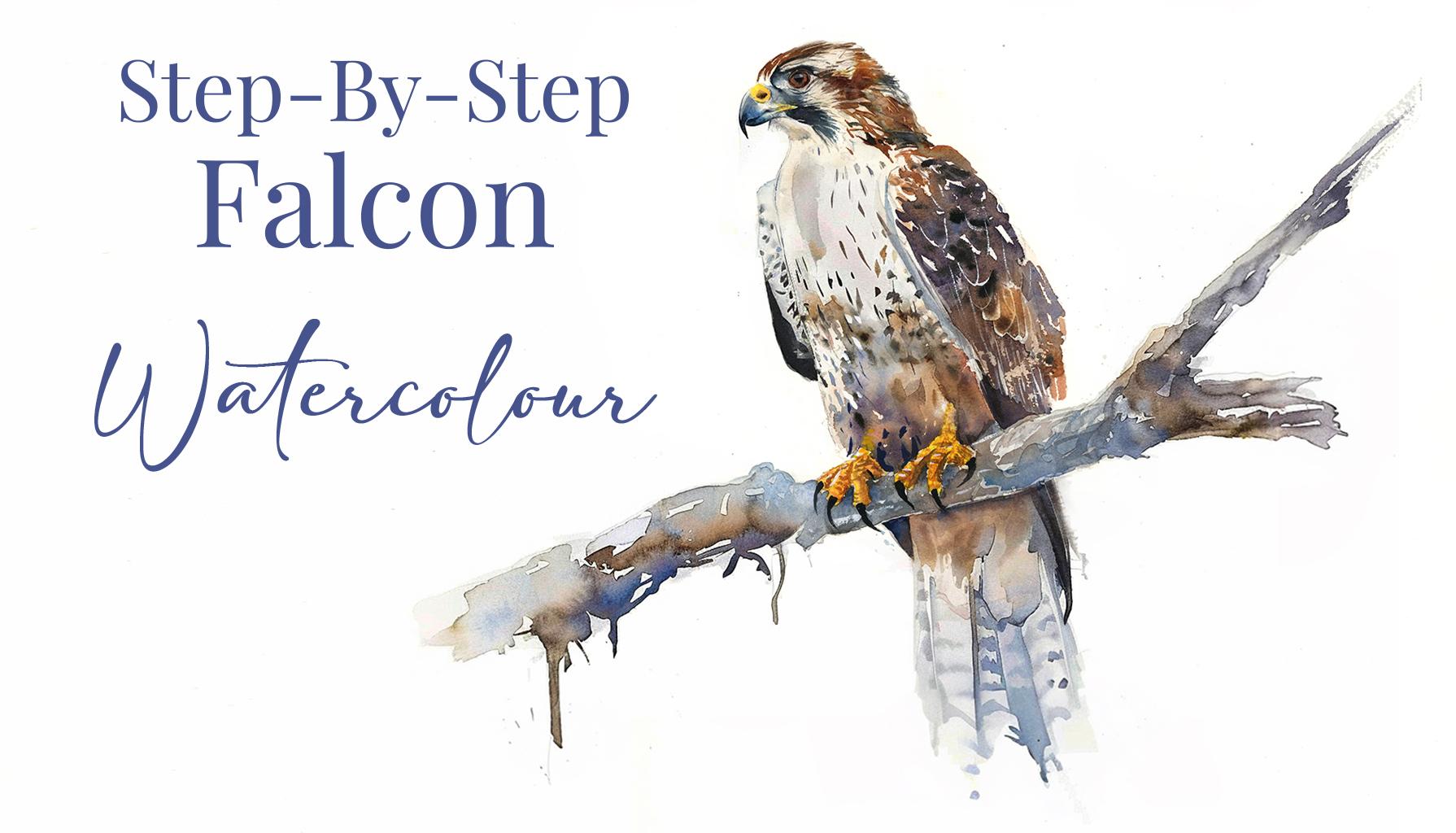
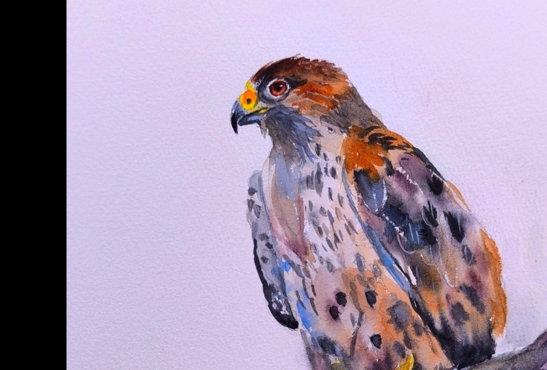
Pereguine Falcon.
2. Your Project: First off, I'm thrilled
to have you all here for this watercolor
Falcon painting class. Falcons hold a special place
in artistic expression with their grace and power,
offering endless inspiration. Today, as we embark
on this journey, I want to highlight
why Falcons make such compelling subjects
for watercolor exploration. Unlike other subjects, Falcons offer a unique blend of
challenge and freedom. Much like in nature where Falcons saw and adapt
to their surroundings, watercolor allows us to embrace spontaneity
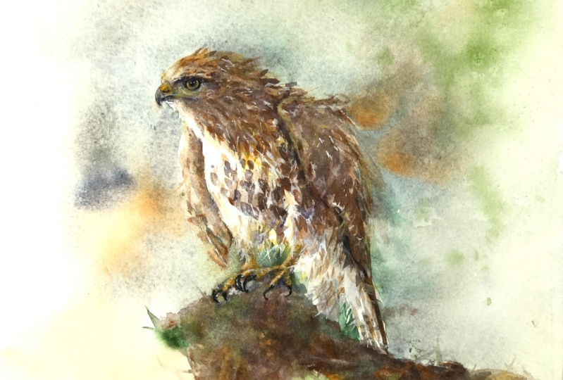
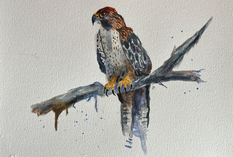
and individuality. In the resource section, I've added a high
resolution image of my finished painting
to help guide you. You're welcome to
follow my painting exactly or experiment with
your own composition. As we're going to be focusing on the painting aspect
of watercolor, I've provided templates
you can use to help transfer or trace the
sketch before you paint. It's fine to trace when using it as a guide for
learning how to paint. It's important to
have the underdrawing correct so that you can relax and have fun learning the
watercolor medium itself. Whichever direction
you take this class, it would be great
to see your results and the paintings you
create through it. I love giving my
students feedback, so please take a photo
afterwards and share it in the student project gallery under the project
and Resource tab. I'm always intrigued to
see how many students have different approaches and how they progress with each class. I'd love to hear
about your process and what you learned
along the way, or if you had any difficulties. I strongly recommend
that you take a look at each other's work in the
student project gallery. It's so inspiring to see
each other's work and extremely comforting to get the support of your
fellow students. So don't forget to like and
comment on each other's work.
3. Materials & Supplies: Before we start this painting, let's go over all the materials and supplies you
need to paint along. Having the right materials can greatly impact the
outcome of your artwork. So I'll go over all the supplies I use for
this class and beyond. They're very useful to have at your disposal and we'll make it easier for you
to follow along. L et's start with the
paints themselves. And like most of the materials
we'll be using today, it's a lot to do
with preference. I have 12 stable colors in my palette that I
fill up from tubes. They are cadmium
yellow, yellow cha, burnt sienna, Cadmium
red, Alizarin crimson, ultramarine blue, cobalt blue, cerliu blue, lavender,
purple, Vidu black. And at the end of the painting, I often use white guash
for tiny highlights. I don't use any
particular brand. These colors you can
get from any brand. Although I personally
use Daniel Smith, Windsor and Newton,
or Holbein paints. So let's move on to brushes. The brush I use the most is
a synthetic round brush like this scoda Purl brush
or this Van Gogh brush. They're very versatile, because
not only can you use them for detailed work
with their fine tip. But as they can hold
a lot of water, they are good for
washes as well. They're also quite affordable, so I have quite a few
in different sizes. Next are the mop brushes. Mop brushes are good for
broad brush strokes, filling in large areas and creating smooth
transitions or washes. They also have a nice tip that can be used for smaller details. But for really small details, highlights or anything
that needs more precision, I use a synthetic
size zero brush. All brands have them and
they're super cheap. Another useful brush to have is a Chinese calligraphy brush. They tend to have long bristles
and a very pointy tip. They're perfect for
adding texture or creating dynamic lines
in your paintings. You can even fan them
out like this to achieve fur or feather
textures as well. And that's it for
brushes onto paper. The better quality
of your paper, the easier it will be to paint. Cheap paper crinkles easily
and is very unforgiving, not allowing you to
rework mistakes. It's harder to create
appealing effects and apply useful techniques
like rubbing away pigment. Good quality paper, however, such as cotton based paper, Not only allows you to rework
mistakes multiple times, but because the pigment
reacts much better on it, the chances of mistakes
are a lot lower, and you'll be more likely
to create better paintings. I use arches paper because that's what's available
in my local art shop. A water spray is
absolutely essential. By using this, it
gives you more time to paint the areas you
want before it dries. It also allows you to
reactivate the paint if you want to add a smooth
line or remove some paint. I also have an old
rag or t shirt, which I used to clean my brush. Cleaning off the paint
before divving it in the water will make the
water last a lot longer. It's always useful to
have a tissue at hand whilst painting to
lift off excess paint. Also, you never know
when an unwanted splash or drip might occur that
needs wiping away quickly. I also have a water dropper
to keep the paints wet. When you paint, it's
important to have them a similar consistency to what
they're like in the tubes. This way, it's easier to
pick up sufficient pigment. A hair dryer is useful
to have for speeding up the drying time and controlling the
dampness of the paper. And lastly, masking tape. And this, of course, is just to hold the paper down still onto the surface to stop it sliding
around whilst painting. Also, if you plan on
painting to the edge, we'll allow you to create
a very crisp clean border. And that's everything
you need to paint along. I encourage you to experiment and explore
what works best for you. Now, let's get ready
to start the painting.
4. Tips For The Sketch: Let's go ahead and
start the drawing. I'm going to use my thick lead mechanical
pencil to begin with, and just starting at the very side and working
my way all the way to the other side so I can map out the general
length of the piece, and then I'll go from
top to bottom as well. Just to get the main points of the composition mapped
out compositionally, so I know how it
sits on the paper. Also, take note to
how I'm holding the pencil at the back here
rather than the front. I allow a bit more swing with the pencil when
I hold it a bit further back because it's a bit more gestural and it allows for a bit more movement. If you're holding it
close to the front, it's a bit more restrictive. And also, I'm trying to
use this pencil very lightly and holding it further away allows for a
lighter pressure. I like to show how I approach these drawings
before a painting because the drawing is actually the most important part of
the art making process, the painting process,
because we're basically drawing out the skeleton of the painting in order to
put the flesh on later, which is a paint, and you can't do it the
other way around. So now I'm switching
to a finer point. Now that I've got
everything mapped out, I can go back in with
a few more details. Because the same observation
skills that are used with drawing are the same
as when painting. We're using color with paint, and we're using a
larger brush rather than a fine lead pencil. But we're still
thinking in terms of shape and proportions, and it can be a bit more
fiddly using the pencil, but I try to encourage
people sketching because it will help
their painting skills and development much faster, better. With this painting,
there's some areas that require quite a lot of detail like the head, the
beak, the eyes. But then other parts
of this painting, this falcon, can be a bit more elusive like the
shape of the body. So I'm taking a bit more
time to get the head right and the
overall silhouette. But once I've done that, it'll be quite quick just
to fill in the rest of it. I also like to start from top to bottom because
I don't want to smudge what I've already drawn in by working
from the bottom up. I don't have to go over
it again with my hand. When I do draw like this, I'm I'm trying to think
ahead in my mind of where I want the pigment
to go and where I want to leave gaps of
white on the paper, and just other textures
that I can imply. I'm looking for large shapes, medium shapes, and small shapes. So you can see I've got a bit of speckling hair going
on in the middle, and also allowing an opportunity for larger washes, so to speak. Also, I'm trying to keep myself
aware of different edges. Some edges I want there to
be hard lines, hard edges, and others were going to
be a bit more transient, a bit more of a gradient, which is impossible to do with a pencil when you're
drawing the outline. Notice that I'm not
actually using any shading, it's purely an outline. But just because I'm
not drawing down where the gradients will be by
drawing it out like this, I'm I'm thinking It's allowing me to plan the
painting in my mind. If I were to trace it, then I'd struggle to I'd have
to spend a lot more time really thinking about what
I'm going to do because it's by this drawing process that it gets you to think
about what you're going to do. So being quite abstract
with the log here, allowing for a little drip, maybe a few drips
every now and there. I don't want this log
to have much attention. It's just something to
hold the falcon on, leaving it quite simple, starting to work on the tail. You can see a lot of
these pencil marks are open for interpretation. They're not strict. They're quite spontaneous. Notice the contrast in the way I'm drawing with this pencil, compared to the first one, the first one's wave in. I'm using a soft lead. You can barely see that first
lead that I've drawn out. With this, I'm holding the
pencil closer to the end and I'm being a lot more precise and a bit
more swift about it. I think that's pretty
much the sketch done. We can use a putty rubber
if we want to clean up some of the soft lines because I don't want there to be a lot of pencil markings. I don't want to see any
pencil marks by the end. And I'm making sure I'm using
a putty rubber rather than the hard rubber of gone display up in the
top right hand corner. Just emphasizing a
few more details, but let's begin the painting.
5. The Bird Underlayer: There's many ways to
start a painting, but I'm going to work from the top down, starting
with the beak, and I'm going to use a very vibrant yellow for
this cadmium yellow, and just filling in a few of
the most vibrant sections, if possible, you can have a printout or on a
separate screen. You can see my finished painting that I have in the
resource section to compare with where I'm adding these areas. You got
it for reference. Now I'm applying a little bit of cadmium red into this yellow, which will make it actually
orange, of course. I'm going to fill in
the eye area because although this looks overly
vibrant at the moment, I'll go over it with
black later on. I just want a little underlay. I'm thinking about
the laying process. And there was a bit
too much liquid there, so I just used my brush to
distraw some of it out. I think is you going to
have a little sponge in the top right hand corner
where I dab my brush just to get rid of excess water or paint
that's on my brush. So now I'm actually mixing
a bit of purple into that yellow and it neutralizes
it and makes it a brown. But you can use burnt sienna if you don't want to deal
with that mixing. Burn Ciena is a nice brown
or whatever brown you have. It is open for interpretation. You can use whatever
colors you see fit. I in fact, really enjoy seeing students
mixing up the colors a bit and experimenting with their own unique
color schemes. It makes the student gallery so interesting to scroll
through and just see all those unique
creative ideas. That's what I love
about watercolor, the endless possibilities of it. You could paint
this painting 100 times and it'll never
turn out the same. With that brown paint I mixed, I've gone thicker at the top and used water just
to spread it out lightly. It's actually a very thin
layer of paint in the end. And I made sure
not to touch that orange or yellow on the
beacon eye because I don't want to draw that vivid
paint out into this wash. So I was very particular
with the tip of my brush not to interact
with that area. And now I'm blending out
almost to a pure white. So it's a pure transition this. Taking a bit of black and
a few dabs of that black. And the paper, even
though it's wet, because it was a
light layer of water. It's only slightly moist. It's not soaking wet. So when I dab that black there, it fades out with a smooth edge. It's not going to completely
blend out altogether. If it was too wet, it
would just completely blend out into a flat wash. But I do want there
to be speckles. So that's why I'm not completely saturating
the paper with water there. I added a little bit of blue to that gray because blue is, of course, the complimentary
color of brown. So even though it's very
subtle, it does something. It just looks a little bit
more attractive, I think. Starting to work up from
the bottom and connect it. I'm trying to leave
the right side of the wing or the right wing, white of paper for
the time being. I'm not going over that
with an underlayer.
6. The Branch Underlayer: Again, I'm mixing a bit
more of this monotone blue. I don't want to use
pure blue and I don't want to use pure black, and I'm just doing the
underlayer for the branch. Mixing in a bit of brown,
keeping it interesting, not keeping it a pure color, and also mixing up the
different consistencies. Some areas are pure water. Some areas have more
pigment than water. You can really use this as
an opportunity to experiment with the different ratio
of pigment and water. Now a majority of it's brown, and I'm using that monotone blue this looks very blue, but when you mix it with
a brown on the paper, it'll blend on the
paper with the water, and a lot of that blueness
will disappear because it's against its
complimentary brown. I'm doing a few flicks, using my finger as
a little t point. So to tap onto so that
it just flicks off. Then just using a tissue to just mop up the ones that
I don't want to keep. I make sure that my brush is as full as possible so
that it's already naturally wanting to drip. If you don't have your
brush fully soaked, then it's going to
be difficult to get those splatters
and it's just going to go everywhere cause it'll
force you to tap harder. I always have a tissue in
my left hand just to dab and take away brush strokes just a few seconds after
in case I want to undo them because watercolor is a medium with which
if it dries too fast, then it's very
difficult to undo. So you have to be very quick. That's why having a tissue in your hand is very convenient. Now I'm using more of a
neutral gray on this side, but we're still
keeping that brown. I'm not really paying too much attention on keeping within the lines of this branch. I'm just trying to fill it out with a lot of
energy and expression. By spending too much time thinking about the details and getting it within the lines, a lot of that
expression is lost. So often by working faster, a lot of that energy can
come in your painting. Now I'm going to take
some lyserin crimson, a nice cool red and mix it with, cerlian blue, which
will make a purple. A reddish purple, depending
on how you mix blue into it. Then I'm going to mix a
bit of green into this, which is the complement of red, so it grays it out again. I'm going back to this area
because as I said before, I want there to be speckles and I didn't wait
long enough before the paper was dry and
I've lost those kind of speckles, going back in there. But I'll wait a bit longer and do it in the
next stage, I think. Now what I'm doing,
I'm actually taping pure water onto this as
it gets close to drying. Be although you might not
be able to see it now, gradually you can see how it's interacting with what
we've already painted, and it's creating a
nice organic effect. Working on the tail now
with a bluish gray. We've got many grays going
on on here, as you can see, but they all have a little
influence of a different hue. Now I mixing brown and a lizard crimson and just
tapping it into here. Just trying to keep
it interesting. I don't want to do a flat color. Whenever possible,
I want to keep it interesting without
overwhelming it. You can do whatever you want
at the bottom of his tail. It's just a underlay, and I'm keeping it abstract. Now, time to dry it
off of the hair dry, make sure it's completely dry.
7. Vibrant Yellows: Now, zooming in, I'm going to start painting the claws or at least the
feet to begin with, so I'm using that same
yellow cadmium yellow. And using a smaller
brush just to fill in those sections
we've drawn out. You can experiment with
different consistencies of the yellow paint to
reach the peak vibrancy. Moving on to the
next one. Same idea. Using the tip of our brush
to just paint the outline and then using a
bit more pressure to fill out the rest of it. There's a little bit of
the leg going up there. So I want to make
this foot a bit more emphasized than the other one. I'm using cadmium yellow, but there are so many different
colors that are close to yellow that you can use
lemon yellow if you want or hands yellow. I often mix a whole load
of different yellows into my yellow pan and just mix them all up together to create
their own unique yellow. So you can be
adventurous with them. Now, I mixed a bit of burnt
sienna onto my brush, and good quality burnt sienna. It's nice and bright. It almost looks like orange
when mixed with this yellow. And I'm just adding a few of those wrinkles that
you see on birds feet. And I'll leave that there
for the time being, leave the feet and now I'm going to move back
up to the top to start painting the head and I'm using cobalt blue
to start off with, and I'm mixing in a bit
of purple into that. And using the very
tip of my brush, I'm very careful just filling out the first part of this beak. Now the yellow that we
painted previously on the beak is completely dry
because we use the hair dryer. We don't need to
be worried about that contaminating each other. But using a bit more
water on the edge here, and being careful that
it doesn't overflow, I'm going to create a transition between this blue and yellow
without it turning green, and to help us along the way, I'm going to add a bit of black in there or neutral
tint is what I use. To just desaturate it because
it was a bit too colorful. I like to have a
little bit of blue or any other color to keep
my blacks interesting. That's why I use neutral
tint because it's completely neutral and I can influence
it whichever way I want. Some of the other blacks you can buy are influenced
with other colors. So it's a bit difficult to control if you have
a cool bluish black, then it's difficult
to make brown. And having this dark right next to the yellow of the beak
really makes it pop. Be very careful when painting
this tip of the beak because if it goes too
thick, you can't undo that. So it's better to go extremely careful and gradually build onto it rather than going ed and going a bit too
thick with that tip. Adding a bit of pure
water and then mixing it in to make a bit of a
gradient to fill it all out.
8. Painting The Head: Now I'm taking a bit of burnt sienna mixed with a
little bit of zarin crimson, and I'm starting
to paint the fur at the very top, a
little feathers. I'm trying to create a jagged texture to create the illusion of
different, different angles. Like the brush strokes
are overlapping each other in slightly
different angles. Getting a bit of
water on my brush, and you can see how bright this color goes when it
brought out with water. When it's thick, it
looks saturated. But when you add
that water to it, it really makes
it quite vibrant. Being very careful
around that eye. There's a little section around the eye
that I'm trying to maintain the white of the paper. If you look at if you look at the reference
of my final painting, you'll be able to
see what I'm trying to preserve which area
I'm trying to preserve. I'm using a very dark black
just to make those areas pop. This is why having drawing skills can
really help because, with detailed areas like this, you have to make your
drawing clear for yourself. You know which sections
you should paint and which sections you should leave especially at this part, I'm making use of the
tiff over my brush. I've got this blue bit, this
dark blue, grayish blue, contrasting with the dark
brown on the other side, which visually goes
well together. Using pure water
slightly pure water on my brush just to
blend out those edges. The water isn't overflowing,
it's just glistening. I really have to rub the paper quite a lot to release the water from
my brush onto the paper. If there's too much
water on my brush, it'll just spill off and
it'll be uncontrollable. And you can go back and forth. There was a bit too much
water and pigment there, so I just used my brush
to suck some of it out, and I just rubbed it on the
sponge or towel off screen. And there again, I'm going back, slightly we it to
create a smooth edge. T. If you're feeling a bit anxious about
painting details, you can watch this video or paint it in a
different order. You can come back to
the head at the end. With watercolor,
there's a lot of flexibility with how to paint. So as you see, we painted a vibrant red for the
eye to begin with, and now we're going
back over it with a darker hue and it stands
out a bit less now, but that red adds a bit of a
glow there, a subtle glow.
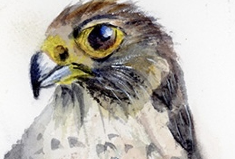
9. Painting The Eye: What I'm trying to
do with this eye, I'm not sure of the
anatomical terms, but for the very black
part in the center, I want there to be a smooth
edge as well as the outline. And now I'm just
using a white just to tap a white
reflection on there. But I'm making sure
it's fully dry first. I use a hair dryer to
make it completely dry before I go into
that white gah. You can also use white
watercolor as well. When using it for this, there's
no difference whatsoever. I prefer to use white gah for highlights because
it's more opaic. White watercolor, even though it's white is still
slightly transparent. So we're coming close
to finishing the head before we move down to
the rest of the body. I'm just thinking
about what to do next. Maybe adding extending
this bit here, so I'm adding a bit more water to blend out and draw
out some of that brown. And have it a bit darker so that there's a nice
transition there. Maybe get rid of
some of this water. It's a bit too dark, so I'm
going to get a tissue and just dab that out a bit. And I'm going to go back with
the white ah and just get a few more accent
accented highlights. Using a very fine
tip of my brush, emphasizing the
cure of that eye. Being very careful.
Using a lot of finess in this area goes a long way. Using the finest line just
adds a bit more finess to it. I just noticed I got
a splash mark there. So I'm just using a harder brush just to scrape it away and then
a tissue to clean it up. Next, I'm taking a bit
of a dark pigment. Just to put a little dot here. Again, I don't know
the anatomical terms, but the little hole in the
beak at the top of the beak, and I wanted to blend out
a little bit at the top, so softening that
edge at the top. Another fine line here
to accentuate the beak. Few tiny dry brush marks. Now we can start thinking
about the rest of the body. Getting some burnt
sienna on my brush. Most of it's already
on the pat anyway, so I'm just mixing it with some other colors
I've got on there. Going back to my larger brush because it's a bit
more expressive. Creating a nice little gradient
of brown and gray here. Mixing a bit of purple
into this gray. But it's a bit too much, so I'm going to dab it back out again. You always be willing
to change your idea. You don't have to commit to
things if it feels wrong. It's using that tissue
to undo if you can. That's a bit better. That's
softer, it's more subtle.
10. Starting The Body: Now I'm going to
connect the head with the rest of the body. Still using the tip of my brush. Again, trying to mimic
feathers, small feathers. Almost cross hatching, trying to move my brush strokes
in organic way, random, trying to mimic
the randomness of nature. Taking some blue ultramarine blue and Ceran blue, that is, and going back over that brown in a random fashion as well, and not over mixing it, allowing the water color to blend it and mix
itselves on the paper, adding a bit of pure water to encourage that mixing process. Because you have to think
ahead sometimes in watercolor. For example, that
part that I just did there looks very
different now than how it will in 5 minutes because it takes time
for the watercolor to react with the
pigment and the water and the way that it settles, This part on the left, I started with a dark bit of
pigment, almost black, and I'm coming down
with pure water, and I'm going to connect it. And you'll see when I connect it how the water just flows upward. Because even though
it's a thin strip, it really bleeds out
into that water. And it should do the
blending for me. I'm allowing watercolor
to do the magic for me. It does look very strong, but black does dry
lighter lighter in tone. Also, it's good to have a
full tonal range anyway. Having a few of the
darkest darks is nice. But I am drawing some of it out because
it is a bit too intense. Now I'm going to take
this grayish blue and do dabs at the top. To finish off this
left side wing. Creating a bit of
a edge there and preserving some white of
the paper in between. Now moving on to the left side, just going to do
a line thin brush stroke just to define where
we're going down here, the edge of the wing using
this grayish monochrome blue. Trying to mix different colors
into every wash that I do. So I start of a little
bit of that blue and then add a bit of brown and now
a bit of a lizard crimson. I'm not trying to go
over the top of it. Little subtle nuances.
11. Complementary Colors: Mixing a bit more this
grayish blue again, using cobalt blue
and Serlian blue. I start with a stronger
burnt sienna because I know I'm going to go
back over it with this blue and it will
neutralize each other. Will neutralize itself. That's a good thing about experimenting with
complimentary colors is you know how they interact
with each other and you can plan a to make
it a bit dynamic. That's what we're doing here. Going all the way
down to the bottom, leaving a little bit
of a gap between this wash and the
feet, the claws. Maintaining a few the white
parts of the paper here. You can see how that water has created a bit of a
cofloer texture. Sometimes that's unwanted,
but in this case, I'm trying to
encourage that texture because it creates a nice
organic feeling to it, a bit like plumage
in the feathers. Now that that area is wet, I can start dabbing
other colors into there. And by other colors, I just mean this burnt sienna and
this grayish blue. It's half random
and half trying to imply the texture and shape of the pattern in the f. Also
thinking about the tones. I guess it's not random, it's trying to be
expressive, being impulsive. Then at the very bottom here
using the dark pigment, while it's very wet so that
it blends up in a nice way. Because all of these
different pigments, all the different
colors in the palette, the size of the pigments, the granules of the pigments
dry in a different way. By mixing them wet and wet, they create a lovely effect together when they're
so combined this way. Now I'm moving up to the top and adding that spotted feather pattern that
these birds have slightly allowing that pigment to fall off my brush
onto the paper. Using a tissue to tap out
some of that water pigment.
12. Wetness Of Paper: Now that the paper
is only just damp, not very wet at all. I can add these little
dots of pigment, and they're going to
have a nice soft edge. They're going to bleed
out in a nice way, but they're not
going to disappear. They're not going to blend
out into just to wash. They still going to have
that dot like fashion, the pattern on the feathers. But it's going to be a bit more elusive because they
won't be hard edges, they'll be soft and
They'll be unique. Allowing the watercolor
to create this effect. Again, using time
and the drying of the pigment to affect the
way we create textures. Using very dark pigment as we go down to help boost the contrast. I still think it's quite
wet at the bottom, so that's why I'm waiting longer because the
paper is too wet, so it would blend out too much. Of course, the timing changes depending on how thick the pigment is that
you're applying. If it's very, very thick pigment that's got
hardly any water at all. You can just paste it on there and the water won't
interact with it too. But if the pigment that you're applying is already
very diluted, then it'll just spill out
with the rest of the water. What you can do as a
separate exercise is get a plain sheet of paper and cover it with water
and on one side, start applying paint from
the beginning when it's completely saturated with
water, and then gradually, as it comes closer to drying, add more pigment until
it's completely dry, then you can apply
the last stroke, and you can see the difference of how the dryness affects it, and you can do this with different ratios between
pigment and water. You could start doing it from
pure pigment straight from the tube all the way to
highly diluted pigment. And now I'm going back over
some of these spots with even darker pigment just to help boost the
contrast again, because as it blends out, the tones become lighter. But in some areas, I want to keep that darkness.
13. Letting Watercolour Do It's Thing: Now I'm thinking
about how to connect the head with the other
side of the wing here. A to reactivate it a bit, agitate it, and then bring
it down, so it's seamless. But I am preserving a few
white edges there to highlight where the head and neck
is apart from the wing. I'm mixing yellow ocher here with some red to
create a nice brown. I'm showing you how to mix your own burnt sienna without actually
using burnt sienna. Which is a lizard and crimson
and yellow oka basically. Then I'm mixing a
bit of lavender, which I already have
lavender on my palette, but you can mix that with purple and blue and a bit of white. I'm using a bit of a dry brush
effect at the top here to create that texture of
tiny organic feathers. Then I'm being a
bit bolder here. I'm mixing what looks
like a very dark pigment, but it is actually very
diluted with water, it will dry a lot
lighter than it looks. This bit here is probably the boldest part of
the painting process. Even though it takes 30
seconds a minute to do, it takes much more concentration than the details in the face, I find because you only have
one shot and it's impulsive. Because you have
to move quickly. I want to connect all
these different sections, but preserve a lot of the white paper starting
with that purple, that dark grayish purple, and then incorporating
some brown. And where it's dark
in the middle, I'm connecting it with a
lighter wash of color. So that that dark pigment actually fools down with the water and
spreads itself out. What looked very
dark to begin with, you can already see
is lightning up. Again, using dh, using
the side of my brush and doing fast movements to
create that dry brush effect. And the trick, the real difficult thing now
is to just leave it alone. It's so easy to overdo
it and lose the magic, and I do it countless times. There's some kind of draw to watercolor to
want to do more, but really as a point where
you just leave it alone. What feels like it's adding to the painting
actually takes away. It's a lot like golf. You have to try and
finish the painting with as little
strokes as possible. The best paintings are the
ones that are done most economically and
most efficiently. I'm thinking there's lows
left to do on that wing, but even though I know it's not perfect,
it's not accurate, I want to keep that
watercolor aspect, that flowing of
different pigments, so I'm just going to hold
myself back and leave it alone. I like those white little parts of the paper that we've got in between all these sections, and I don't want to lose those. Just a few more tones
that I have to correct, and then I'm just going
to leave it alone. Of course, as it starts to dry, you have a bit
more freedom to go back because when it's wet, everything moves around
really fast and blends. But when it gets
absorbed into the paper, you have a bit more time
to think about things. So that's why I'm
going back now.
14. Painting The Tail: I. But now I'm going to
start painting the tail, starting from underneath
the branch with the same burnt sienna brown
that we've been using. Starting at the very top,
not going over the branch, and just looking for places
to take that wash down to. Trying to keep it organic. Trying not to have
any straight lines. The incorporating some of
that purple that we used above to create the illusion that it's connected the
other side of the branch. They're dabbing in some
dark pigment there, so we ke interesting. We keep it dynamic. We're not allowing
it to become flat. Mixing some of that
lavender in there, using a few vertical
brush strokes. See how that on the left
hand side of that tail, the lavender blends upwards into that brown,
complimentary colors. There's a few stripe
like patterns on the tail here. On the feathers. Trying to connect everything, but in a way that's natural. I don't want anything to be
isolated if I can help it. It's just finding a way to connect everything
in a way that doesn't steal too
much attention, something that flows or looks. Of course, the odd highlight or a few dots can
be unconnected. As we come to the edge of
this tail at the bottom, keeping a bit abstract, implying the shape of the tail rather than painting
it detailed. By leaving out the details
of the tail at the bottom, we're actually
directing the viewer to the main focal point, which I think is the head. Then from the head, it moves down to the wings and the areas
of most contrast. The areas of most contrast will be what demands the
most attention. So you don't actually want
high contrast in every area.
15. Finishing The Tail: K. Of course, there's so many different
elements to think about when painting and
specifically in watercolor. It's good to repeat things. I often talk about similar
things in every class, but there's so many
different things going on. It can get lost. It can be go in one
ear and out the other, or you can learn something
and then forget about it. I still do that nowadays, it's good to constantly
review all these things. Finishing off the edge
on the right hand side, a bit of brown because there's not much
brown going on there. So just adding a bit there. Just touching that to
see how dry it is, and then I'm going to add a
few more of these stripes. Now that it's had a
bit of time too dry. I can add these
stripes onto there without being rowed
that it will wash away. It should still have
a nice soft line, but it won't wash away at. Now I'm going to create
a very subtle background or at least the
edge of this tail, I'm going to create
a little highlight by painting a subtle
bit of background. I'm wetting the paper with
pure water and saving a bit of white on the
edge of that tail. And then going in lightly
with this pigment onto that wet paper so that it
bleeds out very subtle. It's one of those things that you probably wouldn't
notice in a painting, but it just slightly
improves it. We use the hair dryer
to completely dry it off before we move
to the next stage. I'm taking some close
to black pigment, but adding a little bit of blue in there just to
keep it interesting. On the side of the tail at the top where
it connects to the branch. I'm just filling in these
little triangle shapes. Just to add a bit of contrast
the full tonal range. The same on the other side too. To a fine line to connect
it up at the top there. A few little random touches. Then mix some of this blue. Get some of that
blue on the brush, some darkened ultramarine. I'm just going to go back now that this section is dry and just define that section
with a little fine line. Again, very subtle, but
just need to define the two different sections where the wing separates
from the body. Maybe another dot there.
16. Painting The Branch: Time to clean the brush, and let's move on to
painting the branch. So I'm going to take
some of the sill. Serlian blue and lavender, and a bit like we did
for the first wash. I'm going to mix
these two colors and have a bit of dynamic
color change going on, leaving a bit of the under
layer coming through. But being quite spontaneous
with where I'm putting it, trying not to overthink it. Starting with a nice even layer of water and then just dabbing a few random pigments of the blue and brown
in random places. Mixing up how dark
I put the pigments, but keeping them all connected
as this is very wet, these blend nice and smoothly. Now I'm going to do a
bit of a drip here, a bit of an artificial drip. Because I don't
want to risk trying to do an organic drip, so I'm just going to
add a fake drip myself. Taking some more of that blue and blending it in
as we move forward. Zig zagging across. I tend to swiggle my
brush around quite a lot. Just going back and forth between brown and blue,
and a bit of purple. Those are my three main
colors in this painting. You could also include yellow because like I say,
a lot of the time, brown and blue are
complimentary colors, and purple and yellow are
complimentary colors, and we've got all four of
them in this painting. So just swiggling around using a bit of cligraphy, so to speak, to connect it all together
in exciting ways, mixing a bit of green now, very turquoise bluish
green, really, actually. A lot like the green we
have on the Falcons face. Amuted blue, I think,
I should call it. Now, I usually start with all those squiggly little lines, and then I just
look for places to fill in those white marks because I don't want
that many of them, so tiding it up a bit. Ano. I go back and forth between adding more water and
adding more pigment. Now as we come up
to the feet here, we have to be quite careful
not to go over the yellow. You just got to think
carefully and just go with it using the
precision of your brush. Now, you don't have to
be p because a lot of time having that imperfection is what creates interest
and makes it unique. Although it might look
ugly whilst we paint it, the finished piece interest
because of that imperfection.
17. Harmonizing The Colours: Yeah. Now I'm drawing a few colors from the rest of the branch and using them
to fill out this area here. I'm not necessarily always
going back to my palette. Taking pigment that I've
already got on the paper, and that's a good way
to keep it in harmony. Now I'm tilting the paper
to the side and adding a bit more water to move some of this pigment down and to
get it all blending nicely. Trying to manipulate that
pigment in an interesting way. Using the tip of the
brush again just to go in between
the little toes, the little claws, trying
to get the tones right. Trying to balance the
tones because on one hand, I want to keep it the same tone as the rest of the branch, but I don't want it
to be so close to the tones of the falcon
so that it blends in. I want it to be
slightly different. Just in between, I'm adding a bit more darker
pigment just between the little claws to add a bit of shadow
or a bit of depth, and this will blend out softly
because it's wet on wet. And I'm taking a
really thick pigment of yellow and painting
the other leg. One stroke is all really needed. Now I let that edge
dry a bit too hard, so I'm just going
with the tissue just to roughen it up a bit. And dabbing the top of the branch to give
it a bit of form, so it's lighter on the top and a bit more shaded
on the bottom. Now starting on the other
e on the other side. Using that dark purple. You see how with this branch, I'm still using the same colors I used to paint the falcum. I'm keeping them all unified. I'm not using a brand new
color that could make it a bit jarring
and kill the unity. I'm just using tones to make sure they're
visually separate. I start in random
little sections, fill areas of that with one color and then expand
it with other colors. You can see me do
this throughout the painting and in
different paintings too. It's the way to
create nice changes of color within one wash. But you have to move quickly because if you wait too long, there'll be hard edges
and there won't be a smooth transition of color. You have to have these colors pre mixed from your
palette ready to go. Even paintings that use a lot of gray still can incorporate
lots of different colors. Just because the subject of your painting is
monotone or gray, doesn't mean you can in
whatever color you want. You can make grays
very interesting. The good thing about keeping
to a color scheme is that your palette
will be in harmony. So when I go back to
my palette to pick up more colors in the little
pans that I got pre mixed, it doesn't matter which I use because they're
all in harmony. You can see it's
brown at the bottom, and it blends to a blue at
the very top there's a green. A bit too vibrant blue there, so I've just used brown to
desaturate it a little bit. And now I'm going to
connect two sides there. Leaving a little
bit of a white gap.
18. Finishing The Painting: Going back up with a bit of a few splatters of pure water. Again, to create some
interesting texture. I've held back from using
salt on this painting, but you can with using that, particularly on the branch, if you want to experiment
with different textures, and we use the hair dryer
to completely dry that before we move on to
the next section. But before it's completely dry, I'm just going to add a few darker tones just at the
bottom of the branch here, just to give it a bit
more depth and form. There we go. It's
completely dry now. So now I'm going to give a bit more
definition on the claws. I'm taking some burnt sienna and just in between the claws, adding a bit of shading
to differentiate the lie I'm not sure whether claws counts as the whole foot or the individual toes on them. But I'm trying not
to be too tidy, adding a few lines, but just implying the
shading and texture rather than neatly trying
to paint it in. I'm trying to add
a bit of finess while being a bit abstract, but not in a kind of not trying to hold myself
back from being expressive. We can see just with a little
bit of extra depth of tone, it improves the looks
of these claws. It really makes the yellow pop. Now we're going to
take some pure black and very carefully add the
black tips to these claws. Just like curved thin
curved triangles. I want these claws to
be as dark as possible. So my pigment is very
thick at the moment. And as you can see, I'm holding my brush
completely upright, perpendicular with the paper in order to make use of the tip. It's difficult to use the tip if you're
holding your brush at an angle sideways. You can see with these
black little claws, I'm going a bit
above the yellow. I'm not stopping at the edge. I'm going straight over a bit. I'm slightly overlapping. Now, for the claws, I think that's pretty much it. I'm just going to clean my brush and have a look at the whole of the painting
and see what we can do. Maybe we can add
a few highlights. What I find best actually is
to put the painting away for a couple of days and then come back to it with a fresh
eye to see what's missing. To see what sticks out. Be often when you're in the zone painting for a couple
of hours or a few hours, a lot of the little
mistakes that you've made that are visible
to some people, you're just used to them
because you painted it, so you need a fresh eye, you need to
disconnect for a bit. Don't look at it for
a couple of days maybe and then come back to it. So I'm using thick
white wash to create a dry brush line and trying to emphasize
the shape of feathers, the outline of the feathers
on that textured area. But I'm trying not to overdo it. I'm only slightly
adding some thin lines just to help suggest
some of the features. A few of the highlights. And you can see, we've got a whole range of different textures and
techniques in this. We've got a lot of wet on wet. We've got some dry brush. We've got laying going on. We've got large washes. We've got small shapes. Let's have a little final look. Maybe, go back with a dark bit, just refine some of these edges. I think that's pretty much it.
19. Final Thoughts: Welcome back. And let me give big thanks
for you watching. And congratulations to each of you who know you'll
give this painting a go. If you're feeling
hesitant about giving this painting a go,
let me encourage you. There's no better time than now to take that
leap of creativity. We're in a positive
learning environment here where mistakes are seen as
opportunities used to grow, and they're a sign of
courage. So don't hold back. Dive in with confidence and
apply what you've learned. As we've worked
through our painting, we've tackled the key components of watercolor techniques. Achieving a balanced
range of tones, experimenting with
various textures, and mastering the art
of blending colors. I trust you now
feel confident in your ability to apply these
skills to future projects, creating not just visually
appealing pieces, but ones that carry
depth and significance. Remember, watercolor painting is not just about technical skills, but also about expressing your creativity and
personal style. I encourage you to continue
exploring, experimenting, and pushing your
boundaries to create your own unique
watercolor masterpieces. As we come to the
end of this class, I hope you feel
more confident and comfortable with your
watercolor painting abilities. Practice is key when it comes
to improving your skills, so keep on painting
and experimenting. I want to express my gratitude for each and every one of you. Your passion for watercolor
painting is so inspiring, and I'm honored to
be your teacher. If you would like feedback on your painting, I'd
love to give it. So please share your
painting in the student project
gallery down below, and I'll be sure to respond. If you prefer, you can
share it on Instagram, tagging me at Williston, as I would love to see it. Skillshare also love
seeing my students work, so tag them as well
at Skillshare. After putting so
much effort into it, why not share your creation? If you have any questions
or comments about today's class or want any specific advice
related to watercolor, please reach out to me in
the discussion section. You can also let me know about any subject wildlife or scene you'd like me
to do a class on. If you found this class useful, I'd really appreciate
getting your feedback on it. Reading your reviews
fills my heart with joy and helps me create the best
experience for my students. Lastly, please click
the follow button up top so you can follow
me on Skillshare. This means that you'll be
the first to know when I launch a new class
or post giveaways. I hope you learned a lot and are inspired to paint more in
this beautiful medium. I look forward to
seeing you all again in future classes until
then happy painting.
 Will Elliston, Award-Winning Watercolour Artist