Transcripts
1. Introduction: So yeah, let's do this. Hello, everyone.
I'm Neha Poddar. I'm an artist and a
surface pattern designer. Today we are going to
paint something really interesting and honestly,
very delicious. Continuing with the
series of our sweets, we're going to paint this glossy chocolate illustration
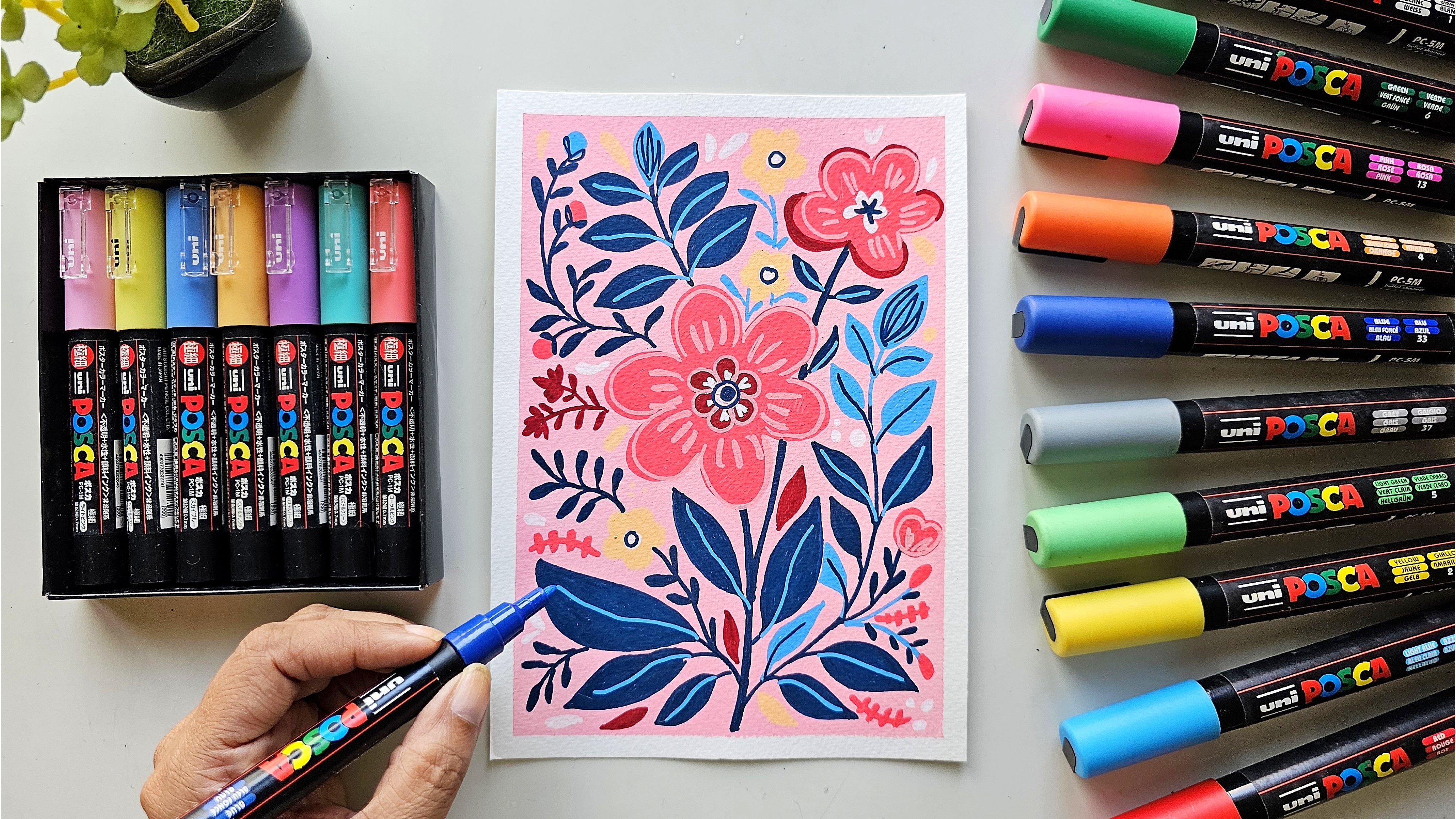
with Posca markers. I did my artistic journey
with Posca Marks, and I have never
looked back since. So why Posca markers? Well, let me tell
you, these markers are like a dream for an artist. The colors are vivid
and opaque and gives an unmatched matt illustration
look to our painting. If you are new to Posca
markers, don't worry at all. I'll be walking you through
everything step by step. We'll start with
a simple sketch, and then we'll start
to build layers, and slowly we'll come into highlights to get that
yammea chocolate. This class is super
bigner friendly. So even if you have never
used Posca markers before, you'll be able to follow
along comfortably. And if you already
love using them, this project is a
great way to practice color layering and creating
textures with markers. By the end of the
class, you'll have your own cute illustration
of the chocolate, and it will be something sweet, small, and satisfying to paint. My aim is to make it an enjoyable and a soothing
experience for you. So grab your Posca markers, and let's get started.
2. Background: So let's keep the paper, and I'm going to use
this washi tape, and let's just eyeball it. Okay, so the half
of washi tape is on my desk and half
is on the paper. And then I'm just
pressing it down there. Just press it down with
both your fingers, especially the part where
the paper is there. Just make sure there's
no bubble on the paper. See, like one has come over
here, but that's okay. It's on the side. So try not to have any sort of
bubble over here. So there just press
them all over, especially on the sides,
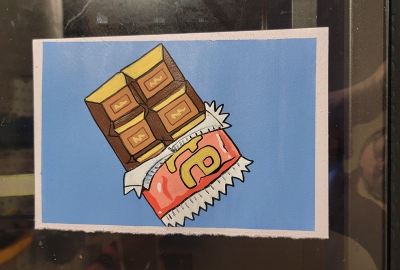
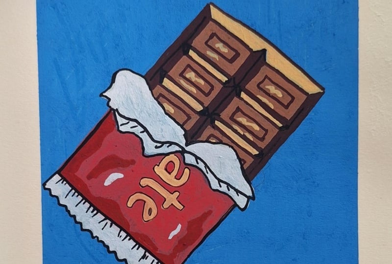
and we're good to go. So today we are going to make a chocolate with its wrapper, which is half open
and just look at it how beautifully all the
colors are coming together. So first, we'll start
with the background. So for the background, I'm going with thalo
blue and titanium white. So our objective is not
to get the exact color, as I had mixed those colors, and I don't know if, you know, we'll be able to
replicate it exactly, but we'll do something which
is a little close to that. So probably we'll
need a lot of white. I think we'll need
some red for this because the color has a little bit of
lavender tone to it, so probably a little bit of red. So I'm taking a crimson
and I'm putting it. So just a tiny bit. Let's see where the color comes. Yes, it is, in fact, the tone, but I think we'll
need more white. I've added just a
tiny bit of white to so we have added to blue, crimson, and white o
to get this color. You can go with any blue. You can take a
Prussian blue also. So this will be a color
for the background. So I've taken a flat brush, and I've just dipped it in water and just dried
it a little bit, okay? And I'm just taking my color. So we'll start with
horizontal lines. And you see how
nicely it is coming, and I like to give
a plain background. So go for a smooth strokes, long and smooth
strokes and just try to fill in all the whites. Okay? In case you want to go for a sketchy background,
you can do that. Okay, you can just take
a little bit of gray or red and just have a
little sketchy background, and it will give you
a nice base, too. Smoothing it out, so
don't forget the corners. And that's it. We're good to go. Let's just wait for
it to get dry and then we'll come back and
sketch the chocolate over.
3. Colors Required: Meanwhile let's
just see the colors that we'll be requiring
for this project. And as you can see, the primary color for this
is the browns and the red. Okay. Let's start. One of the main color, okay, is light brown. And then, of course,
there are places where we can see some shadows. Okay, so these places
are dark brown. Okay. And then the
wrapper is a bright red, so go for a good red. So, yeah, I believe these are our primary colors
for this artwork. And then so now for secondary colors is a
deep red over here, and, of course, the white also. So this is like a maroon. This is like a
beautiful maroon color. Then what I'm going to use is there's a lettering and
some highlights over here. So mainly, we'll
use pastel yellow. Okay, so this color
name is pastel orange. So we'll use this for some highlights in the chocolate and of course, the
lettering also. Then, of course, a
secondary color, there is white.
Okay. But that's it. And then, of course, we'll use fine liner to give
some detailing work. Okay? So you need a
black fine liner, okay? So this will be our color
chart for this artwork. So now let's get started.
4. Base Layer _ Chocolate: I just like to take some
moment and just draw it out. So now I've done
a basic drawing. Okay, just a rough sketch. And let's start now. So we'll start with
brown, the lighter brown. And the area which is getting more light,
like the top part. Okay, so that will
be light brown. So I'm just marking
the area first, and then I'm just painting. So this one has a
lot of fine details. Okay, so we will go
about it slowly. See how beautiful
opaque they are coming. And in case we want, we can just come back
and do another layer. So we can go for a relatively simpler form of chocolate also. So here, the
wrappers are coming. That is why it's just partially that we can
see the chocolate. So now let's start with
the parts where there are, you know, the light is
not reaching properly. So I'm just doing section wise. So I'm just doing it
section wise so that, you know, I don't
miss out on any part. So a lot of times, you know, these dot make sense, frankly. But over time, as we're
adding more details and all, you'll see how these just
start making more sense. So there are two
halves over here. What I'm doing is
I'm just, you know, just doing this part because this part is
getting light, okay? So that is why I'm just
doing the other half. So very slowly a form
is coming, right? And then the middle part, the entire middle part is
not getting any light. So this one is just basically
a play of light and shadow. You can even go ahead and
color the entire part brown. And then where you feel
that the light is coming, you can again come
back to that part. A lot of it will
make sense once we do an overlining
with a black also. So there, I think, these parts are deep brown. Move on to the bright red. And this part of the
wrapper is basically white. Okay, so what we're
doing is we'll just cover this part red. Let's just paint the
entire part red. Okay, so I've just made an outline of where
the red color is. Now, let's start filling it part by part with small strokes. So don't go against
the paper, okay? But the better part
is since we've primed a paper with acrylic markers, we don't get any pilling, and the color, they come out
really smooth than this. See how pigmented
these colors are. I just think that
we might have to do this red color
one more time to give it the best opaque,
you know, opacity. So let us just wait
for it to dry, and then we can come back to it and just put another layer.
5. Detailing: Start with this
light pastel yellow. Okay. So the color
name is pastel orange. You can start with this or you can use a cream color
also instead of this. So now, we'll just
give these highlights. Okay, be careful and don't
go, like, overboard. Very slowly fill the spaces. I just need some more
space over here. There, I think this is done. Now you'll slowly see how
our artwork is coming. So these are just the light is coming from top and it
is coming from this part. That is why this part of the
chocolate is highlighted. Always identify
the light source. Now, see, I have just
missed a space over here. I just need to go back
and do a deep brown. There. So, let it dry
because right now, if I come near this
with a lighter color, we'll just smudge it, so
let it dry completely, and then we'll come and do
this yellow bit over there. So let's just finish here. So I think this is done, and we can come back
to the red part now. It's still drying, so we'll
come back to it later. So let us just give
another layer of red. So the layer below
is, like, 90% dry. It is still a little wet. So that is why a little
it's a little bit patchy, but I think when it's dry, it'll come out nice only. So now just look
at this opacity. It's come out so
pretty and so bright. So you just wait for it to dry. So now let's just
finish this part. There. Okay, so
now let's wait for the red to dry because
that is still wet. And I just I will start
with the white now. Well, let's go ahead
and use a white. Okay. So this part, which is the wrapper wrapper
which is a little turned. So that part is white. It's actually depicting
silver, okay? So, but I didn't want to introduce silver
to this painting because I want it to be very it has to be very
illustration look, so I didn't want to introduce any silver colour or gold color. So that is why I'm
using a white colour. So make sure the entire, you know, the red
part and the browns, they are completely dry when you're starting
with white because then you'll get a very beautiful
and opaque white, okay? And can just come on top of
them also with the white. That is the best part. So once it's completely dry, the white will come out pretty
nicely on the red also, which is quite deep.
Now, let's fill this. Can you see just how beautifully
this white is coming? And then this part is a
little zig zag, okay? Because the stop part had a
little zig zag. That is why. Okay, so white part is done, and I'm pretty okay with it, but in case let's see if I feel that it needs another layer,
we'll just come back to it. Meanwhile, let's do the
last part over here. So this is also that
silver wrapper. Then again, we'll come
over red a little bit. I can finish this off. There. So even these light textures are just giving some
reflective look, which is just giving
it more dimension. So I'm liking that.
6. Finishing Touches: Now we're going to
give some shadows with this deeper red, okay? So we'll give shadows as a
light source is coming from top and it is coming a little
bit from the right side. So that is why some
parts over here will be a little deeper, okay? So because there's a
wrapper over here, we'll just mark the parts first. And since, you know, this is like a paper, so it's not like really
straight line, we're just giving a
little curve just to give it that shape that the wrapper is bending
at some places, and it is not bending. Okay, so the part will
be red, deep red. Also like there's
some shadow over here because the paper is a little, you know, it's going down a bit. That is why. You see a little bit of so
I'm just smudging it over here a little bit
because I want that red, but I wanted a little smudged. So what I've done, I've
just used my tip fingertip, and I've just smudged
a little bit. Okay? So just another pro tip. But what I want is I just
want a little bit of, you know, deeper
color over here, and I'm doing it right now when the red is wet
because, you know, I just want that those part should get a
little merged with the red. Okay? So again, I'm taking
the red and I'm coming back. I just want that part
to be a little deeper. But then again, I'm
putting red on there. Now this is the part
where I can just, you know, just see if there
is any place that I want. So I'm just giving these lines, just making them a
bit more sharper. In case you have,
you know, a one web, you can go ahead
and use that also for this part because, you know, it just gives a bit of if these things are
a little sharper. So I'm just going ahead and giving this white another layer, okay, in some places, okay, because I
can see the blue, and I would just like to
give it a bit more opacity. You can see, like,
some lighter colors you might have to, you know, do again, but a lot of deeper
colors, you don't have to. Like, we didn't do any of
these, like, repeatedly. So there I'm just giving
it one final touch. So now let's come to some parts which are a little
highlighted or embossed. So I just want these
chocolates to have, like, a little bit of embossing. So I'm again taking
the deep brown only, and I'm just giving these You know, I just defining them. There. It is just, you
know, making it come up. And now, let us just put a
little bit of, you know, this chocolate embossing and give some rectangles
in over here. There also some bit over here. Also, I want to give this
brown only very slowly. Now, can you see how the
shape is just coming? Now again, I'm coming back
to the pastel orange, okay? So I was using a
three M earlier, and now I've just
switched to one M, and this is the pointed one that you can see that
it's, like, really sharp. Okay. And I just want to
give some final highlights. So, you know, it can be like probably some name is
embossed over here. Okay. And, of course, like, maybe some highlights. And in case you are
feeling like, you know, someplace needs a little
bit more attention, just do that highlight
right now and you can even make
them more sharper. See how well it is just coming
on the deep brown there. So now, let us give some more definition
with the fine liner. Okay, so what we
are going to do is we're just going to
outline a few parts. You know, it's just giving
us more distinction. So over here, also, we cannot see those
distinction, okay? So what we are going to do
is we'll just make them. Okay, there's a center line. And then where all
these are meeting. Now we can see the bars, you know, each chocolate
individually, also. No precisely. See, I've just
messed it up over here, but better part is that
it's posca markers. You can again come back to it over over this and
it'll be fine. So this is just
something which is deeper than deep brown, so that is why we
are using a black. I just see how it is
also just, you know, it's very tiny, but we
can see the difference. Let me just quickly
outline the wrapper.
7. Tape Peal & Final Detail: There's some detailing
if you want to do. Just go ahead and
give some detailing, like maybe, you know, it's just that some
markings are there. You'll see that, you
know, it just gives a little pop or a little comic sort of, you
know, illustration look. Now, let's do this part as well. Also, since this is a wrapper and it's a little, you know, a little gathered or crinkled, so we have to give
a little bit of, you know, some folds over here. Some are little big,
some are small. So just give these
tiny detailing there. Now we're almost at
the end of this. So now what we'll do is since
I have to write chocolate, the end of chocolate
part over here, I'll just take you know, I'll just take off
the paper tapes. Just look, it's turning
out really amazing. There. So now I'll
just turn it around. I know it can be either way, so I'll just turn it around, and I just have to write an E and a the last
part of the chocolate. Okay, so see, you
can use any ring. You can use a bold letter,
whatever you want. Okay? But my style
is a bit casual. So what I'm doing, I'm just
going ahead and writing an E and then a Okay, so this just gives the
whole part is chocolate. If you want to write
some brand's name, you can go ahead and
do a brand's name also and then just
make it a little bold, a little thicker there. So now just one
last bit is there. So since this part
is going down, there has to be a little
bit of highlight over here. Okay, so some bit
highlights you can give. And then probably
some over here also. So there can you see it's done, and it's turned out so pretty. It's just this offset with
this blue, red and brown. You know, they're
just, you know, coming together very nicely. And I hope you like this class, and I'll see you in the
next one till then, bye.
 Neha Poddar (The Doodle Keeper), The Doodle Keeper