Transcripts
1. Welcome To The Class!: Hello everyone. My name is Will Elliston and I'm
delighted to have you all here for today's class where we'll be painting simple but
captivating daffodil flowers. As artists, we're not
just painting a flower. We're capturing the
essence of a season. The joy of new beginnings and the promise of
brighter days ahead. The daffodils, graceful petals, and sunny demeanor make it the perfect subject for our
watercolor journey. Painting plants offers a
wonderful opportunity to learn and practice
essential techniques such as wet or wet, blending laying
colors, and adding delicate details to bring
our dappodils to life. By working with
these natural forms, we can explore brush control, color mixing, wet on wet
and wet on dry techniques. And the art of creating
textures that mimic the delicate surfaces of
petals, leaves and stems. We'll explore the
beauty of simplicity, focusing on the
fundamentals that will help you bring your floral
compositions to life. I've been a professional
artist for many years, exploring lots of
different subjects, from wildlife and portraits to cityscapes and
countryside scenes. I've always been entranced by the possibilities of watercolor, but when I started, I had no idea where to begin
or how to improve. I didn't know what
supplies I needed, how to create the
effects I wanted, or which colors to mix. Now, I've taken part in
many worldwide exhibitions, been featured in magazines, and been lucky enough
to win awards from well respected
organizations such as the International
Watercolor Society, the Masters of
Watercolor Alliance, Windsor and Newton, and the SAA. Watercolor can be overwhelming
for those starting out. Which is why my goal is
to help you feel relaxed and enjoy this medium in
a step by step manner. Today, I'll be guiding you
through a complete painting, demonstrating a variety
of techniques and explaining how I use all
my supplies and materials. Whether you're just starting out or already have
some experience, you'll be able to
follow along at your own pace and improve
your watercolor skills. If this class is too challenging
or too easy for you. I have a variety of classes available at different
skill levels. I'd like to start off with
a free expressive approach, with no fear of
making mistakes as we create exciting textures
for the underlayer. As the painting progresses, we'll add more details to bring it to life and
make it stand out. I strive to simplify
complex subjects into easier shapes that
encourage playfulness. Throughout this class, I'll be sharing plenty of
tips and tricks. I'll show you how to turn
mistakes into opportunities, taking the stress out of
painting in order to have fun. I'll also provide you with
my watercolor mixing charts, which are an invaluable tool when it comes to choosing
and mixing colors. If you have any questions, you can post them in
the discussion thread. Down below, I'll be sure to read and respond to
every think you post. Don't forget to follow
me on Skillshare by clicking the follow
button at the top. This means you'll be the
first to know when I launch a new class
or post giveaways. You can also follow me on Instagram at Will Elliston
to see my latest works. Are you ready to embark on
this creative journey with me? Great, let's paint a daffodil
and infuse our artwork with the same joy and vitality that this beautiful flower
brings to the world.
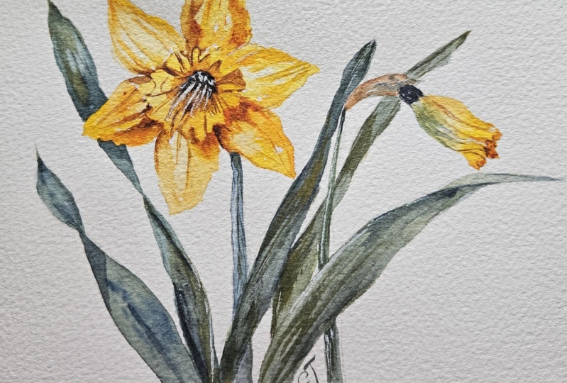
2. Your Project: First of all, thank you so
much for choosing this class. I'm very happy that
you're here joining me. Today we'll be painting the daffodil in all
its expressive glory. What I love about this
subject is its versatility. There are countless ways to interpret and portray
its graceful form. You can be adventurous
in your compositions. You have the freedom to let your creativity and explore the wonders of
watercolor painting. I've designed a simple step by step approach for you
to follow along with. However, I encourage
you to infuse your own personality and
style into your artwork. Feel free to experiment
with different colors, brush strokes or techniques. In the resource section, I've added a high
resolution image of my finished painting
to help guide you. You're welcome to
follow my painting exactly or experiment with your own composition
as we're going to be focusing on the painting
aspect of watercolor. I've provided templates
you can use to help transfer or trace the
sketch before you paint. It's fine to trace when using it as a guide for
learning how to paint. It's important to
have the underdrawing correct so that you can relax and have fun learning the
watercolor medium itself. Whichever direction
you take this class, it would be great
to see your results and the paintings you
create through it. I love giving my
students feedback, so please take a photo
afterwards and share it in the Student Project Gallery under the Project
and Resource tab. I'm always intrigued to
see how many students have different approaches and how they progress with each class. I'd love to hear
about your process and what you learned
along the way, or if you had any difficulties. I strongly recommend
that you take a look at each other's work in the
student project gallery. It's so inspiring to see
each other's work and extremely comforting to get the support of your
fellow students, so don't forget to like and
comment on each other's work.
3. Materials & Supplies: Before we start the painting, let's go over all the materials and supplies I generally use. Having the right materials can greatly impact the
outcome of your artwork. I'll go over all the supplies I use for
this class and beyond. They're very useful to have at your disposal and we'll make it easier for you
to follow along. Let's start with the
paints themselves. Like most of the materials
we'll be using today, it's a lot to do
with preference. I have 12 stable colors in my palette that I
fill up from tubes. They are cadmium
yellow yellow ochre, burnt sienna, cadmium
red, Alizarin, crimson, ultramarine blue, cobalt blue, Cerilian blue, lavender,
purple, di, black. At the end of the painting, I often use white guash
for tiny highlights. I don't use any
particular brand. These colors you can
get from any brand, although I personally
use Daniel Smith, Windsor, and Newton
Holbeine paints. Let's move on to brushes. The brush I use the most is
a synthetic round brush, like this Skoda Pearl brush
or this Van Gogh brush. They're very versatile because
not only can you use them for detailed work
with their fine tip, but as they can hold
a lot of water, they are good for
washes as well. They're also quite affordable. I have quite a few
in different sizes. Next are the mop brushes. Mop brushes are good
for broad brushstrokes, filling in large areas and creating smooth
transitions or washes. They also have a nice tip that can be used for smaller details, but for really small details, highlights or anything
that needs more precision. I use a synthetic
size zero brush. All brands have them and
they're super cheap. Another useful brush to have is a Chinese calligraphy brush. They tend to have long bristles
and a very pointy tip. They're perfect for
adding texture or creating dynamic lines
in your paintings. You can even fan them
out like this to achieve fur or feather
textures as well. That's it for
brushes onto paper. The better quality
of your paper, the easier it will be to paint cheap paper crinkles easily
and is very unforgiving. Not allowing you to
rework mistakes, it's harder to create
appealing effects and apply useful techniques
like rubbing away pigment. Good quality paper, however, such as cotton based paper, not only allows you to rework
mistakes multiple times. But because the pigment
reacts much better on it, the chances of
mistakes are a lot lower and you'll be more likely to create
better paintings. I use arches paper because that's what's available
in my local art shop. A water spray is
absolutely essential. By using this, it
gives you more time to paint the areas you
want before it dries. It also allows you to
reactivate the paint if you want to add a smooth
line or remove some paint. I also have an old
rag or T shirt which I used to clean my brush. Cleaning off the paint
before divving it in the water will make the
water last a lot longer. It's always useful to
have a tissue at hand whilst painting to
lift off excess paint. Also, you never know when an unwanted splash or drip might occur that needs
wiping away quickly. I also have a water dropper
to keep the paints wet. When you paint, it's
important to have them a similar consistency to what
they're like in the tubes. This way it's easier to
pick up sufficient pigment. A hair dryer is useful
to have for speeding up the drying time and controlling the
dampness of the paper. Lastly, masking tape.
And this of course, is just to hold the
paper down still onto the surface to stop it sliding
around whilst painting. Also, if you plan on
painting to the edge, it'll allow you to create a
very crisp, clean border. That's everything you
need to paint along. I encourage you to experiment and find out what
works best for you. Now let's get ready to
start the painting.
4. Tips For The Sketch: When thinking about the drawing, we have to break
all the complexity into as many simple
shapes as possible. We start off with small
light lines or broad lines. For example, even though the
flower has loads of petals, I'm just going to put it in
as a circle to begin with. Just like that. Very lightly, you might not even be able
to see it on the screen. Then one in the middle there. Then just marking out the center of where
those petals will be, petal, the stem
coming down there. And maybe you can have
another stem coming up this way and just put a little
oval there for that. A flower that's yet to bloom, a closed flower head. And then maybe a leaf
coming this way. It's very loose lines, just marking out the basic form. To begin with, another
leaf coming down here, it's got very long leaves, maybe, I don't know whether
they're even called leafs. I'm a specialist on
botanical terms. We've got composition where it's all coming out
from the center. I'm using an HB pencil here, which is a favorite. Now I can go in and more carefully see what the
shapes will evolve into. I'm not trying to overly
detail the painting, the drawing just roughly marking out where things are based on what
we've already drawn. Comparing it maybe have the very center of the
flower a bit off center. To add a bit of depth with
this drawing demonstration, I'm not going to do
the whole drawing because it'll just
take too long. There's too much
back and forth and I want to create a template
for you to follow. That means I have to get an
extra precise and clean, which takes a lot of time if
you want to do it correctly. If you want to use the template
that speeds up a lot of time for you and you
can get straight to the painting practice, which essentially is what
the class is all about. Basically, I'm going to
carry on as I've been doing, going over the basic shapes
with a more refined line. Then after that, I'll
use a rubber and just try and leave a clean line so that when it comes
to the painting, we know exactly which bits which. Let's start the painting.
5. Flower Underlayer: So, I'm going to start
this painting by doing the underlayer for the
petals on the flower heads. I'm going to use
for my daffodils, a mixture of yellows. I know some daffodils are white and golden and have a whole
range of different hues. I'm going to keep to
the classic yellow. I've got cadmium yellow. Here is a good, a good opportunity to explore all the different
yellows there are to offer from lemon yellow, cab yellow, Gabon yellow, a bit of yellow ochre
here we'll use as well. I'm going to just as
it's the beginning of the painting and there's no
stress during the underlay. I'm just going to fill in that
very central section here. If you look carefully
at my yellows here, I think I've got about three different yellows
mixed in there. They all come under the title of Cadmium yellow in my eyes. Cadmium yellow is just
the core bright yellow. I just like to all those
yellows together and they make their own unique yellow when
I in and out all the time. The same goes with a
lot of my other colors, like my red, my green there. Just putting different
variations of hues that are in the same family just makes
everything a bit more unique. Plus I like experimenting
with new hues all the time. New tubes of paint. I always test them. Before I use them, I can
see how similar they are. I know they're safe to
put in the same pan. We've just painted the
central head there. It's okay to go over the
edge if you want there. I'm just trying to think of
a check mark that you can paint to and then you can relax a bit while you think
about the next stage. I think the next stage
we will incorporate a little bit of a yellow ochre. I'll get that activated on the
palette by a bit of water. Add a bit of Dm and
yellow to that, because I don't want
pure yellow ochre. In fact, what we can do
is let me clean my brush. I'll keep my brush full of
water, but clean water. And I'll just wet some
of these petals here. It's all about being playful. You don't have to
worry about edges. Embrace the freedom. See, I just tap that edge now. It's already starting
to bleed out, but I'm not concerned about it. I'm trying to tap into
that playful mentality. Because if you do that, whatever
happens in the painting, as long as you're playful
and have a good time, there'll be a feeling and emotion in it that
will come through. Even if the end result isn't
what you planned it to be from the beginning,
what you envisioned, It'll still have something
unique about it, that's what it's all about it. At the end of the day, like
art is very objective, it's quite difficult to think of paintings in terms
of good or bad, or successful or unsuccessful. Because something that
you create yourself, that you think is unsuccessful, can be adored by other people.
6. Advantages of Watercolour: Some bits are
darker than others, some bits are
lighter than others. Maybe a bit of pure
yellow ochre there. Everything changes. 5 minutes ago I said
I wouldn't do that. Well, less than that, 2 minutes
ago I said I wouldn't do that, pure yellow ochre. But it felt right. So I did it. That's one of the things I
really enjoy about watercolor, which isn't so relatable
with other mediums. The spontaneity of it, the changing of plans. With watercolor, you
can be spontaneous. You can mix things up, be playful with the medium, and let it do some magic
on its own accord. You can allow the water and the pigment to do
things that outside of your control with
oil and acrylic. However you really have to do, ever think yourself,
so to speak. It doesn't play around on the paper by itself like
water cut color does, which in some rights is good. It's more true to what
you want to express. But I like water color because it interacts in an
interesting way. It's quite ethereal almost because it's doing something
of its own accord. Of course, you're the one
that's manipulating it and encouraging it to
view those things. But it's interesting, splatting a bit of
pure white paper just for a bit of texture. Maybe I'll make this a
bit more vibrant here in the center scrub that bit there, the pure water. I don't care if it
creates ugly edges or harsh edges, it's
just an underlayer. For the time being,
those ugly edges are actually quite
interesting for underlay. Moving on, looking
at the anatomy of a daffodil on the
stem close to the head. There's usually a brown
bit, I don't know the term, but if you see photos
or references, you can see that
it has this dried up leaf feeling texture to it. So I'm just going to paint that the end of
layer for this here.
7. Second Flower: Now painting this flower head. Before I started painting, like I did before I hit
record on this class, I took a good few minutes just looking at what I'm
about to paint to see which areas I'm going to paint first and which areas
I will overlap. If you look at the final image
in the reference section, you'll see that I'm going
over this area now. But I know later on
because it's darker, I'm going to go over this
bit with a darker green. It doesn't matter
if I overlap it now using the tip of my brush. I'm using my pearl brush, size eight at the
moment, a Skoda. I'll try to do most of the
painting with this brush because if applied with a
lot of pressure like that, you can achieve quite
a thick brush stroke. But then also it's got a nice
little tip on the end too. Mix a bit of cobalt
into this end and let that green come out of
ultramarine blue here. Two, mixing in with that
yellow to make a green. Maybe if I'm very careful, can mix a bit of red into this
yellow to make an orange. Just dab it in a bit here for the underlay. That's pretty much
it. Now, we can go on and build a few more
textures on top of there, but before we do that, we have to make sure
it's completely dry, so I'm going to use my hair
dryer to make sure it is dry. Maybe I can, before I do that, add a bit more dabs
of that green here.
8. Giving Petals Form: Now we can go back in and do another layer
to the flower heads. And I'm going to use the yellow ochre to start off with mixing quite a
lot of water on my brush. Just stroking in a few lines, painting up to that
middle section there. Maybe I'll tap a bit
of red in there. Oh, that's very strong. Too much. That's okay. I can dilute that even more. A bit of that in there. Just
adding a bit more depth. Maybe some of this brown makes some of that brown in there. Just really explore
what you want to do. A line like that, maybe just going through the
different petals one by one, you can experiment with a thick pigment like
I'm about to do now. One of the most exciting
things about using thick pigment in
watercolor is that ability to create rich and
textured effects that have had depth
and dimension. Using thick pigment
gives that bold, expressive stroke that can evoke like that energy and
vitality in paintings.
9. Hints of Other Colours: Maybe I can help bit darker
pigment right there where it hits the inner section,
let it bleed out. The first bit of strong
pigment we're applying, how was burnt sienna I added. By the way, it might feel like a strange
color to add to yellow, but when painting
different tones and trying to express volume
with light and dark areas, instead of using black
to make it darker, I'd just like to use a
variety of other colors. I could have used purple because that's a
complimentary color. Maybe I'll do the
same again here. Maybe I should risk
it with a little bit of green down here just
for a bit of variety. What I try to do is have a
main primary color scheme. Then I influence other colors, just little hints
of them to make it more interesting
and add depth. By integrating these
little hints of secondary or tertiary hues, we enhance the visual
complexity of it. And strategic placement of these subtle influences
can help create balance, evoke moods, and guide
the viewer's gaze. This approach adds a
bit of sophistication and invites a deeper engagement
with the overall artwork. Go back up there with the burnt. Now I'm going to work around from the top to the
bottom on the other side. A funnily enough, the first painting that really got me interested in art
when I was at school, it's a painting from Salvador Dar called the
Metamorphosis of Narcissus. Narcissus, it actually depicts a daffodil in that painting, because the Latin name for
daffodil is narcissus. The painting itself is about
the Greek myth of Narcissus, who falls in love with his
own reflection and leads to his transformation into
the narcs, the daffodil. You can see that in the painting in a very surrealistic way. The daffodil use in
that painting is highly symbolic and it's where
the flower gets its name.
10. Interplay of Light & Dark: I think that's rather a bit
too strong up at the top, so I'm just going
to use a tissue. Let's dab it a bit. Why that? Moving along to the next petal, maybe I should incorporate
a bit more yellow now. Because of the rest of them
have been a bit brown or golden for a bit of variety. I think I just want to experiment with the yellow
again using thick pay. In fact, I've had
a little bit of an idea as you see here. We've got the dark bits contrasting against the
light of the middle. I think on this side I'm
going to make it a bit more dynamic by making it
darker on these bits, on darker on light. The interplay between
light and dark is crucial for creating dynamic
and compelling artworks. Having light areas against dark areas or dark backgrounds, and then dark elements against light backgrounds adds depth, contrast, and visual
interest to the composition. This contrast define shapes,
highlight focal points, and create a sense of three dimensionality to what is basically a two
dimensional surface. It also contributes to the overall mood and
atmosphere of the artwork, allowing artists to
convey emotions, drama, and tension, if that's what the emotion is that
you want to convey. Mastering the balance
between light and dark enhances the overall readability
and impact of the piece. Drawing the viewers
attention and guiding their gaze
throughout the composition. Whether it's
painting or drawing, the placement of light
on dark and dark on light is essential for creating engaging and
memorable artworks. Maybe I can be particularly
brave here and go very dark with a bit of
red right there. I don't know why I say
because I guess it's a risk because there's nothing to lose if it goes
wrong at the end of the day.
11. Finding Your Style: Embracing bravery and taking risks in painting is essential for artistic growth and the creation of really
impactful works. Because it involves pushing past comfort zones and exploring new techniques and challenging conventional approaches to art. And that's what makes are unique and that's where you find your own style and vision. And being brave artists open themselves up to
this experimentation. Allowing for discovery,
taking risks, means being unafraid
of making mistakes. And recognizing that
failure is inherently part of the creative process and opportunity for
learning and growth. It's about letting go of perfectionism and
embracing spontaneity, allowing intuition and emotion to guide the brush strokes
and the color choices. Taking a bit of blue and green because it's
already yellow there. I'm not even going to add any new yellow to that
blue because I know it's going to turn into green
itself when it goes on top of the yellow that's
already on the paper. It's important to be mindful of the colors in the
initial layer of paint because they serve as a foundation upon the
subsequent layers. Of course, the first colors used in that layer can
influence and interact with any new colors
applied affecting the overall appearance and
harmony of the artwork. For example, if a warm undertone is established in
the initial layer, then subsequent cool tones
may appear more muted or subdued when applied
over it, and vice versa. When you have vibrant colors
applied atop of dull colors, the neutral base may
appear less intense. And that's something that you might want or
might not want. A few stands add a bit more texture
and imply the form. Being conscious of the
colors in the first layer of paint and how they may
interact with nucers applied. We can strategically
plan our compositions, create depth and dimension. Of course, experimentation and observation are key to
mastering this aspect. The only way to do
it is by practice and figuring out by yourself. But you can do it through
lessons like this and through your own studies
if you want as well. Let me go with some
more pure yellow into some of these areas. Okay, I'm just going
to dab that a bit there with my tipping, and I think it was
a bit too colorful. I don't want that
bit to be so bright, so I'm actually going
to use the same blue. Just bring the
vibrancy down a bit like that. Now I'm going to dry this again so that we can move
on to the next layer. Actually, for the next bit,
I'm going to paint in here, but I need all of it to be dryer around the outside so that I don't smudge it when I paint it. So I'm going to use
the hair dryer.
12. Creating Depth: Using the same colors that I
already have on my palette, just to paint in a few textures in the middle, I have a lot of the pencil
lines already marked out, so a lot of time it's just
about filling them in. Going back to what I was
talking about before, it's really not uncommon for artists to feel disconnected
from their own work. They find flaws or feel dissatisfied even when
others really admire it. This phenomenon highlights
the subjective nature of art appreciation and the
diverse perspectives that viewers bring to a piece. Despite an artist's
personal assessment of a painting being a failure, others may perceive
it differently. Finding beauty resonance, or emotional depth that
resonates with them. This dissonance, so to speak, between the artist's
perception and the audience reaction
underscore was the complexity of
artistic interpretation and the whole myriad
of factors that influence individual
responses to art. It serves as a reminder
that arts impact extends beyond the intentions or judgments of its creator. With a viewers bringing their own unique
perspectives and experiences to the
interpretation of the piece. So many artists throughout history have not
been satisfied with their work later on to be
their main piece of work, whether it's musicians
or painters. Ultimately, this disparity
in perception underscores the richness and diversity
of the artistic experience, highlighting the power of art to evoke varied emotions
and connections. Even when the artists themselves may not fully
appreciate the work, then you can start
layering it on, getting a bit
thicker and thicker. The closer into the
center you get. The reason we're getting darker as we get
to the center of this flower is because we're trying to create
depth and form. By manipulating the light and shadow through different values, we create an of three
dimensional form, some pure black
right in the very middle to create some sharp
contrast right there.
13. Scraping The Paint: While it's thick pigment
and it's not dried yet, you can use a turf pick. Why? I have this handy. I'm just going to scrape a few. I've forgotten what they
called the pollen bits. Scrape them out like that. I usually do this
at the very end, but I might as well do it
now while it's on my mind. I'm going to take
some pure white and just fill in a couple of those bits we just scraped
out just to really make it straight from the tube. Now let's start thinking about
the leaves and the stems. I'd like to start from left to right as I'm right
handed so that I don't smudge what
I've already done. In order to have all
the colors harmonized. It's a good idea to mix
them all together first. Because if you mix a
color here and don't know how to mix it again
and you run out of it, then it won't create the sense
of illusion that we want, especially if it's
the same leaf stem. I'm going to move to a
slightly bigger brush. Which brush shall I move to? This number ten van Cough brush. I don't have a number
ten Skoda brush at the moment this Van
Gogh brush will do, we can use the yellows
that we already have here to help us mix some greens. I will use green as a base. Anyway, mix that with
the yellow there, but I do feel like idian is
quite an artificial green. I'm going to mix some ultra
marine blue with that. That's quite nice. I think that's more of
a shade color though. It's a dark. Let's mix this
one a bit. That's too brown. I'm actually going
to use my tissue to clean that section there. I'm going to take
some of that and take a bit more cadmium yellow, quite a lot of it, and
mix that into there. That's a bright green. But is that the kind
of green I want? I think I'm going
to add a bit of turquoise or Serilian blue, that's a bit more like it. Maybe I'll add a
bit more of that. Varidian green,
maybe not that much. Maybe a bit more. Let's move this along into a
different section. So it takes a bit
of time just to think about what color
you actually do want.
14. Starting The Leaves: Green is a particular
difficult color to get, right, actually, because you've got many different
colors from yellow, all these different
blues and green itself. I might add a
complimentary to it, to gray it down a bit because I don't want it to
be so unnaturally vibrant. That's a bit more
like it actually. It's a bit more natural. I think that's a good
starting off point, so maybe a bit more of that. I'm going to start here. I think going to wet my brush. Let's go straight into it. The good thing
about these leaves, they can be a bit more abstract because this is the focal point, the one that needs
the most attention. And the other
parts, a secondary, they don't need to be, that they don't need to be correct. As long as they're not so
incorrect that they take their attention away from the main point, then
it shouldn't matter. I'm lucky how that's going. Dabble that bluish tone there. Maybe able this more
artificial green up here or down there, rather get a bit darker
right at the tip. That's okay for a first take. We'll come over with some
shadow tones a bit later. But for underlayer first take, it's quite all right. I think we allow those pigments to do their magic
for the time being. Let's do the same
thing up above. This one's a bit more
complicated because we've got the overlapping of the petal. We need to make sure
there's some unity. A good way to do that is to make sure you paint both sides
with the same color. That's what I'm going
to do. I'll make sure there's definitely
enough pigment on my brush. And I'm just going to fill in to the edge those
initial sections. So then you've got to make sure the tones
are similar as well. The tones, I mean, lightness
and darkness of it. Just adding a bit of
water on my brush, pure water, because I want
to keep the color there, but fill out this area using water as there. Okay, I'm going to take this blue one again and a couple of
dabs of blue here. A couple of, well,
I call it blue. I mean, the bluish green, It's still green.
Looks green here. Here. It looks blue
because we've got a very strong blue already on
the pigment, on the paper. What I like about
this blue pigment, I believe it's the Serilian
blue I've got in here. It's a different sized pigment
than the green pigment. When it dries, it's
difficult to see on camera, but when it dries, you can see the different pigments
in the different places. It creates a lovely
little effect.
15. The Difference Of Pigments: Different watercolor paints possess varying
pigment thicknesses. And it influences the
behavior of the paints when mixed on dried paper, or when the paints are wet
on the paper together. And it results in unique and visually
captivating outcomes. Watercolors with thicker
pigments tend to retain their intensity and opacity more predominantly
prominently creating bold strokes and vibrant hues. Conversely, paints with
thinner pigments produce more translucent washes
and delicate layers, allowing the light to interact
with the paper beneath. When these paints are
mixed on the paper, their diverse consistencies
interact dynamically, producing a range of effects, such as granulation,
where the pigments settle into the textures of
the patterns of the paper, or blooms where pigments diffuse unpredictably
across the surface. That's that one done. Now I'm moving on to this with that same base color
in the middle. I'm using very thick pigment
to begin with to get that nice contrast between the yellow of the petal
and the green stem. Then once we've done that, we can just fill it in
with whatever we want. As the water evaporates during the drying process,
the pigments settled. The pigments settle and
bond with the paper fibers, capturing the essence
of their interaction. This interplay of
pigment thicknesses results in a rich
tapestry of colors, textures, and visual interest. Making each water color
painting truly unique With its expression of
the Arctic's techniques, the inherent qualities of
the pigments themselves. I feel like it's a bit too dark, so I can just clean my brush and I'm sucking some
of that pigment out. Just a little bit like that. I'm thinking about later on in the painting when I
want to come over with a second layer if
it's already too dark now that it won't
look good later. Now it can get a bit
complicated here with all the different overlappings of the different green
leaves and stems. I'm going to do basically one wash for the
underlayer over all of it. And then the second layer
will differentiate, differentiate different
sections a bit better connecting it all basically, but making sure we do paint the right areas and
leaving the white gaps at a bit more. Be, yeah, I think
16. Using Unnatural Colours: A bit more green. Now as
we're getting to the top, that's almost pure blue. But it's okay to incorporate unnatural colors, so to speak, As long as you have the
important areas like the tips fully green
and it will make sense, incorporating
unnatural colors into an artwork can be a
powerful tool for creating, intrigue, and
capturing attention. When we deviate from
realistic color palettes, we have the opportunity
to evoke emotions, challenge perceptions, and spark curiosity for our audience. Also, unnatural colors can add a surreal and fantastical
element to the piece, and it takes the viewers to a more imaginative
place of mind, rather than something that is directly realistic
or representational. Using some of this
unnatural green. No, If you're not looking to mix your own colors, some greens that you could get are emerald green
or forest green. These are typical
shades found in nature. I tend to use dian green, which isn't so much
found in nature. I just use it as a base
color because it can be mixed to many
different things. You can even, I'm
going to experiment using a bit of black
just to gray it out. By graying it out a bit, we really knock up the
vibrancy of that yellow. Pairing muted colors
alongside vibrant ones is a powerful technique to enhance the illusion of vibrancy by dux. Supposing the subdued
colors with bold hues, we can create a dynamic
contrast that makes the vibrant colors appear
even more intense and lively. Muted colors serve as a backdrop allowing the vibrant
ones to stand out predominantly and capture
the attention of the viewer. This contrast not only
adds visual interest, but also creates
a sense of depth and dimension within
the composition. The muted colors provide
a calming effect, preventing the vibrant
ones from overwhelming the viewer while still allowing
them to shine brightly. I'll come back to
this section later, but I will fill through it and then add more definition when
the time comes later. Incorporating more greens, all different types of greens going on in
this painting now.
17. Why Green is Tricky: This is more of a Barridian
Green going on at the moment using the tip of my
brush to make sure this end bit is a fine point. He, there we go. And I guess I'll have to join this stem and follow it off the page
right to the border. And that's the first take for
the leaves and the stems. Now maybe we can start
from this end, again, mixing cobalt blue and yellow. I'm just going over some
certain sections just to add a bit more depth details,
implying details. Rather than actually
painting all the details. What I like to do is wait a few seconds for
the edge to dry. And once the edge is dried, I use a tissue to
wipe the rest out. And it just leaves a hard edge. But I'll just have to wait a bit more before it
gets to that step. Green can be a very
challenging color to mix. One of the most difficult ones, it's in a unique position in the color spectrum
on the color wheel, because it's not
a primary color, it requires a bit more
thinking when mixing it. Achieving the right shade of
green can be tricky because slight variations
of these pigments can result in vastly
different tones, from vibrant emeralds
to muted olive greens. Green pigments tend
to be less intense and more prone to producing muddy or dull mixtures when
combined with other colors. Because natural green
pigments contain impurities that can alter their hue or opacity when
mixed with other colors. Let's see if it works.
No, that didn't work. I didn't wait long enough. It's okay. You can
try it the next time.
18. Being Playful: Being a bit more
playful after doing all the fine lines of reaching
the edge of the lines. Rather it's time to loosen up again and get back
to the playful mindset. I'm gonna go very dark
in the section behind to separate all the
different stems and leaves. I'm going to keep that thick
pigment on here and need a smaller brush
to spread it out. To continue what I
was just saying, if we look at some
famous examples, it might make us feel
better about how we feel about the outcomes
of our paintings. For example, Vincent Van Van Go with his Star A Night painting. He famously struggled with mental health issues and often expressed self
doubt about his work. But that painting is now one of the most
iconic paintings. There is a lot of people view him as the best painter
there has ever been. Even though he enjoyed
the painting process, he felt like he was
fulfilling his potential, he never felt like he arrived. And also, by Leonardo Da Vinci, one of the most, if
not the most, famous, painting that exists, He was constantly tweaking
it and refining it, all the way until his death. He may not have even considered
it a complete success now that he never felt
that it was complete. Oh, I put my hand on the paper. There have to be wary of that. If you've seen my other classes, you'll know how
much I like using thick pigment and then
spreading it out with water. I like it because it offers a nice little interplay between
control and spontaneity. And it usually results in captivating effects
that I can't plan for. I only manipulate it and I see where the
water color takes it because it encourages
exciting textures and results. I have more faith in that
process than if I was just to mix the right consistency and just fill out that
certain area by myself, a very thick stroke there, and then softening out
with the wet brush. Some dry brush marks, there were again, thick pigment from, then using pure water to
influence it and manipulate it.
19. Colour Theory: Let me talk a little
bit about color theory. Of course, you have
your primary colors which are red, yellow, and blue. Then secondary colors are created by mixing two of the
primary colors together. Red and yellow
obviously make orange, yellow and blue, green and
blue and red make purple. Tertiary colors,
on the other hand, are formed by mixing one primary color with a secondary color adjacent
to it on the color wheel. For example, the
primary color blue. The secondary color green
produces a turquoise color, a blue green color. Secondary and
tertiary colors offer a wind range of hues that
add depth and complexity. Or at least it
conveys a sense of complexity when actually
it can just be worked out. Also, by knowing which colors
what on the color wheel, it'll help you know what works together as a
complementary color. Usually, complementary colors
are directly opposite. But you can split up two
complimentary colors into three complimentary colors if you look at it in thirds. If you go around
the color wheel in thirds rather than
half way across, be a bit more abstract. Again, a bit of excitement. It's not that I'm
trying to change my direction to the whole
outcome of the painting, I'm not trying to make
it an abstract painting, I'm just temporarily
transitioning to a more expressive and loose
style so that I can inject vitality and prevent the
artwork from becoming monotonous or overwhelmed by details as the
painting progresses, some dark blue pigment, again, going right up the here, using the water. Again, same technique of using thick pigment and then
spreading it out with water.
20. Details vs Expression: I or some artists
may find themselves entrenched in
meticulous rendering or overly focused on precision, potentially stifling
spontaneity and creativity. By introducing a little shift
towards expressiveness, it encourages a sense of
liberation and allows for greater exploration of texture and emotion and just expression. By loosening brushstrokes,
embracing bold colors, and relinquishing a strict
adherence to realism, we can infuse our artwork with
more energy and dynamism. This approach revitalizes
the painting process, reigniting the passion
again and enthusiasm, while we still foster a deeper, a deep connection with
the subject matter. Moreover, embracing
expressiveness halfway through a painting can serve as a powerful tool for overcoming creative blocks and pushing past self imposed limitations. Embracing a more intuitive
and instinctual approach encourages artists to
trust their instincts, take risks, and embrace imperfection as part of
the creative journey. It fosters a sense of
spontaneity and fluidity, allowing the painting to evolve organically and unfold
in unexpected ways, making it truly unique. Ultimately, incorporating expressiveness halfway
through a painting revitalizes the
artistic process and gives the artwork a whole
new breadth of life, rather than getting
bogged down in monotonous details that don't actually add more emotion
or feeling to the piece. A common hurdle that nearly everyone needs to overcome when they
learn about painting, including me for a very
long period of time, is the tendency to fixate on mastering
details and techniques. Often at the cost of embracing expression and playfulness
in their work. While acquiring
technical skills is undoubtedly important
and essential. Becoming overly preoccupied
with this precision can hinder artistic growth
and stifle creativity. This fixation on the
perfection often arises from a desire to produce polished or finished
pieces of work. Leading students to approach
their artwork with a sense of rigidity and self
imposed pressure. However, true artistic
expression flourishes when artists allow themselves
the freedom to experiment, take risks, and play
with their medium. Embracing a playful mindset encourages exploration
and discovery. Fostering a deep, fostering a deeper connection with one's creative instincts
and intuition. Rather than striving for
a flawless execution, artists who
prioritize expression can unleash their imagination, infuse their work with
personal meaning, and communicate emotions that resonate with the viewers
on a profound level. Focusing solely on
technical proficiency can result in artwork that feels sterile sometimes or devoid of emotion
and personality. But by contrast, infusing playfulness into the
creative process, even though at the
earliest stage, as I understand it, it's
almost bound to create visually unsatisfying
work to begin with. It does inject the
artwork with vitality and spontaneity and a real sense of authenticity that
really captivates the audience and it only
builds throughout time. Embracing mistakes
as opportunities for growth and learning really fosters resilience and encourages students to push
beyond their comfort zones. That ultimately leads to greater artistic
development and innovation.
21. Finishing Touches: Dealing with a pure
black just here. The fullternal range, a few dots in various places, but I don't want to overdo
it. So I think that's it. Clean my brush. It's going to do
something this bit here. I don't know what exactly. I just feel like
it's not working. So it's going to
flatten it out a bit. Had a bit of brown. Then I was gonna
move my small brush. It's a very tip just to a few various highlights
in certain places, not many at all actually
thinking about it just in a few places that are hard to tell
what's going on a bit. But like I said, I don't
want to overdo it. So I think that's it. I think I'm going to take
the tape off now. Maybe not, Maybe I'll just now. I think that's
it. Otherwise, you can go on forever
with these things. I'll take the tape off and let's have a little run through about what we've learned today.
22. Final Thoughts: Welcome back and congratulations
on completing the class. I hope you had fun watching. And if you haven't already
given this painting and go, now's the time to put what
you've learned into action. I want to take a moment to
thank each and every one of you for joining me on
this artistic adventure. It's been an absolute
pleasure guiding you through the process of painting
this beautiful flower. One of the key techniques we've used is wet
and wet blending. By applying wet paint
onto wet paper, we're able to achieve soft, smooth transitions
between colors, creating a sense of depth and dimension in our
daffodil petals. We've also experimented
with layering techniques to build up the intensity and richness of our daffodil blooms. By adding multiple layers
of translucent color, we're able to achieve
vibrant hues and subtle variations that mimic the natural beauty
of the daffodil. Remember, watercolor painting is not just about technical skills, but also about expressing your creativity and
personal style. I encourage you to continue
exploring, experimenting, and pushing your
boundaries to create your own unique
watercolor masterpieces. As we come to the
end of this class, I hope you feel
more confident and comfortable with your
watercolor painting abilities. Practice is key when it comes
to improving your skills. So keep on painting
and experimenting. I want to express my gratitude for each and every one of you. Your passion for
watercolor painting is so inspiring and I'm honored
to be your teacher. If you would like feedback on your painting, I'd
love to give it. So please share your painting in the Student Projects
Gallery down below. And I'll be sure to
respond if you prefer, you can share it on Instagram, tagging me at Will Elliston
as I would love to see it. Skillshare also loves
seeing my student's work, so tag them as well at Skillshare after putting
so much effort into it. Why not share your creation? If you have any questions
or comments about today's class or want any specific advice
related to watercolor, please reach out to me in
the discussion section. You can also let me
know about any subject, wildlife or scene you'd
like me to do a class on. If you found this class useful, I'd really appreciate
getting your feedback on it. Reading your reviews
fills my heart with joy and helps me create the best
experience for my students. Lastly, please click
the follow button up top so you can follow
me on skill share. This means that you'll be
the first to know when I launch a new class
or post giveaways. I hope you've learnt a lot and inspired to paint more in
this beautiful medium. I'll look forward to seeing you all again in future paintings. Until then, happy painting.
 Will Elliston, Award-Winning Watercolour Artist