Transcripts
1. Intro: Hello, and welcome.
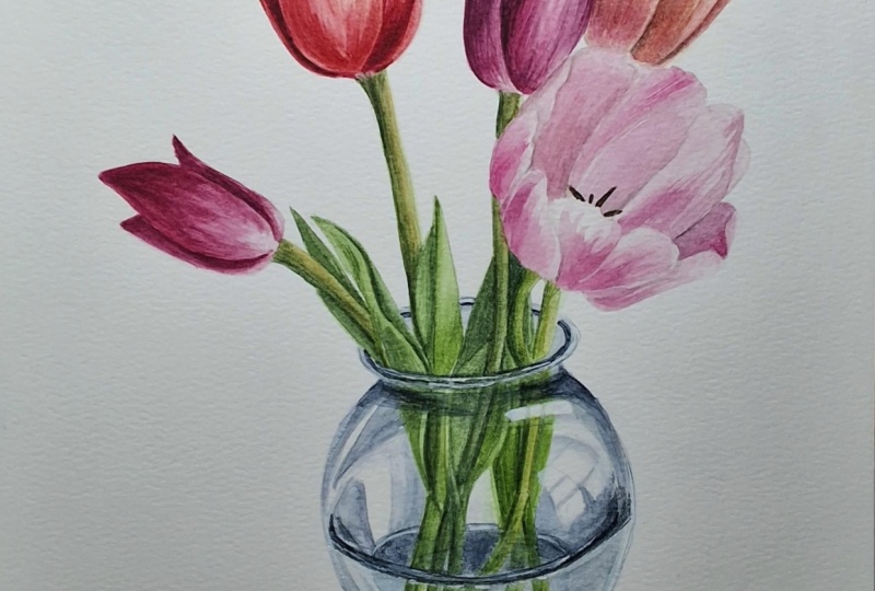
My name is Emily, and I'm an artist and instructor based in Madison, Wisconsin. In this class, we'll look at painting our flowers
and stems using first, a wet on wet layer, and
then a wet on dry layer. We'll also take a peek at how to paint glass using watercolors. You'll have access to a tracing template
included in this tutorial, as well as some color
reference photos and printout instructions that will teach this
tutorial step by step. So grab your
watercolor supplies, and let's get started.
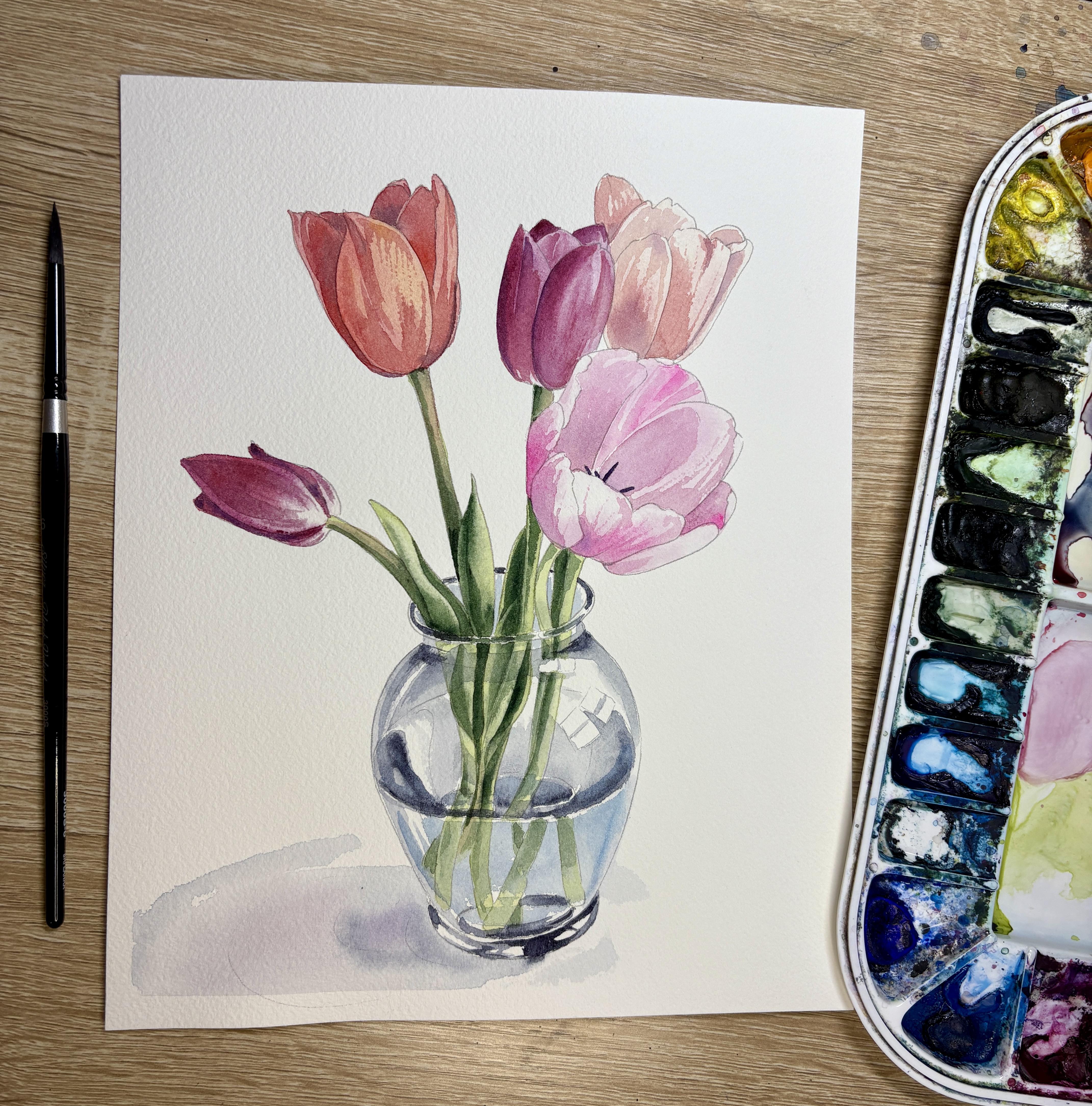
2. Supplies: Alright, so we are
going to start with this tutorial to paint
this vase of tulips. You'll need your template printed on an eight
by ten inch paper. You can either print it directly onto your
watercolor paper. I'm using Arches cold pressed, 140 pound paper, or you can
also trace it onto whatever watercolor paper
you'll be using. You'll need your
palette full of colors. We'll be using some nice reds, pinks, purples, and
also, of course, a few different shades
of green for the stems, and then a blue indigo
color for our vase. And then you'll need some
cups of water, a paper towel. And a few different
sizes of brushes. My kind of go to
brushes for painting finer details are going to be size four and size six round, black velvet limited brushes. But then I also
have a quill brush. This is a larger capacity brush that I might use for
some of my larger areas, including the vase and maybe the shadow of the vase, as well. You can also choose a smaller
detail brush size zero or one for some of the stamen in the center of the flowers.
Alright, let's get started.
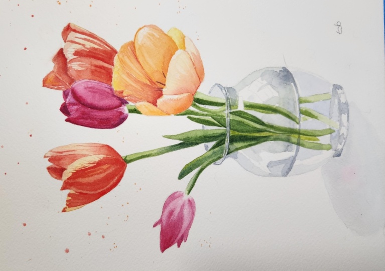
3. First layer of flowers, Wet on Wet: Part 1: Alright, so I am going to start by making sure that
I have a clean brush, and I'll be starting
on one of my tulips. Now, I like to always start with a tulip that's not
front and center. If I started with this tulip, your eye might be drawn here, and it might take me
just a little bit to practice my tulips before
I get good at them. So I'm going to start with
a tulip in the background. I'll start with the smaller one. We're gonna start by wetting
the whole area of our tulip. And as I'm wetting this tulip, I'm going to be thinking
about what color I want this tulip to be. Now, you're more than
welcome to choose the same colors as I'm
using for this painting, or you can choose
your own colors. I always like to tell
students to have a few test strips handy so that they can test out some of
their color combinations before they try them out
on their final piece. Now, I am making sure that this whole section
is nice and wet. I'm tilting my head
to make sure that I see gloss that glossy shine, meaning that it's nice and
wet over the whole tulip. And now I'm going to choose
whichever color I'd like. I'm starting with
quinocrato and magenta, so it's this really
nice pinkish, reddish with a
little purple hue. And now I'm taking a peek
at my reference photo. I'm starting here up at the top of my tulip because I'm
noticing that there's some white area of the tulip that doesn't
have any sort of color. So it's kind of void of
color at the base here. So I'm going to
start at the top. And now, as I'm painting, I'm noticing that wherever
I'm lifting my brush up, a little puddle of color
is going to be left there. And so I'm thinking
about this as I'm bringing the color down to
the base of this flower. I actually don't want to
bring it down and lift my brush up here because if
I lift it up at the bottom, I'm going to get all that color settled at the
bottom of my tulip, and I don't want
it settled there. Now that I have this color nice and all over
where I want it, I can do a few things as long
as the paper's still wet. I can add take more color
directly from my pan, and I can drop it in wherever I'm noticing
that it's dark. So on these tips in the back
and then maybe on the sides of this tulip and along
the center fold, as well. Now, the second thing I can
do if it's still wet is I can lift up any areas that
got a little too dark. So I clean my brush,
I dry it off. And now I'm just taking a
look at my reference photo, and I'm noticing that
there's a little highlight here on the tip of this pedal. So I'm going to
lift up from there. And then I might also lift up from this pedal to the side. It seems like there's
a light source coming from this right side. And so I want to kind of
keep that nice and light. I might also try to lift up again from this
base here if I got a little bit too too dark. And I'm noticing a little bit of a highlight on
this tip, as well. Now, this is going to be more or less the steps that we're going to take to paint these tulips is we'll start with
our wet on wet layer, and then we'll go
back and we'll add our wet on dry after
this first layer dries. Now, with our different tulip, we might want to start with a base color wet on wet
instead of just water. And so I'll kind of show
you what that would look like on this tulip right here. Now, I want to make
sure that I'm not painting tulips that
are immediately next door because this
one needs to dry first. So I'm gonna skip and jump over to a different tulip here. And now, instead
of, like I said, instead of painting
with water first, I'm gonna mix my
base layer of color. And then drop in
some darker pigment. So when I mix this
base layer of color, I do need to mix it
with quite a bit of water because I don't want
it to be all too dark. So let's see. What color
would I like here? I think I want something
a little bit more orangy. So I'm using a pyral scarlet. But I don't want to keep
it just that color, so I'm gonna see what it
would look like to add just a little bit of that
quinocraton magenta. Just kind of tone down
that orange a little bit. You know, I think I like that. We'll see how it
looks on my paper. I can always take a
scratch sheet of paper. Testing out, make sure it's
not gonna be too dark. Now, remember I
can always drop in more pigment once it's wet. So I'm really looking for
this base layer to be a really nice light layer so that I can drop
in more pigment. So I think I do like
how that's looking. So now, like I said, instead of wetting the whole area first, we can just paint
this whole section, all of my tulip petals using this light orange
that we just mixed. Now, here, once again,
my goal needs to be that this whole tulip
stays wet long enough so that I can drop in
some darker pigment and so that I can lift
up any highlights. And so I want to make sure that I have enough liquid on my
brush and on my paper. So if you notice, I
can actually move this puddle around my paper. I do need it to be dark
wet enough to do that. So I am going to go back
to where I started. So I started over
on this left side. I'm gonna go back and
re wet that whole area. I just want to make sure I
have a uniform wetness so that one section of my tulip doesn't dry faster than
a different section. Now, I can take some pigment
directly from my pan, and I'm going to take
a pikas to where that darkest shadow of
pigment is gonna go. So it looks like it's gonna be once again on this left side. Go try to add in a little
bit of dark from here. I can also use this
wet on wet layer to drop in any highlights with
a different color as well. So say I wanted to see
what it would look like to drop in some of
this warm yellow, I can also take a little bit of this warm
yellow and drop it in on top. Kind of help with
that highlight there. Now, remember, same
thing before it dries. I can clean my brush, dry it. And then I'm going to take
a peek as to where some of these lighter
highlights need to be. I can also use this dry brush to help with any of my shadows. If my shadows kind of got out of control or if the edges
got a little too hard, I can also use this dry brush
to help with those shadows. Alright, so we're gonna do this same step for
this tulip here. And this one I'm deciding to wet with water first
because same thing, I'm noticing that there's some white towards the
base of this tulip. And so I want to try to
keep that section white, meaning I'll use
some clean water.
4. First layer of flowers, Wet on wet: Part 2: Alright, now for these two
tulips here to the side, I do want to try to keep the softness of
these two tulips. And so I'm gonna continue to use the wet on wet technique
with just water first. I'll start. Now, at Nona, I'm noticing that these
centers here are darker. They're not yellow, so I can
actually go over the centers the stamen centers in the middle here because I can
go over it with a darker color afterwards. So, I am going to I'll start
with this light pink first. Now for this pink, I'm
using an opera pink, but also mixing it with a
little bit of that magenta. Once again, I'm going
in on the edges first. And then along the
bottom edge here, where these petals will
wrap around the base, that's going to be where
they're going to be darkest. A and now I can go in and I can add some more concentrated
pigment directly from the pan here in certain sections where it's definitely a lot
more intense of a pigment. So I'm noticing
there's a lot more of this bright bubblegum pink
in certain sections here, so I'll come on in with that pigment very concentrated
on my paint brush. Remember that I can always
lift some of this pigment. If it got too intense, I can always lift it. After I drop it in. And I'm going to clean
my brush, wash it. And now for this stage, I'll lift any
highlights or fix any of my shadows using a dry brush. So right here, I'm just
trying to lift around the edges of these petals, especially along the bottom
edge of these petals here, where I am noticing
some highlights. And along this right side, I'm noticing some
highlights there as well. You can also take
your paper towel and lift some of those
highlights as well. If you accidentally don't leave those highlights bright
enough, that's okay, too. It's not gonna ruin
your painting. It just will look a little bit nicer with more
bright highlights there. Now, for this
flower in the back, ideally you would
wait to let this whole the two flowers
on either side dry. And so I'm gonna let these two, particularly this
pink one dry before I move on to this
cream colored one. And so I'm gonna start
looking at my my stems first.
5. First layer of Stems, Wet on wet: Part 1: Alright, so to paint my stems, I'll start by mixing my color. I'm gonna pull away
some of this pink here. So I'll add some
water to my plate, to my palette to one well. And then to this, I'm going
to add some sap green. So I want to start, of course, with my lightest greens first. And then I do want
to take a peek at which darker green I can drop in after I paint this first
layer of light sap green. So here I do have a deep sap
green already on my palette. So I'm going to just
add a dot of water there just to start to
soften up that color. Because I do want to drop in that dark green
directly from the pan. I don't want to mix
it with water because I want that dark green
to stay where I put it. And so I can't have
it too watered down. Alright, we'll test this out. And we'll start by
painting, of course, one of the stems that's
kind of in the background, so we'll take a
peek at this one. So I'm going to paint
that first layer of both stem and leaves. Now, here I'm still
using my size six. However, if you had wanted to, you can always switch. Maybe I'll switch to a
slightly smaller brush. Sometimes I forget to switch
to my smaller brushes. Now here, when we get up
to the edge of my vase, I do want to stop at
the edge of my vase, skip down, leave that
kind of rim here, and then I can continue
the green down below. We're going to work on how
to make that rim there look like it's look very natural and like
it's bending light. But until we have all of these
stems in the background, we are going to just
focus on the stems. Now, I'm going back to
the beginning of where I first started because I'm noticing it's starting
to dry a little bit. So I'm kind of re
wetting my area so that it's ready to drop
in my darker green. So grab a little of
this darker green, and I'm going to drop it in where I notice that there's
some of these shadows. So I'm noticing that there's some shadows along
this fold here and where this leaf
connects to the vase. And then it seems like there's a little bit of a lightness
here along the base there. But then again, there's a
little bit of a shadow here. We skip a little shadow, and then we pull down. I'm gonna wet my brush, dry it, and once again, use that dry brush to then lift any highlights or any
sections where it got a little bit too dark or where
that dark green pigment, if it kind of got out of hand, we can then use that dry brush to adjust
that dark pigment. Alright, that's
looking pretty good. So I'm going to then
skip this stem, and I'll do the next stem. I do want to make sure that
this tool up here is dry. So I'm not gonna worry
about this little section. I'm going to focus on
the section below first. Now, remember that
this first layer is just to get color down. So I'm not too worried
about hard edges here. If you had wanted to,
you can always do it one at a time where
you do the stem, let it dry, and then
the leaves next to it. That is also a possibility. Remember that we are skipping
that rim here just for now. Uh, then it looks like this is kind of coming
back over here a little bit. Might have forgotten
the line there to draw. I'm noticing that it's
already starting to dry, so I'm going to go back up, re wet this area here. I think in hindsight, I would have done
section by section with this lip here, the
natural dividing. So I would have done
this first section, dropped in my color, and then the second section below
dropped in my color. So if you are painting
this at home, that might be something
that you want to try. So it seems like we've got that darker leaf
next to the stem. The stem is what's lightest. Now that I have some
shadows in place. I'm gonna go back pull up just a little bit from that stem. We'll add a little color to
this section of the stem. If any of your colors
go over your tulips, sometimes I have to
take my paper towel. Press down as hard as I can to kind of lift
some of that up. So it's not covering
my nice tulip. And then I think,
actually, well, we'll do one more we'll
do then the base here. And then we'll move on to
this tulip in the background. So it looks like
there's two stems here. A stem and a leaf here. Once again, we'll just
go up to this edge. Now, for this
section right here, you'll notice that there's
two little rectangles here. We don't want to have any paint on top of
those two rectangles. And then as our stems
go further down, they're gonna get a
little bit lighter here. Grab my dark green, try to add some dark
green on that left side. If it is spreading way too much, that green was kind of spreading
too much for my liking, it means you have too
much water on your brush. And so I tap it on my paper towel to just
release some of that liquid, and then I've got a chance to move that where
I want it to go. And then, of course,
this stem here, this one is kind of broken from the distortion
of the glass. And so this is kind of
where this one ends here, right at that water line. So we're gonna just
leave that like that.
6. First layer of stems, wet on wet, part 2: And now I'm going to go back
and work on my last tulip. My water, though, is
a little mercury, so I'm going to switch
it to my new water. Now, for this last one, we've got this kind
of nice peachy color. And so I do want to mix
that peachy color first. So I'm going to add some yellow. And then to that
yellow, I want to add just a little touch
of that orange, and you're gonna get
a nice peachy color with mostly yellow. And like I said,
a little touch of that orange that's leaning
a little bit more red. Now, for this one, I'm going to do I think I'll
do that watery background, and then I'll drop in my peach. And I can drop in the shadows. Since it's a peachy color
and the highlights, I might drop in some yellow. And in the shadows, I'm gonna drop in a little
more of that orange. So I'll start with my water. My other tulips
here are all dry. Alright, so I'll start with
this water down color, this water down peach. Now, because I'm adding
watery color on top of water, it's not really gonna stay
exactly where I put it. That's okay because
I actually don't mind if this spreads
a little bit. I just want to kind of
get it down on my paper. And now I can drop in more of these orange colors that I used for this other
flower over here. So I'm going to use that orange for kind of my shadow bits. Noticing there's a lot
of liquid on my tulip. It's almost too much where it's not staining
where I put it. This is what happens
when you take water down color and add it on top
of a water down section. You just have to kind of babysit it a little bit
more because it's gonna move all over your paper. Alright, then we'll
clean our brush off. We'll lift up where
it got too dark. And if as you're lifting up, if it got too light, you can always drop in more pigment until you're
happy with the color that you have. All right. We'll move on to
finishing up the stems, and then we'll look
at our second layer. Right, then there's a few
different broken stems here at the base here. And so these are broken
because of the way that the light is
reflecting the stems. And so this is part
of the illusion of this glass this glass vase here. And most of these stems here in the base are actually a
little bit lighter in color. So we're going to
be a little lighter handed on this dark green. But I do, of course, want still
a little bit of a shadow. So add a little bit of a shadow, and now I'm going to use my dry brush to lift up where it got a little bit
too dark too quickly. Alright, now we can move on
to our second layer of color.
7. Second Layer on flowers, wet on dry details, part 1: Alright, so now we are ready for our second layer on our tulips. And so our second layer is
going to be a wet on dry. So with our first layer, we wetted the section
we wanted to paint, and then we dropped in color. This next layer, we will
paint wet on dry paper. So we'll have harder edges. Instead of soft edges. So I'm going to
start once again on this tulip in the background. So I'm mixing right now a
medium opacity magenta. I might add in just a
little bit of red as well, kind of lean it a little
bit more red looking. And so I'll test
that on my paper. I'm looking, like I said,
for medium opacity, I don't want it too dark, but I also don't want it too light. I'm using my round
size six brush, and I'm going to start with, um, I'm going to start with this petal
on the left hand side. So I'm wanting to add
some harder edges here. And so I'm going to paint
from the top to the bottom. I'm going to try to keep some of these little
highlights at the base. And so let's see here. We'll just add a
few kind of lines here coming down
from the center. And I'm going to try to
keep this upper edge of my tol up also without
that second layer. I'm going to do the same
thing on this front petal. Gonna start on the edge here. Paint one whole swift edge. And now from here, I'm going to kind of soak
up some I'm gonna make a little puddle down at the
base here with that pigment. I might touch this edge
here a little bit. And then from this
puddle at the base, I'm going to try to pull a
little bit of pigment upwards. Now, you can also use the base of your brush
if you would like to also pull up some of these little veins
towards the center. You have to do this
while it's still wet. And then once you
are done with that, I'm going to kind of um I'm going to fade this edge
by washing my brush, tapping it so it's
not soaking wet. And then using
that damp brush to just blend out just
this edge here. Then I'm also going to add just one single line
down the center there. I don't like how that looks, so I'm gonna kind of blend that out a little bit with water. As you're doing this,
you might notice that certain petals might work the
way that you want them to. Others, maybe you need to kind of blend out the edges that didn't work
very well for you. And then I think
I'm going to grab a little bit of
purple, actually. And along where this
is the darkest. I'm gonna just come
in with my purple and add a little bit of an extra shadow with my purple. Once again, I'll wash
my brush, dry it. And blend out that edge. It. And then I'm going to add just some wet on dry details along
these back petals. So there's definitely more of a shadow on these petals
along the back side. And then this petal
in the center, we're going to add a stripe line down two stripes
down in the center, and then we'll blend
it to each side, so we'll blend it out
and blend it out. Alright, we'll move on
to our orange petal. So I have the same orange
that I had mixed earlier. I might add just a
little bit more of that pyrrol orange Pyl scarlet, excuse me, with the
quinocradon magenta. And now, same thing.
I'm going to start on my petals that are
in the background. I want these to be really
nice hard edges up to where that front petal is. So I'm gonna start
at that hard edge. If any of my color goes
past this hard edge, that's when I'm using my
paper towel to help dry it. No, I also want this petal
here to be nice and dark. And I can always
drop in a little bit more of that pigment
directly from the pan. For this pedal, I'm
going to start at the base and work my way up. Add a nice single line there. Now, for this center petal, I'm going to start at the base. Have some of that pool of color. And I'm going to start in the center line where
I'm going to pull a line down and pull a line up. And I want this edge
to be nice and thick. But the edge on this side, I don't need it
to be that thick. From there, I'm gonna
add a little bit more of that liquid in the base. And then I'm going to use
the end of my paint brush, the base of my paintbrush to kind of draw some
of these lines up. Then I'll do the same
thing towards the top. I'm gonna add a
little a little edge towards this top rim, turn my paint brush around, and then pull some lines down. It's gonna kind of give
us some nice texture on this side of my tulip. Now, of course, any of these little sections in the way back are
gonna be much darker. And, of course, I can always drop in a little of that purple, like I used in the other tulip. I can drop in that purple in these sections where
it's really nice and dark. Maybe along one of
the edges here, along the base, along the top.
8. Second Layer on flowers, wet on dry details, part 2: All right, we can move
on to our other tulip. This one we had magenta, but we did mix a little
of that pyal scarlet in, make it a little
bit more reddish. This one I am also
going to use some of that purple in the
background for. Once again, starting on
these petals in the back, using wet on dry. This is painting on dry paper. So here are my
petals in the back. I haven't switched
to my size four yet because sometimes I forget. So here's where I'm
switching to my size four. Grab a little bit
of that purple. Cause I do want this to
be really nice and dark. And then I'll come back and I'll add a little shadow
along the center. So with this one,
I'm going to add just a hard edge along
kind of this upper V here. I'm pressing using
the edge of my brush, pressing, using the
edge of my brush. And then now I'm
going to come in and blend this edge
down this center. So it's not too hard of an edge. Alright, we'll continue working on our second layers here. So I'm going to start
on my pink flower. So I'm just mixing my
second layer color just slightly darker
than the first. Alright. And now, once again, I'm gonna start on my petals
that are the darkest, according to my reference photo. I'm gonna take some liquid, dot it along the bottom. And then if I want to, I can add a few
little lines using the butt end of my of my brush. And then I'll come back
in and I'll drop in a little bit more opaque
color at the bottom. I am going to skip petals here so that I don't accidentally
blend them together. Now, if you're not liking how the end of this
brush is going, you can always use the
edge of your brush. So I'm making quick
flick motions, moving upwards with my brush. Or, like I said, you can always use the end of your
brush, quick motions upwards. And I think that one got
a little bit too dark, so I'm gonna take my brush
and take some of that away. And, of course, I'm not gonna
forget adding a little bit of shadow on the top of
some of these petals. Alright, now for the petals
here in the background, I am going to do something similar to what I had done with the
petals in the front. So I'll start with filling the base here with that
extra that second layer. And then I am going to bring that darker color mostly up
on some of these petals. Once again, I can
always drop in a little bit darker of
color towards the center. I can either use
this quinacradon magenta or I can go back to that purple color that I was using for a lot of
the other flowers. I can add that. I'm
also remembering that I can kind of
babysit some of these other petals as
they're starting to dry, if I'm noticing that some of the edges are a
little bit too dark, I can come back in, lift
some of those dark edges. And actually, I just
remembered I don't have to go around these stamen because they're darker in color anyways. It looks like this is an
overlapping petal here, so this whole petal
can be darker. And then for this last one. Looks like that's also kind of an overlapping, but instead, I'm going to take and add
a little bit of texture. So I'm following the curves of the petal to add a
little bit of that texture, and then I'm coming back in
on the top since there's a little overlap here at
the top of the petal. We'll add a little bit
of color there as well. And I can't forget this
little petal that I had left do the same thing, add a little bit of
liquid to the base. One or two lines up, following the curve
of that petal there and maybe just adding a little hint of that purple for a little bit of
that shade color. A little bit of
that shadow color. Alright, and now
we can move on to our blush colored petal. So I still have a little bit of this blush color left, so
I'm gonna re wet that. And now, I am going to use some of this orange also
for some of the shadows, particularly for some of the
petals that are overlapping. So I'm going to use that same
technique with this orange. So wherever the
darkest shadows are, I'm going to use
this orange color, and then I'll use
that lighter blush on some of the lighter shadows. I'll pull some texture up. And I'm just using a dry brush to soften
this edge a little bit. And once again, I'll pull some
shadows from the top here. Tulips tend to have these
shadows along the base, a little bit of texture, and then a little shadow
along the top, as well. So I'm going to use
this darker color for this petal in
the background, as well, and then
I'll come through and use that other blush
color for the rest. It's kind of following
the curves of the petal, adding a little
shadow from the top. Remembering that
this shadow color is still really nice
and transparent. It's very watery. And now, this shadowy
color, this blush color. I'm going to use this one
for the petal in the front. Add a little puddle
along the base. We use the butt of my brush, pull up some texture, and then come back to the top
and pull some shadows down. Do you think I'm gonna
add a little bit more of a darker color
in the center there. Now that it's wet,
I'll help it expand. I'll move on to some
of the other blush. H So here I'm just adding a little bit of that purple where I'm seeing
some of the darkest shadows. Just give it a little
bit more contrast. And I'm kind of
babysitting those edges, lifting where I see
that needs lifting.
9. Second Layer on stems, wet on dry details: Alright, now I'm going
to take a peek back at my stems here and add just
a few extra little details. Now, with the stems and
leaves, my extra details, I am going to use a dark sap green or deep
sap green here. And then I can drop
in a little bit of my orange red color
as well if I'm noticing some of the stems are a little bit
more orange red. And here I just want
to add a little detail to get these sections of the
leaves to pop a little bit. So what am I looking for? I'm looking for where stems
and leaves are overlapping. So here I have my stem here, and it's behind my leaf. And so I'm going to add a
little shadow here, behind. And now, instead of
blending it out, I'm gonna choose one edge, so this bottom edge whoops.
Went over the line there. I'm gonna choose this
bottom edge and paint one line of color coming along that bottom edge to
meet that shadow. I don't mind that it's really intense and
it's a hard edge. If you don't like
that hard edge, you can clean your brush
and take your brush, your damp brush and soften
those edges a little bit. And then when we take
a peek at some of our leaves, we're going
to do the same thing. Where We are these hard edges? Where is it overlapping? So I notice that this little
leaf is overlapping here, so I'm going to add a little bit of a hard edge shadow line. And then I'm noticing
the same on this stem, so the stem is behind the leaf. I'm choosing the same side of the stem to add
a little shadow to. So it's this left hand side, thinking that the light is
coming from this right side. If it's not dark enough or deep enough of a green,
while it's still wet, we can add in a little extra deep green
directly from our pan. And it seems like this is nice and deep
here in the center. So this stage, I'm not really trying to
overthink all too much. I might not even look all too
much at my reference photo. I'm kind of taking
a peek at what makes sense logically here. So this leaf now is behind the stem instead of the
stem being behind the leaf. So that's where it's gonna be
a little bit more shadowed. Now, if you are
noticing that some of these stems have a little bit
of an orange tinge to them, you can also glaze over them. So I've got a little bit of
this orangy reddish color. And I'm just adding that
orange reddish color over the whole stem. So it's just a light wash
over everything just to kind of give it a little
hint of that red color. Some of these stems have a
little bit of color in them. Others don't. If you like how that looks, you can continue adding a little bit of color
to certain stems. You don't have to,
though. This is, of course, called
glazing. Continue on. So this lip here where we have
the leaves coming through, we do want to add using
that darker green, we're going to start and try our best to paint a
little line here. We're just painting
dark segments where these stems
are coming through. So I'm trying to
keep a little bit of that white paper shining through on both the
top and the bottom. So there's almost, like,
a little edge of white. Sometimes I'm touching
that little edge of white, and that's okay. This one isn't as dark. This one isn't as dark, so I'm using a damp brush to
lighten it up a little bit. So where that color
is really dark, of course, that green is
gonna be really dark. Alright. And then
before I forget, I do want to add
that dark stamen. So I'm gonna use a
little bit of purple. Add that dark stem in there. Do
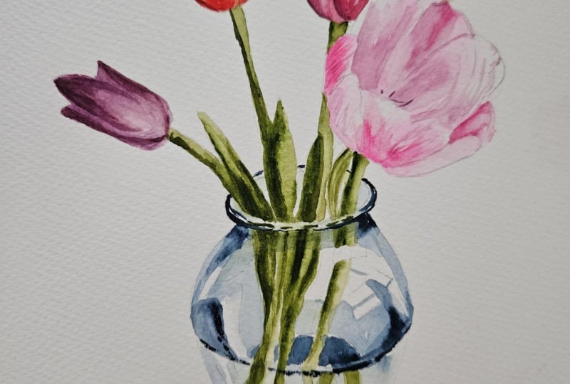
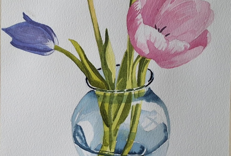
10. Painting the Glass Vase: Alright. And now I want to
take a peek at my vase. So for my vase color, I am going to be using an
indigo with a light blue. So I want to get I'm gonna kind of use a little
cleaner of water here. I'm gonna mix my color first. So I'll clean up a section here, add some water to my plate. I'm going to start
with my indigo, so I'm gonna grab a little
bit of indigo color. That seems like too much. I want it really watered down so that we can have it as a really
nice shadow color. And I'm going to have
my lighter blue ready. This lighter blue I might use down towards the water area. But I'm going to use this
darker indigo up towards the top of my vase first. And so I'll grab all
that watery, pigment. And I'm going to start
on this left side. So there's a dark rim here.
There's kind of a line. On your paper. So we're
going to have that dark come down pretty much the
whole side of this vase. We can go over over
our leaves there. And now we do see a
little bit of a break. So there's a little
bit of a white line. And then we need this little gray or this little
triangle section here. We're going to add a
little bit more water. This is gonna be a
little water down. I'm gonna bring that all the way over that little lip there. We're gonna just try to keep these little windows
here open from color, so we don't want that color. And then we're gonna bring it down also on this right side. Now, if you notice that it's a little darker in any sections, so I'm noticing it's
a little darker at this lip where it kind
of comes together, I can drop in a little bit of that indigo directly
from my pan, and I can help it to kind of
spread around a little bit. Now, these little sort
of sections here, this is where this water is. So this little section here
is going to be darker. It is a little lighter here, and then once again,
it's a little darker. Wait, please. Soften up that edge
just a little bit. This is much darker, and I'd drop in a little bit
more of that pigment there. Now, as we move on to this side, it's kind of similar. We're just kind of under these little window sections here. It's also a little darker. Keeping kind of the
same shape where we're starting to make
the shape of this vase. And then I'm going to take
just some water and blend it out here towards the center. Once again, on this side, I'm going to add a little more of that extra dark pigment. But then I'm gonna help
it mix a little bit. And now, where you see
this little circle here, this is going to all be
a little bit darker. All right, a little
darker of pigment there. So I did try to leave a little
bit of white in between. But this whole line here, this whole edge where
the water is is darker. There's this whole ridge here where it kind of comes
and it swoops around. So And then with that darker pigment, we're also going to take a
peek at this bottom circle. This bottom circle, at least, this dark rim at the
bottom of the circle. This also is nice and dark. So we're going to add
that really nice dark to that bottom circle and then we're going to kind of outline
the bottom circle here. A with this darker pigment, we will paint this
little section along the base. So I'm
trying same thing. I'm trying to leave
a little bit of that paper in between. So you're noticing I'm not going all the way up to that edge. I'm leaving a little
rim of that paper. And then I'm painting this
whole section here darker, leaving these little
highlight circles open. And I'm gonna kind of
use this circle here, this semi circle to just trace that darker
as well. Whoops. Alright. Now that we've
got our darker base, now along the bottom here
where we've got the water, I'm going to add just a little
hint of that lighter blue. So I have that lighter blue. I'm adding just a little bit of that lighter blue to my indigo. And now I'm going to add I'm gonna leave a little
sliver of white here. And from this side, I'm
just going to paint on top of these branch these the
stems here at the bottom. I'm using the edge of my brush, and then I'm gonna bring
it over to this side. And I'm gonna stop there. I might soak up some of that. Here, I can add it to
that little center there. So we're just kind of trying to give the illusion that
there's water there. You can also take some of
this blue and add it to this little water
shadow at the top here. C. And now we're just missing
the rim along the top. So once again, we've
got that indigo. We're gonna try to trace
starting at the corner here, starting at the corner here, pulling in a little. There is a bit of
a highlight here. And then along the back, we
also want that dark rim here. That's just something.
If you wanted to switch to a smaller brush, you definitely can switch
to a smaller brush. Like I said, I probably I don't switch to
smaller brushes enough. And then we're just gonna use our more transparent color
to fill in in between, making sure that I'm not
touching that darker rim there. I don't want to
drag that color in. I'll take a peek if we need any. I just added a little bit
more of that dark and to go just on the corner here where that where the vase kind
of sucks in a little bit. It would be a little bit darker, and I can also take a peek at other sections where
it would be darker. Sometimes the paper will
soak in a little too much. So down here, we've got this base here is going
to be a lot darker. So I might add a
little bit extra to this base only
to balance it out. So I've got that darkness
along the top rim. I also want some of the darkness along the bottom here as well.
11. Cast Shadow and Final Details: Alright, and then when we take
a peek at the final step, which would be this kind of cast shadow because our light
is coming from this side, I'm going to take
some clean water. I'm gonna go up to this edge. And I'm going to
paint just along this bottom edge here with if I accidentally touch up
to that, that's okay. And I'm going to take the
same vase color here, dab some of that vase
color into that water. And, of course, I
can babysit it. So if I need to make this edge
a little bit not as dark. I can babysit that. I can
add a little bit of color. If I want to add a
little bit of purple, or my favorite would be to add a little bit of the flower
color as if it's reflecting. The light is reflecting and dragging some of
that flower color, reflecting that flower color
off of the base there. Now, some of these edges have
kind of gotten hard edges. And so I can also, if you have
a scrubber brush at home, you can take a simple
scrubber brush or your regular brush
if you don't have a scrubber brush and just soften up if any of those edges along your vase got a little too dark or a
little too hard of an edge. Just be cautious while you use a scrubber brush so that
you don't tear your paper. Some of these edges we do
want to keep hard edges, others we might
want to soften up.
 Emily Marie Watercolors, Watercolor Artist and Dog Lover