Transcripts
1. Welcome to UX UI App Design Class: Hello everyone. If you
are planning to start UY UX design Journey Impro
UY UX design skills, this class is your launch pad. My name is Akaanka and I am a UY UX designer who like to build user centric
apps and websites. We are not just talking
UY UX design theory, here we are talking turning your vision into
reality, pixel by Fixel. The main focus of this class is to learn how to build user centric mobile app designs that are easy to use
and look awesome. Imagine the picking
colors without having any accessibility
issues of the app. Choosing phones that enhance readability and convey the
right tone for your app. Explore the world of
icon and their role in creating intuitive and visually
engaging user interfaces. Keeping everything
organized, like meaty labeled toolbox, apply UX principles and
loss to UI designs. And making apps that Gus use and solution to
their pain points. We will not only
design beautiful UI's, we also focus on design user centered app by applying
U X to the UI design. We will do all that and more. We will use Freqma to
design our app mark ups and then turn them into
working prototypes. I'm here to guide
you step by step. So we will work together to build an foot order
app and cover a UX design principles and
best practices that help you to design any
type of app ready to improve your UX
app design case. Let's go. I will see
you inside the class.
2. Selecting Colors Using Color Psychology: There are a lot of
ways to learn about color psychology and find the best color for your
app or your brand. I will start it with most generic way and
I will show you the, my personal method that I
choose to select colors. First of all, I will go to the Google and search
color psychology. Now I will see lot of articles. By following those
article guidelines, I can get more idea about color psychology
and how to apply the color psychology to find
the correct brand color. The blue is
representation of trust, loyalty, security, and it's
related to banking industry. If you prefer most popular
brands related to banking, you will see blue is one of popular color that
most of brands use. The first method is read
this type of articles. The second method is use
a generated details. You can use Google Brat and GPT to ask questions about color psychology
and find the best color. My favorite method is check
the Color Emotion guide. Here is an article about psychology of color
in logo design. I like to follow this color emotion guide
and select the color. For the reason why I use this color emotion
guide is I can check the popular band and
what are the color that they used to create their
logos. In our case, we are going to create
a food delivery app, and it's for a bakery. The emotion and meaning
of bakery is health, excitement and fast delivery. So if we check the
logos according to or under this optimism,
clarity vermit section, we will see the logos
that related to delivery brands and
passport chains like Mcdonalds and Subway. Also, if we check this peaceful growth
and health section, we can also see
some logos related foods. In this app, I would like to use
this green color. If you, if you app is in different niche
or different brand, you can follow this
color emotion, guide the check those logos and find the most related
logo that you looking for. The first part is completed now we have
our color as green, but I don't have
specific green color, so I have to find the
specific green color. And then I have to find the
secondary and accent color. In the next lesson, we will use color wheel and
optimize our primary color. And then we will learn about 603010 rule and find out the second and
accent color for our at.
3. Selecting a Primary Color: Okay, now we selected our
brand color as green. And you will select your brand color
according to your app. So now we can see the options
that we can use in our app. So let's try to find the color that match with our
app and our brand. To do that, I will go to
Coolers.com and I click on Explore Trending Palette. Okay, now in the search bar, I will search green, or I can just click
this color tag. And now we get different
types of color palette. And using those color palettes, we can find the best
color for our app. Let's find out best green color or best color for your
app, primary color. I really like this green color, so I just click on it. And when I click on it, it will copy the color code. Then I will go to the
home page of coolers and click on Start
the Generator. Now in here, I will click on this color code to
select the color. So I will paste the
color that I selected. And now I will click
on this localicon. Now we have the primary color. In the next lesson, I will introduce you
the 603010 rule.
4. The 60-30-10 Rule: 603010 rule is a interior
design guideline that designers use to
create color palette. The 603010 rule is the best method to balance
color across the design. The 603010 rule
has three colors, and each color taking up a specific percentage
of the overall design. The 60% is dominant color, which means it will use 60% of the overall design and
30% is the secondary color. And this color will
be used 30% of the design and 10%
is the Cent color. And this 10% will be used to highlight most important parts
of object on the design. By following this 603010 rule, we can create color
palettes that are both harmonious and
visually appealing. Even though the rules
apply for interior design, we can apply it for I designed to. When we talk
about UX or user experience, there is a principle
called keys. Okay, I double, which means
keep it simple, stupid. By following this 163010 rule, we can maintain the
simplicity and highlight most important part of
the design using colors. So that is why it's
important to use this 60, 30 rule also as a beginner, this is the best method to
pick the correct color. Because if you are going to use color color that has
a lot of colors, it will ruin your design. If you are not good at
picking right colors like me, this 603010 rule will
help you to achieve it. Let's find out some
of examples that 603010 rule used in
interior design. And after that, I will show you two websites that use
the 603010 rule to pick their colors. So here is the first design. So in this design, dominant color has 60% of
the interior and we have this brown color
on the floor and the accent color in
the green decoration. And let's see another example. Okay? In this example we have light as color,
as dominant color. And it's 60% And we have secondary color as this
varnish, wooden color. And we have 10% of accent color. But when you look
at this design, you will clearly see
the accent color is more than 10% So there are
a few reasons for that. As I told before, 603010 is a rule. It's not a law of principle. So we can break those rules. Okay? I will say it again. We can break 603010 rule, which means if there has
something that we have to change or something that
we have to do with colors, and it's totally fine
to break this 603010 rules. This is just a rule
and we use this rule to keep our design simple and
easily find the best colors. Let's go to the next design. In this design, the wall colors are white and flow
color is brown. And we have this dark as color
for the lights and chaos. So let's go to the next one. And in this design, you can see the 603010 rule applied. And sometimes it's not easy to understand 603010 rules
when we check in interiors. Even they use 603010 rule
for interior design. They may use different
types of colors, and as I told before, this is a rule and
we can break rules. Okay, now let's go to
real life example. And now I'm at
Netflix.com In Netflix, you can clearly see 60% of dark color in the background. And behind the background we can see the latest movie
and TV series, but still it is dark. And we can clearly
see 30% color used on the text and this text P.
Now it is the fun bar. You can clearly see what
are the call to action. Cta. Call to Action is the actionable element that
users can use to click, can go to next step. In this case, CTA
is this big red. Get the started button. And purpose of Netflix is give memberships to
peebles and add them to their database and
charge money from them. So when user come to this page, that person will clearly see the message that they want to see and the call to action that they want
to take the action. So this is a great example. Also, if I scroll down here, still I have darker color as the 60% and 30% of white color and there
are few different colors. If we check the overall design, we can clearly see what are the colors and what
are the 603010 colors. Let's go to next example
and E Slack.com In slack, you can clearly see purple
background and it is the 60% Then we will
see 30% of the y. And we can see this orange color as
the 10% You may think, what is the blue color on this sign up with Google Button. As I told before, 603010 is a rule that we use to easily see a color palette
and keep the design simple. Also, if I go down now, we have 60% of this light cream color
and 30% of black color, and we have those
links in blue color. Also, if I go down, again, we have white color as black
brown and it's the 60% Then we have 30% of black
color and 10% of purple color. So section to section, they change the color
combination that they choose, and they also add more colors. So this is the reality. Even though we select
three color palettes, maybe clients want different
colors to add to the design. In that times we have to change our requirements
according to the client. So now you know 603010 rule. And in the next lesson, we will create our
color palette. As we did, we already have the dominate or
primary color and now we have to select the
secondary and accent color. See you in the next lesson.
5. Creating the Color Palette: Hello everyman. Now I
am on cools dot go, and we are ready, select this apple green as our dominant color
of primary color. And now we have
four more colors, but we only need three. So I will remove those
unnecessary colors. Okay, now I have those three color and I
lock this primary color, because we only need to choose the secondary and accent color. So there are a few ways to
select secondary color. The one method, take color
palettes. I go to the coolers and explore trending
palettes and type the green. And you can see this
type of color palette. And we use this to
selate the color. And you can use it to
selate the matching colors. But there are more
ways to do it, more better ways to do it. We already have
our primary color, and this color is dark color. Now we need the light color. To check the color that
match with this green color. I just click here and press the Space button
on the keyboard, and you will see different color to get when you press
the Space button. In this way, you can
pick the right color or you can think the color
that you like to use. In this case, I would like to use white as the
secondary color. And then I click this
lock and lock the color. Now we have to find
the accent color. This accent color will be
color that we used to text. I like this type of dark color. And if I want, I can just check more, but I really like
this dark color. So now I have the three colors. So I want to remind you, according to the 603010 rule, those colors will be changed
according to the sections. Which means if section
background color is white, we can use this white color as 60% And we will use
this dark color as 30% And we will use
this green color as 10% I will show
you it on the design. I only want you to that we will use those colors
according to the sections. Like if one section has background color
as the apple tree, we will use text
color as Y. I hope you understand it now we
have those three colors. But still, we are not done, because we have to consider
about the accessibility, which means we have to check the contrast
of those colors. If you don't know about
the accessibility in U X, the simple explanation is when we create a
design for users, we should create it that anyone can use it without any issues. If you are a product
used by people with disabilities like color bind less or people that
has low vision, we should ensure that
everyone can use this app. And we are not only just
creating a beautiful UI, we also consider about UA. And we have to put user front and center and create
the design for users. In the next lesson, I will show you how to
check the contrast.
6. Color Accessibility Check: Now it's time to do
the accessibility, so we have to check
the contrast. To do that, I go tocolortadobby.com When you
go to Adobcolor website, you will see this type of tab and you will see
accessibility tools. I just click on it. And now I have
Contrast checker tool. Also, I have color
blind tool too. In this case, I click on
Contrast Checker, then I admit here and check the
contrast ratio. I select this color and go here, Then paste the color here. After that, I will also
select this secondary color. When we check the contrast, the contrast ratio is really
low and the test was fail. This means I have to in
the back down color, because if I create
a button with this color button
grapic component and use the back down color, a white, it will be
a issue for abusers. Change the text color to
white and background color as this green color still
we got the result as fair. Now let's go to
the color palette and check how it works
with the accent color. I will put the accent color text and now it pass the text. Let's change the text color
and background color. If background color is
black, this works well. But in our case, we need to add text color as black and background color
as this green color. So now what we can do is
change this back brown color. I can use this
filter to change it, or I can apply this contrast
suggestion like this. Okay, it seems this
color is working well. And let's change the taste color as green and background
color as black. And it works well. And contrast Precio
is really good and now we have to check it
with this white color, so let's cove it and let's add background color
as this white color. And in that case, we still fail. So what we should do
here is my suggestion, I use background color as black. I make the main
color or primary color, our brand color as darker green. So I will apply this filter. And then white will be
the background color. So you can adjust this
white if you like. Then let's change the
background color to text color. And it's working well in my
app Call to actions like buttons will be in green and the text of that button
will be in white. And this is the green color
that I have to select. And let's go to color
palette and unlock this. Then I will change this color. Now let's copy
this darker color. And I will use this
color as text color. But when I use this text color, my backgrounds will
be white like this. So if we use this method, we will not have any
color contrast issues. And we will pass our
accessibility test. So play with these levels and get the best contrast ratio. Okay, now we found
our color palette. In the next lesson, we will talk about how to find the suitable and best
typography for the website.
7. Bonus Lecture - Easy Ways to Select Colors: Okay, let's see the
easy and fast way to find right colors for you. We can find colors or get inspiration from our competitors so we can create a moodboard and collect the design
of our competitors. And gather some design
inspiration from websites like Dribble
Bas and Painters. So let's do it. First of all, I will
create a frame on Figma and increase the
size of the frame. This will be my mood board, so I will rename
it as mood board. But if you don't have experience
in Fikma, don't worry. I will show you how to use
Sikma in next few lessons. For now, just watch what I do. So now I go to find
my competitors. So my competitors are
other food delivery and bakery app. So one
thing that I can do is go to Place Stow and
search food delivery app. Okay, now I am on my
place to account. So I will search food delivery food delivery app and I will see this
type of result. However, you have
to find the apps related to your niche
or related to your app, which means your
competitors then check the review account and find
the design inspiration. As an example, if
I go to the Apply this and in here I can check
the app screen. Also ca install it on my mobile and
check the screen in that way. Next thing we can do is check design inspirations on
websites like Dribble. Now I am on Dribble.com and you can easily create
pre account on Bleble is a website that designers share
the work that they do. So if I go here and search
food delivery app and select the mobile on the field and I
will see this type of apps. Let's open few of them. Okay, after I open those app, I
will get screenshot. Press Chief Command
and Poll Mac. And on Windows you
can use Ni Pin tool. So I will get the
screenshot top this one. Let's got the screen
shotopp actually in here. We have the color that the app maker choose
to design the app. So let's get those details. When we find design
inspirations like Dribble, most of time we get
unrealistic designs, which means if we create designs with those
template as they are, it may be a good UI,
use a interface. But sometimes most
of those designs are complicated and don't have
good user experience. However, in this case, we use those designs to get color inspiration. But also we can use those designs to get
design inspiration. But when we try to get
design inspiration, we have to check the usability and use the experience
of those designs. That's why we should conduct competitor analysis and
find the strength and weakness of our
competitors and get ideas and inspiration
from our competitors. Okay, now I go to the
Figma account and I will add all of those screenshot in Mood
board. Just select Early Screenshot and
at them like this. And now I will put
them on the frame. Before I do that, I click on the frame and change the
field color to like as, so it will be darker. We will easily find the
inspiration that we gather. Okay, let's at them like this. When we create the mood board, always try to at at least
20 design inspirations. So it will easy to
find the right colors or get design inspiration
when we check those. Besides, we clearly see there
are colors like orange, light red, and green
for the colors. Those are the brand colors. And black is the text color, and background color is white. So this is the easiest way
to get color inspiration. If you have no
idea about colors, you can use this method
to select colors. But I highly recommend to prefer the color psychology
and go that path. However, after you
select the color, when you finish with the color
selection, create a frame like this. And press, when you press it will open the color chooser and I'd
like to add the green color. So click on the green color. And then I would like to add the back brown
color. It's white. So I will duplicate
this by pressing Alt and drag it to
right and select it. Then press and select the
back brown color as white. Okay, and also duplicate it and press then we have to
find the text color. The text color will be this. All right, now we
have three colors.
8. Fundamentals of Typography: Choosing the right
typography for the app is the most important
part of UY US design. Understanding the fundamentals of type classification,
typeface, and font is essential for
creating a design that communicates
effectively and engage users without any issues. So let's talk about
type classification. Type classification has
several categories with it, unique characteristics. There are two most important
type classifications, those are Serif and San Serif. In serif type classification, it has small decorative lines at the end of the characters. Those ponts are convey a more traditional
and formal field. On the other hand, we have sunserif
type classification. And the Sun Serif type
classification doesn't have lines at the end of the
characters. Those phones clean and modern, making them popular for digital interfaces. Then we have to choose
the typeface and font. Let's find out the difference
between typeface and font. A typeface is a design
of the characters, while a font is the specific styles and
size of that design. For instance, Aerial
is the typeface. 42 fix bold is the font. Let's see another
example. In this case, the type face is Roboto and the front is 50 weekel regular.
9. Message and Emotion in Typography: Let's find out how to select correct
typography for your app. In this lesson, I will give
you the basic information. And in the next lesson, we will put the knowledge
that we gather on this lesson to select the typography
that suitable for our app. And we will use website
like Google Phone to find the best phone for any
type of app or website. Every app or website has
a message and specific emotions that let users feel about the purpose
of the product. Those emotions and messages are crucial for selecting
effective typography. When considering the messages, we can recognize it
into three parts. Those are serious was playful, modern, most traditional
luxury was casual. Let's talk each of
those messages. In serious messages, we can select classifications. Like if as this example for play pool, we can select sans serif
type classification. Railway is the best
example as I told before. In the next video, we will find out how
to check the phase of the typography on websites
like Google phone. Then we have modern
traditional category. The modern category has minimalistic sanserifphont
type classification. In traditional we have serif type
classification and then we have
luxury and casual. In luxury messages, we can get elegant serif type classification
fonts for Cashewal, we can get ponts like handwritten or script
type font classification. Also, we can select the correct typography
according to the emotions that
give on the app. Mainly, there are three
types of emotions. Those harm was energetic,
font was serious, and formal was informal. I will share the documentation that you can refer
and learn more about which type of
type classification that we can select
according to the emotions. Then after we understand the type classification
of our app or website, we must prioritize
the readability. No matter your brand
readability, shoot, Always be a top priority. Choose a typeface and font size that are easy on the eyes, especially for longer text. Most of time, Sons Phone
are often favored for digital content due to their clarity and easy
of reading on screens. In the next lesson, we will leverage our
understanding of typography selection to choose the perfect pont
for our app design.
10. How to Use the Google Fonts Website: Let's find out how to select
a font for our project. So there are merely two ways. The first method
is consider about the emotion and
message of the brand. And select a font
according to the message. And the second way is do a competitor analysis and find the best direct and
indirect competitors. Then check the typhograpy
that they use on the design. Let's do the both methods. And at first, let's find out
how to select a typhograpy according to the brand. So let's get our example as a law firm message of
law firm is serious, which means it should
be a serif point. Also in emotion, the message or the emotion
should be serious. Which means we can use San
Serif bold typography. So we have two options. First, let's find out serif type classification
typography. So I go to Font.google.com
and Font.dooogle.com or Google Font has collection of fonts that we can
use on our project. In the Google font, we have a search bar. If you know specific font, you can search Kitten here like this. So let's see. We want to find the
typeface, Core Roboto. So when I search it, I got the Roboto phone. Okay, I toss it, and then in here we can type something that appear
on the text preview. Now in here, we can change
the size of the phone. After that, we have filters. In our example, we have to find Serif type
classification. So I select Serif. When I select, I got this type of ponts that related
to Serf classification. When we check the phone, that should be serious. Scroll around the Google
phons and find the pont. In this case, I would like
to select this type of pont. Let's click on the phone
and it open like this. In here we have the phone name. In here we have the
phone characteristic. Now I can go to the type test. In type test, I can see
the preview of the text on head lines and
on paragraph text. For the header, this
will be really good, but for the body text
or paragraph text, it's not will be a good fit because the readability
is not that good. But we can adjust the font size and letter spacing then
test it, work or not. If I decrease the font size to 14 pixel and let's increase
the line height to double, it may look better, but I would like to
select this font head and we have to find
different font for body text. Also, when you select the font, always go about
and read the about text and find out details
of this typography. Because most of time those
font has characteristics and the developer of those
font or the designer of those font mention them
on the about section. So let's find font for the body. So to do that, I go
to the home page. Okay, now I again go
to the Google font for page. And this time we are going to find text for the body. When we find text for the
body or for the paragraphs, we must prioritize
the readability. Sansi type classification will
be best for the body text. I click on this sansori filter and I get this type of font. Now I will decrease the
size to let's say 21. And now let's find out the
font that suitable for Body of the law firm design. Here we have a professional
looking typography. I will click on it, and then I can see the
look of the typography. So let's go to type test. And in here we have
the preview of the paragraph text and
I will highlight it. Then let's set the
line height at 1.25 and then we can change
the width of the font. Let's make the Was 300, okay. This is a more clear font, so now we have two fonts. To select. The font, we can just find
the phone that we are looking for and
this is the typography. And this is the phone
it is with 300. Then I click on
this Select button, and in here we have all
details of the phone. Also, if I go to the font that select before
for the heading, and let's go to type test. And we select the size as 40. Actually 40 A is really
big for the app, so let's make it like 40 and it will be 400. Then here we have the
details just quick on it. And now we have the
font that is selected. And on Figma we
can type this text on the font section and
select the typography. In future lessons,
I will show you how to use those fonts
in Figma design, And in the next lesson, we will select font for
our food delivery app.
11. Selecting Fonts for a New Food Delivery App: Okay, let's select typography
for our food delivery app. So the message of the food delivery app
is related to modern, which means we have to select minimalistic san serif
type classification. So if we check the emotions
of this food delivery app, it should be energetic. So the energetic type
classification is San Serif. So let's go to Google
phone and click on Filter. Then select Sanserif. And in here we have the font. So let's select
the font for our app. My plan is select one phone or select one typography
for whole app. When selecting a pont, always remember, select
one or two ponts. You have to remind the keys, UX design principle, which
means keep it simple. Stupid UF design low. I like this lish phone. Let's open it in new window and let's scroll down to
find some other choices. I want some phone that has and modern look. I like this M plus one font, so let's click on it two. And let's go to the type tester. And in type test, I will change the head
typography size to 32, and the paragraph size will
be 16 pixel and regular 400. I think this is matched. So let's select it. And then we have to, we are ready to select it two. And now let's go to this Molis font and type test
in type tester, change the font size to 32, 16, the weight will be over. Okay, let's select that too. All right, now here we have
fonts that we selected. So to find out those font, just click on this Car Ton. And in here you
can find the font. Also go to the About section, and here you can see
the About details. This font is minimalistic
sensor typeface designed for both display
and text typography. And here is a details. So I really like this phone
and we will use this phone, test the header and
paragraph text on our app. So this is the way
I select phone. There are premium phones and on Google phones you can find
free and professional phones. I have to tell there is not a right or wrong way
to select a pont. Only thing you should
consider the readability. Always prioritize
the readability and accessibility. Even you find a great font and add
it to your design. Then the contrast
is not matching and users can't easily recognize
the message that you say, they can't read it. Which means always try to adjust the font
according to the app. You can increase the
font size, font width, and line spacing that
help users to easily read the font and read the paragraph and
understand the message.
12. Iconography: Imagine a world without
language barriers. A world where everyone is
speak the same language. A language of symbols. This is the power
of iconography. Icons are more than
just pictures. They are powerful tool that
can guide users, convey information and make
your design more engaging. By using icon effectively, you can improve
user understanding. Clear and consistence. Icon can help users navigate your interpace
and understand it. Functionality, even if they don't speak the
language on the design. Increase engagement. Well designed icon can add visual interest
to design and encourage users to explore different features, save space. Icon can convey a lot of information in a small
amount of space, making them ideal
for websites and mobile apps via screen
space is limited. Let's find out how to
select the right icons. Using the right
icons is essential for maximizing their
effectiveness. Here are few things to keep in mind when selecting the icon
for your project. Clarity, the most
important factor is that the icon is easily understood
by your target audience. It should be simple, familiar, and feedly
interpretable. Consistency. Use icons
from the same set or library to maintain a
consistent visual style Cross your design. This will help users feel compatible and familiar with
your interface context. Consider the context in
which the icon will be used. The meaning of the icon can change depending on its
surrounding elements. Accessibility, make
sure your icons are accessible to users
with disabilities. This may mean using fast colors, providing LT or alternative
text descriptions, and ensure that the icons are large enough to see clearly. Now you may think we
are to find icons. There are many
places where you can find high quality icons
for your design project. Here are some popular preotions, Those are Pontosm,
Google Material icons, the noun project. Here some paid versions. I can find an stock
photography website like Do Stock and Hutto. Once you have chosen your icons, it's important to use them
effectively in your design. Here are a few tips. Don't overload your
design with icons. Too many icons can be overwhelming and
confused in the user. Pair icon with text. When using an unfamiliar icon, it's helpful to pair it with text label to explain it. Meaning, use hover status. When user hover over an icon, a tool tip can appear to
explain its function. Test icons. It's important to
test your icons with users to make sure they are
clear and understandable. By following those tips, you can use icon or
graphic to create a more user friendly
and engaging design.
13. Design System: Think of a design system as a
toolbox for your UF design. It is a collection of
re, usable compoons, like buttons, icons, layout, along with the
design guidelines. Everything you need to create a visually consistent and
user friendly experience. So why should you invest time in learning
about design system? Here are a few key
reasons. First, it boosts consistency. Imagine a website where the button look
difference on every page. It's confusing and
frustrating for users. Design system, ensure that your brand identity remains consistent across
all fact forms. And building trust and recognition it end
has effectiveness. No more pre inventing the
real design system save you valuable time and effort
by providing ready made component that you can easily adapt and integrate
into your project. Empower collaboration, forget
communication breakdowns. Design system serve as a
single source of truth. Fostering clear understanding and collaboration
between designers, developers and
other stakeholders. Craft stellar US
familiar interfaces with Individu components and consistent layout
make it easier for users to navigate and
interact with your product. This ultimately
leads to a major, enjoyable and engaging
user experience. Now you might be thinking about creating your own design
system from scratch. While that is an option, it requires significant
time and resources. Instead, consider exploring the many existing design systems available, each with its own
strength and characteristic. Here are a few popular
examples, Google Material, This design system created by Google Material
Design system offers a comprehensive set
of components and guidelines to build in modern
and beautiful interfaces. Apple Human Interface Guideline, Apples HIG, provides detailed
specification for designing app that fees at home within the Apple ecosystem
Carbon design system. Ibm's carbon design system focus on accessibility
and inclusivity, ensuring your products
are usable by everyone. Learning about those
existing design system and how they work will not
only follsh your X skill, but also offer valuable insight into best practices and
industry standards.
14. UX Principles and Laws: Creating a mobile
app is not only think about the looks and
functionality of the app, it's all about
understanding the user. And put user frotent center, which means we have to
prioritize the user needs. And design our app to give solutions for
users pain points. So to do this, we have Ux principles.
In this lesson, let's learn about
the X principle. The first principle is
user centric design. Imagine a world where
websites and app are designed with your specific
needs and preference in mind. That's the essence of
user centric design. This philosophy puts us at
the center of every decision. Here is how it's work. First, we have to
empathize with the user, which means we have to work in users shoes, understand
their needs, goals, frustrations, and mental models through
research and observation. Then we have to do early
and frequent user research. So don't wait until the
end of the project. Get feedback throughout
the design process to continuously refine
and improve your product. Then we have to create prototypes and test
them with real users. This feedback loop helps us identify and address
usability issues early on. Then we have to focus
on the whole journey. Every touch point
matters designed not just for
individual features, but for the entire experience users have with your product. The second principle
is consistency. It helps us to build trust
and familiarity of entire. Imagine walking
into a restaurant where a layout changes
every time you visit. It would be frustrating, right? Consistency in UX is like a familiar layout of your
favorite restaurant. It fosters a sense of
trust and familiarity. Make it easier for users to navigate and interact with
your product. Here, a key aspect of consistency, the first one is visual design. Maintain consistency
in fonts, colors, layout, and icons
across all interfaces. Then we should consider
the navigation. So keep the navigation structure consistent across different
pages and sections. Then terminology. Use consistent terminology and jargon to ensure clarity and
understanding. Now we have accessibility principles. Accessibility helps to create inclusive design for everyone. Imagine a world
where you can access and enjoy the digital world
regardless of limitation. Accessibility in UX ensure that product is usable and
inclusive for everyone, including peoples
with disabilities. Here are essential
aspect of accessibility. Wcag compliance Follow
the web content. Accessibility guidelines
is the short term. Using the WCAG guidelines, you can ensure your
website or app is accessible to users
with diverse ability, clear and consistent language. Avoid jargon and
technical terms. Use simple and
straightforward language that everyone can understand. Alternative text for images, provide descriptive text
for images. Then we have Gist Principle. Imagine a website where information is shattered
and disorganized. It would be difficult
to process and understand why applying those
principles you can create, visually appealing, and
use a friendly interface. In US design, there are three key principles
in Gita principles. Those are similarity,
proximity, and common region. Similarity mean group related elements
that share characteristic like color size, shapes that improve clearity
and organization. The proximity is place
related elements close together to visually connect them and guide users attention. The common region is enclosed
related elements within a shared boundary to create a distinct group
and enhance focus. By combining user
centric design, consistency, accessibility,
and Gstar principles, you can create a UX that is not only functional
and efficient, but also delightful, engage, and inclusive for everyone. Remember, the ultimate
goal of UX is to make users lives easier
and more enjoyable. In future lessons, we will apply those principles for
our design and get the experience that how those principles will help us
on the real world projects.
15. Information Architecture (IA): Ever struggle to find
information on a website or a good information
architecture makes it easy for users to find what
they need, understand it, and use it. It's a visible force behind great user experience. Think of AO information
architecture as a map. You need to navigate
a new place. It should be clear conscious, and easy to follow. Otherwise you will get
lost and frustrate. Here is why good AI matters. Findability, users can easily
locate what they need, whether it's a product
hidden block post, or customer support. Understandability
information is clear conscious and
logically organized. Use in language Everyone graphs usability navigation
is intitive. Allowing users to
move really and find relevant information
without frustration. So here are the key
principles of good, it's clear and simplify. Only use plain language
and avoid jargon. It's Hyderartical structure which means group
information logically, starting board and branching out of specific usability
and findability. Prioritizing search
and filter in tools. Consistency and anticipation,
which means maintain a uniform style and layout
throughout the design. And here is the way to build an effective information
architecture cart shorting group content based on how user
preserve it. Pre testing, evaluate how users navigate
the information structure. Site maps provide
the visual overview of the wave site structure. User resonas define
your target audience and their information needs. Content audit,
analyze exist content for relevance, accuracy,
and organization.
16. Pros and Cons of Figma and Creating a Figma Account: Okay, let's create
an account on Figma. So click on the link
on Description, and you will come to
the Figma.com In Figma, click on this Get
Started button. And in this pop up, you can use your e mail and
pass or continue with Google. I will click on
Continue with Google. In here I will select
my Gmail account. Okay. I am in here, I can add the name. So I will add my name, then click on Continue. In here I have to select
what kind of work I do. So I click on Design,
then click Continue. Just select the necessary
options and continue. In here, I can invite other
members or my team members. In this case, I click
on Skip button. Now we have a question. What brings you to Fima today? So I click on Other
and click Continue. Click like this and
click Continue. And in here, click on
Starter and click Continue. I will skip this part. Here we create our Fima account. Now I will create a design. To do that, click on this
design file and click on Draft. All right, in here we can
create the design that we want. First of all, I will
name this design. To do that, click
on this file name. Currently it's Untitled. I will rename it. First look, press Enter, and now here we have options
to create the design. So we call this
part is the canvas, or we can call it artboard. And in here, we have options to select and create
elements like frames, shapes and lines
with pen pences. And in here we have texts. And also we have
resources button. And we have hand tools. And in here we have
command button. So let's create a frame. I just click here, and when I click it I get
the pre built frame sizes. So in this case, I will select the size as iphone 13.14 And this is the frame. So when we build our app, we build it on this frame. So I will rename
this frame to home. And now I will
create a rectangle. To do that, I click
here, gan this. When I create a rectangle here, I have the properties
of the rectangle. So we can change the
width here and in here like this. And we can change
the fill color, boom here. So we can add stroke, and we can add shadows. And there are a lot of options. So now I create a text. To do that, click on this
icon and click here. Then let's add text
like hell over. Okay, and now I will
center like this. Then in here I can
change the font. I will change it like poppins
and false size will be 45. Then make it semibold. And make text center, align it to middle. And in here we can
change the color. So in here we can select other
types of shapes like this. And in this hand, we can check the canvas. If this canvas has
a lot of frames, we can just go up and down
and check it like we want. So now we have this
comment option. Fima is a collaborative tool. If you have a team and you
want to mention something, you can just click on
this comment and comment. I want to add comment here. So I click here and I add the comment like trade
box for test and first enter. And when
you hover over it, you can see comment
that you added. And it also can see the
team member of your team. Also, you can mention
team members like this and click this at Sign and add the users at your
team member name. In this case, we don't
have team members, I will mention myself like this. Then we can add images and also we can upload images,
just play with it. And in your left
side you can see the frame and elements
that are created. So we have this assert panels, and in future lessons we will go through a lot of those
sections and details. Now I n this more button, and in here you have
a present button. If you click on it, the design will open
like this in Figma, we can also convert these markups or the
designs to prototypes, and we will see how they
work in the future lessons. Also, we have option to share if I click on this Share
button and I can get a shareable link
of this design. So those are the basic stuff that you must know about Figma. And in future essence, you will be master the
Figma and you will be able to create
Figma design easily.
17. Grid Layout: Okay, now let's be
familiar with grids. So I will remove this form
frame and create three frames. So I will remove those
comments, delete them. And now I will create frames. So first I click on the frame
and create form size frame. And then I create another frame, and this will be tablet size. In tablet, it's create
this size frame and also create a
desktop size frame. All right, now we
have three frames. When we design our UI element, we should think
about a way to align those objects so we can use layout grid to
do the alignment. First of all, I click on the frame and click on
this Layout Grid Plus. And now we got this
type of grid layout. Let's increase the size. In here I click on this
grid layout setting. In here I click this top
down and click on Column. This is a phone inter base. I will select the column
count as five, and I will add the margin like 20, which mean we'll have
a 20 pixels of space. Okay. And gutter is the
size between two elements. So I will say gutter to 50, like this. And let's
do it with ipad Mini. And select the ipad
Mini tablet Frame. And click Layout Grid, and click here. Then
select Columns. In here, I will set the column count six and margin will be 30, and gutter will be 15. Okay. You can change those spaces according
to your design. This is the way that I
used to create layout. Let's go to Desktop Frame. Click Layout Grid. Click here, Set Column. Then in Layout of the Desktop, it
will be 12 columns, and the margin will be 140. Gut will 20. So this is the look
of the design. So if I go to the
desktop version, and now if I create a rectangle, I can align it according
to those grids like this. So that's why we should
consider to create grid layout to understand
the alignment of our design. In the next lesson, we will find out how to use auto layout and easily
create our design.
18. Auto Layout Basics: When I first start to use
auto layout, it confused me. But there are a lot of
benefits of using auto layout. The most benefit
thing is you can save your time by applying auto
layout to your design. Because if we don't
use auto layout, we have to manually
adjust the positions. Also, after we create a design, if we want to add
some content or more elements to section
of the frame, we have to just the whole frame to do it. But when we use auto layout, we can just add
elements as we want and the layout will adapt
according to the elements. Also, we can create a responsive design with the
auto layout, which span. When we change the screen size, the elements will shrink or
grow according to the frame. Okay, let's start to make
a design with auto layout. So I will remove of those frames, and let's
create a frame for phone. So I will select this
iphone 15 pro frame. Okay, let's add layout grid to this frame because it will easy us to check the alignment. Make a column column
count will be five, margin will be 15, and the gutter will be 15. Okay, as the first step to understand the power
of the auto layout, I will create two buttons. For the first button, I will not use auto
layout option. And the second button I will use the auto layout. So let's create
the first button. To do that, I click on the rectangle and create
a bottle like this. Okay? And let's change
the fill color to red. And let's add corners like 15. This is the background
of the button. And now click on the text. And let's add the text. Click okay. Now we can add text like Roboto. In Roboto Naked Medial, and the size will be 30. Okay, now I put this text on the rectangle and let's
change fill color. Why highlight both
of those texts. And press command G to group it. Then I click this text
and a line middle. And click on text, a line as click
horizontal line center. And now I click on the button. And let's make it like this. And let's think we need to add top padding 15 and the
bottom padding 15. To do that, I will adjust
this text to 15, 15. And then let's think we need to add right and left padding 50. To check the padding, you can click the element
you want to check. And press all like this in here. We need to make this 50. To do that, we have to
manually adjust it like this. Nine. Okay, here is 15 and
so we have to do the same. Okay, now here we have a bottle. So let's create the same
bottle with auto layout. To do that, I click on the test and create a
test called click Me, and now I click Shift A. Shift A is a short cut to
create auto layout. Okay? Text just become auto layout. If we check on the right side, we will see this
auto layout section. And in this auto layout, we can change the text
position as we want. Okay, in auto layout, we can add padding as we want. Just click this
individual padding and we have to add the left and
right padding as 15. And the top padding, let's see, top padding 15. The top padding will be 15. Before I do that, I have
to make it like this. And now reds top padding, 15, 15. Okay, now let's add
the fill color. The fill color will be right and the text color
will be black. Okay, now at corners, so the corners will be 15. Here are the two buttons, okay? Then I click on the text and click here and
make it content. And also make this content, which means the size will be changed according
to the text. So let's change this
text to like by one. Get one free by one. Get one free. Okay. Now let's
put it like this. And if we are going
to do the same here, let's make it like by one, get one free C, we have to manually adjust
the content like this. So that's why I say the auto layout is really
powerful and not like this. If we want to change
the padding and margin. So let's make this
left padding as 30. We only need to click on here and we can just
adjust it like this. Or when we click on it, we will get this type of pop up. And in here
we can add the sizes. We can go here and
add it from here. Okay? Okay. In this case, if we want to do it, we have to manually
adjust it like this. This is just a simple example. But in future, you will see the real power of auto layout. Also, let's add auto
layout to this frame. To do that, select
the frame and you can directly pick this plus
button of the auto layout. Or you can press Shift. In this case, I just click
this plus button. And let's see, we want to make those two buttons to Horizontal. To do that, just click the
Horizontal Layout button, and those two become
the Horizontal. And if we want to Vertical, we can just click on Vertical. And let's change the size between those two
objects like this. Let's make it 20
think we want to adjust those two designs
according to the frame. To do that, click on
the item and click the horizontal resizing
peel container. Now you see our button goes beyond
the margin grid. To fix it, we can just change
the padding left and right. Click here, we can
add it like 15, and it automatically become 15. So now if we have to
change the position, we can click on the layout and change
the position like this. This is a really powerful
method to create, design a bot and that's the
benefit of auto layout. In future, we will
learn more about auto layout and we will create the food
delivery app with this auto layout feature. And I will go through
all of those options. In meantime, do your
research or just play around with those options
and learn how they work. As I told before, this was really complicated
for me when I started. But when I try to adjust
the options of auto layout, it just become easy to create the design that I
work to practice. Let's create another option. So just click here
and change it to 60. And in this time, let's create frame and change the frame
field color to blue. Let's make 15 as the corners. Now I will duplicate
this frame like this. So press control
C control, sorry. Just select the frame
and control and control. Okay, now change the colors to green and this one
will be yellow. Okay, now let's think we want to put those three boxes
in the horizontal way. To do that, select all of
those objects and press Chief, and it just added
to the auto layout. And now I can click the horizontal layout
and make it horizontal. Let's change the padding
between those buttons as 15, let's make it like 30. Let's think we need to change
the size of those boxes. To do that, click on these boxes to layout and change it to fill. And now select all of those frames and make
them as fill container. See, now we can adjust it
according to the design. Now if we want to add
another rectangle like this, we can just create a rectangle squared
Desn and put it like we can just copy one of this rectangle and
paste it like this. Then let's change
the color to fight. And this is the power
of the auto layout. I hope you understand the
basics of auto layout. And in future, you will
find out a lot more about the auto lay and we'll see
you in the next lesson. In the next lesson, we will learn how to
create a sticker sheet. And understand what
sticker sheet is and how we use sticker sheet
to make our design fire. See you in the next lesson.
19. Designing a Brand Logo: Now we have colors and
typography of our desire. So then we don't
have a brand logo, we only have this text
called Sweet Food. So let's convert this
text to brand logo. To do that, I will just make a copy and go to
the sticker sheet. In sticker sheet,
I just pace it, then I duplicate this color and let's put this
space like 90. And in here I change
this to logo, and now I can change text to head. Then let's add this
first part color to green color and the second
part color to this dark color. If we want, we can add some small icons in
front of this text. To do that, we
have to find icon. So I will go to a website like I can find to
find free icon. Now I am on Iconfinder. In here, I will search bakery. Then we have this type of icon. So let's select something minimalistic and look
good on that design. In this filter I just click Call Free and let's
find out free icon. Let's add cupcake like this. So I will download this
cupcake. All right. Now I go to the design, and in here I will
pace the cupcake icon. Then I will decrease
the size of the cake. And let's select
both of those texts. And press Shift at
the auto layout, then make it center left. Okay, then let's drop this icon. Just double click on the icon. And you will see this type of panel in here, make it crop. And now we can copy like this. Okay, it's bigger, let's make
it bit smaller like this. And now let's add some
padding line here. This is just a
minimalistic icon. Okay, this is the
design. I think I will change this Pka
color to green color. And so I will change this Cpk color to this dark
color or the green color. I think this dark
color will be great. So I will just
click on the icon. And now I click on
this port bottle. And in here I increase
the size by two eggs. So this is the port option. And select the icons
and G clk port. And now I will open Potoshop
and just change the color. Okay, just change the color. Now I double click on the image and click
this little arrow icon. Then click on Place Image Video. And it will open
my files editor. And in here I will see
the icon, the tie editor. Okay, Then I click
here to paste it. All right, it paste and this is the globo that
we just created. Now we have the colors, logo, and the typography. Also in here we have
wire frame plate. And in next level we will go to create the high
fidelity markup.
20. Sticker Sheet: Sticker sheet is a collection of predesigned UI
elements like buttons, menus, icons, and
other components. So sticker sheet is like a
cheat sheet for designers. It helps designers to build consistent and user
friendly interfaces quickly and easily. So let's find out how to create a sticker sheet and what are the benefits of having
a sticker sheet. This is our Figma file. I will go to the mark up page. And in here I will create
a new frame. Click here, then increase the size
of the frame like this. Now I will change this
frame name to Tika She. Okay. As I told before, Tika Sheet is a collection
of pre built designs. Currently, we have colors for our designs and fonts
for our design. So we can define the colors
and font on the Tika sheet. When we start to design the app, we can add those components
according to the design. And when we create new
components and elements, we can add the copy of those elements
to the sticker sheet. So let's start by adding
colors and typography. In here, I press
to create a text. I added like colors, then increase the size to 50. Change form to poppins. I really like the Fpin want, so that's why I always use Fpin. We can create a simple grid
layout in that way it will be easily aligned to and
margin is 60, gutter 20. All right. Now
align it like this. All right, now let's
check over color palette. I got a screen out of
the color palette. So I will just dragin drop
that color palette here. So this is the color palette. And now I will create three rectangles because
we have three colors. So click here and rectangle, the size will be 150 by 150. And now I click the rectangle and change the fill color
to this green color. And then I obligate
those rectangles. So press all ten Dragon
drop it like this. Okay, let's adjust the position. And now this will be white and this will
be the dark color. Okay? Now the white color
didn't show on the design, so let's change this fill color to light a little bit
darker like this. Okay, now we can create
variables for the colors. And we can use
those variables to our design and it will help
us to create the consistency. So I click on this rectangle, and in here we
have the color. So I click on this style icon. And now I click on
this plus icon, and it will create a variable. In here I can add the name, so I will add green. And in here we can
add Description. I leave it empty. Then I click on Create Style. And now I click the second rectangle and I
do the same name will be it. And I do it for the third 12. Okay. We also selected
the point for our app, so I will duplicate this
text and put it here. Let's make the space
between those, 260. Then I will change this
text to typography. Then I will click Context
and create new text. Let's call this text a header. And I highlight the text by pressing control or
command by command. And then I go to the text, and the phone that we
selected is plus one. So here is the phone
I selected the font. Then I will change
this font to semibol. The font size will be 350, okay? This will be the header, Phone five, let's make
it a line center. And now I will add the
details of this phone. The details will be
first the typea name, it's M plus one
and enter a slash. Then the width will be semibold and the Si will be 35 pixel. Okay, now we can create text, four paragraphs, I
just obligate it. And let's make
paragraph text Si 16. And let's make text align. Left like this. And let's make text a line of this
header text as left. To then change the semi world to regular and this will
be the paragraph text. Now let's change the
details, regular 16. Okay, mainly we need
two fonts for our app. Now the sticker sheet
has a reusable content, but currently we only
define the details that we use to our app to reuse
those colors and text. We can create variables for each and every
properties that we use on the colors and taste. At first, let's create a
style for this main color. We can call it
style or variable. To create it, I select
the rec triangle, then go to the Fill In fill, I click on this for dot and
then I click this plus cycle. In here I can add the name. The name will be green. And then I click on
Create Variable. Then I go to this
color, it's white. And do the same. Click here, click the
plus cycle and make it. Why? Then click on the variable. Actually I already
created the variable, that's the reason
I can't create it. But in your case, you can create it. Then go to this dark color and click here,
click plus, cycle. Then add the name and
click on Create Variable. Okay, Now you have variables
for all of those colors. Now let's create variable
for the tybography. To do that, just sel tag that you want to create, Abs, and in here you
will see the text. Click on this style and click on this Creative
Style plus Ck. And in here, add the name. So I will add names header. And if I want, I can add Description. Then I click on Create Style. Then I click the paragraph
text and do the same. Click here, click this
plan and add paragraph. Then click on Creative Style. All right, now we have re
usable colors and tybogapy. Let me show you how to
re, use those stuff. To do that, I go to the
wireframe and prototype. And in here I will just create
a rectriangle like this. And now if I want to change this rectangle color to green color that
we use on the app, I can just click here and click the color like this. And if I want to use
the white color, I can just click
like this or this. Then let's create the text. So let's add text like hello. Okay, and make it center. Now let's change the
text to heading. Here is the heading
text that we created. So if we want to change
it to paragraph, we can just click here
and click the paragraph. In any case, if you need
to change some details, you can click this
detached style icon. And now in here you can change the properties that you
want to change, like this. This is the way to create a sticker sheet and use
details on the sticker sheet. When we create
components like buttons, search bars, cards,
and other elements, we will add the components
that we create on the design and convert them
to free, usable component. In future lessons, I will
show you how to do it.
21. Get the wireframe set: We are going to design
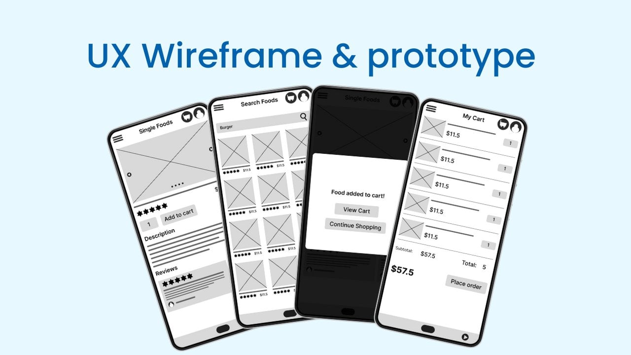
food delivery app. In the QY Ux designed wireframes
and prototyping class, we create this wire frame set and the
interactive prototype. If you didn't watch that part, you can watch it
on the Skillshare. I will put that link
on the description. I will see you in the
visual design section.
22. Designing the Header: Now we have a clean artboard and we have the wireframe set, so it's time to create
high fidelity Maga. Let's start with Home page. I click on the Home page
and copy the wireframe. Then I paste it
on the Maga page. Let's increase it by pressing command and choosing
the mouse wheel. On Mac now I will create a
pram click on the frame, then I will select the
Prey Mass iphone 13.14 Okay, Now I rename this
frame name to home. And now I will add grid. So when we add layout grid, it will be easy as to maintain
the alignment in margin. I will add it as 15 and
the gutter will be 50. Okay, now let's start
with this head. So first we have
this hamburger menu. To create a hamburger, I just click the rectriangle
and use rectriangle, or we can use icons, but in this case we can simply create hamburger
menu with the triangle. I will
make it like this, then in here I will add the
width as 50 and high tax A. Now it's at corners 15. Let's see, this is the design
and the corners will be 15. And let's change field
color to this green color. Okay, now I will dubligate it. Just press Old Dragon
one item like this. Now I will highlight both
of those retrangles. Press Shift A, click this
plus icon to add auto layout. Highlight it. Press this plus C. Okay, now I make it
a line top center, and the vertical layout
will be selected. Let's make spaces three. Okay, Now click on
the retriangle and dubligate it by pressing
control and control. Okay, the hamburger
menu is created. And then we have to
create this title. We already created the
title, created the logo. I just use this logo. Before I use it, we can actually convert
this logo to a component. In next few lessons, you will clearly understand
about the component. For now, I will just click this icon to create a component. In the next few lessons, I will show the benefits of the component and why do we
need to use a component. I will rename this
component name to logo. Okay, now I come here
and select the frame. Then I go to this *** menu. And in the assessed menu, in more cup we have this component. I will just drag
and drop it like this. It's bigger, so let's
reduce the size. To reduce the size, I will just press
control said to cut it, and hear control
to paste it here. In this way, we can
easily make the changes. As the first step, I will just decrease
the size of this logo, can make it 25, 25, okay. Then we need to change
the size of the text. To change it, we can
change the text variable. To change the text variable, we add header text
variable here. Just click on it and click here. When we create the stickers, I show you how to create
this type of variable, and I hope you remember it. Let's adjust the text size. Let's make it like 30, but about 25 to 22. I think this size is
better than before. To test it correctly, click on the frame and
click this present icon, and it will open a new window. It's look like this. I think we can adjust this, just this text to 25. 25 will be, looks
good on the design. Okay, Now we have a
logo and in here I just cut this logo and paste it again on
the sticker sheet. If you didn't understand
it, don't worry. I will show you
the way to create components and give you full understanding
of the component. Okay, now we can add
those two logos, so the car ton and
the Vata icon. To add logos, we can
use Library Pontosum. Fontosum is a icon library. So we can use Google
Material Design System and the icons on the Google
Material Design System. I think you will remember the lesson that we talk
about the design system. However, in this case, let's use Fontosm. On Figma. There is a community
in this community, other designers had
their resources to community, and designers like
us can use those resources. To use those resources, we can just click on this resources icon and search
the resources item here. In this case, it's plugins. In plugins, I will search it. Fonts. Here is the
phontosum icon. Click on it, and it will
install to the Figma account. And it will open like this. I already installed the
phontosum icon on the Figma, so I will show you how
to install the plugin. Just click here and
let's install some. I can plug in just
such like icons, if you didn't install
the pontosum. When you hover
over the pontosum, you will see it like this and you will see
this Run button. Just click on this Run
button and it will load to your break ma
account as a plug in. To find those plugin, you can click here, and in here we have
plugin section. In the flag in section, we have all the plug
ins that we installed. Also, we can click here, and in here we can
click the plugins. And in the plugins we have
the plug in that we install. Click on the phone
or some icons. And in here we have
to find the card, Ticon, I will just search card. And here we have cards icon. So I will click on this card ton and it
added to this design, so I need it on the home page, so I just drag and rob
it to the home page. And also we need a avatar icon. So let's get the avatar icon. User. Okay, here
we have user icon. All right, now I will increase
this size to 30 by 30. Just click this contained
property and make it as 30. And it will be automatically
adjust according to the weight when we add this
constrain proportions icon. So in this case, let's make it 30. Okay, Now we have two icons. So I will change this
icon color to green. I think you will be
remember the 603010 rule. In this case we will use 60
as the white background and 30 as the green color and
ten as this foot icon. Okay, now we have design that we should
add to the header. Now you will remember
the auto layout, so let's add auto layout. To add the auto layout, I will highlight all of those
sections and press Chief, press this plus icon in
the auto layout like this. And now we need this to
be horizontal, like this. To make it horizontal, we can click this
horizontal layout and it become horizontal. I will go to the layers. Okay, now you see
there is a issue. In the car icon, we have frame, but in the user icon, we don't have that frame. The reason is it just
detach with the frame. So let's create a frame by right clicking it and click
on Frame Selection. Okay, now this auto layout didn't perfectly fit
with the design. Let's make it fit
with the design. So to do that first, we have to add auto
layout to the frame. To do that, click on the
frame and click Auto Layout. Okay, in the frame we need vertical layout,
which means we need to foot section
vertically like this. Now let's adjust the
details for now. Let's add vertical gap as ten. And the left and right
pattern will be 15. Because we add the margin as 15, which means the
elements will have a padding of 15
between two corners. In top I will make
the padding as ten. Okay, now in this
header section, I will change it name to header. And then let's add
the was fill content. And the vertical is in, will be, now I will make them a line center
left like this. And now let's add
a toll layout to these two buttons because
this has the three columns. The first column
is hamburger menu, the second column is logo, and the third column is
the carton. Avata icon. Select those two icons,
then press Shift, And in here I will change the horizontal gap
to 15. Like this. Then set it to fill contain. Okay, now I click on the hamburger menu and
change it horizontal, Resize into fill container and also go to the
logo and do the same. And go to the avatar icons and set it to the
field container. And now you will
see it like this. So now it's really easy to do. First I click on the
hamburger menu and it should be in a line left and
a line center left. Then this avatars icon should
be a line center, right? And this logo should
be a line center. So now we have the design
that centered correctly. If you check it on
the frame, it will look like this. It's
far, weakly aligned. And in here, the avatar
icon, little bit bigger. So let's resize it and make
it similar to the car icon. Okay, now it's look like this. And let's add margin top as 15. So it's currently ten. Just click here and make it 15. All right, now in the next lesson we will
learn about components and convert this header to a component and
continue the design.
23. Improving the Header: When we check this design, the title is not
accurately center, so let's make it center. To do that, we have to adjust
the parameters of the auto. First, we will click
on the main Autoa. Then set this horizontal
gap between item to zero. And next we will
click on the logo. And logo will be content. And also click on
this Car Ticon, and Avata icon make
it content. And in hamburger menu
make it a contain. All right, now the logo is
perfectly centered only. We have to adjust the space
between those two sections. To do that, select the header and adjust
the size like this. Increase the design
also in here. All right, Now if we check it, the logo is accurately centered, so there are loto ways to make changes to the
design using auto layout. So it's always
recommended you to play around with the
settings of the auto layout.
24. All About Components: Okay, now let's
create a component. Before we create a component, let's be familiar with the
name so the component is a re, usable element that we can re, use throughout the design. So let's convert this
header to a component. To do that I just
select the header. And then you will
see a icon in here. And it's a create a component, so I just click on it. Okay, Now this header become a component. When it
becomes a component, the element name will
change and the color of the element will change
to the light purple color. Okay, now let's see the
benefits of this component. Before I do anything, I will just cut this
bipasin command, an x and paste it on
the sticker sheet. The sticker sheet and
paste it like this. Then I will put it right here. Let's name this
section as elements. Okay, now here is the component. This is the first component
that we created. We call component, or that we call
this first component as a master component
because we can create a lot of instance using
this master component. Let's create a instant
or let's create a copy. To create a copy, isolate the home
page of our app. Then I go to *** in
the asserts panel, we can see all of our component. Do you remember we
already created component for our logo? Here is the new component
and its name is headed. I click on it, and
when I click on it, it will say, in instance, we can click this
Insert Instance button, or we can just drag in
drop it on the Home page. Now this is a instance
of the component, which means if we change
this main component, it will change the
design of this instance. That is one of benefits
that we have when we create component. In example, just click on this hamburger
menu and change the color. Now I clicked on the
master component, so let's change the
color to black. And when I change it, the instance of this
component will also change. When we select the component, the properties of that
component will be listed here. In here we have the details of the component When we
click on this icon, we will have option to detach
instance when we detach. And if we now change the
design of master component, it will not affect the
component that we detail. Also, we can create
variants of this component. As an example, let's
create different page. I will just duplicate
this page and remove this instance
of the component. Now if we go to the wireframes and phototype
page in Search Foods, we don't have the logo
in the Search Food, we have the title
called Search Food. So let's copy the
Search Food page and here. And now let's change
this title to Search Food. And now here is the home page and here
is the Search Food. The difference is in here we have title
called Search Food, which means we have to replace this logo and add
Search foot title. Search foot page. If we just go to asserts and
add this header to here, this will not be the header
that we want to add. For search foot page, we need the text called
search food. Let's do it. It's really easy because we can create variants of
the master component. Create variant, select
the master component. In here you will see a
button called a variant. Just click on it and you
will able to see this type of variant increase the
size of this variant frame. And I will just put it here
to weave it correctly. Let's go to the layers panel. And I will remove this logo, because in here we
need the title. To create the title, I click Context and click here. Now in here, I will name
this as page title. Okay, in the page title, we will use the text as header. So now we have to add a
toll layout to this title. I will just first shift A, then I will change this
to feel like this. And now we have the
variant of this component. Instead of using this
master component, now we can use this variant with the similar features of
the master component. In this case, I will just reduce the textiles
of the title. To do that I click on the title and detach the styles
of the header. And let's make title
text to like 21, like this, make it center, and at text as center. Okay, now let's go to our
search foot page. In here. If we go to the asserts, we will see the header. So click on the header. And in here we have
option to select the master component or variant as we want to
add it to the design. In this case, we want
to add the variant. So just click here and select the variant and click on Insert. And now we will see
this type of design. And this is the variant.
Just remove this. If we just put it like this, we can see the properties of
the instance of this header. And here we can select the variant and it
will look like this. This is the way to create variant and add it to
the separate pages. Now I can just press tea and change this text to
search foods like this. This is the benefit
of use component. If we didn't use components, we will have to
repeatedly create the designs for each
and every section. That's why we need
to use components. On the prototype face, we can use this component to
easily create our prototype. I will show it on the
prototype section. In here, we had the same issue that this text didn't
align correctly. To fix this alignment tissue, we can send this text
to left side and add the space between the
hamburger menu and the text. To do that, I will go to
the master component. And in this variant I
will select the texts that have auto layout
and make it a line left. And I will select the text and also make the text a
line left in here. The main component, I will
change the auto layout, horizontal gap to 15, like this. And now if we check
on it design, it will look like this and we will able to fix the
text center issue.
25. Designing the Search Box: Okay, let's create
this search bar. Before I create it, I will hide this
search foot frame because we have work to
do on the home page. So select the search foot page, and in here I will lock it, which means I can't
edit the design. And then I click on this
icon and it will disappear. And I will do the same
to the wire frame too. Okay, let's create
the search book. To create a search book, I click conret Tangle there. Click on the frame. And now I will set the height
of the rec triangle as 45. And then I will convert
this to auto layout, press on Shift and A. Then I will set the size
as field container. I will change the Trang
size to Field container. Okay, now I will change
this field color to white. And let's add the shadow effect. To add the shadow effects, just click on the
rectangle in the effect. Click here, click the plus son. Then click on this sun icon. And now I will make y as zero. Let's increase this. And now I will change
blur to light 15. 15 is too much, let's make it a and increase
the opacity to light 50. Okay? Now I will add corners. Let's add corners to light 25. Okay? And the shadows
are too black, so let's change
the opacity to 25. Okay? Now if we check it
on the design, it will look like this. And if we want, we can add stroke
around the search box, but for now this will be good. And if there has any contrast issue or
accessibility issues, we will change the design. Okay, now we have to
add this search box. To do that, I will go to the fontosum and
infontosal search. In here, I just
added the search box and we have to add it
inside this container. To do that, I select the search box and press
command X to cut it, and in here, press command we to paste it. Okay, now we select this rectangle
as horizontal field, so there is no space to
add this search box. So that's why this search
box put under the text box. So if I make the layout
as horizontal layout, it will look like this. But we need to add this search
box inside the search bar. To do it, I will
select the search box, and then in here, I can make this content
absolute position. Which means we can put this search icon
anywhere on the design like this. Because it no longer depend on
this auto layout. We can freely adjust the
position of this search box. Let's put it on here. And like this then I will
change it color to team color. So when I click this, it only click the auto layout. If I only want to
click this search box, I have to double click here, but there is a short, the short cut is
press command key and just click on the icon
that you want to select. As an example, if I want
to select this logo, if I select it like this, the whole layout selected. But if I press Command
and select it, it to selate the bottom item
in Mac command in Windows, I think it should be control. Just play with the keys. Okay, Now I click on this vector icon and
select the dark color like this. Okay? Now in
U x negative spacing is really important because if we have good
negative spacing, it will help users
to read it correctly and understand the
pliative of the design. To add the negative spacing, we can directly add it
to the home auto layout. So I click on the home frame. And in here I will
add negative spacing, or I add the vertical gap 60. Now if I check on the markup, it will look like this. Okay.
26. Designing the Category Section: Now we have to create this
category section to do that stress on and create a text called
Category Categories, then selected as header. And the color will
be the dark color. And now we have image and the
description of the image. First image will
be Daily Special, first category will
be Daily Special, second one Paste, and
third one beverages. Let's create those categories. To create them first, we need to create the image. For now, I will use rectriangle a rectangle like this, and then we need another text. So let's create a text. The text will be daily specials. Okay, now let's change
the text to paragraph. Actually, it better
to have bigger phone. So let's create different
variant of the phone to Let's duplicate this one
and detach the style. Then let's make this media
click here, quick concrettyle. Let's name this as
Subheading Concrete style. All right, now let's go
to our design. Click here and change the text this
style to subheading. Okay, now I will select these two items
and press Shift A. Then make it center, and the space will be 15. And now also click
those two sections. Press Shift A to
categorize it In here, we will add the
negative space as 20. In here we have four sections. To create four sections, we have to select the category
items and press shift A. Then I will set the layout as
horizontal layout. And now if I select the single
category, press dubligate them. Just drag and rope like this. Now if you check it, we have to reduce the
size because we need four items to reduce the
size before reduce the size. If we create a component use
in the single category item, it will be easy as to change the design because when we
change the master component, it will also affect the instance
of the master component. I will remove the component
that we are not going to use, and in here I will convert a component, and let's name this component
as category item. Now we can adjust the size, let's adjust this
size to 72 by 72. And so we have to reduce
the size of this text. To do that, I will just click the text and in a
con detach style. And let's reduce
the font size to, to the spacing will
be set to s. Okay, now let's go to Asserts and check on the component
that we created. And let's add it here. And let's add four of them. This is the master component. Create, for instance. And I will put Master
component on the top. And select all of
those components. And press Shift here
to add the layout. And let's make it
horizontal layout. And in here we have to
reduce the size bit more. Let's make it like 65. Now let's reduce the space
between those two options. Let's make it like 15. Okay, in here let's
make the space to 12. And now we can increase
this rectangle size. Press command and select the tangle. And let's increase its
size to 80 and make it 80. Okay, now we have
four categories. And now I will cut
the master component. Ten, add it on the
sticker sheet like this. Then we can go to assess
and add component to here. I will change this
space into 15, okay. If we check the Moca, it will look like this. And now we have to find
images and add those images. Then we have to change the
text of each category item.
27. Adding Content to Categories: Okay, now we have to
change those titles. So let's change them. The second title
will be paste this. So I click here, then press command and
select this text to copy it. Then I go here and
paste it like this. Actually, I have to
paste it without style. So first I will
paste the text here. Then I will press control to cut it and paste it
in our category. And next, go to Beverages
and press command and select the elements. Then copy paste it
on the URL bar, because when we place
strict on the URL bar, we will able to remove the
all the style as example figures ops pace this here the text change
to the different text, Our original text is plus one. That's why we place strict on the URL bar and
place the text here. Okay, Now it's time
to add images. To do that, I press Command
and select this rectangle. And we are going to replace
this rectangle with images. To do that, I go to the
Shape to, and click here. Then click on Place
Images Video. Now we have the images. So I will add those images to the description of the
resources section. And when we select the image, we can put it like this, and it's at the pasty image, the beverages image, and
finally, light image. Okay, now if we
check the design, those images don't
have radiuced corners, so let's reduce the
corners of those images. To do that, we can use
our master component. So click the image rectangle
on Master component. And let's add radiuced images as 15 radiuced corners at 15. And hear the corners radiuced
and it's look better. Now we have to create the fofular foot section and
recommended foot section.
28. Designing Popular Foods Section: Okay, let's create the
popular foot section. First, we need to add the title. So I press and create this
title as Popular Foods. Now I will select the
text style as Head. Now in here we have four
foods items in a row. But if we add four
foods item on the app, it will not look better. And we will have a
accessibility issues. So let's add two
foods for one row, and let's add them two by two. For this popular food section, my plan is to create a elements that have
a bigger image of the food item and then name. Then we will have the
price above the name. And price we will have
the rating in number. So let's try to do it First, I will create a rectangle. This recranger will
be image of the food. For now, let's
make it like this. And then we will have the
food name and the price. Let's create new text
and let's add it like name as a label. Then I will duplicate this
text and make this dollar two. Okay, Now I will add auto to those two items and make
a horizontal layout. And I will set the horizontal
gap between items 20. And then I will select this
rectangle and create auto. In here I will change this, 62 15. Like this, okay. Now we have to set
this foot name to the right side and the
dollar amount of lab side. To do that, I will change this content horizontal
resizing to fill container. Then I will add horizontal
gap between item 22. Okay, Now it's
changed like this. And now we can add
food name as we want. So there are more adjustment. We will do it after we
complete the full section. So for now, let's
create the structure. And above this foot, title and price, we
can add star rating. To do that, I will just
copy a star from here. Let's get star from our plug in. So let's
go to fonts and such. Star, here we have a star. So let's cut it and paste
it inside this auto layout. It will go above like this. Then let's resize it
to eight by eight. Then I will add the auto layout. And now I will add text
inside this auto layout. This text will be five, okay? Now I will change the
fill color to dark. Let's change fill
color to dark now. Then I will change auto
out to horizontal layout. In here we will have to
change the size of the pont. Let's make it a. And first we can add
our phone to this text. And let's detach the
style and make it a, let's make it like medium. All right, now we have
those two items in between. We have gap size ten, but I will reduce it to two. Then I will make it
center like this. But still we didn't get
it align correctly. So I will click this Advance
Auto Layout Settings, and click this Align
Text base line. Take it like this, Now
we align it correctly. Okay, now I will reduce
this space into like six. And now let's check the
design on the preview. And it will look like this. I think we should increase the size of the
star and this text, let's make it like 16. And let's change this text
to the subheading text. What about this? It's bigger. So I think the tool
will be perfect. Okay, in year there's a tool. I think 13 will be perfect. And now I will add in between Gap like six and now it
will look like this. Okay, now we have to adjust the settings of this foot name. To do that, I just click on the foot name and add
text style as paragraph. Then I will add this size, text size as spading. Okay, now if we check the
design equal look like this. So now I will make a
copy of this design. And let's add the
two auto layout, make it horizontal like this. Then if we add this two. Auto. And now I will add the
image size as 180 by 180. And just remove this, then let's duplicate this. Okay, now we have a issue. If I duplicate the food items, and let's make them as auto layout and add
horizontal auto layout, so we are not able to understand the right size that we
should add to the design. To fix it, I will just create a rectangle like this and
increase the sites like this. Or I can just click on
Fill Container. And so with this 360. Now this is the width
of full size elements, but we have to check the half
size of this rectrangle. To do that, I will click
on the rectrangle. In the width, I will
divide the width by two. Then I got the half
size of the element. But still we have a issue. Let me show you it. Before do that, I just increase
the size of the frame. Just click on the frame and press Command on Mac
and all ton Windows. Then drag it like this. Okay, now I will
duplicate this and add auto layout. And add it like this. Then remove this
horizontal gap to zero. Now we don't have the
in between spacing. If we just just use this element size as half
of the item to fix it, we have to add 15% gap
between those two elements. We can do it easily by
adding this gap past 15. And click Dirrangle,
make it fill container. And click this rectangle
and make it fill container. In that way we get
the correct size. Let's do the same for this. To do that, first of all, we have to select the frame. In the frame, I will add the ts field container and I will also add this
fill container. After that I click here and let's make this space
in between 215. And now we only have to increase the size of the sect
tangle. To do that, we can just select the
rectriangle and make it fell container and we
can do the same to this. Okay. In that way we just
get a perfect sizing. Now I will remove this part, then we have more changes to do. First of all, I will increase the height of this
food image to 200, and now I can convert this to a component and
make other changes. To do that, I click on the design and click
Concrete Component. In here, I rename this
as food item. Okay.
29. Making Changes to Food Item Component: Now let's do the changes. First, I will change this
star to our brand color. The brand color is green. Sorry, I highlight the
star and the text, then add color as this
green color like this. And now let's imagine
if we have bigger name, let's try to add a bigger name. And when we add bigger name, it will not perfectly align. To fix it, we can
just easily make this fill container
and now it will adjust according to the text
count. Like this. If we increase the
size of the price, it will also edges as we can add padding
left to this text. In that way we will have a space between
those two sections. To do that, I press Command
and select the text. And press Shift to convert
it to auto layout. After that, I will add
padding left like sick, make it hug and a sick. Then if we add the name
like this, it will directly alive. Now I will set this
as fixed with. Then I will press
command X to cut it and paste it on
sticker sheet like this. Okay, I will also
remove this one. Now I will go to assess and
drag and rob this foot item. Then I will press
command to duplicate it. Then I will highlight
both of those objects and press Shift to
at the auto layout. Then make it horizontal layout. Then change this gap to 15. What will happen if she at to? Okay, now it
would look like this. Now we have the basic design also We have to
change the corners. To change the corners, I will go to the master
component and add corners. Slide 50. It didn't work. Okay, It's not
working to fix it, let's go to Master component
and add the field color. Now we can see the corners. Also, we have to add some paddings before
we add paddings. If we reduce the corners
of this rectangle, we will be able
to fix the issue. Only we need to reduce top
left and top right corners. So let's make them 15 like this. All right, and then
we will have to add some padding to
add paddings in here. I will make bottom
padding as 15. And we don't need top paddings, but we do need left
and right padding. So just click here and
add it as 15 or so. And this as 15. Actually, we only need to add padding for
these two sections. To add it, we can
wrap this section, another auto layout and now we can add pad into this
auto layout like this. I think 15 is too much. Let's add it like
six. And here we go. If we check it on the design, it will look like this. And now we can add
shadow effect. To make it better to
add shadow effect, go to Effect. And now click the sun icon. And let's make is two and
the blurriness will be two. Okay, then we can save this
drop shadow by clicking here. And click this first con. And let's add it Name
as Food Item Effect. Okay, Now if we check
it on the design, it will look like this. Now only we have to add some images and fill
original details. Also, we have to
fix the space in between those two sections
between popular food and this food item. To do that, I will select both of those
items and press Chief A. Then we can adjust the size. Let's see, the size that
we use here, it's 15. And let's change this to 50. Okay, now it will
look like this. So we can just select this frame and press
command to duplicate it. In the next lesson, we will add real details
to the food item.
30. Adding Content for Food Items: Okay, now we have to add details for each and
every food items. So I grab names of
food items with fries. So I have image set, so now I have everything I need to create real food items. Let's start with this one. First, I will change
the foot name. Let's go to this Google doc. You can find the foot names and images on description
or resources section. I will copy the name and
press command and select the text press to highlight the text and paste
the foot name here. When I paste it, you can clearly see we will
have a alignment issue, which means we need to increase this second foot item when the first food item
getting bigger. So how to fix it First, we will try to adjust
this instance. I think you remember this is the food item master component and those are the instances
of, of that component. Let's adjust this one. And when we fix this issue, we can apply the changes
to the master component. I press command and
select the food item. Then we have a issue with
height currently height, vertical resizing. Set task. Let's try to set it like feel container data, it's just fixed. And let's try to increase
the food item name. Press command and select
the text to high red. Then press command C and Paste. Few times like this. Okay, now the food item adjust according to
the other food item. Let's start at the details. I will copy the details from here and past command
and select the text. Press then Paste
Control command. We then copy the price. Click like this and
paste it like this. Let's go to the
next one like this. Paste, copy the price.
Paste the price. So go to the next
line and do the same. Okay, now we have to
increase the frame size. To do that, I just click on this move tool and
select the frame. Then press Command on Mac
and control on Windows. Then we can adjust the frame height without
changing the co design. Let's add other details. Okay, I press on Moto, now we have the details. And in here we also have to adjust the vertical freezesize
into field container. Okay, now it's looks good. So it's time to add the images. Adding images are
really easy to do That face command and
flak fang image fanger. In here we can click
this little drop down icon and click on
flat images slash video. And let's go to
the images folder. Okay, in here, select the image and click
on the rectrangle. It become a image, then do the same
first of the design. Okay, we successfully
completed that part. So let's preview the design. Let's go to the present. Here we go. This is
the current design. And now we can change the
star rating as we like. The next step, we have to
add the second section, the recommended food section. In the next video, we will find out how to do it.
31. Designing Recommended Foods Section: Now we have to create the
recommended foot section. It's really easy. Just highlight the
ofular food section and press command C or controls, and just press
command or control, and you will get the
duplicate of ofular food. I click the frame and
increase the pram size by pressing Command on Mac or
control on windows like this. Let's make it like this. Okay. And now I can change the Title. Just go here
and double click here, press command C to
copy it and press click here and press command
way to paste it like this. It's really simple. So now we have the two sections. If you want, you can
change the food items. But in this case, we mainly focus on the design, and so I will not going
to change the foods. Okay. In the next lesson, we will going to design
the search food section.
32. Designing Search Page: Okay, now we have to design
this search for page. In one of our previous video, we already design the header
part of the search for page. But let's start from scratch. First of all, I will
unlock those two frames, and now I will select
the search for page and remove it because I need
to make it from scratch. Then I can get this wire
frame from here. Now I will create a new frame to do that, click on the frame, and the frame size
that we selected was iPhone 13 and 14, all right. And in here, I will change the frame name to
search forts Okay, then I add with layout. It will be column five five. Margin will be 15 and
gutter will be 50. Actually, we have the grid
that we already used, and this is the grid right. Now, as the first step, I will add auto
layer to this prame. Simply, I can press if A or
press this plus cycle of the auto layout. And now I have
to change the setting. So the horizontal
padding will be 15 and vertical padding
also will be 15. Then I don't remember the layout properties
that I used on home. So I click on home frame, and in here, we have the details. So the vertical gap
between items will be 60, so let's make it 60 right. Now we have to add this menu. If you remember
the video that we create variant of
our main component, we create a variant for
this header section. If I go to the sticker sheet, here is the header
master component, and here is the variant. Okay. Now I can directly at that component by
creating a instance. To do that, I click on the frame and go to
this assert section. In here, I can see
the header section. I just click on it and in here, I change the property
to variant to it, and now I click on this insert inter and
I will put it here. Also in this component section, I can change the component. Or I can change the variant. Okay. Now I will
press T and copy this text, then come here and paste
the text like this. Now I click the M tool. Now our header
part is completed, and now we have to
add the search bar. So in the search bar, we have search text
called burger. So if we convert
this search bar to a component and create a
variant that we created for the Header, we can use that
component directly. So let's do it. First, I will go to the layers panel and select
the slash bar component, and I will press
command x to ti. Then I will put it on the
sticker sheet. Let's put it. Here, now I convert
it to a component. Just select the element and
click on create component. In here, I will change its
name to search search bar. Okay. Now I can create a
variant of this component, and add the search
takes to do that, I will select the
master component and click on this
variant button, and now if I want, I can rename the variant. In this case, I will add with term like this. And now I can add
such text to here. Let's copy a text
and add it to here. Let's square a text, and text name will be burger. Okay. Now we can add tiles. So we have prev text, and in this case, I will add Parag text, and then I will put it here. So now I have to apply absolute
position to this text. So I click on here. And now I can put
it anywhere I will. In this case, I will
put it like this. Now I will go to the search
food page and click call Act and here our search bar just drop the search
bar like this. Okay. Now I have a issue because when I try
to take the variant, the variant, not listed here. The reason for that is
I rename the variant. When I rename it, I just remove our properties. To fix it, I can click
here and click on add new, and then I can
rename the variant. In this case, let's
rename it with the term. Okay. Now, let's see
what will happen. Click on the instant, and here we have the variant. All right, we
created the search bar. In the next lesson, we have to create the item list. Also in the beginning
of this video, I just remove the search bar
and make it as a component. So let's create an instance of that search bar and add
it to the home page. I go to the Asarch
page and in here, I dragon rob the
search bar like this.
33. Designing Search Results Section: Okay, let's continue the design. In here we should have a text called Search
Result for Burger. So this burger text
will be changed according to the system
that we search on here. So let's create textbox, and let's type something like
search results for. And we'll add double code. And in here, this case we
will use the text as word. Okay, now I will highlight the text and go to
the text style. In here I will say test
subheading like this. And now I will
highlight the system. And let's change it
to green like this. Okay, now we have to create this card system or
the results system. In the search food wireframe, we have three foods. But as I told in previous, if we create three food items to
the search result, it will not help to
the accessibility. So let's create this
type of design. Now we already have the
food item component, which means we can
go to the assess and just select the food item
and include it like this. And now I will select the
text and the food item. Then I will press Shift
to make a auto layout. Okay, there has an issue
when I add the food item on, it didn't add onto
the search foot frame. So let's remove it. And also I will add this text to the search
foot frame like this. And we'll remove this frame. Okay, now let's start it again. First I go to the
asserts and just drag, drop it like this. Then I will highlight the
food item and the text. Then I press Chief. Okay, and in here I have to reduce the in
between size as 15. I think it's 15. Yeah, it's 15. Okay, now I will add another food item like this. Then I will select those
two food items and press Shift A and make
it horizontal layout. Okay, it seems we have an issue. So I said the padding
of this frame as 15, but on the main grid
it's a different. So let's try to check the
parameters of main grid. Oh, we have to change it to 15. Let me see it in here. Yeah, in here it's 15, so let's change it to 15. Oh, I got the issue. We use this main grid grid layout to the wire Pm, and on the high fidelity Y we
have different layout grid. So let's save this grid system and then we can add it
to the search Ford. To do that I will click here
and click on Plus Cycle. Then in here I
will add High five Hi Fi mean short term of
high fidelity design. Then I click on
Create This Style. Now if I click the Search Ford, and let's remove this
one and click here. Then we have the
hi fi grid system like this. So if you don't
remember the grid system, you can check the previous
video about grid system. Now I have to duplicate
this frame like this. In this case, I can use the same food items to
the search food result. Which means I don't need to redo the work because
I already did. I will copy this frame
and add data here. First I will copy this one. Then I press Command
control C to copy. And I just click
on this frame and it like this. Okay?
Then I select the search foot frame and press Command and increase
the frame size like this. Okay? Now I can just remove
this empty food item. Now if we check the space between the search bar
and search results, it is bigger and the
law of common region, similar items will
group together. Which means we can those two sections
as single section. To do that, I will click on this main frame of
the search result and click on the Search
bar and press Chief to make it auto layout. Then I will reduce
this space into 15. It should be 15 like this. And now we have a
search foot page. Let's decrease the frame size. Okay, now we can
check the preview. It will look like this. And now we have a issue. Let's fix that issue. Let's see if that issue is so on the home page, that tissue is not
on the home page, which means it only
on the search page. It happens when I create a auto layout with the
whole section to fix it. Let's do some adjustments. First, I will select
this frame and let's make the We feel okay. It just fixed. Let's see again. Okay, now that tissue
is gone Al right, in the next lesson we will go to the next high fidelity UI, which means single food page.
34. Pro Tip to Improve UI Design Skills: Here is a protyp to improve your UI design skills and
get design inspiration. So if you don't have any design inspirations or
don't know what to create for the list like this and how
should the header looply or you don't know the best
practices and standards, You can always check
the design systems like Google Material or Apple
Human as an example. Let's go to Material Design. So this is the official design system of Google. In here, we can check
components on components. Let's go to buttons, and let's check common buttons. And in here, they will provide all the details and guidelines you must follow
to create a button. So those are standard
UY rules or UY designs. That's why you should
follow this type of design system if you don't
have any design ideas, if you are a beginner. As an example, if we go to
the guidelines and in here we will have the details with
the screen out of a button. That a way add to our design. In here we do don't
section and when we follow this type of design system even you don't have any
UX design skills, you can naturally get the
user friendly interface. So in this case, we have keys U x
principle, keep it simple. Stupid Ux principle. That's why you should follow
design guidelines like this. In another example, if we go to the cards and we already created
the card list, so if we go here, we can check guidelines, and in here we have the
things that we must follow. In this series, I may not
complete all the UI elements, but you can always
check this type of design systems and understand how to create a perfect design. In that case, if you
build the different app, you can follow the guidelines of the design system and create components according
to your requirement.
35. Designing Single Food Page: We successfully
designed the home page and search foot page. Now we have to design
the single foot page. First of all, I will copy this wire frame and paste
it on the moke up page. Okay, now I will
create a new frame. So the frame size will be iphone 13.14 Now let's rename
the frame name. Okay, Now I and Layout Grid. Just click here and here is the saved layout
grid, this style. Okay. Now we have to at this header
section to do that, we can just go to Act, and in here we have
the header section. Just that can rope it here. And let's change the
property to variant two. I forgot to add auto
layout to this frame. So let's add the, just click on the frame and click the plus sine
on Auto Layout. And let's check the values. Okay, the values will be the top bottom left
right paddings are 15 50 and vertical gap between
items will be 50. Okay, now the space title should be changed as
the food item title. In this case, I will select
my food as this one. Press command and select
the text directly. Press Select it and command
to coffee in the page title. I will just past the foot name. When I paste it like this, the font style will change. First I will paste it
on the URL bar and then paste it like this. Okay, now I select Motto. Now we have to
design this carozel. This is the Rocrozel. Let's design it. First, I will create
a rectriangle, and let's increase
the rectrangle size. This, let's make it
300, right, 200, okay. Then I will dubligate
this rectrangle and select both of those
retrangles and press Chit. Then it make a auto layout, then make it horizontal
layout. Okay? Now this second rectangle
is not visible. To make it visible, I can click on this
single foot frame. And when I click on it, we can see this clip
content check box. And it checked, if I uncheck it, the elements outside of
the frame will be visible. Okay? Now this is a carousel, which means this have ability to horizontally scroll, okay? Now I will diuce this gap to 15, which means this is the first card carousel item and this is the
second carousel item. Okay? Now I will reduce this in between gap to 15 like this. Then I can add as much as
carousel items, I won't. Let's add four of them. Maybe three will
be work in here. Let's click on this
first rectangle and replace it with the image. To do that I will
go to Place Image, and in here I have three images. Let's add them to those
triangle, those like this. Okay, Now we can
start the design. First I will reduce
the corners like 15. And now we have
to add the title. Add the title. I will just press on
this and press here. Then grad, add text like this. Actually, we can copy
the text from here. Copy it past here. And now we can gain
the text style. Now I will select this
food item title and this zero carousel and
add the auto layout. Press Shift ten. Okay, now I will change this in
between pace to 15. After that I will click this one and add
corner radius as 15. We'll do it for this one too. Okay, Now what I do is just press on this auto
layout and press Command. In Windows, it should
be old control. Then I will decrease
the size to here. Now what I do is press on Single Food and click
on Clip Content. Then click here and
click on Clip Content. All right, now I change this
fix with to Fill Container. Now let's start to add this dollar amount
and the star rating.
36. Designing Dollar Amount Preview and Star Rating: Let's start to add this dollar amount
and the star rating. So I will add dollar amount here and star rating
below the title. So let's do it. First of all, I will change this title size to header size, and in here, let's
add the price. To do that I will just press on and create price dollar two. Okay, then let's make
them auto layout. It should be horizontal layout and the width will
be fill container. And let's add horizontal
gap to photo like this. Then let's change
this color to green. Let's add it like this. Now in here we have
to add star rating. To do that I can
copy this stars form single food or I can go to
the plugins in Plug in. Go to Fonts On fonts. Here we have star and let's select the star and dubligate
it for a few times. And highlight the
stars from here. And press Shift A. Then change the
horizontal gap to 15. Let's reduce the
size of those stars. Let's click Conc
Strain Proportions and make them 14 okay. And select them, the
horizontal gap will be okay. And half of star, this changes size to 14. Put it inside the auto layout. And this, okay,
now we have star. Let's add it on the single
foot section like this. Just cut it and
paste it like this. Then we have to add the rating. To do that, I will press
and create a text box. Then let's make it four. Change this text size
to 16 and unlink this. Let's change it to, then I can add this text
inside the auto layout. Ten, paste it like this. Then highlight the auto
layout to make it align left, center, and go to Advance
Auto Layout Setting. And click on this stick
to Align Taste Base line. Okay, now I will change
this color to Theme Color. All right, now we can put
this inside this auto layout. Just press control X or
command X to cut it. Ten command to paste it. Okay, So we can reduce the in
between size on the stars. Let's make it three. All right, now if check
it on the review, it will look like this. Actually, we can
decrease this in between sizing of this text
and the starting. Just click on Starting
Auto layout ten. Click on Text Auto Layout, wrap it with another
auto layout ten. Let's reduce this two. Okay, it's better. Now it's time to design this button and textbook
to select item count. I think this looks better without adding a
line, text base line. Let's remove a line,
test baseline. Okay.
37. Creating Count Controller and Adding to Cart Button: Okay, let's create
the count controller and add two card button. First of all, in here I will
create a frame like this. In the frame, let's
adjust its size like 50 by 14135 will be work. Well then I will reduce
the corners like 15. Let me add some
fill color for now. Okay, the corners 15. Now what I'm going to
do is add the Est, click on Tron, change stroke
color to this primary color. And now I will remove
the fill color. Okay, now I have to add
plus sign and minus sign. So let's go to the
resources plug ins, phone tosum, old phone tosum. We can get those icons,
Ole search plus. All right, here we have plus sign and also let's
get minus sign. Okay. Now I will
add those plus ten, minus sign inside the frame. And then there's I will sell, then I will add tax. This text will be one. And there's Add text Sizes. Head select, it adds
Head. All right. Now I will click
on the Frame and click Shift to make
it auto layout. After that, I will align center. Then I will add this horizontal
gap between two auto. Now let's add horizontal
padding as 15 and vertical padding at four. All right, now I will
remove those frames. The height was change, so let's at fixed height
and let's add height as 40. This. Okay, now what I can do is change this
field color to green. And now we have the
count controller. So now it's time to
create a button. To create a button, I will create another frame and there's a just frame size. Frame height will be 50
and frame will be 135. Let's radius corners as 50. Actually, we have to match
the corner radiusation as the search bar because we have to keep the consistency. So it will be 25, so let's make it a 25. Then I will add field
color like this, Green. So I will radiuce this pound
control corners to 25. Okay, now what we can
do is add the textbox to this button frame and
the text will be al. Now let's make this frame as auto layout. Now let's add horizontal padding as 20
and vertical padding as 50. 15 is too much. Let's check the size
of this search bar. Let's make the vertical
padding auto to. Let's set this as fixed width. And let's make the
height fixed height. And the size will be fot. Now let's change this label
size to subpading like this. Then let's make
it a line center. Now we have this button. Let's create a component. And rename the component as button. Okay, then cart and go
to our sticker sheet. In sticker sheet I will
just paste it like this. Okay, now let's get the instance of this
button like this. Then let's change the
label to a two car. Okay, now what we can do is reduce the size of those details on the count controller
because when we compare it to the
button, it's two big. So first let's change this
number two subheading size. And the plus and minus button will be good for
this type of design. So let's select those
two frames and add them on auto layout and make
the layout horizontal. After that, let's change
this in between size to 15. And now we have a perfect
had to card button. Also, we can add this At to card
button to this main frame. Select the At to card section and press command X to cut it, and press command V to paste it. Okay, so I will change the
height of this button to 50. Okay, then select this frame and make it align left
center like this. Let's check it on the design, it will look like this. In the next lesson, we have to create the
description and review section.
38. Adding Description Section: Now it's time to
add description. So I will get the text box, then I will type
something like this. Then I will go to um, Ifs site to get some
dummy text in here. I will just copy
text line this pace, that text line here. Then I will make the text
to paragraph after that. You have to reduce it like this and I will only keep four lines. After that I will add another text and this
will be just link call, read more and change the details to stop heading and change the fill color
to this green color. Then let's set both of those
sections and press Shift A. Then reduce this in
between size to 15. Okay, in here if we want, we can add text
called description, but I will keep it like this. After this text, I will add the horizontal line to
separate those two sections, So it will be a divider. To create a divider, I will click on Shape Tool and click on Line. And let's just drag
a line like this and press Shift to make
it a line correctly. Now in here, I will change
this color to dark. And let's make this size
zero point A in the design. It will look like this. If we want, we can change this darker color to dark
gray color like this.
39. Creating Reviews Section: Now what we have to do is create a reviewable
to create them, I will increase the size
of this single foot frame. And in here, I will
create a new frame. And let's adjust the
frame size to this. And let's make high task 135. Now we can add effect. Actually we can't directly
add effects to frame. What we have to do is create a rectangle around this
frame and make it like this. Then let's change it color. Now what I can do is make to layer, then let's
add the details. First we have to
add the reviews. To do that, I will select this review section and
convert it to component, and let's rename it
as Review the Stars. Then I will cut it from here and paste it on the elements
section like this. Then in here I can
change the design size. But before I change it, I will create a variant. And now we can change the
size of this variant. So to do that I will
highlight all of the stars. And let's change we at 25, 25 is too much. Let's make it as 2020
will be perfect. And also this text
size will be 16. Let's increase the
prime of the variant. Okay, now what we can do is go to our design and click here. Then go to Assets. In Assets, we have review
stars. Just put it on here. Actually, it should be inside this, like this, okay? Now what we can
do is go here and go to ***** and at
assures like this. Okay. Now let's select the second variant
of this review star. And now let's fix this issue. To fix it, I will click
on the rectriangle and click here to make
it absolute position. Which means this
rectangle will be not affected to the other far
of this review section. So let's put that rectangle
on the top of the screen. Then I select the frame and
increase the frame size. Actually, we have to
increase this width as 300, which means we have to
increase the rectrangle two. After that, I will change
the effect because it will be great if the effect will
have around the element, like in this search box. To do that, I will
go here and let's click the rectangle and
unchange these effects. And click here. Then make y as zero and make b eight. And now it's look good. Now what I have to do is add some horizontal and
vertical padding. Let's add the mass 15 by 15. Okay, now we have the preview. So let's add textbox here. For now, let's add loam
is text like this, Decrease the size of the text. Let's make the task
fill container. Okay, now change the
size into paraga. We have to increase the
height of this design. Let's increase it to 200. Also increase this. Okay, let's make
this gap size as 50. Now what we have to do is
add the Avata and the name. To do that, I will create a lip, reduce the size of the
elif to like 40 by 40. Now what we have to do is
add another textbook and the textbooks will be then let's make it as subheading
and put it like this. Then highlight those two
sections and convert it to a auto layout or wrap it with the auto layout,
just frequent shift A. Then make a
horizontal layout. In here we have to
change the position. Text will be below and the
Avata icon will be above. Then lets make in
between size two. And lets make a
line left center. Now what we can do is
increase the width. This frame press command
and increase it like this. Also, let's increase this
one to the rectangles sin to actually we can change
the heights content. In here we have 15
bottom and top padding. It will adjust according
to this review. Now we have the review box, and in here we can add
the text called Review. So to do that I will click
on and let's make it reviewe the size header and
put it above this frame and below this one. Let's cut it first like this, then select those two elements, and first shift A, then let's make the size as 50. Okay, now I will convert this
review box to a component, select it, and click
on Create Component. Then I will rename
it to Review Box. And now I will cut it, Then paste it on the
sticker sheet like this. Okay, now what I can do is click the Frame
and go to Asserts. In asserts we have the
review box. Let's create instant and put it on here. If I go to Layout and cut it, then we can paste it like this. After that, let's create
the second review box. To do that, I can just
dubligate this one. And let's create a third one. Then I will highlight those three review box and make them inside
the auto layout. After that, let's make
it horizontal layout. Then click here and
click on Clip Content. And it will look like this. So what we can do is click on Clip Content. And in here this review should not
show in the padding. So if we go here, it will be look like this. So to do that I will click on the frame and press
command and adjust the. We like this, then just
click on clip content. All right, now we
have the review box. So when I check this content, we have huge spacing
between those two sections. So let's check it on real time. When you see it, it seems this spacing is too much
because we already at the divider, so if we
decrease this spacing, it will not affect the design. Also, we have an issue with the drop shadow of the
review box to fix it. Go here, here. It will look okay. But yeah, we have a issue. I think we should, yeah, we have to increase the
size of this auto layer. Actually, we can make
the height as container. Then let's add padding 15. Okay, it fix. Also we have to add
horizontal padding, like 15. I think 15 is too much on
the horizontal padding, make it four. Okay. I think now that tissue was
gone. All right. Now I will highlight
those three sections and press shift A to
make a different frame. And now we can decrease the size to like 15
and let's check it. Okay. Now it's look. Okay. Also in here we
have another issue. Because I already
add padding as 15, so this must be zero. Okay. Now it's look fine. Now what we can do is
add name and avas. So to do that I can click on this frame and remove
the click content. Also click on Single Wood. Then click on, click on, and in here now I
press Command and ciliate this rectangle,
Ciliate this ellipse. Then click on Place Image. Here we have avatars. So just click on those
avatars and add them. We'll do the same to
the rest of the design. Okay, now it will
look like this. So this carousels either actions or the horizontal scrolling. We'll be create on the
prototype section. For now, we just create the UY click on single foot frame
and click on Clip content. Then click here and click on Click Content and
add the checkbox. And this is the sofa
design looks like. Now I will reduce this single
foot frame size like this. Now we completed
three frames and we have to create this cart
and those pop up box, let's do them on the
next few videos.
40. Designing Cart Page: Now we have to design
the heart page. So let's start it in. Wire frame set. I will copy the heart frame. And let's go to the
Moka page in here. I will paste it like this. And now I will
create a new frame. Sorry, I have to
select the frame size. It's iphone 13.14 Let's
screame the frame. Okay, now we can
add the layout red. Okay, now what we have
to do is adding head. So let's go here, let's add the header. And the header will
be variant two. In here, we have to
convert this two, or we have to add auto
layout to this frame. To do that, select the frame
and click on Auto Layout. And now let's set the sizes. Vertical gap between
item will be 60 and horizontal
padding will be 15. Also, vertical
padding will be 15. Okay, now we can change
this text to my card, copy my card text
and paste it here. Now it's time to create this. To create it first gen
create a rectangle and this rectangle will be
the image of food item. So let's make it 80 by 80. I think 100 by 80 will be good. Okay, now those corners
should be 15, right? Yeah, those should
be 15. Like this. And now we have to add
the title and the amount, then this type of
count controller. So let's do it First, I will create a text, let's add some texts like this. Then select some
heading text style. And now let's copy the name. Let's copy this name. Paste it like this. Actually we have to
only paste the text, and now we have to add
this count controller. To do that, I will select
the count controller. Let's go to layout. Okay, I just select
the count controller, then we can convert
this to a component, click component, and let's
rename it as count controller. All right, now what I'm going
to do is cut it from here and paste it on
our sticker sheet. Let's paste it here. Okay, now I will recon
this frame and let's go to Assist and get the
Hound controller and put it here like this. So this is a instance
of count controller. Now we need that count
controller here. So let's go to assist. And now drag and drop this
count controller like this. But in this case we need
to make this smaller. So to do that we can
create a variant. Before we do that, let's
add the last section. Four cart item will be the price. Let's add the price like this. Okay, Now I will select all of those items and press Shift
to wrap it with auto layout. Then let's make it
horizontal layout. Click here and
let's untick this. Click Content. Now we
can see the design. Let's reduce this in
between item space into 15. Let's make it a
line left center. Now we can adjust the design. First, let's start from here. Actually, we can just
reduce it to something like by 75. And now
click on this text. And let's make this text
to paragraph text size. Okay, now let's
create a variant of this count controller and
make kick bit smaller. So here is our master
component of count controller. Let's click on the
master component and click on this
at variant bottom. And here we have a variant. Now it's time to
reduce the size. First, I will just reduce
the size like this. Let's make it like
100 by 30. And let's change the size
of this plus sign. Let's click this
constraint proposition and click the size. And let's make it like 60. Let's reduce it to 14. 14 look good in here. We can do the same. Okay, now let's decrease the
left and right side padding. Let's put it like two here. Also put it like two. We don't need to change the
text size in, but if we want, we can click the text and
change it to paragraph, but it's not necessary. Okay, now we have the different size of count
controller, so click here. And in here we can check the
variant and reduce the size, but still it seem bigger. So what we can do is produce
more of the content. First, let's reduce this in between item size to like, okay. Now we can just
reduce this text to size like we as 125 now. So in here we can
reduce this more. If I go to the design and let's check the design actually, if we reduce it more, it will not accessibility
friendly. So there is one thing that we
can do to keep this like a single line that is reduce
the size of this text box. So let's try to reduce it. Let's make it like 110. Okay. Now select this. Then let's try to add in
between gap two auto and okay. Now let's try to
increase this text. Okay, that's good. Let's try to increase this text. Actually, when we increase it, the alignment go off. We have to fix this
pre sizing issue. Which means if we add numbers
to this amount, it will be increase the size and the design will be go off. Let's fix it. To fix it, I will just increase its size
to 60 as the width. Then if I try to
add more numbers, it will not have a issue. So this is the way to fix it. And now we can create
the cart item component. Let's click on the component. And let's rename
this as For Name. And the price will be like this. Then click here and click on
Create Component in here. Let's change this
to For item, okay, so we have to add
divider in between. So now I will cut this one, and let's go here, paste it on. Yeah, like this. Okay,
Now I will come to the my cart cart
frame and go to ***. In ***, we have the
food item component. Actually now we have two
types of food items. We can rename it like
cart food items. So let's do it as the first day. Let's go here and click here. And let's rename this
two cart food item. Okay, when we have few
food items, we have to add divider. Using divider, we can separate those
food items like this. So let's do it. I'll go to Shape Tools
and click on Line, Press Shift and create
a line like this. Then let's change
it color to darker color and set corners
a round round, decrease itself to 0.7 Okay, now I can select
these two objects and press Shift to make it
rapid with auto layout. And then in here I
will add paddinessi. Okay, now let's try to add
more cart food item like this. Surely we have to add
the inside this frame. Okay? Then click on this
divider and paste it like this. Okay, Now it's look good. And only we have to duplicate
it with this, this. Now at the bottom, we have to add the
subtotal and total food item counts also the final
amount of the order. So let's do it in next lesson.
41. Changing My Cart Design: We have to change
this My card design, especially those
food items designs. Because for standard
card page there should have a way to
remove items from card. So in this case we don't have a button to remove those items. And also we can add
rating that those items or those food have on the My Card section
under the food name. So let's do it first. I will go to the master
component and cut it from sticker sheet and
paste it on the card page. All right, now this
is really easy. First, I will increase this
high on the card item, so when I increase it also it
affects for those instants. So I will remove those instant and now
it will be perfect. Now what I'm doing is click here and click on
a line to Okay. Then I will add Top Gap Pass 15, the padding as 15. And then I click on the text and press shift 102 at
the auto layout. And in that auto layout, make it vertical layout. After that I can just cut this count controller and put it under this auto
layout like this. For now, let's change this
space in between count 15. And now what I need to do is add review count
for this foot item. To do that I can use this type
of review count, so I can just copy it from here. Let's create it for practice. Okay, go here and
first let's go to the plug ins and open
fonts icon in here. I will search star. Let's add this star here. Select it from this
layout and cut it. Then put inside this frame. Surely it should be in here. And now let's set it size at 14. Okay, Now I will press
Shift and convert it, or put it inside
another auto layout. And I press N in here, I will five. Actually it should be 0.6 and now let's
change its size to A. Let's find its size from here. Okay, what is the size? It should be 13 and okay. Now go here, and this should
be 13 and sizes medium. Then click those two objects. Actually, then press Shift A and make it horizontal layout. In here, the size will be six. And click this advanced
auto layout set in on a line text baseline. Okay, now we have
to change it color. All right, now what we can do is remove this gap
in between two. Like actually we
can check it from here and we can apply
this same setting. It's I think we add, yeah. Okay. Now what we can do is increase this foot
name size two here. And actually we can increase the whole auto lay. This, Okay. Now I can apply auto lay. Actually, we can
increase one more point. Now it's perfect. And now we have to
add trash box or close icon to remove
this item from the card. So let's go to Plug Ins and the call fontosm icons in here. I will search trash. I will select this trash box, and let's select it. Click here, actually, we can
convert this to auto layout. Click on this text
and press Shift A. And now I will directly place this trash bin inside
the auto layout. Now click on the auto layout and set it as vertical layout. Now I will set alignment to and horizontal in between. Size will be to. Then I will set a pill container so those two
will be aligned correctly. And let's change this bin
color to green color. Okay, now we have a perfect
cart food item component. Let's change this top
padding And bottom padding as 7.5 because we
are going to add the divider. And in that divider we can set the
horizontal fattiness. Actually, vertical
fattiness 7.5 Okay, let's add it to, I
will just click on this line and press Shift
and paste it, this. Then let's change it color to light gray, make it rounded. Let's add 7.0 0.7 and click it. Also click this card item. Then press Shift two
at the auto layout, and this gap between
size will be 7.5 So this is our
main component. But we can also add this
line to this main component. So to do that, I have to wrap this main component with
another auto layout. So let me show it. Click on the component and click on this line
or the divider. Then let's shift a. After that we can set
the size as 7.5 Okay, Now this is a normal frame with auto layout and this
is the component. But actually if we can add this line inside
the component, but if we add it
like this, it will not perfectly alive. Only way to fix this is
remove this component and create a new component
using the same details. To do that, I will first
copy the component name, and let me go to asserts. In asserts I will create
a food item component. Actually, we have to put
it outside of the frame. So now I go to assert. In asserts, I go to the card, and in the card I will just
drop a instance like this. Then I click on the instance
and click here. And frequent detach instance. Now this frame is not a part of this main component
because we detach it. So now I can just remove
the main component. When I remove it, we will no longer see it on the assert panel because
we just remove it. Now what I do is I
will go to Layouts, and I can directly put this one inside the
frame like this. Then I can select the main component and press this Create
Component button. And let's rename the frames
cart food item like this. So now if we go to the asserts, I can see the food item or card food item, main
component here. Okay? Now I will cut this from here and go to
the sticker sheet. And paste it inside
the sticker sheet. Actually click here and
paste it like this. Okay, past pot here. Now let's go to the card. And in assert, we can click on this card food item and add
it to our design like this. Okay, something wrong. Let's go to assert. Okay, now we will. All right, so now what
we can do is click on the card Food Item
Components, for instance. Then let's shift A in here. I will change this to 15. Okay, now we can just
add items like this. Now we have to add the total. And add the Place Order button. So let's do it in next video.
42. Designing Cart Items Summary Section: Okay, now in here I press
and create a text box. So this text box will be
foods in here we have two, or we can add foods count, in this case, each four. And let's change this
text to subheading. Now in this side
we can add amount. So let's duplicate this text
and select those two text. Then press Shift A and make it horizontal layout and set
the Ta field container. And now I will add this
horizontal gap between two to. Okay. Now I will just duplicate
this one like this and in here we can
change the two tax. In here we can add text
for now, let's add zero. We can do the same thing here. Now what I do is just
select those two sections and press Shift to make
a difference to layout. And let's add the Ta. Add it in between sizes 15. Then I will add
the divider here. Let's click on the line. Let's add the divider like this. And now let's change it
color to the top color. Okay, Now let's change size to two and click this
advance stroke setting. And in here I will add this. Okay, Now I will cut this divider and paste
it inside. Light this. Then I will just copy one of the text and put it below
the divider in here. I will add this as
total amount here. For now we will add a zero. And now what we can do is click the text and change
it text to header. Also change this text to header. In here I will change it
color to our thin color. Okay, Now below that I will be at the button that
call place order. So to do that, increase the
size of the frame and then go to ***** in as click on button and thick con
in that instance, and let's put it to a. Then change this
label to place order. In this case, we can make this button as the
full width bottle. To do that, we can easily go here and
let's create a variant. This variant here, they click on the button or
the second variant. Now go here and click this one. Then change it to
second variant. After that I can change
it properties first, let's change it
fill container and it just become a
full width button. Okay, now I will set those two st chances
and press shift A. Then I will change
this size to like 30. Let's make it like 40. These, Okay, now our pages looks good. Let's check it on the design. Now what we have to
do is add a content, So in the next video
we will do it.
43. Adding Content to the My Cart Section: Okay, let's add real content
to the my card section. So let's start with
the first item. So let's make the first
item as this food item. So coffee the text and
paste the text here. Actually, I have to fate the
text before fat it here. I can increase the size. So to increase the size, I will go to the parent. And let's make it
size like this. Or we can just click here
and Pec fell container. Okay, now it will
affect all the content. Okay. First let's add those
foods tighter like this. Okay. Now we can add the prices. To add prices, you can go
here and check those prices. And in here we got the issue. This text should be
aligned to the right side. So let's Fk fix it. I will click on the text and fix this alignment right of key. It should be fixed as it fixed. Okay, let's add other details. Okay, now let's change
those amounts to. Now what we have to
do is add the images. To add images, I press Command
and select the fanger. And click here to place
the images. Go to foods. And in the foods here
we have the food. Okay, now we have to
add the food count. It's five. And let's
add the total amount. The total amount is
$10 And in here we have to change this amount
because we ordered two T, so it should be
changed as $5 Okay. Now let's add taxed as three. And in here we will vote
the total as $13 Okay. Now let's check the design and
it will be look like this. So now we completed
four claims and now we have to create the
pop up message box and convert these
frames to prototype.
44. Designing Add to Cart Popup: It's time to design this pop up. So let's design it. I will just copy it. And let's go to the markup
page and put it like here. Let's put it here. All right, now as
the first step, let's create the frame. The frame size will be
iphone 13.14 Now what I'm going to do is reduce the size of this frame
because this is a pop up. So it better to reduce the left and right horizontal
size in like 30 pixels. So let's do it. Main reason to do it, if someone click on the
add two card button, the pop up will
appear like this. To reduce the size, I will click on the frame. And to Width In width, I will add -30 And now the original size of
the frame was 319. Then we reduce 30 pixels, and now we have 360. So let's try to add
this grid layout, okay? And now I will press command
and reduce the height. Just make a 360. All right, now I will change the frame name to
add to cart pop. Okay, now what we have to do is convert this
to a auto layout. Actually add the auto layout. Let's say the properties, Let's make in between
sizes 15 in this one. Okay? Now make it align center. Now let's create the
food added to cart text. Okay? What just
happened actually? Okay, When I add the text, it just becomes
smaller because we set horizontal and
vertical resizing. So let's press command control
to control to redo it. And let's make with
the high task fix. Now I will add text and
let's add this text here. Then go to the text style and select the
header text style. Now we have to add
this card button. To do that, I will
go to Asserts. In asserts, we have this button. Just put it, and let's poppy
this text. Paste it here, past the takes on the button. Okay, now we have main button. But it will be better if this button has more
left ten right padding. So let's try to use the variant. And in the variant we have to change this as
fill container. So I think this look is
better than previous. Okay, now what we have to do is create this continue
shopping button. So I will just duplicate this button and
it's Add the taxes. Okay. Now those two
buttons are similar, but when we add two buttons, we only should have
a fiery button and the second button
should be secondary. In this case main call to
action button is view card. View card button will
be look like this. And let's make this
button a secondary. It's really easy to do that. I will go to the sticker
sheet and get some spacing. I think let's put it below now. I'll pick on this
ad varian button and let's create a
secondary button. Creating secondary
button is easy. Let's rename this a secondary. Okay, now let's just
change this to secondary. And now we can
change the design. Change the design first
I will add stroke. This stroke size will be two
and the color will be green. Also, I will set it at center. Then I will remove
the field color. The field color will be Y. Then the label color will
be this green color. Okay, we just created the
second rebuttal like this. Now we have the first pop up. As the next step, we have to reduce the corners. So to do that, I will just add 25 to the corners of
this frame and now look like this. Then I will
just click those two buttons and press Shift to make it a auto layout or add
the auto layout. Then I will select the main auto layout and change
this vertical gap to 30. Let's try to add it like 60. 60 is too much. Let's add it like 30. Okay, now we have one pop up. And this pop up will
be inside the app when we convert the
markups to a prototype. So in the next lesson, we will create this
second pop up.
45. Designing Order Success Popup: Okay, let's create this pop up. To do that, I will copy this order success
section and go to the Smoke Up
and 40 right here. Okay, then what I'm going to
do is create a new frame. This frame size will be iphone 13.14 and let's reduce
the size like 30 fixer. And let's add the grid layout Now first I will add the text. This text will be this order
success message. Okay, Then a text style. Okay. Now what I'm going
to do is add auto layout. So auto layout will be fixed. And also height should be fixed. Height, and here
it should be 365. Okay, Now let's change
it a line, top center. The padding will be 15 and the bottom padding
also will be 15. And the side padding, or horizontal
padding, will be 152. Let's add gap 60. And now I will add
another text box. This text text box will be
your order has successfully placed or you have
successfully placed an order. So let's set it as subheading
and make it a line center. Now we have order ID. Let's duplicate this one and
add this text like this. And let's change
fill color to green. Now we have this Track
Order button. Let's add it. Go to ***, go to
Buttons Insert Button. Actually it should be here. Then let's change the text
to Trade Trade. All right, now we go to second variant, and we should be field
container like this. Okay, now what we have to do is decrease the
size of the frame. Just press command or
control and pull out, let's say As 400. Okay, now I will select those three elements and press Shift to make
a auto layout. Then add in gap between
sizes 15 and in here, let's add the Ta auto and
see what will happen. No, the auto will
be not work good, so we have to keep it Tas 60. And maybe we can decrease
this size to 360. Okay, now we have to
add the close button. To do that, we can go to
the plugins and Fontosum. In Fontosum, let's
search close time. Yeah, let's search time. And here we have the button. So just go to Layout
and remove this one. Then click on the button and
click on those two elements. Fast shift a and at the auto layout. Then set it as
horizontal layout. Now we should we make this order success on top and
this vector icon on bottle. Then set the frame and
make it a line center. And let's set this as field container and
set this as auto. Okay, Now I will change
this field color to green. Okay, Now let's change this
frame color to order success, pop and reduce the border as 25. Okay, it's much better now. And maybe we can add
this text to center. It's really easy to
make this center. Just click on the text and
make it feel container. Then add text at a line
center just like that. It's center center. And now we have all the frames. And in next few lessons, we will convert this app
to intuitive photo type.
46. Fixing UI/UX Issues in the Design: Now we have all the design. So I saw some issues on the
design and in this lesson, let's fix all of those issues. As the first issue, this hamburger menu is bigger. And if we reduce the size
of this hamburger menu, it will be, look great. So I will go to the master component
of our header section. And in here I will
just select the frame. And let's reduce the height
of those rectangles. Let's make them thick. Okay? And now let's
see the design. So now what we can
do is click on the frame and increase
the in between size. Let's increase in
between size like four. And now it's much better
than the previous ones. So we can decrease the
width of this spcangles. Let's make them like 40. And set the frame to a
line, actually in here. Let's set this as to, Okay. Now if we check the
design, it's much better. And now we have another issue. So let's click on the frame and go to Prototype,
But don't worry. In next few lessons, I will show you how to convert
this design to Phototype. For now, let's go to the
Show Property set in, and in here I will
select our devices, iphone 40, because our
frame size is 390. Then I will click on Person. Let's go to the design. Okay, here is the home page. In this home page, the logo was covered
by this camera. So what we can do
to fix this is a top padding. So adding top
padding is really easy. So I will go to design
and click on the frame. In here, I will change
this top padding 60, and let's see how it looks. So now it looks much better, but we can set to 30. Okay, 30 will be work
here in a real lap. This will be not a
big issue because the app will adjust
according to the device. Okay, now I have to do it for all of those either. But if I add padding
to the head component, I only need to do it at once. So let's do it really easy. Select the master component, and then add to padding as 15, because we already added
the frame padding as 15. Okay, now let's see Clerk. Now the second issue is we have this hamburger menu in
each and every page. But it should be only
in the home page. The other page should
have back button. So let's fix it. Fix it. I will go to the tigers. And here we have the variant. So I will just click on here. And let's go to Plugins
and select Ontos. Then in here I can search back. Actually we have the icon here, so let's click it. And here we have the
icon. I copied it. And go to the variant two in frame five in this
hamburger menu. I just paste it. Then I will
remove those stick elements. And now I can increase the size of this icon. Actually, what I can do is
remove it from this frame. Just like that. And remove the frame. And now what I can do
is make this as feel, then I can just
increase the size like this actually
control and re con, constraint propositions in here. Let's make it type
24 is two week, let's make it 18, 16, 14. Okay, 14 is much better. Now I will change field
color to this green color. Now if we check the
design, it will look like this. Actually, it
should be 30 because those, because height of
these elements are 30. So let's copy 10 this
frame and paste it. And now remove this ava and
put this inside the frame. Actually, I will
increase the size of this vector to 20 because
it should be similar to those two. Okay, I
just set them as 17, and then I will see the variant and at the
top padding as 15. Okay, I think now it looks good. So now here we have
another issue. In this section, we have 60 as the in gap between spacing, but in here we have it like 15. So we should increase it. To increase it, just simply put the search bar out of the frame and it will
change like this. Let's see the look, okay, now we have similar
look on the section. Okay, in here we can also
make this city like this now. It's much better. Okay, those are the issues
I saw on the final design. Now I will remove those
wire frames that I got from the wireframe and prototype page because we already
have all the design. Then I will make them
a line like this. Actually, we have to change this after when we
design the prototype. But for now, let's
put them like this. Okay, now in next video we
will going to create a footer.
47. Designing Footer Menu: Okay, now let's create
the footer menu. So to do that, I will go here and
click Corner Frame. And let's resize this
frame like this. And let's make frame
with frame highest 60. And now my plan is to
create three icons. The first icon is home and
the second one is my orders, and the third one is my review. So in this case, we have three main items, So let's
create three of them. First of all, I will get icons
for those three options. So home, have home. Yeah, I will cook it
inside this frame, and let's add otolea
to this frame. Okay, now what we have is order. Let's find icon for order. I will use this. Tea cup, Pka, coffee cup Pika. Then what we need
to have is rebeca. Let's check and re
maybe command Ticon. Well, so let's add
this command Tica. Okay, now let's change
this to fill container and add this one as photo. The horizontal
padding will be zero and the vertical padding 15. Okay, now we should have text
for each and every link. Users should understand
the meaning of the icon. So let's create a text. And first text will be home. Let's change it style to Paca. We can make it like medium and reduce the font size to two. Okay, then highlight
those two sections and rest shift to make
a auto layout. And the gap will be 1015 is too much. Might set it center like this. Then we will be, and let's do same
for the coffee icon. So I will just
duplicate this one. Then cut the coffee icon
and put it inside this one. And then here I will change
this to order orders. Then I will duplicate this one, replace the image, and here
we will add this as reviews. Okay, now I will reduce this
top adding to zero, and so reduce the bottom
padding as so now I will change the fill
color to this green color. So we'll do it for this order. 1.12 Okay, now we
have footer menu. So this footer menu
should be sticky when we scroll the design
in the prototype face, I will show you how to do it. For now. I will make this
footer as absolute position. Which means we can pot
this footer anywhere. We won't, actually we
have to add fill color. Fill color will be white. And now we can add
it anywhere we want. So we have to add some
top pan, bottom padding. Let's to it 6.6. Okay. And I will select the footer section and
click on Create Component, and change its name to Footer. I will cut it now. I will paste it on the
sticker sheet like this. Okay, now we have all the design that we can use to convert
this to a prototype. In next lesson, we will
going to know about the phtotyping and follow the best practices to create
prototype propessionally.
48. How to Use the Prototype Tab to Make Interactive Prototype: Fema has built in tools to convert our more
cups to a prototype. If you go to your Fema design, you will see a tack called prototype on your
right hand side panel. Just click on it. When you click on it, you will see this
type of window. If you don't see it, just click on the canvas and
don't select any frames. And in here you can
select the device. In this case, I will
select the device as iphone 14 because
my frame with this 390 pixel. So if we go to Prototype, let's click on Canvas. And in here the iphone
14 with this 390. Okay, Then in here we can
change the iphone 14 model. So I will set it as midnight. And if you want, you can change it as you like. Also we can rotate the device, but in this case I will
use it as default. So we can also change
the background color like this. So let's
check this in action. So I will click this
present button. And here let's go
to our home page. In here we have iphone 14 frame. And we can change this color to, let's change it like blue. And the prime size prime
color just change to blue. Also, we can
change the background. Let's change it to ash color. Now as this is the way to
select device for your design. Then I will select
on the home frame because that is the frame
that we start the flow. When we click on the home, we will have a text called
Flow Starting Point. In here, I will click this plus sign to at starting point. Starting point means
the place that we start the flow or
start to use the app. In this case, we will
first go to the home page, then we will click
on this foot item, and then we will go to
the single foot page. After that, we will add to cart. So this is the first
starting point. Also we can have another floor. So next floor is we click on the search button and it will
go to the search foot page. After that, we click on this foot item and it will
go to the single foot. So this is what we need starting point. Even if you don't select a starting point, the Fema will add a
default starting point. In this case, I will
rename this flow one as Placeorder
Place Order Flow. In this flow, when we
click on this foot item, it should redirect us to
the single foot page. There are a couple ways
to design this flow. The beginner or unprofessional, or hard method, just click on the element that you
want to redirect. In this case, it's
the foot item. And when you hover
over that element, you will see this type of a dot. And when we click on that
dot and drag it like this, we will see a arrow. And if we want to go
to the single foot, we can just drag it and drop
it on the single foot frame. We call this line a connection. This is the connection
start end point. And we call it connection. Note this page is the
connection endpoint. The behavior of this connection. When user click on
this food item, the user will redirect to
this single foot page. So we can adjust the
options of the connection. Let's click on the connection, and in here we have the pop up. In this pop up, we can
define the action, in this case on tap, which means when user
tap on this foot item, the action should be happen. Here, we define it. Navigate to single put. Here is the single put frame, and in here we can add animsre. Now let's add this
as instant, and let's try this action. To try it, I will click
on the present mode. And in here, if we click
on this food item, we should redirect to
the single foot page. So let's try it. So now we are on the
single foot page. Okay, this is the way
to create a prototype, and in here we can
add animation. In this case, let's add
this push animation. But I usually don't
use those animations for projects in the usability
testing, but we can try it out. So
let's go back here. Is that animation? Now, here is the real question. Currently we have only
one single foot frame. So when we click one of those food items
on the home page, we should redirect this single foot page
at the connection. The default connection
behaviors are on tap and navigate
to the point frame. Let's try like this also. Let's do it for this 12, okay? Now if we click on those items, we can just go to the
single foot page. Now think you have 100
items like the food items, which means we have to create
100 connections like this. However, if you have
to change the frame, in this case when we click
on this single food item, if we want it to go to a different frame
like this card frame, we have to change those
connections one by one. And it's not a professional way and it will take lot of time. In next video, I will show you the way to fix it
using component.
49. How to Use Components to Create an Interactive Prototype: Let's see how to use
components to create prototype without creating a lot of connections like this. So first I will remove
those connections, because if we use components
for create this connection, we only need to
create it at once. So now I have to find
the master component. If you remember, this is the master component that we
create for this foot item. So this master component
has a lot of instance, so all of those foot items are instance of this
master component. Which means the master
components behaviors will apply for all the instance that we create using that
master component. Which means if we create
a connection like this, this should be applied
for all instance. Again, let me show
what I did in here. I can go to the prototype tab. And when I go to
the prototype tab, I will hover over
the master foot. This is the master component. Then I just and create a connection and point it
to this single foot frame. And the properties of this
connection is on tap. Navigate to single food, which means when
someone click on this master component or instance of this
master component, it will navigate to single foot and we will
have a push animation. Let's see it work. I go to the presentation mode. And in presentation mode
I will go to Option and click on Show Sidebar. In here we have the floor. So click the floor, we can just click here and
click on Present icon. And in here, if I click
on any of this foot item, I should redirect to
the single foot page. So let's try it out. Okay, it works. And let's click this one. Redirect to the foot item page because we use the
master component. So this is the power
of master component. So now if I click on this frame, it will show all the connection that those instance hot
item component have. This is the easy and
proportional way to create the prototype
as I told before. Now if we want to change the
connection, in this case, if we want to change
this connection to card, we only have to change the connection of
master component. And it will apply for
E instances like this. If we add this
connection individually, we have to manually reconfigure it to the card frame
when we change it. Now let's set it to the single. Okay, Now what we have to do is after we go to the
single foot page, the slider is not working. We have to make this
slider working. Also, we have to add action
to this add to cart button. Also, we should add action
to this back button, and we have to add the footer. So let's do it one by
one in next few lessons.
50. Adding Horizontal Scrolling to Carousel: Okay, in the single foot page, we have to add horizontal scroll feature
to this image carousel. To do that, I will go to
the single foot page, and in here I will
select the frame. So this is the frame
and currently it's not showing because we add
clip content Checkboox. Just click on the frame and
untick this clip content. Then I will select this frame, and in here we have
clip content checkboox. Now I will put this
card frame here. Now I have the full
preview still. I don't have horizontal
scrolling feature to fix it. First, I have to reduce
this frame size. Currently, this frame size
is hot and but we have to change it to only the part that should visible
on the carousel. In this case, I
will press command and radiuce this
frame size to here, because we only need
to see this section. If I go to the design, we only see one slide. Now I adjust this frame two size, then what I do is
I go to Prototype tab. In prototype tab we have scroll behavior
for the position. I will set tat scroll with pad. Which means when we
scroll it like this, the images or the carousel will also scroll with the
rest of the element. In overflow, we have to
set it Tas horizontal. Now if we check it, the horizontal scroll
is perfectly working. Now if I check the design, our padding is not correctly line. Let's fix it. To fix it, I just go to the
design and select the frame. Then I click on click Contain. Now if I go to the design, it will look perfectly. So this is the way to create horizontal scroll and
create a carousel in Figma. In the next lesson, we will add footer
section to the design.
51. Adding Footer Menu to Frames: Now it's time to
add this footer. Footer. Never to our home page. To do that, we have
the footer design here and we created
it on design, high filitive work up section. So let's cut it and put
it on the home page. After that I will set this
as absolute position. Then what I'll do is I
just set it like this. Then press Command and
fit it to the corners. After that in here I will add left and right
padding as 15 by 15. Then for the bottom padding, I will add line 30. Let's change the fill
color of this design. To do that, I will
make it as dark and now I will change the
items colors as Y. Also, this will be Y two, only the selected
section will be green. So after that, what I'm
going to do is click on this Aline bottom button and
set it below the design. Then I go to the
prototype. In prototype called behavior, I will set this position as
fixed, stay in place. Then I go to the mockup
and check the design. It will look like this. And actually we can
reduce this to like 15. It seems too much
like this, maybe. Let's set it test
20 also on the top. What about two? Test 15. Okay, now it's look good
and here we have a issue. So let's check it. Okay, we have to
remove this one. And I don't know
how we went there. However, now we
have great footer and it looks really well. Now what we have to do is add this footer to each, every page. It's so simple, just select
the print and go to hazards. Then we can just create
instance of that design. Let's find out. It should be on home page okay,
footed like this. But only thing we have
to set it correctly, just increase the
frame size like this. And put this footer
to the frame. And now click on a line bottom. Let's produce this
frame size like this. Let's see it in action. Let's go to the search foot. Actually, we have to put the
end of the design like this. So to do that, click here and
increase the design size. And just click on the foot and
click this, a line button. Let's manually adjust it
like this and like 30 Okie. Let's see it in action. We have to go to Property
and set fix stay in place. And now it will work like this. So let's continue this
and do it for the frames. Okay, Now
it set perfectly. And now in the next lesson we will continue this
place order flow. So see you in the next lesson.
52. Adding Connection to Popup: Okay, in prototype, we just
create the pasty tape. So when someone click
on a foot item, it will go to the single foot. Now what we have to do is if someone click on this
at two card button, it will open this
at two card, pop a. So to do that I click on
the At two card button and I click on this connection
load and add to here. Then here I have the way
to change the property. So the action will be on tap the transaction or the change
will be the open overlay. Because we need to add this pop up when someone click
on this at To Car. Okay, now we have
properties to configure. The action will be
happen instantly. And in here we have overlaying. In design, the pop up should be centered and it should
look like this. And I don't need to close
this when clicking outside the pop up box, I do need
to add the background. So I click on a background. And in here we cancelate
the dark color. And I will reduce
the opacity to 25. Okay, now let's check
this in action. So let's go to the first page. And I click on this
food item in here. I click on At To Card. When I click on At To Card, I get this food
added to card pop A. So it better if the
background is more darker so it help to
clearly visible the pop A. So let's make it more darker. So just click on the
connection in this property, in the background, I will
make it like 50 here. Now it's much better. What if we change it to seven? Okay, now it's much better. Now what we have to do is add action to
those two buttons. When someone click on
this view card button, that person should
redirect to the card. Just click on the
button and click on this connection node
and put it like this. It will be redirect to the
card when someone tap on View. Also, if someone click
on Continue Shopping, that person will redirect
to this search. Food Pay. Okay, and now let's
check the design. Now I click on View Card. I just direct to the new card. Let's check it from beginning. I click on the food, now I am on the food page. Now I click on at
the card bottle. And in here we have pop up. In here I can click View Card,
click Continue Shopping. If I click on Continue Shopping, I just send to the search pay. Okay. Now in my car, we have Place Order button. When someone click on
this Place Order button, it will open this Order
Success pop up on tap, the action will be
open over lay in here we can manually set
the pop up as we like. I just click on manual and
now I can set as I like, let's set it like this and click Add Background. Let's add Background color 70, and let's check it in Action. Click here, click to card, click View Card in View Card. Click Place, Order, and pop
up will be, look like this. But I will set pop up
as center because it automatically place on
the center of the design. Okay, now we have the flow. Now let's see what
we have to do. So in here, if we click
on this close bottle, this pop up should be close. To do that, I click on this
close button. And when I drag it, I can see this type
of icon in the second icon. If someone click on
this close icon, the page will redirect to the back page in
this close overlay, if someone press on
this close icon, the pop up will be closed. So let's try it. It close, that's okay. Now we don't have action
to this back button, so let's add action
to that button. We already have a variant
of our component, so let's point it to
this back button. And when someone click on this back button,
that person should. Go back to the page that
he or she comes from. So let's drag the connection like this and set
it to the back. And now let's check
it in action. Now if I click on
the back button, it will just go to the back. Let's click this one. If I click on back, it will go to the back. So we have other items. In this case, if someone
click on this card ton, that person should redirect to the cart page just
pointed to the cart page. If we don't create a component for this
header or menu section, we have to manually
add this type of connection for three times
to get the functionality. But with the variant
and the component, we only need to do
it at one time. And it will apply for all instance that we created
with the master component. Okay, now let's check
it in action like that. I can just go to the pages. Currently, we don't have order page and review page and it will be your assignment. So for now, we will not add any functionality
to those items. But if someone click
on this home page, that person should be
redirect to the home. To make that functionality, we have to put this master component
inside the sticker sheet. So let's do it. To do that I press
command X to cut it. And let's go here and paste it like this. Okay, now what I'm going
to do is go to home acids. In acid we have the footer, so let's just put it like this. And now we have to make it absolute faction
position correctly, then go to prototype
and set it as fixed. Okay, now we got a problem. We have to do the same for the each and every instance because we change the
potion of that design. Just highlight all
of them and go to absolute position. And let's try to put
it back like this. Then we have to manually
just the position like this. So now it should be work fine. Okay, now I think everything
will be work well. So now let's add action to this. Oh Michael, it's really simple. Just click on it,
go to prototypes and just create the
connection like this. And now it will really well see. Okay, now we are getting closer to the end
of this section. So let's see what more stop that we have to do. In the next lesson, we will scroll horizontally, this review section,
We already created it. So we will do it again. Not only that, I will show you how to change the elements or how to change the component when we click on a
button like this. As an example, if we click
on this search button, the text will be appear here. In the next lesson, I will show you how to do that.
53. Adding Horizontal Scrolling to Review Section: Okay, let's add
horizontal scrolling for this review section. So I go to my design, and in here we go to the single foot section
and click on the frame. I go to the design tab, and in here I select this frame. To do that, I have to
go to layers on layers. Here is the auto
layout and here is the section that we have
to add, horizontal scroll. In here, we don't
add clip content, so let's go to the next section. In that section,
we also didn't add click content. What
about next one? It's not the section and this is the section that we added. Click content I antique, and here is the review. So I go to the frame and press command and adjust the frame like this. Then I go to Prototype. In prototype I will connect
on over four horizontal. And let's go to the Design. Now it works like this,
it's really simple. And in here I just click on
this frame and go to Design. Click on click Content. Okay.
54. Making the Search Box Interactive: Now what I want to do is when
I click on this search bar, or if I tap this search bar, a text called Burger
should appear here. And then if I click
on this search box, it should be redirect
to the search page. In the search page, the text should be burger and the search result for
burger should be appear. So let's try to do it. To do that, I will
go here because this is the master component
of our search bar, and I will just put it right here. Then I will increase this wrapper and click
on the component. Then click on a variant, okay? In here I will change the
variant name to add text. Okay? And I will put this search food page
text field here. Then bring this one right here. And now I will just press tea and create a
text called Burger. Then I will put it inside this variant and
just click on it. Let's make it like
absolute position. And position it here. Okay? Now what I want to do is when I click on
this search bar, in this case when I click on this search bar or tap
on the search bar, this should be appear
to do that I click on the default component
and go to Property. Then in here I just create
a connection to this one. In the connection the
action is on tap and the reaction or the
change should be changed to change
will be a text. And it should instance, which means when you say
tap on the search bar, the burger text
should be appear. So it basically changed
to this search bar. So let's see it works. Or not go to home in home, I just tap on the search
bar and it show burger. And now what I want to do is when I tap on
this search icon, it should be pre direct
to the search food. So if I just create a
connection like this, the action will not
work correctly. So let's go to home page. On home page, let's
show the sidebar. And in here, if I click here, just p to the search. But if I click here and click on this search icon,
nothing will happen. Because we connect this
default search bar to the search foot page. To fix it, we can also connect this one
to the search foot. Okay. This is a really
simple part that we created. So now we also create that part, and it seems all working fine. So now let's add action
to this trash button.
55. Using Variables to Remove Cart Items: In this lesson, let's add action or interaction
to this trash button. Which means when user click
on this trash button, the food item will be
removed from the card. To do that, we can
use local variables, so just click on the canvas, and when you click on it, you will see text called
local variables in here, click on this icon. And in Figma we have this new variable
feature, and currently it on a mode. So let's use this
variable feature and add action to
this trash box. First of all, I will click here and click
Create Collection. In here I will set the
collection name as cart items. And then in here I will
click on Create Variable. And we have four
types of variables. In those four types, we selt the Boolean
type in here. I will rename this
text to C. Let's add the full name so it will
more easy to understand. Let's add it like this. We decrease the size
of this variable, pop up and then
create the next one. I will create two
more like this. Okay? Next at those names, and I will set the
value as true. Okay, Now we created variables. If we click on the canvas and
check condocal variables, we may see a variables. Now what we are
going to do is set those variables to
the card items. Here we have the first, it just click on it. And in this layer section, if we click on this
and make it close, the section will be closed. This function should happen when we click on
this trash icon. To do that, I will right
click on this icon. When I right click, I will see the four
variables that I created. Just assign those
four variables. This is for the first one. Next I click on the second
item and right click, then it's Blueberry Fpin. And let's do it rest of the item like this. Okay, Now what I'm going to do is
I go to Prototype. Then I press command and
select this trash icon. Then I can see this, not so I just selected
this trash bin. Now I click this plus
icon in interaction. In here, I will select
the action as on tap, and I will change this
none to set variable. To use this feature, we should select a Team Res, click on Choose Team Currently, I will set Tick to the Team
Project and click on More. So we can't do this
in the graph mode, so that's why we have
to send it to team. So let's move it, okay. Now I click on this None
and click on Set Variable. In here I will set the variable as the first one and the
value will be false. And let's do it for the
rest of the button. Click the trash bin and
click on Interactions. And the action is on tap. Change this non to set variable
and it's blue morphin. Click on it, set the
Boolean value as false. And let's go to the next one. Let's go to the next one
and click the path line. This is the last one. Okay, now it should work. So let's see it worked or not. Now I am on my card. Let's go to the home. Let's go to the card. And in this card, I just click this crash button
and it just disappeared. So let's click this
one. It disappeared. What about this one? Like this, we can add functionality to the
remove button of the card. So let's go to Home page again. So let's go to Options
and show the side wa, and let's try it again. Click like this and
it will just remove. So this is a advanced
feature also. We can remove this
content when we can change this content when we click on
the trash button. In future lessons, I will
show you how to do that. In meantime, try to play with the Fikma and learn new
features like this. So Fema is a really
powerful tool and in future it will help you to become a successful UF designer.
56. Class Project: Hello everyone.
This is the ending, and thank you for
staying with me. So you have a assignment. Let me explain it so far. We create high fidelity
markups and convert those high fidelity markups
to a high fidelity prototype. So your assignment is
create three pages. Those pages are my order
page and track order page. Then finally, you have to
create a menu for this app. After you create those
three UI designs, you have to convert them
to a prototype. And this project, when you
design the Track order page, when you click on this
Track Order button, your Track order page
must be appeared. When you click on
this hamburger menu on your menu should be appear. I hope you enjoy
this class and gain valuable details that help
you for your US carrier. Again, thank you for
check this class and I will see you
in another class.
 Akalanka Karunarathna, UI/UX Designer & Content Creator