Transcripts
1. Introduction to Creating a Professional Blog with WordPress & Elementor Pro: Are you ready to create a professional blog that
not only look amazing, but also can be monetized? Welcome to create a blog website with Wordpress and elemento pro. In this class, I
will guide you step by step through the
build in modern, responsive and fully functional WordPress blog
using elemento pro? We will start from
very beginning. Buying hosting and domain, installing WordPress and
setting up element of pro. Then we will move into
design where you will learn how to design fully
custom unique blog, create blog pages, single post
pages and category pages. Add search functionality to
make content easy to find. Set up a subscriber form to start building
your email list. Build important pages
like about contact, privacy policy and
terms and conditions. Fix mobile responsiveness, so your site look
perfect everywhere. Set of email and SMTV for
professional communication. By the end of this class, you will have a beautiful, user friendly and
monetizable blog customized for your personal brand,
business or clients. Hi, I am Akanka, a web designer from Sri Lanka and also the founder
of UX Alchemy. I created this class to
make blogging easier, faster and more accessible, even if you are
just starting out. If you have ever
felt overwhelmed by WordPress or didn't
know where to start, this class will give you the clarity and
confidence you need. If you're ready to build
a professional blog, the smart way using modern tools like WordPress
and elemento pro, let's start building
your blog together, see you inside the class.
2. Pros and cons of Elementor and WordPress: This class, we will
mainly use two tools, WordPress and elemental pro. Let's take a look at
what each tool does, their pros and cons. Also a few alternatives. You know exactly what
you are working it. First up, we will use WordPress. WordPress is our
website platform, the foundation that
powers your site. It is one of the most popular
platform in the world. Used by over 40% of websites. Let's talk about prose. It's open source and free. You get full control of your website from design
to SO to performance. You can install plug ins to add almost any features
you can think of. And it's beginner friendly, especially when you paired with a visual builder like elemento. Now, here are some cons. You will need to buy a domain and hosting to make
you a site live. It requires regular updates and backups to keep
things running smoothly. While it's flexible, setting it up can feel
technical at first. Alternative to Wordpress,
weeks and square space Earl in one website builders that are easier to start with, but they offer less control. Webflow give you
more design freedom. Also, for simple website, framer is another best choice. The finally element element
of pro is our page builder. The tool that lets you turn this Pt voluFgma design into a fully functional
word website. Let's talk about pros. It's extremely beginner friendly no code needed, dragon room. You will get full
design control over every part of your site,
including mobile view. Elementp includes advanced
widget like forms, sliders, prize interval,
testimonios, and more. With the theme builder, you can design your
site's entire structure, headers, footers, block
templates, visual. Element of P is a paid plug in, so it's not free. Also, if you decide to swip
to another builder later, your design won't transfer over, you will need to rebuild and
even though it easy to use, you will still need to spend some time learning the
interface and basic practices. Now let's talk about
some alternatives. There are builders
like Prix builder, Brave builder, DV oxygen. Not only that, we have Wordpress default
Editor Gutenberg. In the next lesson, let's jump into design
3. Buy Hosting and a Domain Name: Hello, everyone. Now it's
time to buy a domain and host in because we need
the domain and host in to host our
WordPress website. So first less pick domain. There is a website
called taldls.com. In this website, you will see all the promotions and deals
of the domain providers, and from here, you
can buy a domain that select best Hostin and
get cheaper domain. Here, you will see a filter. In here, I will search our domain name as
web design custom, and here I have to click on
verify you are not robot. Okay, here we have the
available domains, and from this price filter, I will put it like $1 and let's see what type of
domain that we have for $1. In here, we have web design custom dot S
domain 4099. Name Jeep. So I will pick this one in the spaceship we can got dot
XYC domain for dollar 0.98. So here I just click on Name Jeep and it will
redirect to the name jib. And here I can search
the domain name. So let's copy it from
here and paste it. Then click on search. We don't need the.com. We need dots. So here we can see dot s, actually, we can
add dot S. Okay. Now here we have it
for dollar 2.98. I just click on add to card
and it added to the card. Now I click on Checkout and here I can add
the promo code. So I will go here and let's
find out the promo code. This 99 special is
the promo code. So I just copy it and paste
it here, click on apply. Okay, now I have to log
into Name Jeep account, actually I already have
a name Jeep account. If you don't have one, you can click on Create free
account and follow the step. In my case, I will
click on login, and here I will add my
username and password. Okay, I just logged into the
Namechp account and here, I will add the promo code, copy it from here and
paste it like this. Click on apply, and now we
have the subtotal as 0.99, and I will unticke all of
this stuff, so remove it. We don't need any
of those stuff. So now I can click
on Confirm order. Before I confirm the order, I will go namjb.com, and let's refresh it. Then we can select host by clicking this host and
click on shared Hostin. And in Name GP, we can get this IstllA
and I Stellar plus package to design and develop
our WordPress website. In the IstllAPackage,
we will have email feature and
we will have GB, SSD, and three website. In the ItllarPlus we will
have unlimited domain. However, there is a limit, even though it's a unlimited,
it's never unlimited. I think it's just a
marketing gimmick. However, in here, we have unlimited mailbox and we
have this autobup feature. This autobup feature
is very powerful, and my recommendation is pick
this ItellarPlus account if you are going to use the name cheap server
for you website. So currently there is
a Black Friday deal. That's why the amount
is this much low. However, still, Namecheap is the cheapest and affordable
hosting provider out there. And here we can set the
billing as monthly or yearly. If we set it as monthly, it will be cost this much. However, I set it yearly, and now we can get it for 22.80 $0.08 and we can renew it
after year for $44.88. So now I click on Get start and here we set it as new domain and click on already in the card and our total cost
will be 23.80 $0.07. Now I can click on. Add to Cart and here I can
click on confirm order. However, I already
have tears hosting, so I don't need this hosting, so I just click this clause
icon and I only need domain. Also, you can get domain
from those other providers. And if we go to this XYZ
domain on spaceship, we can search the domain name
here and continue the work. But for this, I will
choose the name GIP, and now I click on Confirm
Order and continue the purchasing also
very important thing before you purchase the domain, always check the
text of the domain. If you purchase domain with wrong text or wrong characters, it will not represent
your brand. So always recheck the
text of your domain. If you search domain
like custom web design, you will see that this
domain is already taken, which means we can get this domain and instead
of getting that domain, we can get this type of domain. So when we get a domain, we always have to check the domain is top level
domain or to do that, you can just search
on Google like if we are going to B dot XYZ domain, we can search is XYZ
domain top level domain. Then it say XYZ is a
top level domain name, and in that way, you can find out
west domain name, but most familiar domain
names are.com dot. Dot org. If it's, it's dot co
dot k, like this. Getting top level
domain is really important because Google
and other search engine will rank top level domains easier than just ranking
some low level domains. So I will see you after I complete the domain
purchase process. Okay. Now here we
have the domain name, and now we have to change
the DNS to change the DNS, I will click on
Manage hanging DNS means we have to configure
the domain with the server. And here we have name
chief basic DNS. I will change it to name
chief web hosting DNS. Then I will click on this
savy and it changes. Okay. Now what we have to
do is go to the C panel. I go to host in list, and in the hosting list
here is our host in. So here we go to C panel, can I just click on it and it will redirect
to the C panel. So it doesn't
matter what type of domain or hosting
provider that you choose. A C panels have the
same functionality. So I will scroll down and
here we have domain section, so I just click on it
and now from here, I click on, create a new domain. Here we have is domain set, just click on,
create a new domain, and here let's add
the domain name, copy the domain name
and paste it like this. Then in the hosting server, it will create new fold call
custom website design dot. Okay, so we will
have a subdomain. So now I click on submit button. Okay, the domain is
successfully created. So if I click here and
go to the website, it will look like this. In name G, we have presl
certificate for one near. So when we click here, we can see connection Cece, which means SSL certificate
is configured correctly and also our URL is TTPs Okay. So now, Earl wood, if you didn't get this page, just wait for five to 10 minutes and this page will appear. Okay. Now what we have to do is install WordPress
in the domain.
4. How to Install WordPress from Scratch: Hello, everyone. It's time
to install WordPress. I go to the C panel
and in C panel, we have soft tacular
app installer. I just click on it and here we have Wordpress
and from here, I just click on Install. And now here I have to
select the details. First, I will select TTPs and
without this www dot part, so just TTPs as the protocol, then I will select
the domain name. So here is our domain name
and here I will choose the latest version
of the Wordpress and I will not add
any directories. I will just install WordPress
in the root folder, and here we can change the sit
name and site description. But let's change those tu
while we design the website. For now, let's keep
those stuff as it is. And here we have to add admin username and
admin password. I will add those details
also will add a password. Make sure to remember your user name and password
because you should have to use this username and password to log in to the
Wordpress and from here, I will change this
admin email to working email because currently this email is not working. Okay, scroll down and here I don't need this
any extra plugins. Remove the extra plugins
and now click on this Install button
and it will start to install the
wordpress on website. Okay, Wordpress successfully
installed and from here, I can click this URL and go to the WordPress website in
the administrative URL, I can go to Wordpress like this. From here, I just click on No, I don't want to try to
try an ET setup process, and here is our
WordPress dashboard. To access WordPress dashboard, we can just at our
website URL and then add WP Admin at end
of website URL. Now here is our
website look like. In the next lesson, we will clear up
the Wordpress and remove unnecessary stuff
from our WordPress website.
5. Installing and Activating Elementor Pro: Hello, everyone. We are going to use Elementor Pro to design our custom website because Elementor is best WordPress
website builder out there. Elementor has a pre version, but it has limited features. Let's check Elementor plans. To come to this page, click the ink on resources
section or description, and you will redirect
to this page. Then here we have
a pricing plans. The recommended pricing plan is Advanced solo
website builder. With this pricing plan, we can get 118 pre
and pro budget, and it has 86 projets, but with the essential plan, we only have 57 projets. As if we go to market
in ecommerce section with Advanced solo we
will get pop up Builder. This is a feature that
we are going to use, and in the essential brand, we don't get much features. However, if you are going to design more than one website, you can go to Advanced plan. Or if you are a freelancer who build website
for your clients, you can purchase
the expert version. By choosing this type of plan, we will able replace lot of plug ins and add
ons and it will help to increase
the page load in speed and optimize
overall website. So let's start to
install Elementor. To do that, I will go to the
dashboard of our website, and here I will go to
plugins and click on AdneU. First, we have to install
the element pre plugin. So from here, I will
search Elementor. Then here we have elemento
website builder plugin. It's developed by elemento.com, and it's compatible with
our Wordpress version. So I click on Install Now. Okay. Then I click on
Activate. All right. Now I click on Escape and I will skip those step
or I will click on this Close button
because we are going set up Elementor Pro using
the Elementor website. Again, click on the URL of the resources section and you
will redirect to this page, and from here, I
will click on By now button on Advance solo
website, Builder plan. And here I will have
to fill the details. Then I will click on pay
now and make the payment. After you successfully
registered, you can download it from here by clicking this
Download button, or you can go to Elementor dashboard by
add ind elemento.com. And when you do that, you will see this type
of download icon, and then you will see
element plug into Download, click on then you
download will start and now you have the
element of plugin. Now let's set up with
our website to do that. I will go to the
WordPress dashboard and go to plugins and click
on Install Plugin. Then I click on add new plugin. Then I click on this
upload plug in button. Then I click on to pile, and here we have the downloaded
element pro plug in. So it's a C file. So I just select it
and click on Open. Then I click on Install now. It will take a few
minutes to install. Okay. Then you will
see this window. So from here, just click on
this activate plug in button. And it will
successfully install. So here is the install plug in. Now I click on
connect and activate. Then I will come to
this type of page. So here I click on
activate my license. Okay, elemento pro
successfully activated, and now we can use the
features of the elemento pro.
6. Cleaning Up the WordPress Dashboard: Hello, everyone. On your
WordPress dashboard, you will see this type of item. To remove all of them, you can just click on
these Estren options and here you can untick the Istab
that you don't like to see. Like this, when you untick them, you will no longer
see those tab. A on plugins, I will
go to Install Plugin. It automatically install
light speed cache on website. Here is a light
speed cache plugin that installed in my server. I will click on
Deactivate because for now we don't need
any cache plugin. I will delete it. Okay, perfect. Let's start to design the
website in next lesson.
7. Elementor Editor Walkthrough: Hello, everyone. Let's be
familiar with elemento editor. So let's create a page. Now I am on our WordPress
website dashboard, and from here, I will hover over the pages and click
on Add New page. And here I will add
title as Taste page. So here we got a pop
up of templates. I will close it, and here I will add taste page. Then what I'm going to do is click this edit with
elemento button. When I click it, I will redirect to
the elemento editor. I will skip this for now, and here is our elemento
editor, and first, I will click on page set in, and from the page set in, I will change page layout
to elemento canvas. Like this, when we do that, it will give us a
blank page that we can use to design
our custom website. In our left hand side, we can see the widgets that
we can use with elemento pro. If you have a element
of pre version, you will not able to access
all of those widgets. You can just drag and drop any of those elements
into the canvas. Canvas is this blank area. For now, I will close this structure tab and if
we check on this top bar, we can see in the left side, we have side set in icon, so let's click on I click on it, we will go to the side setting. In this side setting, we can change or set up our core website
options as an example, if I click on layout and currently the content width
of desktop size is 1140. If we change this to 101,060, it will affect the
whole website, but I will keep it as default. And if we want to add padding
to the top of the website, we can just unlink this value by clicking
this chain icon, and here we can set it like 60 and then let's click
on save and now I click on back to Editor and then let's just drag
and drop a headline like this and the
headline will drop like here because we
have 60 of top padding. So if we again go to sit setting and go to layouts and
make this as zero, the heading will be zero. Now I will click on Save changes and go
back to the editor. Then by clicking here, we can see the structure
of the website. Currently, we have
only one headline. Then here we can add nodes, just click on nodes
and then if you want to add the node or
thought about a section, you can just select the section. In this case, I will select this headline and here
I can type node lie. This is for testing. Then I can click on leave a node and that node
will appear here. Think if you work
with the team and you have few designers
who work on pages. By adding this type of nodes and when your co designers
will log into the website and check the
page and they can read those nodes and understand
the design very well. Let's close this one. Now here we have the page name. The page name is test page
and currently it's in draft. If we click on this
published button, it will available on website, but currently it's draft mode. Then we have this icon, this G icon for access
this page setting. If you click here and
change the details, it will affect the entire site. But if you click here and
change those details, it will only affect
the page setting like I did before by
changing the page layout. Then we have three views. First one is desktop, second one is tablet and
third one is mobile. As an example, if we want to change this text
size on mobile, we can just click
on the text and go to Etyle then
change the font size. Actually, I have to click
this text like this and go to Etyle and now I can
change its size like this. When we do that, it will
only affect on the mobile. If we go to desktop version, the text will be same and it's same on
the tablet version. Mobile version, it changes to the size that we already set. Now I go back to the
desktop version. Now the most important part
is this weird section. As I told before, we can use these pro features on the element of pro and
on the pre version, this stuff will be low let's remove this text and
let's create the section. The first is thee, we have
to add the container. That's the proper way
to create the website. I will click on the
container and it will add like this
from this container, we can adjust in details. For now, let's
keep it as default and then I will add
other items to do that, I will click here and then
let's add the headline and also click this plus icon and let's add text
editor like this. Now I click on the container and currently it direction
is vertical. It has a column, but if we click on horizontal, it will change to
the horizontal. There are lot of options that we can use to design
a perfect website. And let's see if we want
to change this text. We can click on this pencil icon or click here and click on Edit, and then we can change
the text from here. I will change it
like yellow Word. And then I click on style and I will change this
text color to for now, let's change it to black, and I will change this
type for Grappy pins. Pins is my favorite font, and let's change its size to 60. Let's make it like 60. Then I will change it to medium. Maybe normal will look
better like this, and we can change
the line height like this and set
alignment to lay. Okay. Now for now, let's remove this text editor. I just click here, and then I can just
press Delete button or I can just right click and
click on Delete, like this. Now again, I click on the
container and let's add this Mint heights 600 and the container
height become 600. Then I click on this text
and let's make a line center so click here and let's make this justify
content as center. And let's make this
as middle to do that. I click on this
center like this. And now here we have two
lines. So let's fix it. To fix it, I will go to the
Advance, and in advance, we have said this
width as custom width, so we can click on default and it will
make the full width. So there are a lot
of stuff to do, and on future lessons, we will use all of
those stuff and you will be able to
create awesome sign. Okay. Now here our
simple hello world takes and now if I click
this height panel icon, we can see the real view and also we can click
here to get it back. And if I click this arrow icon and click view pages,
it didn't update. Let's click on publish and
let's try to view it again. Okay, I view this. If we want another section, we can just click here and click at the container to
here like this or we can click this
plus icon and click on Plex Box and
select the structure. If I want to add
two column grid, we can just click here
and now we have column. So we can do it by manually. As an example, let's
get this container, and I click here. Then let's go to Estyle and let me add the
background type. So click this classic
and let's change color to this blue color
and click on Layout. From Layout, I will set Mint heights let's
make it like 300. Okay. And this structure is a bit of headache, so to fix it, I will just put it like this and I just drag it to
left site and it will become a section so we can easily check the
structure of our website. And from here, we need to add this type of two
columns to do that. I will click this plus icon and just add a
container like this. Now we have the container inside container so we right
click and click on Dublgate then what I can do is I can click on
the main container and change it direction to or horizontal and it just
become two container. And here we have a
gap to fix this gap, I will change this gap to zero, and now we don't have gap. So now I click here to
select this container. Go to tyle, click Classic
and change the color. Let's change it to
screen color and let's change this totyle clicks. Let's change to this text color. Elemental Editor is a really
simple editor to use. So I just click on
publish or we can just click on this preview
icon to preview changes. We can click this icon or
preview icon and check Elger changes on the real
and in future lessons, we will go deep in the elemental editor
and learn much more.
8. Theme Installation and Blog Post Setup: Now let's install the theme. I will go to here appearance
and click on Team. On Tens, click on at them. Here, I will search Hello
Elementor. We got the theme. We can click on
Install and click on Activate right now we have
elemento pro and Halo element. Theme. Now what we have to do is we have to create few blog post. On post, click on all posts and here currently I
have three blog posts, but I need more blog post because if I don't
have any blog post, we will not able to get the quality preview
of our website, which means we will
have a lot of Ipaces. Let's create a few dummy posts and after we
completed the design, we can let all of them and
click here and click on models and trash those posts
and delete them permanently. I will go to ChaGPT
and at Dover prompt, here I will say you
are a finance advisor and I want you to generate 12 log posts and I will remove. Here is more information
part and here I will say they should have title 500 to 600 words category should be personal finance,
tax, debt management. Investments. I will remove this, give me three choices
part and here I will say also give me small desscrption
for each categories for each category
and press Enter, here we have category
descriptions, and here we have blogposts. The block posts
are really small, which means is not good, I have to say you
should Generals and E host should have at least 700 plus words. Let's see. Yes, please. Here I generate the log post. Now it has to
generate the B two. I will say, please, it will generate the
rest of blog post, and on this current blog post, those are not related
to financial niche. I will just remove all of them, click on this check
box and click on bulk action mow
toash apply on Rash, click here, delete per apply. All right. And now I
will go to categories, and currently we have this
uncategorized category, but we already generated
few categories. So let's say, please here
to generate the rest. And let's go up. And here, let's add
those categories, just click the personal
finance and add the name and the
description like this, click on at category, then a tax description, at category in debt management, it's description, finally
investment. All right. Now we have four categories and the uncategorized category
is the default category. Leave it right there
and then let's go to all post and now we have
to add those posts. Here is the first blog post. First copy the title
and let's go here, click on at post. All right, here we have Gutenberg editor we have
to use this editor, just copy the title and
let's copy the rest of log post like this
and just paste it. Here we can remove
those stuff like this, delete it and also we
can delete this one, select the item and Oh, just select the item and
press delete on the keyboard. We this and these
titles are on H three, I will make them H two. Also, I will make this H two and this title is on the main
title is on the H one and the rest of the
title will be H two and if there is a lot of H
twos that's not good thing. In that case, we can find out headers of this main header
then make them H three. For now, I will
just make it like this and the plug in rank math, you can do that easily. Now I will click on publish
and publish the blog post. Currently we have the
blog post like this and I will go back and here we
have to add featured image. Without this featured image, this blog post will
not look good. I will create featured images
and we'll see you in sec. All right. I just created
the featured image. Let's click on this title, and then we can see this
feature Image button. I just click on it and
here I will upload all the featured Images that I already created. Here we go. I select all I
have nine of them, and let's wait till it's
uploading and you can find out those featured images or images set on the
resource section. Here, if you check those images, all of those images width
and height is same. Here we have 1060 as
width and 720 as height. So Always make sure to
add images force that has same width and height to make the uniqueness
of the website. If we add images that has different sizes that will
affect our website design. Now I click on set
feature Image. Also, I have to add
ol tag, ALT tag, then I click on, said future Dimag now I click
on save and here we go. We just created our
first blog post and we have eight more to go. Also on category, we have
to select the category. We already created
our categories, the default Fst category
is uncategorized. I will remove it and here
we have personal finance, Blog post, now I
click Conceive right. Now this Gutenberg editor
has a lot of features. If you like, you can use them. As an example, say, if you want to add
new section here, just click on here and press
Enter and then click on this ad Blog and
here you can select what type of element
that you want to add. Also, if you click on Browse
or click on this plus icon, you can see all the elements. For now we are good, so I will click on save. Now I will click on
here and let's go to A post page and click on
at post to add New Post. Now let's go up. We already add this one and now we have to
add the second one, copy the title and
face the title. You guess make it look
better than this. This is just for testing, copy and paste like this. Okay. Now I will click on this post and click on
save featured image. Sorry, set featured image, and here we have
emergency fund image, add Al tag and slate category, personal finance, click on
publish, publish the post. Now I can here, click on at Post and
add the first of post, so I will do it
and see you after.
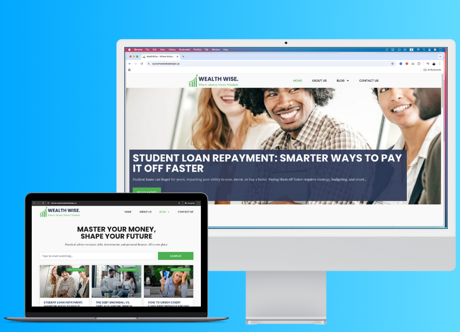
9. Setting Up Site Settings: Okay. Now we have
all the post and here this post category is
selected as uncategorized. Let's click on Quick Edit and here we can set it as
depth management update. Now also we have
our brand details. Here is the brand logo. I just created it and here
we have the style guide. So here we have brand details and we have the color codes, also header and body text. That we are planned to use. Okay. Now we do have
all the information. Next, what we can do
is we can go to pages, click on all pages. And here, click on at page
to create our homepage. For the homepage name, I will just add wealth wise. Sorry on title, I will copy and I will
paste it like this. Then let's add this part to
the tag line of the website. When I just paste it by pressing Command V or Control
V on Windows, it added as a paragraph. What we can do is we can paste that text here and
highlight the text, Command A or Control
A, then command X. And come on way to
paste it like this. Okay. Now I will click
on edit with elemento. Okay. Nice. Now we are
at elemento editor. What we can do is we can define those stuff on the setting. Click here and click
on this side setting. On side setting, let's
go to global colors and here we have
primary secondary text and accent colors. Let's copy those color codes. Add to our website
like this. Here we go. Actually, this should
be background color, not the text color, so I will just add background no need to color just add
background for the text, let's add primary
color as the text, which means let's copy this primary color from here
and paste it like this. Or maybe let's make this bit darker like this color because it should be easy to
read because this is a block and even though
this is not a block, when we create a website, we have to check the
color accessibility, and now I click on save changes then here
we have the fonts. What we can do is let's go back and click on Global fonts, and here we have the fonts. Let's add those fonts. First, we have fopens
copy the pop ins, add font family as fopen, and the size will be
let's make the size as 62 and with bolden hundred. I will make the transform as uppercase and let's
change the line nine. Let's make it like this and letter spacing
is pretty good. So here I will change
this primary two header. Then here we need to add
subheader for subheader, family font family will
be popping and size, let's make size as 52, not 62, 52 with mold
crasformg line night, let's make it as 52, all right, and here we need to
add the text font. It's Laura just copy it. Aura and let's make it 21. Maybe 20 will be work. Then with this normal, let's as Linet, maybe we need
to change the line height. Let's check it after
we come to this. Then I have to at the
button for button text, let's get hopinsHpins 21, let's make this
as semivol paese. Maybe let's make this as medium. Linet will be also 21. Now please conceive
so we now have the global fonts and global color and
ignore the them style. Then on site identity, let's add those in for later. For now, we have to
go to background. On background, I will click on background type as classic, and here I have to add
the background color, so click here and select the
background color like this. Then concept changes,
then let's go back. And now we have to
add the layout. So let's set the
default with this, then gap will be two. The default container
padding is ten, let's keep it like
that and let's go back and everything
good to go. Now close here and let's
go to the website. Now here I will click
on page setting, on page setting, page layout will be element of full width. Also on the layout, let's make it element
of full width. Then let's go back
and on site identity, let's add those
details right now. So first, copy the st ename, paste the sit name here, then copy the tag line. Pase the tag line here. Also, here we can
add the site logo, click here, and here we go, here we have the site logo
just add it and at old tag, click on select and sit FV icon. I just created the Fav Con. Let's click on this Qs
image and let's add this FV icon and you can find these details on
the resources section. Okay, now click conceal it right now click on Save changes. And let's go to the
editor window. All right. Now the website look like this, so now I click on publish
and let's repress this page. When I repress the page, it looks like this.
10. Creating & Customizing a Header: All right. Now as
the first step, we have to create the header. So let's go to
WordPress dashboard. So our website, URlawp Admin. Then from here, we have these templates and
click on Team Builder. On Team Builder,
here we have header, click the plus icon. Nice. From here, we can select a header or we can
create one from scratch. Here I will close this and
let's create from I scratch. From here, I click the
plus icon and select the plex box and the plex
box will be direction row. And here we go, just
go to advance of this container and remove
all margins and paddings. And as the perch is depth, I will add the St logo. Just click here to add element and here we have side
logo. Here we go. Then let's go to EtyleOEtyle, we can change the width of it. Let's make the M left with
as 75% and rest is good. So now I click on the container and add
top and bottom padding. Let's add top as six and the
bottom as six like this. Now we have to add the man so click on add element
and search Menu. And here we have a fresh
menu just add it like this. Currently we don't have
a menu on the menus. So what we have to do
is we can click this, go to the menu screen. And manage menu from here. So what I'm going to
do is I click on this, create a new menu. Then here I will
add the menu name. Let's make it main
menu and create Menu. Okay, we successfully
created the main menu, and now we have to
add the menu item. Here is the homepage. Just click the home page
and click on addTo Menu. And if we go to view all, we don't have any other pages. Here we have page called home. But let's see to check it, I will go to pages and pages. On all pages, we
don't have any page. Now what I can do is
I can click here and change this navigation label
to home just like this. Then we have to add about
blog and contact pages. What we can do is we can
create custom link here, just go to customink and
add the URLs hashtag here, let's add Link textas about us. Click on at Meno, then again, at hashtag and at
the Link Texas Blow. We have to create separate pages for all of these custom links, but for now, let's focus on
the main menu and home page. Or actually we can create
the empty page for each page or we can create empty pages and assign
it to here directly. So in that way, we will not have
much work to do. So I will remove those post
and click on Save Menu. Now what we can do is go to
pages and click on At NW. And here I will add this page title as
about us publish it, click on AD page,
blog, publish it, click on at page and
contact us publish. Okay. Now what I can
do is I can go back to the menus and here
under appearance, here we have menus and
here now we can click on pages and view all and here
we have all pages like this, select all of them and click on Atomnu and it added like this. Then on categories, we
can category and click on Add Menu and we can add those category under
this blow like this. Just add it like this
under the mainblow page. Now click on Save
Menu and now let's go to Elementor header and
just publish this for now. Actually, we can
save this as draft, click here and click
on Save Draft. In that way, we can save
it without publishing. Now select the
Worresmnu and here, choose the menu as main menu. Okay, the menu loaded
like this and now I will select the main
container and on layout, add this as space
between like this. Okay, now we have to
change the menu design. What I can do is
click on the menu and go to Etyle and the
typography will be button. However, we have
to change it size. Let's change it like 18. Then the text color
will be text, normal color, and
on HA actually, we don't need a divider. If you like the divider, you it like this. Then on edge over, the text color will
be this green color. So when I over, it will look green and
we don't need a pointer. So on active color, the text color
will be secondary. And on content here
as the pointer, check it as none. If you like pointer like
this, you can keep it, but I don't like
just click on none, and alignment will be start. Okay, now all look good
and go to E style. And here, let's make this
horizontal pattern as zero, and vertical pattern
also will be zero. Now I will add I
space between us. Let's add it like 90, 90 is too big. Let's make it like 60. Yeah, 60 looks good. Okay. Now let's go to drop down. Let's make drop down text
color as primary color here. Then the background color will
be this background color, and the typography
will be button, but the font size
is 80 like this. And on edge over, text color will be green color, and the background
color will be. Let's make it primary color
and let's see it work. Yeah, it works perfectly. And on active, let's make this. Okay. Now here we
don't need a border. And here, let's add
horizontal patterns, let's make it like 30, and let's see actually
should be vertical pattern. Make vertical pattern
as 30, 30 is too much. Maybe let's at 20 and the horizontal
pattern will also 20. Now it looks like this, and here we can change
the distance from menu. Let's make it 2020 is too much. Let's make it like nine is
pretty good. Toggle button. This toggle but
we need to adjust the toggle button details on the mobile view because currently the mobile
wave look like this. But in future lessons, we will fix the mobile view, and for now, let's
keep this like this and let's
make it as center. Just click on this main
container and align items will be center and
also click here. Now I will sec this
container and on line items, click on Center to
make this center like this and it's
looking pretty good. Also, let's fix the tablet
and mobile versions too at the same time. So what I can do is click
on the tablet version. On tablet version, I will
select the container and at marging
left and right as, let's make it like 15
and left will be 15. Okay. Now this image
looks pretty good, and now click on
this Hamburger menu. And here we can change the size as we like.
Let's change it. 36 and border with will be zero, border radius will be also zero. And the background color will be this primary color
or the text color, and the Hamburger menu on color will be
background color. Okay. Now we have an issue. When we open this menu, it opened with rest
of the container. To fix it, I will
click on the word Rsmo and on here on the content, I will make this as full width. And then if I check it, it will open like this. And now here we got an issue. This toggle button get the unresponsive and it's
like out of the layout. What we can do is we can
click on the container and and container change
direction to column vertical, and now if I check it, it will look like this, and now it look really good. Also here, we can make
this site logo content to middle by adding to the
hundred percent like this. And if you check
these properties, you will see this
tablet protrit icon. So it means when we make changes while we are
on the tablet version, those changes will only
affect the tablet version. If we go to the desktop version, the design is same, and here you can see
the desktop icon. And if you click on mobile, you can here see the mobile. Okay, now let's work
on the mobile version. Okay, let's go to
mobile and here's look, I just click on
the main container and let's set the direction
to pro horizontal. Okay. Now, here we go. This menu item should be on
the right side to do that. What I can do is go to sit logo. Here, now let's go to
advance on advance, I will change this width not the image with the
width of this site logo. Let's make it custom and let's decrease its
size like this. Let's add it like this. Okay. Let's make it 270 Nice. Now, we had this issue before, which is the side
by is not showing correctly and I found the
reason for that issue. If we go to the
container on container, we add margin right
and left as 15. But what we have to do is
add it on the padding. Let's make margin
left right as zero. When we do that, the issue
was fixed and here I will add top six and
padding will be 15. And also left
padding will be 15. Again, we have to decrease this size to a little
bit more like this. Actually, if we go to
not here in container, let's go to layout. On layout, let's
make gap as zero. And now on side logo, we can add it like
this, not 25245. Okay. Now it look pretty good. And if we go to the
tablet version, we can do the same thing
on the tablet version. So just click here and make this as direction
row horizontal. And let's go to advance, remove this margin
right and margin left. Then let's add it right here. Actually, we have to
click on Link value together to check it 615615. All right. We didn't add the margin right and left
on desktop version, so we can put it like
this and here we go, here is our menu and logo, and this is the header. Now click on Publish and then
here we have At condition. So I will click on at Condition, and I will make it
include entire site. Then I click on Save and clause Ar now let's go to our homepage. Let's go back Wagers page. And here we go. Here
is the homepage. Let's check Okay, now
it's look like this, and this is the footer part. For now, let's create
empty footer and we can create the footer after we
complete the hero section. Not hero section, the homepage. Okay, let's go to Team Builder
Templates Team Builder. And here we have two headers. This is the header. So if I go here. This is the header, so I
will remove this header. On Trash, mod trash and click
here and click on Renim. Then let's at Head,
change it like this. All right. Look good. Then let's go to Footer. I just click here, and
here are some footers. For now, I will skip it and just click on publish at
condition entire site, click on Save and Close. Okay. Let's see. Here we go. Now here is the website. In next lesson, we have
to design the home page.
11. Designing the Hero Section: Everyone. Now let's
design the homepage. Currently, if we go
to the homepage, it will look like this, and I want to set
the homepage page. In our case, let's go to the
dashboard and pages 0 page, and we need to set up this page. So to do that, what I can do
is go to press dashboard, and let's go to
set in and Tding. I will open it in new window, and here on your
homepage displays, click on a static page and set this homepage as our well twice
homepage that we created. Now I click on Save changes. Now if I visit the website, it will look like this because
our homepage is empty. Now I click on it with
elemento all right. Now it's time to
design the home page. Okay, let's start the design. First of all, we have to
create the hero section. So my plan is to
create a post slider. So this slider will
have around three post, probably most recent
three posts. Let's do it. First, I click on this plus icon Xbox and
direction will be column. Okay, now here I will
go to Advance and remove all the padding
and margins all right. Now I will click on
this ad element. So I element of Pro, we have loop carousel. Using this loop carousel, we can create sliders
with dynamic content. So post is a dynamic content, which means we can add post using our dashboard
in other term. In other term, WordPress is a CMS content management system. So let's use this feature
to create our post grid. To do that, I will
just rag and rob this loop carousel
inside the container. Okay. Now here, I can
select the template type. In our case, it should be posts. If you create
different force types using plug in advanced
custom fields, all of those items
will be load here. In our case, we have post, and then here we can set the query before
we set the query. Let's create a template. So I click on Create Template and click Save here
to save this design. Okay. Now here, what
I'm going to do is I click on this plus
icon and Plex box, the direction will be column. Okay, then as I did before, I remove all the
unnecessary E stuff and click on add element. And here we have pose title, post excerpt, feature Dimag, post content, post info. What we need to
add is background. To add the background, I will add forced
feature Dimage. What I can do is I select
this container and go to Estyle click on
Classic and here, I can use this
dynamic tags feature, click on it, and here
we have dynamic tags. In our case, I need
feature Dimage. Just click on feature Dimage. The feature Dimage
shows like this. Before we go further, I will click on this loop
item set in and here I will change this title to
pause slider template. Then I will publish this. Now I click on Save and back and we are back to our homepage, and here what we
have to do is select the loop garsel and now here we have to add
the number of slides. I need three slides. Sit on display will be one and sit on Scroll
will be also one. Now I click on it template, and here we go, our
template changes like this. Now what I can do is I can click on the container
and let's add Might. Let's add the height
as 700 like this. Now let's go to Es
tiles on E diles. The position will
be center center, and attachment will be default, repeat no repeat, display size, let's make it cover like this. Then we can add scroll effect, but I will not add it, and here we can add mouse
effect. I'm not doing it. What I'm going to do is add
in a background overlay, click here, click normal, and the background type will be classic and the color will
be our primary color. Or it. Let's make it
background color, and let's increase
the opacity like five surely I will not
add any background color. Now what I want
to do is add pose title and little
bit description or little bit info
about the post like excerpt and here a
button called Read Me. Let's do it. To do that, what we can do is click
on add element and first, let's add post title. Okay, I not allow me to dit. So what I can do is I can publish this and
click on Edit page. Okay. Now again, click on
Edit template. All right. Now I can add it's
like a glitch. So just add the post title
and the post title is here. I want to put it here. Before we do that, let's
just create the design. Then I want post excerpt. Let's add like this. Then what I want is a button. Let's at the button like this. Okay. Now this text is
not showing correctly. So what we can do is we can add the background
color to this text. So to do that, I have to
create a new container. Let's dragon rope a
container like this. And again, let's remove
all the unnecessary stuff, and on daction let's
make it column vertical, and I will put it right here, then I add all of
the pause title and the post excerpt and the
button inside this container. Actually, let's make
it like this. Okay. Now I will select the
container and go to Estyle, click on background type, and let's change the
background color. Primary color like this. Okay, pretty good. Now, let's edit with the title. Select the post title,
go to East tile. Alignment will be left, and typography will
be header like this. Then the text color will
be background text color. Nice. Now we have
to add the excerpt. So here I will set
the length as ten. Let's check. What about let's click on apply
to post content. Okay, now it's here
ten is not good. Let's make it like 225. Okay, 25 is much better. And let's go to Etyle alignment, alignment left, and
typography will be text. Then text color will
be background color. And now it's look like this, and now what I want to do
is make this button better. I will click on the button and the button text
will be read more. So we read more like this. And if you want, you can add dynamic tags, but I'm not going to do it. And for the link, we can add dynamic tag. Click on dynamic tag, and here we can
add the post URL. If you have no idea
about dynamic tags and uv garausel or if
you want to go in depth, I already have a full
course about elemento pro and you can check it or just add your comment
on the Q&A section, I will create separate
lesson about dynamic tags, lobe carser and grade
about those stuff. Okay. Now let's go to Estes on Es dies
position will be left, time for gap will be button. Did you remember that we
set all of those stuff on the side setting and text color will be let's make
background color, and the color will
be secondary color. Did you see what I did? Here the text color, global color code
there's background and the background color
is this green color. Border radius, it'll be zero
and let's make padding as. Let's make top 22, right, 30, bottom, 22, left 30 like this, it's a bit bigger though. Let's make this as 20 to 20 now it is much
better, maybe 25. Yeah. 25 looks much better. And in here, let's
the edge over design, so click on it and click on
takes color to primary color, and the background
type will be or the background color will be changed to white
color like this. See? Also, you can add
transaction like how animation, like this. Let's grow, see? Yep. And now next, what I want to do is I
want to add this below here and make this much
make this smaller. To do that, I select the
subcontainer that we created, and let's go to advance
and but let's add padding. So click here and let's
add padding as 20 to all of those sides
and alignment start. And here I can change the
let's change the width to 60. No 60 is not good. Maybe 90 will work. Yeah, 90 is pretty good. Then I have to go to main
container on main container. I also have to add the pad. Let's said it as 20. And now let's go to layout. And here I can set
the justify content as end and align
item will be start. Okay, did you see now
it's much better. And also what we can
do is we can click on this second container or
the background container, and on here, if I click here and we can just
decrease it opacity, let's make it like this. Okay, now it's
looking pretty good and also on our excerpt, we can add text after the
end of this paragraph. What we can do is we can go
to Advance and on after. Let's add three dot like this. And on button, this three
dot is not looking good, so I will just remove it. So when someone clicks
on this button, that person will redirect
to this page or this post. Also, let's click
on Link option and change it in change it
to open in New Window. Okay, now it's
looking pretty good. Okay, now what I
can do is click on publish and click on Save and B. And let's see here we go. Here is the design. And now let's just the design. First of all, let's
set up the query. So click on the Loop
carousel and go to Query. The query source will be pause. And here, if we want, we can add terms of author, include or exclude, but I'm
not going to do it any. So date will be all
an order by here, this should be DESC descending, which means latest
post will be show first and oldest post
will be show last. Okay. Now, on setting, we can
change the EPL speed. And when we edge over, the sider will be push and
we can change the direction, or if we have more
than one sider, we can add of set slides, and in our case, we don't need any of them, and I will remove the navigation because
we don't need it. And also, I will
remove the pagination. Okay. Now the main thing
that I am concerned of this design is not fully cover the layout and
it's pretty ugly. It looked like old, so what we can do is we can
click on the container, and here the content width
will be full with like this. Now it's look good. Okay? Okay, now it
look much better, and also what I need is, increase the Min night. Let's try to do it here. No, it's not going from here. So I will click
on Edit template, seven leave and here, click on the container, and let's change this Min
Night to like VH and pH 200. Means this will show on
the entire home page. But the issue is, I forget we already
have this header. So what I can do is I can
make this Min heights 80. Yeah, it will work
and click on Save. Then click on here
to edit the header. And now I'm on the header, just click on the
header container and set Mnhight to VH to 20. OMG is big, but let's see
it should be perfect. Let's click on here
to edit the page. Yeah, it's bigger
than I expected. So surely this should be 80, not pixel VH ET,
publish, let's see. Here, let's make it like ten. Ten will be work, save it. Let's go here, actually select this container and add
this as 90 and save it. Actually, I added
it for rome place, so I have to edit in
the homepage section, not inside this template, so I will go to Edit
templates and here, here, I select the container
and change this to. Let's change it
like this and click change it to Hundren
and click on Publish. Let's see. Then let's go
back to our homepage, click here. Click like this. Okay, now it's LF
12. Designing the Featured Posts Section: Okay. Now let's create
featured post section. To do that, I will go here
and click on plus icon, then Flexbox and the Pex Box
direction will be column. Then on Advance, I will remove all the
margins and patins. Then I click on an element, and here I will search posts. Here we get post elements, so I will just put
it like this nine. Now from here, we
can change the skin. I select this cardkin
and three columns will be work and the post
per page will be six, which means six or post
will show like this. Now the image resolution
is looking good and image ratio is also
good on this number, then we have to check
about the title. Here, we need to show the title and the title tag
will be H three. Then on exerp I will add exert length as
they added like 15. I think it didn't update. Yes, it's not updating. Maybe let's remove EAP, click on this show
button to hide it. Now it's like this and also
I will remove the read more button and we don't
need date or comments count, and I will make open new window. Then this badge will be okay we don't need to
show the Avatar two. Now it will look like this. But if you really need exerpt, you can show it and make exp
length like five and let's see it on the real
views on real view, it show correctly, so we have to make this exp length like 50. Now if we check it, here we go, we have
it size as 50. Now let's go to query on query. The source is posts
and date will be all, then order B will be random, which means it will randomly at posts for this
section or we can order them by command
counts or last modified or using menu order, but I will make it random. Then on pagination, we
don't need a pagination. What we can do is we can go to the style tab on Style tab, let's make this
column gap as 20. The row gap also will
be 20 alignment left, and the card background color will be this background color, and let's not change
the border color. I will make border radius as zero and here we
have box shadow, make it open, and we will
have this box shadow. And on image, I will
keep the default image. Then let's go to content. On content, the
title color will be primary and the typography
will be subheader, but we have to
change the details. Here, I will make it like 21, then the bolt will be medium. Medium, no, not medium. Maybe semibold will work. Yeah, Semibold is good, and also here, let's make it 25. Letter spacing, let's
make it as default. Maybe let's make this
line height as 30. Now, 28 will be work. Okay. Now we can
adjust the spacing, so I will add six and we don't have any
meta details here. So what we can do is we can
go to Except on excerpt, the color will be text color
and also here we can make this text color as the
color of the title, but let's keep it as primary and then the typography
will be text. This typography is too
close, as I remember, I already change it, but let's see before we do that, let's add some space
into bottom line 20. And for typographic
click context, click on this manage
global font and click Context and let's
make this line as. Let's add it like 26 and save changes back to editor Okay, now it's pretty good, but still it's too close. So again, let's go
here and click here, click on Set and text, let's make this as 30. Now it's much better. Now, if we want, we
can add the read more. Actually, let's add the read. Click here, and here we go. And let's go to Estyle on
Etyle content under Content, here we have read more. I will make color as secondary color and set
the button typography, but here we have to
reduce it font size. Let's make it like 16. And here's change this
space into like six. And here, there's add
space in like 20. Okay, now it's
looking pretty good. Okay, now all looking good. So what I can do is just click on publish,
see the changes. Okay, now it will
look like this. Also, we have to here at the
title. So let's do that. Also here, we don't
have a featured image, and the space between the title and this
image is too big, so let's fix it. Let's go here, and we can
change this space into, like, let's make it like three. And here we can change
the badge details. Here we can change ground
color like this and text color will be actually the background text color
will work like this. Okay, now publish
it. And here we go. Now here is the design and
it's looking pretty good. So let's add the title
to add the title, I will click here and
let's add the header. So the header, M
tag will be H two. Let's add it like our lats
insights and go to set in, make it a line lay
typography will be header and also I
will duplicate this, then the ML tag will be P and's at this don't
miss a thing. Read our most recent
and popular articles, and let's make it as text. And then I will click
on this post section, and let's at margin drops two. Now it has more spacing. Publish and here we go. Now it will look like
this and I will click this Read Me button on the depth Snowball
was depth Avalanche. Click on the Edit post and
click Concept featured image. Let's add this featured image like this and click concept. Okay. Now let's move
on to the next step.
13. Designing the Category Section: Okay, now let's create a section to show
all the categories. So first, I will click on this plus icon and
let's add flexbox, direction column
type, container, then on advance remove all
the margin and padding. Then here I will add
margin as one to 20. The space like this, then let's add header and
heada text will be explore your financial journey
and also I will duplicate it and add the
subheadline like this, then make it paragraph. Now I will put this center. Click on the headline, style, click on typography and
select subheader type here, make it center and also let's make this center
and the text like this. Now here we have
to add categories. So let's go to our
website and on posts, here we have categories, and here we have
four categories. What we can do is we
can use icon box. So first of all,
let's add element and let's add the container
inside this main container. Then let's remove all the
paddings and margins, and then let's go to layout and the layout
direction should be row. Next I will click on Add
element and search icon Box, here we go, here we
have the icon box, and let's add the category
details first I copy the category name and
paste it on title, and then let's copy the
category description, past the description like this. Then I will also click
on the view and click on copy address and add the link address there and
click on opening New Window. Now we have to change
the design to do that. Let's go to EstilsOEts
if we want, we can put the icon like this and make this left
and right to do that, I will click here and
vertical alignment like this alignment will be
left and the icon spacing, let's make it as 15 and also
for the content spacing, let's make it like 15 15 is
too much, but it's okay. Now, let's change the icon. Let's go to icon and
actually on content, I have to change
the icon from here. Actually, what I can
do is I can copy all the categories
like this and then let's go to hag BT
and let's paste this and let's remove
those items like this. Then I will say, give me one awesome icon for each
let's see, here we go. Let's copy this one, paste it. You have to remove this lines. Actually, there is no icon
called handhold in dollars. Give me free phone
so icons. Let's see. Let's say there is more. Yeah, let's copy the
university and paste it. Okay, insert it. And now let's go to
E style on E style, Let's change icon color
to secondary color. And the size is okay. Then on content, let's
change typography to button. Title typography is button, and the normal color
is text color. Go color will be this
green color like this. Then description tiroF will be text and the color
will be text color. Okay. Now why we write and click onto bligate and it will
duplicate like this. Then what I have to do
is change those content. Let's go categories,
copy investments, let's not select
investments, investment. Like this, then let's
copy this text. There's the text, right
click copy link address, paste it and chart. Icon chart. Here we go, then I can just click on the container and right
click, then duplicate. It will duplicate like this. Then let's add the
details again, add it like this. Let's add the wallet. Always get the help of AI
when you design a website. Let's copy in noise
part and let's put it here noise and come here tax. Tanks. Copy it, paste it here. And also, I have
to paste the URL. I think I forget to paste
the URL on personal finance. It's right click copy link
address, paste it like this. Okay. Now here we go. Here we have all four items, but we have a lot of issues. Let's fix them one by one first. I want to make this size as 50%, so let's go to Advance and on
me click on custom and 50. Then also click here and go to Advance and custom 50 like this. Then I will we click copy, then we click paste
style, paste the style. Now also we got an issue, which is we don't
have enough spacing. So what we can do is we can
create a separate container. Put that container here, then let's remove
those stuff and I will put this container
inside that container. And also, this one will be inside this main container
that we created, and on layout here, I can set the row and column. Let's make it like 40 and 40 so I don't need to
add 40 to column. And now here will look like
this and let's make it 60. And then I will click on
one of these icon box and let's go to Itis and let's
go to advance on Advance, let's go to border
and make it solid. Actually, we don't
need a border, but what we need is box shadow. Let's add a box
shadow like this, and I'm not going to change the box shadow details,
and on layout, let's change padding
to six, maybe yeah, 15 will be work and
then now rightly copy, paste this style,
paste this style, also here, paste style. Actually, what we can use is
grid, not this container, and if we use the grid, it will automatically adjust
according to the grid. Let's go to here and
let's add the grid. Let's add the grid like this and the grid will be two columns and those will be also to
the gap is 40 is too much. Let's make Gaps 20. Then I will add those
box to the grid. We can just add it and put
it here and also from here, make it default size
and add it here, right click copy,
press the style. When we do this, we can get the design that has same
size of the background. Let's go here and
kill the fault. Stated like this. And yes, then let's remove
this whole container. And now it has exactly
same size in each item. Also, for this box shadow, let's go to border. And here I will change
this to, like, no, let's keep like this
and spread will be three and blur will be 22. Let's make it blur as
ten and p will be one. We click copy Patty,
ft style, pastyle. All right. Now we have this
section fully developed. Also, if we want, we can add
margin of as 60 like this. 60 is too much. Maybe
30 will be the size. Now, let's check
it on the design. So if someone click
on this category, it will go to the
category page and actually we have to
edit the category page, which we will do it
in future lessons.
14. How to Create a Subscriber Form Section: Now let's create a
subscriber form. To do that first, let's
create the container. Like this, then we have to go
to advance link the values, then here one, 20
will be top margin. Then I will have to add
the header to do that, let's go to elements
on elements, drag and drop the headline, and I will add this
as the headline text. Let's go to style
on Etyle alignment will be center the typography
will be subheader. Now I will just duplicate
this subheader, main header and
make a subheader. Let's go to Estyle on
Estyle change it to text, and then I will add the text as this and you can find all of this content on the
resources section. Now I have to add
the subscriber form. What we can use is
elemental form. I will form here. Here we have the form. I will just drag and
drop it like this. Then let's go to advance and let's add top
margins to entry. Now we have space. We also did it here, if you remember, see what? Now let's see what type
of fields that we need. On subscriber form, we need email and we don't
need message field, we need email field. Also, if you want, you
can keep the name, but I will remove the name and only keep the email and button. Also here as the form name, I will set it as
subscribe. Okay. Now on label, I will
hide the label. Then, we have the button
for the button text, I will set subscribe like this. Okay. Now I want to
make this in line, which means text area or the text field and the button
will be in the same line. To do that, I will click
on the email field, and here as the column width, I will make it as 75. Okay, now you see with this change and also I go
to buttons on buttons, the column width will be 25. Okay. The text field is
75% and the button is 25%. That's how we can
create the online form. Okay, let's make
this design better. First, I will go to Estyle
on Etyle as the column gap. Let's make it as 15, and we don't need to
worry about row gap. Let's add it as 15 for now, and we don't need to worry
about label HDML field, and then let's go to field. In field, we can
add the text color, so I will add the
text color as text, and let's add
typography as text, then the background
color is white and let's make the border
color as bit gray like this, let's make the border
radius as zero because we have to follow the buttons
and other card designs, we have to keep the
uniqueness of the website. Then all good here and on button position will be
esh and alignment center. Then the typography,
let's make it as button and border type. None, then the background color will be this secondary color, and the text color
will be white color, and we don't need
a border color, and we don't have any
previous or next button, and the board radius will be zero and text
padding will be like 14 14 will work because we have to match the text field and
button height like this. Then here I will go to background color
will be primary color, and it will like this. Then I will keep the text
color as white color. And if you want, we can
add animation like this, but it's not necessary. When you make those changes, always apply the design
and style that you use here because it will keep the uniqueness
of the website. Now we have the subscribe
form and if we want, we can go to Let's go
advance and so we can add right patina 60 and the
left padding 60 is too small, maybe 90 90 by 90 will be good, maybe one to 212120
by 120 will be good. So now it has smaller size, also, I will go to
the main container. On main container, I will
add the mint height as 350, maybe 400 and justify
content will be center. Then one style, we can
add the background color. Let's add this green
color and let's reduce the green color opacity like this and let's make this as 600. Yeah, 600 will great and next let's go to
the form on form, we have to set the
action after submission. Here, I will remove this we need to do is we need to
collect the submission, which means when user
sent this email form, that email address will be regret to our email collection, and I will show you
how it looks within a few minutes and also
here if you want, we can add email marketing
tool like mail Jim. If we select this mail him, you can see here we
got the Mailchimp tab, and here we can add
the Mailchimp ABI. In that way, you can connect your subscribe
form to Mailchimp. In this lesson, I am
not going to do it, so I will remove
this mail chimp and also here we have
this mail action, which means if we go here, if someone subscribe
to this email list, we will get an notification, and we have to set up the two
email also from email and stuff that we want to get the fields mean fields
that has this form. Also, if you click
on this plus icon, we have a lot of options
here if we select this mail, we can also send a
mail to our visitor or the person who fill this form and click
the subscribe button, so we can notify him
that we got their email. I will remove both of them, and if you like to add it, you can write yourself
or if you have any issues while trying
it, just let me know. I will create a laser. And on collect submission, we can collect the user IP
and user agent of the sender. If someone send that form, we can collect the email
also UIP user agent. On additional option, I will
keep default promulgation as browser default
and let's go back to form field and on Form field, here we can the page
order, so we can say, let's say enter you email
to subscribe on advance, if you want, you can
set a default value, and if you want, you
can change the ID. So in form creation lessons or the contact page
design lessons, we will go deep into these
fields, and for now, it's all looking good, and now I will publish this and let's test this
subscriber form, so I will click on preview
changes and let's go here. I will enter my email here, then I click on subscribe and here we got the
success message. Also, we can change
the message design. So if we go to style, here we have the message
and let's change message typography to text
and color will be this color. Error message color will be
red like this, publish it. Now the message color
will be different. So I will go to dashboard
and on dashboard, under Elementor, you can
see the submission section. If you click here,
you can find out all the email or all the form submissions that
you have on the website. So here under subscribe form, we got this email. What we can do is we can
select the form here. If you have more than one form and if you want to
get only subscribers, you can select the form
and you can click on Export filter CSV and get the CSV file also in future or if you plan to use
email marketing tool, you can use this CSV file to add those emails to your
email marketing tool. Now it's looking good.
15. Designing the Footer: Now we have to
create the Potter. So let's do that. To do it, I will go to the
WordPress dashboard. On Wordpress dashboard, I will go to templates them Builder. On them Builder,
here we have Footer. Just click this plus icon. Actually, I think we already created a Footer.
Try to edit it. Here is the footer. I will remove this
unnecessary footer, and here we have the
footer and click on Edit. Here we go. I will go
to set in on set in. I will just remove this text and let's keep
only footer apart. Okay, now I will create
a flex box like this. Then in mean height, let's make it as 300. Yes, then let's swing
the margin and paddings. Then let's add 20 as margin top. Then on his style,
let's add around. Let's add background like this. Let's make this as 350 pixel. Yeah, that's much better. Then from here, I
will add a element. First, I will add the side logo, and also again on the container, let's select the direction
as crow horizontal. And without just adding
solely the side logo, I will add container,
remove the stuff, then I will put this logo inside the container like
this on container, it will be column vertical, and a line item start justify
content will be start too. Now I need the ad text. Add the headline here, exchange this two paragraph
and it will be text actually, this logo is not
working here because this logo text is same
as the background color. That's why that part
is not showing, so we have to change the
logo before we change it. Let's change this text color. And what I can do is without
just adding the side logo, I will remove the side logo
and I will add the image. And just like this,
let's put it here. Then I have to change the image, make it here I
will add the logo, choose this image and here
on the resources section, you can see this is white logo. Let's add it like this. Then let's face the ALD tag. Now we have this logo without
the white background. It's good. Now here we have to
add a small paragraph. I will add text like
this and now I will luplgate this container and I will do it for three
times like this. Then I will remove this
text and the logo, and I will do it for here too. Nice. Now here I will
add the important link. So first, I will
add the headline, then I will add the title
as important links, and on die, let's make it alignment center
Typography will be sub d, but we have to change the size. Let's make it 30 and line
height will also 35. And the text color will
be this background color. Then let's make this
as center to do that, click on the container and make the line item center like this. Now I will have to add a menu. Search menu here and I will add this wordpress menu here
on mobile dropdown, I will make it as none. Actually, I have to add
it on this container like this and now
I have to create a menu or I can choose
the header menu select the word pres meno item or
the word tras menu element, and the menu will be main menu, and let's make layout
as vertical like this, then alignment center,
and pointer will be none. Now let's go to Etyle. Here I will search. Here, I will change the menu
name to important link. And on menu Icecream, we have to change this menu, but let's do it after we
create all the content. For now, let's go to
its die and here, let's change it text to button and text color will
be background color like this and edge over color will be green color and the active color will be also green color. And we can change the
vertical padding if you like. And here I will add the
space between as 15. And here, let's remove these horizontal and
vertical paddings and let's make this as 30. 30 will be work, and it
will look like this. Then what I can do is I can copy text and paste
it like this, then click on the container, make it a line item center, and here I will change
this to reasoned post. Then I will click on add
element and add a post element. I will track these posts
and drop it like this. Actually, it should be
drop here like this and I will salt the skin as classic and currently
it's in horizontal, but we need this in vertical. To do that, I will
make this column as one and post page will be three, not minus two, three, and the image position
will be left like this. And the image resolution medium will be work and here
on the image width, let's make it like
30%, like this. Maybe let's make it as 40. Okay we need to show
the title and we don't need to show the exert and we don't need to
show the metadata. And also, we don't need
to read more button, and let's make
open a new window, so when someone click on it, it will open in a new window. Okay. Now let's go
to Query on Query, I will select posts, it will order by the date
and order will be DESC. Then I will click on this ignore ItigiPose
and pagination, we don't need pagination. Then let's go to EtyleOEtyle, let's make column gap. Actually we don't need
a column gap here. Let's make this raw gap as two and also let's make
this column gap plus two. Anyway an alignment will be left and here we don't need
to worry about the box, and also we don't need to
worry about the image. Let's go to content, and let's change
content title color to white color like this. Also, the typography
will be text like this. Let's make this text size to 16. Now it's much better
and also here, let's make line height 20. Alright, it's
looking pretty good. And if we want, we can
make this skin as card. So the background will
be in white color, but I will keep it
as classic. Okay. Now I will click on
this main container, and let's go to Adlace let's
add bottom as 220 like this. And also, let's reduce this image size in that way
we will have good alignment. Let's make it as 30. Okay, now we have the footer
top part is completed. Here we have to add the copyright section.
So let's do that. To do it, I will click on Class icon and add new
Plex box like this, then go to advancing all
margin and paddings, and one style, let's add the background color
as this text color. Then I will click here and add headline let's drag and rope and let's make
it as H three. And here I will click here and I have to select the
date dynamic tag. So here we have
current date and time. Then I click on this G icon and the date
format will be custom, and here we only want
to see the E. So I will keep the Y and remove
all of them then on advance, we can add the before
and after text. For before, I will add
add sine and for after, I will add or rese
wealth wise, or rested. Now let's go to
Estyle on E style, make alignment center, and
typography will be button. Then the color will
be background color. Now here, let's make
this typography to 60, 18 will be per and then I click on the
container on container. Let's make top padding as 15 and also bottom padding
will be 15. Here we go. Actually, let's change this
typography to text and here, make it medium, 18
will do the job. Then I click on publish and
now if we check the design, we can see beat design Footer. Also, if we want, we can remove
the content from here and also we have to create new
menu for the import links. Let's do that right
now and to do it, I will go to
appearance and menus. On menus, I will click
on Create New Menu. The menu name will be important. Links and click on Create. Now here I will add I will add homepage AS page, Blog page, and Contact us page and
click on At Tomenu here, I will change this to home
and click on Save Menu. Currently, we only
have those four items, but in future, we
have to add more. I will go back to our Footer
editor and click here, then change the to
important links menu like this for
important links, we also have to create privacy policy and terms
and condition pages. I will show you how
to create them too, and then we have to add those links too.
Let's publish it. Okay. Now in next step, we have to fix the
mobile issues. We have to fix the mobile
issues of this homepage. Then we can go to Designer Aus, the blog and the Contact page, and let's do them
in next few video.
16. Fixing Mobile Responsiveness: Go forward, let's fix
responsive issues. Click on edit this element
to edit this main page. Then let's go to tablet
Atriov I look like this. We already fix the
menu and header apart. Now we have to fix
from this hero slider. If we go to the mobile view, it will look like this. What I can do is I can click on Edit template to
edit hero section. Then I am on the hero section. If you check here, you can
see four slider template, and here is the container. Let's go to main container
and on main container. I will add Mnhight as hundred. I mean the hero section will
actually in min height, I will add it like 80, so it will be 80%
of the tablet view. Then on the container, I will make this with 100%. As I have to change the font
size to do that I select the pose title and let's go to Etyle on Etyle Here I
click on this icon, then I click on Manage
Global font, a icon. Then from here, we can see
we are on mobile Portriot. So on mobile Potriot I will
change this size to like 46. Then also, the line height
will be let's make it as 1.2. No. Let's make it as one. And also on the subeter
I will make it like 41.21 will be line high. Also on text, I will change
this text font size to 18, and for the button, let's make it 18 like this. Then I will click
on Save changes and click on back to
Editor. And here we go. Now we have smaller size fonts and on mobile hero template, it shows two items, but I only need one item. Let's try to fix it. Actually, we have to make that change on Loop
carousel setting, so I will click save and bag and here I can select the container
inside the container. Here we have Loop carousel
on Loop carousel. Here we have slide on
displays two on the tablet, I will make it one. In that way, it will
show like this. Okay. Now it's looking pretty good. Let's click on Edit template and click on Save and on here, the in between size
is bit bigger. So what we can do
is change the gap. Actually, if we go to side setting on site
setting layout here, we can see the gap. So we can change this
gap to 15 or ten. Yeah, ten will be works. So on tablet, it will be ten, and for the content padding, if we want, we can add zero. Then let's go to mobile
view on mobile view, it's look like this and gap
ten will work on there too. Now I will quick conceive
change and I will go back here, then if I go to global fonts and here is the header
font size on mobile. So let's change it to 36
and inet will be one. Actually, default lint is one, so no need to change it. And here, let's make this as 32, and the text size will be 18
and line height will be 1.2. Let's make it 1.4. So it will be easy to read
also for the buttons, let's make it as 18. And now click
conceive changes back to So when we use global fonts, we don't need to
adjust them manually. When we adjust it
on the global font, it will affect all the elements. Now our header is looking good. Now let's go to our
latest inside section, and let's fix the
tablet version first. So on the tablet version, we have to add the left
and right padding. Let's add right padding as ten and also left
padding as ten or maybe 15 15 is the size that
we have to uh, yes, it's 15. Okay, and it's
looking very good. Then let's go to the mobile
view and see what we can do. On mobile view, we don't
have to do anything. It's adjust accordingly. If we want, we can change
the in between size, but I will keep the default 15. Then we have this section, so I will go to tablet version, and as we did before, we have to change
the right to 15, also left to 15, and it will adjust also, it will adjust on the mobile. Then here we have to do the
same two subscriber section, what advance here will be
15 and left will be 15. If you think this
space is too much, you can remove it, but I think this
space is better. Now our homepage is fully
responsive and here we have a issue click on the subscriber form and we add the right
and left padding, so I will make it zero and
it will look like Okay, now I will publish it, then we have to edit the footer, click on footer and on footer, let's go to tablet version. And here, what we have to
do is add left and right. Top will be 20, will be 15, bottom to 20. And then here the reason pose, we have to make it one column
and it will look like this. Then on mobile, the
top part is okay, an important link is okay. For the reason post,
it looks like this. And if we make the
image position top, we can see the
text like this and the issue is it will
affect all the section, so I will make it as
left like before. So in situation like this, what we can do is we can
duplicate this section, and then I will hide this above section
on the mobile view, so it will be only available
for desktop and tablet, and it will not available
for mobile view. So I will go to Advance and here Responsive
on responsive, we can click on hide
on Mobile Portal. And when we go to
mobile, let's go down. It will not show. And then we don't want to show this on tab lat and
desktop version. To do that, I will click here and go to Advance
and responsive. Here, I can make it hid
on tab and Hy on desktop. So it will be hid
on those screens, and it will available only
on the mobile version. Now here, what I can
do is I can click on Content and make
image position top. So our pose title will show
like this also on the Is dies we can to image and we can change the
spacing like this, make it as two maybe
three will work. Now on desktop, this
will be not show. I will show the image
with left side, this one, and on mobile, this will be show. Now I click publish and let's
check it in real design. Here, I will right click
and click on Inspect. Then here I will click on
this Toggle device tool bar. And here now we have
the mobile version, and if I scroll down, here is the result that show. And on the desktop version,
here is the result. I hope you got the idea. Okay, now we successfully design the header but also here, we have to add height and left readiness 15 and
publish it nice. Now here we have the design.
17. Designing the About Page: We have to design the ATS page. Let's click on here. Currently we have
the empty page. What I do is I
click on Edit page. Then here, I click on Edit
with elemento button. Now I am at elemento editor, so I can just click
here and click Context blocks and click
direction column to create a new container and let's make Margin and Padina
zero here there's at Margin to pass 60 like this and here we have to add
the details and first I will add the headline the headline text it will be center and the typograph
will be header, and also I will duplicate
it and make this as paragraph and at this
typography text. Now what I have to do is I
have to generate content. What I can do is I can
get the help of AI. Okay, here I am at the AI chat that I used
to generate blog post, and here I will say, give me about page
headline and content, you need to have header sub header and
description about us. In your case, you have to
write it yourself or use help of AI according
to your niche and it generated something
that I don't want, so I have to tell this AI this
is for the block website, it includes all the let's go
up and check our categories. Just copy the category. It includes all three
categories, three categories, and other three
categories and give me about content for
this block website. And let's see what will happen. Okay, this is good. Let's copy this part, and here I will just add it
like this and in your case, don't do the same. You have to do it according to your niche and according
to your website is tied. Then here, we can add
what we cover so. Let's add that one
after this session. So what I can do is
I can lick here, click Context Box and
direction as column. Then go to advance on Advance. Let's add margin to pass one, 220, and inside this, I will create another
container and let's remove all the margins
and paddings and on layout, I will say the direction as horizontal and Y
content will be here, and then I will click
here and add the image. Then I will add a
headline right here. Did you remember
this container is a direct horizontal container? That's why this headline added like this and let's go here. I will just copy
the headline text here and add the
headline text like this. Actually, we can
use this container. I will add the image and headline to this
main container and then let's make
this main container as direction horizontal. Then I will add this headline, only this headline inside the container and
this container, the subcontainer will be
column vertical like this. In that way, we will not
need to add lot of elements then let's go to STIs and STIs make this as
subheader like this. Then I will duplicate this and let's make this as
content H three. Also, this one will be H
four and here at the person. Actually, we can add that
grid that we already created. I will remove this one and let's go to the homepage
and on homepage, I will click on Edit
with Elementor. You see, I am not designed this website or
call into a plan. I am just created real time. You know, I just copy this grid, just copy it and
let's come here, then pace the grid like this. Then on the grid, actually we don't
need the grid here, but let's grid the grid grid, the columns will be one
and the rows will be one, two, three, four rows. Oh, like this. And here, let's make this image sizes 40%. Actually, we have
to go to advance. Let's make the image size here
as hundrn and on advance, the width will be
astern, which means 40%. Like this. Nice.
Actual range as 50, 60, 60% will work, and this one will be 40 per. No, this one should be 60% and this image should
be 40% like this. Now here, I have to add a image. This image should
be vertical image. When I create the image, I should consider about that. I will create the
image. Come back here. I just created the image, so create image I use
CNMAOuse website like fxs.com and use Figma to cut
it and change the sizes. Here we have the image, this image ha use is 700
and the width is 600. Let's add it here and let's
see what we have to do. I will just and drop it like this and here copy the ol tag, past the ol tag, and here it will look like this and it's not
fully covered here. What we can do is we can
increase the image height. I will go to Canva and do
it and we'll come back. Just design the image, I will go here and
at that image attack and let's see is still not perfectly aligned
with our design. So what I can do is I can
make this as aligned center, or I can increase this custom
with live make it like 50, 50 will be worth. Or what you can do
is you can find out the width and
height of this section. So to do that, you can
click on preview changes. And here we go on here. I will right click click
on Inspec and click here. Then here you can see the image height and
image with height. You can use this with
height to create the image. Now let's move on to the next
section and let's go here. Let's see the next section. Next section is why we do
this and join our community. Let's create those two sections. I can easily duplicate
this section and paste yes we have to
paste it below this. What we cover section, we can just do it
like this and here make this march in top
pass one, two, 20, and let's change this text
to why we do this like this, and then we can
add this section. Now we have to add join
our community section. What I can do is I
can copy this text, just duplicate this
text and put it below, then here, then copy this and ublgate this section and paste it below like this
and add it like this. Then I have to add on here, add this form, so I will just copy it and
paste it like this. In here, I will click on this
headline and let's make it as H three also will do
the same to be a H three. And when we add this as middle, it not very use apparently, what we can do is
we can click here and make it a line
left like this. Also, we have to do the same here and the subscribe session, let's make left and
write patins like this. Now what I want to do is add image like this to
this side to do that, we have to wrap these items
in different container. Let's click here and add
a container like this and all the stuff here I will just add all the item inside
this container like this. Here we go. Now, let's have an space between
those two section. We can easily add margin drop to here or we can use two
different containers. I will just add a
margin top here. Let's make it as 30 or
maybe 60, 60 will work. And the other ways we can click here and add a container
like this and again, remove those stuff and
inside this container, we put this one and this one. Then I will duplicate that container and remove
this one and this one, then I will put this one and this one inside
that container. Now, actually, we have
to add this one too. This is a little bit work, but just add in the margin
top will be but I just want to show this for you now
on this main container, I can go to layout and I can add the row gap as 60 like this. Then I want to add a image here. To do that, I will
I will click on the main container and
change it direction to row horizontal and
just duplicate this. No, let's just copy
this image and just click here and paste
the image like this. It will be just according to
the design and click here. Let's make this as 60. Then click here and make
this align items center. Also we have to do the
same here like this. Now I can change this image. Here is the newly created
image and I click here, then go to Content
and upload the image. Also we have to
add the ALT text. When you add the ALT text, always add meaningful text and O friendly keywords like how to be wealthy or
something like this. And here we go, we just design the a page. Also, if we want, we can add
more section to this page, but let's keep this
as minimalistic. Now white on published, and next lesson, we have to fix the mobile
responsive issue.
18. Fixing Mobile Responsiveness on the About Page: Okay, now we have to fix the
mobile responsive issues. Before we do that, in last video that we do the
mobile responsiveness, we change this gap to ten, but we only want to do it in
tablet and mobile versions, but the desktop
version also changed. Let's go to side setting
and on layout here, let's make this as two y
because if we make it ten, it will always ten and
let's click on changes, click on back to
Editor Okay, perfect. Now let's go to tablet
portrait version, and let's change them. Let's add adding right
as 15 and left at as 50. Also here, let's change this. Let's make it direction column and then click on
the image and go to advance and make this
as hundred or we can just make it full and also
we have to do the same here. It's actually on the layout, make it 100% like this. Then we can add the right patterns 15,
left patinusfty nine. Now here also we can do the
same make column vertical, then go to advance at right paddin as 15 and
left pattern as 50. Then let's click
here on advance. Make this full w. All right. Now it's looking pretty good. Then let's go to mobile
patriot on mobile Port riot. It seems everything looking very good and we don't
have to do anything. Okay, now click on publish, as like that, we just
design the A page too. Now we have to set up the blog page and let's
do it in the next lesson.
19. Blog Page Setup: Okay, now let's set up the
block page to do that, we can use element
or Them Builder. Under templates, here we
have the Team Builder. Just click on it and now here, click on this at New. When you click on this, here we can see each and every section of our
website that we can edit. We have to edit all of them. First, let's edit
the block section. Here we have archive. If I click on this Info icon, here we can have
the description. So here we can create
the block list. Let's do that, click
on this plus icon and here we can get the
pre built templates. If you like, you can
use one of them, but I'm just close it and
let's build it from scratch. I will click on this
plus icon, Tex Box here, then make this zero as the
value and for the margin top, let's make it 60 on elements, here we have archive title. I will just add it and this will automatically adjust
according to the page. Here I will make it center and let's change typography
to header like this. Then again, I will click
on add element and here we have arch force
just rag and drop it. Did you remember the last
time that we did the same on the homepage and
here we can do the same? Now here we have to adjust
the style to do that first, let's select the skin
as part like this, then the column will be three and we should
show the image. Let's make image resolution like medium large so we can get clear image and we have to show the title exerpt and
except length will be, let's make it as two. Then if you want, you can
show the date and commands. So in this case, I am not showing the
data or commands, so I will just
delete it like this and here we can keep
the read more button, and here we have the batch. Then let's go pagination. We can set pagination like this or we can use
this infinity Escod, which means when
scroll the website, rest of the images will load. Also here, we can add
no more post message. I will keep the default message. If you want custom message, you can use this. Okay. Now let's go to
EtyleTap on ItyleTab, make column gap
pass and a gap will also 20 alignment center
alignment and card, we have the work shadow and I'm not going to
change much on there. Also on the content, I need to hide the author. Here, let's swing this Atison
because we don't need it. Now let's go to style on card. I will keep the
default data for here. Let's go to image and let's
change image spacing. Let's make it like C and the badge background
color will be this color and the text
color will be this color. Now on content, the title color will be primary color and
the font color will be, let's make this subheading, then we have to change it to 21. Here it will be 28, we can make it semiv like this. Now on meta, we
don't need to worry about meta because
we didn't add any. Then on excerpt, let's
add the text color. Also the typography will be text like this and also we can change the spacing and now we have to take care of
the read more button. Let's make it green color. The typo will be button, but we have to reduce its size. Let's make it 16. You can check this design and follow that
same design pattern because we have to keep the uniqueness of the
page in each page. We don't have a pagination
and here make this nothing pound message primary color and it's a bit
like subheading. Okay. Now all good. However, just adding this
archiv text is not a good idea. Let's create a headline
and subeding using AI. Now I am at our JG BT
chat, here I will say, give me header and
header or blog page. Here, let's copy this sub. Actually, I will copy this
one and let's change this. I will just remove this.
I have to remove it. Then click here and add
a headline like this, then style Men header. Actually, let's make it
subhead head is two B. Here I need to show
this in two lines. What I can do is I can add
a RO break tag like this. Then I will duplicate this, then come here and
change typographic to text and let's add this
text right here like this. Okay. Now I need to add
some spacing here so I can simply add bottom margin
as 20 like this. Nice. Now it's looking good. Now what I can do
is I can click on Publish and now I click
on Add condition. On Add condition, I can
include Earl archives, but this is not what we need. We need to add post archive. We need to show only posts, click on post archive
and click save close. Now how to access this page? Actually, I will
go to set in and change this to host gave. I think that word is
correct, but I don't know. Now if we view this like this, it will show but that's
not what we need. We need when we
click on this block or when we go to the blog
page that we already created, this block list
should be appeared. To do that, I have to go
to WordPress Dashboard. Let's go to WordPress Dashboard. And on Wordpress dashboard, here I will go to setting and undersetting, go to Reading. On reading, set post pages blog, then click on Save changes. Now if I check it here, it appeared like this. See, it's looking
pretty good and it will automatically show the next
set of post or the blog post. Actually, if I check this, the space in here
is really small. We need to add bit space
between those two sections. So to do that, I
will go to Footer. Click on Then click here
and let's go to Advance. On Advance, let's add
top margin as 1220. In that way, we will
have a better space. Maybe let's add it as 60
and click on Publish. And now, if I check it in
the signs the home page, here we can see the spacing
and also on the log page, we can see it clearly here. Okay, now it's looking pretty
good and this is not it, we have to do more stuff. As an example, here on the
homepage, we have categories. Here is our categories.
Here is category. If I click on category, it show like this and this
is not looking good at all. What we have to do
is we have to go to the Team builder
under them builder, click on forced gave, and here I will right
click here and click on OpenNw window tower postcard. Then what I can do is I can click on at New and ignore this. What we are going to do is if
we go to category page like this or search page as an
example, let's search ABC. Actually, there is no ABC
post, let's search tax. When we do the searchlight tax, it will show like this, but this is not what we want. We have to create each archi
page for those sections. Let's do that. Doing
it is really easy. First, I will fix the responsiveness issues
on this blog archiv. After that, we can
just copy this. To do that, I will click
here and here we have to add the pad in let's right
Paden 15, left padding 15. Also this text is
too big to fix it, go to style on content. Let me go to the homepage
and check it too. I think on homepage,
we fixed it, but we have to check it
and make sure on homepage, we fixed it correctly. Let's see content, the
typography changed to 21. We did it. Let's
do the same here. On here, content and title
will be 21 like this here also 2.1 0.1 will be work and the rest of
the text is okay. Actual 21 is too
small, doesn't it? No, it's okay t's go to
mobile and on mobile, it's looking pretty good. Nothing to do here. We are good to go.
Now what we can do is we can just rightly copy. Then we can go to new archive
page and can face this. Then here we have to
add archive title, not the custom title, we have to add this
archive title like this. Let's delete this one also delete this one and
let's do it again. Just rag and drop the
archive title like this. Then one d make it center
and add subheader, then here, let's see the
invit pin size here. It's 20. There's a
margin bottom as 20. Now I can publish this. When I publish this, I have to add the condition, click on add condition and
then here we can set this. If I set it all archives, it will set to the
all of archiv pages, what I want to do
is I want to add all archives and add
another condition. Then in this condition, I have to exclude post archive because we have a different
archive page for it and also we have to
exclude search result Archiv and then I will
click on Save and Close. Okay. Now here, if we check
like this on search Archiv, it will not work
because we exclude that search Archiv p type. I will go to the homepage and
let's go to our category. In this category, it
show like this and see. Now what I want to do is I
want to add the search field. If we add the search
field to block page, we can search the
post. Let's do that. To do it, I will first
remove all of them. Let's publish this
and let's clear up the page like this
and go to dashboard. On dashboard, I have to
go to the Them Builder. On them Builder, again, we have to go to archive. Actually, we forgot to rename
this archive page edit and here let's set the name as
oh my god, and publish it. Okay, now let's go back.
20. How to Add a Search Bar: Okay, here on the post page, we have to add or we need
to add the search field. Let's click on Edit and on
here I will add search. Now let's add the
search bar right here. Here we go. Here we
have the search bar. In here, I can change
this text if I want, so I will keep it like this. Now here we have results. In these results, we can show the live results and I
will show you how it's set up in next lesson or after we completing this
search functionality. Then we have query. On query, I will
set this source as posts because if we
set this as all, it will show post pages and other stuff that
our website have, but we only need
to search posts. Click on posts and on
additional setting, we don't need to
worry about this, and then let's go
to EtyleOEtyle, I will set search field
typography to text like this, then let's set the text color
and we don't have a icon. Also on focus, we can change
the text color like this. Then for the gap between input and button will
be two like this. And then on clear, we don't have a icon so we
don't have to set it up. Then for the submit button, text color will be
background color, and the background type will be secondary this green color. Also, we have to set the
typography to button like this. Then this search button
board radius will be zero and we have to add the
top and bottom padding. Actually top and bottom is okay. We have to add the
right pattern. Let's at 30 and left also
will be 30, maybe 60. Let's add a 60. It will be better
because we need to shoulder here and on the button and on a showers change
text color will be white and the background color is primary color like this. Also we can add the
HA effect like this. Now it's looking pretty good. If we want, we can add
instruction like search post, but I am not going to do that, so I will go to advance advance let's at
bottom Patmus 20. We will have space to
breathe like this. Now it's looking pretty good. Now I will click on Publish
and we have a lot more to do, but let's try this
up for try this, I will contribute changes
and let's the blog page and here I will type
tax and click Osearch. When I click CSearch it have all the details or all the
post that related to tax, but we have to create the search Archiv
field and let's do it. To do it, we have to go to the
Team Builder Team Builder, let's go to Templates
Team Builder and now we have to create
search Archiv page. To do that, click on adn
and click on Archive. And here, let's remove
this and we can just get this section
just copy and paste. Okay. Now what we have
to do is let's add text, so I will duplicate this
then put it down here. Here it should be here. Then let's change this alignment like this and make
it paragraph and remove this text and click here and set this Archiv
or Archiv tit. It will show the
archive title here and let's go to E tyle on Es style. Let's change typography,
let's 21 and here make this semble and here
26 will be here we go. This is a dynamic tag. Remember, we at
the archive title. This archive title is
similar to the page title. As an example, if we
search tracks here, this will be the archive title
or the title of the page. In this case, it will
not here in this case, it will show Now I want to take here and set the
title search archive. Did you remember
that we didn't set search page when we publish
it here at condition? Here we have search results. When we set up all archive page, we didn't set this. That's because we need a separate page
like this to do it. Now I click on SavanClos
and it published. Now if I check it, if I just repress this page, it will be like this. Let's try to copy this section. Now let's see it
search perfectly. Now as the next step, actually I have to check
the responsiveness. Here you can see the responsiveness
is not looking great. On the tablet version, it's perfect and on mobile, let's click here and let's go to style on Etyle submit button, we have to mail
this as 20 all 20. Surely, let's make it zero and will be 15 by 15 like this. And also, here we
have the clear icon, and this is the clear icon. Actually, we can change
its color like this. And if you want, we can
change the icon size. So here is that icon.
I just forgot it. Okay. Now it's looking
pretty good. Now publish it. Actually, I will copy
this part and on search Aga we have to
pace the style like this. Okay. Now publish it and
next we have to set up this. Let's click here results. To set up it, I will dig results and
click on Show here we have to create a temp live result mean when I search like this, the result will show on here. It will show in real time. To do that, I will click on
reattemplate, concept here, let's change this to
live search results. Click here xbox and add
the ex box like this, then remove your STA. For padding let's at Padins six. Now here we have to add the
tap that we need to show. First, we need the
featured image, I will make it 300 by 300 and then what we need to
show is post title. If we want, we can
show the post excerpt, but let's not show
the post excerpt. If you want, you can
just add it like this and I'm not going to do
that, so I will delete it. Now I will click here
and let's go to layout. The layout direction will be horizontal and this
image should be here, then click here, then
change the typography to text like this and
this image look okay. Then what I have
to do is I have to add border bottom because this will load item like this because the post will load
like this horizontal. First row is here,
second row is here. Let's click on main container
one style we call border. The border is solid
and bother with, let's make it to the
border color will be this color and actually
we only need bottom, we only need the bottom
border like this and let's make this colorless
little ash like this. This is it and this is not it. We have to add the link, which means when you click
on this image or this text, it should be redirect
to the particular post. To do that, click on. Let's do it for the image first, click on the image. Make this as custom URL and
here at dynamic tag and here, click on postRLT is dynamic tag and post
URL will there also, let's do the same
for this text here, we can easily post okay
and text color on primary, let's show the primary color
on normal on edge over. Let's make it
secondary like this. Okay, now I click on publish
and let's go back here. Then I will click on publish, and here I will search here Live search result template
that we just created, just select it and publish it. Then let's try it. Actually, we have to test it
on Live that's right here. When we do it, here
is the result, but it's not looking
good at all. Let's change the design to
change the design, here, I will go to EtyleOEtyle
now we have results page. On result, let's add
the background color. Let's add this color as
the background color. Let's add small box shadow. A let's not add it. Let's search like tag here. Now we can change it on the design by
checking the design. First I will make the
distance from search field as zero and the bold radius
will be zero padding, let's make padding as zero. If we want, we can change
the width of it tax. With the result like this. But let's keep widths the time. Text field like this, that is the better way, and the gap between row will be zero and gap between column, we don't have a column, and this is it. The rest of the design, we can change using the live search result page so click here and first let's
start with the image. Okay. Let's go to style
alignment will be left, and let's add width as 100%. And for the container, let's justify items,
align center. Let's make full width, and then let's see. Let's click on publish
and let's test it again. Tax. It is still
bigger and the images are not aligned correctly or
they have different sizes. We have to fix it and change
the size of the image. To do that, I will go to here and let's add a
container right here. On the container, let's make
margin and padding a zero, then let's add the
image and on container, I will add container with a 40 and then I will
duplicate the container, and here we have to
not feature image. I have to duplicate the
container like this, then remove the image from
here and at the pose title. Also make this with as 60. And the in between size, let's make in between size as 50 maybe this size will be 30
will be work 30 will be work, and here, make this 70 and click CPablish and let's see the preview right now.
Let's off this work. E search tag. Now images are
aligned correctly, but still the image
size is too big. To fix it, let's go to forced archive and I need to
make this image smaller. Let's try to do it from here. Exchange it with 50% and here the container size will be also then let's go to container
and on container, no, we have to go to container on container, make it center. Center like this. Let's make max with acid
add Alignment center here. Water radius will be zero, and let's see if it works. Let's got post cave tanks. Finally, now it's
looking much better. Now we have this space, so it's not going to work. What we can do is
we can click on the container and remove
the max like this. Actually, without changing it, let's change this
container size. Maybe let's add it like
50 and let's try now. Let's hope it work.
Finally it's working. What I did is I just keep the featured image size
as 100% and here I change this container
to 15% like this and this container will
be let's make it like this. I will autofill and click on publish and now it's
looking pretty good. C Tanks. And there you
can add a lot of stuff. As example, you can add the EAP. So what we can do
is we can go here and clcpas icon here at post exp and go to Style and first click on these
settings and in setting, add Exap length as
maybe 15 will work. And on advance if you want, you can add more stuff. Then on Etyle let's make it a line lave and change
the typography to text. Let's make it like s 60. Let's make this spacing as 15 and let's add text
color like ash color. Then we can publish and let's
see the design right now is to where I just publish
it, but nothing happens. Tax. I didn't appear, let's lickier and
less good content. Let's make this apply
to pose content and let's see if it
connote text tax text. Now here we go. Here
is the excerpt, and here is text, also, here we add a lot of
spacing this as six not zero. Let's make it.
Yeah, let's make it a zero and on this container, let's make this O as sixk Now publish it and let's
click here in search. Oh. Here we go. Here
is the final design. And if you want, you can test more ideas and make this better, but this is good for me. And now we have
search page done, also live search result done. Now we have to add the same functionality to
this search Archiv we just addit only to forced archiv
copy and come past style. Also here, we have
to go to result open and hear search
search because we have to set up the
template and click on Fablsh now if we go to
search result page page, and let's test it. When we test it, it will
like this. Pretty good. Next step, we have to
edit the single post, and let's do it in
the next lesson. Currently, if we go
to personal finance, we will see it like
this and text, we will see it like this. In next lesson, if we
click on this single post, we need to change this
design. Let's do it in
21. Single Blog Post Design: Okay, now let's design this
single blog post template. To do that, I will go to WordPress dashboard, or
WordPress dashboard. Then here let's go
to Team Builder. Inside Team Builder,
click on at New, and here we have single
post. Click on it. Here we go. I will remove this one because
we don't need it. Then first, I will click on here and create a
Plex box like this. Actually, let's create
two column one because we didn't create e
two column structure, so let's click here and let's
create this type of one. We can do it manually, though. But let's click here and
let's remove all the margin and paddings and let's
do it here, same also. Let's do the same here. Okay. Now on the top, let's add top margin as 60. Now first, we have to
add the pose title. Add it and then we have
to add post content. Actually, before post content, we have to add the
feature image like this and then at the bottom, let's add post navigation, so it will navigate previous and next post after
we add in all of this, we can make the design
then before that, I need to add Share button. Here, we have share button set. Let's add it like this and then if you allow
users to comment, you can add post command section like this and before that, I will add post section. In this post section, we will get added post. Now let's start design. Before we design, let's add all the content that we
plan to add to the sidebar. For this side bar,
I will add search. Actually, we can
get the search bar from here, just rightly copy. Here is the post
arch search bar. Then paste it like this. We have to change the design, and then I will add
post set like this. Okay. What else? This is enough for now. If you have more
stuff like author, if you want to add
the author details, we can add orthobox like this. And yeah, let's
add orthobox too. So in that way, you can clearly see even though we
don't add it here, but if I add it, you can clearly
see how to use it. Okay. Now we have
to edit the design. So let's start from
spacing issue. So here we need to have a
spacing from those sections, click on the main container and go to layout at column mass 20. Then let's take care of
this header go to style. Left typography will
be subhead like this. Then the image, the image, we don't need to do anything. I will make it full
and for this text, I will make alignment left
and text color will be text, and typogram will be
this text like this. Okay, now let's go
here and on here, we can add Share button, so let's click on Share button
and let's add Pinterest, duplicated, Twitter, not twitter egg let's
add only those stuff. If you want, you can add other, and here you can
change the design. I will say the gradient
type is square, the column will be at
alignment left target URLs, current page, and one style, we don't need to do anything. It's already looking good. Then on advance, I will
add margin bottom as 60. Now it has more space also. The top is 30, 33 30, like this. Now we have to edit this previous and next
button to do that, go here. And if you how the
label, you can hide it, but I'm going to show
it and let's show the arrow for tile
and also this border. Then let's go to E
style on E tyle. The label color will be this green color
and the typography will be the button typography
and let's make it 16. Or 18 will be work. Then, post title color will be also this color and
text will be this, but we have to reduce it like
12 12 will work and arrow, the arrow color will also
this green color or we can add light gray color like this and I will
give the default size. The border will look like this. If we want, let's add
some spacing like this. Okay. Now it's looking okay. Traday there was heavy rain, so I stopped recording. So let's continue. And what we did is we add the Her color or dgo color to this post navigation element. So we go through all of those items and add
the edge of color. Okay, now let's go up
and start from here. Okay, now then we have to
take care of this section. Easily what we can
do is we can go to dashboard of the word press. Then actually we have to visit the site and I will lick
on edit with element or. We can easily copy This
is a post element. So on homepage, here we
have the same post element. What I'm going to do is
I will right click copy, come here, right click
and paste the style. Actually, let's make it card. When I make it card,
the design changed. Okay, now what I do is I change the column
count to two and we will have two column posted and post per
page will be also two. Show images, and
let's keep all info, and here I will remove metadata and comments and
excerpt length will be, let's make it as 50
and show read more, which will be category, and important thing is query. On query, what we can
do is set the source as ports and date will be
all order will be random. So when someone
visits this post, they will have a random two
posts and pagination none, we don't need to worry
about pagination, and this content
is also completed. So what we can do is go
to the command section. I'm not going to use command
section for this blog, but I will show you
how to make it better. So here, click on this pencil icon and on
command here we have a skin, select the theme commands, and source will be current
forced in advance. We don't have much stuff to do, but still the links and the button color is not
same as our theme color. To fix it, I will
click here and make this save draft and
let's go to stsetting. On side setting, we have
to style to this theme. So to do that, let's go to typography. Let's make body
text color as text, and the typography will be text. See if when ID do it, it changed and
typography spacing, I will just leave it as it is, and here link colors will be this color on HO let's
make it primal like this and the typography
will be also same and then we have this comment button
here if you want, you can select the
typography like this, but I'm not going to do it. I will save changes
here and still we have to fix the button
colors to do that, I will go back and
here we have buttons. On buttons, I will
say the type of gapio button and on
normal text color will be background color and
the background color will be secondary color and we
don't have a border radius. Also we don't have
a border type, and we have to add the
paddings and margin. Let's make top pass 15, 22, 15, 22, like this. If you want more
space, you can add it, but I will keep it like
this and on edge over, the text color will
be pack brown color, and the type will be primary
color like this. Okay. This is how we can do it, and now we can click on Save changes and click
on back to Edit Okay. As I told you before,
I am going to remove this because
I don't need it. I just show you it for. If you need to add
that to your website, you can follow the steps. Now here we have the author
profile on author profile. We can make the
layout as we want, and here let's go to Etyle. I will keep the image. I will keep the
setting as it is, and the name will be let's make the primal color and the
typography will be button. Let's keep the text. Let's make it button size. As this biography takes typography with this
text and button, currently, we don't
see a button, so let's keep it as default. Actually, we have to add our user details to
make this look better. So let's do it after we complete
the rest of the design, and now here we have the
search bar, click on it, and let's go to
EtyleOEtyle submit button. We have this padding. Let's remove
completely like this, then let's make it as six by six or 12 by 12 will
be much better. Now this is pretty good
also on tablet version, it will look like
this and it's okay. Then I will go to
desktop version and here we have another
block post set. What we can do is we can add
the a Block post design. This block post
design to get it, I click on Edit Footer, copy, come here,
pace this style. Then what I'm going to do
is I will go to Skins card. Actually, skin is
classic let's see. The skin is classic, column is one, postra
page is three. Let's do those column
is 14 per page. Let's keep it as six. And let's ring those two stuff. We don't need to
show the excerpt, and also we don't need to show the read more button
on the Estyle, let's go to content, and here the background
color is white. Let's make it dark
color like this. Now it's pretty Okay, now we have supercool
single blog post. What we can do is we
can click on publish at condition and on includes, I have to select
these two posts, and here make it all post and click on Save
and Close. All right. Now let's go to our
WordPress website and let's go to read MotoRad
the post, and here we go. Here we have the blog post, and it looks the way that
we want it to look and see, this is pretty cool,
and here we have to adjust to do that, we have to go to
WordPress dashboard. Let's go to WordPress dashboard and on WordPress dashboard, I will go to users and profile. Here on the profile, I have to enter those
S. I will add those SF, I will add the first name John Doe and nickname
will be Edwin. This play name will be John Doe. And here let's go to
JGPT and search give me biographical info for
this particular writer. Actually, we have
to add the name. His name is John Doe. Okay, here, let's copy this
one and paste it here, then we need to have
a profile feature. Actually, we have to connect this website with
Gravata to do it. I'm not going to do it, so I will click on Update
Profile and then if I go here and let's go
to post, Oh my God. Here we have all information
about the author. But it's too long, what we can do is we
can go to the dashboard and team build click on this
element of single post. We actually have to
change the name. Let's rename it here, click on setting icon and say single Block post or single
post publish and here, click on this Avatar
and let's go to style let's make this
biography text like 40. No, still it's too much. Actually, what we
can do is we can put it below here like this. So in that way, visitors
can read about him. Also, if you want, you can
add the archive button so you can see all of that
person's post here, here, Jack. Let's add dynamic tag. Let's add post author
name, and click here. And on before addRd and
after apostrophe S, post read is face,
John DoysFst Okay. Now here I will go to
Etyle on Etyle Martin, let's change text color
to background color. And the background color will be secondary color and the
typography will be button. It's too big, so let's
text size as 16. Ho, make it primary like this. No, actually, this
should be this and the background color should
be primary color like this. I will keep the default fading, so here is the way to show
the author's details. If we publish this
and let's go to here here it still
didn't update it, but for some reason,
it's not updating. However, if we click
on that button, we will go to this arch page. Now the single
block post part is completed and most of
work is completed. Now we have to create the
contact page. Let's do.
22. Designing the Contact Page: Now let's create
the contact page. To do that, I will go to the Contact page and
click on Edit page. Then from here,
click on Edit with elemento and I will
go to ChaGBt and say, me content for contact page. Like this, it should be contact. Us and this is a financial log. Let's say, nice. Now let's add those information. To do that, I can go
to different page. Actually, let's go
to at page and click on Edit with Elementor
and from here, we can copy this section. In that way we don't need
to build it from scratch. And then let's copy this text, place it here, copy this text. Okay. Now we have to get in touch part and partnerships
and guest collaboration. Let's add those info. First, let's create direction
row column and let's remove all the margins and paddings and add margin top
pass one to 20. Then I will click here
and add the container. Also, let's remove margin and
padding on that container. Then click here and
add a headline. This headline will
get in touch, copy, paste it like this, go to
Estyle align until we left, typography will be subheader. Then we have to add this
email phone and office hours. To do that, I will go here
and search icon list. Here we go just drag
and drop it like this. Then here change
this icon to nlop. Let's get this actually. Let's get this one and then
we have to add the email. Let's get this email. The email will be invoke
at custom website design.us and also on
the link if you want, you can add mail two
and email address. I think this should be correct info search
Mail two on Google. Mail to work like that. Se Nice. When someone click on this icon, it will open this email, it will open email box, and then we have to
add the location, the location it's phone number. Let's add this phone
number. This is a page one. I will just add as it is search phone and add the
phone number right here, then we have to add
the office hours. Copy the office hours and here search office
lolock at a clock. Okay, pretty good. Now, then what we have to do is let's copy this
partnership and guest contributions
and lubricate this one and put it right
here, paste it like this. Then copy this one and paste it right here
and on this style, make alignment left and here, copy the text, paste the text. Nice. Now I will create
a new container, click here and add that
container right here. Actually, I have to
add it right here, click here and add it like this. Okay. Now it's in this
second container, but we want it here, right here. No here actually on here. Okay. Now here, I will change the margins and padding and
copy this one, stick inside, and here send us a
message at this text, send us a message and
copy this part and paste it like this and
at this text like this, then here I will
search form on form, just drag it and
drop it like this. And here we go now on form, I will search I set
it as contact form. And here we need name should
be required placed Let's a place solder in the
you will name here, then email email Presder will be less than the email address
this press it like this. Then message, not
label placeholder on the pilas no not
any suggestions. Now also we can add a subject. The text type should be text and here label will be
subject and placeholder in the enter the email subject subject like this and
it will go right up here. This is pretty good,
and if you want, you can add more email
fields, and on Advancetting, you can set default value to each email as an
example in message, I need to add halo you can
just add it when I add, it will automatically
add to the mailbox. And nice. Also, we want to
show the required mark, and this message
should be required like this and button is okay. So if we want, we can change
this submit button text, but I'm not going to do that. On action after submit will be collection submission and email. So on collection submission, we can collect this form data into the collection
submission form which located under Elementor and submissions and then on email, here we can set the two emails. So when someone asks a question, you can directly get
it to your email box. And here as the message, if we add the all fields, we can get the all fields. Or if you want
specifically one field, you can go to four fields. Let's think we need this name. So let's go to
advance and we can copy the short code
and come here. Then on email, we can just
tach his name is the name, two will be our
email and the prom will be the person
who sent this email. I already created how to
set up emails and SMDB. If you didn't check them, I will add it after this lesson and after we set up all
of those informations, we can go to EstilsOtils, we can change the column gap. Let's make column gap as 15 and the row gap should
be 15, not column gap. Let's make it as two.
Then label is spacing. Let's make this space to label. Maybe six will work. Yeah. And if you want, you can change the text color. And if you want, also, you can change
the typography. So here I will make this as bit small like 18 and line night will be also 18 and fill the border with I
will make it as zero. Actually, we need a border. One and here primary, then the border radius
will be zero like this, and let's make this little
ash color like this. Okay. Then let's go to button. The button is all
good. Nothing to do. Then on message, we can say
success message in green, error message in red in line message color
will be this color. This should be red. Okay. Now we don't
need to worry about steps because we only
have simple form. Now we can publish
this and if it, here is the form, and now if I fill the form, then click consent, we will
get the submit message. Also, we can change those messages if you want
to change those messages, let's go to additional options
and on custom message, you can add custom messages, and I'm not going to do that. Let's go to submission page
and in submission page, here is the test message
that I just sent. Now we do have the contact page and the
fully working blog as the next step if you plan to get Google Adsens or
plan to run ads, you have to have term and condition and privacy
policy pages. I next lesson, I will show
you how to generate them
23. Create an Email and Configure SMTP: Do it, I will go to
my name chip account. You should go to the HSTMPvider
and access the C panel. So here I just click on here
and click on Go to C panel. Okay, I redirect to the
C panel and on C panel, so if you didn't use Name
JP, it doesn't matter. The C panel is same on
every HosteM provider. It may have some changes, but it's pretty similar. And if you don't have email account or if you
are service provider, email account, you have to contact them and
get it from them. So on name Jif we
already get the emails. So if I scroll down, we can here email account, or we can just search
here email. Here we go. Okay. From here, I will just
click on email account. Okay, here, I have
my old emails. From here, I just
click on Cre and here I just select
our website URL, and for use Name, I will add info and let's
generate a password. So I will generate a password and we'll be back. All right. Now I click Concreate the email will be info at custom
website design dot, so you can add any name or
any name here as an example, if you Joan, you can add
Joan at your website URL, and now I click C Create. Okay. We need another
email to add as two email. From email will be info, and let's create two email
as Let's select the domain, and I will add my name. Okay. Then I will set up
the password like this. Okay, then I click on create. Okay, now we have
those two emails. Let's set those information. So first of all, let's go to plugins and click
on Add New plugin. And here, let's search WP
mail SMTP, not main mail. Mail. All right.
Here is the plugin and is compatible with
our WordPress version. Click on Install Now. All right. Now, click on Activate. I will just click on
go back to dashboard. Okay. Now here we
have the setting. Also, we can test if our email
working correctly or not. If we go to tools on tools, here we have email test, and here we can add our email address and
click on send email, then it's say there is
an issuer detected. However, this site
email work before. Let's see if we get
email this time. Okay, I just log into my Gmail account and I
am not seeing the email, which means this plugin break email functionality
of my website. So let's fix it. So first, I will go to
settings in setting here, I will have to set
the prom email. So our prom email
will be this one. Copy it and pace
the pmmail here. The Prom mail mean email that we send emails
from this website, and then here force Prom email, make it on, and here
we can set the name. I will keep the default name, and I will keep
the default data. Then in mail Iwa the SMTP. Okay, here we have to
add the SMTP host. So let's get those information. To get those information, I can just go to C Panel
and here is our email, and I just click on
Connect Devices. Okay, here we have
all the information. First, we need host as host, I will use this email address. Let's go here and add host as
our current email address. Then for encryption, select SSL, and here SMTP pot is 465, SMTP host should be
this outgoing server. Just copy it and paste it here, not the email address, and SMTP use name
will be the email the username and here the password
to the email account. Did you remember that when
we create email account, we just create the password for it at that password,
pace the password. Okay, authentication make on, then I click on Savesetting. So if you use Google Workspace
or other email provider, just select the mailer that you use and set up the details. In this case, we are
using SMTP of the server, so I set up that information. Okay, let's go to tools and here we got some
issue, refresh it. Okay, here at the send to email and click on sendMil let's
see what will happen. For some reason, the
website is not loading, but let's hope this will work. Okay, it says success and
here is warning message, and for now, let's ignore it. So now here we got the email. If you follow the
same step that I use, you will successfully able to fix the email not sending issue.
24. Creating Privacy Policy & Terms & Conditions Pages: Now we have to create
the privacy policy page, also term and condition page. To do that, there is two method. The first one is ooe AI HAG PT and tell you block niche
and other stuff you do and let AI to generate your
content when you generate the content or the privacy page and term and condition page, you have to thoroughly check the content and add
to the website and the next method is use term and condition generator
or privacy policy generator. Let's use Privacy Policy
generator and try to create it. I just search Privacy
Policy generator on Google and here I have
a couple of results, and here I will go to this privacy policygenator
dot info website, and here we have to
follow the step. First, I will select
the version as website. Then when I continue here, I have to add the website
URL and website name. And here I will add
I am an individual. If you are a business, you can add the business and
here add the information. Then you can enter the country. I will enter my country
and click on next step. And if you collect personal
information from users, you can add them here. In this case, we have
subscriber form, which means we collect
email address and also we may create first name and last name on
the contact form. And then I click on next step, and here you have to
mention the way that other people or visitors
can contact you. I will use the method as
email and add the email here, then I click on next step. And here, if you want to use this professional
privacy policy, you have to pay so
I will click on No, I don't want a professional
privacy policy and click on next step. And here I have to
add Email address, then we will receive the code. Just add at the email address
and click on generate. All right. Here is the privacy
policy page and from here, we can copy the text
or HTML version, or you can copy this link
and directly at that link. The best way is create your
own page. Let's do it. Now I go to here our
blog and all pages. And here I will
click on at page and this page title will
be privacy policy, then I click on edit with
Elementor and also I will open page about page so I can copy the
design from there. So I will click on edit with
Elementor and here is it. I will just copy this
first part and come here, then just paste it like this. Here, I will remove this. Actually, I will duplicate this and then I will remove
here like this, then I don't need this
part and here, I will. Actually, I don't
need this part too, and here I will add the
privacy policy text this, then let's copy
this two clipboard, and here I will add text editor. Here's the text
editor just add it. Let's go to code
and face the code. And nice and I will remove this H one of the
privacy policy page. Now if I go here, I can make a line left
and select the text. Also, if I want, I can change the text color, and also link color, but by default, we got
all of those information, and here is the
privacy policy page. After we completed it, I can just publish
this and if I view it, here is our privacy policy page. Yes. Now we have to
add this Footer, also, we have to generate the
term and condition. It's pretty easy. You can Google term and
condition generator, and here you can get term and condition generator.com and you can follow the step as we did before and
complete the form, then you will get the
SDML code like this. I'm not going to do that. Now what I'm going to do is
I will go to Mino on menus, here I will use important links, and on important links, I will add the privacy
policy link like this. Now I will click Save. Then if I check the website, let's go down here. We have the privacy policy link. If I click on it, I will redirect to our
privacy policy page. Okay, we successfully
design our blog. Now we have to post
blog articles, and you can expand this by creating more categories
and doing other stuff.
25. Class Conclusion and Final Project: Congratulations on
completing this class. Now it's your turn to put everything you have
learned into action. Your class project is
to design and build a block website for a
niche of your choice. Here is how you can
approach it step by step. First, fix your niche. It could be travel, food, take, fitness, low or anything
you are fascinated about. The second step is
set up Wordpres with Elementor Pro on newer
posting and domain. The third is step, design Newer blog,
create a homepage, a blog page, single
boost post layout, and category pages, and fourth step is
add functionality, include the search
bar and set up a subscriber form to
start collecting emails. The next step is build your essential pages
about contact, privacy policy and
terms and conditions. Then test your blog on mobile, make sure everything looks
great across all devices. When you are done, share your project on Skillshare
Project Gallery. Include the screenshot of blog, a short description of your
niche and why you chose it. Also, if available, you can
share a live link to blog. I would be love to
see what you create. Thanks for joining
me in this class. I will see you next time.
 Akalanka Karunarathna, UI/UX Designer & Content Creator