Transcripts
1. Wireframe and prototype building fundamentals for User Experience: Everyone, welcome to
the wireframe and prototype building
fundamentals for user experience
skill share class. My name is a cancer and I am a UI UX designer with over
three years of experience. I am fascinate about user experience design and I am excited to share my
knowledge with you. In this class, we will start by learning the basic of
wireframes and prototypes. Then we will design
wire frames for popular apps to get a
feel for the process. Next, we will build
the wire frame from scratch for
a food delivery. We will use this app
as a case study to learn how to apply the
principles of US design. Finally, we will convert our wire frames
into a prototype. This will allow us to test our designs with users
and get feedback. We will going to use Pigma to build the wireframes
and prototypes. Don't worry if you never build a wire frame before
or use Pigma. We will start from
the scratch and I am here to guide you
every step on the way. By the end of this class, you will have a
solid understanding of wire prams and prototype. You will also be
able to design and build wire frames and photo
type for your own projects. Are you excited? I can't wait to see you
in the first lesson.
2. Introduction to wireframes: Wire frames are low
fidelity sketches of a website or app. They don't have any
colors or design just the basic structure
of the interface. This makes them quick
and easy to create. It allows designers to focus on the user experience without getting bogged down in details. Wire frames are used to communicate ideas to
other people on the team, like developers
and stakeholders. They can also be used to test different design with
users and get feedback. This helps to make sure
that the final design is user friendly and meet
the needs of the user. Here are some examples of how wire frames can be used
to solve problems. Four people, a website for a new restaurant might
use wire. Pm store. Show how the men
will be organized, where the contact
information will displayed, and how users can
order the food. An app for a grocery store
might use wire frames to show how users can browse
the stores inventory, add items to their cards, and check out website
for a travel agency might use wireframes to show how users can
search for flights, hotels, rental cars, and book
their travel arrangements. In each of those examples, the wire frames allow the
designers to focus on the user experience
and make sure that the interface is easy
to use and understand. This can help to improve the overall customer
experience and make it more likely that
people will use the product. Wireframes are a valuable
tool for designers. They can help to
save time and money, improve communication and taste different designs with users. In the next video, we will introduce
phototypes and learn the difference between the
photo types and wireframes.
3. Introduction to prototype and different between wireframe and prototype: The main difference
between a wireframe and a low fidelity prototype
is the interactivity. Wireframes are aesthetic, while low fidelity prototypes
are interactive. This means the
users can click on different elements of the
low fidelity prototype to see how they work. This is important for testing
the usability of a design, as it allows users
to interact with the interface and provide
feedback on how it works. Here is an example of a
low fidelity prototype. A designer is creating a new
website for a restaurant. They created the low
fidelity prototype of the website using basic shapes and
text to represent the different elements
of the interface. The prototype includes
the home page, the menu page, and
the contact page. The designer shares the
low fidelity prototype with some users and ask
them to test it out. The users provide feedback on the usability of the website. The designer use the feedback to improve the design
of the website. Low fidelity prototypes, a
valuable tool for designers. They can be used to test the usability of the
design idea early in the design process and to get feedback from users
and stakeholders. This can help to
improve the design of the final product and to ensure
that it is user friendly.
4. Pros and cons of Figma + Alternative design tools: In this lesson, we
are going to create a Figma account and get
familiar with the Figma tool. If you already create
an account on Figma, you can skip this lesson. Let's get started to do that. Click Get Figma for free. Link on the description, and you will redirect
to this page. In this page, click on
this Get Started button. Click on this blue Get
Started for Free button. Then click on Continue with Google and sign up
with your mail. After you sign up, you will get a confirmation
e mail to your e mail box. Complete the
confirmation process, and you are ready to go. I already have a Figma account. I will open it. Okay, now I am on
my Figma account. So I will click on this
design file button. Then I am on the Figma tool. As the first step, I will click here and rename
this Fima design file. I will rename it as wire frame. Then in the left hand side, we have tools like move
frames and shapes, pen and pencil, text
and tools that we can use to design
prototypes and wire frames. In your right hand sign, you will see Properties
Fane Prototype panel. As the first step, I will create a frame. To do that, I will
click on this Pm icon. In here I can see
the prem sizes. If you are going
to design website, you can select size on
the desk of version. Or if you are going to
create a mobile lab, you can select phone size. In this case, let's
select phone size design. To do that, I click on
this phone size and select a frame that
called Android Small. So here is our frame, and we can rename the
frame as we want. I will just make it like home, and then in here we can
change the wen height, we can add corners, and we can do a lot more things. In the wire frame
design process, I will go through all
of those options. For now, I will just
create few shapes. I click the little arrow icon on Shape tool and I will
select a rectangle shape. And press Shift and
create a rectangle. Let's make a 200 and is 200, then I will make it center. Next, I will click here
and click on Line. Then I will press control and
zoom in using mouse wheel. Then I will click
here and press Shift. Then drag the line to here
and drop it like this. Then I will also click on
the line and click Shift, and then click here. Then rag it as I did before. And here is a simple
design that we create. Now I will select both of
those lines on the stroke. I will make the stroke
cast two, okay? This is a simple
wire frame shape that represent the
image of our design.
5. Design first wireframe for Gmail app: Hello everyone. It's time to
create our first wire frame. The easy way to create
and practice wire frames are mimic interface
of app or website. We can get screenshot of apps, website and design wire
frames for that interface. I already got four
app interfaces. I will just drag them and
drop them on the Sigma, and those are Gmail
app interface and Youtube studio app interface
and Instagram app interface. Then here is the linked
in app interface. Let's start with this
mail app interface. I will just drag it here and
I will open it like this. You can find this
interface design on the resources
section of the class. Now I will create a frame. Just click on here. Now I will select the Android
Large Size here. See it? Then I will decrease
the size of this mail. Interp. Just click on the
corner and press Shift. Then you can reduce the size without
affecting the design. Okay, and now I will
rename this frame to App Wire Frame. Okay, now we have to add
layout grid to this frame because it will be easy to guide the layout and
add our component. To do that, I will click on the frame and click
on Layout Grid. Just click this plus sign, then click here and
make it to column. And I will make columns count as four and the
gutter will be ten. Also, I will add margin
to this frame as ten. Okay, now we can guide those
lines and build the design. I will increase the
design like this. And let's start to
design the wire frame. As the first step, I click on the triangle and
create a triangle like this. Because we are going to create this search bar with
this hamburger menu. Then we already have the color as this ash color
and I will keep it. This is a low fidelity
wireframe so we don't need to change the corners or add
graphic to this wire frame. We only need to create the basic structure
of the mail lab. This is the text field, and I will click here
and click on Ellipse. Then I press Shift and
make a ellipse like this. I will make it like 30 by 30, just fresh shift and
change the size by clicking the left mouse
button and change the size. Then I will change the
color to like this color. And bring it here like this. This is a user icon. I will make it like a user. To do that, I click on ellipse and create another
ellipse like this. This is the head of the user. I will increase by pressing command and using
the mouse wheel. So this is the head
of the user avatar. I will create, let's create a polygon shape and create
a rectangle like this. Then I will reduce the corners. I will go here, and I will reduce the
corners to line three. Okay, let's make it a
bit bigger like this. Okay. Here is the user
avatar's two shapes by pacing, shift. And go to the
horizontal line center. And click it. It already centered like this. Okay. This is the user icon. Then we have the hamburger menu. So I will go here
and click the line. Then click the Shift and make the hamburger
menu like this. If I didn't select the shift, the line will not horizontal, so I have to select the shift. And okay. Then I will increase the stroke, select the line, and
add stroke as to, okay, increase the
size of the design. Then press all ten, click on the line, and Like this. Let's
make it like this and select all of those
lines by clicking Shift, and click on the
left mouse button. And click the More option. And click on Distribute
Vertical Spacing. Okay, now it's
vertically centered. And now we have the
hamburger menu, and we have the avatar icon. Now we have to add this text. We can add this
text by just adding a rectangle like
this and add colors. Let's add the same color. Just click this icon
and click here. This will be that text. Or I can just type
search in mail. I will add search in mail here. It will be more detailed. Click on this text, I can, and click here. Then add search in mail. Okay. Now I will drag
it and drop it here. Click the text and
click the text Feel. Then make it a line,
vertical center. If I want, I can change the
phone and the phone sizes, but this is okay for me. And now I will add
this second text. So I click here
and click on Old. Then I click on the mouse
left button and Dubligated. Then I will put it
here and I click on Old and over over
this text field. And I will make the space as 15. Then I will make these two. And let's make bold, let's make it semibold. Now we can add this e mail item. To do that, I will click on E and create a Elise like this. Then I will create a rectangle. This will be the title
of the email I make it. Just click here and
click on the Ava. I will in the color this color. Then I will in high. So I will duplicate this
triangle and set high to make it bigger like
this and change it to two. And then we can
add another line. Let's highlight both of
these and make it ten. Now I will select all of these texts and bring
it down like this. Then I have to at the time to do that will just copy
one and paste it. Then make it, this rectangle
is out of the frame. So I will click the rectangle
and bring it back to the frame, make it center. Then we have this Staletta 15, 15. Change the color to color. Okay, now I will highlight
or select all of those shapes and press Command and it will
become a group. Then I will press all
Dubliatedy dragon like this. I will space 20. Let's make the space 20. And I highlight three of those components and
make it like this, I think we can add more space. Let's add 30. Then I will highlight those three and duplicate
them like this. Okay, Now I will
remove this one. Then we have a footer. Let's make a footer. Click on Rectangle and create
a rectangle like this. I will add the 40, let's make it 50. Okay. And now we have
those two icons. Let's just add face holder. This one will be here. And change the color
to the dark blue. And just duplicate it. Okay. Here we have the
low fidelity mail wire. Pray. Now, in the next video, we will create a
bit complex one. We will create it
for Youtube Studio.
6. Design second wireframe for YouTube Studio app: Okay, now let's create the
wireframe for Youtube Studio. I will grab this Youtube
Studio interface here, then click on the frame and
click on Android Small. Then reduce the size
of this interface. Okay, then rename the frame
to YT Studio Wire frame. Then I will add
the grete layout. Just click here and
click on columns. Then four columns gutter will be ten and margin will be ten. Okay, now let's create the
first part as the first, we have the Youtube studio logo, then we have this Upload button and well then the user logo. Let's click here. Let's create a
rectangle like this. I will make it has 60, then I will add Text Studio. Then change the
phone to bolt and increase the phone size
like this, make it center. Then click on Elipse
icon like this. Let's make it 20 by 20. Let's change the color to
dark as we have another icon. Then we have the profile icon. I will click all of those on the rack them here like this. I will make avatar. To do that I will increase
the size and click here. Then create the small
lips like this. Then a rectangle shape. And create a rectangle then
at some corners like this. Okay, Let's make
it a bit bigger. It's not center. Try to make it center
as we can. Okay. Then we have this channel name and subscriber account
and the channel logo. Let's create the
channel logo first. Let's created like this, then click triangle and
here is the channel title. Then click text and add
the subscriber calculates as like 10,000 Let's
make it a bit bigger. Then we have a small
text total subscribers. Let's highlight it
and make the text to medium and decrease
the size of the text. Okay, let's highlight
all of three objects. And click on Command. Click here, then click
on a line vertical. Okay, now the second
part is completed, and now we have the third part. To create it, I will
click the text, or I can just copy
the text from here. I will just over this text and press click on the text
and paste it here. Let's make the High
test 20 and make the size to medium and
reduce the font size. Let's make it semi board. Okay, then text will
be Channel Analytics. Then we have two boxes, we have text here. Let's blig this text by
clicking and dragging it. With pressing hold,
the text will be last 28 and highlight it. Decrease the size
of the text medium. Okay, And put it here. Then click the text and make
it vertically a line center. Okay, Now we have two box
create a triangle like this. Let's make the
size as 125 by 60. The text will be. Let's put it here. Text will be, I will
duplicate this text. Let's make it 635
and highlight it. Then we have to
increase the size, 16. Okay, and it, smile it 50. Okay, and duplicate this, and put it here like this. Okay. Then highlight all
of these sections. And press command G to group it. Then duplicated by
pressing all ten, raging it to the right side. Then this test will be
changed to watch time. Okay, if we want we can
just add those symbols. We can click the arrow
and increase this, then add it like this. And we can adjust the
arrow as we like. Make it like this. I will Dublgatetre can
make this mid fidelity, but low fidelity is enough to
get the idea of the design. We forget to add the
avatar logo here. I will click here
and change the color to the and add the avatar logo. Also, we can add
avatar logo like this. Just press ellipse and
create the head part. Then click the line at
the line like this, then change color to this. Let's increase the
stroke, make it center. Then click on the line
again at the hand. Duplicate the hand like this. This is another type of Avada. Okay, now we have this latest
published content section. Let's click here and duplicate. Let's make it 20 published content. All right. Then create a box. Create a rectangle like this. And the size will be 340 by 160. Now here we have the video
thumbnail and video URL. Then the time, let's
create the video, I will change color
to this color. Let's change the
color like this. Then click here and
two lines images are always show as the image as a box and
the cross like this. Then we have the text. To create text, I can use lines. Click here and
here is the title. Then I will increase
the size to E T. Let's decrease
color to this color. Then we have the second, the second text will be, it is smaller and it
will look like this. Then we have a line like this. I will decrease the
color to light color. Okay, now we have
the small icons. Let's add those icons. Just create the
ellipse like this and change the lip color
to this color. Okay? Then we have some text. I will duplicate
the text from here. Then I have to move
it to the front of the frame and it will be six. Then one, let's make it two, let's fake it. 21, 61, 60. Okay, great. And now we have
those other texts. So let's add those texts. So I will copy the text
and paste it here. I will quickly add those texts. Now I will add those
texts like these. Okay, let's make it
vertically centered and creek all of those icons
and make it a line, right? Okay, now we have the box. Let's create that
box to like this. Then I will obligate
this content. I can obligate all of this
content and add it here. You can do the same or you
can create it from scratch. I will highlight all
of those contents And just paste it here, then make it about like this. Okay, let's put it like this and nice, get as to where. Okay, nice. Now we have to add the
button part to do that, I will just increase bit
of the design like this. When I increase it,
I just click on the command and click the corner and increase the crew. We have some links or
buttons make a ellipse. This is the N. Let's
change color to this color and duplicate this text here. Then at the text dashboard, let's highlight it and make
it a little bit smaller. Make it size as nine. Okay, The duplicate the text, we have to duplicate it for four times 1234, okay? And the next one
will be content. And the next one takes the last one comments, not the last one. The fourth one comment and the fifth one
highlight like this. And it also press Command by. See it in the component. So we can group it,
make it center, and press Command,
press Command center. Then I will make it, yeah, I will click all of
those contents and click here. And click on Distribute,
Horizontal Spacing. It will look like this. Here is the final wire frame. In the next video, we will create this
for Instagram.
7. Design third wireframe for Instagram: Okay, now we are going to design low fidelity wire
frame for Instagram. I will add Instagram
template there. Then I will create a frame. I will select the prey mass, Android Small, make it. Then I will change the
name to Instagram. Okay, now I will add
the layout grid. The layout grid will be columns and we will
add four columns, then will be ten. And we'll add the
margin as a ten. Okay, now I will create
a triangle like this. It make it 50. Then I will quick context, I can add the text. This text will be, make it bold. Okay, this part is done. Now let's create
those three icons or those three buttons. So we can just add leaves
to create those icons. Will change the color
to light dark gray. Lubricate it like this. Okay, slate of those three
then bring it right here. Okay, now we have to create
those four at icons. Let's create the lip shape, then create elipse like this. Let's make it a 80.80, okay. Then make it here. Let's make it ten, let's make it to it. Okay. Then I will just add an lips that represent the head of the user and
create a polygon. Let's make it like this and change the color. White and corner as this. Let's make it bit bigger. I can create another ellipse, it bit bigger like this. Let's change it color to white. There are a lot of ways for this I can like this. Okay. Then I Dubois, before I duplicate it, I will highlight it pre, then dub it like this. Okay. Something wrong. This is a bit bigger. Let's make it smaller like this, it all of this and
align it correctly. Then I will just create a triangle and
triangle like this. This will be the
names of user name of the Instagram all over here. I will add text as Story, Story and highlight
it, then make it. Regular and radio the phone
size to 14, 14 is better. Let's put it here. I will put this text align
with the story text. Highlight all of those texts. And just click here
and align correctly. Okay, then we have
to create this part. To do that, I will just click
here and click on Line. Then press Shift and
create a line like this. This is the line that I created. Now we have the
Low and the name. Let's click on one of these
users and press all ten. Rag it like this. Now I will make it smaller. Let's align it here. Okay. And now just duplicate
this by facing all ten. Click left mouse button, and here is the name of
the Instagram follower. Then we have the image
to create image, direct angle and create
a image like this. Let's make it 60. Now click on line and
create a line like this. This is just a low fidelity, we can do usability
test with those Us, we just need to convert those
wire frames to prototypes. After we practice this, we will design wire
frames for our own app. Then we will convert
it to prototype. Okay, now we have 123.44
buttons or icons here. And here is one icon. Click those three
icon and duplicated the to this one. Okay? Okay. Now it's okay. Then just obligate this
text line and this will be the count and this
will be the date. Actually, if we want
we can just add text, but for now I will just add
those two lines like this. Then we have this
below I can set, Let's create it will just increase the size
of the interface. Then click here, click Conectan. Create a rectangle like this. And this part is easy. Let's copy those four
items and put it here. Then I will send it to above on the Instagram
via frame frame. Now we have five items. I will ubligate this one, then I will send it to here. And I will also send this to Corner and select
all of those items, and click on here. Then click on Distribute
Horizontal Spacing. It will look like this. And now we successfully create
the Instagram wire frame. Okay, we create
three wire frames. Now it's your turn. Just create it. In next video, I will show you the
way to create it.
8. Design fourth wireframe for Linkedin: Okay, now we are going to create wire frame for linked in. I hope you are ready. Create the wire frame. Let's follow the step. I will put it like here. Then I will click frame and
create a Android small frame. Okay, let's make it a bit
bigger so we can just compare those two
sections like this. All right, then I
will change the name to link in wire frame. All right, let's start
the design first. I will just click here
and click on Lives. Before we do that, we have
to add the layout it. To do that I click the frame
and click the plus cycle. Click here, then make
the column count to four will be ten, the margin will be ten. Actually, we can
save the layout. If you just click on the four dots and
click this plus con, you will get the grid that we created and I will just name it for grid and click
on Create Style. If I create a new frame, let's create a new
frame for iphone eight. And if I want to add
the grid layout, just click here and click
this to add four grid layout. Figma has features
to save grids as you can save colors
and other steps. Now let's start the design. As the first step, I will click on ellipse
and create the ellipse. It's for this avatar icon. Let's make it 40. 40 by 40. And make it 22 by well. Make it 12 by well. Okay, let's make it ten by ten. All right, now have to
create a rectangle. This rectangle is
for the search bar, so let's make it a size 30. I will just add the
text called search. Then we have this chat's create a small lips like
this and add it here. Okay, the first
part is completed then I will create a line here. Then we have the
user's details create. Leaves this for us
at let's create it, let's make it 50 by 50. Let's make it like 70 by 70. Okay. Then click a line
and create a line. This is the name. I
will make it five. Let's make it eight. This is the name of the
user who share this first. And we have the occupation or job title of the
user, make it like this. And let's make it too, and we have the time that
person share the first. Let's make it like this. Okay, Make it just press control to group it and
let's make it sent. Okay, now we have the
description of this post. I will just click here
and lubricate this. This is the description of the. I will add more
details like this. Then we have this
big fat to create, create, create this fast. Like this. Let's make
it 340 by 340, okay. Then create a line like this
and create another line. Okay, Then we have
the command count. Create smaller lips like this. Then command count
will appear here, 125. Not come in count, it's count. Okay. Then we have
a horizontal line. Now we have a button
and come in button. Let's create the
button here, 30 by 30. Then the text called like and dublicated by selecting and copy Putin. Like yeah. Okay. Now we have the bottom. Let's create.
Before I create it, I just decrease the size. To do that, select the wire
frame and click Command and change the size
of the wire frame, The clang like this
and create the menu. Then we have 12345 items. I will just obligate one of
these and make it center, change the color to dark gray. Then I will also copy the
text and send it to above. Then make the text as home. Okay, then to get this group then by pressing command, let's stay in the
font size to it. Okay? Make them center the distribute
horizontal spacing. Okay, so here is the low utility wire
frame for linked in. In the next lesson, we will go into create
a wire frame for app.
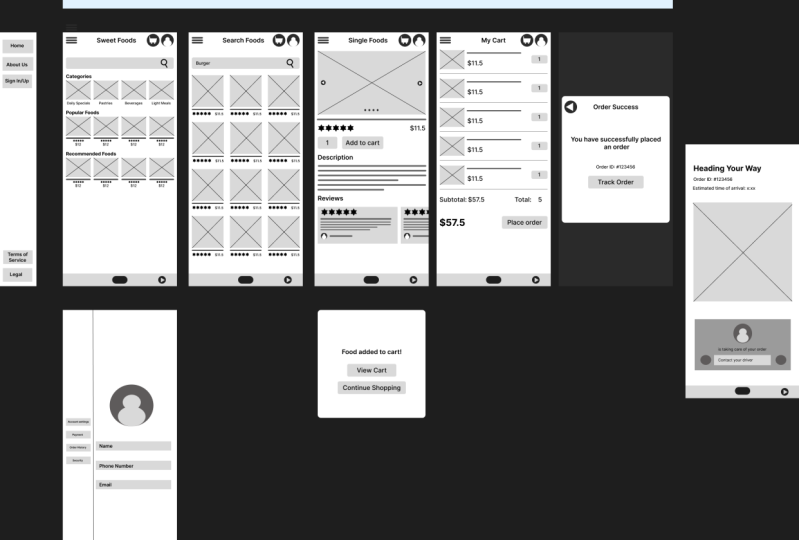
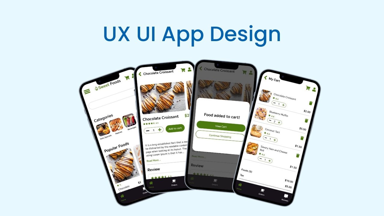
9. Intro to design wireframe for food delivery app: Okay, now it's time to design wire frames
for our own app. We will design a food
delivery app for a cafe. So to do this, we have to do user research and
create personas. User stories, conduct user
research and empathize with users and audit competitors to gather information
to design our app. It is a process that we
have to do in UX design. But in here we are only
focus on design wire frames. I already do the
competitor analysis. And let's start to
build the wire prams. I will log into my Ima account. Now I will click this blue design file button
and create a new project. Then I will call this
project food delivery app. Let's start design the wire Pm. Then we will convert those
wire prams to photo types. In next video, let's start
design from the scratch.
10. Design home page wireframe for food delivery app: Start with the home screen, I will click on the spray icon, and I will select the
Android Large Size. Now I will change this
text to Home Page. Then I will add Layout Grid. Click here, and our
grid will be column. Then we will have four columns, and gutter will be ten, margin will be ten. Okay. Then I click here to
save this grid, this style. And click here at the name. Let's get, okay. Now I will start with the menu. Let's click Triangle, and we
will have a hamburger menu. Makes three, then Dublicatese. Hi, I told of them. And change the
color to be darker. Then I will group them. Now I will create a user
icon here to do that. Create a elipse. Then let's create a avatar,
create another elipse. And shift, this
will be the head. Let's change to white and dubligate this
by pressing old ten, drag it bit below, then make it bigger. Okay, now we have a
let's bit bigger. Now I will create
a surge bar here, because we need a surge bar
to search foods on cafe. In this way we will be
able to find best food. Then I will Radio
corners, make five, okay? And click here. Then click on Elipslipsn. Change color to this color. Actually, add Only Eat Rock, click here and three as
the east stroke size. I just create a search icon. It will be the three. All right, now I
will highlight it. And let's group it. I will group this on, the first part is completed. In next part, I will create
a section for category. Click on this text, click here, and this
test will be categories. I hope words are correct. And let's make it bolt. If you want, you can
change the text, but I will use default text. This is a lot later. Let's use default text. Okay. Now I will create
box four categories, create a rectangle like this. Then click the
line, Create image. This is a image. I will obligate this
text and change the size to 11 will be medium. Okay. Make it center. This text will be
Daily specials. Daily specials, I will
highlight all of this clang. And it will become a group. Then blibli again, Ubd again. Then I will highlight
all of them and make it a line
vertically centered. Okay, it's a text. This one will be beverages will be still be meals. Okay, our categories
are completed. Then I will just here
and change the spacing. Add the spacing as, then I will add foul
foot section To do that, obligate the category
part and add food. Okay, we can blige this text. Actually, we can just
line into this text. To do that, click the line and this will be
the title of the T. Then we can add, get this one. Now we can add the price. I will just add dollar to. Then I have to group
those items correctly. Song group eight. Okay. As we can add star reviews, let's add star reviews. Just create a, maybe we can use polygon to
create a group. It reduce the signs in
the field core to black. Right now we can duplicate this. Now we have to add
recommended foods. Just duplicate this one. Okay, we can duplicate the
popular food section to add. Here we can add more items, but for now, let's
add those items. Now I will click the command button and change
the size of the frame. Then I will add the rectangle
and create a foam in here. I will click on Rectangle
and create Home Button, make it center on the top. I will add Text Name of the app. I will just set foot Smolt 20. I will make it center. Each and every frame must have a name because when we
make this photo type, we have to understand the
frame that we are in. I think this is bigger. Let's change height to okay. Looks good. I will make this bit
smaller like this. Now we have to add here. I will duplicate this on. This is a food delivery gap. We must have a card. Let's create a car. Create a rectangle like this. Change it to white
color, make it center. Double click here, then
also double click here. Okay. And now I will click on Lives and
just add the wheels. Then we can add the handle round it. Now, why? Well, group this,
make it center, okay. We can change the
background color. If we change the background
color to dark like this, we can clearly
visible the icons. Okay, now let's go
to the second item. The second item will
be search page, page. Let's do it.
11. Design search page wireframe for food delivery app: Now it's time to
create search page. So let's create a frame. And it will be
Android Large Size. Change the frame name
to Search Foods. Okay, now I will click here on the grid and
Slate the main grid. Now we can just copy this above section
from the home page. I will highlight all
of them and press all and just duplicate
it like this. Now I will change
the title to Foods. Okay. Then we have to
Create Foods here. Before do that, I will
duplicate this text and add the text like burger, and make it size medium. And reduce the text size to 14. And put it here, okay. It's the search text. And now I will add foot result. So let's create a
rectangle like this. Let's make 100. Okay. Then distribute
horizontal spacing. Now I will click here
and click the line. Then make a line like this, and make a line like this. Okay? Then I will highlight
them and duplicate it. Okay? Now I will add title here, the ratings, then price. Let's click this one. Let's add the title. I will shift and create
a line like this. Okay? Increase the size of the line. Then change the
color to like this and reduce the corner
or round the corners. Then I will add star rating. I can create a star rating, or I can just duplicate
it from the home page. I will duplicate it from the home page and
just pot it here. Then increase the size 310. Let's put the rate in here. And title will go to here. And increase the size
of the title In here, we can add the price. Just click this
one and add dollar 11.5 Let's reduce the Ok. Put it like this, make it horizontal center. Okay, I will just remove those
two items and I can group this item then
Dubligatedlet's Group it by pressing
Command and Dub it. Okay, then highlight
three of those groups and click on Distribute
Horizontal Spacing. Now I will just dub and
repeat the items like this. Okay, looks nice our
search page is completed. All right. Okay, looks good. In next video, we
will going to create the single product page to showcase the product
or showcase the foot. Before do that, I
will highlight all of this and check the size here. In here I will change
the size to 20. Okay.
12. Design single food page for food delivery app: The single foot phase. To do that, I will create a frame created
Android large size, then add the frame
title as single foot. Okay. Now I will
copy this head part. Only the head part,
just highlight it. Ten face, all ten
db it actually, before we do that, we
have to add the grid. Let's add this grid. Okay, Now I will add
food image here. It will be a gallery. And we will have the food title
and we will have ratings. Then we will have the price. After that, we will
have a button to add. We will have a small
text field that we can select burger accounts
that we want to add to cart. Let's do it. We will have
reviews and descriptions. Let's start to design it. First I will create a rectangle. So this will be a image. Let's make it 200 as the
height and 340 as the width. Create the line. Okay, Now we will have two buttons that we
can change the slide. We will have four circles
to change the image. Let's create small circles. Let's select this color. And it will be six by six. Okay? Then obligate.
Obligate it. Okay. Now select all of them, and up it, make it center. Okay, Now we will have
two buttons here. Let's create those two buttons, then change the color to
white and put it here. Maybe we can increase the size. Let's duplicate it, highlight it and dubligateowin image. Then let's create the text. We add this type of
text because the text will be change because
when selected foot change, the title of the food
will be changed. That's why we are
not going to create real title like add real
foot name to this foot. Now we will have the
previews and the price. We can just get
those two from here. Just select it and
get it from here. Put the price here. Let's increase it to 60. Increase the review size, 15. Now we will have a button. This will be the
Add to Cart button. Let's create a rectangle and
create the button like this. Will be 40, let's size as 130. Okay, Now I will duplicate
this text as a car. Let's send this text here. And change size
to medium and 60, it will be 20. Select the text and the frame, then make it center like this. Then click here and we
will have to add count. This field will use to select the foot count that we
want to add to cards. Let's put it like this
and duplicate the press on one will be, go here again. We have to make it front. Okay. Now click here and reduce
the corners at five. And do the same here. Okay, The first
part is complete. Highlight this and
bring it up to 15. Okay, now we will
have the description. Then we will have the
reviews duplicate this one. This will be description, let's add description as this. Let's duplicate this. We have the round both corners. We only round one corner, So let's do it to all of those texts and
make it like this. Okay, our description
is completed. If we want, we can just add
more items not necessary. Now we will have to
add the previews. Click here and
duplicate this one. This will be reviews. Okay, let's add review box. Duplicate this review
box and put it here. Bring it up. Now we
will have to add title. I will just duplate this title. Let's bring it up like this
and change the title size. Let's make it ten. This is the
description of the review. Let's decrease the
size like this. Okay, nice. Then at the at icon
of the review, change the color to
create user like this. Change the color to white. Then this will be the
name of the review. For this type of app, we only need the name. I will group this ava
center the name, Okay. Then I will highlight this and press control command
to duplicate it. Here is the Duplicated review. Okay, now I will click
the single foot frame, then change the size or change the height of
the frame like this. And we have to add
this bottom part. I will just highlight it and
put it like I will dubrow, we have single foot page. In the next video, we will go in to
create the cart page.
13. Build cart page for food delivery app: The Card page. I will click on a frame and select
Android Large Size. Then change the
frame name to card. And copy the first part. Okay, It's a grid
layout two. All right. Now change the text to my card, then make it center. All right, now we have to add the food list that we selected
or that user selected. Click here, and this will
be the image of the food. Let's make a 60, then create a line. Now we will have the
title and the fries, and we will have a text pile to change the item
count of the food. Let's create the title. Now we will have
to add the fries. We will have to add the text
pill to in the food count. Then duplicate this. Now selected food count one
user need at more item, he can do it using this at the horizontal line. Now I will group this
and let's obligated. Now I will add subtotal
and the total food count. So subtotal now, yeah, we will have the total food. We will highlight all of those subtotal part and
remove it from the group. Now here we will have the total. Let's make it bold. And then we will have
a button to check out. Let's create a rectangle
and create a button. Check Out. Oh, let's
add like please order. All right, now I will
add the menu item. Let's add it here. Okay, here is our cart page.
14. Build order confirm popup for food delivery app: Okay, in last video we have some aligning issues,
let's fix them. In card page, this should
be a margin of five. And now I will highlight all of these sections and
this should be margin. I think it's ten, it's 220. Let's add margin
of ten is the ten. All right, and then it, maybe we can decrease
the size of the frame, but it's a look, good. Okay, now it's time to
create Order Success page. Create a new frame and the frame name will
be Order Success. Let's add grid layout. Okay, now in this page we don't need card button,
this avatar button. We only need back button. Let's create back button
as the first step, okay? And change the color to this, and this will be white. Okay, here is the back button. And now we have older
success message. Let's copy this title
and make it success. Now let's create a
text, make it center. Let's add text like you have successfully
placed an order. Okay, make it a line center. Let's put it one to 80. Okay. I will duplicate this and order ID. Then add the order ID and make
it medium size will be 14. Okay. Now we will have a button called
track the order. Let's check the button sizes. It's 40, let's make it 40 and okay, make it center. All right, let's send
this to the center. And now I will reduce
the size of the frame. Make it center like this. Then we can add the frame
around this content. Let's reduce it to 15. Okay? And this will be a
wide And click on the frame, actually we can make
this frame as a pop up. To do that, it will be
look better, let's do it. To do that, I click on Rectangle and create
a frame like this. Then change color to white
and send it backwards. Then reduce the corners. Let's reduce it, let's
reduce it as a ten. And then I will click on this order Success frame and change the color to
this darker color. And bring this text here. And select Back button. And Back button will be here, or we can add this
as a close button. Back button will be here and it's look better than
the previous look. In the next video, we will create a pop up to
this Add to Cart button.
15. Design add to cart popup for food delivery app: Okay, let's create food
added to cart pop up. To do that I will click on the frame and this
will be a pop up, so we have to use custom size. I will just click here
and here is the frame. I will rename this frame to, let's set it as
added to her pop up. Okay, now let's change to
340 and will be also 340. Then let's reduce
the corners to ten. Okay, then we will have a
text foot added to cards. So I will just create this
text and put it here, center correctly and click here. Then let's add layout. Okay, then this will
be foot added to card, Let's make it 120. Okay. Then we will have
to add two buttons, one will be view card and the next one will be
continue shopping. So let's create the
view card button cart, and this will be medium size. Okay, here is the
view card button. And also we will actually, we have two at corners. Then I will duplicate
this button, and now we will have
Continued Shopping button. Okay, then increase the size of the button, make it center. Okay, here is the pop up. And in prototype, we
will add this as pop up when someone or when user click on this Add
to Cart button. Okay, in the next video, we will go in to convert this low fidelity wire
frames to prototype. See you in the next lesson.
16. Do final touch up to wireframe before convert to prototype: Okay, let's do the
final touch up before we convert the wire
frames to photo types. If I check it on
the present mode or check it on
actual mobile view, it will look like this. We have to increase the
size of the design. To do that, I will just click on the frame and
increase the size. Then I will increase
the height to 800. Let's add this footer
menu like this. And let's check the design. Okay, it looks perfect. So I will do the same,
two other designs In the single foot, I just add it as a search foot. It should be a single
foot like this, and the popup window is okay. Now we have to prove those buttons because
we are going to use or we are going to
convert those buttons to component and
create the photo type. I will see the text and the
triangle and creek command. We'll do it here and we'll do
it for rest of the button. Okay, also I have to click here and click the
item on this group, and it's only the image item. Then make a group
with those items, and we'll do it for
those four items. And I will show you why I
do it in prototype lesson, I will repeat the process. Okay, now we are ready. Let's click on this
item and click Preview. It will preview like this. In next video, we
create the Phototype.
17. Create prototype of food delivery app - Part 01: Okay, let's convert the
wire frames to photo type. To do that, I will go to, I will click on this
prototype menu. Then I will see the home page. So let's start from
top of the home page. So end of our class, I will give you a
project to complete. So it will include
create wire frames for this hamburger menu
and some of other frames. So I will not going to create prototype for this
hamburger menu. And you will do it on
the class project. So let's start from
the card icon. So this is our card page. And when we click
on this card Ticon, we will go to the cart page. So I will select the card, actually we have to
group this card before we create it to a
component. Let's do it. Click here and click
the background item. Then press command
G to group it. And we'll do it for the
rest of the carton. Let's do it. Okay. Now click on this carton and I will
convert it to Component. It's so easy, just click on
the item you want to convert, and you will see
four triangle here. Just click on it. When you hover over it, you will see a text
call Create Components. So just click on it. When you click on it, you will see it become
a component and you will see purple line
when you select it. Now I will click it and we
have to point it to here. To do that, I will click
on the Phototypeow. Over the icon, you will
see this plus sign. Just click on it and drag and
drop it on the heart frame. Then you will see a pop up menu. In the pop up menu, you can select the action
you are going to do. In this case, it's on tap. When we tap on the icon, we will go to the Card page. Then here is the section that we can define the action
that we are going to do. In this case, it will be
navigate to the card page. In here we can
select other pages, but we only need to
select it as a card. And now if I check
it on the action, I just click the Home
page and click here. Then just preview it
and click Home Page. Now if I click on this
card card button, it will to the My Cart page. This is the basic to
create prototypes. And Fema has ear the feature to do it without messing
with any design. And we can do it clearly. Now we have this avatar on. When we click on
this avatar icon, it will open my profile page. This is another activity that you have to do
on the class project. Now there are three
more card buttons. Now there are a
few ways to do it. We can just convert this card button manually
and individually, then link it to the card page. But we already created
this component. If we replace the same component
with other card buttons, it will be clear and we will not have a lot of
connection like this. Let me show what I mean. Let's convert those button
to component like this. And now let's manually
direct them to the card. Then this will also
direct to the card page. Let's make it like this. Now if I click on the canvas, I will see three lines. This is the three line that
we point those button to, this card page, but we can
duplicate this one component. And if we replace this first button component
with other card button, it will not become mess like this and it will save more time. Let's do it in that way. I just press control
to undo the changes. Okay, Now I click on
this car item, right? Then click Copy. Then I click here
and right click. Click on Pace to replace it. Just replaced our component. Now if I click here, I will see this connection. And if I click here, I will see this connection. Let's do it for the
rest of Hard button. Now this is the way to
easily create prototype. Okay, as the next step, let's add action to
this search icon. If someone type here
and search something, he will go to the search page. He will get the search result. To do that, we can
click here and click on Component and
convert it to Component. Then click this plus icon and just navigate it to
the search page. We don't need to
do any action for this search bar because it's
already on the search page. Now we have those categories. In this case, we didn't create a prototype for categories. Let's recreate those categories
to this search foot page. To do that, I will
double click here. Did you remember
that I create groups for those category images? Now select that group and
click Create Components. And if you want,
you can just rename the text like category image. But I don't do it
because this is a simple wire frame set. There are only few wire frames, but in big project, we definitely have to
rename those categories. And I do it for save
time, but if you like, you can just rename those
layers on this section. Now when we click on
those categories, we will relate to
this search foot page because we didn't
create different page, four categories,
food categories. Now as I did before, I can just copy this category
image and click here. Then click on Pace to replace. And double click here
to select the category, and click on Pace to replace. Do the same here, Okay, nice. Now, if we check the process, if we click on it, we will
read the search page. If we click on the search bar, we will read to the search. Okay, Now it's time
to add the action. When someone click
on those foods, click here and convert them
to components like this. And click the plus icon. When someone tap on it, click on this food item, that person will, to
the single foot page. Okay, now I will
right click and copy. Then right and click
on Pace to replace. Because all of those
popular food items are same in this wire frame. If we add individual actions like let's add action to this, there will be a lot
of connections. But if we replace the component, there will only have few connections and it will
be really easy to manage. Okay, Now I will do the same, just click on Copy and
click on Place to replace. Okay, now our home
page is completed. And now I will do the same thing to the foot
on the search foot page, because all of those are same. Just click one of the food
and convert it to component. Then over over it, and you will see
this type of plus button and drag it to
the single foot frame. Okay, now copy it and replace it with the
rest of food items. All right, in the second lesson we will add action to
this at two card button. If we check the current process, I will go to the home page. And let's go to the prototype. And let's go back
to the home page. And if I search some food, I will go to the
Search Food page. And if I click on A and it
will go to the Single Foods. If I click on this card button, it will go to my card. We will continue to
build the prototype.
18. Create prototype of food delivery app - Part 02: Now I will add action to
this at two card button, click on the To Card button and click on Create Component. Then when we click on
this at two card button, it will open this
at two card pop up. When we click on it, it will say foot added to card. Let's click here and send it
to the A card pop up frame. Now I will change
those parameters. The first one will be
navigate to a car pop up. This is a pop up, it will not navigate frame, it will only open overlay. This had to card pop up will be a overlay of the
single foot frame. Click on Open Overlay, and here we selected the frame
that we want to overlay. And we will at the
effect as instant. Now in Overlay setting, I will click on here
and click on Manual. Then I will adjust the
position of this overlay. Let's adjust to the center, like this, okay? Then I will click
on a background. Then click here. And at the background, when this pop up window open, rest of the page will
be light black color. Now we said if I check it, click on Single Page. Let's click on the Preview mode. And if I click on a card, it will pop up as
overlay. Let's continue. If I want to edit this, I can just click here. Let's close clicking outside. If I taste it, click
on it Towards. If I click the outside
of the pop up, it will show the
single foot page or show the current page. But in this case I
will not add it. Now we have two buttons. Just click on the button and
convert it to Component. And it will red to
this my Card page. Click here and red
it to my Card page and click on Continue Shopping and convert it to Component. Let's send this to
the search foot page. When someone click on
Continue Shopping, he will read to the
Search foot page. Okay, now we have to do
action on my card page. So let's add action to
this Place Order button. Just click on it and
click on Component. Then when someone click on
this Place Order button, he will read to
Order Success Frame. Okay, now I hope you
understand the process. And this is the way to convert
wire frame to prototype. And now I will convert this
button to a component. This is the home button. Then connect it
to the home page. When someone click on it, he will read the home page. I will copy it and replace it with the
rest of the button. Now, let's replace this one too. I forget to add the back button. Let's add it quickly. Let's add back button here. Let's create simple ellipse. And create the
ellipse like this, change color to this, and click on Rectangle. And create the small rectangle. Okay, now let's group it
and click on Component, and it will become a component. Now I will click on Photo Type and click the plus
icon on the component. When I drag the
component connection, you will see the
back button open. That means if someone
click on this back button, it will react to the
previous page that you open. Let's check in on the action. Pick to the back, will
duplicate this design. Duplicated like this. Okay. Now let's check
the real action. Let's open this. Now I am on the home page. I click on the search page. Now if I click on
this back button, I will go to the home page because I was on the home page. This is the way to
use back button. The back button is not align. Let's align it correctly. Actually, let's make
it center here. All right, now we
have the prototype.
19. Test food delivery app prototype: Now we have a low fidelity
wireframe prototype. So let's test it. Before I test it, I will remove the flow one
part because we don't need it. Just All right,
let's test it out. I go to the present mode and
now we are on the home page. Imagine I am a user who
use this to find food. I will type food here and
click the search button. And I will go to the search
page and I am burger. Then I click on
one of the burger. In here I can see
all the details of the burger and we have image slider description
and reviews. Then I can add burgers
that I want to purchase. Then I can click Add to Cart. When I add to cart, I can view the card
or Continue shopping. I will click on
Continue Shopping, and here I can again search food that I like and
then add to cart it. Let's view the card. Just click on the card. Here is my card. In here I can check the subtotal and food that I purchased. I can count of the food
that I want to purchase. Then I can click
Place the Order, and I will get this
order success frame. In here, I can click on the Track order And
track the order. I didn't complete it because you will do it on
the project section. This is the process of our wire frame set
and I hope you get clear idea about design lofty wire frame and
convert it to prototype.
20. Class project: Okay, here is the project. So you have to continue
this wire frame set and add three more frames and share it with the
fellow designers. To do that, I will give link to this prototype so you
can duplicate it. Then as the first step, you have to create
a hamburger menu. To do that, you can search on
Google like hamburger menu in app and you will see different
type of hamburger menu. Especially when you create
this hamburger menu, it should be a pop
up pop up like this. So as an example, if I create new Android frame, the size of the hamburger menu should be half of this frame. And when you click on
the hamburger icon, this will be pop up and
rest of the page will be dark like we did it
on the add to cart. Pop up stride. Just run the single food. And if I click on At To card, this is the pop up and
rest of the pages darker. So after you do it, you will go in to
create frame for edit. This avatar, it will be a
frame called My Profile. So then you will create a
page to track your orders. So it will be track order frame. So we didn't do any UX
research to design this app, so I suggest you to go to Google or place like Ble to
find design inspiration. As example, if I go to rival, let's search Track Order page, we will get this type
of track order pages. So if we go here, this will be great
track order page, so we can use it also. You can do your research and
find this type of frame. Then you can redesign it. Or you can create the wire frame of that page to profile page. You can do the same like this, do the research and
create those three pages. After you create it, click on this blue
Share button and set this as anyone with
the link can view. Then click on this copy link and share it with the
fellow US designers. Good luck and thank you for
staying with me and I hope you get valuable details about create
phototypesireframes. If you have any questions, just ask me and I am
willing to help you. I will see you in
another time. Thank you.
 Akalanka Karunarathna, UI/UX Designer & Content Creator