Transcripts
1. Introduction: Hi foil here. Welcome to my studio. I've been painting and exhibiting for over 25 years and all of the types and styles and mediums that I have explored through my arts practice. I find mixed media collage to be my absolute favorite. Recently, I have been enjoying the process of using image transfers on the job blank. And there's nothing more satisfying than using your own photos for this exciting experimental technique. In this art class, teach you how to use your own photos to create successful image transfer with the jelly printing technique, you will learn how to prepare your own photos for the image transfer process. And then we will discuss the materials that you would need to use. First, I'll show you the simplest technique for the image transfer, and then we will look at how to create a two-color monitoring on the job plan. You will learn how to create image transfers with your vintage photos. And then we will experiment with the effects of using stencils in the printing process. This class is suitable for anyone. One thing to learn, this unique modern printing technique, perfect for beginners. I was showing you each technique with clear examples of how you can create these techniques at home. At the end of the class, you will know how to create a successful image transferred using your own photos. And as a bonus, I'm going to show you step-by-step how to use those beautiful prints into what creative collage painting. In the first bonus lesson, I will show you step-by-step how to create an easy vintage collage. And in the second bonus lesson, you will see how I use my favorite image transfer to create a funky modern design. Your project will be to create your own image transfer with your favorite photo and to share that print in the project section, I'm so excited to see what you create, so make sure you share with me one of you prints. I absolutely love this technique and I really hope you enjoy this class as much as I do. So let's get our materials sorted and let's make ours.
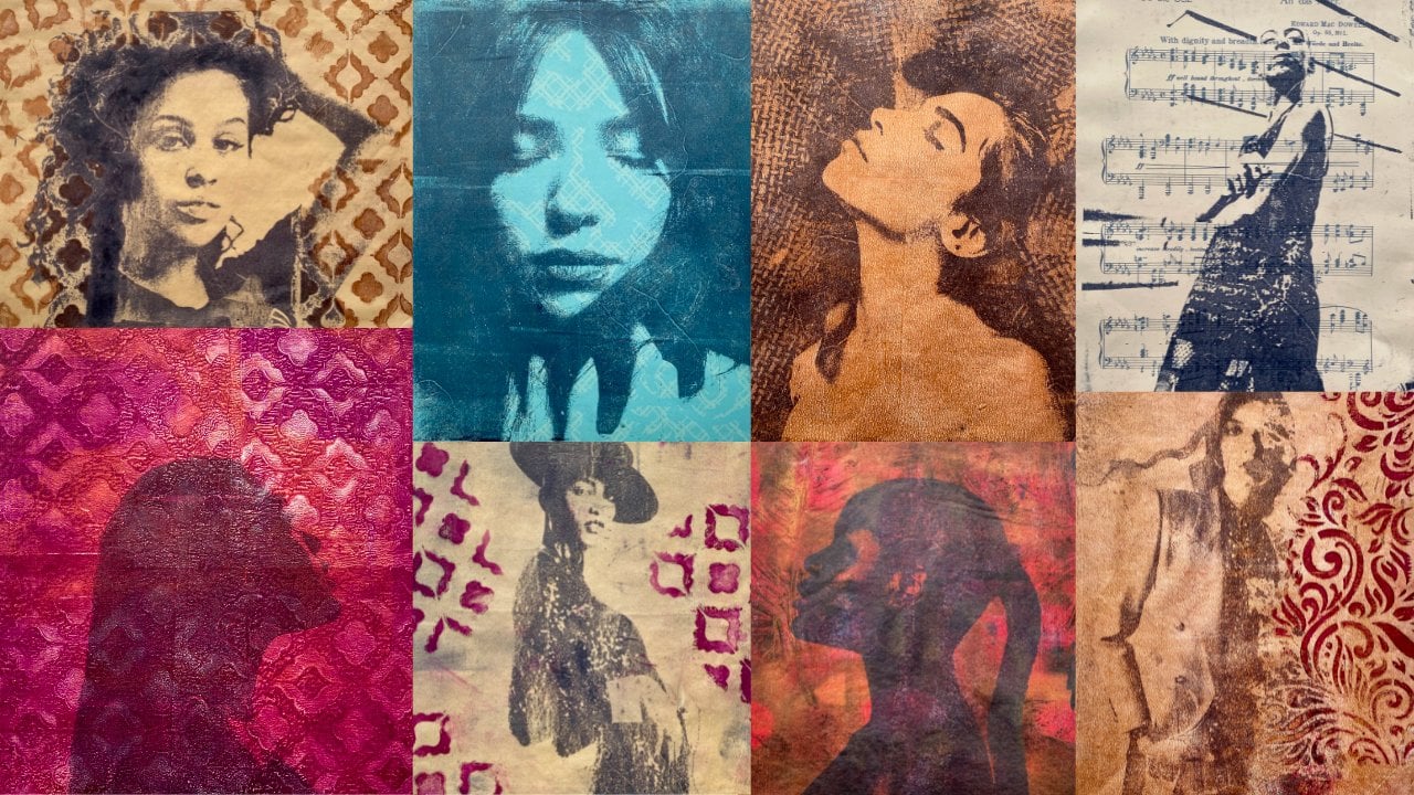
2. Preparing Your Photos: Using family photos is so fun and so incredibly rewarding. But the first thing I want to tell you is if you've got something like this beautiful photo of my anticodon vintage photo. Do not put this on your gel plight warning, warning, warning, warning rope. Well Robinson, don't put any photos on your geo plague. They will seek forever and you'll just cry and you won't be able to get it off your wreck, your photo, your wreckage or play. So don't put your fido on a gel play. What you want to do is take a photo or scan your photos. So I've got this beautiful little one here. I took a photo of it and I put it on my computer and it looks like this gorgeous sepia tone vintage photo. It's probably 70 years old. This fido, step 1, you need to have a digital image of the photo you want to use. Now if you've heard of a younger generation, you'll probably only have digital images, but some of us in the more mature category actually have photos. You want to either take a photo or scan them, have a digital copy, put it on your computer or your phone. You can use any of your photos to create image transfers, your family, your kids, your calf, your cat, landscapes, buildings, your holidays, or even vintage photos. Whatever it is that you treasure can become your artwork. You just have to make sure you prepare your photo properly for the transfer process. Now, if your photo is a vintage one like this beautiful one. This is my mom when she was 14 and her ball gown dress. That photo is 60 years. What you're going to need to do is have a tweak of you vintage photos to make them more successful for the image transfer process, there are two most important components of transferring an image on the job plate. Number 1 is the amount of paint, and number two is the quality of the print. So if you have a beautiful photo like this vintage, one of my anticodon, first of all, you're going to need to turn it to black and white. It's very simple. I used a basic photo program on my computer and made it into this black and white version, then you need to increase the contrast because they're successful image transfer works with strong contrast areas of light and dark. I personally get my photos printed it out at the office stationary because it's only a five-minute walk away. I print my images out in color even if the photo is black and white because it works better for my image transfers. Now there's a lot of ways of doing image transfers. There's not one way to rule them all. So you will need to try and experiment with the materials you have and the things that you're going to use. You might have your own laser print. You might need to try whether or not it's going to be successful in black and white prints or calibrates. You'll have to experiment with that. I've tried the black and white images from the office shop and they do not work for me. So I have found what works for me and that's what I'll be using. You can experiment with what works for you or you can try the option that works for me, because truly it works every time. Now, it is really important the contrast of your photos because the image transfer process uses the dark areas of your image to resist the paint from the gel plate so it leaves that image on the job play. The light areas of your print absorbed the paint into the paper so it doesn't leave that paint on the plate. That's how it creates the transfer process. So it's very important that you have strong contrast, which means you don't want to use grayed out black and white photos with all the same tonal range because they won't transfer well. So number one, look at the photos that you want to transfer. If there's they're all one gray tone, it's not going to work. You're going to need to create much more successful images if you want you transfer to work well, some other vintage photos don't work so well because they don't have a clear enough detail on the image. You know, there's 60, 70 years old back then. The reproduction value so bright. So you will need to tweak and the sharpness and the contrast of the digital image before you print it out. To do the image transfer, it's quite simple to do. Basic program on your computer or on your phone will actually do this for you. And you want to set yourself up for success.
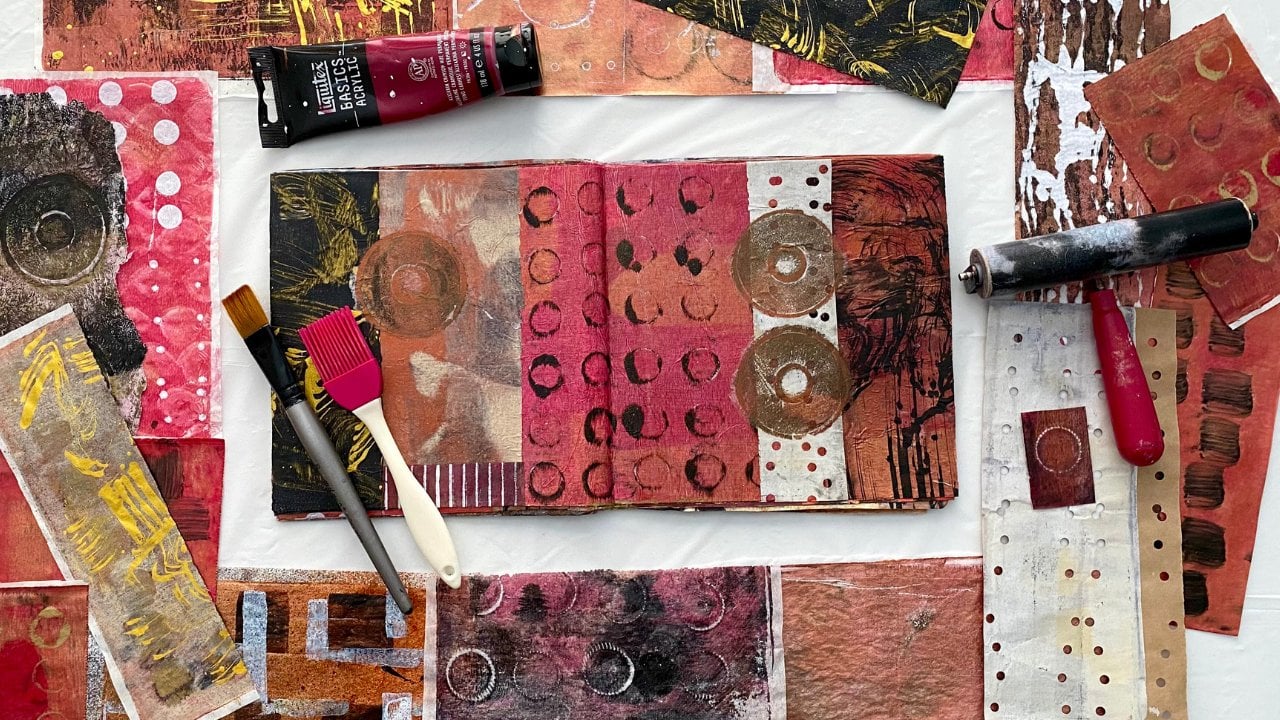
3. Your Material List: Now the tube guts your images ready and printed. This is the setup that you'll going to Nate, We need to jail play, need to Brian for rolling on the paint. I like to use two branches, one rolling on the plate, and then one for extra contact when I'm printing the image, you don't have to use two brands, but I just like to some pipelines for wrote off to you, Brian. I like to use brown packaging paper because I have stacks of it and it's a free results and not even use it in future collages. Now, I just have some very basic student grade paints. I have found these very successful for both the jelly prints and the image transfers. There's no drama about what paint to use. It's more important about the quantity of paint on your plan, but we will get to that. Now you want some images of your little treasures. I've got some here of my beautiful kids. I'm going to be using these ones because they are gorgeous. And some paper, I like to use Chinese rice paper because I have an abundance of it. You can also use ordinary copy paper. And I like to use scrapbooking paper as well. It just adds a different textural background. I like to put stencils on the transfers to make some interesting patterns. So you want some of those or just even some fabric was some papers and has great texture. This one is one of my absolute favorites. So simple, it's just a piece of paper. It makes incredible texture on the job site. So you want to get yourself all setup. We've got everything in arms reach. You will need some baby wipes to clean off your plate. You're Brian and your hands and maybe even a damp cloth so that you can create some beautiful image trend space and high cow white to show you the first one I'm going to try.
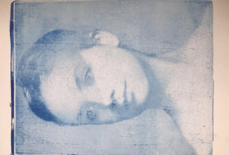
4. The Easiest Method: I absolutely love this photo of my son and his beautiful girlfriend was taken a couple of years ago. It's just fabulous. It's got good, strong contrast of light and dark areas and that's what you need for a successful image transferred. Now I have printed that in color. Of course, when you transfer the photo onto your job plate, it will be whatever color that you paint that you use. So I'm going to use mars black so the image will come out or black and white. But I use a color print, laser print from the office shop because it transfers better. I have tried using the black and white print copies and they don't come out as successful as the color prints. So their buck and a half, not even that much, and it's just worth it to use the best print that's going to transfer your image successfully. Now when I get my photos printed at the office shop, I always get at least four down so that if something happens and it doesn't work the first time, I've got a few other copies that I can use. It is a mono hybrid, so you only get one chance to transmit the image from this print because the transfer process will destroy the print. It's, that's what a mono print is. It's one print. You can't reuse it. So get yourself surreal for copies of your photo so that you can try different backgrounds. You can use different textures, you can try different colors. Also, if something doesn't work, you've got another chance to make it happen. Or if it does, where you've got another opportunity to create a different image with some other possibilities or colors or textures. Sart, get yourself a color print, laser printing from the office supplies store, and gets you so far fewer copies of it and then you're good to go. I'm going to use this one. I'm going to use mass black. Now, this is a very photo student grade paint. It's not expensive at all. The biggest challenge that I have had with the image transferred is not putting too much paint on the gel pipe because I tend to be a little heavy handed. And that has been one of my problems. However, now I'm a little wiser and more determined to not put too much paint on the upright nama one. Right? That should be or I a nice thin layer of paint. And then you check your print guy's face down on the plate. The transfer process works in the dark areas resist the paint that's on the plate so it sticks to the job site. And the light areas in your photo absorbed the paint and they just get sucked into the paper and they don't paint doesn't stay on the plate. So basically, all the light and dark areas react differently to the paint that's on the plate. That's why you need an image with strong contrast. So it can create that transfer. Now you need to give it a good firm rather all over. And then we should be good to go. All right, so that is a beautiful and successful transfer from my color laser print copy onto the gel flight. Now the first thing I'm going to do is just create an image straight onto a very cost-efficient scrapbooking piece of paper. This is the easiest, simplest, and most direct way to do the image transfer process. Transferred from the print onto the gel plate, from the gel plate straight onto a piece of paper. Your paint is still wet and will be absorbed by this piece of paper. You can use a break to get extra contact. Can make sure it does get absorbed on the paper. Good firm Rob again. And let's see what we have. Okay, So that has been a very successful image transfer from the color photo onto a laser printer image onto the gel plates and transferred onto the paper. So you can use any of your own photos to do the image transfers. Your kids, your family, your cat, your car, really anything that you treasure and one or two into a work of art, you can create an image transfer, which I'm going to try this photo here. This is my mom's cat, and I know that she will love me forever if I do an image transfer. Because she loves him. Sitting in the puzzle box, I'm like Evan and defect bomber the puzzle box that he's a cat, right? And that's what cats do. So I'm going to try and see how this photo comes up as an image transfer. You have to have a good contrast with your photos. That is really, really important. So strong areas of dark and light because that's what creates the image transfer. Most other, most important thing is to not have too much paint on the gel place. The little tricky part is you've gotta have not too much paint because it would take, I go to image from the print, but also you have to have enough pipe that it then prints onto paper. I know it's a little tricky and sometimes it will take a few tries to get something to work. You will have to experiment and try what's going to work for you. So a thin layer of paint on the Jill plate. And then you put your print on the plate and give it a firm rub. And little treasures sitting there causing all sorts of trouble. I'm going to put him on this pace of scrapbooking paper. You can use a brayer to get more contact with the paper. Let's see how he printed. And because the background was so white, that doesn't print just little baby, which there is there. And I think that looks pretty cool. That's a nice image transfer bourbon. You can see here the puzzle box. You can even read that it's a thousand pieces. We've got a little bit of the puzzle here. And he's sitting and you can see clearly his face and whiskers and eyes and yeah, He's printed out really nice. So that was strike from the photo onto the gel play and then straight onto a scrapbooking piece of paper. That's the most direct and simplest method of good doing the image transfer. The case I, this time I have this fabulous 50. This is me with my gorgeous two sounds. At my 40th birthday. Yes, it was an eighties party cause it was eighties were the best. The music that dress our main look at, look at that gorgeous eyes shadow. So I'm going to try and see what this fight I can transfer in a lie. Well, look at that. I don't have a nose, but that's okay. I can live with that. Nice. That's a fabulous image transfer. I'm just going to put the first one onto a piece of scrapbooking paper. Very affordable paper. This is the easiest technique. And let's say how we came out. All my Gammas we are to gorgeous, absolutely beautiful. Payne's gray in a very affordable paint. Straight from the color copy print from the office shop onto the gel plight, and then straight onto a scrapbooking piece of paper that's worked really well and I really have a nose, but the other features have turned out great. Oh my gosh, that eighties where they're just the best.
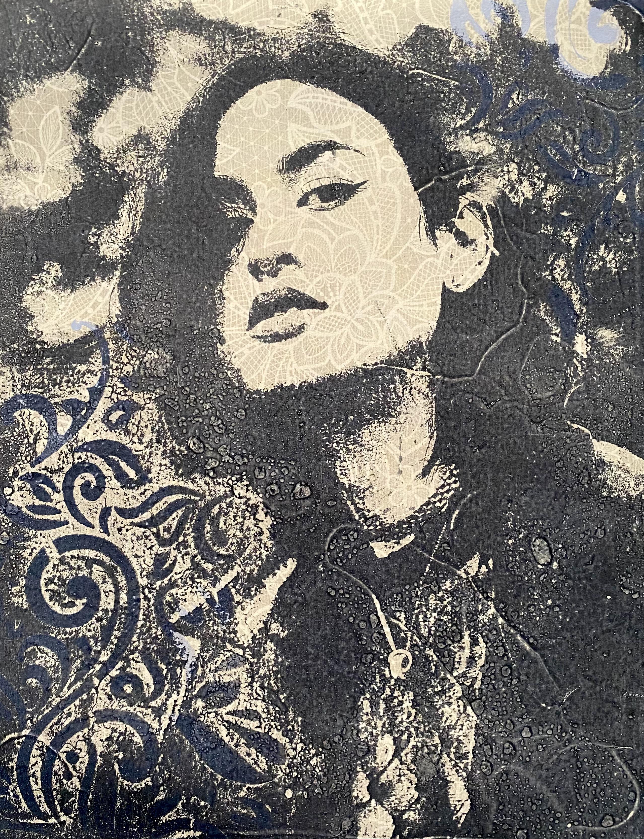
5. Using Vintage Photos: So when you get your prints done at your office stationary, make sure you get a few of the same ones or you can try different backgrounds. Even though this is a black and white image, I had a calibrate color laser done of the photo. The color prints have worked way more successfully. So, you know, something's working. And what you just did, what? I'm just using a brown black which is kind of a sepia color and blending it all out here on the job. You just gotta make sure you don't have too much paint on the job place. So that's a good image transfer. And I'm going to put her straight onto this piece of paper. This is the simplest and most direct way to do the image transfer. Straight onto a piece of paper while the paint is still wet on the gel implant. So this is just a scrapbooking paper. Quite affordable from the craft section of department store exam. Not to think that it's thicker than the rice paper I was using. Human a good firm or of, let's say how she came out. They are weaker. That's a beautiful image transfer. Very happy with that. That's in an anterior brown black color, which is like a sepia tone. I thought the sepia tone would work well with the vintage style of photo that it is. You can tell it's a vintage fighter. I've put it on scrapbook paper that has this kind of vintage look and color to it. So it's suits that really well. That would make a fabulous collage. I could put that on canvas, add some more collage elements to it and it would be absolutely beautiful. I'm really happy with that. That's a really successful image chance for. So I'm using this fabulous image of my aunt and I'm going to try it on a background that I haven't tried before. So we'll see if this idea is a good one or not. Gotta be a little bit experimental. Nice thin covering of paint. That's fabulous. Image transfer, transferred beautiful on the plate. And I'm going to put it straight onto this pace of dressmaking patterns. There. I think this should work designed to yet because it would be much the same as using tissue, which is a fabulous material for image transfer is he Rica. And that's transferred really nicely. I'm liking the sepia time. I'm loving the idea of the dressmaking patterns. It gives it that CPL look. I'm the paint is a brown black, so it doesn't look like a sepia time anyway. But on this dressmaking pattern that has that vintage look about it. So I could now put it straight onto a canvas or into a collage, or use it in a way that I could add other pictures and images to it.
6. Part 2: Using Vintage Photos: Look at this fabulous photo of my mom when she was 14. For enzymes, for any old photo? That was when she was doing ballroom dancing classes and back in the day. So I took a photo of this photo. Hello, little increase in the contrast because the photo was a little more grayed out. I'm not sure how well this image will transfer because it's quite pixelated. Yeah, it was quite a small photo. And you've images don't have to be all A4 size. I'm just doing this size because it's better for showing you how to do different things. And I'm enjoying the size of the prey spot cause they don't all have to be the full A4 size. I'm not sure how this one or transfer because it's quite pixelated in the print. We'll say. Sometimes you can be pleasantly surprised. And other times yet just recently there's a void. Then the experimentation of image transfer. Good family. Not as clear as I would have liked, but I'll let that dry and I might be able to pull up more with the background color. Right on thought I might try a powder blue with this one, just for something a little different. The worst thing can happen is a congest not work and relieve manner. You have to at least try different ideas, different colors, different backgrounds cuz you wouldn't know until you try whether or not you liked something. All right. Okay. It's disappointing years when it doesn't work. You just try again. Really is RK to have something not word count. But that's the worst thing that happens. It'll be IK. Notice even as, even as you can possibly get coat of paint. And then this one is the rice paper. Again. My son went to Shanghai and when he came back, he brought me a whole pile of Chinese rice paper. So I am very grateful it works exceptionally well for image transfers and jellies, primates in general. So you've got to be happy with what you have. Just use what you've got in your studio. Standard copy paper will also work just as well. Round and then we'll say not sure if his prints going to work. We have to try. I like the blue against the sepia tone. That's quite nice. The facial features aren't strong enough. Now that's because of the photo. It's not a strong enough photo to produce a really sharp image transfer. So you've got to look at your photos and you've got to really determine if they're going to transfer. Well, if they're old vintage photos like this one, you might have a bit of problem because of the lack of sharpness and clarity of the details. But at least try Give it a go. You won't know till you try it if it's going to work or not, and if it doesn't work, just fine. Another 50, have another go at something else. It's not too bad. It's just not overly clear. I think I could do better with a different photo. Right? Not wanting to give up easily. I'm going to try this image again of my mom. I know that the first attempt didn't work out as well as I would like. I always pray three or four copies for at the office supply store when I get my photos printed because I like to have a few attempts at trying to get something to work. It's not a clean and crisp image because it does come from a vintage photo. So sometimes, you know, the technology wasn't so great back in the day and the image quality is not so clear. But I'm going to try again. This time. I'm going to try putting. The transfer onto tissue. Because of the find and absorbency of tissue, maybe I can draw out more of the details. Well, that's my idea. Now I'm using brown black, which is a beautiful sepia color. And it goes really well with the vintage style and Friday. So she has transferred really well. I'm very happy with that. I'm going to put straight onto a piece of tissue paper, ordinary tissue paper, and see if I can pull more of her image. I love this photo, but it does. The problems that you incur with vintage photos. Sometimes there's not enough clarity. It's definitely worth having another go at trying. It is just a theory, however. Oops, a little bit more careful with the tissues. Tissues come up quite nice. Yeah, If I put it onto white paper, you can see it a lot easier. So that's the beautiful image transfer from the vintage photo of my mom when she was fought Heyne, which is pretty much 65 years ago. Oh my gosh. I mean, it hasn't got the best spatial features that would have been nice if I caught her smiling, but does doesn't want to transfer exactly because the photo was being sold vintage. It's not as clear, but she's still transferred nice. And being on tissue is really fun because of course it's transparent, so that's a clear image of the wife. But if I was to use, say, some scrapbook paper, put her on something more vintage looking. Then if I collaged that on, that would be the tissue would become more transparent and she would blend into the colors, textures, and patterns of the background. And that could look really cool. I really like this idea. You should try this idea of you have been teach photos. Just remember, you might have to practice a few times to actually get it exactly how you want it. And the vintage photos are harder in the clarity and detail because the technology wasn't as sharp as it is now, but it's definitely worth experimenting with. It's a lot of fun. I think I'd love to make my mom, I collaged of this image that would be really cool and be fun. Yeah, so keep experimenting, keep trying and say what amazing, beautiful family photos you can make as image transcripts.
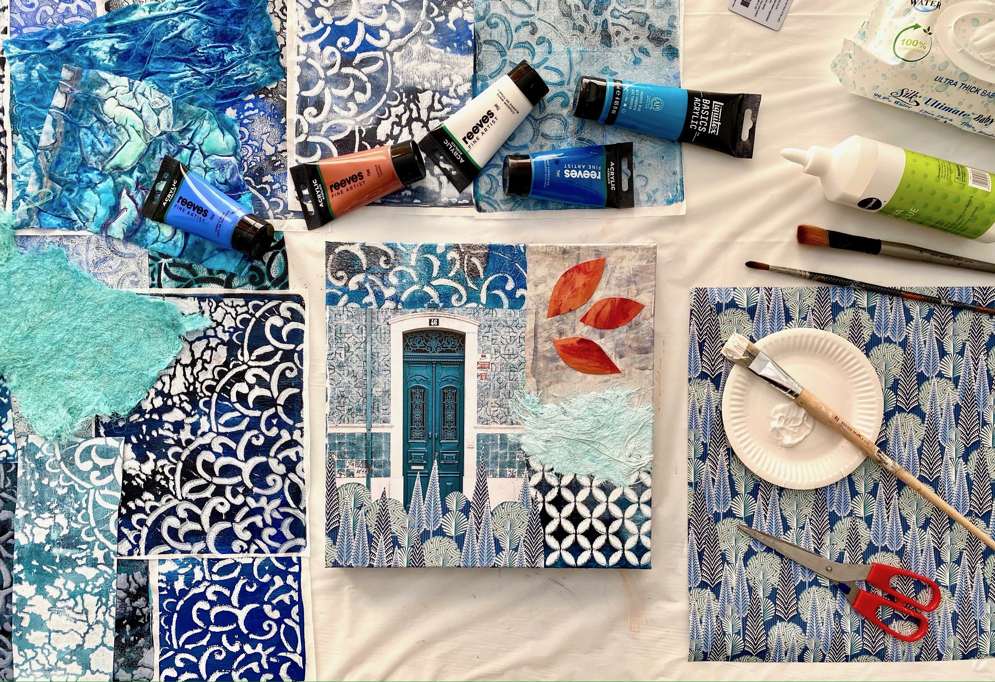
7. Bonus Lesson 1: Easy Vintage Collage: Okay, so I have this absolutely fabulous image transfer of my beautiful ansi dawn on this dressmaking patterns, which I absolutely love. It works well with the vintage style of photo. It's transparent, it's fun. So I'm going to put together a very simple vintage style themed colored colors using anti-codon as my main focus. I'm now the thing about colors is the beauty of collage is the multiple layers. So putting your image transfer onto something like this that's transparent, which you could use tissue or this dressmaking patterns. It means you can put things under it and you can put things over it. So I'm going to play around with multiple layers of colors. On this particular canvas. It's 41 centimeters by 31 centimeters, which I think is 12 by 16 inches. And I'm going to just have a little play. I'm not sure exactly what I'm gonna do. I'm just going to start gluing some layers and some papers on if I don't like it, I'll change it. And I'm just going to intuitively creates something that I feel is really beautiful with this particular image transfer. So I'm hoping to inspire you with your image transferred using your own photos. And perhaps you'll put a collage together with the things that you have at your place. Now I'm going to be using some matte medium for the adhesive. And I think I'm going to start with this pace. I'm gonna glue here. I'm using a fair amount of scrapbooking paper. You know, those really kind of affordable big pads of different colored papers that you get in the department stores and the craft section, I'm going to use a heap of those. I've been using them for the image transfers and they work really well. So I like writing script looking piece. I think I'll put it up here. What I like about the dressmaking patterns is the lines and the textures that it creates. Going to try and smooth out the wrinkles. You will get wrinkles in it because it's such a fine texture. But it all adds no led to the composition. Long as I get a face on wealth smooth and over with a brush, it would be the silent you are using tissue. You've got to be a little gentle and getting it on. And it will also crinkle. And, you know, it's colored, it's a work of art. It's not a photo to be crinkled. Okay, so I've got my layer of dressmaking pattern. I ended up pulling up over the whole thing. It's such a lovely sepia tone. And anti-codon is the image transfer on there. I've wrapped it around the sides. So it continues, I love those patents and address begging button. It's fantastic. I'm actually not as though. So maybe that's why it's more of a novelty, but it is a novelty. So now, what will I do next? I've cut a piece of the, another section of the scrapbooking paper. And I'm going to put it over on this side like this. I just haven't quite decided exactly how I'm going to do it if I want it that big, long. Man, such hard decisions to make to a one it like this or do I want it like that? So I'm going to play around with that idea then to think about what's next. So I've been rummaging through my role is and putting out little bits and pieces. Anything wrong with a class like this is knowing when to stop. What's ways than not heavy enough pie, but he's having to match it because then you can't decide. Think I like that their crown diamonds. I think she should have crown diamonds to show you, just sticking a few bits and pieces on and trying to build myself to stop fiddling with it. She definitely has to have crammed diamonds. And like this, it'll type runner I found two. I love juxtaposing the different layers of pipe is underneath and over. It's eight China, I think that's what I love about class, is the interesting layers and layers. Okay? So I think I shall leave it alone now. I'm really happy with how this is coming out. So this is a really simple way of doing a beautiful vintage collage. You do your image, transfer it onto a dressmaking Cassin. And they gather all your collaged, colored and themed papers. They can be scrapbooking papers or kraft papers and put them all together in layers. And that's beautiful. I think it's come up quite nice. As you see, I've taken the colors around the sides. I think it always adds to the painting. And I'm going to let that dry now. And I'm pretty happy with that. That was really fun. I hope it inspires you to create something with your image transpose. Because really there's nothing stopping you other than your own limitations. Resources are endless, they're quite affordable. And I know you can do this. So have fun and keep creating. Cheers.
8. 2 Colour Monoprint: I'm going to try one more of my beautiful photos from my daughter. Think will use Payne's gray. And I'm going to do a two comma. One I print. She looks beautiful, very nice. Image transfers. So what I'm going to do with this one is 22 column one, I pray. And I'm just going to put in a little bit of texture. Why the print is still wet just to break up these areas that are quite thick. It, this is just a paste of pathos. Got a nice strong wave to it. Just textured paper. And I'm just pushing it into the print, the transfer while the paint's still wet, just to give it a little bit of texture. And I think that looks really good. So I'm going to wait for that to dry and then I'm going to put a second color on it. So this time I'm going to put a Liquitex runs. It's just the basics paint. Quite a nice iridescent bronze color. I'm going to use that for the background. And that is the paint that then calls the print. You want a nice even coat over the print, not too thick. Thick enough to draw up the paint and make a nice background color. I'm using the Chinese rice paper. One of my faves because I actually just have a big head. It's thin and absorbent and sell. It works really well. For prints on the middle class. Sorry, K, so that frames had really nice. The bronze looks good with the Payne's gray color. And E can see the textured marks from where I pushed that paper into the gel plate when the paint was still wet, her facial features have transferred perfectly. I really liked this print. It's turned out just beautiful. So I have another idea that I wanted to dry. And that's the thing, right? You've just got to keep trying different IBD, his dear friend of backgrounds, different colors, see what proofs well, but also to see what you personally like. You're going to like some colors more than others. We've heard you preach turn out so you just gotta keep trying different ideas to see what works. So I'm going to try this photo. I've just used Mars Black. And I was thinking of doing something a little dramatic. Sometimes these ideas work and sometimes they just died. But you can't stress about the ones that don't just come up with another idea. Right? So that is a good strong transferred. Very happy with that. That's a great image transfer. Now my idea is to put it on these vintage shade of music. So what I'm going to do is wait for this to dry. And then I'm going to use some transparent mixing white to transfer the image onto the music page. And why I want to do that is because the transparent white will be just give it a slightly lighter look on the background so that the music notes don't overwhelm the image. Well, that's my theory. Which you know, it's, the theory works on a bad day and minute. Let this dry and then we'll try the idea. So my idea is to put her on is vintage music page, which I just ripped out of a music book that I got from the thrift shop. And I want to use this transparent, why? It's a liquid techs paint, what's called transparent mixing white. And my idea is that it should, as well as transferring the print and should not bet the color a little on the music page. So it's not so strong so that the image transfer stands out more. That's my theory. But thing is you can't have too much paint on it because it doesn't transfer well. But you've got to have enough paint on it. But the background, yeah, I know it's tricky. So don't beat yourself up if some of your ideas don't work because just know some of my ideas don't work. It's very disappointing. When it works. Hallelujah, it's amazing. I will see how this idea goes. This is just from a music book from them through shop, grip down a page. Alright, so that's pretty nice. So I used Mars Black on the transfer, and then I used a transport mixing white as the background and to pull the print onto the page of music notes. And what I was aiming for is see how the mixing white. You can see the difference between the page color and the mixing white. See how much lighter it is. So that's just not bad. The strength of the music notes, so it's not so overpowering and fighting with the transfer image. I think that's a great idea, is very successful. Yeah, That's great print. I'm very happy with the image transfer. The mixing white was a successful ideas and try on the music notes. I loved the music in the background. I'm Yay team. That's worked really well. So I give that IV or try. That's the transparent mixing what liquid techs and I just use the basic paints of mask black. And a music school page from the thrift shop.
9. Adding Stencils To The Print: And we're going to use this beautiful photo of my son and cocoa. And again, because I just love it. And I think this time I'm going to try layering the backgrounds with a stent. So we'll see how we go with this idea. Why it can only not That's happened before is OPA okay? Nice thin layer of pay. Not too much. Not too little. Is your first challenge. Getting the pipe amount rise on the plate. You don't want too much but you dose I don't want too little. Let's go. Good thing ramp. So that is a beautiful image transfer. Look at the goal and just pay. So now I'm going to leave that to dry because then I'm going to experiment with putting a layer of stencils on it. That's the second greatest challenge I have is waiting for it to dry. Right? So the transfer is totally dry and I know that because I walk to the shop that I wasn't tempted to mock it up because, oh my gosh, I have so much trouble waiting for them to dry. My idea is I'm going to put a layer of color on this. And then I thought it'd be really cool to put some stencil into it. And I write, it'd be fun. Funds always good. That's that. Now there's a couple of ways I could do this, but put this on that and then roll it like that. That might roll off some pints. See, look, that's created a really nice texture like that. Let's do that again. So what I'm doing is putting the stencil on and basically rolling the patent onto the paint that's already on there. It's just a nice subtle texture in bronze. So I'm going to now leave that to dry. And then I'm going to put another layer of color to pull the print. And we'll see how well that are DeWitt looks like at the moment. Okay, so that layer of beautiful stencil has dried. I must be getting better. I'm going to put via of alizarin crimson. Now, I think the most successful way to do this is multiple thin layers. Because by my experience, thick chunky lines don't work. So multiple thin layers. I don't know if that's enough pipe. I'm still trying to experiment with stencils how much is too much? But you need enough to pull the print off the plate. That is always the drama for me. Not enough paint or too much paint, right? Give that a guide. So now that's the final layer I'm using the Chinese rice paper that I have because it's thin and absorbent and I really like it. It works really well in collage. And we'll say if this very enticing you is successful, if it is you now I'm going to have to do another one, a little bit of fame of pressure with the brayer. And we'll see how my brilliant time here when t is 0, there'll be Hallelujah means first problem. The papers caught on the plate and it's torn. Heartbreak. It is so incredibly distressing. When it doesn't work. I made, Let's all just have a big cry. Because that was such a brilliant idea. Now the pika has caught on the plant. So was it too much paint? Did not wait for it long enough to dry? Or is the paper too thin to cope with that many layers? I don't actually know, but I loved the idea. So I'm going to try again. That's really, it can only not work. So I'm going to do that process again and I'm gonna see if I can make it work. Okay, so I'm at the same place again, I've put the image transfer on the gel plague, and then I put a little bronze pencil texture and the second layer is now dry. Look, fortune favors the brave. It's just have to keep trying. I'm going to use a different color this time. Not that wouldn't that wouldn't have been the cause of the last catastrophe. But I just want to try different color. Fortune favors the brave. You just have to keep trying different ideas and ways of doing things to find out what's going to work for you. And clearly what doesn't. I think the last one failed because the paper was too light and too thin. That's what I think the problem was. So I'm going to try different paper this time and see if it works. I'm going to try just a scrapbooking paper. It's not expensive. It comes in one of those affordable be pads of paper. But it's a bit thicker then the rice paper, not as thick as card stock. So let's try it again with some different paper and see if we can have a successful transfer with this. So he do high full-width this time. You know, I'll try something else if it doesn't box. All right, moment of truth. There'll be tears or there will be Hallelujah is most often good so far, there's hug for this one. Yes, my theory was correct. It was definitely the pipa last time that was too thin to cope with the layers. Look at that, that is absolutely beautiful. So that's the image transfer in a mouse black. I then put a layer of bronze with the state. So patent that enough, you can really see the stead. So all you could see it a little bit. And then I put a sand color to pull the print. And I'm very happy with that. This is just a scrapbooking paper. It's not too thick. It's not as thick as card stock, but it's stronger than the rice paper. So if your paper is tearing when you're trying to pull it off your job might use a stronger paper. Good lessons to learn. And I'm really happy with that. Yeah. They look beautiful. I mean, look at them seriously. They are rock stars.
10. Part 2: Adding Stencils: We're going to try now the idea with this beautiful photo of my studying daughter. I'm gonna try and play with some stencils with this image. So first we'll get the transfer on the gel. Beautiful transfer. I'll let that dry and then apply with some stencils. Die. My beautiful image transfer is dry enough. Yes, Could that. So I thought I would try putting a nice blue stead solo on how you got to Chinese ideas. As I've said before, they could only not work. Now I don't want too much paint. I do have a tendency to put too much paint on. And I've liked this flower on, he was my thought. Now you can't do this if your image transfer is still wet because the putting the stencil on and pulling it off to pull off your transfer. So we'll soon know whether or not mine was drawn enough to oh, that looks okay. I can live with that layout. Let's put something on the side. Let's go down this way now. Yeah, like this is designed to UPI k. And we know so far not too much paint. Otherwise it just gets sticky. Lucky doesn't look good anyway. That's okay. I don't mind that can do a little touch up with a baby wipe. I don't think I want that there. So you can have a little fetal. You don't want to rub too hard or you'll rub you transfer off. You can do a little touch up. Question is, do I want some more? Should I leave that alone? Okay. I think I'll leave that to dry and then I'll call the print. So it looks quite pretty distinct. Soil should be dry enough now to pull the print, I'm going to use a transparent mixing white. To pull the print. It softens the background that you put it on because it's transparent enough to see the gram. But it is a, makes it a little whiteness or that it softens what you print on. And then I'm going to print it on some a piece of texture scrapbooking paper. See how it's transparent enough that you can see the image underneath. But it does still have a little bit of white. Look to it. Just trying to get my prayer marks off it. And I'm using this textured Python. It's not as thick as CAD Stoke, but it is thicker than the rice paper. Just one of those pads of paper that you get in the craft section of department stores, pretty cost-efficient. We'll see how that comes up. For another, Let's see how we when it's pulled nicely off the plant. Well, he can't really say much of the powder blue. That didn't really work. So you look, you can see a tiny bit of it there. But it has got the print of way the stencil or was it just got lost in my color. But that's a really nice image transfer. I like the texture coming through on a face here. I think that looks really cool. It's a great color. That's the Payne's gray that works really well. And I like the look of that texture element there with stencil. So yeah, I think that's pretty successful. Pretty happy with that print.
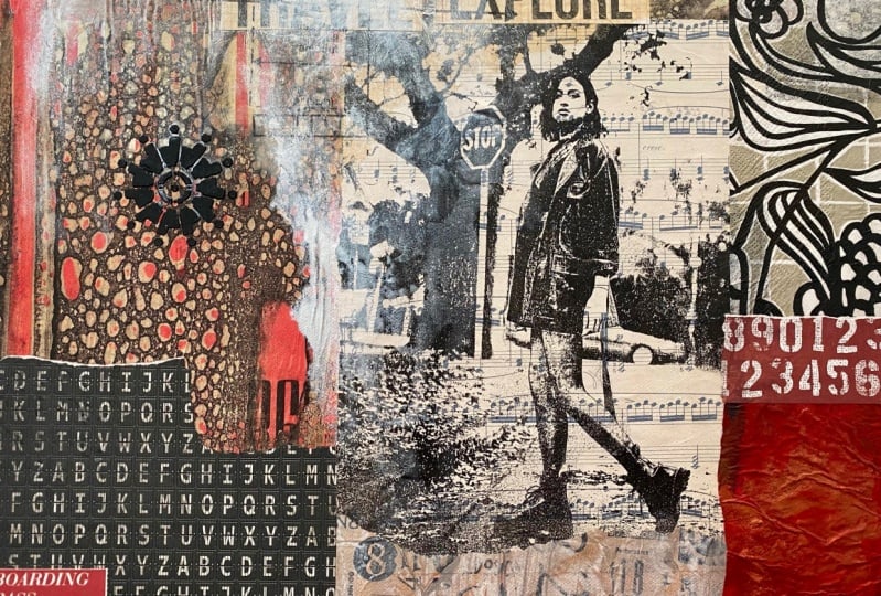
11. Creating A Modern Collage: I absolutely love this image transfer of my daughter that I did on the vintage music shapes. I just think it's gorgeous. I just love it. I love the grounds look of it. It's very her so attitude. And I've got these beautiful piece of National Geographic paper that I've dissolved with the situ soul. And I'm, I'm really inspired to put these two images together. So that's my starting point. That's what I want to do. I'm going to use this pace of National Geographic and I'm going to use this image transfer. And from there I'm going to create this collage. Quite spontaneous, very intuitive. These are my starting points. I've gathered some other collage papers, and I've got some different textures and colors in both the neutral tones and in different shades of red. So I'm going to put these together and see how it goes. I don't know exactly what I'm going to do. I just know that I'm really inspired by these two pieces. They go well together. I think it's very funky. I loved the way. You can't quite see the wording and the love that texture and I love the color. So I'm gonna start with this and then I'm going to see how it develops in the process. This will you be actually watching it as I create it. And if it doesn't work, use hear me cry. But the thing about color is that you keep working until you like it. If you don't like something, you paint over it, you'll add some more paper. Don't stress about your collages when you're making them just dot, just get yourself going, get started with what inspires you, and then keep moving until you're happy with your finished artwork. That's the plan. I love this image of God just inside tepees. So it's gotta be kind of edgy. And I've got a great collection of different pages that work with the college side. Let's just make it happen. Hello. Hello. The hardest thing with this application is to know when to stop because I really hope you enjoyed watching me put this together. I've just made decisions as I've looked at my materials, put them on, responded to something else and kept going. The sides look fabulous. I'm a big advocate of taking the collage elements round to the sides. I think it looks beautiful, more finished and professional when you do this. And it's just really hard to not want to just keep going. I'm loving the beautiful image transfer. This is Soviet. Don't forget to take that tissue piece off the back of the Soviet when you're using them. Loving the National Geographic pages which are dissolved, we sit yourself, all of these elements of collage I'm really enjoying. So I loving these words, defamation, travel and explore. So I'm really happy I might just do one more thing to it. Perhaps. I wouldn't mind putting some of the dressmaking pattern on. I love to do this because it creates another layer. It makes things more interesting and intriguing. I like the patterns that are in the dressmaking. I think I might play around with this. Put this on somewhere. I'm not exactly sure. But I think I'm going to have a little play with this. The good thing about dressmaking patterns, it's very easy to take into place when you put it on if you like it or don't like it, you can just rip it off really easily. I'm not sure exactly how I want it to go. So I'm just going to put some on and tear it where I don't want it to be basically rip it off again. And if I put it there like that, I like the way the arrows going across, like the way it comes down, to move it up and get, getting it right is the tricky bit. Getting things way you want them. That's what you've got to play with. So I'm like, I like this texture, be alive that shape our life the way that dressmaking patterns dissolves. So it just becomes kind of a CPU time. That's pretty fun. So I left the collaged dry. And I'm pretty happy with how it's coming together. It's looking pretty nice. I could stop or I could just add a couple more things. I'm loving this Soviet. Oh my gosh, I love using Soviets because it's so soft and so easy to use, loving the musical notes. So I've got this little piece here, which i'm, I'm pretty kinda put a bit, a little red bit down there and I'm want to put something there. I'm feeling like circular hormone to circular image or shape. They're just not sure exactly. So I'm going to have a little rummage around and see what I might come up with.
12. Part 2: Finishing Touches: So what kind of rabid around but I couldn't find anything that I was particularly excited about in my papers. So I'm going to put a little stencils there. Now I really like this one, but I only want that shape in the middle. So I've put some masking tape on it to prevent the pipe going beyond the shape that I want to use. So I'm going to put it here with stencils. I personally like to add I hippie jail because I like it thick and chunky. That's just pretty much how it is for me. That's how I like it. So I'm going to put it on with a palette knife. I like stencils to be raised up and to be really dramatic that so me, make sure you've got a baby wipe on hand or excess villages of the paint for when you don't want them to be. But I did add the masking tape, so I'm a little bit more confident that it won't be too bad. This is a pretty funky shape, looks like a some kind of metallic thing. All that's very cool. I love that. It's kind of like a metal looking colleague of some sort in my stencil box of endless wonder. That looks fabulous. I like that. Yeah, I leave that now. That has to dry. And I'm going to put want to put a splash of red here. Probably not that max, that's a bit big. So my cut that down. Like the boarding pass IDS thing is we've got the treble thing up the that might be too distracting, I think Oh, long here. And just have a boarding pass. Because I think that relates well to the treble. Same side. That like that. Yeah, I think that what I liked, the little baby would age along here. I think I'll keep that and just put it like yeah, that's cool. That's all I can say. It's just this continued trial of ideas. And if something doesn't work, you change it or fix it, will paint over it or rip it off. Really RK, just gotta keep going until you're happy. Does take me a while to get happy. Because I just like putting more and more on. That's going to look very cool. They're like that splash red. I like the theme of the travel. And that's pretty cool. Right? So I'm going to let must dense will dry. And then I just might throw some paint on there in some silver because uneasy, just splash it out, mess it up a bit because it's extra kind of feel of image that she is. So I'm gonna do that, but I'm definitely going to wait to that. Stencils dried. There we go. Boarding pass has been laid on. And looking beautiful. Now I know I said I was going to work to my stencils dry, but I'm not good at weightings. My boarding passes Beautiful. I love that. I'm thinking I want some silver, splashy silver just to give a little blink. So I've got this beautiful FW ink in sober pale, one of my favorites by inks, favorite color. And I'm just going to splash it on. I'm going to try not to wreck my stencil because I really like it. But I want maybe I should cover that and maybe I should do a little preventative measure here. A little preventative measure. Maybe I should just cover that up so I don't recommend because I really like it's working well. I just wanted to add some splashes of Silva because I think that she soups it. Now you have to be brave, right? That's why I was going to wait for my stencil to dry. But I didn't. You just have to be brave with creativity. Because if it doesn't work, you can just fix it. I like this. Let's put a bit like that. Now I really like it to run, but not too crazy. Because the more you spray it, the more it'll run. I want to throw must pencil. Maybe I want to go and network. Still bit down into this is just water that I'm spraying it with. Just gets the ink moving. It's studying color this color. When it dries, it'll be all like pearlescent silver. And I think that's probably it. Having that now I do have to wait for it to dry. I think that's pretty beautiful. I think it's finished by the way. I know I'm actually going to stop loving it. Now this will dry. I'll show you what it's dried. It'll be beautiful, pearlescent silver. I mean, I think you can probably see now that it's nice and shiny. And I'm loving this. Well, he she is, She's almost dry. But you can see how beautiful that Silva pale ink looks on there. When it catches the light. It's a little bit wet, but it's okay. All right. So that's finished now. Yes, I'm going to stop. I absolutely love this collage. I think it turned out very well, the image transfer was successful. And all of the elements of paper and colors in it, I'm really happy with. I liked the theme of it and the adventitia and the travel. Love that little stencil. That's really cool. So thanks for joining me and watching the networking of this particular class. It really was a spontaneous and intuitive approach. So I want to encourage you to just go for it, whether you're creating your artworks, take risks, have courage because it can only not work. And then you can wipe it off or you can change it or you can paint over it. Really, it's not too scary. Just jump in and let yourself create something beautiful and just trust that you are well able.
13. Thank you & Farewell: Thank you for joining me in this art class. I truly hope you've enjoyed it and you've gained courage to create your own beautiful artworks. I would love to see what you've created, so make sure you share a picture of one a priest in the project section, let me know if you have any questions. If you're really stuck on something that's not working for, you, reach out and I'll try and help you to see if you can get a better result. Sometimes it can simply be the paper you're using or even just the way you are applying your paint. So you can contact me directly and I can help you solve those problems. You can find out more about who I am on my website. And you also might want to look at the other classes I have here on Skillshare. I'm a little obsessed with jelly printing at the moment. So you will find a couple of other classes on this subject. There's so much to learn, there's so much to experiment with. It's so exciting that I really hope to see you again creating your beautiful paintings. And you can join my private Facebook group where you can show me more of your artwork and learn more of my secret techniques. I would love to have you join my art class again and all the face. We'll create a pursuits.
 Froyle Davies, Mixed Media Artist