Transcripts
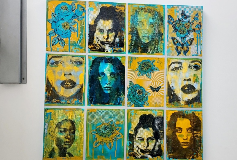
1. Introduction: Hi. [inaudible] welcome to my studio. I've been painting and exhibiting for over 25 years. All of the types and styles and mediums that I have explored through my arts practice, I find mixed media collage to be my absolute favorite. In this art class, I'm going to show you how to create a beautiful image transfer portrait painting. This technique requires no drawing whatsoever. This is one of my favorite techniques and it is my own personal invention. I will lead you step-by-step through the entire process, showing you exactly how to create this painting, which materials to use, and some of my secret tips. In part 1, I will show you exactly how to create the image transfer. We will discuss which images are best to use for this technique and how to step-by-step go through the process to create a successful image transfer with the Gelli printing technique. In part 2, I will show you how to adhere your print onto the canvas, which materials to use for the paint application, and how to finish the painting like a professional. This class is suitable for anyone wanting to explore portrait painting with a contemporary and experimental process. Anyone can do this because I will show you step-by-step what to do with each layer and each part of this process. Although, if you are new to Gelli printing and the image transfer technique, you might want to have a look at these other classes that I have on Skillshare. Because with this one I start with the basic techniques of Gelli printing and this particular class is perfect for understanding your image transfer process, you might want to look at those other classes first to become more familiar with the Gelli printing technique. The project is to create a beautiful and finished portrait painting. I know you can do this. I will be taking you step-by-step along the whole process from the absolute beginning to the total completion, even how to finish your painting like a professional. Your artwork will be ready to hang and you'll be amazed at how beautiful it is. I've put a material list into your resource section of this art class, so have a look at that. You can follow along exactly using the colors that I'm using and a similar image that I've chosen or you can choose to use the list as an inspiration and choose your own color scheme. You'll be able to do this because I'll show you exactly the materials to use and the techniques to be able to achieve these results. I can't wait to see what you do, so make sure you put a photo into the project section of the class. As a bonus lesson, I've gone through the whole process again with a different image and a different color scheme. This one I'm calling The Making Of a Goddess because truly this portrait looks like she should be. I had a lot of fun creating this particular painting and I really hope you enjoy the bonus lesson. Follow along with me and allow me to show you how to create a beautiful portrait painting without having to draw. Let's get our materials sorted and let's make art.
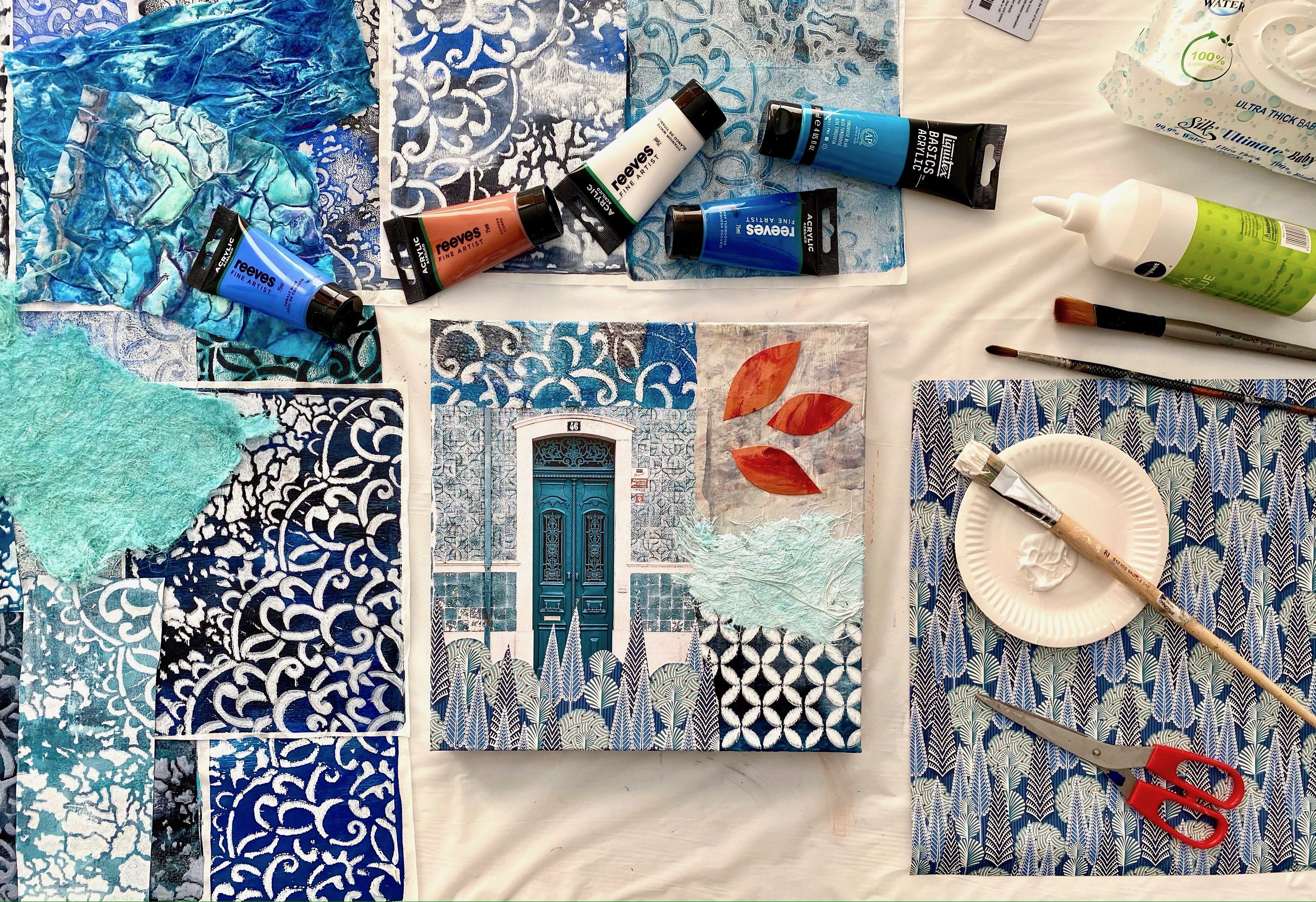
2. Getting Started: These are the materials that you're going to use to create your Gel Plate Image Transfer. You need your image. You need to choose your portrait photo that you're going to use for this project. We'll talk more about that in a minute. It needs to be a color laser copy. I cannot stress that enough because they turn out the absolute best image transfers so you want to make sure you've got a great portrait for your portrait painting. This is the gelli plate that I use. You don't have to use this brand, you can use other brands. Although I have used this one very successfully for quite some time. I think it's probably been six years I've had this gel plate. Look at that, it's fabulous, it's amazing. It's a 10 by 8 size. I like this size because I can print my images out and it can do the full gel plate. Also, you can use standard copy paper when you're creating gelli prints with it. I think it's really easy to use this size, I love it. I use two brayers; one to roll the paint on, and the other one when you're rolling the paper on to take the print. You don't have to use two brayers. I just do because I like things to stay nice and tidy. This is the roll of sheet. I always have a roll of sheet next to me and I like to use paper packaging for that. It also makes incredible colors paper so make sure you keep that. If you put too much paint on your gel plate, you then want to roll at it and wipe it onto the roll of paper so that you take some off the gel plate. Again, if you have too much paint on your gel plate for the image transfer, it won't work as well. We'll also cover that more in a minute. I'm using the Atelier brown black, it's a sepia tone. I also have other paints here. These are very inexpensive paints. There's Reeves paints. They come from the office stationery shop where I get my color copies printed. The Liquitex basics is also great for gelli printing, works well for the image transfers. I have found that darker colors transfer more successfully, and that makes it work just a lot better. But you can try other colors. Baby wipes, I always have baby wipes on hand. I use them to wipe the gel plate, also the brayers, especially if you're changing colors. We're going to put our image transfer onto white tissue. Now this is plain white tissue from the cheap shop where I bought a whole pack for a couple of bucks, cut it to this size for my gel plate and that's what we're going to be using for our image transfers. Because what we want to do is put the image transfer onto a canvas and then turn it into a portrait painting. You want the transfer to be thin so that it dissolves onto the canvas. It's not hard using tissue. In fact, this is the most easiest way to create an image transfer on the gel plate. You put the paint on the gel plate, you put the image on top of that, and then you create the transfer. You then put the white tissue straight onto the wet paint and pull the print. It is the easiest and simplest method, and that's what we're going to be doing. Make sure you have a stack of white tissue because we're going to be doing quite a few of the image transfers. I also have a stencil here that I'm going to want to use in my portrait painting. So if you've got some stencils as well that you want to put some extra texture into the layers, that's always good. I think that's everything. We're going to discuss a bit further, the image that you're going to want to use, and I can't wait to get started.
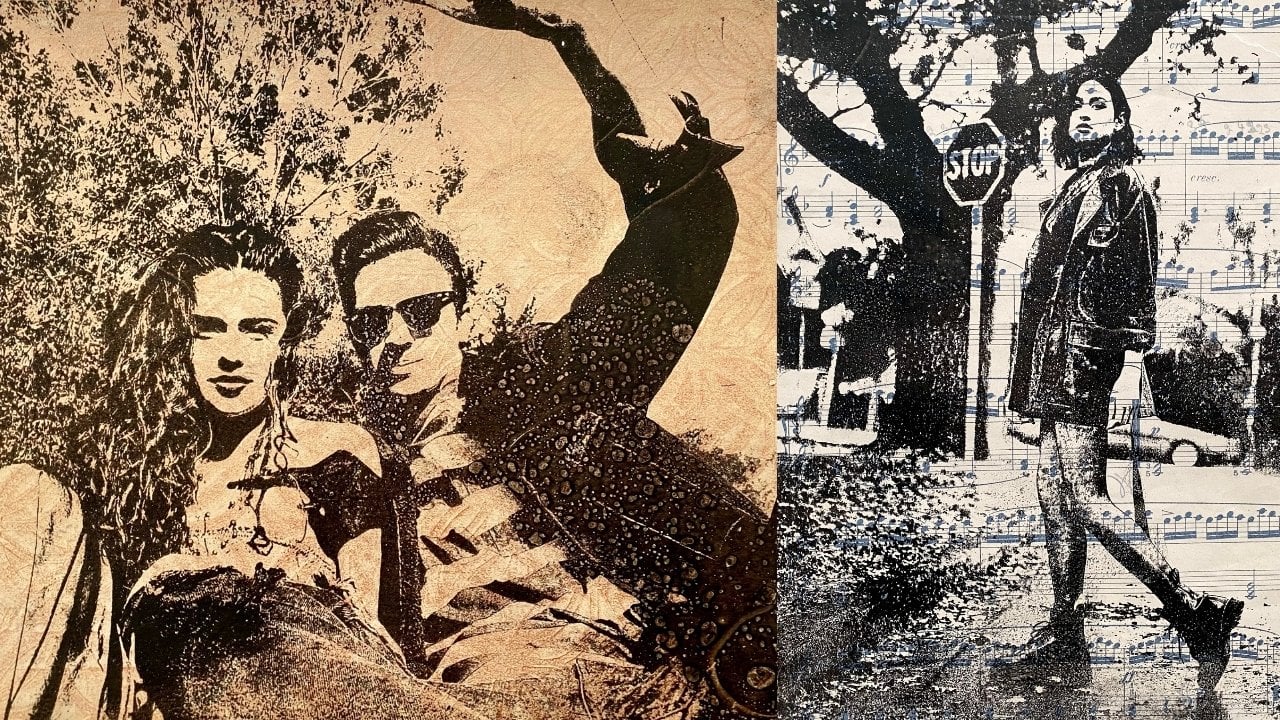
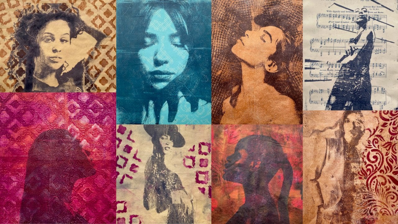
3. Choosing Your Image: When it comes to choosing the image for your portrait, there's a few options. Of course, you can create a selfie. You might be really good at it. I'm not so good at creating selfies, but you might like to do a self portrait, and that could be really exciting and very liberating as a person. It's quite confronting looking at yourself as an image and even more so when you're creating it as a painting. But I would encourage you to try this as a self portrait. It really could be an amazing experience, and I'd really love to see what you do. The next thing you could choose is perhaps an image of a family member or a friend. I've decided I'm going to use this photo of my beautiful daughter, and I'm going to see how she comes up as a portrait painting. The third approach that you could try for your image of your portrait is online. Of course, if you're going to use an image online, you have to use royalty-free websites. You don't want to have copyright issues down the track because someone doesn't like the way you've used their image. So make sure it's a royalty-free website like Unsplash. I have used quite a few portraits from Unsplash. You type portrait in the search bar and hundreds come up. These are beautiful images. You can use some royalty-free, no copyright issues. You can just download it very simply, it's free, and then you take this to your office stationery or office shop and print out the color laser copies. They don't have to be black and white, but they have to have strong contrast because the paint will absorb in the light areas where there's less ink and it will repel in the dark areas where there's more ink on the print. That is what will create a successful image transfer. You can use color images. Just make sure, like I said, it has a strong contrast between dark and light tones because that's going to work best when you're transferring your image. I would highly recommend using Unsplash if you don't want to do a self portrait or a family member or friend. You're going to want to create six image transfers with the same photo. Once you have decided what your image is going to be, you want to go to your office stationary or copy shop and print out six color laser print copies of your photo. It has to be a laser print and it has to be in color, because this is what works best for the image transfer process. Trust me, I've created a lot of image transfers from the gel plate and I am giving you the absolute best way to be successful with this application. Get yourself six copies of the photo image that you want to create for your portrait. The first thing we're going to do is create the image transfer for our portrait painting.
4. Part 1: Creating The Image Transfer: This is my beautiful daughter and I'm going to use this photo to do the image transfer portrait painting. I'm not sure exactly how it's going to transfer because it is quite shadowy. It may not be enough strong contrast between the light and dark. Because how it works on the transfer process is that the dark areas repel the ink on the print and the paint stays on the plate. The light areas absorb the paint, they don't stay on the gel plate. Then that's how you get the light and the dark and the transfer process. This is a color laser copy. I go over to my office stationery shop, which is a five minute walk away and I get them printed.
5. Let's Make Six!: Wow, this one had a lot more paint on the gel plate. Sometimes if it comes out too fast from your tube and you put too much on your gel plate, you can brayer it off a bit. But clearly this time I didn't brayer it off enough and it has a little bit too much paint. But I'm going to pull this print and see what it looks like. It could be really interesting. Don't be disappointed if some of your prints don't work out, just keep going and keep making them and then see which one you like the best. See, this one had way too much paint on the gel plate. That's why I say the image is the most important part, and then secondly, is the amount of paint. As you can see, that's too much paint on the gel plate because the image transfer from the photo was too blurred in the process. Good lesson to learn. She looks a bit like she's at The Phantom of the Opera. It won't matter how many times you try the same photo, even with the same color on your gel plate, it will come out different every single time. Even if you're purposely trying to make it come out exactly the same, it will still come out different, which is great because you have a variety to choose from. But sometimes you're like, I wish I could just get it to go like it did last time. Anyway, not to worry, print out six images and do six image transfers, and then let's see what we've got to work with. This one looks like she's going to be fairly moody. I like moody. Moody suits my little treasure. How did she come out this time? Much better than the last one. Quite strong in it's coloring. Still quite defined on this. Isn't it amazing how differently her look feels with the different prints? This one, she looks quite sad. Even though it's exactly the same photo, the print itself feels sad. I don't mind it, it just fascinates me. It's totally amazing how different it can look each time. Wow, that's quite a nice transfer. Don't get too stressed out and worried. If something hasn't worked exactly the way you want because we can fix it as we go along. Now this is my sixth print, and then I'll show you the lineup of how it worked for me. I'd love to see how you're going, so make sure you put your six prints in the project section. That would be absolutely fabulous, and tell me which one you are choosing for your portrait painting. How exciting, I can't wait. You'll actually be really surprised once you see them side-by-side how different they are, even though it's the same image and the same paint, and even created all at the same time. They still have a lot of variation. I absolutely love this monoprinting technique. Let's see how we went. With the last one, try not to rip it off the plate. There we are, the last of my six image transfers. She's quite moody in this one, very shadowy. Now, I'll show you them all lined up and you can see the incredible differences between each print. I'll tell you which one I'm going to use.
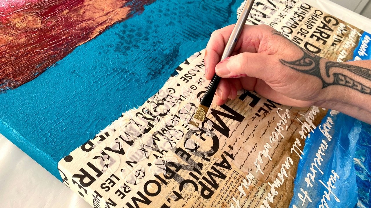
6. Part 2: Preparing Your Portrait: This is the print, the image transfer print that I've decided I'm going to use for my portrait painting. I like that she has good clarity, but she's a little moody, not too moody. She's definitely not Phantom of the Opera, which had a little too much paint on it. Now what you want to do, I'm going to center the portrait in the middle of my canvas. I have a 30 centimeter or 12 inch by 12-inch linen canvas. That's what I'm using. I absolutely love these, I have great texture in them. That's what I'm going to put this portrait painting on. I find it's a great size. It's also easy to post if you're doing this for a gift. I want to put her right in the middle, so I want to tear away all of that other tissue around her. We're going to use matte medium to adhere the tissue to the canvas. It doesn't matter what brand you're using. I'm using a liquid text basic brand. But it doesn't really matter if you've got other different brands of matte medium. Don't stress about it. Just use what you have. Now, I have found the easiest way to tear tissue so that it goes exactly how you want is to get a bit of ordinary water and brush on the tissue with ordinary water. Now what that does is it softens the edge of the tissue and it makes it tear a lot easier than tearing it while it's firm and dry. Just mark around where you want that print to tear. Just with ordinary water. You do have to be a little gentle with your tissue because it will tear easily. It's tissue paper. But now because of the wattage that I've created with the brush and the water, it should follow that line quite easily without too much drama. Then when that is a little bit dryer, we're going to stick it onto the canvas. See how it just tears away quite easily. Because the edge has been dampened with the water just a little tip to make life a little bit easier. I'm going to allow that edge to dry a little bit before putting it on with the matte medium. You can also give it a little bit of touch-up to get it exactly how you want it. Once you've torn the excess tissue from around your portrait, you want to find the position on your canvas where you'd like to put it. I'm putting her pretty much smack bang in the middle because she is the focus. Now, like I have said, you do need to be a little gentle with the tissue, putting it on. Sometimes it does get a little crinkly. Don't stress out because we are going to add layers of paint on top of her and around her. It'll be okay. But just be mindful that you want to be a little gentle in putting her on or him actually. I keep saying her because it reminds my daughter. But of course, you might have something completely different. I always start at the top. You want to try and get your image on as smooth as humanly possible without stressing yourself into a frenzy. It will crinkle sometimes. Don't panic. Like I said, we can fix anything down the track if it crinkles. We can sort it out. Now I've just used the Liquitex basics matte gel medium. I love using this one for adhering image transfers to the canvas because it's easy to use. It's not as sticky as PVA glue or some of those other things. You can use, however, whatever you like. I'm going to show you very clearly and concisely how I do this process. You can change it according to what you have, but at least you know exactly how I did it. I would be pretty much telling you all of my secrets as we go along. Don't tell anybody else. Now I am covering also a bit of the matte medium just to make sure that the image is flat. It's probably not striped. I'm not stressed about things like that because I know that we're going to be adding quite a few layers of paint on this image. Getting it straight on the canvas is not a concern to me. I like to get it on with as least crinkles as possible especially in the facial area. You notice I haven't touched that because she went down quite flat. The more you poke at a wet piece of tissue paper that has an image transfer, the more chance you are of tearing it or making it crinkled. If yours has gone down relatively flat, then it doesn't look like it needs any adjustment. Leave it alone, don't poke the bear. Just let it stay nice and anchoring gold. The less your fiddle with, actually the better. I'm going to stop now. I'm going to let that dry. That's gone down quite well. Don't worry about excess matte medium around it. All of that gets covered up. Like I said, this is a 30 centimeter or 12 inch squared. You can have a rectangle. You can put your image to one side. It's endless, what you can do with this process and application, don't get stressed up. If you don't like something that I've done and you want to change, do it, however, it's going to make you happy. I'm just going to show you exactly how I make my portrait paintings and then you can adjust it to what suits you or to your style. Please put a photo in the project section because I would really love to see it. Oops, you see. I tore that off because I'm fiddling with it. I'm leaving it alone. I'm backing away from the canvas. That has to dry completely. I will be leaving that now overnight. I won't touch this again until maybe tomorrow if I get a chance to work on it. We're off to a great start. Once your image transfer is dry and adhered to your canvas, we can do the next layer. Now, what you want to be thinking about, is how you're going to blend that image transfer into the canvas That's on. I'm going to use the same color that I used for the image transfer to fill the background around the canvas area. I used a brown-black on the image transfer and I'm going to paint that same brown-black color around the canvas to blend it into the rest of the canvas. It doesn't have to be a perfect type of layer. Basically, it's just going to be a background. If you did your image transfer in blue or green or some other color, then that's what you're going to want to do to blend it into the background. Otherwise, if you're following along with these colors and this particular application, then you paint, this is what you do next. Now don't worry about marks like this, or dings and bangs on your print because it is a model print from the Joe play. That's actually from the play itself. This is from too much ink on the play. Don't get stressed out if it's not looking perfect, that's a shadowy effect from the actual photo because you're going to be creating lots of layers for this portrait painting. All of those things are going to get blended into the whole overall application. What you want to do now for this layer is blend your image transfer into your canvas. Now I'm going to go over some areas of this print to blend it into the background because we're creating a portrait painting. The aim of this layer is to stop blending the print image onto the canvas and heading into the direction of a painting. It doesn't have to be a perfect layer. You just need to get a basic background code on it because we're going to be doing quite a few layers. Now it doesn't matter if this light is a bit rough because it's just a background. You let this dry now. Then we're going to do another paint layer on top. Then we're going to seal the layers before we actually add some of the paints and mediums. It's all step by step, one layer at a time. It is going to be absolutely beautiful.
7. Adding Stencils: My beautiful image transfer is on the canvas. I've painted around the background the same color that I did the image transfer. It's all adhered, it's all perfectly dry. Now this process is very step-by-step and each layer has to dry before you put the next layer on. I want to now put some stencils in this section of my portrait painting. They may or may not still be there in the end, but that doesn't bother me, I just like adding layers of textures and then what survives contributes to the painting. What gets covered up is quite okay because it became part of the history and the development of the artwork. I'm going to use this stencil here. I think it's called a damask, I'm not sure. I might have to look that up. It's a little bit not, but it's okay. I just like the shapes of these seem very vintage looking and I think that suits the old worldness of this particular image transfer in the clothes that she's wearing, in the look on her face, and the sepia tones headed in that direction of an old world almost renaissance looking portrait. I'm going to put some of these beautiful stencils down the bottom here. Like I said, they may or may not still be there as the painting develops, but that's okay, I'm okay with that. If they don't survive the process, that's okay. I think I'll just put some in this corner and I'm going to use an ordinary makeup brush to put the paint on. I'm using a golden iridescent bronze fine. Clearly it's one of my favorites because I'm squeezing it out the remnants of the tube and that's okay. That's what I'm going to do for this next part of this painting process. You don't have to put stencils on if you don't want to, but if you're following along, this is pretty cool. Just go and put a light layer of the paint with the stencil because we don't want it to be too thick and chunky, we want all the layers to just blend on top of each other and we'll see how we go. Now you want to have a damp cloth with you on the side in case you put on a stencil or something and you don't like it, just wipe it off again, it's really no drama. That's why also it helps to have each layer dry as you add to them, because if something's not working, if your idea wasn't as brilliant as you first thought, then you can just wipe it off. Easy peasy, lemon squeezy, it really isn't any stress at all. Little bit of bronze fine stencil in the corner. Let's see how that went. It's not too bad. It's a little blobby, but like I said, it's just a layer underneath, and you may or may not even see it with the final painting so don't get too stressed out about it. Just add it in there if you want to, leave it out if you don't, and we'll keep moving along. Now this of course has to dry before I put the next layer of paint on. You have your painting now, it's all dry. Stencil is dry, the image transfer is done, the background is dry. This next layer is probably the most boring, but the most vital to the success of your portrait painting. Now, we want to seal this paint layer because the next layers after this one are going to have a lot of fluid pouring medium, acrylic paint, iridescent inks, and they'll hold a lot of fluid. The fluid can get onto the image transfer and cause it to bubble and to blow up, and then it separates from the canvas. We don't want that. Or it can cause your stencils to also gorge on the water that's put on top of that paint layer, and it can cause them to distort and to become loose in the paint quality, and we don't want that either. We have to seal this layer so that the next layer that we put on doesn't negatively impact the beautiful paint and image transfer and stencils. Now I like to use a gloss varnish to do that. You don't have to use this particular product. You can use anything that's going to be an acrylic protective layer for this section of the painting. You might want to use a different medium, or a different type of sealant, but I've always used the gloss varnish and I have found it to be successful. But when I haven't put on the varnish in this section of the painting process, I have had negative results. That's why I know what will happen if you didn't do it. To arrest me on this, this is boring, but absolutely vital to the success of your portrait painting. I just use a plastic disposable plate and I pour some of the varnish into the plate. I use a very nice soft brush, inexpensive, but nice and soft. I use the same brush for vanishing and we pretty much just put the varnish on. You don't want to go too crazy backwards and forwards over the whole thing because your paint is still fresh, and you don't want to lift it at this stage of your canvas if it gets sticky. All these things can happen, I have done all of them, so let me just help you in this process of what not to do. A single layer exactly like this, don't go over it too many times because like I said, it will pull the paint off rather than seal it. Basically that's it. It's that simple. You now have to leave that to dry entirely, perfectly dry. I like to leave a day in between these layers, at least so that it can dry. The weather today is not so great in New Zealand, so I might leave it a couple of days, but you want this varnish to seal this layer so that when you apply the next layer with thick volumes of fluid and water, it's not going to disturb this particular paint layer that's on there now. That's the goal. It's like an isolation coat, or a separation layer. You can call it all sorts of things. You can use a gloss medium, or some other brand that has an acrylic, which is just a polymer that you can put on two separate in-between your layers. I just used the gloss varnish because I have it in my studio. It works and I found it to be successful. It might seem a really annoying, boring, trivial thing to do, but trust me, if you don't seal this layer, you will have problems as we put the pouring medium on and the other fluid paints. Just do it, and we wait for it to dry. See you when it's dry.
8. Applying The Paint: Okay, so this layer is completely dry. It's been sealed. I used an acrylic vanish because that's just what I like to use, but you can use any acrylic medium. You just need to seal the gel print and the stencils and the paint on this layer so that as we pour the paint on the next layer, it doesn't destroy what's already on the canvas. That's the plan. Now I'm going to use golden, iridescent bronze fine. It's a fluid paint. I'm using a Liquitex bronze, see how the two color bronzes are slightly different. That one's got more of a couple of orangy tone and that's more of an antique bronze. I love that. I love that you can put the different bronzes together and they are actually different times. I'm also going to use the Atelier brown black, which is this background color because we want it all to blend into a harmonious layer of paint. I'm using the background color to blend it in. Now, this is my secret sauce. It's the Liquitex pouring medium. There are on the mediums on the market, pouring mediums if you want to try them. This is just what I prefer. I found it works really well for the kind of result that I'm wanting to see. That's what I'm using for this painting. When you're using this medium, don't use good brushes because it's extremely hard on your brushes, this particular medium. It will wreck them. Even though you're washing them out straight away, it still makes them stiff and hard and destroys them. So get cheap, affordable bristle brushes from like the Dollar Shop or the Cheap Shop. Don't use any good brushes with this medium, you'll be sorry they will get wrecked. Now, I like to put my paint in jars because I find it easier to mix. It is also a pouring medium and I'm using inks. Hello, you need to actually have it in a container that's going to handle the volume of fluid. Also what I like about jars is that I can then put a lid on top and seal it, and they also store easily. This one is the iridescent Liquitex ink. This one is the bronze golden. See how it's more thicker and opaque, it's just a stunning and take bronze color. Love it. This is my sepia, which is brown, black, which looks a bit like Vegemite. That is an opaque color. The ink will be maybe semi-opaque. You also want to have clear with you as well when you're doing this so that you can leave areas completely blank of colors so your background is showing through. Now, the hardest part for me with this kind of application, it's again, not to use too much paint. I know I do have a tendency to get a bit carried away and put on too much. That is my biggest problem with this particular application. You also want to have a damp cloth, it does get sticky and some baby wipes. I like to have those on hand as well, just in case something becomes a mess, which is quite possible. This is a fluid medium so it might run everywhere. You can use gloves if you were to bet your hands. It's not toxic, it's all acrylic. It's not toxic in any way, but it is sticky and sometimes it takes a while to wash it off your hands, so you might want gloves, no problem. Now the first thing I like to do is save the area that I won't lift. Now I want her face and her hand and this section here to not be fully covered in paint. That's the plan. I'm going to put a coat of just the clear Liquitex pouring medium on top of her like that. That's how I always begin. Next, I'm going to want to put the background color around the edge because I want this paint to really blend into what's already on there and become a more cohesive painting. That's going to go around the edge like that. Maybe even a little over here. Now, it is highly experimental, this process. You're just not going to quite know exactly how it's going turn out until it dries. What I like to do is just put a little bit of the color around the painting and let it flow and let it blend. I do want to leave some of these stencils on this corner being able to be seen. I'm adding some clear there as well, as well as a little touch of the bronzes. Once you've got a good covering of paint on the canvas, you want to move it around so that it gets a flow and it mixes together. You can put your canvas up on pieces of wood so that it doesn't pull over the side while it's drying. I like to let the paint run right off the edges. Like I said, it can get messy because then you know, it's got a full covering of paint. Now it is a fluid medium, it's a pouring medium and it's been created to do this very thing, to flow with the paint and to create movement. As it dries, it will keep moving. You want to make sure you have a level table while your painting is drying because it will run to whatever direction your table is leaning. That's got a really nice flow on it. It's got some great movement, it's got some beautiful mix of bronze colors. I managed to keep her face from being too covered, and I can still see the stencils. I'm winning at the moment, but let me warn you, it doesn't always dry exactly how you're thinking it's going to. It is an experimental process, and that really is half the fun of what I love about this particular paint application. You never quite know what you're going to get exactly, but you can set yourself up for success. You can have a little fiddle with it at this stage. If you're not happy with something, you can move it around. I'm thinking I'd like a bit more of this bronzy golden here. But remember, every time you add something, you're going to upset the flow of what's already there. If you put too much paint on, it will just run over the edges, or over your print, you might not want that either. You do have to be careful between putting on too much and trying to create the balance that you want. Then you have to actually leave it alone, which is another one of my problems, I like to keep filling. I now need to leave her alone to dry, and we'll come back and see how she's drying in a bit. I ended up putting her up on these little pieces of wood, just so it takes her off the table so that as the paint drips over the edge, it doesn't pull underneath the canvas. I'm pretty happy with the color combinations at the moment. I can't wait to see how she dries. I just hope it dries as well as I'd like. Make sure that your area where you're drying your painting is perfectly flat and level or else it will all pour in the direction of where the lean is because it is a fluid medium. [inaudible] I'll let her dry. We'll see how she comes out.
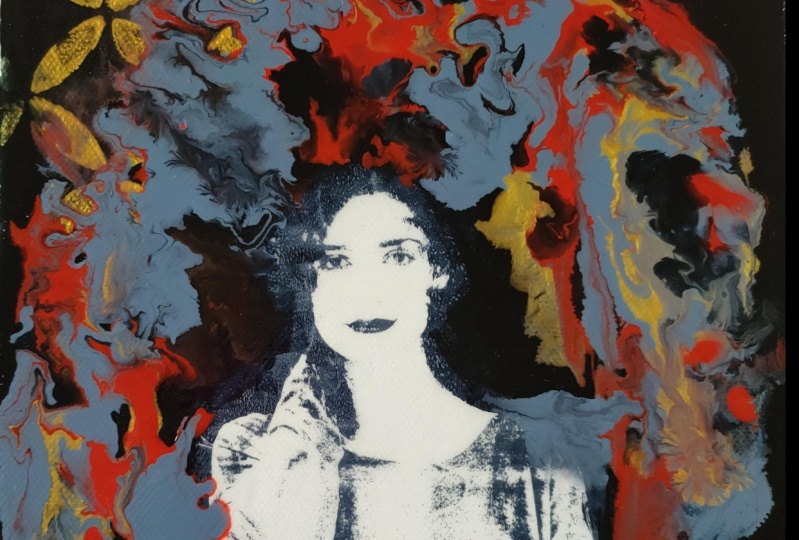
9. How Did She Dry?: How did you go? How did your painting dry up? Are you happy with how it looks or has it not gone exactly how you want? It's a little bit like that. It is highly experimental. You can put a second layer over the painting when it's completely dry if it hasn't worked exactly how you want. They are ways to fix things and change the painting. I'll show you now how mine dried up. My beautiful daughter is all dry now. How did your painting come up? Are you happy with the way the paint dried? That's the thing. It doesn't always dry exactly how you want all the time. What I really like about this painting is the mixture of the bronze. I like that you can see this is the Liquitex ink that I used, and that's the golden bronze fine. They've got two different tones. This one's got more of an orangey base which looks quite coppery, and the other one's more of an antique bronze, and I absolutely love that it has those two different shades. It also has the sepia paint that I put into the mix of poured elements, and that has blended through really nice. I'm very happy with how the colors have come out. I was originally thinking of putting more stencils up in this section, here on top of the painting, which you can do entirely. When it's completely dry, you can also add another layer if you're not happy with something, or you can add more stencils to the elements as well. But now looking at the painting, I think I'll just leave it alone. I really like the flow and the line of the paints. I absolutely love the color mix in here. I think, if I add any more to it, it might distract from the beautiful paint application, which is what I was really going after with those particular materials that we used. I think she held strong the image transfer. I didn't obliviate her completely, which is fantastic because sometimes I do have a tendency to do that. There's a little of the paint going onto her face, which I don't mind. It's giving her this shadowy feel, almost like she's hiding, or she's coming out of something that's really cool. I like the swirling movement of the paint, and that's why I used that particular pouring medium because it creates this beautiful organic swirling movement. You can never reproduce your painting again exactly the same, never, not even if you try. As you saw, the image transfers change drastically each time you print them. Well, the same goes with this paint application. Every time you try a painting like this, it will come out completely different to the one you tried previously. You can always have another go with this whole process and try different colors or different images because truly, every time you put your hand to it, it will be completely different. It is an absolute one-of-a-kind original painting. It starts with a monoprint, which means one, and the whole painting application you can never reproduce in a fit. I love the way the colors are coming down here and flowing onto the stencils without completely obliviating them. That's worked really well. I think I'll leave her alone. I won't add any more layers. I think that I'll just finish the sides, type, and string up the hanging and probably sign my name, and there you go. We will have a beautiful finished image transfer painting portrait. Can't wait to see it up on the wall. I'm happy with how she's come out. I think the painting's looking beautiful. The next thing I'm going to want to do is paint the sides. Now again, I'm using the Atelier brown-black. This is the color of the image transfer. It's the color of the background that I painted, it's also in this paint from the pouring, and I'm now using it to paint the sides. I think the sides are important to make sure you get a good color on because when you're walking up to the painting, you actually notice the sides if it's hanging on the wall before you even actually see the face of it. Paint your sides. I just think it looks better. It's a personal decision, but I prefer the sides to be painted. I think it looks more finished. I think it looks more professional. I'm going to paint the sides with the brown-black color. Then when that has dried, I will show you how to string and type your painting and finish it like a professional. We'll leave that to dry.
10. Finish Like A Professional: Your painting is all nice and dry and looking beautiful. Now we're going to finish like a professional. Your sides are painted. It's looking fabulous. The first thing you want to do is get a nice clean cloth for under your painting because if you're going to be working on Your workspace, you don't want to have any glue or pipe left on your table. I always cover it with a nice clean cloth just in case there's some residue and I don't want to wreck my beautiful painting, first thing. Now what I like to do, this is a personal opinion, you don't have to do this, but this is what I personally do with all of my paintings. I first of all start by getting famous tape and taping the back like this. Just means that the painting looks neat and finished. Then you want to make sure you have your painting up the right way before you put the string on. Now, you might think that that's pretty obvious, but let me tell you, I have strung things sideways after I've put the tape on and it ended up all turned around. Check that you're up the right way first. Yes. Then I like to measure. I'm measuring eight centimeters in case you want to know, but it really doesn't matter what your measurement is. You just want to make sure it's assigned both sides. I like to keep it up in the top third of the painting. I just think it will hang nice when it's up that top third, that's personal again it's all personal opinion. Now, I get the D rings and the screws from Mitre 10, which is a hardware store. I also get these little things, these little bumps on black soft felt things from Mitre 10, the hardware store as well. The cord, I think I got from an art framing shop. But you can get that also from your hardware store. You want to measure out enough cord over the edge here so that you can tie a good knot. Don't leave yourself too short because You want to be able to secure that. The one D- ring goes on the cord that you've just measured out. The other D-ring gets tied on to the end like this. Nice secured knot. You get cord in different thicknesses. This is quite a thick one. You can get thinner ones. This is leftover from much bigger paintings that I was stringing, but it'll be okay. Just that you didn't cut yourself too short and then tie a good note. What I like to do is use a bit of the famous tape onto the loose ends of the cord because it just makes it neater. You put that on there. Then you roll it tight like a cigarette like that. It just makes the end of that cord. The loose ends makes it all nice and neat. I know I'm into neat. What can I say? Now I have an electric little screwdriver. You might have a normal screwdriver. It really doesn't matter. You just want to put your D-ring and the screw in the mark that you made. In a way, you go. Now if your cord is too long like this, I always make mine way longer because I don't like running short. I have done that a few times and it's rather frustrating. You just twist it and that will shorten it up. Like that. Give it a bit of a pull so it stretches out the cord just a little. You don't want to pull it too tight but you want to have it thin so it doesn't sag. Then you put it on your other mark. Hopefully, they're similar. Preferably the same. Then you have your cord on. Your cord's in place. D-rings are secure. It's looking neat and tidy with your tape. Then you put your little black felts on here. They are adhesive, they are just like magic. Mitre 10 baby is it busy lemon squeezy put your felts on. Your beautiful painting is now taped and strong and ready to hang. Look at that. All beautiful, all ready to hang on the wall, can't wait to see it.
11. Bonus Lesson: The Making Of A Goddess: In this one, because it's got so much dark space around the image, I'm going to have a little play with some texture. Our face transferred beautifully. This is a text to plate. That's what it's called. Can't remember where I got it from because I've had it for so long. I'm just going to push that texture into the wet paint. I like that. That looks great. I smooched it with my fingers. But besides that, I think that's come up good. What color should I put on her background? My choice is metallic copper. Funny how I always choose these images with such attitude. Let's go with a bit of metallic copper and see how she looks. Maybe we can add a bit more warmth. Let's see how she came out. The color is pretty nice. I hope she printed well. Not too bad. Look, she looks like an Egyptian goddess with a neck pace. I like that color. That was the iridescent copper, and then because I wanted to make it a bit warmer, I put a bit of the Alizarin crimson. That looks pretty nice. I like that color. I like her attitude. It's got a few crinkled marks, but that is what you get. With an image transferred, it's never going to be perfect. That's what makes it a beautiful monoprint. You can't repeat it, you can't get it the same ever again and that's the beauty of this particular artwork. I'd had the beautiful image transfer onto this canvas, and then I painted the copper around the edge and around the sides. I then sealed it with an acrylic gloss medium just to protect the paper as I now layer some more paints on top of it. It just helps to prevent the paper from getting all crinkly and bubbling with the fluid and the water absorbency. Why am I doing this? Why not? Yes I could leave her like this. She does look like a beautiful copper goddess with the chest plate here. But that's not how I roll. I always want to try something new. I always want to try something different. I don't want to push the envelope. It's quite a small canvas, so if it doesn't work out, it's not a drama really. But I'm going to try adding some layers of the acrylic paint. They're in a jar because I'm going to use paints and inks mixed with a little bit of the Liquitex pouring medium. Now, that is the secret sauce. Don't tell anyone. But that's the secret sauce of what makes this whole process absolutely amazing because it causes the paints and inks to blend together. The acrylic medium causes the paint to move and to blend and it creates that beautiful flow. I've got a few colors. I've got some bronze here. This would be a Liquitex ink. Bronze, beautiful. I've got a Cad red here, which may or not be a great idea, and I've also got iridescent copper, which I'm loving. This one in here is just the clear medium than I'm using to mix the paints together, and we'll see if this idea is going to be a good one or not. I'm going to start by just adding some of the clear fluid medium across her face because I'm going to try really hard not to wreck her. As you can see, I'm just brushing some on in some different areas. I put some little wood pieces under the canvas because I want it to drip over the edge, and I don't want it to pull right under the canvas there because it just makes it thick and chunky and painful and you got to cut it off later. Then you just got to move it around and hope it moves in the direction that you want it to go. You're quite unsure exactly how it's going to go while you're in this process, because it looks really different when you're painting it like this. When it dries, it also dries really differently. It can be a little scary at this stage as to how it's going. I'm just mixing a little of the colors together. You really won't see any of these properly until it dries. But at least you can see the crazy process that I go to to make this particular application. Then you're going to leave it to dry, which is the hardest bit because you want to keep fiddling with it. Just started to drop in some yellow gold just to give it a bit of brightness. I'll leave that to dry. Hopefully it will be amazing. Here she is, the paint has dried. Here is the making of a goddess. As you can see, yes, I did lose some of the background imagery. I did like the breastplate she had on here. From the image transfer, lost that. You can see a mix of the colors. I've got an idea. I want to try putting maybe that breastplate back because I didn't really like it. See a little bit underneath there. I made it with this texture plate when I did the image transfer, and I basically just went like this and pushed it on while the paint was still wet on the transfer process. I'm going to do that again. What I want to do is just try and put the paint on the top layer of this texture plate to take that image, like making a print. This is my idea. What you want to do when you try ideas like this is make sure that your artwork is fully and completely dry so that you can easily wipe it off if your first attempt is not successful. Sometimes your first attempt at things like this just shows you how you should have done it, and always have a damp cloth or some baby wipes on hand. I've put the paint on there. I'm just going to press this on here to see if I can take a bit of a print image of that shape that I really initially liked. Actually, that's what made me feel like that she was a goddess in the making. Let's see if it turned out. Yeah, I'm a lot happier with that. I think that's connected a lot more to her. I might just take off this smudgy bit there. See how easy that is to remove? I wish it was always that easy to fix. Take that smudgy bit off. We might even take that smudgy bit off. That's okay. Now my beautiful chestplate on my goddess has dried thoroughly. I left it for a couple of days now. Whenever you're doing more layers on your painting, you want to make sure that each layer is completely dried before you touch it with the next layer. Otherwise it just doesn't go well. It can create bubbles under the surface because it traps water or fluid or air. So I just make sure each layer is completely dried. I'm just going to do a final cut on her, I know the poor little thing has had such a beating. But I just want to add some more of the little bit of the bronze and the red, and I'd really like to just integrate this chest piece more into the final layer of the painting. I'll leave that to dry and then we'll see how the beautiful final cut looks. She is my beautiful goddess. Finally, the last layer has dried and she looks rather beautiful. I love the look on her face. I love the chest plate here from the text to plate, that worked really well. You just have to be a little brave, experimental and allow yourself to really try some different applications to see what you like best. I'm pretty happy with my goddess. I think she looks beautiful. I think she'll look nice up on the wall. I'm just going to give the sides an extra touch up because they got a little manky in the process, put some tape and string on the back, and I think she'll look amazing.
12. Thank You & Farewell: Thank you for joining my art class. I hope you enjoyed this workshop and I truly hope you've been inspired. Maybe you've been a little challenged, but overall, I hope you've learned a lot and created something beautiful that you can be proud of. If you're stuck on something or if something didn't quite work how you would like, you can reach out and e-mail me directly or you can find me through my website. You can also continue to chat through my private Facebook group, Creative Adventures in The Studio, and you can reach out there and ask me questions, or just follow up, or just show me your beautiful portrait painting. I'd really love to see that. I hope you put a photo in the project section because there really is something deeply satisfying when a student creates from what you've inspired. Don't forget to check out my other Skillshare classes. I have one on basic jelly plate printing, also a couple on the image transfer process. I absolutely love this experimental, creative process, there's so much incredible possibilities that can be achieved. It does require a little bit of practice, some patience, and some courage to keep experimenting. I really enjoyed creating this art class for you, I so hope to see you again, so join me in the studio and let's make art.
 Froyle Davies, Mixed Media Artist