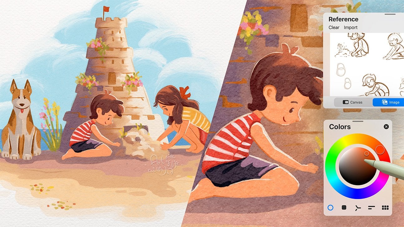
Transcripts
1. Introduction: [MUSIC] What if you could use just one Procreate brush to
achieve an interesting look, nice texture and crisp
edges in your illustration? Join me in the class
to find out how. Hi, I'm Eva [inaudible], an illustrator and designer
based in Central Europe. I've been a
commercial artist for over a decade and I run
my art business online, working on my own
and client project. Some of the most
common questions artists ask me are
about brushes. Which brush should I use? What size? What settings? And so on. Brushes are indeed important for the outcome of your
digital painting, especially if you want to have some texture in
your illustration. In this class, you will discover
how you can turn one of the predefined Procreate
brushes into a versatile brush, so you save yourself time. Pressing the pause button on
your next best brush hunt. As a project for this class, you will be using the
new brush to create a loose, abstract
floral illustration. Basic Procreate knowledge
is helpful but not necessary for this class as
I will guide you through it. Without further
ado, let's start. See you in the class. [MUSIC]
2. Brush Overview: [MUSIC] First, let me show you a few examples on how you
will be able to use the brush before we start working on the project in the
following lessons. You will be able
to use this brush for both sketching and painting. You can fill in a large area with a solid color
that you like. [MUSIC] You can also create beautiful gradient of
transitioning colors. For example, general
shading using dark tones, mid tones, and highlights. While sketching,
you can seamlessly create a texture to your artwork [MUSIC] and at the end, fine tune the details too. [MUSIC] Some of you might already know that
I have one brush which I love to use, especially
when sketching. This is the brush
I'm talking about. Even though I love the
texture of this brush, the thing is that it creates this rough edge and sometimes I would prefer the
edge of my drawings to be crispier and more defined. This is where the new
brush comes into play. Before we get into
the brush setup, let's prepare for
the project with some inspiration
and color palette. See you in the next video.
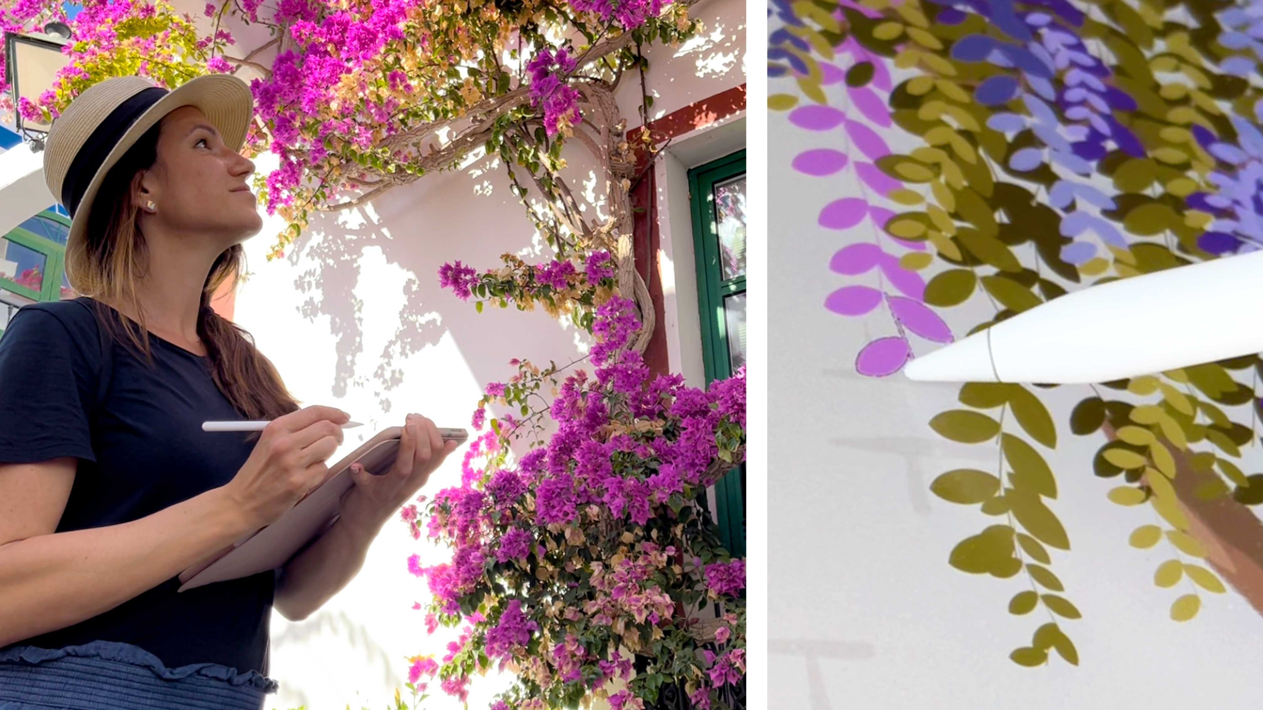
3. References: [MUSIC] If you ever tried drawing something
from your imagination and outcome wasn't as
good as you imagined it, don't be afraid to turn to references and make
them your friend. We all have to learn somehow, and I believe that
using references is the best way to build
our visual library. I really liked to
draw flowers from real life because I just
loved to be around flowers, enjoying the scent, colors, and texture. You can imagine that I take every opportunity I get to
draw flowers and plants, which in turn helps me to
build my visual library and it becomes easier to
draw from my imagination. Therefore, I recommend
that you take time regularly to practice
observing and sketching, even if for 5-10
minutes every day, outside, or at home. Even if you can't every day, 5-10 minutes from time
to time is better than nothing because regular practice
makes a lot of progress. You can use any tools that
you like to practice, observing and sketching
the shapes and details. For example, I either take a pencil and sketchbook and draw mostly line sketches on the bench under a
tree or in cafes, or I practice shapes by shading in a tone
paper sketchbook. When I have a space
in my backpack, I also take my iPad and sketch shapes and
colors in Procreate. If I can't draw on location, I just take a picture and save it as a
reference for later, or I buy a bunch of fresh
flowers for home and practice drawing while enjoying the beautiful house decoration. If you prefer online references, let's take a look at those too. Besides Pinterest
and Google Images, I also like to use Unsplash, which is a stock photo site. The advantage of Unsplash is
that you can use the images in your own project too if you created the
creators properly. You can find many
photos which are great for inspiration
on Unsplash. It has almost everything
you can think of, from people in different poses, animals, places, and
a lot of objects. You can find a lot of
different flowers and flower shapes as a reference
for your class project. When observing the references, after you notice all
the colors and details, try to notice and single out the shapes and
silhouettes too, then try to create a mental
picture of these shapes so you can use them when drawing
from imagination later on. It is also a good thing when you practice sketching
a few silhouettes and shapes of the petals and other details
of the flowers. [MUSIC] To get even more inspiration
on how to draw flowers, make sure to check out my other class about drawing
flowers in Procreate. You can just visit my
teacher profile to find it. When you find the variety
of images that you like, you can save them to your tablet or make a print screen on your computer and send them to your iPad either by AirDrop, through Cloud,
Dropbox, or email. As you can see, I collected a few images which I like
for the flower shapes, as well as for their
lovely color combinations. In the next lesson, let's talk about
the color palettes for our class project. See you in the next video. [MUSIC]
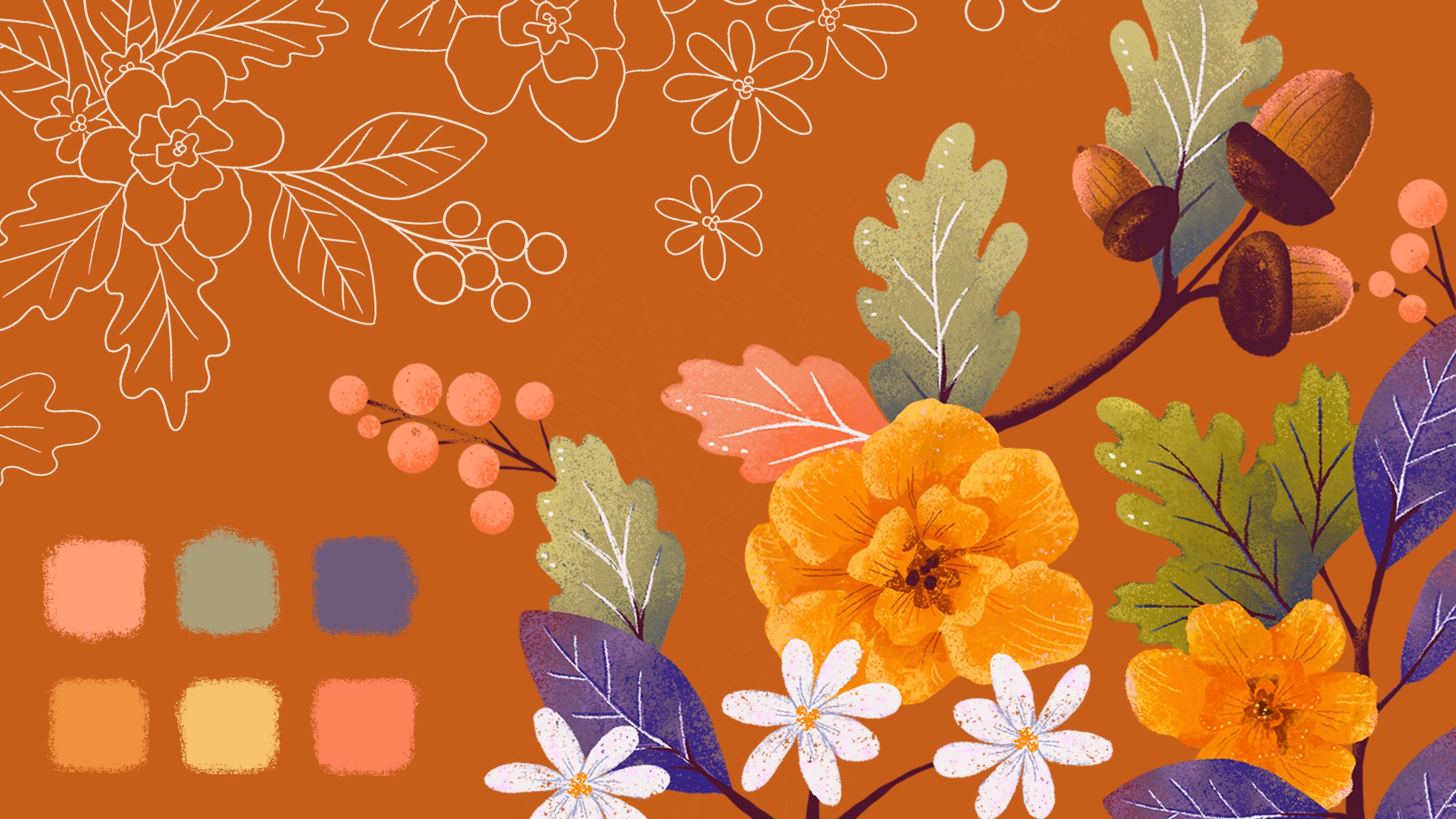
4. Color Palettes: [MUSIC] In this lesson, you will discover how you can use different stock photos with similar subject to build a limited color palette for
more balanced artworks. To bring your reference images
on the side of your iPad, swipe up to see the icons first on the bottom of your
tablet and then drag the camera row window
to the side so you can have your references at
hand when you need them. Here, you can see my color inspiration
for the class project. Here I first selected the darker and
lighter orange tone, and afterwards the yellow as a supporting color in
this color palette. As you can see, it's inspired by the flowers
in this photo reference. To balance out the warm
orange and the yellow colors, I selected few greens inspired by the leaves and
greenery in the bouquet. Let me show you another example. As you can see, I'm using
a limited color palette. Why a limited color
palette, you may ask. Overall with a limited
color palette, you can create a
greater balance in your illustration because it is easier to create
color harmonies. In other words, to use colors
that work well together. If you have too many colors, it is more difficult
to combine them well. Also, a limited
color palette means you have less chance to
over mix the colors. This makes your life easier. In addition to that, limiting your colors also
allows you to paint and create faster as you don't have to make too many hue color choices. What is more, by using a
limited color palette, you can spend more
time focusing on elements of your illustrations, meaning what to draw, and on your composition as well. From this photo reference, I'm selecting the
purple as one of the main colors for
the new color palette. Then I will add a
lighter version of this purple to support the darker one in
this color palette. As a third color here, I'm adding even lighter value. This time, also little
bit warmer hue, inspired again by the flowers
in the bouquet as you can see in the pale rose or a pale color of the tulip
there on the right top. [MUSIC] Then if you don't see the colors properly, you can also test out
your color choices and color palettes against
different backgrounds. Here I can select darker
background or I can switch off the background so I would see it against live gray. [MUSIC] As you can see, I'm looking at the
different reference images for a variety of color palettes. This next bouquet is
quite similar in colors, so I can adjust only few color hues from
the previous palette. To quickly test more swatches, you can also copy the layer and replace only few
hues in the palette. To draw within the shape, just activate the Alpha Lock. [MUSIC] If you want, you can sample the
colors directly from the reference photos
with the color picker. But I believe it's
better to practice just using the color
wheel and try to observe the colors from
the photo references without sampling directly from the photo with the color picker. Like that, you're practicing
more of the warmer hues, colder hues, and overall
noticing the colors better. [MUSIC] I prepared these reference
images for you so you can practice building limited
color palettes as well. You can download them in
the resource section. [MUSIC] When you sample few
colors on your Canvas, you can use the eyedropper on your existing colors and adjust the hue and value further with the sliders on
the color wheel. [MUSIC] Outer color wheel to adjust the hue and inner
circle to adjust the value, or in other words, the lightness or
darkness of the color. [MUSIC] Now let's move on to the
next lesson where you can find out how to create
your new Procreate brush. [MUSIC] See you in
the next video.
5. Brush Setup: [MUSIC] Believe it or not, you can actually achieve so many different textures and effects with just one brush, as long as you know how to take advantage of the brush settings. Essentially, this one brush becomes the equivalent
of having dozens of brushes on hand simply because the settings
make it so versatile. In here, we will be using one of the brushes which can be procreate and changing its
settings to make it versatile. How cool is that? You don't have to
buy a whole new pack of brushes and just adjust with you already
have. Let's do that. Tap on the brush icon and
in your brush library, find the sketching brush folder. You can see different
brushes here. The ones with the
little wave icon on the top right corner next to the brush name are either adjusted brushes or
imported brushes I got. In this sketching folder,
find these brush. Click on it, so it highlights, and then swipe to the left
to duplicate the brush. Always duplicate the brush you
want to change in case you want to go back to the original
brush with its settings. Also, always try to keep
your brushes organized so you can quickly and easily find them when you
want to use them. When the brush is highlighted, you can drag it to the new
folder. Let's do that. To drop this duplicated brush
in the new brush folder, just hover over the
folder until it opens and then drop
it into that folder. You can rename the folder
with the relevant name. For example, texture
sketching, so you know, what do you want to use the
brushes for in the future. When you want to create a new folder in this
brush folder library, just swipe down on the
list of brush folders. Then on top of the brush list folder
plus sign will appear. When you tap on it, you will create a
new brush folder that you can easily rename. You can categorize and
move your favorite brushes based on your style,
projects or topic. To delete a folder you don't want anymore, just click on the wave
squiggly icon on the left and the pop-up window will open to adjust or
delete the folder. I will delete these
examples folder for now. Now, let's look at the settings
of our duplicated brush. If you don't know, on the
drawing pad on the right, you can always test out the brush while
adjusting the settings. Now, go to the properties
tab of the brush, which you can see in
the list on the left. Then adjust the
maximum size option under the brush behavior
options section. You can see that the
brush preview on the brush drawing pad
is already changing. How cool is that? What this means is that we are
able to use this brush for coloring and drawing
big surfaces quickly and with texture. Also try to test out
different sizes and the maximum size option to find out the right percentage
to fit their preferences. Let me show you what are the other aspects
that you can adjust. When you are in the
brush settings, you will see the stroke path
tab as one of the options. Then you can click on
the "Shape" button to see how the brush tip
shape looks like. You can create a new
shape and upload it here as well to create a different
effect when drawing. You can import a new shape by clicking on the "Edit"
button on the top. After importing a new shape, this preview should
be white on black, and you can invert this
with a double-tap. In addition to this, the brush has a grain
texture which you can adjust by uploading
different textures here too, by just clicking on
the "Edit" button. The current shape of the brush tip is quite
useful for sketching in my opinion because it has a flat top part and
the rough bottom part. The flat top part helps you to create crisp and clean edges, and the bottom rough part
allows you to create soft texture gradients
when blending the colors. I will be showing you
how you can use it for both blending and crisp edges
in the following lessons. If you have more similar
brushes with different shapes, you can use a stamp preview to see the shape on the
list when drawing. I think I still prefer
the brushstroke preview, so I will change it back. But at least you know, you have that option there. If you want to rename the brush, obviously to find it easier, just go to the about the brush section and type on the name on top
of the screen. When you are happy,
just tap "Done". That's it for the settings. Now, let's practice
with the brush in the first exercise
in the next lesson. See you in the
next video [MUSIC]
6. Using the Brush: [MUSIC] In this lesson, I will show you how to work
with a pencil pressure for blending the brush size
and the Alpha Lock. In this first practice example, we will draw leaves. Why leaves and not
flowers just yet? Well, the shape of the leaf is more simple compared
to the flowers. It is great for practice, especially if you are just starting out using new brushes. On a new layer, I will choose a
mid-value green color, not too dark and not
too light as we will be adding darker and lighter
tones on top later on. If you remember, I
saved this green in my previous color palette
exploration from references. Please feel free to use
any other mid-value color from your own color
palette exploration for this exercise. Select the new brush
to draw with and set it to bigger brush size and
create an almond shape. A bigger brush tip
size helps you to create a more flowy
and organic moves. You can modify the size of the brush with the sliders on the left side of the screen. Try to use high pressure
with your pencil to achieve solid and opaque
color for this shape. Here, we are using the drag and drop function of the color instead of the manual coloring. To fill the color shape, just drag the color from the
top right into the shape. Before releasing the pencil, you can adjust the threshold. Why to adjust the threshold? Just to avoid the white
halo around the fill color. You can see the
threshold percentage on top of the screen. Drag the pencil from left
to right without releasing the pressure to adjust the threshold and see the
amount of fill color. Then do the same
for the other leaf. Outline and drag
and drop the color. If you are wondering why
dragging and dropping the color and not manually
coloring in the shape, well, drag and drop color it's faster
as you can imagine. The disadvantage of this
drag and drop function is that you can achieve only
solid color and not texture, which you can achieve
with manual coloring. But we don't need the texture
on the base color just yet. We will add texture by adding more colors and
blending later on top. Now, let's reduce the brush tip size to adjust
the shape of the leaf. For example, you can make
the leaves more pointy or more round depending
on your style preference. Why using small brush size? Well, you have more control
over smaller shapes, edges of shapes, and details with a
smaller brush tip size. Making the brush tip size
smaller not only helps you to control the shape details
in more precise way, but it also helps you to
create nice crisp edges. You can modify the
size of the brush with the sliders on the left
side of the screen. Because I'm now happy with
the shapes of the leaves, I will continue with the other shapes on
the separate layer. I will mix up the
leaves as they are now. To continue on the layer below, I will draw a branch for
the leaves to sit on. [MUSIC] If you struggle with drawing more straight and smooth
lines for this branch, the brush settings
can help you through. Open the brushes, duplicate the brush
again so we can create another version of this brush
for the smooth strokes. Then, adjust the stabilization. This quick adjustment is
very useful in this case. [MUSIC] Now you have another version of this brush for smoother strokes. This is a pretty cool
adjustment if you feel like your hand is not steady
when drawing just yet. [MUSIC] When I'm happy with the
shapes of the branches, I will merge the layers
together with the leaf layer. After merging these layers, I can blend the colors together and create
a nice gradient. Then tap on the layer to
activate the Alpha Lock. This function locks
the pixels so you are able to draw within the shapes
that you already created, the leaves and the branch. Now, I will use a lower pressure with my
pencil to blend the colors. This way I can create smooth transitions of
colors with subtle texture. [MUSIC] To speed up the
coloring process, you can use the other hand, the one you are not
using for drawing, to activate the eyedropper. Then continue
blending the colors. Then choose a darker
and lighter value of the green you started with and practice blending the colors with low
pencil pressure. [MUSIC] As you can see, I'm using the
eyedropper a lot to sample the colors
from the gradient. This helps me to create
smoother transitions, and I'm always
sampling the color in between the lighter
and darker tones. [MUSIC] You can also test out tilting the pencil to try different
blending outcomes. In addition to that, you can try out shading
and building up the colors from one
side to another, and the other way too. From top to bottom, from left to right, and so on. I like the gradient
the most while building the colors
from right to left. That way you will utilize the textured end of the
brush shape for blending. It almost behaves like a soft edge brush with
this low pencil pressure. [MUSIC] If you are wondering why I'm talking about soft edge brushes. Well, it's because soft
edge brushes can also help you to create smooth transitions
and realistic coloring, while hard edge brushes help
you scalp their shapes. I generally use approximately
30-50 percent pressure when shading and
blending colors. I use 100 percent pressure for the base colors when
defining the shapes. [MUSIC] To achieve even smoother edges, you can reduce the
brush size and erase some parts on
the outer edges. [MUSIC] We have nice leaves with
smooth gradient transitions, some nice texture, and crisp edges with just
one brush, I love that. I hope you do too. In the next lesson, we will continue practicing with our new brush and start with
the flower illustration. See you in the next video.
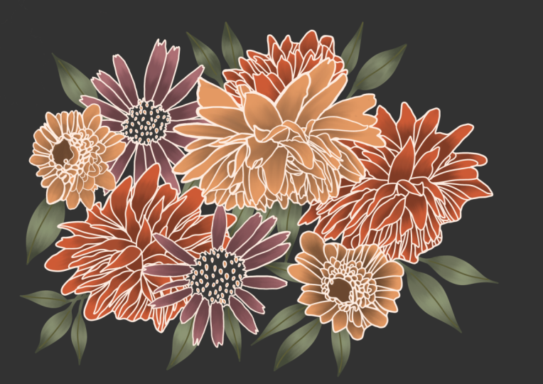
7. Base Colors: [MUSIC] In this lesson, we will start with the
project illustration, and practice more with
our new sketching brush. I will be using
the colors that I selected in the color palette
stage of the process. Let's start drawing
some flowers. We are in a new Canvas, and I'm using Canvas
in a medium size, in this case, A4 which is
around 8 by 11 inches. A higher resolution
is usually better than a smaller one when
creating new Canvas. A higher resolution
Canvas allows you to create illustrations
with lots of details. That is a catch though. The bigger the resolution
Canvas you use, the harder it is to
use the files because the document size becomes
massive and loading, saving, and exporting time can be tricky
in some programs. Procreate is pretty fast, but the layers are limited with bigger size Canvases
which is not great. To sum up, try to use bigger
Canvas resolution that is not massive and it doesn't
limit you too much. In this illustration, I'll be using a process of
first laying down the base colors
and silhouettes of the flowers with a
bigger brush size. Then I will be defining
the petal shapes with a small brush size and more
delicate brushstrokes. [NOISE] Afterward,
I will be adjusting the base flowers
silhouette shape to match the petal
shapes on top. I find this process quite fun
as I'm drawing the blobs of color for the flowers silhouette rather than a line art first. When sketching, I'm not too
precious about those shapes. Compared to if you start
with the line art, you have to be more precise when applying the colors
below the line art. I believe starting
with silhouettes is more fun way to play with
shapes, colors, and brushes. Here, you let your
creativity flow and lay down abstract base
shapes for the flowers. [MUSIC] You can invent the shapes from your memory
or use the reference. For this composition, I'm using few bigger
blob color shapes and few smaller blob color
shapes for the flowers. [MUSIC] When you are not sure what
flower shapes to draw, just use reference
as I mentioned. Remember, if you are
using a reference, always try to notice
and get inspired by the overall silhouette
of the flower first before adding any details. When drawing the initial shapes, I'm using quick loose movements. Try to use a bigger
brush tip size, which will allow you to
quickly apply colors and more organic flow to
build up your shapes. You can either use soft or
hard pressure depending on the amount of texture you want to see in
your illustration. High pressure has
less texture and low pressure has more
texture with this brush. When drawing the shapes, try to create a visually
interesting composition. I'm trying to balance
out the bigger shapes of open flowers together with smaller half closed
flower shapes. To make the drawing more lush, I'm adding few leaves
around the flowers. Try to combine
different flower shapes as we saw in the references. You can experiment with the
placement of the flowers and the leaves until you
have composition you want. I talked more about the
flower compositions with different examples in my
drawing flower class, just visit my picture
profile to find it. To explore your
own compositions, look at the different
references. When drawing the leaves, you can try out
different shapes. For example, almonds shape, teardrop, or oval shape. [MUSIC] When you are happy with
the base color shapes and the composition, you can add gradient
colors on the flowers the same way as I showed you
on the leaf example. First locking the
layer pixels with the Alpha lock and then
with a low brush pressure, you can create gradients. Some flowers, I imagine in
a top view and fully open, and other smaller flowers, I imagine in a side
view and half open. On the fully open flowers, I'm adding darker tones in the middle because that's
usually where the shadows are. The other flowers
on the side view, we'll have a darker tone
on the bottom side. While drawing, you
might find out that you want the brush
tip size even bigger, because maybe you started
with quite big Canvas. If that's the case, you can just adjust the
settings in the brush. [MUSIC] You can observe and learn about the shadow
placement when you're looking at the flowers in the real-life or
in the pictures. [MUSIC] You can add more colors
to create little bit of color variation in
the composition too. As you can see, I'm
adding another color to this composition on some
of the smaller flowers, but only on the
smaller flowers so it doesn't overrule my main
limited color palette. [MUSIC] Now, let's move to the next
lesson where we will define the flowers with more delicate
and precise brushstrokes. [MUSIC] See you in
the next video. [MUSIC]
8. Define the Florals: [MUSIC] In this lesson, we will create
flower petals with a thinner brush strokes on
top of the base colors. I sometimes feel like
it looks like magic. You can change random blobs
of color to something which looks like a flower
by just adding few lines. Let's do that. Before
adding any details, I like to test out
the brush tip size on the side of the canvas
before drawing. Now create a
separate layer above your base color layer with
a smaller brush tip size, start drawing thinner lines to form petals of the flowers. Generally speaking, try
to use smaller brushes to help you create lovely
details in your illustration. I'm using high pressure
when drawing to create opaque,
solid, crisp lines. [MUSIC] I'm using 60-100 percent of the pressure to achieve
this crease details. Don't worry to get
exact pressure, and also don't worry
about following the exact silhouette
of the color base. We can adjust that later. That's what I find so
cool about this process. [MUSIC] As a reminder, if you don't draw from
real-life reference too much, don't forget that
in a real life, the bigger petals are
usually on the outer edge of the flower and smaller
petals are in the middle. I am following the rule from bigger to smaller petal shapes. If you're using reference, try to notice the shapes of the flower petals to
create these lines. When looking at the references, notice where they have bigger
petals and smaller ones. Also notice if they have smooth edges or the petals
have more bubbly shape. [MUSIC] Here I'm using an eraser
to adjust the base shape. We will talk about this
method more in a moment. [MUSIC] Then to balance out
your illustration, try to match the
amount of details of the flowers and add few
lines on the leaves too. To add variety, try to play around with
different details on the flowers and on the leaves with this
small brush tip size. For example, you can
add details like dots, swirls, wave shapes,
or more lines. These types of details
can add a lot of personality and style
to your illustrations. Try different ones to find your favorite styling
and the details. [MUSIC] When you are happy with
your line details, defining the flower petals. You can adjust the base colors underneath to match the lines. To do that, you
can erase parts of the flower base from the
flower color base layer. I really like this
scouting method and working with an
eraser when drawing. Yes, you hear that correctly. What I mean by this is that you don't have to limit
your perception of an eraser as something that you only use and need when
you make a mistake. In traditional art,
a lot of people use erasers to create
highlights too, for example, in pencil drawings or in charcoal illustrations. Because you can of
course create highlights by erasing parts of
the dark values. As you can imagine, you can use the same principle
in digital illustration. For example, if you draw
too much in one area, just switch over to eraser and take some of the shape away. Another great thing
about this is that you can use the
eraser to clean up or soften edges depending on the eraser brush
hardness and edge. To use our new
brush as an eraser, go to the eraser icon
and select the brush. To achieve hard edges, use higher pressure when
erasing with this brush. You will see another example of scouting with an eraser
in the bonus lesson, when will be adding birds. Afterwards, continue adding lines on top of the
flower shapes with a small brush tip size and higher pencil
pressure to achieve crisp lines and high opacity. [MUSIC] You can also try using light
color lines for the petals, or darker color lines. Or try using both. Lighter on one
flower and darker on another flower and see which
style you like better. Another fun thing about this
process is that you don't have to be precious about
creating these lines either. They can be verbally and messy and I think it
will still look cool. [MUSIC] In addition to the leaves
in color and as an outline, you can test out adding few smaller scale flowers to fill empty spaces
in the composition. [MUSIC] At the end, you can add more dark values as shadows to some
of the flowers. For simplicity, I'm adding the shadows only
to some flowers. The darker flowers I'm
keeping without shadows, so this sketchy
illustration doesn't become too detailed
and too realistic. I'm adding few darker tones, mainly where the leaves
are overlapping to create more sense of depth and
little a bit of realism. As a reminder for blending and softer transitions
with some texture, I use around 50
percent pressure. Overall, very little pressure helps you create smooth,
realistic shadows. Well, bigger pressure helps you create hard edges and to scalp. You are done with your
flower illustration using one brush and just modifying the brush
deep size and the pressure when you are
using it with your pencil. [MUSIC] In the next lesson, you can see how I will
add few birds with the same technique to add
variety to our illustration. See you in the next video. [MUSIC]
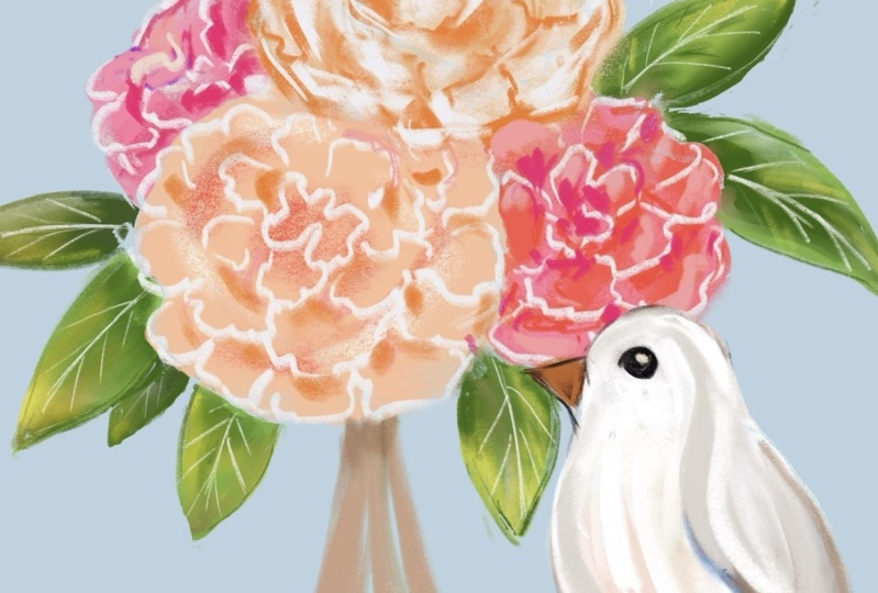
9. Bonus Details: [MUSIC] In this bonus lesson, I will show you how you can add additional elements to
your floral illustration. For example, I will
be adding a couple of birds to make it a little
bit more interesting. Here I will be using the technique of
sculpting with an eraser, as I mentioned to you before. For the birds, I'm selecting a light and pale
colors so they will stand out against the
already colorful backdrop with all the flowers and leaves. The pale color will also match with the light lines
on the flowers. First, I'm focusing on the overall shape of
the birds by marking their approximate
silhouettes and using simple geometrical shapes. I'm using a circle shape for the head and oval shape
for the body of the bird. [MUSIC] Then using the eraser, I'm sculpting the shapes to end up with more defined bird shape. Again, please feel
free to use references in the same way as I showed
you with the flowers. [MUSIC] Then as you can see, I'm using a triangle shape for the beak and a diamond shape
as a base for the tail. To achieve my simplified
style of drawing birds, I will erase parts at the end of the tail to end up with three
geometrical feather shapes. Of course, please try
different styles. Explore drawing more
feathers maybe, longer or shorter
tail or curving the feather shapes on the
tail outwards or inwards. Once I'm happy with the overall
silhouette of the birds, I will use the alpha lock
to lock the pixels and add subtle pale gradient to the tail and the
belly of the birds, so they are not just white. Another idea is to try different colors to add to
these birds as a decoration. You can try out, for example, light pink, orange, brown or yellow, which I think would still fit nicely with this
pale base color. [MUSIC] Then on a separate layer, on the top of the base
white color layer, I will add few details
to define the birds. The eye, beak, head, belly, and few
lines on the tail. I'm using the small tip
size of the brush and high pressure to achieve
crisp lines again. [MUSIC] At the end, we can add an additional
subtle gradient to the birds for more
visual interests. To create these gradient
decorative shapes, first I'm using the
bigger brush tip size. If you want more flow and smaller line when drawing these, you can go ahead and choose, again the stabilized option of the brush which we
created previously. This will help you to create nice flowy and organized shapes. [MUSIC] When I'm happy with
the flow shape, I will activate the alpha lock and this time with a shortcut, I have set up in the settings. If you're not sure
where to find it, it's called the
quick menu setup. For more tips on shortcuts
and deep dive on Procreate, please check out my
class on Procreate which you will find in
my teachers profile too. After using the alpha lock, I will add one more
subtle color as a gradient to this
flowy decorative lines. When creating this
additional color, I'm using very
small pressure with the pencil to achieve
smooth gradient. [MUSIC] Again, regarding
different style, try drawing the wings
maybe in more detail, or you can add feathers
on the head of the birds. [MUSIC] Another idea is to
try different colors. For example, for the beak, or add different
colors on the wings, or change the color of the tail instead of drawing
decorative gradients. [MUSIC] That's it. I really
like this process. Using just one brush and creating nice
sketchy illustration with texture and
smooth gradients and crisp details
and crisp edges. I hope you love your
illustration too, and I can't wait to see it
in the project section. [MUSIC]
10. How Did it Go?: [MUSIC] How did it go? I hope you had a
lot of fun using the new brush in your
floral illustration. If you want to expand on the knowledge you
learned in this class, you can watch my
class about florals, compositions, colors,
and Procreate. Just visit my teacher
profile to find them. Don't forget to share
your class project in the project section because I can't wait to see
all of your awesome artworks. If you would like
me to also share your illustrations on Instagram, please tag me when
posting so I can help you and your art to be
discovered by more people. If you have friends or family who would
like to learn about how to create a versatile
Procreate brush while drawing flowers, share this class with them. If you like the class, please leave a review
because first of all, I learn a lot from your
constructive feedback, and second, you will also help
other students to discover the class and you may contribute to their
artistic journey too. If you have any
suggestions or questions, please leave a comment in the discussion section because
I would love to help out. Thank you again for watching and see you
in my next class.
 Iva Mikles, Illustrator | Top Teacher | Art Side of Life