Transcripts
1. Intro: If you enjoy
exploring new media, creating vibrant
and bold sketches, and just learning by having fun, then this is the class for you. Today, I'm going to be
using some pastels, but not any old pastels. We're going to be using
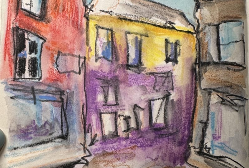
water soluble pastols to create a really fun, happy and alive urban sketch. Through a step by step approach, where we will just
create some art, I'm going to show you all the different techniques that I use and I use these pastols
inside in my studio, but also outside when I'm on holiday and when I
just want to relax, and that is exactly what I think this process and these
tools are wonderful for. If you don't have these exact
pastels, it doesn't matter. In the supplies lesson, which is coming up as the next video, I'll show you a few different alternatives you can use from common wood colour pencils through things like
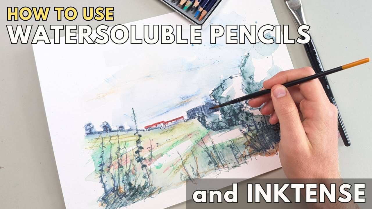
ink tense blocks. If you've seen any
of my other classes, feel the structure
is very similar. We're going to enjoy ourselves, we're going to be creating art. Along the way, I'm
going to give you lots of hints and tips to make you feel comfortable and confident to go out there and do
your own thing as well. By the end, you
created something fun, something loose,
something happy, a really cracking urban sketch using water soluble pastels or one of the alternatives which we'll talk about
in just a second.
2. Supplies: I'm super excited to
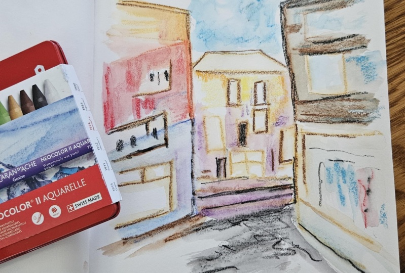
show you these pastols. These are Karen Dash's
new color two aquel. They are water soluble
wax pastils or water soluble crayons depending on what terminology
you want to use. You can see they come in all
sorts of vibrant colors, and that's what we're
using in today's class. Now, of course, if
you don't have these, there are other brands of
water soluble pastels. You can also do many of
today's techniques using soft pastols and a bit of water or even things like
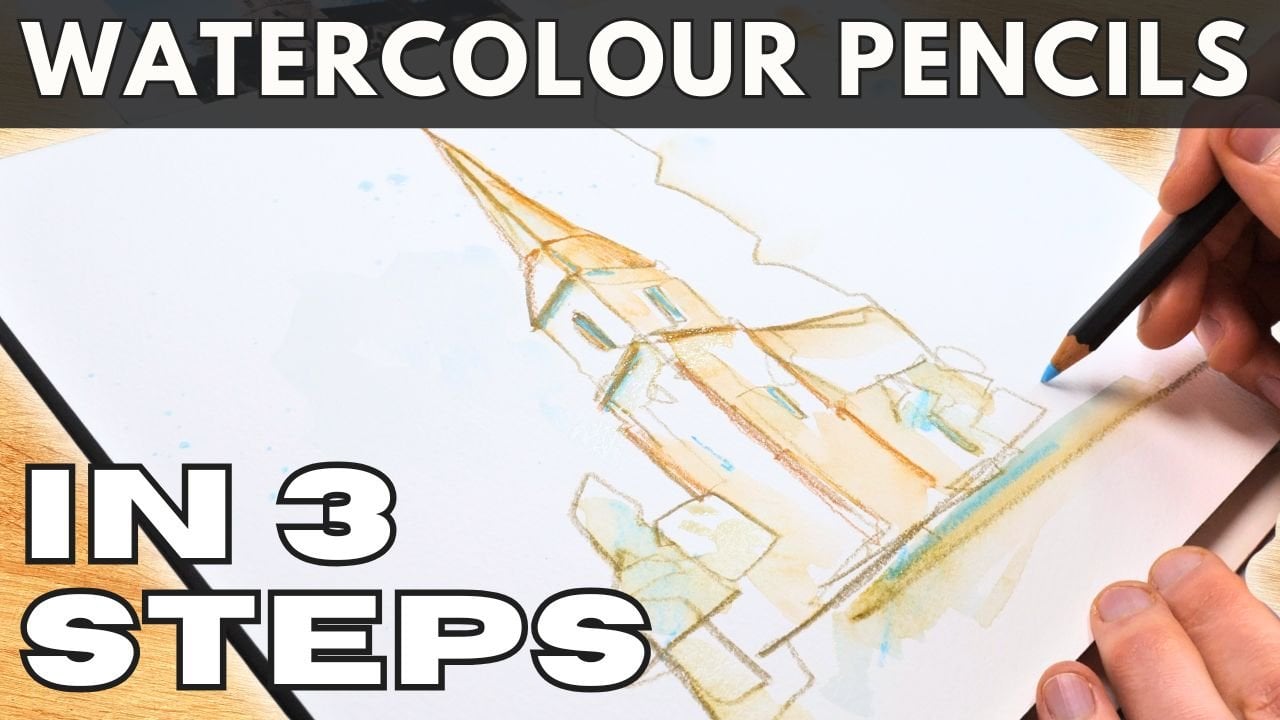
watercolor pencils. If you want to join in and
you don't have exactly these, then don't worry about it. Just make sure you're
using something water soluble and you'll
be able to have fun. Now one tiny little note here, we shouldn't confuse
these with these, which look almost identical. These are Karnashs
new color one. The only difference
is that they say new color one and they've
got these little dots on. Now these are pastels which
are not water soluble. Many of the techniques
we're using, we can't use with these. To sharpen my crayons, I'll occasionally use a
simple pencil sharpener. That's something else I'm using. And all I need today is
a water brush or two. These are brushes with
a bit of water in the belly and then
a simple nylon tip. You don't have to
use a water brush. You can also use a normal
brush and a big pot of water. Last but not least, we have
some kind of sketchbook. This sketchbook is
one of my favorites. I got lots of
exciting fun things in here already, lots of ink, lots of watercolors,
lots of doodles, and even little
notes and things. Now this is quite good
water color paper, but these crayons will work on any decent sketching
paper as well. Just make sure it's
reasonably heavyweight, something above 150
gram/square meter or about 70 pounds per meter. There you go. That's
everything you'll need to have a lot of fun.
3. Lines : Now rather than taking
you through a load of individual period lessons, what I thought we'd
do in this class is we would look at
an exciting scene. This is AC. You can download the reference photo in the class resources, and this scene is from
MevGissi in Cornwall. We're going to use this scene and a series of little steps, bite size lessons to
discover exactly what these pastels can do
so that you can then go out and sketch
anything with them. So if you get your
pastels or your pencil, whatever you happen to
be using, get them open, get them ready.
Let's get started. Now, step one of our
process is just going to be essentially drawing,
doing some line work. For this, I just need a
couple of nice colors, and I need them to
be fairly sharp. I'm going to take
this pink color, and I'm particularly
choosing colors which are quite light because the light colors will fall back when we add more
layers, more depth. I'm also going to choose
this lovely violet color. Sharpen them enough. I don't
want to waste too much of the pastel and that is what I'm looking
for, little points. With our points, I can
pop away the rest of my colors and we can just start off by
doing some drawing. What I'm looking and we can just start off by doing some drawing. What I'm looking for in
this is some big shapes. Look at this. We've got these
big lines, these big marks. I'm just going to use my little
pink salmon pastel here. Firstly, to do these shapes. If you've done any
of my other classes, you'll know I love
talking about shapes. In the front, we have these little sandwich
board more shapes. And the tip here is, it doesn't matter at this stage, especially if you get things a bit all wrong or a
little bit loose. In fact, you'll see that being a bit
loose and a bit wrong might even make the rest
of the process more fun. We're going to start
off by just exploring the idea that we can use
these crayons to draw. They go, I've drawn
my big shapes. Now, I'll swap to my other pastel and there's not too much of a scientific
approach going on here, apart from keeping a light
color to start with, I'm not too worried about
what exact color I'm using. I just use these colors
because I like them. That is what I love about
playing with new toys, playing with new media. Just getting to experiment. I really encourage you to
use things like this as a highly experimental
and fun medium. Here we go. Picking
out more shapes, picking out here
the smaller shapes, things like the windows and these interesting
elements of our building, not just the big shapes,
these big shapes, but also these interesting bits, bits which feel
more like details. Notice how my lines
are overlapping and intermingling and having
a bit of fun on the page. That is the feel
I'm looking for. Also doing lots of
joining up of lines and just playful little
movements of the pastels. That is going to help with
a bit of texture later on. That, I think
already is probably step one done, Ali drawing, which means we're ready
to move on to step two in the next lesson we'll
be adding some water.
4. Water: Step two then is, as I said, in the previous
lesson, adding water. I'm going to just use
this simple water brush. Now with this, I've got
lots of water and I can squeeze it and that water
can come out onto my page. You can see when I use
this bit of water, I can activate what
we've put down so I can blend and
smooth these colors out. I can make these purples, move. I can mix them in with the salmons and we can
soften everything out. Here, what I might
start doing is looking, where have we got shadows?
Got a lot of shadows. So the shadows, I might
just apply lots of water so that those
colors move and blend together and create
what I hope will become a nice soft, interesting,
shadowy aesthetic. Because we've kept it really
simple with those shapes, we're going to get
away with doing an awful lot of
movement at this stage. All we're trying to do is
give ourselves a basis, an underpainting is the feel
that I'm going for here. And then we're
going to be able to play with more and more of these ideas as we
build up the layers, as we build up the complexity that's going on in our image. He just have a play.
See what happens. You can get rid of lines. If you want to smudge them and move them out of
the way entirely, you can get rid of
them with a little bit of a gentle scrub. Just be careful you don't overdo things and damage your paper, keep it light with the brush. But start to build up
that little aesthetic. Now notice I've left
some white spaces. I love white spaces, not
filled them with water, not filled them by movement. Like that, I've applied
my first layer of water, ready to put the lid
back on this and move on to adding some more of
our super fine pastels.
5. Blocks: The brush is away,
the pastels are back. And this. This is where
we have a lot of fun. I've even had to
roll up my sleeves, you see. We're going to dive in. We're going to look
for colors we can see. We're going to invent some
other colors as well. Let's just start here. We got obvious reds, haven't we? Nice. Interesting bricky reds. We are obviously limited
in our colors to some extent by what's
in in the box. They do mix and they
do blend a bit, but primarily, I like using
these for their vibrancy. Here's my take on these reds. We've got some reddy scarlety touches and
a bit of orange. Now we can use the
flat of these. We can use the nib like
we did before to draw. We just block in a bit of color. Look at this beautiful
pinkish tinge coming in. I'll just try the last
of my reds as well. We can get away
with adding lots, making it really
interesting, really busy. And then move on. Don't fill it. Remember with the water. See how much we can
move these pigments. So don't need to fill
this whole area. We're just going to add
a few representative colors and move on. What's next? Well, that's here. We've got this lacy blue. Maybe I'll make it a
little brighter with this blue turquoise and we can even bring back actually
what we're using before, this lovely color we
used to do some drawing. With that, I'll do
a couple of marks. And it's much softer
color, isn't it? I'll leave a lot less pigment on the page and then move on. Here we've got this
bright sunlight. I'm just going to do
something really simple here. Take this bright
lemon yellow and apply it a couple of marks
because although it's white, I'm using this
yellow to go white. It's actually sunshine,
which is actually yellow, maybe even a little bit of
orange in there as well. Next, we move down. We've got more of these shadows. Now, I quite like
these shadows to be purples and
lilacs and things. I think it feels really
interesting doing that, and this is where we're moving further and further
from reality. We get to play around.
What colors do we have? What vibe do we want? Maybe you want to make
it all green and brown. Maybe you want to
do like me, make it all vibrant and happy. And last but not least, we've
got these murky touches, and this is where I
will do some mixing. I know if I take a warm brown and a blue and I mix
them in watercolors, for example, they'll
become neutral. This is quite a
neutral, dark area. Rather than applying
black to it, I'm going to do the
mixing approach. I'm going to do lines. We have these lines
coming through our image. We do lines of brown
lines of blue. You can already see here, look, where they crossover? Do
you see how it's neutral? Hopefully, you can
imagine when we add our water in the next step, those neutrals will build up
and become really exciting. Last but not least,
it's feeling a bit empty up here and down here. I'm actually going
to leave the sky till a little bit later, but I will jump
down here and here, maybe I will use just
some nice grays. I don't want to
overpower the image, but I want to get the feel of there being something
going on here. What's next? Well,
you guessed it. We're going to be
coming back with a bit more water and moving
all of these around.
6. Blending: We are back and we are going to apply some
more water again. So you can see the
pattern already. We do some pastel, we do some water, we do some
pastel, we do some water. In doing so, we
fill up the page. We make it more interesting.
There's more depth. Now with this layer of water,
I'm going to start with my lightest seaming colors, which are these bluey
purples down here. I blend them together, and then I'm going to move them. So this gray can move
up and we can just be very playful and abstract. We can soften everything out. And we're going
to be able to add a lot more structure at the end, which is so close already. Up here, we've got
some bright reds. Look what happens when
we add that water. It just comes to life. Absolutely amazing.
Like I said before, the same thing will happen
with watercolor pentils. If you want to try these ideas
with other media as well, maybe you're already doing
it with these pastels, but you're looking for
something else to do next. We'll try repeating
these ideas with watercolor pentils and
other water soluble media. Now I'm going to just soften
a little bit of this. But I quite like the
scratchy textures, and it's okay not to
add water everywhere. We might want a
lot of variation. We've got soft textures,
scratchy dry textures, and then we'll
move over here and get some more of that wet, neutral feel by mixing. But because we apply them in different layers,
we'll get variety. We've got some blues
coming through, we've got some browns, then in other places we've
got real neutrals developing that murkier feel.
I can use this. I can pick up some of
this pigment here and I can draw with it
with my brush so we can pick out other
shadows that we haven't actually done with our dry area. Here, this gray, bit more
water. Look at that. Just swamp the
page a little bit, and then we can use that gray and get it moving
around for us as well. Look at waters
moving everywhere. That I think is a good sign, having a bit of fun on
our page, there we go. That's all we need to
do for this stage.
7. Sky: Now, in this little section, we're going to do the sky
and here is where we can explore some other
interesting techniques. If we take our brush, what you'll find is
you can actually just paint so you can
pick out from your past, your pencil some blue
and just paint with it. We don't have to preload
the page with our pigment. You can even splatter.
Look at that. I's really fine,
interesting splatter, which you can then soften
together with your brush. I can pick out a couple
of different blues. That's quite a light blue. Here's a deeper blue. Pop that in there, get a bit of mixing going on on the page. Like that, a bit more
splatter in there. Then we'll go to a
really light blue. This is our turquoise blue that we've already encountered. I can use that to be neat. You can see the brush has already still got
that rich blue one, so we're going to have
to get a bit more of our turquoise, there we go. Now we can neaten
up these edges, get that blue floating
and flowing around. Then what I'm going
to do with this wet, use that blue to imply some
reflections in the windows. Now I know these
windows are actually quite dark except
for these ones, but my windows are
at least going to start with having a
bright blue reflection. There we go. That's a
nice start, I think. It just gives the image a
bit of a lift, doesn't it? Can do some dry textures
in the sky as well, little scribbles, have a play,
make something abstract. There you go, yet another way to use these
amazing pastels.
8. Structure: Like that, we're actually
nearing the end. I know this looks
quite abstract, but that's where our final
magic step comes in. Again, I'm just going to get one of my pastels
nice and sharp. Here's where I think
it's quite helpful to get a darker color. I personally love sepia. I think sepia is a
nice almost neutral. It's actually a brownie tinge. It's not black, so it's not overwhelming and
we can use that to draw and to provide that structure I mentioned
just a few minutes ago. Look, as we draw around it, notice I've left the page wet. I've not waited for it to dry because that gives
us some variety. As we draw, we get this
sudden popping out effect, all these colors suddenly
fill out that page, make it into something
fascinating, or at least that's
my interpretation. I hope that you're
enjoying yourself enough to have that interpretation
of your own work as well. It's really good to
have a positive outlook because it can feel chaotic, especially doing an
exploratory approach like this can really feel
chaotic and scary. Just take the leap, see what happens and then
refine it next time. At least that's my approach. Much more fun I
think than spending hours doing exercises
to work things out. Hopefully you can
see what I'm doing working gradually
around the image, flowing around these
original shapes, going all the way back
to the first step, flowing and floating around to just add what I'm
calling structure, a little bit of direction
to those colors which we've spent ages getting to
float all over the page. We can follow some of
these original lines. We can also add new ones. I could add got this
little rim to the window. We could add that in now,
just a little suggestion. Not trying to be too
neat or too specific. I'd really encourage you
to let this be quite an abstract, fun, alive process. So this line goes into
the sky. I find that fun. You might not, but give it a go. You won't know until you try it, whether you like it or,
you know, if you hate it. But then at least you
tried it and you learn. Find these details again. We've got this lovely sign
here with a window behind it. Since we know we have that sign, we know as well that
we've got a little bit of room to play with some
other colors, haven't we? We've got this now
popping out a bit more. Now that we've been
a bit more specific, bit darker with our lines, and we can continue
this drawing approach. I could find that this has a pinky blob with a couple
of nice blues around it. And then it's got some
yellow in it as well. So we'll take actually
let's make it orange. It really stands out and we
can make ourselves this sign. We can put some more oranges in here and under there,
just have it play. See what happens. Get that
feeling of that sunlight. On the top, it feels a little
empty on top of this roof. I'll just do a tiny
bit of light texture. In the windows, we've got
all snicty little details. Let's play with those ideas. We can use some blues, just picking up
almost random things. Things I've used already
is what I'm aiming for, but not thinking
too hard about it. I'm just getting the impression
of these busy windows, block in a little bit again. There we go. That
one's interesting now. Maybe we do the same over here. So small shapes, small marks to make it feel
like there's a lot going on. We can even block in some of the darker tones of
these windows now. All these dark details just suggest a lot of work
and effort has gone in. In fact, we're just having a play. We're just
having a bit of fun. But it's simple big bold marks. That's all we're
all we're doing. It feels a bit funny without
the blue in the window here, and I just missed out
at the beginning, there we go, a bit
more blue to go on. Then on top of that blue, bit more of our darks, just like we have over here. Got a big sign I
missed out as well. And you can hopefully,
again, just see what am I doing? I'm
just having a play. I'm wondering around
go, miss that out. Maybe there's an interesting
way I can explore. We can add interesting details. All these cobblestones.
Let's try those. Let's do a little
flicks and flex with our little
brown pastel here. We've got different color of cobblestone then on the left, or gray, so we'll do different
flex and flicks over here. Then the background,
gets a bit darker, a bit more moody, a bit deeper. So we'll do some more of that purple and bring it right to the edge
of the building. Because that edge will help this building
hopefully pop forward. And then I'm going to
keep this as part of the same step because
what we can do now, of course, is activate some all that that
we've just done. We can activate, we can get these blues and reds
mingling and softening. We can have a fiddle, we can
get that dark in the roof. We can get this shadow coming down here a
little bit more. We can have a play just moving and flicking around
with our brush. Don't over do it this way.
We've added the structure. We don't want to lose all of that wonderful hard
earned structure. We just want a tiny bit
more pizzas on top, something just to make it
more vibrant and loose. If you wanted, you
could keep going. I'm tempted just to do a
couple of brick marks, a couple of little bits in here. And maybe I'll take some purples and do some brick
marks with those as well. Then maybe what we've
lost a tiny bit of is the sense of these
horizontal stripes, so let's get those back little
bit. Just a little bit. Easy. It's easy to
overwork at this stage. So at the point where you
think, Oh, what am I doing? I'm fiddling, which
is very easy to do. Then take a step back,
pop your initials on and admire the fun
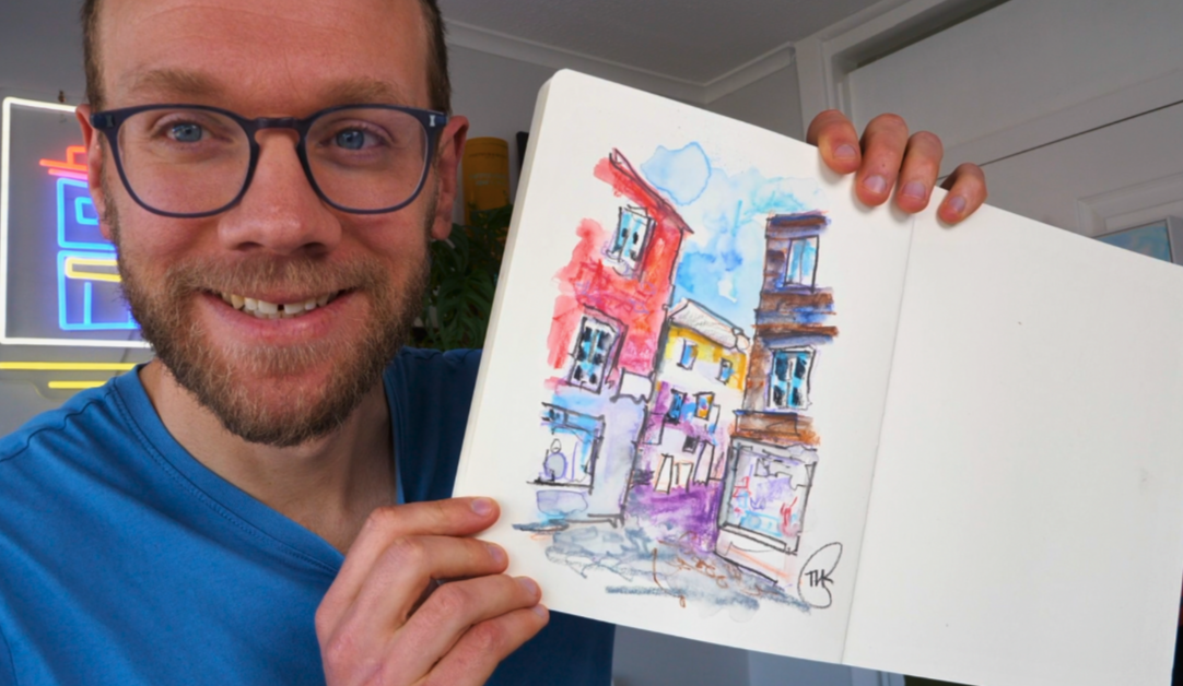
that you've just had. There you go, This is
my scene complete.
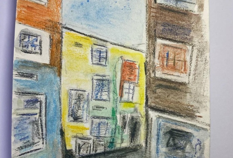
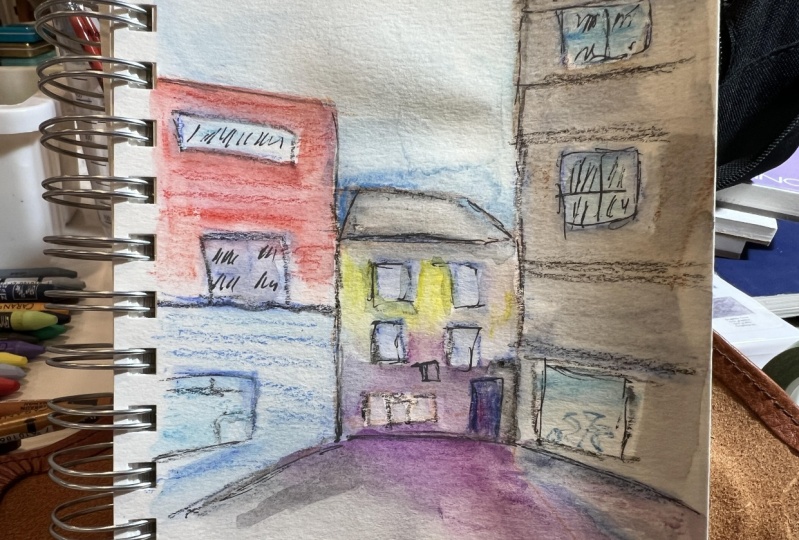
9. Variety: Final final step, of course, is to admire our art, but also to consider
alternatives. So I just wanted
to show you that actually these astols if you're using pencils or in
tents or something like that can be used not
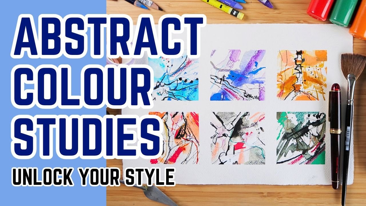
just for urban sketches, but for abstract landscapes and all sorts of
other things as well. So experiment, take these
ideas and play with them, see what happens, and
share with me the results. You can pop your project up in the class resources
and project gallery. I'd absolutely love to see a big variety and
your style as well. If you've enjoyed
this, leave a review. Takes a couple of minutes,
and it means the world. And perhaps I'll
see you in one of my other sketching
classes on Skillshare. If you enjoy this,
you'll probably enjoy my watercolor pencil classes or my ink tenth
classes, for example.
 Toby Haseler, Urban Sketcher, Continuous Lines