Transcripts
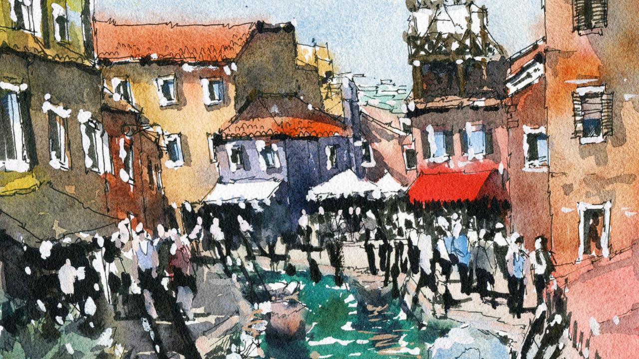
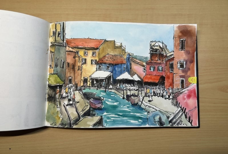
1. Introduction: Hi, and welcome to urban
sketching in Brunner, pen and watercolor essentials. Valving the places
that stick with us, whether it'd be a new city, town or even nearby park. It's easy to take
photos, but heck, we preserve that memory
in an easy, unique way. In this class, we're going to
learn how to draw and paint a lively Borodino
urban landscape. By the end, you'll feel
confident to draw and paint your very own urban
landscape from any photo. We'll go through simple
sketching techniques in pencil and eventually pen. This will form the
foundation for our final illustration
and painting. Once you're happy with
your ink drawing, it's time to add
some life to it. Splashes of color, Ed's
personality in depth. Walk you through my simple two-step process
to paint anything. It's easy. First, you paint
the lighter areas, such as the sky or the
sunlight and the buildings. Wait for it to dry, then add the darker
shadows and colors. Anyone can do it you included. So join me in this class. I'm excited to get started and share with you my knowledge on creating an amazing
urban landscape sketch.
2. Materials Required: I want to talk about
the materials that you need for this class. So firstly, you need
a mechanical pencil. This is a 0.7 mechanical pencil. You also can use a 0.5
mechanical pencil. So fine. If you didn't
have a mechanical pencil, just use a normal
pencil but sharpen it. I find that mechanical
pencils are really good. They allow you to get in
a very thin line with a lower profile
and you can raise them much more easily as well. So that's why I use one. That's a planning stage. So before we even getting any
pen, I find with beginners, It's always a good idea to sketch something in
quickly with pencil first. Now, there's two types of
pens that you can use. These ones here,
just black ink pens, and they have a liquid
ink with a ballpoint, a roller ball head. And their cost about $2 each. These are uni-ball pens and there's a whole bunch
of them that I have here. This was three of them,
0.38 millimeters, 0.5 millimeters, and
0.7 millimeters. Now, I use all three of these, but really you can get away
with just using a 0.50.7. So that's probably the
easiest way to get started. Now, if you want to
spend a little bit more, or if you have these already. These are a bunch
of pigment liners. And pigment liners have a head that's basically kind
of a felt tip head. It's hard to see felt
tip pen that softer. It's a little bit more forgiving as well when you're
drawing because you're not pushing down too hard on
the paper to make a mark. So it's definitely a
little easier to use. So if you have something like
this, I do recommend it. They often come in a few
different sizes as well. So these ones come from 0.05
all the way up to 1 nib. And I've also got a
few others in here. If you have a look, it's
got a whole bunch of sizes, but I'd pick up a bunch of
these every now and then. And if you look at it, they're kind of see
if this one has it. They've got a head that's
sort of a flat edge. It's almost like a bullet point. Not a bullet point
but a flat edge. And this allows me
to shade in and get some darker areas a lot quicker than just using that
pen itself to shade. So here's an example
here like that. This sort of flat edge, you can really color
some things in. And I've done that on
some areas like here, you can see just in the
Windows colored some of that in here, here under hear bits and pieces. Okay, it just makes
things a lot easier to get in those large contrast. If you don't have those
pins, that's fine. You don't need them. It just makes it
easier to see using that pin and continuing
just coloring and coloring. It takes a little bit more time, but you can get away
with it if you've just got to 0.5 pen, that's completely
fine. Just use that. Just makes sure that
your pins are permanent. So they are waterproof. Really important because
if they're not waterproof, when you go over
with watercolors, That's all just going to
lift off and you're going to lose the drawing. So really important, that's really the most
important thing to remember. Makes sure that
Penn is waterproof, water resistant or
something like that. It will say it on
the pen itself. Okay, if not, just make sure
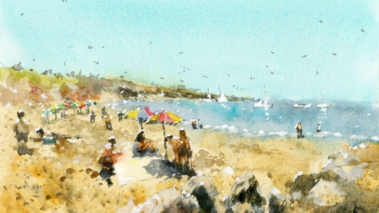
you ask your supply store. So this here is my palette. And for this class, I'm using a variety of
cool and warm colors. Mainly warm colors though. So if you notice
in the buildings, we've got a bit of this kind
of orangey, yellowy color. Now that's a bit of debate
of this Quinacridone, orange mixed with a
bit of yellow ocher. Yellow ocher is just
a great general color for warm buildings,
a warm color. I've got a little bit
of this color here, which is Buff Titanium, which is a kind of
off-white color that works. I've used that for
the ground here, just to get in that higher
contrast for the light, you can even just
leave it white, but I'd like to just have
a bit of color in there. Notice I've left some of the, the, the umbrellas
here, white as well. Other colors that I'm using, That's just a bit
of par or red here. It's like a staining read, very vibrant and
works to just create a center of interests
in this right there. So what else have I got? I've got a bit of browns
and a bit of neutral tint. Neutral tint is
just a combination of all your three primaries, red, blue, and yellow together
to convenience color. And let's have a look. What else? We got a bit of purple, bit of a bit of ultramarine
blue, which is fantastic. And let's have a look. What else do we
have? A lot of it. A lot of it. You notice sometimes
I don't even know exactly what color that I'm
using here in the water. As long as you've
got a greenish blue, you can get in this
impression of water. So I've used a bit of
ultramarine mixed with a tiny bit of turquoise, so a little bit of, a
little bit of yellow. So you can mix ultramarine with yellow ocher
at that creates that turquoise see sort of color here in the
boat, in the sky. I've just used a simple
wash of cerulean blue. So it's not a huge amount
of colors that you need, really just a bit
of yellow ocher. The rooftop actually I've got a tiny bit of burnt
sienna there, some reds bit of that buff
titanium or off-white color. That's not even required. You can just use a bit
of yellow and just dilute it down significantly, so that is just faded out. And finally, the last thing that you're going to need
is a tube of gouache. And this stuff here is
what allows me to get in these lid to highlights
all over in the air, just keeps it a bit of life. You can see here
highlights on top of the figures just
bring out just some, just some impressions or ideas
of things that are there, that may not or may not really be there even
though the corners of the houses and stuff as well. A little bit of
these highlights, so great color to have. You can also mix it with
your watercolors to create warmer or cooler
highlights kind of thing. So that's all you need to
know in terms of colors. Now, let me talk a little
bit about brushes. And firstly, make sure you've got a towel
or something like that. It can be a disposable
one that helps you to vary the amount of
water on your brush. And that's important because sometimes you may not want to put too much water
in a certain area, it's just going to flooding
and cause a bit of a mess. So I'm dabbing it on that, on that tau really helps. So here I've got a
bunch of mop brushes. Mop brushes are an
essential brush that you need when you're
using watercolors. Because the wash,
that first wash, especially where you've
got all your light colors, it needed to be done
pretty quickly. And these brushes pick up enough paint to allow you
to get in all those areas, kind of let them mingle, mixed together and but
still allow you to cut around and create detail
because they go to a small tip. So make sure you
get some of these and you just use one if you've
got a smaller mop brush, people asked me what size
brushes I use and it really just depends because I'm using
a smaller painting here. They've done a small
paintings, 1 eighth sheet. You'll find that I tend
not to use this one. This is a larger mop brush, a size 0 mop brush. I tend to use the smaller ones. Don't even know what size. Let's have a look
at three dash to 0. And that is not
sure what that is. It's a smaller, smaller brush, but you notice, have
a look at the paper. But think to yourself, what is the largest
brush that you can use without sacrificing on being able to cut around shapes. So you want it to be able
to pick up a lot of paint. I'll probably use
this one in fact, but not that one because this
is gonna be just too much. It's going to go all over the place and I won't
have enough accuracy. Really depends on the
size of the paper using. If you're using an A3 or
even one-quarter sheet, probably this brush would be a bit better to use in this one. But for this type of scene where I've
got a 1 eighth sheet, but we're just going to use these two smaller mop brushes. This brush here is a
smaller round brushes, a number eight round brush. So number eight is number six to eight round brush
is going to be fantastic. And this is used
for small details. So when I'm using the gouache at the end to add in
some highlights, maybe adding in a bit of
color to the windows here. Little detailing here just
allows you to get in, get in detail with the small point doesn't
carry much paint. So you can get more
control with it. So that is basically
it for materials, make sure that you have a large container
of water as well. If you've got about
a leader, holds about a liter, that
should be fine. I do keep this
little spray bottle as well, spray bottle of water. You use that from time
to time when an area is drawing and I'm not finished
painting into that area yet, so I'll just spray on top
and it just allows you to continue painting there
without that area dry. So that's it. Let's get started
on the next lesson.
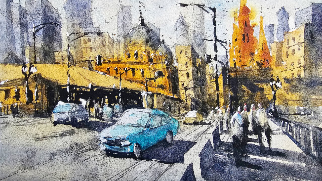
3. Pencil Sketch: Alright, let's make a
start on this scene. And I'm gonna be
using a pencil first because this will
allow us to get in a little design before we
actually get in the pen work. I think this makes
it a lot easier, especially if you're
getting started. And I don't really focus too much at this stage on
getting any of the details and just more of a generic structure of
where the buildings are. Okay. What I'm doing here is
that I'm drawing a line and just an imaginary line
where the buildings finish. The building's off
in the background. So you can see it sort
of goes around about, I wouldn't say it's it's almost like a quarter
of the way into the, into the scene from the
bottom of the page, we can measure about
a about a third would be, would be fair. So about a third of the way up, just draw that line in around
about third the way up. That way we know, roughly speaking, where the buildings
are in the background. So let's go ahead and I
think what I'll start doing is that there's so
much to actually put in here that it can
be overwhelming at times. I like to draw the buildings
that are in the front first, some of these umbrellas,
that type of thing. But to do that, I think what
we'll start off with is actually getting the side
of the canal coming in. So we can just you can see
the canal just coming in. There's a little section
there and then it just goes all the way to
the left like this. Okay. That I'm good. I like that. There you go. Just a bit of this wall, I suppose, um, and then this
edge of the wall there. And then you can see it kinda
go down into the water, disappears somewhere off
into the water like this. But mainly just a little
kind of waterway can now. Okay. Alright. And you can see it
just running in like that. So if you just imagine
it's almost like a little air where
it gets smaller at the back and then larger here as you move
towards the front. Okay. And while we can start doing
is putting a few boats, just a few indications of
what may look like boats. And I always look at the
most simple shapes possible. Look at that. It's just a kind of sounds like a rectangular shape
sitting on the water. Okay. Of course, there's
little intricacies in there. And I'm not going to really put in too much detail for that, but just little bits
and pieces like this. You can see the motors
as well of the boats. Even this one here
in the distance That's kind of like the
back of the boat as well. So I can just have a
little bit play around, put that in like that almost
like little tea cups or little cups floating on
top of the water. Okay. Just think of them
that there we go. There's another one,
maybe another one here. Okay. Like that off to the distance. And of course we might have
something over here as well. Again, another type of boat, it looks like the
back of the boat. You can't really
see too much of it. But I'll just simplify
that down again. Like this. Just looks like there's
some type of boat or whatever here
in the foreground. And you look at
this as a couple of these wooden pylons and they really common when you're
talking about Miranda here, where you've just
got all of these little polycystic and
the water and you'll notice that they get smaller
than the distance as well. Okay. Let's get this wall
on the side of the wall in a little
bit like that. Just smashing where it
might hit the water. Again, there's another
large boat here. And you might think these
large boats get in the way, but it's so important to put them in because
they're gonna make those smaller boats appear like they're receding
into the background. So if you've got it,
you do have to have a combination of large
and small shapes, larger shapes in the foreground, smaller shapes in the
background in order to create that
illusion of depth. Here we go. The side of that war. It's not perfect, but we
certainly getting there. Now we've marked out where the bottom of the buildings
in the background. Now, we know some of
these buildings here, they actually come a little
bit further forward. I'm going to place
this one roughly. Okay. Let's have a look. It's not even maybe about a quarter of the
way into the scene 12, little less than a
quarter of the way. Then we can see
also here there's the larger building that
just goes all the way up. Okay? It's important to remember here that you don't need
to get this perfect. Okay, as long as
it's close enough, no one's going to notice. In fact, if the photographer had just shifted their camera a little bit more to
the left or the right. The proportions will be
little different as well. So we just want to
create an impression, but making sure that we're also adding in enough detail here. There's a window just
to put a window here. Of course, this will be detailed more when I
go in with the pen work. Can I'm putting that
in first as well as maybe some little
bodies of figures. This little figures
maybe walking here. This gentleman's wearing a hat of some sort, disappearing. As you can see behind
this umbrella, this shade, we can kinda
coming up like that. You can see just
some of the ruffles, folds of the umbrella. There. There we go a bit and
running downwards like that. They're like that. Just a little
indications, um, is fine. You can see here as well, there are some more, these wooden pylons
just sticking out. So every now and
then I'll just draw another one in there
is even a smaller. But here it looks like just a little orange
boat or something like that may actually emit that
it looks too out of place. I want to put in another
boat behind there. It's kinda like that. And there's maybe another
one behind as well. Just indications. That little larger. Good. Okay. There's the
bottom of that war with a water sort of starts. Here you go. There's a
corner of a wall here. And look at look at
this little wall. And if you look at
where it starts, it starts roughly in
the center of the page, look at the reference photo, middle of the page. So just etch it out
roughly in here. Again. No need to be obsessed
with how perfect it looks. Just putting in a basic
foundation first. This actually
starts with a wall. Actually goes up a little
bit more up around here. And we may have to
fix that up later on, but that should do the trick.
I'll figure it out later. Okay. And we can, of course
that's getting some more people just walking
around off in the distance. Like that. Just getting in a
few more figures. Again, not too much detail. I like to put them in order
to put them in pretty quickly with the pencil
because then we can go in afterwards and reshape them and stuff like
that with the pen. We've got a doorway here. There is another three
separations, 123. And then on each separation we have like a window or
a door kind of thing. So just a little bit like that and we'll detail
it out more later. Okay. Just something like
that to start off with. Okay. Now I'm going to
have a look directly above this wall and
let's see what's here. We've got these kind of
white umbrellas and I can go ahead and try and put one
in. It's just a triangle. Just look at that.
It's just, it's just really just a triangle. Simplify it down to that. And you can see behind as well, There's a bit of cloth behind that behind that wall. That's the stem of the umbrella. Maybe some off in the
distance as well. Over here you have this
kind of red shade. I love this red shaded. We've got to get this one in. Just running out like that and connecting on with the
building to the right. Let's just get that in
roughly and then we can get the side in like this. And you can see it's kinda
got this pattern like that. It's wavy fabric at the bottom. Okay, let's go up and
finish off this building. And really this one's kinda complicated because there's
a structure on top, a little balcony almost. It's going all the way up. And I'm trying to say
is going to simplify this down as well. And don't want to spend
all day with the pencil. The pencil work just indicate
roughly where they are and then I'll go in
with the pen later. Okay, so there we go, just
to kinda top section of it. Get it to look more
three-dimensional. There. It goes up a bit further. Fantastic. Let's have a look over at
the buildings to the left. Now. This is where it can get
a little bit tricky. Actually. I'm gonna go with this
blue building of first, because I know that it's
overlapping with the center. The center of this umbrella
here, the bottom umbrella. Maybe leave the space a
bit wider in the center. Okay, it's up to you. How can we simplify
this blue building? Well, if we look at it, it's basically a box. So I can come down. Let's go ahead and just get that side of that
building and like this. And not all, nothing
I need to keep in mind is having a look at how tall this
building is as well. If we have a look, the roof of this building finishes
around where this build, the roof of this building starts getting in a quick little
measurement there like that. So that way we know
when I'm coming in with the bottom of the building they bought
on the structure. It's not not gonna be too
overwhelming, too tall. So there's a little
chimney here as well that has a three-dimensional
look to it, like this. Like that. And of course we can change
this up a little bit. It doesn't have to
stay like this. Always implied down just
something like that. On top. Kind of just goes up there and becomes this little
pointed section like that. There we go. They're top of that
building is fine. Just bring it down a bit to face so they're
the ground is. And of course I can start drawing in this building
to the left now. Because we know, since we've got the roof
of this building, essentially that it starts in the middle and about the middle
section of the roof here. Okay. So go up there. Where does it stop? Maybe about here. Around about the
center actually of this balcony to the right. Notice that I'm always using other shapes that
I've drawn in here and other features to
gauge where to put in the remaining buildings
and things like that. That's why it's so
important to get those original shapes correct. Because it's going
to form the basis of everything else that
you draw in there. Of course, there are all
these little construction things and stuff
in the background. I'm not going to put those in. We don't need we don't
need to put those in. You can change what
you want in there. I think they look a bit ugly, so I'm going to take those out
and I'm just going to have a play around with some
of these buildings here. Just the building here in
the background or something. Something there like that. Could be the window
here as well. I mean, the the buildings
just go all the way off into the distance. It's hard to see, um, what happens really, but I
get smaller and smaller. This looks like a balcony or something like that here too. So I can just HIn
something like that. And let's have a look. This large building
here on the side, I want to just get in a little indication of
where it goes up to. Maybe here. Like that. Just merely is large
shape to the left. I'm not concerned
of accuracy at all. We just know it's a large
shape on the left hand side. Alright. And I'm gonna get in the
rooftop now of this building, which is just going to go
directly across like this. Okay? Just draw a couple of
horizontal lines like that. Then you can sort of look at
these buildings and think, have I have I got enough
room on those buildings? Do I need to extend
them out a bit more? I think we're kind of okay, this one on the
edge though I will enlarge and a little like that. You can see here in
the foreground there's even this large shade comes
all the way down like that. I'm just going to place
it like this quickly. Okay, that's a little shade. Bits and pieces over
here, of course. And what I think is important
is putting a few figures. So I'm going to
check in a few here, sort of standing around
near the shades. You get some of them
that might catch a bit of sunlight as well. Like that lady here you can see just catching a bit
of sunlight there. Few overlapping people
in the background. Look at these theories.
Now the window here, so you can see
another window here. Window up the top as well. Here, K here. And here. Oops, this is more squarish
actually like this. Then the rooftop kinda comes
through. It's interesting. You will actually refine this a bit lighter
shade here as well. It looks like some kind of
shade and a fence at the base. There's some sap green shrubs or something growing
here at the bottom. In this tables and
chairs here as well. Again, not a huge deal. I'm just penciling
in some basics. A couple of windows here. A couple of windows here. Oops, it's actually further up. So you want to, this is why it's really good to go on
with the pencil first. You can always change this around with the
pen work afterwards. This white shade, just
stark white shade here. I think this is super important. That's going to catch a really strong reflection or reflection and really
strong element of light there. And underneath you've got shops and things
like that as well. Few people are walking
around on this building. We can start indicating
some windows. Okay. Oops. This one perhaps I may extend
this to say I might extend it little bit more to the left actually in the
pen, the pen work. I'll tidy that up just to
extend that off so that the window is hidden
behind a little. Okay, Here's another
window there. Okay. So I think that looks
pretty good for the draft of what we're
going to do with the pen. And it's certainly not perfect. And it's not meant
to be perfect. It's just to get yourself
into the mood of composing, thinking of what you want to include and what you
want to exclude. Where to place all
the buildings, making sure that they fit in before you go in with the pen.
4. Ink - Foreground: So I've got a 0.7 pen here. You can use a 0.5 for
this entire scene, but I do like to use a pen
that's a little bit thicker, four bits and pieces
down the front also alternate between
the 0.50.7 at times, especially if I'm
just estimating where to put lines
and things like that. Now, the first thing
I always like to do is draw the stuff
that's in the foreground. So the stuff that's right
at the front first and the reason being
is you're going to have a really tough time
cutting around shapes if you don't get them
in to begin with. So you can see here, if I draw this
umbrella in first, then I won't have to worry about these figures and
potentially cutting around. So that's why I
always like to work, usually from the foreground
up until the background. But if I do work on
stuff in the background, really keep in mind that I don't overlap onto areas for it. So for example, I'll
get these figures. I'll draw these figures
in first because I know the figures are in
front of the buildings. So this is just a little
bit of this umbrella. Again, taking time to draw in a little bit of the
side of that umbrella. Again, a lot of this
is going to be nice and sharp afterwards when
we get in some watercolors. So it's gonna be kind of
a really light color, like a pinkish red color. And I'm just going to
focus a little bit more on this side here. You can see the little bits of the frilly bits of the
umbrella kind of get larger and more obvious. Good. Again, these boat, boat here, we can start putting in
that boat like this. Holding the pen at
the end as well. I find really helps. Because you then have
a bit more freedom. You're not so congested up and things just start
looking a bit too forced. Again, this is like a cloth
on top of a top of an engine. Hard to really draw this one in. But just something like
that indication of it there. Of course. You then have these pylons okay, that stick up and they kinda
go behind the Umbrella. Umbrella is a more sort
of in the foreground and I'm just doing this
on purpose as well. Get a few Maureen. I'm making them a little larger. Perhaps the one that's just
coming up around here as well out of the scene.
Something like that. And you can just
drawing the edge there of the canal where
the water is underneath. Of course, around the boat. You're going to have
this the edge of the canal right here and where
this white marble or white stone lines the canal area that you can see
kinda hit the water. Just estimating where it
is, somewhere like that. Okay. And what was it does help if you practice before
you go in there, It's weird but I sort of think of it almost like
throwing a ball. You're practicing in
your mind or even just on the top of the paper
before you put that Markin. Often I find that
it just looks so much more accurate when
you do it like this. Okay, because with the pen, it forces you to really be
intentional with what you do. Because the more you
go over it, I find, the more forced and unnatural. Unnatural it looks. So here we go, just the top of this boat. I'm just putting in a little bit of light up the top there. You've also got a boat perhaps, shape of some sort here
in the background, something there as well. Off like that. Good. And we'll just work
a bit on this. Now getting the bill that
this again is indication of the the stone that
runs behind like this. Okay. It doesn't have to be
perfect as you can see, it's just enough to
indicate what is happening. Okay. There you go. Just
behind that as well. That's part of that stone there. Okay. So let's have a look. What have we got here? We've got weird that
wall finishes off like that and then it goes
straight behind these boats. There. Okay. Cutting behind the
boats like that. Okay. Let's get in this wall
of some sort like that. And I'm going to put
in this structure, this kind of wall
here then what it is, some kind of little
wall like that. Okay, there's some bricks
and things we have to get some more detail in later on. But for now that should be okay. Seeing as we're
working on the boats, I'm going to continue just
working around this area and drawing in the boat, the left. Okay. Just take your time. They're just like little almost look like little tea
cups on the water. Okay. Because they facing us as well. We don't get too much of
that side view of the boat. Okay. Here we go. This is like a little bit of rope and bag on the top
of this boats engine. Here. I'm just
going to draw in a little bit more of the side
of that birds indicate. Give it a bit more of a 3D look. Coming up to the
front like this. Let's go ahead. Before I do that's
getting this pylons. So again, this is what I was talking about when
you're using a thicker pen, like I've got the 0.7
pen here, for example. It just helps to push this, these little features
forwards more like that. There might be another one
just sticking out like this. As you go through to the back, I always find it easier if you just if you make them
a little bit thinner. And that's essentially just
by using a thinner pencil, thinner pen, sorry. Okay. As you can see here,
this is what I mean. I'm cutting over the top. So this is like
not really ideal, but I've forgotten to actually go in there
and draw them in first. So you get these sort of cutting over lines and things like that. So I tend to prefer to
do things like that. There we go. Let's get in this
boat is some kind of boat here and the engine of
another boat, I think here. Back of the boat like this. Good. It gets a bit kind of abstract as you move towards
into the distance. And I actually like it that way. So then the viewer
is not too concerned with all the little
details there. Okay, There we go. That's
just getting some of this. Again, this little
there like that. Then it's getting a bit
more of this color. This edge. Good. Here. The edge of that wall as well, can use this hatching technique to do this sort
of thing as well. To just get in a bit
of darkness behind. I'm starting to loosen up, which I think is,
which I think is good. This is where I can just
start to potentially add in some figures and little
bit of line work. More intricate
sort of line work. We've got a few figures just
kind of walking around here. Okay, Let's just
put in us and the legs as well like this. There might be someone here
just near to the water. Looks like they're
just sitting down. Kneeling down kind of
thing here near the water. Let's go ahead and I'll draw in this other figure here as well. Just a couple of legs moving
into the scene, perhaps. A few more here,
another one here. Move towards the foreground. I tend to make the figures are a little more detailed, um, because of course they're closer to us and just
getting that sense of depth is important so that you can see here I'm
adding in their arms, maybe some shoes, something just something a bit
more detailed in there. You can even put on a hat or something like that
for some of them. I always just like
to add the figures in first, like this. And putting them in
also, in a sense, in a way that makes it
just gives a bit of variation so they don't have to all look the same or draw. Walk in the same direction. This one's kind of
walking towards the left. This one might be
walking towards the right-hand side with
that slightly bent knee. This knee here bends
towards the back. Like that. There is a door here. I'm going to start drawing
into that door like that. There we go. That's
a bit of a door. And again, now we can get into the buildings
because I've started, I've already finished drawing
the figures in front. So I don't have to be worried about going over the
top of the buildings. So just a bit like that. I tend to draw the lines
and segments as well. People often ask, why do I
draw the lines and such, in such a way I find that
by doing it in this way. It kinda adds to that style, my personal style, I suppose. And if I get a line in, it doesn't look
completely straight. It doesn't look out
of place because all my other lines are
kind of jaggedy as well. So I think a degree of
accuracy is very important. But I think often people overemphasize how accurate
you need to be actually set. There you go. That's just a window. Got another window here. I'm just drawing that
in. This window. On top, There's
another one here. So take your time
with the drawing. And what happens is if
you take your time, the final product will always
look better. More detailed. Look at that. Just a little bit of darkness in the center
of that window there, which I think I'll
actually get in with another pen afterwards. Have one of these is basically a permanent
flat edged pen. And a few of them, and they are great for general
kind of coloring in work. Just want to get in a
bit of darkness quickly. You can do that here. But I'll actually do a lot of that light. I'll have them out. If you don't have one
of those felt tip, sort of darker pins,
don't worry about it. All you need is basically a 0.5 pins just takes you a little bit longer to color things in. So let's go in here. Look, I've got this
window, another window, and let's get some of that detailing in for that
window here and back. Here we go below the
roof as well like this. Then there's another
overlapping roof over here as well like that. Right? Good. And let's bring this
all the way down. Okay. There you go. Edge of that building. Here's where again, we've
got another kind of shade. Overhear. Someone who is actually
the side of this shade. Grafton make it a bit larger. I've not left too much
space here on that side, that doesn't matter.
There we go. We've got this kind of pattern, kinda like what we had here. I'm just going to
imply it, okay, just this wavy up and down. So the pattern, okay. There we go. Get that shading. Straight line coming
across like that. Figures in the
background as well. These figures are
great because they help just add so much life
and interest into sin. If you've ever been to Venice, there's no way that there's gonna be a few people
walking around. It's often really busy. Okay, so just a few more here. Just while I'm in the mood
of drawing in figures, why not just add in a few more? Of course, here in
the foreground you've got some larger ones. And you can just sort of, again peg on some more details. There could be some
shorts or something. And leg. The leg there is
a head of another figure. T-shirt here. Here. Here. Some shorts, legs. This as I get closer to
the front of the the, the scene, I tend to do this, just add a bit more. Make the figures
look a bit larger. It goes another one
that I put in there. Let's have a look at
these ones. I think what I could probably do with them is just enlarge
and touch as well. I feel like these ones too, a little bit too small,
but doesn't matter. We will figure it out. Just could be some hair
or something like that. Just to get them around
the same size as these ones because they're roughly in the same
position, right? So we don't want to make them to the size difference too much. Okay, so again, let's go with the next object that we have. And working from the
objects in front. This umbrella here,
you're getting a bit of that umbrella like
that triangle. Maybe go and then there's
another one at the back, little triangle at
the back, like this. At the bottom. Here there's a stem of the umbrella
like this there. At the bottom parts of the
umbrella as well here. Okay. Good. Something here. I don't
know what it is like. I think might be a person
sitting near or something. It's hard to say. Of course, we start getting
into the buildings now. And there's a top
of this roof here. I will just indicate
we also wanted to put in a part of this
structure on top, some trying to just
place the legs of it. Here. It's in rows hanging on
top of the roof, isn't it? It's interesting, kind
of interesting kind of structure. There we go. Horizontal line like this here. And coming back here. Here as well. Here. The is like a curtain there or something. Then I really don't want to
spend too much time on this, but at the same time, I think having enough
detail in here to imply what we are actually
putting in, It's important. Just a little balcony
like overlook, I suppose. Okay, Look at that. It's a little bit wonky. Just straighten it out
a touch like this. Okay? And then we can have a look. We've got these kind
of cross sections in the center where
they're kind of like these three cross sort
of areas. Like this. Just a bit of a
something like that. Simplified, of course. Simplified but it's in there. Okay. This is of course the roof and these little tiles
and things in here. So I can just like putting these little
indications of tiles. Sometimes it's smaller. Little pen like this. This is a 0.3 pen. Works quite well to just indicate a little
bit of texture. And I don't overdo it as well, just a few little
bits and pieces, especially near the goddess
of the roof here as well. It does help. The odd tile or what have you. Good. It's getting some
of the windows. Here's one like this, one here. That the windows have a
kind of a shade as well. On each side, which I will
just draw in like this. 12. There we go. Maybe go a bit more
on top. Like that. We're getting the side
of this building. While I'm at it. There we go. White frame at the base
of this window to end. I think that should be good
to go for that building. Let's move across to some
of these blue building. And I'll get that
one in like this. What should I use
this smaller pen? Or I can, I'll use or
continue using the 0.5. Actually. Move that down. Okay. This large chimney like
shape coming down. But here's a house or something behind their top
part of the chimney. Like this. Simplified down of course, this yet the top of this blue house has this
kind of like burnt sienna, brownish red tile pattern there. So I'm going to work on that. Just draw in that building. And of course, the roof top. So important. We use. This is another window to
the right. Here. You see more of that rooftop
in the background as well. I'm not a layer of some
house off in the distance. Another window. I think I'll use this
smaller pen as well to just not smallpox
this smaller nib depends what I'm trying to say. That will help to just
make these lines look a bit more subdued as we move
off into the distance. You can see just little
bits and pieces, maybe on top of the roof. All the way off
into the distance, that kinda thing there. Okay. Good. Great. This of course
formed part of this. When you're looking balcony or whatever the building behind. I have a feeling it might
even been some kind of construction or something
that just looks a bit odd. There are, I'll draw
something in like that and we'll decide
what to do with it later. Maybe go and just coming up and finishing this one off now, maybe a little bit further up. There we go. Come down. You've got all the line
work already in there. So you're kind of
following that line work. You make it more precise and
you also changing it up. We feel you could do with extra details or emission
of other details. So I'm just gonna go
and draw this one in. Make sure it connects up
with the roof. There we go. Good. Good. That white part of the building. And then of course, we've
got the windows, so 12. Then we've got the
third window kind of hidden behind there. So you can see what
I'm going to draw in the frames of these windows. Can just these white
frames like that. You don't have to connect
them all up everywhere, but just enough of an indication,
look at this one here. That just little rectangular, rectangular shape like that. Another one, for
example, like here. Hidden behind this building, also has a shade, this white shade
cloth shop front. Here. We're going to add just
coming across the, connect that up a bit like that. And, um, oops, a little
bit of this bottom part. Emphasize that more. Let's play around with
these windows as well. Again, just simplify
down the windows. That's good. The frames of these
windows as well. Let's drop in some little
frames, wireframes. They make a difference
in the end. Surprisingly, quite a,
quite a big difference. K is getting the
edge of this house. Their hits the
ground about there. There's some kind
of other structure running down the
side of this house. I won't make it too obvious,
something like that. And another window
behind like this. And just getting some more
of this pattern of tiles. Suppose another smaller pin, nib pen. Really basic. And you can even do it to put in middle bricks and things on the edges of some
of the buildings. Casey, some of the bricks
start to get exposed. I'm with the older buildings here in the front especially. Okay. Um, so let's get into
the buildings to the left.
5. Ink - Buildings: Now I'm gonna be
using this 0.7 liner. It's going to make
things a lot easier for me to sketch in. So start with this one here. That a couple of these pillars moving downwards. Just getting that
side of the pillar. That sort of in the roof that we'd gotten here. Now we've got like
a rooftop there. Shift this down. Another couple of
windows here as well that you want
to just get in. While we have the chance
is draw those windows, couple of windows in. One here. Good. Okay. Just keep going. Goods. This is basically the rooftop. Okay? I like that. So you can get some
of these tall, tall like looking shapes here. Okay. Now these sort of
splits down into half. We got like the yellow part of the building or the warm
part on the left and then on the right-hand side
you've got more of this greeny color and building. I'm going to bring
that down to here. Okay. And there's also cause that little other building
all the way to the left, which I can just sort of alter, change up a little
bit, bring that down. Okay, there we go. Looking good. Let's just put in a bit
more of this window here. And there's another window here, of course, these
white frames windows. This more of this shade of that Windows will that
right hand side part of the window, the shutter. I mean, again, there might
be a shadow there as well. Okay. Good. Now we're done mostly
with those buildings. I'm just going to
start putting in the shade underneath
now this cafe. You can see just the bottom of that shape kinda comes
out all the way to here. So I'm going to just
extend that out like that. And let's put in a bid of this
bottom part of that shade. This little effect like that. There is another kind
of what do you call it. Now, the shade here as well. It's kind of an interesting
looking one scene. It's difficult to draw this, finish this one off
first, like that. They kind of combine
onto one to one almost. Of course you got all kinds
of things going on in here. There's some kind
of like I said, some type of shrub, bush, some flowers in here, some little what do you call it? Little fence. Fence off the area
somewhere underneath. It's not a huge deal really. I think I've noticed
there is a kind of one of these wooden pylons
going behind as well, and a cross here to just
underneath like that. Good. Rest of the stuff
underneath the building. I think we can just simplify down or just
get that into one big. A shadow underneath. I don't want to overdo it. There's another
window that will put on this little house. Okay, the edge of that house. Doorway here at the
bottom as well. There. Let's go work my
way back at touch here and start looking at these. There's another window of some sort there or a door frame. I think it's a window
actually like that. You can even see there's
like little lamps. I'm like, Look at that just
like a kind of It's like an inverted inverted basically like a triangle, triangle shape. That can be indication
of some type of lamp hanging off the side of
that building to the left. Good work a bit on the
facade of these buildings. More. Of course, again,
like these buildings, you can see they have these
like on the rooftops, these little almost like
little ends shapes. Just for the tiles
indicating the tiles. I do them so quickly like this because I
just don't want to get bogged down in them. Really. We've got pretty
much everything in there. The last step is
really just looking at there's anything
else to detail. But at the moment I'm kind of
liking the level of detail. It's really just looking at
it and thinking to yourself. Is there a way that I, um, could make this look
a little bit better? For example, I might
add in another, I might add in another
row of houses here, just this one on the left. Again to just emphasize
that sense of depth. And I'll get another
window in here. Like this. Here. Just to create another, another kind of shape. Like that. It looks
a bit better now. I'm good. I'm gonna go in. I'm just thinking. I've got some of these pins like I
was mentioning before it, darker pins that
have a flat edge. And this can add in a tiny bit of shadow and darkness in areas. So I'll just go ahead
and have a play around. I'm not gonna do this
to all the entire area, but just under some
parts where I want to draw out some extra darkness, for example, I think, I think this works quite well. So for example,
this little shades, shutters, sorry, of the windows. Simply just add
them in like that. And you're done. And then we'll go
further down below. I forgot the drawer
in bits and pieces. Of course. The shops
or that kind of thing. Here. You can go and just again do
this using this darker pen. If you don't have
a pen like this, just use a just use your normal I'm ink pen and
color it in and areas. It does the exact same thing. It's just makes it quicker. Okay, so I think
this also helps to increase that sense
of light and dark. Extra shadows. Contrast, especially
underneath these shades, makes quite a difference. So I cut around the
figures as well. That makes it look
more realistic. In terms of the shadows
underneath the buildings. You can even see it
coming across here. It goes underneath
the left-hand side. You don't want to
get all of it in, but just it's kind of like a it's kinda just
carrying this shape, like a dark shape
all the way through. And the shape is
really the shadow. But the darkest of
the darkest shadows. And of course it's not done yet. I mean, we, we go in afterwards
and we can figure out, I'm adding a few bits of
details here and there. But It does help, makes, it makes it quite
simple to get in the stark contrast early on and give you a bit of hope
to continue. I find anyway. So you can see it's
just little detailing. I mean, I've got one, I've
got another pen here. Let's just add in some
horizontal lines to create this. I don't know these, the sense of these shutters like
that simplify. Darker in the middle here. This one is kind of like opened, half opened or something. Maybe a little bit
of darkness behind these shades as well. Kind of like what
do you call it, the red umbrellas
here in the front. Even in the water, you can start putting
in a little bit of tiny bit of
darkness and like to do this around the
boats at times to just draw them out
a little bit more. Little bit of darkness
at the bottom of the boats helps to anchor
them to the ground. These pylons as well, you notice these wooden pylons. Some of them are pretty
dark and so you can just go into them
straight away and indicate the approximate
locations with the pen. Notice you're just building
detail bit by bit. You just adding detail on top until you feel like you've got a drawing that you're proud of, that you happy to continue with. It's also at the same time, it's funny because you
also just gauging. If it's too much, constantly just looking
at it and thinking, have I, Is that enough? There we go. Again, these windows
look at that just a little bit of color in there. A little bit of this darkness just brings out the
detail of the window. They get, the windows
get a bit small. You can then start
using these other pins. Thinner, thinner liners. Okay, but just like that, just a little bit of
darkness in there. Of course, you've got again, another kind of situation here, this shade underneath the
building and the white shade. And I just darkness under
there that's waiting to be brought out like that. Here there's like a shutter, another window of some sort or another, another window here. Here. Okay. We'll look at some of
these background bits and pieces and I think I'll
go into the background. I want to keep a lot
of the darker areas, hopefully just closer
to the areas of focus. Okay. I'm just softening
a bit around there. Good. Bit here as well
underneath these shades. That could just be
a bit of darkness. Let me go look just a
simple how little effort it takes just to get in
the shadow of a window. Few little strokes like that. Even need the color that
window all the way in. Oops, there's something back
here like another window. I thought I'd indicate
that as well here. The framing bit
better like that. Okay. Another thing I like to do is look at some of the
figures and think to myself, well, maybe I can get
in some of the legs of these figures already just
darken down the legs. For example, this one here. There's a figure here
maybe with some shorts on. Get that one in and
this one here as well. You don't want to make
all their parents darker, but just maybe a bunch
of them here and there. So they just have
a bit of a bit of difference as oppose
between the figures. There we go. Another good thing that
you can do as well at this point is getting in some of the shadows of these figures. Across the ground. I mean, there's someone I thought I'd put in someone's
sitting here. I didn't put it in so well, but I'll just add it in better. He'd bit of shadow
to the background. Here, a bit of the shadow
to the right, like that. See, and you can just join
that shadow one on the ground, make it look like they're all running in
the same direction. All the way to the
right-hand side. Connect on, you will
notice on top of the other figures as
well, the shadows. Okay. Let's get in Let's get into
some more bit of darkness, maybe under here
behind this boat. And the start of the what you call it the canal underneath
this boat as well, you notice it pretty dark
so I can safely just put in extra darkness there and not only that in the
boat behind as well. To just bring out
details in those boats. Like that. Pylons,
these wooden sticks. Just kinda put in a few
more here in the distance and restate some
of them as well. Like that. Right? There we go. Couple of figures. And again, kind of getting that shadow shape to run towards the right. But we are also having, in this section there's gonna be more detailed darker
shadows because these buildings is going to
cost a large shadow anyhow. So it's no big deal. We're really putting it a bit of a dark shirt and that
figure in the background. Lot of this is just emphasis on little minute details making it look like this
detail in there really. But perhaps there's not. You just implying the few
little shapes here and there. Some details. So you look at that
just some legs. Legs of this one as well, kind of in the shadow
running towards that, right? I'm going to just like this. Okay. Often the distance more here, maybe underneath this this one. Good. And it's just putting a bit of this wooden thing like that. Really coloring behind
that boat as well. Help it to stick out a bit. We look at this one and
maybe there's a shadow here. So much like having a duo, duo tone situation where
there's like about two, really two tones in here. And then we'll add in all
the rest of them afterwards. I just don't want
to overdo this bit because I love drawing with pen. When I get to this stage, it becomes a lot of fun. The beginning part always
kind of bugs me because you're starting out
with nothing and you really have to
just push through it. But if you push through it, you'll find that the layers of detail and the little corrections
you make along the way, suddenly a scene
starts to emerge from all this chaos and
miss and you just have to, you just have to
persist and you have to have faith that it's
going to work out. Since difficult thing to
do is one of the most, one of the most
difficult things to do really in watercolors too, just to just have
faith in yourself and keep reminding yourself
that it's going to work out. Just keep on going,
just keep on going. Another line there,
another line there. Emphasize here, emphasize there. Until you get to a point
where you think, hey, that this actually looks a little bit Like what
I'm trying to draw. And you find also in the
absence of the reference, you a lot easier on yourself. And you're comparing the
reference to what you've got. Often it's a futile
effort because the reference is always
going to be a million times more complex and detailed. Okay. I'll put in a bit
more underneath these funny little rooftop
area, things like that. Little bit here as well. I think I've overdone that one, a touch and this blue building, but we always have
to put up with it. Good. Maybe a little bit in the
canal sections of the canal. Sort of going around
the edges of the canal. I mean, we will there we go. Disappears off here. Off in the distance. Connects onto that
figure actually. Okay, I think we will
keep that as the drawing.
6. Painting Light: Alright, we're going
to start doing the first stage of the painting. Now this is painting the light. And the important part to
remember here is that we're looking at really keeping
this super light wash. So I'm just mixed up a bit
of cerulean blue here. And it's mostly just water. If you look at that, it's
really just 80 per cent water to approximately
10% to 20% paint. Ok, so just a really, really light wash. And the
reason why is we just want to preserve that
softness in the sky, that really light color up. I think with the paintings, you have to make sure that the sky is the lightest
part of the painting, so you don't want that
to be overpowered, so keep it very light and it does look almost two week when you have it on by itself. But you need to just keep in mind that it's not going to stay like that forever. Okay. So just a quick little
wash like that and it's pretty much done
for the buildings. I'm going to use a
few different colors. I think it's always good
to just experiment, play around with
what you would like. And for this building here, I'm going with a kind
of an orangey sort of color, orangey brown color. And it doesn't have to
be exactly the same as the colors in the reference. I always like to change
things up a touch. Just keep in mind
that we're looking at warm colors here
for this building. I always try to
change it around. Looking at warm colors
and cool colors, rather than looking at
specifically an orange or a dark blue and cerulean
blue or something like that. Just I tried to simplify it down basically into
warm and cool. So anything that approximates
or goes towards the yellow, orangey, yellow side
of the color spectrum. You're looking at
this color here, anything that's more
towards the blue, greenie, purple, the colors. That's what I refer to as cool. So hope that simplifies
things down. A little bit more of
this brownie color. This is just burnt sienna, really speed of burnt sienna. And a bit of orange. Quinacridone, burnt orange
in there in the windows. I might just put in here, there's like a brownie color, so I can just drop in a
bit of brown in there. In this window, actually
there's some corners so I can just go ahead and drop
in a little bit of, there's actually
this grayish color that I had on my
palette from before. I can just drop
in there quickly. Okay. It doesn't
matter too much. We just got to make
sure that mainly we've got warmer colors in here. Probably on this
building, I'm gonna go a little bit more reddish. And in a little bit more red
and red and a brownie color. Just mix that in
that cut around and leave those edges of the
windows white as well. Like that. I'm dabbing in a bit of color here on top of
that roof as well. And don't be afraid to leave
some bits of whites on. Another interesting thing,
these rooftops here, They're all of that same
sort of reddish brown color. So I do like to just
go in and give it a touch of that first
and it will melt in, do its thing and then
you can come back to it a little bit later. But it's just a good thing
to get in to begin with. There's a bit of an orangey
color, orangey yellow color. I thought I'd drop
in for this one. This one here. Again, this
brownie, orangey color. I just like to call
it a warm color. That's the simplest way
to define it really. I'm gonna pick up a
little bit of white, a little bit of buff titanium, and a little bit of red. And I'm going to
go straight into this building underneath here, which is almost like a looking at kind of like
a salmon type of color. Here we go. It's dropping a bit of
that color like that. The trick is to get everything
to kind of mix together. Okay. If I actually lean, lean this paper up on a slight, lean it down, slight tilt. You can also get this effect. Just get the colors
blending a bit better, closer and moving downwards. Okay? I do notice a bit
of yellow here, kind of like a yellow ocher, so I'm picking up some of
that and just trying to get that in as quick as I can so that you
have a bit of this. Mixing going on. I don't want any weird
sort of edges forming. Any hard edges forming in
this stage of the painting. We can move down. Let's
go ahead down here. Light wash of yellow. Just carry that down. It's mostly just water. Thinking of remember what
I was saying before. You're just looking at
very, very light washes. Of course, this
house over there is actually it's actually blue, so I won't touch that just yet. But I'll go over the
top of these ones, this one here and the
distance kinda like, uh, reddish pink color. The distance something
there as well. And then you've got
these turquoise see colored buildings
off in the distance. Which I can just indicate like this and leave some of
the white on there. Why not? I'm good. Now into this area here, I'm going to get a bit of
orange and mix it with some red just to get a deeper,
more vibrant red. Just drop that in there
for this for this shade. Okay. Keep makes sure that it's
still transparent like that. Okay, Just drop it in
there and let it go. And I'm also a bit of
bit of buff titanium, and a bit of that red will
get you also the color of this umbrella
here, these shades. So we can just go ahead and
drop that in and melt that into the other one as well. Like that. Okay, good. Good enough. Or that color in their mind, you we haven't gone in,
gone into the ground yet. Even I'm going to pick up some cerulean blue and I'm
going to go into that, the side of this
building like that, maybe a touch of ultramarine
as well through here. I just want a cool blue color. That's all I want. Okay. I don't want it to mix
in with anything else. Just let it keep that retain
that cool blue color. Okay. I think we've done that day. Alrighty. Now, let's go ahead and look at the buildings to the left and then we've got
a bit of green. So it's dropping a bit of strep period of
green for this one. Okay, this is where you can
obviously just get creative, use whatever colors
you feel work for you. Especially on these areas
where you don't need to worry too much about
how dark you go. Because as you can see, I'm actually using
a lot more paint, probably 50 per cent
paint, 50% water, because this area is going
to be in darkness anyhow, the rooftops may get a
little bit of light. So that's why I'm
kinda trying to leave the top of the roof tops a little bit
lighter for later. But you can see
on the buildings, for example, I can pick
up a bit of this yellow, a bit of this yellow ocher
and just drop that straight in to the buildings of
the left like that. That could be just the top
of that building there. It's kinda like a
grayish like a grade down yellow in here. Sometimes it can just turn
green if you're not careful. I think I've managed to do that. There we go. Little touch of that burnt
sienna on the rooftops here. This little touch of that
get that warmth coming in. I'm going to move this down the page and just getting a
bit of brown on top of this. It's really just a bit of
brown and maybe purple mixed in here would be
good brown and purple. I'm going pretty dark. 50 per cent water, 50 per cent paint again, and I'm just getting
in a little bit of this idea of the shade there. Of course, this little, little bits and pieces here, the base of those buildings
in the back as well. The ground I've noticed
is just so bright. I mean, it's I'm
thinking whether to even putting any
color through it, but I will add in just a wash of whatever I've got
leftover and the palate, which is basically kind
of like a grayish color. You have some Wyatt as well, tiny bit of this
off-white color. I think this is just going to
help get rid of that wire. I don't want it to be
too stark further down. So just just a little bit of that white running
through like this. Coming through. You might want to swap
to a smaller brush if it makes it easier as well to cut around
these figures. But the main thing, I'm just trying to get this in very, very Lightly going to preserve
that lights in the ground. Then here is a bit more here. This is actually some
green or something. We can just drop in some
green here for this bush. Here, Here. Bit more here for this
little boat in the front. You can even just pick up
a bit of blue and make this let's make this
boat blue, like that. Okay, good. What else can we do? Bit more blue or a cooler
color for this one. Like that? What else did we have? Bits and pieces here. Bit of warmth maybe
for one of them here. Oops. It's getting a bit more of them. Maybe some brown or something. Okay. Water as well. It's gonna be
interesting because I wanted to leave little bits of, potentially a little bit of white in there or
if I miss it out, we will actually just
not worry about it and getting some gouache, some white gouache afterwards. So I'm mixing up a bit of
turquoise, see, color. It's got like a
greenish blue color. And, um, maybe a bit more green in there actually
would be good. I'm just mixing a bit
more of this green. Okay, That's better. Drop that in a bit
more turquoise. And I'm going fairly
dark in here. But I'm also trying to leave maybe some
white reflections, as you can see in the water. Tiny little bits of white reflections
running through that. You know, that the
water is fairly dark compared to everything
else in the scene. It's almost one of the darkest
parts of the painting. Then I can pick up a bit of purple or dark or neutral tint and just drop that in
underneath some of the boats. This helps to anchor the
boats to the, to the, to the water and create a little almost like a reflection of
it is simple reflection. Nothing. Nothing too out there. Okay. So having a look and just
checking what we have here. This is looking good. We've got I think
we've got quiet. We've definitely got, got all the warm colors in here or the softer,
lighter colors. And the trick now is basically just to
put in the shadows, bring out a few little
details here and there. And we'll be ready to go. So what I'll do also at this time is that I'm going to just put in some
colors on the figures. Quick little colors. Just dashes of going a bit
of blue here, for instance. Might just put some
into this one. Okay? Some of them you can
just leave white, there's no problem there. Just dropping little
colors here and there. And I find that helps to create some interest
with your figures. Make them look a bit
more like people wearing colored clothing
and stuff like that. You don't have to do
it to all of them, but I do try with a
few here or there. Even in the
background, you might pick out a few that you
want to darken down. But it's not a huge deal. Some early May, the
ones in the foreground. Okay. What else do we want
to put in there? Really think that should be it. I'm just adding a few
tiny, tiny minute details. Really splashes a
blue perhaps a bit into the windows could help to indicate just the
reflection of the sky. Blue there and there. Not all of them,
but just in them. Some of them would be good. Okay. Good. And give this a quick dry.
7. Painting Shadows: Alrighty, So time to
get in these shadows. And this is the most
funded in my opinion, I love putting in the shadows. I'm gonna be using a
number six round brush and also this small and mop
brush that I have here, this is a 01 slash 0. This is a smaller mop brush that I'm gonna be using as well. So first things. First, we have to mix up
a color for the shadow. I'm going to just simplify
it down and use a bit of this purplish color mixed
in with some black, a bit of brown. There's some green
left over the palette. I don't really want to
put any of that in there, but it's starting to
go in there anyway. But if you've got this
general purpley brown color, I think that's a
really good color to go with for shadows. And let's go ahead and do this. I'm going to go straight in. It's pulling it and put it
in a bit more blue in here. Actually, I'm going
to just drop in a bit more shadow here on the right-hand
side of this building. You can see in the
reference photo that the shadows pretty sharp starts off like right
on the edge like that. Okay. I'm holding this brush very lightly and
just trying to get in some color on the right-hand side and
underneath the roof top as well. See if you look here, there's a little bit of shade
under there as well, so just dropping that in, okay, let's put it in a bit more
neutral tint as well. It's good. Underneath here
you notice there's a little tiny bit of a shadow to sort of just goes underneath. I'm just dropping a bit of
paint under there quickly. There's also a shadow
that goes across across the background and cuts through that
building like that. So almost like a it's like a it's caused by another
building behind that one. Here as well. We've got a
shadow on this building. The right-hand side there. Just Good that in. I think I'll be able to
do most of these actually with the mop brush. Really depends on the size
of paper you're using there. Okay. Let's get in the shadow
and the shadow I'm going to use a
little bit darker. Let's go here. There and get it to
come down like here. Good. Blend that together. Alright, um, and also just stop
putting on a bit of this shadow underneath
the roof top like that. Joined that on nicely so that it forms part of that
one sort of shadow. May extend this a little bit. It just extend it down
a little bit like that. So that would look nicer. Good. Shadow on top is
probably a little too dark so I can just lift off
a touch of paint there. Okay. Dab dab in a little bit more. If it appears as one big shadow, that's no big deal actually. Go down. Let's have a look, maybe a little bit of
darkness at the base there. Let's have a look over here. We're going to get in a
little bit of darkness and keep it transparent
underneath the rooftop there. Like that. Underneath here as well. This thing here, this balcony. I don't know what it is, but it's sitting on top
of the building, is going to be shadow
underneath there. Anywhere. Essentially
where the sun can cast a shadow
beneath a raised object. You can drop in a
shadow like shape here, even because that light source is coming from the
left hand side. So the shades on the right-hand side of
underneath the right-hand side, you're going to have a bit
of that darkness as well. Okay. Remember I'm just
using the same color. Even on this building,
it's hard to see, but there is a
little shadow being cast across the
building like this. And let's light sort of
shadow, but it's sharp. Running across, it's probably from the top of the building. And this is going to
forms part of this, the window shadow in
that window as well. Here. And not only that, but
behind this building, it's actually little darker. I'm going to just shade
this one down a little bit. Just add a little wash, light wash of that purple
over the top of that one. Okay. Look maybe a bit here. Drawing out some little details. This whole building here is
going to be fairly dark. I'm going to just try to
darken down this entire lot. But what also want to leave
some previous color on this, so I want to get
rid of all of it. Just darken it down. Just add in another
wash over the top. Like that. Little bit of that yellow can leave that
in. That's okay. You've got this nice contrast
between the warmth behind there and it's like
a darkness here. And of course it goes
on the ground as well. We've got this shadow
that's cast on the ground like this
from that building. But I'd like to leave sometimes
bits of bits of light running through it like that
so that it doesn't look all to too much of the same. Even these little shrubs, why not just leave some little lighter
bits in there as well? Like that. This is like a little
boat or something here for our cool it down, put rid of coolness in their
bit of blue like that. Okay, I'm going to swap over
to this smaller round brush now I think I'll get a
touch more control with it and have a look around, see what else we can
perhaps do a little bit of this shadow to the right-hand
side of these windows. You can just do this
sort of thing like that underneath these windows
and little bit of shadow under there as well. I just tend to do it
pretty quickly so that it doesn't doesn't look too forced. As it dries, it
starts to look good. But you have to wait
and see till the end. Okay, good. The figures, I'm going to
get a bit more darkness. So we'd have like neutral tint and a bit of purple,
really dark colors. And from here, I will just
work on getting in the feet, the legs of these figures. What I'm doing is basically
getting in all the really, really dark bits now
and emphasizing. I'm drawing like the most
emphasis on, on these areas. Because we don't have these
super dark areas ingest yet. We do have some bits and
pieces here and there. But it's really these
almost black areas that will make the
light pop-out. Can actually put
in a bit of brown in here to create this. These just make them look
a little bit more brown. These wooden pylons. Good. Okay. Bit more of these legs here. The shadows that we
had stated before, this is another chance
that you have to redo the shadows, re-emphasize them. That's another
wooden pile on here. Okay, here in the foreground. Another couple here
as well. Here. Okay. Give this a little dry.
8. Finishing Touches: Continuing on with
all this darkness, as I was mentioning for four. Let's work a little bit on
detailing, for example here, this little, which you
might call it shade. I can just draw out a little
more detail like that. Okay. Extra darkness underneath
this one to cut around the fingers and
it creates a sense of contrast with them as well. And that light then starts
to pop out a lot more. You'll notice she
have these almost like pitch black areas in
some parts of the scene. Here we go, Just some
legs of that figure. Here. You can just drop in. Another figure here, lakes. Someone walking there. That little shadow
is just getting those shadows on the ground, soften them off a bit
and I think they're just touched too dark. But should be okay. I'm here. Indicating these legs
a bit more like that. Yeah. Even if you've got a section where you may not
have figures in, you can try, you can
even add them in there. For example. I'm just thinking, oh, there's one here
anyway, that's okay. I was thinking maybe like here I could put in a couple of legs, make it look like there's
a figure here behind. We've been here. Alright. Good. Couple. They're just walking around. Sometimes a little bit of darkness around
the heads as well. On the top of their heads does
indicate some hair and it does help to bring out the
figures from the darkness. So I will just drop in
a little bit like that. Notice how quick that is. It's just a dab here and there. To indicate, always
like to indicate things rather than to
make it too obvious. For the viewer. There we go, some more of these like pylons sticking out as well here, here. Maybe a few more here
in the distance. I'm just thinking,
what else could we do? Perhaps? Some shadows, some more shadows in
parts of the roof here. Just thinking, darker ones. Here. Here. We'll soften
that edge a touch though. I don't want it to overwhelm the good darkness and they're really just darkness
underneath the rooftops. Maybe in here there's
just some extra, extra bits of darkness running through underneath this shade. So very abstract. But you can tell I'm certainly is something there suddenly a
shade of some sort. Okay, That little bit of brown. I'm going to just use this too. In the stilts and things of this. I'm not sure what it is. But basically this top part
of the building there, That's looking a lot better now. It's like a private balcony. Like this. Wouldn't even need to do
those curtains because they will appear white anyway. Like this. If I don't
have to use gouache, I avoid doing it to easier
just to leave it out. It looks better I find
if you leave it out, but it's not always possible. Okay, a little bit
of do we have here a little bit of darkness
in bits of the roof. Now you notice on the edges
of the roof sometimes you get little dark spots
underneath like this, just shadows, darker
shadows forming underneath. So this is a good trick as well to get in a
little bit of that. Gibbs. Yeah, It just, it
gives the buildings a little bit more structure. I'm good. Okay. So give this a quick dry and then putting the final touches. So what I've gone over
here that I've picked up a little bit of white gouache. So just squeeze that out
straight from the palette. Picked it up with a
small round brush. And I'm just spent some time going over some of
the areas that I can see perhaps highlight here or there could be
perhaps some water, a bit of a wave in the water. It could be a highlight
on the side of the boat, a little highlight on the pylon
or something like that on the shoulders of these figures in the window frames as well. You can see sometimes you
lose a bit of that light on the window frames,
that White frame. So I'm just going
around as you can see, dropping a little bit
of that paint in there. And you can recover
some of the white. Of course, that you have to
do this sparingly, can't. We can, but it's starts to ruin things when you overdo it. So you just have to be careful
that you are using this quite sparingly, this
technique anyway. So there might be a
bit of this path that you want to just bring
back a little bit of that yellow or something
like that in there. So I can just drop in
a bit, will be there. We'd have gouache mixed
in with a tiny bit of, a bit of yellow that brings
back at touch a light. Suddenly. Not too much. You can just dampen that
down a little bit if it's too much tiny bit
here, here, like that. And the great thing
with gouache is that you can go over the top of whatever even darker
paint and it will still it will still
show through. I can drop in a little bit, even a little bit of yellow
in here to indicate like some just some
warmth in the water. A little bit of extra
color in there. You'll notice as
well, I've gone on top some of the figures. I've just dropped in
a bit of paint on the shoulders and the heads
of some of the figures. And that helps to
bring them out. Just indicate perhaps that
there is a person there. Can even make up another
person here in the front. Like that. There's really no one there. That sort of thing. And just drop in
bits of gouache. You find that it does start
to suddenly come together. Bits and pieces. You can
even just get it dry, brush it onto some areas
of the buildings to make it look like a bit of texture
or something like that. Okay, so have a play
around with that gouache. Bring out those highlights. And when you're ready, you can put the brush
down and call it a day.
9. Class Project: Your class project is to draw and paint your own
urban landscape. This can be the scene featured
in this class are based on one of your own photographs or since you've observed outside. You can also refer to the scan drawing and painting
templates attached below. This will allow you to trace the drawings if you
choose to do so. I recommend drawing
each scene freehand. Drawing is an important step in improving your
painting skills. It provides you with
an opportunity to compose and plan your painting. Once you've finished
with the drawing, use a watercolor
steps and processes included in the class demonstrations to
complete your painting.
 Watercolour Mentor (Darren Yeo Artist), Art Classes, Mentoring & Inspiration!