Transcripts
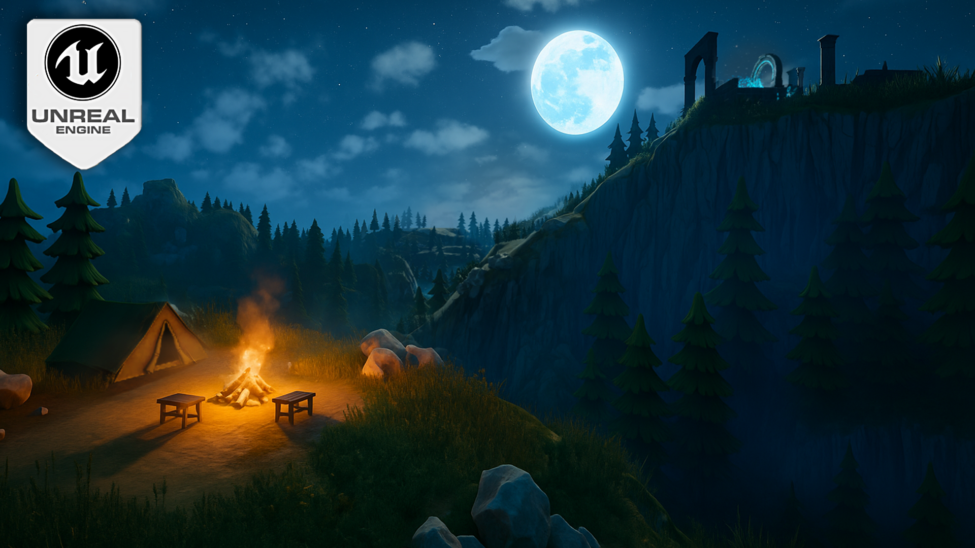
1. Unreal Engine 5 Stylized Night Environment VFX Lighting, Foliage & Landscape Design Intro: What if you could light a moody, stylized night scene
that looks cinematic without spending weeks
wrestling with landscapes, foliage and folk
headaches in real? In this course, that is
exactly what we will build step by step inside
our reel Engine five. Hello, and welcome
to Unreal Engine five stylized night environment, VFX lighting, foliage
and landscape design. I am Luke from Predi Tutor, and I will teach practical production minded
environment building, and I love turning
messy workflows into clean repeatable steps. We start with a fast gray
box to plan composition. Then we sculpt it to
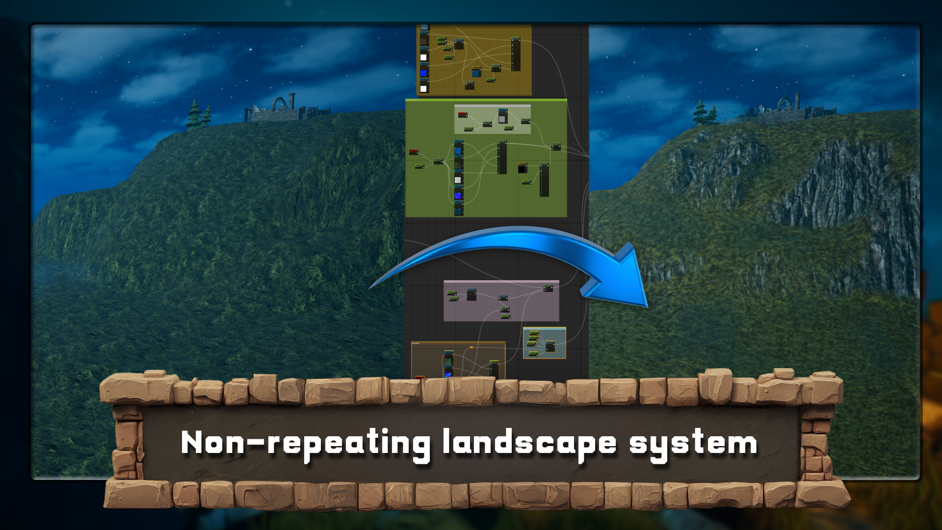
rain and switch to creating a non repeating
landscape material that blends by slope and distance with high base displacement
on nana topology. We replace a blockout
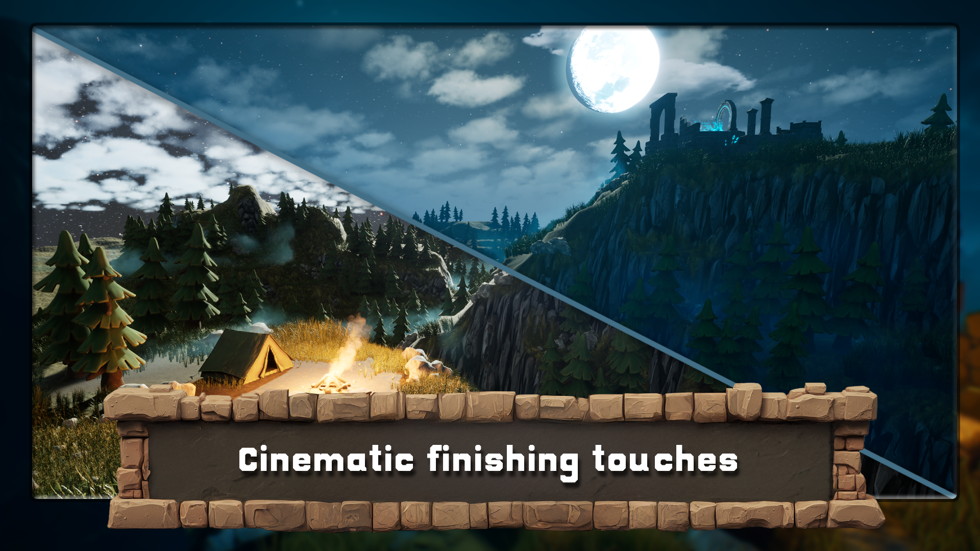
with modular ruins kit, tune the skies and stars, stack or volumetric for depth, add motion to the foliage, sprinkle in niagara particles, and finish with the
lighting and grading for that cool versus warm punch. If that sounds like
a lot, don't worry. We'll take it one
step at a time. So what you learn the ruins
workflow and composition. Block out first, then
swap module pieces for clean focal path
terrain and materials, manual mountain sculpting,
distance based blending, slope logics from grass to
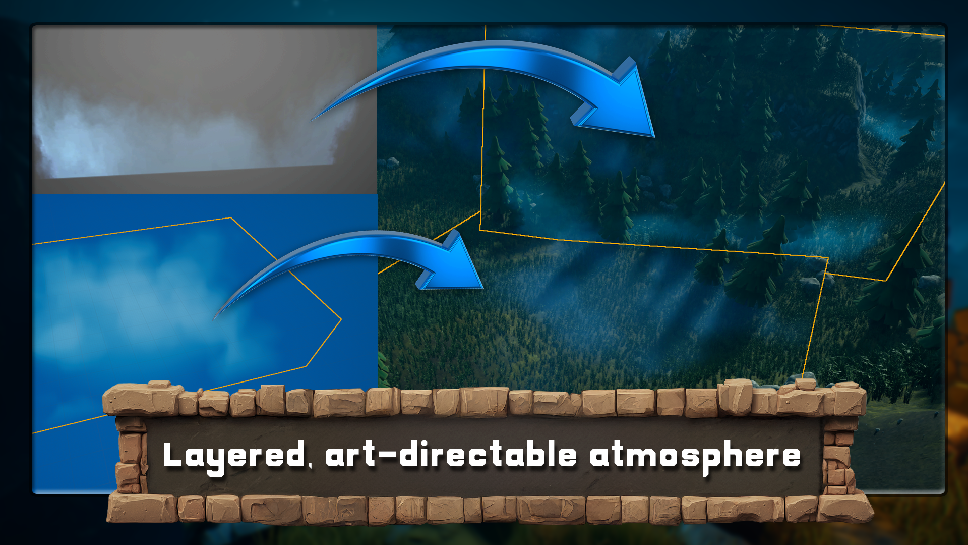
rock, and height displacement. Volumetric tool kit,
exponential height fog, drifting animated fog planes, and localized noise volumes that layer together
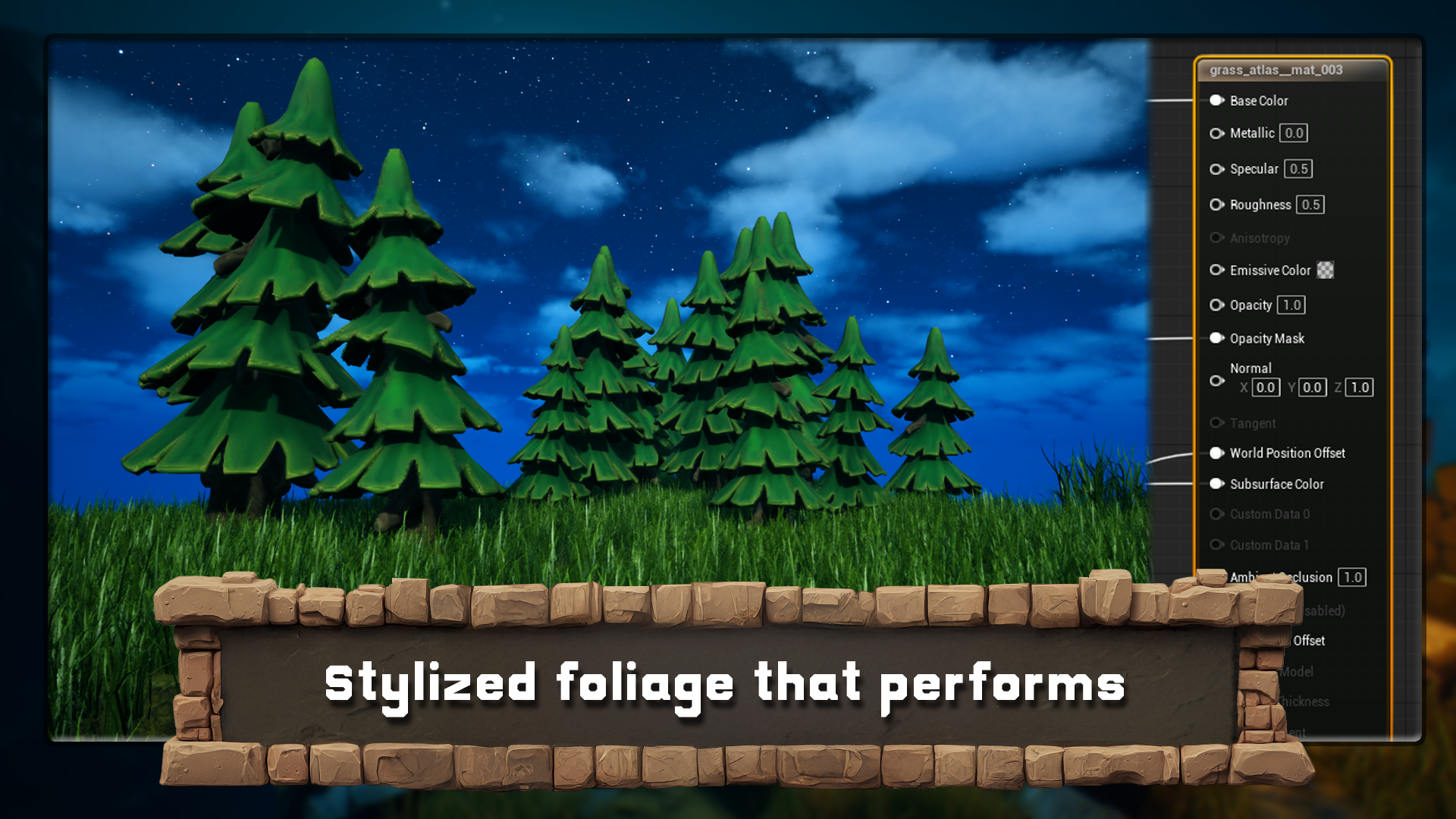
convincingly. Stylized foliage and motion, animated trees via
global parameters and world space noise, optimized grass
using vertex masks and wall position
offset for the wind. Particles and decals, a ruined teleport
effect on the ruins, a stylized campfire, and custom moon cloud decals
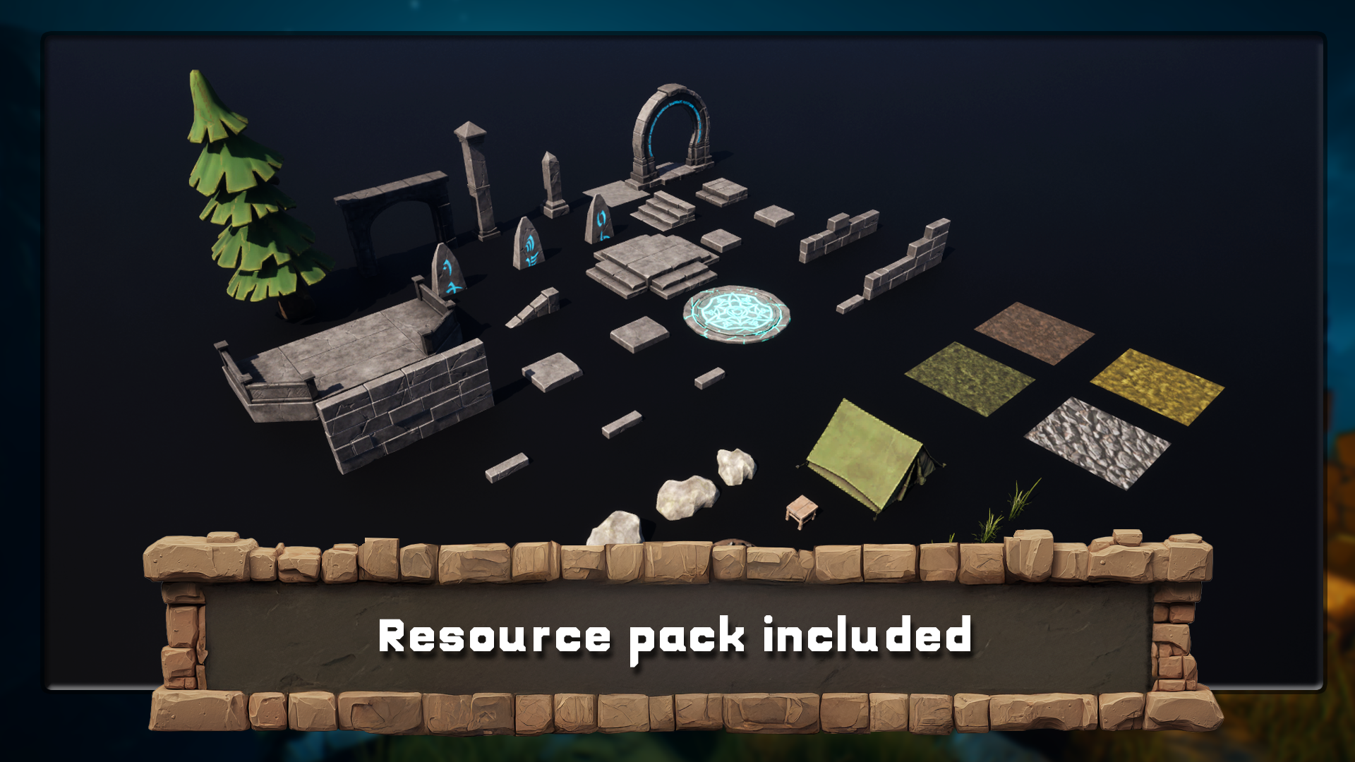
to control the sky. Lighting and color balance. With the resource
pack, you receive a zipped reel engine
five project, which includes modular ruins, meshes or seamless
landscape texture sets with full PBR and height maps, and everything else you need
to create this environment. By the end, you will not only have a finished
night scene, you will understand
why each choice works, how to control
repetition on landscape, how to stack volumetrics
without a foggy mess, how to make foliage feel alive without
tanking performance, and how to push that cool
versus warm balance. So the scene reads
beautifully at a glance. Create your stylized environment you will be proud to show and a toolkit you can apply to any night scene you build next. So join me in unrelengin five
stylized night environment. Let's Build a night your
portfolio deserves.
2. Setting Up Your Stylized Night Scene in Unreal Engine 5: Hello and welcome, everyone to Unreal Engine five stylized
night environment. We effects lighting, foliage
and landscape design. And to start it off,
we're just going to mention that all the shortcuts that are going to be used in the course are going to be
seen on the left hand side. So everything that
we're doing over here within the scene creation, you're going to be able
to recreate with ease. All the mouse clicks, all the letters, everything can be seen on the
left hand side. And before we get started, I'm going to go on to
the Epic Launcher. And for this particular course, we're going to make use out
of the version 5.6 0.1. If you don't have this version, whenever you are within
Unreal Engine library, just click on This
plus button over here and select the newers
version for 5.6. Afterwards, you can
click the yellow button to install and then
click on the launch. While since launching, let's
go over the resource back. Resource pack will
include a zip file. Make sure you extract and unzip all of its contents
because within it, you'll find the
Unreal Engine project and images folder as well. Now, going back to the
Epic Games launcher, once you clicked
on the launch and let your project load
for unreal engine, you're going to get
this sort of a window. We need to do
within here is find ourselves the project
that we're going to use. So by clicking on
Browse over here, within the recent projects, we'll be able to locate the night scene free
Cheater folder, and it should have the config content and dot u project file. Mine has additional folders because I already have it open. Once you open up the project, it will generate you
those new folders. You don't need to
worry about that. We simply are going to select this file over here
and click Open. Is going to mention that it was created with a
previous version. That's okay. We can
just simply use more options and use
Convert in place. The first time it loads, it might take some
time to do so, but the next time, it
will be much faster. And you should get yourself
this sort of a window. To make sure we're seeing
exactly the same layout, we're going to go
onto Window and use a loadout for
default editor loadout. That we're having
exactly the same layout, so it will be easier to
follow along this setup. Now we can go on
to content drawer and find ourselves
preview level. If we were to
double click on it, we're going to see all of the content required
for the resource pack. Now, if you're getting
some errors like this, all you need to do is
just go all the way to the right hand side and
find Fix button over here, click on both of them like so, and that's going to fix
any of the map checks. Then we can go ahead
and close this down. Now, this is the type of content that
we're going to have, and we're going to have all
the necessary pieces for creating our own ruins
within the environment. We're going to also have
a single tree before this entire setup is more of a stylish tree for this
type of environment. We're also going to
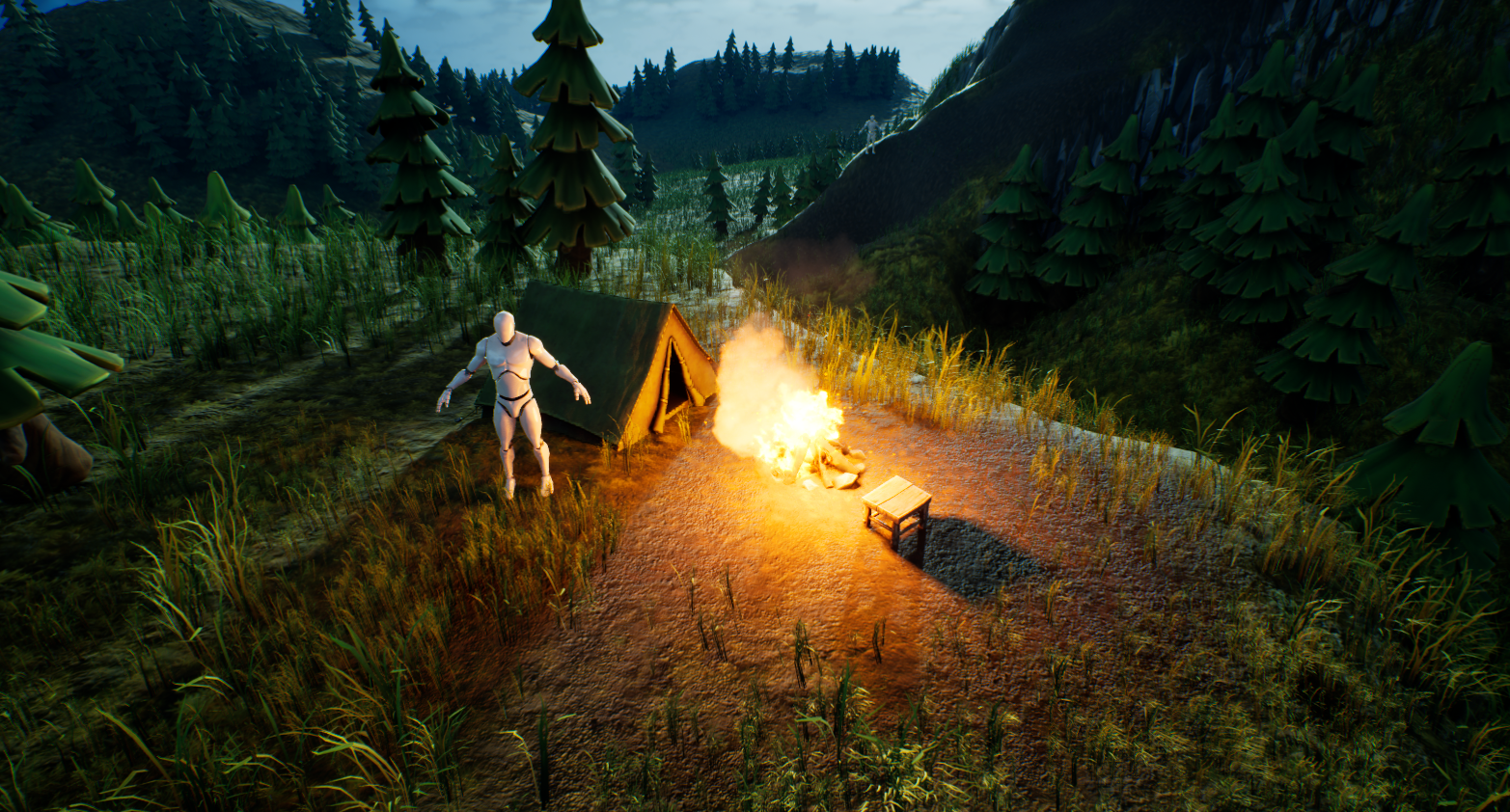
have a couple of rocks, a plane of a moon some clouds to go over it and campsite
items like so, then we're going to
have some materials for our landscape use, just like that, and finally some foliage to be used
again for the environment. All of which we're going
to set ourselves up for the landscape itself to make
the best use out of it. Now, this is not quite finished piece when it
comes to the resource pack. We're also going
to have something additional needed to be
added onto the setup. And if we go back onto
the content drawer, we can click on this
ad button over here. And this will allow us to
import additional content back. And from this, we're
going to make use out of the third person import. Now, this will allow us to add the human scale that we're going to use
throughout our scene, as well as if you'd like, we can also make use out of
the third person template. Two well run around
in our scene. This version of a
third person has been updated from 5.5 to 5.6, and it will be a newer version. In case if you're using
an older version, this will be slightly
different to you. The most important
thing, though, now that we we have added this. We can just close down all
of this content browser. The most important
thing, though, is that once we have the
thing added onto our project, we can go onto
characters, mannequins, meshes and find
ourselves a quin simple, which we can drag
it onto the scene to check the human
scale reference. So that's pretty
good. And you can already see that the
moon, for example, would be way too small
for the scale of a scene. So we're going to
go ahead and adjust that throughout the course, making sure that everything fits nicely within
our environment. We're also going to have
a menu open up that says that ten changes to source content
have been detected. We can click What
change and see that A, there are some changes
that have been created because the update
of a file was needed, but we can fix it
by clicking Import, and that would be it. We don't need to worry about
anything else in here. By default, this should be
set up as a normal setup. We can just click Import, and that is going to fix
all the necessary issues. The final thing that
I would like to mention before we continue on is that we would need
to save out our level, and just using Control and S, which is a standard procedure, wouldn't be enough because using Control and S would only
use save current level. Whenever you're having
a certain window open, it would only save out
that specific window. If you want to save everything, you would need to use
Control Shift ands. At the bottom right hand corner, we can see a tab that
says free unsaved items. Using Control Shift and S, we would be able to save
everything all at once. Alternatively, we can
just simply click on those unsaved items over here on the bottom right hand corner
to save all of its content. And now you see that
it says all is saved, and that's exactly what we want. So that's going to be
it for this video. Thank you so much for watching, and I will be seeing
you in a bit.
3. Building a Powerful Reference Board with PureRef & AI Tools: Hello and welcome
back everyone to UnreelEngine five stylized
night environment, VFX sliding, foliage
and landscape design. In the last lesson, we imported ourselves a resource
pack for the scene, and we added ourselves
a first person template onto our
Unreal Engine five. Within the resource pack, there is one more thing
that I'd like to bring out, and that is going to be this
image folder over here. Once you unzip the entire setup, you're going to have a folder
of images for referencing. And those folders will
contain everything we need to have for just quick references, including just a
general lighting setup, as well as the PNG
formats for, well, the environment itself, and also just some render
shots of the scene. So to make it easy for
myself, what I tend to do, you can either have
it as PNG files or so I'm going to use an
application called PURF. If you're wondering
what Puref is, I will add a video at the end of this one to explain
what it's all about. But for now, though, I'm going to have myself an empty project, and I'm just going
to start dragging each one of those folders individually just to make sure that they each have
its own space. And just by doing it,
so we can import all of these items into its
own separate pieces. And once we have it, like, so
we can see that everything that we need is basically
going to be set ourselves, is going to be set for us, and we're going to have
everything nicely ready for us. So first swings first is just general images of
environment referencing. And to be honest,
when it comes to referencing, the
more the better. Honestly, you should have the type of referencing
for lighting. You should have the
referencing for some composition for
general environment, the location of the environment, as well, so what kind of
trees you'd have and whatnot. All of that type of
setup, you would really, really benefit from
having just to kind of get a broad idea, a general idea of
we're trying to create and the positioning
of each one of the pieces. So first things
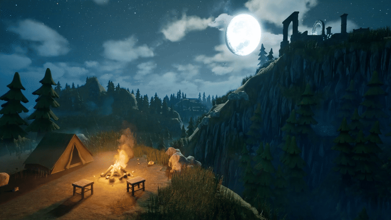
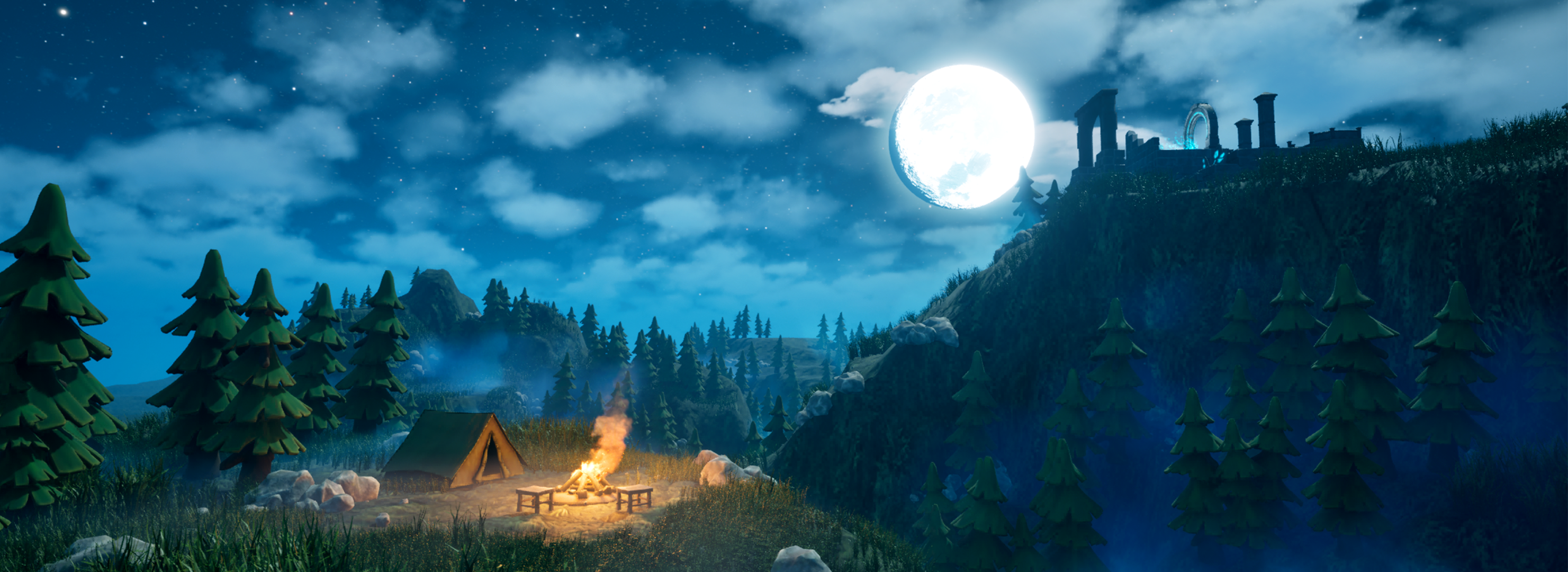
first, if we zoom in, for example, let's have a look onto this shot over
here, this vertical shot. Although the final render that we're going to create is going to be more of a landscape. This is a perfect example of how the setup would look like. And at foreground, we have a nice camping site
fully, nicely lit. So the focus of our eyes always would end up going
towards this section over here. We also have at the opposite side in terms
of, you know, symmetry. So if we draw the grid
like this, we'd have one, like in one corner and another focal piece
in another corner, and all of that would
be a little bit more enhanced with the moonlight
itself and the moon itself. So that would be a
nice type of shot, and we have some
bit of connection with a path going upwards, and the rest of the objects
is more like silhouette type. So they're not fully
lit and whatnot, but because it is a night scene, we'd get those darker shadows, those hotter type of colors. And in the background, we'd get actually lighter
ones because of the soft type of fog that is going in the landscape itself. The entire landscape, the terrain itself would get lightened up a little
bit by little bit. And that's a nice way
to kind of break up, you know, the foreground
with the background. Like so and then in
the background itself, real nice light from well, the skylight, the beautiful type of scenery that
we're seeing over here for all the stars and
everything of that sort. That's basically it. When it
comes to the night scenes, it's really important to
kind of distinguish that it's not as simple
as a day scene, and I really recommend you
to just go into movies and cinematics and have a look at the way the night
scene is set up. And usually when it's done, it's going to give you somewhat of a glow for bluish tint. So they're not actually creating a realistic type
of a night scene, but it just has
to be believable. We're going to talk more about the lighting as we get
further down the line. But the whole point is that the bluish light is often
associated with, well, the night scene, it gives
that cold type of a look, and whenever there
is a campfire, it would be more
of a warmish glow. And over here, we're going to have ourselves the
references for, well, just the general terrain. We're going to have ourselves
the human reference, which is 1.8 meters for, I believe, both the female
and male mannequins. So that's that, and over here, we're going to see a few of those mannequins
placed around the setup just to kind of get a bit of a reference
for the overall scene. Then we're going to have
the overall landscape, again, with those Mannequins
slightly visible. For a better visibility, we're going to have
this scene over here, which is going to have all of those Mannequins
visible over here, and we also are going to have
some numbers seen in image. These numbers are going to
represent the height that was being used for this
particular landscape. So this mountain over
here, for example, would be a bit lower
in comparison to this one and this one
is the tallest peak. And then we're
also going to have a number for this
mountain over here. So these are the four
numbers that we see on the terrain to help with
the overall referencing. So we have a lighter coloring, lighter exposition to
kind of see what kind of mountains we're having out of the setup, and that's
pretty much it. The rest is mainly for, well, better bit of referencing. You see the top down
views and whatnot, a bit of extra close up shots, all of that good stuff
just to kind of help us visualize this overall scene. So with all of that being said, just to make better
use out of PUF, for those of you who
want to do that, I'm going to play a quick introductiony video
to the PureRef, and this will help you to better navigate throughout
the entire program. So that's going to be it for me. Thank you so much for watching, and I will be seeing
you in a bit. Welcome, everyone to our in
depth referencing guide. And it's very important that we actually use
references in pretty much any kind of modeling or environments that we're
actually going to be work on. So before we actually
do anything, before we put any cubes
down or anything like that, it's really important
that we have some really, really decent references
to actually work with. So the first thing I want to recommend is that you can use something to actually
put all your references on like Photoshop or even word. But what I'm going to recommend is that you use something called pure so if you go to the site,
that's called purev.com, you will actually open
this, and from there, you can actually
click Get Pure Rv, and that then will take you
to this download screen. And you will see at the moment, you've got 157 or custom amount, you can actually put this on zero and actually
get this for free. So it's completely free, and you can come back and
make a donation if you like. And then all you need to
do is click Download. So the only things
we're going to talk about pretty much for
reference in here, are going to be free, except our mid journey part. But there are other
alternatives like Dlly and a load of others
out there that you can use instead of mid journey. Once you open up pura, then, this is what you will be
greeted by this screen. And if you want to right click, you can actually drag
this around to any of your screens or you can actually make it
smaller, like so. And it's a really,
really good program. This really, really handy,
highly recommend getting. Now, let's actually think
about getting our references. And there are a few sources that we use to actually
grab references from. But generally, what you
want to do is you want to build up a kind of
reference pag if you're going to be a hobbyist or a professional in
three D modeling or environments where
you're going to see things perhaps on
Pinterest or sketch up, and actually, you want
to save them in a file. So I know people with
thousands and thousands of images that they've
saved over the years. And whenever they're
coming to a project, they'll then dive in
and actually find all of the images that they've got on that particular thing. This could be a samurai
warrior or a Chinese bell. Also, a lot of people
I know as well, who are working
professionally at this will go around museums. They will take their
own actual images, and then they'll also upload
those to the file as well. So the first point of call
if you're not actually got your own database yet is probably going to
be actually Google. So let's open up Google, and you can see here
that at the moment, I'm looking for a
Victorian delivery truck. I'm going to do is, I'm
just going to go through these and get some nice
references like this one, for instance, and then
I'm simply going to right click and I'm
going to copy image. Then what I'm going
to do is I'm going to go over to PUR RVs. I'm just going to open it
back up, press Control V, and you'll see now that I've
got my nice image in here. What we're also able to
do with PUREvs we're able to also pull it out and
make it bigger if needed, which is really, really
handy when we're putting in lots and lots
of actual images. Now, the next thing
I recommend you do once you've actually
got an image in there, is what you can do
is you can left click and drag it
over somewhere. And then what you can
do is you can press Control N and you can
actually make a note. So let's call this Victorian
Trucks. Let's put it Trucks. Now, within my scene,
I might actually want a Victorian lamppost as well as part of the scene
or something like that. So let's actually
look at the next one. So the next point of call is actually going
to be Pinterest, and let's actually put in Victorian lamppost.
So let's try that. Like, so let's see what we get, and we can see we've got many, many styles,
especially this one. This one's actually really nice. This one's also really nice. So what I'm going to do is I'm going to actually take this one, I'm going to right
click Copy Image, go back to my PUEv and then
drop the images in there, like so and maybe make this
one a little bit bigger. What I tend to do is I gather a load of images for
each of these things. When we're actually
building a scene or even just the model, you want to grab as many
images as possible. I'm talking hundreds
of images here. And especially if
you're doing a scene, you want all of
the little parts. You want everything
down to the lighting, the environment, the trees. You want to grab references for absolutely everything because it will make your
scenes just really, really look so much better if you've got some
really good references. So now let me show
you this is one that I'm actually working
on at the moment, so if I come over
and load Reason, and I'm just going to
load this one here, and you'll see at the moment,
I have all of my props. I have all of my main
buildings that I'm going to be looking out
to use as references. I have a ton of doors. I even have a load of foliage. I have all my windows. I have my lights over here, and I also have, more
importantly, all of the lighting. In other words, it's a scene. So what time of day
is it going to be? Is it going to be, you know, early in the morning, or
is it going to be at dusk? Is it going to be a night scene, or is it going to be midday with that sun beating
down on my scene? Just make sure that it
actually matches the scene. There's no point having
a scene like this, for instance, so this one here. If you've got a log
cabin out in the snow, you really want it to
match your actual scene. Now before moving on,
there are a couple of other places that we do go
to use for referencing, especially something like
sketch up, which is really, really great because you can actually come into
an actual scene. And then what you
can do is you can actually rotate
around it and really, really check out how a model is put together like
something like this, which is one of our actual own. But you can see here how
easy it is then to get a good idea of what actually
incorporated in this scene. And what you can actually
do from there, then, is we can actually come down
and we can actually get some screenshots of this or even right click and copy image. There's also, let's
say, if we wanted to do a Victorian truck, for instance, to keep the same theme as
what we've been doing, you can see that
there's no end of actual Victorian or vintage
type vehicles on here. Not as many as what
there is on ArtStation, but still a very, very good place to start looking
for reference in. That leads me on to my next one, which of course is ArtStation. This simply is one of the
biggest resources for referencing or for looking
up artists in the world. So let's put in a
reference of Victorian, for instance, and let's
see what we actually get. Let's search artwork. So we're going to search artwork and let's see what it
actually comes up with. Should be lots and lots of
things to work with here, especially good, if you're
looking for actual lighting. So you're looking for lighting effects
like this one here. And again, we can take these actual um use them
for references. And the best thing is about
ArtStation is we can also come down and look at things
that may be concept art, so two D or actual
three D. And we can also come down as well and look at what subject
matter it is. So it could be automotives, so Victorian automotives, or it could be architecture
or something like that. So the possibilities with ArtStation are
pretty much endless, and you're able to grab
tons and tons of really, really high quality references. There are, of course,
hundreds and hundreds of other places you could probably
go to grab references, but I'm showing
you these because as far as references go, these are some of the
best places to go. Let's move on then to one of the things that we
really use a lot of now, which you wouldn't have
thought actually would come into it as far as
referencing goes, but it actually is
really, really handy. So let me introduce
to you now Chat GPT. So here is Chat GPT. You can see that we
have Chat GPT four, but we also have 3.5. 3.5 is actually free, and it is actually good enough
to do whatever you want. You really don't need to pay
for this. It's also free. So what I'm going to do
is I'm going to go to message, and I'm
going to type in, give me ten different buildings for a Victorian town scene. Something like that. Let's click Enter and let's see
what it gives me. So you can see now it's given me a lot of things to
actually work with here. And the best thing about
this is you can also say, give me ten more. And it will just then go
ahead and give you ten more. Now, these things
are really handy to use because then I can simply take these ideas and it'll
also bounce other ideas to me, and I can then go
into Pinterest. Or Google search and actually look them up or try and find
something like this. And I can kind of get
ideas and design my scene around there using all of those things and
especially Pure rev. We can also take them in
to our actual Mid Journey. Now, again, our mid
journey is paid for. I think the lowest amount is
$20 or something like that, but there are many, many
free things out there, but I will still show you
what we actually do with our AI based image generator. So you can see at
the moment, this is the image that we've
actually generated. I know we've called it it's
Victorian era delivery van, and this is what
we actually get. If we go to my images, you will see that
we've generated a ton of images about
all of the things. Especially, we use this as
well to generate textures. It's not just there to actually generate images and ideas
and things like that. You can actually use it to
generate transfers that are going to go on Windows or
adverts or actual textures. And we do use this, especially for things like curtains
because it's really, really easy to get that look that you're actually
looking for. Can see we've got a lot of
ideas for living rooms. We've got a lot of ideas for bedrooms and
things like that. What we can also do
in mid journeys, we can also go and explore. And what you could do is
you could look up with a search prom Victorian. Let's put in carriage. And then we can also
get ideas from this. So if I put in
Victorian carriage, you can see this
as what comes up. Now, if we come over to here, we can also see if
we click on here, this is the actual prompt
that somebody put in, so you can actually
take that prompt, maybe change it around a bit, and then get your own
images rather than just simply copying
other people's images. It's a great place to start to actually gather
your own images. The other thing is
about mid journeys, I can come in for instance,
let's just go back. And then what I can do is I
can hold the shift but down. I can grab all of
these, for instance, and then what I can do is click the Download button and
download all of those images. And the best thing is
about PUREv is you can bring in multiple images
at the same time, so you can just drag, drop them, and then they'll all appear
actually next to each other. So really, really
handy things to have. So, lastly, then, to sum up, don't do what I did
a few years ago, where I just dive straight into blender and not even think about references and just find references if I had to while I'm actually
building something. Don't do it that way. It leads directly into building a
beautiful gray box, as well, all this, because first of all, you grab all of your references, you make sure
everything's set out. You can go and find some more
references if you need to. You know, if you suddenly
have a spark of inspiration, you want to make
something on the fly, then grab some more references
for but to start with, grab all of your references, have them really, really
nicely laid out, and spend, you know, even half a day to a day grabbing all
those references. You can then save
the pura that as well into individual files, and then you'll have all
the other references around that particular
build in there, ready to use maybe on another
project in the future. Or everyone, so I hope
you found this useful, and I'll hope you'll take
my advice going forward. Thanks everyone. See you
on the next one. Cheers.
4. Creating and Navigating Your First Level in Unreal Engine 5: Hello and welcome
back everyone to Unreal Engine five stylized
Night Environment, FX sliding, foliage
and landscape design. In the last lesson, we went over the PURF setup for
our referencing, which got us this
sort of a file. Now we're going to move on
to creating our first level. So for us to do
that, we're going to go on to file new level, and we're going to
select the basic scene. We're going to go ahead and
click Create, and right away, we're going to hit Control
and S to save our level. So this one, we can call it night scene like
so and click Save. And that way, we got ourselves
a very nice basic type of environment that already gives us a nice components such
as directional light, skylight, as well
as cloud system. If we want to set ourselves up with a third person character, if we were to hit plane
now, nothing will happen. But if we do want to have
that third person start a content that we
imported previously to be within the
scene, we can do so. We can simply go on to
edit project settings, and then we're going to find
ourselves a game project. We can go on to all
settings over here. Then search for
simple y game mode. There we go, default
game mode over here, and we can select BP
third person game mode. Once we have it over
so we can hit close. And now when we click Play, we're going to see
ourselves this character, which we're now going to
be able to move around in. If we want to control where
the character spawns, we can simply go on to
Add button over here and search for
start player start, like so and then select it. And this will give us capsule
where we basically move it, it'll spawn our character
in. So that's pretty nice. Um, in terms of motion and how to navigate
within the viewport, I'm going to play a quick video for viewport
navigation basics, and then we're going to continue
on with the next lesson. So thank you so
much for watching, and I will be seeing
you in a bit. Hello and welcome
everyone to Unreal Engine five basics guide for
the camera motion. And we're going to start off by introducing you to
the camera type of motions within Unreal
Engine five in order to help you follow
along the lessons easier. So to start off within the middle section
of the software, we have a perspective
camera view by default. And using this, we can
move our camera around. The main thing that
you need to remember for when you're moving
your camera around is that by holding Alt and ev
one of the mouse buttons, you'd be able to make
a certain motion. So, for example, by holding
Alt and left mouse button, you'd be able to rotate your
camera around, like so. By holding Alt and
middle mouse button, you're able to pan your
camera around just like that. And finally, by holding Alt
and right mouse button, if you were to scroll up
and down using this motion, you'd be able to zoom in
and out of your view. Alternatively, you can simply just scroll your mouse wheel and zoom in or out of
the project like that. Now, if you want to zoom in
towards a selected object, what we can do is if I were
to select this box over here, for example, I can
click the letter F and it would zoom in
right onto the object. Now we can use this to
rotate our camera around and simply see a level with the
object selected as a center. If we were to select a
different one and click F, we'd zoom in onto our asset. And if the asset is larger, like this ground plane
over here, for example, if we were to click F, it would zoom out and
make sure that the camera view has the entire
selection within our view. So this is pretty
good for whenever we want to zoom in
onto our selection. You do need to be careful, since if we, for example, were to select a
sky and click F, it would zoom out all the way, and we don't really
want this to happen. So make sure that before
clicking F though, your selection is not
something like a skysphere. Now, if you want to have
more control over camera, and let's say you want it to be similar to our
first person game, what you can do is by
holding Right Click, you'd be able to enter a sort of camera movement mode
within your editor. Right now, if I were
to hold Right Click, I can simply rotate
my camera as if this was a first
person sort of a game. Now, what's nice about
it is if we were to hold Right Click and use WASD, we'd be able to move
around our acid so. So by holding RClick and W would be able to go forwards by holding right click and S. We can go backwards, A to
go left and D to go right. And also, if you want to go
up directly or down directly, you can use the
combination of Q and E. So by holding right mouse
button and holding Q, I can directly descend
down to level. Similarly, by holding
right click and holding E, we can go up to level
just like that. Now, if the camera is a little
bit too fast or too slow, we can make use out of this icon in the
upper right corner, which says the camera speed. If we were to click
on it, we can use a slider over here to set
the speed of our camera. So for example, if I
were to set it to one, I have a really slow motion
and we'd be able to have a really fine control over where our camera with
an editor mode is. If we were to set
it up to eight, we'd be able to go really fast up and
down, just like that. But by default, it should be
set to something like four. There is a value underneath
it, which is set to one. If we were to set it
to two, for example, this will multiply
our four speed to be all the way to eight. So right now, if we
were to go up and down, you'd notice that
it is way faster. So this is quite useful for when we're working
with different scales. I personally only
recommend you to use this value for when you're
going up and down in scales. So, for example,
if you're working with planetary kind of scaling, we'd want this to
be increased to, for example, 14, and then
this way we'd be able to go all the way out
real fast out of a level. But by default keeping it at one and simply scaling
this up and down, we'll do just fine. Within the perspective view, we also have a couple of
hover perception modes, and those would be on the upper left corner of the window for the
perspective camera. So right now we have
set it to perspective. We can change those to be top, bottom, left and right. What this would do is
basically it will help you get different types of
use for our level, right now, because I'm set to bottom, if I were to set it to left, and if you don't see anything, we can always make use out of the letter F and go back onto
the level just like that. This is quite useful
for whenever we're creating environments
and assets, and we just want to make
sure they look good and proportional to the rest of our level and from
all sides of angles. Again, by default, this
will be a perspective. If you do want to change it
to be into multiple cameras, though, and you want to see
multiple of them at once, we can click on the upper
right within our view mode, but over here, you click
Maximize or restore View. Way we get three
different viewpoints, all from which are different
types of perspectives. Now, other than the perspective, all the Ava ones
will by default, be set to wireframe. If you don't want
this to happen, we can always set
them to be lit. So especially when
designing a level, this sort of a view
might be quite handy. To go back onto one view, what we have to do is locate our perspective camera and click on this button over here. Within this perspective view, we can also change the way our camera perceives
the entire level. And right now it is set
to be default of IT, which means that all
the shading would be seen with proper
shadows and whatnot. So in order to change that, we'd have to click on it. And if we were to, for example, select unlit, would show you all
the level without any types of shadows. You
can go ahead and do that. We'd get this sort of result. It's also something
like a wireframe, which you'd see in AVO cameras. If we were to click
on it, we'd see the types of geometry
that we'd have. So it's quite nice
to know, especially if you by accident sometimes, click on one of them and you don't know how to get out of, can always go on this
button over here and select after which we also
have show icon over here. This one will get you
different types of visualizations for your
respective camera. But what you need
to know, though, is if you have something
that's a little bit off, for example, I have
my grid right now, which is barely visible, but it is often quite useful for when we're
creating our level. But if this is not
visible, for example, if I have this turned off
with this button over here, I want it on, but I don't
know which one exactly it is. We can always go ahead
and click USE Default, and this will bring back
all the selected defaults that is usually set up
by the default template. That's pretty much all there
is to the camera controls. I hope you enjoy the video, and now let's get
back to the course.
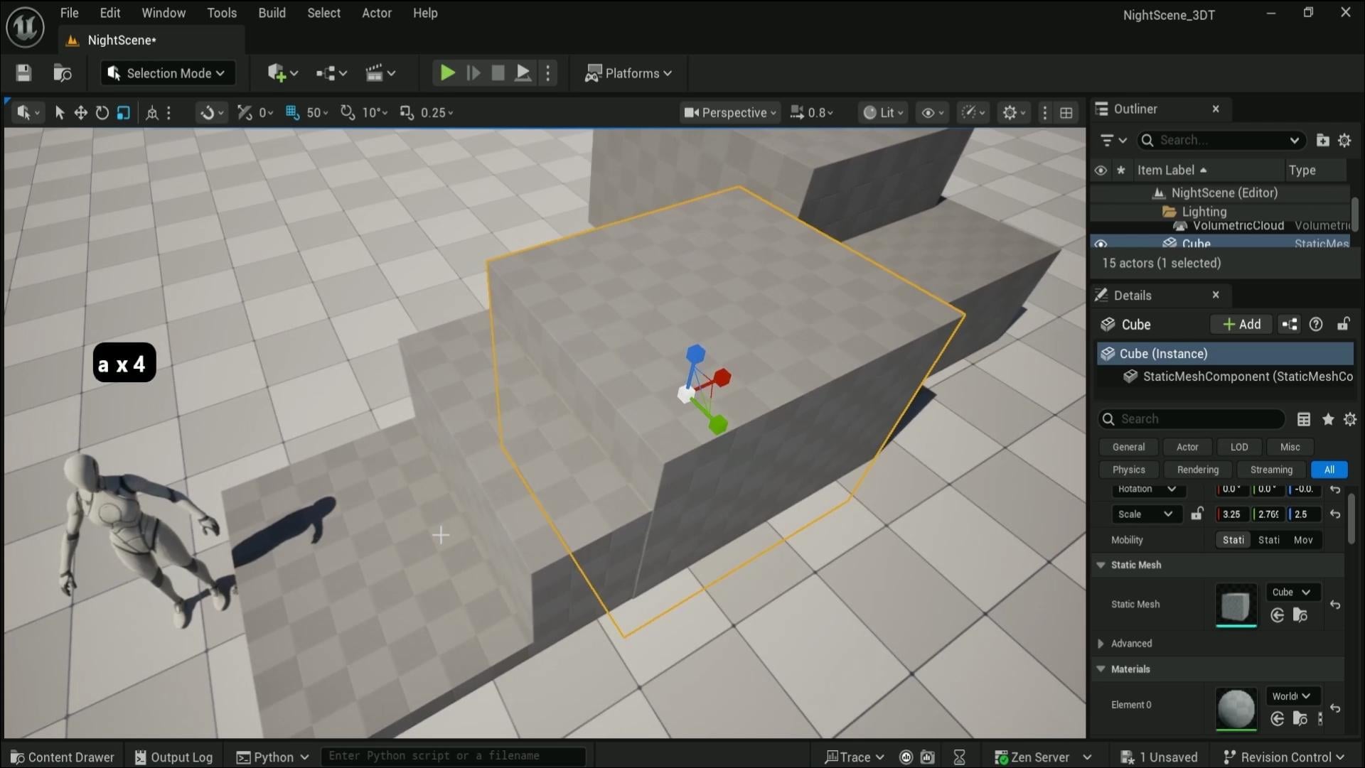
5. Graybox Spiral Ruins in Unreal Engine 5 with Precision Tools: Hello and welcome
back everyone to Unreal Engine five stylized
night environment, VFX, lighting, foliage
and landscape design. In the last lesson, we went
over the basics of, well, the user viewport and created ourselves a nice brand new level for us to make use out of. Now we're going to start off, well, working on the scene. And first things
first, what we're going to do is we're
going to create ourselves a basics cube sir, no, the basics, shapes cube. There we go. And that's going
to give us a nice scale one by one by one for well, a cube. We're going to make use out
of this to create ourselves a very simple and nice
little setup for gray box. In terms of moving
the object around, we can use W to select
our Gizmo for movement, which can be also
clicked over here on this corner upper
left hand corner. We can use this to
move it around using this Gizmo of the
arrows like so. We can also click E to
go into rotation axis, which will allow us to rotate our object around
just like this. And finally, we can use R to
go onto the scaling Gizmo, which will allow
us to either scale the whole object
like this or use only the axis lock
to scale it in terms of the axis
itself, just like that. And if we look at the reference, like, so we're going to
create this piece over here. We're going to start off by well oversimplifying
this entire shape to give us something
for, well, the ruins. So we have ourselves a cube, and I would also like to grab a character that we had previously placed it
in a different scene. So Quinn Mannequin, like so, we can leave it as is and now start working
well with the basics. And First things first, when working with the design, we need to visualize how it would look
like as a ruin setup. And for that, I'm just
going to start off by, well, using this
soup to extrude it. Like, so notice how I also
have some snapping turned on. At the very top, we have
highlighted blue grid snapping. Make sure this is enabled
and angle snapping. So when we are rotating, it's going to snap
by ten degrees. And also we have scale
snapping as well. So that's set to 0.25. All of these options
are set up by default, just kind of help
us out, visualize how this will be shaped out. And to start off, we're
just going to well, make a very basic
type of platforms. And whilst we're doing this, we're going to talk
a little bit about how well they're going to be
looking like for the setup. So when creating
ruins like this, it's important to not just create a simple
blocky type of results, and we're going to work towards more dynamic type of a shape. So in this case, I'd like to make more of
a spiral type of a setup, meaning that we'd have, well,
this is the front platform. We'd have another
platform that's also going, lower a little bit, like so maybe a little bit
closer, just like that. And that's a nice basic setup. And then another
one at the bottom, like, so something
of that design. So it's going upwards like this, which is looking quite nice. And then let me
just have a look. I think it's a little
bit too high up, so we can just go
ahead and select them both and lower it by one. There we go, something
like this is nice. Then when it gets to the
middle part over here, we can make it even higher. So I'm going to upscale
this a little bit, like so and scale it outwards just to make sure that the corner is not touching, and it would look a little bit
more natural to the setup. Now, in this case, I don't like the way this
is being overlapped. I'd like to ideally move it
outwards or alternatively, I can squish this down
a little bit like so, and we'll get this
sort of a setup. This part over here, it would
look a little bit too void, too empty if we'd
leave it as is. So what we're going to
do is we're going to make yet another
duplicate and move this downwards like so and even maybe expand
this a little bit. But I don't want this
entire gap to be filled up. What we're going to
do is we're just going to move this a
little bit to the side and slightly scale it downwards. So just to make a nice little
platform to help us break down this vertical entire
shape just like that. And already, it's
looking quite nice. It's going upwards like this, and then it's going
to spiral upwards even more on the higher
section over here. However, at this point, we might have noticed that the material being used is a little bit
hard to visualize, especially with such
bright lighting. So one thing that
we could do is we could change up the
material for this gray box. And if we were to select
all of these blocks, so, we can go to elements on the right hand side
within a detail stab, scroll down until
you see materials. We can simply click
on the material stab, search for grid, like so and
find world grid material. Click on it, and we're going
to get this type of result. Some of the parts are going
to be slightly glitching out, and the reason for
that is because we are overlapping some
of those meshes, but that's totally acceptable for something like a gray box, we can fix that later. We're going to fix that now
because it's boring me, so I'm going to turn
off this scaling real quick and just slightly upscale this a little
bit just like this, just by tiny bit, like
so, and there we go. We fixed it. Need to
worry about this, you know, being a little
bit outward or something. We can do something similar for this one, as
well if we want to. But, again, this is just a
quick fix for overlapping. And since this is
only a gray box, we don't need to worry
about it too much. Honestly, we could have
kept it overlapping. It would have been totally okay. Moving on with the shape. So we already have
this type of a setup, which is already
looking pretty good. Now we need to move
it even higher up over on this section. This time, we need
to also visualize a little bit for the
staircase, as well. And for that reason,
I think I might even lower down this scale. So this time the scaling
is set up with snapping. I'm going to kind of squish it downwards a little bit just to make it a little bit thinner. The reason being is
that I do want to have some space
for the staircase. And when working with the
staircase for gray box, there are a couple
of options to do. One way would be
well to hold alt, move this outwards to make
a duplicate, like so, and we'd have ourselves very nice basic type of
platform which we could then rotate it and just pretend like this is
going to be a staircase. That would be one
way of doing it. The other way, a
little bit more of a complex way would be to
go onto the selection mode, go on to modeling
section over like so, and we have a brand new well, setup layout for creating and
adjusting different meshes. For now, though, we're
just going to go on to create staircase, and you can see it over here allows us to
create a staircase. We can adjust the number
of steps over here. Probably we can change
something like six maybe, like so, and that
would be totally okay. I think six is enough. Going to go ahead and just tap on our terrain, click Accept, and we're going to get ourselves basic type of a mesh
for the staircase. Now let's go back on to the
default selection mode, and we can just slightly
tweak this staircase a little bit just to kind of better fit this overall setup. And I am going to lower down the grid to ten
for the snapping. That way, I can
actually tweak this a little bit more in terms
of, well, it's positioning. So I think this staircase is a little bit higher up too high. Something like this
will be quite nice. We then we can then hold
Alt and drag this outwards. So if we're dragging the gizmo, you'll notice that
we have arrows, but if we're just selecting
the square over here, we're going to affect
multiple axes at once. That way we can do
the vertical axis as well as horizontal axis, but not move it in
this kind of way. So by just selecting this,
we can just move it like so. And again, while
it's holding old, we can just duplicate
it like so. And yeah, in this case, I think this setup is
a little bit too much. So what we're going
to do is we're going to break down the
staircase a little bit and just leave a little
bit of a place for, well, a platform
like this. Like so. That will be much, much
better, I believe. So there will be a
nice walk in platform. It then goes upwards again. And over here,
let's say we could have a staircase,
maybe more like so. You can imagine it being broken down a little bit,
just like that, and yet another
platform. Just like. And this edge is right. The upper side over here, we can have a little bit
more control over the setup. We can start working with
curving to be higher up, even higher up
section over here. And I'm just going
to go ahead and select this block over L Zo, move it up to the
side, just like that, and we should probably have
another staircase actually going upwards even from
here, just like that. And like so. Yep, that sounds that looks like it's going to
be quite alright. Now, this platform over here
should be even higher up. We now need to decide in
terms of the staircase setup. So, honestly, I'd prefer this
to be a little bit steeper. That way, it could go
up higher, faster. And then I'd want to
have another staircase, which would only be a couple
of staircases along that just kind of would finish up
this section over, like so. But this staircase is
a little bit too much. So we're going to create
a variant for that. We're going to go back
onto modeling mode, get ourselves to staircase. And this time, we're just
going to create two steps. So select two steps, click Enter, and then place it somewhere on the
ground, click Accept, and we're going to get ourselves basic two staircases for
grey boxing out or setup. So that's what
we're going to do. Now, in terms of the
setup over here, we're just going to
grab this piece like so and move it
upwards like this. And we are actually
running out of time. So I think I'm just going to help us finalize
it a little bit to have a small platform over
here and extend this over, like so, something like
this is a very good start. We can over view this in a next lesson and kind of fix
up all the necessary parts. So yeah, let's go ahead and continue on with this
in the next lesson. Thank you so much for watching, and I will be seeing
you in a bit.
6. Designing Natural Spiral Staircases for Stylized Ruins: Hello and welcome back
to room to n reele Engine five stylized
night environment, VFX sliding, foliage
and landscape design. In the last lesson, we went
over a nice little sea for a gray box that we're
going to continue on with this and talk
a little bit about, well, the original idea of just making sure that
the gray box itself is going in a little bit of a more spiral
organic type of way. So on the right
side, we're having this nicer elevation
that goes up and up and up until it goes to the end of
the middle part, and then it turns with the staircase and then goes onto the left
hand side over here. So if we look from
this end over, so we're going to see
that it's quite vertical. We need to go ahead
and fix that. We also need to fix
up this staircase over here because we ended up, well, not quite
finishing that just yet. And I'm just going to, well, change up the position
a little bit, change this up in
terms of the box, making sure that the
staircase at the very end is going to be a little bit
more well flashed out. Let's put it this
way. And we also um, now think about, well, the end bit over here at the staircase, because we don't want this
to end on the stair itself. So we want to have a
small little platform at the very end
just to make sure that we have some nice way
of ending the staircase. Again, we're not worried about
it too much in terms of, well, it's positioning
or anything like that, blocking out the
shapes just like that. So something like that is
going to be more than enough, and then we can think about the last piece of block
over this one over here. And I think I think this block
can be a little smaller, just a little bit like so and places closer to the
section at the very start. These staircase might be
a little bit too wide, so we can just shorten
this a little bit and just looking
at overall setup. We can see that well, it's looking quite nice
for the overall section. We now need to
start considering, well, the final pieces. So for example, this
back end over here, even though when we're thinking about original
camera placement, it might not be
quite as visible. It's still a good idea to
make sure that everything from all the sides are going
to look well, quite nicely. So for this part, we can have a look at the
reference a little bit. So if I was just
check reference, we have the staircase. Go all the way up to
the topper section. Then we have some way of
breaking this vertical section like so and a little bit of breaking around
over here as well. So let's go ahead and
just grab some of those elements to make sure that we're having
something like this. So from top down view,
we're going to have this kind of a visual aesthetic. Let's go ahead and have a
look if we can sort this out. So first things first,
I reckon we can have a little bit more of a
nice elevation over here. For this section, we can
just make sure we are having a little bit
of a part like so. Nothing too much,
just a little bit of a platform going
downwards like so, and maybe even that
same staircase, small staircase that we had over here is going to be
placed over like so. When doing a gray box,
I'm also making sure that I'm not overusing too many
of different elements. So, for example,
this staircase over here is a little bit wider one, and I might want to shorten this down a
little bit in terms of width to make sure that
the duplicated staircase is going to be well, somewhat of a similar width. So when we come back to creating assets or
using the module parts, we don't need to, well, make sure that we have each
width uniquely set up, and we don't need to make
multiple unique acid parts. So that is that in terms
of this section over here, we can actually, I reckon, make a little bit more wider
of this area over here. So I can make this
quite a bit wider over, like so and just
place just like that. And the bottom part will also
need to be wider, actually. So I'm just going to go ahead and stretch it out like this and just place it
replace it like so, and this needs to be the not as wide,
something like this. What I'm doing right now
is making sure that well, we're breaking this surface
around a little bit, and we're also having some well, non 90 degrees type of
angles over on the end. So it helps us to just break
down this entire section. And I think that's
honestly enough, we just need to
make sure now that we have this whole setup. We're going to have some well, breakage, as we talked
about earlier over here. So I'm going to make probably a duplicate
over from this one, this and just create
it something like so. Again, it doesn't need
to be super accurate. We just need to get
general shapes out of it. And I'd say the best setup of the gray boxes would be just to make sure you're
keeping the flow going, not stopping and just
constantly iterating and adding unique shapes to keep the organic out of your setup. So something like this,
I reckon at the base, like a small platform to just break up this vertical
surface will be quite right. We can have some bricks or
something of that sort. And that's another thing. When
you're creating gray box, you might want to consider
the type of well, assets that are being used. So for example, in this case, because we're having more
like a ruines type of setup, it's really important to
know that you could have bricks at the type of
pillars you could place. And all in all, you know, considering the type of assets you're potentially
able to work with. Even at the very start, when creating a grid box, you don't really have those assets. It's still, you
know, good to know. That's why at the very start,
it's important to have some references of that exactly the type of
theme you're going for, what kind of visual
effects you're able to get out of your
setups, and what not. So for example, we're
also needing to consider the way
emissive glow will be shown in the
runs and stuff and whatnot that will allow us to highlight some of
those asset parts. But something like this,
I think is quite right. This is a bit of an empty gap, so I'm going to be
a little cheeky with it and just fill it
in with an extra block. Again, I'm not too concerned
about it at this point, just making sure that
it's just blocked off. And then when we're
using assets, we're able to consider
the type of setup. This part over here, I am
a little bit concerned about because we don't have exact the staircase
that would fit. We could make this,
for example, bigger. We could make free
staircases and whatnot. But looking at the reference, if I was to go back
onto the reference, like so, can see that this staircase is actually a little bit of an
interesting one. Let me just find the one that shows the reference
a little bit better. So over here, this staircase ends up having more of a
vertical drop over here. So there is a staircase that
goes to the right side and a staircase step that
goes upwards from here. But this part over here is a little bit
more of a vertical drop. And in this case, it's
totally acceptable. And the reason for
that is, well, because the staircase that's
being used over here, can be considered to be, well, broken up a little bit
with used up parts. So we can just simply put
that into consideration. And when we are going to have a step that's
going to be missing, it's going to look like it's just broken off or
something of that sort. So in this case, I
am actually just going to reuse this
part over here, just to kind of
replace it, like, se and put it over on
this end just like that. This way, we can have
this sort of a staircase, which can be accessed through the side or through
this part over here. So I'm just looking
right now that maybe we need to elevate, lift this platform
up just to make sure that the section over
here is nicely covered. So something like
will be quite nice. And, of course, we can have a little bit of
an extra platform over here just to kind of make sure that these aren't
floating as a staircase, and that's pretty much it. So as you can see, this over here will be missing
step, but that's okay. We'll just make it look like
it's broken up a little bit, and that's all right. So, once we have this
type of a chunk, the main block of our ruins set up in a nice
spiral kind of a way, we can even visualize it a
little bit if I was just to bring this onto our Puref, I can just show that, like, A, it goes in a spiral,
kind of a way. And that's exactly what we want. It makes it look nice and organic, with
some parts, you know, broken up a little bit, and it doesn't look like it's exactly just chunky
type of ruins. So I think we can work with that in terms of placing our assets. Uh, the other thing now that
we need to consider is going to be placing the setup in order to make sure
that the silhouette of our environment is going
to look quite nice because if we consider the angle of our original type of a setup, where we have a camping
spot on a foreground, and then in the background,
it's the ruins. This is going to look
something like this, where the ruins will be
a little bit more of a distance with a back light, making it more of a silhouette, meaning that if we look at it from something
like this angle, right now, it's just block. It's not visually
pleasing to look at. We need to make sure
we add smaller ways of breaking this up a little bit to get a better
look out of this. But we are running out of time, so we're going to continue on with this in the next lesson. Thank you so much for watching, and I will be seeing
you in a bit.
7. Shape Dynamic Silhouettes with Pillars, Arcs, and Framing: Alone, welcome back everyone to Unreal Engine five stylized
night environment, VFX lighting, foliage,
and landscape design. In the last lesson,
we went off with our gray boxing setup, which is already shaping
up pretty nicely, but now we're going
to continue on with this and make sure that, well, we add some silhouette
aesthetics on to our setup from the
designated viewpoard. So what I mean by that is
now we need to consider about this type of location
or final composition. At this point, it's
really good to start considering how
we're going to set this up and how
it's going to look like when the final
piece is finished. So we really need to start
thinking about well, the overall silhouette
of our ruins. And before we do that, we need to consider where the camera is going
to be placed, and it's actually going to be placed in quite a low angle. I am going to make this
platform quite a bit smaller. So I'm going to
select this platform, go onto the TTL stab and change
the scale to two by two. I think that's quite
right. And so, just to make sure it goes out of our way when we are
lowering the camera. Now we can just simply
start considering the angle of this setup.
Something like so. And I'm trying to find where the human reference is.
So that's where it is. And it's going to be
at a reasonable size. Yeah, okay. So I think it's a little bit
closer, something like this. And yeah, I think
that's pretty good. So once we have a setup,
something like so, we can save this position of our viewport location
by clicking Control one. Clicking Control one, you
can see it saves bookmark. So using Control one,
Control two, and so forth, we're able to save out different
angles of our viewport. And then when I click one, I'm able to go back onto that
saved viewport location. So no matter how
differently I move, I can click one and then go
back onto the same setup. So that's pretty handy. I'm going to move the platform a little
bit more to the back, so it would go out
of our view a little bit and something
like that. All right. Now we can start considering the overall viewpot
setup or our Ruins. If we look at the top
down view on this setup, we have some pillars over here for the entrance,
which is pretty good, we're also able to make use
out of this setup of an ark, and we have some
pillars over here just to help us break down this
seemingly boring shape. So that's exactly what
we're going to do. We're going to make sure that we are breaking all
of these parts up. And we're setting up some nicer shapes out
of this gray box. So real quick, again, we're going to just we're going to make use out
of this platform. We're going to hold Alt and
make a duplicate out of this. And then just simply make
it smaller, like so, and something like this will
be right or an entrance, again, keeping it simple,
keeping it basic. That's the key of
making sure that everything is quite
nicely set up. Now, if you look
back at this setup, from a distance, this might look like it's taller than this, but it's only because of an
angle because if we have a look at something
like this shape, we'll notice that this
angle shows that, A, they're kind of close
to the same height. So this part and this
part is kind of similar, but it's still able to help us break down
the overall shape. And the reason for
that is because, well, we are able to get this
closer to perspective, which is going to give us that nice outcome
so far was to place the seemingly same height over here at the
start and click one, we're going to see that, hey, we are having somewhat
of a same result. And quick tip, we can also use letter C on our
keyboard whilst holding Rock mouse button to
kind of zoom in to see visual aesthetics how it
looks like from this angle. So again, if we are holding right mouse button
and clicking and holding C, it's able to zoom in, like so and I believe, yeah, by using Z,
you can zoom out. So these two buttons,
whilst holding, again, right mouse button
allows you to zoom in and out within
your viewpoint. And once we release the right mouse button,
it goes back to normal. So it's pretty good for, like, just visualizing, seeing how it looks like with the setup. So this part, I think, might need to be a little
bit further, actually, it's a little bit too close
to my taste for the platform, like so, and again, real quick, real simple setup
because it's a gray box. We're just making sure
that everything is looking quite nicely as a setup. And now we can use this
to make a duplicate, to make a pillar, like something like so, making it a bit
probably thinner. And something like
this is right. So we can place this someplace
in this area, reckon. If you click one, we
can see why because it helps us to break down
this again type of look. And if we look back
onto our design, this one is actually well, in terms of the silhouette
is quite similar to the front arc, this pillar. The arc in the back is
a little bit lower, and then the pillar in
the back is even lower, giving us this very nice and unique type of
shape where it's just like a quite high start goes lower than even lower
and then quite high up, again, but not as high as the starting point,
but quite close. And that just gives us a nice type of
zigzaggy type of setup, and it just helps to break down the silhouette
of the design. And that's what we're
going to try to get. So over here, the
design might be a little off maybe
because this needs to be a higher up, maybe
closer to this. There we go. Is this better? Let's say that it is, but
we're now losing on something, and that is we are losing on this small gap in the middle, meaning that the part or well, for the pillar that
goes behind the arc and the front pillar is going to
be quite quite, quite bad. So this pillar
over here needs to be a little bit more apart. And so this, I think, this pillar needs to be moved a little bit
off to the side, so that way we can have
a better positioning. So maybe just a little
bit off like this. Let's see. Quite right, except this pillar now is needing to let's have a look at the top down view
for this setup. And the pillar is actually at the back end of
the back platform. So it's going to be
on here, actually. Now let's go ahead and
see how it looks like. It's looking quite
all right, actually. Just needs to be a little bit more right to the left, sorry. And I think this platform could be potentially
a little bit bicker. That way we can move this a
little bit more to the back. So when we click one, we can see that this really needs to
be going more like this. Actually, let's have a look. Aha. Now it's outside
of the setup. So what I'm going to do is
I'm going to select this, go just the top down view, and going to use this to go
diagonally across like this. I think that's going
to be quite nice. Let's have a look. And yeah,
that looks quite nice. Maybe this dispillar could
be a little bit smaller, look a little bit
shorter, like so, and there we go we're
getting that shape that we wanted out of the setup. We don't need to worry about
gaps too much just yet, just the overall shape
of a silhouette, because we are going to
come back to it all with the proper assets
and aesthetics and everything of that
sort nicely set up. I don't think we need
to worry about anything else at the moment in
terms of the gray boxing. We got the main part.
This little platform is going to be just
an asset on its own, and everything else, I believe, is pretty much sorted. So we got ourselves a very nice, basic setup. Or an arc. I just don't like
this to be a block, and the reason being is
that it's a bit hard to see as this part is, well, quite large at the front. So real quick, I'm just going to make a duplicate out of this, make this squish up a little bit and put this on both ends, then just have a nice
column at the top. So basically, we're
replacing this block of a grey box into more of a
door hinge type of look. And we can now
delete this block, and that gives us a better
look on how it's going to look like for the front
entrance of that archway. I think is looking pretty good. So yeah, but just playing around with gray
boxing, you know, playing around with the
shapes a little bit, we're able to get
some real nice type of a looks just like that. And now we can start
thinking about, well, the night scene. But of course, we're going to continue on with this
in the next lesson. Thank you so much for watching, and I will be seeing
you in a bit.
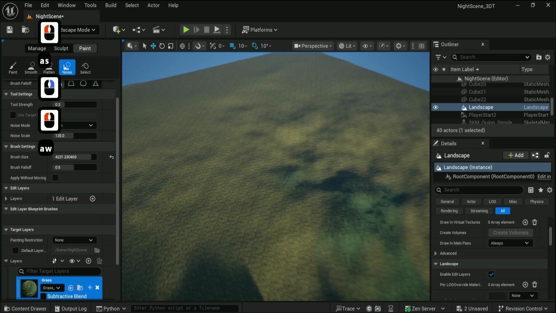
8. Stylized Moonlit Lighting with Manual Exposure Settings: Hello, and welcome
back everyone to Unreal Engine five stylized
night environments. We have fax lighting, foliage
and landscape design. In the last lesson, we
left ourselves off with a nice little gray
box for our scene. We're now going to continue
on with this and start setting ourselves up
with a nice lighting. So, real quick, we're going to talk about what we
have already in the scene, and I'm just going to zoom
into the middle part over here to see that we have
well directional lighting. We have the skylight. And I just realized
that the outliner was upside down for me. So let me just put this back by clicking and holding
and then dragging it. I can move this
around. So going back to this skylight and
volumetric Cloud. All of these can be enabled
and disabled just like that to see what exactly we
have inside of our scene. So that's pretty good. When it comes to
the lighting setup, we will also need
one more extra thing out of this entire setup. Keep in mind that
all of this for organization's sake is already placed in a lighting folder, and we can open this and close this folder
down like that. Everything is going to
be nicely positioned. So one more extra
thing that we need to think is the post
processing volume. And this will help us to get the lighting a
little bit better. So if you click on this
button on the upper section, we can search for
post processing, like so and then click and drag and drop it into our scene. Right away, I'm just
going to right click onto this object selection and scroll down within this massive
menu and find move too. And then whilst we
are hovering over, we're going to select lighting. And this way, it puts this post process volume into the lighting
folder just like that. That way we can have a nice control over the entire thing. Anyway, why we need this
post process volume? Well, by default, real
engine has exposure set to be automatic to have a certain eye
correction for the scene. When we are making general lighting scenes,
that's quite all right. But if we're doing
more of night scenes, that's going to give us more problematic setup because we want some harder shadows. We want the darker setups. So for that, we're going
to make sure we have the post process volume selected then within
the detail stab, we're going to scroll down
until we find exposure tab. Within exposure tab,
we're going to change the metric mode from
auto exposure to manual. And then we're going to change well exposure
compensation. I think that's what it is.
The fault tab is quite small, but yeah, exposure compensation. By moving this up and down, we can have a completely
different type of look, and nothing is going
to happen because I totally forgot about
one more tiny thing. And that would be
that by default, this post processing is not going to affect
the entire world, and your camera would
need to be going inside of the setting inside of the box for it to be actually affecting your well viewpoint
and everything you see. In order to make sure that
it affects the whole world, what we need to do
is we need to select this post process volume and
then search for infinite. So infinite extent or
in brackets unbound. If we have this selected, then this entire
post processing is going to start showing
up for the entire world. We can now hit delete
on the search bar and go back to the
exposure setting, and then we can just
play around with this value to get brighter
and darker result. However, for the night scene, it's not just simply, you know, darkening down the setting. This is not going to look quite as nice for a night scene, and there is a little bit
more to the overall settings than just making the scene
a little bit darker. So we're going to explore a little bit in
regards to that in terms of what exactly makes
a night scene a night scene. I'm going to increase the
exposure by a little bit for now because we're going to firstly talk about
other options. And first things first,
directional lighting. We have this option over
here at the very top. If we were to select it, we're going to have lux
intensity set at six, which is great for
sunlight over here. But if we want more
of a moonlight, we're going to need to
change this up a little bit. So sunlight is going
to be much brighter, much more intense in
terms of lux value, but the moonlight
is actually going to be closer to a value of 0.7. If we were to change the
intensity over here, it's going to give us this
type of result already, which is looking
well, darker up. Which is fair enough because our exposure is a little
bit lower at the moment. The other thing I'd
like to talk about is the direction of the
directional light. Right now it's placed
all the way at the top. But what we can do is we can
use Control L to move this. So whilst holding this, we can use our mouse
to go up and down. Oh, let me make sure I change up my direction of
the camera like this. So we can use Control
L and move it up and down to move the
sun just like this. We can also go left and right to change the
direction of it. And notice how the sun also gets well more of a orange type
of color and whatnot. The reason for that is because
we have a sky atmosphere. Sky atmosphere will change up
the lighting parameters for a world of your scene to change as the sun
position changes, you're going to have different absorption values
of the lighting. And that's all fine and nice. We will want to make sure
that the lighting that we're getting over like so when
it's a little bit lower, it's going to be more
of a bluish tint. I'm actually going
to click one to make sure we go back onto our well, setup for the position
of the scene, going to click Control L,
reposition the sun like so, and now I'm going to switch
up the color of the light. For that, we have option for
the light color over here, right underneath the intensity. If we were to click on
this box over here, we're going to get
ourselves color picker. Using it, we can change
the color just like that. And we also additionally
to the color, we have the value over here, which will change up
the brightness of it. But for now, all we need to know is that the value
should be at the very top, and then we can change
the brightness to be slightly bit of blue like so, and we can click Okay. Then once we get it, maybe a little bit
more positioning, let me just put it
something like. So once we get it, so we can grab
directional lighting, and yeah, we're good with
the directional lighting. We just need to make
sure it's a little bit larger when it comes
to the overall well, brightness of this,
we are going to change the texture of the moon. But for now, we're just
going to change up the size to make sure we're
getting a nice overall shape. For us to change the
size of the light, we can simply go on directional lighting
and scroll all the way to the top where we see
source light source angle. We can use this to, well, make it larger, smaller,
all the way up to us. And we're going to make
it a value of eight. That's reasonable size for
such a stylized scene. If we have a look back
on the reference, the moon is going
to be quite large. So it is quite nice to have this source of light
as a starting point. For the moon, although
this is not going to be a sun and we're going to be changing
up the texture later. It is a good starting point. Afterwards, we can
go on the back on to our exposure just to
increase the visibility. So let's go back on to where it there we go,
post processing volume, and we can slightly increase
this to a value of let's say 13 Yeah, that
looks pretty good. So that way, we're
getting ourselves a very nice bluish type of
a tint with hard shadows. And honestly, when
it comes to, well, basics of the setup, this kind of a look usually is, well, pretty good as a starting
point for night scene. And that's what I tend
to use most of the time, just changing up the I just realized that there's two
player starts in our end. So let's go ahead and delete one and just keep the upper one, and I'm just going to place
it in the scene, hit play, and now we're able to have a
nice lighting or our scene. Now, let's go a little bit
about why we did what we did. And the first thing is that if we go back
on to referencing, we'll see the type of the
setup that we have over here. What we want to ideally do when we're creating
a night scene, looking at reference is lower down the brightness
when it comes to an angle the light
source is coming from to get those nice,
hardened shadows. So darker spots would
be quite, you know, dark and black and mysterious to create some
interesting silhuettes, especially when we are
facing the light source, that would be the
ideal scenario. The other thing is that when we are lowering the
intensity of the color, it's going to look a little
bit lower saturation. Um, we are trying to mimic what a night
scene would look like, to make it more believable
and to make the perception, although visible, like
in this shot over here, we still want to make it seem like it's not
entirely day scene. It would be more
of a night scene. This still needs to do some work with the post
processing and whatnot, but as a basic light, that is quite nice. The thing is, when we are
viewing something darker, our eyes naturally adjust
to the darker environments, and we end up seeing the same scene as we would in day if there's enough
of light source. But the amount of
perceivable color that we would see
would be way less. So that's why it would seem
more or less saturated, less color in your scenes. In terms of a blue tint, that's commonly seen
within night scenes, that's also really
good to talk about is when we are seeing
the night scene, it looks quite cold. It looks quite desolate. But the thing is that when
we are seeing something in a light source that is way
less of light intensity, or eyes tend to shift
the color a little bit towards more
perceivable visuals. That's why, even though
technically the moon reflects the light of the sun and it should bounce
off in the same manner, we see more of a blue
tint because essentially our eyes shift up that
perceivable light source, and in turn, we get
that older look. Although when we look at
the light source over here, it's going to be warmer
because the light is a little bit
quite more intense, let's say, and it gives off that warmer
look from the fire. When it's mixed up with the
light source of the moon, overall scene should look
quite cold in comparison. And that's pretty much it. We're going to add in a fog as well to our scene to
make sure we're able to well get more detail out of our environment
forgot the setup. Again, though for now, this basic type of
setup will allow us to get a very nice
type of look out of our scene whilst not overdoing with the
setup of the lighting. One thing I would
like to say, though, is if you're not seeing
the same type of outcome, you might potentially
have a different look a quick little tip if you find the scene a little bit to
be too dark for the moment, we can change the
exposure without changing the lighting within the scene itself for just this viewpoint. If we go onto the
perspective tab on the top, there is an option to
use game settings. If we were to take this off, we have option to
use lighting for just the exposure of this
well, just this viewpoint. So we can use this to drag
it upwards like this and we much lighter type
of a scene which would help us with just
overall perception and visualization
of the environment. And once we are happy with
placement and other stuff, we can just simply
take this option back on and we'll get the lighting
that we had previously. So that's going to be
it from this lesson. Thank you so much for watching, and I will be seeing
you in a bit.
9. Sculpt Terrain Elevation for Cinematic Landscape Composition: Hello, welcome back
everyone to On real Engine five stylized
night environment, VFX lighting, foliage
and landscape design. In the last lesson, we left
ourselves off with more of a natural night
lighting type of setup. So now we can continue
on with our environment. And this time, we're going to continue on with
the terrain design. So we're going to
go onto this button over here onto the little
tab and select landscape. By default, when we're first
creating the landscape, it's going to give us
options for what kind of setup we want
out of our grid, the base of our well, terrain. And we have options for scale, and we have options to change up this grid quadrants
and all of that setup. But honestly, the
default setting for what we want is going
to work quite well. So all we need to do is
just make sure that we're creating a new and we are going to just simply click Create. So let's
go ahead and do that. Let's click Create,
and it's going to set ourselves up with
this sort of a terrain. Now, what kind of
a terrain is this? Well, the terrain will allow
us to create height values, essentially for a scene. And we can use the
sculpt button over here to either raise
this value like so, or while folding shift, we're able to lower this
down just like that. And that's essentially it. We have other options
for the tools, which we're going to
slightly touch up. But the most important part is that this is
using height Map, meaning that we're
only able to go up and down with
the terrain tool. Not able to, in our
sculpting software to just move the setup sideways
or anything of that sort. We're only able to
move it up and down. So in order to erase this, we can either use eraser tool, which will allow us to erase all of this data
that we previously created or we could use
a tool called flatten, but we'll have plenty of chance to work with this
option well, now, though, let's go
ahead and think about the overall design
for this scene. So going back on
to our references, we have this nice
little reference for the height of our hills, and we have all of these values. So we can make use out of that. First things first, though, we can use a sculpt tool to
kind of lower everything around this area or
where we have our ruins. To just somewhat of a reasonable setup,
something like that. And then we can consider where the camera would
be for the cam site. If we click one,
it's going to be, well, quite low, actually. So we can, for example,
lower this down and see where it would look
like, and there we go. We at least now have
a camera where it's not going into the
terrain itself. So that's a good start. Of course, we're not quite
done with the setup. We now need to
consider the values of the rest of the
rain essentially. So, going back to these
values over here, this value was set
as default zero because it's the
point where we were having the zero axis of
the world and where we had this entire gray
box for our ruins. In terms of the setup over
here for Little Hill, it's minus 885 meaning that if we now go onto the FlatenTol we
have latin target. If we were to enable
this, we have options. And by just simply clicking on WO Mouse and using minus 885, we're going to Oh, minus 885. There we go. Clicking Enter. We're going to get
ourselves a grid slightly visible
underneath the map, which will show the
exact height that this mountain was supposed
to be within our reference. So it's a nice little
functionality for this setup, which will allow us to get exact same values as
I had in this scene. In our life for well structuring this entire
environment much, much easier. I'm going to click
one once more and just kind of reposition my
camera perhaps a little more, a little closer, just to
see how it would look like. And yeah, okay. So I think
a little bit closer. So now I'm just
looking at how close this setup is in comparison
and actually is much, much closer,
something like this. Yep, that seems much better. Our previous camera was way, way too far off in the distance. So having it something like
this will be much better. We can also click F 11, by the way, to go
into full scale view. That way we can
actually see the entire 16 by nine resolution and
to see a wide screen. Yeah, this one was too far away. Something like this
would be much better. And we can now click and
hold and just tap it on our surface to determine
where the setup would be. And let's say a mountain
over here will be much, much nicer, something in here. I'm going to click Control one to kind of reposition my camera. So now we can go back onto it. And I'm going to kind of
flatten this out a little bit just to make sure that we're
getting a nicer setup, going to double check
how close it is to the edge of this terrain, which is not too much
something around. This will be quite right. And now we can just
simply click one, see again the distance. Again, we're going
to add a little bit of additional detail afterwards. We're now just checking
to make sure that the original mountain is
going to be over here. Then we're going to have
another mountain on the back. But I would say we're going to make a brush
much, much larger. So using brackets
square brackets, we can make it
larger or smaller. Or alternatively,
we can go back onto our landscape view by clicking F 11 and changing the
brush size over here. So what I'm doing
right now is just making sure that I have this area all the way around just a little bit lower down. We're going to fix it later
with the rest of the setup. But I would say that makes it a lot more workable with
the entire layout. And then we can determine where the rest of
these values would be. So if we were to go onto
this section over here, we have some human references
as well in this section. So we have a bit of
a ravine over here, which would be at
say, in this section. Yep, over here. You can use the scalp brush to make the brush
much, much smaller. And then holding shift, I
can just get a quick result. I'm going to go ahead and
turn off the game settings just to kind of see
a little more on what it's looking like and
something like this as a base will be
much, much better. So just like that, we're able to get somewhat of a similar look to what
we have over here. So it's already shaping
up pretty nicely. Next up is going to be a
mountain in the background. I'm going to go ahead
and check real quick. This needs to be lower down so we could actually
see what's going on behind these parts. There we go. Now we're seeing what's
in the background. And the next one
will be a mountain on slightly left side for
this section over here, and that is going to
be two, three, five, so slightly taller than what
we have over for the ruin. So let's go ahead and
use the platin tool. Changes to two free pipe, like so we can see the
grid being like this. I'm going to go back onto the camera that
we had previously and just kind of
slightly set it up, so it would be slightly
to the left of our entire position of the
composition, the camera setup. Let's say it's a
little bit, well, if the center is
somewhere around here, it's going to be a little bit of the middle
section of the left. So okay, we can do that. We can click F 11 to make sure that we're having
anti scammer setup. So somewhat center. And I'd say over in
this section over, like so, that would
be our mountain. I think that yeah, that will do quite
well, actually. Maybe it needs to
be a little bit further. Let me have a look. I think it does need to
be a little bit further. So over like so, and
I'm going to use eraser just to kind of erase the rest of
the Oh, not eraser. We're going to use
platin This time, we can use this pipette option over here and just tap
on the lowest section. And that way, we can
use this as an eraser in comparison to where
the lowest ground is. Like so so we have a bump over here in comparison to the setup. Although looking back at this, I think it does need to be just a little bit closer. Yeah. I think the first time I used
it was quite a bit alright. If we have a look at this setup, we have basically kind
of same distances from this to this mountain
and then this to this, and then a bit of a
zigzag essentially onto our main focal points. So I'll try to get it a little
bit close in comparison to the distance
from this to here, and I think that will
be a little bit better. So we have a setup over here, and the next one
should definitely be let's have a look
a little bit more. Should be over here.
Yeah, definitely closer. All right,
we can do that. We can just select this back, and I can just click on
the top surface over here, then just kind of get it
like so and even closer, let's say, like this
there if we're going now, it's growing a
little bit taller, exactly what we want
out of this setup. Keep in mind that we're going
to have also some trees as well to kind of help us
break down the surface. All we're doing now is
just making sure that the humps themselves are well, a little bit nicer of a setup. And I'm just going to flatten
this back a little bit just to kind of see the
general shape of this. Again, I'm not really interested in the overall shape of the mountain
at this point. I'm just checking if the hump
itself is nicely placed up. And I think, honestly, that looks quite nice. That looks quite alright. So we have a setup over
here like Solic. So let me just have a quick look again
over on this section. It looks quite
alright, and the one in the back is going
to be minus 450. So let's go ahead and do that. We're going to go click F 11. And we're going to select
the value minus 450, like so and then a
bit of a zigzag, and it should be somewhere
in this section over, so I'm just going to check
for the value over here. So this is the
mountain in this area. This is the tallest peak, so slightly a bit
more to the left. So yeah, right over here, I'd say it a little
bit more to the left. I'm just going to
flatten this part out, and there we go. I think we're having
some nice peaks. Now, once we have general
locations of such peaks, this area, this area, this area, and this area, we can
start working around those sections and we lower
everything else down. Let's go ahead and check the area for the
lowest parts on here. We can just grab a general
setup and then work our way in terms of adding
terrain detail afterwards. I would say we can go on, well, back onto the landscape, grab a little bit of a
lower value over here. I say, we can lower this
down just a little bit. So holding shift, I'm just going to lower it down just
a little bit more. Like, so I think
that's quite right. Let's use flatten with the pipette and just select the value
something like this. And now we can
just simply, well, erase everything
else from our setup. So we'd have those main
islands for composition shot. Then we can work from
there. And once we go around our setups
just like that, we can later work with
the general setup. This area is going to
be for a mountain. Yep. Just going to double check. Yeah. This seems
like nice curves. Just going to check
in 16 by nine setup. Just for the sake
of it, I'd like to change the game
setting to this to make sure that the exposure
is going to look right. Also, if you're not liking
the what's it called the game icons visible or
post processing box and such, we can click G to hide all
of those game icons like so, and now we can properly see and visualize the composition. We can then click G to go
back out of it to again, see these icons, click F 11, and we're able to now see back
to what we had previously. All right, so once we
have this general setup, let's so L So we can
now go ahead and well, erase a little more of it. So start making the
brush larger, larger, larger, and just erasing
everything else. Afterwards, we can start adding some humps and bumps in a bit. But for now, let's just
make sure that we're having those main sections properly set up with our flattened and
everything else can be, well, added in later. So once we have this section, we can just erase everything else from existence in
terms of the height value, lowering everything else
down just like that. Quick and nasty type of way. And in the next lesson, we can continue on with this. Of course, to make sure
that we are having a little bit of a nicer type
of a setup when it comes to, well, these chunky type of mountains and hills
that we're having. So let's just make sure that we are lowering everything
down just like that. We don't need to be super clean. You know, some humps
and whatnot are okay. We're going to come back
to all of that in a bit, but the main height needs to be lower down just
to make sure that we're not losing any of the main section or
our composition. So yeah, we got ourselves the main parts
for the mountains. We're now going to continue on with them to make
sure that they're looking a lot better instead of the hums that we're
having right now. So that's going to be it for me. Thank you so much for watching, and I will be seeing
you in a bit.
10. Sculpting Jagged Paths and Stepped Platforms: Hello, welcome back everyone
to Unreal Engine five, stylized night environment, VFX, lighting, foliage,
and landscape design. I'm going to go
ahead and go onto Perspective tab and just
tick off the game setting. So that way, we can have a
better view of our landscape. And now we're going
to go ahead and, well, go back on to
the landscape setup. So, first things first, what I like to do with this kind of design is make sure that we don't have any of the edges that are just straight
at the very end. The reason being is
that even if we have a specific camera
shot and whatnot, it's still better to
just kind of get rid of those sharp edges on our horizon just in
case anything happens. So the best way for us
to do that would be to use noise texture. If we have this
selected by default, the noise will allow us to use noise mode for both adding and subtracting
and if we start dragging, we can see the type of a
setup we're going to get. So just like that, we're able to get
some variation, although I'm going to
click Control Z and perhaps lower the scale. So where would that
scale the strength be? There we go. Tool strength, we can set this up to
be 0.1, and that way, when we are using it across so, we're able to get
some interesting results just like that. And we don't need
to do it too much. We just need to make
sure that we're able to break this down like so, and we're getting some, well, more unique type of results and shapes out of the
back just like that. And yeah, we're able to get
ourselves nice results. If we want more variation, what we can do is we can
increase the scale over here, and that would allow us to
have more intensity for, well, those bumps going
up and down and whatnot. But honestly, the
default setting is, well, quite all right. You can see now the
difference that we're having is looking
much, much better. Now, the other thing that
we would need to do is going back to the
setup over here. We would need to set
ourselves up well with better a design for those mountains and whatnot,
for all the ridges. First things first, I'd like to go back onto the
selection mode, grab the mannequin that
we had previously. Like, so and let's see. Yeah, we're just going
to go ahead and click W, hold Alt and move this
onto the side that way. It creates a duplicate, and we're able to place
it on the ground. We can hit home key, sorry, key on our keyboard that just plunks it
down onto the ground. Like, so in that way,
we're able to see the overall size and
scale of the setup. And I would say that, yeah, looking at this, the reference for a human
is a little bit smaller, so I'm going to just reposition
the camera a little bit. Click F 11 to kind of have
it over, so that way, we have this mannequin a
little bit better position. Oh, let's just
make sure it's not on the ground.
Something like that. I'm just again, checking
with this reference shot, making sure that the size of the human is somewhat
similar to over here, and I think that is
looking much much better. So now I'm going to go ahead and just reposition my
camera a little bit, maybe a little bit higher up, like so more of the skies
visible. Very nice. Clicking Control O. That way, we have a better camera. At this point, we can remove this platform over here that we had previously because we're not using it if it
for a gray box. So and then we can
start thinking about, well, this platform over here, how can we get more of a normal looking platform going from the entrance
onto the exit? Well, a quick way for that would be using the landscape
tool called Ramp. Ramp is a very nice option allows us to well create
one point over here, and we can tap on another point, and it gives us
this type of setup. We can also go back, click on the previous point and just
realign the way we want. And once we get the
right type of result, should be a little bit
smaller, something like this. Once we get right
type of result, what we can do is just we
can simply click Add Ramp, which is going to
give us an attire. So my software has crashed
while doing this operation. It happens every
once in a while. Let's go ahead and just
slightly redo this step. I'm going to reposition my
gizmos a little bit, like so. And once I'm happy
with the result, we can also change up the with a little bit if
we want to honestly, the default one is quite right. We're going to click
ADRM and there we go. Hasn't crashed. I am very happy about it, so
that's very nice. I'm also going to
click one just to make sure that the ramp
is not too much, which I think it is. Looking at the
reference over here, it's a little bit more of a steeper type of result
in comparison to this. So I'm going to
click Control and Z and just select
this a little bit, bring this back a little more. Click Adamp and see the result, and I'm much happier with this. Alright, now that we have
something like so we can play around with
Latin tool because honestly flatten tool is such a helpful option to make use out of because
you're able to well, control the placement of
your setup quite nicely. We're going to take
off flatten target, and this will start giving you a brush that behaves completely different
to what we had before. Now the flattened target is off, meaning that when we click
on a specific point, it's going to be that
flattened target by default. If I was to click on the center point of this
and start holding it, it's going to keep that
flattened target as such. That's quite useful because when we're using it from
the bottom over here, I can start a little bit
higher up over here. And with a tool strength of 0.1, I can just start tapping it
and I go slightly lower, and then it starts
creating a sort of a path. And using that, we can, well, create ourselves like
a nice little zigzag that goes up the mountain. We don't need to be super
accurate or something. It might just look like
an abandoned path, and I think that's more
than enough for the setup, although I'm going
to click Control Z, and I'm going to make
this a little bit smaller or a brush
and just like that, I'm going to start carving
out this into, like, a sort of a zigzaggy path
for people to get up to. And usually I start off from the top and just kind
of, like, go downwards. And again, just a
basic type of a path. Nothing too complicated. We can also bring in our
little human reference because that's going
to be quite helpful for perceiving how high, how tall and how
steep this place is. I'm just going to place it
right in here, like so, and now going back to the
landscape using the sculpt, we're able to, well, make some nice path. Just like that and
just like that. So I am hpping multiple times basically until I get
the desired result. Sometimes I go up higher a little bit and then start
dragging it outwards, sometimes from the
bottom a little bit. And whilst doing this
kind of process, we really need to
be considering how the positioning of the mouse initially affects
the overall setup. So for example, if over here I want this to be a
little bit outwards, I start off with the top a little bit and then
drag it outwards. I want to be lower down, I start with a lower placement
and then kind of, like, drag it inwards, and then it carves into this setup, like so. And just like that,
we're able to get well, nice reasonable nice
setups, just like that. So a little bit of
this aggi pattern more than enough for
something like so. And just like that, we are able to get ourselves a nice little pattern like so. And something over here. And just like that,
a path to our ruins. So it's going to look
quite right on this edge. We might need to carve
into some of the parts over here just to
make sure we break down this overall shape. It's going to be barely visible, but even so I think
it's quite nice. Perhaps we can just bring out
this shape a little more. And all in all, there we go. Nice, little shape overall. Alright, so that's
the basic setup. Of course, we have a
lot more to cover. So I think we can do that
a little bit over here. We can also use
something called smooth, which will allow us
to well smooth out this sharp setup,
another great tool. And just like that,
we're able to get well, some smoothing out edges. Over here, we can use
flatten to kind of help us break down this overall shape a little bit into
multiple parts. So here I'm having
more like free, more like free platform. So one on top and
one on the side, and here at the bottom
to kind of again, help us break down this overall
pattern just like that. And in terms of the
shape over here, when we look at it
from this distance, I think it's quite alright, although we could just break it down a
little bit even more, like so and all in all,
that's quite good. Our sides, I'm not too
concerned about it because I'm not going
to show it too much, but we can also use
the flatten tool to kind of help us break this shape up a little
bit into nicer patterns. So maybe a little bit of a
higher section over, like, so maybe inwards, like, so just like that. And by playing around with
just the flattened tool, we're able to get really, really nice type of
shapes just like that. Over here, maybe
I'll break this down a little bit more. Like so. And we can even
increase the strength 0.3 now to kind of even
speed up this process, like so, and dragging
it from lower end, dragging it from higher end. It gives us some
nice elevation in a variation for this section. Just like that, I'm going
to check the camera, make sure it doesn't affect
the composition too much. But speaking of composition, we can basically use this
elevation tool to also get, well, more interesting
elevation over here. So by just grabbing it
from higher sections, we can just play around
with it and just, you know, build it up a little bit, take it down a little bit, something something like so, and get some really
nice, unique shapes. And honestly,
that's quite right. In terms of the back, we can also play around
with some noise, but I just realize we
are running out of time, and I would like to spend a little bit of
extra time, well, sculpting these mountains out in the background because
they're going to be quite important for the overall
silhouette of the setup. So that's going to be it for me. Thank you so much
for watching, and I will be seeing you in a bit.
11. Erosion and Hydro Tools for Realistic Mountain Shapes: Hello, and welcome
back Everyon to Unreal Engine five stylized
night environments, VFX, lighting, foliage,
and landscape design. In the last lesson, we went
over mainly the use of flattened tool and Ramp tool
as well as a smooth tool. Now we're going to continue on sculpting process
and get ourselves a little bit of a nicer design out of these mountains that
we're having over here. So what's happening
with them well, can start off by getting
the flatten tool, actually, we can just make use out of it to kind of help us break down these shapes a little more so we don't need to
worry about it going, you know, higher than
the mountain is. We can just break down
the elevation to get more organic looking shapes
by just clicking in between the mountain on top of the mountain and just
outside of the mountain. And just by doing that,
we're able to well, get some nice variation
out of this entire setup just like that
manually sculpting it what exactly we want. And whilst looking at
the main composition, we're also considering, well how the elevation is
over here, for example. And just like that,
we're able to, well, get some more unique
and interesting type of shapes just like that. And for now, that's
going to be quite right. When we're adding material, perhaps we might need to adjust some little bit of
tweaking for the slopes, mainly because we're going
to be setting up somewhat of an automated material system, which will create cliffs on the slopes of
those mountains. But looking at this
is quite right. I would like to now go on to yet another tool or two
tools, to be honest. Erosion and hydro. These tools really help to
get more organic type of look out of a situation for when we have
those landscapes, all of that nice setup. We're able to make use out of
hydro and erosion to well, simulate erosion and
hydro as it says. But in terms of technicality, they're basically
applying certain noise and just kind of wver down the already existing height data to give us well, more
organic outcome. So most of the time
I will use hydro if I was just to increase
this and just click and hold, we'll notice what it does. It essentially smooths
it out a little bit with some averaging
out information, and that's going to well, give us a very nice setup. The erosion on the other hand, if I was just to make this
brush quite a bit larger, you can see that it kind
of drags everything down, and the noise or the
setup is going to be quite more organic or
larger mountain pieces. I prefer to use this but
when it comes to well, basic landscapes
itself where there is more grass and
stuff, for this area, for example, I would try
using it the hydro setup, and that gives us a nice way to break down some of this shape a little
bit, just like that. Now, in terms of erosion, we can just use it over here and just kind of tap
it a little bit. In certain areas where we don't think much
detail is needed. In other areas, we can
even click and hold. So, for example, over here,
we can click and hold, and then it starts eroding, especially on level pieces. It's quite nice, actually. So we can get ourselves well, somewhat of an interesting
looking detail. I would recommend you
not to overuse it. And if you want for areas
like this, for example, we can use where would be
noise mode from lower. We can use both. That way, it gives us that extra detail whilst
at the same time not changing the location of
the placement too much. So we're able to just tap tap, tap tap up and get some
more unique results. I just realized it went to selection
mode for some reason, we just go back on the
landscape. There we go. And I can just use erosion with noise set to both and just kind of get some great results. So over here maybe would
be pretty good as well. Just the very, very on setup.
I think that's quite right. And maybe a little bit over here just to kind of break down the
shape a little bit. I think that's quite all
right. Yeah, it looks perfect. G to click F 11, just to make sure the
design is quite nice. Now, this mountain over here, let's go ahead and start with flatten because I really like this tool and it just helps
me nicely shape what I want. I'm seeing some highlights, and I'm just going to click G. There we go that fixes
it. That's quite alright. So by clicking G, we're able to lower down this highlight. And now I'm just going to well, start clicking, making sure that this peak is the peak section. Same shape of a silhouette
needs to be over here, so a little bit
on the left side, slide drop on the right, and small peak over like so. And that's exactly what we're
going to try to recreate. The peak is going to be at, say, let me have a look again. Yeah, the peak is a little
bit off to the side, giving some space for the tent. So let's say this
part over here, meaning that this
should disappear, like so, and we can even
erase it just like that. And again, drug in it from lower onto the higher part allows us to just essentially erase it. Going to make the brush
quite a bit smaller. Start sculpting out this section to be a little bit sharper. So just a little bit
sharpened up, like, so we don't need to
be completely sharp, but just from this
visual, there we go. A nice little sharp part, it right, maybe even
more, actually. Like so. And then we can, well, use a little bit of a
sculpt over here to kind of get this area a little bit higher up
maybe, a little bit, like so, we can go back on to the flatten tool and
then slightly just, you know, flatten this
section, just like that. And this side is
looking quite right. I'm quite happy
with this result. This side, on the
other hand, needs a little bit of a way
to break this up. So that way, we'd have its
own peak at the very end, yep, that will be quite right. And of course, we can spend
as much time as we want, as much time as we
need. No need to rush. All is okay in
terms of the setup. But once you get
a general shape, what you can do is then build
around this shape itself, you know, make sure it looks
more fitting as a design. So just breaking it in, going from higher setup, from lower setup and just using
the flatten tool to well, get a nice, unique shape. And once we're happy
with it, we can, again, go back to hydro to erosion
to kind of mix those two in a little bit to get
more unique deep shape. There we go. Erosion on the
end might be quite nice. It really helps with the slopes, especially since it doesn't
get those sharp parts. So that might be quite nice over here, especially, like so. But then we can also go back onto the flatten tool and kind of flatten certain
parts just to get back some of that
steepness because when we are going to have our
own terrain material, it's going to help us
highlight these sections. So something like
that is pretty good where it has multiple
levels and whatnot, really helps to bring out
niceness out of the design. And honestly, I think
that's quite right. We got to sell a nice mountain. This part, I'm worried that it might be
a little bit too high up. I'm going to slightly
shave it off or at the very least
the front of it, and then just slightly
lower this down. There we go. Nice. Now
I like it. Perfect. I think the overall
design is pretty good. Let's have a look at it
from the perspective of, well, lower down exposure. And yeah, it's
looking quite nice. It's very good. Alright. We got ourselves nice
little chunky mountains or hills in the background. We can also add a little
bit of erosion over here. I would honestly recommend
mixing it up with some noise, so a bit of noise, like so as a starting point, just quick quick taps, like
so throughout this section. Nothing too much, just
a little bit like so. And by doing that, when we are using erosion, it's going to give us
even nicer details. So afterwards, we can just
click and hold and then drag across even with a higher
strength point heat even, I would say, let's go
ahead and drag this down. I would say noise mode
can be set to lower. We don't want to increase
the foliage too much. So by just doing it, so you can see the type of result
that we're getting. I'm making sure I'm not touching
anything in the middle, though, the parts in the back, making sure we're
getting some really, really nice type
of detail route. And I think that would be all. I would also lower maybe
a little bit over here. This part as we get closer,
it looks quite nice. And I just realized we lost
some bit of detail over here. So real quick, I will go and
fix this up because I think I touched it up a little bit
too much in this section. That's right, though.
Let's go ahead and just do a couple of quick fixes. There we go. Oh, the
flatten tool is too strong. It is very, very strong. Let's go ahead and lower
this to point free and just kind of oh,
still too strong. Let's go over it to 0.1. And there we go. More manageable, way
more manageable setup. Like so, making sure that we're having just a little
bit of that tail. And just like that, we're
going to be quite alright. Okay, so that's going to
be it from this lesson. Thank you so much for watching. And I will be seeing
you in a bit.
12. Creating Layered Landscape Materials with Texture Blends: Hello and welcome back everyone
to on Reel Engine five, stylized night environment, BFX, lighting, foliage,
and landscape design. Now that we have ourselves a nicely modeled
type of terrain, we can make use out of it. Let's go onto the
selection mode and start working well with
the material itself. To start off, we're going to begin by going onto
the content drawer. We're going to just simply right click on an empty space
and select material. We can call this
landscape material. Like so now we're going
to double click on it. And we get ourselves into
the graph material shader. Within it, it's a two D
interface of a graph. We can use a right mouse button, right mouse button
to move around. Mouse wheel to go up
and out of the setup, and that's the basics that we need to know
for this moment. We can straight up
start by changing this material to not use a
conventional material setup, but instead to use a
material attribute. If we select this, it's going to be
highlighted in orange. Now we can go into its
detail stab on the bottom left hand side and use
material attributes. Once we click on it,
the material will change to be a single piece, meaning that it requires
just a single input. This single input,
all of the time will basically be make
material attributes. Over here, it turns the convential PBR material into a material attribute which then can be connected onto the setup. But we're not going
to connect it just yet because we need to set ourselves up with something to be used
for a landscape. To use landscape setup, what we need to use is going
to be landscape layer blend. So this one over here,
landscape layer blend. Let's go ahead and click on it. It's going to give us a
real nice type of a node, which we can then use in the detail staff if it's
selected to create new layers. So we're going to start off by creating two new layers like so, and it gives us Index
zero and Index one. And within it, we can change
the name of the setup. So for this particular one, we're going to make a setup
for green layer name, and the other one can be yellow. And once we click Enter, you'll notice that layer naming changes
over here as well. And by default, that's
what we're going to use to test out the setup
of the landscape. So I'm going to select this, use Control C, Control
V to make a duplicate. And now we're going
to attach one to yellow and another
one to green. And to make sure
we have some well, ability to differentiate
between those two, we can click and hold free on our keyboard and then just
tap on the graph, like so. And this will give
us vector free, which is also used for coloring. So once we have the selected, we can go onto this box over here and change this to yellow, like so and attach
this to base color. I'm going to do the same
thing for green as well. So I'm touching it to base color and changing this to
green. Click Okay. And now we have two
different colors basically for make
material attributes, which we can then connect it to the landscape material
at the very end. We can then hit Control
Shift in S to save it out, make sure that everything is saved at the bottom
right hand corner. It says all saved, and I'm going to now close
this down real quick. It's going to ask if we want
to make changes and whatnot. We can click, and now
it's going to go back onto the previous
viewport setup, which will have the content drawer for
landscape material. This landscape
material can be now applied onto our landscape. So once we have the
landscape selected, we can scroll down
until we get where is it material so there
we go landscape material. We can just simply
have this selected. And once we have selected, we can just click on
this button over here, use selected acid
from Content Browser, and this will apply the
landscape material. And right away,
it's going to give us complete ***** blackness. What is going on? Well, we need to create some weight
paint information. Which will be used as a mask. So for us to do that, we
need to go on to landscape. And landscape now has also another option
within its stab. It's called paint. If we
were to click on paint, we'll see that, hey, there are some at the
bottom target layers. Right now, there's nothing
here. So what's going on? Well, we can click on
this button over a year to create layers from
Assad materials. And because we
have this applied, it's going to create those
layers for yellow and green. Then we click on this, we're going to see that
both are set to none. We need to create new weight
blended layer information. So let's go ahead and create it. It's going to create a folder
for us with layer info. Let's just go ahead
and create one. And let's just create another
one for this one as well. Click Save, and there we go. We're going to get
landscape layer information within this folder, which was created by
default once we click Save. So shared assets. There we go. Let's go ahead and click on this bottom again
to make sure we save everything or use
Control shiftiness. And now we have the weight
information selected, and with it, we
can select yellow, and we can start
painting, and now it starts refreshing
and here we go. We start getting some
information about our setup. We can also click on green and also click on it to
get green color. So that way, using the
wet paint information, we can blend in textures
onto our landscape. And that's the basis of
landscape material creation. Once we have
something like that, we are able to move
on to creating some of a little bit more
advanced material setups. So let's go back
on to the material and see what else we
can create out of it. Now, in order for us to well, create PBO materials,
we have some options. We can go click Control and
space on our keyboard and go open ourselves up with the content browser
within the material stab. Now we can go onto content
and select textures. Then we have dirt, grass, stone, and yellow grass. We're going to set all of them onto our make
material attributes. So let's go ahead and
actually make uh, hit Control C, Control B four times to make four of those. And then once we
have them set up, we're going to be able
to make use out of it within our setup. So first things first, it's going to be dirt. Let's go ahead and just grab everything and place
it into our scene. Like so then we can just move it around until we get all of them nicely laid
out for the setup. Like so. I'm actually just going to move
this off to the side, just like that so we can have
more separation. All right. So once we click on
the texture sample, we can see on the left hand side what kind of texture it's
using if we scroll down. So this one is going to be,
well, ambient occlusion. Let's find Amber
occlusion within here, which is going to be
this one over here. Then it's going to be dirt. Let's attach it to a base color. This is the only
one that's brown, so that's the easiest one. This is going to be a height, which is going to be
used as displacement. However, before we use
it as displacement, we are going to drag it onto an empty field and
search for multiply. Like this, we're going
to select multiply. The reason we're using multiply
and then attaching it to displacement is
because by default, a value of one would be way too much for
something like dirt. Using a value of one point, sorry, 0.2 would be much better. Afterwards, we have
ourselves the height, sorry, normal, which is going
to be attached over here. And finally, this is
going to be roughness, which is going to be
attached over like so. So that way, we have ourselves material attribute
for this setup. We're going to do the same
thing for a grass as well. So let's find yet another
setup and connect this too, if we go back on to our
textures, to grass. So let's go ahead and grab
this whole entire piece, and again, let's just
reassemble it real quick, like so, and we are
going to have ourselves a nice little line
that we can now just quickly reattach it so
this one ambit occlusion. So this one is the only one
with color, so base color. This one is the only one, well, not only one, but
this one is a height. So it can be used over
here, displacement. Then this one is normal. So let's go ahead and attach
it to a value for normal. And finally, roughness value. Let's attach it to
roughness, just like that. And honestly, we can just try to replace it as a starting
point for yellow and green just to see how it
behaves as landscape material. So we're going to
go ahead and delete these ones that we had
previously and just quickly reattach the setup for yellow
layer and for green layer. So the end of the sockets, we're just touching it,
like so one more thing. If you ever mess it
up with the socket, just use Control and
you can hold it and just take it off from a
socket, just like that. So in case you're
making a mistake, you can easily fix it. And once you have it attached, like so you can hit
Control Shift in S, make sure it's all saved up. Now, if you go back onto the
material landscape mode, still not showing up
as the right material. What's going on? Well, let's
try just closing this down. There were going out,
popping up with, Hey, would you
like to save this? Yes, please, let's go
ahead and save it. And once we save it, it's going to refresh,
and there we go. We got ourselves grass and
we have ourselves the dirt. Of course, this is
not acceptable. We still have a long
way to go because everything in terms of the pattern setup is
still not up to par. How can we break up this seems? How can we break
up this pattern? We're going to learn
everything about it, continuing on with
the next lesson. So thank you so
much for watching, and I will be seeing
you in a bit.
13. Breaking Texture Repetition with Noise Based Material Blending: Hello and welcome
back over on to On reeelEngine five stylized
night environment, FX sliding, foliage
and landscape design. In the last lesson, we
left ourselves off with a very basic type of a setup
which allows us to well, go and use different
materials for dirt and grass. We're now going to go over certain different
techniques for, well, making sure that
we're not having this repetition
visible in our seems. So first things first, let's hop onto our material and talk a little
bit about one thing, which would be
beneficial for us. And that thing would be
simply scaling the texture. We can use something called
if we were to right click, something called
texture coordinate. This little node over here. And by default, we
could select it and use on the left hand side
its details for UV tiling. If we were to change this from one to something like four, for example, it would
be four times smaller, or if we were to use
something like 0.1, it would be the size of
the original like 10%, the size of this one, which
would also benefit our setup. So we could either use this tylingO if we want to
have a little more control, we can set this material up to be a material
instance instead. Material instance means that instead of just
using this material, which is often called
master material, it would allow us to change parameters that would
be directly affecting the scene without the need
to constantly save out this material every time we're trying to change
certain parameters. So for us to do that, we
simply can hold S and tap on our a left mouse
button on our graph and then have the name for
this to be scale graphs. So then we can hold
and tap on a graph and get ourselves
a multiply node, and connecting both
of them would give us multiplication for both the U and V at once because this
is actually a vector two. So U and V would be
basically two parameters, and they're going to be scaled
up by one single value. So we can change this to
a value 0.1 by default, and then we would
need to connect every single one of those
texture samples, and right away, we
can see it changing in our texture area
just like that. So we just need to
make sure that we're connecting every single one
of them just like that. Now, once we hit
Control Shift and S to save we should be able
to see it over here. I'm going to actually
close this down because, again, we just need to make sure we save this by clicking. Now it updates it, and now
we're going to have a much, much larger type of
a grass textion. Of course, if it is a texture, maybe the grain itself might be a little bit too
large and whatnot, so it might not always work this type of solution
for our setup. Also, going back to the
setup of the parameters, what we have over here, if I were to click this
pattern over here, like so, have a material. To change this into
material instance, we can right click on the material and choose
create material instance. So this way, we have ourselves, well, the material
instance of our landscape. And now with this selected, I can hit Control and space and just click
on this button over here to change this hopefully to landscape material
underscore instance. So that's the important
part that this is changed. Now, if I was to double click
on the material instance. I have on the right hand side, a global scalar
parameter values. We can open the step up, click on this tick
box over here, which will now allow us
to change this parameter. And by simply upscaling
this or downscaling this, we can adjust the parameter
value just like that. So straight off the bat, we don't need to oversave the
master material or whatnot. We can do some tweaking like so. Well, the sake of this setup, we're just going to keep
it as a value of 0.1, because it works quite well for this particular environment. Now, an alternative
thing of what we can do with the setup if we were to go onto the
material instance, now within the
material instance, we can select parent over
here, double click on it, and it's going to give
us back onto the well, material graph that we
have mastered material. We can hit Control Shift and just to make
sure we're saving everything because I noticed
at the top on the tab, it had an asterisk, meaning it wasn't saved. But now because we saved it,
we can see at the bottom, all saved and the asterisk on the tab next to
the name is missing, where if I was to make
a quick change like so, or let's say, copy paste, like so, now, what else
can we do with this? Well, the other way of making sure that the tiling noise is not as visible so over here, don't worry about this part
in the back because if you start filling it up with a
specific weight of layer, it will update itself. Right now, we don't
have anything, so that's why there's
no information for it, and for that reason,
it's just black. We're going to go
back to it in later. Now let's just focus on
this pattern over here. How can we
additionally fix this? Well, another way of
fixing it would be to make use out of
certain noise overlay. So what I mean by noise
is if we were to right click and search for
texture sample, like so, we can have ourselves texture image just like
we had with the import, except now if I was just to make this a bit bigger and actually, we'll take off the substrate material over here since we're now using it to get more
view out of our graph. There we go, because this is going to get
more complicated. Alright, so now we
have texture sample. What do we do with it? We
don't have any images. Well, within Unreal engine, we have a couple of
choices for noise. If we type in noise, we can see the variation of
noises that we have, and we're looking
for tiling noise 05. This should be within the
Unreal engine itself and should be part of the choice for
you to select basically. Now that we have a
selection like this, we're just going to make sure we create a section, just
like we had over here. We can even just
copy this, actually. So let's go ahead and
drag our box across, so using our leftmuse button,
we can hit Control C, Control to make a hop paste
for the texture coordinates, and we just want to
change the name of this, which we can do so
by clicking F two, and we can name
this a green caras. Noise scale, just like that. Because we renamed it, this duplicate is not
going to be the same. If the parameters
had the same name, then it would the value within an instance would affect both
of them in the same way. So if we were to change one, the other would also change. That's why it's important
to change the naming whenever we're creating
parameter nodes. So anyways, we have this setup. This noise scale is
going to be set as two, and we're going to attach
it to the texture sample. So it's going to overlap
nicely on our setup. And also we are going to, well, get ourselves
yet another parameter. So let's hold S,
tap on the screen, and create a name for green
grass, noise, opacity. Whenever I'm creating
the names, by the way, I'm making sure
that if I'm working on the same shaded section, having the name setup be basically the same start because it's alphabetical order. So you notice that here
is green grass scale, green grass noise opacity. In this case, however, it's scale grass because if we're having al material
incidents over here, we can have all the
scale parameters for different
shaders at the top, and that just kind
of makes it easier. Alternatively, there are options for additional ordering
of the parameters. If we were to select the node, we could create a group
over here for a parameter. So now it's set to none, but if we were to create a name for it, we'd be able to create small tabs that would
help us organize it. In this case, we
don't really need to, but feel free to
do so as it might help with some organization
for certain cases. Alright, so going back to this, we have green grass
noise opacity. This one is going to be
set as one by default one. Let's click Enter. There we go. Then we're going
to hold M and tap, and then we're going to attach the upper section to A
and bottom section to B. Essentially, we're
multiplying by this value. So that way, we can, if needed, simply increase
the value over here, and it's going to change whatever this is being used for masking to either lighten
it up or darken it. This could technically be
set up with the multiply for a base color to
increase the performance. In certain cases,
it might be better. But I personally realized that the tiling is also going to be visible with something
like a normal, as well as the roughness value. So this tiling that we see, even if we change it
up with the coloring, the pattern that we're seeing
throughout the section, if we zoom out a
little bit over here, maybe it's more
visible this pattern, this pattern would
still be quite visible because of the additional
PBR information like normal or roughness
and displacement and such. So we've not touched
the displacement yet. Don't worry about it. We're
going to get back to that. Uh, for now, let's go
ahead and simply change up the coloring overlay
using this mask. So this mask can
be actually set up with a No material attribute. We're going to make a copy
of this material attribute, and we are going to set
this up with a black value, so we can also right
click on this. Oh, just maybe I'm
rushing too fast. I used I held free and
just tapped on the screen, and that gave me vector free, which we can use for color. This color by default
can be set as black, but we also would like
to ideally use this as well, color parameter. So we can right click and
convert this to parameter. We can now rename
this so we can call this green grass, noise, color. And you can actually have
spaces inside of this, like so I prefer not to. It just makes a
little less hassle. And in the past, programs
used to be a little more well picky with the spacing, especially encoding sections. So having no gaps and
just having capitals, I just find it more useful
as a personal preference. Plus, whenever we're
having a smaller tab, more is able to fit
in these texts. So just again,
personal preference. Feel free to have
spacing if wanted. The other one, the roughness, I think we can just set
up the default value. We don't need to change
this one to a 0.9, so it's going to
be quite a rough, no reflection type
of a value, like so. And then we're going
to just combine this basic material with
the material of the grass. Using something called
blend material attribute. There we go. Blend material attribute
will allow us to well combine A and B of these
two material attributes. And Alpha is going to be
this noise over here, which we can connect it like so, and now it's going to give us
a nice little noise setup. So let's have a look
at what we did. We're going to click
Control Shift in S to make sure we save out or well, not yet. Sorry about that. We need to attach this to
what we had for the grass, which is layer green, click Control Shift
in S and save this or I guess we can use
Apply. There we go. We can use this button
over here to apply it. Usually, I just close
it down and that makes sure that well, gives
us the right setup. I'm just going to open up
the material instance now. Move this window downwards, or if you have a second screen, don't be afraid to just move this window to another screen, makes it a little bit easier. So let's have a look
at what we did. All right, so what
we have over here? Well, we have noise opacity and noise opacity if
we increase it over, like, so we can see that,
he, it's overlaying noise. So if we set this to zero, we can see that, Hey,
this is the default one. If we set this to start setting
it up higher and higher, we're going to see the type
of result that we're getting. Now, when it comes to scale, we can set this up
to 0.5, for example, and see that this is
what we're getting and the type of noise
that we're overlaying. By playing around with this, we can essentially get ourselves very nice way of helping us break down this pattern, as you
can see over here. Now the pattern is
a bit different. So if I was to change
the opacity to zero, this was the pattern
of the grass, and if I was to change
it to 0.3, let's say, or 0.8, make it a little
bit more extreme, we're going to get ourselves
this type of result. So just like that, we're able to break
down the pattern. For this particular case, I think we're going to keep
this scale grass of two. And noise opacity. Actually, we're going
to change the scale of this grass to something
more reasonable, so value of 0.6. There we go. We're going to change the opacity
a little bit. So opacity itself, I
think is quite right. The scale, however, can be way lower because
we just want to make sure that when the pattern is being used in larger
places with a background, it's not going to be quite
as visible for the setup. So the scale, I just increase opacity just to
make it more visible. The scale of this
can be set to 0.06. I think that's going
to be quite right. Or sorry, 0.006. There we go. So it breaks down
these larger chunks. And of course, now
opacity can be lower down two more
reasonable amount, so back to 0.8, like so. And just like that, we're able
to break it up even more. And, of course, let's not forget global vector
parameter value, which is going to be the color
that we had for the setup. So we could make
it, for example, something like
reddish, like so, or, you know, a bit of a
darkish green something like this I think
will work quite well. Let's click Okay,
and there we go. It helps us break down
not only the color, but also the noise. So if we have a look at
certain aspects over here, so this is a little
bit more flat. This is a little
bit more chunky. That is exactly what we want. So that's going to be
it from this lesson. Thank you so much for watching, and I will be seeing
you in a bit.
14. Camera Based Grass Blending with Distance Blend Nodes: Hello. Welcome back eon to Unreal Engine five stylized
night environment, VFX, lighting, foliage,
and landscape design. We are now going to
continue setting ourselves up with the
landscape material. So let's go ahead and just go back onto the material instance, or the landscape, and, of course, open up
the master material. Now, within it, we're going to start off
by going back onto the landscape layer blend node and changing
up some things. Those things will be, well, making sure that we
have multiple arrays, not just two that
we currently have. So let's create a couple
more to make them four, and we are going to change
up some of the names. So Uh, first things first, this layer green is
going to be grass. We can just rename
it real quick. So from green, we can
just call it grass, like so to make
it more easier to read because it's going to get more complicated
with the node. We want to make sure we
keep it as readable as possible to not
overwhelm ourselves. The yellow was dirt. So let's just call
it dirt, like so. Also going to have
another layer, and that is going to
be for Index two. So we can call this one
grass, yellow and brackets. We can put auto because
this is going to be an automatic setup
using the slope, which we're going
to come back to it in a bit and index three, actually, sorry, we will
just go ahead and remove it. If we have too
many of the items, what you can do is
you can click on this arrow over here and
select Delete, just like that. So now we have three items. Alright, we're going to move
dirt a little bit higher up. We're going to move grass a
little bit off to the side. That way, we're able to well, distinguish them a
little bit better. And also, if we want, well to organize it even more, you can select the
entire piece and click C on your keyboard to
make a common frame. Here, we can call this
one dirt, like so, and we can even change
the color if we want to, well, distinguish it
a little bit better. That is totally fine. Here, we can have it as a grass. So we can select
this entire piece, click C and call it
grass plus noise. Like so. That way, we'd have ourselves
a nice indicator of what this is just like that. And we can even have a
frame within a frame. So if I was to select
this entire piece, hold Control to select frame, click C over here, and we
can call this one noise. That way, we have a
frame within a frame. If we want to delete the frame, we can just simply make
a selection for it, click delete, and that
would delete the frame. And yeah, that's pretty
much it for organization. Let's go ahead and
continue on with the layer grass yellow. So for this piece, let's grab an make material
attributes like so, and we are going to start off with actually setting
it up as a base color. The reason we're setting this up as a base color is because, well, we want to have some
visualization for our piece. So we have this
material attributes, and we're going to make a
duplicate of the same piece. We're then going to hit three
and just tap on the screen and make new base
colors just like that. We're then going to make
one color. I I two. There we go. Updated now and
another one, another color. And now we're going
to talk a little bit about blending materials
based on a distance. So that's ano way of breaking up the landscape, what's it called? The pattern, making sure that it looks a little
bit more organic. There is a very nice little
node called distance blend. One over here, and
this will allow us to blend the distance based on, well, the distance of a camera, how close, how far
away the piece is. So let's go ahead and visualize what it does first,
how it works. We're going to use blend
material attributes for that. As always, it gives
us an ability to mask these two pieces, and I'm just going to
connect A and B to these two material attributes and distance blend to Alpha. Now, for blend range, what we can do is we can set ourselves up with
two parameters. So hold S, tap on a screen, and this one is going to be a grass yellow distance range, and the other one is going to be grass Yellow, distance,
start, offset. Hopefully, I wrote
them correctly. Luckily, this is
not a coding setup. We don't need to make
sure that we don't have any of misspelling or
anything of that sort. This is mainly for well, for us, just to make sure that we have certain reference
to work with. So now that we have this, we can go ahead and
connect this piece onto layer grass, yellow auto. And let's go ahead now
and save this out, Control shift in S. And just to make sure it
saves it out properly, I prefer to just close it, and then it asks me if I'd
like to save it properly. Let's go ahead and click Save, and we're going to have,
well, black material. The reason being is that
we changed everything that this material instance
had meaning that we need to go back onto
the landscape and delete the layer data
for these pieces, which had different
weight information. Now we're going to go ahead and just click this
button over here, and it's going to create
us three new pieces. And right away,
I'm just going to add weight to each one of them. I prefer that this wouldn't
pop up, but it is what it is. Let me just go ahead and just click on every single
one of them just like that and click Uh huh. So this one cannot
have brackets inside. Let's go ahead and just
fix that. There we go. Now we have three
different materials. We can click Control
Shift and S to save it all out to make
sure it registers. And now if I was to use grass, it should update this
piece. There we go. And the most important part, though, is grass yellow auto. This one is an interesting
one if I was just to paint it out a little bit in a larger scale so we could
see what it's doing. So we have a blue shift. Once we get closer, it
should switch up to colors. So let's see. I'm going to also check if the
distance range, Oh, right. We didn't set up distance range. So I'd like to have these default parameters to
already have a certain value. So let's go back onto. There you go. Default value. So the distance range
can be set as one and distance start offset can be
set as 5,000. There we go. Let's go ahead and
click Control Shift and S, save it all up. And now we should see it's not setting
this up. Why is that? There is a bit of an error on unresolved error on the
top right hand corner, so let's go ahead and
click on it and set ourselves up for
rebuilding landscape data. Hopefully, that will
solve our issues, and I'm still not seeing
the fix over here. So why is it not changing? I think the values might
be off at the moment. So for the range,
let's go ahead and use 1,200 or a value. And for start offset,
let's use -1,500. So, and there we go. Now we have ourselves a
material that blends together. So basically, once the
camera is getting closer, you're able to change
and adjust the material, change it onto another material. The range will allow you to control the distance
of the setup. Oh, let me just
change it gradually. So you can see how it blends in, and 1,200 will work
quite well for this. The distance is
basically saying, like, how fast it starts going from
one material to another, so we can change it, so it would change up faster and whatnot. But -1,500 will work
quite well for us. And yeah, with that material
now working properly, we can finally go back onto the landscape
material and figure out how we can make
use out of it. So, we have the mask that
is working pretty well. What can we do with it? Well, we're going to
make use out of it to change the scaling
of the texture, and I just realized we are
running out of time for that. So I think we can continue on with this in the next lesson. Thank you so much for watching, and I will be seeing
you in a bit.
15. Layered Texture Scaling for Realistic Grass and Stone: Hello and welcome
back everyone to Unreal Engine five stylized
night environment, BFX sliding, foliage
and landscape design. In the last lesson,
we create ourselves a nice little mask that
allows us to blend in two different materials based on the distance of the camera
from the landscape. Now we're going to go ahead and, well, make use out of it. So let's go ahead and find ourselves yellow grass texture. So within a content, we are going to find
textures over here, and we are going to
get yellow grass. Let's go ahead and just
simply drag it out and quickly reattach the pieces. To make it easier
for us, we're also just going to duplicate
one to another, and I'll explain
you shortly why. Let's go ahead and
just move the rest of the piece a little bit lower, like so, so we'll
have more space to work with just like that. And now let's go ahead and see. So ambient inclusion
goes in here. This base color can go off and we can just attach
the grass, base color, then height for displacement and normal as well over here. And then finally the roughness. So the roughness
will go in here. Now that we have the
connection like so, we also need well
texture coordinates. So let's go ahead and
create ourselves that. So we can just type in chord, and it should pop up
with texture coordinate, setting up the multiply scale
for grass yellow, scale A. So and just attaching
one to another. Then we are attaching all of
this to UV just like that. And finally, so now that
we have it like this, we can go ahead and
make a duplicate out of this entire piece
because I don't really want to do this again. So I'm going to delete the blue color and just make
a duplicate out of this. And that way, we can
connect it to B. And this one is
going to be scale B. This way, we can make the
upper one scaled as one. So it's going to be quite small, and the up one can
be scaled as 0.1. And now let's talk a little bit about what we
did, why we did this. Well, for Saus we basically are reusing the same textures
that we have over here. Again, the second time,
the thing is, though, it saves the performance because you're calling out
those same textures only once, even though you're
blending them in twice and reusing them. Um, it also saves out on the size of your landscape
of your project. So if you're not, using
new textures every time, if you're reusing them,
it will generally be more optimal and more
efficient for the use. And now the reason why we're doing this
is because basically, when we get closer, we
want to make sure that the detail is in
higher resolution. For certain pieces of grass, it might work for
quite a noisy texture. It's going to work
when it comes to texture that has more
recognizable pattern. It might not work quite as
well, but something for, like, a noisy, again, noisy texture like this, it's going to work. We also have, for
example, stone. So this stone over
here, the pattern is quite recognizable. If we have a look at
it, if we, you know, change the scale whilst
we are getting in closer, it's going to be very, very recognizable. We don't
want to do that. We want to make sure
that we are having a reasonable um setup based on the type of
texture that we're using. So something like yellow grass, where it's just just
noisy and stuff, even though you might
think, like, Hey, the buds might look
different in size and stuff. When it's on a distance, it's not going to be
visible, honestly. It's going to be quite right. So it's a nice
little trick to use. And once we have this
type of a setup, we can go ahead and
click Shift an S, save it out, and see
if this updated, which it did not,
so I'm just going to go ahead and apply
this over here. Let's see. There we
go. Now, it's updated. Going to hit Control Shift and net just to make sure it
saves everything out. And that is what
we're getting now. So once we're getting closer, the texture is changing. Once we're getting
further apart, the texture gets
quite a bit larger. So at this point, what I like to do is I like to, well, make sure that we have this texture
applied everywhere. And I'd say, yeah, we can just simply make
the brush larger and just, you know, brush in
the entire landscape, like so just like that. So the main weight of this
texture will be this grasp. Now the next thing is if
you click one, which again, the saved out camera
that we have, the bookmark camera is we're going to see the
type of difference. So for this hill over here, we want to make sure that it
keeps that smaller grass. For the ones in the background, it can keep the larger grass. But this type of grass
might be a little bit, you know, too chunky. But whilst we're looking
at this type of setup, we can go back onto the
landscape material. Instance material, there we go. And I'm going to adjust
and tweak it a little bit. So the upper section is
maybe too small, actually. So I'll go ahead and think I'll change this
to a value of 0.3. Like so. So now this texture over
here is a little bit better. And the scale of B, I think keeping it as 0.1
will work quite well. Although I'd like this to be
just a little bit smaller. So maybe 0.15. Yeah, there we go. Perfect. Again, the pattern is
very recognizable now, but we're going to start mixing the
materials up and whatnot. It's going to give us,
well, pretty great results. But just like that, we
can see the type of difference we're getting
when we're getting closer, we're getting further apart. We're getting a very
nice transition. And yeah, if you're looking
at it from a distance, these parts are going
to look more like, you know, bushy
types, chunky types. It's going to help us break down that natural foliage
because we wouldn't have just rows of
consistent type of foliage. But when we were using
this method, again, we were able to, you know, make more of an organic look
out of our environment. So, yeah, that's going to
be it from this section. Let's go back on to
the material now. Since we have a little
bit of extra time, let's go ahead and set this
up with yet another material. This time, it's
going to be stone. Let's go ahead and set up
this material attributes node as a PVR material with
all these textures. So let's link everything up, just like we did with
the yellow grass, and this is going to be roughness. This is
going to be normal. Like so, height is
going to be over here, and base color is
going to be over here, and amet oclusion is
going to be over here. So, what can we do with this? Well, we can firstly get ourselves the texture coordinate with some additional
parameters for scaling, and this is just going
to be stone scale, like so, and I'm just
going to go ahead and attach everything just
like we did previously. So we'd have a
parameter for stone. Just like that, hitting
apply, let's have a look. And maybe we need to
hit Control ****. There we go. And I'm still
not seeing the stone. So what is happening over here? This should be stone scale in the parameter section.
And oh, right. The reason we're not
seeing it is because we have not attached this to the output of our
master material setup to this little bar over here. If the parameter is not going to the outside output
of the settings, it's not going to do anything. But we are going to continue on with this
in the next lesson. So thank you so
much for watching, and I will be seeing
you in a bit.
16. Natural Cliff Transitions with Slope and Height Blending: Hello and welcome
back everyone to On Reel Engine five stylized
night environment, VFX sliding, foliage,
and landscape design. In the last lesson, we
left ourselves off, well, with the blending material for different scaled textures
for the yellow grass. We're now having ourselves
also the stone that we have already set ourselves up with except we don't have
anything to plug it in with. Well, the thing is that we are going to
make use out of it to blended in with the
already existing grass, yellow grass that
we have over here. Let's go ahead and do
that. First things first, what we're going to do is
we're going to slightly reposition our set up so we'll have even more space
to work with over here. Then we are going to create yet another blend
material attributes. Material attributes like so, and we are going to combine the output of blended material attributes
from the yellow grass, the one that we had,
and the stone over here to a value of
B, just like that. So these are combined. Now we just need to
figure out what to do with, well, the mask. And for that, we are going
to use something called world aligned. World
aligned blend. Yep, that's the one.
And this is going to allow us to determine the
angle of a landscape, and based on it, we'll be able to say, Hey, when angle is hitting
that specific point, we want this to be
a stone instead. That's going to help us break
down this entire section. So instead of it being
just grass greenery, we'd have some bits of
cliff being seen through. And that's going
to be quite nice. So first things
first, we are going to go ahead and create
a couple of parameters. So first of all, it's going to be il
holding. Actually, sorry. Let me just move this a
little bit to the side. I don't want to be hitting
this node link. So okay. The ones that we
need is basically the blend sharpness
and blend bias. So by default, the up
ones will be right. If you see in the brackets, it says brackets, brackets S, meaning that it's a parameter, single value, and free
would be vector free. So that would include
three values. We don't need to do
anything about them, but it's still worth the gnome. So right now, we're
just going to go ahead and create blend sharpness. Like so and put it in here. Oh, sorry, let's go ahead and make another one
as well, right away. Well we blend bias
and put it in here. That way, we have
the values required to create by default
a nice angle. Right away, we can
test this actually. We can go ahead and just attach
the vertex with normals. This is the one that we
need to use or the mask, we can attach this to
Alpha and see if it works. And let's not forget to
tach this entire piece onto our lovely layer grass
yellow automatic. Now that we have
this type of setup, let's go ahead and
hit Shift sorry, let's hit Apply First,
Control Shift ins and that should give us everything
that we need over here. I'm going to just
move this downwards, and it's popping up with
a new warning over here. Let's just hit rebuild. And hopefully, we're going to start seeing some
interesting stuff, which we're not because
these values over here, I have not set them up yet. Let's go ahead and
just select them both. The value on the top
can be set as 2.44, and the value at the bottom
can be set as minus sorry, -5.82. There we go. And there we go. So you can play around with these
values and whatnot. We are using the negative value, so it would basically
invert this mask and put the cliffs on the side. If it was a positive value, it wouldn't detect
the slope at all. Yeah, but just playing
around with these values, we can see the type of
difference that we're getting right away,
right off the bat. So yeah, using -5.82 will
give us a real nice result. And just like that, we are able to break
up this entire piece. With multiple of materials based on the slope of the setup. Of course, this is
not quite done. If we have a look at it, you'll notice that the way it
blends in is very generic. It's not giving us any
detail out of the surface. And if we get closer, it's very, very obvious. We need to make sure that we're adding more detail out of it. The landscape itself has, well, low type of resolution. We can even, I think, preview this with the wireframe mode, so you can see the wireframe is actually quite
low in comparison, which is good in a
way that it keeps the density of the mesh low
and performance quite high. But again, this blending
is not acceptable. We need to get better. So what can we do? Well, we can go to landscape, and we have a little option. The option that we're
going to use is going to be this value over here. So the high texture. If we double click
on it, we have some nice dark and
light values of a mask that can be
used for displacement. But now, though,
this is going to be used with the combination of
the already existing mask. And by blending these
values in the mask of a grass is going to
intervene more between the crevices of the stone. So how do we do that?
Well, the thing that we need the only thing that we need to be
honest for this, Oh, let's just go and
move this to the side, is to use blend overlay the blend overlay
will allow us to mix in the values
that are in between the darkest and brightest
points of the mask. In this case, it's
going to be in between the stone mask
and the grass mask. So the areas that just have partial transparency,
essentially, that will be mixed up
with if we set this base, that will be mixed up with the height variation over here. So we can just plug this in into our blend V free and put
this out as a result. Of course, this will give
us a lot of control. So in addition to
that, we are going to create some
intensity control. So we can use something
called a power, a math node that will allow us to increase
the intensity of this height value over
here with parameter. And this parameter can be set as a control parameter
for the slope, so we can hold S and
create slope height Power, and attach it to the
exponential power over here. And now we can combine it
onto the blend overlay node, and the result, we can
put it as an Alpha. This way, when we set ourselves up with applying hit
Control shift in S, we can see that we're
getting this result. Now, what is this result? Well, if we go to the
material instance, we can find ourselves
where would it be? There we go. Slope height power. And there's an upper warning. Let's just go ahead and click
on it to make sure it fixes the landscape problem that it
had, which just popped up. Anyways, going back to this
slope height power parameter. Once you start increasing it, you'll see that, A, it's now blending a
little bit better. I'm going to move the camera a little bit to
a better angle over here. So you can see by increasing it, you can see the grass
basically starts overlaying more in crisis and whatnot
and gives us a very, very nice type of a blend. Now that we have
parameters like that, let's go ahead and change
up the scale a little bit. So scale for stone, I think, should be instead of
0.1, should be 0.15. That way, it will be
a little bit smaller, but from a distance, it's not going to look too repetitive. And as for the
slope height power, we can lower this down
to a value of 6.57, and that's going to give us a very nice transition
for the setups. Over here, we are having
some interesting results, but I think it's
because the slope is just weirdly placed. Everywhere else is
looking quite nice. Let's go ahead and check it with our lighting to see how
it looks like so far. So game settings, turn this on, and that's what we're
getting over here. Again, it's going to be
mainly solo at work, but if we look at it, we are still seeing
those differences, small little differences,
small little detail for scene, but it's still going
to work quite nicely. And now with this
slope over here, we can play around
with the settings for we the values
of the landscape. So I think we can go
ahead and do that. We can go onto the landscape
sculpting and just use flatten tool to kind of get ourselves more
interesting results. Let's see. So there we go. A little bit smaller, like so, and even brush fall off, if we lower it down, we can
get steeper bit of cliffs. There you go. Some
bit of a variation. It's going to be quite nice. All right. So now that we
have the seatings like this, we can go back onto
our landscape paint and I'm just going to reapply
the yellow grass over here. And here as well, there we go. Now we're getting nicer setups. And let's go ahead
back to flatten, just kind of fix up these
breakages a little bit. Even if I'm not planning to have it visible
by the camera. It's still quite nice to have some variation. There we go. Just nice little breakage. Like so. And just like that, I think, it's quite alright. Okay. Yep, it looks quite nice. This part over here, I'm
not quite keen on it, so let's go ahead
and just fix it. So now we can work
with slopes while visualizing the type of detail
we're getting out of it, which is going to look
much, much better. And I think I got a
nice hump over here, but it's a little bit too
much, so I'm just going to kind of ease this off like this. Just kind of removing
this entire hump. Just like so. Let's go
ahead and have a look. It's still a little
bit too big of a hump. So let me just go ahead
and just work it down. Like so. This way, it's not going to be in the
way of setup over here. This part can be just
broken down a little bit. Like so and yeah, that looks much better. These parts over here can be just slightly broken
up a little bit, a little bit, not too much. So we'll have more
detail in these parts. These parts are going to
be covered quite a bit with the foliage,
with trees mainly. So I'm not too worried about it, but just having some
bit of variation. In our setup is going to make this so
much better looking. Alright. So that's what we're having so far.
Looking pretty good. We're going to continue on
with it in the next lesson, though we're still not finished with the
landscape, by the way. I'd still like to enable a couple of additional
parameters. So yeah, we're going to continue on with this in the next lesson. Thank you so much for watching, and I will be seeing
you in a bit.
17. Nanite Displacement with Height Map Remapping: Hello and welcome back around to Unreal Engine five stylized
night environment, FX lighting, foliage,
and landscape design. We left ourselves off with well continuing
for the landscape, and now we're going
to go ahead and just select the landscape
output material, and we're going to enable
nanitetessllation. So within here, if we
were to go ahead and select the well mass
material output, we can search for Nanite in its detailed step then select used with ninite
and enable tesselation. And once we do that,
we're going to hit Apply, and this will allow
us to make use out of the already existing
displacement that we had. So previously, you know, how we attached the displacement onto or make
material attributes. Well, now this
information is going to be used for the setup. So this means that
once we hit Apply hit, control shift in S to save it, it's going to start giving us some tesslation
out of the setup. We're going to go
ahead and just double check Yep. All right. So once we select the landscape material,
now in the mesh itself, we need to search for Nanite in the detail stab
within the viewport, not within the mass
material this time. And once we are
searching for that, we have option to enable Nanite. Once we click Enable,
it's going to give us a warning that we
need to build data. Once we click Build data, it will start
rebuilding the mesh. Meaning that the painted
material painted setup will be used for displacement. And that's the setup
we're going to get. So we need to make some fixes, make some adjustments for it. Right now, everything by default is too intense for
the displacement. We need to go ahead and just clear out the search history, go back onto the landscape
material, master material. And within here, let's select back onto the
landscape material. Search for nanite and we
should find ourselves. There you go.
Nanite tesselation. So once we are back within
the mass the material and change up
displacement magnitude to be way less by the
fault is set to four, we can change this to
0.5 and hit Apply. This will fix up the
overly exaggerated amount. Now you can see that
we're getting a lot of nice detail out of our mesh, especially the rocky surfaces. So we go to areas where
there is a rock texture, so we're going to get the displacement out of
it, which is pretty good. But when we are enabling
displacement, of course, there are certain
issues that we need to address and we need
to fix certain parts. First things first is going to be the fact that when
we are zooming out, we are essentially
changing this texture. One to another in
the tesselllation. And that is firstly quite
performance savvy because well, it needs to tesselate this same location
twice to displace it. It's looking quite right,
perhaps, but honestly, what I like to do personally
is make sure that I only use single displacement for this type of deformation. So going back to the material, we're going to locate
ourselves to yellow grass, which is this part over here, and we're using one
displacement for one scale, another displacement
for another scale. But in this case,
we're going to find ourselves the larger
or in this case, smaller value, which
gives us larger texture, and we are going to just
locate a displacement, the texture over here, and then we're just
going to replace the one that's at the top for
a smaller texture, which is used with
the distance blend. Now whenever we're
using a distance blend, it's going to switch
out those textures. But the offset of the displacement is still
going to be kept the same because we're just reusing the same height for both of these make
material attributes. Now we can go ahead and
click Control Shift and S. Well, let's
apply it first. Control Shift and S now hopefully once it
calculates everything, you can see at the bottom
right hand corner, it says preparing shaders. We are going to have a
setup that's only going to have one type of displacement. So it's still going
to look like it's just moving the entire time. Of course, this tesselation, because it's set up with nanite, it means that whenever
we are further apart, the tesselation is
going to be less. Whenever we're getting closer, it's going to be more
and more detailed, but at least, you know, the bulges are not moving
for the landscape. And just seemingly random setup. Now it's just one displacement, and I think that's
much, much better. The other thing that we might consider would be when
we are having dirt. So if we were to
now use landscape, paint tool with a dirt material, there we go just wait
for it to update. We're going to have a certain
location here for, well, ten, if we were to start
applying dirt weight material, let's just wait for it
to compile the shader. Like so. We're going
to see that, hey, there is something weird going on. What's
happening over here? Well, this dirt height is actually when being used is actually lowering
down the entire setup. So if we go to find
this dirt over here, if we were to have
displacement by default, like so and hit Apply, we're going to find
that now it's loading. You can see the feet of
manikin is quite alright. When we want to, for example, lower down the value
of displacement, we can use multiply
to low displacement. The difference though
here is that this is a height map and we are
having a displacement map. The thing with the height
map usually is that zero, which would be a black colored, darkest patches in the setup, that would mean that it's not
going to displace anything, but with a displacement texture, what that means is that it
usually has a value of 0.5, which is a gray value as
a standard default value. And having zero means it
would start going downwards. So if I was just to
show you as an example, so this value over here, if it was 0.5 for displacement, that would mean it's
a neutral value. But for height value, zero being black would mean
that it's the default value. And if it was for displacement, this zero value would start dragging and displacing
the value downwards. For the mesh. So to offset that, what I usually do
with displacements, is I simply change up
the range of the setup, meaning that if we have, let's see, range map
value range, there we go. Using this remap value texture, we can essentially convert our height onto, well,
displacement value. So instead of using
this multiply, we are going to make it slightly adjustments to make
sure that we keep the entire information of
the texture whilst allowing us to use displacement without the offset of what
we saw over here. Now, the dirt is being placed on top because we
just remove the multiply. Anyways, so in order to avoid the extreme
offsets and whatnot, by just using height
for displacement, we can use remap value. So if I was to put
this in input, we can say that actually, let me just move this
a little bit outwards. We can say that the input
low is going to be zero. I'm going to hold one and
just tab on the graph. This way we're getting
parameter value, but sorry, not parameter
value, just a float value, but that's not going to
be a parameter value, meaning that we can't change it within our material instance. We don't need to change
it because we're simply just adding some values. So input low is going to be a value of zero, so
it's going to be black. Input high is going
to be a value of one. And we are going to be changing
this from zero and one to a value of -0.5 to
a value of plus 0.5. That way, the main
center section will be nicely placed
in the middle. So the gray area is going to be kept neutral as displacement
intended to be. And yeah, let's go ahead
and just simply do that. So -0.5, 2.5. So just like that, placing it in like so and
putting it into displacement. Now we can use the multiply value a little
bit more comfortably as well, because once we have
this remap value range, we are able to, well, lower down the intensity
without having some extreme values of it
going downwards and whatnot, like so, and just using
this as a value of 0.2, as we did previously, we can see the effect
by applying it, waiting for it to
recompile a little bit. And seeing that once this
is done, there we go. I will actually
just put the result without multiplying
to the displacement. So just putting it directly, applying hidden control
and S to save it out. Let's just wait it
out a little bit. So in this case,
a multiply value is not actually even needed. That's fair enough. But we do need to do something about
those peaks over, like so. I think the intensity of the
value is, well, too much. So we can actually use clamp over here. I
think that would be better. And clamping the value
from, let's say, -0.3 to a value of 0.3 will basically crop out
the top section, like so. And if we were to attach
it to displacement, it's going to give us a
very nice dirt effect. Of course, if you want to just simply lower the intensity, instead of using a multiplier, what I would recommend. So let's have a
look. There we go. Much nicer result. A. So instead of using a multiplier or a clam,
you could also, what you could do is
create a vector free, value like so, set this
to a value of 0.5, meaning that it would be
default displacement value and then use arp, which you can do by holding L, tapping on the graph like
so, attaching this to B, having A set as the value
for remap value range. And now we could use afterwards, the Alpha to control this setup. So that's what we're
going to do actually over because I think still it's being a
little bit too intense. Yeah, let's go ahead
and have a look. We're going to go ahead and just move this out of the way. So this would be an alternative
way for other materials, for example, the
stone or the rock. Maybe it's a little
bit too intense. So by just using the larp
like this with value of 0.5, it means that we're going to get only half of the intensity
of the value range. Now, once we plug this
in, we can apply, and now Once this
loads up, there we go. We're going to get
this type of result, which is still too much. So let's say if it is too much, we can set this to
0.9, hit Apply, and then, there we go. So we're only doing
it just barely, so if we set this up
to one and hit Apply, then it's only going to be the general color value of 0.5, meaning that it's going to be a neutral offset and
nothing is going to change. So if you want to remove it
completely, you can do that. You can see now the ground
is completely flat. You can see some
bumps, but that's because of the normal value. But if we set this
up to value 0.9, I think that worked
quite nicely for us. So let's go ahead and just
use that, and there we go. You can see there is some
slight bump in the dirt value. And of course, you could
set this Alpha up to B well, a parameter. So you can click and
hold S, tap on a screen, and then just type in
dirt displacement. Intensity, like so,
and just attach it to the alpha and apply it. I should have changed this
with a default value to 0.9 because I don't want to
go back onto the instance. Now we have it so, let's go ahead and just
quickly do a recap. Because I think I just ended up over explaining
this little part, but I really, really think it's important to
know all of this. So essentially, with
the displacement, we can change up from the height to a value of
displacement information. Then we can use
clam value to kind of extrude the upper and
lower piece of information, making it a little
bit more flatter as a as a height value. Or alternatively,
we can just lower the opacity of the height value and lowering the intensity, overall intensity
of the information, giving us less displacement
whenever we need to using this little
setup over here. And hopefully, that gives
us a lot of control with, well, creation of future
landscape setups. Of course, we could set it
up for other areas as well. But honestly, the
height values and everything are going to work out pretty
well in our favor. So that is pretty much let's go ahead and just close
this down and have a quick look at the height map. So click F 11, and there we go. We're getting to rain with a lot more detail on our setup. It is looking much nicer. So, yeah, that's going
to be it for me. Thank you so much for watching, and I will be seeing
you in a bin.
18. Advanced Height Blending for Realistic Grass Layers: Hello and welcome back over to Unreel Engine five Stylized
night Environment, VFX lighting, foliage,
and landscape design. In the last lesson, we went over more variations with
the landscape texture. We're now going to do one more final thing in order to make some
additional variations, and that would be going into
the landscape material. That would be to create height
information or blending. Now we have a nice way of high blending for the steepness
of this automatic grass. But let's say we
want to well add our own grass over this
section over here, and the issue would be, once we start adding
a grass over, like so just normal weight
painting using landscape mode, we'll notice that this grass
and this grass just has a very generic type of blending and it's not going
to look quite as nice. You know, the detail
for it is going to be relatively low resolution for the mask. So what can we do? Well, going back
through material, we can actually for the
landscape layer blend node, make use of instead
of weight blend, we can make use out
of height plant, and that's what
we're going to do. We're going to make use out
of it for grass blending. So this layer of grass layer
is going to be index one. You can see the layer
name over here. We can use blend type to be from L B weight
to height blend. And once we do that, a new height grass
information piece pops up. So instead of just
having layer grass, we also have height grass. And this height grass
can be used well with height information that we have over here, dirt
height or something. In this case, it's
actually going to be not grass that
we have over here. So we have second. This is roughness.
This is height. So this height information could be potentially
used for blending, but in this case, we can reuse another piece, and that would be reusing
the if I was to find it, there we go, the height
information from stone. The reason we can reuse this one is because it has
a very nice mask. That's going to be combined with the weight information later on, and this will give us nice
blending for the setup. So we don't exactly always need to reuse the same height value. We can just combine them, and it will give us a nice result. So for us to use this, what we're going to do
is we're going to use Right Click and let's
use height arp. This one is an interesting
one because we can grab the information
from the height texture. So let's go ahead and
do that. I'm going to find the height
value over here. Just double checking if
it's a height value. It is. Let's grab this
information like so, and quick tip if
you want to have, well, some control over the way those noodles
end up interacting. You can double click on the part of the link to create
this reroute node. Then with this selected, you can just move
it holding control and just using Lt Mase button
to move it out of the way. That way, it doesn't overlap as much with the
rest of the setup. And we can get
fresh information. So for A, we're just going
to set it up as zero, like so for B, we're going to set it
up as one, like so. And then for this, we are going to have
transition phase, so that's going to
be while holding S. We can just click on
the graph and call this grass stone height phase. So that way, we would know
that we can use this value to transition between the
grass with, well, a mask. And then, of course,
we want to contrast. So let's go ahead and
create a new parameter called grass, stone contrast. Like so and put it up like this. The grasstone height
phase can be set as 0.5 to make sure it's
like a default value, and then we can use
the result within R, or is it at the very
top height grass. So this will just give us some additional information to control instead of just
using direct value. And let's go ahead
and just attach this to if we find it
height grass, like so, and now once we
have it like this, we can hit Apply, hit Control shift
in S. There we go. Hit Control Shift ins and we can see that this is
what we're getting right now. Oh. Let's just wait for
it to load. There we go. So now if we go back to
landscape material instance, we can see these options
grass stone over here. And we can, well, change, for example, contrast. So if we were to increase it, we can see the way it
starts blending it in. And if we change it
to a maximum value, you can see that it has
much nicer details. So this one can be set
as 0.3 of a value, sorry, this is a contrast, so we can set it to 3.2, three. There we go. And the phase can be set as 0.3.
Yeah, there we go. So the phase will
control basically the blending as well.
Just like that. So 0.3, will give
us a nice result. And that way, we can have, well, some nice bit of control between how the grass
blended in with one another, giving us a very, very nice type of a result,
just like that. Now that we have
the whole setup, we can go onto the landscape
and material and do some organization because we
did a little bit of that, and we've not finished it. Let's go ahead and make sure
we clean everything up. So this one would be
grass, yellow grass. I'm going to click
C. There we go. We can call it yellow
grass plus distance blend. Like so and change it to
yellow because it is yellow. And this part will be stone. Just checking up with it. Yeah. Okay. This part can be
just called stone material. Nothing else with
it can be brown. And this part, we can just
simply select it like so and have a comment saying that this is a what's
it called slope mask? And finally, this will be
height blend for grass. We can just call it
height, blend or grass. I'm just going to
make it maybe more bluish, just like that. This one I'm also going
to change the color. Just like that. There we go. Alright, so we are pretty
much sorted with that stuff. If we go back onto
material instance, we have a lot of variation
or this type of parameters. So you can see just by using a single single variation out
of the controls, you know, changing from distance, changing from the
height, masking, distance masking, by just
doing it by one time of that, we're getting a
lot of parameters. And you can imagine
if you're doing it more complexity by just reusing, for example, the distance on
multiple of the materials, you would have a lot
more parameters. So for that reason, it's best to group them up a little bit. And I think this is the point
where we should do that. So here, we have dirt. We can change this to
have group of dirt, like so, and that would be
it, I believe, actually. Yep. There's no need to do
anything else over here. Grass noise, we can change it up over here for a group
of grass noise. Like so. And then whenever we
find a parameter, which is named float value, we can just change
this to grass noise. Grass noise. And I believe
the color is as well, grass noise. It's a parameter. So I'm just checking if all of these are
selected, so that's it. Yep. And going downwards, we have yellow grass distance. So we can change these up. Low grass distance. And I'm just going to go
ahead and not even use this arrow over here instead just copying and
pasting the group name, and this will give us
that same outcome. Makes it a little bit
faster to change up to groups, just like that. And this is also going to
be this is a slope mask, so we can set it up
as a slope mask. Yep. So slope grass mask. So slope yellow grass mask. There we go. And that's it. And finally, we have stone. Yeah, we can just
name this stone. So I think that's only going to be one
parameter for the stone. This height blend for grass can probably go
into the group for the grass grass noise, there we go. We got ourselves a
nice little setup. We can now go ahead and click
Control shiftinSO sorry, apply first, then
Control ShiftinS. And now within instances, we'll see that we have nice
little tabs that makes it so much easier to organize
and just go between them. And that's pretty much it. When it comes to the
landscape setup. We can now make use out
of this entire part to start painting
in some values, to make sure that everything is looking presentable
for a landscape. So that's going to be it for me. Thank you so much for watching, and I will be seeing
you in a bin.
19. Painting Grass with Texture Noise and Color Matching: Hello. Welcome back on to Unreel Engine five stylized
night environment, VFX sliding, foliage,
landscape design. And in the last lesson, we left ourselves off well with the finalized landscape result. We're now going to go
ahead and start using it to make do with the painting. And in order for us to do that, if I was just to paint in a little bit of
a grass over here, we'll notice that firstly, the grass itself, well, it takes a little bit of
time to update whenever it's being used on a new
chunk of terrain. So keep that in mind. And
while it's doing that, we can go onto Well,
there we go. It's done. Or we can go on to
talking about why it looks like it stands
out a little bit too much this type of grass. Well, we sometimes need to blend in the
textures a little bit. And if we were to go onto
the content Textures folder, we can select grass folder, double click on a base color. And within here, we have some
options to make use out of, well, additional fine tuning for blending in these values. So right now, it might
be looking like it's a little bit too different
from this type of grass. We don't want this to
be exactly the same, but we want this to fit
the same environment. So what can we do? Well, if we scroll down with an
adjustment step, we have some options. Brightness controls how
bright or dark the grass is. We can play around
with it. For example, if we want to increase the
brightness, we can do so. We also have an option if it was just to put it off to
the side like this a little bit for
better visibility, we also have an option
for saturation, so this will increase the
saturation and whatnot. I think the saturation
is quite good. The main one is RGB
curve as well as Hue. RGB curve will allow us to control essentially the
contrast of the setup. So if we want, we can
bleach it out a little bit, and hue will allow us well to
adjust and tweak the color. So this has a 360 value, so you can imagine
a color picker being 360 for the entire
hue of the setup. So if we were to go to 360, it's going to be exactly
the same as zero. And if we want basically
to adjust the hue, we need to know that because when we are
moving it forward, we can see that, A, it starts shifting to blue,
then, you know, purple, pinkish, and then it goes back
all the way around. So when we want to, you know, adjust tweak the value and we
start seeing that, A, it goes in the
wrong direction, then we can just
go all the way to side and start tweaking
the value a little bit, so to get something like this, although this doesn't
stand out too much, we need to we need it to
stand out just a little bit. So maybe 37. Like this, I think it doesn't
stand out at all, so let's go ahead and
set it up to 340. And I like this a little more. RGB curve can be
increased to there we go, have a darker effect. And just to bring
back the brightness, we can bring this
up a little bit. With adjustments like
that, we can see that we're getting the
right kind of value. So I'm just looking
with the lighting, just double checking that
the game setting is on. And with this kind of lighting, we can just make sure
that the lighting that we have for the grass is
going to be quite alright. What is happening over here? Well, there seems to be some
glitches with the shadows, and I believe it's because
we basically need to rebuild the nanite which is, you know, fair enough. We can do that in a bit, though. Now we can just go
out of the lit mode for game settings and just start playing around
with the values a little bit. For larger scales,
what I like to do often is within the
paint is just use noise, and whilst using a noise, we have an option to just paint in a value
that will give us. And just like that, we can paint in a certain bit of areas. Or additional looks. Tool strength, let's increase
this to value of one, and then we can see the
effect of this noise because somewhere some areas will allow us to use it,
other will not. And that is because
we need to change up the scale of the noise. So if we were to
change this to well, let's try ten at the moment, there we go. That's
more like it. But for the background,
we'll need to have, well, more variation, actually. So what we're going
to do here is we're going to change this
to 100. Let's see. Yeah, that looks quite right. It just helps us to break
down this entire shape. Even when it's scaled
upwards for the background, it's still going to look
quite off for these section. So with this noise set to that, we're going to be able
to get nice result, and they're also going to be
blending in quite nicely. So that's quite right. You
can just do it like this. You get nice patches of grass. I think it's going
to be quite right. It does look a little
bit off to me. With this kind of
colorful grass. So let's go ahead and check
if the game settings, the game settings with the game settings actually
looks quite nice. Maybe a little bit
too saturated, maybe a little bit too much. So let's go real quick
and adjust that. And I just realized
this is not saved, so I'm just going
to make sure it is click Control S,
and there we go. Saturation just going
to lower it just a little bit more. There we go. There we go. This is
going to be perfect. Low saturation type
of grass, very nice. I like this quite a lot. A distance, let's not zoom out too much because we
don't have any upper detail. But honestly, it's going
to be looking quite right. So just using this noise paint, we're going to cover
most of the items, and I'm not quite
sure what happened, but it seems like my back
ended up being flattened out. I think it might be because of the crash that
happened previously. So just real quick, I
will go ahead and fix it. So just selecting
the noise sculpt and I'm going to
make brush quite a bit larger ig just kind of
quickly tap on the back. To get all the
detail that I want. There we go. Just to make sure it breaks down
the overall angles. Maybe this one is a little bit too much, but I think it's okay. Just like that. All right. This is looking pretty nice. Maybe this one needs to be more intense because
it's more visible. And we are good. Now, let's go on to
the landscape details, make sure we have this
landscape itself selected, and there we go. That's
what we're looking for. When we go back into
the selection mode, we're going to see
that landscape actor with Nara meshes
needs to be rebuilt. If we are redoing
some landscape parts, it'll pop up as this error. If this is not popping up, just go onto the
landscape details app, find Nanite and just
click rebuild data, and this will fix this
issue, just like that. Like so, and now we have ourselves the
right kind of a look. Of course, when we get
to the closer areas, this section might need some additional
variation in the grass, so we can also do
that a little bit. Let's go on to landscape
painting and just again, play around with this
value for the grass. Just a little bit like so, so we can start off with the noise that we have over here. And don't worry about the shadows over
here because again, this is because of the
need for rebuild data. And actually, I'd like to
spend one more lesson just to make sure that we're getting some dirt in the areas as well. So now we have the
general section of the landscape setup. We're going to move
on to the smaller sections with the next lesson. Thank you so much for watching, and I will be seeing
you in the bit.
20. Detailing Dirt Paths and Grass Transitions with Sculpting: Hello and welcome back everyone
to Unreal Engine five, Stylize night environments,
VFX lighting, foliage, and landscape design. In the last lesson,
we went over, well, just adding some textured
variation for the landscape, using the already pre built weight paint that we
have for the grass. Now we're going to
continue on with this and just have smaller variation
over here as well. I'm just quickly tapping in a little bit with this
preset of a noise, although, let me
just have a look. Yeah, the noise that
we have currently is too large for
the smaller setup. So let's go ahead and
change something like 50. Just going to check. Yeah,
it's still too much. Noise scale can be set to ten. Let's see. Yeah, this is going
to be much, much better. So for areas like over here, for example, might need to be, you know, more spread out and can be just used like
this just a little bit. Like so don't worry about it too much because
we are going to well, populated with
trees and whatnot. And we also need to consider the main shot that
it's being used with. And that is looking pretty good so far this
area on the top, I'd like to also have some
bit of variation and grass. Just like that. I think
that's quite right. This section over here, you
can just tap it a little bit to have some nicer chunks. Just like that, not too much. Even I would say the strength, the tool strength
can be set to 0.3, just to make sure that we
are just nicely adding in that additional grass
variation without it being too intrusive with
the rest of the pieces. So just like that. This part is a
little bit too much. I'm going to go back onto just adding grass yellow, like so, and maybe over here, we can just ovulate
a little bit back, and I'm going to do something
similar over here as well. Even with the paint brush, not the noise brush
at this point, kind of, that's too much. Let me just click
Control Z real quick. I will lower the tool
strength to 0.1. And just quickly tap it over, so because it's going to
be so close to the camera, we don't need to have
too much variation. And we're going to also apply some rocks and
grass and whatnot. So that's going to help
us out with the setup. In case of this area, we're going to work
with, well, the tent. So let's just make sure
that we have some bit of what's it called? Dirt type of texture. So we're just adding
a little bit of that. In this area, but not too much. So I'm going to hold
shift once holding shift, it should invert value and
just remove that weight. So that way, we can have
just some nice patches, as you can see over here. It's not going to be just
completely like dirt type. It's going to have
more variation. Although this part over here, I know that it's going
to have a camp site. So we need to make
sure that we're not making it too grassy. Finally this part over here, it needs to be completely
covered in dirt. So I'm going to go ahead
and just put it at 0.5 and just start just adding
in some dirt like this, and then we can just
remove it afterwards. The reason we're doing it
like so is because, well, we need to make
sure we have a path towards the entrance
of the ruins. And that's going to
be quite visible. What happened over here? Well, I'm not quite
sure, actually. Huh. I'm going to click Control and Shift and
as to save it out. And for some reason, this
section just glitched out and just lost all of the
terrain data for the dirt. So what's happening over here? Well, let's go ahead
and just select the mesh terrain and just
find the rebuilt data. Hopefully, this will
fix us there we go. It brought back the
dirt that we had. I'm not sure why there was a glitch before,
but there you go. If you're having
the same problem, just make sure you click
rebuild data on your nanite and it will bring back the well, the texture
that you had. Let's go back on to landscape. And finalize this part. So it's going to look like so, and we can just
make this smaller, hold shift, kind of
click in certain areas. I mean, it's a
little bit too much, maybe even smaller or
maybe even just use the noise with much
smaller setup. Yeah, say, we can use five or the noise data and just hold
shift and just tap tap, tap, tap tap, even larger
noise tool strength 0.8, and get a nicer result. To make it a little bit more clear on what we're
doing over here, I would say what we can do is we can go on to unlit mode and just kind of low down the
texture that we have over here. I'll actually go
back onto paint mode and see what I can do with it. So just quickly tapping, so just making sure that
the dirt is more broken. Just like that. It's going to give us a very nice very nice type of a path, which is going to be
partially grassy. So that's going to
be quite alright. Maybe we should add a
dirt path over here, but it's going to start thinning out a little bit, basically, to make it seem like
it's been starting to overgrow and where
it starts off, it is not going to
be quite as visible and it just goes off onto
the side, just like that. I think that's pretty much it. We can also go back onto sculpt mode real
quick because I'm seeing that there's a lot of those smaller details
which are triangulated, and I don't like the way
it gives out the shape. Just in case, though, I
will select back onto the landscape and click
rebuild data one more time, just to see if we can
avoid those parts. And I think actually we
can, so that's good. Yep, the displacement is working quite nicely
with the terrain. So now we're not getting that same nasty look that
we had previously. I will go back onto the
lit mode just to check, and Yeah, I'm going to smooth out some
of the parts a little bit. The shadows that are hitting it off from this part is not, not the best, not the best. Let's go ahead and just go
back onto the landscape mode. Let's hit sculpt, smooth, and just clean it up a little bit to make
sure we're removing those extreme values
from the sections. So is it working? I'm not quite sure we're
going to make it there we go. I need to make it a
little bit bigger, and it will work quite well. Going to make full strength
to 0.1 and just kind of clean up where the shadow is hitting a little bit
in weird places. So this part over here
this part over here. This part a little bit, I don't like this part at all. And I think this part just
a little bit, a little bit. There we go. Alright. This is looking, this is
looking quite alright. I'm quite happy this result. So, yeah, we got ourselves
a nice little terrain, which we can we can set ourselves up with
a nice lighting, although this lighting is
still just a basic form. So let's go ahead and continue on with this in the next lesson. Thank you so much for watching, and I will be seeing
you in a bit.
21. Creating a Rotating HDRI Night Sky with Custom Materials: Hello. Welcome back everyone
to UnreelEngine five, Stylized night
environment, BFX sliding, foliage and landscape design. That finished with our
landscape terrain. Let's go back a little bit to
the opposite side upwards. Let's go ahead and
add some detail to our lovely sky that
we're having over here. We're going to go back onto the selection mode
just like that. And now we are going to
well select the sky itself. Once you click on
it, you should have the outliner selected
as SM sky sphere. So this is what controls
a sphere selection. You can click on
the focus button clicking F will allow you to
see what exactly this is, and this is just a massive dome going all the way
around your scene. So how can we make
use out of it? Well, if we have it selected, we'll be able to find ourselves
the material being used, and just go all the
way to the top. There we go elements. It's using a simple sky dome material, but we're going
to create our own version for a night scene. Let's go ahead and
use Control space to create a new material. Let's go on to content, and we can just create it over here. Let's right click
and select material. This one we can call Sky so sky material.
Sorry. There we go. Might be a little bit
clear, just like that. We can now double click on it, and what can we do with it? Well, for starters,
let's go ahead and find ourselves the
texture for the sky. Let's go ahead,
click Control Space, find the condon folder,
click on textures, and you should be able to see where would it
be extra textures? There we go. In extra textures, there's going to be HDR space. We can simply drag
and drop it like so, and in order for us to make use out of this
material for sky, we need to make a couple
of different setups. First things first, we need
to change the blend mode, sorry not the blend mode, the shading model to be
unlit because, well, it's not going to be used for
a shading of PBM material. It's just going to be
background texture. The type of texture
that we're using, by the way, is something
called HDR space. If we double click on it,
we'll see the type of setup. And right now, by default,
it is set as this. Sometimes when you're
using a texture, it needs a couple
of adjustments. And before we get to that, I'd like to mention that
this is an EXR format, meaning that the compressiveness
of this format is, I believe, 32 bits. So the transition from here to here are the lines that
we're going to see. Maybe it's not going to be
quite as visible on the video, but the lines that
we're seeing over here going to be less visible when we have the compression
rate higher with Exar or dot HDRI formats. And other thing is that this resolution that we're using over here is set up as
eight K texture, and you can see that
imported texture is eight K, and then display texture is
also eight K. So that's quite important because we are going to be using it as a cube map. Can see by default, once
we're using these formats, previously mentioned
EXR or HDRI formats, it's going to set itself
up as a cube map, which is exactly what
we want for a sky map. Then the next thing
that we need to know is that sometimes the
compression is not going to be quite as nice by default because it's going
to try to use MIP maps, meaning that the
further the texture is, the less of oil resolution
that it's going to have. But because this is a skybox, it's always going to be visible. We need to make
sure that it uses the maximum resolution possible. So within the level of detail, we need to make sure that
it is using unfiltered. Or no MP maps. If one of those options
are going to be fine, I think we can use no MP maps. Most of the time I
use that. And we can see right away what it does. It has the transition from one to another way better in terms of
the compression. The thing that
might well compress these files is the
compression setting itself. The compression
setting over here, if we were to change from
default to HDR precision. So this one over here.
It's going to then compile and this type of compression
is going to be well, a lot less optimized. But for the use of sky Boxes, it's exactly what
we need, especially when we're using for nicenes. We can see the type of
blurriness we're getting, the transition between the stars and all of the gases
from black to, you know, to lighter
color, we're going to have a much
nicer softer transition. It's exactly what we want. Now that we have it, so we can go ahead and close
this tab down, and it should save this out. Just going to check
double click on it again. And yeah, these settings
has been saved out. Now we have it like so, we can just simply attach it to
a missive color like so, and it's going to say
that UV world input required for cube map samples. Meaning essentially that hey, this is not a simple UV UV type of setup because
it is a cube map. We need world coordinates,
and by default, texture sample we use just
simple UV coordinates. So what we need to
do is we need to just right click Search for absolute Sorry, absolute world. We can search for
world position. There we go. Sorry about that. If we select world position, we are going to find ourselves
absolute world position. I'm not sure why the naming is like that, but it is what it is. And by default, it's just
going to be like that. It should be kept as
absolute world position. Then we can just
attach this to the UV, and now the error is
going to be fixed. We can hit Control, sorry, we can hit Apply, then hit Control Shift in S
and then save it out. Or work, and right
away, we can see that the type of a
setup we're going to get is going to be
this type of a sphere. Now, before we
actually apply it onto our sky dome in order
to make sure that the performance doesn't
drop through the roof, there is one more tiny
option to make use out of. When we click back
on the material, we need to search for sky and
there is an option is sky. We need to make sure
we enable that, and this will allow us to
well change the setup, and you can see
when we're moving, it looks completely different
now with the setup. This is exactly what we want. Basically will allow us to save up on the
performance of the setup. Let's go ahead and hit
Apply again, actually, hitting Control Shift and S, and I'm going to just turn
off this a little bit. Then we're going to apply our created material
onto this sphere. So let's find the material
and create ourselves material insets right
away because we're going to have some settings to play around with, of course. So let's right click Create
material instance out of the sky material to get
sky material instance. We're going to hit
Control Shift in S to make sure that
the start disappears. And now we can go back onto the sky sphere and select this button over
here for materials. So you selected from content
Browser. And there we go. We change it up. Now we can go back on to the inside
of our environment. You might be scared
now that like, Hey, we're way up in sky in
space. What do we do? Well, we can select, for example, something
like skylight, something that's
smaller basically in comparison to SkySphere, which is virtually everything
outside of clouds. So we can just select one
of those and click F, and that's going
to bring our scene back into reasonable location. And now we can see that, Hey, we have we have a sky. We have a sky, a night
sky, lovely night sky. Of course, this is not finished. We need some additional setups. So let's work with those
additional setups. The night sky requires a little
bit of additional work in comparison to the
day scene sky boxes. And the reason being is that the night sky will have
a bunch of little stars, and if they're just stationary, if nothing is moving in
the scene for the space, you know, the glorious space, then it's going to look fake. For some reason, our brains are better at detecting
the night sky, making it look nicer. But when it's a
day sky, you know, it's just like a nice
little gradient, maybe some clouds on the back
or something of that sort. And it's totally
fine as a static. Here, though, we're going
to need some controls, and let's start with
the controls for this setup by going back
onto the sky sphere, selecting the sky
material instance. And let's get ourselves the first control
for the rotation. The rotation of this sky texture
because maybe, you know, when we are having
a moon over here, the little galaxy over here, right behind it would not
be quite as nice of a look. So we need to make
sure that we are fixing this up with a little
bit of an extra touch. So what can we do to have
some controls for rotation? Well, there is a very nice
node called rotate about axis. This node will allow us to control the rotation
of the Skybox. So we can make use out of it by combining it with absolute
world position node. So first of all, we'll
combine XYZ into normalized rotation
axis or sorry no. That's not right
into the position. Yeah, because we're
telling the position of the UV texture coordinates. And then we are going
to have some control. So the way the
controls are going to be set is going to be firstly, we're going to determine which axes are going
to be rotation axis. And in this case, we want to be rotating essentially on Z axis. So if we have a look over
here on the preview, we see that axis Z
is facing upwards, which if we use it as rotation, is going to just rotate
it like this sideways. So how do we do it? Well,
we need to determine that using vector free, Um, we can click and hold
free and then just tap on a graph and attach this to
normalize rotation axis. And then we just say that, hey, we're using just Z value, which is going to be set to one, which is going to actually
give us a blue color like so. Essentially, XY z, vector free can be used as
a color picker as well. So that's why you'll see the combinations of the two
sometimes with that setup. Anyways, going back to this, we're just telling now that
Z axis is the only one that's going to be used for
rotation, nothing else. And with that said, we can control what's
being used for it. Pivot point, we're
just going to use the default value being
centered off the mesh. So that means that we just need a parameter for zero to be
placed in a pivot point. We don't need to offset it
or anything of that sort. Rotation angle, we're
going to control it from the material instance. So by clicking a holding S, we can tap on the
material graph, and now we can call this rotation like so and
attach it to rotation angle, then hit Apply and
we can go back onto sky material instance to see nothing because we
need to go back to this. And I just realized
that we need to now attach the rotate
about axis to the UVs. However, we cannot attach it directly because if we were
to attach it directly, it's going to offset the
original world position axis. We need to basically add
the value of this node onto the already existing
UV information onto the already existing
cube map UV information. So the way we do
it is we just use a simple add map
node. Like this. So combine X Y Z and the
rotate about axis node, and then we output
the UVs. There we go. Now we can finally hit Apply and this will give us this setup, which if I wish just to lower
it enable the rotation. We can now use this
to rotate our skybox, so that's quite nice. We can play around with
rotation later once we get the rest of the
settings, honestly, because we still have a long
way to go to setting this up to make it look like lively, nice type of skybox. For now, though, we're
going to leave it as is. Thank you so much for watching, and I will be seeing
you in a bid.
22. Creating a Flickering Starfield with Animated Noise: Hello and welcome
back everyone to Unreal Engine five stylized
night environment, affects lighting, foliage,
and landscape design. In the last lesson, we
set ourselves up with a nice material for a skybox, although this is not quite there just yet because it's
a little bit too static, and the stars themselves are a little bit too big overall. So let's go ahead and get
ourselves more detail out of this entire
night scene skybox. So going back to the material,
what can we do about it? Well, for Saurus I'd like to add an additional um control for the brightness of the
sky because if we're adding, well, additional detail onto it, we want to make sure
that the main image, we're able to make use
out of it to darken it or maybe even brighten
it if we so desire. Let's go ahead and do
that. All we need to do here is just simply
create a multiply node, attach the output
of the texture, and set up with a
parameter that we can use from within the
instance material. So holding S, we're going
to tap on a screen, name it background exposure. Like so, and we can just attach it onto the multiply
default value being one, so it would give us that
same type of result that we already have just
like that. All right. Next up, we are
going to add a well, sky star pattern that will allow us to add smaller stars
onto the texture. Even though if this texture
is eight K resolution, all the tiny stars that we
see in the texture itself, if I was just to open it, all of those tiny
textures of the stars, they're still rather large. They're quite big
for the detail. Once we start zooming
in, you know, there is a lot of
space that could be filled in with smaller stars. But even for eight K resolution, the tiny stars that we see in the sky wouldn't
look quite right. So we're going to
essentially overlay a starry seamless texture with the already existing
Skybox material. Let's go on to the sky material. And for that, we're
going to hold T and just click on
the material graph. We're going to
just simply select the detail Stab texture section, and we're going to
search for star. Searching for S star, we should be able
to find texture star sky stars over here. Let's go ahead and
just simply use it. I think both of them
are actually the same, so we can just make use out
of it. Just double checking. Yeah, they seem to be
the same actually. Let's go ahead and just
make use out of it, and we're going to get
this type of result. Now we're going to set this up with basic texture coordinates. This is not a cube
map, a simple texture, so we're just going to use
coordinate texture like so, and we're going to combine
this with a multiplier tab, and holding S, we're going to create star scale multiplier. Which default can be set to
ten to make sure that it overlaps ten times the
amount of this texture, which is, I believe,
512 resolution. So even though it's a
lot less than eight K that we're having on a skybox, because we're overlapping
this ten times, we're going to get this result. And we can even check how it
looks like real quick if I was just to attach this
to the end of emission, emissive color just
to kind of preview. There we go. You can see the
amount of tiny little stars that we're getting
out of this is going to be quite large. However, the type of the setup that we're having over here is a little bit
too much too bright. We can set up a similar
brightness control exposure that we have over
here, the BG exposure. We can just do the same
for these stars as well to make sure we have
a little bit control over the brightness of them. Let's go ahead and hold S, tap on the screen and call it star noise, brightness. Like so. And the default value,
we're just going to set it up as 0.5 because default, I think is a little
bit too much. So that way, when we are
attaching it like this, the brightness is going
to be much, much smaller. So nice little basic setup. Now we need to make sure that
there is some variation. When we're tiiling this by ten, it's going to give us a lot of noise that's going
to be the same pattern. We want to make sure we
have some variation within. So for that, we're going to set it up with a
multiplier value. And we're going to multiply
this with a texture sample. So holding T, clicking on
this and searching for a nice little texture called Perlin noise Perlin noise mask. I think the first
one, yep, it is. Let's go ahead and select it, and now we can overlay
this with a multiply. I'm just going to
reattach it real quick, like so, and we can see that this is the
result that we're getting. It is going to give us a
much much nicer variation, even though we're scaling
it in the same kind of way. There is a little bit more of an extra detail
out of the setup, which is pretty good. The parlise doesn't have any
of complete black values, just some gray and white values. So when multiplying, it's not going to have too
much variation. We can leave it as is basically. Now, moving on, we have ourselves some additional
setup that we can do. Next setup that I'd like
us to do is basically going to be motion
for the stars. And what I mean by
that, obviously, the stars aren't
going to be moving. They're not going to be
jiggling on anything. The stars are very far away when considering the grand
scale of cosmics. But we need to make sure
that they're flickering. We don't want them to be
just static like this. We want to make sure
that there is some additional Well, how
should I put it? Additional light variation.
So for us to do that, we are going to create
a texture sample. The texture sample is going
to be per line noise. This time, it's going to
be because it's like, more of an intense contrast, so it has more of those
black values over here. That's going to essentially turn off the stars in the section. If we were to set it up with
a multiplier right away, we can see the results. So I'm just going to real
quick reattach this. So by just using
this Berlin noise, we can see that some
of those stars are now giving us black patches in
the system in the skybox. The default value is a
little bit too large. So what we're going
to do is we're going to use coordinates like so, and we're going to
attach it to the UVs. And this, we're just going
to use the value over here. We're not going to
set it up with a multiplier that we did
before in the past. We're just going to set
it up with UV tiling, texture coordinates set to four, and now it's going to give us smaller patches of
dark areas like so. Now, the next thing is,
this is not animated. We need to make
sure it's animated. So the node that we're going to use for that
is going to be called Panner. Panner is a very nice
node that allows us to essentially move and pan the
texture off onto the side. If I wash just to attach
it to the UVs like so and get the texture coordinates set to coordinate,
just like that. We are going to have
some motion, hopefully. I'm not sure if it's
quite as visible. But if we look at the starts, we're not going
to see any motion because we need to
set up the speed. The speed itself is going
to be, well, for now, we can just set it up to one to see how it looks like,
and there we go. We can see them flickering,
but by default, it's going to be quite
a little bit too much. Yeah, it's going to be quite
a little bit too much. So what we're going to do is
I'm going to set this up to be one end value of
0.5 instead for Y, is going to give us some nice liquor going
diagonally across, so. The speed itself, I think is going to be quite
right because we don't want them to be
just going off as stars. They're just going to be
flickering a little bit. But in terms of variation, when it comes to
the bigger setup, it's going to be not enough. So we need to overlay ourselves with another
variant of this. To get more variation
out of the spanner. So what we're going
to do is we're going to select
texture coordinate, panner and texture
sample, hit Control C, Control V to make a duplicate, and now we have two
variations out of this, but they are identical. So this version text
texture coordinate, we're going to make the
texture even smaller. So we're going to set
it up eight by eight, making this way smaller, like so, and we're going to set this up with a multiplier,
just like that. So these two noises will end up overlapping like and we can put output onto
the multiplier. However, the panner here
is a little bit too fast. So by playing
around with values, I found that using
a value of negative 0.1 and negative 0.1 is going to basically
give us a good result. By having negative
value in a panner, we're able to essentially go in the opposite direction
of the positive value. So if it's X one and 0.5, it will be going
to the right and 0.5 slightly upwards
by half the speed. This one is just going
to be diagonal going slower in the left
and downwards. And that's going to give
us this sort of result, which is nice little
flickers of star lights, which is going to
look pretty good. So yeah, we got ourselves
star flickering. Of course, we need
to combine it with the original setup that
we had for the Skybox. That we are going to
use a blend screen. So blend screen will allow
us to combine two values, but it's going to
essentially overlay the brightest parts of those
values with one another. So everywhere where
there is a white dots, is going to be kept as is
the sky for the sky tiling. And whenever there is a
darker patch from the skybox, it's going to just
ignore it, basically. And on the brighter spot, it's going to give us where there's gas clouds and galaxies, it's going to give us nice
outcome for the texture, essentially giving
us this result. So we could technically do some overlaying
with the panner or the texture multiplication like we did over
here for the stars to make some parts flicker. But because the skybox has
those gas clouds and whatnot, those nebulous visible when we are overlaying
this with panners, it wouldn't look quite
as nice, honestly. Better to just have
some flickering from those tiled stars, which gives us just
basically some of the stars flickering and all of it will end up
looking pretty good. Let's go ahead and apply this. Like, so and have a look
at the sky instance. So we can go ahead and
click Control Shift and S and see how this looks
like, and there we go. That is what we're going to get a nice little skylight of, well, all the nebulous,
all the beauty of space in our unreal
engine night environment. Of course, we're not quite done. We can play around with
all these settings that we set ourselves up with the
sky material instance. So for the exposure, let's
go ahead and use a value of 1.19 for the background, just to make sure that
some of those nebulas, OL are quite a bit
brighter, like so. Rotation wise, we can
set this up to 2.03, just because it moves the nebula a little bit
more off to the side, and it's going to be
next to the moon, and I think it's going to
look quite nice overall. Then we are going to have star noise brightness set to 13, which is going to give
us this. Oh, sorry. This is going to be, um, star brightness set
to 0.32. There we go. We're going to lower the
brightness of the stars, and the star scale multiplier is going to be set a little
bit higher fif 13, just to make sure
that they're a little bit smaller when we are combining the skybox, stars and these little stars, they're going to be
looking quite nice. So yeah, feel free to play around
with the values and whatnot, but I found that these
settings are just looking quite nicely overall
for the design. And yeah, that's pretty much it in regards to the
setup of the Skybox. We're now going to
continue on with the setup of making
sure that we're getting nice moonlight and whatnot
for the entire barment. So thank you so
much for watching and I will be seeing
you in a bit.
23. Building a Glowing Moon with Translucent Textures: Hello, and welcome back row to n Reel Engine five stylized
night environment. We affects lighting, foliage
and landscape design. Now that we have ourselves a beautiful scenery
for the skybox, we're going to continue
on working with, well, the sky itself, we're going to get ourselves
the moon in the background. And the way we're going to do it is actually going
to be quite simple. We're going to create
ourselves a basic plane. So go to shapes plane, drag it onto the
scene like that, and we are going to
make a material for it. So for the material, we are going to create
ourselves a new material. Like so call it the moon, and we're going to right click and create material
instance as well. That way, we can check some parameters
whilst we're doing this. So we're just going to drag
the material that we created, the instance of it
directly onto the plane, and this is the type of
outcome we're going to get. Now we can go on to the material graph itself and start working a
little bit with it. So what we need to get is
going to be the moon texture. I already have it prepared
within the textures folder. This one over here,
we can just drag and drop it into the setup, and we're going to get ourselves texture sample for the moon. This material needs
to be not a PBR, but just simply unlit shader that way because it's going
to be quite a large object, we're going to save up some
of the processing as well. And the other thing that
we need to do is set it up to be as a translucent. So right now it
is set as opaque, meaning that this
entire piece is going to look well as a moon texture. I'm going to actually right now that we're setting
ourselves up with a plane, I'm going to change the
preview a little bit to be a plane instead of a
spherical setup over here. We can click on this
spot on the word, like, so in that way, we're
getting this blank plane. If we were to attach RGB
to theemissive color, we'll get the preview of the moon once it's setting
up the shader, there we go. The thing is this texture
is also a PNG format, meaning that the image itself has an Alpha
Alpha for the moon. So it is quite a stylized moon. We're going to make use out of the Alpha to set it
up with opacity. Opacity by default is going to be ticked off because we need to change this from opaque to translucent, as we
talked previously. So because this PNG has a mask, it's able to directly
set it up like so, but we're still not quite done. We want to have a little bit of an extra control while setting ourselves up with the
moon in the environment. So first things first, what I like to do is I'd like us to get ourselves
a little bit of a contrast control for this image directly from
the material instance. Although we can do some
controls from well, the image itself, you know, double clicking on it like
we did with the grass. We can do some
parameter controls from material graph.
So what can we do? Well, we can right click
and search for contrast. Contrast RGB or sorry, contrast preserved color.
That's the one that we need. There is a cheap
contrast version, but the one that
we're going to use is this one because we're only
using it for the moon. We don't really need to worry
about the optimization too much because it's just
for a single image. So we can just simply
attach it to the color. And the contrast itself can have a parameter,
so we can hold S, tap on the screen, and
just call this contrast, like so and attach it
to the contrast value. And just like that, we'll have ourselves controls
over the contrast. So even if we were to
set ourselves up onto the missive color now and set
the default value to one, we can play around with this and see the type of contrast that we're getting
out of the moon. Reason this is quite
important as a control for unlit version is
because we are trying to set this up to
be more emissive. We're going to make
it glow a little bit, meaning that once we
start making it glow with a little bit of bloom
in our post processing, it's going to lose
a lot of detail within a texture
if we don't have the control or the set contrast. So now that we have
the contrast control, we're going to multiply
this with strength value. So we can call this missive,
sorry, emissive strength. Like so and set it
up with a multiply, and that way we'll have control over the glow of the moon. And finally, the last thing that I'd like us to
have is going to be a multiplier value
of the color itself. That way we have some bit of control over the
color of this moon. So we're going to
multiply this again with a value for a vector free, which can also be used
for change in color. So by default, we're going to
want to have this as white, meaning that it's not going to have any effect to the moon, and we're going to set
it up with multiply, and this is also going to be set as parameter or color
just like that. Now we can attach this to
a missive color like so, and hit Apply just like that. And we have ourselves a
very nice little setup except there is one more
thing that I like to check, and that would be
within a detailed step if we were to search for shadow with the
material selected. We'll see a couple of options. We need to make sure that the contact shadow is ticked off. Otherwise, it would create shadows which would
be performance heavy, cast ray traced shadows. This could be ticked off
as well if you're using ray traced rendering or if
you'd like to have that. But yeah, that's pretty much it. We can now go ahead apply, close this down and
open ourselves up with the material instance. Like, so Oh, that's a sky. That's not a material instance. That's the material instance for the sky. We need the moon. There we go. Now,
these parameters, we can play around with
them and see how it works. For example, if
we were to change this strength to be
something like ten, it starts glowing and
it's very lovely, and you can see that
it loses the details. So we can, for example,
play around with the contrast to get
the information back. And the color, once we start dragging around
the color a little bit, we can get various different
shades for the moon. Is also pretty handy. I'm going to go ahead and just put this back to default because we're going to
change these values when we're putting
this up in the sky. Before putting this up
in the sky, though, let's go onto the plane,
search for shadow. Like, so we're going to
tick off cast shadow. If you don't have
this ticked off, it's going to be very
performance heavy because this entire plane is going
to be outside of the setup. Now, what do we do
about this little moon? Well, we'll want to put this moon right over
into the horizon. And for that, we're going to rotate this plane a little bit, just so it would be facing us. We're then going to
move it a little bit off to the side, just like that. And what we're going to do now is going to be a little
bit more interesting because we want to have an
illusion that the moon is big. But of course, the skybox is not at the same distance as where the realistic
moon would be. If we were to drag this
moon past the skybox, it wouldn't be visible. So we want to make sure that it is right in front of the skybox, but we don't want
this moon to be too close to us because if we're moving
our camera around, it's going to be quite clear
that the peripheral setup, the perception of the
moon being there, even though it
looks quite nice in a stationary setup might
then look quite a bit weird. So yeah, what we're going to
do the plan of this is just simply move this as close to
the skybox edge as possible, and then we're going
to play around with the size and orientation. We're also going to just
simply double click on the plane to just simply
rename this or alternatively, you can click F two with
this plane selected, call it the moon, and we
have ourselves the moon. Like so. And now we are going to get our camera scroll our mouse down while
sorting right mouse button, get our camera
movement quite high, so we can just
move it outside of this landscape and then drag
this all the way to the end, like, so until we get
to the very edge. At this point, we might not
be able to see the moon. So what we're going
to do is we're going to change the scale. We're going to lock
in the scale to make sure that everything is
being changed at once. We're going to change
it to something larger, 10,000 100,000 up
to you as long as we see the moon basically,
because then afterwards, we can just scroll outwards
like so and start seeing where this sky that
we have is set. There we go. I'm seeing
the edge of the sky. We are going to bring it
over to the very edge. Or what we can do is actually
we can select the edge, find ourselves where
the sky sphere is, and basically go to
the top down view. But, yeah, we can just
use this one over here. We can click on this button
to get four different panels, and one is going
to show the top, another one is going to show
the back and left side. So we're going to find
ourselves at the top. We're going to have the
sky sphere still selected, hover over the top section where it has a top perspective, we can click F, and now
we're going to have this sphere visible
in our viewport. Now we're going to
go ahead and select back onto the moon
or we can just simply outline our search for moon and find the moon plane. And then we are going to
find where this moon is, and there we found ourselves
to the little moon then we're going to bring the
moon back into the setup. So it's going to
be quite close to the edge but not going
outside of the setup. This way, we're going to have the moon plane, basically
not overlapping. The sphere, we want to make sure it's inside of the sphere, and we're going to
have a nice setup. Now we have it like this, we can I'm just going to bring it inwards,
just a little bit more. We can go back onto the
viewport, original viewpod. We can click one
and see what's up. This is the type of moon that
we're having at the moment. This is quite big, a
little bit too big. For sure, we can go ahead and make it quite a bit smaller. So at this point,
I'm just going to take off a zero,
and there we go. We got ourselves a little moon. And now, what can we do with it? Well, first of all, let's lower the
camera sensitivity. Scroll downwards, like so. Now we're going to do something a little
bit more interesting. We're going to set ourselves this moon with
additional controls to make sure that we don't just need to move this
moon like this out in the setup because once you start moving the moon
off on a distance, you're going to realize that
the moon itself is flat. So this type of conspiracy needs to be
hidden in our game, and we need to make
sure that we are definitely having
something that well, allows us to make the move
make the moon move in accordance to the face
being facing landscape. All of that, we can continue
on with the next lesson. Thank you so much for watching, and I will be seeing
you in a bit.
24. UE5 Controlling Moon Rotation and Layering for Camera Angles: Hello and welcome
back everyone to Unreal Engine five stylized
night environment, VFX, lighting, foliage
and landscape design. We got ourselves a very nice, pretty moon in a distance. We can move around and the peripheral vision
is not going to change. So that is very,
very nice for us, although we need to make some
bit of changes for that. So the type of changes
that we need to do is set ourselves up with this moon to be with
certain controllable. So we wouldn't just move
the moon to the side, and it's going to
start looking flat. We need to make sure we have something that will allow
us to control this moon. So what can we do? Well, we can create ourselves a
little moon control. And for that, we are going to
simply create a cube shape. This one over here, we're
just going to move it up a little bit somewhere so
it wouldn't go in our way. The location of
this doesn't matter too much because the
distance of the moon is so far away that you're never
going to realize that it's, like, offset or
anything of that sort. We're going to select this cube. We're going to hit F two, and we're going to call
it moon control. Like so. And now we have ourselves. Well, let's go ahead and select
it again, Moon controls. We're going to now right click
on this and move this to the lighting folder because it's going to be part of
the overall lighting setup. So now we have ourselves cube. The thing is, though, that
this cube that we're going to be controlling is
visible in the scene. We don't want this
to be visible. We want to make sure that
it's just visible when we are seeing the rest of the icons and whatnot.
So what can we do? Well, if we have
this cube selected, we can just simply
search for game, and it's going to find
ourselves actor hidden in game. We have this ticked on,
nothing's going to happen unless you click G.
And when you click G, it's going to hide all of those game icons as well
as this cube over here. So it's quite important to know because if
you're rendering, basically, it means
that it's not going to be visible
within your scene. Now we have this cube that's not going to
affect the world. We can select the moon. We can right click
on the moon and select move to buy and control. Or sorry, no, we
need to not move it. We need to attach to because we're attaching this
to another object, and we can find the
control setup over here, then select this like this. And now this moon is going to be inside of this little cube, meaning that whenever we are moving this cube
around, like this. If we want to make sure
that it's not just glitchy, we're going to turn off
the rotation snapping. And this way, we can see that moon rotation is
nicely set up for us. So that is very, very good to see. So we can have the moon
anywhere we want in our world. I'm going to click one now, and I'm going to just position this moon in the
area that I want. Which is going to
be a little bit more closer to this section. So now that we have the
moon position nicely, we can select back
onto the moon, and we can just click and hold and then drag
or actually clicking and holding and
dragon is going to give us minimal controls. So what I'm going to do
instead is I'm going to make sure that we have
10,000 as a base scale, and then we can just change
one to two to be 20,000 or even two to three to be 30,000. And is that enough? That's
a little bit too much. So let's go back to 20,000
and just change it to 2,500. And I think as a moon, that might be quite right. Oh, I changed the rotation
of the wrong thing, but I'm going to go ahead and just do it like
this a little bit. Little bit of tweaking,
little bit of adjustment. We can always go back
to the moon if we make some adjustments
when we are building up this ruins setup. But now that we have the
controls of the moon, everything is shaping
up to be great. Now you might be
wondering about, well, the clouds being
in front or sorry, in the back of the
moon, no matter what. And that is going to be
partially of the priority. So if we change the priority
translucent priority to something like minus now, I know that some of
you might want to make this moon way in the background with the clouds being overlapping in terms of, you know, the volumetric
clouds being in front of it. In this case, for this
particular scene, we're going to do slightly
different type of setup. But if you want to have
clouds where it's behind it, it's not just enough to move
the moon all the way through bag because it's going to still be the clouds still
are going to be um well, behind it because that's
the way they're rendered. The quickest way of fixing that would be to simply go onto the moon setup and change the opacity from
translucent to masked. Then make sure to simply change the opacity mask from opacity
to well, opacity mask. Way, when we hit Apply, we're going to have
a moon cut out, meaning that translucency issue that we had previously is
not going to be an issue. The only thing that
we would need to do is we would need
to make sure that the skybox that we have would need to be
a little bit bigger, so it would encapsulate
all of the clouds. So that's pretty much it in regards to the
setup of the moon. I'm just going to glick Control and Z and make sure that we have that same opacity
that we had previously, like this one,
because with this, we'll have the moon always in the front for such
a stylized scene. It's I think, much better. Thank you so much for watching and I will be seeing
you in a bit.
25. Adding Stylized Glow and Cloud Layers to the Moon: Hello and welcome
back everyone to Unreal Engine five stylized
night environment, VFX lighting, foliage
and landscape design. That we have ourselves
a nice little moon with a little bit of a
bloom for well, from post processing,
we're going to work with some of the
overlays of the moon, adding some additional panels
to overlay some, well, nicer glow for the moon for Saurus and then we're
going to add clouds, small little cloud planes to make sure we're
getting a nicer effect instead of just having these uncontrollable
volumetric clouds. So what can we do? Well, to start off, we're going to go ahead and
click on the moon, click F, and zoom in to the
big chunky boy over here. And we're going to go
onto the content folder, right click on an empty space. Greater LSE material,
and we can call this one Radial moon glow. So right away, I'm going
to right click and create material instance,
just like that. Now you might be wondering
what do we do with it? Well, we're going to create a
duplicate out of this moon, select the moon, click
Control C, Control V, and we're going to slightly put this moon behind our
already existing moon, be slightly behind it like so. Then we're going to
increase the scale to be something like six. Actually, let's
make sure we have the lock turned on so
when we're scaling, all of the axis are going to
be scaled upwards, like so. And we are going to have
something like this, basically a massive moon behind
our little moon in front. This massive moon, of course, needs to have a
different material, so we're going to find
the material element, and we're going to replace
it with the radial moon. Let's go ahead and
select the radial moon. Instance, material instance,
we're going to go back onto the plane and click
this little button to use selected asset
from the content browser. So now it's just going to have a pitch black plane
behind our moon in front. Of course, we're going to
make some adjustments for it. And for that, we are going to go into the material instance, so radial moon mass material, and we are going to start
creating some tweaks for it. Rosas, let's go ahead
and change this to be a translucent and also unlit, just like we had with the moon. We are then going to make use
out of a little node called radial exponential,
so radial gradient. Exponential, this one over here. This node will allow us to well get ourselves
a nice little mask. If we were to change
the preview to the plane and just attach
this right away to opacity, we'll see that by default, we are getting this, which is essentially
a circular alpha, which is exactly what we
want to make the glow. We're going to make sure we have some controls from the instance. Holding S, we're going
to tap on the screen. We're going to create
a radius parameter, just like that, attach
it to the radius, holding S, we're going
to create density like, se and attach it to the
density just like down. And now we have control for how big this is and the
density of it as well. We can set these
both to one for now and we're going to
control that in a bit. But before doing the controls, we need to make
sure that we have emissive controls as well. We need to make sure we
have the color controls. We're going to hold free
and tap on the graph, and we're going to right click onto this vector free
that we created, set it up as a parameter, and call this color. Then we're going to
set our selves up with a multiplier value and we're going for this
multiplier to be a strength. This color is going to be multiplied with
a certain strength, which is going to give us intensity control for
the emissiveness. Now, once we apply, we are going to have ourselves a very nice instance control
for the radial setup, and by default, this is
what we're going to have. Now we can just enable all
of these options like so, and first things first, what we want to change
is probably going to be the strength itself. Or actually, let's go ahead
and just play around with the radius and density once
we change up the color. So I'm going to go
ahead and change up the color to white for now. That way, we can change
up the radius of this, and we can start
seeing that, Hey, we have controls for
how white we want this glow to be so for
this particular glow, we're going to have
something like this, a value of 0.37. I think it's a
good little start. The density can be smaller, so this will allow us to
control the transparency, how much we're getting
out of this mask. So we can set this value to 0.8. I think that's going
to be a good value, so radius now looks like
it's a little bit too much, so let's lower it
down by a little bit. Value of 0.28 seems quite right. As for the strength,
this is going to control how much the glow is being set. So before we do that, let's
go ahead and change the color to make it glow a little
bit more of a bluish tint. Like, so let's click Okay. And this is looking much
better. There we go. So the strength is
going to be a value of 0.26. I think that's
quite all right. Maybe a little bit more.
0.26. There we go. Sorry, 2.6. Yeah.
That looks very nice. I'm quite happy with the result. Let's go ahead and
click Control Shift and S to save everything
out, closes down. Click one and see how it looks like within our environment. And that's how we get
an additional glow that's more stylized towards
the environment setup. Now that we have this
lovely little glow. Let's make sure we have some additional setup
for cloud system. What I mean by that
is let's go back onto the moon and let's create a duplicate out
of this moon again. Holding Alt, we're going to make a duplicate by moving it out
of the Gizmo, like this. And yeah, the starting point
is going to be that we just make it a little bit more in
the front, just like that. And we are going to create a
new material for the cloud. So let's go ahead and do that. We're going to right click. We're going to right click on
the side, create material, call it moon Cloud, like so, and we're
going to right click and create material
instance out of it. And right away,
we're just going to apply it onto display. So that way, we can start working with the master
material for the moon cloud. So now we are going to begin by doing what
we did with the glow which is going to be
making sure that the setup is translucent and
unlit like so, and this will allow us to make use out of a missive
color and opacity. Or the opacity. What we're going to
do is we're going to hold T tap on a screen
to get texture sample. We're going to grab
ourselves a Cloud texture, which is going to be within
the content browser. There we go Cloud texture
02, Cloud texture 03. We're going to just
use one for now and we can set ourselves
up with opacity. The thing that I'd like
us to do now though, is make sure that
we're not setting it up with just the
normal opacity as is because I'd like to have a little bit more control
out of the opacity. What I'd like us
to do is simply, well, the color of the
cloud is pure black. I'm just going to click on
this little square over here, which allows us to
also change the color, and I'm going to just
change this to white. Instead, that way, we'd have a white cloud more visible
for the setup. All right. Now, instead of
using the multiply to control the opacity, we're going to right click
and search for clamp. Clamp will allow us to well
clamp down the maximum value, essentially allowing us to
make the parts that are well completely visible to
be partially transparent, but it's not going to affect the already partially
transparent areas. And what I mean by that
is if I was to attach the texture of the cloud
to opacity like so, and we're going to
get this result, we can change the maximum value to something like for example, at this point, five,
just as an example, and we can see that
the areas that were completely non transparent are now a little
bit transparent. But the smaller areas where the transparency was already partial is not going
to be affected. So we are essentially clamping down the
value of an Alpha, and we only need to do this minimally to
the value of 0.9, just to get a slight
bit of result, just to make sure that the moon is always going to be
visible no matter what, and a cloud is not
going to just overlay that setup and I think that is going to
be looking quite nice. We are running out
of time, though. I think we're going to continue on with this in the next lesson. Thank you so much for watching, and I will be seeing
you in a bit.
26. Animating Volumetric Clouds with Texture Coordinates: Hello, welcome back everyone
to Anreil Engine five, stylized night
environment, VFX lighting, foliage and landscape design. In the last lesson, we
left ourselves off with the cloud setup for the texture, which we're now
going to continue adding ourselves up
with some detail. And first things first, we're going to make sure
we have some control over the color of the cloud because even though the white fluffy cloud
looks quite nice, because all the clouds
in the background are set up with volume metrics, they're going to inherit
the color of, well, the light direction
lighting that we're having and we need to make sure we're matching
that up a little bit. So these white fluffy
clouds wouldn't stand out too much
and would look like it's part of the
scene instead of just being like
cutouts or decals. So we're going to hold
M, tap on the screen, and add in the
value of the cloud, as well as hold free and add
in the value of a color. We're just using this as a base color seta
because this texture is basically going to have various values for
gray and white, and it's just going
to add a bit of detail to the cloud color instead of us using
this for just opacity, we're going to make
sure we're using this for the color as well. So for this, we're
just going to apply it with a simple vector
free multiplier value, and default value we can
be whatever it wants because we're going to change
this to be a parameter, just to make sure that we have some control over the color. Like so, let's go ahead and attach this
to a missive color, and right away, we're going to have ourselves some
orange clouds. So I think I'm
just going to make it a little bit more visible. So we could actually
see what's going on. There we go. A little bit
of an extra visibility. Alright, so what else can
we do with these clouds? We don't want these
to be stationary. We want to have some
motion because, again, these clouds in the
background all are moving. We are making sure
that we are matching that a little bit and adding some motion onto this transparent
cutouts of the clouds. So what can we do? Well, for Saras we'll need ourselves a coordinate
node, texture coordinate. This is going to be
the default of DVs, and we're going to add in
to this texture coordinate. So right click and find add
like so and we are going to distort the UV coordinates to make it
wobble a little bit. So what can we do
with it? Well, we can get ourselves a texture. Or simple texture color, we can hold T and
click on a graph, and we can find a texture called wind noise
game wind noise. It's very nice because these
are colored in various ways, and every color can be
translated to a vector free, which is going to be like this. Red, green, and blue
indicates X, Y, and Z values. And because this has a noise
of a variety of colors. It's going to be able
to allow us to distort it in multiple ways
for the texture. So if we were to just simply
add this entire piece, it's going to give us an error. The reason being is that this is using RGB, so vector free. Whereas the texture coordinate
is using the two vectors, so vector one and vector two. So we need to make
sure that we are using that same amount
as well over here. We can start off well trying it by attaching simple
one vector like this, and it's going to be used onto vector one and vector
two simultaneously, giving us some really
bizarre type of looks. So right now this is a
little bit too much. So first things
first, we're going to set ourselves up with
a multiply value. And the multiply value is
just going to be set as 0.1, and that's going to
give us the intensity for offsetting the cloud. So you can see if we
have this at 0.5, for example, we have some
really strong intensity. So we're going to set this up with animation offset
or animation strength. Like so and set the
multiplier value of this wind noise texture with a multiplier of 0.1 and adding it onto the
texture coordinate, giving us a nice
little distortion. But of course, this
little distortion is not enough for animation. We need to make sure
it actually is moving. And just like we did previously, we're going to use a pattern,
which will allow us to, well pan the texture just like we did with the
stars if we were to set this up with the UVs and the texture coordinate needs
to be texture coordinate, so the time can be set as is because we
can just simply control the speed of the timer
through X and Y coordinates. So the time being
default is going to be reasonable to control the speed to make
it a little bit, well, nicer for us. We are going to use vector two. However, there is a bit of an issue with Unreal
engine if we were to create vector two and try to convert this vector
two into parameter. It's actually going to
create vector three, so going to give you all
of those RGB values. So we don't need to
overcomplicate it for ourselves. Instead, what we're going to
do is we're going to create two separate parameters
for X and Y, like so, and then we're going to combine them into vector two. So for us to do
that, we're going to use a node called append. Just a pen vector, and we're going to use A
and B for that to combine X and Y into vector
two, just like that. And this will allow us to, well, if we start using the
values over here, it's going to allow us
to distort the clouds, make them distort while
the texture is moving, it's going to add that information to the texture
coordinate of the cloud, giving us this
very wonky result. Right now, this result is well it's how should I put
it? It's not quite right. It's only going to be
offsetting it diagonally. The reason being is
that we're only using the red channel to make sure
we are using vector two, just like we did for the texture coordinate to make sure we're not
using just single value. We need to make sure that we are adding red channel
and green channel. So previously, we
combined the two vectors. Now we're going to
basically do the same. We're going to go ahead
and drag it out from R, search for append
and a pen vector, and we're going to drag
it out from G and append. The red and green
values together. Now we're going
to multiply this. The multiply itself is going
to contain those two values. So if you click on the multiply, we can see that we're getting
constant A and constant B, which is then going
to be added onto the constant A and
constant B, two vectors. And just like that,
we are going to have a nice wobbly result
which we can control. So for example, if we
want the white B zero, it's only going to pan this
noise in one direction. So, yeah, that's pretty much it with the
setup for the clouds. We can now go ahead and just
apply this, save this out, and close this and play
around with values to make sure that we are getting
a nice little cloud lay in front of our moon. So the only thing I just forgot is that we're going to have a second
cloud, actually. But let's not worry about
that just yet because we can set ourselves up with the first setup of the cloud. And I just realized that there might be a little
bit of an issue. Yes. So even though the
plane is in front, the moon is still overpowering the cloud because of the high
intensity for the emission. So what we can do is with
the selection of the moon, we can go onto the detail stab. I'm actually going to close this window down not
to overcomplicate it. We can select this cloud
and we can go onto the detail Stab and
search for priority. Priority will allow us to change the
translucency priority. So by changing this
to a value of one, it means by default, the
moon was set at zero, and this being set
to one will give us the transparency, although, looking at this now,
we might need to adjust we might need to adjust the clamping
value as well. So let's close down
the search bar. Let's go back onto the
material and fix up some couple of issues
with the master material. First things first,
the clamp value. Let's go ahead and just
set up lamp value, like so, which can
be set to 0.9. And the next value
is going to be, well, the texture sample. Let's go ahead and right
click and set it up to be a cloud texture like so. And now we can go
ahead and apply. And within here, we're going to have
clamp and cloud texture. So now, if this clamp
was set to one, we are going to see a little
bit more of that cloud, although it's still
not quite as visible. Let's adjust the shape
a little bit right away because I just realized that what we're having over here is, well, a blob on the side. I'm going to go ahead
and just rename this moon plane to make sure that it set a cloud
plane instead, and it's still going to be
attached to the mood controls. So whenever we are
moving the moon, it's going to be in position
with the clouds as well. So what do we have over here? Let's have a look. Well,
we have this little shape. So we can go ahead and start playing
around with its values, so we can just rotate it, make it look a little bit nicer. And in order to make sure that we are
rotating the right way, we are going to change the world space coordinates to be using local
space coordinates. That way, when we are rotating, it's not going to change
the angle of the plane. But that's pretty good. And I'm just going to now make sure that we are having a nice
little cloud in front just like that. And the strength of the moon he's a little
bit too strong, I reckon. Although it's
looking quite nice. At aber, we make some
little adjustments. So we can go ahead and just make this stretch
out a little bit. If we want to, where
would the scale be? There we go. I'm
going to take off the lock from the scale and just change up the
X coordinates. So it would be four
2-4, like this. We're going to have
much wider setup. And now, if we click one, we can see the cloud is
looking quite nicely. The only thing is
that the strength for the animation might
be a little bit too much. Let's go ahead and
lower this down. Value to 0.3 for
X and 0.1 for Y, and then we can change the
animation strength to 0.01. And just like that,
we're going to have a little bit of a wiggle. And that's honestly all we need. We can now change up
the color as well. The color can be a little
bit more of a bluish tint, and you can see just right away the type of effects
going to get. We're just matching up the
colors to be the ones, the same color with
AverClouds just like that. And the clamp can be
set to a value of 0.5 0.95, it's going
to be quarter right. And on top of that, we can make a duplicate
out of this plane, just like that, and we can change the cloud
texture for this one, to use Cloud texture 03. And just like that,
we're going to have two little clouds that are going to look quite
nicely in the setup. Let's go ahead and just
maybe lower the size of this one to be a little
bit smaller of a cloud. But maybe set it to
free. There we go. That's a nice little cloud. And this one can have a clam
value of six, maybe 0.8. So I'm just checking the result. And that's looking pretty good. The strength of the
clouds can be a little bit higher up
now that I'll have a look at it to make sure it
wobbles a little bit more. And I think the color can be a little bit
darker up as well. Yeah. That I think will help so small little
tweaks just to make sure it better fits in with
the rest of the design. There we go. After having a closer look on the
cloud setup as well, I realized that it
might be best to also have a control for the opacity. And although in the original
plan, I did not have that, just having multiplier for
the opacity will help us to control the opacity of
the mask a little better. So let's go ahead and do that. I apply, and the default value should be set as
one, there we go. So now we have opacity. And with this, not only
does the clamp work, but also the opacity
for this one, and we want to have a
little bit transparency. We don't want it to be too much. We can also, of course, set
it something like this up where some other cloud
will go over the moon, which would be totally fair. I would like this to be
small little setup, though. So having it as a value of 0.6, I think we do much better. And with that said and done, we got ourselves a
nice little moon with a nice little glow, which we can also go back
to adjusting a little bit. So maybe a little
bit of a tweak for the radius, just a little more. There we go. Something like that might be a
little bit better, although it's a
little bit too much. So maybe 0.29 instead. There we go. So feel free to play around with the settings parameters
as much as you want to get a nice little glow. And all in all, I think it'll turn
out quite nicely. So that's going to be it for me. Thank you so much for watching, and I will be seeing
you in a bit.
27. Replacing Greybox Arcways with Latticed Ruin Structures: Hello and welcome
back everyone to n reel Engine five Stylize, night environment, FX sliding, foliage, and landscape design. In the last lesson, we
finalized our setup for the beautiful moon we
see in the background. Now we're going to continue
on with the ruins setup. If I was just to lower my camera while folding
right mouse button, just to make sure it doesn't
fly off into the distance, we can get back onto
our ruins grey box. So within here, we can, well, change from the game exposure to make sure we lighten
up our environment. We can just tick game settings to make it a little
bit more bright, and we can start bringing
out the environment pieces. So what do we have? Well,
we have a styles ruins kit, and if we go to model section, we're going to have all sorts of asset pieces that we
need to use to well, set up with this entire section. So first things first,
I reckon we can sort ourselves out with this
section over here, making sure we have
a nice archway going all the way
across like so. And to use that, we will firstly
find ourselves with an arch way within the settings. So this one archway B one is going to work quite well
for the upper section. Let's go ahead and bring it
into the scene, like so. And place it at the very top. I'm going to rotate it, actually going to
click Control Z, going to lock in rotation. That way, when we are rotating, we're going to get ourselves to 90 degrees and clicking
W moving upwards, now we have a bit
of an issue here. What do we do when we have
this sort of a setup? Well, there are a couple
of ways of fixing this. If we want this to be
a little bit wider, we can even even go to scaling and just
scale it outwards. So, which might be
quite right because, well, it's still going to look quite nice. It's
not too stretched out. But if we look at the sides, they're going to be wider, and maybe that's not
exactly what we want. So alternative thing
that we can do is we can go on to the
modeling section over here. And use deformers. Deformers are great
whenever we want to make some additional adjustments
outside of just scaling. So we can use a lettuce
deformer over here. And with lettuce deformer, we can make some adjustments. So once it loads, we're going to get these dots over here. We're going to
firstly start by just changing everything
to be set to two. Like so, and then we're
going to determine which one we need
to make use out of. And this is going to
be X axis resolution. By changing this,
we can see that we have multiple pieces in here, and we're using five
as a resolution because it's going to
keep the arc on the side, the pillars on the side,
not stretched out, but we can move the former in the center area to kind of stretch everything out except for those pillars on the side. And if we were to do
that, just like that, we're going to get a nice stretch out section
right in the middle. But the part on the side is
going to be kept the same, meaning that this part, if we have a better lighting, this part is not going to be as wide as we had before
when we were scaling. All we need to do now is click Accept and it's going
to change up the mesh. So now this mesh will be it's going to be
changed as well, so that's something
worth knowing. If you want to have well variation that doesn't affect
this kind of mesh, what you would have
to do is basically, you would have to create a
duplicate out of this mesh. So right now you can see that
when bringing this inwards, we're going to have
this type of issue. If you don't want
this to happen, always make sure you well
before doing this operation, you create a version that's going to be
an additional one. So right now, I'm
looking at the settings. And although here,
it says it would autogenerate a new
asset with in a folder, there was no option
that would create that. Unfortunately, so yeah,
always just in case, go to create option over here, form option over here
and use duplicate. When using duplicate,
you can click Accept, and that's going to create another version in your section. So over here, if I was just to select
this button over here, which will browse this
item in a content browser, we can see that we
made another version. So if I was to make
well adjustments, like we did before,
using lettuce, for example, if I was to move this upwards
and click Accept, this outer part is
not going to change. So that's something
worth knowing, although for this
particular section, we're only going to use
this one arc only once, even so it's still good to know. Now, before we continue
on with the setup, let's go ahead and make sure that everything
is organized properly. And what I mean
by that is all of these cubes over
here are set up. Well, outside of our outliner, just not within a folder
or anything like that. So we're going to make sure
we click Shift space, sorry, Shift Control and use in
order to organize everything, what we're going to do is we're going to use Control and Alt. So Control and Alt, and you're going to use
our left mouse button just like that to
drag it across. When using Control and Alt
drag left mouse button, and you're going to be able to just make a selection
just like that. Make sure you hold
Control and just tap out on the landscape to deselect this entire selection
for just the landscape. Now I'm also going
to click Control and Left Mouse button to make sure I deselect this asset that
we have previously. And now we're only
left well with this. Let's just make sure we move it off to the side and
click Control Z. To make sure everything is moving with us.
So that's good. Now we can simply click right Mouse button and select
if we go to the bottom, move to create new folder, and we can call this
gray box just like that. Now, additionally,
if you want to be an extra careful what you can do for the organization's sake, you can select this
entire grey box piece or all of the pieces
just like that. So we're just selecting
everything that's in a folder. And you can make use out of game item actor
hidden in the game. We're going to most likely
use that for the future. But by using that, we're able to essentially we hide everything
whilst in the game, and by clicking G,
we can just simply hide and anhyd all
the unvited objects. So when we are replacing
all of the asset items, by just using the G, we'll be able to hide and
anhyd all the pieces. Speaking of which, it seems like the staircase pieces
are not selected. So let's see what's
going on over here. I'm going to go ahead and
just select the folder, right click and select
all descendants. Just try moving this
off to the side. Everything is selected. So I guess I missed out on the selection for
the stairpieces. So just make sure you
have everything selected. And again, using this
actor here in the game, might be pretty beneficial. Now we're going to go ahead
and do some additional setup. Well, of course,
we need to because this entire archway is floating. So let's go ahead and grab some use out of our ruins pack.
Let's see what we can do. We have some bricks over here, so let's try to make
use out of them. I think by just grabbing
a couple of bricks, we'll be able to make
some nice variations. So let's go ahead and
grab a couple, like so. And I think we can either grab all of them like this or we can just have
the two of them, so we're going to make
some variation by simply duplicating this out and
rotating 180 degrees. This way, it makes
sure that well, we're having same scaling, whilst at the same
time, we can have a bit more variation scaling the individual
piece of bricks. And once we have it like so, we can simply set it up to be more in size for this area. So let's
go ahead and do that. We're going to start off by just putting it in the center area. I'm going to click GNw
so it wouldn't get in our way and we can
start thinking about, well, what can we do about it? How can we set this up
to be more aligned? I'm just going to double
check real quick, and we are simply
going to scale them down in only Y and X axis. So Z is going to be
still quite chunky. Then we can just adjust
Z axis afterwards. And with having this entire
selection like this, we can bring out a
nice little setup. And I think we can make it
even smaller, just like that. So the part at the
top is going to be quite a little bit
smaller in comparison, maybe a little bit
thicker, like so. And let's turn off
the grid locking. So that way, we can
just place it like so. And again, at this point, we're just making sure
that the general setup is somewhat reasonable, which I think it is. We can perhaps maybe
make this a little bit out giving us a little
bit of a gap over here, just moving the bricks around, making sure that the placement of positioning is nicely set up. And once we have
the general setup, we can just select all
four of those bricks, make sure we are right clicking, moving them onto a
separate folder, just to make sure we keep
our setup organized. We can call this one
just bricks, archway. So just to make sure
that if we do select this piece, when
we're duplicating, we can always right
click and use select all descendants on the folder and it will just
select all the pieces. Afterwards, we can
hit Alt and just move this downwards so
duplicate the setting. We can also just
move these bricks 90 degrees and just reposition
them back to be centered. Like this, this way,
it's going to look like completely different
bricks, just like that. And I'm realizing that this
brick at the top was a little bit too chunky perhaps. So just going to
make sure we realign this original setup just a
little bit in terms of z axis, making sure that none of the bricks are
floating like that. Like, so Yep, looks right. Now I can select the
bottom pieces. I like so. And we are going to
simply actually, we're going to select everything within a
fold at this time. So now it's a layer, two layers of bricks, and we can make a
duplicate it again, just like that, and it's going to give us a nice little setup, and we're going to duplicate it again until we
hit the ground. So I think at this point, can still do it
like so, and we're going to get ourselves
this nice little setup. Now we can start thinking
about the shape, the way those bricks are
interacting with the archway. And we could make a duplicate
on the outside right away, but I'd prefer to just walk on one side and then just put it onto the outside afterwards.
So what can we do? Well, for starters, we can make the bricks at the
bottom way larger. And I think that would
be very good for us. So what can we do? Well, we can just use Control and Alt and just make
selection just like that. Hit Control, we select
this entire piece, and still not going to
select entire of the bricks. So let's go to the out side. Control Alt, make
selection over here, Pol control the
select this bricks, and I'm just going to
move it off to the side. And I just realized
that we need to use Control Alt and Shift
to make a selection just so it would it wouldn't
lose the selection. So whilst holding
Control and Alt and using our love mouse button, we can also hold Shift and
select additional selection. Just going to move
this off to the side. And I'm seeing this
brick over here, just going to click it. Yep, we were missing a brick, so I'm just going to hold
Shift and just select Oh, no, going to hold Control
and select this part. And that way, I'm
just making sure that all the bricks that we have
over here are selected. I think, actually,
one more brick is missing, so there we go. All of them are
selected. Now with the bottom layer
bricks selected, we can just click R
to go on scaling mode and just simply scale them upwards just by
a little bit like so, and then we can just reposition this what we're going
to also do is make sure that this in front is
going to be quite flat and only the parts outside are
going to be well sticking out. I think that's going
to look much better. Just making sure that
it's nicely positioned. And we are having
this type of a look. It helps us to break
this down a little bit. And this layer over here
is actually floating, so I'm just going
to go ahead and select it real quick, make it, scale it upwards a little bit, stick it inside of the
bricks, just a little bit. So it's going to
look quite nice. Now, we can select this entire pillar for the
bottom of the archway. Like this, select
all the sentences and slightly readjust it. So this part is going
to have more of a gap. The reason that I'm doing
this is because I know that once we mirror
it to the other side, it's going to end up this
entire chunk block of chunks, is going to end up
making the path in this middle section
just too narrow. So once we have the
entire section like this, we can go ahead and
select all of the bricks. We can right click and we can
use Transform Mirror axis. Actually, we need to make
sure we duplicate it. So holding Alt,
I'm going to make sure I duplicate
this entire pillar. Then we can right click and
use transform mirror axis. I believe it's Y. I'm just looking at the
Gizmo over here. No, it's going to
be X, actually. And what it X? No, it
was not, actually. So I'm going to transform YX. There we go. It was YXs. So now, this flat section
over here on the inside of the archway is going to be also flat on the
overside by just simply using transform mirror with multiple selections
of the bricks, we are able to get ourselves a nice little symmetry
out of this archway. So that's how we
would set ourselves up with all of these
brick patterns, and everything is still within
this one folder over here. And we can even select this brick archway
as well and just simply right click on it and move it to the bricks Archway. And we can leave it as it is. So that's going to be it from this lesson. Thank you
so much for watching. We have completed the
entrance archway. We're now going to continue
on moving on to well, the rest of the ruin setup.
28. Building Platform Foundations with Modular Bricks: Hellon, welcome back everyone to Unreal Engine five Stylized
night environment, VFX sliding foliage,
and landscape design. In the last lesson,
we set ourselves up with this nice little
arc over here. We are now going to continue on with the setup for the
entire environment, which if you click G because it's in using actor
hitting game, it's going to bring back
the gray box so we can easily compare well with the
setup by just clicking G, turning off and on the
gray box like that. Let's go ahead and work
with well, the platforms. Let's see what we
can do with them. Well, for Cartus, if we
have a look at the design, we'll see that the type of
bricks that we're using is, well, there are two variations. One type is going to be these larger stone
blocks like so, and another type will
be smaller brick types, where you can see also
them being on the side. So we're going to
use larger bricks to create certain
platforms on the setups, and then we're going
to set the walls up afterwards for this section over here to make our
lives a little bit easier. So let's go ahead and do that. First things first,
let's go ahead and grab the stone
blocks over here. To make our lives a
little bit easier, we're just going
to make sure we're grabbing all of them at once. So I'm just checking one of
them are called Stone block. So I believe these ones will
be actually just bricks. I'm going to just bring
them over and see. And yeah, these
seem to be bricks. I'm going to now
delete them, like so, and bring over these
blocks from here. Now I'm going to just
real quick check, make sure that we are not in
the same gray box folder. We're not because it's going to make our lives a
little bit easier afterwards. But for now, though,
let's go ahead and just use these blocks to well, create a nice little platform. When creating this
sort of a platform, it's important to know that
it's like it just needs to be the upper section
more flat because, well, as you saw previously, the gaps in the middle
were harder to set up. But if we have a bit
of a flatter top, it's going to make our
lives much, much easier. And actually, I think, yeah, there is another
brick over here. And let me check if
there is another one. Nope, just four bricks.
Perfect. All right. Once we have
something like this, we're going to basically
rotate them around like we did previously to get some extra variation
out of them, and we're going to set them up with a bit of a larger platform. Once we get selves
a larger platform, we'll be able to well work our
way with the entire setup. Into the platform. So let's
go ahead and do that. We're going to grab all
four of those blocks. We're going to
hold Alt and we're just going to paste
them out like this. We're also going to click E and just rotate them 90 degrees or sorry 180 degrees and put them back in
here, just like that. I think make sure we have these brick setups a
little bit more equalized. Yep, we can just simply
grab these blocks and move them to the side because
we rotated them 180 degree. These longer ones actually turned out to be the
longer ones on this end. So just makes a
nice little square. If we look at it
from the top, it makes a nice little square, so none of the bricks are actually going outwards
from this original setup. So with that in mind, we can
now grab this tire section, hold Alt and make a
brick setup like that. I'm just checking, huh, I noticed something
right off the bat that this because of the 180 rotation is actually a little
bit higher up, and the most important
part is just to make sure that they have more
of a plain surface. Doesn't have to be
perfectly plain. We can just overlap
them if needed. But having something like this will help us
out quite a bit. Next up is going
to be just simply grabbing all of these
platforms like so. And what we can do to make ourselves or make our
lives a little bit easier is we can make sure that the next time
we're having selection, we are simply selecting
all of them at once. This will make sure that well, we're able to manipulate all
of those bricks at once. And for that, we can instead
of creating a new folder, we can simply click
Control G which is going to create a group actor
with all of this selection. So now when we
select back on this, we're going to see that
this entire section is selected and it's going to
make our lives so much easier. Now, going back to
the setup over here, I'm going to actually
duplicate just in case this is going to
be off on the side. In case we mess it up, we
can always come back to it, and we can see what
we can do with it. Well, for Sas we can check on the amount of
bricks we need over here. I think honestly, this can
be quite a bit smaller, so we're just going to
squish it down a little bit. Not by too much, I think keeping this value is going
to be quite right, even more actually like this and the thing that we're
doing here basically is figure out the default type of brick for these platforms
that we're going to use because our boys will need to adjust all of the bricks
later down the line, and it's better to
figure out the type of brick size that we're
using right away, not brick size or, like, stone slabs that we're setting it And because I want the first original
path over here to be, well, the same size
as the gray box, I'm just going to make the
general setup like this. And I think we're going
to go ahead and delete one row just to make sure
we're having a nicer pattern. If we look back
at the reference, we're basically
seeing that we have free chunks like that, and I think that works,
much better in the setup. So let's go ahead and do that. In order to ungroup everything, we can click Control G again. Sorry, not that. Going to
click Control Z. Al G. Or Shift G. There we go. Shift G will work, and now it's going to
engroup everything, and now we can
delete this row and select the other
pieces just like that. Just like so. And I'm going to collet
Control G once more. And this way, we have
ourselves a very ersilar row. And now I can simply set
this up like this to make sure we are having the
piece quite nicely set up. I also stretching it out. I'm stretching it out
just a little bit in X axis as well, just a tiny bit, making sure that none of the textures are actually
stretch out too much, but we're doing it
just to make sure that the platform is fitting
nicely within the gray box. Once we have the upper section, we can click G to hide
the rest of the item, and we can use Alt to move
it downwards and well, set up an entire
platform like that. To avoid the pattern
being the same, what we can do is just simply we can turn this
around 180 degrees, and we're going
to have ourselves the unique look like that, and we can grab
both of them now, move it downwards like this. And even though this is going to look the same as this
one, as this layer, these two layers
is going to be the same because it's
every hour layer, it's not going to
be as recognizable, so it's going to be quite right. So we can now grab these again. Actually, we can grab
even three parts like this and we can hold Alt and
just move it downwards like. So and the other thing we can do is instead of
rotating this 180 degrees, we can just simply turn this
around basically like this. And by simply
turning this around, we're going to get a unique
pattern and a texture. But we'll rotate this
actually around 180 degrees, the very bottom layer. So now every brick pattern
is slightly different. And overall, it's giving us a very nice platform
for, well, the ruins. Now we can also have something lower down the line over here. So what I would
say is we can grab these parts over here,
these four layers. I think that's enough.
Yep, it should be enough. We can now go ahead and make
a duplicate out of this. I think it'll work quite well. I'm going to click W
hold hold and move it all the way to the out
side, just like that. In this case, though, we'll want to make sure
that let's see. Yeah, what we're going
to do is we're going to move them actually off
onto the side like this. The reason being
is that it makes our selection much easier to do. I'm going to hit Control. Sorry, I'm going to hit shift
in G to ungroup everything, and I'm just going to
make selection over here and just delete
these parts like this. Maybe we can do it all at once, but honestly, it's alright. If I was just to select
multiple pieces like this, got ourselves even
smaller platform now. So let's go ahead
and make sure that we use Control and Alt, use our left Mouse button,
select everything. Going to move to outside,
select all the outside. Using Cl, Alt and Shift. Make sure to use shift to add onto your selection and not change the
selection completely. Go to hold Control and
just tap on a screen. In case you're wondering
how sometimes I see the landscape being
selected very top, we see an orange highlight, meaning that the
selection itself is higher than the entire
viewpoard screen. So if we look at
it from the side, we can see that this
orange line is going to the edge of the landscape and then follows
the viewpoard downwards, meaning that there is
selection that's bigger, it goes out of the viewpoard. We can click while Solding on the mouse mouse
button and deselected. Now I'm going to
move this out and realize that there is another selection that needs to be done. I'm just going to go ahead
and make a quick selection. And this brick is missing. But that's right
because it's not going to be visible for us. We're going to go over
deleting some of the bricks, optimizing it in a little bit. But now, though, let's
go ahead and just move this in the right section. And there was a brick that
I'm missing completely. What brick would that be?
This one at the bottom, this one is definitely needed. So let's go ahead and
select it and just move it so if you make a
diselecti by accident, just click Control Z to
undo that diselection. And that way, we're able to get a platform
in the right place. I clicked H by accident. We need to click G. There we go. And it's looking quite right. But these bricks over here are actually too much outwards, which is not very
nice overall design. So let's see. We
can probably delete these ones outside
just to make sure that the pattern is
being kept the same, and we're going to make sure
that the gap is closed off. So we're just going to make these bricks a
little bit larger, like, so I just close it in. Just like that, maybe this
brick a little bit smaller. And just like that, we got
ourselves a nice little setup. These bricks can go inwards. I don't really mind
because it goes inwards, and we are going to have
a staircase over here. So it's not going to
be quite as visible. I'm quite happy
with this result. Now let's move on to
yet a number section, this platform over here. We can pretty much do the
same except this time, we're going to reuse
this platform. And for this particular reason, we are going to go ahead and, well, rescale it a little bit. We're going to make this
a little bit smaller just to make sure it fits
the overall pattern, the size of these slabs. So the already existing grouped
up pattern of the slabs, we are just grabbing it again, making sure that it matches the already created
platforms that we have. And I think that's
quite alright. It doesn't need to
be perfect because, well, these are quite
abandoned ruins and whatnot. I'm just going to put
it off onto the side, and we are going to continue on with this in the next lesson. Thank you so much
for watching, and I will be seeing you in a bit.
29. Stacking and Randomizing Brick Layers for Visual Variety: Onto Unreal Engine five,
stylized night environment, VF lighting, foliage,
and landscape design. In the last lesson,
we left ourselves off with some basic platforms, basically replacing the gray
box that we already have. Now we're going to continue
on with this little project, and we are going to, well, bring our ruins set up to life. So, what can we do? Well, we already have ourselves nicely sized up brick layer. We're going to try to reuse it basically for all the major
platforms that we have. And we're going to start off
with this one over here. I prefer to start working
with the tallest ones. The reason being is that simply, it allows us to well
have nicer position of the main um patterns, let's say, and then we can just work around it when
it goes lower. So that's pretty much it. We're going to position
our rocks like this. And actually, this
works out quite well. I don't think I'm even
going to change the scale, although maybe a little bit on this end might be
quite all right. Yeah, let's go ahead and just squish it down
just a little bit. The reason being is that
we'll probably squish or we scale stretch some patterns out a little bit on the lower
section of the platform, which sticks out a little bit. So knowing that, I'm going to go ahead and
squish this down. We also have well, let's say, two or more one more brick on this side as well
that needs to be added. So for this case, I will get myself these brick layers
upwards a little bit, going to hit Shifting G, and we will select
another layer. I think we can just
grab this one over here since it has a
nice straight line. Can grab it from the upper
side and holding all bring in from the left
to the right side. And that way, we're able to get ourselves this
nice little setup. And let me think. We can grab an entire
platform and potentially bring everything stretching
out everything nicely out. Or we can stretch
out these bricks over here a little more and make sure we fill in the right section
to be more straight. And I think that's
a better choice. The reason being is that we
can select these bricks, for example, the shortest ones, and just stretch
them out like this. And looking from the top, we can control the
straightness of it, because essentially these bricks needed to be straightened out on the edge to be more aligned with the corner
of this platform, and we can just stretch
it out a little bit. To get a nice look. I think that's quite right. Now we can just simply hold Control Alt using our
left mouse button, select the entire
piece like this. I'm going to hold Control
and just de select the bottom part and
just double checking if that's the only thing
that we have now holding Shift and G or Sorry. Control and G, Always
mix these two up, which groups and which
groups, the shortcut. But once we have it grouped up, we can put it over at the top, just making sure that
it's nicely aligned. Like s. And once we
have this alignment, we can click G and then, well, work on this platform to
make sure it goes downwards. Now, doing this kind of way is quite fast and
easy, rather easy. But the optimization is not
going to be the greatest. And the reason being is that simply there's going to be a
lot of mesh in the middle, which is fair enough. But we can always come back to it and just
clean it up a little bit. The point with this particular
modular kit is that, although, yes, it will use
more meshes, and you would, for example, have more texture because if you're
working on a platform, all of those bricks
have textures, whether they are going
inwards or outwards, meaning that every single
phase is being rendered. But the nice thing
about it is that, well, you're able to easily manipulate
these platform layers, these stone slabs,
and other thing is that you don't really need
to reuse different textures. So these are, I think, using just one material. Yep, all of those brick slabs are using just one material, and by just simply rotating the slabs and everything around, we're able to use
one material to get multiple platforms and to make the slabs look very
unique in terms of, well, displacement
and everything. So all of that turns
out quite nicely. Anyways going back
to the platform, let's go ahead and continue
on with all of these layers. And Mm hmm. You know? What we're going to do
is we're going to hold Alt and just move
downwards like this, multiple at once, and then we can adjust
the map for rolls. So for example,
this one over here, we can just rotate
it 180 degrees and get this same type of look just making sure that the
displacement is not off, which doesn't seem to
be. That's pretty good. Then we can grab this
platform over here and rotate it in Y axis
instead, I believe. Yep, that will work
quite well, as well. And we're getting some nice, interesting variation out of this entire piece,
which is pretty good. Then we can grab the rest
of the layers and just make a duplicate, push
it into the ground. Maybe this one at the bottom, at the very bottom
is not needed, so I'm just going to
perhaps delete it. Yeah, I think I'll delete it, even though I see
some gaps over here. I think just getting rid of
it is fine. Oh, apply to all. When it's grouped
up, you just need to make sure you apply
to all, there we go. This gap over here is
not going to be visible. There's no way anyone
is going to see it. I am not worried about it. So all in all, it's good. The only thing I
would say is that yeah maybe some parts
need to be rotated. So this part over here, I think, definitely needs to be rotated. Let me just go ahead
and do it like so. Oh, this is now being the
same pattern as here. Let me rotate it like this is
well done, and there we go. A unique type of a pattern. Which is going to
look pretty good. Now, there is a bit of a
pattern going vertically, but it works quite well. But if you decide that you don't really
want this pattern, what you can do is you can grab this entire
platform like this. My recommendation is just
grab entire platform, making sure that this
platform is selected. We can then just
simply move this onto a new folder and create a new
folder, call it platform. Like so that way, the entire platform is
in contained space. That's the key here
because afterwards, we can just simply click
Shift Ng and that's going to, well, remove this
entire grouping. And afterwards, we can, if we want to just rotate
some bricks around, make sure we play with that
a little bit and well, get a little bit more
of a unique pattern, maybe some bricks
sticking out and whatnot. And just like that,
we'll be able to get an even more
unique type of a look. And if you want, you can even play around with
them being, like, rotated a little
bit if we turn off the snapping rotation
just like that. Make them a little bit
stick out like this. They don't have to be 90
degrees perfectly aligned. We can totally play
around with the design, just like that and get
ourselves some really, really nice type of looks. I'm not worried about the
insights too much because I know that there's going to be another platform over here, and there is going to be
another platform over here. But, some parts, maybe at
the top at this point, could be just slightly
lifted and whatnot, slightly rotated,
really is up to you let's not forget that also when we click one, this is what
we're going to see. So it is not going
to be too much. And also, let's not forget that the game settings
is not turned on, and once we turn it on, this
is what we're going to see. So it's going to be
rather small detail, but even so we can see the type of focus that
we're going to get, especially for this
arc over here. There's going to be a lot
of light shining through. So we need to make
sure that there is some nice detailed variation and also This part over here, perhaps, would need to be
done in the same kind of manner where we rotate
the bricks a little bit. And I think, yeah, we
can do that as well. So let's go ahead and select
these entire brick parts. I just realized that this is
just a separate brick layer, which we can go ahead and
select just like that. I'm going to hold Control Shift and Alt and just select it
like this from the top. And Control Shift and Alt. Hopefully, that selects
it all. Let's see. There are some bricks in the middle that
are not selected. But all in all,
it's quite right. Let's go ahead and just move
them to another folder. We can just have a
selection like this, and we can also just
click on this button, by the way, and just simply
rename this tool platform. There we go. So now
we have platform two. And these bricks can also just be deleted since
they're getting in the way. But we don't need
to worry about them just yet because we're going
to be fixing them later. Now, going back to
this real quick, we can click one
and see that, Hey, these bricks are quite visible and we can play
around this idea that they're going to be
more visible by just having some of the bricks a
little bit more outwards, having more of a
unique silhouette out of these, just like that. I'm going to hit shift
in G over here and just kind of make some bricks
a little bit more loose. That way, when we're
looking at this section, it's going to look
quite a bit cooler, I reckon, maybe even have some bricks a
little bit more rotated. So maybe even like
upwards a little bit. This one can be just
ticking out a little bit because it makes it look a little more organic.
So clicking one. And yeah, this is
looking very, very nice. I'm quite happy
with this result. And we are going to continue on with the grey box population, adding detail onto our
ruins in the next lesson. Thank you so much
for watching, and I will be seeing you in a bit.
30. UE5 Building Modular Brick Platforms with Duplicate Hierarchy: Front 200 real engine five,
stylized night environment, Vat lighting, foliage
and landscape design. In the last lesson, we
left ourselves off, well, we've continuing on
with the ruins setup, and now we're going to
go ahead and continue replacing the gray box parts with the platforms that
we have over here. So next up is going to be
this section over here. We can simply go ahead and grab some of the platform pieces and just replace,
well, the platform. Let me just go ahead and
find the right ones. So looking at this, I believe we only need just a
couple of bricks. So we're going to go ahead and actually make our lives
a little bit easier. This platform over
here seems like it's already nicely
placed up for us. I think it might be easier
to just reuse this one. Let's go ahead and select it. Right click and we can
use duplicate hierarchy. Like so, this creates
platform free folder, which we can move
it off to the side. Oh, classically control Z. Make sure we're using this
gizmo section over here, so it would not affect Z axis. And I'm going to click G
to make sure we are well, making sure that the section
is nicely placed up for us, so a little bit higher up. And we're just looking at this
end part over here mainly. This hour section, we can
go ahead and delete it. So let's do that. To make our lives a
little bit easier, we're going to go onto
the platform folder for platform two and sorry, not platform two, platform one, and we're going to hide it. That way, we can just go ahead and select all of
the necessary parts. I'm going to double check
which ones need leading, and it seems like only
free bricks at the front. So this section over here, we can hold Control and Alt and just make a
selection like so, and I'm going to hold,
deselect the landscape, and deselect any of the bricks that were
selected by accident. So it seems like a lot
more have been selected, so it might not be a best
option to select it like this. Maybe let's reposition
the camera. From this angle, like so,
holding Control and Alt, we can make a selection like so, a little bit smaller perhaps. Just a little bit too much. So let's go ahead and see
what is happening. A ha. So what is happening right
now is that we still had some parts of the group and it was making an
entire selection. So what we can do is
we can just go ahead and simply select everything, all descendants in a
folder, hit shift in G, and that should remove
any of the groupings. Now, when making a
selection like so, we're going to get ourselves
the right selection, just like D. And I think we can just go ahead and Oh,
let's click Control set. Let's deselect the landscape. And let's make sure that
all these are selected. We can go ahead and delete
it, and we can bring back the previous folder. So folder one,
platform one that is. I also because I deleted
the landscape accident, getting this warning over here, I'm just going to go
ahead and click Rebuild, and it's going to give
me the right setup. Except the shadows
are a little bit off. I'm going to move the sun
a little bit upwards, and there we go now it's
fixed. Just a quick update. I'm not sure if it's more of an engine glitch or what not, but if you have some
issues with the shadow, you can just simply wiggle the direction lighting and
then we'll fix it back up. So going back to this,
let's have a look. These parts over here
honestly can be hidden away. I think that would
be the best choice. You can just bring
them in words a little bit and maybe even squish them. So to have a nice look. I think that looks quite nice. All right. Next up is
this platform over here, which I think we can
actually reuse a platform three except we already
deleted some of the items. But looking at this back, I might still be worth using. Yeah, let's go ahead
and use platform free. So this one over here. Let's make a duplicate
out of the hierarchy, like so and move
it up to the side. This time, we're going to
move it upwards a little bit. And because we don't have
groups at this point anymore, we are going to
need to well select the bottom bricks and make
duplicates out of them too. Create the wall setup. And looking at
this, it seems like we're almost reaching
this endpoint over here, but it's not quite there. We're going to go ahead and just grab these couple of breaks, so we're going to hold Alt, just make a duplicate
out of this. And like that, we got
ourselves to the right setup. Maybe we can lower this
down a little bit. Like, so we're just squishing
those bricks in and getting ourselves a nice
stone type of a well, almost like a wall
like platform. It's quite a thin one, it's
alright. Let's have a look. So this part over here, I'm a little bit worried
it out too much, but I think it's quite right. Anyways, let's make
sure that we are grabbing all the bricks
from the bottom, so we'd be able to well, make sure that this
platform is not floating. So, the easiest way for this particular part would probably be to grab
this entire platform, actually, and move
it off to the side. That way we can make
the right selections. And I just realized,
Yeah, we also need to delete this
entire layer over you, like so, or actually, it might it might look quite
alright with the staircase. Yeah, we might even leave
this row out because I think it looks quite nicely and breaking down
this ruins pattern. Either way, we need
to go ahead and just make a selection
at the bottom, like so. Click Control, the
unnecessary part, holding Control and Shift Alt. We can make a selection
over like so. Select any of the
parts that not needed. Maybe I may a little bit of an off with the
selection. Let's see. Seems like most of it is set up. Yeah, that seems right. Let's go ahead and hold Alt and just make a duplicate alike. So in that way, we're getting ourselves
a nice break setup. I just realized
that this part over here is overlapping
a little bit, so we're going to just slightly reposition the
breaks a little bit, re angle them and make sure that there's
no large gap like so. Small bits of alteration. I
think that's quite all right. This going to be a little
bit smaller as well. And there we go. A nice
little brick section. Now, we can go back onto, well, selection or platform four, make a selection
for all descendants and bring this back in. And I think that's going
to be quite all right. Maybe bring this
outwards a little bit. There we go. Something like
this will do quite well. I'm worried a little bit about this gap being quite
small in comparison. What we might do is we might remove this entire brick layer. The reason being is that
looking back into the plan, we see that we have a
staircase over here, and if we have such
a thin narrow setup, the staircase might not fit. So at this point, we are basically
refining what we had with a gray box and in
comparison to well, usability of the
entire ruins setup because we want to make sure that all the bricks
are more fitting. So I think, yeah, we're
going to go ahead and delete this entire path and
just kind of make sure that these sections over here are more pink in this
particular case, we're just going to
select these upper rows of the brick and slightly
move them downwards. Make sure it's more fitting, and we might even move them
to the left a little bit and even squish them just a
little bit, not too much. Like so. I think that
looks quite alright. I'm going to go ahead and select these bricks as well and just re repurpose them a little
bit, and there we go. Looks like a nice hypo setup. There are a couple of bricks
like this one over here, which will be
overlapping and whatnot. But in fairness, when I'm
working with such setups, I only make sure that I'm looking at the overall
pattern and whatnot. And if some of the bricks end up looking like they're
inside of one another, it might not look quite off if they are in
the right place. So because this is in such an hidden place in
a convex in a cavity, it's not going to be
much of an issue. So yeah, that's going
to look quite nice. Now we can start working
with this section over here. And figure out what we
need to do because, well, we don't have any
platforms over here. We need to make sure
we have something that the stairs will
be able to go on. So for that, I think
we might as well leave it off as is and start
working from the bottom up. So that will make our
lives a little bit easier because once we
configure the bottom space, we can then just
build it up upwards. So we'd get a nice
staircase pattern. But looking back at this, we're going to quickly make
some additional parts. So for example, this over here can have brick
layers nicely set up. Let's go back onto
platform four, like so, and just make sure we break up the surface a
little bit more with this section for the
frontal bricks part. Let's go ahead and
make a duplicate. Oh. Right click on
a platform folder, select not select duplicate hierarchy,
creates platform five. I'm going to offset it a little bit because
looking at it, I realized that we only we
only need one brick layer, I believe, that's going
to be more than enough. Looking at the thickness
of these bricks, I think it's going to
be more than enough. So holding Control and Alt, we're going to just make
a selection like this. Holding control, going
to select the landscape. Let's see if that's the
only thing that's selected, it is. Let's go
ahead and delete it. And no time so and we're just removing the unnecessary bricks to get
ourselves this nice layer. Now with this layer, we can just go ahead and delete
upper section as well. The reason being that
this wall that we're looking for is not going
to be quite a stall. And I think that's quite
alright with this setup. So we're going to
make use out of it. Let's go ahead and grab
the platform five, go to select all descendants and remove these little parts, so looking at this, we might also need to remove
this layer over here, but before we do
that, I'd like to actually make yet
another duplicate out of the platform five. Two. Oh, sorry, let's go ahead
and click on a folder. Duplicate hierarchy, and we can move this to the sour side. Let's make sure that we
have locking for snapping, so we get a 90 degrees
type of an angle, and we can put it up like so. Now that we have it like so, let's go ahead and start
thinking a little bit about the thickness
of these sections. And let's remove the bricks that we're not
going to be using. I think there's one inside
as well or a couple, actually. And that's
fine for now. Let's go ahead and now
start thinking about this brake setup, which, honestly, I think is a little
bit too much outwards. Let's go ahead and select the entire section, all descendants. And we're going to
slightly squish this thing a little
bit inwards that way. We can move it a little bit to the right, sort to the left. Like so. I think that's going to be a
little bit more fitting. Yeah, that looks right. And now, we can bring this inwards, like so and see if we can have the right
type of thickness. So at this point, we can
start thinking whether or not we want additional brick
layer actually over here, or if we can keep it as it is with the setup for now,
let's go ahead and leave it. And if we need to, we
can always just bring additional layers to these parts and make a duplicate out of it. But let's make sure we do
delete this section over, like so, just to make sure
it's not getting in our way. And let's see. So this
is looking quite nice. Let's go ahead and
grab the platform. Five and just slightly
move this to the right. And I think there
we go. Perfect fit. Very nice. I'm quite
happy with this. We got ourselves a nice little border, nice little foundation, which we're going to be
able to make use to make this indoors room over here
out of the smaller bricks. But for now, let's go ahead and leave this lesson as it is, thank you so much
for watching, and I will be seeing you in a bit.
31. Constructing Interior Rooms with Modular Wall Assets: Alon, welcome back around to Unreal Engine five stylized
night environment, VFX sliding, foliage,
and a landscape design. In the last lesson,
we left ourselves off with this little
setup over like so, and now we're going to continue on working with the design, making sure that we're getting every single detail
out of this gray box and replacing it with the right prefabs out
of this modular kit. So let's go on to the
folder for models, and we should find ourselves
a wall. This one over here. And we're going to
start off by just dragging it onto the scene like so and creating a nice
little box for us to use. So let's go ahead and do that. We're going to hold Alt and just duplicate the wall like this. And we're going to select
both of these walls now. Going to hold Alt, move
it off to the side, going to click E, and
using the rotation, we're going to
rotate 90 degrees. Let's just make sure that
the rotation sapping is turned off beforehand, so we get a right angle. So that way, we can go ahead and just overlap these
walls, like so, and we can for starters, before actually
finalizing these walls, think about the upper section. The upper section is going
to be set up with a plane. So let's go ahead and find
ourselves this little plane. So this one over here, is going to be working
quite nicely for us. We're going to drag
it into the scene. And actually, before
dragging into the scene, let's make sure that the
grid snapping is enabled. This way, when we are dragging this little plane for
the ground onto the scene, we're going to be able to
just snap it onto the setup. We're going to hold alt and
just move these outwards, like so, and they're going to be snapping nicely together. That way, we can have
those two planes. Out nicely staffed up and then
duplicate it once more to have a two by two grid of
these planes because, well, we have grid snapping turned on, and the unit of this plane is, I believe, 2 meters by 2 meters, giving us a nice
little plane like. And once we have this setup, we can then worry about the placement of those
set walls before. Let's go ahead and lower
these down a little bit, just so it'd be nicely
placed inwards, like so. Now we can just move these walls out a little bit like this, and we are going to get
ourselves a nice little setup. Actually, this wall,
we can leave it in the inside bit clipping. I
think that's quite right. We can just scale it
down a little bit, and it's going to be much, much better as it
allows us to well, remove any of the
potential gaps. We're going to do the same
thing for this wall as well. We're just going to move
it inwards a little bit, make sure that it goes
inside of these other walls. Or in this case, we
actually need to go outwards because
I just realized that this needs to be touching the outer section
of the upper ceiling. So it's not going to
that plane is not going to be going
outwards from the bricks. So now we just need
to make sure that this little gap over here is not going to
cause us any issue, so maybe we can even move it inwards a little bit,
a little bit too much. We can turn off the
grid and move them, move it manually, just to kind of slightly
overlap it, like so. I think it's going
to be quite right. Yep, this is quite right. And this part over here as well, making sure we're getting
no gaps on this section. Something like that, I
think works quite nicely. These two walls actually
a little bit higher up. So I'm going to go ahead and
lower them down to make sure it kind of has the same
height as the upper planes. Something like this. And that works
quite well for us. Alright, now that we have
something like this, let's go ahead and start
repositioning this entire piece. To make our lives a
little easier, of course, we're going to go ahead
and select all of these pieces and group
them all together. So let's select everything
that we have out of this little bunker that we created basically in
this little room, and we're just going
to then, well, have the ability to
make a selection like this to move it upwards. We're going to click
G without control. We're going to click
G to make sure we are seeing where the
grey box is because, again, grey box is
set with the game, actor hidden and game option. So that's pretty good for us. And let's see. Let's lower this down to a
reasonable amount and see if we can slightly
tweak and adjust it. So we're going to place
it over, like so. And looking at this, I realized that this setup is a little bit too thin
for this room. So there are a couple
of ways of fixing it. One would be to simply, well, place it a
little bit backwards. This gap over here might be
enough for the staircase. And 01, we could trim
down some of the bricks. So those bricks make it thinner. So let's see which
version would work. The main thing, though, is
that when we click one, we need to make sure
that this setup is just nice silhouette
overall from a distance for our
ancient ruins. But yeah, let's make sure that the gap that goes behind it is large enough for a
person to go through. So what we're going
to do is we're going to grab ourselves
the mannequin, or actually, I believe, yeah, we can grab the one
from the environment. This one over here, holding Alt, which is going to move
it out to the side. We can hit end to put it onto the ground and
see if it's enough. So I would say
it's quite narrow. It could be enough, but
it's not quite there. So what I can do is we can just simply have the selection of the group and just
slightly squish it, which might not work quite as well because
when we're squishing it, it's going to do local. So let's make sure
we fix that up. Unfortunately, there
is no easy way of scaling object when it
comes to a single axis. The reason being is that well, it's, I think, one of the
downslls of unreal engine. If we're just scaling the
entire piece like so, it would work quite well. But if we want to just squish it up a little bit like this, each one of the pieces
would use local axis, meaning that those
walls would end up getting separated
from each other, and we don't want this to
happen. So what can we do? Well, for Saudus, we can hit shift in G to
ungroup everything. Then if we were to do that, it would still work
in the same way. So now we can simply
create ourselves an empty, which we could use to, well, scale it down, and then afterwards, we can
just take it out from it. So what I mean by that is, let's go ahead and
actually group it all again together to make sure
we have the selection. We're going to create
a simple, well, we could create a
shape like this, place it somewhere
in the middle, like so, and we're going to
use this cube as a pivot. We can just call it pivot. We can select back
onto the room, hit Shift G, and
then we can, well, right click on all of
these parts at once, once we have them grouped off and find attachment
to the created pivot. And it's a bit of a round
of way of doing it, but once we have
ourselves to setup with this pivot and now all
the objects for it, we can see that
everything is attached to this little cube. We can use this to well
squish it up in setup. So I believe if we
select it like so, we can just squeeze it
a little bit, like so, and even so it still seems like it has
those local setups, but now at the very
least the pivot, attachment of those walls are
going to be better kept up. So that's a little
better. Unfortunately, we still need to readjust
it just a little bit. That is what it is. Let's go ahead and click G, make sure we are
seeing the gray box. And with this, we
can just reposition this slightly. Like so. We can make it a little
bit smaller even. There we go. That is
looking much much better. And then we can just
select the walls and reposition them a little bit better to make sure it fits. The setup like se I think that's actually
quite all right. And this part over here. Oh, this is a gray box. Now, this cube can be deleted. If it is deleted,
it's going to, well, give us all of these parts back. So that's pretty good for us. And we can just simply go
ahead and select these walls and using Alt we can
move it downwards, although, looking at this, we don't need to
move the wall here. We just need to move these
two walls just in case, so it wouldn't be as visible if we are having an additial part. So this staircase is
going to be up to here. This little section is
still going to be visible, and we ended up
just fixing that. Alright, now that
we have the setup for a nice little room, we can start thinking about
the staircases and whatnot. We can lower this
brick a little bit, so it wouldn't be as
visible over here. Same for this brick.
And we're just lightly repositioning those
bricks that we have at the entrance of the upper floor section just
to make sure it doesn't overlap with the floor that we have over
here on those planes. And there you go. We got
ourselves a nice little room. We're now going to
continue on with the setup in the next lesson. Thank you so much
for watching, and I will be seeing you in a bit.
32. Designing Walkable Staircases with Custom Brick Platforms: Hello and welcome back around to Unreal Engine five Stylize
night environment, BFX lighting, foliage
and landscape design. In the previous lesson,
we set ourselves up with this little room box over here. We're now going to continue
on with the setup. And what I'd like us
to do now is firstly, get the staircase
out of the way. So let's see what
we can do about it. Well, let's see the type of
staircase we're working with. We can go in a content folder, ruins and find models
for the staircases. So we have two versions, this one and this one. I believe it's quite alright.
These versions like so. And that's all we need. Actually, we also need the
steps side, I believe as well. Let's make sure we grab it. And that's going to
be it. All right. So now let's think about what we can do to the positioning
of the gray box. We need to make sure we get
the first staircase properly set up because then it'll make it easier for us to to make sure that it's consistent
with the staircase sizing. So what we can do is, well, we can just simply make
this a little bit smaller, like, so just a little bit. We can look at the
human reference, make sure that it looks
quite right in comparison. And I think it is
looking quite right. We can then place it in here and maybe even squish it
just a little bit more. Not too much, though.
We don't want to stretch out any
of the textures. Can even place some of the stairs a little
bit into the wall, which I think is reasonable. Although I think we can get away with pushing it
inwards a little bit more. There we go. Something
like that, that will do. Now the next
staircase is going to be over here a little
bit higher up. We can hold Alt and just make
a duplicate out of this. We're going to firstly align the staircase with the one
that we just created in terms of the height and
then move it off and then have a platform in
between those staircases. The flat section will be
nicely set up for us. In this case, we have a
slight bit of an issue. It's not much of an issue, to be honest, but
it's something. So what we have over here, although we align the scale or the height of the
staircase quite nicely, we have this section over here once we
start dragging it off to the side that the platform
is a little bit higher up. Even this staircase over
here does not reach it. So at this point, we can start
thinking about what to do. Well, first things first, we need to figure out whether or not that's going
to be an issue. And I don't think it's
going to be as much of an issue if we set ourselves up with this platform over here. It might be quite
alright. The reason being is that, well, it's going to look
just like another step over here onto the platform. As long as the height
is reasonable, it's quite right.
And I think it is. The alternative thing of
what we could potentially do is simply get ourselves the shorter staircase
from here and basically combine these
staircases together, maybe lower this
down quite a bit, like so to make sure it
goes into the ground, something like that would
be quite alright as well. But I think again, over here, we're going to be able to get
away with just this setup. Uh, next step is going to be, well, this normal platform, this platform between
the staircases needs to be just straight. So let's go ahead and get ourselves a nice little
straight platform. We can either use this plane over here
that we had for a wall or to make sure that the brick section matches
up with the platforms, we could get some
bricks from the side. I think getting some
bricks from the side is more reasonable. And I think what we
will do is we'll get five rocks from here that are already
nicely set up for us. We're going to make a
duplicate out of it, and we're going to move
this to a new folder. So we're going to click on a
folder with the selection, fold this platform Mini, move it outside of the
platform original, and we're going
to have ourselves a folder somewhere
called platform Mini. There we go. That's the one. So now we can make use out of it and set ourselves up
with some sections. And in this case, we could
either keep it as is with the size or we can also
make it a little bit smaller because even though the scale and the size of these
platforms are same, we could definitely make this
just a little bit smaller to make sure well, it is a little bit better
for a walkable surface. We kind of differentiate from these larger platforms
on the side, and I think it fits a
little better overall. Okay, now I'm going to go ahead and make a
duplicate out of this mini platform and then move it out onto
the side. Like so. And here, we're
just going to match up the height a little bit, like so, maybe even move it a
little bit off to the side, making sure there is no gap in here. I think that's
quite all right. Yeah, that looks quite alright. We can actually just
grab these a little bit, make sure that the stone has a little bit of
gapping in here. And I'm going to go on to unlit version just to make sure we're seeing the
pattern a little better. And just double checking
if everything is right with this base, this platform between the
staircases, which it is. And we don't actually have
a platform over here, so let's go ahead and
fix that up real quick. We can grab I think we
can grab a platform one, perhaps, this one over here, although I'm worried
that it's going to be a little bit too big for this. But I think it's a
nicer starting point. Let's go ahead and just
make a duplicate out of this hierarchy to make yet
another platform like so, and we are going to, well, work our way opposite
of what we had. Just going to check
the width of this. So I think three bricks is
going to be more than enough. Just going to check real quick. Quick check, like so. And yeah, free bricks is
going to be more than enough. We can control Z
to undo this part. Now we can go ahead and just grab a couple of bricks like so. Just like that and going to grab some bricks
from around it as well. Like, so this way, we have this type of
platform like that, we don't need bricks
underneath, so that's okay. And then we can simply make another platform
folder, platform. Small. We can call it like that, put it into just a scene, not a folder without a folder, and we can go ahead and select this and all descended
like so and hit the lead. That way, we're only
having this little tiny platform, which is nice, which we're also
going to be fixing up a little bit to make sure
nothing stands out too much. None of the bricks stick out. And just by selection and reusing already existing
platform pieces, we can quickly make a smaller platform that goes in front and
helps us to break down the overall silhuee
little bit although from this angle it's barely
going to be visible. I think it's still
quite alright. From the composition angle, it's going to be still
small little detail. And let's reposition
the height and everything to make sure it's
nicely set up. There we go. And I think we also
need to remove, well, these bricks over here. So let's go ahead and
do that. It late. And in cases where we are not able to see
the setup like this, what we can do is, well, we can click G to make
sure we hide our gray box, which we set up with,
again, hidden game. And then we can
click H whenever we select the staircase to
kind of make sure we don't have those bricks
in the staircase itself and slightly readjust all
the platforms when needed. So the bricks are a little bit too inconsistent
with its variations. I'm going to make this
a little bit smaller. And just reposition these
a little bit, like, so now we can hit
Shift I believe, or patrolling There we go
to get the staircase back. Alright, so we got ourselves
nice little setup. This part over here is not
it's not fully placed up, so we do have a gap, which we can fix by holding
Alt and just moving this downwards leg so to
fill in this little gap. And like that, we have ourselves
nice little platforms. Everything is going nicely, and this staircase is
looking up quite nice. And we can even check it up to see if our
character is able to walk up and down on this little
ruin setup, which it can. And yeah, it's quite nice. Alright, so next up, we
got ourselves, well, continuation with
the staircase setup, which we're going to work
on in the next lesson. Thank you so much for watching, and I will be seeing
you in a bin.
33. Fixing Stair Collisions with Convex Collision Settings: Hello, welcome back everyone to Unreal Engine Five stylized
night environment, Vec lighting, foliage,
and landscape design. In the last lesson, we laugh ourselves off with a
nice little staircase, which we can play in
our real engine and use it in our first person to kind of run up and down this
little ruined setup. Now, with this in mind, we're going to continue
on with weld layout, and we're going to work a
little bit with the rest of the staircase, seeing
how it's set up. And first sings first, I just realized there is a little
bit of a gap over here. So what we can do is
we can grab all of this little piece over here and slightly move it like
so. Hopefully, it will help. Then we can just scale it
outwards a little bit and see. So, for some reason, whenever I scale it outwards, it just decides to deselect, so I just need to
click Control Z because I do not want to. There we go did it again. I'm not sure why
it's doing that, but for a quick fix, let me just realign this
a little bit better. Yeah, that seems much better. And going to maybe make
these bricks even larger, like so, making sure there's
no gaps or too many gaps. Even when we're seeing gaps
like this where we are in a game view with a lit mode, they're not going to be visible. So that's right for us. And that is looking
much, much better. Going to go back
into unlit mode. The reason being is that, well, we have a better
view for this section. We can make a duplicate out of this larger staircase like this, hitting R for rotation, moving at 90 degrees, putting it downwards like
so, and just checking. How it's going to look
like. So this staircase is floating a little bit. Can we fix it? Should we fix it? That really depends on
the little staircase, because if we look
at the reference, we still have this little
staircase over here. So we're going to try to replace the little staircase
with this platform. And we can see whether or not we can hide the
platform inside or not. Because I think this
is just a couple of stairs and we have quite a
bit larger of a platform. So I will try to actually
move it to the side. And now at this point, actually, before we continue on
with the placement, what we can do is we can
select the previous staircase. We can right click on
the scale, hit copy, go back onto the
smaller staircase, right click on it,
and hit paste. The reason being is that
these two staircases, were created to be well, similar scaling with
the bricks and whatnot. But we wanted to make sure
that these bricks over here when we rescale the
larger staircase matches with, well, the smaller staircase. And now, because we copied and paste the transformation
for the scaling, they should fit quite nicely. So just like that, you can
see it looks quite alright. The other thing now that we
need to think about is how to fit all of this together because we can have it like so, and haha we can
see that this part over here is actually
just a little bit higher, and that actually works in
our favor because we can lower this down until
it touches the ground. So Does it actually
touch the ground? It does not. I'm going
to lower it even more. We get something like this, and we can just slightly
reposition this a little bit, so and get ourselves a very nice little
staircase, just like that. Over here is going to be
yet another staircase. Let's go ahead and just
make another staircase, like so, put it on the ground. And actually, this is going
to be quite the right fit. We don't even need
this brick over here. We can go ahead and delete
it and reposition, like so. You can notice that one step is actually inside of
those bricks over here, but because we're just
clipping it inwards, we don't need to change anything because it's
not going to be visible. But just like that,
we got ourselves, well, a nice little staircase. Let's just make sure
that the gap is not going to be visible, like so. And slight reposition. I'm not worried actually
about this gap over here. I think it is quite fitting, especially since on the other
side, there's a larger gap. We just want to make
sure that, well, this is quite fitting
with one another. So I think I'll just
lower and a little bit more. Like so. And yeah, this is
looking quite right. Except I'm not too happy with this actually being
stuck out a little bit. So what I will do is I will
just lower it just a little more to make sure it
better fits in with this. And I think that works
out quite nicely. We can reposition some bricks, and it's going to look like
it's part of the inside. Those staircase is, well, underneath is not going
to be quite as visible, especially in such
a dark lighting, so it's going to
be quite alright. Away, we have ourselves a nice little
staircase with well, some splitting over on the side to give us a real nice design. We can have a look
at it, preview it and see that it's
looking very nice. The only thing that
I would say is that maybe this brick over here is going to look
a little off because, well, it's sticking
out like that. So what we can do is we can make this actually a
little bit smaller and kind of fit these bricks that are on the side
of the platform, which are connecting
to the staircases. We can make the bricks a
little bit smaller and make sure it better
fits in this section. I also want to make sure
that this larger brick over here perhaps is going to be touching the edge on
the staircase on the side. So maybe we can even
stretch it out a little bit more like so that way. We've got a nice little setup. We might be worried
a bit about, well, the texture and how these
cracks, for example, on a normal map, are
visible on this brick. But honestly, if we are
worried about that, we can make this a
little bit smaller. We can push this to
the side and make this up brick a little
bit larger, as well. And that way, we can avoid making a single
brick too large. And just like that, we're going to get ourselves
a very nice connection. Maybe even just a little
bit off the side, a little bit pushing.
There we go. And I think that's looking
very, very nicely. Let's make sure we maybe re angle some of the
bricks a little bit, just like that. And there we go. Alright, so now we got ourselves staircase going
all the way to the top, and it's quite nice. This staircase doesn't seem to want to work for some reason. Which I wonder why. It works over here
but not over here. So if there is an issue with the staircase not
working quite as well, as you can see over here, maybe lowering this a little
bit lower might work. Or alternatively, we can go into the third person
character and adjust it. So I think we need to, we'll need to adjust it a little bit. So right now, we can grab
our third person blueprint, which is going to be
in content browser, third person per person folder, blueprints for person character. We can go into here and
there are some options, and it's quite a
complex blueprint. So let's scroll down and
simply within a detailed stab, we'll find something
that says steps. I believe There you go. We can just simply
search step in the detail stab and
find Max step height. From 80 centimeters, we can change it from 45 centimeters, we can change it to 80
centimeters, hit compile, and now it's going to be, well, a little better when
it comes to the steps. So now, this should so I tried a maximum value
to be quite extreme. And yes, it is
working for, well, something like this, but it's not quite there
with the setup. Some reason the staircase
is still not working. So what we're going to do
is we're going to quickly fix the physics for it. So if we were to select onto
those staircases like this, we can double click on it, and we're going to see
a collision option. The collision option
will allow us well to create a collider on what your character
is stepping on, and I would really like us to, well, change this up. If you want to preview
the collider itself, you can click on this
i button over here and you can simply click
on simple collisions. And there you go. This angle
is a little bit too steep. So what we're going to do
is we're going to go into collision section and
use autocvex collision. On the bottom right hand corner, we're going to
have some options. Increasing the hull
count, vertex count and whole precision would
increase the setup, but I think that using default
one will work quite well. We don't need to have a collision on each
one of the steps, but we just to have a nicer, steeper or less steeper
type of a design. And with this done, we can go ahead and now close this and check the
staircase again. Hopefully, the staircase, there we go, works quite nicely. So we'll go back to my first person character and put this back or
the steps onto 80. Because honestly, it
works much, much nicer. So Max deep height, 80, like so, hitting compile, and
just double checking. There we go. We got ourselves a very nice staircase
going upwards. And just like that, all is good. There is some issue with collision here, and
I think I know why. The reason we have
issues with collision is because our gray box that
we set ourselves up with, although they're not
visible in the game, they are still
active in our scene. So what can we do about it? Well, we can simply go onto our grey box. Let's
find the gray box. Like, so let's select
all of the descendants. And within this search box for the details, find collision. And within a collision, it's not showing the option. I believe I know
why because we have the Quinn part of the setup, holding control, I'm
going to deselect it. They collision preset, we're
going to set no collision, and that is how we'll just
remove the collision. So we have a playable
character now that ignores the gray box. Alright. So that's going
to be it from this lesson. Thank you so much for watching, and I will be seeing
you in a bin.
34. Balcony Design & Destroyed Stair Placement with Plane Cut: Hello. Welcome back our own
to Unreal engine of five, stylized night
environment, VFX lighting, foliage and landscape design. In the last lesson, we
pretty much finalized the entire platform for
our little ruin setup. We're now going to go
ahead and continue on well with enhancing
this overall design. So what can we do? Well, for Cas in the reference, we have a little
balcony over here, which ends up dropping
off onto the side. So let's go ahead
and sort that out. We also just realized that we don't have a railing over here. We can go ahead and
fix that in a second. But let's find the
required balcony. So in the section over here, we're going to find
this little piece. Like so we can go
ahead and just rotate a snide a grease with the
rotation lock turned on, like so and position it to be nicely placed
up in this area. Like so. And now, of course, this is going to be a
little bit too big, so let's go ahead
and make it smaller, just like that until it starts
to fit Wethin the section. So almost there, we're just going to make
sure it's nicely positioned, like, se, put it in a
front just like that. A little bit
overhang can happen. Like, se and a f we can actually keep this
a little bit higher. Now, this is going to
look still too big, so let's make it even smaller. Like, so just like that. You can even just squish
it up a little bit, and that's going to
look quite right. Yeah, that's looking
quite nice. Okay. Let's have a look. If
the scaling is right, we just need a tiny
little platform like so. I think it's going
to be quite alright. In terms of, well,
the staircase setup, we can work with that as well. Or this side, we can make a duplicate of the already
existing staircase, little piece over here. We can turn this 180
degrees and lower it down a little bit until it is
placed in the ground, which by doing so, we're going to get
this type of a look. I think that's quite
nice. For this part, however, we need to get ourselves an additional
staircase set up. So what we want to
do is we want to make sure that the
staircase that we set up over here is just going to be
slightly sticking out. Like so. And that way it's going
to look like it's just a little bit broken
off of a staircase. So that would look very, very nice. Just like that. So what can we do
about it? Well, we can go ahead and make a
duplicate out of this. Mesh, we can go on to
modeling mode, like so, make a duplicate using X form, so that would be a separate
static mesh, just like that. And now we can grab ourselves
pieces that we need. I'm just checking which
pieces exactly we need. So these parts over here. And we can go ahead and just cut the shape out a little bit by going onto the modeling tab, and there is a nice little
option called plain cut. Plaincut will
basically let us to bisect the entire
piece on our setup. Let's make sure we have the
rotation properly aligned. So this way, like, so we're just going to remove the unwanted parts until we get
something like this. Afterwards, we can go ahead
and click Accept and we got ourselves a nice little
staircase to make use out of. Now, the extra thing
would be to make sure that the pivot point
is offset as well. So we're going to go on to
the X form at pivot point, and we're going to
set it to be back. There we go, and hit
Accept and that way, we have ourselves nice
little staircase, which has cut out planes, but we don't really
need it because we're going to set it up in this
section over like zone. We're going to set it
up a little bit higher up to make it seem like some of the parts are a little bit
destroyed, just like that. Going to move it
off to the side. And a little bit too much. There we go. This is quite nice. We can now go ahead and grab the platform from the base and actually move this
upwards like this. That way, it's going to well, not interfere with
what's underneath. But at the same time, it's
going to look like this is I staircase that's
slightly destroyed. So there is missing
steps over here, and I think that's going
to look quite nice. Go ahead and slightly
move this to the side, so slightly downwards, like so, and that's going to
be quite alright. This little piece can
be slightly smaller, so it wouldn't overlap
with this stone and maybe even more to
the left, just like that. Slide repositioning, making sure that there's no gaps, basically. And I think that's going to
make it look quite nice. This same staircase actually can be reused over here as well, because I don't really like
this way of an overlap, so we can just quickly make
a duplicate onto the side, and it's going to
look quite right. Yep, that looks pretty
good. All right. We got ourselves a
nice little setup and the staircase over here, and everything is
shaping up quite nicely. We also should grab ourselves
a nice little archway. And, of course,
before doing that, let's go on to the
selection mode and grab the staircase over here to place it on
the side of a so. I think that's going to
be looking quite nicely. So looking at it from inside, it's going to just add that
bit of an extra detail, making sure that not
everything is 90 degrees. This diagonal setup for the railing on the edge
of the frontal staircase, is going to look quite nice, maybe a little bit
off to the side, like so, and there we go. Next up, we have
ourselves a little extra. So this archway over
here, this one over here, we can just place it in
our ruins setup, like so. And I think we
have the same type of issue as we had previously, where this staircase is
it unneeded at the front, so we're just going to go
ahead and remove it, actually. As we position this
more in the center, make it a little bit smaller, so going to make sure
that the human reference is going to still fit through this setup,
which I think it is. Yeah, seems like it's right. So let's go ahead and
make it even smaller. Something like this. Yeah, that looks quite nice. And let's see the staircase
is over here now. So let's make sure that
from this frontal archway, from this portal that
we have over here, it's called portal because we have some ruins out of front, and we are going to have
a nice ruin in here, nicely glowing in a bit. But for now, let's
make sure that this front section has these
little staircase removed. We can do so by going
into modeling mode. And going to model plane cut
and rotating this plane, L so and then just removing
just the skip staircase part. Like so. And I'm going to remove it until we actually get to
this part, just like that. That way, we're going to remove it until
we get to this part. That way, we can go
ahead and hit Accept. We can go on to mesh,
use triangle select, and just kind of grab
with a smaller size, grab these trangles at the front and delete
them manually. So something like this. Just grabbing all of
the pieces like that. Oh. Yep. Okay. And
then afterwards, we can click grow, and
that's going to allow us to, well, grow this or flood fill. Doesn't seem to want to
work, though. Let's see. I'm not too happy
about these pieces, not going with the selection. So in order to fix
that, what we can do is we can go on to let's see. Mesh, weld. And if we have the
tolerance like this, we should be able to hit Accept. And now, hopefully, if we
go back to triangle select, make selection like this,
flood fill, and there we go. It's going to give
us a better option. So most likely some of the triangles were not
well welded together. But if we were to use the
welding tool, as I showed you, we're able to then go back
onto the triangle selection, select what are the
triangles use flood fill, and this gives us the
entire selection, which now we can make use to
well, delete these spaces. And this way, we clean up the topology a
little bit better. We can hit Accept and that's basically another
way of cutting up the topology and
repurposing it for our use. And in this case, I
think it's quite nice, although I would like to move this a little
bit to the back. So it'd have a nice
little notch on the side, and I will check real quick at the same time to see if we have visibility
collision properly set up. It seems like it's
properly set up. Let's see if we're able to well, walk through this
gate. Da da da da da. Of course, we're
not because there is a human reference inside. Let's see now. So going up the staircase and it
does not let us do that. Real quick, we're
going to go ahead and just change up to collision. We're going to select the piece, go to view simple collisions, like so, and, yeah, we need to fix up the collision. By hitting this, we
should be able to get ourselves a nicer collision,
but it's not enough. We need to increase the
vertex count and hull count. This will allow us to get a
better hole for the setup. Like, so, we might even
increase it even more, but this hull precision
shouldn't be used as much because it just gets the collision a
little bit closer, but something like that will
work quite well for us, and now we can go ahead
and close this down and hit play and see that we can actually go through this gate we should be able
to go through this case. So what's going on?
Well, let's see. Cole count increase,
max vertex increase. And I guess, let's increase the whole precision
a little bit to make sure we increase
the processing time, but hopefully this whole will be a lot better to go through. Let's have a look.
And there we go. We're able to go
through just like that. Okay, so we're now
going to continue on with the placement of everything that needs to be placed
on the upper sections of ruins to get even more
detail and make sure, especially that the silhouette is looking quite nicely with the setup for the ruin setup. That's going to be
it from this video, thank you so much
for watching and we'll be seeing you in a bit.
35. Interior Optimization with Hidden Geometry and Brick Cleanup: Hello and welcome back on to Unreal Engine five stylized
night environment, FX sliding, foliage,
and landscape design. In the last lesson, we left ourselves up with this
nice little piece. We're now going to
go ahead and control ourselves the setup for, well, a little bit
of optimization. We have all of these bricks,
but if we look inside, all of it also
includes the volume, and we don't want
this to be the case. We want to optimize
this a little bit. So what can we do about it? Well, we can do a
little bit of trickery. We can go ahead and select
items from the top, click H and just hide
them out of the way, just to make sure that
everything inside is hollow. The thing about these building blocks is that on the inside, they're also going to have
mesh render of the faces, but that's something that we're
going to just keep as is, since we did use module
pieces to create this. And the thing that we
want to do to make sure is that on the inside, all of these bricks
will get removed. So let's go ahead and just
hide everything from the top, like so and then determine the type of
bricks that we can remove. So looking at this, these are actually
part of a group part. Just going to make sure
that they are part of a platform, which
I think they are. Yep, they are,
okay. So we can go ahead and just click
Control G, I believe. There we go. Make sure that
everything is ungrouped. And then we can just
delete these parts. These bricks on the side
are going to be visible. We're going to make sure,
we're going to make sure that we well, not delete them, we hide them. Using this, we're
going to actually click Shift and G. There we go. Now it's fine and just
unhide some of the parts. Going to go to unlit mode just to make sure that
everything is nicely set up. So this one over here could
potentially be deleted and just slightly
stretched out, like so. That's going to be
much, much better. This one is hidden. These ones on all the angles are going
to be hidden as well. These ones in the middle
are going to be deleted, and I think we can just delete the ones just right
in the middle, just like that. Until
the very bottom part. This part over here of the bricks can also
be deleted slightly. These are not going to be
visible, also can be deleted. And I'm not sure about this one. I believe it can be deleted. So just like that, we are
essentially making sure that less items are rendered
in this section. And I think this part over
here can also be deleted. Yep, it can. And
that's pretty much it. From the bottom, we can
also check if there are some pieces that
are unnecessary. So for example, this
entire section over here, it's never going to be visible. We can go ahead and
delete it, apply to all because it's a group. We need to make sure we
take this option on. This wall over here, is
a little bit visible. So we're going to
go ahead and leave it same for this wall. Actually this brick
wall can be deleted. This piece can be deleted, and that's looking quite right. So let's just go
ahead and check on the inside is going
to be quite okay. This is definitely not
going to be visible. We can go ahead and delete it. And yeah, just like that, we're able to hide things from the top and make sure that
we optimize the mesh. So all of these parts on
the inside will probably be needed to be deleted.
Yep. All right. We can go ahead and just
start by deleting this parts, this, this, this and this. And in a way, it feels like playing
minecraft, to be honest, because we are just removing
blocks out of the way, mining deep into the ground until we see grass
or lovely grass. These parts can also be removed, I reckon, not going
to be visible, nope. And just like that, we got
ourselves a nice little setup. But and I think that will
be enough, actually. Maybe this one over here. We're digging into our ruins, getting a nice little space. The upside with this, well, it's going to
be more optimized, but the downside is that if we have a little bit
more of an extra gaps, it might be visible so much. If we get, like, super close, we'll be able to see
through the gaps. But if there's no light sources
or anything of that sort, it's realistically never going to be visible, so that's right. We can hit Shift H or sorry, control an H to bring
everything back and control an I think I might have
made a slight mistake. So we have a bit of a gap over here because I deleted
the wrong blocks. As a right toe, we
can just go ahead and make a duplicate
out of these blocks, so to make some variation, we can just even
rotate them around just like so and place them in the right position and
then upscale them a little bit to better
fit into these goals, like so, and it's not going to be noticeable
that we essentially had to replace the
slabs, just like that. So now, it's going to
look quite alright, and it's going to be a
little bit more optimized. So that is pretty good for us. And honestly,
that's all we need. Now we can just start
figuring out what to do with the additional parts. So these couple of
pillars over here. And if we look into our Puref we have smaller
slabs over, like so. We also have some bricks
going on the side. So we'll start working
on making sure that it doesn't look like just
a simple flat surface. We're going to be breaking
this apart a little bit more. Otherwise, it's going to
look a little bit too flat. So start with the
most basic ones, and that's going to be
these pillars over here. Let's go ahead and find
the right pillars. We have two options
for the pillars. I this or this, this
one is going to be broken up pillar and this one is going
to be the full one. Let's go ahead and just simply make use out
of the full one, se and place it right
in the section like so. Now we need to consider
the scale of it. It has to be the
size that we want. And this right now is
a little bit too big, so let's make it a little
bit smaller, like so. And once we scale
the uniform scale, we're also going to
squish it downwards a little bit like so
because I want to have a little bit
more of a thickness out of these pillars
and that way, the shape is going to be more visible when we look
at it from a distance. I think that's going
to be quite alright. We're going to be reusing the
same pillar on the upside. Let's go ahead and do that
and placing it like so. Right where this
gray box pillar is, essentially replacing
this little piece. And in this case, we can even leave it or
make it smaller. Let's go into our
silhouette or sorry, into our preset camera by clicking one and
seeing if that's right. And honestly, this needs
to be a little bit more to the right because
it's a little bit too close to the archway. Let's go grab this and move it a little bit more to
the side or we can click one and with
this selected, we can just simply click
G to remove the Gizmo and now let's look at
this camera view, and at the same time whilst
the obelisk is selected, whilst this little
pillar is selected, we can just slightly move the X axis and that's going
to offset it a little bit. We want it to be somewhere
in the middle in between the archway
and our pillar, and that's going to nicely break down, I
think, the surface. Quite right. And
looking at this, I can see that we have a bit
of an extra small issue, which I would say isn't
too much of an issue, but this part over here
is a little bit too flat. In comparison, it doesn't help us to break
down the surface. So what we can do is we can select this part over here and slightly raise this either
upwards or scale it upwards, even so just by a little bit. Like so kind of help us get
more shape out of this. Just like that, and this
one is actually in the way. So I'd like to move this reset platform just to see what's going
on over on this side. And we are missing actually
one more platform over here. And since I just
realized that just now, we're going to go ahead
and fix it right away. So the easiest fix for
that would be, well, to grab ourselves a platform
which I completely missed, and that's going
to definitely help us break down the surface. Let's go ahead and grab ourselves at the
platform from the top. We actually just need one layer from this section over like so. We're just going to go ahead
and select it like this. We're going to hit Alt, Holt Alt, sorry, and just move it out of the
way, make a duplicate. We're going to click on
plus for the new folder, so it creates a new
folder like this, and we can call it plot form low or something of that sort. Move this entire folder into the scene so it wouldn't be
a folder within a folder. Now we have a separate
little folder like this. We can go ahead and right click, select all descendants and start playing around with
the positioning for it. So let's lower this down. Let's see if we can make it
fit in a little bit more. So I'm quite happy with
the way the bricks, the two bricks over here are fitting exactly to
the setup over here. I'm going to make sure that our bricks basically are
placed next to each other, so it doesn't overlap too much, and we get those nice little
bevels out of the way. Um, so to do that, we're going to go ahead
and well quickly click G, select back on one
of the bricks, right click back on a folder
on the platform loaded, we just created and
select all descendants. And that way, we
can just slightly move this inwards or outwards. We can also go click
Unlit just to make sure that these bricks are nicely placed up, which
I think they are. Except for this one over here, I'd like this brick to be a
little bit more outwards, perhaps, something like this. It's going to be quite
alright. And looking at this, from a distance, I think we can afford it to
be a little bit higher up. Actually, I think
it would be best if we had this a little
bit more to the back. I would help us break down
the overall angle for this. Let's see over here. This
is looking much better, but even so we can slightly
push it backwards, like so. Let's have a look. Maybe
towards even like this. Let's have a look if
this would be better. Yeah, I think this would
be way better because it helps us to break down
the surface even more. And if I was just to raise this just a little
bit higher up, we're going to get this a
look, which is pretty nice. Now we can go ahead and select this platform
section for the top, hold Alt and move it
downwards, like so. We can also rotate it
around a little bit, actually. Let's go
ahead and do that. And move it back in place, just like that, already
looking pretty good. Now we can go ahead and select this entire platform and
select all descendants, hold and duplicate it. To save our time, actually, we're going to go ahead
and slightly optimize it. So we're going to try to
remove some of those pieces. I think that would
be the best choice. Let's go ahead and do that. We're going to go ahead and
select all descendants. And then whilst folding control, we're going to
select all the ones that we don't want
to be selected. So all of these parts, so we are going to deselect. Just like that, I'm
going to go onto it mode to show you what is
happening a little more. So basically, I'm only selecting these parts in the
back and the ones that are underneath, we
don't really need them. You can go ahead
and hit the lead, and this should give us
a real nice brick setup which we can now go ahead and
select all descendants for. The inside of it will
be empty as well. It's quite right, and
let's go and lower this down until we get ourselves a nice little platform,
and to finish it up, we can also add in this
tiny little staircase over here just to
make sure that, well, it's a little bit more
fitting for a walkway, like so, And let's have a look from a distance
how this looks like. This looks like this. I think
it turned out quite nice. We have this vertical type of line that we've broken up using this little
tiny platform, and all in all, it's looking much better. So we're going to
continue on with the ruins setup in
the next lesson. Thank you so much for watching, and I will be seeing
you in a bit.
36. Vertical Silhouette Polish and Glowing Summoning Circle Setup: Hello and welcome
back everyone to Unreal Engine five stylized
night environment, VFX, lighting foliage
and landscape design. In the last lesson,
we left ourselves off with this lovely little setup, a little bit more optimized, a little bit more of a
vertical silhouette, making it look nice
in the moonlight. Now we're going to continue
on working with this and make sure that we are
getting more out of this. And I just realized
looking at this, we might have a
slight issue with this little bit of a gap in
our previous brick design. So I'm going to go
ahead and just real quick fix it, just like that. A little bit of adjustment
with the scaling. And finally, on the inside, we had a bit, I believe, couple of bricks that
I wanted to delete. I'm going to go ahead
and just have a look. Yep, on the inside,
these two over here. Think will be better
to have it deleted. Now we have a little bit more optimization out of the way, and we can continue on with
our little setup for design. So we have some ruins
out of front over here to help us distinguish
the entire setup, and that's pretty
much it, honestly. We can then place the
ruins portal over here and have ourselves a little bit more
detail out of it. So let's grab all of these
ruins that we have over here. Just like that. We're going to, well, make it a little
bit more interesting. So what I tend to do
usually when I have multiple props like that is I tend to have ares
one in the middle. Then on one side would be, well, middle size and the smallest one would be on the other
side, giving us, like, a zigzaggy pattern, so it goes from this to this
type of a setup. And that's what I
usually like to do. So let's go ahead
and just do that. So we're going to make this
a little bit smaller, like, so and that's going to
look quite alright. And this one can be
the smallest one. Like so maybe a
little bit too small. She asked a little bit bigger. Like, so now we can just work on a little bit of rotation. So one facing to one side, one facing to another side, maybe even have some rotation
itself in a vertical axis, like so slightly tilted. We can do all of that. And this one as
well in the middle. Let's make sure it's not
completely straight. So we have something like this, and already it's
looking quite nice. Let's go ahead and
grab it. Place it on our little platform
at the front. Like so and we are going to
have ourselves a very nice. So a little bit of an issue. We can't scale it up like this, so we're going to do the
same technique as we did previously for this room
on the top of the ruins, which is going to be, we are going to create
ourselves a shape cube over. This way, we can use this
cube as a pivot point. I'm going to call it pivot, select all of these three ruins, right click and put it
to attach to pivot. Like so now we have
this cube over like so and scale it all at
once, just like that. Maybe we could have done this
in this section right away, but I prefer to do it like this. I think it's going
to be quite alright because we can now
rotate them all at once, as well, and it's going
to look quite lovely. Let's click one, see how it
looks like from a distance. I think we can
bring this inwards a little bit towards the camera. So let's go ahead and do that. And at this point, we
can just go ahead and delete the cube. Let's see. So how does it going to
look like from a distance, looks quite alright, but
we can have a little bit of a gap over here with this
one and even more rotation. So this way, it is broken up a little bit
more, just like that. And also, this can be facing
towards the camera as well. Just like that. And
that looks quite nice. I'm happy with the
way this set up. We have a nice
variation looking from a distance helps us break
down this overall silhouette, and the glow out of the
emission that comes from these ruins end up well drawing
the eye towards itself. Speaking of drawing the eye, we're going to find
ourselves yet another thing, something called Semonin circle. So that looks pretty nice. It has a very nice glow, which we're going to place it right in the top
section over here, and it's going to look super
nice and super lovely. Something like so. In this case, we can start deciding
whether or not we want partially of this to be in the archway that we
have over here or slightly lower it down
and made smaller. So we can just slightly
make it smaller f. Something like this
is going to look superb. It looks like the staircase
goes to the center, and I am quite happy
with this design. I'm actually happier than this. Over here, we had,
will the setup be more outwards
from the staircase. But setting it up like this
is much nicer, I believe. We can now work on
the side wall over here that we have
at the very top, the broken aspect of the ruins. So this section on a corner
is going to help us out with breaking down this
little bit of a pattern. And right now it looks a little
bit too flat, of a wise. Let's go ahead and
grab ourselves the broken walls that
we have over here. We have two walls. This one over here, and
this one over here. We're going to make use
out of both of them. I'm going to bring them
closer to the walls. Going to actually select the
walls that we already have underneath of this
well seminated circle. A small load of
bricks and going to grab the transformation
scale this way. These both variations of
the walls are going to have the same size as
we have over here, which is going to be good
for us because we can now go ahead and make some
nicer loaded setup. So what we have over
in this section, we have in the back the one
that has middle brick out, so we're going to go ahead
and just set that up as well, although it's not
going to be quite as visible in our overlay, it's going to look
quite nice over here. Like so. And this up one is going to be facing
towards the corner. Let's make sure we have the
rotation snapping turned on, so we can get it set to be
90 degrees, just like that. And at this point, we can grab ourselves the
pillar that's broken down. So this one over here, I'm going to grab the
pillar from the side, just copy its scale,
paste it in here, work from this as a default, see if that will work out
for us, although we can, of course, change it
out with the setup. Let's see. I think
this one can be, well, slightly stretched
out a little bit, like so, and that's going to
look super nice, actually. Let's make sure that the pillar itself is not floating and is being supported by the weight at the
bottom, like this. And now the brick wall over
here can actually be pulled into inside of this section. I don't want the bricks
to be sticking out from the side of the arc entrance. So we're going to slightly
squish out the bricks, like so, maybe push it
inwards a little bit more. Just like that, we got ourselves very nice little setup, like so. All right. So let's have a
look at what else we have. We have some bricks
laying around. But other than that, the
setup is quite right. Looking back, the railway that we have is over
here and not higher up, but turned out much
better in my opinion, because looking from a distance, this little setup works really well visually looking
from this angle, which I'm quite happy about. And yeah, the only thing
that we do need is, I believe, just the bricks. The brick setup, we
can start off by, well, just grabbing
ourselves smaller bricks. So these four bricks over here, we can just place
it in the world and just kind of unpack
them a little bit, making our own little wall
or just a cluster of bricks, for that matter,
something like that. I think that's pretty much it. Yep. You can have this brick
a little bit higher up. And once we have this
amount of bricks, we can just grab them,
leave them on the top, and we are going to continue on with this
in the next lesson. So thank you so
much for watching, and I will be seeing
you in a bit.
37. Simulated Physics for Natural Brick Scatter and Wall Damage: Hello, welcome back everyone to Unreal Engine five stylized
night environment, VFX sliding foliage
and landscape design. In the last lesson, we left ourselves off with
this little setup, making the ruins
blow a little bit, but now we're going to
add even more detail, especially when it comes to well laying
bricks on the side. So these little parts over here, we're going to make sure we have all of that nice little setup. So for us to do that, we already have a selection of
bricks, like so. I'm going to go onto the side a little bit and make them
a little bit smaller. So it would better fit the
wall section over here. We don't need to have
too many variations. We already have the stone slabs, and we have those little
brick walls over here. So we're just going
to make sure we match them up a
little bit like so, and there we go.
Much, much better. No. In terms of the setup, all we need to do now is just select these bricks, like so. In the detail sub, we're
going to search for physics. And before doing that,
actually, with the selection, we're going to create a new
folder so it wouldn't get messy because this can be
quite messy, quite fast. So with this, we can go ahead
and just call this bricks. So now, again, with the selection in a detail
sap searching for physics, we are going to simulate
physics. What does it do? Well, we can, well, simulate physics with it. Essentially, we are
going to make sure that enable gravity
is also tick tone. And if we click on these
free dots over here, we can use Option to simulate. Essentially, this is going to play the entire environment. Only difference is
that when we simulate, we're not going to be put into the first person character
that we already have, so we can click Simulate. And then it's going to start falling off the
setup. Look at it go. Lovely little setup, except
if we want to save it, these positions,
once they're fallen, once we click Stop,
it's going to go back to the original placement. What can we do to
save the position? Well, if I was to duplicate these bricks and
hit simulate again, and then wait for them to fall. The selection that we have
over here of the bricks, if you don't have a selection, whilst simulating
can make selection like this and you can click K, and that's going to at the
bottom right and quarter says, saved the position
of those bricks. And now when we hit Stop, this position is
going to be saved, essentially. So
that's all it is. We're going to go ahead and make some nice little
variations of that. The only thing I
would say, though, is that we should
have some damping. The default type of brick
set up once we hit play, not hit play, sorry, once we hit simulate the bricks are
going to be bouncing around. They're going to be, well, quite light weight type of setup. One way of fixing it,
we could change up to mass for the bricks over here to make sure
that the weight, overall weight of them is
going to be much heavier. That would thing, the best
fix would be to use damping. Is one for linear damping,
meaning the transformation. Whenever it's falling, it's going to speed
up and slow down. We're basically
going to determine that by increasing this value, we're going to
determine that it's not going to be bouncing
up and down too fast, not going to change
its momentum too fast. D one is going to
be angle damping, so that's going to be rotation, essentially the same
as the linear damping, but for the rotation itself. So it's going to
make sure that it doesn't change up to
rotation too fast. If we were to change
both of these 2.5, like so, we can
simulate the result. Oh, I just completely forgot. We need to have all of
these bricks selected, and now we can change it to 0.5. Like so. Now we can simulate. And now we can see that these
bricks still quite fast. If we want to have more of an extreme value,
we can do so. We can just change these to ten, just to kind of showcase
this, and there we go. It's going to be much slower, and you see no bouncing,
nothing like that. It's going to be so much better. For this particular
setup, having 0.5 of a value is going to be reasonable more than enough because
it's just going to make sure that we don't have, well, random bounces like that. And here, it might be
still right, but again, 0.5 will do just
well enough for us. If we don't want to have such extreme values for bouncing, just lower down these
values over here, and it's going to
be quite right. Now that we have
setup like this, we can make a duplicate out
on the side of the bricks. We are going to now make
some duplicates out of this, and this really depends on how many bricks you
want in this area. If we have a look at this
reference over here. The amount of bricks, let's say that we have is around 20 or something
of that sort. I think that would be
reasonable amount. So we're just going to
duplicate this five times. So two, three, four, five, I think that's a reasonable
amount like that, going moving this upwards. Like, so we're now
going to go ahead and select this entire folder of the bricks and see how
it turns out if we click simulate,
something like that. The thing I'd like to mention is that when the
simulation is done, if you want, you can
just grab one of the bricks like that during the simulation and
just move it upwards, for example, and just flung it into the setup and then
it can be used to, well, knock some bricks
down if we want to. All of that is fine as well. Once we like this setup, we can go ahead and just select the entire descendants
like so, and we can hit K, although holding control,
I'm just going to make sure I select these parts, like so, and now hit K. And hopefully, when we stop, we have this
entire piece of waltz. And to make sure we are finished
with this entire setup, we can go ahead and
simply tick off simulate physics with this
brick selection that way. When we make a new simulation, it's not going to be
affecting this little piece. And the main part though of
this is when we click one, it should hopefully help us
break down this little piece. So maybe over here, we can go ahead
and just make sure that we are breaking it up, breaking this entire
piece a little more, having some
bricks like this. Or artistic value, making sure that during the scene
from a distance, we have more exaggerated
type of look. Maybe it's a little
bit too much. It's a little bit
too much. We rotated this brick a little
bit too much. We're going to make
sure we tick off the angle snapping
and just kind of bring this back a
little bit. Like so. Now, from a distance,
I think it might look I don't like the way the angle is facing
actually for this brick. So we'll go ahead and just
slightly rotate this like so. Now let's have a
look. There you go. I think that's much
better, actually. Yeah, it looks much better. So I'm quite happy with
this. Now let's go ahead and add a little more bricks
overall. So let's see. Where else should we add
bricks? Let's have a look. The top down view will
probably be the best setup. And we have a lot of
bricks on this edge. A lot of bricks on this edge, make it seem like there
was an entire wall that's broken up. And we can do that. We
can definitely do that. Let's go ahead and just grab
all of these little bricks, hold lt, move it
off to the side. And now we can just, well, move the character,
the mannequin for the scale reference
off to the side. The reason being is that
it's going to have collision and we don't want this to be affected too much
by this collision. So now we can just simply make some duplicates of a
wall setup over here, like so, maybe even
another one over here. And it's going to be
handled quite well. Now we can even move this
to the other side over, like so, have some bricks
falling down over here. I'm going to make sure they
don't fall too much downwards because we want to have
some of the bricks being placed on this section. And I'm just going to go ahead
and make some duplicates, like se maybe have a couple
of brick sections like this, and I think that should
be enough bricks. Let's go ahead and simulate
all of those little pieces. Bom bom, bom. There we go. Nice little simulations. And honestly, I think quite
happy with this result. I'm quite happy
with this, indeed. So let's go ahead and keep it. Let's go ahead and
select of bricks, select all the
immediate descendants. Click K. At this point, I don't think we'll be
needing this patch, so let's go ahead and
just click K on it all, and we can click Stop, tick off the simulation, and we are going
to be just fine. Although, actually, we need to make sure
we select it all, Deselect these bricks
over here, perhaps. Click off the simulation,
and there we go. We're going to have ourselves
very nice little set of the bricks scattered all over the setup of our environment, and I think that
looks quite nice. So, yeah, that's going
to be it from our setup. Let's go ahead actually and grab these little bricks that
we had from a template, and I think we can
even just put them off on the side over
here on the front. I think that's going to work
out quite nicely. Like so. So just playing a
little bit about with the bricks when the simulate
physics is ticked off. Actually, these bricks do have simulate physics ticked on. Let's make sure we
have them disabled. That way, we have ourselves
some nice little bricks in the corners well
just like that. Just kind of helping us
fill in this little space. And I think it's
pretty much finished. Let's go ahead and play it
out. See how it looks like. We got ourselves a very, very nice type of and that's it. So I think we are pretty much finished with the overall
design of the ruins. Thank you so much
for watching, and I will be seeing you in a bit.
38. Optimizing GLB Imports from Blender to Unreal Engine 5: Hello and welcome back over to Unreal Engine five stylized
night environment, VFX lighting, foliage
and landscape design. Now that we have a general
setup of the ruins, we're going to talk
about exactly what we use in the setup. And what I mean by
that is the items that we use here are not
just a simple import. If we go onto the item itself, we'll notice that they are
slightly interestingly set up, especially with the
material itself. If we'll double click on it, the material itself is already set up with a bunch
of parameters, and the reason for
that is because we set these up with GLB Import. So before we continue on, I'd like to talk a
little bit about what GLB format is and how it's
being used in unreal engine. We're going to primarily
focus on the theory work. So if you feel like you want to just go
on with the practice, feel free to skip this lesson. So first things first, what is a GLB format? Well, when it comes
to GLB assets around different programs, GLB is one of the
best formats we have right now is basically
binary version of GLTF. That's another name for
this type of format, designed to be lightweight,
portable, and fast. A GLB file can wrap your
geometry, materials, textures, and animations
into a single package, which makes it super
convenient when you want to send assets
straight into the engine like real
engine five without dragging along dozens
of loose files. So the GLB format is basically
allowing you to have a single format
that allows you to import various of
different free D items, including animations, geometry, and items like
materials and textures, all of which can be packed
up in a single GLB file. So just like FBX format, which allows you to have a
free D version or an FBX, also have animation
inside of it. But GLB is a one step higher. It is a uniform threeD format that allows you to basically
get an entire scene. And I believe it also allows lighting to be
imported, as well. So if you create an asset
environment already in Blender, for example, you can
directly move it from blender to unreal engine. That said, the GLB
is not perfect. Different programs
do not always treat the format in exactly
the same way. For that example, if you
export it from blender, you will notice that ambit
occlusion texture does not automatically get you
wired into the shader. So PBR materials often
would include roughness, normal base color,
and ambien clusion. However, with something
like blender, it does not automatically
give you that option. This can catch people out because it looks fine
in one software, but suddenly in
another software, you are missing important
shading detail. And that's quite
important because if we have seen
something like this, you'll have ambit occlusion set up from something like
substance painter, and all seems to be good. However, the default shader does not allow you to
have amber occlusion. So in that case,
you would have to have another shader output, GLTF material output,
which you can get it only by enabling an add
on for GLTFal setup. That will allow you to then
grab the ember occlusion and put it onto the shader
itself, like so. The other thing that I'd like
to mention is that items like color mixing
or color ramps, color grading or anything
like that you do with the shader itself is not
going to be transferred. It's not going to be transported
using the GLB format. It basically only
allows to transfer the texture data directly with
the setup for PPR values. So meaning that this multiply over here is not going
to be transferred. Whenever we have shader
additional setups, usually what the program does
is it grabs the A value, the original value of
whatever is being input, and just skips this
node entirely, just puts it into the
base color output, giving you that information
within the GLB format. So that's something
worth knowing because if you're
trying to do more of shader work and you're
considering about putting it into real engine, this might not work as expected. So that's something
worth knowing. And in reel engine, the setup for GLB formats
is a lot quicker. So you can directly input it in and just drag it, hookup
material instance, which this will be done
for you and already have sliders and options
tweak things like roughness metallic and even
ember clusion strength. It is far more streamlined than building every
shader from scratch. It's faster because
you can just directly grab a format and place
it into the engine. However, because it is automatically generated
and standardized, it is not always as optimized. So if you're working
on way larger scenes, you might want to consider creating fine tuned
shader with as little parameters
as possible because the more data you're using, the more shaded setup
you're creating, the larger the file is. If we look at the format for
this material over here, we can see that it has
a bunch of options, and those options, well,
they need to be set up. If we look at the
master material itself, we'll notice if we go on
to the master material, we'll notice that this is the type of setup that
we're talking about here. So all of this requires
to be processed, and if used properly, it's still going to
be rather optimized, but it's not going to be the same much just
plugging in a couple of textures directly into
the material shader itself using our own
custom material setup. But this does have its own uses. Although it's not going
to be as fine tuned as you had built a material
network yourself by hand, the big win in Unreal Engine five is that once
your GLB is imported, you can create
material instances. So again, going back to the
original material instances, all of these options
can be nicely configured and adjusted
within your settings. So that's pretty good. You can adjust the
parameters nicely with already existing
textures and tweak it to the values of
the game engine. So it is built for iteration. It is really handy when
you're testing looks quickly or testing setting up
variations of the same asset. In short, GLB is fantastic
for speed and portability. But if you want to keep an eye on how different
programs interpreted, real engine five makes life easier with its
materialized system since. But if you're chasing
absolute optimization, you still want to dive in
and refine the hadas manual. And just as a quick show, I'd like to showcase
a little bit how it looks like when you are
importing a GLB file. So I have an option for a
GLB centered over here. I'm just going to go ahead
and drag this into the scene, and it's going to pop in with a menu asking me about
the preset setup. So the default asset pipeline interchangeable
generic assets pipeline is the one you want
to go generally for. And we have a lot of
options, for example, if we want to insert asset
name for general offset, on the setup and speaking
of translation and offset, the thing is with
the assets being imported into the scene
for Unreal engine, you need to consider how
you are importing them. Generally, I would
recommend you to grab all of the files. So for example,
this whole scene is just placed into one GLB file, as in I had. Let me show you real quick.
This scene over in the setup, all of the parts
would be separated like so and I place them all in the center
of the world and real engine not real engine,
sorry, Blender file. The reason being is that
if I was to try to export this file as GLB file as is. So using GLTFEporer, it wouldn't work quite as well because these origin points, although they are
set up like so, and Blender is able
to pick them up, real engine, unfortunately,
is not able to pick them up. So what we'd have to do is
we'd have to use ShiftinS to put cursor through world or and then right
click or sorry, shift again to use section to cursor to place all
the objects like this. So you'd basically have to
export all of these assets, so to make sure that
the origin point is as intended for the assets, moving all of the parts
with the origin points in the areas of the world
position just like that. That makes sure that well, when we have items
like bricks over here, for example, all of these parts
would be properly set up. Otherwise, if the GLB format would be exported with
this kind of offset, the origin point of this would be in the center
world over here, and this is not something
that we want to have. The other thing is you ideally want to export
all of the items at once because if multiple
items use the same material, you wouldn't want to
have multiple duplicates of the same material. You want to make sure that
the textures are being used with frou as many
different objects as possible, meaning that once you're
done with the setup buildup, you'd be able to, well, import the GLB
format all at once. Uh, next up, it's pretty much some nice options
that we have over here. We have a vertex color, which would also be
allowed to be imported. We have some
skeleton animations. If you do have some
animations in the scene, although I would recommend you
if you do have animations, to import it as a
separate GLB format. We have static meshes options. So combine static meshes. Make sure this is
ticked off if you're importing multiple
files at once. And then as for collisions, sometimes I try to, well, have the setup for
building collisions. But in most of the cases, you would not need it
in terms of building. Building as Nite
objects is quite interesting one if the
objects are simplistic. You don't exactly need it,
but it's still good to have. Generate Light Map UVs
is quite important. I would recommend you to
keep this on if you want to avoid any glitches if you're
doing any light map baking, although, again, something like this can be generated
afterwards, so it is up to you. And there are some additional
options, honestly, to go through, but most of it will be just
this default setup. If you're using, for
example, EudimS, you would want to make sure
that this is TikTon and also another thing is if
you set yourself up with the normal
materials in blender, you would definitely
want to have flip normal map green channel TikTon. The reason being is that
the normals being used in Blender is something
called GL, sorry, OpenGL. And Open GL uses a bit of a different normal
texture format. Unreal Engine uses
something called direct X, and that would require
the option to be ticked on if you're converting from one normal
texture to another. And that's pretty much it
in regards to the setup. You will then be able
to get yourselves real nice options out of these items. So another thing
that I'd like to mention is that once
you have these options, you can make some nice control. So for example, you can go
on to the base color tab, which allows you to
set up the color, and you can control, for example, base color factors. So you can make it,
for example, the entire scene with, like, a green tint for the ruins, maybe more of a reddish. If you'd like this,
you can totally do so you can see how much
you can bring the color. For a setup, maybe
even yellowish bricks, do that. You have the option. If you don't want to use
that, you can just click on the reset to
default properties, and by having this as white, it's going to just make sure
that it has default color. It has options, for
example, for Alpha cutout. If you have some
transparency in your items, this would be an option
to, for example, increase if you want to make sure you tweak some
of the values, and that is pretty much it. Those are the main options.
We have some options, for example, for a
tiling scale over here. So these would be more for if you're using
seamless textures, we are not using
seamless textures, so we don't really need
to worry about that, but we are using emissive. A emissive has option
for emissive strength. If we turn on if we go onto these ruins over here and we
select the material for it. Just wait a little
bit. There we go. If we select the
material for it, go into emissive, we can
increase the strength for it. So if we change four, it's
going to glow a lot more. If we change this to 0.1, it's going to remove that
glow just like that. And if we set it to 100, it's going to be really
glowing in our scene. So that is something
to consider. If we're looking at
it from a distance, maybe having this as a
higher value might be quite a nice use of
this emissiveness. So I think by default, we're going to keep it as one. But if you want to
play around with it, please feel free to
go ahead and do so. The final couple of options that I'd like to mention are going to be the normal seclusion
and specular. Specular in most of the cases, we're not going to be using. This setup does
not have specular, but we do have roughness
and they kind of interlinked roughness
and specular values. If we want to have increased shininess, for
example, we can do so. We can go ahead and go
on to roughness factor. And let's say we are trying
to make a wet type of scene, we can lower this down
and make it quite shiny. And if we do it for
all of our materials, it's going to be really
nice as a setup. Because we can have maybe
some rain or something, and just like that,
we'd be able to make a wet environment. Then next up we have,
well, ambient occlusion, ambient clusion we can just
increase the strength, and it would give
us a higher value. We can also just write
in our own value, so if it doesn't go past
this certain parameter, if we want to
increase it and make sure that we have of a setup. Normal value is very
interesting one, because if we were to
increase this by ten, something like that, we'd
get more bumpiness out, well, stones over here. So that's something
worth to consider. If we want to, for example, have more roughness
out of these stones, which some might consider to
be a little bit too flat. Personally, for a
stylized scene like this, it's wonderful
looking, I believe. But if we want to have
additional options, we can have well, we can go on to normals,
click on the scale and change this up to be something like 100,
maybe 100 too much. That would be quite
nice, though. You can see you get
more bumpiness, the cavities and everything
get a little bit harsher, and all in all, it's
looking quite nice. So just something
worth to consider. Of options, a lot of
control, but again, maybe the optimization might
not be a best if you decide to make ruins throughout
all of this terrain, maybe you might consider
to rebuilding the texture, sorry, rebuilding
the material out of the textures that get
imported into the GLB format. So, yeah, that's going to be it. From this lesson, a little bit of work in terms
of the GLB setups. Just as a quick summary, the GLB format pros and cons. It packs geometry, materials, textures, animations
into one file. It's great for portability and quick inputs into
unreal engine five, but it is not always perfect. Blender exports leave
ambit inclusion needing a manual input. Unreal engine import
is a faster setup, but less optimized than
building shaded by hand. And finally, material
instances in Unreal Engine five leads you to quickly adjust parameters
such as roughness, color, amid clusion et cetera without duplicating
the materials. So that's going to be it for me. Thank you so much
for watching, and I will be seeing you in a bit.
39. Creating Magical Portals with Niagara Particle Effects: Hello and welcome
back over on to UnrelEgine five Stylized
night environment, VFX sliding foliage
and landscape design. In the last lesson, we went
over a little bit GLB format. We're now going to continue
on with the setup and start doing a little
bit of the particles, and then we're going
to come back to well, adjusting a little bit more of that GLB assets for
our environment. But just to break it
down a little bit, we're going to work with this
little portal over here. So what can we do with it? Well, if we go on T content
Browser and onto content, we can create ourselves by
right clicking Niagara system. The one that we're going
to use for the basis of the Niagara system particles
is going to be Buntin. This one over here is a very nice base type of a template. Let's go ahead and
click Create and we are going to have ourselves a
brand new Niagara system. So we can call this
portal underscore VFX. So, and we can even
place it in our scene. So let's go ahead
and drag it onto our portal to get
this type of result. Now, of course,
this type of result is not quite there in
regards to the setup. Let's double click on it and
see what we're working with. And we are going to
have a graph like this. So what I'd like us to
do is I'd like us to simply move this window a
little bit off to the side. This way, we have an
option to work with the VFX itself whilst we are creating it
for the environment. Reason I like doing this instead of just working with
this window and the preview on the
top left hand corner is because this way, we're able to see the scale
within the settings itself. So that will be
way better for us. Let's go ahead and
just simply find ourselves this fountain graph. And just like within a
material graph system, we can use right mouse button. We can use our mouse
wheel to scroll up and down and find everything
that we need. So we're going to go
ahead and just slightly reposition our window
tab just like that. To get everything we want, which is going to
be the detail stab and this fountain setup. Alright, now that we
have it like this, we can start by changing
up the emitter itself. So the emitter is
going to determine how the particles spawn
in terms of, well, if we want them to spawn
more or if we want them to spawn less all
of that good stuff, and we're going to go
ahead and select it, which will allow us to see both a mirror state
and spawn rate. So both of these items within the stab are going to
be visible for us. So we can go ahead and
just simply select the stab to see everything
within a detailed stab, and we can check the setup. So if we were to change
the spawn rate to 300, it's going to start
spawning a lot more. There's also something
called loop duration, which we are going to
keep it as is by default, it's going to be
quite right for us. Next up, we're just
going to go ahead and go into the particle spawn. This will determine how the
particles are going to be affected at the base
at its default values. So we can tell, for example, when it's going to disappear, what kind of values they inherit by default velocity and whatnot. And yeah, all of
that good stuff. So first things first, what I would recommend us do is going to be changed
up to shape location. This is basically going to
determine the particle spawn, the spacing of how it's
going to be spawned. By default, it's just using
a shape location sphere. If we were to find it within the tab over here, when again, particle spawn is selected, we are going to find
shape location. So let's go ahead and
find it over here, this one over here,
shape location. So this will determine the
spawn point, basically. If we were to change this
to something like 200, for example, it would give
us this type of result, which means that if we set
this to a value of one, it's going to spawn from this spherical
object by default, spherical object of the center. But what we want to do is we want to make
sure we're getting a nice radius ring
around our well, portal. We're going to make it
so much nicer with that. So let's go ahead and
change up the setup. So we're going to go from
a shape primitive from sphere to a ring disc
set up with circle, and the radius we can
play around with that. Let's have a look first. It's a little bit hard to
visualize this radius of ring. So what I'm going to
do is going to go scroll up until we find
sprite attributes. And within here, there is
something called sprite. Now, these are sprite sizes. We want to find and
we go lifetime. That's the one in
point attributes. Lifetime, if we were to set
this 2.1 to all of them, we are going to be able to basically say minimum and
maximum value set 2.1. It's going to determine when the particles are
going to be deleted. So with that in mind, will
see the particles themselves, the shape of how
they're being spawned. Now we can go back to the
ring radius and slightly tweak up this setup. So for SRs, let's make sure that it's properly centered,
just like that. And I think that's
quite all right. And now, in terms of the
sizing, we can change up, for example, this to
be 200 and have it. Well, this would be too big, 150, still too big, I think, and we can
change it to 120. And I think at the edge
of this blue glow, it's going to be much better. One thing that we might consider
is that this is going to be starting spotting from
where the stairs is. So maybe even less
would be better 110. And I would even consider to
move this particle a little bit more to the side
from the staircase. So that way, we're going to
have something like this for the shape of the default setup. So next up, we have ourselves, well, going back
to the lifetime. We have this option over here. I would say, let's set this
up to a value of 1.8 and two, and this is going to
give us this result. By having more of a variation, we'd have more variation between how far these go
up and down and whatnot. Next up, we have
ourselves, well, within the particle spa, we have option to
control the color. If we were to change this, we're going to be able to change the overall color of our setup. And I would say we
can just have it more of a bluish tint,
something like this. It will work quite well for us. We're going to have
a very nice type of a blue result coming out
of this little setup. Next up, we have
options four size. We definitely need to change
up size because the size for these little blobs over
here are way too big. So what we can do
is we can change this minimum value
to three and five. And I believe it's
going to be quite nice. It's going to give us
seemingly large option, large size particles. But when we click
one, this is the type of a particle that we're
going to start seeing. So we always need
to consider, like, the main shot that
we're working with. And the size for these
particles will be just right if we're using this size
from that distance. So that is quite nice. Next step, we have an
option for add velocity. Add velocity will help us
if we were just to find it. So shape location, add
velocity, there we go. So this is the tab
over here, basically. We're again, seeing all
of these tabs at once. Add velocity will allow
us to determine how fast the particles initialize,
how fast they start going. We definitely need to lower this down because the
original speed is just flinging out these particles
up just very high. Let's go ahead and
lower the minimum speed to 50 and maximum speed to 200, and that's going to have
this type of eration. But what we're going to do
now is we're actually going to remove gravity because
they're being flung upwards, but we need to make
sure that they're also not going to be dragged
downwards by the gravity. We want to make sure that it's
more of a magical feeling. So within a particles update, showing that every time
the particle is alive, it's going to be updated
with a certain value. In this case, gravity force
is an option as well. Meaning that the moment
it gets flung over, the gravity is going
to start constantly be affecting it and
it's going to start bringing this to a
halt a little bit when it starts going upwards
and then afterwards, starts going downwards,
no matter the velocity, it's going to get gravity force being
applied constantly to it, meaning that at some point
it will start going down. So with that in mind, if we were to turn
off gravity force, we're going to
have these lots of particles starting going
magically up in the air, and it's going to be
super nice like that. Oh, going back to the
velocity option over here, we are going to I think
actually add velocity is done. Let's check out the
particle update. Yep. So what do we have
with particle update? Well, we have option
for particle state, meaning that the that we have a graph option
over here for Alpha. And this Alpha graph will allow us to basically
change when it is zero, it's going to start, initiate
the life of the particle, and when it's one, it's going to be the end
of the particle. Meaning that this graph
over here indicates that when the scale of Alpha
is at the very start, it's going to start
the value of one, and once it starts going to the end of its lifetime,
at the very end, it's going to start
slowly fading out, which is quite nice,
but we want to make sure it doesn't just
pop at the very start. I kind of just fades
in and then fades out. So for that, what
we can do within this Alpha scale is we can use toolbar to grab a template, and we're just going
to use pulls out, meaning that it's just going to appear quite fast from instead of just popping
into existence, it's going to fade into existence and then
slowly diminish. So the starting point is
going to look more like this, which is pretty nice. And finally, one thing I'd
like to talk about is that we can add additional
options onto our setting. So by default, these
are the settings, the type of setting
setups that we have. But let's say we want to make sure they are wobbling
a little bit, and every time the
particle is alive, it would try to go one
way, then another way. We can add a certain force
called Vertex force. If we were to click
on This plus symbol over here on the
particle update, we can search for vertex force. And we should find ourselves. Oh, let's go ahead and just
simply search for force. There we go. Vertex force,
this one over here. If you're not seeing it or
are simply overwhelmed, just make sure you
are library only. This should give you
the right option. Let's go ahead and
click on Vertex force, which would create as this force over here,
just like that. And I believe by default, this should be placed nicely for you. Just going to test
it real quick. So vertex force, yeah,
should be right. Should be placed right above
solve forces and velocity. If it's not properly placed, just make sure you drag
it like this and place it in the right area,
just like that. Now with this, we
can see that, hey, we have some nice
little controls. And one of them would
be vertex force amount. If we were to set
something extreme, Oh, we have a lot of spinniness
and all is nice. By default, having a value
of 200 will work quite well, though, and we just want to make sure that it's
not spreading out. We are being pulled
in to the center. If we change to
something like 1,000, we can see that now the item
is being pulled towards. But having a value
just a simple 50, I think will work quite well, making sure that it's not
going outward too much, maybe setting it to a little
bit of a higher value, something like 80
will do quite nicely. Or 150. Let's see. There we go. Such option, please go ahead and
play around with it. If you want to have it
merging towards the center, even more, you are free to
do so with this option. But all in all, from a distance, this is what we're going to see a nice little setup of a vortex of magical
particles coming outwards. So that's that and I believe we are pretty
much finished with that. We can go ahead and just
make sure we compile this, close this down, and we have ourselves a nice little
particle system. Final thing, I would
say is that we should add a bit of a lighting
system over here. So for that, we can
simply click L and tap on the screen to get
it this because these don't glow by
themselves quite as much. We're going to make
sure we are having a nice bluish tint in our
scene, just like that. In this way, we are
highlighting some of the ruins. The default value might
not be quite right, so let's go ahead and
fix some value sub. So 5,000 is a little
bit too much. Let's go ahead and change
it up to 2000 instead, a nice bluish tint. Then we have attenuation radius. Attenuation radius is basically showing how much it
affects the scene. Lowering this down,
it also affects the intensity a little bit, so keep that in mind,
but we want to make sure that we're just setting it
up to something like 500. So it basically just gives us a general lighting in this
section and nowhere else. And also it's less
performance intensity, the less of a value
you use here. Next up is going to be the final thing,
the source radius. So I would say the source radius should be quite a bit higher. So something like 300. Make sure you don't
make it too high. We want to make sure
that these walls aren't getting affected
with the back lighting. So if we make it too light,
it's going to look like it's just glowing straight
through these bricks. So just make it big enough, so it's barely
touching the walls. The reason we want to do
that is when we hit play, and we go on to the setup with the
character if you choose to, your character is going
to be nicely glowing, but the shadow itself is
going to make it look like it's coming from the
portal this area over here. If it was a smaller
source radius, it wouldn't look quite as nice. And also, you can play around with the soft source
radius a little bit. If you set this
to a value of 50, it's going to just soften
up some of those shadows, and I think that might be
quite nice in comparison to the hard contrast of the moon from those shadows that
we're getting over here. And that is pretty much it in regards to the setup for this
little portal that we have. Thank you so much for watching, and I we be seeing you in a bit.
40. Realistic Campfire Scenes Using Cascade and Point Lighting: And Hello, welcome back around
to Unreal Engine five stylized night environment, VFX sliding, foliage,
and landscape design. In the last lesson, we
left ourselves off with a nice portal glow coming
out from our ruins. We're now going to go
ahead and continue on with the setup and add in some detail to the
bottom left hand corner. So first things first, let's go ahead and
create ourselves a nice little setup
for our cam site. So if we have a look at our
entire setup over here, going to have a nice
little campsite with some benches over
here and a fireplace. Let's go ahead and set
that up real quick. So within the meshes, I believe, section, there we go. We're going to have campsite, tent, and a wooden stool. That's all we need for this
little part over here. Let's go ahead and just
drag all of our items like so and position
them accordingly. So all we're going to do is
just place one over here, place another one over here and rotate the angle of our tent. I'm going to go ahead and go out of the game setting
so I could actually see the directional a
little bit more like so. And I think we can just
rotate it a little bit more so we could see more of
a side going to click F 11, actually, so we could have
a proper proportions. And just drag this a little bit, so hit end, so it would
go down onto the plane. Let me just go
ahead and do that. There we go. And something
like in this area, I think might be
quite right. Like so. Then I can grab the fireplace, put it off a little bit to
the side, just like that. And finally, the couple
of stools can be placed in a section
over, like so, and we can just rotate it and maybe put another one over
on the other side as well. Let's say there's two people making use out of this
fireplace, and there we go. We got ourselves a
nice little setup. Now, what can we do about
the fireplace itself? Well, let's actually drag
this down a little bit so we'd get it more in dirt
into the ground, like so. And the next part will be making sure we're
getting a fire. For the fire, we are
going to make use out of a nice little functionality
from the start content. Before doing that, let's go ahead and just save
everything out. Let's make sure we have
everything saved out. Now let's go onto Content drawer and click on this
plus Patternov here. Then import or sorry, add feature or content pack
and search for content, start content at project. This one has a lot
of basic type of content to be used
for our scene. But honestly, the only
thing that we need is going to be in
particle section fire. So if we were to close
everything down, ourselves to fire particle, we can drag it into the scene, and that's what
we're going to get a real nice type of a fire. However, this fire is
not the same type of particle system as we had with the fountain or
not the fountain. Sorry, the teleporter type
of ruins setup up there, we have an older
fire particle setup, meaning that we have to set ourselves up with some
couple of extra parameters. Before doing that,
let's go ahead and fix up the size of this fire. If we were to just go back to the game settings lighting just to kind of see
how it looks like. We're going to need
to make sure we adjust some parameters
of this particle system. Let's go into the
particle itself. So let's find ourselves
this particle, go into the template, pee fire. Like, and this is the type of options that
we're going to get. So they're somewhat similar to what we had with Niagara system, but this one is, well, old school type,
let's put it this way. It is quite nice to
make use out of though. So let's go ahead and find ourselves the right parameters. The way that we need
to set ourselves up with is when we
click on the flame, we're going to have all
the parameters over here on the bottom left hand
corner for the details. So this is the main part
that we're looking for. And we are looking
for in this part, the option to control
the size of the flames. So where can we find
the initial size? Let's go ahead and find that. I think actually in this part, we need to make sure we have selection for the
initial size itself. So, start size distribution, there we go minimum, maximum, all of those angles. And I think let's
try setting this up by this value just to make sure we are playing
with the right values. We're going to click
on this panova here, which will isolate everything. So that way we are seeing
what is going on with this setup Like, so. So this is what we're
getting right now. Let's put this at 60, this at 90 back up to the vault and 40 and 70, just like that. Okay, so this at
say, can be had. Let's go ahead and put it
to 50% less on everything. And The flame is quite right, but it gets off to the side. So we're going to go
onto the sphere section. We're going to find
velocity scale. And if we put it to 100, let's see what it does, and there we go just shoots it out. So that's the one
we're looking for. We need to make sure
we put it to 1.1. That is, that way it
doesn't get spewed out too much, like so. And the starting location, let's see. That's not it. We're going to go on
to initial velocity, start velocity, and
velocity radio. So if we put this to zero, I believe this is
going to just keep the flame in one place,
which is good for us. The maximum can be set
to ten, I believe. Yep, it's going
upwards slightly. And then in terms
of the upper value, so we're only
affecting Z value now, minimum maximum being
between zero and Z ten, meaning that some of the
flames will go upwards, and some of the plane flames
will be kept stationary. The other thing that we can
control is going to be, well, the direction of
which the flames are going. And honestly, I think if it
was to go out from the tent, not into the tent because
that would look like it would catch on fire really fast. Let's go ahead and
make sure that it goes towards the ruins. That would look pretty cool, I think, the wind blowing
towards the ruins. So for that, let's
find the right value. So we're just going to
put ten to both of these, see which way it's blowing now. Let's put 100 to both of
these, and there we go. We know that this is
flowing towards that side, meaning that if we
put -50 and zero, we are going to have flames
going outwards like so. And this, we can also check. So 100 goes positive value in that direction towards
this area over here, meaning that we can probably
put this at 50 and zero, and it should go diagonally. I think that looks
quite nice overall. Now, one more thing
that we should check in here would be
going back to the sphere, I believe, start radius. There we go. So this one, if we set it to 100, it's going to control
where the spawn point is. The default value was 30. We definitely need
to lower this down by half, I believe
will be right, just to make sure
no random flames spawning in this section, and I'm going to actually
bring this a little bit to the front,
just like that. Alright, we're getting ourselves nice little flames. That's good. We can even just lower this
down just a little bit, like so. So that's good. Checking back with the rest of the particle system by just clicking off this a
button over here, we should be able to see
the rest of the flames. There we go. So we still have some way to go in terms
of adjusting this flame. Let's go ahead and click on the a button over here for
the second flame part. And this part can be done
in the same kind of way. So for Saras the
sphere, star radius, set it to 15, that initial size, we can set it by half. Like, so we are getting
this kind of setup. And honestly, it seems like the velocity is already
going in that kind of area, so I'm quite happy
with this setup. I don't think I'm going
to change anything. Let's go ahead and just simply click on this button over here, disabled soling to perform the
following tocalnable, yes. So ideally, I would like to
disable everything else, just to kind of see
what it looks like. So we still have smoke
and ambers and sparks and distortion for this
particle system of the flame. But already, it's
looking quite nice. Let's go ahead and continue on. So this time with smoke. The smoke is a needed one, a
very needed one because we want to make sure it looks
quite nice within the setup. So let's go ahead and see
what we can do with it. So first things first, we can make this smoke
a little bit brighter, but I'm not sure
about that because we should put in a light source
like we did with the runes. Let's go ahead and hold L tap on the screen just to kind of
see how it will affect. The smoke and I think. Honestly, because it gets
shined with the light, we're going to keep the
default smoke as it is. Maybe just a little
bit smaller though. Let's go ahead and make
it smaller because it looks like it's just
puffing the entire thing, the entire campsite. We
don't want this to happen. We want to make sure
we go to initial size and lower it by let's say 30%
or something of that sort. 40 over here and 25 over
here might do the trick. Let's see. There you
go, that looks much, much better, otherwise, again, it looks like it's
a little bit too much, a little bit too much. I would say that the spawn rate is a little bit too small now. Let's go ahead and
increase it to four by clicking on the span over
here, changing the constant. We can get ourselves
this sort of smoke, and that's looking much,
much better overall. So I think we can
leave it as it is, as long as we make the motion of the smoke go in the same way as the fire, we will be good. So let's go into
initial velocity, and that's let's see. I believe we should
be able to just copy the entire setup of the flames of the
initial velocity. So I'm just going to
go ahead and try that. So copying the distribution from flames onto smoke like so. And now the smoke is going
in the same direction, which is pretty good for us. We want to make
sure that some of the smoke is always
going in that direction. So we're going to go and
change the zero value to make sure that we always have
that sort of a direction. It's going to look
much, much better. Although now it's a
little bit too fast, a little bit too fast.
I will be honest. Let's go ahead and
lower this to 30 and -40 and this to
ten and minus ten, and this should slow down the smoke for it to
go very, very slowly. Like so. And I believe
we are pretty much done. We have a smoke acceleration
plus, by the way, which if we were to increase
it to something like 1,000, you'll see that it starts
off quite slow and then speeds it up like that. So that might be something
worth looking into. But honestly, this is
an option that is, well, if I was to
make the smaller, it's a joint type of a constant, meaning that the entire part
will have the same usage. Although, well, stylus effect, it might be best to
leave it as is because, well, it's better to just have a simulation of
it pulling upwards. Like, so if we were to try
to well change up the smoke, for example, going a little
bit more in direction, play around with the
shape and whatnot. We start playing around with
this value and whatnot. It tries to well adjust the
smoke and fire that we had. So it might be best to
leave it as is finally, we have embers and
spark and distortion. These are quite nice options. Let's go into embers real quick. So the embers themselves are
looking well, quite nice. Let's go ahead and
just make sure we have the sphere or
the star radius, much smaller so something
like two or even one, I would say, some wise, it's way too big. There we go. Let's turn off the sparks.
It was turned off. This is still seems too big,
actually. I'm not sure. Why? It's so far off. So let me go ahead and
just put it to 100. And yeah, this is too much, something like one
will be quite right. We just need to put
this to one as well, and believe we are getting
a nice little result. Now, I would say we should go onto a spawn setting over here, and there is a little
option called burst. Burst will allow us to basically determine
the consistency. If we were to set
something like that, you'll notice that it starts, well, giving us let's see. Maybe 100 would be better
to showcase. Oh, sorry. I think it's actually 0.1 that will give us that
setting that I'm looking for. One more final thing
that I would say is if we were to go to spawn, we have an option for burst. And if we were to change this, I'd leave to 100. I'm sorry, 0.1 or Ambers, Let's click S to just isolate this so we can actually see
what we're doing. And we should be able to
see in spawn for a burst. Once we have ourselves
with this amber, I'm trying to make
this a little smaller, and I just realize another force that's acting up upon it,
that's going to be orbit. If we were to disable it,
it's going to give us this. Well, let's go ahead and play
around with the settings. Let's go into offset distribution
and just set it to ten, ten, and minus ten minus ten. Like so, and this
way, there we go. We're getting some Amber that's actually coming
out of the setup. Maybe it's a little
bit too much. Let's go ahead and
put it to 15 15. Like so and there we go. Except this time
because it's smaller, I don't think we need 30, we can just set up to ten, and that's going to
look quite nice. Initial velocity, I
think it's going up or I think it needs to go up faster because if you consider
the amber heat, you would have the amber
to be going up and out. So let's go ahead and
increase that a little bit. We can change the max
to be 20 instead. So that way, there's going
to be more variation. And I think that is going
to look quite nice. Maybe the span rate
now can be 15. Let's have a look. And the
sphere can now be set 2.5, so just to make sure we have
more variation and where it spawns and looking lovely. Now, what about sparks?
Well, let's have a look. The sparks themselves, I think they're going
to be quite right, even for this tiny setup. Let's just have a look at the
sphere, starting rotation. Let's put it as two instead, and that is it, actually. And then distortion distortion
is an interesting one. It basically distorts the way the camera is, so
we can have a look. Isolated version, you
can see it like so. And honestly, we can just set up the sphere a
little bit to be smaller, set it to 20, and there we go, very, very nice type of look. And we got ourselves a whole
blame everything that is required from the
basic starters content to get well and nice
design and nice look. Just need to make sure
that the light that we created over here is going to be a little bit more
set up for this design. So let's go ahead and
just put it over. So let's make it orange to make sure we are
getting a warmer look. I do recommend you
highly to make sure that the orange that we're using is going to be quite saturated, quite a large extent, because we are
going to lower down the saturation in a post processing a little bit
for the night scene. And that means that what
we have over here needs to be quite high saturation because when you go
to the fireplace, the fire itself should
bring out the light, and it should make the scene
a little bit more warm. Overall, of course, if we lower the saturation
for this part, it's not going to
look like that. And I think we just
need to make sure that this is set
to smaller value. This is actually
let's have a look. This actually needs
to be much larger, so the attenuation radius, let's see, can be the same. The source radius, however, needs to be a little
bit higher up. And whilst doing
this source radius, we're just going
to look at the way the shadows are
casted on the chairs. We want some softer ones as we get closer to
the source radius. So something like
that is going to work out quite well for us. And I would say that's
pretty much it. So that's going to be
it from this video. Thank you so much for watching, and I will be seeing
you in a bin.
41. UE5 Natural Terrain Detailing with Foliage Tool and Rock Clusters: Hello and welcome back on to Unreal Engine five stylized
night environment, VFX lighting, foliage,
and landscape design. In the last lesson, we
left ourselves off with this little fire going
off on our campsite. We're now going to make sure we enhance this little details. Well, make sure we don't have just an entire flat
section in a terrain. Let's go ahead and start working with something called foliage. This foliage section over
here is not only for plants, I also can be used for
things like stone, rocks, and pebbles to
enhance your all terrain. What's good about it is
that it allows you to place multiple objects
in a more optimized way. So it's really good for having a larger quantity of items
scattered in the scene. So within the mesh stab
in the contents folder, we're going to find ourselves
three little rocks, which is going to be the
default size of this. I'm just going to go
ahead and just place it real quick in the scene
just to kind of have default scaling ready for us just so we could know what the main reference of
these rocks are. Now let's go on to the foliage,
back onto the foliage, and now we can hold um, mouse, lab mouse button, whilst all of those three are
selected and drag it into the foliage type over
here to have it selected. Now, by default, you should see all the icons to have
these blue ticks, make sure all of
them are ticked on, and then we can work
with them a little bit. So let's make sure we
have all three selected. This allows us to go lower and use certain parameters to
work with them all at once. So what can we do? Well, if we were to just place
it like so to just tap it, we're going to have
a bunch of rocks. Holding Shift, we're going to
switch from paint to erase, like so, and then it's
going to remove it. And the main option for that will be over here for painting. We have radius, density, and and that's it, actually. Density will allow us to control how many rocks we're spawning. So like so, and radius should control the
size of the brush. Oh, sorry, the one option for the size of
brush is at the top, which also has paint
density in it. Let me just take you through it. Also use closed
square brackets and open square brackets to change the size for the
brush, just like that. And now in terms
of paint density, this is basically a multiplier
of the density over here. For each individual rock, we have its own parameters. So if I was to
change this to five, and the rest will
still be set to ten. If we were to select
all of them at once, it will say multiple values. Having that in mind,
the upper section for the pain density
will allow us to change the density of all of them at once as a
sort of a multiplier value. So having this set to one will give us just a default value, but keeping it as 0.5 is best as a default value
because then you can lower it, you can increase it as
a last density value. Other couple of options worth
noting would be filters. Landscape and static measures will essentially tell you when the items will be placed or where they're
going to be put on. So if we have
landscape turned on, it's going to allow you to
place it on the landscape. But if let's say we don't want the rocks to go on
on a tent like this, which is a static mesh, we would probably want to
have static mesh turned off. This really depends
on the type of setup. Sometimes the terrain
itself is a static mesh, so that would be turned on. Again, all of that depends
on the setup that you have. Also, things like translucent
would mean that if an object has transparent
material, it will not go on it. So stuff like that
worth knowing. Now, going back to the
settings for the rocks. Let's make sure we have
all of them selected and start working with
the scaling setups. I like to do is by default, I'd like to keep those
rocks reasonably sized. So let's say we pick the type of rocks that would
be the largest in our scene. So I think the default
size like this would be considered to be largest
that we're going to use, and I think that's going
to be quite right. Now in terms of the scale, we can change the minimum to be a little bit smaller
to a value of 0.8. So that way, when
we're spawning, they're going to have certain
bit of smaller variations. And as a starting point, what I'd like to do is, well, I start by applying
it onto the setup. I think we're going to go
ahead and place it over here. Some of the rocks
just to kind of get used to it with
the placement. We can start placing it
like this holding shift. We can just remove
it. And having some of those rocks
like this will help us to break down this
surface just like that. So when we are placing it, we don't want to just
scatter it randomly. We want to cluster them up. Honestly, having it clustered
like this will help us to kind of direct
the eye a little bit. And when we're
looking, we don't just see a noise of
rocks, but instead, we are seeing that, there is
an area of rocks over here, area rocks over here and such. And we can also use it too, if we go out into unlit mode. Can also use it to well, kind of hide some of the
parts over here, for example. So where there is
more of a steepness or the terrain is not
quite with the setup, we can use it to well, kind of hide some of those
little parts like so, and some of the parts can be just simply
placed like this, having a very nice
type of a setup. Now, if you're wondering why it's not being placed
on the steeper side, well, well, we have an option over here where it says,
ground slope angle. If we were to change this to 90 for maximum
value, here we go, we're going to
start being able to place rocks in the
higher sections. So that's something
worth considering. We can put it to 60, and I think it will
be a little bit better for the placement,
especially for rocks. Upper fing to consider
would be offset. This offset would allow
the rocks to go inside a little bit if we have the minimum value set to minus ten. I believe that would
be a better option. You can see the
rocks going inwards. If we were to set it to -100, we can see that the rocks now are going inside a
terrain completely. So minus what was the
last value we used? I cannot click Control Z
to get that last value. I believe it was minus ten, so it's going to go
between the value of minus ten and zero to
get to the right setup. So that is going
to be quite nice. And I think those are the main options
that we need to know. Random Yo will
allow us to, well, rotate our rocks in
a random direction, but it's only on Z axis. To make sure it rotates
in any direction, we can just change
this angle over here, and we can just use, I believe, 360, like so and just
start placing it. So that means that
it's going to be in any type of angle for the setup. And that's going to be
a little bit better. And with this little setup, we can just start
placing some rocks. And I think that's going
to be quite alright. Some of the rocks might be
overlapping with one another, and that's going to be partially because of the pain density. But I honestly think it's
okay to keep it as it is. And the other thing I'd
like to let you know is that when working with rocks, I start off with larger rocks. Larger pieces and
then go back with smaller rocks to kind of
enhance the clusters. And just like I talked
about with this trio, this ruins over
here where we have larger in the middle
than smaller. With rocks, what I do is
I get a larger chunk, like in section over here, for example, and then we get
some smaller ones to kind of help us enhance these
larger parts of rocks. And with that said and done, we can just go ahead and add
a couple of rocks over here, a couple of rocks over
here, maybe even here. And if we'd like, we can even add some next to this pillar, although not too much,
something like so, maybe on this end as well, quite would like this to look like it's blocked
off a little bit. There we go. And then we can start playing around with
it a little bit more. We can start adding in
this area, in this area, in this area, like so and
just a couple of clusters. So it's not going to be
quite as visible with dark lid mode just like that, but even so it's going
to look quite nice. The main section of it
though of our setup will be, well, this area over here. So I'm going to raise the rocks that we have over here just for now and start putting
it on into the setup. Or actually, we are
running out of time, so I reckon we're going to continue on with this
in the next lesson. We do have just enough time to allow me to play with more of the chunks of rocks in here in areas where it's a
little bit less visible, but in areas that would still look quite nice
at the bottom of the cliff in areas where it's maybe next to the
mountain over here, this place doesn't have much, so we can just go ahead and
start adding it in nicely, like so looking at
it from a distance, how it looks like,
looking pretty good. And just a little bit
of a couple of chunks, there and there, and
that's pretty much it. So yeah, we're going to continue on with this
in the next lesson. Thank you so much for watching, and I will be seeing
you in a bin.
42. Rock and Pebble Placement for Natural Terrain Detail: And Hello and welcome back everyone to n real Engine five stylized night environment, VFX, lighting, foliage,
and landscape design. In this case, we are
focused more on foliage. We already started off with
our little rock set up. We're now going to continue on with areas where it
matters the most, especially this section over
here where the tint is, tent where the tent is. And I'm going to move
the mannequin out of the way because I realized
that the mannequin was a little bit too close to
the tent and we can start, well, using these
rock formations. So, we are going to
start off by getting some nice rocks over in
this section over here. Like so. I think that's
quite all right. Is it right? I
don't think it is. Just want to remove
one more. There we go. Something like that
will work quite nicely. Maybe a section over here. Let's have a look in a lit mode. That looks quite right.
Let's have a look. We can also add a couple
of rocks over here. Couple of rocks like this,
a bit of a rock over here. It's going to look quite right. Maybe a couple of rocks
over in this section. Let's not be too
stingy with them, and that is pretty much it. I just a little bit over
here just to make sure it kind of breaks down the
surface a little bit, and all is nice. We can also have some
rocks over here on this section just to make sure it's a little
bit more rocky. And now we can move on to while creating smaller
versions of the rock. So what we can do is
we can drag them. Oh, sorry. That's not going
to work like that, actually. So what we can do is we
can just select If a boy, we can sort it out by grabbing
all three rocks like this, then going on to
scaling like this, and we can make the rocks
smaller, much, much smaller. So sorry, from 0.1 to 0.5, let's see what it gives us, and this gives us this
type of rocks. Perfect. That's
exactly what we want. So now we can start thinking
about the density of them, because they are smaller rocks, we can have the paint density a little bit higher up to
a value closer to 0.8. And let's see. And that might still be
a little bit too little, so I'll just put it
to one. Let's see. That looks quite nice. We can start using it to basically brush
around our rocks like this to get some nicer
way of breaking them up. And over here, well, let's get some little rocks. And while holding shift, we can remove the type of rocks
that we don't want. And that's going to give us some nice results
throughout the settings. I think that's going
to look quite nice. So just quick brush,
brush, brush, maybe take off the lit
mode. There we go. Now, in case where there
is a setup like this, if we were to hold
shift and erase it, it's going to erase probably
this entire rock as well. In this case, we can use
the option to select and we can find the
rock over here. Hopefully, if it
lets me select it, which it should let me select
it. What's going on here? Oh, we can use
single. There we go. And using single, we should be able to there we go,
delete it just like that. All right. Let's
go back to paint and paint in some of the rocks. I think the density, honestly,
is a little bit too small. We can go to 20 and just
kind of bring in more rock. To a setting. Or, I think, honestly, this area over here, the slope might be the issue, so going to put it to a value of 70 or smaller rocks
is a little bit okay. There we go. We're getting some nicer variations
out of rocks. Over here, we can just place
it around the The fireplace, although it's a
little bit too high. I think it's a little
bit too much, actually. We're going to go ahead and add even smaller pebbles,
I think in this area. But overall, in all
the other places, we can just simply just brush around the
rocks a little bit, and that's going
to give us a very, very nice type of detail, like so, and just a little bit over here, just
a little bit over here. So I think that looks
reasonably nice. Let's go ahead and
just keep on tapping, keep on playing around
with the overall patterns. And honestly, I really
like working with lit mode in those
cases because it helps us to kind of distinguish the specific objects
from one another, helps us identify the entire
patterns from a distance. And all in all, it turns
out like it's quite nice. So maybe over here,
a couple of rocks, a couple of rocks over here from a distance at this point, it's going to be quite right. Maybe over here.
Maybe over here. So and some over here and
just quick tap, step, steps. But even so it gives us
such nice variations. I really like the way
it's turning out. And, you know, we can even use it on its own just a little bit, couple of taps to help us just help break down the
overall surface over here, you know, making sure it
doesn't look too flat, but we're also adding
a little bit of grass, so we don't need
to worry ourselves a little bit too much
with this entire design. And even so just adding
a couple of rocks, medium sized rocks in the
area is always nice to see. So again, where those
larger rock clusters were, we are just simply placing
smaller versions around it, making sure that
the overall cluster of the shape is being kept, and we're just enhancing those larger rocks
to make it seem like it's well,
maybe falling apart. Some of the rocks maybe
broke off or something, or the wind has blown the smaller rocks
onto the larger more once or maybe it has fallen off the cliff or something
of that sort. Let's go ahead and
have a look at the setup with the lit mode. There we go. So this part over here has too many rocks
right away, can be seen. So let's go ahead and remove it. And now the shape overall is, I'm not quite happy with it. Mainly this little
piece, there we go. Let's see. It looks quite nice, but
now it looks a little like it's not enough
little tiny rocks. So maybe we can fix
that. Let's have a look. There we go. Something like
that looks quite nice. This on its own is
not quite as nice, so I'm going to go ahead and just probably remove
this larger one, kind of lay some
cluster in the side, which looks nice, perhaps. Yeah, it looks quite nice. And this little rock, let's not forget to add in some little friends
and over here as well, because the camera is
definitely going to be visible. We want to make sure
that it looks nice. Alright, so the final
piece is going to be the tiny rocks,
the tiny pebbles. Now, we might be
thinking like, why are we adding tiny pebbles? It might look right
for the medium size. Well, for the tiny pebbles, it's going to be
quite important. Let's change it to 50. We're using tiny pebbles where there is
larger light source, so we're here to kind
of help us break down the overall surface
of this well terrain. Just make sure we are enhancing
all the right details. The thing that we need
to consider though, is the placement offset. In this case, it has to
be very small number, so a value of -0.1 is
going to be quite right, and the scale itself can be set to 0.05 or even 0.03, 2.2. Let's have a look how this looks and it looks like
it's not enough. 0.1 and minimum 0.03, scatter some bit of pebbles. And here as well, we
can just go ahead and just scatter it all like so. It's looking pretty,
pretty nice. And in areas where we
had rocks as well, might as well scatter
them, scatter, scatter scatter, just like that. And right away, we can see
the detail's coming out. It looks really, really great. So that's pretty much it. Now, when it comes to
this path over here, we can also enhance
it a little bit, have some bit of rocks to kind
of help us with the setup. If you're still having with
the glitches like that, just, you know, move
the sun a little bit. Let's see if we can fix
it. Part over here. I'm not really happy
in the landscape. I'm just going to go
onto the landscape mode, hit smooth and just kind
of help us ease out those hard shadows because
I really don't want any of the hard
shadows being in here. Let me just go ahead and fix it. Like so. And I believe
it will start saying that I need to update and rebuild the mesh because
it's nanite because we need to make sure everything
is nicely set up. But now it's going to
be looking pretty good. Now that we have this setup, so let's go ahead and update the sun real
quick, there we go. And we got ourselves
a nice light source. Now that we have our
setup like this, we just need to consider
the grass and the trees. We're going to continue on
with this in the next lesson. Thank you so much
for watching and I will be seeing you in a bit.
43. Animating Wind Effects on Stylized Tree Materials: Hello. Welcome back a run to Unreal Engine five,
stylized night environment. VF sliding foliage
and landscape design. In the last lesson, we finalize some parts with smaller rocks, going within or seen, making sure that clusters of rocks look a little
bit more natural. Now we're going to
continue on with yet another item for
our environment, which is going to be
this tree over here. So what do we do about it? Well, for starters, we need
to set ourselves up with a nicer design to make sure that is not just
a stationary object. And what I mean
by that is, well, let's make sure we turn
off the game settings for now to get a brighter scene. Like, so at the moment, we have this little
tree over here, which we're going
to make use out of. But it's not animated. There's no motion in
it. It's going to look too stationary as
an object as is. So what we're going to do
is we're going to create ourselves another material
just for the tree. So first of all, this
is an LGB format, meaning that this
is indeed the type of texture we talked about
previously that contains many, many, if we go onto
the master material, that contains many, many things, and this is just going
to be quite complex, but at the same
time, it's going to be quite easy to set up. We're going to make use out
of our unique system created. We're going to add it onto the
already existing material, and we're going to make sure
that everything works to make a nice win system.
Oh, how can we do that? Well, we're going to
for starters make a duplicate out of the tree just to have it nicely set up for us. And then the next part is going to be we're going
to make use out of one of the materials for now and create ourselves
a new material. So let's go on to the content. Although we're going to
create a brand new material, call it system. This is going to
be temper setup, and we're going to well place
it onto the tree itself. Let's go ahead and
just drag and drop it onto the element one. And we can also click
this button over here. We should be able to click
on it to make sure that both the bark and the leaves
are using the same system. So yeah, this tree over here
is using two materials, one for bark, one for leaves. This is quite important
because well, we need to set ourselves
up with system that will affect both of
these materials. So let's go into
the material setup, like so and start
working with this. And just like we did previously
with the cloud system, we're going to hold T, get
ourselves texture sample, and grab ourselves wind. System game with noise. It's very nice. I like this texture a lot
because it gives us a noise that allows us to offset into multiple directions
for the setup. And so it is really,
really good for that. So we got ourselves this. We're going to set it up
with a panner, of course, like so, which allows
us to pan the setup. Now next step is going to be we'll need to grab
ourselves a pen. End not many,
sorry, Penn vector. Like so. So we get
A and B, for speed, X and Y, and we can
create values for these. But now we're going to just
set it up with load values, set it to 0.1 to
both, like this. And that way, we got ourselves some panning out of the setup. Now, this setup is going to be plugged into the
world position offset. So we can right away
try that with the RGB being placed into World position offset to get a wobble effect. Hopefully, it seems like we're having an error,
and let's have a look. I just realized that
this was not connected, the append vector. There we go. Now we can go ahead and
see what it looks like, and this hopefully
will start wobbling, but it's not, and I just realized the reason
for it because we don't have the coordinates. So for coordinates for now, we can go ahead and
just quickly grab ourselves a coordinate,
texture coordinate. We're going to replace that
because we need to make sure that the entire motion
of the wind system is affecting all of the
trees at once in a nice way instead of just
the trees individually. But for now, though, we
can test out the setup, make sure that the system is wobbling because we need
to make sure that well, we are offsetting the setup. And it doesn't seem to want to work. So
that's interesting. Let me just have a
look with just this. If I were to save this
out, let's have a look. Les it have an offset? Doesn't seem to have an offset. So this might be. This might be because we
need a multiply value. Let's go ahead and
set it up to 100. Let's see if it works now. This should work.
So I crashed and ended up needing to sort a lot of the stuff
out back with rocks. But I'm finally back and
just a quick reminder, make sure you always
save everything out. Control Shift and
S is your friend. All right, so what I
wanted to do was firstly, make sure we test
out the offset. And for us to do that, we're going to click M, use the RGB over here, which is going to be
used as a vector free. Then we're just going to set
it up with value of ten to multiply and put it onto
the world position offset. And let's see. Is it displaying
the setup? Is it working? I believe so. Let's
put it to 50. Just a check and
yep, it is working. Perfect. That's exactly
what we're looking for. Well, not exactly because
we have this entire setup, so we previously created
this little panner. Let's go ahead and
attach it over like so and now we should have, there we go in a time mesh, moving, wobbling and stuff. If we were to click
Control it as we are going to see the
results of our labor, which is going to be a
jellyfish of a tree. If you're making a
nightmare fuel type of setup, feel free to use it. But let's talk a little bit
about what's wrong over here. And, where do we even start? Well, for starters, we have
a thing that we are using, which is going to be
texture coordinate. This is displaying the offset
that we have over here. If we have a look at
this as a base color, like so we'll notice that we'll
have some irregularities. The reason being
is that it really depends on the UVs, this setup. So what we need
to do is firstly, we're going to use
something called, well, absolute war position. World position so
lovely little node. We're only going to use X and Y because this is a two D plane, so we only need that. Let's go ahead and attach it to the coordinate and right away, you'll delete this
texture coordinate, like so click Control Shift
in S or Apply in this case, and let's see what
it looks like now. Now I believe by default, it's going to be well
a little bit too big. Yep, so it's actually
pretty hard to visualize what this looks like
when the outcome is this. Let's go ahead and make
ourselves a multiplier. Like so and attach it
with a value of 0.001. Hopefully, this will be enough
for our little preview. Just like that. And
now, there we go. Absolute world position
requires a smaller value, much, much smaller value. So by multiplying it with 0.001, we're getting the entire result. Now you're seeing
that we're not having any of the issues
when it comes to, well, UVs what we had
previously. So we have that. If we were to now
apply this setup, onto our world position. We are going to hopefully have a nice wobble that's not going to look like
a nightmare fuel. So let's have a
look. There we go. A jellyfish type of a tree. So definitely a progress. We need to continue
on working with this. But we are running out of time, so we're going to do
that in the next lesson. Thank you so much for watching and I will be seeing
you in a bit.
44. UE5 Animating Wind Effects on Stylized Tree Materials: Hello. Welcome back a run to Unreal Engine five,
stylized night environment. VF sliding foliage
and landscape design. In the last lesson, we finalize some parts with smaller rocks, going within or seen, making sure that clusters of rocks look a little
bit more natural. Now we're going to
continue on with yet another item for
our environment, which is going to be
this tree over here. So what do we do about it? Well, for starters, we need
to set ourselves up with a nicer design to make sure that is not just
a stationary object. And what I mean
by that is, well, let's make sure we turn
off the game settings for now to get a brighter scene. Like, so at the moment, we have this little
tree over here, which we're going
to make use out of. But it's not animated. There's no motion in
it. It's going to look too stationary as
an object as is. So what we're going to do
is we're going to create ourselves another material
just for the tree. So first of all, this
is an LGB format, meaning that this
is indeed the type of texture we talked about
previously that contains many, many, if we go onto
the master material, that contains many, many things, and this is just going
to be quite complex, but at the same
time, it's going to be quite easy to set up. We're going to make use out
of our unique system created. We're going to add it onto the
already existing material, and we're going to make sure
that everything works to make a nice win system.
Oh, how can we do that? Well, we're going to
for starters make a duplicate out of the tree just to have it nicely set up for us. And then the next part is going to be we're going
to make use out of one of the materials for now and create ourselves
a new material. So let's go on to the content. Although we're going to
create a brand new material, call it system. This is going to
be temper setup, and we're going to well place
it onto the tree itself. Let's go ahead and
just drag and drop it onto the element one. And we can also click
this button over here. We should be able to click
on it to make sure that both the bark and the leaves
are using the same system. So yeah, this tree over here
is using two materials, one for bark, one for leaves. This is quite important
because well, we need to set ourselves
up with system that will affect both of
these materials. So let's go into
the material setup, like so and start
working with this. And just like we did previously
with the cloud system, we're going to hold T, get
ourselves texture sample, and grab ourselves wind. System game with noise. It's very nice. I like this texture a lot
because it gives us a noise that allows us to offset into multiple directions
for the setup. And so it is really,
really good for that. So we got ourselves this. We're going to set it up
with a panner, of course, like so, which allows
us to pan the setup. Now next step is going to be we'll need to grab
ourselves a pen. End not many,
sorry, Penn vector. Like so. So we get
A and B, for speed, X and Y, and we can
create values for these. But now we're going to just
set it up with load values, set it to 0.1 to
both, like this. And that way, we got ourselves some panning out of the setup. Now, this setup is going to be plugged into the
world position offset. So we can right away
try that with the RGB being placed into World position offset to get a wobble effect. Hopefully, it seems like we're having an error,
and let's have a look. I just realized that
this was not connected, the append vector. There we go. Now we can go ahead and
see what it looks like, and this hopefully
will start wobbling, but it's not, and I just realized the reason
for it because we don't have the coordinates. So for coordinates for now, we can go ahead and
just quickly grab ourselves a coordinate,
texture coordinate. We're going to replace that
because we need to make sure that the entire motion
of the wind system is affecting all of the
trees at once in a nice way instead of just
the trees individually. But for now, though, we
can test out the setup, make sure that the system is wobbling because we need
to make sure that well, we are offsetting the setup. And it doesn't seem to want to work. So
that's interesting. Let me just have a
look with just this. If I were to save this
out, let's have a look. Les it have an offset? Doesn't seem to have an offset. So this might be. This might be because we
need a multiply value. Let's go ahead and
set it up to 100. Let's see if it works now. This should work.
So I crashed and ended up needing to sort a lot of the stuff
out back with rocks. But I'm finally back and
just a quick reminder, make sure you always
save everything out. Control Shift and
S is your friend. All right, so what I
wanted to do was firstly, make sure we test
out the offset. And for us to do that, we're going to click M, use the RGB over here, which is going to be
used as a vector free. Then we're just going to set
it up with value of ten to multiply and put it onto
the world position offset. And let's see. Is it displaying
the setup? Is it working? I believe so. Let's
put it to 50. Just a check and
yep, it is working. Perfect. That's exactly
what we're looking for. Well, not exactly because
we have this entire setup, so we previously created
this little panner. Let's go ahead and
attach it over like so and now we should have, there we go in a time mesh, moving, wobbling and stuff. If we were to click
Control it as we are going to see the
results of our labor, which is going to be a
jellyfish of a tree. If you're making a
nightmare fuel type of setup, feel free to use it. But let's talk a little bit
about what's wrong over here. And, where do we even start? Well, for starters, we have
a thing that we are using, which is going to be
texture coordinate. This is displaying the offset
that we have over here. If we have a look at
this as a base color, like so we'll notice that we'll
have some irregularities. The reason being
is that it really depends on the UVs, this setup. So what we need
to do is firstly, we're going to use
something called, well, absolute war position. World position so
lovely little node. We're only going to use X and Y because this is a two D plane, so we only need that. Let's go ahead and attach it to the coordinate and right away, you'll delete this
texture coordinate, like so click Control Shift
in S or Apply in this case, and let's see what
it looks like now. Now I believe by default, it's going to be well
a little bit too big. Yep, so it's actually
pretty hard to visualize what this looks like
when the outcome is this. Let's go ahead and make
ourselves a multiplier. Like so and attach it
with a value of 0.001. Hopefully, this will be enough
for our little preview. Just like that. And
now, there we go. Absolute world position
requires a smaller value, much, much smaller value. So by multiplying it with 0.001, we're getting the entire result. Now you're seeing
that we're not having any of the issues
when it comes to, well, UVs what we had
previously. So we have that. If we were to now
apply this setup, onto our world position. We are going to hopefully have a nice wobble that's not going to look like
a nightmare fuel. So let's have a
look. There we go. A jellyfish type of a tree. So definitely a progress. We need to continue
on working with this. But we are running out of time, so we're going to do
that in the next lesson. Thank you so much for watching and I will be seeing
you in a bit.
45. Gradient Based Tree Animation Using World Position Masking: Hello and welcome
back, everyone to Unreel Engine five stylized
night environment, VFX, lighting, foliage,
and landscape design. So at this point, we are
within a low foliage field. We have ourselves a little
squiggly type of a tree, which looks quite
interesting and unique, but we're not quite
there with the setup. So first things first,
what do we need? Well, we need is we
need to make sure that it's only offsetting
it in X and Y axis, so it's not moving upwards. That's going to make sure
that it wobbles just, you know, sideways
the entire tree. We're going to go
ahead and fix that. The way we do it is somewhat similar to what
we have over here with absolute world position using only X and Y
instead of X Y and Z. This wind noise has RGB, so three vectors
basically as values. We need to make sure
we only grab two. So for that, we are
using a Penn many. A Pen many will allow us
to just grab R and G, like so and B is going to
be the fault value of zero, zero, which once we apply it, we can even just
use RG over here. So once we apply it like so, it's only going to start
wobbling in X and Y directions. Making this tree less
like a jellyfish and more like a wobbly creature like so. So it still looks like a jello. We need to go ahead
and continue on fixing it. What can we do next? Well, for starters, we
need to make sure that only the top section is mainly moving and what I
mean by that is that, well, the bottom
needs to move less. Well, to fix that, we are going to go ahead and create a little
bit of a mask. And by mask, I mean we are
going to grab ourselves an absolute world position
world position alike. So this world position, we're only going
to use a Z value. If we grab a Z value
of the world position, we can try putting it into base color believe it will
work to showcase what it does. It basically will
grab an entire setup. Of the value from X and Y and give us an
outcome for the color. So if we start lowering this
down into value of negative, it starts turning black. So the axis of zero, if we put it over here, actually, this is
an axis of zero. So if we lower this tree down, so you can see
where this mass is and we can use this mass to basically tell the
gradient of this object. Now, first things first, we need to make sure
we clamp this value. To make sure it is either zero or one or
anything in between. This way, we avoid any of the artifacts that we're going to continue
on creating with. And the first thing that we're going to
do is going to be, if I was just to put it
over here to the side, the first thing that
we're going to do before the clamp is going to be using an ad adding a value over
here will allow us to, well, change up the
value of this gradient. So by allowing ourselves
to move it up and down, we will be able to
if we said ten, for example, I think,
should be enough. We'll be able to offset
this little parameter, maybe 1,000 just to
kind of showcase it, really kick it up a notch. Now there we go. We have
ourselves value much lower. So this allows us to basically control the height of the setup. The next thing afterwards, we'll want to have is
going to be divide. So this will allow us to control the strength of this
gradient over here. Although it looks like a line, it does have a value in between, and this divide will allow
us to well control it. I think if I set this
to 100 and apply, we are going to get
a nice little value. Let's see. There we go. More of a gradient allowing us to basically getting ourselves a mask that transitions
from dark to white, so it wouldn't be as strong of a mask when we're going to be
using it with this offset. So the only thing now is to
make sure that this is not just a world position
because we don't want the trees to be
lined up in one z axis. We want to be based on an individual position
of the object. So for us to do
that, what we can do is we can make use out of this absolute world position and subtract let's go ahead
and just subtract it. We can subtract a value from it. The value from it can
be object position. Object position, world space. And if we subtract
this value over, and I believe these values
will be way too high, but let's go ahead and click
Apply and see how it goes. There we go. We got
ourselves a blue tree. Okay, so the reason we're
getting a blue tree perhaps, is because we need
to change these to make sure we get a
default value like this. I have no idea why it's blue, but there we go. E away. It's going to give us
this. Okay. And I just remembered why it's
a different color. That caught me off by
surprise, I'll be honest. But I completely
forgot one tiny thing. And that will be to mask out a value because this
is object position, meaning X, Y, and Z coordinates. So we could potentially see
multiple colors in this tree. But what we need is,
in order to mask this, we need to use mask
component mask. This little guy
will help us out. And if we attach it like so, by default, it's
going to be R and G, which would be
similar to X and Y, but we need Z axis, which is going to be blue. So let's go ahead and go
into its detail stab and make sure that we have the
selected only take on on blue. And now it's going to give
us a proper mask for z axis, meaning that if we hit Apply, we are going to get
ourselves a very, very nice type of a
mask that's going to be attached to an object
directly onto an object. This is very important
because we're now able to, for example, divide by ten to make
sure we get ourselves a nice little gradient
onto our object. If it were to show it to us, maybe 100 don't worry
about the values. Don't worry about the
parameter Jessier because we're going
to get to that point. But again, over here
like this, using divide, we can get ourselves a nice
little gradient and using AD, we can tell it where to move it up and down
based on these values. And just like that,
we got ourselves a nice little setup for a mask. So now, how can we use it? Well, the use of it is
going to be quite simple. We're going to grab this,
move it downwards like this, so we wouldn't
confuse ourselves, and we are going to
use a larp value. So let's go ahead and
hold L. Let's put it on the larp and the
world position offset, we're going to hold
control and put it on A. As for B value, we're
going to put it as zero, meaning there's going to me no movement, nothing like that. Now, this mass that we created is going to be
attached onto Alpha, just like that, and attach to
the world position offset. And once we have everything
attached, hopefully, everything should
if we had apply, everything should
move only on the top. So let's have a look. And the opposite happened,
which is reasonable. We can just simply
switch it out. So holding control,
we can switch out the learn value for B and A. And now the A is zero, zero. Let's hit Apply. And hopefully, there we go. Only the top is moving. If we set up a nicer little
divide value over here. So let's say 400,
we're going to have a more gradual motion
as it goes downwards. So that is pretty nice for the setup we can go ahead and make use out
of this entire setting. Let's go ahead and
make sure we hit Control Shift ness to
save this project. And that is a good
place to stop. We got ourselves the offset
setup with some animation, which is attached to
well position offset. But before we attach it,
we get ourselves a mask, which we then use with
the mask component, all of that good stuff,
we then use it with LRP and attach it to Alpha or
world position offset. Of course, right now, we still have the base color attached to the mask just to make sure that we are able to
visualize this mask. Later on, we're
going to detach it and just use the world
position offset, but we are still not quite
there in regards to the setup. We still have some work to do. So we're going to continue on with this in the next lesson. Thank you so much for watching, and I will be seeing
you in a bit.
46. Controlling Tree Wind Motion with Global Material Parameters: Hello and welcome back an n Reel Engine five stylized
night environment, effect lighting, foliage,
and landscape design. In the last lesson, we
left ourselves off with this wonderful little motion for the wobbliness of the tree. We're still not quite there
yet because we have some of the things that we need to set up as global parameters. What I mean by that
is, if we look back on a default tree we
had two materials, one for bark and one for leaves. If we simply set
ourselves up with the parameters to control
these values over here, it would mean that every time we are changing up the parameters, we'd need to change
the leaves parameters and we'd need to change the
parameters for the bark. And that would be very
long and tedious. We need to make sure we have the ability to control
the parameters for both. And that's also quite important if we're having different
objects as well. So let's say we have
not only one tree, but multiple trees
or I don't know, something else that
requires wind motion, you would need to definitely
have global parameters. So what can we do about it? Well, if we go onto
content Browser that we created with
the wind system, I just realized
the wind system I created was within
a meshes folder, which it's actually correct. I'm just a little confused. FingertpT should not
say game meshes. This should say content folded. There we go. That seemed
like it was glitched out. It is what it is. It's right. Anyways, going back to this, let's go ahead and
right click and search for parameters or material. Yeah, I see what I did. Material. Here we go. I moved my mouse onto
one of the folders, and that was the case. So when you right
click, just make sure not to hover over one of the folders because you will only be searching
that specific folder. Anyways, we need to get ourselves material
parameter collection. This is going to be very nice. We can call it wind
parameters like so, and get ourselves
this little array. Now, what does this array do? Well, first of all,
we're going to click Control Shiftins to save it out to make sure
we don't lose it. Next up, we're going to create multiple indexes in
scalar parameters. So we're going to create a
total of seven array elements. Let's go ahead and create it. And then once we open it up, we can just open all of
them up just like that. We are going to be having
this. What is this? Well, we can essentially
create parameters that can be imported into
materials and use them. So the first one is going to
be the divide option 400. We can set up default value
400 because that will work quite well and we
can call it gradient. So that's going to be,
again, the divide setup. Next up is going to
be the additive, so offset, and that
can be set to 200. Like so these will be
great default values. Afterwards, will be strength. We'll need to set
ourselves up with strength for the
multiplier of the offset, so we can set it
up as default 50. And then we will
also have windscale. We'll just need to set
ourselves up with the multiplier for world
position to get that. But we'll work on
that wind scale, and we can set it up
to a small value. So 0.0, zero, zero. Actually, let me just
grab this copy paste. How many zeros are there? One, two, three, four, five. So five zeros and then three. So 0.5 zeros and then three. This will be a
good value because the scale of the noise
will be quite large, exactly what we
want for the noise. Then we go ourselves
X and Y values. X and Y values for the panner and we can use point minus 03, like so, so the wind would be going flowing in one direction. We can always change that, but these default values
will work well. For Y, it's going to be 0.02. And finally, the last one is going to be a little bit
more of an interesting one because this is
going to be motion in the visual randomizer. Uh huh. What's this? Well, we are going
to sort it out. Let's not worry about that just yet because we can
now go ahead and hit Control shift in S to save
it and close this down. Let's go back onto
the material for the wind system
and work with it. And first things first, let's go ahead and set
ourselves up with wind scale. So that is going to be
within where would it be? There we go. Absolute
world position. We need to just simply
grab a multiplier, which we already have over here. And then we're just
going to Right click. And in order to use the
collection parameters, we just need to find parameter
node, this one over here. And within here,
within the node, we got parameter name. So if if we had this already selected
within our content browser, when creating
collection parameter, it's going to automatically
pick the collection. But if you don't
have it, just go onto the detail stab and you can just select it from
here within this node. Next up, we are just going to go ahead and we find ourselves the wind scale like Zo we're going to attach it
over here, just like that. So that's going to
be the wind scale. Then next step is
going to be X and Y. So that's going to be we can just go ahead and
copy this actually. Makes our lives a little
bit easier. Why not? Uh, just like that, we are going to attach X and Y. Lovely. Right? That is
looking pretty good so far. Then we have the strength. So strength is going
to be over here. I'm just going to hit Control
B to again, phase this in, get the strength, plunk it into the value of
B, and there we go. And these two values over here, let's not
forget about them. So we're going to grab a Offset? Yes, adding is offset, like so. And then, again, I' hitting just Control
V to paste it in. Makes my life a little
easier. Why not? Let's go ahead and grab gradient,
put it onto the divide, and we are going to have
some lovely parameters, lovely values to
make use out of. Now, I think we are pretty much done
except for one thing. By the way, we can just
minimize these tabs. Like, so if you choose to,
doesn't really matter. The functionality
will not change. But let's talk a little bit about what we created
on the last part, which was Dudu motion
individual randomizer. So that's the last
parameter that we created. How can we use it and what
we need to use it for? Well, the thing is if
we have multiple trees, this little freaky tree, let's go ahead and
just quickly make some duplicates out
of it in a row, just kind of highlight
the point like this. We'll notice that all of this ends up moving
in the same kind of way and the texture of the setup ends up being
very, very visible. Good to go ahead and hit
Apply because we just set ourselves up with some
collection parameters. That's going to work
much nicer. There we go. And we can see that
all the swaying, it is going just back and forth
and there's no variation. They have even though the
noise is being larger, if it was smaller,
that same noise would be very repetitive of a voice. So what can we do to fix it? Well, there is a
little node called per instance random.
Random, there we go. If we were to plug this into
the base color just to cut a preview what it is, let's
go ahead and do that. Unfortunately, it does not
work with the base color. It is what it is, but
we don't need it to work because we are
just going to go ahead and set it up nicely
with the per instance random with motion individual randomizer parameter
that we set up. Collection parameter, node. Let's go ahead and just simply
multiply these two values, just like that, and then we are going to add it to the value
of absolute world position. So this will offset
the coordinates for each one of those objects. So let's go ahead and just
simply grab add node like so, add in the nodes like this and
put it into the coordinate and we'll just go ahead
and fix up the mass so we can preview
this a little better, hit Apply and let's
see how it looks like. Okay. Now, the trees
are going to look like this and they are
swaying nicely, like so. Yeah, it doesn't work with just placing
objects like this. But if we grab ourselves the
objects with foliage setup, so these ones are
placed with foliage, which we're going to
do for our trees, you can see that some of
them end up moving one way, some of them moving another way. This value that we're using right now is a little
bit too extreme, so it just looks a little off. But when it comes
to larger scale, you'll see that this value helps to get a very
nice type of output. With extreme values, it
can be a little bit buggy, but you can see that yeah, they do indeed work with offset. Again, the scale of the
noise is quite small, meaning that the overall
scale is, well, quite large. And if we want to, we could example this
down a little bit, and that would give us there
we go individual wobbles. So just a quick test, putting it back values to as
created, and there we go. So now we can go
ahead and focus on making use out of this wind with our already
existing textures. So that's going to be it for me. Thank you so much for watching and I will be seeing
you in a bit.
47. Animating Forest Trees with Wind Shaders and Foliage Tools: Hello and welcome
back everyone to Unreal Engine five stylized
night environment. VFX sliding, foliage
and landscape design. In the last lesson, we
left ourselves off with this little wiggly thing
that we're going to make use out of for
our amazing forest. We're in this lovely flat
terrain that we have. I call it flat because, well, we don't have any trees
to kind of break it up. We are going to go
ahead and fix that now. We're going to make sure that this material that
we have over here, ends up using the
right wind setup. So how can we do it? Well,
we are going to first identify where this
master material is. So this is going to
be M clear coat. 1 second. I believe. I'm not sure why, but I believe, these are using different
ones. That's interesting. There's not going to
be much of a change. But for some reason, this
is applied as clear code. Hm. That's I've never seen that happen
before, to be honest. When importing GLB format, you should be able to
just get away with one, and there was no coding
to make use out of it. Okay, let's go on to
the leaf section. Sorry about that. Let's
go onto the leaves, find ourselves the
default and default. This one over here, we can
grab. That's for sure. So let's find it within
a default setting. Over here, we can hit Control. Sorry, we can just
right click and we can make a duplicate just like that. And we can call it MM
underscore GLB copy. There we go. And we can move
it onto our content folder. There we go all the
way to top. Move here. If you're not able to
access this by the way, when clicking on this button, make sure that
within the settings, you have engines content and
plug in content enabled. Both of these, well, although honestly for this case, we only need engined content, but both of these are
good to have it enabled, but make sure to not really do any adjustments for the
master materials or any of the items in here because
you're not only going to be changing the
projects settings, you're going to be changing the engine settings,
permanently, meaning that whenever you
create a new project, these settings will
still be kept. So that's why we're
making a copy. That way we can change this
with ease and not worry about it and set ourselves up with a nice parameter.
So what do we have? Well, we have this
at the very end, and that's pretty
much the same as what we had with
our Wi material. All we need is just this
little world position offset. So what we're going to do is we're going to just
move it off to the side and have ourselves
some little space. And with this little space, if we go onto our wind, do do do, wind system
material. There we go. We can simply just
grab this entire thing outside of everything oxy sorry, everything outside of
this main material node. We just grab it, hit Control C, hit Control C, like so, and let's move back to master material GLB
copy to hit Control B, and it puts everything
into our setup. Let's just make sure
we have enough space to make it a little
bit more tidy. Now, the end of arp, all we need to do is plug it into pixel depth of
sorry, not that. I always mix them up, although
they don't have the same naming world position
offset. There we go. Once we have this plugged
in, we can hit Apply. And now the beautiful thing
is that to do, do, do do. The beautiful thing is that we wait for the shader to load. Of course, that is what we need. Hopefully, this hasn't
crashed my project. There we go. Going to hit Control shifts because I'm
getting paranoid about it. But once we have it, we can just go ahead and
relocate our tree because I think it will be just
easier, find the tree bark, open up this part over here, and replace this parent with our created master
material GLB copy. We can just select it like this, hit this pattern over here, and we are going to do the
same or leaves as well. So that is going
to be pretty good. All right. So this is
the master material. Yes, it is. We can just
simply go ahead and replace it and close this and at
shader is loading up. We got motion within our tree. So, yeah, that is pretty cool. I love creating the system
because it's interesting. It's unique, and it gives some life to the scene
with such stylized trees, honestly, it makes
it look so nice with the shadow of the moon. I think it looks
very, very nice. Anyway, enough of that, though. Let's go ahead and just
delete the acid in the back. And I just realized
we have these little things in
the back, as well. Let's go ahead and delete them. They're not needed
for us anymore, so. And we set this tree up
now with the foliage, although we can put these
trees over here a little bit. If we look at the reference, we have a couple of
small trees over so and sometimes
I prefer to just make some of the work a
little bit more manual. So the two trees that are
going to be visible over here, I think we can just
leave it as not foliage, and that will just give us a little more control because
I think this is going to be the main part of
a what's it called? A main part of the silhouette? So we're just going to
move it up like this, and that's going to look
very, very nice a thing. Maybe a little bit rotate. There we go. Maybe a
little bit to the front. Oh. Like this, small little
twigs. Just like that. But I think that looks I
think that looks quite nice. Alright. Now, going back palm to the lovely foliage
that we use with rocks. Going to hit Control Shift. As an example, I
already had this on. Don't worry about
it because we're just going to simply bind the tree that we had it over
here and wait a second. Why is it previewing like that? Ah, Mm hmm. Okay. So
I've not updated the main I've not updated the
main material for it. My bad. Or I used an example
for this tree and ended up leaving, this off. So that should be leaves
like that. Sorry about that. There we go. I thought it
was compiling shaders, but it was just a
quick little mistake. Now we have this tree properly
set up with the foliage. We can put it into
our foliage type and make sure we have
these rocks ticked off. This is a must because we only want to work with the trees. Now, let's see the
size of these trees. The size of these
trees is massive. We want to make sure
it's way smaller. So let's go ahead and
go with the scale of 0.7 and 0.8, perhaps. Let's see. Uh huh, looking much better, but I think we don't have
enough variation on it. And also another quick thing
in regards to deleting. If we're only having
the tree selected, we can hold shift and erase, and the rocks are going
to be kept the same. In order to erase something, you need to make sure that
the tick mark is ticked on. So it's only going to be
erasing whatever is ticked on. So that's a quick little
information for you guys. And what did I say? Oh, right, the variation. Let's set it to 0.5.
Let's see how that goes. Africa that looks like
a nice little forest. We can go ahead and
play around with it. I think we're going to start off with the area in
the back over here, and this density is, Oh, this is too much. This is not quite as nice. Another thing that we
need to consider is, well, the positioning
of these trees. This is not how it's
supposed to be. The trees need to be
going upwards because, well, they will look quite off
if all the trees are just, you know, at an angle. No, no, no, it's not good. We need to find ourselves setup, where is it reached normal. There we go aligned to normal. If we were to take this off, now they're going to be
properly placed upwards. The upper thing is going
to be the density. Let's make sure that
the density for the trees is set to well, 100. We can keep it at a 100. Pay density, if we lower this, we should be able to
lower this as well. Or let's lower the
density painting to 20, and there we go. We got ourselves
nice little trees. And I do recommend you
just like with the rocks, to make sure we are simply having just some
variation in setup. We're not going to have just, you know, brushing all over. This is not going to
look quite as nice. I recommend you just tapping
it in certain areas, holding shift, delete some, at some and just have
like a bit of variation. The top over here is very
important for us because we are going to see
the silhouette of it. So we need to make sure that
set up the trees quite well, and it's going to
look nice, for us. If we have some
trees in the back, maybe that would help as well, let's have a look, and
that looks quite well. I think in this case,
we can increase the pain density a
little bit and just start adding a bit of
lusciousness to certain sections. Like, so, I guess, from a distance, it looks
like it's not enough. It didn't look
like it is enough. Let's see now. That
looks much better. That looks quite
alright, actually. I'm quite happy this
result, but the trees, these three trees over here,
I'm not happy about them. I'm going to go ahead
and remove it and maybe add some over
here. Let's see. And that looks much better. I'm quite happy
with this result. We can also add some in
here as well, of course. I think the density over here should be a little bit higher. There you go, because
it can just fill in this little gap quite nicely. And we are running out of time. So we're going to
continue on with the placement of trees
in the next lesson. We're going to make sure that it looks very nice
when it comes to, well, the silhouette setups. And yeah, thank you
so much for watching, and I will be seeing
you in a bit.
48. Optimizing Grass Materials and Placement with Foliage Settings: Hello and welcome back e one to UnreelEngine five stylized
night environment, VFC sliding, foliage
and landscape design. Now that we set ourselves
up with some nice, lovely trees in the background, we're going to continue
on with the setup, and I'm just in my unlit mode just to make it a little
bit easier for us. We're going to find ourselves some grass
and start working with D. So we have four different grass variations
within the mesh folder, content mesh, and we can just
drag it out into the world like that to have the
pieces set up like so. This default setup
is not a GLB file, so it's going to be a
little bit different. Let me just go ahead and grab
all four of them like this. And if we look at the material, it is simply an Alpha setup, an Alpha texture with, well, just a general texture
for the grass. Using that, we're going
to be able to get ourselves this type
of grass buds, which is looking pretty nice. One of the things that
we're missing right now is that these grass
pieces are set up, so it would be only
visible from one side, meaning that the grass that
we're seeing over here, if we look at it from the other side is
going to be invisible. So let's go ahead and
fix that right away. We're going to select
on the material, scroll all the way to the
top and find ourselves with a detail stab to sit it. Let's go ahead and select it, hit Apply like so, and that's going to be the first fix that we're
going to have like so. Next step is going to be the
fact that this right now is, well, it's just a simple plane. We need to make sure
it is using an alpha. So let's go ahead and make
sure we are using that. We're going to change the blend
mode from opaque to mask. This way, we can make a cut out out of our grass buds like so. So the end pieces are
going to look much nicer. Let's go ahead and have
a look before and after. I'm going to also
change up the game setting so we'd actually
see a little better. So we can now see the end bud. Let's apply, and there we go. Alright, so that's a
number thing to fix. And as a preview, let's go ahead and straightaway, grab these into our
foliage system. That way, when we are working
with this entire setup, we can actually see what's
going on with the grass buds. Yeah, let's go
ahead and do that. We're going to go ahead and
save it all out and escape. Then we're going
to grab this grass and put it into our
foliage system. The grass foliage system
needs to be slightly adjusted because it's
not such large objects. They need to be made sure that these grass pieces are a
little more optimized. For us to optimize it, we are going to go all the way
until we find there we go. Until we find cast shadow, we need to make sure
that cast shadow is turned off otherwise. It's going to be, well, every single bud is
going to try to cast lighting and performance
is going to drop. If we have this ticked off, we can now go ahead and place
this a little bit like so, and we're going to have
ourselves nice little grass. So that's a good
little start like so. The other thing that we need
to consider is going to be, well, optimization for culling. What I like to do personally
is I just like to add this maximum set to 200 and
just play around with it. So now we can see
that it appears and disappears when it gets
closer and further, which is pretty good, but maybe it's a little bit too little, so let's set it to 2000. And now when we
are in a distance, we are going to see
these disappear. And looking at this, we
ideally want to set it up so it would disappear only when perhaps it's
reaching, let's see. When it's reaching this
point of the setup. So if I was to put my grass
over here on the side, we can then play
around with value and see where it starts
disappearing. So let's go ahead and do
that. Let's put this 28000. Oh, there we go. It appears. And disappears at this point. And I think that's going to
be quite all right because we need to make
sure that the grass is not going to be visible
roughout the entire scene, but only to when the
camera is close by. So that's another thing
to fix, which we did. Other thing, by default, this should be turned
off, but no collisions for a praise like this should
definitely be turned off. Make sure it is. And
that will be that. And the rest is okay. We also have option from what we had with the trees
to align to normal, which if we have a look at it, the grass might be
quite alright with this alignment to normal. But we also have an
angle over here, which we can change,
for example, to 15. And now it should
only try to align when just a little
bit off with angle. So I think that's going to be
quite a little bit better. And I think we are done with the main premise of the
foliage setup, placement, we're going to go ahead and
just play some inside of this little area and then
talk a little bit about well, general setup for
it in material. We're going to go back
to the material mode. Let's go on to selection, find ourselves this little
material that we had. Let's actually just click. These are the four
grasses that we had previously placed manually. Let's go ahead and just
click on one of them, select the material, and
this is what we're having. So what can we do now? Well, for Sarus, we
need to know that this material setup is using
all of the grass vertically, which is really good
because we want to locate the bottom
section of the grass. The reason we want to locate the bottom section of the grass is we want to imitate
contact shadows. Right now, the
shadows are disabled. So the grass itself is going to look a little
off for the setup. If we have a look, it's
just going to look like, well, just glowing
and out of place. So for us to fix that, we are going to make use out of the texture and multiply
it with a gradient. So let's go ahead and
do that. I'm going to go into the preview mode and just go to plane so we could actually preview
what's happening. And now we're going to make use out of something called
linear gradient. This one over here,
linear gradient. We'll use UV channel by
default, so it's all good, and we can choose
either U gradient, which is going to be horizontal
or vertical gradient. And using the vertical gradient, if we have a look on
how it looks like, if I was to put it
in the base color, we're going to get
ourselves this. It's going to be
darker on the top and whiter on the bottom. So let's go ahead and adjust this mask for the
sake of the preview, I will just also
disable opacity mask so we can actually see what's
going on a little better. And now we're going
to start off by using Add to offset the
mask a little bit, like so, we can set it up
with -0.5, just like that. And this will just drag the
mask a little bit lower, so the transition will be
a lower pace, lower area. Then we can set ourselves
up with multiply, like so, and multiply by two to
sharpen up this mask, just like that, already
looking better. And of course, we need to flip the mask around. So
how can we do it? Well, there is a
nice little option called one minus or minus X. There we go. And we can just use this one minus X
function to invert the mask. And just like that, we
got this type of a mask. So now we're going to
make use out of it by simply multiplying
with the main color. So let's go ahead and
do that. Like so. And we are going
to get this type of result where the
bottom is darkened, and that's exactly
what we want if we were to put it back
onto the setup with opacity mask and all we're
going to get this type of result and if we were to
see before and after. So let's apply
onto our material. If we were to see
before and after, we're going to get
darker bottom bases. So it's going to look like
more contact shadows. So that's already looking
much, much better. Next up is going to be something a little
bit more interesting, which is going to be
subsurface, subsurface color. So what subsurface color is, we need to firstly enable it. And that's going to be oh, it's actually going to be
within the shading model. Let's go ahead and enable
this to be subsurface, which will allow us to make use out of a subsurface color. And what this does is basically when the light shines
through the object, you're able to basically get an indirect lighting
back out of it. So it makes it look like
more of a thinner object. Right now, if we look at it from this angle over
here, for example, we're going to see,
well, all the grass is quite dark and whatnot. And we are playing with, you know, the
silhouettes and whatnot, but we still need to
make sure that the grass is visible when
we are, you know, from this angle over here, where the light is shining
towards us and not behind us. So what can we do with it? Well, subsurface color
will help with that. We can go ahead and grab
ourselves a nice little option. And as a quick showcase on what it does is
we can hold free, tap on a screen, and we can
just put the subsurface in, and we could even Oh, we could even change
this color to be red, for example, just as a
quick little sample. So let's apply,
and then we'll see that we'll have a little
bit more of well, translucency out of the grass. When we're looking at it from this angle, it's
more of a greenish. But essentially, when
looking from this angle, we're going to see that
the grass is starting to be more translucent
with this color. If we set it up with
a multiplier color, so let's go ahead and do that. Like so with a value of 0.1. We can just lower down the intensity for
it. Let's it apply. Again, we're just using color, multiply by 0.1, and we're going to get
this type of result. Now if we look at
it from this angle, it's going to be
quite all right, but if we're looking at
it from this angle, it's going to start bringing out the color from the grass
and from a distance, it's going to be a
lot more visible. Of course, the color that we're using right now is
not quite right. We need to slightly adjust it, let's go ahead and do that. Let's go ahead and change
this to be more of a greenish yellow. Let's see. Something like this value
will do quite well. Yep. And multiply with
0.1, we can hit Apply, and now it's just
going to be a little nicer for this thin type
of grass, just like that. Yeah, there are options to use subsurface color with manual
textures and whatnot, but honestly, using it like
this will work quite well. The only thing, though,
is that we need to, well, grab ourselves the
ability to make sure that the contact for
the bottom is not going to be as visible
because, again, we're getting the same
result as we had previously, where the grass
is just green and the bottom darker parts
are non existent. So we're going to reuse
that same mass that we already have we're
going to hit multiply. We're going to combine it with the gradient that
we had over here. So yeah, the same linear
gradient that we had, we're going to
combine it together, and we're going to put it onto the surf surface
color, just like that. And this will help us to kind of negate the entire bottom piece, making sure we're not
lighting up the base. And just like that,
we're going to get a very nice
little color set. So next step is going to be
to adjust the grass itself. We're going to go
onto the texture. We're going to double
click the texture, and we're going to play
around with these parameters. So while we're playing
around with them, we can just maybe move
it a little bit more off to the side like this, so we could see
the grass itself. And now the grass texture
that we're having opened up, we're going to go to adjustment
stab Let's have a look. There we go. So first
things first, brightness, we can lower this down by quite a little bit until we
get more of a darker look. So value of 0.28 will work
quite well for this setup. Next up is saturation. So the saturation that we're having right now is a
little bit too much. By lowering it down,
we could get more towards a closer
version of this grass, which would be pretty nice. Let's go ahead and lower
this just 20.9, like so. Next up is going to be hue. So what we want is a color that goes in
the opposite direction. So towards this, there we go. If we are starting to lower, we get some interesting results. Let's go ahead and change
this to a free free one for the hue, and that's it. It's going to give us a
nice little grass setup for our entire terrain. Now as a real quick check, I will go ahead and grab the human reference and
place it on the ground. Like so just to see how it looks like with the
scale of the grass. So some of the parts
are quite a bit taller. Our parts are shorter, and I think that's quite right. I think it works
out quite nicely. So we're going to
be able to continue on with this in the next lesson. Thank you so much for watching, and I will be seeing
you in a bit. But
49. Creating Local Wind Animation for Grass with Vertex Masks: Hello. Welcome back
everyone to UnreelEngine, five stylized night environment, VFX sliding foliage and
a landscape design. In the last lesson, we
left ourselves up with some nice little grass buds
coming out of the setup. We still have some work to do, and the main thing
for that would be some animation,
because right now, even though our trees
are swoing in the wind, we haven't got any of
the grass system set up. And it's going to be
actually a little bit different in comparison
to the setup. We're not going to use those global parameters
that we had. Instead, we're going to set up its own system because rice
being on the bottom and all, it's going to look
much nicer if we do. So let's go ahead and do that. We're going to find ourselves
back on the baterial tab, like so, and we're
going to start off by grabbing
ourselves a texture. The texture that
we're going to use, if we hold T tap on the texture, we're going to set it up
with a water texture. And there is a very
nice water texture. Called T water N. Unfortunately,
there's two of them. So let me have a look
at which one is needed. I believe it's going
to be this one. Yep, it is perfect. We're going to be using
normals because it has data for well X Y
and Z coordinates, and it's going to make it look
like a nicely swoing wave, almost like, well, water, like some ocean for the grass. So that's going to
be very nice for us. We're going to make sure we make use out of it and
make use out of it, we're going to make use
out of a node called world aligned world aligned
texture. That's the one. So this is the type that
we're going to use, and we need to set it
up with texture object. However, the texture
sample that we have is not a texture object. It is a texture sample. We need to convert this
to be a texture object. So if we right click, we can convert it to
texture object like so we can now connect it
to this value over here. Next up, we need to
determine the texture size. So based on the world position, we're going to determine
the texture size, so we're going to use
vector holding free, we're going to tap
on a screen, and we've got X Y and Z coordinates. Each one of them, we're
going to set it up to 7,500, like so. It gives us a nice base
texture size like this, and we're going to attach it to the texture size, just like Tan. And finally, we have
world position. The world position is
going to be set with, well, absolute world position. World position, like so. And in this case, we are going to set it up a little
bit differently, meaning that this world
aligned texture can use, well, vector, vector free. So not only you're going to
be getting the top down view, but also you're going
to get some offset for for the set value, but we want to make sure that we have some motion in the grass, so we're only moving
the top down grass. And for that, we need to, well, separate them, actually. We need to grab a panner. Like, so the panter is going to use X and Y coordinates,
just like that. And then for the speed, we can set the values
up with one being 25, other being 25, and we can
append just like that. This material,
we're going to keep it as just a simple
master material. We're not going to make
a material instance because it's only
going to be used once. We don't really need to do
it as a material instance. So now we have ourselves to append with setting
up with the speed. We got ourselves X and Y codint, but this wall position
requires vector free. So we need to append
the vector again. So X and Y needs to
be appended with Z, so we get X Y and Z back. So that's exactly what we're
going to do, just like that. And now we have X Y and Z. Which we can put it onto the world position,
just like that. And all of the rest is fine. We can keep it as is. Now we can go ahead and
grab the XY coordinates. Honestly, we don't really
need the z coordinates. We're going to only make
use X and Y coordinates, and then we need to
basically reset the Z value, so it would be zero. So that way, it wouldn't create some weird
artifacts for the offset. So we're going to well, use append again, append vector. We're going to just
grab ourselves a zero value for the X Y
and Z for the Z value, and then we're going to
multiply this entire value to make a nicer noise by 16. And as a showcase
what we have so far, let's go ahead and just put this into our world position
offset, just like ten. And once it loads up, we're going to see
slight wobble. So how does this
wobble look like in the real setting?
Let's have a look. There we go. And that's what
we're going to have so far. A nice little wobble, go in some swaying a bit left, some swing a bit right, and it's going to look
like a nice wave. The only thing though, is
that it's swaying from the base up and also we need to offset it so it will be
lower down a little bit. We're going to make
sure we do that. But as you can see, it swaying at the base is not good. So what can
we do about it? Well, we can make use
out of the vertex color. Using vertex color will help us to create ourselves a mass. That's the general
way of doing it. Although, with this type
of texture, honestly, we could have used the
same way we did over here where we have a gradient, but it's better to have
more control over the setup of the item because some
of the buds are smaller, some of them are
bigger, and we want to make sure that the
general gradient is being kept the same. So yeah, for that,
we are going to use something
called where is it? Mesh paint. I believe
that's the one. Yep, mash paint will
have a vertex color. We're going to make
use out of it. We're going to turn off
the RGB channels like so, which will start
previewing the section. Let's make sure we have
the selection of a grass. I think we can just do
one at a time, like so. And once we have a selection, we can go on to paint, set the paint color to black. And we can do so if we have a look at the setup, the
pink color is white. The eraser color is black, but essentially it's just
primary and secondary color, which you can switch
using a button X. So by clicking X,
you're able to just, well, switch between
them black and white. And once we have the
main color as black, we can use our brackets,
make it smaller, larger or using this slide
over here. We can do so. And we can just simply tap on the base to kind of get
this type of a mask. Now, we're going to make
sure that the fall off is set to Max and that way, we're getting a
nice little setup. And I'm just going
to click X to get a white and maybe lower
the upper section. And I think we can make it, we can make it a little bit more extreme. Let's go
ahead and do that. I'm going to just quickly tap once or twice to make sure we have some bit of gradient
instead of holding it. If we were to hold it,
it's going to well, give us no gradient at all. So let's make sure
we don't do that. And that's going
to be quite right. For this one, we're going
to move the another piece. I would say we can also
lower the strength a little bit and make sure we just have nice gradient. There we go, something like
this, that will be perfect. In case you're not
seeing a mask like that, just make sure when
you're painting, you have the RGB selected RGB. Honestly, we're only
going to be using red, but if was fine, we're going to keep it simple. Let's not overcomplicate it. Essentially, each one of those channels is
its own information, and they're just
presented as red, green, and blue, as well as
Alpha for opacity. But again, they're just
separate channels. They're not going to be different or anything
of that sort. And we are going to just
simply get ourselves a mask for the base of every single piece that
we have over here. So we're going to just tap, tap, tap like, so until we get a
reasonable mass for the base. And that's yeah, that
looks quite right. We're just making sure
that every single bud has a little bit of a
black mask, like so. So maybe need a little more. But using this method, we can just control
exactly where we want the motion to stop, which is very, very nice for us. This one over here,
we can also do a little bit of masking like so. That's going to be
quite all right. Making sure that every
single bud has it, and we can even make
this larger, would say. I said to chew. Let's go ahead
and do that. There we go. And at the top, I'm just going to
tap it out a little bit to get this
kind of gradient. There we go. And finally,
this part over here, we're going to just, this one
is in the ground, actually. So let's go ahead
and just quickly grab this upwards a
little bit, like, se and use, sorry, not foliage, mesh paint with this
selection paint, and we can just make this
brush a little bit smaller and just tap it in. Just like that. This section of the
grass doesn't want to be affected for some
reason. There we go. Now it's affected properly, and we're going to get
a nice little grade in as well by just tapping
the white on the top. And yeah, that's
looking quite right. Let's go ahead and keep it. We're now going to need
to make use out of it. So to make use out of it, it's
going to be quite simple. Let's go onto the
material, like so, and find ourselves the section
of world position offset. So this multiply over here, we are going to simply
use this as a mask. So let's grab vertex color. So this is information. So
RGB, red, green, and blue, we're going to only use red, and we're going to set
it up as a mask for arp. So if we put in the
original value as this and the value for B zero, and then use the red
channel for Alpha, we can essentially
say that whenever the verte paint is set to black, we're going to get
the zero value, meaning that once
we hit the supply, we're going to have ourselves a nice motion only for
the top and not opposite. And let's have a look. And we have the opposite of that
what we just talked about. So let's go ahead and switch
that up a little bit. So the easiest way to
switch our around would be by holding control,
but you get onto the B, and now by clicking Apply, we are going to get
the right result, the A value being set to
zero, and there we go. A nice little motion, the base is not moving, and that's exactly what we want. So if we have a look at
this grass over here, we have ourselves very
nice motion for the grass. I'm just looking at maybe some parts still
moving a little bit. All of the grass here is fine, and this one seems to
be a little bit off. But we're going to just reapply the grass that we
have over here. The motion is there. It's just the offset
is not quite there. So we're going to
continue on with this in the next lesson and see
what is going on with this. Thank you so much
for watching and I will be seeing you in a bit.
50. Finalizing Grass Animation and Manual Painting for Realism: All. Welcome back on to On reel Engine five stylized
night environment, VFX sliding, foliage,
and a landscape design. In the last lesson,
we left ourselves off with a nice little
grass vertex painting. But we finally went over
the entire masking, and there was a
slight little issue. And that issue was that, even though we apply the mask, nothing is being
placed over here, and we're having everything b. And the reason for
that is if I was to bring a brand new mesh and have a look at it in mesh
paint or GB channel, we'll see that there is no mask. So what is happening? Well, Uh, there is a tiny little option
that I forgot to mention, and that would be if we
were to select the grass, go back on the mesh paint. That would be using this little bottom over
here called to Mash. Using the bottom to mash
allows us to overwrite the vertex painting of not
only the individual asset, but of the well, the entire grass itself. So let's go ahead and
continue on doing that for every
single one of them, just to make sure that we grab
a texture for all of them. And right away, once
we're finished with it, we can place just to check
the grass over here, go into the mesh paint and
see that now the grass will have the vertex paint inherited from these grass buds, meaning that this now
will move properly, and that is very good for us. So we can now go ahead
and delete these parts over here on the grass, these little meshes and start
using it onto our foliage. We can also decide the type
of density that we want. Think having it set as
one will be pretty good. Which might be not
even enough, actually. So what we're going to do
is we're going to select this entire piece and
set it up to 300. Let's have a look at this. And even more, let's
say, 800. Let's see. There we go. Nice luster grass, maybe a little bit too much. Then we get away
with 600, let's see. We can get away with 600. The first thing that I'd
like us to do is there is basically two variations
for one longer grass, one smaller grass variation. We can go ahead and disable
the longer grass and only have ourselves smaller
grass to work with, which should be, I believe
these ones over here, or it might be not, actually. Let me have a look. So this
one is this smaller grass. Yep. This one is going to be this version,
which is larger. This one is going to
be larger as well. And finally, this one
is going to be like so. So we want basically this
variation and this variation. This variations grass 8003, and this one is grass 9003. So these two, the up ones in the middle are
going to be disabled, and we are going to Sass select all of them quickly
delete already existing ones, like so and just disable
it like that again. Now we can just work
with well, small grass. The small grass
will require us to have even more density
actually, like so. There we go. Much nicer. So why we're doing this? Well, we want to
make sure we have a general grass everywhere
that has grassy setup. But then we want to
have some ability to create variation for the grass where we
want to be taller, smaller, shorter, and whatnot. So we can just plunk in the
grass everywhere on the sill, for example, and it's going
to look quite nice. Like so. We can just place it down. We can even make this larger, plunk it down like
so, and then we can just work our way around it. So because it's
such a small grass, we don't need to worry
about it too much. The slope already is
nicely set up for us. Just a quick check though. 45 degrees is
actually too little. Should be 60. There we go. Now it's going to be
much, much better. And we can just plunk
in the grass like so. Manually painting it in
in all the right spots. Also, let's not
forget to make sure that we have the
option. Where is it? Option for static meshes
tick off. We don't need it. We don't want to have grass or, for example, these trees
over here or on our ruins. So that's going to
help us with that. And in terms of, well,
grass over here, we can make some
variations like this, let's have a look. Mm hmm. That looks quite nice. Let's make sure some
corners have grass as well. Let's have a look.
It's looking nice. I'm going to go
on to unlit mode. That way we can see a little bit more when it comes to this grass and put extra care in
the primary composition. So this is going to
be the tent that we have over here and
just tapping it around, getting ourselves
nice little setups. We can even put it
over in here as well. And afterwards, we can just hold shift, break
it up a little bit. When it comes to erasing, we have this option over
here called erased density. If we were to change this
to one and hold shift, nothing will happen
because it means that it's going to keep that
same pain density as one. This is going to be
set as one, as well. We were to change this to 0.1, it's going to replace basically the paint density from 12.1, meaning that while
we're holding shift, some of the grass is
going to be still kept. So that's a pretty good option. So maybe 0.3 will do
a little bit better, and 0.3 is a little
bit not effective. There we go. So now
we can just basically create some trimming effect
around certain areas. So that's going to be
pretty good for us. Like so and yeah, just enjoy painting
in the grass. Maybe having a little
bit more brightness will work in our
favor in this case. We want to make
sure we have nice lusciousness in our grass and in areas where it's not going to be the
main focus of the camera. We can just simply make
the brush quite a bit larger and just go at
it just like that. And it's going to
be quite right. Yeah. There we go. Now, let's not forget
the mountain, as well. We need some little
love for the mountain. There we go. And this is going
to be nice and luscious, green grass. Like so. Over here as well. This ta valley should be nice
and green just like that. And we can make the
brush even larger, just to kind of fill in the
grass a little bit. Like so. Alright. I think
that's enough grass, honestly, what we
have over here. We don't need to worry about
it too much going outwards. This is going to be quite
a reasonable amount. Nice bit of luscious grass. We can even have a
look at how this looks like in our game view. So just like that,
and so much better. It's looking so much
better already. When it comes to
this area over here, maybe it's a little
bit too flat. We can work with it a
little bit, actually. We can even grab a
little more pebbles or maybe smaller grass buds, and I think that's exactly
what we're going to do. So I'm going to make
this grass even smaller actually by going into well, let's go ahead and select
both of these grass buds. We're going to go
onto the density. So density, we can
change this value to be, let's say, 2000, and the scaling can
be set to 0.21 0.5, like so, and then we can make the brush just a little bit smaller,
and there we go. We're going to get
nice little buds of grass in areas where we want. So they started to
fill out basically. The raised density
is still set to 0.2, so we can just quickly erase some of them a
little bit like so. And just playing around
with this type of grass is going to give
us some nice results. Whether it's taller grass, we're going to make a nice
transition with shorter grass. And just like that,
we're going to get very nice type of a setup. Yep, that looks pretty good. Alright. Now, when it
comes to larger grass, we can go ahead and just
work with that as well. We can grab ourselves larger grass and
start working on it. So let's see the density, let's go ahead and
select both of them so we can affect the
density at once, and we can just tap insert areas where we
think it would look pretty cool with
breaking up the setup. We can just make the
density a little bit nicer in these areas like so. And the variation here
is pretty nice now, I would say, maybe a little
bit over here. There we go. Now we can have some variation
even in here as well. Let's go ahead and turn off the game setting
so we can actually see and just have some
variation in certain areas. For example, by this
ruined entrance, maybe some of the parts would be a little
bit more overgrown. Helps us break down the shape and talking about
breaking down the shape. Here, grass would
be pretty good to have here a little bit as well. A little bit over here. Holding shift, we
can also trim it. And yeah, I think that
looks really good. We can have some patches
scattered around in our sections. Just like that. Just a little bit of trimming,
all of that good stuff. I think it's going to look
quite nice. There we go. Some bit of overgrown grass in this section is going
to look quite nice. Maybe some even grass
next to the trees, just like so, and maybe a
little bit off on a distance. We need to make
sure we break down these patterns a
little bit, like so. Because it's going
to be well picked up in this area, especially. So this is a little bit flat. Maybe we can have
some grass over here, maybe some grass over here. Maybe in the corner like this. Let's hold shift
with erase it set to zero and just kind of remove it from the
areas we don't want. And I think it's already
looking quite nice. Can have some grass
taller over here as well. Let's not forget that.
And there we go. Nice, grassy type of a setup. It's looking pretty good. Alright, so that's going
to be it from our lesson. Thank you so much for watching, and I will be seeing
you in a bit.
51. Creating Animated Fog with Mesh Planes and Flipbooks: Hello, welcome back everyone to Unreal Engine five stylized
night environment, VFX sliding, foliage
and landscape design. In last lesson, we left
ourselves off with a lot of little grass
setups over here, and we're going to continue on adjusting and tweaking
the whole setup. This time we're going to add a little bit of fog
because in reference, as we can see over here, we have some smoke coming through. There are multiple
ways of having more of a foggy volumetric scene
with an unreal engine. One way would be
using volumetrics, which we're also
going to set up. Another way would be
using a little bit of poise processing, which
we're going to touch up. Some of the settings by the end. And the final thing would
be to use some mesh planes. Using mesh planes is
a great way of adding some additional VFX
onto your scene because you have
a lot of control over the way the
visuals look like. You can have lots of
detail out of a setup. Let me show you what
we're going to use. I within a texture step, there is something
called smoke Trimset. This option over here has a contact sheet
essentially of a smoke. And the way this was set up was basically I
grabbed the video. I turned it into a contact sheet with some edges being worn
out a little bit. Make sure there's nothing on
the side of the edges that would give us some nasty cuts. And then once we had
the contact sheet, we're now able to make use
out of it as a flipbook. So a flipbook essentially
will go through each one of those little parts
as individual frames, giving us an animation. We don't need to do
I particle setup. We can set it up as a plane. So let's grab ourselves a
simple plane onto the scene. Like, so I'm going to go
ahead and just take off the lit mode just so we can
see what we're doing like so, and I'm going to go ahead and
turn on the snapping tool, turn this around 90 degrees. Grab ourselves this little plane and start working with it. Actually, let's go ahead and
make it bigger right away, and you know what? Instead of going
to it and it mode, what we can do is we can adjust the scalability
of the project. And what I mean by that is
if we click on this battle over here for performance, we have viewport scalability. If we were to change
this to low, by default, it's set to epic, changing it to low will give you
more frame rate. It will lower the distance for some of the foliage and
whatnot, but all in all, you're going to get somewhat
of a similar visual effect, whilst, although it's not fully, but at the same time, the performance will
be much better. So that might be a
good starting point. Now, next up, let's go ahead and create ourselves yet
another material. We're going to call
this one a fog mat, like so, and right away, we're going to create ourselves a material instance because if we want to have
multiple planes, we might want to have
multiple duplications out of the same instances and slightly adjust some
of the parameters. Next up, we're going to
go onto the material. I did apply the material
instance onto this plane, by the way, just
letting you know. And next up, we're going to work with this material itself. So, in order for us to make
use out of this for a fog, we're going to change the
blend mode to additive. It is quite a
lightweight because it only adds additional
bit of value, meaning that the base
color is going to, in a way, behave as an opacity. Any of the darker colors is
just going to be not visible, black being
completely invisible. So meaning that if we have something like
red, for example, and we can see it
in the preview, if we have this set to black, it's not going to
be seen at all. So that's how the
additive works. That. But of course,
let's go ahead and set ourselves up with a texture. So let's hold T, click
on the screen and grab ourselves the
smoke that we had. O we can just type in smoke
smoke dream sheet like so, and we are going to set set
this up with the base color, just like that to
see that we have, if we change this to plain that we have this type of setup. So now we have a lot
of little pieces. We can use this as frame. We can right click and
search for flipbook like so and use this in our setup. Now, this is going to just
be used as UVs data like so, and we're going to get
something like this. Now you can see it changed a
little bit, but of course, this has not changed
fully because we need to determine the rows
and the amount. So by default, this was set with eight by
eight frame setup. And it's going to
give eight rows, eight columns, and we can
determine that over here. I'm going to hold one, tap on
a screen and just use eight as a value because it's
eight by eight, like so. And that's going to give us a single frame just like that. Now, in order to make sure
we have control over it, you can see it already
being animated, actually, which is pretty nice. In order to have
control over it, we're going to set
it up with time. So by default, it's going
to use time already, but we're going to use a
multiplier with a speed control. So holding S, we're going
to tap on a screen. We're going to call
it speed, like so, and we're going to
put this as 0.1, as a default value to multiply
it with animation phase. And just like that,
we have ourselves a slow little fog coming out, and we can even apply this and see how it looks
like in our environment. So let's go ahead and do that. Like so, and right away, this is what we're
getting basically. We got to sell a really
nice bit of a fog. That's slowly moving. And well, for environment, it's going to look
really, really nice. Now, for us to get a little
bit more of an extra control, we're going to go ahead
and set this up with a multiplier for vector free. So let's hold free,
tap on the screen. Use this with a multiplier. Right click, change
this to color. So we can change and
adjust the color as we see fit and apply this to the
base color just like that. Now that's going to be it
from the base color itself. And although, well, let's change this
default value to white, make sure it doesn't impact anything in terms
of the base color. Next step will be the opacity. So as a starting
point with opacity, we can do same
multiplication actually over here as we had with
RGB and color. So it would overlay a little bit when we are darkening
up this color, which will be
pretty good for us. Next up, we're going to
make another multiplier, and this time, we are
going to have some, well, additional
parameters actually to it. So the parameters that
we're going to use is firstly going to be
camera adept fade. Let me just find it. There
we go. Camera adept fade. This little option is
going to be wonderful because it will allow us to have an opacity based on the
distance of a camera. Let's go ahead and
attach this over here, hold S and create
a new parameter. We can call this scam fade, like so, and we're going to just attach
this to fade length. Honestly, that's all
we need for this. We can change this
default value to 200, 200, like so, and
attach this to opacity. And we are going to hit Apply then we're going to check how it looks
like in our setup, and I am going to open up a material instance so we can play around with the
settings a little bit. And just like that, though, we see if we get closer, it starts fading out, and
that's exactly what we want. If we want more extreme
values, we can totally do so. We can use this camera
fade option over here. If we change it to 2000, we'll see that it's invisible, but once we get a
little bit further, it gets visible,
and that's very, very nice and convenient for us because it doesn't
break the immersion. If we don't have this at all, we start going past the fog and it's just going
to look very, very weird with, you know, the plane passing through. So this helps us to
kind of negate that. It's very nice.
The other thing is that the sharp edges when
it comes to the terrain. These sharp edges, well, they're going to be
contact edges whenever your terrain is touching or your object is
touching this plane. We want to make sure we have a little bit more of
an ease into that. For us to do that, to fix that, we're going to grab another
piece called depth fade. Depth fade will basically mean that the closer it
is to the terrain, depth the mask will settle in. So we can make a new multiplier, and I'm just going to
attach it over here to multiply or camera depth
fade with depth fade node, like, and we can
set this up to be depth fade or this distance. Oh, sorry. We're going to just hold S tap on the screen
and call this depth. Fade, like so, and we can
set this value up to 100, put it into the depth fade, and that's going to help us out. This opacity at the top means
the maximum opacity value, but we want to
keep to be as one, so we're going to
leave it as is. But now we can go ahead and check what the depth fad does. If we have a look
at it over here, we can see now that there is, well, some transition
from this to this. If we play around with the depth fade parameter that
we just graded, we can see that this allows
us to basically transition from the depth of terrain. So that's pretty good. And yeah, having it set as just 200
is going to do quite well. The final thing that we need
to figure out is, well, the idea for this bug to not look plain when
we're going behind it. So for us to do that,
there is some options. We're going to go back
onto our material. And we're going to set ourselves up with yet another item. So this part will be just grabbing pixel
normal world space, so the normal off the face, and we're going to
use dot product, so dot product maps node to combine it
with camera vector. Camera vector, worldspaceT
one over here. We're going to combine them two, and basically allows us to tell the angle at which the camera
is looking at this item. Then we're going to make
sure that we're using ABS which is going to
allow us to, well, make sure we don't go
into negative value, and we are going to use power, which is going to allow us to exponentially
increase the value. So this can be holding a. We can just name
this angle opacity, like so, and attach it to the exponential
with a value of one. And finally, just to make
sure we clamp the value up, we're going to use saturate. Like so just to make
sure it doesn't break anything when we are
multiplying this value. And this is going to be attached actually right after
these values over here. So we're going to make
a number multiply, attach it like so, and
into B, just like that. So we got this
entire little thing, which will allow
us to control when opacity is set up
based on an angle. So once we start looking from the side you can
see started fading out and we can play around
with this parameter, angle opacity if we want
to increase the value. So once we start increasing,
we can see it fading out. But if we're looking
at it from this angle, we are still seeing it. So that's quite nice. And, yeah, it's just
make sure that we don't have any fogs that
just looks plain, all the angles and setups. You can see example like this. We can have 11 way,
another one, another way, and that would help us to get some real nice type of fogs. And yeah, in the next lesson, we're going to start placing
them around our scene. So thank you so
much for watching, and I'll be seeing you in a bit.
52. Placing Layered Fog Planes for Realistic Depth: Hello. Welcome back around to nReLEngine five stylized
night Environment, VFX sliding, foliage,
and a landscape design. Now we have ourselves
a lovely setup. Let's make sure we click
on this button over here to save everything
out to make sure we don't crash the system whenever
we are populating it with the fog planes
because you'll never know Unreal Engine
has its quirks, but it's a lovely software. We're going to go ahead
and make use out of it to, well, get some nice coloring
out of these planes. So having it
something like this, more of a bluish tint, I
think will work more nicely. So let's go ahead
and save it out and start placing
them in our scene. So right now, we have, well, this setup over here. If we want to review it
back with epic parameters, we can, or we can just simply start placing it with
the low scalability. That's also going to
work within our scene. And yeah, let's go ahead and start doing
some work with it. So first things first, let's turn off the
rotation angle, and let's scale it up a
little bit with setup. So we could actually see how
it looks like. There we go. Now, in terms of
the setup itself, the parameters, let's go ahead and have a
look at it a little bit. So the angle opacity might
be a little bit too much. I think setting it to
one will be right. The Cam fade is okay. The fate can be a
little bit higher, so setting it up to 250
will be better and speed can be a little bit faster as well to make sure we're
getting a better frame rate. And I believe that is it. We just need to make sure
we have this quite bright. And I think, that
will do quite nicely. I'm just looking at the setup, and I guess we can adjust after the placement
opacity a little bit more. If we want to, let's go ahead
and go back to the low. And let's see. First things first, let's
place some in a bag. So I'm going to go ahead and
just take this entire piece, put it in all the way back. Like, so we can rotate
it a little bit, make sure we have a nice angle, stretch it out a
little bit if needed. And there we go. We
got a nice fk plain. Like, so I really want to visualize it
a little bit better, so I'm going to
go onto lit mode. There we go now, it's a
little bit more visual. Now we can have this
a little bit more rotated a little bit
closer to the edge, and we can have another
one in this area. If you don't want this to
be duplicated too much, you can just flip this invert
it to a negative scale to have a different look in comparison to
this fog over here, and that's going to
give us a nicer result. Like, so maybe we can just move this a little
bit off to the side, the one on the back,
and let's have a look. There we go.
Something like this. It's going to look quite nice. Let's go ahead and
preview it real quick. Yep, the fog is shaping
up quite nicely, right. Then we can have a
couple of planes on the front of this mountain. So let's go ahead and place
some of those fog planes like so in these sections
just like that. So we can have one over here and maybe even
one over here. A little bit more to the side. We can even squish this one
up if we want to just like that. Let's have a look. Let's click one. Go to nlit mode and review
this a little bit. So this is sticking out
a little bit too much. Going to lower this down,
and it's looking quite nice. The instance, I do believe we need to
have a better opacity. But lowering the color of the value is not
going to help us out. So what I think we're
going to do is we're going to grab a multiplier. Yeah, I think that's what
we're going to do, actually. We're going to go back on
theropk material and set it up with just opacity
multiplier at the very end, just to make sure we are able
to exaggerate this color. So let's hold S and
just make it opacity, multiplier, like, and attaches
just in case we need it. And in this case, we'll
definitely need it, I believe. Let's go ahead and apply
it and see if we're able to just use this
opacity or multiplier, set it to two. There we go. Let's see if it
looks quite well. And yeah, I think it
looks much better. There we go. Simple multiplier, just like that. All right. So next up is going to be, I believe, another fog
plane in the front. We can just go ahead and grab this one, put this in the front, we can invert the scale
as we did previously, put this little section, put it somewhere in the ground, like so, and we'll
have another plane. We can even rotate it a
little bit if we want to to make it seem like it's
nicely set up for us. Okay. So we have yet
another plane. Let's see. O sections, we should definitely have
some planes over here. So let's go ahead and make
a duplicate out of one of the planes and place it
in this area over here. Like, so just like that. That's looking lovely. Let's go ahead and create yet another plane and
place it in here and say, well, this way, we're able
to get some lovely texture, some lovely depth out of
this section over here. Except we want to make
sure it goes inside of the what's it
called the cave? Not the cave, the
cliph like this. And you might want to rotate
it a little bit backwards. So slight tweaking and rotation, just to get something
a little bit nicer for this section. Let's have a look. That's
looking quite nice. This though, I think should need to be going lower a little bit and a little bit more to
the back, just like that. Alright. And I would say we can have another plane over in this section over here. Just kind of slightly
tilted like this, just to make it look
a little nicer. I think I'll just go ahead and just invert the scale for it, so this larger part
will be on the upside. And just like that,
we're able to get another nice fog plane. This kind of setup, you could make adjustments and placements. All of this is rotated
towards the camera, towards the main shot like this. But if you want,
you can also change the camera angle like
this and then start adding even more planes
from this angle. So then you can
use the what's it called angle opacity with a higher value and make sure that whenever it's
at this angle, these planes will
not be as visible. So that is my recommendation, let's go ahead and click one, go to Lit Mode and see
how it looks like. Maybe a little bit higher up. There we go.
Something like this. And yeah, I'm quite
happy with this result. We could have potentially
one more plane going behind the
setup of the tent. I think we can try
that for sure. Let's go ahead and
grab the plane, place it, and set it up with
just a slight little fog. Maybe even make it
smaller to get it. Since it's closer to our camera, get it a little bit higher
resolution at the same time. Something like so. And that
will work quite well for us. Although it's a little bit
too high up, I believe, we can just squish this
down actually like so and get this type of a look, maybe even invert
the value like this. Yeah, that looks quite nice. I'm quite happy
with this result. Let's go ahead and
go on to it Mode, see how these fog
planes look like, and they are looking quite nice. All right, so that's
going to be it for me. Thank you so much
for watching and I will be seeing you in a bit.
53. Enhancing Atmosphere with Volumetric Fog and Post Process: Hello and welcome back on to Unreal Engine five stylized
night environment, Vx lighting, foliage
and landscape design. In the previous lesson, we got ourselves some nice
little fog plains, but we're still not quite there yet in regards to the setup. The main thing that's
needed, honestly, for just a general
vibe of the atmosphere for foggy or atmospheric
result is volumetric setup, and we already have at
the very start started setting up the general
setup for the lighting, let me just go on to
the lighting folder. We already have
directional lighting and exponential fog within here, as well as the sky atmosphere, the lighting and all of that good stuff
for the night sky. The only thing that's missing
realistically is going to be just tweaking some values
for this exponential fog. If we were to go onto the setup, we can play around with
some of the values. The first thing that we're
going to do right away is just enable volume metric fog. By just enabling it,
you'll realize that, hey, it's actually starting to look like there's more
depth out of it. And if we look at the
settings from a right angle, we'll see that there is more
of how should I put it, light rays coming out. We can play around
with scattering distribution for that setting. But honestly, keeping
it at its default 0.2 value is going to be quite a thing I
would say is that, to make sure that it is part of that colder atmosphere that
we're having over here, we should change up the albedo. This albedo should be
more of a bluish tint, like so, a little bit
more, just like that. That's saturation. Perfect.
So this is going to give us a nice transition from
what's in a foreground, what's in a background,
all of that good stuff. Extension scale is an interesting one
because it allows us to well change up the amount
that we're having, like so. We can keep this
as 0.5 of a value, so it will be somewhat lower. Instead of one, just like that. And let me just check
some of the settings. We also have the main options for the fog over
here at the top. If we were to change this fog density to
something like one, we're going to have a general
neutral fog over here. So this part is not the same as the volumetric
options we had before, this is just more of an overlay, which is more performance. He Sorry, more
performance lighter, but at the same time, if we mix up the volumetric
and this option, we're able to get
some nice results. So we have fog height fall off. This is going to depend on where the value of this
exponential fog is, where the main icon is. If I click F, we can see
that it is set over here. Meaning that whenever we are having the fog,
with the fall off. Once we start dragging outwards, you can see that it really
depends on the setup. So we're going to keep
it in a default state and just keep the fall off as 0.15, like so. It's going to give us
a nice little gradient throughout the settings,
so that's good. Then we have some options for scattering color and
atmosphere ambient color. So this will allow us to, well, control some adjustments
for the way the setup is for well overall coloring and lighting of this
volumetric fog. And if we have a look at it, the main option is basically for us going to be ambient color. This one will mainly allow us
to combine what we have in the background with the
foreground and we just want a nice bluish shift like this, and that's going to
give us in the distance like a nice bluish
tint, which again, makes it look a little
bit cold towards the setting of the well,
the moonlight scene. That's exactly what
we're looking for. Next up, we have some
options within, well, the if we were to
go back on to Oh, let's just wait for it to save. If we were to go back on
to our post processing, which was somewhere
in this area. There we go. Post
processing volume. We're going to make some changes for it a little bit, as well. The reason being is
that now that we have the flame on the setting, on the area of the scene, we also have the need to
well, do some color grading. At this point, we can start setting up with more parameters. So again, within the post processing volume that we
have in the scene, we're going to start adjusting it to make
sure it's better fitting for the
overall settings. What are the options is
going to be the temperature. Temperature is very good at making some of the scenes
a little bit more colder. If we were to lower this down, we can see it like
super bluish tint. We can also make it warmer
if we want to, like, sew. So that's some
interesting bluish tint. I think the default
was this value, but if we were to make
the option just a little bit colder to a value
of yep, 6,000, like so. And we can also then
apply the tint, so we can either go to
negative value or positive. So this will also help
us with the setting. And we just need to go
on to negative 0.1. So just to kind of give
a bit of an extra look. Next up is going to be global parameters over year right underneath
the temperature. These are the options
that will allow us to do the main control over
our well settings. So let's go ahead and use them. The saturation is
quite useful one for allowing us to control well the
saturation of the setting. If we were to increase
it by default, it's going to well
saturate overall colors. If we lower it, it's going
to make it black and white. And nice about it is
that we also have option for controlling how the colors are being
affected by the saturation. So if I was to change this
to a value of two, like so, and if I was to use this circle, we can see what colors get washed out if we were to
use this little circle. So we want more of a keeping
it more of a bluish, for example, tint,
we can offset that, and it's quite nice, as it will allow
us to if we set it more towards the orange value, towards the red value, like so, it will allow us to get more saturation
out of our flames. And that's exactly what we
want. We want to make sure that wherever there
is more flamy result, we're getting a warmer feeling, slightly exaggerated
value of that. And let's go ahead and use that. And we are going to set it
this saturation value to 1.12. So just a little bit is
going to be affected. Like so. Next up, the contrast if we were to click on a contrast
value over here, we can set ourselves
up to a value of 0.19, like so, and a contrast
will basically allow us to, well, set the contrast stop. I just want to
make sure we get a little bit more of the
detail step there we go. So yeah, the contrast
will allow us to sharpen up the image or
even soften it up. And what we want
over here is just slightly softening
it up because, well, the default value of
the moon hitting it with the shadows is going
to be quite hard shadows. So to offset that, we're
going to lower the value. And we're going to increase
the contrast a little bit. So this contrast
will allow us again to play around with
customization. We're going to drag it towards
more of a warmer setting, and that's going to leave
us with this result. I'm also going to click
G, so we're not going to have those values of, well, the icons and whatnot. And yeah, next up is
going to be Gamma. Gamma will allow us to
if we were to change it, it's going to be kind
of like brightness. We can hover over to see that it's basically
controlling the luminance, which is pretty good for us. So we're able to just
slightly lower this to sharpen up the entire
scene, like so. So 0.95. Just like that. And that's pretty much it. The rest, shadows,
Mtones highlights, will have the same settings, and we can use that to, well, control a little bit
in the darker area. So for example, if I was to
enable contrast in shadows, I can increase it and it
will darken up the shadows. We want to use that
to our advantage, to increase it
value to a value of 1.13 to get a bit of a
sharper result out of this. So that's looking quite nice. Next up Gamma, again, luminance, but it's only
mainly for shadows. We can use it to brighten it up, and just using it to a
value of 1.04 will help us to brighten up a little bit
those super dark areas. Next up, the mid tones.
Let's go on to that. Let's use saturation and
increase the mid tone value. It's not the brightest,
it's not the darkest value. If we were to increase
this saturation is going to be for the
middle values themselves. We're going to use this
well increase it to a value of 1.2 and set it to
more of a bluish tint. So it would lower down
the saturation for, well, mainly the background, actually, we're going to lower
it to this value over like this, and there we go. I think that's
looking pretty good. The contrast, we are going to also use it for the mid tones, and we're going to increase
this to a value of 1.1, which we will sharpen
up the overall values, we want to be just a little bit towards the bluish, like so. The reason being is that it will sharpen up the mid
tones, as it mentions. So that is it. And finally, the highlights, that's well, the
highlights of the scene. If we were to use it
with the contrast, we're able to well sharpen these areas where it's brighter. So all the lighting where the moon is hitting onto
the plants over here, especially, is going to give us sharper outcome.
So that's quite nice. We can just increase it
just by a little bit, like, so if we were to set it to zero, it's going to not look so good. But by setting it
to a value of 1.1, it's going to be quite right. And yeah, I think that's pretty much it when it
comes to the setup. Now, looking at this scene, we can finally visualize and preview a little bit more on
the aesthetics and whatnot. And looking at this, I believe that the particles are actually
a little bit too slow. We can lower them down. So to make sure that it's not too eye catchy
with the overall lighting, we can go on to the part will be a x and just kind of slow down
the vortex that we have. So the vortex force, we can put it to 1,500, like so, and add velocity,
we can lower this down to 21 50, just like that. So it's going to be
much, much slower. Like so. That's already
looking much better. But I think we can
do a little bit even a little better, actually. So let's go ahead and lower
this to a maximum of 100. Let's see how this looks like. I'm not quite liking how fast
it's turning, to be honest, so I will go ahead and go to
the Vortex force and change this Vortex force
amount to 50 perhaps. Would that be better?
Change the pool origin to 50 as well. Let's see. A little bit too little. Let's put it to 80,
and there we go nice, playful particles
going in a direction, which from a distance is going
to look super, super nice. And I think, just like that, we got ourselves a nice setup. Alright, so that's going
to be it from this lesson. Thank you so much for watching, and I will be seeing
you in a bit.
54. Lighting and Tree Placement with the Foliage Tool: All right. Welcome
back around to Unreal Engine five Stylized
night environment, VFX lighting, foliage,
and landscape design. In the last lesson, we
set ourselves up with some additional customization for well, lighting variation. We made sure we slowed down
the portal a little bit. And I'm even considering about slowing down this
smoke over here. It might be a good idea. But for now, though, I think
it's looking quite nice. The other thing
that I'd like you to know about in terms of the overall lighting
is that we have a nice little option to
increase the ambient occlusion. If let's say there
are parts where, well, this part over here, which is completely invisible, if we want to increase
the overall lighting, we can go onto our skylight. This skylight essentially
grabs the entire well, lighting from the sky, from the source of direction lighting and just puts it as an ambient lighting, and it also helps with the
reflections and whatnot. So if we turn this off, it's going to be even darker. But we can make use
out of this within the detailed staff for it.
There is some options. So we have intensity scale. If we were to set this
to something like ten, we'll see that everything gets a nice little bloom effect. This ambient lighting ends
up looking well like this. We can make use out of
it to a value of four to just make it a little bit brighter in regards
to this entire setup. So here is how it was before
with the intensity of one, and here is how it looks like
with the intensity of four. Just a little bit of variation, and now we can just play
around a little bit more with the fog planes over
here, I believe. Now that we see them a little
more with the lighting, we can invert this probably
will be better visually, like so we have another
plane, I believe in here. Yeah, we do. We're going to just bring it
outwards a little bit, like so, and put it
more into the setup. And we can, of course, increase the value for
the fog planes even more. So positive multiplier. If we set this to four, it might be a little bit better. I think this is
looking quite nice. Let's go ahead and play around
with the settings just a little bit. Like, so. And one more thing I'd
like to mention is that we don't have the
trees required, actually. It's a little bit of a surprise, and we have some trees
over in the front. We have some trees over
in the back as well. We need to make sure
we add them in. So let's go ahead and do that. I'm going to reposition
my camera now a little bit even
more like this. Like so. It's
looking quite nice. Going to make sure we have some additional
detail out of this. Yeah, this will work quite well. Just looking at, you know, the main reference that
we have over here, checking where the
composition is and whatnot, doing some final
bit of tweaking. So clicking F 11, making sure that we have
a nice little setup, something like this,
click Control one, and now we over saved it. I think it's going to
look much, much better. And, of course, we need to set ourselves up with
some well trees, some extra little
trees in the setting, if we look back on this
section over here, especially from a distance, we see we have some trees over
here, some bits over here. There are some sections here to help us break down the overall landscape,
which is fair enough. Let's go ahead and do that. Let's click F 11, go on to the foliage mode, and let's use this single tree. Let's click Control
A to select all. Just take one of them. It's going to
deselect everything because we only
want the tree now. So let's go ahead and
make use out of it. So I'm going to click one and just put some tree over here. There we go. A couple of trees. If we want to have more control, we can just click
on a single and we can just then select oh, one at a time, just like that. I think at this point, it's a
little bit too much for me. So yeah, having two is
going to work quite nice. But this section maybe they're a little bit too
close to one another. So I'm just going to
go ahead and delete one and just place another one using a single
factor there we go. Anyways, let's go ahead and just simply play around
with some extra trees. So we have some trees down here. Let's go ahead and paint
them in a little bit. Like, so Here we go. Next up, we have some
trees over here. So I'm just going to place
them right behind the fog. Like so. Nice little
bit of trees. Looking lovely. Some bit
of trees over here, well. Like so. Maybe not this one. Making sure that the main angle is giving us a nice way
to break down the forms, and we have a bunch of
trees over here just to kind of help us break
down this entire setup. I'm going to increase the
density to 50 over here. So we should be able to
get even more trees in this section, just like that. And just looking at the
reference over here, we have, small section over here, small
section over here. We're keeping it
more in sections, so that's going to be
looking quite nice for us. So this area, it is
actually quite empty. Let's go ahead and
add some of the trees in this part over here,
perhaps. Let's have a look. Yeah, that looks quite nice. And then, looking at this setup, we'll notice that, well, we do have some trees over on the corner just to
kind of help us break down this form over here, but I don't think we need it to be all the way at the top, like here because it's
just going to take off the upper section. So just a little bit lower, I think it's going
to be quite alright. Let's go ahead and just
add some of them in here. Although I think this is a little bit too
much with the density. Let's lower it down back
to further like this. Something over here
will be quite right. Like so. And let's go
onto an angle, actually. There we go with this 70, I think it would be a lot
better because we were able to get more interesting
results out of this. There we go. And let's have a nice little
chunk over here. Actually, there we go,
something like so. Let's have a look. It's
a little bit too much. So in this case, we're going to go onto the brush density, put it to point free, and
whilst holding shift, we're just going to remove
some of them to kind of help us break down
this entire form. Like so, maybe have some
in the back as well. Let's have a look I visible. They are perfect. Very nice. And maybe some in here as well. Just a couple of tabs like this. I think will work quite well. Could have some
over here as well, and the rest will be just to
kind of make sure it doesn't look too unstable
as an environment. If we decide to have some camera angles a little bit
that go inwards, they're not going to just
have completely empty planes. So we're just making
sure that we're also setting them up with
some additional trees. Also, even though
they're not visible, the shadows do kind of get
into the view a little bit, so we need to might perhaps
consider that as well. That's why we're setting
these up like so. And speaking of shadows, these sections over here
will definitely need some trees because, yeah, shadows and all will give
us some darker depth, and that will be white, nice, a little bit of an extra tree
area, tree line over here, even though we're not seeing
it within our viewport, it's going to a little bit
darken down in this section, which is going to
be great for us. Speaking about
darkening it down, let's add some bits
in the background. That's well over here. And I'm not sure about this
flat surface over here. We can add it a little bit just making sure that
nothing goes into the main shot because
I don't really want to have them on the
right side, like so. So just adding a couple
of trees just like that. In the area and we are going
to make sure that well, it looks more populated. In regards to this
section over here, maybe maybe, maybe maybe
a couple of trees. Like, so by the rock, I think it looks quite lovely. And finally, let's have a
look back on this setup. If we need I think we definitely need some trees over
here on this section, and that's going to
look plain otherwise. Yeah, it's just a simple plane. So I'm going to
add it over here, some and over here, perhaps. I don't like how high
up they are actually. So I will perhaps try to lower some over here like
this. Let's have a look. Some are visible. But I'm
not quite sure about it. I think in this case, I am
going to choose to make some even smaller trees to make sure that we are
well filling in this area. I don't want this
to be too high up. So yeah, we're going
to go ahead and just change up the
scale of these trees. Let's not afraid to do Let's
not be afraid to do that. We're prepared to change
it to a minimum of 0.2 and maximum 0.5, or even actually 0.3
to make sure we have more consistency and just
small little trees like. So we can have those small
trees in other areas as well, just to make sure
we, well, you know, make it more organic, just like we did with the rocks, just like we did with
the grass a little bit having some clusters, make it look, so much nicer. So let's go ahead and just
add some trees over here. At this point, I'm just going to go on it mode and just kind of help us kind of add
some smaller trees. Hopefully, so the trees are
a little bit too small. I'll be honest. So
I'll go ahead and increase this 5.1 on both ends, and that's hopefully
going to help us out kind of break up the formation a little
bit, just like that. Let's have a look. Over
here, we can also add some. Over here, we can also add some because it's nicely
facing in the front, and just a couple of
here, a couple of here. We can also add just
a couple of tabs in here and maybe in here as well. You might as well add in some as well in here, and that's it. We are going to have a
look on how this looks like and go on to
it mode. Let's see. In comparison to
this type of line, I think it looks
much better because this one was just
empty gap over here, whereas for this
section that we have, I'm going to even zoom in to kind of check
how it looks like. We have some nice variation. Yep, that looks very nice. I do think we can add some smaller trees in
this section, though. Let me just go
ahead and do that. So F 11, act onto
the foliage and just kind of small little
trees just kind of help us break down
this shadow section. Like so. Got to click. One, just kind of see
how it looks like. And it's looking quite nice. I'm quite happy
with this result. I think it's looking very nice. There is a bit of a issue
with the light bleed, I noticed over here
with this archway. So as a nice little fix, I believe it is
caused by nanite. So let me just go ahead
and disallow nanite. This hopefully should fix. No, it does not seem
like it fixes it. Let me go into the mesh itself
and see if it fixes it. Enable nanite support. We can go ahead and just enable Then we can scroll
down, apply changes. And hopefully, if we
click one, there we go. So by just using Nate, actually, it kind of helps us out because we're not getting light bleats that we had over here. But that's pretty
good. All right. So that's going to be it for me. Thank you so much
for watching, and I will be seeing you in a bit.
55. Creating Custom Volumetric Fog Materials in Unreal Engine 5: Alone, welcome back our own to Unreal Engine five stylized
night environment, VFX lighting, foliage
and landscape design. In the last lesson, we
left ourselves off with a nicer lighting and
overall gentle setup. We're now going to continue
on with the ambience work. And this time, instead
of just having, you know, the height
fog that we had, instead of just having
the planes that we had, we're also going to add
individual fog volume. And for us to do
that, we're going to create ourselves a new material. So within a content browser. Let's go ahead and create
ourselves fog volume, so we can call it volumetric. Fog. So and right away, we can just right
click on it and create ourselves
material instance. So we'd have some
visual feedback. We can go ahead and
create ourselves a shape for the volume, which we're going to
just use as a cube. Like, so let's go ahead
and make this bigger. And that way, we can actually see what we're going
to be working with. So we're just going to create
this little cube over, like so, and now we're going to apply the volumetric
fog instance. And afterwards,
let's go ahead and go on to volumetric
fog material. And start setting it up
with, well, volumetric Bog. For us to do that,
we're going to click on the material itself. We're going to go onto the material domain and
change it to be a volume. This will remove most
of the items and make sure that we have just albedo, emissive extension,
and ambit clusion. We're only going to be
using the free out of the four and Amit occlusion
is not going to be used. We also need to,
as the error says, change the material to additive. So let's make sure we change the blending mode from
opaque to additive, like so, and now it's usable. And the first thing
that we want to do for this fog is going
to be hold free, tap on a screen, and set
this up with a color. So let's right click,
convert the parameter, and we can call it color, like so, and we can
attach this to Albedo. And also, we can attach this to emissive
as well, actually. Because we just need
to use a single color. Let's make sure we change
this to default, by the way. And before I'm combining
it to the emissive color, we're going to be using
the same parameter, but we want to have
some extra controls for the glow of the volume. So we're going to hold M, we're going to tap
on the screen, and we're going
to just set it up with multiplier value like so, and of course,
we'll control that with the material instance. So holding S, we're going
to tap on the screen. We're going to call
this emissive, like so, and we can just attach it onto the setting just like that. Right away, we can go ahead
and test how it looks like. We can go ahead and apply this. We can click on the saved item over here on the bottom
right hand corner or using Control Shift ins, and we're going to get ourselves
this volume thickness. So that's already looking quite interesting, quite nicely. And the first thing
we want to do is we want to make
sure that there is more of a masking on edges. We don't want this
to be too blocky. So what we're going
to do is we're going to make sure
we change that. To make sure that there is no blockiness like
we had over there, we're going to create
ourselves a mask. We're going to use
object position. I believe it's going
to be that one. Object position. World space. Yeah,
that's the one. Next up is going to be
absolute world position. The world position. There we go. And we are going to
combine them to get, well, the mask for our object, we're going to use
sphere mask for this. So sphere mask. And if we were
to combine them with XYZ, we'll be able to tell where the mask is for the extinction. And if we were to just
put this in to see what it looks like, this
is what it's going to do. It is now going to turn
our cube into a sphere, but we need to have
more control over it. So the terms of control
is going to be firstly, we need to tell the radius. The radius should be
based on object width. So for that, it's going to be object radius over here, we're
just going to put it in, and then we're going to change the hardness so we get
ourselves fog edge, hardness ability to control. We're going to hold S, we're
going to tap on the screen, and we're going to hold
this fog edge opacity. Like, so the default value, we can change it to a value 0.2 and put it onto the hardness. Now we're going to get
ourselves this type of a look where the edges are
bogged up a little bit. So it's not going to give
us as hard of a shape. So that's a nice little start. Of course, we need to continue on with this, so let's
go ahead and do that. The next up is going to B. We're going to break up this mass to make sure it's not just a solid chunk of a volume. For us to do that, we're going
to use T, tap on a screen, and we are changing
this to a volume noise. And there is 32, 64, one, 28. Each one will be
higher resolution. 64 will work quite well for us. We don't need to go
onto the higher version because it's a little
more performance heavy. And we're going to
start setting this up with, well, some parameters. We're going to set this
up with a world position. Like, so we need to have some controls for
the world position. So we're going to wrap X Y Z because it's a
volume and we're going to subtract from it
a value for time. And we're going to make sure, well, we have control
for the time. We're going to hold S,
we're going to call this speed and set it
up with multiplier. That way we have some control
over the speed of this. We can set this to 100 and Yeah, that's going to give us
some motion with or volume. But of course, we need
to make sure, well, we multiply the values
with X Y and Z. So for this, we could use
potentially vector f, and we could turn
this into parameter, but to make it easier for
me to make control nicer, I prefer to just have three different parameters like this and just combine them. So this one is going to be if we click F two,
we can rename it. We can have it as X value. We can have this as Y
value and this as Z value. And we should be able to
use append many or yeah, that's the one where we can just set this up
with vector free, like so and use RGB to multiply, and now it's going
to be X y z value. RGB basically turns into XY z because it's
just free vectors, and we can use it to subtract
the value from here. So for value, let's change
it to one so that we make sure it always goes
upwards, and that way, we essentially create ourselves a little panner for
a volumetric setup, and now we can go ahead and set it up with some
scale parameter. So we're going to go
ahead and do that. We're going to use multiply. But before using
the multiply as is, we're going to go
ahead and divide this value for B because the absolute world
position value default is well quite high. So it's better to go
ahead and divide it. So if we were to
divide this by 1,000, it's going to allow us to have a much more reasonable a
control for the scale. And now for this, we
can actually just use S and create noise scale, like so and attach it
to A, just like that. And outcome is going to
give us a nice panning. If we were to test it over here, we can see what we've done. Which is not going to
work just yet because, well, we need to add some additional
parameters, actually. Let's go ahead and
continue on with this. So firstly, the volume, the value that we have over
here is a little too low. We need to use cheap contrast. That will help us to break
this up a little bit, like so. And the value for this can be a parameter, noise contrast. We can set this to
a value of two. So we're able to control
the sharpness of our fog. And next up, we have
a noise multiplier. So let's go ahead and set up
a noise multiplier value. To determine how strong
of a value this can be. This can be set as 0.5 because default value is
a little bit too high up. And then we are going to, well, clamp this actually. The reason we need to clamp
it is we need to make sure that it doesn't
go over the limit of extinction because
otherwise it will give us some interesting artifacts
for the glow of the volume. So we can have this and we
can actually make use out of these values to have min
and maximum, like so. Because it will allow us to well control the opacity a little bit in terms of
clamping it down. We can check how it looks like now with the volume control, and there we go. That's
what we're getting. So we are not getting
anything at all, because if we were to go onto
the material instance fog, we have all of these
options and we want to use X Y Z noise multiplier,
if we were to increase this, we should get ourselves the noise Oh, I forgot to make
sure we save this. Like so. And now
that it's saved. Ah. Okay, so noise scale. By default, I kept it as zero. It should be set to one or 1.3, actually, little bit
of better value. Let's see now. Oh, right. The clamp value, let's make
sure it's also set to one. There we go. That was the issue. The clamp value at the end
needed to be set to one, and we got ourselves
this fog bag. Now that we have the fog bag, we can play around
with the noise a little bit and see that we're getting some nice little
noise in this fog. And we have speed controls, we have XY z controls, we have noise contrast, which is going to allow us to, well, play around with
the overall noise. And we can just basically
combine this up. I'm not seeing the noise itself. So we're going to go ahead and continue on with the setup. Let's go ahead and combine this with what we had
previously for this mask. We're going to set it
up with the subtract. So we're going to subtract the value from the sphere
mass that we already created. Like so. And finally, I'd like to have one final multiplier for the
last extinction. So final multiplier, like so. We can set this value to one just to make
sure that we have the final controls of all the little items
at the very end, and that is it. Let's go ahead and apply
it, save everything out. And in terms of the
settings that we have, we can go ahead and
enable everything and start playing
with the values. First things first, in
terms of edge opacity, we can go ahead and
lower this down to well, get the fog to have no edges. We can set this to a value of -3.5 and it's going to give
us a good base result. In terms of minimum and maximum, we can keep it as is
or actually yeah, for now, let's go ahead
and keep it as it is. The noise contrast, if we were to turn into
a negative one, it's going to give us
an inverted contrast. So that's going to be
quite right for us. Then we have noise multiplier, which we can set up to a value
of five or 4.9 actually, like so, and then we
have a noise scale. The noise scale is by default,
a little bit too high up. Let's go ahead and lower
this down to value of 0.25. Then we have XYZ. So for some reason,
this is not working within this version
of one wL engine. I'll go ahead and try to change this to just multiple appends. So it's a little bit
of a workaround. And we're going to
append yet another one. So basically we're having
X Y and Z like this, and we're going to have the
values nicely set up for us. Now let's go ahead and save
it out and see if it works. And Oh, right. The cheap contrast only allows
for a single parameter. So this needs to
be instead of RGB, it needs to be just red like so. And now, it should work for us. Let's have a look. And I
just realized my mistake. So, it turns out I was not using the right volumetric fog. It was a fog material
instance, one for the planes. We need to make sure
we use volumetric fog, so a mistake on my end. And right, it's working now. So just a quick recap, I went over the setup and the top section for the color albedo and
admissive color was the same. The item for sphere max was
the same, and this section, I just ended up
splitting this off onto separate append options, as well as fixing up
the usability over here for the texture
noise, volume noise 64. Then I went on to just
setting it up like so, and using a clamp, taking it from a multiplier. And the main issue
that was the case was just that noise contrast needed to be within
a certain range. Otherwise, if you go past it, if you go under it, it's not
going to affect it as much. But if we set it to a value
of one point minus one, value close to that,
you're going to get yourself the result
you're looking for. Also, I went on to
change up the clamp. So from one, that would
give us the setting for, well, nice little breakup. I changed this to a
value of 0.1, like so. That helps us to
make sure there's no too many gaps in this fog, and that's pretty much it. We can go ahead and also
now change, for example, the Xpeed if we want to be going in one
direction, we can. Let's say for X, we can
just put it to 0.1, y, I believe, if we put
this to just to check. Yeah, Y is going to be -0.1. So it's going to go
out to the moon, just like we had with the
smoke and everything. We're making sure we are having consistent
type of a look. And as for the fog
itself for the color, we can go ahead and
just simply click one and see how it looks
like within the setup. So we're just going to
match up the rest of the coloring of the fog
of the flock planes. So let's go ahead and do that. So we're seeing
this fog over here, and we're just going to
make it a little bit more bluish and here
we go. Perfect color. Just like that. Alright, so that's
going to be it for me. Thank you so much
for watching, and I will be seeing you in a bid.
56. Enhancing Stylized Environments with Fog Placement & Lighting: Hello, welcome back everyone to UnreelEngine five stylized
night environment, VFX, sliding, foliage,
and landscape design. In the last lesson,
we set ourselves up with this lovely fog plane, which we can now make use out of it. So let's go
ahead and do that. The main key factor is that the larger you
make this volume, the more of a fog
you're going to get. We can also put this a little bit more into the
ground, and that way, we can essentially get a fog to go within areas where there's only sections of
going it inwards. And I think that looks,
it looks quite alright. Let's go ahead and make
yet another duplicate to go in the back as well. So in this section, I'd
like another bit of fog. There we go. That's going
to look quite nice. We can even tilt it as well. It's going to be
affecting the setup. So if we were to rotate it a little bit
more with elevation, we're going to get a nice,
nice result, like so. Alright. So we got this setup as well. We can also add a fog onto
this little section over here, kind of help us break
down the entire form. Let's go ahead and
do that. And I just realized I removed
the fog from here. So let me go ahead and just
make a duplicate out of it and reset the
rotation. There we go. That way, it would be
nice and straight, and we can put it into the
ground just like that. A little bit of fog
in this section. It's going to look very nice. I think so, yeah. It's
looking pretty good. Next up, we got ourselves while holding alt, let's
go ahead and just move it. And there we go. We
made a duplicate. Let's go ahead and put it onto this cliff
over here as well. We're going to rotate it towards the elevation of the cliff and place it in the area. Just like that. Lower it down a little bit, rotate it a little bit as well, and we are going
to have some very, very nice type of result, as it will help us to
kind of distinguish, get some nicer variation and softer look out of
this entire design, although it can be a
little bit more to the right, maybe like this. Let's have a look. Yeah, I think it
looks quite alright. In this section, we
can even make it a little bit, well, larger. Like so. And that's going to
look quite right, I reckon. Yeah, it's looking
lovely. All right. And next up is
going to be, well, some additional fog maybe over here in this corner
because otherwise, I think it's just going to
look a little bit too flat. For the section, we
can make it larger. And when creating fog chunks like that, I personally, again, prefer to just like we
did with the rocks, the tray, the trees,
and everything, I prefer to have them as
separate chunks instead of just one massive large
chunk because it helps us to break down
some of those forms, some of those shapes
into a nicer variations. And just like that, it's going
to look quite nice for us. So next up, we got ourselves
an area by the little tent. We can go ahead and even
add in the fog over here. Just like that. Like so. In this case,
because it is, well, an area that's way
closer to our camera, we can go ahead and just make a duplicate out of
this volumetric fog. Let's go ahead and make
a duplicate, like so. And we're going to use
this separate instance. For the setup. I'm using Instance
one now to duplicate. We can now go into it and play a little bit
with the settings. So if I were to click one, the first thing that we should
do probably is going to use fog edge opacity just to make sure that we're getting
closer to the parts inside, like so, we can make this
a little bit smaller now to better fit this
entire setup, like so. Next step is going to
be if we click one, we can change up
let's have a look. I don't like how this corner is for this particular angle, so I'm going to go ahead and
just rotate it a little bit, like so to get a bit of a nicer look and at
opacity even more. Like, so now if we play
with the contrast a little bit and the noise scale, if we were to increase
the value a little bit, we're going to have some
very, very nice results. Like so. And because it's
so close up to the camera, we can actually just lower down the brightness
a little bit, quite a little bit, actually. Like so just to get
nice variation, just to make sure
it doesn't overlap too much with the other
parts of the scene, maybe I would even make
this smaller as well. Just to make sure again, we don't overwhelm the seem
too much with the setup, and in terms of color, we can lower this down to
halfway amount. There we go. Contrast, we can play around
with that a little bit. Like so and noise multiplier. A little bit like that. And I think this will do quite well. Let's put the maximum
value to 0.5. Just having a little
bit of that fog in this area will do quite well. We can even lower down the
saturation a little bit because it was getting too
bluish next to the fireplace. I think that's going to
be much, much better. And when it comes
to the fire itself, we have this light over here, which because we're
using volume metrics, there's going to be a
nice little option. Let's go ahead and
grab this light. I'm just going to go ahead
and just search for light. And within the light, there is going to
be an option for indirect lighting intensity and volume metric
scattering intensity, I believe, we need to
use just this one. Let's go ahead and just
put this to extreme value. Let's see how it works. That's actually not the
value we're looking for. There we go. That's the
value we're looking for. So this is going to enhance the light bounces coming
off the volume metrics. If we by default, had it as one, it has
a bit of a nicer glow. But if we set it to
two, it's going to give us even nicer type of glow. With that in mind,
I think it's going to look much nicer overall. And yeah, I would
also say that we can lower down the speed the way it's traveling
upwards for this section, set it to a value of 0.5, like so, and the noise scale,
I would honestly double it. I would double it, I think. It's going to look much better. Nice little soft
touch. There we go. And let's not forget
this area over here. Let's go ahead and grab
one of our volumes from this section and place it in the edge of this cliff. Just like that. Right away, you can see
the effect it's making. And I think it is exactly
what we want. Alright. Although this part can
now be lower down. And tweaks like that are
always important to do. You can just play around
with the settings, tweak it up a little bit. See what works, what doesn't. And yeah, we can now
go even further, take it a step further and grab a screenshot and analyze
this a little bit. So we're going to continue on with this in the next lesson. Thank you so much for watching, and I will be seeing
you in a bit.
57. Lush Grass and Night Sky Atmosphere with Volumetrics: Hello and welcome back around to Unreal engine five stylized
night environment, VFX, lighting, foliage,
and landscape design. In the last lesson,
we left ourselves off with a lovely
type of scenery. We're going to make
use out of it, and I took a screenshot for it to analyze it with
the original scene. So first things first,
what you might notice is that the light in this
area is a lot brighter. So we can go ahead and
increase it a little bit. And also, I noticed that this section over here
is a lot more fuzzy, is a lot more nicer in
comparison to this, which I think can
certainly take away from the overall visuals as
this harsher type of well, shapes are just simply
too much for us. Let's go ahead and make
sure we fix those up. So going back to this
little scene over here, we already played around with
the lighting and the way it's being affected with
the volume metrics, but we can do so
even more if we were to find lighting
in our outliner. So this little light over here, we can low down
the source radius. I think that would
be a better choice, and we can increase the
brightness just by a little bit. So from 6,000 to
let's say 7,000, like so, and that brings us the brightness
onto this section over here. Next step is well fixing grass. Let's go ahead and do
that. In foliage option. What we have is an option. Actually, we need to change
up the items that are growing out because these
large grass buds might not be in the right way. So we're going to go onto the paint option with the
raised density of zero, which is going to completely
remove this section like so and just kind of rework
this part a little bit. That's super close
to our camera. So this grass buds I quite like, but everything else
that's super close to this section, I did not like. And I think the tallest grass is the ones are in the middle. Let's go ahead and just untick them and only keep the
first and the last one. And let's go ahead and
have a quick look. Yeah, that's the ones
we're looking for, we're going to make use out
of this. Next up, scale. Let's go ahead and
change it to 0.1 0.1. Let's see how this works. It's looking quite nice. So with this setting
and maximum set 0.2, have a little bit
of a variation. We can go ahead and play
around with it a little bit. So if we were to change
this to lock X and Y, we have the ability
now to sorry, if we were to change this to f, we have the ability
now to change the X, Y, and Z scales independently. I'm just going to go
ahead and put these up as default values or 0.1, 0.1 0.2 0.2, so they would give us the same type of result that we have
over here, uniform. But now, let's say
we want them to be well smaller we make them, the less of a space
they're going to take up, and that's not really
what we're looking for. We want to make sure that
they're a little bit wider at this point to make it a little bit more fuzzy.
So what can we do? Well, we can change
this value to point f, point free, and this
value to point free, and now it's going to
be a little wider, which is going to
be much better. Let's go ahead and just
double that, actually. There we go. And that's going
to look quite a lot nicer. The only thing is
that we can't do it too much because you
can see that there's going to start being some artifacts from
this kind of scaling. So if we change it to a
value of 0.5 instead, like so, and let's have a look. They go much better. So now we're going to go
ahead and change the density to a value
of 8,000, I think. Let's go ahead and
just try that out. And it's looking nicer. There we go. We can even change it to
80,000 actually, even. Kind of just really
fill in the space, make sure that the fuzziness of the grass is going to look
very nice in our area. And I think it's looking quite nice
but not quite there. I'm going to go ahead and
increase density even more. There we go. Something like
that. We'll do the trick. I will increase the
scale a little bit actually to a value 0.2 and 0.3. Let's see now. Yeah, that
is what we're looking for. That's exactly what
we're looking for. All right, we're
going to go ahead and just fill in the
space a little bit, a little more this
section over here. And we can also play with the z value
a little bit, as well. If we were to change it to 0.1, we're going to get
more squished up off a grass 0.01, even. Like so. Let's have a look. That grass might be quite right. I just realize I'm only
changing one grass, but we need to make sure we
change all of them at once. So let's put it to 80,000 for
the value, and there we go. There we go. That's
what we're looking for. Nice, luscious grass. So that was a little
bit of a mistake. And we can just grab this luscious grass in an area
where the cameras going to be and just populate it
with this a little bit. There we go. Nice little grass. Like so. We can even go around
the rocks a little bit. As well, I don't think anyone is going
to complain about that. I think it's going to
look quite nice, like so. Let's have a look. So in comparison to the
previous setup, we have over here and here, and now we got this. Now we can add in the
previous grass a little bit. So I could say that let's go
ahead and enable this whilst we're adding in the grass and
it's a little bit too big. Let's go ahead and
just grab these and change the scale
to a value of 0.5 0.5. 0.55, like so, and we are going to have some
bit of variation in grass, just a tiny bit closer
to rocks maybe as well, and just some bit that gets a little bit
larger once it gets to the section with more pieces
and maybe over here as well. And just like that,
we got ourselves a very nice type of setup. Now we just need to
make sure, well, we play around with deleting it actually, because
we need to select it. We need to go on to where
is it? A raise density. If we were to have it as zero,
it's going to delete it. Having it as 0.1, I believe
it's going to be enough. Let's hold shift and just see. Is it deleting? It is
leading, but not enough. So a value of 0.05, let's Okay, if I use a zero,
that is going to delete it. We need to use 0.001,
perhaps. Let's see. What we're looking for
is we want to make sure we leave some of the value. So 0.01, let's see. There we go. That's what we're looking for.
We're making sure now that the grass doesn't just end up
being in this weird shape. We are trimming it
up a little bit to make sure that
whenever it reaches the dirt section over here, it's going to look
a lot thinner. And I think that's
looking quite nice. Now we can also play
also a little bit with the darkness in
terms of how bright the grass is if I was to go back onto the
grass that we had. So let's see onto the grass material can slightly increase
the color for the multiplier to a value
of 0.2, let's see. So control shiftiness.
Just a little brighter. So we're changing
up the subsurface. Let's try, actually,
the value of one. I'd like to see what the
maximum value looks like. There we go, that is
a little too much. So value 0.3, I think
we do the trick. Let's go ahead and apply, and we are going
to have ourselves a nice little bit of
glow out of this. Next up is going to be the sky. So the glow over here is
a little bit different. There is a very nice option in the height fog that
we already worked on. Let's have a look. So
sky atmosphere ambient. If we were to just add in more of this we can change
up to color, basically. So if we were to add in
saturation even more, brighten this up, and we can even change the value over
here to a value of two, it's going to give
us nicer result. So maybe that's
something worth to consider to get a
nicer brighter result. Lower saturation, the
values kept as 1.5. And I think that's, that's
quite nice, actually. We got ourselves to
height fall off, which you can use well to grab that nice atmosphere if you want the starry night sky, a little bit more
back, you can lower or increase this to get it back. But if we have it as a
little bit of a transition, we can have something like this, and I think that looks
very, very nice. Maybe a little more
like so, right. So that's going to be it for me. Thank you so much for sticking with me all the way to the end. In this class, we went through the entire
night scene setup, building up ruins and landscape, shaping the mood and lighting, and dialing in the atmosphere
with volume metrics. You now have a
complete workflow. You can repeat and adapt onto
your own personal projects. If you found this
helpful, it would be great if you could leave
us a feedback or a review. It helps a lot and guides
what we improve on next. Thank you again for your time
and focus until next time. Happy modeling, everyone.
 3D Tudor, The 3D Tutor