Transcripts
1. Welcome To The Class!: Hello, everyone.
I'm Will Allston, and I'm delighted to welcome you to this watercolor class
where we'll explore the whole spectrum
of vibrant colors and how we can use them to
elevate our own paintings. It's truly remarkable how the
use of vibrant colors and tones can infuse any
subject with vitality. Have you ever been struck by the transformation
of a subject often overlooked or dismissed or even with a seemingly
negative cotation? Well, today, I've specifically chosen
a beetle to showcase how even the most
unconventional subjects can be transformed into captivating works of art through the power of vibrant
colors and tones. I've been a professional
artist for many years, exploring lots of different
subjects from wildlife and portraits to city scapes
and countryside scenes. I've always been entranced by the possibilities of watercolor. But when I started, I had no idea where to begin
or how to improve. I didn't know what
supplies I needed, how to create the
effects I wanted, or which colors to mix. Now, I've taken part in
many worldwide exhibitions, been featured in magazines, and been lucky enough
to win awards from well respected
organizations such as the International
Watercolor Society, the masters of
Watercolor Alliance, Windsor and Newton and the SAA. Watercolor can be overwhelming
for those starting out, which is why my goal is
to help you feel relaxed and enjoy this medium in
a step by step manner. Today, I'll be guiding you
through a complete painting, demonstrating a variety
of techniques and explaining how I use all
my supplies and materials. Whether you're just starting out or already have
some experience, you'll be able to
follow along at your own pace and improve
your watercolor skills. If this class is too challenging
or too easy for you, I have a variety of classes available at different
skill levels. I'd like to start off with a free expressive
approach with no fear of making mistakes as we create exciting textures
for the underlayer. As the painting progresses, we'll add more details to bring it to life and
make it stand out. I strive to simplify
complex subjects into easier shapes that
encourage playfulness. Throughout this class, I'll be sharing plenty of
tips and tricks. I'll show you how to turn
mistakes into opportunities, taking the stress out of
painting in order to have fun. I'll also provide you with
my watercolor mixing charts, which are an invaluable tool when it comes to choosing
and mixing colors. If you have any questions, you can post them in the
discussion thread down below. I'll be sure to read and respond
to every think you post. Don't forget to follow
me on skill share by clicking the follow
button at the top. This means you'll be the
first to know when I launch a new class
or post giveaways. You can also follow me on Instagram at Will Elliston
to see my latest works. Let's get started with learning exciting and colorful
watercolor techniques and how we can use them
to elevate our paintings.
2. Your Project: First of all, thank you
all for being here. Your presence in the community truly enriches our
creative journey together. Today, we're embarking on an exciting exploration as
we paint a vibrant beetle. What's intriguing about today's
class is its versatility. It offers us endless
possibilities to express ourselves uniquely. While I'll be painting a beetle, if you're feeling adventurous, you're welcome to pick any
subject that inspires you. As we delve into the process, remember that mastering the tonal and value
ranges is key. With this understanding, virtually any color can be employed to elevate
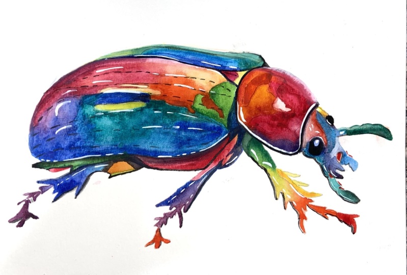
our painting. As long as we maintain balance. In the resource section, I've added a high
resolution image of my finished painting
to help guide you. You're welcome to
follow my painting exactly or experiment with
your own composition. As we're going to be focusing on the painting aspect
of watercolor, I've provided templates
you can use to help transfer or trace the
sketch before you paint. It's fine to trace when using it as a guide for
learning how to paint. It's important to
have the underdrawing correct so that you can relax and have fun learning the
watercolor medium itself. Whichever direction
you take this class, it would be great
to see your results and the paintings you
create through it. I love giving my
students feedback, so please take a photo
afterwards and share it in the student project gallery under the project
and resource tab. I'm always intriqued to
see how many students have different approaches and how they progress with each class. I'd love to hear
about your process and what you learned
along the way, or if you had any difficulties. I strongly recommend
that you take a look at each other's work in the
student project gallery. It's so inspiring to see
each other's work and extremely comforting to get the support of your
fellow students. So don't forget to like and
comment on each other's work.
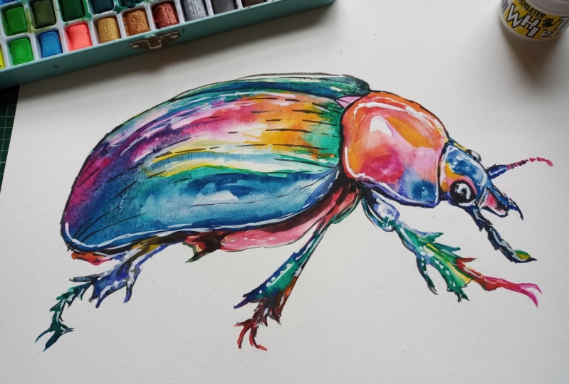
3. Materials & Supplies: Before we start the painting, let's go over the
supplies I use. Having the right materials can greatly impact the
outcome of your artwork. So I'll go over all the supplies I use for
this class and beyond. They're very useful to have at your disposal and we'll make it easier for you
to follow along. Let's start with the
paints themselves. And like most of the materials
we'll be using today, it's a lot to do
with preference. I have 12 stable colors in my palette that I
fill up from tubes. They are cadmium
yellow, yellow ochre, burnt sienna, Cadmium
red, Alizarin crimson, ultramarine blue, cobalt
blue, Can blue, lavender, purple, di black, at the
end of the painting, I often use white gush
for tiny highlights. I don't use any
particular brand. These colors you can
get from any brand, although I personally
use Daniel Smith, Windsor and Newton
or Holbein paints. So let's move on to brushes. The brush I use the most is
a synthetic round brush like this scota polar brush
or this Van Gogh brush. They're very versatile because
not only can you use them for detailed work
with their fine tip. But as they can hold
a lot of water, they are good for
washes as well. They're also quite affordable, so I have quite a few
in different sizes. Next are the mop brushes. Mop brushes are good for
broad brush strokes, filling in large areas and creating smooth
transitions or washes. They also have a nice tip that can be used for smaller details. But for really small details, highlights or anything
that needs more precision, I use a synthetic
size zero brush. All brands have them and
they're super cheap. Another useful brush to have is a Chinese calligraphy brush. They tend to have long bristles
and a very pointy tip. They're perfect for
adding texture or creating dynamic lines
in your paintings. You can even fan them
out like this to achieve fur or father
textures as well. And that's it for
brushes onto paper. The better quality
of your paper, the easier it will be to paint. Cheap paper crinkles easily
and is very unforgiving, not allowing you to
rework mistakes. It's harder to create
appealing effects and apply useful techniques
like rubbing away pigment. Good quality paper, however, such as cotton based paper, Not only allows you to rework
mistakes multiple times, but because the pigment
reacts much better on it, the chances of
mistakes are a lot lower and you'll be more likely to create
better paintings. I use arches paper because that's what's available
in my local art shop. A water spray is
absolutely essential. By using this, it
gives you more time to paint the areas you
want before it dries. It also allows you to
reactivate the paint if you want to add a smooth
line or remove some paint. I also have an old
rag or t shirt, which I used to clean my brush. Cleaning off the paint
before diving it in the water will make the
water last a lot longer. It's always useful to
have a tissue at hand whilst painting to
lift off excess paint. Also, you never know
when an unwanted splash or drip might occur that
needs wiping away quickly. I also have a water dropper
to keep the paints wet. When you paint, it's
important to have them a similar consistency to what
they're like in the tubes. This way, it's easier to
pick up sufficient pigment. A hair dryer is useful
to have for speeding up the drying time and controlling the
dampness of the paper. And lastly, masking tape. And this, of course, is just to hold the paper down still onto the surface to stop it sliding
around whilst painting. Also, if you plan on
painting to the edge, it'll allow you to create a
very crisp, clean border. And that's everything you
need to follow along. I advise you to explore
and experiment with different materials all the time just to see
what works for you. So let's start the painting.
4. Sketching It Out: So getting straight
on with the drawing, I'm going to use my sicker lead mechanical pencil for this, and I'm just going to
start with swooping curving lines just to
get the broad shape to simplify the main
shape and just to make a bit of spatial awareness on the paper for how the
composition is going to go. I'm looking at the most
broader shapes to begin with, and then filling
them in one by one. And for the legs,
I'm just applying lines at the moment,
just directional lines. No details. I'm not
going to go into details yet until I think everything
is in proportion. And you can see the way
I'm holding my pencil. It's halfway down,
and it's at an angle. I'm not holding the pencil in the same way I would
if I was writing cause curved lines and circles are much easier to draw when you
have it like that. And by drawing this fluid way, everything's got a bit
more rhythm to it. It's interconnected a bit more. And while I'm mapping it out, you can see bit by bit. I'm getting a bit more defined. My circles and curves are
getting a bit smaller. I'm starting to add a bit
more shape to the legs now. Now I'm going to move to
my finer pencil because I think the drawing is
correct proportionally. I like the position of it, so I'm using a finer tip with
a harder lead to just go over where I want the
different sections to be. Because with this
painting, in particular, this drawing, I'm
trying to create little sections for
different colors. So I do want there
to be a lot of hard lines of hard edges
with the paint later on. So I'm just mapping out
where these divisions are. And if you're drawing a different subject
and you want to incorporate lots of
different colors. It's much easier if you
are very specific with your drawing and different
sections involved. So if while watching this, you can pull up the picture
of the final painting, you can see how it's starting to I'm mapping out those different sections which will then be different colors. Of course, before I
record this and do this, I practice we have lots
of different sketches. Just to experiment. And I explore a bit
with paint as well. I don't think that I'm
just doing this in one go. It takes a bit of preparation
to work out everything. Gets a bit more detailed
around this head area. But the good thing
about drawing things like this subjects like this beetle where we don't see or we're not so
familiar with the details. There's a bit of freedom
that comes along with that because we can draw
it incorrectly. And as long as it looks
pleasing to the eye, we won't see it as wrong. So now that I've basically
started adding details. I'll do that rest off camera, but I'll just show you what I do to prepare it
for the painting. So once I've used that fine
line mechanical pencil, I go back with a putty rubber because it
doesn't leave any residue, and as you can see, I can rub out the soft
lead from behind, and it leaves the fine lead which I'll use for
reference in the painting. So let's get on
with the painting.
5. Starting The Painting: So before we start, I just wanted to point out that in the corner
of my palette here, I'm using a bit of opera pink by Daniel Smith because I don't
have that in my palette. And although I'll be incorporating
many different colors, I'm just going to
use a little bit of opera pink because a
little goes a long way. So I've just put
it in the corner there rather than squirting
it into one of my pans. And with this class,
in particular, I'm going to be experimenting
with many different colors, but you don't have
to follow exactly. You can explore with
the palette you've got. I'm not expecting you
to go and buy out fresh colors just so that
you can follow along. You can do that if you want, but you don't have to. You can use red instead
alizarin crimson or something. So start off, as you can see, I'm using a very diluted yellow, Just in a few areas where I'm going to preserve the paper. Well, not the paper, actually. I'm going to try and paint
these yellow areas dry it, and then they're going
to glow later on. I'm going to save
those bits among the other washes
so that you'll see the final result in the
end is that there's a warm glow rather than
the white of the paper. So I'm not preserving
the white of the paper, I'm preserving
these yellow bits. But they count as
the first layer because I can't paint them afterwards after I've
already painted on top, so Next, I'm just looking
at different areas. This painting in particular, with the drawing I've done, I've really made lots of
different sections and segments. So it's a bit like coloring in because they're all going
to be different colors, and I'm just like I've
done with a yellow, and like I'm doing with this reddish burnt
sienna right now. I'm I'm just finding different areas to fill
in with different colors. I'm mixing a bit of yellow
ochre into that as well. A bit of green at the bottom, and green while it's still
wet so that it blends out. And you can see, I've
got a sponge there, a damp sponge where
I just use it to control the
moisture in my brush. If I've got too much
water on my brush, I'll just dab it on
the sponge and it will control the amount of water that comes off onto the paper because
if your brush is too full of water and you
apply the brush to the paper, then it'll all spill
out onto the paper and it'll overload
with too much water, and it'll be
difficult to control, and it might spill out
into different sections, and it will dry
unevenly as well. So. So I'm incorporating
a pure Well, it's a lizard and
crimson with a touch of that opera pink in there. Because, although it's hard
to explain now, visually, I'm going to have a
bright green next to this red later on
in the painting, and the two when they're
next to each other, they'll really make
each other pop. So I'm thinking ahead with
where I'm placing the colors. And I'm just dabbing thicker more consistent bits of red pigment in there to have a bit of a darker
tone on the edges. You can see as it's still wet. It just disperses out
into a smooth way. That's how you create a
nice smooth gradient. So I'm just thinking
about what colors I'm going to use next. Checking to see whether
that yellow is dry dry enough yet so that I
can then do the next stage, but it's still a bit
damp, so I'll leave it. Now I'm using a bit
of that opera pink. Mixing it with that lizard and crimson and painting
another section, starting to paint a
bit in the leg. Okay.
6. Limited Palettes: So with the way
I'm painting this, rather than doing a big wash
over every single section, like I do in a lot
of my paintings, I'm really breaking it down
into different sections. And I mix a color like this red or like the
yellow before it, and I think of where
else I can use it. Even if it's just
a little section. By adding them all
together at the end, they'll look very nice together. I'm trying to keep it well balanced as well, evenly spaced. So a bit in the middle
a bit to the sides. Taking a bit of cau red now
and mixing that into it. Just to create a bit of variety. Now, with most of my paintings, I try and have a
limited color scheme because there's lots
of benefits to it. But with this one, I'm really pushing as many
colors as I can into it. I'm kind of creating a
rainbow like painting, and that's how you can
make a lot of subjects interesting by getting
the tones correct, but incorporating lots
of different colors, So, normally, as artists, our
aim isn't to overwhelm our canvases or paper with a myriad of different
pigments or colors. Instead, we usually
have to carefully select our base colors and
then use subtle hints or suggestions of other hues to add uniqueness and
intrigue to our work. I usually think of it in terms of never mix four colors
when three will do. When we prioritize
this simplicity and efficiency in
our color choices, we can create a more
defined vision, and more harmonized vision. By limiting the number
of pigments we mix, we maintain clarity and avoid
muddying our compositions. This approach encourages us to explore the versatility
of our chosen colors, experimenting with
different combinations, different concentrations,
to achieve desired effects. Whether we are blending
colors to create soft transitions or laying
them to build depth. We strive for precision and restraint allowing
each pigment to shine whilst contributing to the overall harmony
of the painting. But today, we're doing an exercise in
something different, which is equally correct. It's all about personal
taste and preference, and there are many advantages to incorporating lots of different colors in
watercolor painting. It adds richness and variety by using a
wide range of colors. We can create paintings that are visually
rich and varied. Each color adds
its own unique hue and tone to the composition, and this results in a
vibrant and dynamic artwork. It's also a factor
of expressiveness. A diverse palette allows
artists to express a wide range of emotions and
moods in their paintings, different colors evoke different
feelings and allow us as artists to convey our intentions to convey our message in a
much more effective way. It also allows us a
bit more versatility. Incorporating lots of
different colors gives us more options and
experimentation for creativity. We can mix and blend colors in various ways to achieve
different effects and textures because some pigments have different factors to them
that affect how they look, maybe they're more granular, maybe they're more transparent. This all adds depth and possibly more
complexity to our work. Also, it makes it
much more unique. Using a multitude
of colors can make a painting stand out and
appear more distinctive. It allows us to create a
literally one of a kind artwork. I mean, a lot of watercolor
is unique anyway because the way the pigments mix in such an
unpredictable way, they're quite impossible
to replicate. Unlike oil painting
or acrylic where you can Very decisively, paint the brush strokes and blend it exactly
the way you want. Watercolor is a medium where you have to allow the water and the pigment
to do it for you.
7. A Burst of Pink: Each artist has their
own unique style and preferences when it comes
to color selection and incorporating lots
of different colors or whether you want to
limit your palette. It just gives us an opportunity to personalize our artwork and showcase our individuality. So you can see now that I've been incorporating
more and more colors. I've gone back to a
more vibrant yellow. I've also close to the head, mixed a bit of blue
and purple on there. I also forgot to mention that
I'm using a Van goth brush, the same one I usually do. It's a size eight, I believe, but it all depends on
the size of your paper. And I'm going to do the
whole painting with this single brush because it's got a nice
thin point on it. So it is good enough for
the fine details as well as the broad washes
because we're not doing any huge broad washes
today with this painting. But at the moment, I'm applying a very thick pigment and just
applying it in this area, and then adding water and slightly agitating
it to bring it out. I keep on going back to my water pot to
pick up more water. And you can see, as I
touch the edge of it, it just spills out
into the rest of it. And now I'm going to apply some cerilian blue because Ceran blue has a lovely
granulating effect. It's got thick
granules in there. It's not so opaque. So when it mixes with a transparent
color like opera pink, it really does some quite
magical things there because The thicker granules of the seran blue dry on top of the finer
ones of the opera pink. So having a close look at
the painting afterwards, you really see some
nice effects there. Of course, this opera pink, which is a red at
the end of the day, um, When mixed with this blue, it turns into a lovely purple, nice fiber and purple. And on the top of this pink, I'm going the other
side of the spectrum, the warmer side of the spectrum. So I'm adding orange now, which I mix myself using
yellow and cadmium red. Cium red and yellow, I'm using. I'm just agitating it
where it makes the purple whilst it's wet so that it's
a nice smooth gradation. So like I said,
even though I'm not doing any big washes today, we're still practicing
doing these smaller ones and incorporating
blending into it. Okay. And I just keep on dabbing back and forth with
the purple sporadically, evenly spaced so that as it
dries, it merges gradually. I'm considering
how I should work the top of this part
of the beetles shell. I'm going to have to
blend them across there. So I'm using a bit more
dilution with the paint now. So it's going to be
lighter at the top. A bit more yellow
to keep it vibrant. It can be quite difficult to figure out how to make the paint as
vibrant as possible. And each different
pigment and paint has a different level of consistency
to get that vibrancy. In watercolor painting,
in particular, the vibrancy of
different colors or pigments can vary depending on the tone of the hue and the concentration of the
pigment that's used. And understanding these
nuances is essential for achieving optimal color
saturation and vibrancy. For instance, colors like yellow often reach their peak vibrancy with thin pigments
when applied lightly, yellow pigments appear
luminous and transparent, creating a delicate
and sunlit effect. However, with yellow
when applied thickly, it can appear duller
and less vibrant. This happens as the
additional pigment obscures the inherent luminosity of the watercolor and blocks
out the white of the paper.
8. Transparent Pigments: Transparent colors, if
you look at my palette here, often look darker. So when we want to make
them more vibrant, we have to dilute them a
lot more so that we can see the light reflecting through them onto the
white of the paper. On the other hand,
though, some colors require more pigment to
reach their full vibrancy. For example, cobalt
blue is a color that benefits from a slightly
heavier pigment concentration to achieve deep, intense tones. When applied thinly, cobalt blue may appear
pale or washed out, lacking the rich saturation that characterizes
its full vibrancy. By layering on thicker
applications of pigment, we can make use of the full depth and
richness of cobalt blue, and it gives our artwork, a striking depth and presence. Similarly, colors like
Alizarin crimson or vdianGreen also require
heavier pigment to achieve maximum vibrancy. These colors possess inherent
depth and intensity, which can be enhanced through the strategic use of
concentrated pigments. I'm just trying to preserve
this white part of the shell as a kind of
a reflection highlight. But Moving on, I'm going
to apply a bit more yellow here to boost the orange
quality of it and swooping up, spreading that pigment up to the top to blend
it out a bit more. Next. Let's take a bit of this Ceran blue that has a bit of opera pinkin
so it's a bit more purple. And now that the yellow up
here is completely dry now, I can start filling
out this area. I think on the left, I'm
going to keep it warmer. And then possibly blend it
cooler on the other side. So I'm using pure opera pink and having it
blend into the blue. And now on the other
end, it's pure blue. So a nice little
gradation there. Following the curvature
of the shell. And I'm making sure that my hand isn't
touching what we just painted 'cause I don't want it getting on my hand and then smudging it to
different sections. In hindsight, maybe I
should have painted this left part first, but sometimes you just
have to go with the flow. It's always good to
have the ability to paint without resting your
hand on the paper anyway. So I'm using pure cerlian now just filling
in this section. I've already drawn out
which section I'm painting, so It's just about filling it in and then
getting the tones right. Starting to incorporate
a little bit of green. And you can see in my palette, I've created different sections for different color families. So I've got the reddish
orange at the bottom. Then I've got the bluish
purple in the middle, and now I just started
the green one above that. And I'd say so far, it's all pretty mid toed at the moment. Even the thick use of opera
pink is quite a light tone. At the very end, we'll get
to the darkest tones and apply to complete
the tonal range. But I am putting a bit
of vidian green in here, which is a dark figment also. But it does blend out
a bit as it dries. So I'm aware of that using a thicker pigment
when it's very wet, it does naturally blend out
and dry lighter than how it looks when you apply it. Okay.
9. Opaque Pigments: So yeah, by understanding
how different colors interact with varying levels
of pigment concentration, we can harness the full
expressive potential of our water color pigments. And you can see with this green that I'm
just putting down here that the darker bits are less vibrant than
the lighter bits. But that's the opposite
with the red pigment, man red I've got in my palate. I I use thick pigment there,
it's still very bright. Okay. So Experimenting
with thin washes and thicker applications
really allows us to learn how to manipulate
the color saturation, the luminosity,
and the vibrancy, which at the end of the
day helps us create more dynamic and
captivating artworks. But it all takes a bit of
practice and experimentation. So I encourage you to
test it out yourself, see how far you can take it
with different pigments. And you can practice
while you paint. You can start off light and
then add thicker pigments. And of course, it also comes down to understanding
transparency and opacity in watercolor.
That's also essential. I'm just using
very thick cerlion here straight from the tube because I feel it lost as it
blended out with that pink, it lost its hue a bit. I definitely want to emphasize
that blue in that section. So I'm applying very
thick paint there. While it's still damp, so there's still no
hard lines there. But as it's drier, it'll be harder line, but still ultimately soft. If it was completely wet, it would blend out as one color. There won't even be an edge. But at the stage it is now, there'll be a nice soft edge, and you can see where I
mixed it or applied it. I'm now actually
sucking out some of that water to leave it a
pure blue, a lighter blue. So as I was saying, the knowledge of
transparency and the pasity allows us to control
airing a bit better. And how we want to
achieve certain effects. Of course, transparency
refers to the ability of a pigment to allow
light to pass through, and that creates luminous
layer effects while opacity describes
the degree to which a pigment obscures
underlying layers, resulting in more saturated
and opaice colors. So now I'm going in with some global teal blue
mixed with viridian green, There's another pigment that
has nice granulation to it. So as it dries, there'll be a nice
pigmentation effect to it. It won't be a completely
smooth evenless wash. But that's the desired
effect that I want. Also, it has a lovely
turquoisy kind of color that further expands the color range we're
experimenting with. So I always tend to go with a
thicker brush mark to begin with and then use
water to bring it out just like I'm doing here. And you can see on
the back of tubes, the little diagrams that say, whether it's a transparent, a semi transparent or
an opaque pigment.
10. Granulating Pigments: Transparent pigments such as ultra marine blue or opera pink, they create vibrant washes
and subtle gradients, allowing underlying
colors to shine through, and they lend a
sense of luminosity. These kind of pigments
are ideal for building up transparent glazes and achieving delicate transitions in color. On the other, like I'm doing
here with this Verdan green and cerlian blue,
Opaque pigments, which also include man
red or yellow ochre, they provide more
coverage and intensity, making them more well suited
for blocking in shapes and creating bowl solid areas of
color, like I'm doing now. While opaque pigments may lack the translucency of their
transparent counterparts, they offer rich saturation
and can be used to create striking contrasts
and highlights. Understanding the behavior of different pigments in
terms of transparency and opacity enables us to make informed choices when
layering these colors. Because, of course,
opic colors overlap, and they lack that transparency. So strategically combining
transparent pigments with opic pigments allow
us to achieve a wide range of effects from aerial washes to bold
textured surfaces. Of course, as I always say, experimentation with
these layering techniques such as wet on wet
or wet on dry, further enhances
our control over the transparency and opacity, allowing us to create
depth and dimension, Okay. Mastering transparency and
opacity empowers us to unlock the full potential of watercolor and allows us to create
dynamic artworks. Of course, there are so
many different elements to watercolor painting that are all interspersed
and interlinked. When you practice painting, it's good to have an idea of what particular element
you want to focus on. And then, over time, all the different ones
kind of merge into one, and you kind of have a sense for how you want to
go about something. So on this left hand side, I'm really going thick
with ultramarine blue. I have a little bit of
cobalt blue in there too. Cobalt blue is an opaque figment and ultramarine is
a transparent one. So the mixture of the two
create a nice effect as well. And you can see it at
the very bottom here, I'm being careful that it doesn't go over
into that red section. Well, anywhere, actually, on
the lines on the left here, I'm making sure I don't
brush over that pencil line. You can see how at
the bottom here, the turquoise color of
the blue and the green. Interacting with the red is quite a powerful
visual statement. Taking a bit more of
the opera pink now. I'm on the left side
incorporating it. So in this section, it's quite a dynamic
wash because there's quite a few different colors lending into each other
and there's no division. Of course, when I'm
drawing something like this or planning
out the composition, I can't draw with a line, a gradation or a blending area. So I just kind of roughly
do a circle just to imply where the change
of color will be, and I have to remember when it comes to painting
that that's what I want. Because the rest of the
drawing has harsh lines to help me differentiate where I want different
colors to be. That's why squinting your
eyes happens helps too. Because when you squint your eyes and look
at the subject, it's It helps define the
tonal ranges a bit better. So you can see what's dark and
what's light a bit better. And it helps you work out how
you should paint something. While watching this, you can even gently squint your
eyes at the screen, and you can see how it kind
of eliminates the mid tones, and it just shows you a bit clearer what's
dark and light. And if you were to draw it, where you would divide
the different tones.
11. Contrasts of Colour: So I'm bringing that
opera pink up to the top, creating a nice edge
against that blue. And now, on this side, almost reaching full circle, I'm incorporating
some yellow into it. And it all started
with that wash below, and then we worked our
way around gradually. Now some orange. Moving the pigment around a bit so that has a nice, clean blend. And then I'll have a
highlight somewhere in between this pink bit
and the green bit below so that it doesn't blend so that it
doesn't mix about together. But we can always come back. At the end with the white guash to pronounce the highlights. Also, you could masking fluid. I don't generally use that, but it's certainly an option. If you don't like using white
guash or don't have any. It's something you
can experiment with. Using masking fluid offers both advantages
and disadvantages. Some of the pros precision. It allows us to preserve areas
of the paper, of course, and we can apply the masking fluid and just
forget about that section, and it will maintain all those intricate
details and achieve a very crisp edge when you remove it at
the end of the painting. And by masking certain areas, we can work in layers
without orrying about unintentionally blending
colors or losing highlights. And we can use it
to build up depth. We don't necessarily need to use it at the beginning
of a painting. We could paint something on the first layer or the
second layer and then apply the masking fluid and
then taking it off after multiple other layers have been painted on top of it. And when I do sometimes use masking fluid in more in my
more ambitious paintings, I use it in multiple
different ways, whether it's with tuff bits or the side of a
pen or a pen lid, I don't use brushes because
it just destroys the brush. And that's one of
the reasons I don't use it that often because
even when it's dry, the the kind of
consistency of it, the edge of it, I have a feeling it ruins the brushes
when you use it to paint. And that's one of the cons. It's Sometimes when you remove the basking tape
or the masking fluid, it leaves behind a little bit of a residue or discoloration. That's if it's left
for a very long time. Not all papers are suitable
for masking fluid because they can't withstand
the properties of it, the amount that it
sticks onto it. So I'm trying to figure
out how to finish this wash. Connecting it. With a few gaps in the middle. I don't want to all to
blend out together, but using the tip of my brush, I'm agitating it a bit just to make sure it's all
interlinked somehow.
12. Getting The Drawing Correct: The good thing is, it's all
open for interpretation. You can't really go wrong as long as the
tones are correct. If I painted that middle
bit with purple or pink, it wouldn't make that
much difference. Likewise, I painted it pink at the top and blue
at the bottom, but I'm sure it wouldn't really matter if I decided
to paint blue at the top and pink at the bottom
or blue for the head area, and then orange for
the main shell area. Come to think of it. I'm just having fun putting
color in different places. With this style of painting, the placement of the
color isn't significant. We're not painting
I think realistic. So it's all just a matter of personal taste and where
you want colors to go. And it's kind of liberating, painting something without
having to worry about the correct colors
because it gives you that opportunity to explore what individual pigments do and
how they react to each other. I say this a lot, but it's
a bit like coloring in, but the next level because we're working with
texture and tone. As long as you get the drawing or the trace of it as
correct as possible, It makes your life much easier when it comes
to the painting stage. You can even experiment with tilting the paper
like I'm doing now. By tilting it, we are really agitating where
that pigment goes, especially with
that cobalt blue, which has a thick
granulation to it as it moves across the
paper when you tilt it. A lot of those pigments, the granulated
pigments get stuck on the teeth of the paper in
the texture of the paper, and the water flows through it. So really you can
see where I did it. It's created a lot of texture, which I kind of want
in this section. I'm just interested with how the medium of
watercolor interacts with water in an organic way. Sometimes I find it's
easier to paint in a clean detailed way because there's a
direct way to do it. You can learn and you can
improve your technique. But when it comes to being
a bit more abstract, it's a bit more open ended, and there's less rules about it. It's more unpredictable. So it's ironically, quite difficult to be
expressive and just let go and have it come out in a captivating,
interesting way. Without it looking
like a complete mess, there's a kind of balance to
creating this messy look, but in a controlled way,
it's deceivingly difficult. So I'm just adding a different section up
here with the pink again, contrasting with the green. See how far that
opera pink has gone. Just a little bit
squirted on my palette, and we've got a lot of pink
in the end on my painting. I think there needs to
be a bit more tone going on on this head area. So I'm just going to
define the curvature a bit by adding a bit of a
darker section to it. I've chosen to put
red on here on this section because I'm not trying to steal the
attention in this section. If I put a green or blue there, it would be too jarring. I want just something
that works quite nicely. So I've allowed that to dry with the hair dryer and
going back into it. A bit like I did
with the head area, I'm going back to define some of the curves starting
with this blue here. Layering it on. When I layer colors, I try to keep it within
the same color family, like blue on top of blue
or red on top of red because it can be quite difficult to judge if
it's a different color, it might get muddy
or grayed out. But sometimes that's
not the case. I whenever there's a
rule in art or painting, take it with a pinch
of salt because there's always an opportunity
to break that rule.
13. Your Interpretations: So I'd love to see your
interpretations of this painting and how maybe some of you will explore a completely different
color scheme. Mixing all the colors around, using completely
different colors, or maybe some of you will
paint a different subject, having similar colors, but painting something
completely different. You can find inspiration in
a lot of unexpected places, and often it breathes new life into your
artistic journey. It encourages you
to explore beyond the conventional subjects
of wildlife and landscape. Or at least different takes on these wild life or landscapes. Everyday objects, emotions or experiences offer rich sources of inspiration that can lead to unique and meaningful
watercolor paintings. Consider how the mundane can be transformed into
the extraordinary. For example, a simple cup of coffee in the morning
may seem routine, but it can inspire a
captivating watercolor painting by exploring the
interplay of light and shadow on the
surface of the liquid, possibly the steam
rising into the air, or the intricate
patterns of foam atop. By capturing these
fleeting moments, you can elevate the ordinary, but also invite viewers to appreciate the beauty of that
seemingly mundane moment. Emotions are also another
potent source of inspiration, the feeling of
nostalgia evoked by childhood memories or rush of adrenaline from an
exhilarating experience, or the tranquility
of a quiet moment. These all serve as
powerful themes for watercolor paintings. And through color,
composition, and brushwork. We can convey the essence
of these emotions. Even if the subject
is something that we usually paint before taking this different emotional
kind of route to it. It resonates on a deeper,
more personal level. I'm trying to make a
nice vivid green in this section to create a bit of a strong contrast
against the orange. And adding darker
pigment around the edge, allowing it to bleed
in towards the center. Same with this area, where we preserved the
white of the paper. I'm using that white
of the paper to make a nice, vibrant green. And now you can see
if you look back towards the first
strokes we did of the yellow in the
under we can see how we preserved theosy
of the paper. If you want to
create more texture, you can always dip your fingers into your
water bucket and just flick them as the
painting is drying. And depending how close
the paint is to drying. When you flick the water, the more texture they'll be. If it's still very wet, it'll blend out very smoothly. But if you wait until
it's 90% dry and then flick your wet
drops on there, there'll be a lot of texture. Going over this yellow bit here of a darker green cause you do need some darks to bring out the vibrancy
of the mid tones.
14. Exploring Abstract Subjects: Going back to
different subjects, you can start exploring
with experiences, everyday experiences
such as a stroll through a bustling city or a quiet afternoon spent
watching people in the park. You can just spark inspiration for a lot of enjoyable scenes. It could be the play of
light on architecture, the movement of
figures in a crowd, or the juxtaposition between nature and urban urban setting. Embracing the unexpected and
seeking inspiration around the world allows you to open yourself up to a whole wealth of
creative possibilities. It could be the texture
of paint peeling off an old door or the sun filtering through the leaves or even something a
bit more abstract like laughter shared
among friends. How would you try
to express that? If you look beyond the
obvious and really let your imagination sow it can really be quite enlightening and a fun way to
express watercolor. Now I'm mixing quite a
deep dark color here, a kind of purple,
or reddish purple, because I've got a liarin
crimson and ultran blue, which together as their
transparent mediums, make a very dark color
when used thickly. And I'm just going over some areas almost like a
thick line, like a pen. On some of the borders of
the edges to divide them, and again, bring some
dark tones into it, because we need a
full tonal range. We need light tones, mid
tones, and dark tones. Because having these dark tones, as you can see, right
now, for example, really makes the colors pop, especially the pink
and the green here. Using the tip of the brush to place the fine lines
the surroundings, and then go back over it with more pressure
to get a thicker line. This also means that
you don't have to have such a line or clean edge when you
first apply the colors, you can come back with this
to create a clean edge. So we've been painting larger
sections with broad washes. And now we're going to move
on to painting the legs, which requires a different
kind of technique. Being a bit more
precise and having a bit more finesse with our
brush using the point of the brush to get inside those small
intricate details and gaps, which is good practice. Again, We're not so accustomed to seeing the
details of a Beatle's legs, for example, so we can be quite forgiving
with ourself about it. We don't have to get it perfect. So it's a good opportunity to practice filling in and using the versatility
of the brush. Using the very point
of it and how adding pressure affects that or how
the angle of it affects it. A different things to
work out and experiment on to help improve technique. Also, how much pigment and
water you want on your brush. I tend to find when I'm
doing these details. I don't want to overload my brush of water.
I want to keep it. Almost 20% full or 80%
empty, if that makes sense. I don't want the water
to be spilling out. I want to have to I want as much control as I can possibly get with
getting the water out, especially with the very
small fine details. The last thing I want is to touch the brush
on the paper and have the pigment and water
spill out over the lines. So it's better to
be safe than sorry, and it might take a bit
of a learning curve. It might be uncomfortable
having to go back and forth picking up more pigment. Sometimes what you
can do, like I did is have that bottom section
here, a bit more watery, and then you can
take the water from that section to spread over
to a different section, so you don't have to reach over to the water pot all the time.
15. Painting The Legs: And I actually sped
up my footage here because there's not much
more other than practice, there's no special secret
to painting details. It just takes a bit of patients
who have the brushwork. So while I'm painting
these details, I'll talk about the
impact of light on color because it's very
profound and it influences how we perceive and interpret the
world around us. Lighting conditions
play a crucial role in shaping their
appearance of colors, and it alters their hue,
saturation, and value. And as artists, understanding
the nuances of how light interacts with
color allows us to create mood and atmosphere
in our watercolor paintings, we have more precision
and intention. Different lighting
conditions such as natural daylight or
artificial indoor lighting, or the warm glow of a sunset can dramatically alter the colors
within the scene. For example, under
direct sunlight, colors appear more
vibrant and saturated. While in the soft, diffused light of dawn or dusk, colors may take on a cooler,
more subdued quality. Additionally, the angle and the direction of the light can create dramatic contrast
between light and shadow, and that further influences the perceived colors
within a composition. And by harnessing
this knowledge, we can manipulate
lighting to evoke specific moods and atmospheres
for our paintings. Within, for example, painting
a scene in bathed and warm, golden light, for example, can convey a sense of warmth,
comfort, and nostalgia, while cool, muted tones
are the opposite, they invoke feelings of tranquility or
possibly melancholy. And by carefully selecting
and manipulating colors to reflect the desired
lighting conditions, we can give our work a motion and a kind of
narrative depth to it. We can tell a story,
convey a message, and it really transports our viewers to a
specific time and place. Of course, no one's perfect, and I don't think there's
a full mastery of art. There's always something
more to be learned, but it's just having these ideas in your mind when you paint that can help inspiration
come through and help. You kind of spirit come
through in your paintings. Understanding how light interacts
with color allows us to create more dynamic compositions
that play with contrast, depth and focal points by strategically placing areas of light and shadow
in different areas. Artists can draw attention to certain elements
within the painting. And this guides viewers gaze and enhances
visual interest to certain areas and
away from others. Because we don't want every
part of the painting to be screaming for
attention, so to speak. We want to kind of have
a natural flow of gaze, because, of course, depending on what style
you want to paint in. But a lot of the masters. Whether it's oil painting or watercolor or even photography, they compose their paintings
in a way that direct the eye and make it easy
on the eye, so to speak. In watercolor painting,
specifically, the transparent nature of
the medium allows us to layer colors and achieve subtle variations in
hue and luminosity, and they can mimic the
effects of natural light by building up washes of color and allowing them to interact
with each other. We can capture the ethereal
qualities of light and create paintings that resonate
with vibrancy. As you can see, like I've done throughout the whole
of the painting. I'm creating
different sections or segments and trying to
make them quite dynamic. So I'm varying my color a bit. Some of them, I'm just
basically blocking out with the same color and
varying the tones. Some of them, I've got
transitions of color, like yellow to pink, some of them are darker,
some of them are lighter. I'm going back to this one on the left here while it's still wet it's the same tone. It's the same color rather,
but a different tone. I'm going to incorporate
some green into this one. And again, this
green right next to that pinkish red
really makes it pop.
16. Happy Accidents: When experimenting and
learning watercolor, there's, of course, going to be moments when mistakes happen. It's inevitable and even as someone who's painted
for a long time, I still try to push
myself and almost aim in a strange way for
these happy accidents because it's in these
intentional mistakes, so to speak, that exciting
new things could come across. So embracing mistakes and happy accidents is
really the way forward. It's an essential mindset
shift for any artist, particularly in the
realm of watercolor, where spontaneity
and unpredictability are part of the medium's charm. Just filling out this
section with dark pigment, incorporating more dark tones. So yeah, it's important to remind ourselves
that mistakes and unexpected outcomes
are not only natural but often integral to
the creative process. Rather than being in
them as setbacks, we can embrace them
as opportunities for discovery, innovation
and growth. With water color where
pigment interacts with water and paper in
intricate ways, mistakes and happy accidents
frequently happen. A brush stroke may
bleed unexpectedly. Colors may mix in
surprising ways or a drip of water might create
an intriguing texture. Instead of trying to control every aspect of the painting, Embracing these spontaneous
moments allows us to tap into the medium's inherent magic and harness its full expression. We have to alleviate ourselves from the pressure
to achieve perfection and fostering a mindset
of experimentation by liberating ourselves from self doubt and the
fear of failure. Because at the end
of the day, we're just trying to have
a good time anyway. We don't need to add that
pressure for ourselves. It's valuable for
learning experiences. It empowers us to take risks,
explore new techniques, and push boundaries and take our artistic practice
to the next level. Also, another advantage to embracing mistakes is that
it cultivates resilience. It teaches us to adapt and improvise when faced with
unexpected challenges, which is really what
Watkl is all about. It's invaluable in the
art making process. And every great work of art has been a process
of that way of thinking. It's come across through
innovation through people taking risks or experimenting because it didn't
come before it. And the only way for
something new to come is with that of it
not working out, and I'm sure great artists
had lots of setbacks, but they didn't affect them. So I kind of made
this class a bit of a challenge to
myself because I'm aware that some people are uncomfortable
with bugs or beetles. And I thought by trying to create a intriguing
or there I say, a kind of appealing
painting out of something that doesn't necessarily
have a bad connotation, but some people are uncomfortable would be
like an ultimate test. So, right here, I've
noticed that I've done a little smudge on
the paper there, so I'm going to use a hard
brisk brush to agitate it and mix that pigment
around with pure water, and then I'm going to use
a tissue to very quickly to suck it up and get the white
of the paper clear again.
17. Testing Yourself: A It's a test that I've tried
a few times with myself, and I encourage you to try in the project section is to
test yourself to see if you can create something nice out of a subject that
isn't nice, so to speak. And one of the best
ways to go about it, like I have approached this is to make the use of
vibrant, attractive colors. It's almost like cheating if
you use beautiful colors, anything that can
look beautiful. And nowadays, there's such
a huge variety of colors. I get so inspired by looking at my color charts and how many
possibilities there are. And then there's another
take on this challenge of painting something
captivating is by taking something
that is nice, but not using any
appealing colors at all, is using grays or
subdued muted colors. That's more difficult because
captivating colors can be obviously very captivating and they can do the work
for you a lot all the time. But when you can't rely on those nice colors and you
try and challenge yourself to paint something a bit more less saturated,
less vibrant. Then it really makes you think
about tones differently, about textures,
about composition. You got to think about
every single other aspect. So a lot of the time
when I was learning, and I still do it now, especially when approaching
an ambitious project, I do a lot of gray scale or
black and white painting because it really makes you think about the composition without the reliance on color. So those are a couple of
challenges you can do. And I know usually in the project section,
people like to, of course, follow along with
the painting I've done, which is, I'm perfectly
happy for you to do that. And you can still
do that. But if you want to take the next step and challenge yourself further, you can either try taking a different subject and making
it interesting or you can take a pretty subject
that is quite common and trying to painting in a intriguing way without using any colors at all. Just tones. So now
I'm going back over this just change
the tones to create a bit more depth and shadow
and illusion of shadow because I feel it's
lacking a bit of three deniality in it. It's a bit flat. It's got
a lot of different colors, but they're all quite flat, so I'm using the
tones now to with that three. Again, mixing. Enough colors so that
it's just a pure dark. And there's really not much
water on my brush now. It's a pure pigment. When painting with
a full tonal range, you don't have to paint lots
of darks or lots of lights. Just a few touches
like I'm doing now. Just something to help show what the full tonal range is. Okay.
18. Adding Dots: Okay. The good thing about watercolor is
that you can layer. Unlike well, you can still
do it with oil and acrylic, but in a different way because of the translucency
of watercolor, you can really work on layering rather than
doing it all in one go. So I paint the base color blue or whatever color it has been. But for this, what I'm
painting now it is blue, and then I'm going
over it now with a second layer to
fix the tones a bit. As it's drawing
closer to the end, it takes a while to It takes a bit longer to
think about what to do next because you
don't want to overdo it. You just want to tie
the painting together, bring it to its completion. So it takes a bit of sitting back to looking at way
to apply the darks. In a minute, we'll
add some highlights. I'm thinking I should add a bit more a few
directional lines on the shell to help
with the curvature. But I think I need a bit more dark on the head area, so
that's what I'm going to do. I'm going to define the eye now. So I start with thicker pigment. As I do most of the
time, I start with thick epigment and then
use water to blend it out. I use a thin tip of the brush to go around the edge of the area
that I'm trying to fill in, and then I just fill it in. Same movie other ey. Not Rich Pate on the
other ide. Is a hint. Basically with these
dark sections. I'm almost randomly going over the areas that
I've painted before, on one side of the
outline of it. If that makes sense. I'm not filling in obviously
the whole area. And with this bit now, I'm just doing
implying more shapes. But just a few dark lines that follow the pre existing
rhythm of what's there. No, using pure water to
blend pretty wet some areas, and then I can create
a nice soft tone in Making a darker blue. And now, I'm just going to add a few lines onto
a few dotted lines. So I'm just tapping as I go
along in the curved line. Just to accentuate the
curves ture of the shell. And it takes a bit
of practice to draw a nice smooth line whilst you're lifting up
and down, tapping. And you ought to think
of the end in mind. You have to start but look at
where you're finishing and then rehearse it in your mind and then just go along with it. Ironically, the slower you go, the more difficult it can be because you lose sight
of where you're going. If you have a kind of flow. It's all linked up a bit better. Maybe just another one
down here. Very subtle. Probably wouldn't notice it on the first take
on the first look, but it just tricks the
mind into a bit more form. Another made on the paper there. I have to clear that up.
19. Finishing Touches: Okay, now, I'm going to get some white guash here that I
have in my palette pre wet, but it is the same
consistency as the tube. I just squirted some in
there before the class, and I'm going to do
a similar thing. I'm going to help accentuate
the curve by highlighting some areas. I don't
want to overdo it. It takes a bit of judgment. You don't get over excited with the use
of it, apply a stroke, then sit back and then take your time to
look because often, so many times, I've overdone it. I've thought there needs
to be another stroke here, and I apply, and I
think that looks great. And then 5 minutes later, I'm like, that is a mistake. I shouldn't have put
that down there. So I try and be a bit
more cautious now. Sometimes if the paint in your tube has
dried out a bit more, you might want to add
a bit more water. Just to make it
come off the brush a bit better because we're not trying to achieve a
dried brush effect here. Okay. Few more reflections. This is what this white guash is really implying and indicating some reflections on the sell. Okay. It can be a nice idea to add
these white lines on a edge where there's other lines like the black line here. Emphasizing. And the contrast of this precise line or precise white application of the white quash with the more expressive marks is
quite nice, I think. It grounds it, having
a bit of precision, contrasts with the abstractness helps ground the painting a bit. A few more on here. On
the feet, legs, rather. Often, this approach
to painting, the way we've done it today by painting in different
sections quite intricately can take longer than the more expressive style. The more abstract style because usually they're done
in a single wash or they're a bit more less
defined with the details. That's often the case.
The longer it takes, you can have more precision. But it does take away
slightly from the expression. Now, the goal of this painting really
was the use of color. So that's where we're getting
the expression from here. So I think we're allowed to take away from
that expressiveness. Even though we do
have expressive washes in the center there. So I think there's a
nice balance going on. And on the underside of this
shell area, the shell area. I'm just doing a white
line underneath there. That's a little reflection, emphasizing the edge on
this reflection here too. I think that's pretty much it. We've gone from left to right, adding all the white
highlights here. They all look quite
even and well balanced. So basically, you
can see we've got the expressive coloring in
of the different sections. Then we go in with
the darkest darks to emphasize the
tones, the dark tones, and then we lastly go with
this white just to pop the highlights in
Smoothing this eye a bit. It was a bit too hard line. I'd like to have
it a bit smoother. But I think that's now done, so let's sum up this painting and let's go
through what we've learned.
20. Final Thoughts: Welcome back, everyone, and congratulations on completing this vibrant watercolor journey. I hope you've not only
enjoyed the process, but also feel inspired to dive deeper into your
artistic endeavors. If you haven't yet
attempted to give your own rainbow
colored painting a go, now is the opportune moment
to let your creativity flow. The aim throughout this class
was to see how something unusual can be turned
into something captivating with vibrant
colors and tons. We wanted to prove that even things you wouldn't
normally expect to be beautiful can shine when we add
exciting colors and rich tones to discover the magic where ordinary
becomes extraordinary, bringing the canvas to life with a burst
of color and death. Remember, watercolor painting is not just about technical skills, but also about expressing your creativity and
personal style. I encourage you to continue
exploring, experimenting, and pushing your
boundaries to create your own unique
watercolor masterpieces. As we come to the
end of this class, I hope you feel
more confident and comfortable with your
watercolor painting abilities. Practice is key when it comes
to improving your skills. So keep on painting
and experimenting. I want to express my gratitude for each and every one of you. Your passion for
watercolor painting is so inspiring and I'm honored
to be your teacher. If you would like feedback on your painting, I'd
love to give it. So please share your
painting in the student project
gallery down below, and I'll be sure to respond. If you prefer, you can
share it on Instagram, tagging me at Williston, as I would love to see it. Skillshare also loves
seeing my students work, so tag them as well
at Skillshare. After putting so
much effort into it, why not share your creation? If you have any questions
or comments about today's class or want any specific advice
related to watercolor, please reach out to me in
the discussion section. You can also let me know about any subject wildlife or scene you'd like me
to do a class on. If you found this class useful, I'd really appreciate
getting your feedback on it. Reading your reviews
fills my heart with joy and helps me create the best
experience for my students. Lastly, please click
the follow button up top so you can follow
me on Skillshare. This means that you'll be
the first to know when I launch a new class
or post giveaways. I hope this class has
left you inspired to explore the boundless
possibilities of a watercolor. Until next time, may
your artistic journey be filled with curiosity and
discovery. Happy painting.
 Will Elliston, Award-Winning Watercolour Artist