Transcripts
1. Class Introduction: Ever wanted to paint a
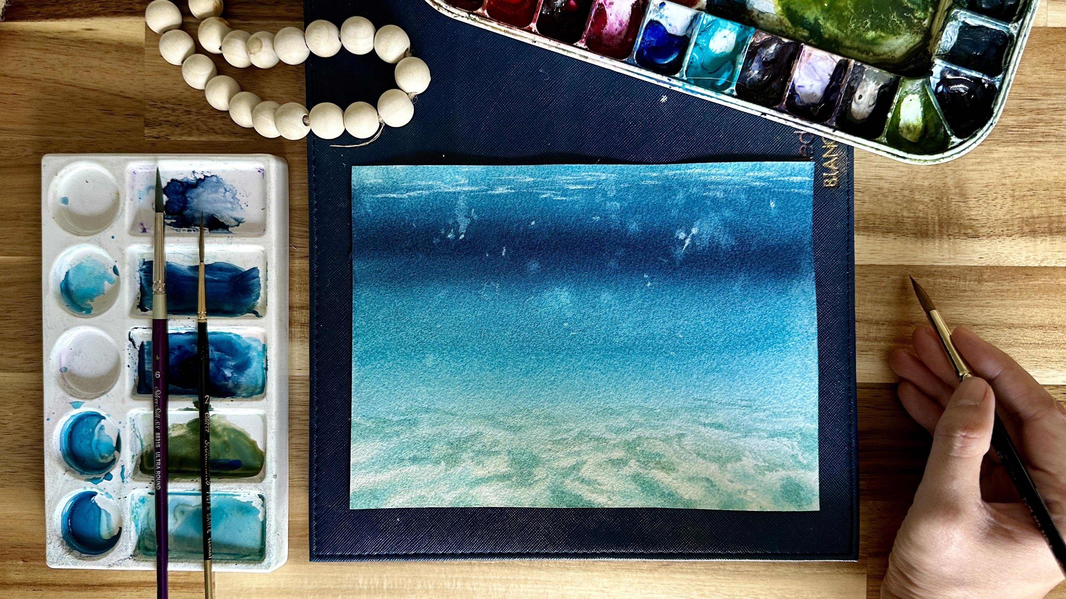
dreamy underwater scene, but weren't sure how to achieve
that soft flowing effect. In this class, I'll
show you how to bring an underwater world
to life using the wet on wet technique
in watercolor. Hi, I'm anaiea, a
watercolor artist, Skillshare top teacher,
and workshop instructor. I love painting
vibrant landscape, cityscapes, and seascapes. And I'm passionate about sharing easy to follow techniques that help you create expressive and
atmospheric paintings. I've had the privilege of partnering with
Silver Brush Limited, Schminka and arc and mounts, brands that share my passion
for inspiring creativity and making painting enjoyable and fulfilling for everyone. I truly believe that
painting is for everyone. My purpose is to inspire people to discover and pursue
their creative passion. Whether you're picking
up a brush for the first time or looking
to refine your skills. I want to help you build confidence and enjoy
the painting process. I'm excited to guide
you through the short yet technique packed lesson on painting
underwater scene using wet on wet technique. We'll start by going over
the materials you'll need look into the understanding
aerial perspective, a key concept that
will help us create depth and realistic
reflections on seabed. Next, we'll explore the wet on wet technique
and how to control water and paint ratios for smooth blends and
fluid transitions. You'll also learn essential watercolor effects like lifting, splattering, and soft strokes to add movement and texture. Finally, we'll put everything
together in a step by step demo to create a
stunning underwater scene. This class is perfect
for beginners and anyone looking to expand their watercolor skills
with new techniques. By the end of the
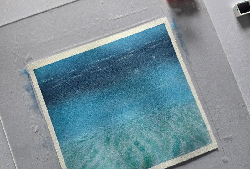
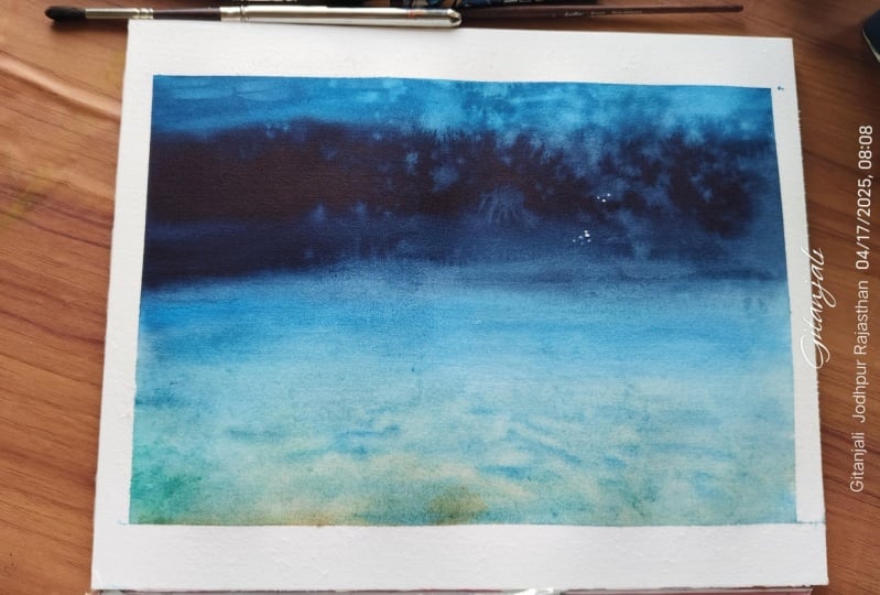
class, you'll have a beautiful underwater
painting and a deeper understanding of how to create atmospheric
depth in your artwork. So grab your paints,
relax, and let's dive in.
2. Materials: Before we begin painting, let's go over the materials
we'll need for this class. The most important
material when working with a wet on wet
technique is the paper. Make sure to use 100% cotton, 300 GSM watercolor paper. I'll be working with a size
of around seven by 10 ". This is crucial
because cotton paper has excellent water absorbency, allowing the pigments to flow naturally while staying vibrant. Lower quality paper tends to dry too quickly and
doesn't hold water well, making it difficult to achieve the soft blended effects we
want in our underwater scene. So this paper is Bao Hong
Artist grade watercolor paper. Next, you'll need a
water resistant board, such as a white board to hold the wet paper
flat and secure. Since we'll be
wetting both sides of the paper with water, placing it on a wet
resistant surface will help keep it moist for
a longer period of time. This extended working
time is essential for successfully applying
the wet on wet technique. For paints, I'll be using SminkaHadum watercolors
in the following colors. Cobalt turquoise, cobalt blue, indigo, and burn Cena. Now let's talk
about the brushes. A flat goat hair brush for pre wetting the
paper is needed. The bigger the
brush, the easier it is to evenly wet the surface. Next is a three
fourth flat brush. I'm using the silver
brush black velvet made of squirrel hair, which is perfect for painting
smooth water gradients. This is Renaissance
sable hair brush size eight for painting
details on the seabed, and a silver silk 88 brush
size four for lifting paint, creating soft glowing
effects in the water. Lastly, prepare
two cups of water, one for rinsing your brush, and another one for
cleaning washes. Prepare also some tissue
paper for blotting excess moisture and
lifting paint when needed. These are all the materials
we need to prepare. Let's go to the next video to
talk about the techniques.
3. Understanding the Subject: Before we start painting, it's helpful to first understand our subject and how we'll
approach the painting process. To do this, we'll create
a thumbnail study, a quick sketch that helps us plan the composition and colors. Now, let's begin by dividing
the paper in three sections. The top two thirds
will be for the water, and the bottom third
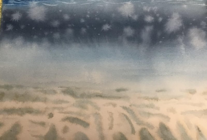
will be for the seabed. To achieve a sense of depth, we'll use a soft gradient of color transitioning
from dark to light. The uppermost part of
the water will have a mid tone blue to suggest
the water surface, followed by a deep dark
blue in the middle. Since we are working with
the wet on wet technique, applying wet paint
onto wet paper, this will allow for
smooth transitions and natural blending of colors, mimicking the way light
disperses in water. Next, let's talk about
how we'll create aerial perspective in
our seabed reflections. To keep it simple, first is to assign a vanishing point
on the horizon line. From this vanishing point, draw a diagonal line downward. These lines will guide us
in painting reflections on the seabed one key thing to remember is that reflections closer to us appear bigger, while those near
the horizon line become smaller and
more compressed. Keeping fine gaps of
unpainted surface in between these reflections
will help create highlights, enhancing the impression of light filtering
through the water. Now, I'll show you how to lift colors to create an
impression of light. For this, we'll
use a small brush. First is to wet the
brush and remove excess water by dabbing
it on a tissue. Create a stroke on the paper, then tap a dry tissue over it. This will lift the color
and reveal a lighter area. If you want to lift dot shapes for light reflections
or bubbles, simply press the damp
brush onto the surface, then tap the tissue. This lifting technique is useful for adding subtle light effects, making the underwater scene look more natural and dynamic. Now that we understand
these principles, let's move on to the
actual painting process.
4. Painting Process: Now let's begin painting our underwater scene using
the wet and wet technique. We start by wetting
our 100% cotton, 300 USM watercolor paper
using a flat coat hairbrush. Make sure to apply clean water on both the front and
the back of the paper. This step is very important because it helps
stretch the paper, preventing warping
when we paint. And second, it keeps the paper
moist for a longer period, giving us ample time to
work with soft transitions. After thoroughly
wetting the paper, lay it flat on a water resistant board and gently stretch it to
remove any wrinkles. It's crucial that the entire
surface is evenly wet. There should be no puddles
of water or dry patches. At this point, we wait for a few minutes to let the
paper absorb the water. The goal is for the paper to be moist and not soaking wet. A good indicator
that the timing is right is to do a test stroke. If the paint spreads
uncontrollably, the paper is still too wet. If the paint creates a
soft yet defined stroke, then the paper is at the
perfect moisture level. The key to painting wet
on wet is patience. If you rush and start painting while the
paper is too wet, the colors will become too
diluted and washed out. On the other hand, if the
paper dries too much, we won't achieve the
soft blending effects we need for the
underwater scene. Usually, the paper takes about five to 10 minutes
to absorb the water, depending on room
temperature and humidity. While waiting, let's
prepare our paints. I'll use a small flat
brush to mix a creamy, saturated blend of
cobalt turquoise with a bit of cobalt blue. The paint should be fully loaded onto the brush
with a generous amount. A tip when painting wet on wet is the color always appears one level lighter once
applied because the wet paper slightly
dilutes the paint. To compensate, don't be
afraid to paint with a slightly darker tone than
you think is necessary, as it will adjust as it dries. Now, let's start painting. For the first stroke, using my saturated mix
of cobalt turquoise, I make a horizontal stroke across the top
section of the paper. I try to keep the
strokes minimal. The fewer the strokes, the cleaner and more fluid
the painting will look. Avoid going over the same area too many times to
prevent muddiness. Now, let's add
depth using indigo. I load my brush with
indigo and apply it just below the
cobalt torqoise layer. Because the paper
is still moist, notice how the two
colors blend seamlessly, creating a soft transition. To help the paint flow
and blend more naturally, I tilt my board
slightly downward. Now, let's create a
smooth transition. To refine the gradient, I clean my brush, remove excess water and do a soft horizontal stroke
over the transition area. Again, we want to
keep our strokes minimal to avoid
overworking the paper. Lightening the tones near the
seabed is also necessary. As we move lower to the paper, I take my cobalt Turquoise and gradually add more water
to lighten the tone. Near the bottom third
where the seabed will be, I further dilute the mix, creating an almost
transparent wash to give the illusion of depth. At this stage, we already have the foundation of our
underwater grating, and you can see the
beautiful soft transitions forming naturally. Now, we want to
refine the water. Before making adjustments,
I first wipe off any excess paint that has pulled around the
edges of my board. This helps keep the
painting clean and prevents unwanted drips from flowing
back onto the surface. Looking at our water painting, I want to adjust the upper
portion to create more depth. Right now, I feel like the
tone could be slightly darker, though not as dark as the deep indigo
fragment next to it. By enhancing this contrast, we create a stronger sense
of depth in the water. Next, I'll add some
tiny water blooms to enhance the natural
texture of the water. Using my fingers, I gently splatter clean water
onto the painting. I only use a tiny amount
to ensure the blooms appear subtle and don't
overpower the scene. At this stage, I also
use tissue paper to carefully absorb any excess water collecting at the
bottom of the paper. If this water flows
back into the painting, it could create unwanted
blooms or stains as it dries. Now, to speed up
the drying process, I take my heat gun and dry the lower portion
of the paper. The goal here is to
reach a moist to damp surface, not
completely dry. This ensures that when we
paint the seabed reflections, the paint will blend softly but still maintain
some definition. Now let's paint the
reflections on the sea bed. Let's prepare a light mix of cobalturquois and burn
henna for the reflections. The resulting color should
be soft and earthy, helping to create the illusion of the seabed beneath the water. Before applying the paint, I make sure my brush is
damp, not overly wet. This is important because if the brush holds
too much water, the strokes will
spread uncontrollably. If it's too dry, the paint won't bled naturally with
a damp surface. Before painting the reflections, I will do a quick test stroke. Here, I notice that the paint is still
spreading too much, meaning the paper is too wet. Since we want a soft
but controlled stroke, I take my heat gun again to dry the surface
just a little more. Now, let's apply
the reflections. As we paint, remember
two key things. Number one, follow the
diagonal perspective lines. This should all converge toward a single vanishing
point on the horizon. And number two, leave unpainted gaps between
the reflections, which creates
highlights that give the impression of flight
filtering through the water. To soften any hard edges, I take my shader brush and
gently lift the paint, blending it seamlessly into
the surrounding colors. This step enhances the
realistic underwater effect while maintaining the illusion
of movement and light. With this step completed, we now have a beautiful
atmospheric representation of the seabed reflections. Next, let's add
the final details to complete the painting. Now, using my round brush, I continue painting the
reflections on the seabed, keeping in mind
the imaginary grid we talked about earlier. This helps maintain the
correct perspective as the reflections recede
toward the vanishing point. At this stage, the brush
is still loaded with a very light tone paint with just enough water to create
soft and subtle strokes. Since we want a sense of depth, I take my shader brush from time to time to lift
off some color, helping to create movement
of light in the water. Now, we want to enhance
the reflections. To add more depth, I dab a slightly darker tone
of our reflection color, especially in areas closer to the foreground where
details appear clearer. I make sure to keep the white gaps
unpainted and also lift color along some
edges to enhance the impression of light
filtering through the water. As the reflections move
closer to the horizon line, they become smaller and the white gaps between
them also become thinner. For the reflections
along the horizon line, I use thin horizontal strokes to keep them subtle and distant. Again, I take my shader
brush to lift some paint, ensuring that the reflections feel dynamic rather than flat. To enhance the
reflections even more, I carefully darken some
portions just a little. This prevents the
reflections from looking too flat and monotonous. I also add a few more horizontal strokes
in the far end of the painting to make the reflections look
fuller and more realistic. For the foreground reflections, I repeat the process of adding
a slightly darker layer, but I make sure to do this carefully to avoid overdoing it. Here, I still use
coboturquoise and buncena but with less water to achieve a stronger contrast. Now, let's add tiny water blooms to enhance the natural
movement of the water. Using my fingers, I splatter a few more drops of clean
water onto the painting, keeping the effect
light and subtle. This helps break up any areas
that might feel too smooth, adding a natural water texture. Now I lift colour on the surface of the water using
a clean damp brush. First is to make a light
stroke over the area, then immediately
tap a dry tissue onto the stroke to
lift off the color. Repeat the process lifting
some fine lines in this section to
create the impression of light reflecting
on the water surface. I also make sure to vary the
length of these highlights so they don't look too uniform but instead appear natural. Now, to add some final details like bubbles and
finishing touches, I will create an impression
of bubbles on the water. I dot my brush lightly onto the surface and immediately tap a tissue to lift the color. The key here is to keep
the brush dump, not wet. So before dotting, I wipe off
excess water on a tissue. I take a step back and
look at the painting from a distance to check
the overall effect. This helps me see if
the balance of light and shadow and texture
looks natural. Finally, a helpful tip. Stop even before you
feel you're done. It's easy to overwork
a watercolor painting, so pausing at the right
moment ensures the artwork stays fresh and spontaneous
rather than overwork. And with that, our
painting is complete. And
5. Final Thoughts: Thank you so much for joining me in this watercolor class. I hope you enjoyed exploring
the wet on wet technique and learning how to create depth and movement in your
underwater scene. I'd love to see your work.
Don't forget to upload a photo of your class project
in the project section. By sharing your painting,
you'll get a chance to win in the giveaway or even be
featured on my Instagram. If you enjoy this class, please consider
leaving a review. Your feedback means
so much to me. It helps me improve
my future classes and inspires me to create
more content for you. If you'd love to explore more ocean inspired
watercolor techniques, check out my other
Skillshare class, Master Ocean waves
in watercolor, where I'll guide you
through painting dynamic crashing waves
with confidence. I can't wait to see your
beautiful underwater paintings, happy painting, and see
you in my next class.
 Bianca Rayala, Top Teacher | Watercolor Artist