Transcripts
1. About the Class: Hello, everyone.
I'm Bianca Rayala. I'm a watercolor artist, educator and Skillshare
top teacher. Over the years, I've had the
joy of teaching thousands of students from all over the
world here on Skillshare. My classes are all about making Watercolor approachable,
joyful and meaningful. I work with brands
like Schminka, Silverbush Limited,
and Arkon Mounts. In this class, we'll be doing something a
little different, but something I
believe is really valuable if you want
to grow as an artist. Be doing a master study, a focused intentional
way of learning by observing and painting the
work of a great artist. We'll be studying the beautiful
and atmospheric paintings of Joseph Zuck Big, one of the watercolor artists
who has deeply inspired me. I've learned so much just by looking closely
at how he paints, his use of tone,
composition, and timing, and I want to walk
you through how you can learn from
his work, too. This class is designed
to help you build confidence in painting
atmospheric landscapes, learn how to create
depth and perspective in watercolor or explore loose
and expressive brushwork. Whether you're a beginner
or have some experience, I'll share techniques
that you can easily apply to your own paintings. We'll begin by talking about
what a master study is, why it's helpful, and how to approach it with
the right mindset. Then we'll take time to look at parts of Joseph's paintings, how he paints skies,
distant figures, reflections, and we'll do a
few studies based on those. After that, we'll paint a full landscape
inspired by his style, bringing everything
we've practiced together in one piece. The techniques you learn
in this class can also be applied to studying the work
of other artists you admire. My hope is that
this class not only helps you understand
Joseph's work more deeply, but also equips you with
tools to keep learning and growing by observing and
practicing with intention. By the end of this
class, you'll have a finished painting
inspired by the work of Joseph and a deeper
understanding of how to apply these techniques
to your own artwork. Whether you're new
to master studies or you've been curious about
painting in this style, I hope this class helps you build rhythm of
creative practice, rediscover the joy of painting, and maybe even surprise
yourself along the way. So grab your materials, and let's get started.
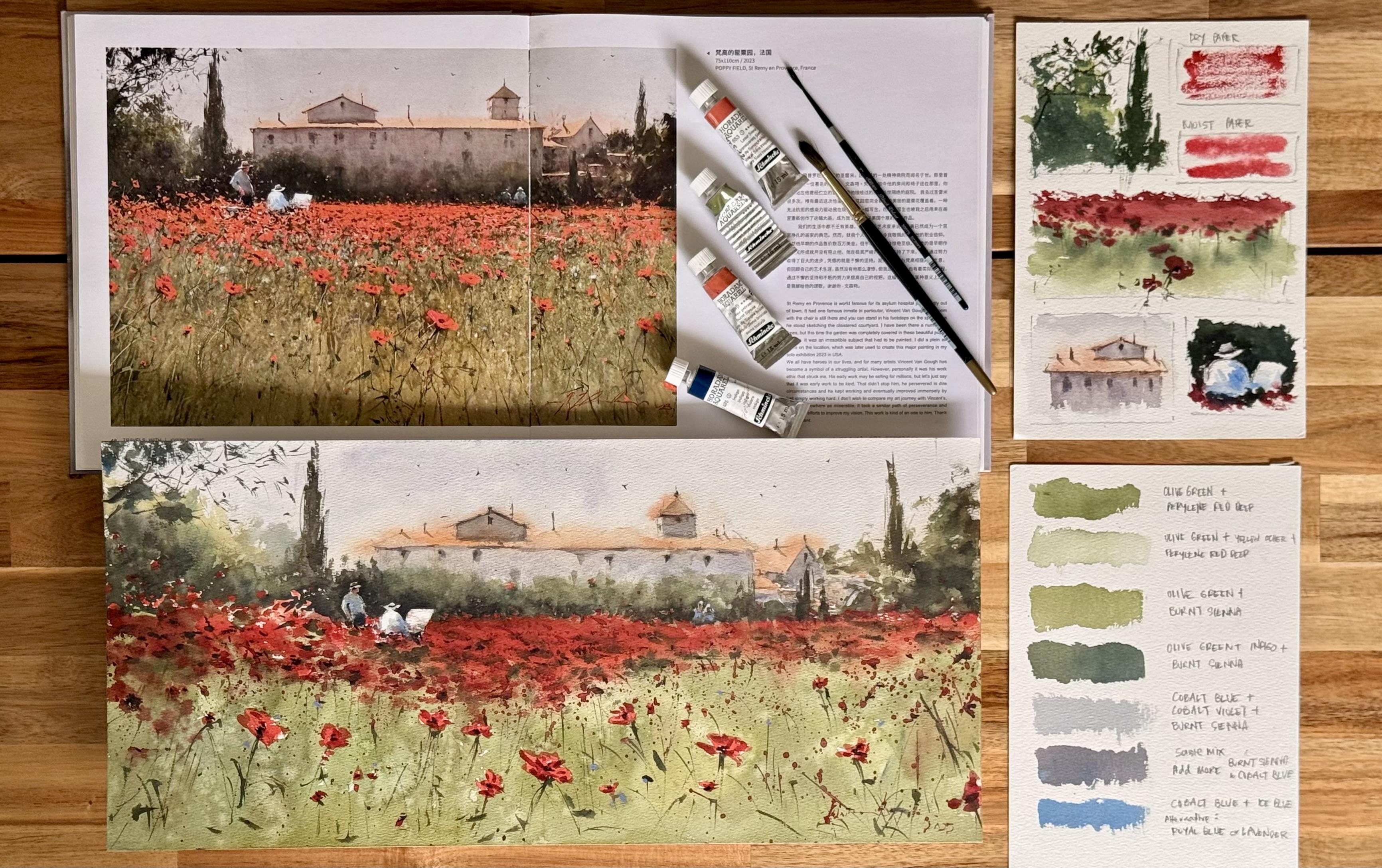
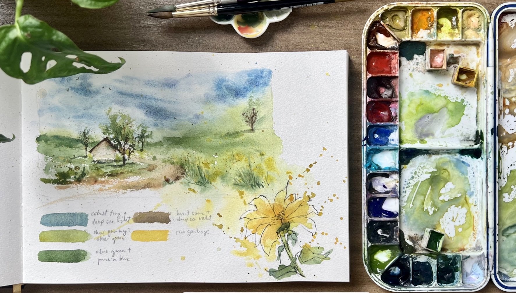
2. Materials: For this class, let's start with the materials
I'll be using. First, for the paper, I'll be painting on med
en watercolor paper. This one is called
pressed, 100% cotton, 300 GSM, and it's a ten
by seven inch size. I really like this paper
because it has a nice texture. It absorbs water and
paint really well, and it's turdy
enough for layering. I'll be using it both for the main project and for
practice painting exercises. What I also love about
this paper is it's quite affordable compared to other
watercolor paper brands, but still has a good quality. For the brushes, I'll
be using some of my favorites from
Silver Brush Limited. This is the Renaissance
brushes in size ten and eight. These are my go to for washes, and I also use them for
adding some details. The silver silk 88 ultra
round brush in size six, this one is a great brush for more precise details and the black velvet script
brush in size one, which is perfect for
really fine lines like tree branches
or flower stems. Now, for paints, I'll be using
SchmikaHadu watercolors. You'll find a full list of the colors in my palette
in the resources section. Even though Joseph has his
own signature set of colors, I'll be working with my
usual watercolor palette. I love it because it reflects my personality and preferences. Instead of copying
his colors exactly, we'll focus on recreating
the atmosphere of his painting by mixing
with what we already have. And for the other essentials, I'll have tissue paper, a spray bottle for
misting the paper, pencil and eraser and
two cups of water. You'll also find
the reference photo of Joseph's painting that we'll use for this master
study in the resource section.
3. What is a Master Study: Before we start painting, I want to take a few
minutes to talk about what a master study is and why it's such a helpful way to
grow as an artist. A master study is
when you take time to observe and recreate the work of a more experienced artist, not to copy for the
sake of copying, but to really understand
their decisions, how they use stone,
how they simplify, where they place
their brush strokes. It's a way of
learning by looking closely and painting
with intention. One of the artists
who has deeply influenced me is
Joseph Book Big. His work is atmospheric, expressive and full of emotion, even when the subject is simple. For this class, we'll be studying his poppy
field landscape, and I'll walk you through
how we can break it down, study it, and paint it together. Doing a master study helps train your eyes to notice
those subtle things. It also helps build
confidence as you start to understand how and
why certain things work. Over time, you begin to bring that sensitivity
in your own work without even realizing but I also want to
gently remind you, this isn't about
making a perfect copy. This is a learning process. If you share your
painting online, just make sure to
mention that it's a study and credit
the original artist. For example, you will
write in the caption Masters study after
Joseph Z for practice. Lastly, while we focus on one of Joseph's pieces
in this class, the approach you learn
here can be applied to studying other artists
you admire, as well. This is just one of many ways to keep learning and growing. In the next lesson,
I'll show you how to start observing
like an artist, breaking down the puppy
field painting into value, composition, and mood.
So let's continue.
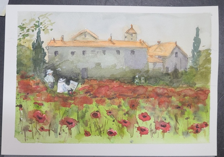
4. Observing as an Artist: Now let's take time to really observe Joseph Z's
Poppy field painting, and I'll show you
how to break down a painting visually before I begin any kind
of master study. We'll focus on the three things. Number one is value next is
composition and lastly, mood. For our first step, which is seeing values
with a gray scale print, we will begin by preparing a grayscale version
of this painting so we can better observe the value structure without
being distracted by color. You may do it by
adjusting the settings to gray scale on
your phone or iPad, or you may simply print
a copy of the reference. By looking at the
grayscale image, here's what I noticed. First, the sky is the lightest
value in the whole piece. I also noticed that the
middle structure and the puppy field fall in
the mid value range, creating the gentle
warms across the scene. The foreground grasses and the shadowy tree areas on the sides are the darkest spots, giving the painting both
depth and grounding. The contras is subtle
but very effective. For example, the light roof of the building still stands out because of the mid value wall beneath it and the
darker trees beside it. Joseph is using value
carefully to suggest light, depth, and structure without
over rendering anything. Now, let's look at understanding composition
with a tree by tree grid. Now I place a three
by three grid over the painting to
analyze the composition. You can manually draw the
grid on your printout or use an editing app
for digital copy. The main building sits right
across the upper third, creating a strong
horizontal anchor. The dense orange poppy line crosses through
the middle third, pulling your eye
through the landscape. The two painters sit off
center in the left third, which adds human interest
and asymmetrical balance. There's also a
gentle Z shaped flow that leads the eye from the left edge of
the trees toward the two figures and
across the red puppies. It's a calm yet
dynamic composition, but still very intentional. Now let's see the
mood and feeling. Looking at the mood
and how Joseph created this peaceful warm and
nostalgic feeling, we can see that the foregu field has a subtle texture
in the greens. He likely misted water onto the paper while the
underlayer was still wet, creating soft granulation and
a natural filled texture. He also noticed that the
orange red poppies near the horizon were probably done with a dry brush technique. The broken texture gives
just enough detail to suggest blooms without
being heavy handed. The figures on the
left two painters seated in the field
appear to have been left unpainted initially, preserving the paper's
natural white. This clever choice makes
them glow softly and stand out effortlessly from the
mid value background. It's a beautiful example
of how Joseph uses light, not outlines to define form. They also feel like
they're bathed in sunlight and air
enforced and luminous. Similarly, the roof of the building has a soft
transition into the sky. There's no harsh line. Instead, the air and the light seem to wrap
around the structure, and he uses tonal shifts and
subtle shadows to suggest the form of the roof rather than relying on hard contrast. That soft connection between
the sky and the structure makes the whole painting
breathe lastly, the trees along the
left and the right are painted with bold but
organic brush strokes, confident, not overly detailed. These expressive marks
bring energy to the frame while maintaining harmony
with the looser field below. Now, when studying
a master's work, we learn not just how they painted something,
but why it works. Try starting with number one, a gray scale picture to
see the values clearly, agreed overlay to break down the composition and
observations on mood, brushwork, edges, and texture. This way, you're
training your eyes to see like an artist, not just copying, but
truly understanding. In the next lesson, we'll do a small brush studies
to explore how Joseph paints skies,
foliage and figures. Let's move to the next step.
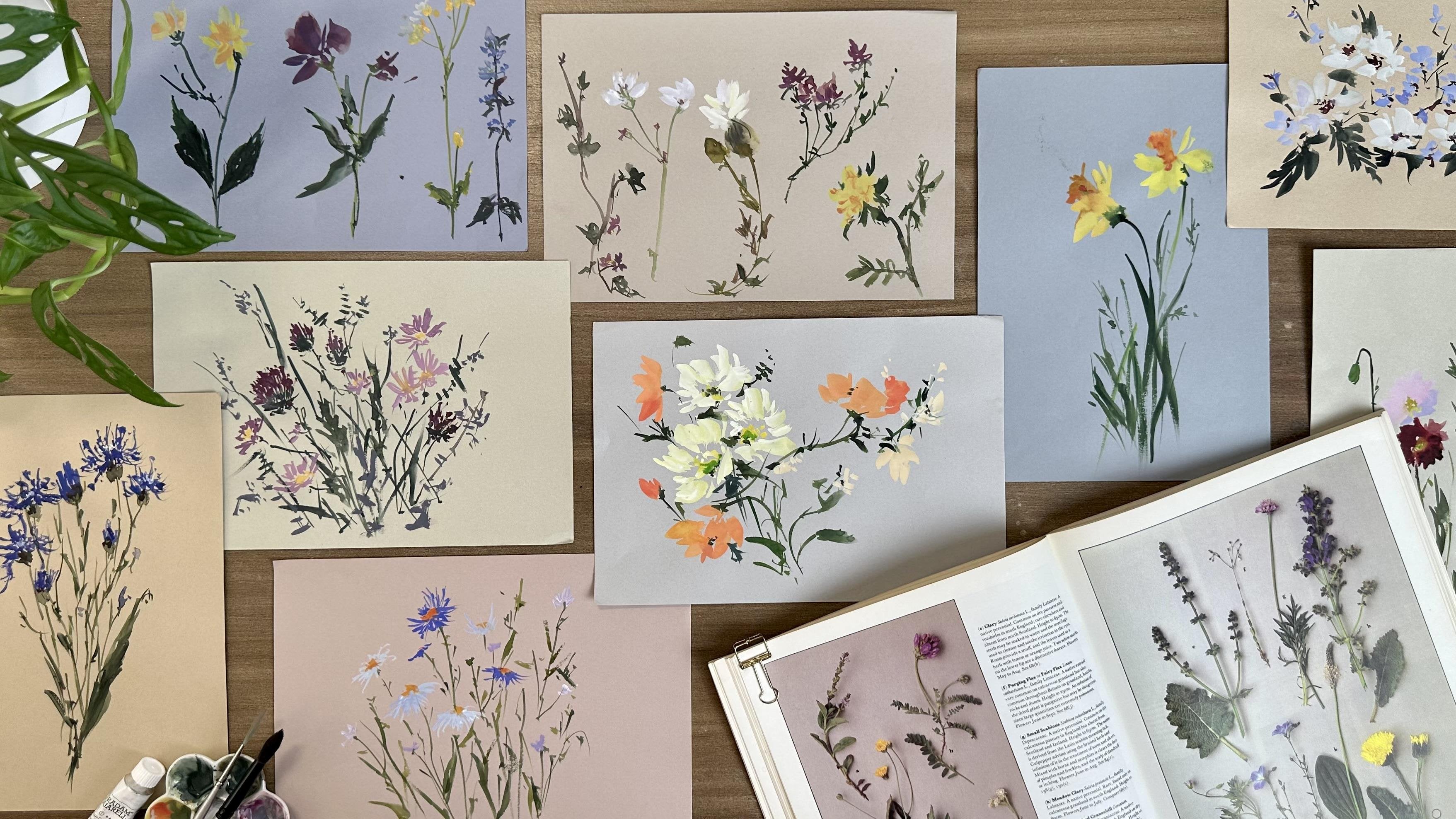
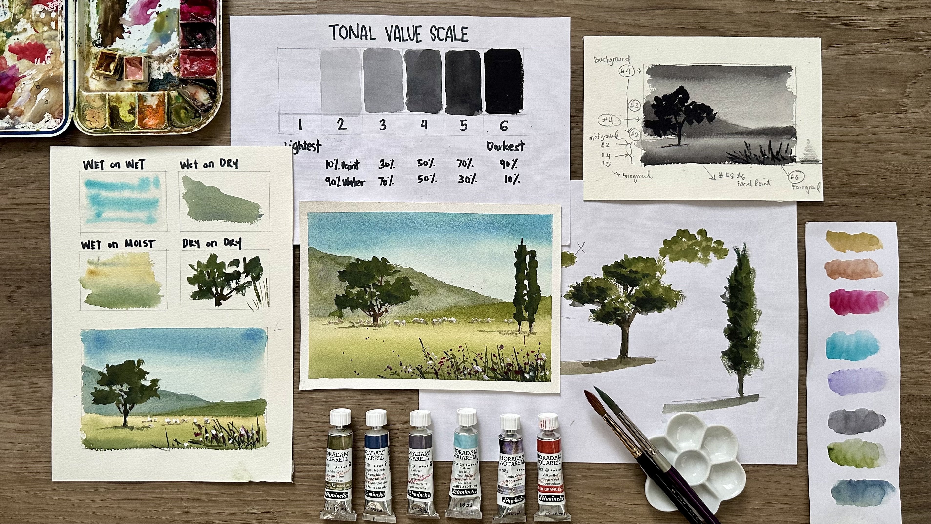
5. Technique Practice & Color Mix Study: This lesson, we're going to
zoom in on a few parts of Joseph Z's painting and do
some technique focus studies. This is one of my favorite
parts of doing a master study, just observing closely and then experimenting
with what I see. These are like bite sized drills that help us understand
how he builds up different parts of the scene with
intentional brushwork, timing, and subtle use of color. Let's start with the trees. Joseph's brushwork here
are confident organic. They're not overly detailed, but you still feel the
form and movement. The trees don't have outlines. They are formed by bold,
expressive shapes. As a personal example, I used to make my trees look symmetrical, equal on both sides,
evenly spaced. But observing Joseph's
painting helped me realize the beauty of contrast in
shape, size, and direction. Let's try painting
a few tree forms using just quick,
decisive marks. Don't fuzz over each leaf. Focus on the rhythm of your
brush and how the edges bleed or stay crisp
depending on the timing. Now to add depth to
a bunch of trees, load your brush
with darker tones, but keep the same
kind of movement. Think of it as dabbing
the brush while swaying your arm to
create a flowy rhythm. This works even better if
you paint standing up, so your whole arm
moves more freely. Next, take a script brush and paint in the crowns
of the trees. This finer strokes suggest those light, airy top branches. You can also try missing
the trees to create that soft fading effect as if the shapes are disappearing
into the atmosphere. For a cypress tree, I like to switch to a
slightly dry brush. I blot off the excess water then use quick downward strokes. After a few strokes, I missed it again to give
it a soft misty finish. Astly, let's recreate the twigs. Use your script brush, holding it almost at a 90
degree angle to the paper. Make sure your paint is a little thicker than what you
used for the green, so the fine lines stand
out against the foliage. This twig light strokes bring a finishing touch of
detail and contrast. A Now, let's study the
poppy flowers next. Near the foreground, some of the puppies appear
sharp and distinct, probably done with a dry brush, so the paint skips on the paper. Near the horizon, the puppies feel more faded and softened, likely done with a wet
or moist technique when the paper is no longer
glossy wet but still damp. Now let's practice both methods. On dry paper, drag
a red loaded brush gently so the paint creates
textured broken edges. On moist paper, dab in the red
and watch it bloom softly. This will give you
better control when you recreate this effect in
your final painting. For the first exercise, which is the dry brush puppies, load your brush with thick, creamy red paint, remove
excess water first. The goal is to have your brush rich in pigment, but not wet. Drag it gently on
the dry paper and see those beautiful
broken textures. If your marks look too solid, that means your brush
is still too watery. Now for the second exercise, which is to paint
on moist paper, I want you to wet your
paper lightly and let it dry just a little until
it's moist, not glossy wet. This stage will give you
soft but controlled edges. If you paint too early, the color spreads
uncontrollably. But on moist paper, your red marks will
spread gently, creating that soft focus
effect we're after. Now, let's paint
the puppy field. Start by wetting the paper with a light green wash to
represent the field. While it's still wet,
drop in more green tones. And then mist it with water
to create subtle textures. Add small dots of dark
greens here and there, then miss again for extra depth. Let the field dry just a little before adding
the first puppies. Now, to paint the puppies while the upper part of the
field is still moist. Use the belly of your brush at the sideways angle to dab in soft red marks
for distant puppies. With a script brush, add tiny red dots
to create variety. For the foreground, wait
until the paper is dry. Then use your round
brush to dab in rich varied red dots as
impressions of puppies. Vary the size and cluster them naturally so they don't
look evenly spaced. Use your script brush to
add more fine red dots and some darker green strokes for contrast around the flowers. Now that the lower field is dry, paint the foreground
puppies with hard edges for sharp contrast. Add stems with a very
light flicking stroke, and this may take some practice. Sometimes the lines come
out too thick or uniform, but with a light touch
and quick wrist flicks, you get natural looking stems. Now, for a third exercise, we will be looking at the
buildings and windows. Let's paint a mini
study of the house. Notice the soft color transition from the roof to the sky. The tones are close, but the shadows define the
edge, not a hard line. Try mixing a warm tone, maybe a diluted burcena, let it flow gently into the
sky wash. Then when it's dry, go back in and add the
shadows to separate the roof. For the windows,
we'll use the wet on moist technique
again. Let's paint. I'll start with the sky, a light tea mixture
of cobalt blue, cobalt violet, and
a touch of Brncena. I'm just washing
that across the sky, leaving the roof area unpainted. Next, I'll pick up some
Brncena and paint the roof. Notice how it connects
with the sky wash, and it's okay if the
colors bleed softly, that keeps it natural. I'll continue finishing the background sky
around the house. Now, for the first shadow
layer, I'm mixing a light, diluted tone and painting the
shaded side of the house. I'll also add a soft outline
on the roof with burncena. It looks like a little
blurry, but that's fine. Let's dry this layer
with a heat gun, or you can just let
it dry on its own. Once it's dry, I'll go back
in and deepen the shadows. I don't need to
make them too dark. Just a subtle shift is enough
to make the house glow. Well, this wall is
still a little damp. I'll darken the roof slightly
to define the shapes. Now, I'll add a few
tiny chimney marks. I'm keeping the tone soft, and I'll drop in a little
shadow for each one. Finally, let's
suggest some windows. I'm using a slightly
darker wash, just making small marks while
the paint is still moist. If the marks feel too dark, I'll soften them with my finger. Notice how they
melt in slightly, which keeps them from
feeling too harsh. This gives the building a weathered harmonious feel rather than a
cartoonish flat one. The key here is to keep
everything soft and subtle. It's not about sharp details,
it's about atmosphere. For fourth exercise, let's paint the small human figures
near the house. What's beautiful here is
that they were likely left unpainted at first and only added once the
background was dry. This left a glow paper
white highlights that make them stand out
with very minimal detail. We will try the same approach. First, paint the
background wash, but leave a little gap
where the figure will be. Once that's dry, we
can come back and suggest a figure with
just a few quick strokes. To make it stand out, I'll
paint around the figure with a darker tone that's
negative painting. Be careful not to lose
the shape as you go. Now, let's add just a touch of shadow on the
hat and the shirt. I'm leaving a small
part unpainted, so it looks like the light
is hitting the shirt, and that little highlight
makes the figure come alive. Remember, less is more here. Don't overwork the details. The impression is enough. Finally, let's practice mixing muted colors the
way Joseph does. He rarely uses bright,
saturated uses. His palette is gentle and tonal. For example, mix olive green and a touch of red or gray
to mute it for trees. Try adding yellow ochre too to achieve lighter shade
of this muted green. I also try adding olive
green to warm colors like burn henna to
reduce their intensity. For shadows or dark greens, I take olive green, indigo, and burn chenna and
let your shadows be cool and your highlights
stay warm and soft. For the atmospheric
blue gray skies, try mixing cobalt blue, cobalt violet, and
burn henna to mute it. This gives you a
moody, desaturated blue with beautiful graze. I avoid ultramarine because it's too bright and granulating. For warm gray for the
building shadows, try the same colors
we use for the sky, but I will add more Bncena and cobalt blue or sometimes
cobalt violet. These combinations
produce rich warm grays that ship depending
on your ratio, perfect for soft building
forms or tree shadows. For muted lavender
for distant details, I try mixing cobalt
blue and ice blue. An alternative you can use for ice blue is royal
blue or lavender. This creates a
soft distant tone, great for the human figures. Remember, atmosphere
isn't just about hue. It's also about the
saturating strong colors with their complement,
controlling timing, let your paper be slightly damp before dropping
in details for soft edges and
using more water to create transparency
and airiness. You don't have to get an
exact match for every color. What we're after is the feeling, the softness, the
harmony, and the glow. Take your time,
enjoy the process, and remember that even
the smallest studies help lay the foundation
for the final painting.
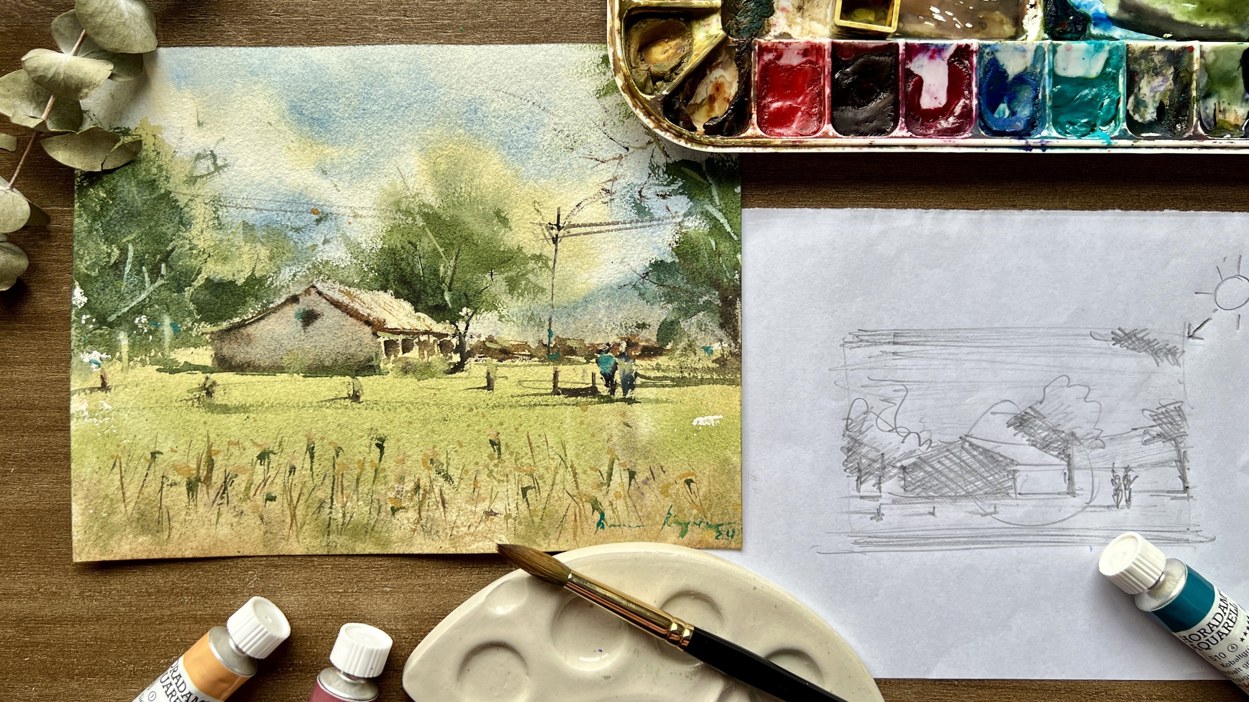
6. Pencil Sketch: Let's do the pencil sketch. The very first thing
I like to do when sketching is to locate
the horizon line. For this piece, I'm placing
it just above the midline, almost a third of the
way up the sheet. This instantly sets
the perspective and gives me a sense of
space for the landscape. Next, I move on to the big
shape of the building. At this stage, I keep the
lines simple and direct. No need for details yet, just the main silhouette. I also suggest the roofs
on the right side. Don't worry about making
them too precise. Remember, this is
just our guide, and Watercolor will do
much of the work later on. Once I've mapped
out those shapes, I start adding the main
roof and chimneys. A little tip I use
here is I compare the negative spaces in my
sketch with Joseph's painting. Looking at the shapes around
the objects help me check if the proportions
feel right without getting stuck on
exact measurements. Now, let's add the trees. I keep these marks
light and loose almost as if I'm sketching
the air around them. No textures yet we'll save
that for the painting stage. Right now, they're
just gentle shapes to remind us where the
foliage will sit. On the left side
of the painting, we have the human figures. These are very important to
get in proportion because even a slight difference in scale can make them
feel out of place. I always begin by observing
the general shape, the tilt of the body, the angle of the arms, and the shape of the hat. I keep reminding myself
that less is more, just enough information so
that when we paint them later, they look natural
and believable. Now, let's add some flowers on the foreground
and middle ground. Again, I'm not drawing every single poppy we
see in the painting. Instead, I squint at the image and pick out
only the flowers that are most visible or that
really help describe the feel. This keeps the drawing clean
but still full of life. Finally, I go back and refine the sketch with just
a few more details. Nothing too heavy, clarifying
lines were needed, so I have a clear guide
when we start painting. And that's it. Our
sketch is ready. It's loose, it's simple, and it leaves plenty of room for the freshness of
watercolor to shine.
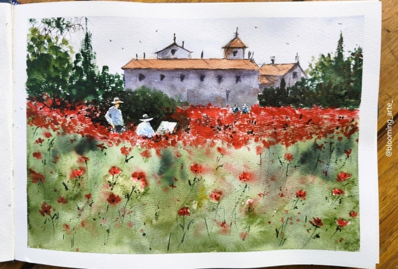
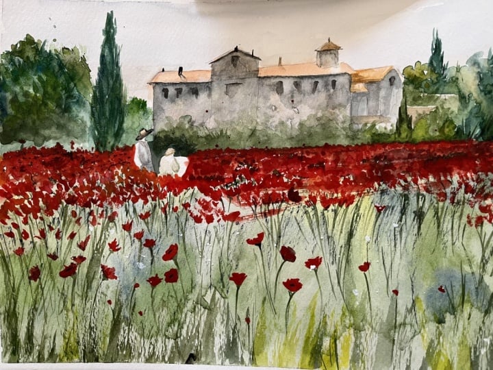
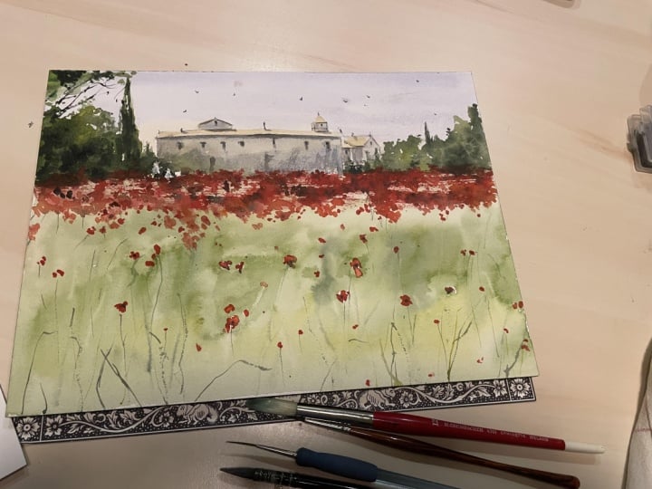
7. Painting Process Part 1: Let's start painting.
First, I prepare my watercolor block by gently erasing some of the
strong pencil lines. I don't want them to overpower
the painting later on. Then I tilt my paper
just slightly. This little angle really helps the watercolor flow
down naturally, creating those beautiful
soft transitions we love. Before I begin, I
miss a bit of water, cross the sheet to keep the surface fresh and ready
to receive the paint. Now let's mix the sky. I notice Joseph's painting
has this lovely grayish ky, not too blue, not too
dull, just atmospheric. To mimic that, I
mix cobalt blue, cobot violet, and a
touch of burnt cena. Then I dilute it
with plenty of water until I get this
transparent gray blue tone. As I paint, I let the color
bead slightly at the edge. So when I connect the next wash, I won't leave harsh lines. About halfway down the sky, I add a touch of more
cobalt blue for variation. Next, I move into
the roof areas. I'm using Bncena
slightly darker than the sky and paying attention to the smooth
transition between the two. This step is all about
keeping it soft and natural. No hard outlines just
tone against tone. Notice how the warmth
of the roof already creates a gentle contrast
against the cooler sky. Now, let's paint the shadowed
side of the building. I'm using the same gray mix, cobalt blue, cobalt
violet, and Brncenna. I let the burncena
mingle with the gray, allowing the colors
to play on the paper instead of mixing them
too much on the palette. This way, the wall feels
alive and not flat. Time for the field. I start with Perlin
red and olive green for this base wash. Skipping over the human
figures and some flower spots. I begin with a
light wash and then gradually transition
into a richer, darker tone as I reach the
middle and foreground. It's important here to keep
the mix creamy, not watery. So even when I miss
water over the paint, it doesn't just wash away. And With the base down, I take my sprayer and
lightly miss the surface, tilting the board so gravity
pulls the colors downward. You'll see beautiful
flow effects happening almost like
nature painting itself. Don't rush this, watch
the watercolor move. This is where painting
becomes meditative. Now I deepen the field
with darker greens, layering in creamy ticker mixes. I recommend that you
watch me paint through this part first before
trying it yourself. It will help you understand how the washers connect
and where to pause. Watercolor rewards
patients, take your time. It's not about hurrying but about letting the
medium guide you. To suggest the texture of grass, I use up and down strokes
with a creamy green paint. I also drop in touches
of yellow ochre, which brings out
little pops of light. Then I miss again, so blooms and soft
textures form naturally. As it drins, the field becomes
full of depth and light. Now, for contrast,
I add darker spots of green where I'll
later place the flowers. This helps them stand out more. With my liner brush, moist, but without paint, I gently
lift off some color, leaving thin stem like marks. It's a subtle trick but
adds beautiful details. And then with the same
brush loaded with paint, I add fine strokes
of flower stems. And if the brush feels too wet, I dab it on the tissue to keep the mark sharp
and controlled. I missed the field once
more to create tiny blooms. Let's set this aside to
dry before we move on. Now, back to the building. Since the wash is dry, I prepare a deeper shadow mix, cobalt blue, cobalt violet, and erchena with less
water for richness. I carefully paint
the shadowed wall outlining the roof edge. Mindful to paint
around the figures, keeping those paper white
highlights reserved. On the lower part of the wall, I push the value darker by adding a little
of the green mix. This extra depth will make the human figures glow
against the background. On the roof, I use the same
mix to deepen shadowed areas. Then I switch to my synthetic round brush
to paint the windows. Because my mix is thick, it leaves crisp marks even on slightly damp paper,
adding subtle definition. I notice the roof feels
too light against the sky, so I glaze over it with
a thin burnt china wash, softening the edge
of the outline. I also paint the smaller
roof shapes on the right. U Now, the building is starting to
feel alive and dimensional. Note that you don't have to
do this step just in case the roof doesn't look too
pale on your own painting. Now I prepare a
darker brown mix, again, with burned
cena, cobot blue, and cobot violet to
strengthen the roof outlines and hint
at window details. Just a few tiny
marks are enough. We don't need to overdo it. Oh Moving on to the trees, I mix olive green with a bit
of red and yellow ochre. With a fully loaded brush, I place broad organic strokes. Then with my liner brush, I layer unique
strokes for texture. To create depth, I darken
parts of the mix with indigo, giving variety to the greens. The trick is layering light and dark so the trees
don't look flat. As I add more tree strokes, I let my brush go
a little drier. This creates that rough textured defect
that feels natural. For the cypress tree, I use a few vertical strokes
keeping the shape distinct. On the right side, I
adjust the green shade slightly and paint broader
strokes for variety. Then I layer in
darker tones and add another cypress tree shorter this time to balance
the hump position. Finally, I darkened part of the building wall under the trees to push it
back into shadow, making the roof appear
brighter by contrast. With that done, I prepare a lively red orange mix to begin painting
the puppy field. This burst of color will tie
the whole scene together.
8. Painting Process Part 2: Now I'm ready to
bring this painting to life with a puppy field. I begin with a dry brush stroke, holding my brush at
a side angle so that the belly of the brush makes
contact with the paper. I've loaded a thick,
concentrated mix of red paint. This gives me that beautiful
broken dry brush texture that immediately suggests
clusters of flowers. As I slide the brush
across the paper, I avoid covering everything. I want to preserve those
little white caps. They become highlights that
sparkle through the color. Be especially careful to paint around the human
figures on the left. We'll need that clean
space later on. I continue rubbing
the brush gently, keeping the marks
textured and fresh, so the illusion of
flowers begin to appear without me
painting each petal. Remember, less is more here. Next, I prepare a deep
green mix of indigo, red, and olive green. With this darker color, I add scattered dots and patches
between the red strokes. This gives the impression of leaves and shadows in the field and helps break up the red so it doesn't look too uniform. Then I drop in a
few more red dots, especially in the middle
portion of the field. At this stage, I miss the
field lightly with water, and this softens some of the red marks causing them
to bloom into gentle shapes. The result is a lovely
contrast between crisp hard edged flowers and soft blurred
ones further back. Even though the paper
is still moist, the paint remains controlled because my mix is
thick and strong. To create variety, I also splatter some red paint
across the field. These tiny dots give
the impression of distant flowers and add
energy to the scene. Step back occasionally
and look at your work from a distance because
it helps you see the bigger picture and
decide where more color is needed without
overcrowding one area. H. I miss the paper again and continue splattering, then I add slightly larger
dots of red in the foreground. This bigger, bolder strokes
pull the flowers closer to the viewer and make the field
feel full and abundant. Around the larger flowers, I add a few tiny dots, keeping in mind that
we don't need to copy the reference
painting exactly. Remember, the heart of a master study is not to replicate the
painting perfectly, but to study the artist's
thought process, the way they handle composition, the balance of hard
and soft edges, the brush techniques that create an impression rather
than the detail. Our work will naturally
look different, and that's the beauty of it. Now it's time to
suggest the stems. I switch to my silver
silk 88 brush, which allows me to make
very fine thin lines. With controlled pressure, I draw slender strokes for stems, then a few slightly
thicker ones for leaves. It's delicate work, but
it's delicate work, but it ties the flowers
back to the field. For extra texture
in the foreground, I switch to my liner brush. It's fine tip, makes expressive grassy strokes that bring this lower area to life. I add a few yellow touches to subtle notes of light that
glow in the foreground. Here, I dab my brush around to suggest leaves
and small details. At this point, I relax and let my strokes feel
more spontaneous. This stage is about
looseness and freedom, and you'll notice the more
relaxed your hand becomes, the more natural
your painting feels. To make the red
poppies stand out, I strengthen some of the focal flowers with
richer red marks. Notice that I don't
paint every petal. Instead, I think of the overall shape and
use varied pressure on my brush so that the strokes feel loose, natural
and expressive. Now for the finishing detail, the dark centers of the poppies, I mix a creamy, almost inky dark
thick enough so it won't bleed into the red and carefully dotted
in the centers. Instantly, the
flowers come alive. Let's move back to the
building for a moment. I add a few extra
lines and touches of shadow on the roof to define
its form more clearly. Small adjustments like this give structure and balance to
the whole composition. Next, I mix a very dark green and begin negative
painting around the figures. This means I carefully paint the background darker so the figures stand
out more clearly. With just a few careful strokes, their silhouettes
sharpen and become more defined. Take
your time here. Any mark that strays too far can easily change the
shape of the figure. Slow, steady
brushwork is the key. With paints gray, I paint
the pants of the figure. For the shirt, I create a
lavender mix from cobalt blue, white, and a touch of violet. This gives me a subtle
shadow for the white fabric. I'm careful to leave a small unpainted highlight
on the shirt, so it shines as if light
is falling directly on it. On the hat, I add
just a hint of color, once again, preserving the
white areas where light hits. For the second figure,
I start with a hat, then paint the shirt shadows
with the same lavender mix. As I adjust the negative
spaces around him, his form becomes clearer
and more lifelike. Finally, I paint carefully
around the canvas his holding, letting the flowers behind
it glow with contrast. At this stage, I step back and
add a few final touches to the puppy field I darken selected areas just enough to increase
contras where needed, but I remind myself
not to overwork it. To bring the painting together, I returned to the
roof one last time. I deepen certain shadows, making sure the direction
and tone of the shadow stay consistent with the light
in the rest of the scene. And as a final flourish, I paint a few tiny birds in
the sky with my liner brush, keep them small and
subtle, not too dark, not too large, just enough to
add life to the open space. Now we have our
finished painting a vibrant atmospheric
puppy field inspired by Joseph
Brukwk full of movement, light, and expressive strokes. H
9. Final Thoughts: Thank you for joining me today
for this watercolor class. I hope this session helped you reconnect with
your creativity and reminded you
that painting can be simple, freeing and fun. I'd love to see your creations and hear about your experience. Share your sketchbook pages
with me on Instagram or in the class project
section here on Skillshare. Let me know which subject
you enjoy the most or how this practice helps
park your creative flow. If you enjoy the class, please consider
leaving a review. Your feedback means a lot to me. It helps me improve
my future classes and truly encourages me to keep
making more content for you. If you want to keep
going with your journey, I invite you to check out my other watercolor
sketchbook classes or try my watercolor
travel class, where we paint scenes inspired by real places and memories. They are a great way to stay inspired and keep that
creative momentum going. Until then, keep
painting with freedom, follow your curiosity, and I'll see you in the next class.
 Bianca Rayala, Top Teacher | Watercolor Artist