Transcripts
1. About the Class: New to watercolor painting, you often wonder how to
make your art better. You look at your
work and feel that something's missing
or not quite right, but you can't exactly
figure out what it is. I faced the same question
when I started painting. The key, more often than
not is value and contrast. Learning to use these
two elements well can make your paintings
really stand out. Hello everyone. I'm Danka Ayala. I'm a watercolor and
artist and educator. I'm also a Scotia top teacher. I work with brands
like Tri Studio, Silver Brush, Limited, Schenke, Arcan Mounts, and
all about Art International. I truly believe that
painting is for everyone. Over the years I've
taught thousands of students across
the world and it's five purpose to
inspire people to discover and pursue
their creative fashion. In this class, we'll learn
how to master value and contrast in your
paintings to take your watercolor art
to the next level. We start off by
understanding the basics of tonal values and conscious and how to create values on sketch. And then we'll look
at a variety of helpful techniques for
creating gradients and, and how to incorporate
tonal value with color. We'll also do some
practical exercises on how to paint landscape
elements with dimension. Then dive into painting
our class project. For class project,
I will walk you through a step by step
painting tutorial of this beautiful and quiet meadow where you'll have a
deeper understanding of tonal values and
skills to infuse depth and impressionism into
your watercolor painting. Make sure you have your
watercolor supplies ready. You'll need watercolor paper, brushes, a palette, and
some watercolor paints. Don't worry if you're still
gathering some materials, you can watch and learn
how and practice later. I also provided a free
downloadable copy of the class handbook. We'll find the step by step painting instruction and reference for every exercise. This class is designed
for everyone, whether you're just
starting out or have some painting
experience already, I'm sure you'll
pick up something helpful to enhance your artwork. Ready to unlock the
secrets of creating death in your painting.
Let's get started.
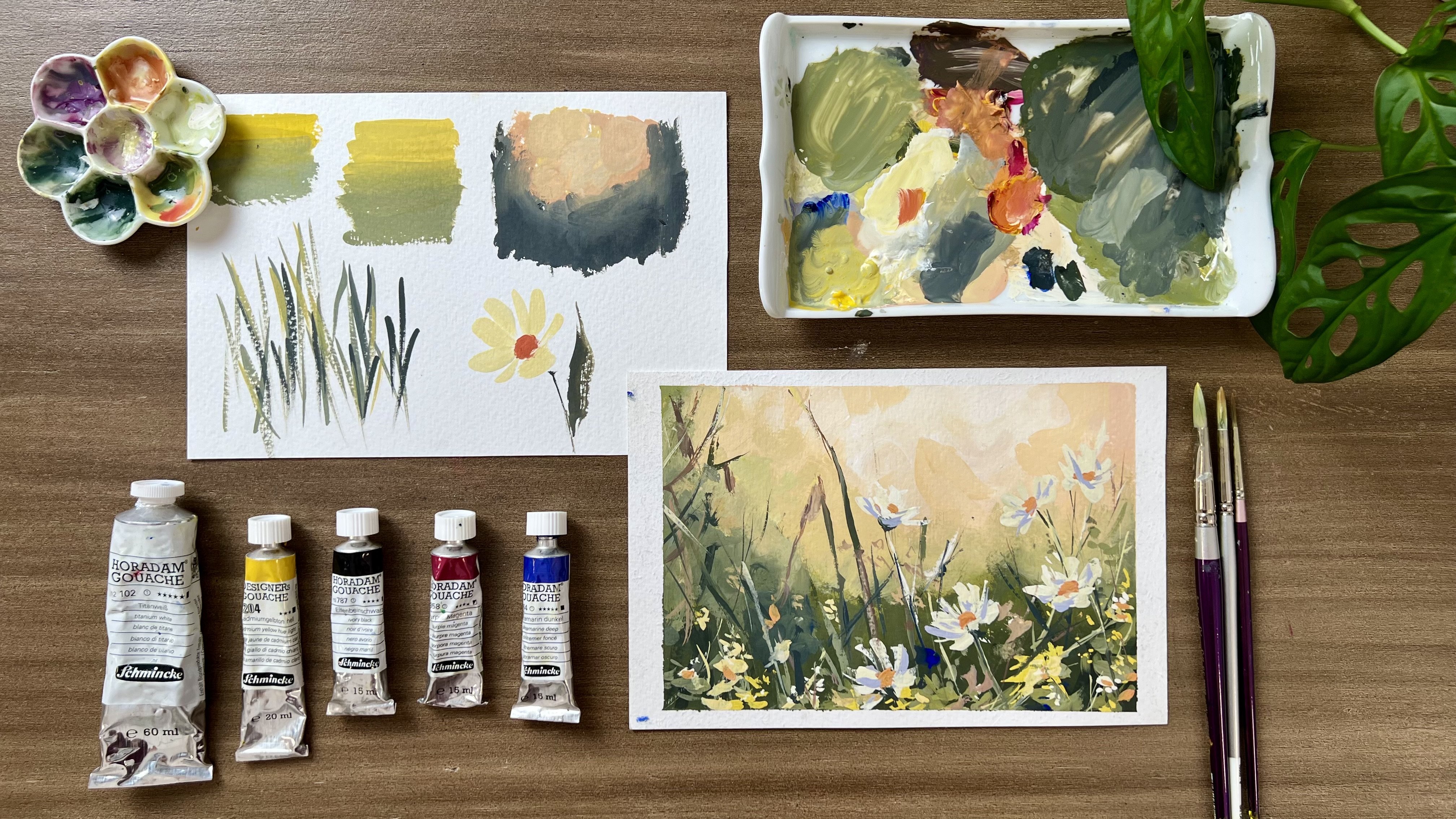
2. Materials: Before we proceed
to the lessons, let's take a look
at the materials you'll need for the class. First, we need
watercolor papers. Watercolor paper is specially designed to handle the
flow of water and paint. Look for a medium weight, around 140 pounds
or 300 CM paper. For most projects, you
can choose between pads, blocks, or loose sheets. Depending on your preference, we will be doing a lot of practical exercises like
tonal value exercise, value sketch, practice painting of trees, watercolor techniques, and the final landscape project encourage you to prepare
some sheets for the class. When it comes to watercolor, you can choose between
pan sets or to paints. The paints come in a
wide range of colors. But I do like to use only a
few selection of colors from Schminka and just mix and blend them to achieve
your decided shades. The watercolor
brushes I'm always using are these round brushes
from silver brush, limited. This black brush is
called Renaissance brush, which is made of
real sable hair. This brush is great
for painting washes because it absorbs water
and paint really well. The purple one is silver silk
88 round brush size eight, which I use for fine details and painting landscape elements. Now for the parts of the
brush, this is the handle, then this is the
metal that holds the handle and bristles
is called ferrule. Then, here's the
bristles of the brush. For the bristles, the belly, while this is the
tip of the brush. When choosing a
brush, it's good to consider the flexibility
of the bristles, the size of the belly, and the pointiness of the tip. A common mistake to
watercolor painting is not being able to activate
the paints really well, causing very pale washes. To activate the paints, you have to pre wet it first with water
using your sprayer. Then gently rub your brush on the paint to get
as much pigment. Let your brush get fully
coated with paint. When your brush is fully coated, try different strokes
that your brush can make like full belly stroke. You do this by laying
the entire belly of your brush flat on the paper. You can try it in
different directions. Next, try doing fine
lines by removing the excess paint and water
from your belly of the brush. And then apply very
light pressure. You'll see how fine the lines your brush can create
with this tip. For the paints in my palette, the colors I'll be
using are yellow ochre, burn China, Kinacrodone magenta, cobalt turquoise,
cobalt violet hue paints gray, olive
green, indigo. Lastly, titanium white. We'll mix these colors
to paint our landscape. Feel free to use
other colors that you already have or you're
comfortable using. Prepare also pencil eraser, tissue paper and masking tape for creating borders
for the painting. You will be needing cups of water sprayer and a mixing
palette for the mixing colors. These are all the
materials you'll need. Let's talk about total value and contrasts in the next video.
3. Tonal Value and Contrast: It's every artist's goal to
have a beautiful artwork. We challenge ourselves to improve our work
and make it better. But have you experience
looking at your painting, then, you know that something
has to be improved. Something is missing
or not quite right, but you can't figure out
what exactly it is like you. I had the same feeling
when I was starting out. Honestly, it normally comes
down to tone and contrast. Learning how to master
tonal value and contrast in your paintings will greatly
improve your watercolor work. Unlike other medium,
watercolor does not use y to get lighter colors. Rather, it uses water
to change the value. Tonal value is the lightness, darkness of a color. A light value is
transparent or very pale, and a dark value is
rich, deep, and opaque. And we get different
values in water color by adding more or less
water to the mixture. A thick mixture of
a lot of paint with a little water will
give you a dark value, while a lot of water with only a touch of paint
will be a light value. To better understand this
is to create a value scale. Let's use paints gray or any neutral color to
do this exercise. To better understand this
is to create a value scale. Let's use paints gray or any neutral color to
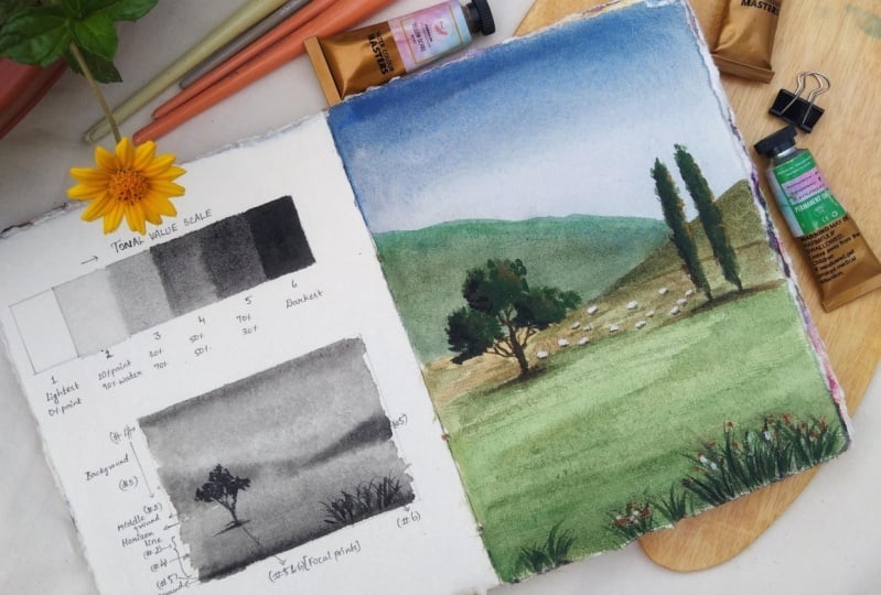
do this exercise. Here I make six columns
and number each column, 1-61 being the lightest value, and six the darkest value. Since one is the lightest value, we will leave it unpainted, meaning we will have
the original shade of the paper as the
lightest value. Now the second to fifth
columns are the mid values. Since we will adjust
the amount of water and paint in
creating different values, let's assign the ratio of
water and paint four columns, two to five value two is made using 10% paint
and 90% water. Value three is around
30% paint and 70% water. Value four is 50%
paint and 50% water. Value five is 70%
paint and 30% water, while value six is 90%
paint and 10% water. Now get your brush and start making a mixture
for value two, composing of mainly
water and hint of paint. Then paint a rectangle
on your paper. This will be our light
value or value number two. Next, let's make
value tumber three. We make a mix wherein we add a little bit more of paint
in the water puddle. We must be able to see a
slight change in value and value three has to be
a little darker than two. For value four, we
create a mix that is quite creamy inconsistency since it's a balance between
water and paint. Here we can see that the
paint is starting to be quite opaque and
rich inconsistency for value five, just increase
the amount of paint in your initial mix to get an even darker and
more saturated paint. Lastly, do value six with a very minimal
water in the mix. When you paint the rectangle, you'll notice that the
paint barely flows. It's evidently thick and opaque. Look at your value
scale now you should be able to get six distinct
values out of paints. Gray from lightest
to darkest value. Now here's the thing. A
common mistake we commit, which results to a painting
looking flat or off, is when you paint with
just three or four values. However, when you place light tones next to
dark tones correctly, you create contrasts which help give a sense of
depth in your work. Contrast helps us create
better composition. It leads and draws the viewer's attention
to the focal point. And contrast is used to tell the story in your work or what is going
on in the picture. To make it simple, the key to having a
beautiful painting, a painting that doesn't
look flat and give a sense of depth and dimension
is contrast. Contrast is achieved when
you master how to use each value in appropriate and specific
parts of your painting. A painting has five
basic parts, foreground, middle ground, background,
horizon line, and focal point. Let's talk about
each one briefly. First is the horizon line. It refers to a physical
or visual boundary where the sky separates
from land or water. It helps us to create
perspective which makes a two D surface appear three dimensional by creating
an illusion of depth. Next is the background. The background refers to the area or space
in the distance. This is the sky and distant
mountain in our subject. The middle ground occupies the space in between the
background and foreground. This is where the focal point is usually located to
create balance. The foreground refers to the nearest area
in our painting. It is the grass and flowers in the lower right,
closest to us. Lastly, the focal point, the center of interest
in your painting, it's the part of the
picture that we find naturally fascinating and
want to know more about. Here, The tree and the flock of sheep
are the focal points. Now, how do they
relate to tonal value? We use dark tones
for the foreground, light tones for
the middle ground, where focal point is, and mid tones for
the background, and mid tones for
the background. A dark focal point on a middle ground pulls
out the focal point, while the dark foreground draws the viewer's eyes into
the central character. To better understand this, let's create a value sketch. And let's label each
part of the painting with appropriate
tonal value level. Let's do a simple sketch, make it just a small
practice exercise Here, I'll draw the horizon line in the lower third
part of the canvas. Next I'll draw the mountains
at the background. A small one on the right and then a bigger one on the left. Then I draw the tree here
on the left most side. Let's start painting using just one color which is paints gray to create a value sketch, we start with a background sky. We will be using mid
tones for the background. Here we will apply tonal value four on the
upper part of the sky, then gradually decreases
to tonal value 3.2 as we reach closer
to the horizon line. We do this gradual transition of tone to create sense
of perspective, part of the background or the mountains here. When the sky is
getting a bit dry, I'll make a mix of color with tonal value four to
paint the mountains. Next, let's paint
the middle ground, which is the part of the
ground near the horizon line. I will use tonal value
number two For this, we use light tones
for the middle ground because it is where
our focal point is. A dark focal point on a light middle ground
pulls out the focal point, making it really stand out. Then as we move to
the foreground, we gradually increase
the value to 4.5 When painting the ground, just like what we did
on painting the sky, we achieve aerial perspective
when we change the tone. Now let's dry this completely, then paint the focal point
with tonal value 5.6 I make sure to remove excess
water from my brush to achieve this really
nice thick paint. I will also use tonal value six to paint these grass
blades in the foreground. Here we can see that even
with just one color, we can create a
painting with death, as long as we use
appropriate tonal values on each part of the painting.
4. Watercolor Techniques: Watercolor techniques play a crucial role in
watercolor painting. By mastering a variety
of techniques, you can express a wide range of emotions and moods
in your painting. They allow us to
control the flow of paint and create
precise details, build depth and dimension, and produce a wide
range of textures that adds visual
interest in our artwork. Let's look at the four
fundamental techniques, wet and wet, wet and moist. Wet and dry and dry and dry. As I do a demo on
each technique, I'll show you also how
each technique can be applied in painting
our class project. As I do a demo on
each technique, I'll show you also how
each technique can be applied in painting
our class project. Let's start with wet
on wet technique. Wet on wet is a
technique where you apply wet paint onto
a wet paper surface. This creates soft, diffused,
and blended effects. It's perfect for
creating backgrounds, skies or dreamy, seamless
transitions between colors. To achieve these, wet your paper thoroughly
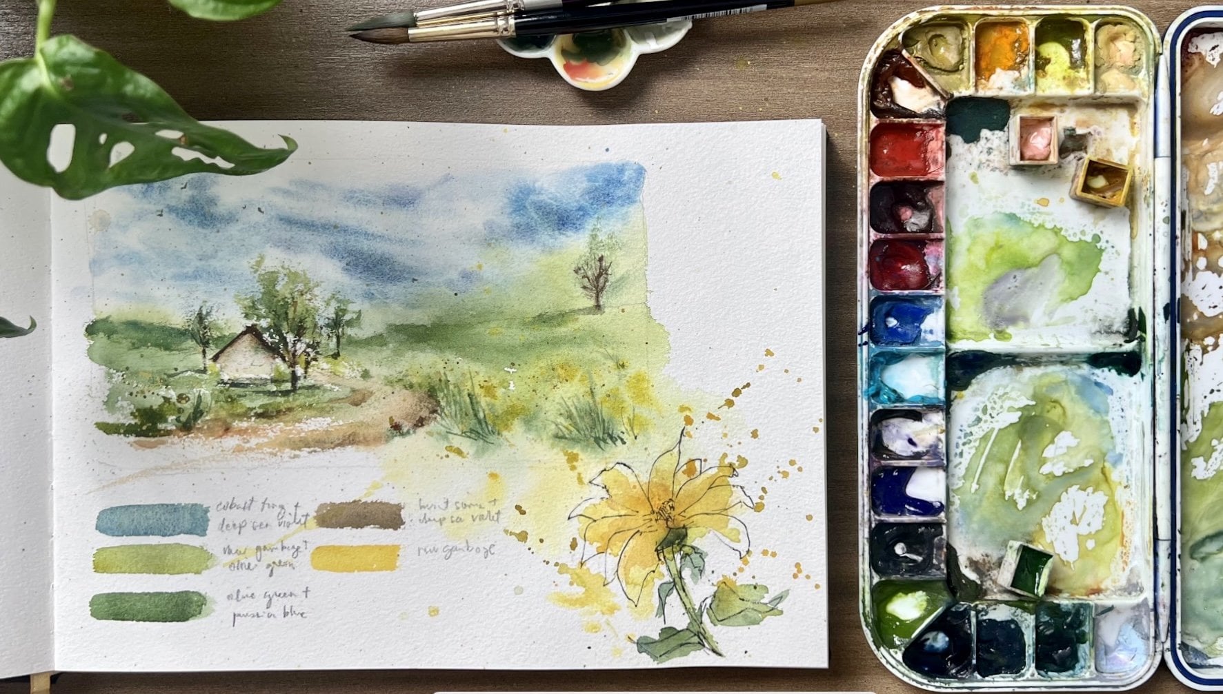
with clean water. Then apply your paint. While the paper is still wet, the colors will flow and mingle, producing a beautiful soft wash. Let's do a color study
using the wet Un technique. Here on my thumbnail sketch, I'll paint the background sky by first pre wetting the sky
fragment with clean water. Afterwards using tortoise and a bit of violet,
I'll paint it over. Remember the proper tonal
value as you apply the paint, we still use value four in
the upper part of the sky, then gradually
decreasing the value to three in the middle part, and fading it out to value
two near the horizon line. Our next technique
is wet on dry. Wet on dry is a technique
where you apply wet paint onto a
dry paper surface. This method offers precise
control over your brushwork. It's great for
adding fine details, defining edges, and creating
sharp, crisp lines. Start with dry paper and
apply your paint directly. The colors won't
blend as easily, allowing you to achieve
clear and defined shapes. I use this technique for painting the
background mountain, so we get a nice defined shape. Let's do it again
in our color study. Make sure that the sky is thoroughly wet so
you can paint wet on dry using green mix made of
torquoise and yellow ochre. I'll paint the distant mountain. Refer to your Total
Value Guide for the appropriate value
for the mountain. We use value four for the other Monday on the right. I made it slightly darker
to make it more distinct. Next is wet on moist. As the name suggests, it involves applying paint to a paper surface that is
moist but not dripping wet. This technique allows for a bit more control
than wet on wet, you can create softer edges and transitions
in your painting, making it ideal for creating subtle gradients and
layering colors. Simply moisten your
paper with a brush. Wait for a few minutes
for the paper to absorb the water a bit and
then apply your paint. You will use this technique
in painting the grassland. We begin by late paper wetting
the grassland fragment. Wait for the water
to get absorbed a little bit and then apply color. Starting with pale yellow, then transition to
greenish yellow mix. And lastly, a dark,
creamy green mix. Like what we did in
the volume study, we did a tonal
transition from two, then four, then five to
create sense of perspective. Our last technique
is dry and dry. Dry and dry, as
the name implies, involves applying dry paint
onto a dry paper surface. This technique results in bold, textured, and
granulated effects. It's excellent for
creating rough textures, adding intricate details, or layering without disturbing
underlying colors. Simply use your dry brush or a dry pigment to apply
paint to dry paper. I love using this for painting. Texture trees, tree trunks, intricate grass blades,
and other details. Let's practice it
on our color study. Make sure that the surface is really create a color mix
in value five or six, meaning there is very
little water in your brush. I start painting the crown of the trees with the
belly of my brush, making very organic strokes. Then with the same thick
consistency of brown paint, I paint the branches and chunk to connect it on the ground. I simply smudge the paint
of using my finger. Let's practice painting the grass blades here
on the foreground. Keep the paint mixed very thick to create very distinct strokes with very thick paint. In value number six, we can also paint impressions
of flowers by simply dabbing the brush and
creating dots of colors. I do the same when painting the impression of flock of ship. In the middle ground, I get
white paint straight from the tube paint dots of white and then add
shadow on the ground. Here, comparing our value
sketch and color study, we can see that value and color work in harmony
to give form, volume, and depth to
objects in a painting. By using varying values
in your painting, you can create contrasts
between light and shadow. This contrast adds dimension
and depth to your subjects. Also, when you combine
different values with colors, you can achieve complex
and realistic effects.
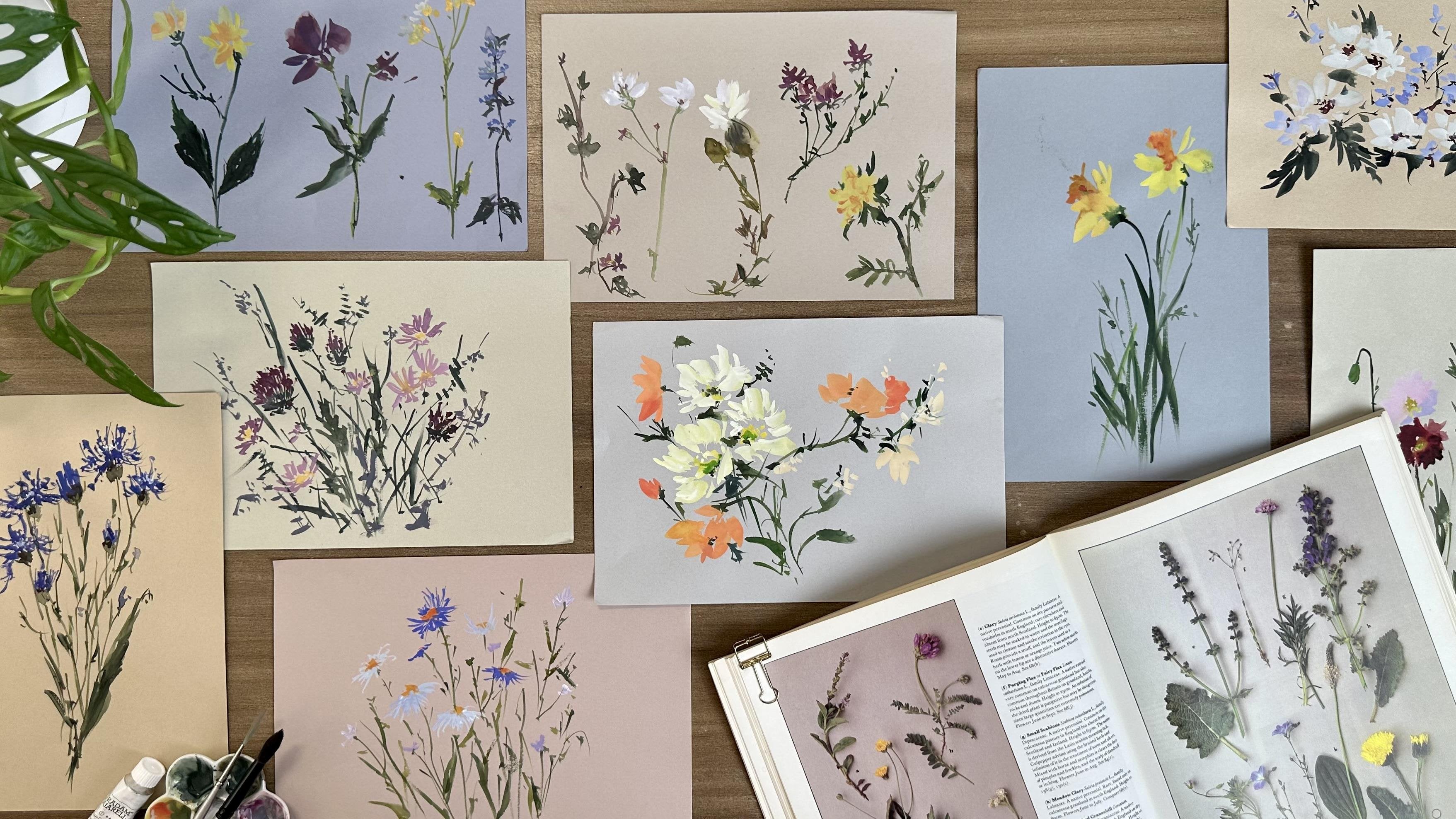
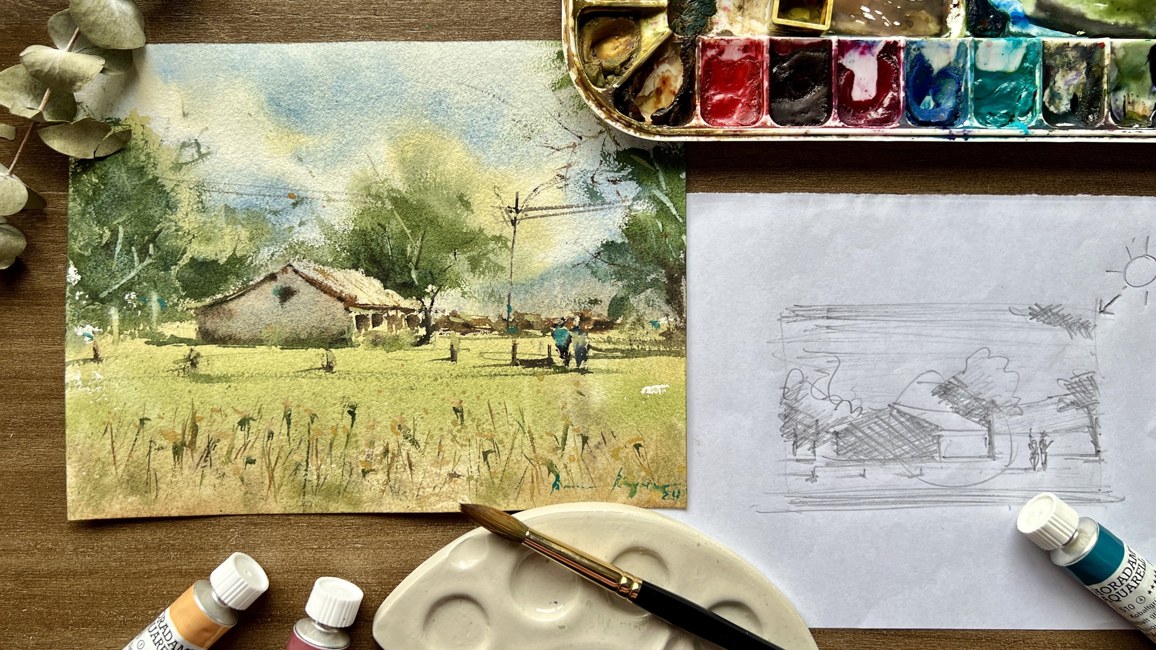
5. Tree Painting Exercise: Let's do a quick
tutorial on how to draw and paint trees
for a landscape. A common mistake when drawing trees are doing it like this. But instead of drawing
it like how kids do, we first draw a slim trunk and then three ovals like this. From here we draw cloud outline. Then draw their branches
and then thicken the trunk. Let's do it one more time now, starting from the
clustered leaves, then we draw the branches. Lastly, the trunk, you may add another cluster here on the left to
make it look fuller. Now to paint it, I get a green
mix In value number five, I remove excess water from my brush and then with
a dubbing stroke, I paint the outer
part of the clusters. I don't fill in the space
like coloring it with a pen. Doing that makes the
tree more unnatural. Here we dab the belly of the brush paper until we fill
in the fragment completely. Next, let's add a darker tone on the left side to
create dimension, I add indigo to my green mix
to make it darker in shade. Next, using bird ana. In value six, I paint the branches and the trunk
with a synthetic brush. Keep the mix very thick and opaque to imitate the
texture of the trunk. Then lastly, we paint the ground with a quick horizontal stroke. Add a bit of color under the trunk to connect
the tree in the ground. Next, let's paint
a cypress tree. I start with an oblong
or columnar outline, then the trunk in the middle. I fully loaded the brush
with paint and then do a vertical stroke
from top to bottom. I let the full belly of
the brush touch the paper. And then I do some
angle dabbing strokes to create the shape
of the cypress tree. Notice that my brush is dry, that's why I create
those dry stroke and then paint the trunk,
followed by the ground. Now that you've learned all the important
principles and techniques, let's do our class project
in the next lesson.
6. Painting the Class Project: Let's begin by doing a
simple sketch similar to what we already did on
our previous exercises. Let's start with
the horizon line in the lower third
part of the paper. Then I draw diagonal lines for the mountains
at the back road. Next is the tree
here on the left. Draw it the way we did in the
previous practice lesson. And let's add another
tree here on the right. I'll draw a light guide
on the base of the trees. Then for the foreground, we'll add the grass
blades with color. Let's add tiny dots here
in the middle ground as impression of flocks of
sheep in the meadow. Our drawing is complete. Let's lighten the sketch a bit before starting
with painting. As we paint this,
remember to apply the principles we've
learned about tonal value, contrast, and
watercolor techniques. Let's start by pre wetting the sky fragment
with clean water. We do wet un, wet technique
to paint the sky. Make sure to pre wet
the surface evenly. If it's hard to make the
paper wet with a brush, you may use a water
sprayer as an extra help. Next, I activate my
paints by missing them. I get torquoise and a bit of violet to diffuse
the bright blue. I start painting
the upper part of the sky with value four, then gradually decreases
the tonal value by simply adding
water to my brush. Here you'll see a
gradation of blue from dark to light tone as you get close to
the horizon line. To fasten the drying process, I take my heat gun and
dry the sky fragment. You may dry it naturally, but be sure to wait for it to be completely dry before
doing the next step, which is painting the mountains using wet on dry technique. Now using the same
mix for the sky, I add a bit of violet
and yellow ocher to create a cool green
color for the mountains. I start with the
one on the left. Be mindful of the tone. It has to be
slightly darker than the middle part of the
sky to show perspective, I also sprinkle some
water on the layer to create nice,
soft, misty texture. Now, I added some olive green in the existing mix to
make it a bit creamier. You can also add some yellow
ocher for a nicer color. I'll paint here the next
mountain on the right. Since our consistency
is a bit taker, you would see that the
paint is not flowy anymore. Now let's paint the meadow
with wet moist technique. It's okay if the paint from the mountain slightly bleeds to the surface since it
has a very light tone. After covering the lower
fragment with a bit of moisture, I started painting
the middle ground with a very light yellow mix. Then a slowly transition
to a mid tone green color. Then lastly, a dark green color using the same
mix plus indigo. It is like using
level number two. Level number four, and
then level number five. Here you'll see a
sense of perspective. Because of the smooth
transition of color and tone, I let this dry
completely again before painting the focal point,
which is the tree. As we paint the trees,
we'll do the dry, dry technique using olive green, indigo, and a bit
of yellow ochre. Remove excess water from your brush and then
paint the tree. I do the dabbing stroke
with the belly of my brush. It's important to note that the tone has to be darker than the tone on the
background mountains to make the trees pump out. While still Moise, I
add some shadow on the trees by adding darker
tones on the left side. Next, let's paint the
trees on the right. Do the vertical
stroke then enhance the overall shape
with dabbing strokes. As I enhance the shape
of the cypress tree, notice that I use a thicker
and darker mix of color. I do this so that we can create shadows and dimension
on the trees. I still do the dabbing
strokes as I paint the shape. And then here I'm using a light yellow ochre
to portray light. I also add some yellow ochre on the round tree on the left. Take your synthetic
brush and get a thick brown color using burn anna to paint the
branches and trunks. Make sure that your brush
has almost no water in it to get a very defined
and thick stroke. With my left over green paints, I connect the trees on the ground with a
horizontal stroke. Next, let's paint the grass
here in the foreground. With value number six, I use different shades of
green for added interest. I suggest practicing
the stroke to make it look more organic and
not stiff or uniform for extra high light. I take pink straight from the tube and add dots of
paint here in the foreground. You may also splatter
some pink here and there. I add some white paints to add light in the foreground too. Then the last, let's
paint this tiny ship in the middle ground with dots of white paint
straight from the two. As you paint them, they should all lie within
the horizon line. Then I mix white and burn hanna to create
shadows for the shape. You don't have to be so
particular on the shape. Even dots like this can
create the impression. Don't forget to
paint the shadow on the ground with a
light green paint. The ship won't look floating. Let's add a bit of finishing
touches here and there, and our final
painting is complete. The carefully peeled off the tape to reveal
the final painting. I hope you had a wonderful
time painting this piece after learning the fundamentals of tonal value and
watercolor techniques. Hope this inspires you to
paint more landscape pieces. So I'll see you in the last
video for my final tips.
7. Final Thoughts: Thank you so much for
joining this class. I want to congratulate you on completing this journey
from start to finish. I hope you've gained
valuable insights and techniques that will make
your artwork even better. Remember, mastering
the art of depth in your painting is an
ongoing process. And each stroke of your brush brings you one
step closer to your goal. Very useful tools for you in this video player where you
can pause and play the video. There's a little button that
will allow you to rewind 15 seconds if you need me to
repeat what I've just said. You can also just how fast
or slow the video plays. And you can also turn on captions in different
languages for this class. If you have any questions or need further guidance
down the road, please don't hesitate
to reach out. I encourage you also to stay connected with
your fellow students. Share your progress and
inspire one another to upload your class project
and resource section so I can see it and share
feedback about your work. When you add your project, be sure to include a link
to your Instagram so that anybody who's curious about your work can find
more about you. I also provided the
downloadable copy of the reference
and final painting in the resource
section of the class to help you in creating
your class project. Encourage you also to take my other class to further
help you in your practice. Watercolor for beginners
techniques to paint landscape. In this class, you will learn powerful and
effective strategies to loosen up your painting style and to create
captivating masterpieces using watercolor in wide
variety of techniques. Watercolor, ocean waves, paint with depth
using tonal value. Using the knowledge
gained on tonal value, learn a simplified way
of painting escapes, and ocean waves, I can't wait to see what
you have created. Don't forget to share your
work on Instagram and tag me at Bankaayala so I can
share it to our community. Remember, artistic expression
is a powerful tool, not only for your
personal growth, but also for making a
difference in others. Paint to inspire
paint from the heart. Let's keep on creating see
you in my other classes.
 Bianca Rayala, Top Teacher | Watercolor Artist