Transcripts
1. About the Class: Are you curious about creating a dreamy bokeh background
using gouache? Wondering how to achieve the enchanting in magical
effect on paper. Join me in this class as we explore the secrets of painting, dreamy bokeh background
with Gouache. Hello everyone. Welcome to this exciting class
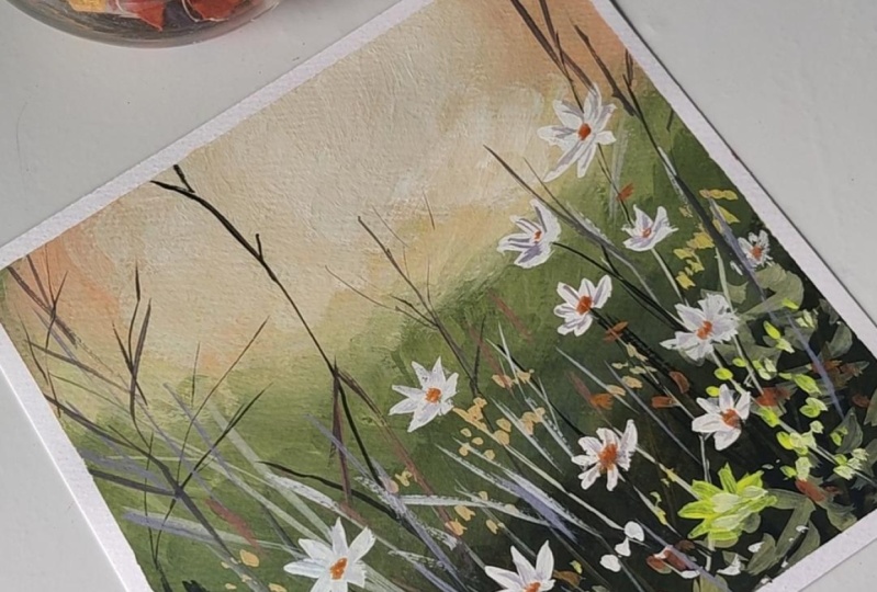
where I'll take you to a magical journey of painting a flower field landscape with a bokeh background
using gouache. My name is Bianca Rayala and I'm a passionate artists with a deep love for watercolor
and gouache painting. I must go share thought,
feature and work with renowned brands like
silver brush limit, the shoemaker acro, our balance and all
about Art international. With my experience
working alongside these amazing brands and through my six years of teaching, I've had the privilege
of witnessing the transformative
power of painting. I truly believe that
painting is for everyone and it
has been my joy to inspire and guide thousands of students from all
corners of the globe. They're creative journeys. Through my teaching, I aspire to ignite the spark of creativity within you and empower you to pursue your passion
for painting. In this class, we'll explore the captivating beauty of
painting, a flower field. Each blossom coming to life with vibrant colors and
delicate brushwork. But we won't stop there. We'll add a dreamy bokeh
background to make our artwork truly
enchanting wash is an incredible medium that allows us to blend
colors seamlessly, create soft transitions and add layers to bring death
and life door artwork. Throughout this
class, I'll guide you step-by-step from understanding
the basics of gouache, mastering essential
techniques, you learned to paint the
magical bokeh effect. Fluid, grass blades and
delicate daisy flower petals together will leave
a masterpiece that celebrates the
beauty of nature. Painting is an Art Form
that knows no boundaries. Painting is for everyone. Whether you're someone
picking up a brush for the first time or an
experienced artists. This class is
designed to inspire you and nurture your
artist experienced. By the end of this class, you'll not only have a
beautiful flower field painting with a bokeh
background to cherish. You also have acquired
valuable skills and knowledge that
will stay with you throughout your
artistic journey. Beyond technical
skills, you'll gain the confidence to
express yourself through Art and the
joy of exploring your creativity and
new and exciting ways. I'm here to support you in your district grow
with and I can't wait to see the amazing progress you'll make throughout
this class. So let's pick up our brushes
and without further ado, let's begin this
artistic adventure. Have your painting everyone
2. Class Project: Our class project is all about capturing the beauty of a
vibrant flower field with a dreamy bokeh background using gouache paints and
the techniques you will learn
throughout the class. You'll create stunning
Gouache masterpieces. Let's walk through
the step-by-step process for class project, we'll begin by lightly
sketching the main elements of our flower field on the
cellulose watercolor paper. This sketch will serve as a
guide for our composition. Then apply the bouquets SEC
using semi-circles strokes to create a magical and dreamy atmosphere
in the background. This will add depth and emphasize the Flower
Fields beauty. Next, we'll use our
blending techniques to paint the colorful
flower field. You will learn how to mix
and blend gouache colors. So cheap software and
sessions and vibrant use. The class project wouldn't
be complete without the lush and organic
grass blades will use brushwork to create
fluid and natural looking grass to
complement the Flowers. Finally, we'll focus on the
delicate, lazy flower petals. You'll use the brushwork
that we will learn in the class to create
charming blooms, adding the finishing touches to your artwork
throughout the project. Don't hesitate to ask questions or seek clarification and stuff. Feel free to leave
your questions in the discussion
section of the class. Once you have completed
painting your class project, I'd love to see it and share
your thoughts about it. Now let's go over
the simple steps. So upload your project and leave a review on Skillshare
your project. Upload and review. Not only showcase your
beautiful artwork, but also serve as a
great encouragement for me as a teacher to upload the class project login to your Skillshare account and
navigate to the class page. Scroll down to the Projects and Resources section and click on the create project button at a catchy title tier project
that represents your artwork. Feel free to create a brief description or
story behind your piece. Click on the upload button to add an image of your
completed work. Inserted the image showcases your painting be differently. Once you're satisfied with their Project
Details and images. Click on the Publish
button to make your project visible to
the Skillshare community. Now, the leave a class review. Stay on the class page and scroll down to the
review section. Click on the leave
a review button. Choose everything that reflects your overall experience and
satisfaction with the Class. Next, shared thoughts and feedback about the
watercolor class. You can mention specific
techniques that you enjoyed, how the class inspired you or any improvements you'd suggest. Once you're done
writing your review, click on the Submit
button to publish it. As they review your
class projects, I'll be providing individual
feedback on your artwork, offering guidance and
celebrate your achievements. It's really value your
dedication efforts and I'm excited to see your
interpretations through watercolor
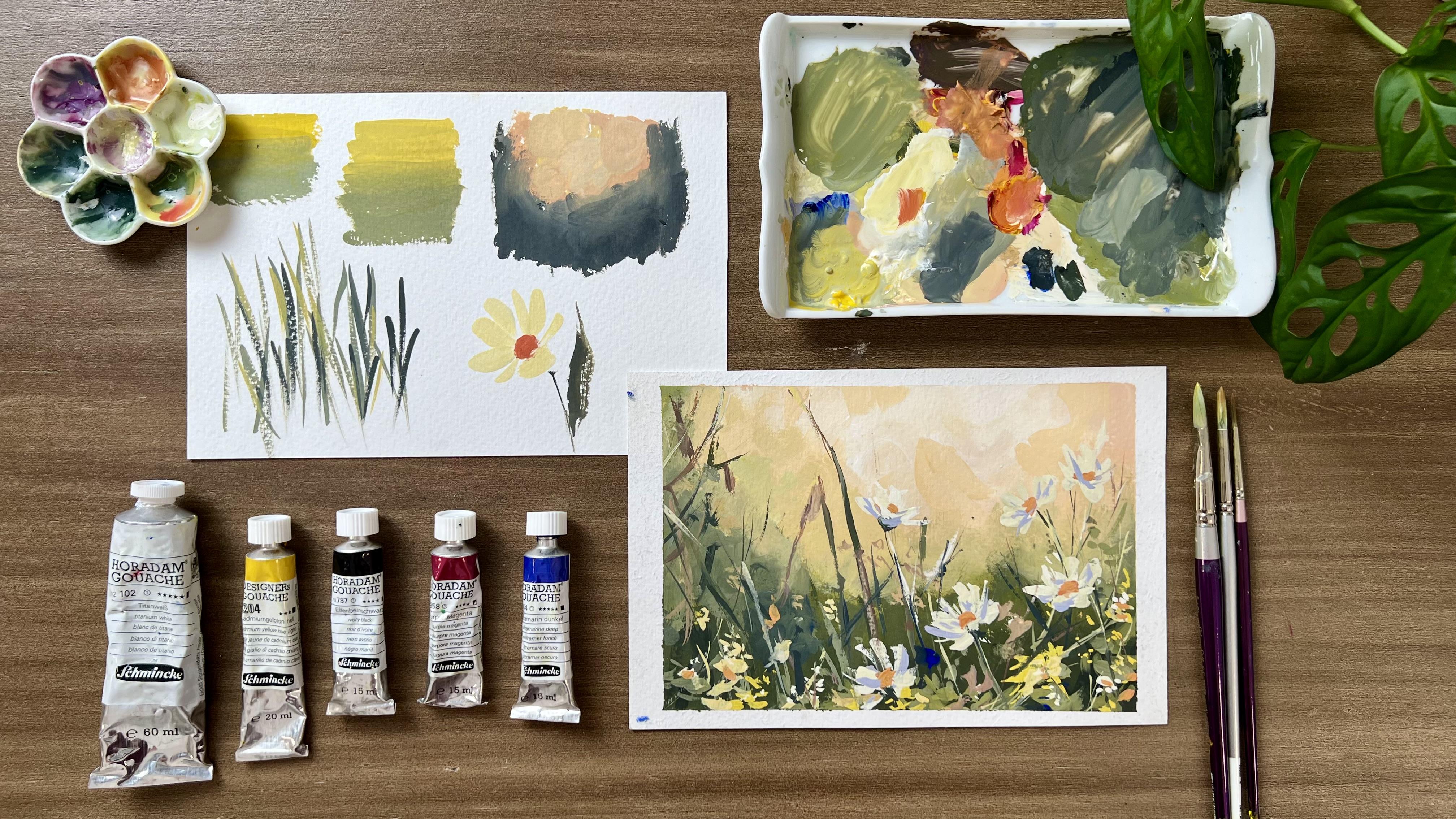
3. Materials: Welcome back. As we go
further into our class, Let's go over the materials you need to create your masterpiece. Or first essential
material is paper. The great thing about
gouache is you can paint it on wide range of surfaces, including watercolor paper,
illustration board Canvas, and other tooling paper. I personally prefer using hot press watercolor
paper or cellulose paper. This smooth surface provides an excellent BCE for
gouache painting. I recommend using
paper with a weight of 300 GSM for optimal results. However, if you don't have hot press watercolor paper or
cellulose watercolor paper. You can use any paper
with a similar week. The key is to have a
surface that can handle the water and gouache
without warping. Our vibrant color
palette consists of gouache paints from
Srilanka, harass them. The colors we'll be using our
cadmium yellow, you purple, magenta, ultramarine, deep
ivory, black and white. I provide the download, the Bokeh copy of the
color recipe that we will use in the
class for Guide. You can find it in the
resource section of the class. For the brushes, a brush with synthetic fiber is perfect
for gouache paints. You just need the round and oval shape to create a painting. In this class, the
brushes that I'll be using are from silver
brush limited. These are silver silk, eighth, eighth over crescent, one-half. This brush is
perfect for painting large areas scraping
smooth and even strokes. Silver silk, eighth, eighth
goat, mop, oval treat. This one is optional. I use this brush for
scrubbing or blending colors for a soft,
dreamy Effect. An alternative for this brush is any old brush that you can be comfortable to use for scrubbing or blending
on your paper. Another brushes, silver
silk, eighth, eighth, ultra round brush size to this brush is
excellent for painting the fine details such as delicate grass blades with
precision and control. Silver white round size six. This is perfect for
painting petals and larger details with
ease and accuracy. I also have here a
ceramic mixing palette. Choose one that allows
you enough space to experiment with your color
combinations without smudging, will start our painting
with a light sketch. Pencil and eraser
will come in handy, have cups of other readily
available for rinsing your brushes and a stack of tissue paper to blot
excess water and pink. Lastly, to create a crisp border and maintain clean
edges on your painting, will be using a masking tape and tape our paper on the board. There you have a comprehensive
list of materials that will be needing for the
class, gathering materials. And let's have a
quick review about the fundamentals of gouache
in the next lessons
4. Gouache Overview: Washes a versatile and
vibrant water-based paint that offers a lot of
artistic possibilities. Let's get started by understanding
the basics of gouache, its composition and
characteristics and advantages it holds over
other painting mediums. One of the most distinctive
characteristics of gouache is its opacity. Unlike watercolors
that are transparent, gouache offers excellent
coverage and allows you to paint light colors
over dark backgrounds. This quality opens up a
world of possibilities for Layering and creating
vibrant, bold artwork. Also the fast drying nature of gouache and evils artists
to layer colors quickly. If you make a mistake, it's easy to work or correct areas without disturbing
the layers below. When it comes to versatility, gouache can be used on a
wide range of surfaces, including watercolor paper,
illustration board Canvas, and even toned paper. This flexibility allows artists experiment with different
textures and effects. It also typically
dries matte finish, giving your artwork a unique
and velvety appearance. Wash paints are either sold in tubes like this one or in pen. I like using the ones in tube because they don't
easily dry out. If you're using to
Gouache paints like mine, simply unscrew the
caps carefully and squeeze out a field mode
of paint in your palette. Take care brush and dip it
to your water container, and then add a few
drops of water to the gouache paint on
your mixing palette. Now you're using your brush. Mix the water into the
gouache paints are really, you want to achieve a smooth
and creamy consistency similar to that of
heavy cream of WIP, adding too much water at once as this can make the
paint too runny. When it comes to blending colors are creating color transition. The secret to a
beautiful soft gradient or blend of colors
is titanium white. White is the key
to make the paints easier to blend and
not to get muddy. We mix Y to the color to get a smooth connection
between colors. After you've finished painting, clean your brushes, palette, tori with water, close
the leads of your gouache paints security to
prevent them from drying out?
5. Essential Techniques and Painting Exercise: Before we dive into the
process of painting a flower field with a bokeh
background using gouache. Let's Master some
essential techniques like blending colors, creating the bouquet effect, painting fluid grass blades and creating delegate
DC flower petals. For our first technique, blending colors for
soft transitions. I think colors in gouache
is a fundamental technique that adds depth and
dimension to your artwork. To achieve soft transitions,
follow these steps. Start with two or more colors
on your mixing palette. Dip your brush in
water and mix it with one color until it reaches
a creamy consistency. I add a bit of white depending
on the you I need to have. And remember that white helps us achieve a
smooth color blend. Apply the first color to your
paper in the desired area. Later color in the fluid stroke. If you feel that the
paint is too dry, just add a bit of water. Next, clean your brush or
get another brush to pick up the second color
and gently touch it to the edge of
the first color. You may get a clean, damp brush to blend the
two colors together using gentle horizontal strokes
if you want a flat wash. The thing here is to
blend colors with a stroke that supports a texture that you
want to achieve. Let's do the next technique. The second technique
is the bokeh effect, that adds a beautiful sense of depth and magic to
your background. To achieve this effect will
use semicircle strokes. Dip your brush into a
light translucent color. I do use white and yellow here. Lightly touch the
brush to the paper. Forming semi-circles in different
sizes and orientations. Vary the pressure on
your brush to create both faint and more
prominent circles. Next, take another mix
with a different hue. I added a bit of red in the mix. Allow some circles to overlap
while leaving some space between others to achieve a natural and dreamy
bokeh background. Okay, becomes extremely
alive with the use of high contrast being the area
around with dark color. Here I'll use green to make the light shine
right through. The third technique
I'll show you is how to paint fluid and organic grass leads that will bring life to your flower field.
To paint them. Load your brush with a
vibrant green color. Hold your brush at
an angle and create thin grooving strokes
represent the grass blades. Vary the length and direction of the strokes to add
realism and movement. To enhance the
grass natural look. At darker tones
with them brush or a darker green you creating
shadows and highlights. For the last technique. Let's practice brushwork
To Paint disease. These are lovely,
delicate flowers that require careful brushwork
to capture their charm. Use a small round
brush and load it with a soft white or pale yellow
color for the petals. Been small, rounded and slightly elongated shapes to
form the petals. Vary the angle of
your brush and the pressure to put in
every strobe to create organic strokes leave a tiny gap in the center for the
flowers. Yellow core. For the flowers,
yellow center uses slightly darker shade of
yellow or pale orange. Add details with gentle
strokes to create texture and highlight the
petals that Kate Nature. Now that you've learned
some essential techniques that will play a
significant role in Painting are
stunning flower field with a bokeh
background using one. Now that you've learned some essential techniques
that will play a significant role in
painting our class project. Let's move on to
the exciting part. Applying these techniques to bring our flower field to life
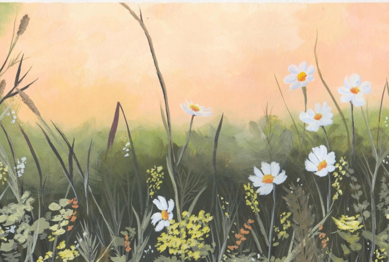
6. Class Project Part 1- Painting The Bokeh: Let's begin by creating a brief pencil sketch to
guide us on the composition. You may download
the reference photo in this resource section. They start with a DC here
on the lower right side. And draw some flowers somewhere
here above and try to vary the size and the
direction they're facing at. I look at the reference and get the essence of the picture. Trying to copy the mean
Flowers that will make this side of the Painting
Fuller and in-focus. Next, I draw some
grass blades as well as flower buds on the left, just as how I see them
from the reference. This pencil marks
will be covered by the Gouache been
since it is opaque. But we do this sketch
basically to give us an idea on the
placement of the elements. This is our pencil sketch. Now let's prepare pains. I take titanium white. I also squeezing some Paint of each color that I'll use
for the light fragment, which are cadmium, yellow
and purple magenta. Let's mix colors. I take my brush and mix
white with a bit of yellow. I wonder creamy and
smooth consistency. So I tried to control the
model of water in my mix. I add a bit of magenta to get
this nice pink pitch color. I can add some more
yellow to make it warmer and white to
make it smoother. Mixing colors and Gouache
often takes time, but I encourage you not
to get stressed out, but instead enjoy the
process of finding the correct balance between
to get your desired mix. Using my round brush, I make another mix. I wet my brush, take some
white with a slight death of my mixed pitch color and use it for the light
fragment in the background. It makes your strokes by
pressing my brush on the paper. And don't worry, you won't
ruin the brush as you do this. Next, I paint the
peach color around the white area in
semi-circle strokes. Notice that I alternately
use the two brushes to create a soft blended transition
between the two colors. In creating the bouquet
effect in the background, there must be a play of light. So as you blend the colors, try to retain the
light in the area. The good thing about washes, you can Lear white
over and over again. So if every field that you
are somehow using the light, you can simply layer another white or light hue
to build it again. Another tip I want to
share when painting with gouache is to control the
amount of water in your brush. If you use a lot of water, you lose the opacity of the
paint in the effect would be too faded and we'll
keep your consistency, rich, saturated and creamy for
a nice thick matte finish. Here I'm trying to introduce a bit more of magenta in my mix to create a subtle gradient in
tones from very light tone, then slightly warmer tone than a stronger pitch tone
to emphasize the light. Much better. But rather
painting process, I mean, doing the circular
motion in my stroke. Next, I take my scrubber brush to smooth transitions
between tones. Hyper wet the brush
and dab it on a towel to remove excess water. I simply around the surface
with this very dump brush, almost dry when you fill it Just blend the colors nicely. The key tip here
is to ensure that your blending brush
is really dry. So you want this
term, the layers underneath or lift
off the colors. I notice that there's a portion that they
want to enhance, so I add more yellow to my mix and paint
it over the area. Next, I use again my scrubber brush to
smoothen the edges. Now I take some more white, make the light shine brighter. I still paint in
circular motion, then blend the edges with
a damp scrubber brush. The process is very
repetitive and therapeutic. The only thing you
need to keep in mind you won't feel
lost is a tonal values. Preserve the light thans and
greater chad of mid tones. Next, let's paint
the green fragment. I get ivory black and
ultramarine blue. Did you know that if you
mix yellow and black, you create a dark green shade. But let's start first with
a light shade of green so we get yellow and blue. He still use two brushes, one for Linda green color and another one for
blending the edges. I need the color with
one brush and then blend it with the background
with another brush gently. Don't forget to always nap in
the brush before blending. As I paint this green fragment, it tried to vary the ratio of blue in the mix to create
different shades of green. Sometimes I add more yellow to get a yellowish
shade of green. When we change the tones, we avoid a work from
looking flat and monotone as much as possible. We want to play of stone, yet maintain color harmony. That's why we still use the same colors to
create different use. I want to show you how versatile
and forgiving wash is, meaning it is easy to
hover up a mistake by simply Layering another
color on top of the mistake. For example, I will use this moist punch to
blend the colors. Unfortunately, the
sponge isn't really give a nice soft blend and tends
to lift off the paint. Here you can see the surface of the
paper showing through. But by simply Layering
a thick paint over it, you can immediately correct
the mistake on that area. Also the reason why gouache
is a good medium for Beginners because it is
easier to manage and handle. So now I continue to add
more green color and lead them to create
soft transitions I think more yellow and
black to my mix and to get a darker Kremer and green
shade for the foreground. To create an illusion of depth, we must make the foreground visibly and obviously
a darker tone. Notice how I do my strokes
and keep it looking rough. I intentionally do this to create the texture of the metal. Here I haven't had saved the transition between
green and yellow, making it look connected
rather than separated. I wanted to add some more
light circular strokes to further enhance
the bouquet effect. I think we're almost
done with it Background. Overall, it looks math, thoroughly covered with paint and there's contrast
and play of tones. Now we can proceed to painting the details like grass
blades and Flowers.
7. Class Project Part 2- Painting The Flowers: Now let's begin painting the grass blades
and the flowers. I started with
impression of the grass. I use a really dark green color, using more black in my mix. I bought some grass blades on the sides just to set
up the foreground. Next, using white, I create a lighter and more
opaque shade of green to add some details and
elements in the foreground. See that I changed
my strokes to take pressing wants to
make impression of random leaves in the middle. Here, I make sure that I vary
the size of each stroke. It's actually more
of a brush plea to the strokes won't look
uniform and alike. Next, using a small brush, I paint thin stems. Some strokes, if you'll notice, are broken strokes
as much as possible. I wanted to create an
impression of looseness by not outlining or drawing the details completely like an illustration. I look at the reference
and try to look for the prominent
details so I could focus on them rather
than trying to copy all details that
I see the picture. Next, I take a
thick yellow paint, still using my round brush to
paint some wild flowers and fillers to make the field
look fuller and happier. Some flowers I
paint with pressing strokes while others are
clustered dots of paint. Again, you don't have to be too particular in painting
these details. We tried to create
impressions of Flowers with various organic strokes. Now we get more white
in my yellow mix. To paint some highlights
on these flowers. I dab the brush to
create tiny dots. And in some parts I make
slender strokes as highlights among the grass has replaced
few of these highlights. We breathe life and
light on the Painting. Now, let's move on to
painting the white flowers. I want the petals
to really pop out. So we need a very good
amount of white paint. Makes sure not to
dilute it with water. So the strokes for these petals
will really look opaque. As I paint the white flowers, I tried to vary the size, shape, and direction, making
them look more natural. I tried to layer a thicker
white stroke on top of this base layer to create
depth and dimension. If you'll note this, our initial sketch was
invisible anymore. And that's perfectly fine. As we paint the flowers. We wanted to capture
the essence and flow of the petals using
fluid brush strokes, rather than outlining and
filling in which color. Next, let's paint the
thin, delicate stems. Avoid making them look so stiff. Let's make brown mix by
combining blue, red, and yellow with use this
brown color to paint the grass blades hitting
the sunlight. Later on. Let's paint this tall slender
grass with a single stroke. And then we paint this highlighted portion
of the grass and move on to the other
important details to complete our composition. Another thing I love
with Gouache is how relaxing it is to
paint with this medium. There's not much need to hurry every stroke as we're not
dealing with too much water. And like with watercolor, you can really enjoy
each stroke and see how the Painting transforms. In this part, you
see me blending some green and yellow shade once more because they wanted
to enhance the contrast. I felt that this
portion on the left seem too dark and I want
to adjust the tone. You don't have to do this step
if yours is already Fine. But if you see a need to do so, simply layer and then
blend with a damp brush. That's the magic of gouache. We can paint from dark to
light or from light to dark. Now, I'll continue on
creating texture here in the green fragment by
rubbing it with my fingers. Next, let's go back to painting some more petals that
look to Galen week. Here, I think yellow paint
and mix it with magenta to get an orange color for
the core. The Flowers. I paint each one carefully with a semicircle shape following
the direction of a flower. It's so satisfying to
see The Flowers fully bloomed by simply adding
this orange detail. Now, I will add some fluid, tiny strokes to fill
in the large spaces. I also add tiny dots of
yellow as additional fillers. Notice that after
making this trope, I tried to feed them out with my fingers so they
won't look too dark. And so the football point
remains to be the white flowers I look for dark
areas and I paint some pressing strokes for
impression of grass blades. The key here is to simply
enjoy brush marking that over thing and just let
intuition guide you there. Good thing about playing
with a small number of colors is that to
methane color harmony. Whatever shade you get
by mixing the same paint you use will not be
distracting to the eyes. That's the beauty of maximizing
a limited color palette. As we finished the painting, Let's add final details. Like those brown
BAD on the left. The portion of the leaf lightened by the sun
in some highlights. This step is very crucial. Sometimes you might get carried away and please do
much highlights. So be careful not to overdo. So always take a look at your
work from a distance and seeth through the lens
of your phone camera. Let's finalize the painting by painting the tiny
shadows of the stems, some more strokes
of grass blades to create Rockford texture
on the background. Lastly, I take blue
and red mixed with white to get the lavender shade to paint the shadow
of the white flowers. Doing this mix, The Flowers
look dimensional than flat. It plays few strokes of lavender uncertain petals
where the shadows should be. Some shadows are very
subtle and not thick. I also use the same color to add few highlights on the
left side here and there. To connect all colors together. I carefully peel off the masking tape to
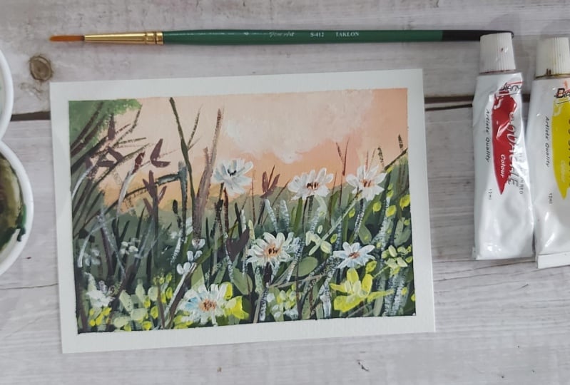
reveal our painting. Here is our gouache painting. I can't wait to see
your work uploaded. The project section. I'll see you in the last video.
8. Your Turn To Paint: Congratulations on
completing this class with, as we reached the
end of the scores, encourage each one
of you to take the next step for sharing your
incredible Class Projects. Upload your beautiful
paintings so we can all celebrate their
creativity together. I'd also agreed the
appreciate if you leave a review and share your
thoughts about this class. Your feedback helps me create even better learning
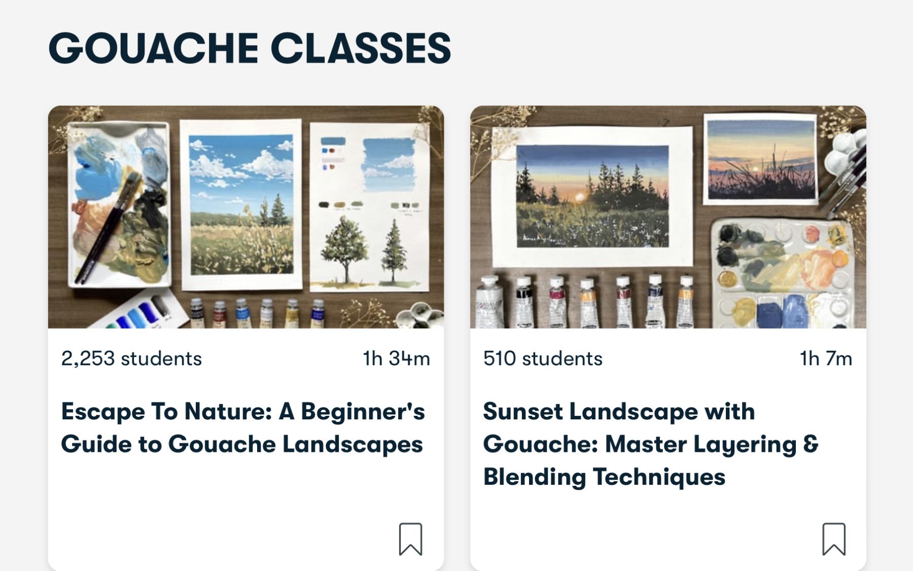
experiences for you. In my next classes, I have more exciting Gouache Classes available
here on Skillshare. As be excited to continue our creative
exploration together, check out escape To Nature, a Beginner's Guide to
Gouache Landscapes. In this class, you
will learn a range of gouache techniques
and as a final project, you will paint two landscapes
for your class project. Another class I do recommend is sunset Landscape
with Gouache, Master Layering and
Blending Techniques, you'll be practicing a
variety of exercises to improve your blending and
brush control skills. For the final project, you'll create a beautiful
landscape painting, highlighting a dramatic sunset. It's class offers
unique techniques and subjects that will further
expand their artistic skills. Painting is a
lifelong adventure. Keep exploring and
experimenting with wash and lead their
creativity bloom. I'm here to support you
every step of the way. And thank you so much for
being part of this glass. Your passion and dedication have needed truly special
you painting, tip, create thing,
and never stop expressing yourself through Art. Paintings, fire, from the
heart season. My other classes
 Bianca Rayala, Top Teacher | Watercolor Artist