Transcripts
1. Introduction: Hello, I'm Martin. Welcome to understanding watercolor. Now. Watercolor can be a bit of a beast. Detain. It's got a habit of wandering off in its own direction on doing its own thing. But with a little organization, a bit of understanding, a dash of technique on the confidence to experiment, you'll be rewarded with cascading washes of color that no other paint can match. Watercolor insists that your deliberate once mistakes are painted, they're very hard to correct. So you need to be brave and you need to take risks. You could say it's a little bit like learning how to ride a bike. Remember, you knew exactly what you needed to do, but you just couldn't make it work. And then all of a sudden you found the courage to lift your feet off the ground and you're away. While watercolors. A similar leap of faith secret is to find a balance between control and letting these lessons will teach you the control. The letting go is up to you
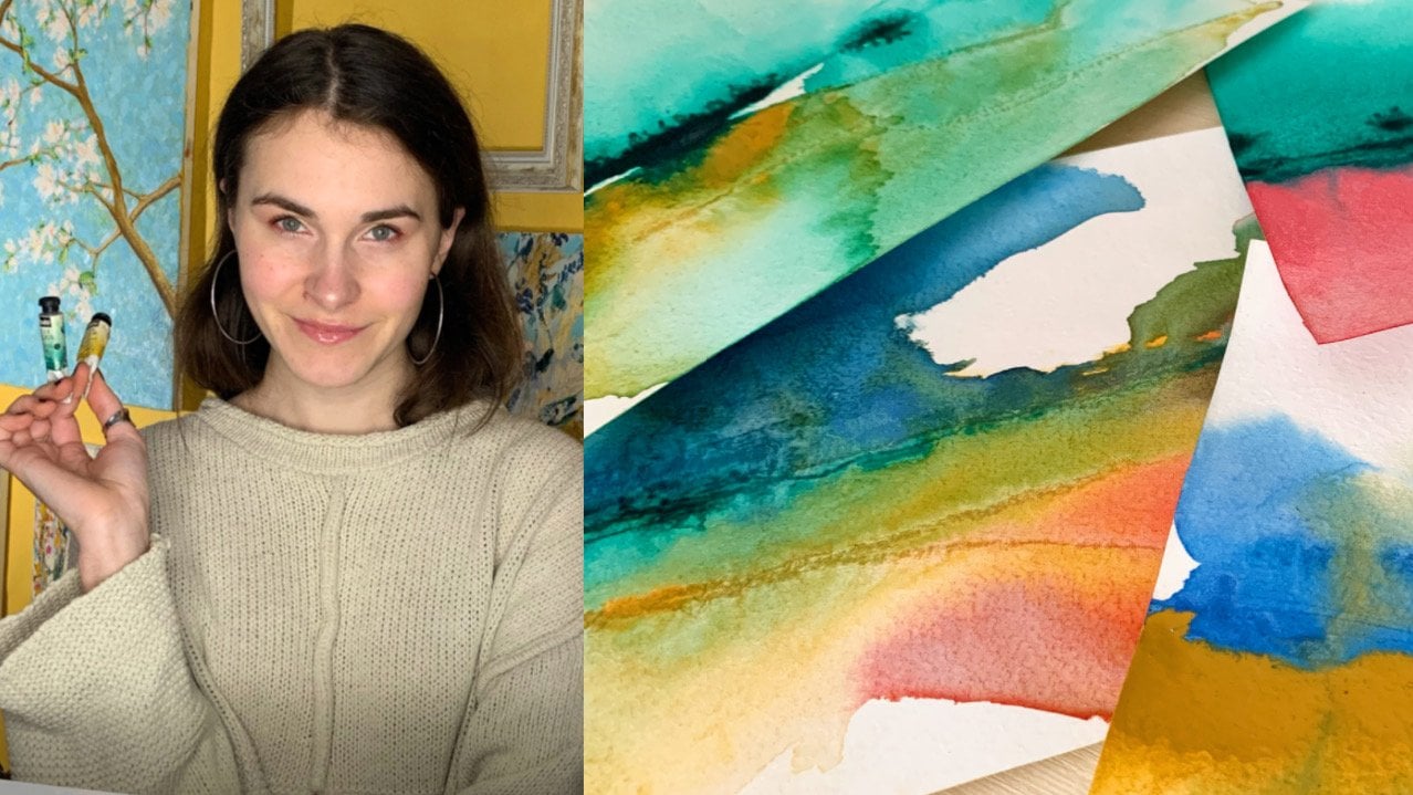
2. Tools and Materials: watercolor paint comes in pans or tubes is the same paint. It's just that the paints in pounds have been dried into hard cakes during the manufacturing process, and the paints in tubes haven't panzar portable quicker, and there's less waste. They usually come in plastic or metal boxes, which keep the pans and nicely arranged. The boxes double up as a palette for mixing colors. It's also easier to control how much pigment is being mixed with your water tubes, a useful When you're working with larger volumes of paint, you will need a palette. If you're working with tubes, A palette is somewhere to mix your colors. Pallets come in a wide variety of shapes and sizes. If you squeeze out more paint than New Year's and you don't clean off your palate, you can still use the paint later. It will harden when dry and can be reactivated with water much like pan color. The brush is the primary tool in watercolor and is at the center of everything you do. It carries the wards to the pigment, controls the concentration of the washing the palate, delivers the paint to the paper on, then becomes the conductor of your imagination. The choice of brushes is overwhelming. There are different shapes, different sizes and different bristles. But I recommend getting to know just one or two brushes well, rather than having a wide selection of brushes that you very rarely use. The best all round brush is around. It should have a full belly to hold a large amount of liquid, either water or dilute color. And it should come to a fine point of the tip, giving you the ability to paint a fine line as well as abroad. Wash of color. A water brush is unlike any other brush. It consists of familiar looking bristles at one end. But the handle isn't solid. It's a reservoir designed to hold water. The two bits screwed together on the clip on cap stops the water leaking out. When it's not in use, water seeps down into the bristles and keeps them permanently moist and damp. But to get more water, you just squeeze the handle to increase the flow. Water brush eliminates the need for a separate container of water, making it really useful for painting on location. Watercolor paper is treated to absorb more water than ordinary paper. Good watercolor paper is strong, versatile and can enhance the appearance of your painting. The surface could be smooth, known as hot pressed. Meaning is being pressed smooth between hot metal rollers. Alternative with surface could be textured, known as cold pressed or sometimes not, paper. This surface allows for a little texture in your work. The pigment will sink and settle it in the dimples of the surface, and pleasing visual effects can occur. We're brush marks, skipped and break over the texted surface kitchen roll invaluable for dubbing excess paint from your brush, wiping off your palate and even creating marks in your artwork. And finally, watercolors. Magic ingredient Water. There's only one type and it's freely available.
3. Project: Discover Your Colours: the first thing to do is find your colors. Watercolor is a translucent medium. It's only when light travels through it on bounces off the white paper. It reveals its true color. So a block of watercolor in a pan gives no indication of its true color. We need to make a swatch card. Ah, handy reference chart of the actual colors that we have to work with. Start by cutting out a piece of watercolor paper slightly smaller than your pink box. You're going to put this inside your paint box to use as a handy reference. Now draw out as many squares as you have pans. Use a pen with waterproofing. That's ink that's not going to wrong. When you paint over it, mix up a rich brush full of liquid watercolor and in the square that corresponds to the pan in your tray. Paint in one of the corners, then clean your brush and in the opposite corner, paint with clear water and bring it up to meet the color. It's a good idea to have two jars of water, one for cleaning your brush and the other as a source of clean water. The pain will run into the Clearwater and create a gradual transition from full strength color to its pay list. Hugh, if you paint over the edges of the square, this will also give you an indication of how transparent the painters do this for every color, and you'll have a swatch card describing the true colors in your paint box. It's just important to do this for your tubes of water color, too.
4. Mixing Paint: The very first thing we need to learn to control is the amount of water and color in our brush, the control of water to pigment ratio. That's how concentrated and intense, or how dilute and pale your calories is at the heart of watercolor painting. When I did my brushing, the water lifted out. It's saturated water has flooded into the bristles on is hanging in there. Let's take this water to the palate. Whether your watercolor is from a tube or in a pan, that paint is going nowhere without water. When I have a much waters I need, I can start to at the pigment, the pigment immediately colors the water and creates a dilute wash. If I want to paint with this wash, it would give me a very pale color. To increase the intensity of the color, I returned to my pigment and increase the concentration of the wash more. I scribbled the pigment and mix it into the wash, the stronger and more intense the color of the paint. I'm going to paint squares of color from the lightest to the darkest and to the lightest again, and I'm going to do this by varying the water to pigment ratio. In my brush for the first square, there's a lot of water and very little pigment. This gives me the pay list of tones. It's surprising how little pigment you need to create a very delicate wash of color. Now, for my next square notice that I'm not going back to my jar of water, I'm going back to the palate and having more pigment to the existing wash for each square. I'm increasing the pigment toe water ratio. - Yeah , now I'm reaching full color intensity. The war she's getting very slightly thicker is turning from the consistency of water to the consistency of milk. The changes very subtle, but it tells me that the concentration of pigment to water is at maximum. If I were to add more pigment, the wash would begin to lose its translucent sea on. The vibrancy and intensity of the color would be diminished. Now that I've painted my darkest square, I want to start to lighten my color again. My brush in my palette both have high pigment to water ratio mixes, so I'm going back to my water to remove some of the pigment from my brush on, dilute the intensity of the color. So I did my brushing the water on dab off the excess water on my cloth. The color of the square is paler. Now I'm adding water and removing pigment. I'm not going back to the palate for each lighter square. I'm dipping and dabbing every time, diluting the pigment that remains in the brush. Adding more water to make the color pain thing is a fabulous exercise to develop your color control skills. Of course, you can adjust the paint squares on your paper. If they are too dark, lift off some of the paint with your brush. If you dipped and dabbed too enthusiastically, go back to the palate for more paint. I recommend you try this with a wide range of your pigments. It will help you to get to know your colors, but more importantly, you are learning how to control the pigment to water ratio in your brush. On. Consequently, the amount and strength of color you're putting on your paper. You'll soon be doing this automatically without thinking
5. The Flat Wash: you might find you never need to paint perfectly flat watercolor wash. But it's a useful technique to know on a good way, to begin to understand the behavior of all car. As I'm making a substantial puddle of color, I'm using a per pet to deliver water to the palate. The golden rule of a flat wash is mixing off color. You need to do a flat washing. Wong go without stopping. If you stop, perhaps to mix more paint, you'll find marks appearing in your what will no longer be a flat wash. Always mix more pain than you think you'll need, because I guarantee you will run out halfway through. If you don't, I'm gonna fill this rectangle with a perfectly flat wash. For this first example, I'm going to tilt my paper. I've taped it to a bit of cardboard, and I'm going to prop it on this box so the surface slopes at a shallow angle. This will allow the water cover to run there. I loaded my brush and paint a strip of color of the top. Then I go back to my palette and I deliver more paint to the paper and then again until I have a band of color on the paper on a long beat of liquid paint that is formed along the bottom edge. Then it's simply a case of leading this bead of water. Cover down the paper with my brush, adding more paint from the palate as I traveled down the paper. It's vital to keep this beat of paint. Moving is the leading edge of the wash, and if I were to stop and let it dry, it would leave a mark. As the bead descends down the paper, it leaves behind it a beautifully flat tone of color with no brush marks on. Hopefully, no marks of any kind on reaching the end of the area. I want to paint. I drive my brush and suck up what's left of the bead, because if I left it, it would dry darker than the rest of the wash. You can't bring to flat wash on a horizontal surface. I'll draw another rectangle with some shapes inside it to paint around, because I want to show you the importance of keeping the leading edge moving. I start again with a generous wash of color in a corner and begin my journey because the papers now horizontal. There is no bead of watercolor forming a longer bottom edge, so I'm using my brush to spread the wash around. But what is crucial is that I keep the leading edge moving, working around the shapes. I can have several leading edges at the same time, and it's essential that I keep them on the move before they dry. Otherwise, they leave a mark for the final example. I'm not going to keep my leading edge moving. I'm going to cut in around the shapes like I was decorating a room, cutting in around the ceiling door frames and light switches on their filling in the walls . But as you can see the dried edges in watercolor, leave a hard line. On the second wash over a dry tone darkens the color, so to recap. For a perfectly flat wash, lead a beat of liquid water, color down and angled surface to paint a flat wash on a horizontal surface. Keep the leading edge moving along the time. Let the leading edge dry and you'll be left with watermarks and hard edges
6. Project: Shooting Stars: Ah, a graded wash and edge control. The ability to soften the edges of a color is a vital technique to muster, so practice this until you're confident with your technique. These stars are in the resource below. Print them off onto your watercolor paper. Fill the first star with good, strong color. Remember to work quickly to prevent your leading edge from leaving a mark. Then, instead of returning to the palate with your brush, dip it in the water to dilute the color in it. On dab off the excess on your kitchen thin continued down the tail of the star. Continue dipping the brushing the water each time, further diluting the color until the final brushstrokes are with clear water. Everyone's paint on paper will behave and react differently in this process, so it's important to practice and experiment with the materials and tools you use the most . No way
7. Wet in Wet: I put down this wash of yellow earlier, and it's dry when I paint over it. With this red, you could see the edges are crisp and hard. Now I'm going to do the same, but this time paint the red while the yellow is still wet, this time depending on how wet the lower layer of paint is. The color diffusers and the edges are soft and fuzzy and unpredictable. This is painting wet in wet is when watercolor comes out to play right in what could be paint onto Clearwater. It could be paint onto wet paint, or it could be clear water going into wet paint. Three amount of liquid on the paper is critical when painting wetting wet because the pigment behaves differently, depending on how wet the surfaces. I'm coating this paper. Take to a piece of board with clear water This stage Eichel. Shiny, wet. The water is only being put on the paper for a few seconds and is not yet soaked in. When I dropped pigment into shiny wet, it will wander off across the surface, with the water carrying the color in swirls and waves after a while, depending on the amount of water on the type of paper. The temperature on the atmosphere, shiny wet, becomes sheen wet. There is no longer any liquid sitting on the surface of the paper. It is soaked into the fiber of the paper. Now, when I had paint, it no longer flows around on the surface but moves within the paper. What happens is beautifully unpredictable. Different pigments behave differently with different papers, but the end result will be abstract fractals and gentle rainbow Grady INTs of color sheen wet is also the time to avoid or create blooms or backgrounds. A bloom occurs when liquid runs into existing pigment and pushes it aside, creating a tide mark of color to create a bloom. There needs to be more liquid in the brush than where you are going to paint the liquid in the brush. Cumbie, Clearwater or liquid paint. The liquid will want to push into the dryer area, and in doing so will pick up and carry pigment with it. It's an effect that can take quite a while To appear. Blooms often happen accidentally and conspire oil, an area intended to be flat color. However, they have a beauty all of their own and can often enhance a painting having a sense of liveliness and spontaneity. Because painting wet in wet softens the edges of ward color, it's often easier to paint washes onto a wet surface, wet in wet, combined with graded washes and the occasional bloom concrete's effective skies and seas and soft areas of toe to suggest, amongst other things, distance in a landscape way .
8. Edge Control: way down a wash of water. Dry paper. The edge is a hard and crisp. Even if I had more paint, it will still stay within the boundaries of the original wash. But what if I don't want a hard edge? What if I want to? Soft edge fading too transparent. We've already discovered that if we leave the edge of a wash to dry, it leaves a hard edged mark. So I'm now rinsing my brush and dabbing off the excess water. Then I'm going to start painting with my wet brush away from the edge of the existing wash on the move towards it. This creates a bed of moisture so that when I reach my color, it's happy to flow into that moisture and create a soft edge. It's important to practice this a lot. Being able to control the quality of the edges in your painting is one of the most important watercolor techniques to here. I've been a little slow on the edge of the original wash, speaking to dry and has created a hard edged mark, but with a little scrubbing with my brush, I'm able to reactivate the paint and rescue the soft edge. Once you've got the hang of soft edges, you'll be able to create gentle transitions from light to dark. Things can create rounded forms, curved surfaces on soft edged shadows. Scaling this technique up produces the graded wash, where the color gradually becomes lighter over a larger area. This is a similar technique to creating a flat wash, but instead of returning to the palate for more paint, we dip into clean water to dilute the paint already in the brush. This is the pigment water ratio control. Again, we're simply reducing the concentration of the pigment as the wash becomes lighter. But instead of painting, individual squares were blending the tones together to create a graded wash. A very gay to wash is where one color gradually changes into another. The process is more or less the same as a graded wash. But instead of diluting the color with clean water, we use a different color half both colors ready mixed in your palate. Start with the first color on gradually at the second color to the mix, gradually using Maura Maura of the second cover. Until the color changes complete things technique can produce beautiful skies and seas way
9. Project: Leaf: find yourself a leaf from somewhere has painted using the wet in what technique when painting wet in wet watercolor will never go beyond the boundaries of the initial wash. So I'm making my initial wash leaf shaped safe in the knowledge that all consequent colors that I add will stay within this shape, scoring the paper to create the veins of the leaf. The liquid color runs in creating a final line than could ever be painted with a brush. If the surface becomes to liquid, I dry off my brush and touch it into the puddle. Capillary action draws the excess liquid into the brush. Controlling water color means removing paint as well as adding it and gradually build up a rich collection of color, each one mingling with the liquid color beneath it that your leaf dry naturally for the best wet in wet effects.
10. Glazing: glazing is the layering of watercolor. Because watercolor is translucent, we can imagine watercolor to be like colored glass. Stacking layers of colored glass will dark Um, whatever you are looking at through it, glazing in watercolor is exactly the same principle, so adding layers of watercolor will add up to darker and darker shades. When we paint the same color twice or more, one layer over another, the color becomes darker. It's important to remember that the underlying watercolor has to be perfectly dry for glazing toe work. Weaken glaze with different colors. Glazing over this red with green dulls down the intensity of the red and creates a pleasing shadow. On glazing can create new colors. Layering watercolor means Not only do the shades get darker, the covers blend so an underlying red glazed with blue creates a violent. The same red glazed with yellow creates an orange. Underlying blue glazed with yellow creates a green on the same blue, please, with red creates another certainly different violent. The combinations are endless way, way
11. Developing Brushstrokes: So far we've been using the brushes, paint and water delivery system, but with a little practice, the brush can become a magic wand capable of describing bold and expressive gestures. This is a simple round brush, which comes to a good point at the tip because of this is capable of painting a fine line. The secret to this control is resting the side of your hand on the paper. I'm not just moving your fingers or your wrist, but moving your whole arm from the elbow when you've practiced on, Got the hang of this. Paint the same line in the same way, but this time, rotate your wrist to press down the belly of the brush onto the paper, right up to the feral so that the bristle splay out and deliver abroad. Wash of color. Keep your hand and arm relaxed in your movements smooth and even the more relaxed and confident you are, the more spontaneous and attractive your brush strokes will appear. This one simple brush technique opens up a whole world expressive watercolor painting way, way, way
12. Other Techniques: eyes possible to create a range of textures and mortar color that aren't achievable by using a simple brush. So here are a few techniques using simple household items to achieve a variety of different and exciting textures. Follow along with the lesson, and you will create a useful document to refer back to in the future. Separate your picture into six areas with masking tape. We're going to explore six different techniques. I'm using a water brush to mix my paint their quick, tough and easy to use. Fill the first square with bright liquid color. This is Cling film While the wash is still wet, I'm layering on the Cling film and scrunching it up. This is allowing the liquid paint to flow into the creases and crevices formed by the crinkled cling film. You can see the effect this is having on the paint, and you have a few seconds to manipulate the film to get an effect. You like the look off, then leave it to dry next square on another wash of color. This time I'm using salt. There are different types of salt. There are salt flakes, but I found that a better option is good old fashioned table salt. As the salt falls onto the liquid color, the salt crystals soak up the color surrounding them. This creates a little moment of thinner paint around each crystal on a patch of more intense car, where the crystal six again leave it to dry. Next, What's resist? This is a wax candle, and I'm drawing on the paper with the candle. I can't really see where I've bean, so I'm drawing blind and the effect is going to be unpredictable. Another option, which would have a similar effect. His wife's crying, but of course, that would leave a color where I've drawn on the paper. The wax resists and repels the watercolor, leaving patches of white paper showing through. This is pure alcohol. I'm spattering it into wet paint. Using my brush, you could use a toothbrush or an eye drop off a greater effect. Who just dubbed the alcohol on with the brush where the drops land? The alcohol repels the paint in a very distinctive way, creating the unique fossil stone fact. Sometimes the desired effect can be achieved by scratching and scoring into a wet surface with a knife with sharpened end of a paintbrush handle or a credit card. This makes grooves in the paper into which the paint can flow, creating a darker line. Another useful tool is the depend. Load up the underside of the nib with paint on draw, then it produces a wonderfully organic line. The credit card might not be an obvious watercolor tool, but it creates a very individual mark that couldn't be made any other way. A sponge also creates a unique effect. Make sure you wet it first, then dubbed the sponge into the paint and print with it. Make sure you keep rotating this spot so that the marks don't appear regular uniforms and try different fabrics to print with, for example, a piece of flannel or a bit of Gore's. Now the paint into the Cling film has dried. I can peel it off. What's revealed is a paint effect that could resemble a choppy sea. Paint beneath the salt is also dry on. The salt can be rubbed off. This is an effect that adds interest to another wise flat wash. Now remove the masking tape right beneath each one. Just what it wants that created this fabulous texture
13. Project: Pebble: Let's try out some of these techniques in a picture. We'll paint some pebbles. We know what pebbles look like, so we don't need a reference photo. Just sketch out a handful of loose overalls. This exercise is about creating texture. I'm starting with. The candle is a white resist on just some of the pebbles are putting down a loose week color wash to create a wet in wet environment. So now when I go in with further stronger color, the edges are going to mingle. Blend. - The darker colors are going to describe the gaps between the pebbles on the shadows, which defined the shapes on these freshly painted areas. I'm sprinkling salt because watercolor is an additive medium, which means that every time you add it, it gets darker. I'm still applying color into the holes and crevices between the pebbles. With every addition of color, the's shadows become gradually darker. On this area. I'm applying Cling film. I'm trying to treat each pebble differently, giving each pebble a different character, and I'm working all over the painting, building up a rich tapestry of different textures. Okay,
14. A Quick Look at Colour: Ah, diagram of this killer whale is in the resources below. Print it out onto watercolor paper and paint this for yourself. Keep it is a useful reference. Mix up ample washes of the three primary colors red, yellow and blue. They're called the primary colors because they can't be made with mixtures of any other pigments. Paint the three primaries in the segments is shown leaving three segments between each one . Paint thes segments is graded washes. It is good practice. Transfer some of your yellow to another part of your palate. Another tiny stab of red. The yellow will begin to take on an orange tinge. Paint this color in the section beside the yellow, heading towards the red. Now add a little more red, creating a true orange and paint the next segment. Then add a little more red and paint the third segment. You are aiming to make a three stage transition from the yellow to the red. Clean your brush and transfer some more yellow. Make a little more, if necessary, Tune of the part of your palate. This time at the tiniest double blue, the yellow will take on a green tinge. Do the same as you did with the red and make a transition from yellow through green to blue . Now transfer some red to another part of your palate and add a small amount of blue. It will take on a violet tinge again. Keep having a little more blue to the red on paint each segment towards the blue. Yeah, you have created the three secondary colors orange green on violent. Your colors may not look the same as this as there are several types of red, yellow and blue pigments, which makes to produce different shades of orange, green and violent. Let's look a complementary colors. Complementary colors are pairs of colors positioned opposite each other on the color wheel , so in fact, the secondary colors you've created the orange, the green and the violet. Other complementary colors to the primaries, the red, the blue on the yellow. When complementary colors are placed together, they make each other appear brighter and more vivid power. See what I mean? However, when complementary colors are mixed together, either in the palate, wet in wet or by glazing complementary colors, cancel each other out and produce a neutral gray. This is really useful knowledge when painting with water color. If you have a color that is too bright or you want to darken it with shadow, simply add it's complimentary color.
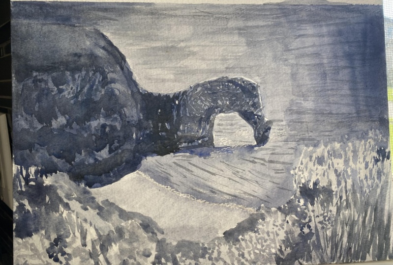
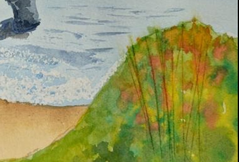
15. Final Project: Landscape: thing is a picture of the coast where I live in Dorset, England is in the resource bill. We're going to paint it, but we're not going to be a sleeve to our reference. We're going to use it as our subject, but only is a starting point, Really. Firstly, I likely sketch out the basic shapes so likely you probably can't even see it. But there's a horizon line the position of the rock formation on the curve of the foreground. I'm going to drop in a sky first, and I'm wetting the area with clean water. I'm painting the sky wet in wet. I mix up a suitable blue and grab some kitchen roll. I'm going to dab in some clams with this Theun I paint in a soft wash. Painting wet in wet means my brush strokes disappear. I had a little more color at the top. A skies generally get lighter towards the horizon. Kitchen lifts off the color and creates pleasing random clouds. Uh, while the surface is still wet, I can drop in a little more color and play with the edges of the clouds with clean water, softening them here and there. Okay, onto the sea. I'm doing that Wetting wet, too. By the shore. I'm rubbing a little candle wax. I'm hoping that this will repel the paint and leave a few flecks of white paper showing through. Now I mix up a slightly different blue on painted in. It looks a little strong here, so I diving with kitchen roll and brush to lift off some of the color way. In what way? Wax resisting the color of the shore way on, mixing up some color for the rock formation. Theme colors are particularly accurate, but like I said, we're not slaves to our reference photo on this painting is all about popping some cling film on top to create a bit of texture. Uh, for the foreground, I'm starting with a bright green yellow again as a wet base to drop in further color, wet in wet. Here, I'm adding the suggestion of grasses by scoring the surface with the edge of a credit card and then charging in with dark colors on letting the colors mingle. Painting with watercolors is as much about taking paint off is putting it on spattering with neat alcohol can create more variety way that I'm continuing to build up new marks on different colors. Uh, where too much liquid has accumulated on the paper. The best way to remove it is to dry off your brush and touch the tip into the bottle. Capillary action will draw up the liquid without disrupting the painting, which is what would happen if you tried to dab off the poodle with tissue or kitchen roll. Now things have dried off. I can remove the Cling film on that further detail by glazing over the painting with the watercolor dry, we're no longer painting wet on wet. The surface is dry, so our brush strokes have clean, crisp edges. - Ways in the distant landmarks on the horizon on dab it back to both lessen its intensity. Add a little textural interest. - The final touch. I'm dragging the belly oven almost dry brush along the sea, allowing little flecks of color to catch the texture of the paper. Just to suggest the surface of the water way, way
16. Final Thoughts: you've probably discovered that watercolors not so much a skill that is taught more a skill that he's learned. I think that's very true. It's a relationship between you and the materials that takes time, patience in practice to develop a mature. So take what you've learned from these lessons I make the mural way.
17. Bonus Demo: I've been drawing the view from my bedrooms for a long time now. It's generated quite a nice record of all the places that I've lived, but I'm not the only one either. Look at fabulous artists like Eric Rebellious on Stanley Spencer. They like a view from the bedroom window. His view from my bedroom window at the moment. I'm looking down on a small lawn garden, shed a hedge on some houses beyond. I'm not trying to accurately record everything that I can see. I'm just using this as a springboard to make a painting right. This is what I'm going to be using. I'm going to be using a pencil two brushes, a tray of water color because he's hard to assess the color of a watercolor. While it's in a solid oh, peak block in the train, it's important to make a swatch card. The color of water color is only apparent when light passes through it. It's the white of the paper on reflects Back into your eye. I've got a couple of jobs of water on a sheet of watercolor paper blocking food. 300 ground cold press. If you want to be nerdy, It's also important to understand that this is just the way I'm doing it. It's certainly not the only way. There is no right or wrong way to paint to draw. Finding out what you and only you can do is off the phone. I start out by sketching out the big shapes. There are many Hench shed vents house just a few very rough guidelines. Now I want to get some liquid color. I'm using a variety of yellows and greens for the foliage. I'm using a little terra cotta for the break of the house and agree for the shed on defense . Getting a washed down like this soaks the paper, which means I can now start to paint wet in wet. This means that when I had more color, it flows into the existing paint. A mingles into the existing color. This creates wonderful on unexpected results, soft edges, back rooms and blooms way. I use a tissue to mop out to tree trunk that I've forgotten to avoid with paint on the wrong end of my pencil to score in the Washington. I'm moving around the picture, not staying in one place long enough to get bored just enduring playing around with the paint because, curiously, that playfulness shows in the finished painting here and there. I'm using a brush stroke, but a lot of the time I'm what's called charging in simply dotting in concentrated color with my brush and letting the paint to the work. I'm also scratching, scoring, wiping and dappy way way. - When that initial washing paint is dry, I'm grabbing a handful of pens. This is a water brush field within dilute to gray black ink pens of various thicknesses, a propelling pencil, a white gel pen. And so anything goes. I'm exploring Mark making possibilities. I'm looking for visual approximations, just suggesting textures here and there and leaving the rest to the viewer's imagination way. I think I'm nearly Don't I pick up my paints again and using this smaller brush at a few spots of extra cover here and there. Way
 Martin Thompson MA(RCA), Art is for everyone.