Transcripts
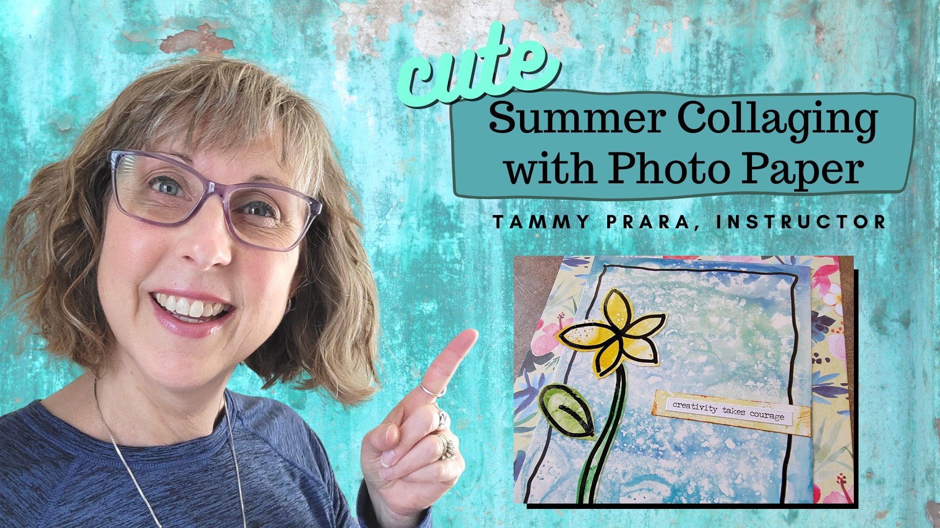
1. Welcome to Collage: Hi friends, it's Tammy Prara, and thank you for
joining me today. Today's class is collage, taking something old and
creating something new. Like last year's calendar. I was inspired when I was taking down my calendar and
putting the new one up to try something creative with that new found materials. I love collage. I'm an artists on Instagram actually
finds joy in sharing simple projects and by encouraging others,
learning new skills. And I love it when they share their projects and their talent. In this class, I will
help demystify collage by sharing my take on what
makes a harmonious piece. I'll discuss layering, color
theory and placement unity. To create a simple collage. Students will use these
concepts and then go on to create a class project
of their own collage. And maybe a step
further and create a monthly desk calendar by using last year's calendar.
Collage is about taking something old and re-imagining it
into something new. I use this artistic
style to make cards and tags and motivational
magnets and bookmarks. My hope is that
students will make collage part of their
artistic journey. And that by taking this class, you will have the skills to have something you can
be really proud of. So stay with me as we
dive into collage.
2. Class Project: Class Project is for you to
create your own collage. Remember the three layers, background, midground,
and focal point. And don't forget text. Plus think about the color
harmony and placement, unity to create a very
pleasing collage. If you want to go to
the next step and create a desktop calendar, take your supplies from last year's calendar and be sure to print out
the mini calendar. Those things can be found
in the resource section. Decide if you're going to create your own focal point or find
one in your materials. Enjoy the process,
and please share this in the project
section of the class. Other students would
love to see your work. As do I. We all learn
from each other. I can't wait to see
what you've created.
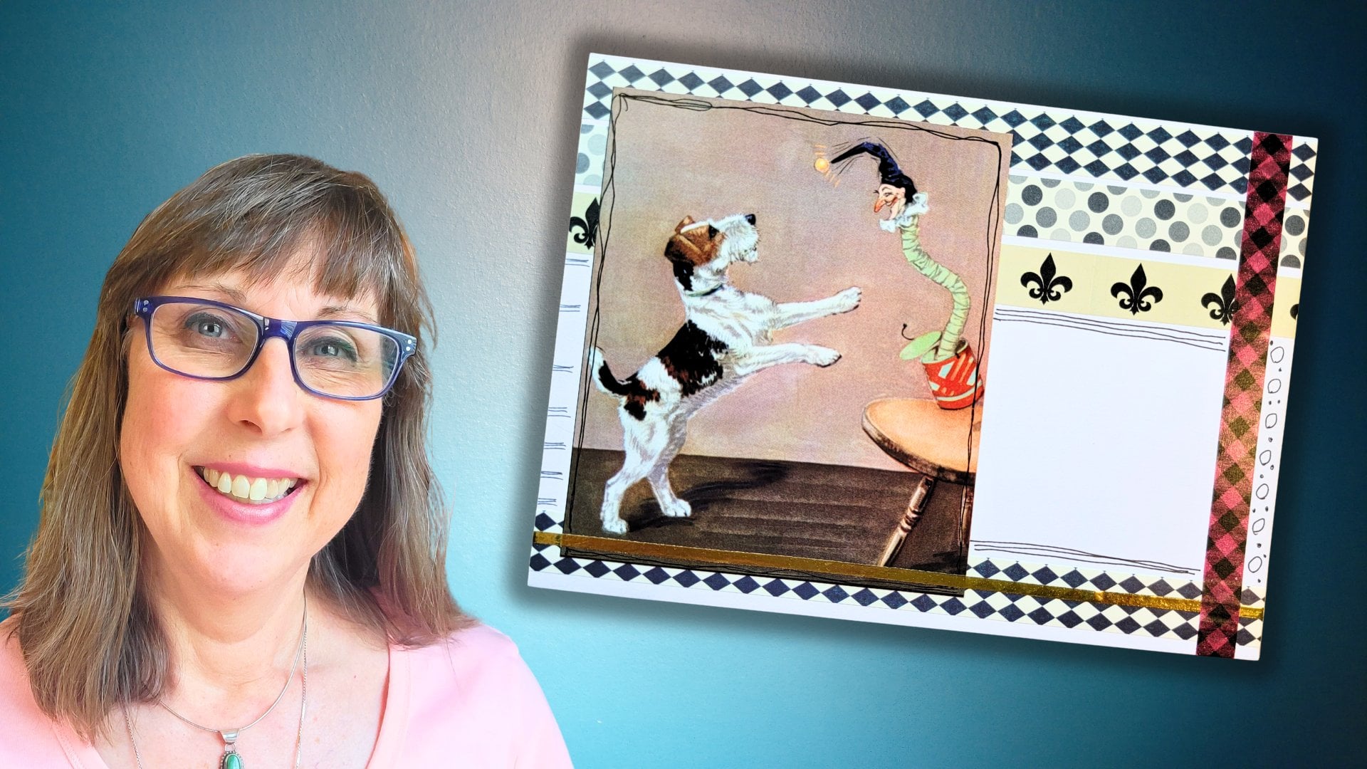
3. Collage Supplies: The supplies for the
class are actually fairly simple, paper and glue. But besides that, what
I used specifically in this class included things
like a color wheel. If you're looking
for a color wheel, you can find that in
the resource section. I also have patterns and
examples for focal point. That's also in the
resource section. At one point, I even
use a craft knife and a cutting mat just
for one fine detail, but you might find
that helpful as well. A ballpoint pen, a fine sharpie. And I really like a Fudenosuke soft
tip pen, card stock in case you want to make your
own rule of thirds card. And don't forget
your calendar and maybe some junk mail
to help you along as you're making
your desk calendars. If you are looking for a stand
to place your calendar on, you can find that in the
resource section as well. I've made these cards
using calendar pages and I wanted to share what
it was that I used. One was the cover. The cover of a
calendar is generally a heavier weight paper than
the pages of your calendar. These are like then
magazine pages and this has a little
heavier weight. This calendar was
full of nature, tons of color of nature, big, bold blocks of color. And we'll talk more about why. This is a great way to go. These micro images are fun. That's where you can see I used my birdie came straight
out of that leaf. What if you don't have a
calendar that's like that? What if you have one
that's more full of words? The images are big, the words are big. The same concept. We're going to use the cover. It's a heavier weight paper. And the inside pages to be our focal points and our text
and our background colors. So I'm going to
show you how we can use different elements out of a calendar like this and using found words to put on our cards. So it doesn't matter which
calendar you style you have. We're going to make one of each.
4. Collage Basics: I want to share a concept with you known as the rule of thirds. And it has to do
with where and why I placed certain
elements on my collage. It helps create a very
harmonious look on your page. And to do that, I'm
going to demonstrate with a four by six card. I know it's 6 inches. And to do the rule of thirds, I'm going to mark
this in thirds. Now this is an
unconventional way to use my paper trimmer. I've marked it at 2 " and I'm marking it
at the four-inch line. And we do the same this way. My card is 4 ". And so to do a third, I'm going to guesstimate because I'm not doing that math
in my head very well. We're going to come in past 1 inch. So one and a quarter and
two and three-quarters. So like I said, two and three-quarters
about here. And one and a quarter
is about here. And I'm going to call that good enough to demonstrate my point. The rule of thirds has to do with these very
special locations. In a picture. If we compare my bird placement, my text placement, it really does come into
this focal area. The same with going long way. If I take these elements, I can see my bird rests and
here my calendars about here, my words are a little high. But I compensated for the bird. I do have about a half
an inch down here, half an inch up here. That kinda helped
with some balance. But you can see how
the rule of thirds and placing everything and
about those areas, it makes a more pleasing
look to a collage. Another area of deciding how to create a collage is
this color harmony. Now, I actually made these two cards without
consulting my color wheel. I just went with what I
felt looked well together, wanting to make my next collage, I decided, you know, what, what is it? How can I describe this exactly? Why does this color
work well together? And I went for my color wheel. It's a two-sided color wheel
called a pocket color wheel. And what I found was, if I look up orange on one
side of my color wheel, it shares words like complimentary colors
that are opposite. Colors that are analogous, that they're all on the
same side of a color wheel. These are analogous
colors, warms and cools. They're grouped on one
side of your color wheel. There's another concept about complimentary is
something called split. Complimentary. I can have orange, but something in the
blue violet range plus a blue-green range
works well with orange. And then there's a triad. Orange can work well with violet and work well with green. And here I did orange and green. It actually came from
the triad of colors. Isn't that interesting? I have this color and it
has an orange, red orange. I really think yellow, orange fits this gold color on the rocks of my
background paper. And I bring my arrow pointing
at that yellow, orange. The complimentary color straight
across is a blue violet. And look how this
blue violet and this bird are a great match. And then where did this
pop of purple come in? This red violet. That's actually part of
the triad for yellow, orange, red violet
fits right in there. Kind of in-between, maybe. Yeah. There's that color right there. Intuitively, I liked
this color combination, but there's proof of why these certain colors look
and work well together. So if you have a color wheel, you might be able to check
before you glue down, is this really going to
work well or are my eyes tricking me or I'm
just not comfortable, I'm not positive of my
skills and matching colors. A color wheel can
be very helpful.
5. Creating the Focal Point: One of the ideas is to have
an element, a focal point, something fun to add to our collage that might make a great looking
house and a flower pot. I'm going to save this
right over this section. Just cut it out like
this is my pattern. Keep the edge, don't keep
the edge. It's up to you. This is our bit of collage that's going
on the card stock. So we can save that up and glue them all down at the same time. Another one, oh sorry, mushroom. But to me like we try that. I even have a scrap big enough. Okay. So I'm just going to hold
it here and cut that out. One thing about a mushroom
is you could make it a two-part collage cut the cap
with one piece of paper, base with another piece. Here's my two others. My little bird and a flower pot. My little birdie. Let's see, up here on the right,
I think up here. And I can even give
it a bit of a tilt. Saved some of my paper by just trimming
that off and I can still see my paper
holding them together. I'm giving it a trim. Now because this is a pattern. If you feel like this
bird is a bit too small, cut around the
pattern even larger. Just use it as a guideline. Let's give him a
fatter tummy it feel like. Isn't that sweet? My flower pot? and? Keep them all in green. one thing about
making your focal point first, is that it sets the tone for what colors
you're going to use. Because my bird need some legs. So I think I can make
him like that. Okay. And how about this? Alright, I'm gonna save that. I'm going to make sure
everybody has enough room. And let's glue. One reason I like this white
background, as you'll see, is we're going to
do all this straight on the paper and
then cut around it. I really like Fudenosuke pens because it has such
a flexible tip, I can do thick and thin lines. So I do want to
start with my bird. I'm going to give him his
legs, maybe something long. And his beak. Kinda like human noses. They can be as large or long. I thought it would be fun
to add a few curlicues. And I'm adding my sketchiness
on the white paper. Because this is glossy. The sad rule is,
these pencils smear. I'm going to use a ballpoint
pen on the magazine paper. A nice dark. There we go. Now, obviously, we could have done this
with a ballpoint pen. Like I said, I liked the thick and thin
lines of how a Fudenosuke works for
my potted plant. I really like having
some scratch marks, kinda give some character
to that potted plant. And the lip of my pot. I want it to show up and we can
etch Scratch around our pot. What about our house? One thing I want to add is a chimney or fireplace chimney. And then let's edge around this. You could detail out your
chimney with a bit of brick. We could do a door. Hopefully. If we trim out the
door and get that on, there, can be as big as we want. Cut them back. And let's get a
little glue on here. I do a colored roof also. Can't be this gray part. Oh, look at that. My little triangle works. Oh, and even larger than
the house. Why not? Now the cutting out. I think I will leave this
because I really liked the idea of flowers on top. Leaving a bit of white
really is a nice way of giving an outline
once it's on our card. Remember, I said it's always
a nice touch when you can put your own
fingerprints on a project. Bird here. That's great. I do think I want to leave
a bit more across the top. It gives me something to Glue or to doodle
on as the case may be coming along.
6. Calendar Card 1: Starting with my
nature calendar, the first thing I want to do
is cut a piece of the cover. My desk cards are four by six. So let's take a bit of this. Actually, I want
to trim this edge because it was not straight. I do want to make sure
I have a straight page, but let's save this. You never know. 4 " this way, because I want to save
these little squares, they might come in handy. So here's my four-inch. And then by six inch. Let's take that. Now this is going to
be our substrate. That means the piece of the collage that we're
applying everything to. And I'm going to
flip through these and talk about my
background color, what that might look like. That's really beautiful,
that little corner there. what's being
drawn to your eye? Maybe this green, I
do like the shadow. We look for a background. If you can see that this is in shadow where this
is in sharp focus, this would be a
great background. This is also in shadow that
might look really nice. That dapple defect, choosing the color of your background, then sets the stage for
using your color wheel. What's going to compliment it? Or are you going to have
something harmonious and color? If you took this
section right here, you could have a
very neutral palette and maybe one pop of color, green and blue right here. And I'm going to
cut a piece just for our background layer, going to make it just a
bit larger than my card. So I have it at 4 and an eight. And then I'm going to trim it to over 6 " six and an eighth. Now let's look at
this color wheel and discuss what it is we
really see here a yellow, green, bright
green, blue greens. So a more harmonious
color palette would be sticking with yellow, maybe a gold, yellow,
orange color. I think I'm going to focus
on the blues and greens, make yellow my focal point. So with that in mind, I'm going to go
through my images again and pull out pieces
that I really like. As you can see, I've
settled on a few colors. This is junk mail
and it really fits this yellow, yellow, orange. It's in here with my greens. So that could be a
really great pop. Maybe my mid layer, I have, um, some reds. Here's the goal of the
leaves, some gold, orange, and this very neutral black, that might be a really good
background element for words. Here is this nice orange
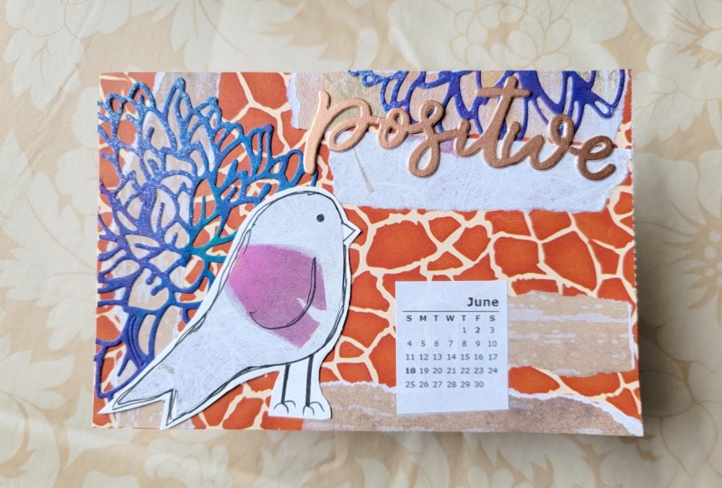
and yellow of the sunset. So using these colors, I want to make my focal point. I've decided to set my bird
on the brightest part of this yellow to go on my card
against that green and blue. So what I'm going to do
is now trim him out. I'm pointing him up here
close to more of a yellow. I'm getting away
from the sunspot. So I have lots of yellow on
my bird and start trimming. Now there's things I
really like about applying this lightweight paper
to some card stock. And that is, I can
cut out around and he will have an
outline already. Let's glue him down. Now this has been
trial and error, but I know for a fact only a ballpoint pen will
work on that glossy paper. So I'm going to put his IN. And bring out a very
loose idea of a wing. But then I can use a Tombow Fudenosuke and
do a sketchy outline. Let's get his legs and let's
see something like that. Extra long and wide and fat. And around. Let's put a beak on. I just really like the beak and white and
not part of the bird. And double lines tend to seem
much more sketchy to me. So that gives it a
really cool look. And now to cut this out as well, one thing I think looks nice
is to have that space right between his legs to have as much of the
background showing. If you have a craft
knife, you could do that. Cut very, very cleanly. Look how he pops
on their hidden, that bright and cheery. That is really nice. Now, even though my flowers are growing a certain
way, that's up to you. Now, another element you can use this junk mail
caption, some words. Big, benefit, big picture. Mighty. Mighty is a great word. Lots use that. This was a nature calendar. Nature might be a
great word to use, but it's huge, isn't it? You, we could write one. But something about mighty. And I chose May
for such a bright, cheery page for our
calendar. Mighty may. I thought that sounded clever. So I'm going to go
with that today. Do I want a torn paper? I think I like that torn look. Mighty may. Oh, yeah. I think that's cute. But it's tails large, so he's coming straight into
the middle of my page here. So mighty may, might
have to fit sideways. We haven't done our mid layer.
7. Calendar Card 1 Part II: We haven't done our mid layer, pulling up my color wheel and
seeing what I had so far. I have my yellow of the bird. And I really noticed because
my mighty was a navy blue. This came up under
split, complimentary. And so the other color I can use happened to be part
of our purple. And I saved that strip
because you never know. But this purple
works really well. So that looks cool. Now I had some strips
like this that I had saved working
on my other cards. Now remember it's from
the same calendar. I was trying to find
another element, maybe another blue in here
that might look great. Or this neutral. Caught my eye. Putting in some strips
cut of your paper and strips is such an
easy way to collage. I just love its simplicity, like making a woven pattern. I just think that's really cool. I might like my May because
it's white on the blue. But I don't mind
this this neutral running through here
though it looks good to kind of balances this
light on each side. Actually, I think I like this. So I'm going to
take a picture and remember my setup
before I glue down. Let's trim this off. Now. Before I get
too carried away. First off, we need to put
it on our background. So this was our substrate, remember, and this
was slightly larger. So I'm going to put in
lots of glue on here, making sure I go
straight to the edges. And in the middle, it's not the
heaviest card stock, but it will give
it some stability. And I think I want to do it this way because this is smaller, it will help me place
that more evenly. And I really liked
my scraper for making sure all the
glue gets on here. There we go. And I'm
going to trim this up. Now this was across the top. And I really think I'm going
to use some scratch paper. Don't end up gluing my entire go. That was up here, don't you think? There we go. And this came down the side. Good. This was across the bottom. Let's see. Do I
want a torn edge? Let's give it a torn edge. Well, I got a lot of
glue on that one. Go over here. My warm hand press, the famous warm hand press. Now, mighty, I liked
that mighty may idea. Layering. That mid layer just helps
give that highlight to our focal points. Simple, simple, simple. I especially like our bird
is looking forward to May. Now let's trim these off. And we haven't calendar page that will look
great on your desk.
8. Calendar Card 2: This calendar is one we're
going to start tearing into for our desktop collage. The first thing we're going
to do is take off this hover. We're going to keep
this as our substrate. We're going to use this as our cards that we're going
to lay collage on top. And I've been making
mine into four by six. Now one of the first things
I wanna do is take off this hole and we're going to
trim this off right away. I do not want that in
my card indefinitely. Save this. Never know when
you're going to need a little bit of white. I love this. I think
I may use that. Love the little things. This font is big enough, it should work really well. I do want to get my four by six out of this little
piece right here, caught it at 6 ". And I've already started
trimming the top. And here I have if we
make them two-sided, 2468 months worth already, and they will stack nicely
to set in our desk holders. One thing for the background, I really like this plane
textured background that might make a great background. Here's some very simple
flowers that would be very easy to cut out
as a focal point. These are fun. They were already
pre-cut for me. Maybe one of those big flowers, something you're looking for
is what's inspiring you. Is it the color palette? This would even make a nice focal point if you
love succulents and cactus. That's calling me right now. I think I like that. I really loved this page. I love text backgrounds that I think that's what
I want to use today. I am going to start
tearing into my calendar. I think that's really cute. But just in case I want this
flower, I may save that. Also. Let's start collecting
our elements and see where we go from there. Something I'm watching as I go about making the
background for my card. I want as much
neutral as I can and I kinda like this
blank space as well. If I had used this side, I'm cutting into
quite a bit of color. If I come over here, I have the slightest
amount of color. I think that will be just fine. So let's trim this out. I want to glue this
down and look, I trimmed at right at the four. I'm going to have to be extra, extra careful how I glue that, making sure I get all my
corners done really well. So this was the larger, so lay that down and lead
this so I can see my sides. Scooter. Scooter. Scooter. Come on now. Oh, good at Covered. Covered really well. Very nice. Let's try to get that glue
spread evenly as possible. My corners are good. I'm going to trim off my front. Actually thinking this way. I was looking at my
elements and really leaning towards maybe a more floral
instead of my succulent. The one reason is because
the succulent is really big. It really takes about half of my of my card, which is fine. A little word, a
little calendar. And we're practically good
to go and look at this one. If I find some
color to back that. Let's see what I have in
my junk mail collection. I have some orange and that's
a really heavy card stock. That navy looks beautiful. I think I'm going
to keep trimming, cleaning up that
extraneous background that was right next
to my succulent one. I have an idea for all this
spiny parts of my succulent. We're going to draw those n actually doodle on
our project here. So instead of crafting a bird, we can just do it all
straight on my succulent. Maybe loved the little
things, something like that. Boy, that Navy just really pops. So I am curious. How are we doing on
our color wheel? We've got a very pale
green, blue-green, navy. So we're looking
on the cool side and we have some neutrals. Pop of orange right there, that blue and yellow. Orange. So maybe a pop of orange whether just hit the
spot, this banner. And that might make
a great addition. Let's go with this. Mostly because most of that
greenery on the banner. Let's look here. Now. One of the things
I'm considering is my rule of thirds. We don't want it
too high to low. This, uh, June luck to
you and October Look, I'm gonna go with October. And overlapping my calendar. One reason is this
white is too close of a match of this
neutral back here. So maybe another leaf. Shall we add in another
leaf and see what we get? I'm not sure yet. Only because it's of
a different style. Now, it really needs
that blue behind, it. Needs that accent right there. And let's trim out this banner. You think really
needs to come down. I'm gonna take that green off. Maybe layer that way. Here we go. Here we go. I do think something
needs to come around. My love, the little things, maybe a black border. Let's get a picture. Let's start gluing down. My warm hand press. I'm going to trim my sides
with my messy scissors. This sharp is good, it's not going to smear. I want to add just a
bit of sketchiness. Putting some spines
on my barrel cactus. There's something about adding your touch to a piece,
your hand print. Now, I know for a fact we did make this completely original. Our own imagination
came together and made this writing on it. It's just something else. So there's our October calendar.
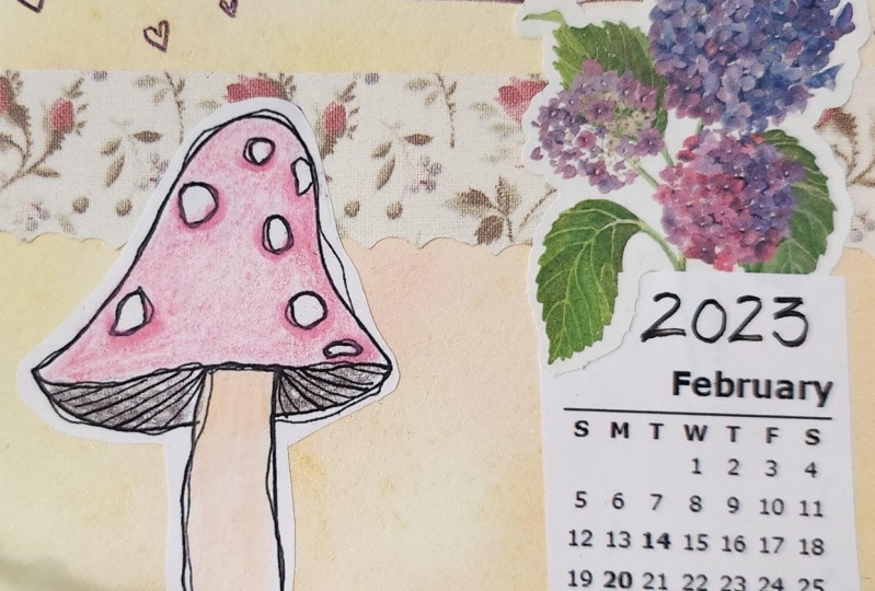
9. Calendar Card 3: To make this one last card using the elements we've
created today. I came across this
piece that's already cut and I thought that
is really striking. I do want to use that. And I decided to go with
my little flowerpot. One is because I'm
still in my cool zone. I know these colors will
work well together. I found the back of the calendar that has
the many pictures. I kinda settled on those two up having a couple of those
coming up out of the pot, I thought would be a good fit. So I'm going to lay my background
on my very first layer. One of the nice
things about using these calendar pages is there's so much
color and texture, you would have to do all these layers yourself to get the same
effect as this one. Photograph. This one was basically
cut perfectly. And I have not even going to
need to trim that at all. The green and blue are so dark. I think I'm going to put
it here on the white side. Well, my picture to be
obviously smaller than my pod. That's very true. Okay, So let's take this off. We don't need it after all that. I would like it to
maybe be in the pot. So I'm going to get a
craft knife and cut that. Needed not to the edge. I just want an opening. I think I got it. Very clever. So we need some
complimentary colors. Let's look in our stash. Something neutral
may maybe a brown. I'm leaning towards that. Let's cut was stripper
to and different widths. Let's see how we like that. I do, I do like that. I actually like the green
that popped up right here. In this light brown. Maybe even down there. Let's keep working. Turning and thinking. Now one of the reasons I
said I didn't want it and the blue this because I thought the colors
were too close. But if we add a background, our middle layer, that
should work well that way. The other thing I was
looking for is a month. Where's my month going to go? Right. So if I have my white made
need something to go that way. Give this a trim. I think I liked
both ends trimmed. Trim here. Nothing wrong with
writing your own word. That may happen, but I'm
not loving the white. So what else can
we do with that? Background. I have so many strips
leftover. There we go. I think we did it. That's great. I'm really happy with that. Let's take a picture too. I see what goes down first. Let's get our glue
ready to glue down. I'm going to touch this a
bit and pull it right back. And then take both
of these together. Then taking both
of these together, give a trip back. Although that blue line. Here we go. If I remembered that I
needed to trim that, I wouldn't have gone so far. Let's give that a bit
back here and glue this. Oh, no. Okay. Don't panic. We got this. We got this. Come on, baby. There we go. So cute. You need to stay together. Don't panic. My warm hand press
works really well. If your hands are warmed. Says My February collage. And I decided I wanted
a way out there. And peace for a
wonderful new year. Let's trim this out. Grabbing my messy scissors. That's the only trip we needed. And there we go. That looks great.
10. Wrap Up: I want to thank
you for joining me today and I
appreciate your time. In today's class,
we learned about collage and some
basics about layering, color theory and
placement, unity. And we also created
some desktop calendars, are using last year's
wall calendar. I hope I demystified
collage and gave you the tools you need to go on
and create your own pieces. Please share them in
the project section, or find me on Instagram. Tag me in what you've
made and love to encourage you and to see
your talent growing. I would love to hear from you
and answer your questions. And by sharing our project, you allow other students
to see your talent shine. We can be encouraged by each
other. Have a great day.
 Tammy Prara, Making Matters