Transcripts
1. Introduction: Hi there, My name is Robin and I love. Good, thanks. I have some apps and did everything by myself or with the help of talented friends. So designing, creating user experiences and doing user interfaces with Figma, with Adobe XD when the customer journeys, so on, so on. So this class is really a passion project for me, for myself here. In this class, I'd like to show you everything about UX design principles and biases and by means of real-world examples. Because in my opinion, only when you apply things, you do understand them properly. So that's why we need to see it out there in the real-world. So this class isn't about a really deep understanding of biases and principles because it's at ended behavioral psychology. And that's quite deep field, isn't it? So I want to give you a broad overview with a lot of real-world examples. So this isn't a class for endless fear input, hell, no. And you will see how big companies like Tesla, Uber, apple, MS, and et cetera. Or are all applying all of these principles, pot as well as smaller, not so popular brands. And yeah, just an even smaller no-name brands. How to say it? I don't know, but companies that are really not well known. So it's all about inspiring, seeing the principles and not just reading about them. So I will do it in a form of presentation, which I will freely talk about. So it isn't heavily stripped, scripted, but the content is structured. So good to have you on board. And let's start with it.
2. Hick's Law: Okay, so Fick's law, Fick's law predicts at a time and the effort it takes to make a decision increase with the number of options. So the more options you have, the more E4 takes to make a decision, right? So the more choices, the more time users take to make the decisions. So easy to say, first, eek ladder, your decision-making process. So it's very important. So how does it come with this law? So this law came into existence when a British psychologist named Edmund Hick in 1950 or no, 1951, experimented with a previously reported concept of the relationship between the number of stimuli and direction time. So it's a function between how much things you have, the choices and the reaction time or better to say, there are three parameters. It's the time or the reaction time, the choices, and the complexity. So we have to reduce the choices and the complexity. An increased reaction time, right? So if something is easy, it takes us less, less effort. So declutter everything. So Hicks law helps users simplify their decision-making process, but at the same time, it doesn't completely remove it, right? So we have the deceased decision-making process still here, but it's quite simplified. So how does it help us, for instance, to direct users to function of a priority? So for instance, we have a landing page and the goal is that we have sign-ups for a calming app launch, for instance. Then it's really important or the main goal here too, the only goal we are setting up this landing page is to reach customers to have their e-mail addresses. So that's our top priority. And now we fix law. We have to set the priorities right? So the goal is to help the users reached a CTA faster or better to say the call to action. A call to action is a sign-up button or up by here or write your email address for getting the newsletter that's a CTA. So if Hicks law, we have better conversion rates. And with better conversions rates, we make more money. So at the end, it's really about to ensure the user does not get confused. And thus, what we'd like to do him, in this case, on the landing page, he knows exactly. Okay. This is the only CTA that's the only button that Surette have to click it. So that's Hicks law very easily said. So let's check some real world examples. So example first, the first example, MOP Apple. So as we can see here, Apple is really good at minimizing tasks or reducing the complexity out of product. So before Apple TV, the normal TV control look like the left one, right? So it says how many buttons? And with the right one, with the one from Apple. It's pretty easy. You just click and press, pause and play button and that's it. And for everything else, you have the navigation wheel on top. Here we can also see another principle, progressive disclosure, but more on this later on. But as you can see, it's all about reducing complexity, right? Because it takes much more time to check to see, okay, I have just to click on the bottom with the placenta pause button. I mean, your grandmother would get it. So it's that simple. That's really about Hicks law, reducing complexity, reducing to afford to take an action. So here we go with Instagram that are really interesting on. So Instagram is one of the most used apps nowadays, maybe Tik Tok, little bit more, but never mind. And you know, Instagram users can upload content in the form of picture, windows, Chiefs, word article, so on, so on. In the app and user has three major choices with respect to the content they see. So they can like it. They can't comment it. And they can share it, those three things. And now if the like functions is what is known as the double-tap, whereas, or you can just double-tap and the red hard appears, right? And that's genius. You see a picture or a video and you can just double-click and you will like it. That's easy. That's so easy. I mean, you don't have to click somewhere else. You can just click on this really big area. As you can see, it's almost half of the picture and it's very intuitive. Although face, Facebook does have the same buttons on the row picture. You do not see people go that crazy over likes as much. You see it on Instagram, right? So it's much more, it's much more native to the platform with its double-tap. And this double-tap feature is a brilliant feature, according to Hooke's Law, That's perfect because it reduces the complexity so much. So It's because really it's so easy to just double-click. And if you're noticing the or, or Instagram is all about speed, I mean, it's so Speed focused. You scroll, you scroll, you double-tap, you scroll, double-tap, scroll double-tap. I mean, it's very fast-paced. It's like Tiktok, but I guess TikToks little bit faster. But you get the idea here, right? The double-tap is a brilliant executed hex law feature. And then we have at the same time and the infinite scroll. I mean, you can scroll infinity down and the feed gets updated each time we're at the bottom. And before this infinite scroll, you had everytime to press Next page, like Google remembered those times in which you had those. Okay. I guess still there for Google. But in this use case in which you have as a content feet. And it's endless. That's brilliant because before you had to click Next page and so, and the friction is much higher if you have to click every time a specific location there. So next example is Netflix. So we all know the pain of browsing through the endless list of Netflix content just to find out an hour has passed. But just deciding, I mean, how many evenings I have watched Netflix with my girlfriend. And at the end we have just looked for a TV are for, for, for a movie. I mean, it's there, there is too much content out there. So it's an, it's an easy to make choices when we know the extent of what is available to us. So to help users who came to a quicker conclusions Netflix came up with are Use or a new section called Top 10 in your country. So I mean, it's always specific for your country. Which lists, show movies based on popularity and watch percentage in your region. So what's popular? You will see in the top 10. Although it's true, and I have to say this, that more and more Netflix originals are appearing, the sections are in this section. This might be their way of promoting original content, but nevertheless, just about talking the concept here. It noted branding section as top ten. People are inclined to make decisions about watching those shows in less time. It's much easier if you don't know what you want to show, to watch than equal to top 10 and select something. And that's exactly something according Hicks law, that you have almost 0 friction. You know how to look into nu can just click. It's really easy. And the same with if you go back, the same with the the feed. I mean, if you're looking, if you're watching a movie or a series, but then the next series is always coming, right? You see a small countdown. So next, how to say next season or next series. And no next video is coming in one to three seconds, right? Or three to one seconds. So you have nothing to do. You can just sit there and watch it. It's also Hicks law and you get them quite easily hooked. The next one is we've Trello. And that's not a good example because. I guess at the OS important that you see examples that are not so good. Because you can see there's a ton of information here. We have just signed up, so welcome. What brings you to Trello? And there is so much information they want to ask before because we have just sign up. We don't know we don't even know the product. So I would heavily reduce it. The next is from Airbnb. Airbnb is designed perfectly, but if it's or if they're filter, they can improve it. I mean, there are so many, countless options to choose from and some of the options are really, I guess, not really relevant, at least for me. So hangers, hairdryers. And for me what would be interesting? Little bit more personal relations because every time I have to ask for how big is this, the bed size and it's the YFP speed. Good. So all this stuff. So it's, it's a little bit to generalized here and the personalization is missing here. As you can see it. There too many options. And also, I'm not so good example is I guess it was Mailchimp. If you're, if you are after you have canceled, then this subscription here, you have this form to fill out and it's way too much. Really. I wouldn't do that. I would shrink it down. And then you have the famous one-click checkout, which is also patented, or better to say, I guess it was patented. But obviously that's, that's a perfect example of the Higgs law. You have trust to click, purchase some, something. So for anything, for anybody who, who don't know what this is, it's all about. You are on Amazon.com and you want to order something, you can just click on this single button here. Add to basket, at the basket or buy in. In British something with one-click. So the normal one above, above, that's normal on right? We know that. But the one-click checkout, That's the one at the end. You can just click once and then you have purchased it in. I mean, that's, that's brilliant. That's why they have patented it over 20 years ago, I guess. And back in those days, you could also put in such stuff. That's hilarious. And so the last example here is this thing for ordering and for myself. I am or I have contact lenses and the company I use are, I bought by my contact lens from US exactly such a feature. And that's, that's good because I can just click on it, select. And then I have the contact lenses at Meroe at home. And I don't have to type in everything. And that's really yeah, it's it's work I have to do and with this option, I don't have to do it. So the E4 to take the order is much smaller. And that's exactly what you want to achieve with Hicks law. You have, you want to minimize the effort. It takes the user to user service, to watch your class, who subscribe to your service buyer product, so on, so on. So that's really, really important design principle here.
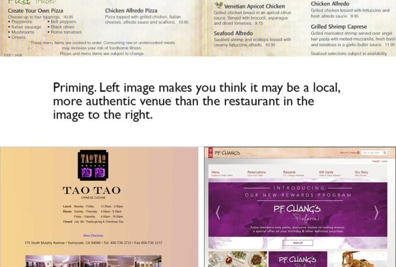
3. Priming: Okay, so the next one is to priming. Subtalar visual or verbal suggestions help users recall specific information influencing how they respond. Priming works by activating an association or representation in user short-term memory just before another stimulus or task is introduced. So that's the definition of this. So in the context of UX, priming means designing an interface with guides, the users or the customer subconsciously towards certain actions. So it's really about guiding or user subconsciously. And it's not like manipulation and we will get this later. It's really about minimizing these efforts the user has to take, right? So it means giving a person the signals that supposedly influence them into making a purchase, sign-up for a service by something or any other actions you may desire. So it's just about giving slightly thickness guiding them. So before we begin, as I've just mentioned with the ethics, I'd like to cover them because it's not manipulating. So it's important to understand said priming is very different for manipulating, manipulating our customer into doing something is definitely unethical. But that is not what we, or what priming is about. Priming means helping the customer make the right choice without explicit, explicit instructions. You know, it's just about giving signals in which the user or the customer doesn't need any more instructions to, to, to, to lower the workload. So when you use priming correctly, you don't end up fooling people in the buying your product. Priming is used to make the user experience intuitive. So you don't have to give instructions which leads to people falling in love with experience on your website or replication. So it's really about this intuition. Make up a product or a service, something that you are designing. Just intuitive, very easy, straightforward. It's not about fooling somebody into buying something he doesn't need. That's a slightly different right? So is that we all go through this problem, right? When you sign up for a new service or is confusion in the beginning, you don't know the service, you don't know how they work. And it's the first time you are using the website. So it makes sense that you will not know what option is there, so you have to see it. And if you use priming correctly, you can guide people to the right thing without them knowing it. It's really just about this. It's not about placing some by Barton's behind something and when you push the button, you buy something. And yet no, it's just about guiding people effortlessly and with a sense of intuition. So one of our favorite examples is use priming in or accompany that it's using priming very good as Apple. I have also showcased some examples from Apple before, but let's get into it. So there were a lot of complaints about the way the wireless mice, mouse is charged. So the charging cable connects to a port on the bottom of the mouth and making them unavailable for use when being charged. And that's quite tricky, I have to admit. So now when you look at it, can you see an a? It looks a little bit stupid, right? So you may be wondering how Apple could make such a bold decision statement because it's not something that's very usual. It's quite unusual. Apple or pedophile say, the mouse is intentionally designed the way to prevent people from leaving it wired. It's just this fact. They just wanted that people didn't leave it when it's, it's wired. So Apple you, that people just attached the charging cable and leave it attached, then be, then be annoyed by it. Which would lead to dissatisfaction in experience because, you know, when the mouse is attached and you can drag it really good. And then you are saying, oh gosh, it's quite, it's not good or it's an easy to handle. So Apple didn't wanted that right. And To be honest, amounts can go up to a month without being charged and it can be refilled or recharged within two minutes, I guess. And then it's an all 499 hours. So two minutes, That's no problem, right? Right. So leaving on uncharge is also bad for it since the battery use to determine if the mouse is needlessly left connected to the charger. So that what I heard. So it isn't good for for a mouse to be charged all the time. But I think that isn't the case anymore because better batteries, I guess. But you get the point here. So Apple wanted that the mouse isn't wired when in usage. So they created quite a unique port at the end and not in front of it. So people had to, to turn it around and can use it. That's quite intentionally. Apple didn't need to do any warnings or message that it didn't want users to leave it or have it plugged in, right? You get the idea thing. So it's quite intentionally. So the perfect user experience is maintaining without giving any instructions. So that's the ultimate aim of priming. So there are also different types of priming, but in this lesson, I'm old, I'm only concerned with the principles of priming. So the main principle, what is priming? What, what is not all the different conceptual priming, semantic priming. The subtasks here. I don't want to deep dive on. And we will look at the biases and principles that build on priming later on. So Let's go to the next one. So which word are you thinking of above and below? I mean, that's also priming, right? So obviously greed and greener. So next example. That's great. So this friendly looking airport landscape lets the user dream about your next trip, increasing the changes of a positive experience. So minimalistic, but you experienced traveling a little bit with how to say it, such kind of. Yeah. I mean, it, it's not a great image, but you see what the people wanted to achieve, right? To give the user this experience, prime him for this whole package. What does it mean to travel the feelings, et cetera? In this class, I have also another principle about exactly this, about doing everything for senses. So how you feel, how it does it look, how does it sound all this off if the census, and that's a great image here. So the user shop feel like, Hey, I'd like to travel, perfect, Let's buy a ticket at some factors. Then, Microsoft keeps repeating this notification and you know what happens? I mean, one day you wonder if this really true and try it. I mean, not in the first place. I will I guess you will see a notification at the end thing. No, thanks. But if it if it's occurring all the time, not, not too much, but sometimes, I guess users will try it. And since Microsoft knows edges a good enough product, or the hope, people will try it. And because people don't actually measure the battery usage, and if H then it's not too bad. They will just change it. And I'm not referring here to the tech people who are using Google Chrome, brave, or Firefox or no, just normal person who doesn't really know much about browsing. They will eventually escaped. And in my opinion, that's far more in the area of manipulating. It's not really like guiding a person that's a little bit in a gray zone here. So let's do e-commerce here. So that's an online shop, right? And when you are looking at it, you're thinking, okay, that's a shop for quality boots, leather boots. And so it gives a sense of quality and craftsmanship pride. So we expect to. Or that this, that this ecommerce store sells a leather boots, right. So we have been primed and that is e-commerce shop is yes, It's actually for for craftsmen, lighter boots. So that's all about expectation management here. And that's great if they are selling such foods. And now I will show you a picture where priming isn't really it completely different. So this this website here. This is a website that isn't aware of priming and did quite a bad job at it. I mean, I hope I hope they weren't aware of priming. So that's a website for a private school that includes up to create grades eight. So yeah, however, the only image displayed or those kids that look really, really young, maybe preschool age. So you can see preschool and create a is 88. That's not on the same level. This might make you believe the school was only a preschool. If you're trusting the images or a piece elementary school. But if you are reading, then you will see, oh, okay, there is a mismatch. So because priming studies suggest we should choose our images and words with diligence. I mean, it's so important and it's quite logic. Text and image should be matching. So our visitors make decision based on their instant first impressions. So guess, a mother for a child who is in great 8. Looks at this website, he immediately close it. That's not the best user experience, right? Next one is, are all about e-comm or ecommerce. So elements in interface can accidentally prime user's behavior and expectations as we just saw expectations, right? Well now we see a behavior. For example, let's assume users encounter a coupon feel on the checkout page of an e-commerce website, even though they may not have planned to use a coupon code. Day very present a coupon code box. Primes uses to leave the checkout or to pause it and search online for promotion called something I have seen again and again and it myself. I mean, how many times I have seen a charm promo code or coupon code and looked for a code, and I have found one. So that's obvious. And you leave and oftentimes, when you're leaving, then you're leaving the website. And if the website or if they have bad luck, you forget about it. And I didn't know you see something else while doing your research for a promo code, you see news, click on it and then the e-commerce storage is for, you. Forget about it, right? So that's accidental priming, That's bad. Another example of this is mentioning trigger words that cause or a certain reactions. For example, spam or privacy. If a cleaner comes to your house, for instance, and mentioning day variant going to steal anything, what would you immediately think? I mean, that they were going to steal anything? Maybe. I mean, why would a person even think of such a thing? I would ask myself, do I have to really, is this a true thing here? So I mentioned the word spam. Emails and up quote have the same effect and that's quite tricky. Sometimes it's quite good, but sometimes not really. I mean, it's, it's really about your target group. If you're targeting people who don't have any clue what spam is or privacy. I wouldn't really mentioned it. If you're doing it like a choke, that silly, then it, it may be working like hey, we will not spam your inbox, some phylacteries. But as you see, it's tricky. So once again, briefly, our brief repetition of the whole lesson here. In the context of few weeks, priming means designing an interface which guides the costumers subconsciously or certain action. And it means giving a person is signals that subtly influenced them into making a purchase, signing up for a service, or any other action you may desire, like not leave the mouse wired like Apple did. So it's not about manipulating it, about guidance. That's a very, very important takeaway of this lesson here.
4. Cognitive Load: Okay. Cognitive load. Cognitive load is the total amount of mentally fork that is required to complete a task. You can think of it as the processing power needed by a user to interact with a product. If the information that needs to be processed exceeds the users ability to handle it, the cognitive load is too high. So it's just about okay, how much you can handle or person in terms of brain power or CPU as in the PC. So in terms of UX design, cognitive load is a strain our user experiences when he or she to think too much just to get something done. It's really about this feeling. You have to think so much that you just close the site. You don't buy something, you forget something. It's really about thinking just too much. Anything that requires users to stop and figure out what to do next is cognitive load. So I think everybody has sometimes experienced this when you are in front of a website or in front of our brochure or tests or some flack this. And then you're thinking, okay, that's going to be difficult. So that's exactly this moment. And when there is too much thinking, the result is you're confused and maybe you are appending the task at all. So the cognitive load is very important in UX, designing for websites, mobile apps, or in general. I mean, it isn't just about product, it's also for services. So another great way of showing the cognitive load is really like a computer. I mean, a computer gets quite slow or even crashes when there are many programs. And as a person who uses the computer, you can then just shuts down. And it's quite similar with a person a person needs then to minimize task the person is doing. So you are getting slower and maybe or just essay, you're just closing your actual tasks, right? So one task can be, you want to sign up for tender. If it's too complicated, then you are just deleting the app. So that's crucial. And in comparison to a computer, I mean, you can just buy a better on our newer one. But if a person It's not the same. I mean, we are kept, there is a limit in the things we can do. So the designer has to know that there are limitations for a person to handle stuff, and that's the cognitive load here. So let's see the first image here, the first website that's an old one. I will show you after this, the new one. So that's the status quo. So it's very difficult to access each gift certificates. There are here, because you have to keep them many active and visible by maintaining a perfectly horizontal scroll without wandering off the triggered area. And that's really tricky. I mean, you can click here at 0, at home. And then you have to wonder all around here. And I have experienced such websites by myself and it's, it's just painful. So this ends up becoming a test for you. Motor skills instead of navigation tool, people should not have to dedicate this much mental and physical effort to navigate. I mean, that's okay for me because I'm quite young. But guess what? That's really, really tricky for a grandmother or a person with Parkinson's. I don't know, but that's even more trickier than for them. So that's a new website here. And as you can see, the new website features as well structured so-called mega menu. That does not require any excessive motor E4 to you. So it's quite easy. You can just click and then it's open. Then you can move around it. The next one with the names, you can see here, enquire involved in weight and impact. So yeah, catchy. Unambitious names may seem attractive, but unfamiliar, unfamiliar terminology. Terminology can actually put users of amine. What's enquire involved in weight and impact? Maybe users don't get it. And potential users or potential users don't get it. Existing users may know what it is, but not any potential users. So using these labels as navigation tabs may be a good idea. Everyone in the organization. So within, when you are locked in. But outsiders need to know the process before the eye words and their meaning. So how does it look like or how does it look right now? That's the newer website. I don't know if it's actually have seen it from our case study. But as you can see right now, the site features or page defining the process so the users know what, how, why are the names there, right? So that terms are no longer used as navigations button as well. Here, That's a great example when you're using credit cards for payments, some sites have it, some sets don't have it. Small theory block here, so our short term memory stores information for about 20 thirty-seconds. Another law, the Miller's Law, we will cover that in a lesson later or in a few lessons later. So another model, Miller's Law, are used at the number of objects which are human brain can hold in short, memory is seven plus minus two, so it ranges from five till nine. To reduce the cognitive load, we can support the users by displaying information which they would otherwise have to store in the short term memory. And the mean that like you can chunk information up, like, like in this green here, right? So before chunking and after chunking it, you can see, okay, three groups. Perfect. And then you can type it the same for banking and you have large numbers, right? Chunking is quite a good way to work with with this law. The second way would be show everything you have just visited. For instance, mark our link, red or blue that you know, okay, I've just visited this line or this website, for instance, with this page. It's quite good because if you don't want to have a newsletter, you can just click No. And because many websites, if they have such a nap newsletter prompt or they are asking for a newsletter, they hit the No button or the Cancel button or the cross. And that isn't really good because if the user hasn't any traction or he really don't laughter website, it just closes the website. So with this step here, it's really, it's really easy to user writer he access or he closes it, closes just this question on the website at all. Or as a whole. That's important. So that's why I have included it. It's really easy. You yes or no. Then this one here. So here we can see CPU cores, Right? Be WM. So a chairman car and Tesla. And now, which one is easier? Which one do you feel more calm? Which one is easier to drive, you guys? And let's really like Apple does it all the time. They are just minimizing all the stuff. It could also be in hex law. Then this side, this is this is yeah. Special. I mean, have fun. If you're looking for something specific on this website, there are too many different colors. Text font, text sizes, groups, images, only text, LOL, no logical structure at different links. Now we shall anchor. So wow. Yeah, so this, this is a really bad example for reducing the cognitive load. It, it's a great example though for increasing the cognitive load. So in general, design GOP simple, right? And tried just avoid using five different fonts or meaningless pictures. If you use some thing, you should be able to explain it. I mean, that's really important. Everything you are using within your designing or within your designs, you have to be able to say, why. Why is it important? So don't try to create that effect. Strive for more ofcourse design. That's quite important. I mean, you can create a wow product, but it isn't like you're doing products all the time. Wow, products takes a lot of skills. And you have to be aware of this Azure to create, of course design then on while product because you then have to live with all the people who don't get it if you're doing it, That's okay. That's a brief design decision. But then it will be suitable for the torque of that group, right? So here we can see the progress of minimizing or minimizing Amazon's website. I mean, minimizing in terms of doing it minimalistic and simplifying a lot of stuff there. So that's the last example here. It's about hinders onboarding and they did a great job with it. So the first thing you do when they see a new form is estimating how much time is required to complete all the steps. And separating fields in different steps is the user's perception of how hard it is to complete. And making the whole process looks very easy. There is another principle that covers this kind of thing. It's all about involvements. Because if you are in the second step of this three-step thing, you are more likely to complete it, but that's another one. That's not a law we'll cover in a new lesson. As you can see, those micro steps are really great because you don't have any cognitive load on it. I mean, during the first name that easy, just have your name the same for burst into any of the changer. It's a great way of reducing cognitive load by splitting bigger tasks into smaller, digestible tasks.
5. Anchoring Bias: Anchoring bias, the initial information that uses GET affects subsequent judgments. Incurring often works even when the nature of the anchor doesn't have any relation with the decision at hand. So it's useful for two or to increase perceived value. So anchoring is a judgment heuristics, right? So anchoring and other judgment heuristics such as framing and priming or helpful in bed eating everyday decisions, particularly in the absence of informations. So if you don't have enough information, you tend to get the help of such heuristics like anchoring bias or framing. So they tend to be automatic for most of the people and can sometimes lead to yeah, estimations or judgmental calls. There are some people who benefit greatly from anchoring. For example, domain experts, the people who really know something out of it. So domain experts with deep experience directly related to the decision or judgment at hand because they have all information they need. So they are familiar with the situation, have all information's, and know the situation, and the early response are likely to be correct. So let's look at a practical example here so that they're more mortgage calculator. So anchoring can set novice users. So users who don't have any clue at all and up for success and establish clear expectations about how process or experienced Mexico. So this is a good example about the defaults and such. Such as the values. They can help users figure out what the big value is and what a small value is. And that's very important. I mean, how should you know that maybe 1% is low or 1% is really big for a mortgage. So for example, for people who have never used an image editing program, our default comma value of 2.2 creates an understanding of exactly this thing was what peak, what's, what's small and decay, then they can play around with it. And then they see, Okay, how does it affect the image, etc. So if you are new to shopping or a house, a quote, mortgage calculator can form expectations by providing default for you. I mean, SHE, you are novel to this whole shopping or house. So this mortgage calculator shows default values that are close to the type of value most users will enter. So this defaults help users have a clear expectation. And no, Okay, What's peak? What small? The same for something like this. For donate thing. Suggested donation. Well, you can also guide users in the right direction of or, or a non-profit website by providing an anchor for deciding how much they should give or donate. This default take the decision burden on a little bit. Because depending on their situation and level of interest in this course, I mean, they can donate less or more than the recommended value. But you can see it's all about, okay, we have right now for as the default. And then it's at about 200 or 100, it's about four, maybe one pound or 10 pounds. So this whole setting here decreases the cognitive load because you have something you can hold on. And also very important, especially with the calculator before people do not have to navigate to a new page and look for new informations and wait for new instrument air. Yeah. And have to wait for loading the pages, everything so it's much more secure also for the website because people do not leave than the website because they have everything at hand. Quite similar. The garden, you're likely to choose the default or change it, but slightly according the anchor. So it's unlikely that you will select something like €1 or 100. So they set the anchor may be 262€6. So now again or once again Apple. And consider how you present the discount. That's quite an important one. So showing the original price of the discount. The price means that the original price can anchor the user's perception of the item's value. And that's brilliantly made from Apple. So for example, if Apple users might estimate a high value because they saw the old price in excepted ill, it Hilts, Steve Jobs crushed the original price and displayed the discounted price. So everybody for the fate, okay, 8100 bucks, so $100. And they are good with it, I thought, okay, it's a quality product. But then as soon as he dropped the price, It's really like our wow, they, they, they crushed it. I mean, they did once again, something like this. So, but it's very important to know that it's more likely that you perceive the value as bigger of the product then lower. I mean, it doesn't really depend on how much decorated, but you have it, it, it's more likely that you see it a little bit better and better. And better terms. I mean, it's exactly the same with this iceland dish. I don't know how to pronounce it, but with this travel agency, I'm highly confident that everybody who's looking at it will tell, okay, it's discounted, perfect. And the discount is rational. It's not just some random thing like Apple did. I mean, I guess Steve Jobs tell everybody or told everybody that they have great engineers and they quote, hot the costs. But with this, it, it's quite good because you will see, okay, the fifth year anniversary offer and that's you can track it. You can see when this company was founded and see our kids really it's true. So it's a it's an opportunity to grab on because next year they want to it maybe in the next or in, in, in another 50 years, you know, when you can rationalize discount and explain why they order it even better. This is what Tinder, they're doing a great job and they're clearly anchoring the six months. Also, if a social proof, that's another principle you're looking at. But that's quite basic stuff for paywall or our payment screen for a mobile app. But as you see there also anchoring it, you have another polar. It's more highlighted, so it's more dominant. That's something like the tinder run. You can see the old price and you will automatically think it's a little bit more. It's more of a, has a higher value. But here it's very important that you not overdo it because as soon as you as you see an anchor all the time and such discounts, you will noticing and thinking, hey, look, on this website, it's all the time. 90% of it's like the summer sales in, in clothing stores like H and M or sorrow. It's all the time there is a discount or, you know, and then you're all ten, you're beginning to anticipating the new price. And that's where the anchoring false, then that shouldn't happen. You should just apply this principle, very rarely really conscious and not just random. And this one looks quite random, To be honest. The one with the travel agency looked good. It's perfect with Apple as that Steve Jobs is quite a good person who, who can tell a story. So that's another, another thing with this one here, that's quite cheap. Then. And the dead, That's a little bit of a tricky one here. So I know this image looks quite silly. But let me explain for you. Skip the class or because of this image. So there was a study, or a study done by Dan Ariely and colleagues at MIT. So the people know what they did. Participants are asked whether they would purchase various goods, such as wireless keyboards, bottles of wine, and textbooks. For the dollar figure equal to the last two digits of your Social Security number. So it's a very random right? Some people have low security numbers or social security numbers. And authors have higher social security numbers. So after accepting or rejecting that price, they had to state the maximum price they would actually be willing to pay for the item. People whose number ended in low digits to the low, lower price thresholds and people who have high ending numbers. So that's a classic that, that's, that's, that's just about anchoring. In other words, participants were primed to use the last two digits of the numbers as an anchor for the price of the goods. Although number was obviously unrelated of the value of the good. I mean that so clear-eyed. And this example, everybody would say, I wouldn't trust it, that can't be real. Okay? So it's true. Here are all the values. But let's look for something like this here. In criminal court cases. Prosecutors often demand a certain length of sentence for the accused. Research shows that demands can become anchors that bias the chart decision-making That's proven, that's true. So I know the one before this one is a little bit silly, but that's another one that somebody can relate a bit little bit more. Or another example is when you are asking, Hey, how high is this building? And this person doesn't have any good references or isn't really good at such estimations. And then you're telling them, is it 50 meters high or 300 meters? And then you are actually just telling how big is it, right? And even though it would be 20 meters high, they would tend to, to tell 50 even though they would say, Okay, It isn't that high. But maybe 50, it will be something different if you have, ask them if it's five or 20 meters, you know. So you can easily prime people with such anchors.
6. Difference between Priming & Nudging: Okay, so in this class, I'd like to cover the difference between priming and notching. So priming we had in a few lessons before and notching will follow. Now, this lesson is quite important because if I wouldn't do it, I guarantee you would ask them in the next lesson in which we discuss notching. What's the difference? It's really similar. So no, it isn't really similar, but it's close. And that's why this lesson here is quite important. So I guess it's important or it's easy to do a quick example. So imagine yourself working in a busy street to work in the morning. You pass by a local coffee shop and dark aroma of coffee hit you. You take a good width and the smell pulsar inside the coffee. I mean, it can also be another store for electrics and they display a football event on the newest TV screen. And you can go further because you're almost glued to the position and you want to know, okay, are they winning or losing? And that's really, that's priming because it's when you are exposed to the environment which entasis you take actions without conscious guidance. So it's unconscious. Priming is unconscious. Now let's see the notching example. Let's take this one step further. You are now inside the coffee house and you ask for an Americano. The cashier asks you, Would you like to have it played or with milk? You reply them. You prefer coffee, bedrooms dark with our milk. Technically, this conversation should be override. But the cashier asks one more thing. We like to have some cocoa chips, cookies with you Americano. They usually go really well with each other. Even if you have never tried coffee and cookies, to whether you decide to have the cookie as well. If your order just to experience it. This is, this is what we call as notching. So this is conscious. You know, he asked, Do we even with somebody sitting next to you, That's a good salesperson, but you are noticing it. So you get cotton notched with priming. You don't recognize. It's unconscious and that's the difference here, notching. It's quite obvious. You see it marks on the street. I don't know, but things you would say. Okay, now I get now I get changed or some flack this or I noticing my behavior is changing right now. That's notching, priming, unconscious. Notching is conscious.
7. Nudging: Okay. Notching or sometimes also called notch, is like priming. So if you don't know the difference, please watch the video before in which I have described the difference between priming and notching. So people tend to make decisions on constantly, constantly, small cues or context changes can encourage users to make a certain decision without forcing them. This is typically done through priming default option science and perceived variety in which, as I've just mentioned, priming, It's just unconscious and the notching is conscious. So that's a small difference here. So notching comes from the field of behavioral economics. Although behavioral economics is a science that is studied for almost 40 years, it was the book notch, written by Richard Thaler and Cass Sunstein in 2008. So it's quite new that put notching on the map. So as you see, there is a whole book about it and a lot more content about notching. So please do not expect that this, I don't know, 15, 20 minute lesson covers a whole book, should be really just a small overview with real-world examples. So that's my goal here. So we have notching, tolerant sometime propose a new take on decision-making. One that takes our humanness and all the inconsistent decision we make as given. So humans are imperfect and we can use the help or all the youth. We can help. So oftentimes it's just irrational. Sometimes the human mind, the US just thing. So. And one important thing with notching is it's possible to improve choices without restricting ops options. So you do you don't use bands or mandate, you just use yeah, notch. So that's quite cool. So it's a little bit more positive, although there or so-called evil or bad notches. But we will cover this at the end of this lesson. But generally spoken, notching is quite good if it's applied in a good way for it, for sure. So and not just any small feature in environment that attracts our attention and ultrasound behavior. So that's quite the same as private, right? The priming is unconscious. So also the important to mention is it should be easy as possible to opt out of the notch preferably with as little as one mouse-click or I mean, it shouldn't really be easy to opt out that supported. And there should be a good reason to believe that the belief or behavior being encouraged by the notch improve the welfare of those being in notched. That's very important as I've just mentioned, notching is generally spoken quite positive. And one last idea, or, or fourth year before the examples, is, as a designer, we often focus only on the design perspectives or design goals. And not think about the consciousness of our solutions or what our design brings, or what the effect or, you know, when our user sees our product or uses it, what emotions get triggered? How does he use it? So really, the user experience of the user journey is notching quite important. So perfect. Let's look at some real-world examples. So an economist who worked at the airport had once the ID to attach an image of a house fly into each urinal just above the drain. The result was an 8% reduction in spillage. So it was much cleaner. Thinks the manufacturer of the urinals reported that the flyer uses clean up by 20 percent on average. So it turns out to a mentee or target, they want to hit it. It's quite easy. But as you can see, that's just the small print of a fly. And 20 percent could be reduced in the cleaning costs. I mean, that that's quite a cool thing. And everybody, I mean, it's, it's, it's a positive sum game. The man in front of the piece or data, find it funny. Or the urinals. And the cleaning companies, They also like it. So all win-win situations. Then this road here or sidewalk, people tend to follow the walk and cycle areas. So left there is Psych or walk area to the right. There is the cycle areas. So nobody gets in other ways. So bicycle stay in the bicycle lane and people who just walk stay on the left line. So that's far more secure because, you know, nobody gets hit by a bicycle. Then this one with the staircase. So stairs to try to invite people to use them by displaying energy use. And the barrier does not go well with the nudge theory. Acid that takes choices, avoid away. I mean, that isn't really smart. I guess. It's just temporary because it's not working. But normally, both options should be available. That's very important because notching is just about showing another option and not in reducing other options. So that's why I've showcased this one. The right thing with the calories. Perfect. The left one, I hope, is just temporary. This one is quite cool. So people tend to use less paper and the cedar actual consumption and some background information. This one up paper towel dispenser by Saatchi and Saatchi, that's quite a good or well-known and marketing agency globally. To integrate this thing here integrates on Manchu message into a paper towel dispenser, which has a cut out in the shape of South Africa, as you can see. South America for sure. Sorry. It's filled with green paper towels with which illustrates the continent screen rain forest canopy. And as paper towels color green, our dispense, the user sees the continent drained of a greener. So all people tend, tend to use less. This one is quite funny. And a toilet paper or by our God, I hope I pronounce it in the right manner. She guru bond, Shigeru, Ban, I don't know. It's also great notch. So the role or the enrol in the middle is just the square q provide, and it provides friction when turning. So they're resistant. Notifies the user that he can some consume something. And then, yes, so the resistance centi, not just the user to take less paper then. And that's actually in Switzerland. So quite near where I live. So the city of lucerne or Lucerne shines program was launched. Her decades of cameras like mazes and hopscotch boxes were pasted around the bins. Encouraging both children and adults alike to use the beans and make are consciously four to the waste. I mean, it's really just a gamification here. And we will cover gamification in this lesson as well in some more examples, but also in another less than so gamification is a great way for notching. That's also quite cool. So another fun example is the illusion of the bottomless been conceptualized by phone theory. It was once a website in which you can quote, hand in your cool ideas and that was one of those. So the bean was installed with a device that's the image here on top of the right signs. And the y's mate, when trash was dropped or when something put into the basket, the device made a sound effect of a long fall. So something like that. There is a video. You can type in model dense. You pass the ESOP tuna now talk. You can just type in bottomless spin and then you will see the video. That's quite good. Now the gamification is with C corps in which you can vote. Then also with piano. And this thing is just called piano stairs. You can Google it. And but each time you step on one stair, this, they're made some piano voices. And now the, the olympic of all notching effect. It's all about mobile apps. Mobile apps. They pushed the limits. I mean, it's, it's thick what they did with just notching that. It's astonishing. And that's no, I mean, it's quite cool coincidence that notch, the book came out 20082008. A guess, was also the iPhone or announced. So that was the time when notching was getting really big. And as we can see here, and the social media platform wants to stimulate the exchange between members. So more people engage with others and can build better connections. Therefore also the social media websites profits because the quality of connections increases and more people would like to, yeah, joint is engaged in community. So Actually, that's a great way to increase engagement. But you see, and that's just one very, very small thing. Every mobile app is as full of those small things. It's not bad. But I think you have to be aware of it. And another one would be the half accept your friend request. Now let's check. That was the same with Facebook as once you accepted a friend request, you got immediately messaged by them. Another great thing was also at Facebook. When he went to a friend of yours, had birthday. You could automatically. So first of all, you got notified. Okay. Hey, your friend has purchased the congrats him. Then there are newer stuff. I think that's quite old, but they couldn't find anything new because I don't have any Facebook account. The new ones, you can do pre made congratulation photos. So as you can see, they are very Good and notching everything out of the platform. Then I mean, that's Instagram. Then Google reviews, that some sort of to-do list reminder app. And this is as well Facebook, but you can see all the time there is no matching. So for instance, Facebook, it's a great thing. It's a good cause. Your birthday, your feeling good. And then Facebook tells you, hey, good feelings, perfect, Let's donate some phylacteries. Then in personalized notifications that also huge with the use of location, pattern recognition. I am. Whatever. These not just prompt the users at the right time with the right information support. Then there is also this game, it's called RPT come. That's a gamified to-do list and shows you really what's possible with notching. This app is all about notching and in a positive manner because you know that you get notched and therefore, you know what this app is all about. But as I said, there are also evil notches, so-called flush with an S, So S L, E. So they have also been called dark notches. Sludge or dark notches are ones that encouraged people to the wrong stuff or things. They are not really conscious about it. Gambling with slot machines are one of the worst of them. Slot machines are so addictive and that's very dangerous. But the same with social media. Social media can also be very addictive. That's what, that's a whole other story. That's just the very, very tip of the iceberg of the notching. Notching is actually the first thing or first position to start or habit in the code way and in a bad way. But that's it about notching.
8. Progressive Disclosure: Okay, so let's talk about progressive disclosure. So an interface is easier to use when complex features are gradually revealed later during the onboarding. Show only the core features of your product. And as user gets familiar on we'll new options. It keeps the interface simple for new users and progressively brings our towards one's users. So we asked, you, see signers face dilemma because on the firsthand, you have users that want to have power, features and enough options to handle all of their special needs. So everybody has nowadays a specific special use case. And on the other hand, use on to have simplicity. You don't have time to learn a lot of features. Really deep stuff. So that's, that's the dilemma we have to handle. And we progressive disclosure is one of the best ways to satisfy both of these conflicting requirements. It simple but yet powerful. So initially show users only a few of the most important options. So you have to prioritize the most important phase. Offer a larger set of specialized options upon request, disclose these secondary features only if users ask for them. Meaning that most users can proceed with the task without worrying about this added complexity. So there is, or there are many different layers. Normally there are two layers. You have the ISI basic stuff and then you have advanced stuff. That's normally the second layer is normally the one that you click on. Advanced Options, for instance. So the, this print dialog is the classic example of progressive disclosure. When you issue the common to print a document, you will get a dialog box with a small set of choices. Mainly how many copies to print, but possibly a few other variations, such as whether to print the entire document or a subset, and which prints to use. Sadly, print dialog boxes have round loaded over the past decade. And some applications offer an initial dialogue box with highly detailed options that would be better placed in a secondary dialog box. So the initial print dialog box typically contains honor more buttons for advanced options. And as you can see here with this dialog box, It's pretty simple, isn't it? We have the printer we can select from. We have copies. We have the print style and Print Options. Everything else is exactly the second layer. We can click on properties. We can click on Page Setup, define styles, review, That's it, pretty basic. So if the user clicks denim advanced options, as I have just said, the system disclosures the additional features. So progressive disclosure has long been one of application designs, primary guidelines, because most applications have so many commands, features, and options, it makes sense to defer some secondary area. I mean, look at this. That's a mix of Adobe Premier, Adobe Audition, and Photoshop. But you can see a ton of options. I mean, good luck learning all those comments in one day. Websites have grown so complex that progressive disclosure is a good idea for many information or its signs as well. So not just on their software as we have it right now with Photoshop, et cetera. But as well with such websites that are quite big. So differing secondary material is also key guideline for mobile design. Because we've desktop, you have much more space. With mobile. You have your much more limited as well, and you have not your input mechanism. With desktop or PC. You have really precise instruments like mouse, keyboard. And with a mobile, It's a little bit different. You have thumbs zones. So it's even more tricky not to over load the user. So. E-commerce site, for example, Mike mentioned a few key product attributes on the primary product page and let users click to a secondary page. So the product specifications are visible. So that's the main goal here. You divide or you deliver the content that suitable for targeted group. In beginning. And newly anew user don't need everything because he would, he would train, he, he would suffer because there are so much things he has to think of. The onboarding itself isn't really productive than anymore. I mean, you can watch all the classes are the lessons before we fix law, for instance. That's an overshooting for everything. So we have to do it in digestible ways. And with, with this law here, that's perfect. So let's deep dive into some real-world examples. Games are our classic, the DoD or a perfect example for, for this law. Because normally you have an onboarding. Well, let's say I will I will speed through this rush. Short. So same if this year right, So gets back, let's get back. So we have some animations here that's are saying, Hey, look, hold and aim at one of the highlighted training. Post, then release to throw them. So you are learning on the go. It's really practical. It's hand on the same if this On slide across to cut the rope. And normally it's like some flack this, that's very rational, logical here. But you have different levels. And it doesn't need to be two levels like picking the ones, like them, printer setting. It can have different settings or different levels. And if you are, if you get this, that's so important for every onboarding. That's so crucial. And as you know, onboarding, for instance, for mobile apps reduces churn rate. Churn rate is the rate of user doesn't subscribe you anymore. So they go away. So with having the user experience beginning Very good. So we also say them time to, well you time to value has to be as small as possible so that somebody opens your app or website and he gets it immediately. What is it all about? What's your unique selling proposition? And with this way, we can assure that the user, for each step, for level one, level two, level three, level four is always on point. He knows exactly what she he took, what he or she should too. So the messages we send are always suitable for a target group. That's important. So as we can see here, that's demonstration, right? So for the first level we tell the user, okay, hey, look, this way. We turn the music on, adjust the volume, switch channel. Smart hop in with us for a TV. Then when he has achieved all those milestones, we go to the next one. We can plead all those and then you move further. You can have a simple or different triggers. You can do it like this. If all of them are done, then let's move to the next one. If 80% is done next, the next move to the next one. After the first month of activating this one. So they are different event triggers, time to, triggers to get to a new level. But I think you get the point. You have to specialize brands content to the suitable target group. Then here as well, That's some photo editing app here we have a primary level if the navigation bar or NEF bar. And then we have a secondary level in which you click then our primary nav bar, and then all those little triggers and switch this up here. So the normal user can easily switch and it's very easy to navigate. And you have an overview that's important as well with Windows, and that, that's the Microsoft Windows settings. It's very easy. You could click here, would get, then you would be brought back to the home screen of all main categories. And then you click on System for instance. Then you can all see this step. So it's really logical and that's so important. And as you can see, it's unfolding. First you have the main settings, then you have the system, then you have to. So you're going from big to small. Here. It even better. Shown, that's Instagram. You click on the profile pic. Then you will see this one here. Then you can click here in Settings. Then you have all those things so it's unfolding. So a normal user would download Instagram, click on the Plus, upload, it's media, and the person is done. So he has just to know the important steps. The same with Photoshop. You have all those main categories and they're enfolding each other. So that's it about this law.
9. Confirmation Bias: Okay, so confirmation bias. People tend to search for, interpret, prefer, and recall information in a way that reinforces their personal beliefs or hypothesis. Confirmation bias is all about selectivity. Selectivity in the data that you pay attention to and how you process data. It's damaging or it's a damaging form of bias which can cause real problems. In both UX research and our personal lives. Biases in unwinnable part of doing any kind of research. I mean, all the time you are biased. And therefore uses will always be biased to some degree in their feedback and the user experience designers will always receive and filter that feedback through their own set of biases. As that everybody has some sort of bias. You have just to be aware of it. While psychologists have categorized many different types of bias and confirmation bias poses particularly or particular problems for UX designers. Confirmation bias is the tendency to adopt a specific user or interpretation and then place outsized value on information that confirms that will leave while downplaying or ignoring data that contradict or doesn't support it. So the stuff you already like, you like just more. This is an important point to understand because it's easy for researchers to fall in the trap of leaving. They can construct methods for gathering purely objective feedback. Therefore, everything is highly subjective. For UX designers, it can lead to stagnation and lift them unable to adapt to changes they never saw coming out, didn't tolerate coming really or address critics. They never existed. I mean, it's like you to do, the whole room is full of red elephants. And your trust open to look for either no or at, in the middle of the room. Just one thing. One thing we'll mouse and your trust seeing this little mass. So learning to recognize and eliminate confirmation bias leads to better decision-making, major research, and ultimately better product and user experience. The more they recognize how bias affects the research, the better position they are to account for any amino acids impact. So this lesson here isn't about how to do it. Okay? We know a little bit stuff about it, okay, put your econ site, etc. But this class is just all about having an overview of all the different biases and principles. So we cannot IEP on this one here. So the cognitive bias has gotten a lot of attention recently in terms of how we consume and share news in the world of social media. The effect stronger than him for emotionally charged issues and for deeply entrenched beliefs which can be particularly dangerous in our current political climate, I guess. So. I will show you two examples that are quite good or at least they're quite polarizing. Let's check it here. Okay. So that's good. Summary of what I have just tell you were told you. So there are objective facts. There is a sum of data that confirms what you are already believing and you are seeing just the small thing there. So beyond news and social media, information bias shows up in advertising. Mcdonald's ads have been telling people You deserve a break today, since the 1970s. This will resonate with those that think, yes, I do. Which is a common belief. Why the ad is very effective? How can you use confirmation bias, improve your designs? You have just seen one example. Just take our site polarize. I mean, the one with McDonald's, it's about relax, about enjoying. It isn't this productivity stream, right? It's, it's more like you can give it yourself. You have, you have achieved something and now you can rest. So it's in some form, it's polarizing. So H a at a H M health insurance in Australia that accompany there as a great campaign, campaign that highlights how much people hate health insurance. You see it here. There are billboards are the two entities shuttle adds admits that the health insurance is annoying. Well, that's honest. This attracts and appeals to people who have the same options. Yeah, I'm guilty. And they might notice this ad more than more generic ads because it confirms their beliefs that health insurance is annoying. Yes, you will likely not be attractive for those who don't share these beliefs. But you might stand out for those who will share the same options. So for those two, you will attract much more and easily and retain longer. So it's polarizing with this background here is perfect because all the people you're actually targeting, maybe for young people. It's the same with banking nowadays. In the terms of traditional banking isn't good. And the fjord decentralized finance, the crypto space is better. So that's also a big split, a big polarization. And it works for all young people, including myself, who are pro, new technologies, defined, such rebellious or new innovative companies. Cool. And that's exactly the confirmation bias. I like such companies. When they are telling me such message, I already knew, then I'm hooked. So that's all about confirmation bias. It's just a rough overview because he couldn't hear, he could go really deep. Just an overview.
10. Fitt's Law: Okay, so Fitts Law, the time required to move to a target depends on the distance to it. Yet related inversely to its size, by his law, first movements and small targets results in greater error rates. So that's not good. Face movements and small targets isn't good due to the speed accuracy trade-off. So the faster you go, the less calories you're. So, you know. So Fitts Law provides a model of human movement established in 1954 by paul Fitz, which can accurately predict the amount of time taken to move, to end. Select a target to move. And select the target. Although originally developed according to movements in the physical world. In human computer interactions. Fitts Law is typic, typically applies to movements. Trout's the graphical user interface, so the UI using a cursor or any other type of pointer. So nowadays with thumps, with mobile, right? So it's still a pliable. So Fitts law is still in usage, although it's made for the physical world. So Fitts Law has been formulated mathematically in a number of ways. However, its predictions are consistent across the many different mathematical representations. So to be honest, I do not care about any mathmatical calculations here. It's just all about design. So forget it. I will not show you any formula here. So put simply Fitts Law states that time to acquire Target is a function of the distance. So distance 20 and size of the target. So the size or the distance to the size and the size of the target is relevant. As the distance increases, movement takes longer, and as the size decreases, selection on GAN takes longer. So bad case would be something far away. And it's mall, a good case where p is close in pig. So in general, comment, buttons and any other interactive elements in the graphical user interface must be distinguished from other non-interactive elements by size, so that you can select a target a little bit better. So selecting options will flow line or linear menus whiter vertical. So for instance, drop-down menus or horizontal. For instance, top-level navigation takes longer than clicking Options in P90 monies were choices are arranged in a circle because each thing from here is much faster, right? Then going from here to here, from here to here. Traveling, traveling distance is the same for all options in Pi many. Unlike liner, many's or distance increases the further along or down the list of options to use recalls. So as I have just said, from here till here, it's further from 10 from here to here. Because normally you'd go from here to here, right? So pop-up menus and better support immediate selection of interactive elements and drop-down menus. As the user does not have to move the cursor from its current position. So you can just right-click and then you will see all these things. So for instance, view and then US, media icons or like int, etc. Therefore, graphical designs that allow the user to interact with our moving helped to reduce the travel time. Next example, or the scroll bars on a window or a system. I think it's OSX line. Window has the up arrow at the top of the scroll bar and the down arrow at the bottom. Likewise with left and right, this formula tries to lean more into their mental model of looking up for up and down and down, right? So you guessing or you anticipate, okay, I'd like to go up. The button is up and vice versa with the one at the bottom. The MCA, however, puts the arrow button side-by-side. The costs due to Fitts Law, navigating between them is much quicker in the formula. To be honest, I didn't even recognize it. I mean, MR. window user. I have as well or MSc. And for me, MEK is more complicated. But just because a Windows user, so I'm more used to the way Windows does it. Actually edited and recognized it till I read it in the journals? So also, a very important thing is size and distance from the most common interactions should be considered when designing any UI element with which the user interacts. So Bill in space, that's so important, especially in this example. So there are many different design guidelines out there, but most calm with a minimum button size and distance from outer interactive elements. That's so crucial. It's also important to account for high risk interactive elements that you don't want the user to accidentally activate. I mean, you want to download and the new elite. That's really smart then. So you have to put safe space in between those. So keep further away such important stuff. Then the same this year. To increase the button size. That's much better because it's very small. The same with this. If you have enough space, use it. I mean, you know, you have an eye for design perspectives. But normally you also want to guide the user that it's clear that the next step is click on the Login button and you don't want to. I mean, that's the next thing you have to click that make it obvious that's very important. So input methods that are more difficult to perform can sometimes actually prevent mistakes like this one. For example, mobile devices are often carried around in pockets which can tricker commons by accident. You know, you have it in your back pocket and then suddenly you are calling a friend and then he hers. Here's ten minutes of you talking with somebody else. But that's not the best thing. So in those situations, a high precision input methods are diploid, which use a high, higher input difficulty to make sure it, a comment is not executed accidentally. So with this here, it's quite unlikely that you power off reboot or whoever your phone by accident when it's in your back pocket, that's really unlikely. However, these input methods, or also a way of making use of the severity of the comment that so crucial, It's the same with accounts deletion for users. If you use a go to settings, then profile and then disable account, delete account intent that you are asking again, are you sure that's the danger zone, something like this that the user knows, okay, if I click here on Test button, my data is gone. And sometimes it's good to make actions not that easy and build in some difficulty. Now next thing is the corners. As the mouse cursor stops at the edge of the screen. I mean, you can not go any further because then it stops. So the limitations is there. It's really easy to get there. So this is partly why you, why you see the Windows Start menu and Apple many in the corners of your screen because it's so easy to reach. Then top and bottom. Similarly, the top and bottom are easier to access. User screen limitations. These are not easy to ask corners because they are not only limited vertically, but still allow for quicker access. Then a point in the middle of the screen. This is why Apple always place applications at the top of the screen instead of at the top of the application window. So it's always on top of it at the, as you can see here, and not in a window in from the software. And then we have the Pfam zone because or dislodged or Fitts law emanates. It wasn't made 1954 and there weren't any smartphones. So this is quite new and there are limitations to it. So the use of Psalms is a cone interaction on mobile device, right? There are times when the phone-based not used for the when we are using our phone, you have to consider that the original Fitts Law formula applies only within the range of motion of our farm. That's why nobody thought of it like, hey, something could be out of our reach because back then you could grab it with your fingers. There was no really an outreach, I guess. And we've desktop it's the same. The mouth isn't. In outreach. You can go or wherever you want. So the problem occurs when an item falls outside of that zone, right? If ten requires an additional effort that Fitts law does not account for and adds additional variable that increases movement time. We need to keep this in mind when discussing the effects described. But I don't want to go deep if this and that should be enough. Maybe we'll do another clause or less than about it. But with the Pfam zone, it's quite easy. Just stay in the green area. Do nothing fancy. And it isn't just, and that's why I have put this image up. It isn't just this zone. It also depends on are you using it with one hand, two hands? When we've two hands, how do you hold it? All you're left, yo-yo, righty. So do you write with right or do you write with left, for instance? So it's very customizable. And I don't want to elaborate on this topic here, right? So that's it about the theory about this law. And as you can see, the Pfam zone has also some other applications or yes. So like this year, it wouldn't consider to navigation bar on the top because it's much easier to reach at the bottom.
11. Attentional Bias: Attentional bias. Users fought filter water they pay attention to and have the tendency to focus on certain elements while ignoring others. So, research has shown that many different factors can bias our attention from external events and stimuli. Assembly sets, such as perceived threat to our safety, to internal states, such as hunger and sadness. So everyone who has bought or sold the house notice for sale signs and open house signs everywhere. So that's that's because they're real estate transaction set open attention bias in the brain. So as soon as you are open or you're interested in buying or selling a house, you will have such a focus on such things. And it's similar to other stuff. For instance, when a person start, starts dieting, suddenly becomes more aware of images of food. So or thinks he, or thinking of doing it of you have some kind of funnel. And you see everything in a certain filter that, and that is highly subjective. Attentional bias and repetition can establish an attack, attentional bias. So for instance, in web design, the use of the same image and slogans, the top of all pages set up an automatic recognition response in the viewer's emotions that elicit specific emotions and words that tell a recurring story establish your identity. That's why a major brands logos are so universally recognized. So that's the same if landing pages. You have elements like the whole copywriting stuff. How should the staff presented in which words? So that you really trigger a user. For instance, if you have an e-commerce store for runners, the news diverts, the users, think in that's a really important so that they tension goes straight to the things he knows already. So the attentional bias is all about what people pay attention to. You have find, or you have to find the little greedy things. They think of. The first thing. Brains tend to focus first on things that you think about most often. So note the pain points of your users and design the whole product with this aspect. So it also focuses on image, words and concepts that are repeated frequently. In UX design, this tendency can be used to capture and direct attention to your message. So be aware that users oftentimes have some kind of an attentional bias. So they see, some times things are, it's highly subjective. You know, they see a pot on TV. And you have therefore to know your target group because then you can really know, okay, what do they think often of?
12. Empathy Gap: Empathy gap. People underestimate how much emotions in influencing user behaviors and easily underestimate themselves. So in a recent study by giving him, it has been shown that although 75 percent of organizations think they are customer centric, Amir, 30 percent of customers per leaf, this would be the case. So there is a huge mismatch and I really don't care about the exact numbers. I mean, that's everything the same if those studies. But I think we can see here a mismatch, right? So the empathy gap exists all around us, not just in business. In general. It refers to the idea of not being able to relate to the emotions, needs, and feelings of others because they are naturally experienced, the world around them differently than you or everybody has its own lenses on. It's highly subjective. Everybody lives in its own small bubble, right? So think about the last time you asked for advice from a friend. That's something personal here. Have you ever been in a situation that before you even got to finish explanation, explaining your problem, you were overwhelmed. We've got wise that wasn't even related to you. Maybe your friend, assume that what makes them feel better would also make you feel better. Or by drawing on their own experience, stale will be able to understand yours. The fact is why you are sure they had the best intentions in mind. They ended up trying to fix a problem. That wasn't yours. You get it. I mean, you have a hammer and you want to drill a screw. I think it's called like this, but it's the wrong tool. If it's the solution, a is maybe for the person a, not for the person p. And somehow with this empathy gap, we don't get it oftentimes. So now translate that story to a business case. Building products and experiences in vacuum will likely result in empathy, empathy gap, because you are not truly in tune with the needs of your intended users. Quite simply, you may be solving problems that don't exist. An example here, you, you'd like to create an app. You are an indie hacker. So a person who can quote by himself and he can do everything by himself, right? And now you encounter a personal problem and you're thinking, Hey, I've asked some friends and they have all the same problems. Problems. Maybe I should do it. But oftentimes you are such a bubble, you're asking biased questions. And furthermore, the EMF and the empathy gap is huge and you cannot feel into other person's, you're building a product for yourself. You are designing it for yourself and neglect all the different peoples. Oftentimes there is an emphatic gap, so it's real and it's really important that you understand it, understand this, and or aware of this bias. So it's nearly impossible to predict the needs and actions of others, which is why you probably shouldn't. While it's true that the great products, product i's can be stumbled upon. The most successful less than ones need testing and iterating to meet the needs of a wide audience. Not just meat of some. You have a really to test it with different people and not just yourself. So if you haven't guessed already, there is no better way to understand what your customers need. And by asking them, just ask them. So make usability tests, customer and user interviews. So for instance, through usability testing, designers, product managers or product owners, researchers, and all the similar positions, can uncover and understand how real people in a real-world respond to the product and experiences from what they like and dislike to where they got stuck and confused, to areas of improvement. Valuable insight gathered from these tests are sure to be eye-opening. And I guarantee it happened to me as well. So don't neglect the empathy gap and put your IQ on site and do testing. Ask your user to, for instance, a mom test. That's quite a famous tests for it, MOM, MOM test. And then yeah, I hope you don't neglect this empathy gap.
13. Visual Anchoring: We shall anchoring structured information is easier to read and memorize. Now, please do not confuse the anchoring bias with the wishful anchoring because it's something completely different. If you'd like to know more about anchoring bias, please watch the lesson. I guess it's one of the first ones in this class. So it's all about structured data arrive. As you can see, both examples are quite structured, but the one below is little bit more with the gray background of the icons. So you can memorize it a little bit better. Same with here. Lists are great for this one. You can also see here, you know, okay, PR, people achievement and best decision. But you see it's quite structured. On the left, you have information on the right side. You have a picture of the people who work there. Here as well. Three cards each for one selling point here as well. So you can see there are three I'm spaces. So on the first one you have, I guess the, the first level menu. So the main level. Then you click on square, then you will have it, it's unfolding. And then you have the primary setting here or the image. But you can see it's very structured. You can see our OK. Now that's for the effects. Then you can modify those effects and that's the preview. So it's a really clearly and you can also memorize it much better. Then the same with this year. You can clearly see that the structured and website, so you have this thing at the top, then this in the middle, and then at the end. So with anchoring or visual anchoring, It's just all about giving the users simplified thing to look at cause. According Hicks law, the law we had in the beginning, it's all about reducing the brain power the user needs to look at your side, so reduce everything and we shall anchoring is a way to use it.
14. Von Restorff Effect: Hey, fun, restore affect. People remember more items that then out. The phone restores effect, also known as the isolation effect, predicts that when multiple similar objects are present, the one that differs from the rest is more likely to be remembered. So make an important information or key action just visually distinctive. Make restraint when placing emphasis on visual elements to avoid them competing with one another, and to ensure salient items don't get mistakenly, I defend identified as ads. And also don't overdo it, please. It's quite dangerous if you overdo it. What we will call this at the end of the whole lesson. But for now I will just show you some examples. And as well, please don't exclude those with a color vision deficiency or low vision by relying exclusively on one color to communicate contrast. Sometimes it's quite tricky to not do it. Sometimes you will do it. But Please be aware if it wouldn't be suitable for project, product or website or whatsoever. If you're doing it, then please be aware and maybe you have to look at your target group. If it's no problem at all, then yeah, you can do it. Then also, carefully consider users with motion sensitivity when using motion to communicate contrast. So as you see, that's not the mainstream staff. The DC affected phone restore of effect. This isn't the normal mainstream website. It's more special, we will see. So personally, I really like this effect and have prepared a few examples in this lesson. So in the first part, I just show you some examples without much explanation. So we will look through and in the second part of this lesson, I will then explain a little bit more. So let's start with it. During this COVID times, I think it's quite funny. And especially, I guess it's almost correct. Yeah, I mean, it's quite funny to show it with a cow. Then this one, the converse. Brilliant marketing. This one is also quite good. It's from a friend of me. The company are telling, okay, you can buy 200 liters of this drink, I guess for $400 or something like this. But it's funny, right? Normally you don't have those sizes of bottles and they will just deliver AC as our bathroom of fun or something like this. But that's very unconventional and that's fun. And this one bed unicorn, they have so many good ideas really worth forgetting. So we have to check it out. It's a fun website in which they are telling cool ideas. And they are around this venture capitalists field. So it's just four. Yeah, it's really just for fun. This one is personal website. As you can see, it was forehead hunting. And this person here is all on touring. And this Alan Turing is quite famous within this development ecosystem. So everybody who knows or as a software developer knows about him, everybody else just doesn't. Just think, okay, Who is this guy? So it's quite cool. And the response is great so far. I guess we have it over one year online, but as you can see, it's quite bold in its assessment decision statements. So it isn't a mainstream app or mainstream website. This one is also a genius. I mean, you can answer do the social proof. Even if you don't have any social proof. And of these companies use crawling mock-up. Yet, that's really good. And as you can see it, it stands out because normally you have all those name droppings on a website and the newer like Okay. Yes. For sure they have it and they're playing with it and the GIF is even cooler. So scrolling mock-up dot io. And once more question, do you remember which animal was here? I gave you a few seconds here. Okay. Was account right. So I hopefully or I hope at least you could remember which animal was there. So let's start with the examples in which I have prepared a little bit of background information. So here we can see that the classical Netflix home screen and the new episodes for instance, or highlighted by a red tags. So it's hearing Chairman know if organ, but it's just saying new episodes. So it's the only differentiator for this kind. And you can clearly see it. I mean, it's, it's a really good there is contrast because the black, the background is black. So quite good mate. Then MSN as well. So our eyes are naturally drawn towards the bestseller tax in Emerson's product listing page. So asthma attack can considerably boost the sale of that product enormously. So here we can see. Then there is a comparison between the sign-up button as you can see here. So without any color, boldness, element. So really lean. And here is it with a bold statement? And as you can see, there isn't such a thing as being too clear. I mean, the user knows exactly where he has to click. The button is big, bright and visible, so the user will instantly know what button to press. And here it's really, it's really visible. Okay, why we have to use this, this effect, in fact, found restores is so ingrained into our brains that it seems self-evident. I mean, it's just logical. If you showed the user, hey, you have to click here. Though. Ux designers use finally serve to push certain options all the time. I mean, if a service has multiple pricing plans, like here, you are guaranteed to see it in action. Even if the user doesn't decide to upgrade, the users still did this chomp. That's important to know because finery serve dictates that option will be more memory. I will. So the user will memorize the Gold plan better because it gets highlighted. And even, even if the user will not purchase it, now, he will be remembered it that there was a gold player, something special or something or a special plan was there. So I'm not the only one that uses a resource to encourage certain choices. I mean, that's that's normal, I guess am especially for paid walls or paywalls pricing pages. So such tables have normally every time this effect, as you can see, Priam Spotify, does it a little bit more softer? It's at that intrusive. But you can see it's bold. Here, it's gray. You have more colors. You have a little bit more information. And he really, you can just do one thing. You can do everything. So it's the same or the same effect here. Then. I mean, as soon as you have done an app, so uses may have downloaded your app, have signed up some flank this but, but stay within this app ecosystem. I mean, that's just the beginning. A person downloads your app and now you are one of those. They have your app installed, but it's important that they use it, right? This is a fun fact really comes in handy. If your AP stands out on the home screen, you will remember it and use it more often. And it's not all only on the home screen, it's the whole app. I mean, if they open the app, is there a distinction between your app and ODR amps? And we'll come to this later on. But as you see, that's one way to use this effect for apps, for instance. So sometimes it may be easier to just compete against other apps in your, in your industry. For instance. That the same with lift. Let's get to the next immature. So most of the top rideshare apps or black, yellow or both. So Uber biotech. Index the DOM. So however, lift up out for a bright pinkish purple icon. So that's quite unique. And also, I think they have something in front of their course. Some animals, I don't know, but you see a lift core fight quite easily or you can recognize it at least. So why is it that great? Because there's a huge overlap between ride-sharing apps as high as 20 percent in one service add. Overlapping users. Don't see a major difference between ride-sharing apps and often check a couple to compare prices. So it's just about prices. It isn't about different services or whatever. That's the same with the school trips and lime tier. Bird. You just use it or you just use the one that has the best discount right now, right? But if you have an app or a company that's really this distinguished from the author, you can remember it much better. So if you have, if your app or if your user base overlaps with competitors, use the phone restore effect to your advantage. I mean, that's the same. Have you ever wondered why does Spotify just have two colors, actually, black and green? It's exactly because of this. It's such a good branding. They have just two colors. And whenever you see this green, you know exactly, it's Spotify. So it's, it's really a bold decision statement. They have just a dark mode to say. So. Now it's important. And as I said in the beginning, you have to maintain a healthy balance. So that's a key to make a cleaner interface with correct emphasis on relevant elements. So please do not increase the cognitive load. I mean, we don't want to have our website, as I have showed in this lesson there, in which everything blinks and different colors. That's not the goal here, right? Because when the majority of your attention is grasped by the different one, less attention will be paid to remember the rest. That's important. So you end up remembering the others less. So you have one website and then you will focus the user's attention just to one table. The rest gets out of focus. So you have to be aware of this. Yes. So let's do an example here with Apple Music. The left side you see is positive and the writer use Apple Music. And Apple Music wasn't great when it first came out. People across the Internet attacked for being messy, hard to use, and bad its job. Well, some people report that it's gotten better. Apple Music will always have a bad reputation burned into it. So that's again, because of the phone restore effect. Apples plan to stand out because it's an isolated incident of pairs design amongst a long history, of course, design. So that goes as well for your app or website, product, whatever. If you make these mistakes, mistake, they will see or enter your user's memory. So it can go into both sides, positive and negative. So you should be really careful with this effect of reusing the distinctive features might distract users and burn into their memory. So if too many things are calling for attention on a user interface, nothing gets the user's attention. None of the elements will truly stand out. So I hope I could bring you some insights within this rule or law here. So please don't overdo it. It, it's cool if you have may or if you want to make a bold decision statement. But really be careful because as it cuts on, the mistake is then leveraged.
15. Tesler’s Law: Hitler's law. If you simplify it too much, you will transfer some complexity to the user. So it's also called the law of conservation of complexity. So tester, that's the guy who invented this law. Created in the mid 80s because he wanted engineers and product managers to realize that it was better to spend one week of developer's time fixing on issue. And to realize software which would require users to spend millions of extra hours performing tasks. His point of view was that those on the inset of software development must deal with complexity. So the users don't have to do it. Not for altruistic reasons or heal after user, but to generate value for a user and therefore to perform better in the marketplace. So all processes have a core of complexity that cannot be designed away and therefore must be assumed by Idris system or the user. Either you as a company or as designer. Do it and think through it and make the system better. Or a user has to deal with the complexity. So ensure as much as possible of the burden is lifted from the user by dealing with inherit complexity during design and development. So sometimes you also cannot just make it any simpler. So we will just look at an example right now. So this is the Apple MacBook Pro, I guess. And when talking about computers and in club, complexity means oftentimes, among other things, for sure, interfacing with the outside world. So input, output. All right, So I'm talking about stuff like walking up to the monitor, to a monitor or a keyboard, mouse, importing files from camera or projected to show a PowerPoint presentation. In the current Apple computers, handling this complexity has been assigned to users because they ditched quite a lot of ports. And I'm aware that there are advantages and that it isn't just a stupid decision from Apple for sure. But you can say that this complexity is only for the transition period as long as you redefine the standards again, right? So, or all to say, in a sense of innovation is always new and unusual. So Apple make this quite bold step and saying, Hey, look, we'd like to introduce new standards to two computers. And we are the first who were doing this step. Everyone, everybody will blame us and will hate us spot, we will do it. And in five years, It's okay. You can you can say that. Okay. But my point here, I'd like to, just to show you that if you reduce the complexity for system, either you are dealing with or the, the user is stealing. And Apple did a really easy wrote essays. There are some other thinkings behind it, but they are trust. They just reduce the ports. And now the user had to deal with it. And normally it looked like, yeah, it looks like this, that you have so many adopters and all this stuff. It isn't really cool. So you have much more complexity because before you had just your MacBook and everything worked great. You can plug in and all this stuff did work. But now there is much more complexity because they decrease the amount of ports right? Now. At the end, the end users, or some smaller end-users came up with an ID and did a Kickstarter campaign today handle the complexity on their side. So as you can see, testers law is all about conservation of complexity. So you are thinking as a UX designer or designers in general, when you're doing to, or you want to reduce something to get rid of something, minimize something. Really think this through and, and think, okay, Is it easier for the user or does it adds an extra step for them? So that's quite an important one here.
16. Centre Stage Effect: Center stage effect. People tend to choose the middle option in a set of items. And in this lesson, I could tell you so much. Theory and all about is tough, but actually a numbers I have read two articles about this effect. And actually it's true, I guess the effect isn't that big, but it's quite interesting. So for instance, here, game show and then you can choose the candidates and researchers analyzed 20 episodes and founded players in the middle. So position 4 and 5 reached the final around 40 percent of the time. While people seated at the edge positions, 18 reached the final round only 17 percent of the time. And I could show you so many examples like this. That isn't like cherry-picking in which I just look at some wrong numbers and some examples that work. Actually that's also proven scientifically. So the center effect, Yeah, that this one exists. But I'd like to focus really on US UX things and design things you can do and not about numbers. And why is it that, but it's quite complex. I saw. So I think one easy thing to do is with the pricing page, right? We have different options to choose from. If you'd like to really wanted a person selects the professional one, then place in the middle. I will also make it a little bit bigger. You know, not just position the middle, you can also play with other stuff. But as I said, the sensor sends century stage effect. Isn't that big of an effect, but it is an effect. It's proven at, it's working. But in my opinion, there are other effects that play a bigger role in UX design, but I wanted to include it for completeness of this class.
17. Aesthetic Usability Effect: Aesthetic Usability Effect. People perceive the signs we've created a statics is easier to use and are more tolerant to minor, not major usability issues when they find an interface visually appealing. So, in other words, users have a positive emotional response to your visual design that makes them more tolerant of binary usability issues on your side. So I'm not talking about big or large or major issues here, right? So it's just about minor issues. So an aesthetically pleasing design creates a positive response in people's brain and leads them to believe that design actually works better on the side or the product works better. So in most cases, this is a positive thing from your perspective. And this effect is a major reason why good user experience. And just be a functional UI. Designing an interface as attractive as well as functional is worth to resources. Right? And visually pleasing design can mask usability problems and prevent issues from being discovered during usability testing. That's the important thing here. You have are really a nice product and you're doing usability tests, you have to be aware of this effect here. If you have an MVP or minimum viable product that isn't really designed yet, you don't have to care about this effect. But if you have a product that's really well-designed has aesthetics, then I would look for signs that the user may be overlooked. Such stuff, right? Like minor box, something like this.
18. Visual Hierarchy: Visual hierarchy. A clear visual hierarchy guides eyes to the most important elements of the page. It can be created through variations in color and contrast, scale and grouping. So let's do a quick 30 seconds breathing in the history of this principle. I mean, it's not a law. It's more like a principal because it contains more loss in it. So more than a century ago, German thinkers, Wolfgang Kohler, knocks, Wertheimer, and Korotkoff can become studying how people perceive the world. Some perceived their surroundings individually and E coli. Instead, we organized them in specific ways to make sense of the dam as a whole. So you're going to group them, for instance, from their research, they created a loss of perceptional organizations, the tenants of Gestalt psychology. Now, I will not explain everything in detail. This will be too much for this lesson year. But as you can see, this long is quite complex and contains other laws like we see in this slide. Some of the loss showed here we already have or had. Some will follow. But it's important that you know, okay, it's a principle in it contains several laws. And I will not go into each of these last because some of them we had already and we will have. So let's dive in with a real-world example here. That's a bad one actually. And the second example will be a little bit better. But if this year, I mean, it's, it's, everything is equally sized vary. A lot of taxes are encapsulate aria, or as we say, in all caps. So you can't really differentiate between important and less important. So everything is important. And there isn't any whitespace. It's really cluttered. So that's not a good example of visual hierarchy, right? It's one, that's a personal one. Because I was once a draftsman and this plan here was from the company I've worked. So that's an engineering office here in Zurich, Switzerland. And plans are great for showing this principle because even though it's very complex, I mean, there are so many small things here. It looks quite simple to read. There is some force of law, principle structured. It's not okay. I was right. And everything follows certain rules. I mean, there are different colors, but it's really systemized. The orange, too much cores, not too much text sizes. So I guess my opinion, That's a brilliant plan with the principle applied. So could we shall design uses color and contrast and maybe important. And we wish you well in a general or at, as a, as a whole, can be created using color and contrast as the first one, The second scale or size. And the third is grouping, so proximity and common regions. So as I've just said, you can use coloring, contrast or both to create visual hierarchy and the page. I mean you just saying then, or you just showing the user what's important. And it's not the actual color of an element that creates hierarchy, but rather the contrast in value and saturation between the element. So it's not about the color, it's about the contrast and the saturation between those. And you can also use typefaces were very wait for instance. So like bold stands out a little bit more than late, light weighted or regular time phases. You can also use an or style words differently with surrounded texts like italic or underlying lines. You can use several things to create a contrast, not just with color. The Noun Project, for instance, is a great example for this because you pay attention, gets immediately drawn to the search bar in the middle here, because there is a great contrast between the black background and the white search bar. And then afterwards the eyes are directed to the white icons below the search field, which provides a glimpse of possible search results. So in general, I would recommend bed with color and contrast. You do the following. I mean, most importantly, don't overdo it. Don't use too many colors, so on, so on. So bright colors naturally stand out. So use them for important nodes where you want the user to look at. Less saturated colors can be used for items or of lesser importance. And the reserve warm, bright colors, like red and orange. For warnings and errors. Don't use too many calls because of cognitive overload. I mean, if it's too complex or the color schemes are two beautiful to look at each just are you simply you are given the user. So restrict yourself to, I don't know, to primary and two secondary colors. So the same applies to contrast. Don't apply to many contrasts because as I've said in the beginning, if everything is important, nothing is important. And contrast applies or say, saying you have something that's here and something that's below them. So you have to have some form of differentiation, right? So the next thing is about scale. That's a very basic thing here. I mean bigger elements and out more and attract users attention. So size can be used as a marker for important importance. As you can see here, I mean, you can easily see what the most important texts here, simply chocolate has made or is a great example for two things. For instance. Or first thing is the text size. That tension gets directly to all natural chocolate bars and as well folder the contrast. So it's quite easy to process. You see RK, the text at the top, and the image at the bottom. Looks quite nice. Then we've charged the diary milk. You see, I mean, the eye immediately drawn to the most important aspects of the product. That's milk product. Milk and it fat content, and that it has 20 gram of proteins. Then there we've had camp. And they also communicated the visual hierarchy with the true hour, with the font size. I mean, the first thing you read is find yourself outside. And the tax gives you a general idea of what you can do on this website, right? So it's all about camping. And then this side that's from Slack. I mean, it's also very basic, but they're using the headings to give you some sort of guidance that you read first. Okay, It's like vert a future works is it's quite for the branding, but you see, it's very, very hard to say a grouping text. Try for free, and then you see how it's working. So we will go to grouping right now, but it's really easy to process. This website in the cognitive load is almost 0. Now with the desired says, I would really recommend to just use three sizes, small, medium, and large. Don't overdo it. Make the most important elements biggest. Make the less important elements smaller. It's really that easy. And if grouping and help us to see the amine is grouping helps us to see the bones and structures of a website so you can see, okay, what's important, what is not so important? What is together? Yes, So for instance, once a user identifies rail group or right, rail group, they may ignore is due to its association of ads and incidence of banner blindness. So the same with Google's search results. I'm, I mean, I'm blind for first tree search results because I know those are just search results and they aren't yeah, relative or important for myself because somebody is paying for them. And here as well, if the heat maps. So you are when you are looking at a website or an app, you would trust screening the side four groups and its importance in all the things you have just discussed right now, right? So you see RK increase bending kappa see on your existing press breaks, okay, what it does. The world's first standardized. I mean, here it's what, what do you see? The first I guess it's really this title here. And then afterwards is go to this one here. Because it's just bigger, bigger and it has more contrast. Here as well. You're looking for groups, the side parallel navigation bore the content feet. And that's Shopify checkout. And you can see two things. This group here and then the group below. And in the second group at the bottom, there are other groups as well. So this one is a group. This one is aswell a group. So it makes it quite easy to process and to see what is it about right? Now. I have put Shopify here because of of the squint test. I mean, if you don't know what squint test is, it's this huge just applying radial blurring to your thing you want to look at. I mean, I'd like to see the groups of Spotify and with the blurring, you can actually see it quite good that this one is a group. This one is a group, and this one is a group. And those two groups stand out the most. Because, yeah, not really here. The white there isn't really a whitespace at the bottom. Yes. And you can see the actually played sun is not visible at all. So you can see the groupings in this body by Spotify app is great because at the top is or, or your playlist. And the second one is recently played. And those two things are the most important things for Spotify.
19. Social Proof: So let's talk about social proof. Social proof is a convenient shortcut users take to determine how to behave. When they are unsure or when the situation is ambitious. They are most likely to look and accept the op, actions of others as correct. The greater than number and degraded or authority of the people, the more likely or appropriate the actions seem that are important. So just for saying here, I could make our own separate class or dedicated clause just for the social proof. I mean, that's a huge principle within marketing, designing products, user experience. So social proof is really, really big. I'd like to cover just a small amount and give you an overview. Okay, what, what social proof is and how does it look in the real world? So please keep that in mind. So for instance, let's type, Let's dive into a real-world example here. So you're planning a trip to Paris and you are looking at two very similar places, but one has positive ratings and reviews, the other has none of them. So most people will not want to gamble there a romantic weekend or cutaway in Paris. So there will be much more likely to go for the less risky option. That's decreases the uncertainty, right? Even if the reviews are not all positive, at least they know what to expect. I mean, it's really important. So everybody, or at least the majority, will choose the second flat. So we are quite heavily influenced by people like us. So the more people relate to the evidence provided, the more powerful the evidence is. If I were to build a scale, I will probably have three levels. Level 1, 2, 3, right? So in the first level, other people did this action. So you see here 20 visitors stayed here. Other people decided to stay here, but I don't know who they are or I mean, what was their experience right at just know 20 people were there. And on the second level, other people like me, it is action. Seeing other people from the same country, although he makes me more interested, since we have similar backgrounds and the same culture, I guess. The third level, France did this action. Apart from family, friends, or a closest connections, we have. So they are the most trusted ones. So we can see, I will definitely choose in every situation, treat a level three or level 2 and level 2 or the level of one. Because in which situation is the most trust there? Definitely the third one. Another great one is using authorities. So for instance, people have a strong tendency to comply with authority. If your social proof mechanism includes testimony from entities seen as authorities in the field, it will have much greater, stronger impact. And it doesn't need to be somebody in the field of this, of this discipline. It can also be just a celebrity, really mean celebrities and the well-known industry experts are great resources when it comes to establish authority and proving your value. Because you know the people, right? And depending on your brand, celebrity approval may come in the form of paid endorsement or even natural endorsements. And maybe, you know, Camille, Camille is a website or platform in which you can pay a celebrity. And they, then they will mention you in their video. Normally it's about 30 seconds. You paid them maybe 500 bucks. And then they will mention you in the video. Something like this. That's docked. Other people. Ist okay, benefit Frankel. Ist NO symptotic and o as well. The woman in the middle, I don't know, but it's something like this and it's branded as Camille normally, I guess. Another cool bias. I mean, within the social proof you have some biases as well. Something like this, the bandwagon effect. So the chance of adopting the same belief, IDs or behaviors increases the more they have been adopted or mentioned by a lot of other papers people. So if a lot of people tell you, hey, you have to do it this way. You will, you will decide in terms or in favor of, of the, of the whole population. If a lot of people tell you something, it's more likely that you agrees on it. And that's called the bandwagon effect, cause you chump like on a bandwagon. And it's, it's related to the, OR to group thinking. Another great way is user ratings thing. We all know that for instance, search for a note-taking app on the App Store or Google Play or whatever story you like. And you will find thousands of options available for you right now. How do you know which one is the best? I mean, you have literally hundreds of note-taking apps and everybody says his app is the best one. Who knows. So clearly you're not going to insult all those Townsend EPS and then pick the best on for yourself. It's too much time. So this is where social proof comes into the picture. You're going to see the user ratings or reviews and then decide which one you're going to pick. A similar concept. User rating can be seen on so many e-commerce platforms, such as Amazon, very contract or fantasy quality of a product for BI, you can even ask questions there, so you have so much trust before even buying the product. The same with Uber. So there are so many ratings, I mean, rubrics exactly the same. Low ratings for passengers, make it harder for them to get rights. Are the ratings below 4.5 for drivers can get them to spend it. Testimonials, it's the same. Humans just seem wired to put faith in our fellow citizens. And so many, there are so many fake testimonials, really. So testimonials, this is what testimonials are quite good. So this is a big reason why testimonials are such a good example of social proof. And many top companies now feature testimonials prominently under homepages. And a testimonial can be about or from a company and from a personal person. So if you would like to build social proof, if testimonials, I have something for you. My friend Daemon is the founder of testimonial dots and T0, and I can only recommend him. So that's a great platform. And you have something like this so-called wall of love, in which you can see all the testimonials and they are live testimony as pneumonia, so you can click on them. Another alternative would be showing a list of clients with whom you have previously worked with. So for instance, for showing users your existing customer base, you are essentially telling them that your product offering is good enough for these successful companies to use. It must be good enough for them too. So for instance, Base Camp did a great job of this by showing the number of companies that signed up last week along with the big companies that they are using already. I mean, you can see over 5 thousand companies, that's huge antenna. You can see, okay, this company so big, there is so less or that, that's quite safe here. Another great example, in my opinion is Sanskrit, a popular e-mail marketing service. And they all, when you click on this text here and this link, your take it to the entire, hey, devoid devoted to centigrades social proof this on here. And you can then see all the logos of the customers and use cases. So that's, that's quite good. Made. Here is Emerson displaying related books based on what other customers who you are. Use the same book also have youth. And you're a classic example of how the behavior of Audrey customers can affect your own. I mean, you're then thinking like, hey, if someone viewed this book, the other stay looked at most be something I would look at. Then 0, That's a fasting app. So if I eat every 16 hours, for instance, 0 highlights the impressive number of people fasting at the particular moment. If you're in doubt, this acts like, like a great motivator, that you should do the same right now. Another way and to you is to use awards or batches, but more generally spoken Awards. I'm city mapper and one password are showcasing some of the best teachers averts a received over the years. A great way to increase trust in your brands. And here is important. There are official of arts and they are, yes, somehow made up of words. I mean, you see this sign here and then you can just pretty much do do it by our own. Something like yeah, I don't know, best manager, that isn't really an avert, it's just a quote. But they're also official word and that they are much more trustworthy. Then you can also use trust batches. Dealing with money transaction would always be a challenge for mobile banking companies like Monsanto or transfer co. So you see all the tracks patches here. Here they are the banking apps. That's why using batches of security companies are regulators is a good way to reassure users that use, that everything is okay, so everything is in safe hands, right? Then another great way is using Platform integrations. So if your product or service integrates with a third-party service, then one of the best social proof as I am. You can just use integration partners. That means, or by doing this, you ultimately put your product in the company of credible and familiar brands. So for instance, with opt-in monster, we do this by displaying all of our email marketing services and platform integration. So that's great, right? And that's just a small impression of all possible options you can do. And as you can see, it's very broad from email, from websites, apps, normal products. Social proof is really diverse. And with the diverse, we have such diverse options. You have so many options within the user experience or UX or with designing. But I think it's important to see, okay, social proof is such an important mechanism or principle when you are designing a product. So do not neglect it.
20. Scarcity: Courses at him while scarcity is typically in walked to encourage purchasing behaviors. It can also be used to increase quality by encouraging people to be more your dishes with the actions that take it can come in different forms. Time limitation, quantity limitation, access, limited. So never fake scarcity really. So the scarcity principle is a well-documented social psychology phenomenon that causes people to assign Hi, while you two things they perceive as being less available. As most things corset, he started offline. Expensive restaurants like this on here serve small portions on large plates, such as the ingredients are rare and prestige. His colleagues have limited places to maintain the sense of exclusivity. But as tech businesses became more matrons, digital products, more refined, scar city was quickly adopted online and it is now one of the most popular methods to increase desirability. We have come to a point in which are so used to seeing and expecting some form of scarcity when browsing online. That implementing one inside your product is not a competitive advantage anymore, but a starting point for any goal that aims to 30 PSI uses needs. And now we have Black Friday, Cyber Monday, Singles Day. So assail it occurs on only one day of the year and consists of a limited number of products offered at a discounted price. In the case of Black Friday, the mops of eager consumers are most often a good thing for retailers until the mob turning from Ireland and they got it. Black Friday makes sense in some way, but I think that's something ethical Here. You have, you are as a company, you can buy larger amounts of goods and sell it for less, or the price is lower. But as so many things that are purchased and aren't really necessary. So that could be a critic for the capitalism. But I don't want to go this rabbit hole. But it's just saying Black Friday, Cyber Monday and single-stage are only went of scarcity. And I don't want to touch this. So scarcity becomes popular because it's extremely powerful and fairly easy to implement. And the reason it's so effective, it's because it combines multiple biases into one. So loss of sensation. As you can see here, the social proof than the anticipated regret. And at the end, we end up having something like this here. So it's packed with everything. High-demand. Social proof like this here. Rare find. Yeah, so just booked by two social, social proof again. So at the end, you're looking at such an offer and you're thinking, Oh my God, I have to get it right now, right? And yes, that's exactly this, this effect, the scarcity effect here. So even though it's RCT can be applied to unquantifiable features like quality of our experiences. Its effect. Or its effect, is much more powerful when assessing measurable resources like objects or places. Because if it's gone, it's gone. It's the reason it's like OR gates, the reason why Amazon or Booking.com embrace it on extensively. I mean, I will I will tell you at the end of this lesson. I mean, it, it doesn't need to be that bad. It can also be something good. So I don't want to touch on these companies. Sometimes it's really good. And based on these measurable resources, there are three main forms of scarcity. So as you can see here, the time-limited scarcity, the quantity limited scar city into access, limited scarcity. So let's start with the time. When time has a limit, it creates a deadline that makes people act before the time's up. When the deadline is unknown, people are not certain that they can get the object anymore unless the act now, which increases the pressure but shows lack of empathy from a you extend point. Ryanair for instance, they take advantage of the fact that cheap proceeds cell first and use this to highlight a limited number of seats left for the lowest price. So you purchased this as fast as possible. With Uber Eats adds the same. You have here also time limitation here. Then this is quite normal. I mean, that's a heavy example. And within the payment pricing pages or paywalls. So this moment, when you download an app, you open it and then it has a subscription screen or payment's screen that asks you, Hey, please pay. And here we can see the screen has a lot of prompt here or elements. There is a timer and that's literal, literally a timer that's counting down. You can see also save 50 percent time here. So get it now. So as you can see with the timer here, it's, it's really like it adds a scarcity to it. Now, on the till limited scarcity, limited or rare supplies are perceived by people as a threat to their freedom of choice, triggering or acting to fight the threat and maintain their access to the resource. And this example from Groupon, both the time for which the deal is available and the number of items are presented of being scarce. So you have seven days and then it's gone. And here it also, if somebody if somebody buys it within those seven days and when people do that, the deal is gone as well. Zalando, that's a German company for cloths. So the product details is play both the available and unavailable sizes. This way it makes the available ones feel more scarce, supply and useful. As some as some people have different eyes and take can you notify you? I mean, in my personal opinion, it's okay. I mean, it's great. I didn't I do not think that's a bad thing they are doing right now. Actually, it's really useful and I'm glad they're using it. This way. I mean, you can click on notified and assume then the size that you'd like to have is available. You have an email for sure. You can then tell, okay, you build up some form of reaction of the e-mails because as soon as you get an email, you react and buy the stuff here. And the next one is Jimmy Choo with their famous shoes, I guess. I think it's the one with the red button, I guess. But you see it's only one available. So I think you would purchase them it faster. But it's really honest. No saddened beginning. But here yet it's okay. I'm I'm curious if there is any other size available or if it's also that they are orange showing the ones that aren't available or if they are showing. But as you can see, Jimmy choose, chooses or does it the same one as before? Then, then go better plan or go pet plan. And tries to convince the user to buy a onetime CAT insurance policy instead of paying multiple expensive pills, as we can here see. So an ear infection for Townsend brain cancer, 14 thousand. So we have that special I mean, that's quite I mean, it's an personal opinion, but in my personal opinion, I think it's a really bad scarcity example. Airplane with the belonged ones and the angular to lose them or the anger, the fear of losing them. And I mean, at least it's very honest. I can tell anything like this or else. I mean, it's really honest. Maybe that's true. But the way they do it with such a kiddy and small cat, I mean, it's really adorable. Adorable. I think you could have done it a little bit less. Introns if I guess, or the northeast right word. I wouldn't showcase or applied scarcity like this. And as we're seen before, three tickets left. I mean, that's really the same stuff right here. That's really common. And I have to admit. I always when I'm booking something, man, that's stressing me so much. Because if you are looking for a room and you finally found something and then it's gone in the next five minutes. Yeah. That's that's not that cool. So access limited scar city. It refers to limited access to features like information groups or spaces. Now research showed that censorship made people place a higher value on the restriction or restructured features than those that are not. Because exclusivity made them feel special. In 2000 22,001 at I guess more 2000, 2001, a few well-known invite only app started making headlines. Simply put, on invite only app is an application that you need to be invited to by authors, users, or, or by the company itself. And the club has probably the only app that you've heard of most. So it's quite famous. It's an audio only, a social media app. And beginning, the company itself invited people and other users had to invite other people. And then invite only is good for the hype, the user experience, and better testing. Because the company has more resources for less people. But oftentimes it's just about the hype. On the other hand, it's because it's bad because the hype some I mean, the exclusivity runs out. It has to run out because at a certain point of time, everybody is already invited. And that's exactly what happened with clubhouse. And the same is for the expectations management. I mean, you have such high expectations because you hear all the time from this app and then suddenly you can attain it, and then it isn't that good. And yet you with invite, invite only apps. Oftentimes the expectations are for two high, sorry, mister slide. But here you can see then, then first day in a dating app that wants to solve problems created by, well too much time spent using dating apps because you're all the time swiping. So this dating app is only a whale brought life for one day per week. So that's why it's called first-day. So you can just swipe on first day. Then there is scarcity in which you can do it with early access and things like this. That was on a waiting list to get to Robinhood. Back in those days. Another waiting list and product on.com. And with the waiting lists, it's really much like, Okay, I type in my e-mail. Maybe it's good, maybe it's not good, but you don't want to be the person when it's launched. You're telling yourself, why didn't I sign up? It's that grid and then you give me your e-mail address for free. That's how it's working. With newsletter. You have scar city as well because you'd like to be the first who knows from something gets notified. And yeah. So as I said in the beginning and like to make this clear, scarcity doesn't have to mean anything bad. Pr see. In fact, it is sometimes better to know that some thing is scarce, but often it's implemented unfavorably. As you see here, there are multiple ways for applying scarcity. Mean the one at the bottom is the best thing to do, and the one at the top is called the mean. You can read it here of rent soon and then pretty soon. I mean, it isn't really qualified or quantified. It can be in one hour and 30 days to years now really, I mean, doesn't say anything. And only three pieces left in stock. I mean, they were three pieces 10 pieces ago, dude. I mean, you see it. It's not really it's not really good mate. Then book now get a 20 percent discount. You're actually saying this always there's some, I don't know, really nice find these places usually booked. That's actually thoughtful. I mean, that's like, I think Airbnb is doing this when they are saying and this Airbnb, airbnb is usually booked. So that's great, right? So you know, okay, you have enough time. It doesn't make so much pressure on you. So having said that, I agree at some businesses take advantage of this and use it on ethically by inventing fake stocks and artificial memberships. Or yeah, just telling you, as I said, you just three things are in the stock and, you know, they are much more in the stock. Right? So everything is is coarsen their stock. Yes. So here are the situations in which scarcity makes sense. So use scarcity to increase perceived value and expert it converts, conversions to promote products that are time sensitive. I mean that then it's really something useful arrive to make people aware of stock shortages that you are like, Okay, then I will buy it because otherwise I will regret it. To highlight the advantages of restricted features. To test what scarcity messages works best for your audience. To test the impact of messages on their credibility and trust and to emphasize urgency. For instance, showing up glowing red, I can highlight the real time status. In some, in that case it, I would use scarcity for your design, for your product. But don't fake any scar city because otherwise people will have some kind of blindness to it in future. And I mean, it isn't really good for your branding and yes, so use core city in a good way.
21. Curiosity Gap: Curiosity gap. That curiosity gap is the space between all the users know and what they want or need. No gaps cause pain and to take it away uses just to fill the knowledge gap. So tender shows you blurred photos of people who liked you. So you have to upgrade to thinner gold to learn who those people are. This feature, laureates, faces or photos, plays on natural human curiosity. It compels people to pay for premium features. I mean, really it's it's not just a normal curiosity cap. It's much more because you're playing here if hopes with desires. So mixed, mixing those up, it's, it's a great boost for people who, who will sign up. So I think that's the most extreme, one of the most extremes way of using our curiosity gap. You can also see that when people like your profile or your photon, that you have some blurry faces here or profiles, the same with messages. And you will, you'll see seeing it here. Getting a goal, see who likes and match them instantly. The next example is our products on the product on a website which showcases so-called haunts. So products that are quite cool. And you can see, you cannot scroll to the bottom of the list. You can just see so I think four or five products. And normally, and the list contains about 30 products. So if you want to view or know more about the products, you have to be signed in or sign up. Then LinkedIn used to show a graph of your profile US. Debt was grayed out with a dialog box prompting you to get a premium account to access. This data on LinkedIn's design was or is leveraging uses curiosity quite effectively by showing them this graph was available and within their reach, they just need to upgrade your account to get the graph, fill their information gap and satisfy their curiosity. As you can see, it's about opposed, I have debt and equity. Okay. How many or who did the post see, but that's the same with with the profile. If somebody have visited your profile, so post and profile. Then this one is, I mean that's also a social network for professionals like LinkedIn is one. But it's in chairman instead slides here actually in German. And as you can see, it's the very same principle. So profile the zoo, he means profile visitors. And you can show all of the people, visitor profile 25. So as you can see, this Christy cap helps you to convert users who are signed yet or signed up to convert them. And the same. Or for a medium articles, if you'd like, or they have articles into new can just read the title, the small description. And if you scroll down further, you have to sign up. It's the very same for news articles. Um, so the curiosity gap is very interesting for user experience.
22. Final Thoughts: Final thoughts. Now we have reached end of this clause. What have we learned? We have explored several UX design principles and biases, as well as countless real world examples. And so albicans, small companies are doing it. If you haven't done a review yet, I would be extremely helpful if he could do one. It helps me because I get the feedback and new students have an impression of the class. If you would like to know more about this topic, I can recommend those four books. I have read all of them. They are great. Besides the books, I highly recommend those three blocks. The people there know what you are doing until after Trump's. So kudos to them. Thanks so much. If you have any question or something isn't clear and just ask me directly or write a comment. Thanks so much for your time and take care. Bye bye.
 Robin Kunz, Swiss Entrepreneur & Essentialist