Transcripts
1. Welcome to Class!: [MUSIC] Do you want to
create animated text for your social media posts, website or online tutorials? Or maybe you'd like to
create animations on the go using your iPad
or Windows device? If so, welcome to class. Hey there, I'm
Chicago Area artist and teacher Tracey Capone, and in this class, I'm
going to show you how to create text animations
using Adobe Fresco. I've been using
Adobe products for close to 20 years for both my photography
and illustration work, and more recently animation. Fresco has been a go-to part of my creative toolbox since
it was introduced in 2019 and it's quickly become an integral part of my
daily creative practice. Now, I'm not a professional
motion designer, but I've been using
After Effects to create my own animations
from scratch, for my blog, social media, YouTube tutorials, and online classes for the
last several years. When Adobe introduced animation
and motion in Fresco, I was so excited because
it meant I could also create my animations
anywhere I wanted, as long as I had
my iPad with me. I spent the last several months since animation
was introduced in Fresco creating a variety of
text animation sequences. In this class, I'm
going to walk you step-by-step through how
you can create your own. We'll start with an overview of the animation and motion tools in Fresco and how they work. Then we'll create five
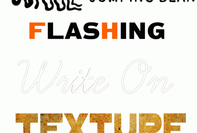
different animations together: A wiggle, the jumping bean,
flashing lights, the write on effect,
and mask on. As a bonus, I'm going
to show you how you can easily animate your
favorite textures. Because if you're
anything like me, I know that you'll agree
that [NOISE] texture makes everything
infinitely better. Now if you're not a
hamletter, don't worry, we're going to be using fonts
to create our animations. We'll discuss which
fonts work best for each type of
animation sequence, how to pull in and
set up your fonts, and how to create
your animations so that it's natural
to the human eye. Finally, we'll talk about the various ways
that you can export your animations to load
them on sites like Giphy, your blog, newsletter
or website. Now you may be
asking yourself with all of the free
animations out there, why create your own? Writing your own
text animations not only allows you to create
them around your brand, whether it's a particular
color palette, font or set of key phrases, it also allows you
to set the tone of whatever message
you're trying to convey. Plus having a collection of your own animations
on hand saves you the time and hassle of
having to sift through tons of animations to
find just the right one. The best part, the
animation techniques that you're going to
learn in this class can be applied to other
illustrations you create in Fresco, not just text. I'm only going to use tools
that everyone has access to, whether you're on the free or
premium version of the app. Now this class is
beginner friendly, but it's recommended
that you have at least some
experience with Fresco. If you're brand new to the app, I recommend starting with one of the great introductory classes out there before
taking this one. Now Fresco may not be the
go-to for text animations, but I'm a big fan of making the tools that you
have available to you, work the way that
you need them to. If you want to create your own text animations but learning more complex animation software just isn't in the
cards right now, this is the class for you. Come join me in class, and let's start animating. [MUSIC]
2. The Class Project: [MUSIC] The project for this class is to create your own animations using one or more of the
methods you'll learn in class. The wiggle, jumping
bean, flashing lights, the write on effect, mask on, and the bonus
animated texture. Once you've created
your animations, save them in GIF format and
you'll be able to share them to the projects and
resources section of the class. Sharing your project not only helps others see
what they'll learn but potentially helps more
students find the class. Next up, I'll show you how to download the 10 free
textures for the class. I'll see you there. [MUSIC]
3. The Class Downloads: [MUSIC] The downloads for this class include 10 high
resolution texture files, which will be animating
later in the class. You can download these from the projects and
resources section, just be sure to access
the class through a browser and not
the Skillshare app. You'll need a password
to access a link, and I'll put that up on
the screen right now. [MUSIC] Next up, an overview of Fresco
animation features. I'll see you there. [MUSIC]
4. Animation and Motion Overview: [MUSIC] Fresco's
animation feature has some distinct
advantages over animation in other apps. The first being that
the animation sequences are created at the layer level, and each layer can hold multiple frames rather than
one frame equaling one layer. Fresco has no
overall layer limits regardless of your Canvas size. These two things together
mean that you can ultimately create
as many animations as you'd like within a
single Canvas as long as the objects that
you're animating separately are broken out
into their own layers. Fresco allows you to
create both paths and frame-by-frame
animations and both can be created within
a single Canvas. Finally, in addition to
the animated layers, you can create as many
static layers as you'd like within the same Canvas and everything will
get exported together. Let's head into Fresco and take a closer look at how
animation works. [MUSIC]. Before we begin
animating in our texts, I wanted to do a
quick overview of how animation works in Fresco. I mentioned in the
opener that you can create multiple animations within a single Canvas as long as you have your layers
broken out separately. You also have two different ways you can create an animation, path animation, and
frame by frame. Now in this class, we're
going to be focusing on using frame-by-frame animation
to animate our text, but I'll show you how path
animation works as well. I have three different shapes
here broken out on two, three separate layers because
I want to animate them independently from one another and using a different method. I'm going to animate the square using frame-by-frame
animation and the circle and oval using path animation with
different settings. Let's start with the square. To turn on animation, you'll select the layer that you want to animate and select the little icon here
at the bottom with the three circles
and the play button. Now, my screen is set up
for a left-handed person. If yours isn't, your icon might
just be opposite of mine. Once you select it, a contextual menu will
come up at the bottom. I'm going to skip over
the top part here. Play all is going to
allow you to play back your animation
throughout creating it as well as when you're done. We'll skip path
animation for now again, we'll do that with a
circle on the oval. When you head into settings, the very first setting
that you can change is the overall frames per
second for your Canvas. As you scrub up, it's going to get
faster and as you bring it down, it
will get slower. I recommend trying different
frames per second with each animation you
create because you may find that you get
a different look depending on what you choose. The next setting that you can change is the playback mode. You can choose from Loop, Boomerang, or Play once. These are standard playback
modes for animation. In this class, we'll be
focusing mostly on Loop, but there's at least one
animation where we'll use Boomerang because it provides
a much smoother effect. Just like with
frames per second, I suggest trying
the different ones just to see what works
best with your animation. You can also turn on
and off onion skins, which are going to help you with both positional
animation as well as when you need to trace
an object like we'll be doing when we create
the wiggle effect. It's going to allow you to see a number of frames
before and after your current frame
so that you can keep on track with
what you're creating. You can change the number
of frames that you can see, as well as the opacity. Finally, the document timeline is going to allow you to see multiple animations
within a document in a single timeline. I don't actually turn this on, so you won't see me turn this
on throughout this class, but just know that it's there. With this box, I want
to have it come up, get thinner, come back
out to its regular size, and then come back down
to its original position. Now there's a couple of ways
that I can approach that. I can duplicate this shape and create that over a series of frames or I can tap this plus sign and it's going to
give me an empty frame, so I can trace out
this box or use one of the shape tools
to create a new shape. Now I actually don't
want to do that. I do want to use a
duplicate of my shape. The first frame that you'll see is always going to be
the layer you have selected. You can change that as you
start creating frames, you can drag things to different
spots in the sequence, but initially, the
very first frame is always going to be whatever you have selected in the layer. To duplicate this,
I'm going to tap on that frame and now I have two frames of
the same exact shape. I'm going to select
my "Transform tool". It's going to ask me
whether I want to choose the selected frame
or the entire layer. Now, remember, I want
to move this up and because I have two frames
within that layer, if I choose entire layer, it's going to move
both one and two up. I only want to move frame 2 up. I'll choose selected frame, I'm going to hold
my finger down on the touch selector here
and just drag this up. It's going to help me constrain my Y-position, so it
goes straight up. I'll hit "Done" to
accept that change. Now I can duplicate that again, choose my transform tool again and I'm going
to make it thinner. Again, hit "Done,"
I'll duplicate it, bring it back out to
its original size, and then I'll do one
more frame again, duplicate it, grab
my transform tool and bring it back down. Once I hit "Done," I can hit "Play" and the animation
is going to run through. Now this is really fast, so let's go into settings
and I can move that down, so it's a lot slower
and you can see the animation a
lot more clearly. I can also choose between
Boomerang or Loop, or I can choose
Play once as well. Now I do want to know, and I'm going to pause this. Because I have my
onion skins on, you can see that I
have onion skins for each frame there and
as I go through it, the onion skins are in
different positions. That's basically how
frame-by-frame animation works. Now again, I could go
through here and I could drag things around
in different order. It's going to make for a
very different animation. You can see it's
double jumping there. But once you create
multiple frames, you can drag things
around so that they're in different locations in
the animation sequence. We've looked at
frame-by-frame animation, let's look at path animation. Now, path animation is actually technically still
frame-by-frame animation. The only difference is you aren't creating the
frames yourself, Fresco is doing it
behind the scenes. To create a path animation, you'll select the
icon and you can just draw out any shape. Once you're done drawing,
it's going to send your shape along that path. Now you can change your settings
here so I can speed that up using my overall
Canvas frames per second. I'm going to bring
that back down. But I have some
additional effects that I can apply as well. I'll tap this fx icon. Now of course I can
change the blend mode and opacity just like any other layer but
in addition to that, I can add multiples of my shape. I can scatter those multiples, bring that back down. I'm going to skip over ease
and in ease out because I'll show you how that works
with the oval here. Now, in addition to the speed settings within
the overall Canvas settings, I can actually add
frames to this. I mentioned at the
very beginning that this is still a
frame-by-frame animation, it's just that Fresco
is creating the frames. If I add frames, it's going to slow it down
and if I remove frames, it's going to speed it up. Now I can still change this. It's going to make it even
faster but this allows me a little bit more control over the actual path
animation as well. Let's go ahead and
bring that back up to a pretty normal speed, that's a little frantic. There's one more
thing that I want to show you with the circle here. I can delete that path and
start over again if I want. I can also add multiple paths. I can draw out another path and it's going to
add another shape. I'm going to can add as many
as I'd like and Fresco is going to create a
frame-by-frame animation behind the scenes
each time I do that. That gives me a little bit
more control over where my multiples are than
the path effects do. Again, I can just
delete the ones I don't like and I'm back
to where I started. There are a couple more settings that I want to show you with path animation and it's easiest to show you where
the shape like an oval. I'm going to draw out a
straight-ish line and it's automatically going
to send my oval along that path in a
pretty uniform speed. Now, I can go into settings and I can play around
with these two options, either original
speed or uniform. I can also turn on or off, ease in and ease out. What this is going to
do is it's going to have it hesitate at
the beginning and slowly easing and then it's going to slow
down at the end. You can see it's easing in, speeding up, and
then slowing down. Let's take a look at
one more setting here. I'm going to turn off ease
in and ease out temporarily. The last one I want to
show you is aligned path. If I click on that,
it's going to align my shape to the actual path. This comes in handy
for something like creating a car on a road. Obviously, you wouldn't want
the car running this way, you want it running
along the road. Turning on a line, the
path is going to do that. Now let's play around
with something here. If I add multiples and I
scatter those multiples, I randomize the alignment path, I could create something
like a school of fish. Those are the various
ways that you can create animations within Adobe Fresco. Remember, if you want
to animate objects independently of one
another and make sure they're broken out
into their own layers, that's going to give
you the ability to create either frame-by-frame or path animation and you can set different settings for each of those path animations
if you'd like. We're ready to begin creating our first text animation
and we're going to start with the basic wiggle. I will see you there. [MUSIC]
5. Animation 1 | The Wiggle: [MUSIC] The wiggle is created by the imperfections
that occur when you trace an object across a
series of empty frames. Take this hi, for example, as I trace it across a
series of six frames, the wiggle becomes more intense because I'm adding
imperfections as I go. By Frame 6, it's way more intense than it was on Frame 2. Which fonts work best
with the wiggle? The short answer. All of them. Single line, handwriting fonts are going to be easiest to animate because you're literally
tracing a single line. But remember the
animation I just showed you have your weight
fonts also work. It just takes a few extra
steps to create the animation. You need to trace the letters across your empty frames
and fill them in as you go. As you add imperfections, just like previously, the wiggle is going to become more intense. Let's go ahead and head into Fresco and take a closer look. We're ready for our
very first animation. We're going to be
doing a basic wiggle. It's a very common animation that you'll see on Instagram. Now, I mentioned in the
opener of the video that you can use any font that you'd
like for this, however, the thinner
handwriting fonts are going to be the easiest and quickest to animate because you're just tracing
a single line. For the purposes of this lesson, I'm going to use a
heavier-weight font because it's a
little more complex, you'll need to outline them and then fill
them in either by hand or using the fill tool
across your empty frames. Because it's more complex, if you can create this one, any other font's going
to be a piece of cake. I'm going to be using a font
called Metallophile Sp8. That is an Adobe
font that you can download with a subscription. Now, overall, for this lesson, I'm only going to be using
tools that you have available, whether you're on the free
or paid version of the app. For the fonts though, I wanted to note for this
lesson as well as the rest. The exact font that I'm
using isn't important. What is important is
the type of font. If you don't have this one available to you,
don't worry about it. Just find the font that works best for what you
want to create. There's plenty of built-in
fonts to choose from. I've turned off the
previous animation and I'm ready to
create a new one, so I'll go ahead and tap
to add a new empty layer. I want to make sure my
text tool is selected, and I'll just tap to
add a new line of text and I'm just going
to type out the wiggle. I'm going to keep it
all on the same layer, but two lines, and I wanted
to stylize this text. I'm going to select both lines here and choose style text. If you don't see style text, you can also access it over
here in layer properties. The first thing I want
to do is change my font, so I'll tap texts there and I'm going to type in, actually, I already have this in a search, I'm just typing Metallo and
Metallophile will come up. If you are on a subscription and you want to import fonts, you can do that by hitting
the plus sign there. You can also go to more fonts that are
built-in with Adobe. Now, these lines
are very far apart, but I'm not going to use the layer properties to change that. I'm going to change that in a different way in a little bit. For right now, I'm going
to say this is done. I'll just close that. I want
to make this a lot bigger. I'm going to grab
my transform tool. I find it easier to use the
transform tool to change the size rather than
the layer properties. I'll hit done. Now, this next step is very important
for a couple of reasons. We're going to be creating
this animation by tracing the letters
over empty frames. I have my animation
on down here, and with this layer selected, you can see this is grayed out. I can't actually select empty frames because you can't select empty frames
with a text layer. I need to convert this to either a vector layer
or a pixel layer, depending on which type of brush I'm going to use
to trace out my letters. Now, I know that I'm going
to use a vector brush. I just prefer to use them. I'm going to select my layer, select the three dots here, and at the very bottom, you'll see convert to vector layer or convert
to pixel layer. I'll go ahead and choose
convert to vector layer, and now you can see it
changed that to a dot. The dot signifies
the vector in here. At this point, that's no longer great,
which means I can add an empty frame if I need it. The other thing
this allows me to do is stylize this
a little bit more. I wanted to take this there, I'm going to grab my
selection tool and select it. Then I'm going to use my transform tool
and make it a little smaller and move it
right about there. You don't have to do this. It's totally up to you how you want your final
animation to look. But just know that
if you do want to do something like that where
you alter the text, you need to make
sure that you can invert the layer first. I'll hit deselect and I'll make this whole thing
a little bit bigger. At this point, I've
prepared my font, I prepared my text, it's converted, and I'm all set to start creating
the animation. One of the reasons that I chose this particular
font is that it gives me a head start
with the imperfection. It's got a wonkiness to it. If your a favorite font that you want to use
for this animation happens to have a lot
of straight edges and perfect corners. You can use it. Just keep in mind that if
you keep that perfect letter or a phrase with the perfect straight lines and corners as part
of the animation. Every time the animation
cycles back to that frame, because it's the only one
that's going to be perfect. It's near impossible to trace
it out perfectly each time. It's going to be very obvious, and it's going to
create a pattern that you don't necessarily want that takes away
from the wiggle effect. If that font happens to be your favorite and you just like
the overall shape of it. What I would recommend
is pulling it in the way that I just did here, adding an empty frame
and tracing it out, and then going back
and getting rid of that first perfect frame. To get my animation started, I'm going to add an empty layer. Remember, I converted
this to a vector layer, so that means I need to use my vector brush to trace it out. If I accidentally
grab a pixel brush, Fresco is going to automatically
add a pixel layer. You can't use a pixel brush on a vector layer and vice versa. I'm going to choose just
the basic round brush. I've also turned off all of my taper and pressure
dynamics and things like that. I just want a regular, straight, almost monoline brush. I can always bring
this back to where it was by hitting this reset
button once I'm done. What I want to do is trace
out my shapes and then I'm going to use the fill
tool to fill in the rest, so I don't have to
do it all by hand. In order to use the fill tool, you need how to
completely closed shape and easiest
way to make sure that you do that when
you're tracing is to start and end inside of your letter. That also allows you to
stop when you need to. I'm going to start on the
inside here and start tracing and I'm not worrying about being
perfect is again, I want those imperfections. Well, I'll go ahead and
overshoot that and then come in. If I zoom in here, you
can see that I have these little spots here
because of onion skin, where it's not quite hitting the original line.
I'm okay with that. I'm going to leave that as is. One of the things that you
want to avoid with this. It's one thing to have little
imperfections like that. Make sure as you're
tracing this, you're not making your
trace a lot bigger or a lot smaller than
the original letter, and keep an eye on
that over here frames, that's why it's important
to have onion skins on. If you do that, it's going to have
a look more like it's breathing than wiggling. Just keep the size relatively
close to the original one. I'll just go ahead and
continue this around. I'm going to grab
my edge here and start tracing this out. I know this seems a very
tedious process and it is. I don't like how that looks. That came out way too far and that's not
going to look right. What I'm going to do
is I'm just going to put my finger on
my touch selector, and that's going
to allow me to use my vector brush as my eraser, and then bring it back so
I can stay on my brush, I don't have to
go to the eraser. I'll just go ahead and
start from the inside here and come down. Again, this is also a good way of allowing yourself a break. If your hand gets tired or
you need to move your Canvas, you can just start
from the inside and start tracing again. I'll just go ahead and
overshoot that, and come in. I'm going to speed
this up at this point, so I will see you on
the other side of this. [MUSIC] I have my outlines here and one thing that I
want to do is just zoom in before I fill these in
and make sure that there's no strange little bump
outs or places that are too concaved that
might stick out too much, because just like with
the straight lines that I was talking
about previously, if in one of your
frames you have a very obvious bump or dip
or something like that, and it's the only one, it's going to stick
out and create a pattern that you don't want. Just check what you're
doing as you go through. I think these look fine. Now I'm going to
select my Fill tool, and just fill these in. I'm going to turn
my onion skins off temporarily so that you can see. If I scrub back and
forth between these two, you can see the wiggles
already starting. Again, it's important
that you stay with the original size
of your letter. If these were a lot bigger, it was going to look like
it's breathing in and out, and I just wanted to have
a wiggle and that's it. Now, I want to do this over a series of six empty frames, so I'm going to add
another empty frame, turn my onion skins back on, and I'm going to
continue tracing this over another four frames. I'm not going to
do that on camera, I'm going to go ahead
and do that off camera and come back
when it's done. I'm not quite done with
my last empty frame, but I wanted to bring
it back because I wanted to show you something. At this point, I'm
at my sixth frame and I have my onion skins on for six frames before
and after my current frame. As you get further along in
the frame-by-frame animation, this becomes a lot more
opaque and it's more difficult to see that
very first frame. If you get to that point and you just want to
check where you're at against the first
frame that you created, you can always drag
this in the sequence to the first one so that the darkest one that you see is actually
that first layer, and then you can just
go back to tracing it. Again, this is just to
make sure that you are on track with the general
size of your letter. You could also turn
down your onion skins. The thing about that
though is that if you are off track and these final frames aren't quite where
you want them, you're not necessarily
going to get that. To do a double-check,
you can always bring it back as the second frame, so you can see that first one. I'll just go ahead
and fill these in, and then I can just
keep this here if I want or I can drag it back. Then once I do
that, it's going to change it back to frame 6. I'm going to turn off my
onion skins right now. Let's go ahead and play
back that animation. It has a nice wiggle to it. Let's just see what the
frames per second is. I have 12 frames, and let's just see what
seven or eight looks like. That might be a little too slow. Let me try nine. Now, I have this set to boomerang rather than
loop, and here's why. If I put it on loop, it gives it a choppy feel, especially if you're only
using four or five frames. When I use boomerang, what it's doing is it's effectively adding 12
additional frames. It's going up and
then coming back. Really, you have 12
frames instead of six, which means you have
less patterning. One final double-check
that you can do with this before
you export it, it's just a scrub
through the animation by hand using the timeline here, and all I'm doing is just
checking to see if there's anything that looks off. With this E here on
this particular frame, I feel like it's bumped
in a little bit too much. I'm going to make sure
I'm on that frame, I'll make sure I have my
vector brush selected, and I'm just going to
fix that a little bit. Now if I scrub through, might still be a
little too obvious. Don't feel like when you
create these frames, you can't go back and
change them at all. You can also use your
eraser if you want. But just remember at
the end of the day, if you have a single
imperfection rather than consistent imperfections
across your animation, that single imperfection
is going to stick out. It's always a good idea just
to go back and check things. I like how this is looking. I like the piece of it. I feel like the
wiggle looks good, I haven't gone too big or too small where it looks
like it's breathing. I'm going to go ahead
and call this done. [MUSIC] The wiggle
effect is created by the imperfections that
occur when you trace an object across a
series of empty frames. Slight imperfections
are desirable, but stay close to the size
of your original text, otherwise the effect looks more like it's breathing
than wiggling. Turning on your onion skins
will help you stay on track. So turn them on in Settings
so you can see frames before and after
your current one and keep an eye on things. Choppy spots or spots that
have gone astray can easily be fixed with your brush or eraser on each individual frame. Consistent choppy spots can add something to
the overall effect, but individual ones
are going to be very obvious in your
final animation. The specific font that
you use doesn't matter. Single line handwriting fonts or even your own handwriting
will be easiest to re-create. Middle or heavier weight
ones will require a little bit more work
as you'll need to trace them and fill them
across your layers. Remember to change your font to either a pixel layer
or vector layer, depending on which type
of brush you plan to use. You can't create MD
layers with a text layer. Once you're done, test out your animation and adjust
your frames per second. Usually doubling the number
of frames gives a nice rate, but play around and try
different settings. Finally, the boomerang tends
to work best with this type of animation as it creates a smoother effect than looping, which can make it look choppy. Next up we're going to take
a look at the jumping bean. I'll see you there. [MUSIC]
6. Animation 2 | The Jumping Bean: [MUSIC] Let's take a look
at how jumping bean works. Individual letters are moved up and down across
duplicated frames, as the letter comes
down its color shifts, and the next letter
begins to rise and fall. This continues for
the entire word until all letters have
jumped and shifted color, so which fonts work
best for jumping bean? Cursive fonts don't work. Print fonts work
best because you can easily animate each
letter individually, and while the weight of
the font doesn't matter, heavier weight fonts will
show the color shift better. Let's head into Fresco
and take a closer look. [MUSIC] All right, we're ready
for our second animation, I call this one the jumping
bean for obvious reasons, the letters are going to jump across the word in sequence. As they jump up and
come back down, they're going to change color, and the next letter
in sequence is going to begin to rise and fall. Now I mentioned in the
opener of this video that this particular animation
works best with print fonts rather than cursive fonts that have connectors
because you need to be able to individually select
and move the letters. So I've written out my
words on a new layer. I'm using a font
called Anton regular, which I believe maybe one
of the built-in fonts. But again, just like with
the previous animation, the specific font that
I'm using doesn't matter. I've already mentioned
that I recommend using a print font for this so that
you have separate letters. I also recommend using a
heavier or medium weight font, because if you are going to do the color change and you
use this at a smaller size, you're going to want to
make sure that you can see the color change and if
you have a thinner font, it's going to be more
difficult to do that, then go ahead and choose
any font that you'd like. Now this is still a text layer, and I've left it that
way because there are some changes that
I want to make using the text tools before I convert the layer
to a vector layer. Just like with the Wiggle, because I want to use
the transform tools to move my letters up and down, I need to convert it from a text layer because I
can't do that otherwise. But before I do that, I want to have live text so
I can make some changes. I'll go ahead and
select my "Text tool", and I want to select both words and the
exclamation point, and I'll move this up here so you can see what's happening. I'll go to my layer properties, and the first thing I
want to do is give each of these letters a little
bit of breathing room. I want some room that I
can not only select them, but so that they have a more individual
presence and they aren't squashed next
to the other letter. This is a little bit tight, so I'll go to my kerning
down here at the bottom, and if you just
start dragging up, it's going to begin moving
everything to the right. I don't want to go too far, I'm only going to go about 30. But I do however, want to make an
additional change to the exclamation point, I'm going to have it
do a little bit of a wobble at the end and flip back and forth and
then as it comes to rest, that's when it's going
to change its color. I need to give it a little
bit of room to do that. I'll just drag this
over so that just the N and the exclamation
point are selected, I'll go back down and I'm
going to drag this up further. I don't need to go too far, is just about 70 there. Again, I just want to have enough room that when I tilt it 15 degrees either way it's
not going to hit the N. Now that I've made the changes to the spacing in my letters, I'm ready to begin animating so I can go ahead
and convert this. Again, I'm not converting this because I need empty frames, we're actually going to
be using duplicates, but I'm going to need to
convert this so that I can use my transform tools on
the individual letters. With my layer
selected, I'll go to the three dots and I'm going
to choose vector layer, but you can choose
pixel if you'd like. The way that I'm
going to animate this is to have a letter rise all the way to my top line
that I'm going to designate, and as it comes back down, when it gets to about
the halfway point, it's going to change color and the next letter in the sequence is going to rise to the top, and that's going to continue
all the way across. I'm going to have the
exclamation point rise and fall, but I'm also going to have it do the wobble that I talked about. What I want to do is give myself some guides to work with. You could do this organically and just move them up
to where you want, it's totally up to you, I just find it easier to
work with some guides. The first thing I'm going to
do is turn on my "Grids", you can find that
in the icon here. Again, don't forget my screen is flipped for a
left-handed person, so yours might be
on the other side. I want to give myself the top line as well
as that halfway point, so with my vector brush, I'm going to choose black here and I'll give
myself an empty layer. Now this is a layer
that's not going to get exported with the final
illustration or animation, it's just going
to give me what I need throughout the animation. I'm just going to draw my
line and hold it straight, and let's do that. I can actually just
select this one, and I'll duplicate that. Let's just bring
that down to give myself a halfway point, so right about there, and I'm going to duplicate
that one more time, I want to give
myself a baseline. Before I do that, I really want to
adjust my letters to have them really sitting
on a line somewhere, so I'll grab that layer and I'm just going
to move this up, hold your finger
on a touch slide if you want to keep it straight. It's already about there, so I'm going to grab
my "Guide layer" here and I want to
duplicate this line again, I'm in the wrong layer there. I want to be in that one and I'm just going to bring
this to the very bottom. I just wanted to give
myself a baseline there, that's where I know all
the letters are going to land and I'll hit "Done", and I can turn my guides off, and I'm just going
to keep these on. Again, we'll start with the J, it's going to come up
to the very top and the very first
frame of animation. It'll come down to about a
halfway point and change to a light pink and the
U is going to go up, and I'm going to continue
that all the way across. The first thing I
want to do though, is make sure I have my
texts layer selected, and I'm going to give myself
about five frames of it in this position
and color just to set a baseline for the
animation so that you can see, started as red and
then it ends as pink. I'm going to duplicate
this five times, and then I'll duplicate it
one more time and this is where we're going to start
animating the letters. All right. The first thing
I want to do is select my, J, with my rectangular
selection tool. I'm just going to
draw a box over my J, I'm going to stay on that frame and grab my Transform tool. I'll hold my finger down
on the "Touch selector", and I'm going to drag this
all the way up to the top. Now you can go up
further if you want, I'm just going to
go to about there, so it's at the very top of the letter and I'll hit "Done", and that is the first frame, de-select, and
duplicate that again. Now I want to select it again, grab my transform tool, and I'm going to
bring it halfway down and I'll bring
it to about there, hit "Done", and I want
to change the color. Make sure it's pink, so I'll go ahead and
select this light pink and I'll deselect that
one and I want to, on that same frame
that number 7, grab my U here and I'm going to drag this
all the way up to the top. The reason that I'm doing this incrementally is because
doing it that way is going to give you a
much smoother animation and it's going to just give it a little bit more emphasis on the jump by doing it
incrementally, So hit "Done". Alright, let's go ahead
and duplicate that frame. I'll go ahead and
select the U again, and I want to bring it
this about halfway down, I'll bring it to about there. I also need to bring
my J all the way down and this is where
planning comes in handy, I almost forgot to move my J, which would've been a problem, and I'll bring that
right about there. Hit "Done", I also
want to make sure I changed the color of my U, and on this frame I'm now going to add a third
letter into the mix. I want to select my M and
because my U is halfway down, I want my m all the way up, so you can see it's ramping. De-select, duplicate the frame, I want my U to come
all the way down to its resting point and then grab my M. I want to change the color and drag it halfway down and you can
determine what halfway is. But I would just be
consistent across the board. I'll deselect and now I
want my P to go back up. For the first couple of frames, you're only working
with two letters, but after that you've got
three going at the same time, so it's something
to keep in mind. You want to make sure
again that you plan it out so that you can keep
track of everything. De-select. Now I'm
going to continue this all the way across the word until I get to
the end, because again, I'm going to handle
the exclamation point a little bit differently and I want to show you
what I do with that, so I'm going to speed it up at this point and I'll come
back when I get to the end. [MUSIC] I have gotten to the point where my N
is about halfway down and it's changed color and I want to begin working with
the exclamation point. I'm going to add a
duplicate frame, grab my selection tool. Actually, I want to backup. I'm not going to add a
duplicate frame just yet. I want to bring my exclamation
point out to the very top. One of the things
that I recommend, is that you have an order in
the way that you do things. You move the first letter, you change the color of the next letter and
drag it to a point. Do it in a particular order all the way across
because it's going to help you keep track
of what you're doing. I actually just lost the order of what I was doing
and that's why I almost forgot to bring the
exclamation point up to the very top on that same frame. I'll deselect that and
now I'll add a duplicate. I'll grab my N and
bring it back down. If you feel it's not
quite where you want it, you can just use
these little arrows. It doesn't have to be perfect. These lines aren't going to be showing once the
animation is done, but you want to make
sure it's pretty close to where it was
because otherwise, you're really going to see it and the animation
is going to jump. I've brought this one down. I want to bring my
exclamation point to about halfway and I'm
not going to change the color until
it's done wobbling. I'm going to bring it halfway. I'm still going to do
this incrementally so that it's got a
more fluid movement. I'll go ahead and
hit "Duplicate". I don't need to re-select it. Just bring this back down. At this point, I
want it to wobble. I'm going to bring it
15 degrees one way and then 15 degrees
to the left as well. I'll go ahead and
duplicate that frame, grab my Transform Tool. I'm going to hold my finger on the Touch Selector and
it's going to allow me to snap it to 15 degrees. You can see it's pretty
close to that end. This is why I wanted to
move it out a little bit. It's not hitting, so I'm not
going to worry about it, but I do want to
duplicate the frame. Put my finger on
the Touch Selector. You can see what happened. Alright. What I should've done is restarted it
because it actually grabbed part of that
N. I'm going to hit "Done" and I'm going
to backup, deselect. I want to make a new selection. I'm going to use the
Lasso Tool instead, because it's going to be very
difficult to do that with the rectangular one because
of that really tight space. Now I know that I haven't
selected any of that N. I'll hit my transform tool and now I can go ahead and
bring this to 30 degrees. Let me just make
sure right perfect. I'll hit "Deselect". I
don't need to redo that. I can actually just use
duplicates to this. I'm going to do about
three of each of these. I'm going to duplicate this
frame where it's going to the right and then
drag it to the end. I'll go to the second frame in where it's
coming to the left, duplicate it, and drag it to the end and I'm going
to do that a few times. I want it to wobble
back and forth about three times.
Let's just see. Now I want it to come
to a straight point. I'm going to duplicate
this frame and once again, use my Lasso Tool. It will be a lot easier than
using a rectangular marquee. Select it, put my finger
on the Touch Selector, and pop it into place. I'll hit "Deselect". This is the point where I want
it to change to pink, when it comes to
its resting point. I'll grab my Fill Tool
and change it to pink. Let's go ahead and
turn our guides off. I'm going to run through
the animation just to check and make sure
everything looks good. I'll go back to that layer
and I'll hit "Play". This looks good. I like
how everything is running, everything landed where
it was supposed to. The issue is that as soon as the exclamation point is done wobbling and changes color, it immediately starts
up again and it doesn't sit on this pink color at all. I'm going to stop that and bring it to the very
end of the animation. I'm on my 26th frame. Now, Fresco has no way
of creating a hold. What I mean by that is
you can't tell it to automatically add a set number of duplicates of this frame, you need to duplicate
them yourself. I'm going to take this
final frame and I'm going to duplicate it about 20 times. I have 20 copies of the completely pink letters
all at the very bottom, so that it's going
to basically hold at the very end and
then start up again. Let's run through that again. Its going to wobble, hold, and then start up again. You can do that as
long as you want. I just stuck with 20 because
I think that's fine. You could also add more at the very beginning
if you wanted it to hold on red longer. I think five frames
is fine for that. I like how this looks. One recommendation I
have is that before you make those duplicates
at the very end, run through your animation because if you find a spot
that you need to fix, you're going to
need to fix it on that frame and every
subsequent frame. Because remember, it's repeating across the entire animation. Doing it before you create
those duplicates means you're going to have to correct
a lot less frames. Just keep that in
mind and run through your animation before you
do those and the frames. [MUSIC] This animation works by selecting each
letter individually, moving it up and back down to the original point over
a series of frames. Rather than working
with empty layers, we created them using
duplicated layers for consistency
across the animation. As each letter comes down
to it's original point, its color shifts so that by
the end of the animation, the entire word is
a different color. Handwriting fonts or anything with connectors doesn't work, as you need to be
able to animate each letter individually. Print Fonts do work
best as you can easily select an
animate each letter. Finally, the weight of
the font doesn't matter. However, heavier weight fonts do show the color shift better. Next up, we're going
to take a look at the flashing lights animation.
I'll see you there.
7. Animation 3 | Flashing Lights: [MUSIC] In this animation, we're going to create flashing lights by
selecting letters at random and briefly changing
their color over a series of duplicated frames. This particular animation
works best with heavier weight print
fonts rather than cursive fonts that
have connectors. Letters are selected at
random and their color is briefly changed before
moving on to the next frame. Let's take a closer look. Now, here we're ready
for Animation 3, which is flashing lights. This is similar to the
last one jumping bean, except that we're
not actually moving the texts so much as the color. We're going to individually select letters like
we did last time. This time though at
random and we'll briefly shift their color over a
series of duplicated frames. Now, just like
with the last one, handwriting fonts or
anything with connectors, isn't going to work with
this animation as you want to be able to select
individual letters. The weight of the font doesn't really
matter, though again, if you plan on using
this at a smaller size, you're going to want to use a
medium to heavyweight font. Because when it's scaled down, it's going to show
the animation better. I've set up my
letters and I'm using a font called Poppins black. It's a heavier weight
font, but again, if scaled down will still show the color shift very easily. Now we're not going to be moving any actual type in
this animation. The motion is going to come from the random color
shifts that are going to happen across the letters over a series of
duplicated frames. It's the randomness of
the color shift that's going to give the overall
animation a more natural feels. So we want to be very
careful when we're selecting our letters so we can
avoid any patterning. Now unlike the jumping bean, we're not going to be using
any selection tools for this. However, we will be
using the fill tool to change the color of
individual letters. In order to do that,
we need to convert our texts layer to either
a vector or a pixel layer. But remember when we do that, we lose any life type, which means that anything you need to change what
the text tool, you're not going to be
able to be sure that you have the font of your choice and any changes that you need to
make it with the text tool are already done before
you convert your layer. Now I've already made the changes that I
wanted to do and they're similar changes so what I
did with the jumping bean. I use the text tool to change
the kerning of by letters, so I spread them
out a little bit. I also adjusted the lighting
between the two lines. I just pulled them
closer together. Once I was done, I went
ahead and converted my layer from text
to a vector layer. Mine is all set to start
making the color shifts. The way that I want my animation to look is that I
want it to hold in this state for the
first four or five frames. It's going to randomly
color shift over a series of additional
duplicated frames and at the very end it's going to flash back
and forth between all red and all light pink until it finally lands on light pink and again
holds for several frames. One thing that you
have to remember is as you change your letters, you need to remember
to change them back. The easiest way to do that is to create all of your
duplicates upfront. I'm going to go ahead and create 40 duplicates of this layer. I'm going to speed it up, so I'll be right back. [MUSIC] I have my 40 duplicate
frames setup, and before we begin
shifting our colors, I wanted to explain why I just
set that up ahead of time. With this animation
in a single frame, we're going to pick
two or three letters to change to a different color. We'll move to the next frame, which will be a duplicate frame, and then pick two or three
more and shift their color. But we need to make sure
that the two or three from the previous frame
are changed back. Let me show you what I mean. I'm on my very last
frame here and I have my Color Fill tool selected and the light pink that I'm going
to change the letters to. I'm just going to
randomly pick three. Now if I were to
duplicate this frame now, these would still be pink and I needed to choose red so that means I need to grab
my color picker again, choose the red,
change this back, go back and change this to pink, and then pick two or three more. It's not that that's difficult, but over a series
of about 40 frames, you're adding a lot of unnecessary time to the
creation of your animation. The other thing
that you do is run the risk of forgetting to
change the colors back. The reason that you
want to make sure that they're shifted back
is so that you don't see any patterning or any
hold throughout the frames. Let me back out of
this and I'll show you why we're using duplicates. I want to take this back
to the original state. I'm back to frame 40
and everything is red. Let me back one frame up to 39. I have my light pink selected, and I'll just choose
three letters at random. If I go to my duplicate
frame that's already in place and already in
the original state, I don't need to remember
to change those letters. I can just pick the next
two or three letters. Now I can flip back and
forth between these two. Now, I picked the same
letters in this case, which is something
you want to avoid. But again, this is just a way of avoiding additional rework. When it comes to
these animations, think about how you want your final result to look and
think about ways that you can save yourself time over
the course of creating the animation as well as avoid pitfalls like forgetting to make changes that you need to. I'm back to the
original state where I have 40 duplicates of this frame and I'm going to head back to the beginning
of my animation. I want the first five frames to be held in this
state, so all red. I'll skip right past
five, go to six. At the very end, I'm going to use the
last several frames to flash back and forth
between all red and all pink a few times and
then have it land on all pink and hold it for
a few more frames there. I'm going to start on frame 6, selecting two or three letters, moving to the next frame, selecting two or three more. It's up to you how many letters you'd like to choose
at each frame. I find two or three random
letters gives a better effect. But that's totally your choice. I'm just going to
select these three. Now the trick is going to be remembering what
you just selected, because remember, if
I flip to this one, you no longer see it. I had L, G, and S selected, so I want to pick
two or three that aren't any of those
letters so I'll go with I, H and F. I always try to choose at least
one on each line. I have F, I, and H. Let's use T
and A this time. I'm just going to continue
this over about 30-35 frames. I'm going to speed it up at this point and I'll see
you on the other side. [MUSIC] I have done that across
35 frames and what I tried to do is just
make sure that I'm not picking one letter
more than others. It's difficult again, you're starting fresh
with each frame, so it may be difficult
to keep track. I recommend scrubbing
through and just making sure that one of your letters isn't flashing more
than the others, unless that's the effect
that you're going for. I think mine looks pretty good. I'm on frame 35, which means my next one
is going to be all red, and this is how I want this. Now, I actually could
just do a few more because I really don't need
these additional frames. I think I will just randomly select just a few more frames
until I get to 40 there. Now I'm on my final frame
and I have all read. Again, I want this
to flash back and forth between all red and all pink a few times and then
finally land on all pink. I'm going to
duplicate this frame, and I'm going to change all of the letters in this
frame to pink. At this point, I don't
need to keep doing that. Instead, I'm going to
duplicate this frame, drag it to the end. I'll go back to the pink, duplicate it, drag
it to the end. This is similar to
what we did with the exclamation point and
the previous exercise. It's just a little easier
to see in this case. I'm going to do
that about three or four times for each one. I know that I want
this to land on pink, so I want that to be
my last duplicate. I need another pink one and I'll do one more red and
then one more pink. We'll move that to the end and this is the end-state
that I want. At this point, I'm going to add about 10-15 frames
of this color. I have a total of 60 frames. I just added about
10-15 of this pink. Let's go ahead and hit
"Play" and see how it looks. It starting on red and it
flashes between the letters. I don't see any letter flashing more than the others
and it looks like all of them flashed at
least two or three times and that's another thing that you want to keep an eye on. If you've missed any of the letters that's going
to show up as well. Just keep an eye out for whether you need to
go back and fix that. It holds on the pink
and then it goes back to the red and
starts all over again. Now you could speed this up. But I find this particular
one if it's too fast, especially when
your colors are in the same family and
relatively close together, it's harder to see
that color shift. It just looks like a
flickering light instead. I'm going to bring that
back down to about five. I just find that
works a lot better. I'm going to do one final
check before I call this done. I like how this looks. I think it's animating
at a nice pace. I don't have any
patterning where I'm not picking a particular letter or I'm picking one too much. I'm going to go ahead and
call this animation done. [MUSIC] Letters are individually selected at random and
their colors are briefly shifted over the course of a
series of duplicated frames. Texts layers need
to be converted to either pixel or a vector so that letters can be selected individually and filled in
with a different color. Make sure to select
your font before converting as once you convert it to either
pixel or a vector, it's no longer live type. The randomness of
the color change is what helps this
animation look natural so try to avoid patterning when you're
selecting your letters. Handwriting fonts, or anything with connectors
won't work with this animation as you
need to be able to select the individual
letters for animation. Finally, any weight font
will work, however, heavier weight fonts will show the color shift more easily. Next up, we're going to take a look at the fourth animation, the write on effect.
I'll see you there.
8. Animation 4 | The Write on Effect: [MUSIC] The write
on effect mimics handwriting by gradually
revealing a word or a phrase and the
natural direction and speed at handwriting. The effect works best when using either a cursive or
handwriting font. Print fonts can be used. However, they are more
challenging to animate naturally. In this effect, we're
going to use masks to hide our texts
non-destructively. Then uncover the text by
animating a mask reveal. By doing so incrementally in the same natural direction
as our handwriting, we can mimic smooth
writing when it's played back at a higher
frame per second. Let's head into Fresco
and take a closer look. We are ready with animation
for the write on effect. Now, this is another very
common animation that you're going to see on social
media or on websites. What we're going to be doing is mimicking handwriting and using the masking feature in Fresco to do that
non-destructively. Now there's a few
considerations when it comes to choosing the font, and I mentioned a couple of them in the opener of the video. This effect works best
with a handwriting font, but it doesn't have
to be cursive. The heavier-weight print
fonts are going to be more challenging
to animate on, and they may not read as well unless you're using
some sort marker font. But I recommend trying out your favorite font and
just see how it looks. Now we're going to be
creating this again by animating a mask reveal. In order to do that naturally, we want to think ahead as
to how we would naturally write a word on and reveal our mask in
the same direction. Now before we get into actually
creating the animation, I want to talk a
little bit about how masking works in Fresco. I have this leaf shape
here that I created, and this is actually a vector
shape that I pulled in. However, I do want to note that masking in Fresco
is all pixel-based. Even if you're starting
with a vector shape, just note that when you start
using the masking feature, you're going to be forced
to use pixel tools, so it is something
to keep in mind, especially when you're
sizing your document. Now the first thing
I want to note about masking is that it all starts
within the layer itself. I'm going to tap on my
leaf layer here and then tap again to get my
layer action menu. There's two ways
that I can add this. The first is to
create an empty mask, which you can see created a white mask there
over the entire layer. Now nothing happened
because again, it's a white mask and with
any masking in any app, white reveals and
black conceals, so in order to hide the leaf, I'd need to tap the layer
and hit "Invert Mask." The other way that I
can create the mask is again to tap the layer to
get the layer actions menu, and mask layer contents. Now the same thing happens that happened
with the previous one, nothing is concealed
because it's giving me a white mask on
a black background. I'd need to tap again
and hit "Invert Mask." Now it's giving me a black
mask in the exact shape of my leaf and the leaf
is [inaudible] concealed. I want to draw your attention
down to the bottom here. As soon as you add a mask here, it's going to give you a very small contextual
menu at the bottom, showing reveal and hide. Now in other apps, when you're using masking, you're going to use a brush
and either use white or black to either reveal or
conceal with your mask. In Fresco, it's all done here. If I have "Reveal" selected, anything I do with
any color brush is going to reveal my mask. If I have "Hide" selected, it's the opposite,
I'm going to hide it. Again, the actual color of my brush doesn't matter at all. What matters is what you
have selected down here. Now another thing you'll note is as soon as you add a mask, it's automatically going
to choose the pixel brush. Again, the masking feature in
Fresco is all pixel-based, so you can't choose
either the live brushes or the vector brushes. However, you can choose
any pixel brush. It doesn't have to
be a basic brush, which means you can
actually reveal your mask using a
texture brush as well. Beyond the pixel brush, you can also use some of the shape and fill
tools down here. I could grab my lasso tool. I could use one of my
built-in shapes and I can use my fill tool and I'll show you how that
works in a moment. Let's start with the
pixel brush though. If you look at your layer here, it looks like the leaf
layer is completely gone. But if you flip, that's the original leaf layer, and if I flip back,
that's the mask. This is a key thing to remember because especially in
the next two animations, we're going to
either be animating the mask or we're going to
be animating the layer, and you need to make
sure that you're on the right one so that the
animation runs properly. I'm on mask layer and I'm going to make sure
"Reveal" is selected. I'll go ahead and select
one of the pixel brushes. I'm going to start with just
the basic hard round brush. On reveal, if I start
drawing on this, so you can see that
it's starting to reveal the leaf shape
from under the mask. I can go ahead and hit "Hide" and the opposite is the case. Now again, I don't need to
just use a basic round brush, I can use any of the
texture brushes. If I grab one of my favorite
texture brushes here, I'll use the pigmented
brush from one of Kyle Webster's packs
and I have it on reveal and I just start
brushing across this. You can see that it's
coming in a little bit more faint
because it's doing it with texture rather
than a solid brush, and if I zoom in here, you can see the nice
texture from that brush. Then conversely, I can
go ahead and hit "Hide", and the same thing
is going to happen. Now I mentioned previously
that you can also use some of the shape
and selection tools. While I'm on my mask layer here, if I grab my ellipse tool, for example, and just
drag out an ellipse, I can grab my fill tool, and it's going to fill in within that circle shape so
that if I deselect it, you can see it creates
an oval there. I can do that with
any of the shapes. I can also grab the lasso tool and draw a shape that I want. I, again, fill it in. It's going to fill it in in certain spots because, again, remember, we used
a texture brush to reveal some of our mask. A couple of final things that I want to note about masking. There's a couple of
ways that you can show the mask on your illustration. You can choose red
overlay if you'd like. I personally find on layers
works better for me. You can also copy your mask, cut your mask and paste it, and we are going
to be using that in the bonus animation and
I'll show you how to do that. Then, the other thing
that I want to draw your attention to is you
can unlink your mask. If I have this linked and
grab my transform tool, everything is going
to move together. If I unlink it by
clicking on that icon. If I grab my transform tool
while I'm on my mask layer, I can drag that around
and you can see that it's staying
within the shape, but I can move it freely
from the shape itself. The same thing goes
for the shape. If I grab my selection tool, I can move that around
independent from the mask. Again, this is going to
be something that we use in one of the
upcoming animations; the mask on as well
as the texture. We need to work independently, so unlinking and linking
is going to be key. Then, one final note, you can also turn your mask off simply by tapping
that icon there. That's it with the masking. Let's go ahead and start diving into the
actual animation. I have my letters
in place and I'm using a font called
learning curve, which is a connected
cursive font, but again, the specific font that I'm using doesn't matter. You can use any font you'd like. But as I mentioned previously,
handwriting fonts, whether cursive or otherwise, do work best for this effect. I have two copies
of my layer here, and the reason for that is
once I mask this top layer, it's going to disappear and onion skins aren't going
to work in this case. What I want to do is
give myself a guide because I'm going to be
animating the mask reveal, and I need to see the
direction that I'm going in. As I mentioned previously, it's important to
think ahead as to how you would write on the words naturally and animate your mask in that same direction to
make it run more smoothly. How I would write this on is to start here at the
left and come up. I would complete my w and then come back around
and start my r up again and continue this until I get to about there on the t, come to the top, start my t to complete my
little hook there. Create my e and my crossbar over my t. Now I'm going to save the dot over the eye
for the very end. I'll write to the o, start here and come
around and up, down, up, and then complete it, and then again on the very
last frame add my dot. That's the way that I want
to animate my mask on. The first thing I'm
going to do is give myself a mask for
this top layer, so I'll tap and I'm going to mask the entire layer contents, so I'll just you
create empty mask. Again, it's giving me
a white mask to start, so I need to invert that. Now of course it's still
showing because I have my layer here and this is going
to be my guide layer, so I don't need it
to be this opaque. I'm going to select it and bring the opacity down
to about 10 or so. I just need it enough
that I can see it so that I can animate
my mask on properly. At this point, you want to
make sure that you're back on the mask layer for
that top layer. Again, the color of your
brush doesn't matter. The only thing that matters is whether you have
reveal or hide on. I also want to make sure
that my animation is on, so I have my frames there. We're going to be creating
this over a series of duplicated frames because
as I add a reveal, I want that to stay in place
as I go to the next one. I have the basic hard
round brush selected, you can choose a textured
brush if you'd like. I'm going to animate mine with a regular opaque brush
with no texture, and I'll zoom in here. Now the first few frames, I actually want it to
be completely blank. I'm going to duplicate
this a few times. I'll start animating
on my fourth frame. With my brush selected and the contextual menu on reveal, and making sure that
I'm on my mask layer, not the actual text layer, I'm going to start
animating this on, and I want to do this in small increments rather
than larger chunks. Doing it in smaller
increments over a lot of frames is going to give a
much more smooth animation. Then if I do it in larger
chunks over a few. Each time I do, I do want to duplicate my frame. I'm going to bring this up. I'll hit duplicate and again, just add a little bit more. Now in this particular case, I'm going to stay
to the left side of this shape and then come
back down on the right. I'm going to bring my
brush down a little bit. Add a duplicate. I just carefully
draw line there. This animation is
not a quick one. It is going to take time and
it takes a lot of frames. One of the things that
I will caution you is because you will end up
with a lot of frames. You want to do this slowly and just keep
an eye on what you're doing so that you can correct
things as you need to. If you accidentally
reveal something, let's say I hit something there. Instead of deleting
the entire layer, I can just hit Hide
and get rid of that. Make sure I'm back on reveal
and just start up again. I hit Duplicate.
Come up to the top. I'm just going to keep doing
this as I come back down. As you need to just adjust
the size of your brush. Once I get back to this part where I don't have
to worry about it, I'll bring it back up
because otherwise, it's going to take me a lot
longer to do this animation. Again, I'm doing this in
very small increments. I'm going to speed
this up at this point until I get to the
t. Just remember that I'm going to be
revealing this in the direction that I
would write the word on. I'll see you once I'm done. [MUSIC] I've animated on
the first part of my first word here and
I stopped the t. I think I might add
just a touch more here so that it comes a little
closer to the t itself, it doesn't have to be perfect, because this is
going to be running through at a high
frames per second. You're not going to
see little things. I'm going to duplicate that. I'm going to start at the very
top of the t now and come down until I get to about here, and make my brush smaller. This is where it's important
to take your time. I want to make sure that I'm not animating on any part
of the crossbar, so I'm just being really
careful to stay inside here. I'll come down. I'm just going to keep going around
until I get to about here. My brush is really small, so it's taking me
a little bit more, but I'm in some
tighter spots here, so I just want to be careful, go to our ripe about there. I'm ending my t. I'm going to add a duplicate
and start doing my crossbar. Now you could do
the crossbar after you do the e, it's up to you. I'm not going to do the dot over the i until the very end. Now I'll duplicate and
I'll start out with my e. I want to stay within
my space right here. I'm just going to draw lines. Went a little overboard there. Let me hit Hide. Again, it doesn't
have to be perfect, but you can really
see spots like this. You just want to keep an eye
out as you're going through. I'll just keep going around. I'm going to speed this up at this point again until
I get to the very end. I'll come back before I finish the dot over the i.
I'll see you there. [MUSIC] Both of my words are written on. One final thing left
to do is to animate on the dot over the i. I've
added a duplicate frame. Now instead of using the brush, I'm going to use the Lasso tool. I want to make sure
I'm on my mask layer. I'm going to trace
around the edges of the dot and then use my
fill tool to fill it in. Once I hit Deselect, it's in place and it's going to pop up on that final frame. A couple of dots about playback settings for this
particular animation. For some reason, the loop animation tends
to get a little bit buggy. I don't know if it's
a problem with fresco that's going to be fixed
or it's just how it works. I find that when I play back, if I just do it on Play once, it works perfectly fine. Once you export it, it
seems to be just fine. It's just the playback mode
that gets a little bit buggy. I haven't set to play once my frames per second or
all the way up to 40. Because the higher frames per second are going to make
this run more smoothly along with animating it on
incrementally. I'll hit Play. You can see it's writing it on, puts a dot and then
it sits there. Let's go ahead and
pause that and turn off our guide layer so
it's completely blank. I'll hit Play again. It's writing it on
in the direction that I would have
written this on. Now, I'll show you how
it looks with loop. Sometimes it runs
fine when it's doing playback and sometimes it gets
a little bit of a hiccup. You can try it. See it just went right back
and started it up again. I just find that playing it
back on Play once works best. I just want to
check and make sure that everything is
riding on smoothly. One final thing to note about this animation is if you
are going to export it with a loop animation
and you want it to hold in this state before
it starts back up again, make sure that you're adding those duplicate frames at the end like we have previously, anywhere from 10, 30, 40, 50, however long you wanted to hold, just add some duplicate
frames at the very end. I like how this
animation is running. I think it's running smoothly and the increments are good. I'm going to go ahead and
call this animation done. The animation mimics
handwriting by writing on a word or a phrase over a
series of duplicated frames. Using frescoes masking feature, we gradually reveal
more of our font until the entire
word is complete. Doing so in tiny increments
over many frames, will give us a much more
fluid animation that if it's done in larger
increments over a few. This animation works best
with handwriting fonts, though they don't
have to be cursive. Heavy weight print fonts are going to be
more challenging to animate but try out your favorite font and
just see how it looks. For best results, think ahead as to how you
would naturally write on your word and unmask it
in the same pattern. Finally, a higher frame per
second is going to give this animation a much smoother
and more natural feel. Next up, we're going
to take a look at animation 5; mask on. I'll see you there. [MUSIC]
9. Animation 5 | Mask On Effect: This animation uses
fresco's masking feature to hide two lines of text and gradually reveal them over a series of
duplicated frames. Both lines of texts
are placed opposite of where they'll finally
land and masks are placed over each of
them, making them invisible. Each line of text is
then moved out of it's mass gradually
over a series of duplicated frames
until both words land exactly where we want them. Let's take a closer look. We're on our fifth animation. This one is called mask on. We're going to have
a line mask on first and then two layers of text are going to come
up from the bottom and the top and emerge
at the same time. Now the cool thing about
this particular animation is we're going to be working
entirely non-destructively. We'll be using a live text because we don't need to change the fill color or use any selection tools so we
can keep the text live. We're also going
to be using masks so that we can make changes
at any point in time. I mentioned in the beginning of the video that any font is going to work for this of
any size, weight, or type. I personally find that using similar fonts if
I'm using two lines, gives them a much
smoother animation than trying to work with
two very different fonts, but it's completely up to you. Again, because you are
working non-destructively, you can test different
things out as long as you remember to adjust your
masks accordingly. Let's go ahead and get started. I haven't set up my text yet
because before I do that, I want to show you two ways
that you can easily create the line that the text
is going to emerge from. I'll give myself an empty layer. The first method is to grab the rectangular
selection tool and just drag out the shape. It's going to give you a
selection which you can then just use the
fill tool to fill in. Now the downside
of this one to me is that the only way you
have of adjusting this before you fill in the shape is to use the add or
subtract tools here. If I needed to
make this smaller, I would flip it to subtract and drag some away and vice versa. Once I fill it in, if I grab my fill tool and just tap and add either a
vector or a pixel, now I can transform
it however I need to. But again, I don't have
that flexibility upfront. The other approach that
you can take to creating that middle line is go to the bottom here where
you'll see this ruler. If I tap and hold, it's going to give me
the ruler but you'll also see these
additional shapes. If I choose square, I have this faint, slightly transparent square
here with a bounding box. I can make the shape that
I want upfront using the bounding box and I can
adjust it however I need to. Then with my fill tool
on an empty layer, I'll just tap and again it'll ask me if I want a
vector or a pixel, I'm going to choose vector. If I turn this off, I have the line in place. If I needed to, I
could go in and grab that transform tool. I just find this approach
to be more flexible upfront and a lot
easier to adjust. I've set up my text now and I'm using a font
called Apparat Black, which I believe is one
of the built-in fonts. But again, as I've already
mentioned, the exact font, type of font, and
weight of font don't matter with this
particular animation. Just play around
with different fonts to see what works best for you. Again, because we are
working non-destructively, you can adjust it as we go as long as you remember
to adjust the masks. The way that I want this
animation to work is that this pink line is going to emerge from this middle line to the top, and vice versa. The red is going to emerge from the line and hit the bottom. I'm starting opposite
of where I want it to end and I do
want to note that I have each of these on their own separate layer because we're going
to be animating each of them separately and giving each one of
them their own mask. I temporarily turned off
the text so we're going to start by animating
the line first. The very first part of that animation is that the
line is going to animate on and then the two lines of text are going to emerge
at the same time. Not everything is going to
happen at the same time, but overall, we want to have the same number of
frames for each layer. It's really important that as
we're animating this line, we need to keep track
of how many frames we use because we need
to duplicate these, that number of frames before
we begin animating them. You'll see what I
mean in a moment. The very first thing I want to do is I want to add a mask to this The process
is going to be the same as what we used
for the write effect. I'll select the layer tap and I'm going to choose
mask layer contents. Now my initial mask is inverted. I need this to hide the line and then the line
is going to emerge from it. I'll tap again and
hit "Invert Mask". I don't know if this is a
bug in fresco or it's just how it is with this
particular type of mask on a shape
but if I zoom in, you can see that I still
have a very faint line here. The easiest way to resolve
that is to unlink the mask, which we're going to
need to do anyway because we're only going
to be animating the mask. I have a layer selected
and I'll unlink that. I'm going to grab
my transform tool and I'm just going
to hold my finger down on the touch selector and slightly bring this out
until that disappears. I don't want it to
come out too much, I just wanted enough that
those faint lines disappear. I'll hit "Done" and
now that's all gone. If you hold your
finger on the button, it's going to do it from the
center and do it evenly. I have my line mask now, the mask is unlinked which means that I can
animate the mask separate from the
actual line itself. I want to make sure
I'm on that layer. Now the way this
is going to work is over a series of frames. We're going to gradually move
the mask to the right so that it gives the appearance of the line emerging
from the left side. Let me just do this manually so that you
can see what I mean. I'll grab my transform tool, again, I'm on my mask layer. I want to make sure it stays
even so I am going to hold my finger down on
the touch selector and I'll just start
dragging this across. As I drag across, again, I'm constraining my exposition. It's making that line look like it's appearing
from the left, even though technically
it's stationary. Let me go ahead and
move that back. Now it's really important that you stay on track
with that animation. The other important thing is that you do it incrementally. I just did it all at once but in order to have the
animation run smoothly, you need to do it in
shorter spurts over a series of frames rather than big chunks
because otherwise, it's going to look
very choppy and not read the way
that you want it to. Let me hit "Done" here. I have my first
frame in place and I'm going to leave
that completely blank. I want it off because I want
this whole thing to go back to an initial state where
nothing is showing. I'll just go ahead and
hit "Duplicate" and this is the point
where I want to start animating the line on. I'll grab my transform tool. Again, I want to
make sure that I'm just choosing the
selected frame. I'll put my finger down
on the touch selector and I'm just going to drag this across till just a little
bit of that line is showing. I'll hit "Done" and I'm
going to keep doing that. Again selected frame. Now I just messed that up because I didn't
hold my finger down. Let's back up and I'll
start again. Hit "Done". I'm just going to
keep doing this until the entire line is showing. [MUSIC] I have done the entire line, I've moved the mask off of that line to the
entire thing is showing. Now you may have seen
as I was going through, there were a couple of times
where I needed to back up because I accidentally
pulled the mask down. The problem with that
is it's going to expose things ahead of where you
want them to be exposed. Just keep track of what
you're doing and make sure that you backup if necessary
and just start again. It's really important to
keep your finger down on the touch selector just to
maintain that position, Right now I have 12 frames, I'm going to go ahead
and hit play on this. I want to go back to my main
layer so that I can do that. I just want to see how
that's animating on. Let's move the speedup. Maybe move it down a little
bit, a little too fast. What's going to ultimately
happen is that once that mask is off screen, we're going to then hold this for as long as it takes to animate our two text layers on. Right now it's starting fresh each time and that's
not how it's going to end. I just want to test that ahead of time to make
sure that there's nothing I need to adjust before I move to the
other two text layers. We've animated our line on
over a series of 12 frames. It's important to
note that even though each of these elements
is on its own layer, and we're ultimately going to be animating each layer
independently. Overall, the number of frames for each layer
needs to match. That's going to ensure that the animation starts
and stops when it's supposed to and no
single layer is starting or stopping before
the other two layers. The first thing I want
to do is I want to add masks to my two text layers. Now remember the pink
is going to animate up and the red is
going to animate down. Once I have that mask in place, I'm then going to duplicate each of those layers 12 times. They're just going to sit in
place with their masks for those first 12 frames while the line comes on to the screen. Let's start with the pink here. Unlike the mask that we
created for the line, I'm actually going to
create these masks using the rectangular
selection tool. I want this line of text to animate from the very
top of the red line. I'll grab the rectangular
selection tool. I'm just going to
make sure that I'm on that layer and just
start dragging across. I'm just getting a rough
start here because I can always adjust this once
the mask is in place, but I'm trying to get
as close as possible. I have my selection in place. It's covering both the
line and the text because I don't want the text to appear like it's coming up
through the line itself, I want it to come
up from the top. I'll tap and hit create a mask instead of
mask layer contents. Again, it's going to give me a mass that I need to invert. I'll invert that
and now it's gone. If I were to unlink this mask, go back to my text layer, grab my transform tool, I can then bring this text up
from the top of that line. You bring that
back. I want to do the same exact thing
with my red text. I could simply select
this copy the mask. I can just paste my mask and
then move it up this way. Grab my transform tool, put my finger on the touch
selector, and I'm all set. That's an easier way to do it again when it comes to
creating these animations make it as easy as possible for yourself so that you
don't lose track of anything and it doesn't take you a lot
longer than it needs to. Both of my masks are unlinked, which is exactly what I want because I want the
masks themselves in this case to stay in place and we're going
to animate the text. It's going to be opposite of
what we did for the line. I want both of them to
come on at the same time, but remember I need both
of them to sit under their masks for at
least 12 frames before I begin
animating them on. I want to select
my layer here and I'm going to tap and
duplicate this 12 times. As I do that, you're going to see the
line start animating on. We've animated our line on, and in my case, I've
done it over 12 frames. We've created the masks for our text and then
duplicated the two lines of text to give each of those the same number of frames as it took to animate the line on. Now your number might
be different from mine, it just depends on how many frames it took for you to animate your line
onto the screen. Just make sure that
all three match. We're ready to begin
animating our text on but there's a couple of things
that I want to note first. The first thing is
that we're going to animate one line of
text on at a time. We want to make sure that when we animate the second line, it's done over the exact
same number of frames. But in addition to that, we want to make sure that we animate it in roughly
the same increments. Because we're creating the
first line you're going to see as you go
across the frames, how it's coming on and you just want to keep
an eye on that and you'll see better what I mean
when we start creating it. The other thing that
I want to mention is that right now
because we don't have any hold frames on this line where we duplicated
this 12th frame, just like we did with
the previous animations, it's going to begin
again and run through its animation as we're
creating our text. Don't worry about that
we're going to fix that on the backend once we know how many frames we
need for our text. Because at that point
we're then going to duplicate this 12th frame over that exact same number so that everything runs
at the same time. I'm going to start with
my pink line of texts. That's going to come
up from the bottom, emerged from the line
and land the very top. I've got that layer selected. It's important to make
sure that you have the text part of the layer selected and not the
mask because we're going to animate the
text in this case, and I'm going to
duplicate my frame. Again, just like I mentioned, the line disappears
because it's going back to the first part
of its animation, but you'll see it animate on
as we animate our text on. Don't worry about it right now. I'll go ahead and grab
my transform tool and choose selected frame. Again, I don't want to
do the entire layer. I'm going to hold
my finger down on the touch selector and just drag this up until I
start to see the text. I just want to emerge
right about there. I'll hit done. I'm going to
duplicate my frame again. You can see that
when I did that, the line started animate on. Now eventually once we're done, the entire line is
already going to be on and stay in place. But until we're
done with the text, we don't know how many hold
layers we need for this yet. Just keep an eye on that. I've duplicated my line, I'll grab selected frame again, I'll hold my finger down and I'm just going to
move this up a bit more. You can also use the
incremental buttons here, just going to do it
much more slowly. It's up to you. I'll hit done. Duplicate my frame again, the lines coming on
a little bit more. Selected frame. I'll hold my finger down. I'll move this up
a little bit more. I'm just going to speed
this up at this point. [MUSIC] It was about five
frames to do that. Now I might find that
I want to adjust that. I might have to go back into my frames and move
things around. What I'm going to do at
this point though is I'm going to go back to my line, go to my 12th frame, and I'm going to duplicate this last frame
until I get to 18 because that's the exact
number of frames I have for the letters. With that layer selected, I'll hit Duplicate
until I have 18. This is going to give
me a better gauge when I'm doing the other one. Now I want to animate
my red layer on from the top to the bottom and
the same number of frames. Right now I am on frame 12 here, and I want to duplicate that frame and you can see that the pink layer is
starting to peak on, so that gives me
a nice indication of how I need to
animate the other. I'll grab my transform
tool Selected frame, hold my finger down, and I'm just going
to bring this on until you start to
see it peak through. You can see that I have
roughly the same amount coming on there as I do
there, so I'll hit Done. I'm going to keep going. Selected frame. Hold my finger down
keep pulling this down. I'll just speed this
up at this point. [MUSIC] I have that animated
on, in 18 frames. Now, I'm finding this is
a little too far down, which is not a problem. I'm going to grab my transform
tool and selected frames, and I'm just going
to tap that back, that's roughly the same spot. Now have same amount of space between this
one and this one. Let's just run our animation and see how it's looking so far. If I hit Play, the line's
going to come on first. Let me slow that down. The line will come on first, and then the two lines of text. Now obviously it's
popping right back to the beginning because
we haven't done any hold frames yet. But really I just want
to make sure that everything's coming
on at the same time. I'll speed it up a little bit. I like how it's animating on. I like how the line
is working first. At this point, I just
want to make sure that I have the exact same
number of frames, which I do. If I pause this, I have 18 frames for both
letters and my line. Now at this point I want to go ahead and create hold frame. So I want it to hold in
this position before it goes back to the beginning and starts to animate on again. I'm going to create, I would say probably about
20 duplicates of each [MUSIC]. I have 38 frames for each layer, my two layers are
taxed on my line. Let's go ahead and hit play
and see how that's looking. So it's going to animate
on hold for 20 frames, and then it's going to
start back up again. Now with this particular
animation, if you want, you can go into settings and
change that to boomerang, and in that case it's going
to animate on hold for 20 frames and then hold for another 20 frames as it cycles back and then it's going
to animate itself off. Now the only thing about
this one is because of the current way
we had it set up. It animates off and then kicks right back
into place again. If you want it to hold for a little bit
before it does that, you'd actually need to add a few more of these
empty frames. You need to duplicate
that for each layer, so that everything matches and that's how it's
going to hold. [MUSIC] Just want to double
check and make sure that we have the
same amount of frame, so 48, 48, and somehow we have 47
so let's go back here. I'm going to do one more, we should have 48 now. Let's hit Play it
going to animate on. Hold, go backwards, animate off. It's going to hold for 10 frames and then kick back in again. Again, you can put it on boomerang and have it
animate itself off. You just need to make
sure that you add a number of empty frames
at the very beginning. Otherwise, it's just
going to kick right back on again as soon as it
animates itself off. I like how this is animating on, I think it's running
nice and smoothly. I don't need to adjust
any of the increments everything is spaced nicely. I actually like how the
boomerang animation is running. It's up to you whether
you want it to run a loop or boomerang, just make sure that you adjust
your frames accordingly. But I'm going to
go ahead and call this particular animation done. [MUSIC] Live text can be
used in this animation, so converting to a pixel or a vector format isn't necessary. While live text is editable and it means that
you can change your words. Remember to adjust your
masks accordingly, so words aren't showing through. Lining up your masks upfront is going to help you create
a seamless animation, but because they're
non destructive, they can be adjusted at
any point if necessary. Any font of any weight and size are going to work
with this animation, so play around with
your favorite one and see how it works. Keep track of how many
frames you create so that all of the layers in your
animation have the same count. This is important for keeping
the animation smooth. Revealing your text in small increments over
multiple frames will give you a smoother
animation than revealing in larger
increments over less. Finally, a faster
frames per second tends to give this a
much smoother effect, but play around with
different settings and see what works best. Next up, we're going
to take a look at the bonus animation, animating texture.
I'll see you there.
10. BONUS | Animating Texture in Adobe Fresco: In this animation, we'll be
creating a mask from text and animating texture
within that mask over a series of
duplicated frames. This animation works
with any font, though it works best with
heavier weight fonts, whether it's print or cursive. Because we'll be animating
our texture inside the mask, heavier weight fonts are
going to show that movement better if the animation is
used at a smaller size. You start with a
line of text and we create a mask from
the layer's contents. From there, texture is
either created in fresco or pulled in as a file and
we apply a layer mask to it. The mask and the texture
are unlinked and we start moving and flipping the texture over a
series of frames, thus creating the animation. Let's go ahead and
take a closer look. We're at our final animation and this is actually
going to be the easiest of the six
animations that we did. It's going to be less
of a text animation and more of a texture animation. We'll be using our
text layer to create an exact mask of the word or phrase that we want to
animate our texture inside of. As I mentioned in the
opener of the video, you can keep the text
layer as a base layer of color or you can get the color directly from the
texture like I have here. I'm going to go ahead
and create using a base layer of color
just so that you can see how it's done. But again, if you
don't want to do that, just either hide or discard the texts layer once
you've created the mask. Let's go ahead and get started. My word is all set
up and I'm going to go with a font called Poleno. Just like with the
other exercises, the specific font
doesn't matter, but the type of font does. You can ultimately use any font you'd like
with this animation, it's just going to depend on what size you plan to use it at. The reason I say that is
if I were to shrink this down and use it as a sticker
on an Instagram story, if there's not a lot
of real estate within the letter to see the texture
animation at a small size, it's not going to read the
way that you want it to. I recommend with this
particular animation if you know that
you're going to be using it in a much smaller size, go with the middle or
heavier weight font. If you're going to be
using it at a larger size, the font doesn't really matter, so pick whichever
one you like best. You can take a couple
of approaches to pulling texture in
for this animation. The first is that you
can add an empty layer, grab one or more of the built-in brushes and
create your own texture. Or if you already have a favorite texture
that you want to use, you can go to the place menu
and pull it in that way. I'm going to do that, I have some textures
sitting in my files. You're welcome to use the
textures I provided with the class or you can use your own favorite
texture if you have one. I'll go to Files, now I know that I
want the color for my final animation to come from
the base layer of texture, that pink, red color. I don't want any color
coming from my texture, so I'm going to choose one
of my black and white ones. I know that I want this
to be the focus of the texture so I'm going
to hold my finger down on the touch selector and
I'm going to rotate this. Now I need this to be
bigger than the word. The reason for that
is we're going to be moving the texture
around to animate it. If it's too small and you move too far to
the left, right, up or down, then
there's the potential for the layer underneath to peek through and you
don't want that. I'm going to bring this up and bring it right about
there, and I'll hit Done. For right now, I don't
need this texture layer. I'm going to turn it off
because I want to create a mask from my text layer. I'll go ahead and select it, tap again and I want to
mask layer contents. When I do that, you can see an exact mask in the exact shape of my
letters is created. Now I don't need this mask
for the letter itself, I just need it be text
to create the mask. I'm going to tap again, I'm going to Cut mask, and I'll go back up to my
texture layer and turn it on. Now I want to add that
mask back to this layer, so I'll tap and hit place mask
and I'll just choose Done. Again here's the mask and if
I flip, there's the texture. Now, you want to
keep an eye out for something if you're
on your mask layer, and you see this icon where
it shows that it's linked, you want to make sure at this
point that it is unlinked. The reason for that is
if I keep this link, and I go back to my texture
and grab my transform tool, everything including
the mask is going to move together, and
we don't want that. We actually want the
mask to stay where it is and we want to be able to move the
texture independently. I'll go back to my mask click that and just make sure
layer mask is unlinked. Now if I go back to
that texture layer, I can move this around
and you can see that the mask is staying
right where it's at. We're at the point where we can start animating our texture. Again, I've made sure that my
mask is unlinked to that I can move the texture around
independent from the mask. My animation is
already on and I'm on that texture layer because that's what we're
going to be animating. This is fine as my first frame, I'm going to keep this and
I want to duplicate this. I'll go ahead and tap
and hit Duplicate. I want to move this to
a different position. So there's a couple of
ways that you can do that. One of the biggest goals when you're doing this is
to make sure that you're not doing it in a
pattern because especially if you have a
lower number of frames, you're going to see a
very distinct pattern, if you're not careful
about how you move it. I want to grab my
Transform tool. Again I want to choose
Selected frame because I only want to move the texture
on this particular frame. The first thing I'm going
to do is go up here to the top and I'm going to
choose vertical flip. That's going to give me a
portion of my movement. Then I'm just going
to randomly drag this maybe up into the right. You can go in any
direction that you'd like, and I'll hit Done. Now I have my second frame and you can see those
moving there already. I'll hit Duplicate
to that again. This time I'll go with say horizontal flip and
maybe I'll move it down into the left so I
have some movement there. Now I recommend doing at least four or five
frames if not more, I tend to do about 10-12. I'm going to go ahead and do
that now and I'm going to speed it up so I'll
see you when I'm done. [MUSIC] I have my frames in place and I'm just going to hit Play
to check my movement here. I see some nice
movement, no patterning. I don't have any lettering
peeking out from beneath it where I pulled it
too far, one way or another. I'll go into Settings,
now this is set to four already from my previous
layer of texture. I am going to just
bring that up. You could certainly do
that obviously that makes it a lot faster. This is great for something like if you're
creating static for a television or you're
doing old time movie film. Where you're using newsprint
texture to create a grid? That speed works really nicely. For the purposes
of this animation, now I'm going to
keep this at four. I have my movement
in place, but again, I want the color from
the text layer to come through so I'm going
to select this layer, so I'll turn off my animation. I want to make
sure that layer is selected and go to
my layer properties. I'm going to change
my blend mode to something like overlay. Now if I wanted to, I could
also change my opacity, but I actually like the
levels and the layers there. I like how that red is coming
through but in some of the spots where the texture is hitting and playing
with that color, it's giving me that PG color. Let's hit Play again and
I like how that looks. At this point I could go
ahead and export this. If you do use these two, all you really need to
do is make sure that these are the two layers
that are showing, and when you export it, and I'll show you
more about exporting in the next video, those two layers
will go together. Just make sure that
everything that you want to export is visible. You could also group
this if you wanted to, but it's not necessary. [MUSIC] Heavier weight fonts tend to work best with this
animation because they allow your texture
animation to be seen even when it's used
at a smaller size. Type is used to create a mask
to place over the texture, but it isn't necessary
to the final animation. That said, if you
do want to keep your original non
animated texts layer in place as a base color, you can export
everything together. Remember to use all
of the tools and the transform tool including flip vertical and horizontal, to create a more random, and therefore natural effect. In order to animate
just the texture, be sure to unlink your mask from the texture layer
and be sure that your texture layer is
visible in the layers panel. Finally a low frames per
second tends to work best with this animation as higher frames per second has a
more frantic feel. Next stop, we're going to
talk about exporting options, I'll see you there [MUSIC].
11. Motion Export Options in Adobe Fresco: [MUSIC] All right, so we've created our animations and we're ready to
begin exploiting them. Now Fresco offers
multiple ways to export your final
animation as GIFs, MP4s and PNG sequences. The one that you choose
is ultimately going to depend on where you plan
to use your animation. We're going to talk about the various formats in a moment. But before we do that, let's go ahead and take
a look at how to set up your canvas to get
it ready for export. The first thing that
you want to do is think about where you want to use it. I want to use this one as a animation sticker
that I can upload to GIPHY and use in
Instagram or messaging, which means that
it needs to have a transparent background and everything else that I had
behind it needs to be off. Pause this for a moment. The very first thing
that you want to do is make sure that the layer that Fresco puts in place automatically
is turned off. Just select it and hit
the little eyeball. Any other opaque layers that you don't want showing
up are turned off. Now if you think back
to the texture layer where we had two layers where I created a solid that I used as the color base and then
the texture on top of it. I would want those two layers to remain on and they would
get exported together. I have my layer ready to go. It's on a transparent
background. Let's go ahead and go
into the export and talk about the various formats
that are available to you. Once you're ready to
export your animation, go up to the Share button at the top and choose
publish and export. You'll see motion at the
bottom and you can change the filename as well as choose from the three
different formats, MP4, GIF, and PNG sequence. Let's talk about GIFs first. They're the most widely accepted and commonly
used format, but they're also
the oldest format. One of the biggest issues with GIFs is that they don't support transparencies including partial transparencies
like shadows. Where a fully transparent
background is needed, Fresco is going to create anti-aliasing and add
what's called a mat around your animation to pad the illustration itself and prevent it from looking choppy. If you have a shadow or
a partial transparency, they're not supported
at all in GIFs. If you need to use a shadow
with your animation, you're going to need
to use a background of some sort or export it as a PNG, which we'll talk about in a bit. The one final issue with
GIFs is that they also have a much lower visual
quality than other methods, so they're more difficult
to use at a larger size. Let's talk a bit about the
mats that I just mentioned. When I choose GIF, I'm given two options, no transparency and
white is transparent. If I choose no transparency
and generate my frames, it's automatically going to add a pure white background in
the sides of my canvas. Now if this will work
for you, that's fine. The problem is again, this is the size of my canvas and there's all sorts
of padding here. If you do plan to use
something like this, I recommend cropping
in closer to your animation so you can change your canvas size and Fresco
before you export it. That way you don't have all of this unused space that's padding whatever
you're placing it on. If I choose white as transparent
and generate my frames, it's going to give me that
mat that I mentioned. You can see a very
faint white line around all of my letters. Now, the actual letters
themselves are untouched, but the white line is very choppy because of
the anti-aliasing. Fresco is forcing
transparency where transparency doesn't exist
with GIFs and that's fine, except for a few things. The first is if you plan to
use this as a text sticker, an animated text sticker
in something like GIPHY, that white mat is
going to show up. Now it's become pretty widely
accepted that these exist. If you go on GIPHY
or sites like it, you're going to see a
ton of animations that have that white mat around it and it's
just been accepted, and in a very small
size where you'd be using it in a story or
something like that, it's a lot harder to see. The other issue
though, is if you do need to use it at a larger size, as of this recording, Fresco doesn't allow an option to either change
the mat color to something other than white
or turn it off entirely. Now in the next video, I'm going to show you how
to take a PNG sequence from Fresco and create a much
cleaner GIF out of it. As well as how you
can use Photoshop to turn off the mat or
change the color. But if you plan to export
directly from Fresco, just know that when
you export with a GIF, you either export with a background or with
this white mat. The next option that
you have is MP4. Now, MP4s have some
more options to them. You can actually store
both audio and video. Though in Fresco,
there's actually no way of adding audio
as of this point. There's two versions
of mp4 in Fresco, automatic and web ready. Automatic is going to be at
the size you created it, web ready is going to reduce
the size a little bit. I don't see much of a difference in quality when you change it. The smaller size of MP4s is what makes them
actually desirable. Sites like Facebook
and Instagram actually require
this over GIFs and PNGs for posts and other
things. Keep that in mind. The biggest issue with MP4s is that they support no
transparency at all, whether full or partial, because they use what are
called JPEG encoding. You can't do any transparency. That's going to lead me
into the final option, which are PNGs. Let's go ahead and
take a look at that. All right, so when you
choose PNG sequence, the first thing you're going
to notice is that there are actually no other
options. That's it. You choose PNG sequence and there's no other
drop-down boxes. The biggest downside with
Fresco and this PNG sequences that it's not actually animated. It doesn't export
an animated PNG, but it exports what's
called a PNG sequence. What that is is a
snapshot of each frame that you created as a PNG file. What you're going to get is
a zip file with an image of each frame and then
you need to take it into another app
and animate it. Now again, in the next lesson, I'm going to show you
how to take it into Photoshop and animate it. But if you don't have
Photoshop available to you, there are a number of free sites out on the web
that you can use as well. The other downside to PNGs, specifically animated PNGs, is most sites don't accept
them at this point. Even though they give you the cleanest export and you can use transparencies,
unfortunately, while most of the browsers actually accept them,
sites themselves don't. What it all boils down [MUSIC]
to is you need to think about where you plan
to use your animation, what other tools you have available to you if
you choose an option, say like PNG sequence, and decide what's going to
work best for your animation. Let's take a quick look
back at our lesson. GIFs are the most widely
accepted animation format, but they're also the
most archaic and have a much lower visual quality
than any the other format. They don't support
transparencies of any kind so mats necessary where a
transparent background is needed. Partial transparencies
aren't aloud for at all so if you've
created a shadow, you're going to need to
create a background element or save it as a PNG sequence. Mp4s have a much
smaller file size, but they don't support
transparencies at all because they
use JPEG encoding. PNG format does allow for full or partial transparency and has a much higher
quality than GIFs. The problem is Fresco exports
a PNG sequence rather than an animated PNG so
you're still going to need to animate the frames
in a separate program. Next up I'm going to show you how to take a PNG sequence from Fresco and create a much cleaner GIF in Photoshop.
I'll see you there.
12. Convert a PNG Sequence to GIF in Photoshop: [MUSIC] I'm here in Photoshop and I want to take that PNG sequence that I
just exported from Fresco, and I want to
convert it first to an animated PNG and then finally export it off as
an animated GIF. Again, the reason that I'm
doing that here is because, as of right now, Photoshop provides more
options when it comes to mattes and GIFs
than Fresco does, so I can choose white, black, I can choose a custom
color if I'd like. Before we head into
the animation though, there's a couple of things
that I want to note. The first is I am in
Photoshop for desktop. As of right now, Photoshop for iPad doesn't have
animation features, so you'll need to use the
desktop version of the app. The other thing I want
to note is that when Fresco exports a PNG sequence, it's going to give
you a ZIP file. You'll need to make
sure that you unzip that before heading
into Photoshop. I've gone ahead and
done that here. I'll just double-click
and open it, and you can see that I
have five PNG images here. But if you think back
to my animation, I actually only
created three frames, but I switched the
playback to boomerang. To compensate for that, when Fresco exported
my PNG sequences, it gave me those two
additional PNG images to make that boomerang effect. In essence, it's one, two, three, two, one, but for the purposes
of the video timeline, it's labeled one through five. Now, there's a really
easy way to open this as a video
file in Photoshop. The first thing you want
to do is make sure that your options are open down here. If it's not, just
click "Options," I'll click the first PNG file, checkoff image sequence
and click "Open." It's going to ask me what I
want my frame rate to be. Now, I chose seven in Fresco so I'll
stick with that here. You'll see it gives me
a video group here in my timeline as well
as in my layers here. I want to focus down
here in the timeline. The first thing I
want to do is make sure that I go to this cog and click Loop Playback so that it doesn't just
run through and stop. I have my resolution set to 50 percent and that's
actually just fine. If you find that Photoshop
is running clunky or slow, you can always change your
resolution to help it along. I'm just going to go
ahead and click "Play." Now, what you may find is
that the first few times it runs through the
timeline, it runs clunky. You can see it stopping there, and that's not what I want, but I find that as it runs
through it starts to learn it. I'm not sure if that's
what it's doing, but I do find it
smooth itself out. I'm actually going to stop
that so I can show you. You can run through
your play head here. You can also run
through it here. If you feel like your
animation is not running as fast as you'd like, you also have the option
of changing its speed. You can just click here on
this little play button. It's going to give you
speed and duration. The duration is based on
whatever your speed is. Let's say I want to
put in 125 percent because I don't feel
like this was running quite as fast as I want it to. It's changed my duration because it's going
to run through those five frames much more
quickly if I click Play. I actually like this a lot more than the way it was
running at 100 percent. It's running the
exact speed I wanted. That's all to say that you have the option of either speeding up or slowing down the
play through if you want, again, just by clicking this
little play button here. At this point, I
have animated PNG. Now, I'm not going
to save it as a PNG, I'm going to export it as a GIF. But that's how easy it is to
create that in Photoshop. But let's take a
look at how we can export our file as
an animated GIF. To export my GIF, I'm going to go up to File, Export, Save for Web Legacy, and it's going to bring
up a dialog box for me. Now, my file is really
large because I created this in Fresco at a much larger size
than I needed to. If you remember, I worked with vectors and I have
no texture in this. I'm going to change my image
size to 1,000 pixels just to keep my file size
relatively low. The other thing I want
to do is make sure that GIF is checked off here. If you have a lot of
colors in your GIF, you can make sure that
the maximum number of colors are showing,
which is 256. I don't change anything here, but what I do change
is the matte options. This is where, under
this drop-down box, you're going to have all
of the options that you're not necessarily seeing
right now in Fresco. I can choose no matte, I can choose the
eyedropper color, so I can use my eyedropper
to select a color somewhere, I can use the foreground or
background colors, white, black, or if I click other, it lets me put in a
specific hex code. It's really up to you
what you want to use. Now, where you'd use
a custom one is, let's say you have
a website that does not have a pure
white background, but you want to have a
matte behind your GIF. You can just go ahead and
click "Other," key in the exact hex code for your
website, and you're all set. Now, I'm going to save
this off two ways. The first thing I want to do
is save it with no matte, and then I'm going
to save it with a white matte so that you
can see the difference. Before we do that though, I'm going to zoom in here. Now, I'm zooming
into 800 percent. You can see that I
have an anti-aliasing here in the spots where
there's a lot of curves, which in this particular
case there's a lot because the font I worked
with had a lot of curves, where I have some
straight lines so you can see that I don't have
that choppiness. But again, I have this
zoomed in to 800 percent, and that's not how I
would be using it. If I were going to use this
it'd be more likely used in something like Instagram
where it'd be much smaller, and you can't see that aliasing. If I start clicking
"Play," I just see that wiggle and that's
without a matte on it. Because I started out with a
really clean PNG sequence, I'm getting a nice, clean output even
with a GIF file. I'll go ahead and stop this. Let's change it to black
so you can see it better. If I zoom in, you can see it gives me that nice, little, black outline there that's going to protect the edges of my text so that the anti-aliasing hits that black outline rather
than the text itself. Now, if I zoom in really close, it's going to look like it's
on everything because again, I'm zooming in to 800 percent, which is not where
I would use this. Let me change this to white. The first thing I'm
going to do is make sure that forever is
checked off down here. I'll click "Save," you want to click "Save" and not "Done." I'll change this to
coming soon white matte, and I'm just going to save
it into the same file. Now, I want to go back up into my File and Export options, because again, I want to
save this off this time without a matte so you
can see the difference. I'll change this to none. Again, I'll change my image size so we're comparing
apples to apples. Make sure forever is checked. I'll click "Save"
and I'm going to do coming soon no matte. Let's head into the previews for both of those so you
can see the difference. I have my two GIFs here, one with the white matte
and one would no matte. I'm going to go ahead and hit the Spacebar to
give us a preview. This is the one with no matte. You can see that even at this really large size,
it's really clean. There are imperfections or is anti-aliasing and
the curves spots, but I would use
something like this to load to GIPHY so that I can use it as a text sticker on an Instagram story or
in messaging somewhere, I would use it really small. Those imperfections aren't
really going to matter. Let me scroll down to
the one with the matte. This is the one
with a white matte. Of course, the text is fine, but you can see
the anti-aliasing and the banding around it. Now, this would be great if
I needed to use my GIF at a larger size on a website and I wanted my text to
look untouched. I could, of course, match my matte to whatever
color background I have, and it would look great. If I have a choice so, I would more likely use this on Instagram
than I would this, because even though
this does have the anti-aliasing again
at a smaller size, you're not going to see it. Now, hopefully one
day they will add the same options in Fresco
that they have in a Photoshop. They're constantly adding
to Fresco all the time, so it's possible,
but for right now, if you do have access to
Photoshop for desktop, this is an option to
either turn your matte off or set the matte color
to whatever you'd like. If you don't have Photoshop and you
still want to do this, there are other free
options out there like Easy GIF and other
websites out there. They may not work as well, but they do a pretty good job of creating an animated PNG, which you can then
convert into a GIF. [MUSIC] Let's take a quick
look back at our lesson. You only need to select the first PNG image
and image sequence at the bottom of the
open dialog box to open your animated PNG. To match your speed, set the frames per second, the same number that
you chose in Fresco. Once you're inside Photoshop, you're going to see
a video group in both your layers panel and
the timeline at the bottom, and this is your animated PNG. Remember, if you want to slow your animation down
or speed it up, just click on the timeline
and change the speed. When you're exporting, choose Save for Web Legacy
under the Export in the File menu and make sure GIF is selected as your option. Once that's selected, choose what color of matte you'd
like, white, black, foreground, background,
eyedropper or custom or turn it
off completely. But remember, if you
do work with no matte, there will be anti-aliasing around the curves
in your design, but when you're starting
with a PNG sequence, it's typically pretty minimal. Next up, we're going
to wrap up the class, so I'll see you there. [MUSIC]
13. Wrapping it All Up: [MUSIC] We're at the end of class and I'd like
to thank you for trusting me with your
time and creativity. I hope you're excited to create your own text animations
using Fresco. I'd love to see your animations. Remember, if you
create a project, please share it to the Projects
and Resources Section. Not only do you help
future students see what they'll learn
when they take the class, when you share a project
and leave a review, you'll help more people find it. If you share one
of your animations in a story you
post on Instagram, tag me as I'd love to share
it with my own followers. I have lots of new
classes in the works, so be sure to head to my
profile and click the ''Follow Button'' so you'll be notified when I post a class. You'll also find my
entire lineup of digital illustration and
photography classes. Information about my Facebook
group that's dedicated to all things digital texture
where you can share your work, ask questions or share your own tips and tricks
in a friendly environment. You'll also find a link to my YouTube channel where I share short digital tutorials that compliment my classes
here on Skillshare. Finally, a link
to my newsletter. When you sign up, you'll
receive a giant brush and texture pack and
regular freebies. If you have any questions about class or a suggestion
for a new one, post them in the
discussion section below or send me an email. The link is in my profile. Thanks again and happy creating. [MUSIC]
 Tracey Capone, Illustrator, Photographer & Designer