Transcripts
1. Let's create a masterpiece! : Hi and welcome to my watercolor
tropical for series. This is the final
course of the series, the combination
with cherry on top, the course we have
been preparing for during this whole series. Today we paint the
masterpiece part one. This course turned out
to be so long and packed with fruits and information that I decided to split
it into two parts. I will release the
second part next week. But those of you who have been following this
tropical fruit series, don't wait any longer, just jump right in if you've just joined us, I will explain. Tropical fruits series
is a collection of nine courses
where you will learn major watercolor
techniques while painting nine single
fruits one-by-one. This allows you to
gradually improve your skills and leads
you to a final course, number ten, the masterpiece. In this course, you combine all the knowledge you've learned throughout this series and create your very own
unique masterpiece with all the fruits and nuts. And that's the beauty
of the spinal cord, is in effect that you create a unique piece with the
composition of your own choosing, with your own vision, your own style, instead of just copying a
photo reference. It is fair to say the courses
for advanced level artists. But if you're a
beginner, not to worry, follow the series in a
chronological order, starting from the beginning, and you will be ready to paint
this masterpiece with us. We've already painted
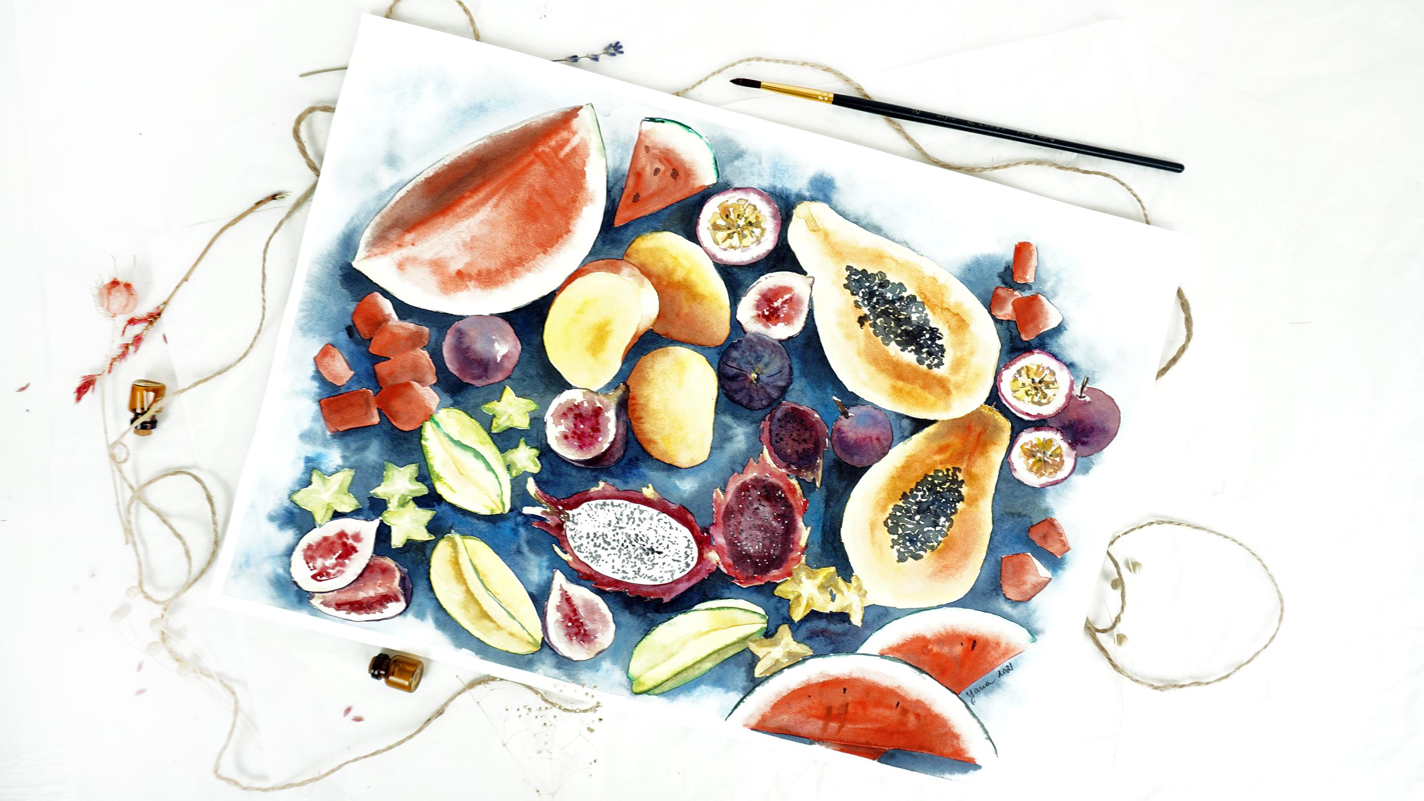
the watermelon, papaya, dragon fruit, mango, guava, passion fruit, fruit,
and deuterium. What's inside? As every course of
the tropical series, the masterpiece course
follows the same structure. First, we discussed
all the art tools you will need for this artwork. Then we work on the
unique composition and how to combine various
foods into one piece. I'll give you three
options to work with, as well as offer you a downloadable outline
of my own sketch, which you can use for
your own painting. We will slowly paint one
fruit after another. Remembering techniques
you've learned earlier and trying
out new tricks. You will deepen
your knowledge of watercolor practicing
wet on wet, wet on dry layering
techniques once more. In the end we will
create a nice background uniting all of the
fruits into one piece. It will take time, so
you will need patients, but it is so rewarding. In the first part
of this course, we paint only half of the masterpiece so that you
do not feel overwhelmed. In the second part, we will
finish the artworks together. By the end of this
masterpiece course, you will have a large artwork with a collection
of tropical fruits, which you select an organized into a nice composition
all by yourself. Let's begin.
2. All the tools you will need for this masterpiece: Here are the materials
you will need to paint this masterpiece. Let's start from paper. You will need really
big sized paper because we're going to place all the different
fruits we learned in the watercolor series
on this paper. So I'm using as MLT
brand watercolor paper. It's A3 size, really large, and the texture is hot press, which means that there's
no tooth on the paper. Remember, in our
watercolor series, I was talking about texture. And it's important to
pick the texture, right? So when you're
painting food art, it's recommended to have texture of the paper that
doesn't shine through too much. So there's not much
of visibility of the grain where hot press
is coming into the game. And it's very good choice
for nice smooth artwork. Or you can go with
cold press as well. Just try to avoid rough type
of paper because that paper has really noticeable
grain and it's going to go through
your watercolor layers. And you will see the
texture on your fruits, which if you want, this type of effect
is totally fine. And most of the artists, they use this type
of texture for their own ideas and purposes. So this up to you, the thickness of this
particular paper is due 60 GSM. You can also go for
higher 300s, for example, I think that's the best tried to avoid thing type of
paper because it's going to buckle under the
layers of water and we are going to use some
wet techniques today. So you want to have
nice and thick paper. You will need tape to attach your paper sheet on the table or on the
special cardboards. Whatever you have,
whatever you use. And the pencil I'm using
today is automatic. It allows me to create
nice and thin lines. But if you don't have
automatic pencil, you can go with hard pencil. Pencil that has H on it, can be H2, which for
whatever you prefer. This pencil will
allow you to also achieve nice and thin line. When you are correct
your drawing, you want to use
kneadable eraser. It's mirroring good eraser
that allows you to lift the pencil stroke
without damaging the texture that you probably will have if you
use a regular one. If you do have to use
a regular eraser, just tried to remove pencil
line as less as possible because it really can damage
the surface of your paper. And we don't want that brushes. I will be using quite a lot
and don't, don't be alarmed. But now you will
understand why my, my main brush will be the same brush I used in
the whole fruits series. The whole fruits
that we painted. And it's a synthetic brush
with the pointy end so I can achieve nice
and fine details. Synthetic brush will also allows me to control water better. But sometimes I will have to paint fast and
add another color. For example, I'll be doing
something dark with purple, and then I will need to add, for example, yellow,
which is much lighter. And instead of losing
time and clean this brush from purple
color and taken yellow, I will just have another
brush in my hand. This is almost the same one
with a different color, yellow and add the diesel I need right away without
losing time on changing, on washing brushes and
gaining new colors on it. So that's why two, but you don't need to have
21 will be fine as well. Then sometimes I will
use natural brush. It's the same size, also pointy end natural brush. Kolinsky. It releases much more water
than synthetic one and release also much more
water than synthetic brush. Then for larger fruits and larger surfaces
like for example, the big watermelon that
fool, you will paint. I will use a bigger size nature
of brush. It's disabled. It releases lots
of water as well. Of course. It has a very different
purpose than synthetic brush. So it's handy to have both
in your brush arsenal. And with this one, you will be able to cover larger spaces and faster
with lots of water. Now, these two are additional brushes that
you don't really need, but it's nice to have them. So with this big natural brush, squirrel with a nice
pointy end, this brush, I will use it for covering
the paper with clean water. The bigger size of paper, and the bigger
spaces that I need to quickly cover with water, it will be very well done. This brush, it can be
also synthetic brush. Bigger size. This brush, I will be using it to lift some of the pigment. And nice and flat corners will allow me to
create straight lines. So this brush will be used
for lifting technique. Now you know why we need so many brushes and really
we don't really need them. So you can actually work
with just these two, for example, for smaller
spaces and larger spaces. Then you can simply use this
brush to paint with water, to apply water before
wet-in-wet technique. So I will leave it up to you to decide how many
brushes you use today. The watercolor I'm using today is my regular set
of watercolors. Here I have, some of them are Rosa, local
Ukrainian brands. Have some year. I have Winsor and Newton and
other international brands. All of them are professional
quality watercolors, but feel free to use student's
grade watercolors as well. That's going to be just
fine for this artwork. Of course, you will need
a separate piece of paper to practice some of the color, colors and color combinations. You will need some
of the tissues, paper towels, and
bucket of clean water. I'm very excited. Let's move on.
3. How to compose a masterpiece: our options: So before we start
painting our masterpiece, The most important thing to
talk about is composition. Because in our tropical series, we have in painting different
fruits one after another, exploring different
techniques and trying out different
color combinations. Exploring the way color
mix with each other and the tones that you can achieve
mixing different colors. However, today, we will create
a big piece where we'll combine different
fruits that we've learned to paint in the
whole tropical series. This means that I can
offer you three options. First option will be to use all the same
fruits that we painted. All the references of all the fruits that we've
painting during this series, which is like nine
different fruits. And paint them again, but on a larger piece of paper. And we will learn how
to put them together, how to organize them, how to fill up the space between those foods so
they look natural. So this way you can, I'm strengthen your knowledge
that you've learned in the whole series and apply
it in big masterpiece. Second option will be to use different photo
references of the same fruit. You will paint already
familiar fruit, but from a different photo, meaning that you're
not going to make the exact copy of what
you already painted. Another thing, this is the
interesting option because you already feel confident painting the fruits
that you know, but they're slightly different, so it's still interesting
for you to practice. And option number three is, while taking the already pre-made already
made photograph, flat lay photo of fruits, maybe like a plate of fruits. And just paint
that from a photo. So all three options have their, let's say benefits
and disadvantages. And of course, the biggest
benefit of painting from already composed photograph is that you don't need to think about and composition at all. You just look at the
photo and you sketch it out exactly the way it
is on your paper sheet. That's quiet, lazy option. But the difficulty
in this option is that it's pretty hard to
find a photo reference where you will have those
same fruits that you have. The children they
tried painting. So there's a chance
that you will have to deal with fruits you
haven't painted yet. And that might be a little bit
challenging, which is fun. In the option where you paint the same fruit but from a
different photo references. Your difficulty will be
to compose your photo. You're, you're, you're painting. You would have to take one fruit from this reference and other
fruits from that reference. Search for it from
that reference. And in your mind, combine them all
together and think of how would you place
them on paper. So that takes a little
bit of time and effort. And the very first option I mentioned is to paint
exactly the same fruits. Just on one big piece. Here. What I would suggest you to
do is to go to Photoshop or any other editing
software and just cut out fruits from the references
that are already offering you before and place them on paper, just like space them out. And I actually already
did that for you. And you can just go to attachments in this
course, find it. And technically just use my
reference that I already did. It doesn't have to be perfect. You can do it yourself. Doesn't have to be a
perfect cut of each fruit. This is not the point, it's
not a Photoshop class here. You just need to have
reference in front of your eyes to know
what you're doing. And this cut out of each fruit can be as
rough as possible, doesn't have to be precise. And you can do it yourself
or you can use mine. So as for me, I would like to go with combining fruits
we already know, but different angles,
different versions, maybe even different colors. So I'll take the
version number two. So the token is over. Let's, let's organize
our composition. Well first I think I
will go for landscape. Format, it's going to be
easier to place my fruits. And what I want you
to think about here is how you will organize those
fruits on the paper sheet. And you need a separate piece of paper or even a
couple to practice. I took the time to actually
sketch out some of the possible compositions
that I can use here. And as you can see, I tried to play around with
the different fruits in different locations to see
how that might look like. In now, I will
discuss it with you. How do you work? I will suggest you
to start sketching your composition from
the biggest fruit. So you think of
the biggest route. You place them on your sheet, and then you take them the most space with
the biggest fruit. And then the tiny space
at less than between, you can fill it up with
the rest of your friends. Keep in mind that it's
probably not going to turn out from
the first attempt. So maybe you will need
to practice a few times to think of the composition
and the way it can be. So don't worry if
you need to use a few sheets to find the
best composition for you. Or you can just
use my own sketch, which I will attach as
well in the next lesson. And you can just download
it and use it as your own. So the biggest route from my
collection of fruits that I selected is papaya, watermelon. So I'll take papaya
and I'll just place it here just the way I see it on the reference,
the same shape. So here's papaya with
the seeds inside. And the next papaya, just right, they're going
to be somewhere here. So it's the biggest one. I took the biggest
space with it. Then. Maybe it's even too
much, maybe a little smaller considering
the size of the paper. Then I will think where I
will look at motor mount because it's also quite
big piece of fruit. And I think I'll put
the big one here. And there also slices
of those watermelons. And again, I don't need to use exactly the same fruit that I see on a photo is just a suggestion like
inspiration for you. So you can just take a
couple of rows from here, couple of frames from there, and just place them
creatively wherever you want. Then we will have maybe slices of watermelons
like the triangles. I can put a triangle here. It's nice when they come in, couples are poised to right
away maybe one more here. And then I think
the third biggest brutal be a dragon fruit. So I'll take dragon fruit and probably will put
it somewhere here. And one driven fruit
is not that nice. So how about we play some more? So from a different reference, I will place another one. I just showed the
outline schematically, so I just roughly know
which one is which. And of course I'm not going to paint every single
detail on those. Just for me to understand
which route is where I'll locate
another dragon fruit, like a yellow one here. And another half here. Has typical spiky skin. So that's how I show it. So I know for myself
that this dragon fruit. So it's differentiated from, for example, passion fruit, which is smaller, but
if I draw it quickly, it kinda looks similar. So if I, if I took and put my
half of the passion fruit, it will be almost the
same without the skin. So small piece here, but we didn't finish yet
with the biggest fruits. So the next big fruit I think
will be mango. The mango. There will be somewhere here. That's the mango. I'll take
another one right next to it. And maybe one more. Somewhere here. I can add star
fruit or crumbling, the one that I used
to call it before, I didn't know the right
name. Sorry about that. So one here, one there. Another one will
be somewhere here. Maybe a couple of more. So I take inspiration from
different references, and I just placed
them in random spots. This way we create our own unique composition
that wasn't existing before. Even though it consists of
already familiar pieces. Here will be some slices of
a star fruit here as well. Maybe a few here.
Just to fill out. The space. Can be a few fix here. Like half of it, a slice. Then another fig here, it's
significantly smaller. That's why I left
it for the end. Just to fill out
space in-between. Big fruit. And also passion
fruit is quite small, so I can put like a round fruit here
and half fruit that's cutting to another round
fruit somewhere here. I can do the same. Here. Just put a
round fruit slice. Technically now, I just want
wherever I see empty spot, I'll just fill it out
with different fruits. The small ones. It's probably gonna be
mostly, for example, pieces of watermelon
and slices of fig, and maybe slices
of a star fruit, and slices of passion fruit. You get the principal, you place fruits from the
biggest to smallest. And then you think if you'd
like to composition or not, and you can redo it replayed
as many times as you want. Just like I did here. And looking at all
this compositions, I can decide the one
that I prefer the most and place it with the
pencil on my paper.
4. Drawing our composition on paper: So of course, the
biggest difference here is the size of our sheep. It's not the same as painted
on a tiny postcard size. And hence masterpiece. That's why, again, I will not be tired of stress enough
how important it is to think of our
composition ahead of time. So I have all the sketches
that I've done before to, to find the most
optimal composition. And I think I fancy
this one the most. Again, this is just
a scheme, right? So it doesn't mean
that our sketch will be the exact same thing. And probably it won't, because this is a
much larger piece. So I probably will put even
more smaller fruit inside. Then here too, just like stuff it and make it look
like it's a lot, a lot, a lot of
different fruits. Alright, I will start from the biggest
fruit, the same way. So first I will paint, I will draw papaya. First buffer will be
something like this size. And I'm just like outlining approximately
the size of the papaya. I will be back to it to kind of manage the
outline better. For now, I just want
to think of the size. And in my scheme over here, this is the two papayas. Now I have slices
of watermelons. I look at my photo reference. I find those watermelon slice is that I drew
here on my scheme. And I add them as well. Very same line. Very carefully. Just to think of this size. So here's two slices. They are slightly
smaller than my papayas. Okay, that works. And then in-between papayas, I have like three big mangoes and Big Mike leftovers
of a watermelon. So I will point out
watermelon first. Here will be my watermelon. You probably don't
see it very well yet. But again, I will
make it darker. After I realized if everything
fits in my painting. Here goes a mango number one, manga number two, manga
numbers three. Alright. So the biggest pieces are here. And now we can, oh, yes, let's add a couple
of dragon fruits. They're quite big as well. So I can add one dragon fruit here and
there will be some skin. I will work on it later. And nearby there will be another dragon fruit
when the skin. Okay, so now I think that's approximately good size of the biggest fruits and all other fruits
will be around us. So now I can actually push
the pencil holder and make our sketch darker and
more visible for you as well. The most important part is that all the fruits that you
paint have the same angle. So they are all looking at the same
angle and the easiest to be this angle to be flatly 90-degree so
that all the fruits, you can see them
from the same side. They're always like this. Using them flat. Because if some fruits you've seen them flat
and some fruits are, and the angle and
some fluids are like, like this in the
basket or something. This will completely
destroy the perspective of your composition
and your painting. And this will look quite weird. So let's make sure that your, your fruits have the same
angle and my case is flat lay. And the reference that I attached to this course
is also flatline. So feel free to use that crate. So let's talk about colors.
5. Color palette for all the fruits: So of course, we
will use a lot of different colors in this
artwork because we have a ton of various fruits and basically all the colors we've
ever used in nine of the courses in this
tropical fruits series are going to be used
again in this artwork. So let's talk about
categories of colors. So it's gonna be easier for us to structure our collections. So let's start from red. We're going to use a lot of red. And here I have a
selection of reds. We start from warm red
and move to cold read. So technically, pink color
is still red because if you look at the
content of this paint, you can see that the
pigment content is pigment. Pigment read hundreds of
B27, pigment red, 264. And that's going to happen with pretty much all
your things except the ones that are
leaning towards violet. So here the pigment
will be violet, 19. And for example, coral, one of my favorite new colors. It has pigment red
for red to white six, which gives us a nice field. So when we talk about
the warm colors, this is all relative feeling. If we take a cadmium
red, for example, like so, it's a nice
hot colored red. Compared to Codename
mother red looks pink, it looks colder, has
a colder temperature. Then there is of course, a bunch of varieties. And for example, this is the
coral that I like a lot. And it really depends on what
subject you're painting. Painting, watercolor. Painting watermelon
in watercolor. I will be using warm red. It's going to be either
bright red or cadmium red. A warm, but when you paint
them next to each other, you can feel the difference. For example, this is bright red. I painted right under cadmium. And you can see that the
tone is slightly different. The cadmium looks like it's
leaning towards orange, a little bit like a character. Character, what kind of tone? And the bright red is cooler, a little bit, tiny bit. So you only concede when they
are compared to each other. If you were only to
look at one color, you will not feel the
temperature of it. It's very relative. So if you look at my FIG that we painted in our fruit series, this inside part of the
fig is a mix between coral and maybe a drop of cadmium and maybe a drop of mondo red. Then to make our
red color darker, we need to use a
complimentary color. Complimentary color
to red is green. If you look at color wheel, you'll find green on
the opposite side. And thus the perfect
color to make red darker. Of course, it's
all about balance. You need to find the perfect
balance between the two. I've got too much green. That's why it looks like a
dark green and dark red. So you need to take a minute to mix this color the way you the way that
will work the best. Here now I've got
like a darker red. And this is what we're
going to use for the shadow on our watermelon or other
fruit like maybe dragon fruit. But for dragon fruit, I think
the best with you would be to use a cold read, which is technically
pink for us. I already painted, so i'll, I'll show here once more. And maybe in the codon. So between quinacridone
and mother read, I can balance out and
find the best tone and the best color for
our dragon fruits. And then on the reference photo, quite a lot of dragon
fruit have this very strong pink colored. So it's gonna be the same thing. Adding a little bit of
green to make it darker. Like so. Or you can as well
add some blue. For nice deep purple tone. So we're going to jump
from tone of pink, lighter tone of being darker, tone of pink, maybe. The color that leaning
towards purple. And for the blue, my favorite blue to use
is blue and then trend. It doesn't granulate. Chips. A perfect, deep, nice color. And I just like it a lot. If you don't have Indian trend, you can use another blue, cobalt blue, double blue towel
is very bright like this. So it really depends if you know what you're
doing and you feel like this bright color. So try out different blues and see which one
works best for you. Speaking, of purple and blue, the color we're going to
use for the FIG is actually going to be a mix of blue. This is Indian trim and pink. For example, the same
mother rather than already used before to achieve nice violet tone
of the skin of the fig. Again, take different
blue that you have. For example, fallow
and try it with your pink to see maybe you like the version of
this violet more. It really depends what blue and pink or red you mix together to achieve violet
and purple colors. So there's no magic pill here. Just take your time, mix your blues and
pinks and reds and see which one you like most. For example, here
is in the trend. And I take cadmium red. So not, not pink, warm cadmium red and
mix it with blue. And I get this sort of dirty brownish color,
which I don't like. So I'm not going to use
it for the painting. But if, for example,
I take magenta, very vibrant pink and blue, which is also very
vibrant blue mix of those two vibrant colors give me a very nice vibrant violet. So it really depends on what is it that
you want to achieve. And from there, choose the color combination
that you prefer. So I will stick to in
the blue and the red. That one looks best for me for the FIG that
I'm going to paint. Let's move on and
discuss other colors. So for our yellow combinations, we will need same, same game. We wouldn't need cold
yellow and warm yellow. So the difference,
the difference is really in tone and only
when you compare the two. So we take this is lemon yellow and paint lemon
yellow on its own. It looks fine. Nice,
warm yellow color. I mean, you always, always warm, right, is the color of the sun. But if you take cadmium yellow and paint
it right next to it, you immediately see
the difference and cadmium is much warmer, hotter, orangey, kind of compare
it to do colors together. You see which one is called
and which one is warm. We will use both of
them called lemon. Lemon yellow will be a perfect color for our
star fruit crumbling. And this color is very special. It's actually the one that I also like to use oral in green, yellow color that
leans towards green. Here is the example. So it's not that
different from lemon, but it has a tiny, tiny undertone of green in it. And I will play
between lemon yellow, orange, green, and maybe
even cadmium yellow. When I will paint my star fruit, we can move towards
warmer yellows. Warmer yellow would be cadmium. I already painted before
here, cadmium yellow. But for example,
mango or Papaya, we would need a color
that's even harder. So I will add a tiny drop
of cadmium red to it. And here, at here we go. I get orange, nice,
nice warm orange. It's not the same as
orange from the tube. Here's orange from the tube. See, there's a difference. So it doesn't mean you don't have to use
it. You can't use it. Of course you can
go for it if it's, if it's more convenient for you. I myself prefer to mix
my orange by myself, so I would take
yellow and red and mix it together because if
the main color is yellow, when I drop a
little bit of Fred, it organically blends
in and it doesn't look cut out and
weigh two different, like for example, this orange. When it makes my own orange, it looks more organic. That's the color I'm
going to use for Mendel. For Papaya. To intensify papaya
color is just like here. I will add probably a
drop of burnt sienna. Nice warm brown color, which will be mixed
with cadmium yellow. So it's not so brown, It's kind of orangey
but still warmer and more intense,
just like here. And it's going to work
in a similar fashion for our slices of mango. We're not going to paint
the actual slides. We're going to paint like a skin that was spilled from mango. That one is a different
mango, right? This one is sour mango, I would say because in talent, the mango that have green skin, they usually sour.
Still very tasty. For our passion fruit. We are going to balance in
between pinkish, purplish. So all the colors that I've
already mentioned here, like a mother, red, violet that you mix by herself. Mostly, mostly pink tone. Well, this is gonna
be the main color for passion fruit and some warm
yellows inside for the seeds. Again, as we discussed earlier, we will use some of the pinks and sometimes we will
add green with yellow. And for the green, I was, I would use style green
or emerald green. They're very similar. Just like so. And I will inject them here and there
to play with our tones. Of course, finally, you will need to work on
details and seeds. And here I have neutral black. Where should I put it? In my collection? I also have this very
special black green color that as you probably guessed, is black with a tiny drop, tiny tone of green in it. I like it when I worked with
green greenery in like poems and something that has green tone under so
you don't have to mix it by herself.
Saves you some time. It's very interested in tone. You can also use it for working on shadows in-between
the leaves like here. There were a degree in
but dark and so now black and green will be
a nice solution here. Alright, so that's quite a lot of colors that we have to cover. And I hope you will find the equivalent of what
I mentioned here. Technically, you only
need warm red, cold red, warm yellow, cold yellow, green, blue, and black, and
maybe burnt sienna, some brown, maybe Van ****. And that will be
enough for you to paint everything that
we planned for today.
6. Class project - for Part 1: The class project
for you will be to publish a collage
that you're going to use to paint this artwork. So whatever references
that you preferred, just put them together and
create a collage that you want to use to paint this masterpiece if you
haven't started yet. If you did start,
submit your sketch, pencil, sketch of whatever
you decided to paint. If it's the same artwork as mine with the
same set of fruits. Or if it's a little
bit different, if it's your own decision
and your own choice. Do submit your sketch. Those of you who
are moving along, submit this stage you're in. Right now. I want to see results
of all of you.
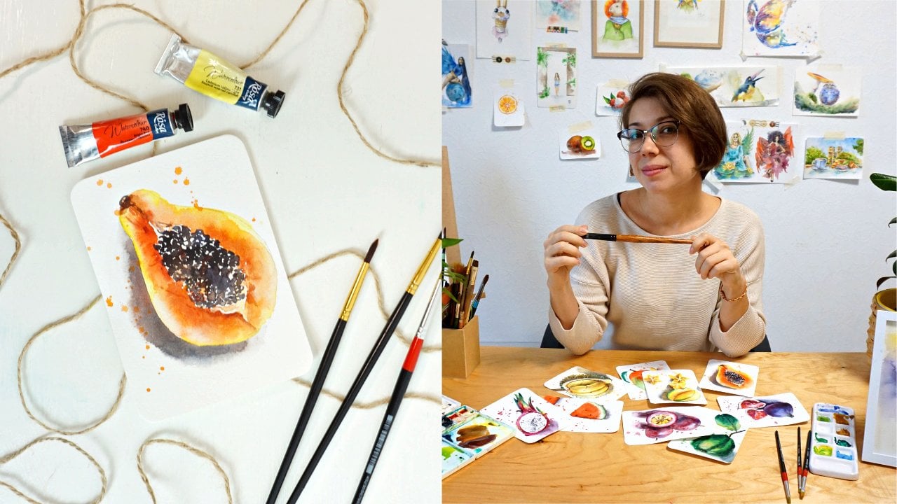
7. First layer of papaya: So guys, how do you feel about
starting this masterpiece? I took eraser and remove the lines so that they're not very visible on the paper sheet. So you probably don't see
any of my sketch anymore. That's on purpose
because I don't want pencil line to shine through
the watercolor layer. So we will start from
the biggest fruit, one of the biggest
fruits, papaya over here. And this is gonna
be my first fruit I will work on in
this masterpiece. So I will use wet
on wet technique. Why clean water on
the area of papaya? Now, I will premix my yellow and I will start
from lemon yellow, the one that will
go in the edge. So you can see my paint is
moving from the edge inside. And that's, that's
what we are going for. It happens because we have
lots of water on the paper. We have lots of
water on our brush. While the paint
is kind of moving into the papaya,
I'm mixing orange. So I take my cadmium
yellow and a little bit of new red to get nice
sunny orange color. I'll repeat again
that I prefer to mix my own orange instead of
using the one that's in the tube because it's
based on yellow that well, in this case I didn't
really use it yet. But usually you use a yellow color and then
you move towards orange. And this orange is based on the exact yellow that
you've been already using. So you keep kind of
imbalance with your colors. Also just like the
dome that I get here. Very carefully. I just dropped my, you know, my orange excuse me. Am I let it move around. Sometimes if I
don't like the way it goes or the direction, I am correcting the flow. As we go closer. Inside here, I'm intensify closer and
closer to the scenes. I'm intensifying the color. Also add a little bit
of our lemon niche. Lemon, cold, yellow tone here
in the area of our seeds. Just like we did in our
first papaya course. I mean, this operator Pi course, where we were preparing
some of the area inside, even though it's all going
to be black later on, we prepare this area for the future seeds and there will be
some shining areas. And I would like to, this shiny area to
be not just white, but have a little bit of
natural papaya color. So we will balance in between orange and white highlights. Back to intensifying the color, I'm going to take a little
bit of burnt sienna, mix it into my orange
that I'm mixed myself. So yellow plus red
plus burnt sienna. I have nice concentrated color that is somewhere in-between
brown and orange. And that's the color that
feels to me like the best to paint papaya. Since we're working
on wet paper. All the strokes I make
are nice and soft. They do not leave sharp lines. There's no sharp edges
in any of my stroke. And we created our first
underpainting for our Papaya. We created the first layer. And now I would like
us to leave it to dry while we are working on the next papyrus so
we don't lose time. Or this. I like to make long
breaks when I'm painting. I'm a little bit
impatient in this way. And I will move on painting the next papaya while
waiting for this one to dry so we can work on the seats.
8. Starting a second papaya: So we're gonna do the same
with our neighboring papaya. And first, I will apply clean water all the
way on my papaya. I'm not coloring. I mean, I'm not applying water in the
place of seeds. I avoided. I kind of like paint
with water around it. But it's okay if you decide
to go inside as well. It just will give more space
for paint to bleed in. And that's absolutely
not a mistake. So the same approach. Yellow edges, yellow
outlines here. Since the paint is watery
and the paper is wet, the color is moving
inside the papaya. All soft and smooth. No hard edges. And I'll switch back
to my synthetic brush because it's easier to
control the amount of water. I am mixing my orange ones more. So I take cadmium
yellow, cadmium red, make nice soft orange color, paint around my seeds. And just let the
color blend sink in. And do its thing. We go very close to the edge, to the yellow edge, to the lemon yellow edge. We have a lot of yellow here. And leaving just a tiny
line on, on the side. Actually here I would
like to play and get a bit more of red, cadmium red. So we move around
between yellow, red, orange, brown, but all
based on the same colors. So the core color
here will be yellow. And everybody else are
just adding the tone and creating this soft
tones and varieties that give us a nice,
interesting result. I'll add a little bit of lemon here in the
area of the seeds. In a tiny drop of blue into my. However, now, be
careful with blue. Blue will get your yellow green. So I'll take burnt sienna first and then I take
a little bit of blue, which will make it darker. And with this dark tone, I will drop a shadow right
under our second or first, actually papaya, so that
the second Papaya has this darker shadow
cast by the other one. Over here. While the paper is humid. But not like soaking wet, It's getting slowly getting dry. I can add some texture. Right? That looks like the beginning. And now we need to wait for
those two guys take and dry. I think my first papaya is still wet and I can see
that the paper is still wavy, so it's kind of risky to go and add anything at this point. So what we can do, we can move on and paint for
example, those two slices. I'll suggest to move this way because here
at least you will not have the opportunity
to touch the paint. So I'm going to bleed anywhere. Because if you try and paint
this side there by accident, you can patch those two guys.
9. Starting watermelon slice in the right corner: Alright, so let's paint
two slices of watermelon. I'll take my neutral
brush so it's easier to move the paint around. And I'll start from wet-on-wet technique
all the same way. Applying clean water first, but on the first
half of the slides. So I'm not covering everywhere. And I'll take, I think I'll start from
very light, transparent. I'm lemon yellow
and now apply it carefully on the area that
is supposed to be white. White dish over here. Super, super light,
almost invisible. Just to give it a hint. And I will take green and
make it a little darker by adding red to my green
and create this skin. Because first we applied water, now the paint is looking inside and it's perfectly fine with
me because it looks natural. So I'll leave this to tourist. Be careful not to
touch your papaya. Otherwise, the two colors
will blend into each other. And meanwhile, I am
moving to painting the inside with the red colors. Make sure you didn't have
too much paint or sorry, too much water on your brush? It's okay if you have a lot
of paint because you see that the water that we applied first is literally
pushing the pigment. So it keeps moving
even in the places that you didn't apply water to. This creates a very nice
and natural edge for us. So I don't want to control it. I just want this pigment to
move around the way it wants. And what I will do,
I will just get a little darker tone of red and play
with the shadows, add some darker tones. And maybe even switch to
synthetic brush so it carries more pigment and
intensify some of the red. Also, I can see that my big men start to
move even further into the area of a white skin that I want
to still keep white. So I'm carefully lifting
the pigment with a tissue. If you feel like you've
got enough of the texture because now is the best
time to create texture inside of your watermelon. By adding darker tone. Later if you do it, you'll get a very
particular dry stroke that will look like
a seed or crack. And if you want to make it more subtle and less noticeable, you want to do it now while
the paper is still wet and two colors blend nicely
with each other. So the first half is really, and actually we can kinda
push it in the bottom. Finish up this slice
of watermelon. Here. I'm working wet
on dry because it's way too small for BCE to paint
in wet-on-wet technique. I just carefully applying the
color where I needed to be. And of course forgot that actually here
should be the skin. And instead I covered
everything in red. But not to worry, I'm lifting my red right away. And even though it's pretty
opaque and hard to lift, I will still try and
with water and tissue, removed pigment from here. And I'll take my green. And I'll add this
skin texture stroke over here and just
leave it there. However, I need a much
darker tone of red too. Show the shadow because
the slides is on top, is naturally casting the
shadow on the bottom one. So I want to show that. Okay, so now I would
not risk it to work on the other slides because
then the pigment will read, pigment will bleed
into our white skin. So I'll leave this until
it gets to dry completely. And meanwhile, I will paint. I can come back
to our papaya and finish the inside
with the seeds.
10. Seeds of papaya fruits: Alright, so the seeds, I will start from
this guy and I'll take black, neutral black. Mix a tiny drop of blue into it. So we have a nice variety
between colors and I'll start dropping bubbles
in side of a buyer. Here. The trick is to create
a circle like paint a circle but not coverage completely and leave a
little bit of a blank space. Not too much. But also try to not stop
displace completely. So I'm leaving a little
bit of a blank spot here. And they're also trying
to not make it way too, you know, like a
separated so there's no huge blank spot in between. And it's all the in-game of
lighter shadows somewhere. See this much darker somewhere. It's kind of gray. Somewhere it's transparent. So playing with density,
light and shadow, you can create this feeling
of those little bowls. Seeds. Sitting there. Having highlights and
looking on atrial. Since in the
beginning we prepare the space and
painted a little bit of light orange tone inside. This allows me to have the highlight with a
different tone in it. So I don't have to like paint orange highlight
for example, on purpose, but rather just leave space blank and lead
the orange tone. Show up. By itself. Also tried to move your seats
in different directions. So it's not like one straight
line of those seeds. Sometimes deceitful, like
Get out of the frame a little bit of the
main mass, so to speak. In some places they will be
very dark and placed densely. In some places you will have
just one lonely see it, showing up with a
highlight in it. And this variety
of shapes, forms. Light shadow will make
oldest part looking nitro in right away. I can do the same thing
with my other papaya. Here it is. We have our seeds ready. I can add more of the pigment
to make it more intense. In some places, not everywhere. Just to point out
the shadow stronger. And also, I forgot to add
the little thing on the top. So take orange mixed
with what is it like? Brown. And add this tiny
little paint on top over here. When maybe here on the
bottom to show the skin. Here the same. And I'd like to add a little bit more of
a texture for our Papaya. The one that's in the bottom. And technically, we already
finished painting papayas. In this artwork. We can move on to
the other fruits.
11. Painting a second watermelon slice: Now we can start painting
our second watermelon slice. All the same approach, just clean water first. Preparing our slides for
the first layer as well. I will be starting from
very transparent lemon, yellow, lemon color on
the area of the skin. Makes sure that it's so transparent that you
almost don't see it. And I will take a
dark tone of green, salting green and
mix red into it, or even a tiny drop of black
just to get it really dark. And I am creating the skin. I'm making the line
somewhere a bit wider and some were a
bit thinner on purpose. So that it looks more
interesting and natural in terms of a painting doesn't look
like one perfect thing. Line. And also allows the color
to bleed a little bit and create this texture
for the scan. Now, I can start working on the red part
of the watermelon. And I take cadmium and carefully drop it
on our watermelon. Remember that it's
going to spread a lot. So do not go all
the way close to the edge because the color
will move there by itself. And here because the paper
got dropped more dry, the paint didn't move as
far away as on the slides. So I'm just hoping it
a little bit I'd take a wet brush and I
smooth out the corners, the edges of this
red layer over here. And I helped the paint move like so. So here as well, you might need a tissue
to correct the pigment. If it moves too far. You can also create the shape of your edge with the tissue to take red to make it
a bit darker with green and add some of the textures very
soft and smooth. Now, the last thing that
we can do here is to intensify this part of the watermelon like
on a reference. And also there's an area, very interesting area that actually the way that
I would like to take a little bit of magenta and just drop it here in the bottom. Because I see a different, slightly different
tone on the reference. And I think it's gonna
be an interesting way to play with colors on this particular slide. Here it is. It's almost done. Now we need to wait for the layer to get dry and
we can add the seeds. And I will, watermelon
slices will be ready to.
12. Starting our first dragon fruit: So now how about we paint
dragon fruit over here? The dragon fruit will be o pink. I start off with wet-on-wet, usual in this masterclass,
this masterpiece. And I'm taking mother
Rose, pink color. And start from the skin, which also has tiny
drops of lemon yellow, which I'll add right away
while everything is wet. The colors kind of blending by themselves and carefully
continue adding the skin. I'm switching between
magenta and red. I think those two perfectly
correspond to the color of the skin of our dragon fruit. But also remember to keep
the shape so that if you see your dragon fruit
is a little bit out of the round shape. You can suggest a
slightly different shape by adding skin like this. Spikes on the skin. Here will be a
different dragon fruit. So that's why I'm kinda
careful on this side. Leaving some space. Now, I am taking magenta
and in blue into it, and in some red into it. And finally some green. Getting a very dark mix, which still has
most of pink in it. And that's what's going to play further inside of dragonfly. Here, I need to remember
to keep it round. And even though
in some places it will leak into our skin
that we just painted. I actually do want
this to happen because then the two layers, the skin and this insight will connect more
naturally than if we would have waited
for the skin to dry. Now, this inside is naturally
integrated into the skin. Just add a tiny drop of lemon yellow once more, a little bit. Cover it with another pink layer so I want to renew
it, refresh it. The tissue I am very lightly touching the inside
to create kind of a texture for this insights
part of the dragon fruit. Here we go. One is done. Second one to go.
13. The second dragon fruit: The second one will be done a little bit differently because the inside of our dragon
fruit here is white, so I want to make sure to
keep it light and white. However, first, what we will do is we will apply a tiny bit of clean water
here inside in the middle. Then I'll take a very light, very transparent, lemon
yellow, almost invisible. Just drop it there and let
it flow in the middle. And we need this to
prepare the inside, just like we did in
our dragon fruit course in the series. So while the inside
is slightly wet, I will work on the skin and
the water that are applied. It doesn't go all
the way to the skin. So now when we're
painting the skin, because there's no water
connecting it to it. It's going to bleed. And I'll not use
whatever technique for this one because I want
to have more control. So I will use wet on dry and lemon yellow right away. While your layers are wet. And very carefully,
I am outlining the skin here to
get into a circle. And also almost touching the
other half of dragon fruit, dropping some
yellow immediately. And those two are very close. So they're almost connected. Even if they blend or
bleed into each other. That would be fine. Which is give more of a
natural feel to our painting. What I want here to achieve
is a nice round circle. So that might be actually one
of the challenging parts. And if you want,
you can add some of the texture on the skin, even if you don't see it
on the reference photo. But if it plays well with your painting, makes more sense. Just go ahead and improvise
and change the shape. Whatever works best
for your painting. So now I need to critically
judge the outline that I've got here and look inside
if it looks round enough. Also, the round one. What I wanted there to be
more of a smooth stroke. So I'll try to correct it. If our circle is
not very struggle, I'm very much circle. Just corrected carefully and change the shape
so that it fits. Your expectation. Should we say that? Maybe even add a little bit
more of a skin over here. And now we need to wait for
the center to be completely dry before we finish
up with the seats.
14. Seeds of dragon fruits: So when you're
completely sure that your inside of your dragon
fruit is completely dry, then you can get Buck and
carefully dropped some seats. Your brush should be very dry. Otherwise you'll leave sick
spot and leave a mark. It's religious
marking the paper. And doing so, it's
kinda look not very natural in terms of the
fruit that we are painting. So try to keep your
brush very dry and relax your wrist and just mechanically
drop tiny, tiny spots. Here we go. I would also
like to take a second and show this little part that separate the top here and here with a light brown color. And I will work on the seeds on our
first dragon fruit. The same way, but because
the inside is dark purple, It's not that visible. But we're gonna use
a trick in a minute. First, I would like to drop a few spots with
the black color. The same way as we did here. And now goes to trick. I'll take a white gel pen. And with the white pen, I'll just drop a few spots, few dots on our map. That looks much better now. Alright, let's move
on and paint my list.
15. Starting the first mango: So mangoes, what we're
gonna do with them. We will use same old wet
on wet technique first. And I will paint with clean
water over my first mango. Covering it completely. I'll take my cadmium yellow. Just put it in the
middle. Let it slow. And here on this side
we see a highlight. So we will keep the
paper almost white. What I do here is I lead the paint and now with
a wet semi wet brush, a rinse it over my tissue. I remove the hard lines
of this yellow and still leave the highlight there. And now I take my cadmium
and add it to the skin. My cadmium has a tiny
drop of brown in it. That's why it's kind of darker. But now I take pure
cadmium red it again and do the same here. Now, I'm not sure. I like
this soft transition into our Mango because
I kind of wanted to be more sharp like a skin. So I will remove those guys and kind
of leave it to dry. And I'll come back
to it in a bit. Meanwhile, with the orange tone, I will just mark
the skin here on the side and rinse my brush over the tissue
and soften the edge. Here on the skin where
the highlight is. So we keep the highlight
nice and clean. And also inside of our fruit, I want to add a tiny
drop of orange. So I'll take yellow, mix it with red, and drop a tiny bit
here in the middle. Paper's still wet. So colors are blending. And I'd like to kind of correct the edge a little
bit with the brush and get it more
into orange tone. The same time I can take
yellow and intensify my skin. You know, this yellow part
inside of Mango here. And it's cool. If your color was in
dance from the start. If not, you can do the same and make it more concentrated. This little orangey
part in the middle. This orange partial with
ferrous upto theory soft do not show off too much. It's literally just
halfway down difference. So very, very, very, very light and careful.
At the same time. I can move towards the
second one and then come back and correct
the skin a little more.
16. The second mango: Maybe better to paint this one. But makes sure that
your skin here is dry. If it's not dry,
then better weight. So the colors do not
bleed into each other. They might still do a little, but not too much. So better if your skin is
completely dry over there. Now, clean water than yellow. And now I'm going to add one-by-one,
slightly darker tones. So I'll start with
orange into my yellow. And because the paper is wet, all the colors are
blending softly. Then this orange is kind of transitioning into
brownish tone. So add brown, burnt
sienna to the mix. Here on the bottom, it
almost becomes red. So I'm adding trend mem read. Because again, my paper
was carrying water. Keeping water, it is easier for colors to just
blending smoothly and create this texture
of the skin without sharp lines and connections. Carefully, carefully painting
around our first mango. And here I'm returning
back to my orange tone. And also make sure
that your shape of your first mango
is not the forum. Also, I can intensify this
bottom a little more. As the color gets dry, it loses this intensity. So I can take a burnt sienna, add a tiny drop of
ultramarine blue. No, not intramolecular. I'm better take our
Indian trend blue. To achieve darker tone. If you take ultramarine, it's going to granulate. Not going to really fit the
smooth texture of our Mango. Just intensified
the shadow here. And I would like to
add some drop-off, red here and there. And the top, I will keep clear because there
is the highlight. So also while we're working
on our each fruit separately, we need to think of a
total final result. And we also need to consider
where the light is, where the source of light is. It is very, very important
because we need to have highlights of all
fruits at the same place. We can't have highlight on Mango here and then highlight on
a watermelon there, right? So if the sunlight
comes from here, then all fruits will have
the same side, lighter. And luckily, our big slice of watermelon has light on this side two, on
the photo reference. So you don't need to improvise
a change light and shadow. But just keep in mind that light source is coming
from the right top corner. So technically, all the right
side of each fruit should be highlighted and left
side should be in shadow. We need to keep
consistency here.
17. The third mango: So now we can work
on the final mango. I'll drop some water on
the shape of our Mango. Then I'll start from Just
nice, pure cadmium yellow. Then cadmium yellow
will move towards orange on its left side. Since I'm dropping the
color into my wet layer. It blends smoothly. And the very left
bottom of our skin, the mango, will be brown
with a touch of red. When I say brown, I mean
burnt sienna brown. You can use other browns. But they need to have slightly
orangey tone into them. If not, just add yellow
and red by herself. And here we go, just
carefully working on our final mango. I want to avoid painting
purely brown skin. It is leaning towards brown, but still it's more like
orange slash yellow. So try to have more of a
yellow and red in your mix. Also remember that this will get dry and lose half of tone. So it's not gonna
be that dark and intense as it seems to be now. And you can see it on the skin, which actually we can, correct right now, since
we're on the mango topic, I took some of cadmium red and carefully correct this skin tone with nice and bright red. Here. The trick to not get with your hand into the layer that
you already painted would be to put your pinky
finger on the paper like this and hold your balance
this way so you don't put your whole
palm on the paper. Here we go. Now, I can rinse my
brush over a tissue and carefully blend the edge of
this red that I just painted. Maybe even read. Sorry, add
a little bit of orange. But remember to keep
the highlight shining, so do not go too far. And the same on this side. Alright, now our skin
is ready and well. In my opinion, we don't really
need to go back to mangos. They're pretty much finished. Just let them dry. And we'll see if we need to add anything, maybe some textures. But at this point, I think there's not
much we can add. Just blend in some sharp
edges here on the skin. And we're reading one.
18. The first star fruit: So how about we move to the bottom and
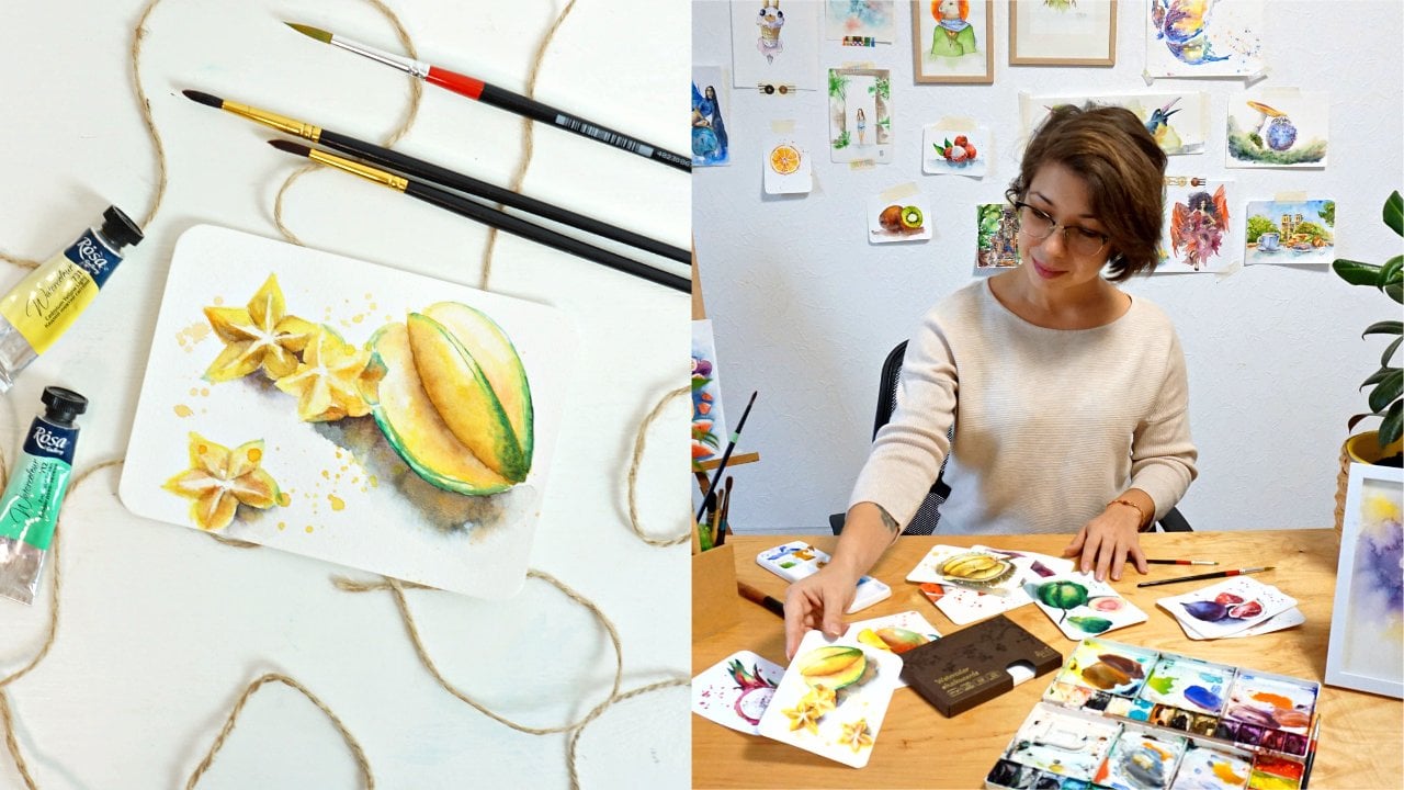
paint starch foods or current boys that I used to call them in my first series. So let's start from the one that is here
and move this way. So at least do the same mistake
of touching the painting, the wet paint with my palm. So I'll start from the left. Cotton ball or star
fruit that's here. And we will work, I think the best
here to work on wet, on dry technique because
it's a pretty small piece. There's no need to
get things too humid. It take lemon yellow and
apply it right away. Keeping this corner left. Almost white,
almost clean paper. I will take this special color
that I mentioned before, already in green that have the yellow that has some
shade of green in it. I will paint the corner, the edge of the star
fruit right away, allowing the color to naturally blend Mexico. And right away I'll
tick emerald green, fallow green and paint the skin. But also very, very carefully on the same line right at the edge. Just like so. I'll let the colors blend. And also I will take a
little bit of orange, which I do mix by myself as
usual and apply it here. And through, let's say, of our star fruit. So this is the place where there is a tiny bit of a shadow. And I want to show it with
this orange tone like this. So I'll skip the one
that's in the middle, the side that's in the middle. And I will work on the
side that's on the right. And the same thing I'll
take orally in green. Added the edge. Maybe even drop a super tiny, tiny touch of orange tone. And then orange, green and mark the outline the edge of the
skin of the star fruit. Now, I would really want us to wait for both sides to be fully dry before I start working on the side
that's in the middle. And before that I want to
smooth the edge of my paint here in the era of
the highlight because it looks way to cut out. All right, That's better. Let's wait a few minutes for those two parts
to get completely dry and then work in the middle.
19. Slices of a star fruit: Now that we are sure that both
layers are completely dry, we can start working
on the side of star fruit that is in the
center, in the middle. Same approach, just apply. Yellow, lemon yellow first. With the wet and dry technique. Having full control
of what's going on. Get a little bit of orange
and edit in the area where this central side is connected
to the one on the left. So they both have a little
bit of an orange tone. Now we would need to add green
line right in the middle. But it's dangerous
to do it in this second because it will
immediately bleed. And while we want to actually see any
straight line anywhere. So I'll add a bit of a
tone with oral in green, with my yellow and green
color here and there. Then I'll just leave it
to dry again before I add a nice and thin stroke
with orally in green. So while I'm waiting for
this to dry, what can I do? I can paint the stars. So I'll take lemon yellow. I'm not going to use the
same approach as I did in a previous course about
painting star fruit. I'm not going to use
the masking liquid. Here. It's going to be too long. I will use the lifting
technique just to lift the paint where
I need it to be gone. Of course, it's not going
to have the same effect, but it's still going
to do the job. With my oral in green. I'm adding the
shadows on a side. And I'll probably do a couple of more of
those little stars. Not really worried
that you don't see all the textures
inside like we will work on in our course devoted
to grumble, star fruit. Those are rather secondary here, just to fill out the space. So I'm not worried that
I'm not going into detail and don't show all
the textures that I see. Just a hint on
those little stars. Gonna be enough
for our painting. Alright, I think this side
of our star fruit is dry. So we can apply cream very carefully with
a very thin line. I am creating this online. And with a brush that I just
raised against the tissue, I will soften this edge
over here underneath. Maybe added a slightly
darker tone of green here to make
it stand out more. Alright, we have our
first star fruit ready. It's all kind of moving
and changing its shape. It's very interesting. I like this
particular reference. Going to add a tiny bit
of greenish yellow color, the overline green
here on the side. And now we can return to our little stars and finish the shadows and lift
some of the pigment.
20. Finishing up the star fruit: So first let's take our brush. Clean it first. So it doesn't carry
any paint mixture. It's just water. And now with rinsed brush, you can create some of the
texture and lift the pigment. In the area where we see white or light
part of the stars. It might be not very
easy to navigate. So you don't need to
really precisely try to repeat those white lines. Just approximately mark them with a brush and leave them
v. We don't really need to make a perfect copy
from the reference. Just give a hint that
this part is lighter. In our star. And the rest we will work
out with the shadows. I will just mark some of
the skin of our star. And also I will get a light,
slightly darker tone. So I'll take green and add maybe a super tiny
touch of burnt sienna. Sienna doesn't really matter. To play with the shadows. We got a little bit
of texture here, and then we can repeat a similar action with
our next star. Here. Maybe get some
grayish tone to show the shadow because
there are whole fruit. The star fruit here
is dropping shadow naturally on this little guy. Then can intensify the shadows with this half of them, half of slides of
the star fruit. And this way we can also correct all those white outlines
that we've painted before, lifted with the brush before. I don't really want to spend too much time on
those tiny stars. So just hinting on those
will be enough for me. I'm just marking the
shadows here and there. Without going into much
of the detail as well. They're not really important for this masterpiece artwork. Alright, I've got some of the slices of the stars covered. And now we can move to paint in the next
big stuff with here.
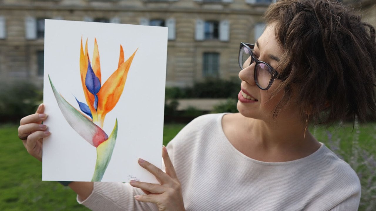
 Yana Shvets, Professional watercolor artist