Transcripts
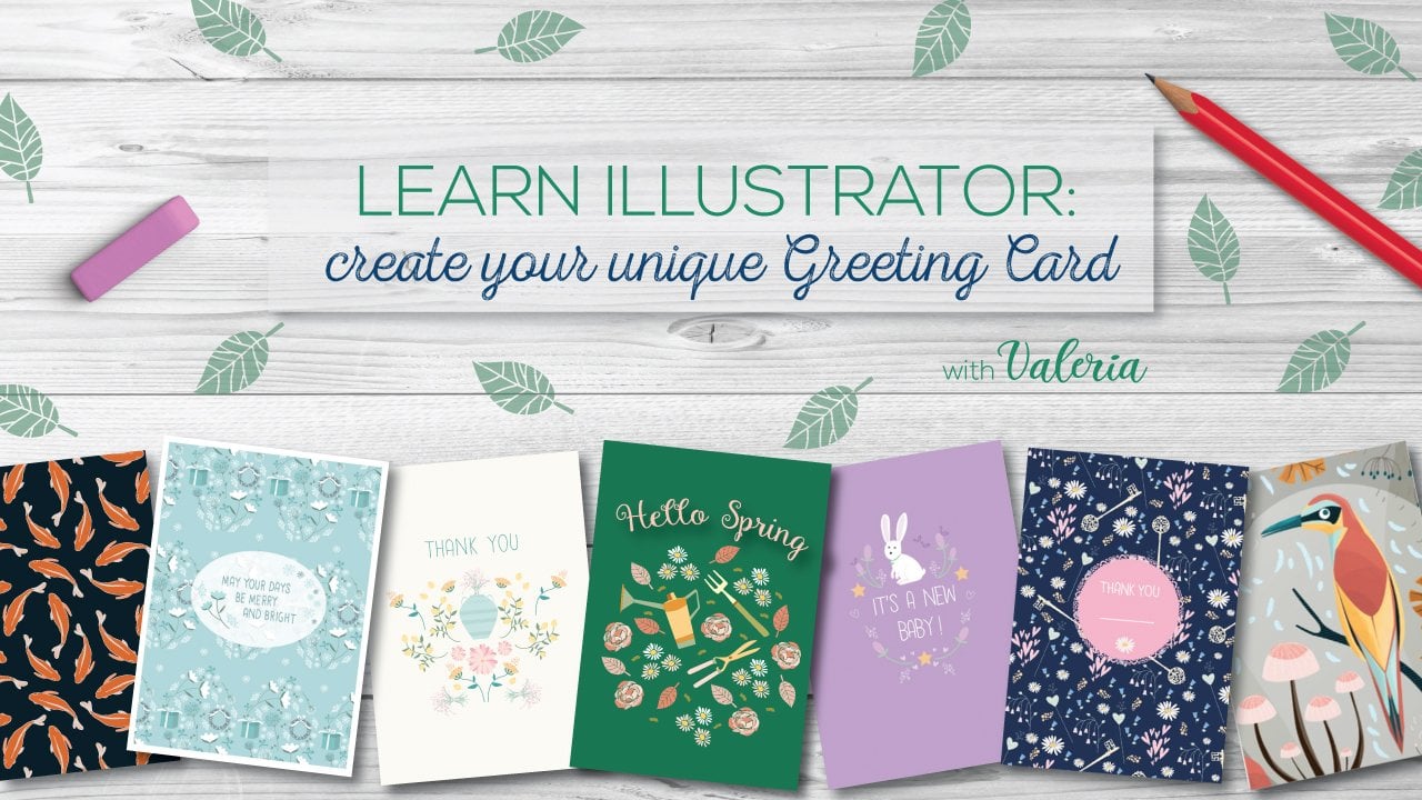
1. INTRO: Hi, welcome to my new class here on Skillshare. My name is Valeria Frustaci. I am an illustrator and graphic designer, and I like to travel and I like to draw and I have a Bachelor in Architecture. I've been an illustrator for more than eight years. And when In March 2020, the pandemic started and the world literally stopped and nobody could travel I decided to start a creative project called Around the World Illustrations. I decided to bring some joy into people's lives. And yeah, around the world illustration started. I started to draw some cities and some places that I really love. Or that I visit often.. Or that I visited often.. And some places that I would like to visit soon! Do do you like to draw and do you like to travel? Would you like to learn how to use Procreate? And maybe you already have a sketchbook full of drawings... Or do you have many pictures of your last trip? I think this is just the right class for you! In this class, I will teach you how to create an architecture. artwork using Procreate, starting from the sketches or your last travel pictures. And we will discover useful tips and tricks to use Procreate efficiently. And we will understand how to create many artworks that can match together to be more appealing for the market. And also we will talk about how to choose the right color palette. So welcome again into my class and I am looking forward to see your artworks at the end of this class. Remember to follow me here on Skillshare to be the first to know about the next class. And also, you can follow me and around the world on Instagram, remember to tag us so I can see your artworks and post them in my stories. Okay, and now let's start.
2. TOOLS AND RESOURCES: Hello. In this lesson, we will see the tools we need to create our artwork and how to find inspiration. The tools are basically three. And iPad, like this one, the Apple pencil and the procreate app. In the class description, I posted the link to download the app. So how can we decide what city to draw? I usually pick one thinking about something I love, a place I visited or a city I will love to visit one day. I am sure you too are dreaming to travel again. Do you have a favorite city? We can start from there. One of my favorite places is Cinque Terre, Cinque Terre is a beautiful area in Liguria, Italy, and I am Italian and it is easy for me to pick up Italian places. So feel free to choose something you are familiar with. I visited Cinque Terre many years ago and I don't actually have one of my pictures here. My old photo albums are in my house in Italy and here in New York City. I just have the most recent travel pictures in my computer. And plus, sometimes you will like to draw a place You never visited and it is impossible You have your own pictures, but no problem. There is a solution. First, you can Google and find many photos on the internet. Be careful because sometimes names and places are not always correct. Always double-check. It is good to do some research and learn something more about the places we are drawing. Another important thing to consider is copyright. Pictures you find on Google are not always free to use. A good website where to find free pictures is unsplash.com. So remember, it is always better to use your own pictures to start drawing a place. But if you don't have other choices, you can find free pictures or go to your local library and find some inspiration and looking for travel books. Books are always a great resource. Little Perk for you! I selected some pictures for you. So this initial phase will be easier. Click the link I posted in the class description to download them. You can choose from one of them to start your project. I found many pictures of Manarola, one of the towns of Cinque Terre. And I will start from here to sketch this beautiful place that I want to immortalize in my artwork. So let's jump in the next lesson to start drawing.
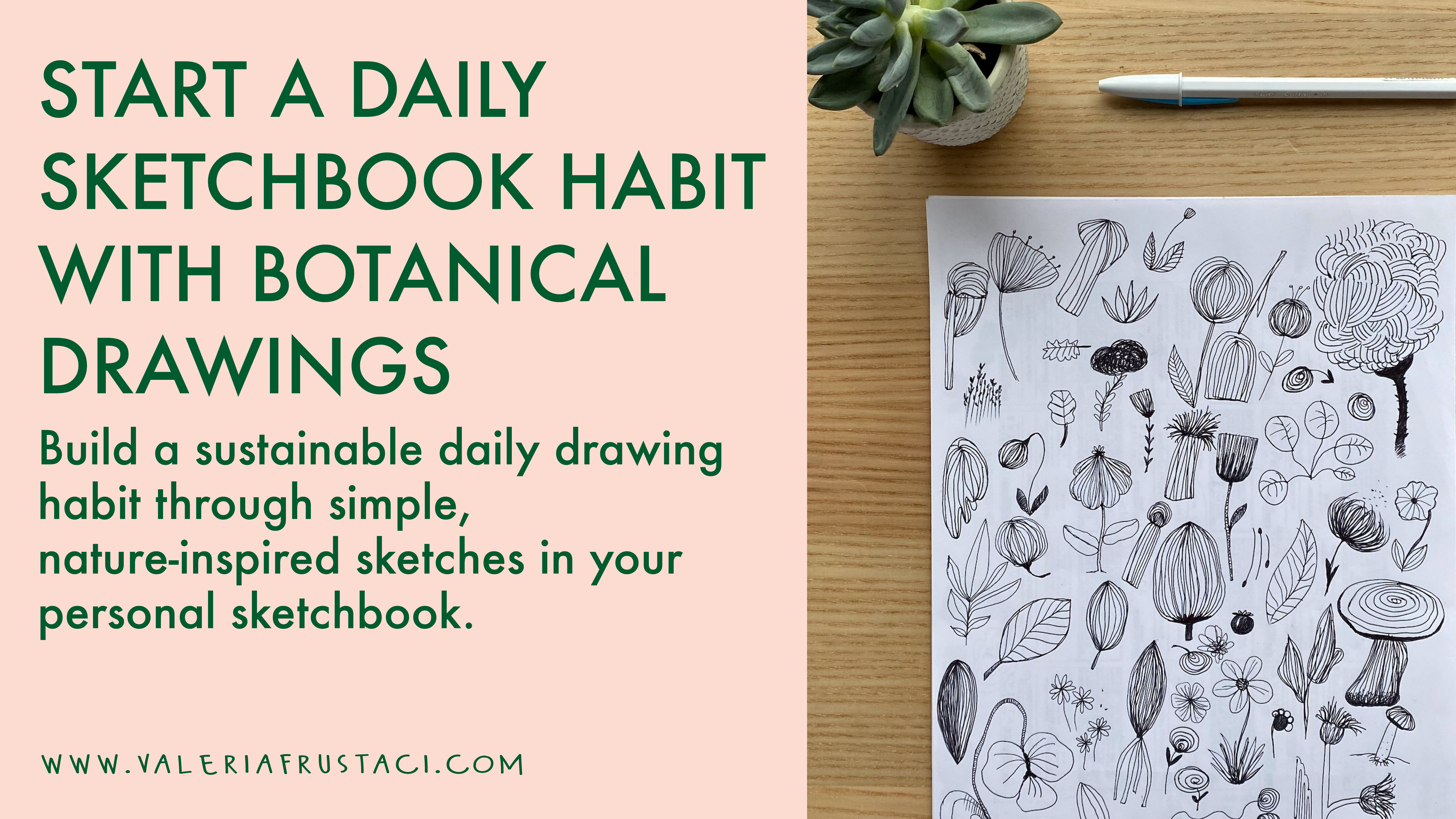
3. BONUS lesson: sketchbook: This is a bonus lesson. It means that you can skip it if you want, because it's an extra focus on sketchbooks, but it is not really necessary to achieve the final result and to have your artwork ready at the end of the class, so you can follow along or feel free, feel free to skip to the next lesson. So I wanted to talk to you about a sketchbook option for two reasons. First, I used to sketch a lot and I have many sketchbooks with me that I use for inspiration for my artworks. I don't use to bring a sketchbook everywhere with me anymore, just because my life is much busier nowadays and I never find The time to stop and start sketching during my travels. But I hope to start again soon. And the second reason why I wanted to talk about sketchbooks is because I know a lot of you are already illustrators or aspiring artists and you draw a lot. So maybe this is an interesting topic for you. Or even if you are new to this, I think it will be fun and useful. We can start to paint our architectural art work, starting from one of our sketches, Instead of using a reference photograph. If you like the idea and you have the time, think about having with you a little sketchbook. So it's easy to bring it everywhere in your pocket and a pencil or a pen. And take your time to sit somewhere and observe a place you like a building or a City view, and then start sketching it. You will learn a lot of things about That place. Drawing is a slow process and allows us to really understand more about something. It will be, it will be also a lot easier to paint the same subject later on your iPad, because you will be already very familiar with every detail. Now, I will show you some of my old sketches. Last thing, feel free to add in your project into The gallery here on Skillshare. your initial sketch or a picture of your sketchbook. It will be very nice to see it.
4. SKETCHING with Procreate: Hello, okay, Yeah, you're ready to start? So first thing, open the Procreate app. Now we'll see together some of the tools we are going to use. So when you open it, usually it opens the Gallery, these are all of your documents. Uh, so this is the gallery. In the gallery, you can find all your documents so you can see I have a bunch of stuff open. I am working on to open a new canvas. Just click the plus symbol. And now you can choose the dimensions of the canvas. I usually go with an A3. Because for this kind of work, I think it's the best solution for Artprints and so on. And I have the right number of layers available to work easily, but you can choose different sizes. Based on the artwork who you are going to do. Remember that Procreate isn't a vector-based software, so you can not zoom-in, zoom-out, or your art will end up pixelated. So if you start with a big dimension, that will be great. So now you have your page, your canvas, and you can see you have three menus. In procreate. If you want to go back to the gallery, just click Gallery and choose a different document. Or if you want to try another size, you can do what we have done another time. Now, the first thing we're going to do is to import our picture. So I'll go here and I will click the Add button, and I will insert a photo. But I will do this. So I can insert a private photo. That means that the photos will never appear in my video because procreate, always records what you are doing. And so then you can export this video. And also for Instagram and social network. It's a very nice tool. But if you have the picture visible, it's useless. So that the private picture, so we can see it's now, but not in a recorded video. You can see that it says private, so it's not visible at the end. So this is the other menu. And I click here. This is LAYERS menu. So you can see all the active layers. You can have a bunch of layers depending on the size of your document. So I'll put these here. And I start working on my picture, my reference picture. So I will do that because I want to adjust it for my artwork. So this part and this part will be cut, but I'm fine with it becauseI want to to center this part, and focus on this. And then I will have more sea here and more sky here. So now I am gonna open this part. You can see all these things here. But what I need now is to reduce the opacity. So I can easily draw on it. So this other layer, I will change the name. So I click on it and rename, and I'll call it sketch. Now I can choose here, the brush I will use. And usually for the sketching, I use the 6 B pencil that is my favorite. But you can choose also this other pencils, or if you're fine with it, you can also go with the airbrushing or Feel free to try some of these brushes and find the one that you are more comfortable with. I will select here the color. So usually I go with a gray or a blue. But yeah, I think I will go with this kind of gray, it feels like it's a real pencil. Here. You can regulate. the dimension, the brush size. And this is the opacity and I want 100% of opacity. And I'll start my sketch. So again, zoom. Doing this, you can see using two fingers, zoom in and zoom out. And I start drawing. So to draw a straight line, you start drawing. You see it's not straight, then you keep Your pencil still and it becomes a straight line. Then you release it and it's done, great, right? You can do that also for other geometric shapes like a circle. See? this is Edit Shape and circle, or it will be an ellipse. So like this, look, this is mine and it's not perfect. And this is done with the help of Procreate. this is a shape circle. It's a perfect circle. Also, use two fingers and tap to go back. And if you want to see again what you've done three fingers and do two to go back and 3, go forward. You can do also a square. See? and then edit and have been something that is more geometrical correct. The drawing doesn't need to be perfect. It depends on your style. I don't like to do everything super perfect Just because I have a bachelor in architecture and then I changed my career to be an illustrator. So I, that's because I loved architecture and I actually love architecture, but I wanted to be more of an artist. So having more freedom. So I don't want to do everything exactly like this. I just want to give my vision and I want more freedom. So I don't, I'm, I'm not looking for the perfection of the shape. So I just need the picture to have the idea of what I'm going to draw. And just because it's an actual place, not something that I am createing from scratch. And so I needed just for the general shape. And like this bridge is gonna to be more precise, but then all the rocks don't need to be perfect. It's just to give the idea of the movement and of the shape. Here's my sketch completed. And now I'm going to show you in this video what I meant for the private picture. So this is the video I exported from, directly from procreate. So can you see that the reference pictures is not visible? Let's see together how to export this kind of video. So open the menu and click export time-lapse video. Then click full length or 30 seconds and voilà! Exported. You can find a video on the images on your iPad. Okay, now you know how to export a video and you have your sketch ready so we can jump into next class.
5. COLOR SCHEME and color palette: The next thing I want to tell you about, it's the color tool and the color palette. So this is the color tool. You can see here. You have different options. So you can select the disk and you can see this and all the colors, and it's pretty easy to use. So you can just move here and find the right color or for you to use. Here you have the history. So the last color I used was this green, and this is all The story of my colors. You can clear it or keep it. And this is the color palette I am actually using for my last artworks. Then you have another menu here so you can choose the classic color view. And also here you can't regulate and choose your colors. This is pretty easy to use and intuitive. The harmony is another tool. It's interesting because you can find analogous colors or the complimentary colors very easily. So for example, if you are using this orange and you want to know right away, a couple of complimentary colors. You just click here and you can see that this two are the complementor, sorry, the analogous colors. If you want to see the complimentary colors, just click complimentary and this is exactly the complimentary of this. Yellow, orange. That's cool because you can easily find the right color to use in your artwork. With a value, you have all the numbers, so you can click Here. sometimes if I need a color, I click here, I copy it and I use in another work. And this is another important thing is the palettes , the palette menu. So here you can see some of the palettes I was using before. And you can add your own palette to create a new one. Or you can also import some palettes. So if you want to create new, just click Create and go there. See this is now empty. You can select some color and add to your color palette and then save it. So if you go back on palette, you can give a name like palette. And you will have it here. So now I'm going to delete this because I have my own color palette. And it's called Fall 2020. And you can just click here set defaults. So you will Have your color palette ready to use. Right here. This is my sketch and this is the layer that I want on top of all my layers. So I'll go here and i will click this to have a new layer that I will call houses. And I already know that I will need another layer on their houses that I will call sea and sky. And for sure, another layer, Called Rocks and trees. If I will need more layers, are we'll add them. But for now I think it's enough to start. Well, I already told you that I have my own color palette and I will be using this because it's cohesive. with my other artworks and I want to keep using this for now. The other thing I need to do is to select the sketch layer and change the opacity. So I will lower it, lower it to around 20%. So I can, or I can see it, but it's not too much, so it can work easily. With the colors. I will have a look to my reference picture. I can see there's oranges, red, pink, and stuff like that. I don't want to color the things the houses like day are exactly. But I will like to give the idea and the feeling of Manarola. So I need to understand how the town is in the reality, but I will not follow every single detail that I can see in this picture. So part is reality and part is creativity. It's my own interpretation of something that exists, Manarola, But it's my own vision of it. That's the idea of the final artwork. And another nice thing to do before starting to color is trying some colors and see how our composition will work. But you can open a new layer and create a coloring scheme. And I usually go with a little spot here. And I try. I look at my picture. The sea here, did you going to be blue or light blue sky the houses and rocks. So I can see four elements. So I already know that I will have four part to organize my color scheme. And what I usually do is choose one of the color. For example, I think I can go with this dark blue for the Sea So I know I will have my water in here. And oops. This is another nice thing that you can do with the color. So you can fill color on the line and be careful there's no open spot. And then you can feel with color. So it's very fast. And now, because I am using this brush, it's not perfect. But for example, if you are going to use the airbrushing, it's going to be a perfect filling . Okay, So this is my sea and I'm going to Go with this dark blue, then the sky probably a will use does light blue. So or maybe I'm not sure I'll try. So there's light blue for the sky and see. Check for that spot. Okay. Exactly. Now it worked. So this is , my predominant color for sky and for water. Then I will have rocks and I think my rock will be something like that. Not sure. Do you get this? Sea Yes,, I know that they have rock here, here, some here. And then we'll do stuff here. This is just a rough representation of my drawing. Just to see if the color composition works and I can try with different colors and see what I liked most. And then I will start, With the real coloring phase. So this is just something that I needed to understand how my composition will work. So yeah, this is pretty much what I was talking about. So you just sketch your drawing in a very rough way with some colors just to give you the final effect. And if the color scheme works for you, then you can start with the coloring phase. I ended up creating two color schemes And I think I'll go with the second one. You can create as many as you want. I usually try with one, two, not more, just because I don't want ito be too much confused at the end.
6. COLORING : And so after that, you can just click here. So you don't see it also for the picture. And you can start with the coloring phase. So I'll start with the sea and sky. So the color did I was that I selected for them, for the water will be this dark blue. And I just checked it a click derived layer, sea and sky. And I'll start coloring, subject me for the brush. This is the brush that I usually use for everything because I love it. So I'll start. Another cool thing with Procreate is that if you have a line, a closed line, you can fill the space with some color. So it's much, much faster than coloring by hand. So now I have a complete filling for this area. But you see because I'm using the 6 B pencil, there is a texture . This part is kind of white and blue and I don't like the effect, of course, I just like the effect on the border. So I'm going to do this to fix it. So this is my water. So this is pretty done And now I'll proceed with something else. Remember, this is amazing. With Procreate, you just need two fingers to rotate your canvas so you can work easily on some part of it. So you can zoom in and zoom out using two fingers and you can also rotate the canvas like this. So now I'm going to color the clouds. Let me see it. My coloring scheme, I think I decided to do some pink. Oh, okay. And if you need to select a color that you already use on your canvas, you just can use one finger and press onto the color. You are selecting and release and automatically that color is Here So let's try with the blue . So that's good for working fast. So you don’t have, every time , to go here and select from your color palette. If you already know that another element on your Canvas will be pink, and you already used that on your canvas. You just use your finger and select a color you're going to use on the next element. This is the final part where I started to color all the houses. I posted the time-lapse for you, that it's much faster so you don't have to see every every single details. But yeah, I followed my color scheme and I painted all the houses, and then I checked some details. I painted some woods and that's it. Oh, yeah. Don't forget to put your sign at the end. So I signed my art work. You just can add a new level. Just for your name, to put your name to sign the artwork. It's very important, especially if you're going to sell this artwork.
7. SAVING: So now we have our artwork ready. We just have to save the files or the file, but usually I save more than one copy for different aims. So just go here and click and Click also share. So you here can see that this menu Share image allows you, allows you to save your artwork in different ways. So you can save the procreate file and I suggest to do that and to transfer it on your computer so you can have a second copy of all your original files. That's safer because sometimes technology doesn't work. So you can save another copy and be sure to use the procreate one. But if you want to print your artwork, for example, or to post it online, or to sell it through print on demand website. You can save it as JPEG. So it's usually what I do, what I do. So I click GP, GP, EJ, JPEG, and all. I'll transfer it to my computer through AirDrop. Or if I'm not in my studio. I just save to files on my iPad and click saving. And yeah, I already saved it, but let's do replace. And exactly did you see this word exports successful? That's that's great. So we exported our artwork and everything, everything went right. You can also use the PDF or PNG or tiff, but usually JPEG is the, Highest quality, but it's not too heavy. So it's a good compromise. Nice thing to do is to export the video. So procreate recorded everything, our process. So just click to export time-lapse video and decide a full or 30 seconds. Usually, when I posted a video, I post them on social media. So thirty-seconds, it's perfect. And it's exporting the video. Will now. And then I have to save the video somewhere so I can already, I can transfer you to all my iMac or I can save it On my iPad. And I'll find it here. This is the video, the 30-second one And that's it for saving files. Today. I'll see you in the next lesson.
8. Final thoughts: So we are in the final phase of this class. And I would like to talk about how to have a cohesive portfolio and thinking about the next artwork. So usually I like to work not creating just one artwork but a series of artworks. So That is because I love the effect and also for for marketing purposes. So I know that more artwork, more artworks that matched together can sell better. So it's kind of a collection. In this case, for architecture, travel, illustration. I think it works great because a client or a company can decide to buy your art works, not just one of them, but an entire collection or more than one. So they can offer to their clients something that match together. And usually you don't buy just one artwork for your new home, but you try to, to buy more and have an interior design theme in mind. So if you can offer more art works with a color palette that it's similar, you can easily match them. So we are already talking about travel, architecture illustration, so it's a very cohesive theme. But also, as you can see, some of my Artworks, around the world Project. I decided to use specific color palette. Although I mix the colors in different way. So in some artworks, the pink, It's like the first color that you can see in others is the yellow or blue. But the color palette, It's pretty similar. And you can match easily two or three of this artwork together. So I suggest you to proceed. Like now you have one artwork and then you can try to create another one. So you can easily choose another place that you like or that you care about, or you visited. And use the same palette and use also the same artwork size. You can always change that later, but that's my suggestion and try to decide the color palette that you are using for 2 or 3 or four artworks. And yeah, and then you can try to mix them together. So I'm really, really excited to see what you are going to create. And I really would like to to see them in the the project gallery on Skillshare. But also, if you use Instagram, I'm there. So you can really find me easily and tag me so I can, I will like to share your, your project to in my stories. And so remember to tag me, I'm very happy you follow my class. I hope you liked it. And remember to follow me here on Skillshare to know about all the new classes I'm working on. And I will publish soon. And Ciao.
 Valeria Frustaci, Illustrator and Surface Designer