Transcripts
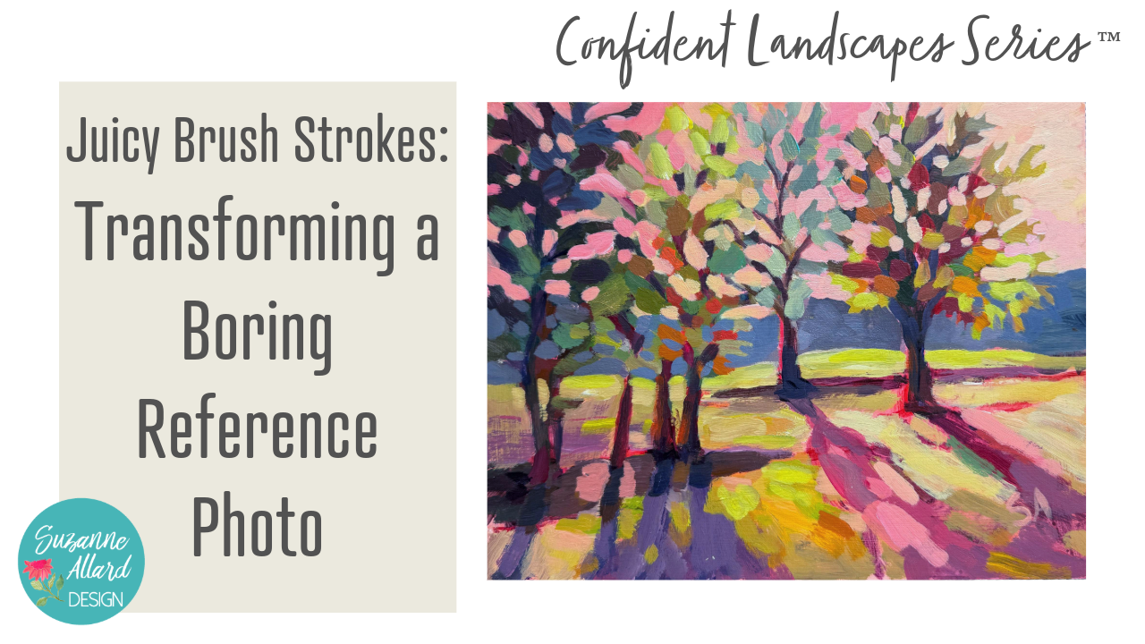
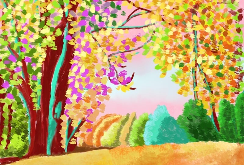
1. Class Intro: Hello, friends. In this class, I'm going to show
you how you can take a boring reference photo, which let's face it, great photos are not the
easiest thing to take, and we're not always
in gorgeous places, but this shows you how to
take a boring reference photo in a neighborhood with
some trees shining, you know, trees
in the shadow and make it into an
exciting painting. I'm going to show you
tricks for starting with a bright underpainting
and layering and the whole and the
cutouts that we do or negative space painting
around the trees is magic. And there's so many fun parts of this
painting that I love. I also paint one of my new
favorite paint surfaces, which is MDF board that I've painted with Gesso,
so I'll show you that. And we'll talk a
lot about shadows because shadows in a
painting like this are, if not they're at least as important as the
subject matter, the trees. But you'll get to where you
see shadows differently, and you realize they're not just gray shapes or dark shapes, and there's a lot you
can do with them. So join me on this one. We're actually going to
paint this one on the easel. So I've got my camera kind of behind me and then,
you know, close in. So it's a little
different than the top down approach I normally use, but I thought I would
change it up and show you since I have been
painting more on the easel lately. So what
2. About Me: Hey, I just wanted to tell
you a little bit more about me if you haven't taken
many of my classes. My name is Suzanne Allard, of course, and I'm a
self taught artist. I got started painting later
in life in my early 50s, and I finally decided to
stop being scared of paint. I would create other things,
but for some reason, painting felt like, No, no, though, that's
for real artist. That's not me. Um, I'm
just a creative person. And I got sick of hearing myself say that and
started painting. And I started just, you know, with some basic drawing, like little challenges
on Instagram. And I'm not a big drawer.
I don't draw much. I'm a sketcher. And
just one thing, you know, I don't want to say
one thing led to another, because I worked hard. I don't want to diminish that. I worked a lot. I painted
a lot. I created a lot. Asked my family. I was obsessed. I'm still kind of obsessed.
I paint in the evenings. But I just wanted to
share a little bit of that story because I think one of the
things that really gets you where you want to go is just frankly not giving up. And, you know, you can
get tired and you can have take a break and
recharge your batteries, all that, but just don't stop
and keep taking classes. And eventually, you
know, if you want, you can get to where it's
you're selling paintings. Many of my students have gone to sell paintings and
show paintings, and that's so exciting for me. I myself sell my work online and license my work
and teach classes online. I haven't done in person
retreat yet. That's on my list. I have to think about that one because I get requests for it, but I think that if you are
interested in pursuing, whether it's casual painting, just for pleasure, all the
way up to an art business, like I have and beyond, you know, just stick to
what you like to do. And then do that
part and then add on things that you don't know
little by little so that you can learn and keep your focus, keep your determination, and
you'll be able to get there. Alright, keep creating. Let's get started
on this painting.
3. Class Supplies: All right, well, I want to
show you a couple names for this project. In this one, we're
going to take a kind of a boring photo in
my neighborhood. I love light and
the way so when I'm walking or even driving and
see light hit certain ways, especially with
trees, I like to take a picture and then see what
we can do with it later. And for brushes,
I mostly use the bright and this size six. And this one's a four and those are mostly what
I'm going to use, and then you can use one smaller brush for very
minor details at the end. Any one of these will work.
I think I used the Filbert, but you can use a small
flat or even around. But for the bulk of the
painting, we're using that. Then I just want to show you, I used acrylic paint. And I put together this palette. I got the idea from Patty Malka. She's an artist, a
wonderful artist, and she posted about she's posted for years about how
she organizes her paints. I changed it up just a little
bit from what she does, but it's basically
what she does. So she puts the paints in here, and then this is she
uses a paper towel, but I got one of those Swedish dish towels that
we have at Costco, or you can find other places, and I keep it damp
and in the bag. But it was hard to do, but it's worked to take those expensive
golden paints and squeeze almost the whole tube
into this craft container. I did take a knife and cut the top because it was in my way when I
would go to paint, so I cut it off and
I still use it. And then the other thing I do
that Patty doesn't do is I get this glad sticky wrap
and I put it on there, and then I put my top on. But within the wells, I've got you do not need
these exact colors, but just have a cool and
a warm yellow, orange. This is a napsal pink. Certainly not necessary. This is a permanent
rose, cad red. This I don't use much
in this painting. This is a most of these
are golden or Nova. This is the Nova flores magenta. Any brand will work
as long as I really encourage you to try to
get artist grade paints, not student grade,
you're just going to really like the results so much better and enjoy painting, even if you get fewer colors. If you want to really limit your palette and still
have plenty of options, get your two yellows, a cool, and a warm, two blues, ultramarine for sure, and then either a
cerulean like this, this is a Prussian blue, but just two blues, try to pick one that's warmer, Cerleans a good warm one. Then I know people
call ultramarine blue warm because
it goes toward red, but to me, it always feels cool. Then this is a dioxin, sine, purple, not necessary. One of these is fine. These are good tone down colors. This is yellow ochre, burnt sienna and burnt Humber. You don't need all three. I
do love having turquoise. You can make it with
a lemon yellow and a serlem so you don't need it and you
certainly don't need green. You can make greens
all day long. So yeah, those are the paints. I just go like this.
I do miss them. Like if I just
finished painting, I'll take a cosmetic Mr. Or even just a spray bottle
and I seal it with this, and then I put this on here
and put it in the bag. And if I know I'm not going
to paint for several days, I might put the whole
thing in the fridge. And I just keep that wet towel
in there and then seal it, seal it, you know, as
best I can like this. And yeah, it's last weeks. As long as you keep enough
paint in these wells, when they start to get
low, just replenish. And within the paint, I did mix a little
bit of slow dry. It's an additive that you can let me get the
bottle. I'll show you. You can add it to your
It's either slow dry or retarder or just a
couple of drops of that we'll extend
the drying time, and I think that helps to
keep them nice and moist. Alright. Let's get painting. Okay, so what I have here
is a piece of MDF board, two millimeter that I got
a package of on Amazon. I was just playing with
whatever they like to paint on and painted, you have to cover
them with gesso, you know, to seal them. So I'll put a link
to both the boards and the gesso in
the supply list. And then I'm just
sliding it into my little I'm on the easel
here for this painting, so I'm sliding it into
my little panel holder. Which I'll put the
link to that, too. I bought it from a company
here in the US called Easyock, but I've also seen
people make their own. I'm just taking a big brush. I'm just going to
tone the board. Toning just means
painting a color on it, and I just like doing that. Most of the time, I just like the effect of the
colors showing through. So I've watered it down. I've grabbed some pink, some of the naphthal
pink and some orange. I usually do a
combination of these, and just covering the white. That's it, nice and watery. If I do have more intense color, I tend to keep that in the
middle or not the middle ish, but somewhere like
you see it there and have it be a little more
faded around the outside. So we'll just let that dry and then we'll come back
and start painting.
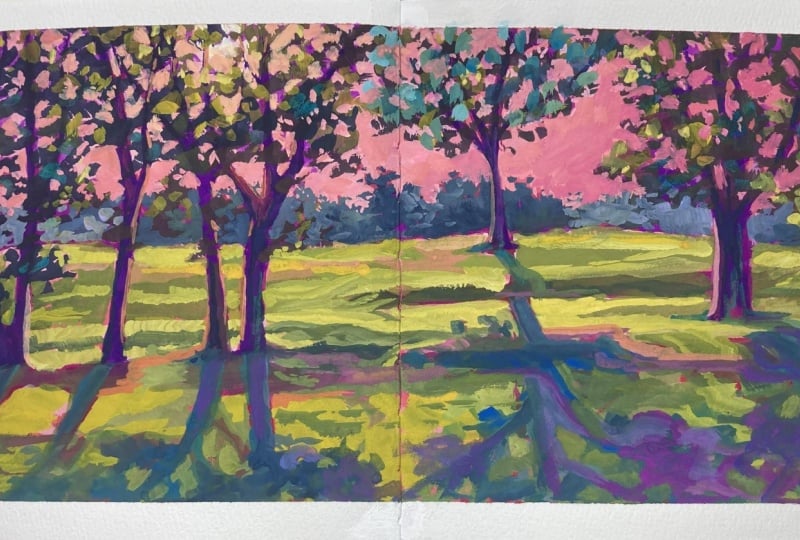
4. Sketching and Beginning: All right. So I've got
the board all dry, and now I'm getting
a number four flat, and I'm just going to
do a very loose sketch. I like to sketch in kind
of a magenta orange. I grabbed a little burnt
sienna there kind of color, and I've got the
photo printed out. You can print yours out
or you can put it on an iPad or something.
I don't know. I've done it both ways, and it's just I think a little easier to have
the printed out one, but I've done it both ways. And so I did speed
this up by two. So I just want you know, just in the interest of, you know, talking through it and you not being, you
know, bored to tears. So it's twice as fast as normal. I just don't want
you to think I paint that fast or sketch that fast. But I think, you know, it moves it along and allows
me to kind of talk through. So I'm looking at the photo, you can see very, like, just getting an idea. I'm just really trying to
kind of place things, really. I'm looking, you know, at the at the horizon, that grass line, and then deciding which
trees I want in here. I'm certainly not going
to put them all in. I do. You'll see add one because
I like odd numbers. So there's four trees there now. And so I'm just sketching
in these shadows. And this mix that
I'm working with now you can see
how watery it is. Did you see that just drip? It's really watery,
and I like that. I'm sketching in some of
the darks And remember, if you put something
where you don't like it, just grab a paper
towel, wipe it off. But this layer is going
to be mostly covered. So don't get too as long as you have a general
idea of, you know, what you're trying to paint
there and what goes where, that's all we're
really doing here. And I'm coming in and
hitting with some darks. This is a challenging photo in the sense that in the photo, all of the tree trunks are dark because the
lights from behind. So but I don't want to
start out with them all dark because who knows
how I'll change that. So I'm kind of looking. This is where I am looking
at the photo in terms of thinking about,
Okay, where is it dark? I'm looking for values, really. I'm not as concerned with shape. I'm certainly not trying to make the branches look like they
look exactly in the tree. And here I'm putting
in kind of the well, kind of the treetop
area, marking it. Trying not to make
these straight lines, even if they are in the photo. I don't want my grassline or my tree line to be
completely straight. I'm just putting a
spot of dark in there. So to make the dark, I've
just grabbed some purple and, you know, mixed it in
with what I had on there. So it doesn't matter. You can make it. You can
use some burnt umper. You can use ultramarine blue and add a bit of burnt sienna
makes a really nice navy. It's just a personal
preference as to what you like
to use as a dark. And now I'm moving to a
bit of a larger brush, but I put that one away. This is a six flat. And I'm going to come in now and make a little more of
that kind of burnt sienna, some greens and just start putting in pieces
of tree, really. I mean, they're just and
I'm being really loose, and I like this brush. It's a bristle brush because you'll get, I don't
know if you can see it, but you get those really
marked brush strokes that makes it look
like an oil painting. This is a brush by
Rosemary and Company. And I used to avoid
these kind of hog bristle brushes
for that very reason. I don't think I just didn't
know how to use them. And now I really like
them for this stage. And you can see how I'm holding the brush, not like a pencil. More like a sword, maybe. How do you hold a sword?
God. And you'll see me. I put the paper towel in front
of the camera on purpose because I do I do that a lot, and rather than
wash the brush out, I just use the paper
towel to get most of the color out for
this stage, especially. So I'm just laying in bits
going darker or lighter. I am looking at the photo
only to see where there's sections of lighter
colored leaves and darker and heavier
versus lighter, but I'm not trying at all to make the tree
look like that one. It's almost like
letting nature be your kind of like a
system of checks. Like, it's not maybe
kind of a guide, but also just helping you with having pieces that you
want to make sense without, you know, going too detailed. And that's another thing about using a nice big
brush like this. I mean, this panel is
only eight by ten, and this is a good
size brush for that. So the bigger the brush, the looser you start out with. Now I've got a little
bit of grabbed around one just to suggest some
tree trunks in there. You can use the side of
your flat brush, too, but that flat brush
with the bristles is so it just doesn't give me any level of
precision, I guess. So this middle tree
or kind of middle, I want it to fade a little
bit into the background. So I am making it not focal point type
colors at this stage. And then when I
look at the photo, this tree on the left
is the darkest one. Not by much, but, you know, I want to vary these trees. So I usually pick out something
to create some variety. So I'm taking some darker. There's a bit of a glare
with the light there, so you can't see that
it really is darker. But doing the same thing there, maybe making the sections a little more chunky
because it's closer. And then I grab some of
that pretty turquoise. And, you know, I didn't want
to go too far with that yet. So I kind of hit hit somewhere else with
it and then abandoned it. And I did that yellow
dot there to kind of just remind me that the sun
was coming through there. I think it ends up getting
lost, which is fine. And then the leaves around
that sun are lighter colored. So that's why I'm putting in
the lighter colored ones. I'm just mixing
color, adding color. Now, I'm going to
pause and go to real time for a minute so
you can see that pace. Okay, so now I'm
back to normal pase. And I'm putting in the dark here that I'm seeing
in that mulch bed. And I see a bit of light there, I end up changing that color
a few times. You'll see. But, you know, at this stage, I'm really just trying to
mark where are my darks? Where are my lights? And then what do I want to do
with each section? You know, what I'm kind of just putting so that I can know my way
around a little bit, put the lights in. Now, if I end up putting
a color in that I really like and I don't have to
paint over it, great. And that becomes kind of the
process of putting in marks. But right now I'm
just saying, Okay, this is that section
that's light colored. I did go with a the
color that it is, sort of, which I don't, you know, a lot of times
I completely change it. But there's going to be a
lot of pink in the sky. So I went ahead and made
the color that it is, which is kind of
this super warm, beautiful light green where
all that light is hitting. And I've mixed that by
grabbing some white, and then I've still got
things in my brush. You can probably see that. So
they're helping to kind of tone down the you know, the white to not
make it too white. And then I've got
lemon yellow in there. The best way to
get those brights that I like of the
grass being hit by light is lemon yellow and white and maybe a bit of,
you know, different things. I'm adding some orange there. And you notice I'm
trying to put down one brushstroke
and then move on. If and not overwork. Sometimes those brush strokes see that brushstroke that
got a little blue in it. There's a little blue under
there. I think that's lovely. And then I went around that red mark because I just thought the red mark was cool and also it could be a
shadow that's in there. And I'm intentionally not
covering up all the background. As the painting goes further, it will get more covered up. But I do try, you know, to say, Okay, don't
cover it all. Here I'm capturing some of those lighter areas and probably end up
toning those down, but at least they're in there and there's
some bits of green. So I'm just exaggerating
what I see. Getting the kind of sorting out. Those are bits of
lighter, you know, the shadows sort of variegated. It's not just one
big dark shadow. So I'm putting some of that
in there to reflect that. And this is where
adding that retarder to the acrylic paints
in my craft box has been great because they're still kind of wet on
the palette even. And so I get a little more
working time with them, which is one of the
disadvantages of acrylics. Advantage and disadvantage
is it dries so slowly. There's also a product called Open Acrylic Golden makes it. And there's a couple other
brands that make like basically a slow drying acrylic, and I've experimented
with those a little bit. Um, not enough to speak
really to him too much. Someone I know, an artist
said she doesn't like how they dry darker, and all acrylics do that, and you just have to that's just getting used to and saying, Okay, if I'm still
working with that. I'll put a color in the colors
you see right there now, to me, are the
brightness I want. And then half an hour later, they're a shade or two darker. So there's a couple ways that I've learned to work with that. One is, like, to
make this class, I have a really
bright light on this. Well, that actually causes me to not make the colors bright enough.
Does that make sense? Because the light is so bright, they look brighter
than they really are. So if I were not filming, I do not paint in
bright light like this because when I
turn off the light, I'll be like, Oh, my
God, that looks dull. You know, it's not
what I wanted. So whereas if I paint, and, you know, not dark light. Obviously, you need to be able to see what you're doing, but, you know, just not really
artificial bright bright light. Then it comes more it causes me to go a little bit
brighter with my colors, and then I end up
liking where they are. So now I'm putting in the
tree line area in the back. And changing the color
variety a little bit, you know, going
with some bluish, purplish tones back there. I'm completely ignoring that
there's a house back there. I don't care. I never
intended to paint the house. It's not what I care
about in this scene. I grabbed some blue,
and it got really dark, so I just kind of
went with it for now. And I think it
ends up surviving. So those are the things
just it's really just a process of somewhat
letting things happen, and then you can always
go back and change them. Always go back. So it's you're not stuck with
anything, really. I'm coming back
into the trees now. Alright, I'm gonna
pause now and go to the next video so that this
video doesn't get too big.
5. Blocking and Building: Alright, so I'm still working on that tree line. I've gone a little lighter
there just because that tree is darker and
maybe it would show up more, but I end up changing that. I knocked the camera, so it started wiggling. I did go back to twice
as fast for this section because I think I do a lot of, like, thinking and color mixing and I didn't want
you to fall asleep. So it's funny how this happened. I went to put in the
guy and you know, thought, I'm just
going to do a white, you know, whitish,
yellowish sky. And then at least there. And I thought, no, no,
I want to keep a lot of this pink that was in the background,
but I want to cut in. And so I end up going back
and forth, you'll see. But I end up thinking, This is what I meant by kind of trusting things and
letting them be. Instead of, like,
before I learned this, I might have just covered
that whitish part up that I'd put
in, but I didn't. I said, Let's see
what happens later. And I end liking it. I end up kind of going over it, but I do end up liking
the idea of it. And again, I just can't
emphasize that enough that you can always
go over something. So move on. And here, so this is where this
brush is not great, and I end up using
a brush that's not a hog bristle brush because I want to I've been playing
with the idea of it, and it just depends on it seems to work
better with oil paint. Or, you know, it just it's
the look that you want. So in this painting, I ended up, you'll see later coming back through with a more
fine brush and kind of going back and
forth on this idea of how much of the
background is showing, how much of the tree and
cutting in in different ways. And I've switched.
That's why I just switched that brush was just too big to
give me any detail. So this is a number four. Looks like when I'm putting my hand in front of the camera, it's like going out of focus. I just realizing that. Very I don't know why
that's happening. Never had that happen
with filming a class. So I'm dabbing in those bits. I'm mixing just a variety of pinky with peach kind of tones, and this is like my
first cutting in blocking in of the sky
area. It'll change. A a lot of people
call these sky holes. And I'm looking at
the photos, sort of, just to see kind of what
sky holes look like, but I'm not saying, Oh, okay, there's
a sky hole there. I've got to put one
there. Not necessarily. But it does help
me to say, Okay, sky holes are first of all, they vary a ton in size, and they're not they
shouldn't look too patterny, which is something you
learn by doing it. They should be um just not
look like a fixed pattern. Okay, so at this point, everything's dry and gives me a chance to step
back and take a look. It's a good first kind of
putting down, blocking in. And I see that I think this is too much
the same value as this. I think back here needs
to be a little bit darker and I got to put the shadows in and
then come back in with some more leaves to make
some more tree shapes. Also, I want to do
another pass here and then reclaim this trunk
here because I do want the five separate things. We have an odd number. I also want to bring some of
this lighter color of the sky into here,
maybe around here. So we'll just keep going here
and see where we end up. Alright. So just for reference, this section, I did
speed up but only, not twice, so 50%, just so that you
can follow along, but yet not I don't lose you. And I'm coming in and thinking about putting
more in the trees, giving them more stuff
and also changing colors. So still thinking that that
left tree is the darkest, and I'm staying more in, like, the darker blues,
purples, greens. I am looking at
the photo, again, only to see there are some sections where the
leaves are a little warmer. And obviously, I'm not painting individual leaves or
even clumps of leaves. I'm not putting them where
they are in the photo. It's more that I'm
thinking, you know, oh, there's a big cluster of sort of dark, and
let me put that in. And we're going to come through later and do sky
holes and things. So I don't have to
worry about that, and I can use the
bigger brush to just get in some color and texture. And then those bits, some of them will
survive to the end. I do use that one
green sometimes to just add to other
greens that I'm making. But most of the greens
I end up making just with a variety of blues and yellows and then oranges
to tone them down. I used in this painting
pretty much every color in that palette, some
more than others. I didn't use the red very much. And I don't really
use a lot of red. I tend to go to magenta. So there I'm just taking
the brush on its side and suggesting some The
way I have to hold it, I kind of blocked your view, but I was holding
it on its end and suggesting a tree trunk
there on that one side. And I'm taking that
tree all the way up. You can see me looking
around the painting. Where else do I want
to put that color? Some bits of dark. You know, I always think about what
I've got on my brush. So if there's any
place to use what I've got on my brush that
makes sense, right, it makes sense to use it before I clean off my brush and
switch to something else. Making more of
that deep magenta, I noticed in the photo that my little shade shadow
area went past that tree, and it's even in the wrong
place, according to the photo, which isn't a big
deal because, again, I'm not trying to recreate the photo and no one is
going to know where that is. But I'm starting to come
into some of those shadows and add I added some
white to that purple. You can make some really
interesting purples with just, you know, a little bit
of orange or yellow. Those if they're complimentary, across the color, you have
to be really careful. But this ends up being an interesting
challenge these shadows of these trees going
through that mulch because the shadow in the mulch is going to
be different color, similar value, but
different color than the shadow on the grass. And you have to show that. Otherwise, you can't understand that you've hit the grass. So there has to be
some difference. And so I end up, you know, putting them in
and then changing them and playing with them throughout the
painting, you'll see. But at least now I'm kind of going over them
with another layer, and I am looking at
the photo, saying, Okay, just for the
direction of the shadow also and the value
and the size of it. And trying to get at least the value and placement
of it somewhat accurate. And the shape of it,
size of it, really. Here's where I'm flipping
This is where I, I can't get the angle I wanted while filming this too and
not block it completely. So I flipped it on its side so I could get the brush strokes going the way I
wanted them to do. That really got blurry there. Sorry about that. But see, then I can get those brush
strokes going that way. Alright, I'm gonna pause and speed it back up a little bit and
talk you through it. Okay, we're back. And I am
still fussing with shadows. The thing about these about
this style of painting that you kind of learn is the
shadows and the background, the cutting in is I'm not gonna say it's
more important than, you know, your trees or whatever you think
the paintings about. Like, we think this is a
painting of trees, right? And yet when you get into it, it ends up I end up
liking the shadows, especially on the
right side the most, and they really draw
you into the painting. And that's just
something I've come to through painting kind
of experience and enjoy. So always think
about your shadows. Is another opportunity to use interesting color,
color variation. They're not all the same. Now here I'm being really
careful not to cover up all of that yummy first block
in layer that we did. I want bits of it to show could even argue that I shouldn't have
covered any of it. But that's something also
just by going, Ooh, no, don't cover that it's those even here on the
tree trunks, like, I'm loving those bits of that original sketch
coming through. Almost like I sketch
and then paint around the sketch to leave bits of it. And that ends up being a
lot of the magic, I think. My photo was sliding down, so I was losing the
size of the shadow, and they're really quite big. So you can see me working
out these shadows. Like, where do I want
to make them darker? What What makes sense, but also looks good. And that's just a process
of trial and error. And squinting is really helpful, looking at the picture and
squinting and seeing that all those shadows
across the front are mostly the same value, but the shadows on
the left clump, the ones that I've made like
a darker purple are darker. So that's why I
made them darker. And now I'm coming in with some more light that
I've made with white, yellow, and again,
what's on my brush. I really haven't
rinsed my brush much. I'm using the paper towel. But I think one of
the things that helps you have your colors look more interesting and
your painting more unified is to have just a bit of the other colors you've
been using in your brush, you know, depending on
what you're gonna paint.
6. Bringing it Home: Okay, so I've added more of the bright greens on the lower right of the
tree on the right, and some more just more texture and color to the greenss tree, the one kind of
second to the left. And now, you know, as
I look at the photo, I'm seeing some of
those highlights in the in the mulch there
and just playing with, you know, wherever I want
those to be value wise. So I lightened them
up a little bit. I'm just being, you know, with the brush, put
it down. Leave it. You'll see me dab
a couple of times, but this is just literally, you know, you say to
yourself, leave it. And now I'm coming
in and putting in some seeing if I want the sky in the back of
this tree to be lighter. I end up changing
the sky a few times. I just want you to see
the process of, you know, exploring and learning about what you like when
you're doing this, you know, the cutting
in, changing it. You know, if you
think about skies, they're all different colors. They're just you
know, there's no one. I mean, unless you
have a clear blue sky, which I don't really paint because it's not very
interesting to paint. Then you're mixing it up, so the sky will go from lighter
to, you know, whatever. I am thinking of keeping
the whole sky, though, in that sort of from a light pale peach all the way through to maybe
some yellows and pinks. I'm not intending to
put any blue in it. But I'm using the sky holes
to give shape to my trees, and I go back and forth
with that process. Yeah. Some of my favorite shapes end up being from the sky holes and cutting in
around shadows and things. That bringing that
pink down a bit is a way to just bring a shade into the painting from the sky so that the sky is even if it's just a
bit here and there, the sky is not the only
source of that color. I do the same thing
if I make a sky blue or whatever color
it's got in it, you want a bit of it
somewhere else in the composition so that
it doesn't otherwise, it looks too divided
and not unified. I'm just kind of bringing a little more oomph
to those tree trunks. There's a little bit of light
on the front of the trunk, especially that last tree. So that's what I
was doing there. And yeah, this is a great trick. You know, when it's dry
underneath, you can do that. So I made that mark too big
and just wet my paper towel and wiped it off
and actually made a nice little shape of my finger on that. So
I was happy with that. Here I'm playing
with, how do I want this kind of line between the tree and
the shadow to start? You know, I I am looking
at the reference, going, Okay, it's darker at the base of the tree. So I'm
playing with that. Okay. You know, in painting, you're learning while
you're doing it. You know, it's not
as if you start out, at least I certainly don't
with all of the answers because you can't possibly because when you put down the paint, you're
creating problems. I don't know who the
artist was who said this, but I've repeated
it that painting or creating is really creating problems and then solving them. And so you don't really know what the problems are going
to be until you get into it, and then you just
work to solve them. And you don't give up.
Almost every painting I do pretty much every painting I do goes through a stage where
I'm just like, Oh, right. This is not, you know,
I don't like this. I don't know that it's
gonna be what I wanted, you know, the ugly
stage, I call it. I'm still playing
with the shadows, looking at the image going, they're not as dark as
some spots in the mulch. But I want to make and
I'm getting better at, and this is just takes practice, putting the paint
down and leaving it. You can always go
back and change it. But if you start
fussing too much and, um blending or at least for this style
of painting or, uh, just getting in there,
trying to describe, holding your brush as a pencil
and getting really fussy, then it will look overworked. I am overworking
this shadow area, but because I'm doing it with brush strokes
that are clean, I may be able to get through the painting without
it looking overworked. Does that make sense? Oh. I have mixed up some more sky color. I ended up doing the sky a
couple of times because I was using the bristle
brush the first go round and just
didn't get the detail, you know, kind of the cutting
in feeling that I wanted. So I've switched to the
softer bristle brush here. This is the Princeton Aspen, and it's a nice soft brush. Synthetic and just allows you to get a little
more control. So I'm kind of going
through the sky again. I think I go through it one
more time, believe it or not. I love that you can see
those chunky brushstrokes, especially in the shadow area. Alright, so here I've moved my painting down more
like on a table. It's the front of my easel, where I have a little leverage. I was just with the camera focused the
way it was on it up. I couldn't get into the
detail and get the control I wanted to go through the
sky the way that I wanted. So that's why it's laying down. And so if you are
working on an easel, you might find it easier to lay it down when you
get to this point. And so I can just really
look at what I've got there in terms of I
look when I'm cutting in, I'm looking at what
colors are interesting, what marks that have been made with the brush
are ones I want to keep. And it's just a really fun way to pull out and push back the things that you want to in whatever
you're cutting out. And most of the time when I get to this
stage of the painting, and I'm like, maybe, I don't know, maybe I'm
not liking the painting. At this point, I
do like this one, but but I'm excited for this stage because it really comes to life
when I do this. So I try to take
my time with it. This is sped up just times two, for you to see, but
you get the idea. And I'm going in there and
thinking about the sky holes, trying to make them
different sizes, shapes. I personally have to
resist the temptation to make them look
patternyO you know, I just have to that's where the reference
photo really helps me. I just look up and say, Okay, sky holes are completely random, and, you know, can be one really big one can be next
to several teeny tiny ones. And the more you do it, the more you kind of learn what sky holes look and feel like. And you can leave some
of them loosely cut in, and then some of them
more tightly cut in. That creates some
interesting effects. A but I find this
part really fun. And some of your
tree marks might completely disappear,
and that's okay. Or might become really tiny, but they end up being
really interesting, in my opinion, when you
paint them this way. You can see here that
I'm just changing the color to a little bit, grabbing a little bit more white and a little
bit more yellow and just changing the
sky a little bit. Oh. And the brush in this one is that more
smaller Filbert or a flat. You could use either
one, but it's either a four or a two. It just you go whatever you
need to to get more control. But also, you know, watch not getting too fussy. I am holding the brush
differently here, if you notice, I am holoting it
the way you hold a pen because I do
want more control. You don't have to
do it this way. People will cut in holding it the other
way, the loose way. But I was at a point
where I wanted to really design these bits of
trees that come through, and I couldn't do it the way I wanted to
do it with that brush. So here I'm bringing again,
like we talked about just bits of that sky
color into the painting. Even if you change
the tone of it, even if you darken
it a little bit or add a little
bit of something, you know, I'm bringing back that highlight using that there. And that way, we're connecting the sky with the painting. You
don't need much. And then I end up signing, but you'll see that if it's dry and your signature is
not the way you wanted it, you can just wet a paper towel. First, I tried to put back in the purple behind
on the A, and I said, No, it's gonna be a lot easier
just get rid of it and start over and turn the I was trying to not turn
it 'cause I was filming, but I can't write that way. So I'm just doing a simple
essay, and we're done. Alright, let's see
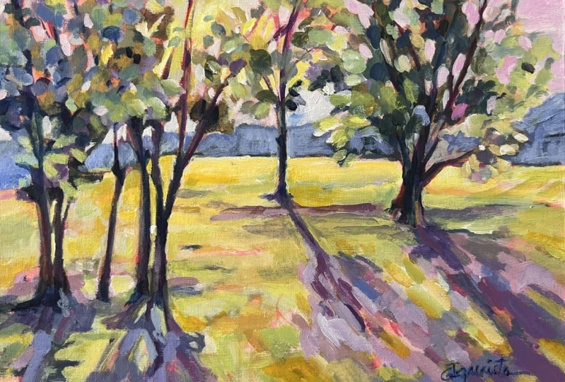
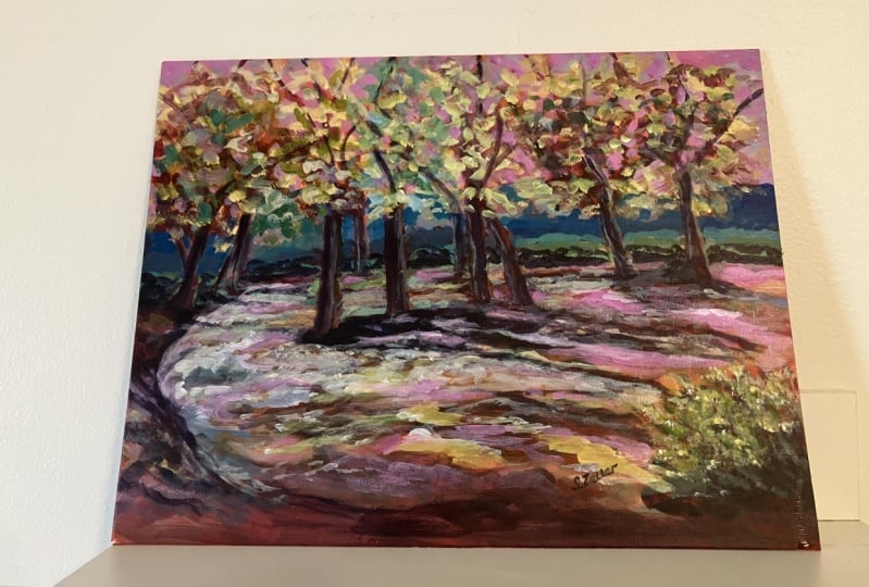
what we think of it and do kind of an analysis. Okay, so I move this to
some better light so we could kind of just go
over it and talk about, you know, just kind of what
did I hit my objectives of taking kind of a ho hum photo of trees in the neighborhood and make it interesting
and exciting. I think I did. There was, you know, a lot
of back and forth with the trees in
the background, which it sometimes that
happens because I'm figuring out I'm sort of letting the painting
dictate a little bit, a little bit of terms of what's kind of emerging and
what I want to push back. And so I just go back and forth. And I ended up
taking this more in a blue direction,
highlighting this more. And, you know, no one's going to see our
reference and say, well, that looks like
mountains back there and these are trees and a
house. It doesn't matter. At some point you
depart from the picture and you start just looking at the painting and say, what
does this painting need? So I like here are the
things I really like. I like the underpainting. I love when bits of
that show through. This was actually wasn't
the underpainting, it was the sketch that I did in the hot pink with a magenta mix, the watered down version and I always try to let
some of that peek through and not cover it up and you see it kind of
all throughout. There might be, there's
bits of the background, the pink background showing through my signature definitely. My paint was too watered down,
so I'll have to redo that. Um it's just, you know, playing with little bits I
like this outlined here, the negative space painting. And then overall, I
like the texture here. The shadows, I think
are interesting. They kind of draw
you in. We have lines that are drawing us into the painting,
especially these here. These shadows are kind of
bring you in along with this. And I just think there's enough that's interesting without
it being overwhelming. There are parts that are
darker than I wanted. When I looked at the
reference photo, you know, I kept thinking, Okay, sun is behind, so this is all dark. But again, I didn't even
really put in the sun. Obviously, the sun's coming this way because the
shadows are this way, but I could have and
still could go back and just lighten up bits
some bits of this, especially these shadow
marks that are in value on my painting a little bit dark because if you look in reality, the shadow is a little bit
lighter than the object, and I've got the reverse here. So that's something
I could go back easily and just lighten that up. But overall, I'm
really happy with it, and I think it turned out to be hitting the goal of
taking a boring photo and making it exciting. Hope you enjoyed.
7. Wrap Up and Resources: Okay, well, I hope you
had as much fun as I did creating this fun painting out of with a boring
reference photo. We ended up with
a painting that's not boring at all, right? And we simplified it. We brought color in, and
it was just a lot of fun. And, you know, it shows
you how if you just stick with something
and let it dry, walk away, come back, then you can get results
that you really like. Sometimes I'll leave a
painting for quite a while, you know, until I sort of feeling it again, I'll
work on something else. So don't be afraid to do that. If you want to keep in touch or get tips and kind of
studio updates for me, you can sign up for my
newsletter at suzanne.com. I'll also put the link in
the supplies download. And then I also have
a Youtube channel. Where I do supply reviews and just casual painting
and painting chats, I call them, which
are a lot of fun. And let's see. You can follow me on Instagram. Facebook, I have, by the way, a student only Facebook
group that I think is maybe at 23,000 maybe more. I'm not sure right now, but it's a large group,
really supportive. I've set the tone in there to be super welcoming
and supportive. So if you want to get an invite to that,
just let me know. Email me at Suzanne allard.com, art at Suzanne allard.com. And other than that, I hope you keep
creating. Don't give up. You can take breaks,
but don't give up. Keep playing with color, keep playing with shape, and you'll start to
see improvement over time by not giving up. Have fun.
 Suzanne Allard, Landscape, Floral, Abstract Painting Teacher