Transcripts
1. Class Intro: Hello, Lovelys. It's Suzanne Allard, soup dot artist here. And today, we're going to take a virtual trip to Tuscany and paint a beautiful
Tuscan landscape. It'll be kind of
abstract in style, and we're going to
use a Pinters photo, which you have to be careful
with using reference photos because you don't want to
have a copyright issue, but I'm going to show you a way to interpret the photo that changes it so much that you're gonna you don't have to worry about some sort of
copyright issue. So we're going to use
acrylic paper in this one, and we're going to have bits. I'll show you some
techniques to have bits of bright yummins
peeking through. We're going to change
colors in this one. Not a lot, but certainly some. You know, I have to so that the colors are
just more exciting. And the thing with the
landscape is I want to paint the way it makes
me feel when I look at it. And that doesn't so you have to translate that for me
into simplifying it, but also then making sure
the values are strong, the lights in the
darks, and that the colors speak
about my excitement. So that's what we're going
to work on on this one. And it's a lot of fun. I think you'll be
really happy with what you paint, and I
can't wait to see it.
2. About Me : Hey, I just wanted to tell
you a little bit more about me if you haven't taken
many of my classes. My name is Suzanne Allard, of course, and I'm a
self taught artist. I got started painting later
in life in my early 50s, and I finally decided to
stop being scared of paint. I would create other things,
but for some reason, painting felt like, no, no, though, that's
for real artist. That's not I'm just
a creative person. And I got sick of hearing myself say that and
started painting. And I started just, you know, with some basic drawing, like little challenges
on Instagram. And I'm not a big
drawer. I don't draw much. I'm a sketcher. And just one thing, you know, I don't
want to say one thing led to another because
I worked hard. I don't want to diminish that. I worked a lot. I painted a lot. I created a lot, just asked
my family. I was obsessed. I'm still kind of obsessed.
I'm painting the evenings. But I just wanted to
share a little bit of that story because I think one of the
things that really gets you where you want to go is just frankly not giving up. And, you know, you can
get tired and you can have take a break and
recharge your batteries, all that, but just don't stop
and keep taking classes. And eventually, you
know, if you want, you can get to where it's
you're selling paintings. Many of my students have gone to sell paintings and
show paintings, and that's so exciting for me. I myself, sell my work online and license my work
and teach classes online. I haven't done in person
retreat yet. That's on my list. I have to think about that one because I get requests for it, but I think that if you are
interested in pursuing, whether it's casual painting, just for pleasure, all the
way up to an art business, like I have and beyond, you know, just stick to
what you like to do, and then do that
part and then add on things that you don't know
little by little so that you can learn and
keep your focus, keep your determination, and
you'll be able to get there. Let's get started
on this painting.
3. Acrylic Gouache Paint Palette: Alright, let's talk about
this acro guash palette and how I put it together. These are little
containers that come with these little rubbery tops, and it's been, I want to say three or four weeks that I've
had these in here. And I have replenished
them a little bit. You can see I'm a double dipper. I keep them sprits with either a little spray bottle
or this one's really misty. And I only do that, maybe once when I start and then
if I'm say painting an hour, then I hit them again
before I put them away. But all I did is I
took some colors, two, I took two yellows, a cool and a warm,
and then some red. So I've got, true red, this is a cad red, a magenta, and this is opera
pink, which is, you know, my favorite
fluorescent type color. And then an orange,
a lime green. This is a Prussian blue. It's just a dark blue,
altamarin turquoise. And these are mostly Turner
brand that are in here, if not all, this is an
ivory, of course, white. This is just a peachy. I had a tube of it, so I emptied the entire
tube into there. I think it's called Juan. This is yellow ochre.
This is a pale lilac. It's not this one. This
is a brand new one. It's a little darker, yeah. So I just basically
took what I had, but I made sure the essentials are you don't even need
both these containers. The reason I spilled over, I really only needed from
here, about five wells. I really only needed the white. I like the ivory, the yellow
ochre, and the burnt sienna. I threw the rest of these in
because I have the space. I figured if I was going
to fill that many, I'd fill the rest of
it, but you don't need greens because
you can make greens. Lime green is challenging to
make, so I like that one. But the only
essential colors you really need are a
warm and cool yellow, a warm and cool blue. Warm and cool red.
And then in my view, turquoise is it's easier
to have it than make it, and then opera pink
you can't make. And, of course, you need white. So then but I have a fair
amount in each of these. So like, let's see if
one needs replenishing. The white usually always does. Ultramarine blue is
getting a little low. So let's go ahead and grab some of that and
put that in there, and I'll show you how I mix a little bit of this
blending medium. Alright, so here's some
whole vein ultramarine blue. And I just squeezed
them in here. But you want a fair amount of paint in there because that's partly what keeps them from drying out is the
amount of paint. So don't be I probably should just empty
that completely into there. But don't be too
sparing with the paint. And then this is Windsor
Newton blending medium. It is for watercolor mediums. But even though this is
acrolGloh, it's been working. You could also use
just acrylic retarder, which I'm also putting, which is what I use
in my acrylic paints. So and I just put a couple drops in and stir
it up. That's it. Um, I like to get
stirs at coffee shops. Those are really
great to stir with. And the blending medium just makes the acrogse flow a
little bit easier, I find. Aqugage can get really
dry and chalky. So this lets it blend easier. It slows drying to
allow blending. Let's see. Any more
that need to be filled? Not really at this time. And then the only trick when you close them is you
just want to make sure that you don't
just set it on top. It's sometimes a
little tricky to get the little bits going around each well so that
you've got a good seal. Yeah, so you can kind of hear
it snapping in. Alright. And this one and then I just
put them in a zip lock bag, and I don't even do
this all the time. But let's say I know I'm not gonna use them again
till tomorrow. I just figure it gives
me an extra level of security from them drying out
because this is acro guash. If it dries, it's dry. You're not reconstituting
it with water. It's not like my guash, regular guash, which
has no acrylic in it. See how it can be
trike sometimes. Okay. And then I'll put
it in a ziplock bag and throw in some wet paper towel or even a wet cloth,
not wet, damp. And yeah, and if I'm
gone for even longer, I'll stick them in the fridge. So that's how I've been
using the acro wash. I'll put all the
links to this and this in the supply list. Enjoy.
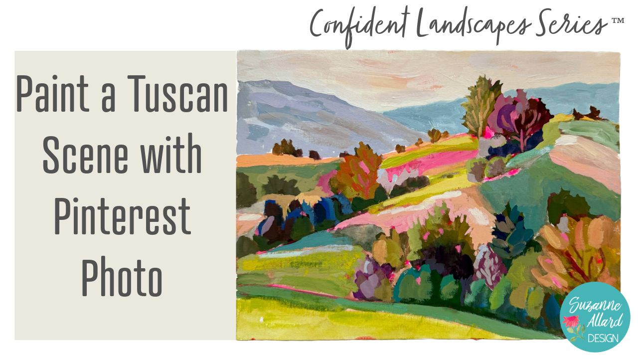
4. Tuscany Supplies and Beginning : Alright. For this painting,
I wanted to show you how, even though I usually will often use my own
photos as reference, the way that I show you
how to create these, you can use Pinterest or
other sources because you're changing it so much
as an example that I mean, if you have an
ability to ask for permission to use the
photo, of course, do. And I actually did post below this and Pinterest.
Can I use this photo? But the person never replied. And and again, we're
changing it so much. It's not as if we are copying
this and then selling it. So as long as you're
changing it significantly, you know, it should be fine. So anyway, we're going to use
this photo as inspiration. Then the other cool thing
about this painting is we're going to use something
different to sketch with, something that you
probably have at home. So let's talk just briefly
about the supplies. I've got a piece of nine
by 12 acrylic paper. This one, the previous painting I did on watercolor paper, so either one works. I've got my paints here and my little let me get
that out of the way. And my little airtight
paint palettes that I'll have my latest toy. I change I always change and try to find
things that work well. But I'm really liking these they're just so
portable and easy, and I've had them in here
for now a couple of weeks. I just keep them misted. We'll do that now when
I'm not using or, you know, when they're
sitting out here like this. And then, of course, I keep them sealed with these
cool little covers. Color wise, I will put the
colors in the supply list, but there's nothing magical too magical about these colors. I would say just make sure
you've got two yellows, a cool, and a warm one, and then a couple
of red magenta, and then opera pink, I
do think is essential, and I also think turquoise
is you can make turquoise. You can't make opera pink. It's basically like
a fluorescent. And then I've got a dark
blue, a cooler blue. And then it's a couple
of cool blues, actually. I've got the Prussian blue
and the Ulti Marine blue. You don't really need a green.
You can make your greens. And then I just had
another one of these, so I put some other stuff in it. I like to use ivory a lot. And then these are really
colors to tone things down. This burnt umber,
asiena Euler ochre. And then I had tubes of this, so I just
threw it in there. This is just a dark green, and this is like a aridian
green. This is a purple. And a violet. These are
really not that necessary. You just need one of these, at least to tone things down. You can make your own greens. So basically, I took what I had, made sure I had the
essentials first, which I would say are here, the yellows, the
reds, the blues. And then these were
kind of nice to have. And then I've got
my palette paper here, which I like to use. As a palette, it's just
the most convenient thing. And then we're going
to use a highlighter. That's my secret weapon
on this to sketch this out because I love having
bits of pink show through. You can kind of see that it showed through here, here, here. You don't know where it's going to most of it gets covered up, but I just love when
bits show through. And you can always try
to let more of it show. And then brushes wise, I've been working on going
with bigger brushes, but we will probably start with the size eight and then maybe go to a flat,
a bit smaller. We'll see. Alright, so first things first, start
to sketch this out. And when I'm sketching, I am really just
catching the big shapes, like I talk about in the landscape kind of
composition, foundational skills. So I'm going to I do try to stay away from the horizon being
exactly in the middle, which it actually
is on this photo, so we're going to
just bring it up a little bit and kind of get this Try to hold your whatever you're sketching
with lightly like this, you know, we're not
drawing in that way. This kind of flattens
out up here, which I actually
ended up liking. And then we've got little I'm
just gonna capture some of these little bits of
trees and shrubbery. Here we have a good sized
one. I really sticks up. Well, I may have
made that too high. Let's bring it
down a little bit. So look at that and then
there's a bunch of This is where we got a bunch of shapes. It's probably easiest for you
if you've printed this out. But if you haven't watched
the foundational videos, I would encourage you to do that to help you with
seeing the shapes. And also, when I
painted it this time, I took out this road. I don't know if you
can see this road. But maybe maybe we'll
put it in. Who knows? We'll sketch it, and it may
turn into something else. I ended up kind of just
doing something else with. Alright, so here this is
where I love with landscapes, and I invent them if
there's not plenty of them, but I love all of the different
sections that there are. So definitely going
to capture those. Here's a bunch more
trees, shapes. This one's another tall one. Maybe not quite that tall, but you get the
idea, more shapes. You see how this
sketches? Isn't that? Okay, then this kind of
comes down like maybe here, maybe a little bit
more like this. And we have a lot of
trees and kind of coming like this and
then like this and really well over into
the halfway mark here. More there, more there. And then I make
shapes out of these see these areas that
are in the sun. So that's a shape, sunny there. Then if you come down here,
there's sunny area there. Um, this is kind of sunny here. There's another big shape there. My drawing is beautiful, isn't it? Look at that. Um, that's how I work. And then I come in. Now, if you end up like
this and you're like, Okay, I don't even remember the lines that I wanted to
make or that I'm, you know, I move things up
and I move things down, you can always come
back through with a brush and grab, say, your pink or whatever
other color you want to kind of peek
through places and come through and go a little bit darker because we came up here. We moved it down,
flatten that out. And these are all
ways to just kind of make sense of your
composition and your sketch. When it comes up like that.
I don't even need that. That's just these are trees, but that's just kind of
where it is behind there. And then we moved this. Anything else? It's not clear. I can come up here.
We move that up. Yeah, so you can
do it like that. And then once you've
got your brush, you can start capturing your dark areas,
which also helpful. And I like to decide, Okay, what am I gonna make my darks? You know, am I gonna go kind of with a Nabi ish or a burgundy, and I mix it up. So let's do kind of a navi ish. And this is just literally to kind of mark where they are. It's not throwing
a little purple in there. That's too purple. You can knock purple back with sienna or this is just kind
of mark where they are. And I like to vary them, too. So, let's say I just
did those darks. These are trees
coming along here. Let's, you know, throw
in a little blue. Maybe back here,
they're even a bit darker and throw in a bit green
still in the dark family. For these things,
that just pops over. Walking in is what
this is called. But it helps you organize
where your darks are. And I like this stage
to be watery because I want here I'll put some
of the shrubs in here. Some of that might end
up peeking through, and sometimes it can
be really pretty. So let's that was too
green, too green. There's some kind
of cooler greens here in the front
of these shrubs. Just kind of it's almost
like marking a territory, you know, claiming, Okay,
this is dark territory. This is light
territory. I grabbed a little light there because
I saw some sun coming in, and I thought that
could remind me. There's a variety here. It's
not too dark over here. Here is a darkish tree. Grab a little more navy. So I keep varying these darks. And the shape, by the way, I'm not really thinking that
it's gonna be a tree, but, like, I know, I might call
it out like that one, then I might make it
more of a tree shape. This is a bit lighter.
Still dark, though. Maybe bring some of
that purple back in. It's behind these.
There's one here. They're all kind of
sitting on this hill. It's dark, though. The bottom of that hill is dark. It's where the base of the trees is. That's
definitely dark. This is our darkest area here. Then I would say this
is the second darkest. To purply. Well, that purple
is really strong. He's kind of come behind here. And then this gets
lighter up in here. It's still a dark, though.
So we're gonna put it in. Maybe just lighten
it a little bit, with some yellow ochre. And this is what I like to do to challenge
myself and to make things look a little differently
is I don't You know, you could say, Well, all
this stuff is green. Why are you using all
these other colors? Well, I'm in shadow. I mean, I'm in darks, but it's not really green
if you really look at it. So I'm varying these darks. To make it more
interesting. This one out here is quite light. And I'm going to make it
so that I can cut in, which I love doing, as you know, I hit it so I can see the
sun's coming in there. I really am This
is the way I work, so I am doing my dark right now, but when I'm there, my eye
is there, I'm thinking, Oh, I might as well
just throw that in. Okay. So I've got the major darks. There's another kind of dark
shrubbery stuff over here. And then we've got
some lighter darks, bits that are up here. A little bit more over here. We don't have to put
everything in, of course. This is up to you. But I do love the way these little bits look
once we cut them in. So I tend to I tend to put more of them in or at least not
take many out. So this tree comes up larger. I'm gonna come up
here with this. Okay. I might as well shift
to some medium tones now over here where the sun is shining is let me
put some yellow in there. Yes, I'm mixing right
on the paper here. Grab some of this because
this is pretty light, and it's a tree of some kind. And there's some sun heating it. So I don't mind. I don't want too much brightness
over here at the edge, but that's a good there's a little bit of that,
and I can tone it down. I need some more water to
get this flowing here. We'll come in and cut
in with that later. It is dark down
here, though. Okay. So I'm just looking
through and saying I want, you know, to identify my shapes. So now I'm going to come in with where those remember those sun bits
that we were talking about, and one of them was back here, and I could choose this color, really any light color. I'm just going to go with
this because it is in the photo and it
is a light color, and it'll at least then I
know that's where it is. I know I've got a
light spot here. Then there's some
shadow Oops, too much. Down here, a midtone shadow. I know it looks like a lot of brown right now because it is. I want lighten that
up a little bit. My shadow. Okay. Alright, back to I'm wiping on a
paper towel there. This was another light
bit. Quite a bit lighter. I've still got some
purple in my brush. I don't mind that. It makes some interesting
blends there. I can already tell
that's the part I'm gonna end up leaving
'cause I like it. And then let's go
up here and get this really bright
top of a hill. So now I'm actually starting
to put some things in that might might survive the
rest of the painting. You just never know. I'm
gonna grab some more of that. I like that I've already
that I've got this bit in my brush of
purple and other things. I'm grabbing this lemon yellow, grab a little bit
of this peach, too. And Oh, no, that's
the dark part. Okay, up here is the light part. We'll darken that next one down. Let's do that now so we don't forget. This is darker here. It's in shadow. Okay. Right now, I'm just trying
to catch those lights. I see another bit
of light over here. It kind of comes through here. And then this is light as well. And I love making some
of my lights with pink. So we're going to do that here. There's also some light here. I guess I'm gonna get rid of the road on
this version, too. It's looking that way. Okay. Now, this is kind of lightish, too, quite light down here. So for now, I'm just gonna grab some of this
and water it down. This greenish yellow. It's blending really nicely with the colors that
were in my brush, so I'm getting,
like, a nice kind of tone down version of it. And we'll just this next piece will just darken
the tiniest bit. Oh, not that much. Let's see what's in my brush.
Yeah, there we go. Then above it, we'll pick out
maybe some oranges in here. I grabbed a lot of
water there blot my I was a little bit peeking
through there and there. I don't remember why
I made a line there. We'll just keep it was a little bit darker
there, but not much. Basically, I'm
covering up the white. Same with this there's
a mid tone there, kind of shadow, shadowy there. Well, I have this
kind of shadow color. Let's put it here where
this big shadow is. Basically, it's just
a watered down mix of what I had on my palette. Got some more shadow up
here. Shadow area here. And this is an area that
is kind of let's see here. Yeah, this is in front. Okay. This is that
bright green area, so I'm just going to so that I remember it come
in here like this. Kind of comes in front of
these some of these trees. Almost got everything, you
know, kind of blocked in. Let's see. I'll just put a bit more of that
peachy color there. This comes up here like this. And for the hills. So instead of in the
picture, you know, it's just kind of
all this atmospheric I created in my painting here, I created some kind
of gradual mountains, but I think I might
want to change them a little bit instead of
having to go up up up. I think maybe
something like this. I'm just sketching what's
on my brush right now. And 'cause we forgot to sketch
those in with the pink. And then if you're not sure I've looked at so many mountains
now that I that I, um I don't know, kind of they're
kind of in my head. So if you're not sure, you could grab a reference
of just Google mountains. But I'm thinking
that I do something different where it's
high on this side. Let's compare it to
where on this one, I made it high on
the right side. And so the mountain
would come kind of like, you know, this, maybe, and, you know, maybe just that. Also, when I'm doing
mountains, I don't make them the same height. That's, you know, they should be different on both
sides of your paper, and, you know, make
them kind of natural. So I'm not gonna block those in. I just wanted to outline them because I'll want
to come in and, um, do that negative
space painting here on some of these bits, which reminds me I want a
few more bits back here. These are gonna be
trees and shrubs. They're kind of in the light, so I'm just trying
to make them a little bit peachy, yellowy. There's not many there, but you can have as many as
you want, of course. Alright, I think I
have all the pieces I wanted in the places,
for the most part. Got some green coming here. The thing is what you have
to remember is you know, we don't get too attached
to the reference photo. We're using it as a guide and just really as
a source of ideas. And then from there, nobody who sees this is going to be looking at your reference
photo and saying, Oh, yeah, you didn't
get this right. Now, the thing has
to make sense value wise and be interesting
in terms of, you know, things being saturated and
brighter toward the front, things being faded at the back, you know,
things like that. But other than that, if you got the
values going well, you can pick out the
colors you want, and, you know, you'll see just kind of
develop it how you want. And then at some point, you'll use that photo less and
less, and that's good. Alright, that's a good start.
5. Tuscany Next Layer: Okay, so I let this dry
a bit, and, you know, I think of this at
this point as kind of a blocked in sketch. And sometimes it's
fun to take your whatever color you used if you're doing what I'm doing
and you like the hot pink, you know, take your it could be a pastel I have here somewhere. How did you go? I had
a hot pink pasta. Oh, here it is. Oil pastele, but we could just
take the highlighter. And just in case some of
these don't get covered up, actually, that's too
it's not bright enough. I can put little bits
of this here and there, they will probably
still get covered up. But some of them
might peek through, and it's just kind of a
nice little something. You could use the paint, as well, you know,
opera pink paint. Sometimes I just like the
texture of something else. And I wouldn't use it so much too much on the edge
because it is going to draw people's attention in, so maybe concentrated around whatever you see as
your focal point, which I'm not sure yet, probably
this area for this one. Alright. So now I'm going to come through
with another layer, and I realized I switched
brushes last time. I said I was going to
start with this big one, which I intended to,
but then somehow I grabbed this one,
which is number six. That's probably what
we're going to use for most of the painting. And now I'm going to come
through and just come in with some more layers or another layer on some of this. Some of this I might leave.
Like, I really like the way this turned out here and it's
kind of bleeding into that. So take a look at what
you've got at this point. Like I said, I like the
texture and the brush strokes. You can see there,
maybe even there. But I'm going to start applying
paint more thickly now. And I'm going to come through first again on my trees so
that I can do my cutting in. And I don't need
to do all of them. I'm not going to touch these because we can cut in fine
on those the way they are. But I am going to come through
here and put, you know, some lighter bits
because you can see, again, using the photo
just as a reference, there's a little bit of
light coming in and hitting on the edge of the basically, the sun is coming this way, so everything in there is
being hit on this side. So I'll be thinking
about that as I put some of these colors in. Alright. And I actually
like the way that looks, and when we cut
into it, it'll be pretty it'll be pretty cool. That's kind of interesting. I'm thinking about color. Do I want to put I like this
sort of turquoise here. Maybe I'll come in here
with a little bit lighter, and we'll just kind of
see how things go. Okay. So this idians good for
that sort of thing. I got to tone it down, though, a little bit with maybe
some yellow ochre. It's kind of. So like, these have sort
of I'm gonna just do one stroke, a highlight. And I want to I
don't like I kind of have this feeling that this
is gonna sound extreme, but not that no brushstrokes
should have the same color, but I like to keep
changing the color, even if it's just a
teeny bit of something. Just kind of suggesting those highlights gets a
little more yellow in here. A little more. I am looking at the photo just to see
where those lights are hitting a little
more yellow up in here. Well, there, they're
kind of more on the top of the tree of
the angle of the sun. I mean, the top of these
shrubs and a bit on the side. And I'll go with the violet to get the highlight on these. I really like this violet color. I'm looking for where
else I can show kind of a highlight.
Maybe right in there. So I haven't washed my brush. Let's look for kind of a So sometimes when
I'm like I say, so this is already kind
of a burgundy color here. So when I think, Okay, what's the light version of burgundy, it's it's sort of a pink. So then I grab
that lighter color and do some of my highlights
in that. Same thing here. There's a tree there with
a highlight down here, maybe That needs to
be darker, though. Value wise. These trees
are much darker than this. So darken that up a little
bit. Bring some of that. Can put a little bit of
that purple up here. And we haven't worked here much. So I think I'm gonna
stay more blue here. And the highlights here are kind of in different
places are here. This shape, it's up here, and then There's kind of I'm gonna use some of that turquoise coming down
in here on this side. Could be reflective light. Then these just kind of fade away into that background color. So I'm going to kind
of make them do that. Not everything can
be the star. Okay. This is going to be done, let's go orange with that
because there's one next to it that's in the light
and is more orange. So I just I'm gonna clean some
of my brush out because if you grab orange with blues
and greens in your brush, it's gonna really knock it back. I do want to knock it back. So, but so I left some in there. There we go. Oh, too
much water on my brush. Let's try that off. I
do want this layer to be thicker, but that's okay. We'll come back through.
We'll work on something else. Well, let's come down
here to this yellow. I'm gonna head to the orange and knock it back a little bit. This is there's a lot of
sun hitting this one. So I'm just showing that here's
some chunks of the tree. We can come in. There's
some tree trunks there. We'll come in
afterwards and do that. And this gets a little darker down here because
this is a shrub in front.Tarken that just a tad. We can kind suggest a trunk
grabbed a little bit of pink. That's one way also to get the viewer's eye
around is some sort of line work, like this. Like we'll do here and here. I was a little toothick
there, and then just come back through like that. And this is where I'm
always trying to be careful not to cover all
of my underpainting, a really cool things happen
in those underpaintings, maybe because they're
just so quick, but you get these, you know, beautiful bits, and so I'm trying to intentionally
not cover all that. I really like how
that's looking. Um, let's come back here
and do something with this. It's not a I should be
knocked back somewhat 'cause it's not a really important part of
the composition. So just gonna tone it
down a little bit. It's just some shrubs. Leave some of that
purple showing, but this could use a
little more variety in it. I'll leave those darks there, but maybe more suggestre
type looking stuff. I did like that blue, though. I'll put a little
more of that back in. Especially in the
this whole thing. This one is in shadow. You can cut in a shrub below
a tree below there. Here, I like how it just There's not I don't need a lot
of definition here. Maybe just a tiny bit of that
purple to being a little more give it just
a little more form and cut into these below it. You're kind of thinking
backwards with the cutting in and
you get used to it, but I still catch
myself going, oops, I painted the back first, but if you want to
do the cutting in, then you paint the top first
and then come back through. Okay. That thing is needs to be
just a little bit warmer. Oh, grab some. When your breath gets too
muddy, you just rinse it out. Um, but maybe don't
clean it all the way. Maybe something like that. So you have a little bit of something
interesting in there. I'm gonna just hit
that maybe with a bit of orange orangy green. And maybe some green through it. Okay, now let's come
back to this one. I'm gonna leave
some of that orange and get some more orange. Taking mixing the
green with the orange. Bringing it up here,
which is where we'll figure out what
parts we want to cut in. And then it gets real
dark at the bottom. All these do. Over here to the end is just kind of
like a we're just gonna make some sort of neutral shapes there and not draw
attention to over there. Bringing the viewer's eye in. Alright, I'm just
looking around, seeing what I think
of this layer. I think it'd be nice to put some there's a really
pretty green here, that bit right there right here that I think would be
nice to call attention, and that's like a turquoise
mixed with an orange, orange yellow, and just
put a bit of it there. One and done. And a darker
version of it maybe down here. Quite a bit darker, though. Kind of in front of these
trees, there's a shadow. And I just I look at a color like that color
that's in the photo, and then I just sort of
exaggerate it from there. And I think that
could work maybe a little more for
this shadow here. This is too light, so I'm
gonna add some water there. Start a little bit
of cutting in there. The bits of pink there
are not in the photo, but I love them, so
I'm gonna leave them. Okay, and then I'm gonna
go a little warmer and make a color to cut
in around this shrub. I won't make a lot of detail. But because it's
not a focal point, but I'll just give
it some shape. I can just bury that shadow
a little bit over here. Everything has variation in it. Okay. I'm gonna soften that edge. Sometimes I just use my finger that shadow edge doesn't
need to be so harsh. Alright. It's taking shape.
6. Tuscany Building Layers: Let's work on this area here. I think this is a good place
for some very light pink. But I want it to be a warm pink, so I'm going to lighten
my pink with the ivory, which kind of gives me
a peach and come across here with just a
couple of strokes, trying not to overwork. I need more paint, though. And then I can kind
of cut in here, make some interesting
shapes here. You need a good amount
of paint to cut in it and it can't be too water
down a little bit of water, but it needs to be able to move. And to me, where the cutting in is just
where it all comes to life. Just change that
paint a tiny bit, warm it up a little
bit over here. Keep cutting in on this tree. Sometimes I look
at the reference to get ideas for cutting in, especially in the beginning. But then you get where
you kind of know. But still, to keep it fresh. Cut in down here.
I'm intentionally not covering all of
our bits of pink. Yeah, I really like
how that came out. And take this color that I've made just to make a little
more squiggly there. It was a little too
much of a line. And I've got this
color. So where else might it be nice?
I think, right there. That bit that's
back there, maybe a little more yellow in it and come back in here and
do some of this cutting in. And I vary my cutting
in detail by, you know, how much of it do I want to
be a focal point versus not. So I do think about that. Like, over here is not a
super um focal pointy area. In fact, I want to
darken that it's gonna draw too much
attention to it. So I will cut into
these but less. Okay. Bring this over in here. This green up here
is bothering me. It's a little We blocked it in, so I knew it wouldn't stay, but it's a little too Kelly
green and a little too dark. So I'm going to come in with it's in the
shadow in the picture, so it can't be too light, but it's I think
it's too warm maybe. We'll see if I can make color better. Okay. I'm trying to squeeze all the
so you can see everything. Okay, we can cut in just a little bit on
these guys back here. Not too much detail. Trying to get more paint on my brush. Okay, and maybe just dry my brush a little so I can
scumble here and soften that. Got that color.
There's a little bit of lightness down here. I want to soften some of this. I do want to put
something on this green, maybe I'll take it in the
direction of some turquoise. And we need to go
right up against that dark because it's dark at the base of those trees. Okay. One brush stroke. I did have to lose
the pink there, but I think I needed to for
what was happening there. We'll leave it there, though,
and there's still bits of it there. All right. I think I'm going to come
into this pink area here with some ivory and
just darken that up. Cutting into that area. And then, you know, sometimes
when you've got the pink, just if something looks a little too monochrome, give
it a little highlight. You might cover some of them up, but you might leave some too. Okay, so that's that. I think I want to take this
in more of a green direction. Let's make some green. I actually don't like the green that I have
in this palette. I think that's called
permanent green when it runs out I use every
single time I use it, I have to tone it down a lot. It's just too kind
of classic green. I'm getting right, I'm
getting a nice warm green. Let's see, no, I
want it lighter. Much later. Maybe more peachy. One stroke. I don't
mind if some of that. Um, Peach shows through
'cause I like it. I just want to have a little more something,
something going on. Alright, here, I'm going
to cut into this guy. I'm gonna keep that pink there, but get rid of the white
that's next to it, okay? And I have this color, and I'm going to bring There's a little bit of a grassy
kind of ridge around here. It's getting interesting.
I'm liking it. You know, you got to
get through that, talk about the ugly stage so
many times in my classes, but every painting
has an ugly stage. And I want to make
sure I have the darks here that I need 'cause
it's it's dark down there. Blues and ice dark,
purples, browns. And I'm not trying to you can probably tell if you're
looking at the reference. I'm not trying to imitate every
shrub exactly, obviously. I'm just suggesting that there's shrubery and
trees down here, different sizes, different
textures, different kinds. And I think I want to I know this was
supposed to be a shadow, but I think I'm just gonna
turn it into shrubbery. I think it just makes
it more interesting, and there's need little variety in this a little too purple. Alright, let's pause and then do the sky and
then see where we are.
7. Tuscany Creating Depth & Interest : We're going to do the
mountains next because then we can cut in
into them on the sky. But remember, they're far away, so we're not going to
do a lot of detail on them or on the
cutting in on them. So we're gonna pick
pushback colors, which means unsaturated and cool is where you want to start with anything
in the background. And I do think about,
though, the painting. Like what do I want that
kind of goes with this? I think a violet color,
slightly violet, which is always nice for
mountains could go on this one, and warm that up a little bit. Basically, it's gonna
be sort of a gray. Let's see what that's.
Might be too bright. You don't want your
mountains to or I don't want my mountains to my background to be so exciting that
it jumps forward. Might be too light colored, too, 'cause we have
to remember Oops. No, I don't want to
go that direction. Sometimes it's challenging
to talk and paint. Let's go back to some violet. Maybe it'll rain. We do have a sky to put in. So we don't want to make
the mountains so light. I've run into this before this challenge where the
mountains are so light that they blend too
much with the sky. So I'm just putting
down my brush, leaving I got to get more paint, so I don't overwork it. Here's where I need a lot of paint to cut in on that tree. So when I'm cutting in, I do make sure I've got
a good amount of paint, and I've added just
a little bit of water so I can really
work with the paint, and then I use that
end of my brush. I also want to make
sure that the color of using is a color that contrasts well with what I'm
cutting in so that it shows. Remember those were
just little bits. I'm trying to add a little
white or a little something different to almost
each brushstroke. At these little bitty
trees I'm not gonna do. Remember we talked about
much detail at all on the cutting in they're
way back there. And you wouldn't see that. That helps you be able
to convey perspective. If I were to really
detail each one of those, it would probably be confusing. Whoops. I just painted on
the heads of the painting. I'm gonna leave that little
bit from undernees like that. And I've painted mountains
before and thought, No, that's not the right color,
and I've painted over it. So I want something different
on this mountain because, you know, I don't want
them to be the same. So I'm gonna try adding a bit of turquoise, see what
you think of that. I I have to get rid of more
of the purples taking it down to just a blue. See if I can get a
pale turquoise that doesn't look too um, forward because Turquoise is kind of warm and we
want cooler colors. So this might be, you
know, it's too warm. We're gonna end up with a blue with a bit of turquoise in it. I remember that thing
about how they dry darker. So I keep adding white, 'cause I know about that. Alright, let me get
myself some good cutting. I'm standing now because
I'm just finding it easier to paint, but I want to get so that I can look down on
this with enough distance. A cutting here. And I want to leave some
of that pink bag there. These literally
do not have to be any any descriptive
shape back there. Just you can kind of
look at the pictures, but don't sit there and try to make this one looks
like a triangle, and that one doesn't do it
quick, like I just did. That's how it becomes
your own, too. Cutting in is like
your signature. I don't want this to
be too. There you go. Too much too linear. And don't add more white. Cutting in. I either hold
it like this or like this when I'm cutting in because I'm using the edge of the brush. And I don't know if you
can see, let me show you. Sometimes the brush
gets just too much paint way down or way up, so then I'll scrape it and get the paint and get the
color back into the tip. But you can see that
it scrapes some of my green that I have in
the brush from earlier, so I'll just grab a
little more white. I'm trying not to make this look too much like a Christmas tree. I want a more kind of
organic shape uneven. So we have to change the cut in color here, 'cause that's sky. It's also a nice idea. It's not too pronounced here, but to just grab a bit of your
other colors and put them somewhere so that you
like this violet, just somewhere that's
a good highlight. So it's not only, you know, in a mountain,
I'll look strange if there's this one
block of that color, and it's not anywhere else. So I'm bringing some
of that purple from that color from that
mountain down in here and also from that mountain you
know, maybe right in here. I didn't I wanted I
covered it up too much, so I'm gonna take
some of that away. Might have to come
back with that's turquoise. Let's let it dry. Alright, let's stew the sky. I like different, you
know, in this in this one, I did, like, a pink sky. Um Let me think if
I want that here. I think a warm sky
would be nice because this warmth that's
coming in here and here, in fact, I want some
more warmth right here. Right there. A little scumbling. Maybe some along here. Hitting some of those
highlight areas with the lemon yellow
or the gold and, you know, regular yellow to help the eye kind of
know where I want it to go. I like that bit up there, too. Oh so I want a little more light on this
tree. Probably too light. Sometimes, after the cutting in, I do this, and
sometimes I don't. It just depends. I think
that was too much. So let's grab the water on a clean brush
and just remove it. Maybe blot it and see
if that's better. Get some kind of
interesting effects coming over it with water like that. Alright. Sky is next. No, that's when you do the sky, you do want a cleaner
brush than I usually use. Whoops. Um, but I want a warm sky. So I'm going to take a lot of yellow, I mean, a lot of white. That's a little maybe two. And then I like to
just take a color and then sometimes mix
it right on the paper. If you're not
comfortable with that, don't worry about it, 'cause
you can always go over it. But I sometimes get a
nice effect that way. Let me go back to some white. The skies are always lighter
where they hit the land. I'm sure there's a
scientific reason for that that I don't know. And I like just the
big brushstrokes with Sky trying not to overwork. I'm getting lots of paint
'cause I have to cut in. And I want those juicy
brush strokes on the sky. Got to get my paint to the edge. You could also take, like, a palette knife or credit
card, but let me show you. When the paint gets way
too up in the bristles, you can push it out and
then get some on your tip. I've got my left hand going, which is definitely a way to
make something less precise. I like that bit of pink
that's coming through there. Well, I I take it. I'm gonna show you
something I just did that I've done before. That I'll have to fix. Maybe you already
figured it out, which is, I took my cut in color down below where
the mountain would be. So hopefully some of that color is still dry and
I can just pop that back in. This part was fine, but that part went right into
where the mountain would be. Something probably no
one would ever notice. Again, I'm gonna try
to find someplace to put a little bit
of that sky color. Somehow I got in
water. Too watery. So that there's a little
bit of that here and there. That'll end up fading. Okay, let's go in and just
put this smaller brush, grab some of this before
it dries. I pop in here. It might be too wet, but we can always
Oh, that did it. Okay. We are very close to the end. This is why I walk away and give it some time
and then come back and see look over some things and decide what
to do next, if anything.
8. Tuscany Final Details: Alright, so this dried overnight and it gives me
a chance to look at it and see what kind of I'm liking and what I might
want to play with. One thing is I don't really like straight
lines in something like this, and this feels too
straight to me. So I want to just
it'll be easy to fix. I could even do it
with an oil pastel or No Color two crayon. Um, or paint, just kind
of get that changed. This this mountain
is feeling too bright colored to me to it's
just a little too bright. And then this one, I feel
like is I don't know, something's bothering me
about maybe the height of it, but it's not too bad. I
might leave it. We'll see. And then I think
I want to just do a little bit more bit
of shaping here and then maybe suggest
some tree trunks here and here just
for some detail. So flip this around, and let's start with the darkening this
mountain back here. So I want the same shade, so I'm going to just
work on getting, you know, something similar, but I just want it
not quite so bright. You know, I know we did
a little turquoise. Remembering that it's gonna
be darker when it dries. Maybe this would
tad more turquoise. See how that feels.
It's gonna be a lot darker because it's
gonna drive and darker. I'm gonna add more
white. I think that's probably more
where I wanted to be a little more white. Of course, it doesn't need to be all the same shade and I
like having some variation. So I'll probably leave
that darker bit. Grab my a smaller brush just to get in some of those details. This is also a flat brush. Trying to be unfussy in this. I think I said
earlier that I often redo the mountain or sky once I kind of
see how it's looking. We also have a little more
variation now, which I like. Put some bits of dark in there. Because even when
they're far away, you do see unless
they're super far away, you do see variation. Okay. That feels better. Take that darker
shade against here. All right. Really like how this scumbling
turned out here. That's one thing I do like
about this acrylic paper is it's got this sort of linen, really like a canvas, but more like to me,
linen texture to it. And sometimes that can
show through nicely. And Sometimes I'll
take my hand and see, like, would I like
this better if it was not quite so high? I think I would. So what we do there is just get some
sky coolor going. This is where you get
really good at, um, practicing making
colors because, you know, I do need to clean my brush to make
that sky coolor. And you get variety
in the sky, too. Got a lot of blue in
there. Still blue. Alright, let's see if we
got enough of it out. Grab some light. Course, you
can see my colors or not. Super clean. And it's okay if we have some variation
in the sky, of course. It's too dark. We should
have variation in the sky, so I'm just gonna try
bringing this down a little and making it a little less lumpy to suggest
that it's further away. Alright. So that
brought in some of the whoops, bit darker bits. And added some variety. Maybe I'll put some bit
of that here. Alright. Now, down to some of
these tree thingies. I'm going to clean
out this brush. And if it's nice and clean and flat and you haven't
damaged it too much, you can get the lines that you want with a big brush like this. But you can just like I did, rinse it, and then take
a towel and flatten it. So you have a nice edge. And this is where I like
to pick up some color, like, that's maybe
a bit unusual. Probably more in my focal point. So I'm just gonna grab some
pink here, darken it a bit. Kind of like I did down here, but maybe this one will have
a bit more yellow in it. It's pretty color. And just
suggest that out of here is some trunk type stuff branches. And, you know, if
you look at a tree, they're not you don't
see one solid trunk. You see hints of
it coming through. And down here, let's
go a bit more orange. Okay. It's just still pink,
it's going on orange. So I'm just kind of touching it down and
just look at a real tree, and you'll see you just see bits of the branches
showing through. And, you know, they're not
in any kind of uniform way. Um Yeah, I like that. I like how this one turned out. Thinking about this one, what
color do I want? Some light is gonna
be hitting that, so we'll go a
little bit lighter. And then if you make
some that you say, Oh, I don't like that
or it's too much, you just come back
through it with some more leaf sections. I want to bring this color
down here a little bit. Maybe more here a little
bit more pronounced. I wanted to bring a little
more life to this tree here. Not so much that I turned
it into a focal point, but just a little sums, okay? I like that. And I may want to tone down. I'm kind of looking
around going, What what changes do I
want to make, if any? You know, what's what feels not right to me
or not the way I want. A little bit too
much of the blue. I love the blue, but I just don't want it
to dominate here. I want it to pop more. Um, I'd like to do some
more work on this tree. So I'm gonna get some
yellow. I've got a blue. I can feel that I've got
too much water on my brush. I won't get those
juicy opaque colors if I've got too much water. I'm just trying to mix a color I like that's got some greenish, bluish to it. Try to improve that. Maybe I did. And I'm gonna do something that's 'cause it
just looks a bit muddy. That might just literally be one brushstroke of something. Let's see. That's
gonna be too dark. That's too intense,
so we'll tone it down with some purple. I
mean, some orange. A lot of times, what
you already have in your palette you can
use to tone things down probably still too light. Mm, it's okay. And I'm just thinking about this
color because I like it. Well maybe put a
spot of it there. Okay. And I want some
green down here. I just feels like I'm I'm
tidying up a little bit, but I also don't want
to take away any of the really sort of
happy accidents that happened along the way. So that's why I'm being a
little more careful now. Alright, so I'm gonna go and
fix that straight piece, and then then I just think I need some
texture here or something. Something about this
is bothering me. So I think I'll play with that. Let's see here. So for this, I'm gonna mix our
yellow with this lime green and just change the direction just a little bit. Make it more of a curve. Whoops. That was some dirty green in my palate, but
let's go with it. Sometimes those are
happy accidents, too. Depends on what you're doing. Alright, that's a
little less straight. Let me see if I just vary this violet in here
if I like it better. Needs to be cool.
That's a little too. I don't want it to match the
other mountain too much. And I'm gonna try. See, I even like that
bit of violet there. Scumbling a little bit of
this textured brown in here. I like that better.
I think what I was feeling is it wasn't
feeling connected at all because even though
I brought a bit of that color into here,
it wasn't enough. And so it was just feeling
like it was kind of out there. So I'm going to do the same
thing, bring some of that bit of sort of brownish
violet I just made and put a bit of it here. Maybe it's a highlight
over here, too. Could be even some trunk
action in here in branches. Okay, you know, you could
keep playing with this, but I think it's done
for me. It's done. I don't want to I don't
want to, you know, risk painting over some of the lovely things
that happened here, like, you know, just
these bits here and this scumbling and
even the texture of the canvas showing through here and there,
things like that. So, yeah. There is
our Tuscan landscape, and you can see that it doesn't look really anything like
the reference photo. So that's what this
style of painting allows you to use
pretty much anything for a reference and
not worry about, you know, being accused of
copying it, which I love. Enjoy.
9. Tuscany Wrap Up & Resources: Well, I hope you enjoy painting
that Tuscan landscape. It is such a beautiful,
beautiful region. And using this photo that had some drama from
Pinterest, I think, and then changing it so much allows us a lot of freedom
when you paint this way. I like how we put colors in at certain points and just the branches
that we did here. I love that. I love the light
hitting this mountain here and just abstract way we
played with color was fun. I also like the
texture we got here on this acrylic paper which just
has a lineny texture that was fun learning to let the brush do something
and take a look and not mess it up basically is a really
instructive point. I really enjoy painting
that with you. If you're looking
for other resources, just want you to know I
have an email newsletter on my website that doesn't go
out as often as it should, but I do like to write insights that I have about the creative life,
studio updates. Sometimes I'll sell originals. I probably get the newsletter out four or five times a year. And then I have a
YouTube channel, which has supply
reviews and paint and chats and just some fun
stuff that we do on there. I have Instagram of course, and that's Suzanne Allard
Design, I should say. And then I have a Facebook on Facebook
student only group. And if you don't have an
email with that link, then just email me at
heart at suzanar.com, and I will get you an
invite to that group. It's a very encouraging group if you're looking for
additional support. But either way, I
hope you continue to create and I hope that
this class has given you some ideas about interpreting
a photo that you didn't take in such a way that
gives you a lot of freedom with what you do with it and how you change it
and make it your own. All right, keep creating.
 Suzanne Allard, Landscape, Floral, Abstract Painting Teacher