Transcripts
1. Introduction: Are you ready for the
next exciting installment of this fabulous adventure? Welcome to the studio.
It's Frole here. I'm a mixed media artist, and I've been painting and exhibiting for over
three decades. Now, I'm completely and utterly passionate about
two things in life. First, it's creating my beautiful creative
mixed media artworks, and number two is to
empower you to develop your creativity and express who you are through
mixed media techniques. Welcome to class eight, the transformative power
of shapes in collage. In this class, we're going
to use a multiple amount of different techniques to create with shapes within
our art journal. Now, what I love about using an art journal is
that it's personal. You can be really expressive. You can create the art
that you really want to create without anybody's
judgment or criticism. You don't have to sell it. You don't have to show anybody. You can really pour your
heart out into those pages and be the creative person
you've always wanted to be. It's incredibly personal,
it's liberating, and it's a whole lot of fun. In this class, we'll explore shapes from
different angles and experiment with
composition techniques to stretch your
creative boundaries. Whether you're drawn
to abstract shapes or more organic designs, these prompts will
encourage you to develop and create
your artistic voice. We're going to start by using various geometric
shapes and compose a visually harmonious
and dynamic collage in day 50 geometric symphony. Then we'll be on to creating organic patterns using
water spray with various inks in day 51
organic abstract design. And in this class,
I show you one of my absolutely favorite ways to create the best
collage paper. In day 52, we're taking on the challenge of a
minimalistic collage. It's a challenge
for me because I'm a self confessed maximist. So using only a
few select shapes in a limited color will be embracing simplicity to convey
a powerful visual meaning. It's going to be fantastic. Quite liberating, I'm thinking. We'll be designing a collage
using repeating patterns and shapes for day 53
repetition and rhythm. Then we'll draw from
the inspiration of the geometric shapes found in urban architecture
and cityscapes. We'll be incorporating elements
like windows and doors, building facades to create that beautiful and exciting
energy of the city. I'm going to take you to one of my favorite places and show you where I took the
photos to create these fabulous image transfers. Day 55, and we're going to be inspired by the master Matis. Be looking at the shapes Matis
created in his collages, cutting out our
own organic forms, and designing them into
pleasing compositions. To finish off the class day 56 shapes in style and contrast, I love the last lesson. We get to use all of our favorite bits
and pieces, papers, textures, and techniques
from throughout the class, all goes onto this one page. And because it's in
the art journal, it becomes a visual diary. You can look at elements
that you've loved, techniques that you've learned, and you've got it there to look back on another
day and remind yourself how good something worked and what do you
want to try again. You'll be inspired by
some new techniques, and you might even
create something that you've never thought
of trying before. Every project you
undertake will reflect your own individual style
and interpretation. This art class is about how you personally respond
to the prompts. About developing
your creativity, allowing you to really express yourself with a little
bit of encouragement, some techniques,
some art supplies, and a whole lot of fun. You can't get it wrong, and you can be as inventive and creative as you allow
yourself to be. This class is for anyone
wanting to develop their creativity through
mixed media collage. Perfect for beginners
because I will lead you step by step
through every lesson, showing you the exact
materials I use and how you can create
similar results. Or if you're a more
advanced art maker, you're going to thrive with
the incentive to create unlimited to pull out of your artistic tool belt and really create with
freedom of expression. There's so much to learn. There's so much fun to have. So let's gather our materials
and let's make art. And
2. Material List: Class eight materialist,
easy, easy. Now, you should have all of these fabulous materials already from the previous classes, and I don't think I've
added anything else new. In fact, I don't
think I'm using as much this time or as many
different material products. So you could be
happy about that. Don't forget, you don't have to use exactly
what I'm using. You don't have to
use the same colors or the brands or
the exact products. I will give you an
absolutely extensive list in your class notes so you can see the colors I'm
using or the brands if you want to reproduce
exactly the same results. I am, of course, using my absolutely favorite
colors and materials. I have my beautiful
golden paints. God bless America, I love these paints and I love
these particular colors. We've got some warm
tones, some metallics, but then I do bust out some beautiful blues and purples
in these colors as well. We're using some interference
paints in this class, and I did a technique I
haven't tried before. I put the paint
on the gel plate. Then I put a dark color over it to pull the
print. Looks amazing. Can't wait to show you that turned out
really, really well. I'm also busting out
my med and paint, my 100 color bag. I love these paints.
They're really buttery. They work well on the gel plate. The only problem with these paints is that the
tubes are really small, but they come in the most beautiful assortment
of palettes of colors. They're really easy to pull
out and use on the gel plate. And we create a whole heap of jelly prints in a printing
frenzy of course. So, yes, we are jelly
printing, love jelly printing. I also have busted out the
Dana Wakey spray inks. I do particularly like the
acrylic ones the best. I've been trying quite
a few different sprays, and you can get the
dye spray inks, which tend to bleed when you glue them into your art journal. That's why I like the
acrylic spray inks. And I've got my favorite izincs, metallic sprays, as well, because you've got to have
a bit of bling, baby. A little bit of bronze shimmer makes everything beautiful. Now I've got the liquid text in the acrylic inks. Love these. We're doing one of my absolutely favorite
techniques for creating collage, paper, cart weight, and we're busting out some
bird wing copper. Love this color. In
the FW pearl acid inks are my favorites, as well as the liquitex inks. These two, for me,
are highly pigmented. They always work really well, and the colors are incredible. Got a few posca pen. Ought to have some posca
pens on the gel plate and my favorite Idscent
antique gold, the liquitex spray plate. Now, I pulled this out
in the last class. I hope you got some because
it's absolutely amazing. Yes, I know it's a little
bit more expensive. But the can does
last quite a while. Make sure you keep your
nozzle clean, however. But what I like about it, it's an acrylic spray plate. So it's compatible with
the other acrylic paints. It works really well
on the gel plate, but also on the paint
and paper as well. So many uses for the
fabulous fray paint. We can put it through stencils. Of course, we have
a stack stencils. I have a few of my other
favorite brands of paint. I know you're going to have
your own favorite brands. So make sure you
pull all them out. Now, what else do we need? Hm. I think I'm going to
need the art journal. Of course, I have my
fabulous art journal. Now this is number two of
three that I bought exactly the same to work through the
hundred days of collage. It's holding up pretty well, it's 20 by 20 centimeters, and I'm pretty happy. It does end up quite thick
and the end quite fat. But I don't mind it because it's a treasure trove of
ideas of techniques, of textures, of papers, of the favorite bits that
we did through the class. And I can look back through
it next year and think, mm, I might try that one again. That's why I absolutely
love using the art journal. Now, of course, we're
busting out the deco foil. We have some of that from the last class with the beautiful
mixed and relief paste, some digital collage papers, some image transfers, fabulous amount of jelly
prints, textured paper. Don't forget the beautiful
coz and I'm bringing in two of my favorite art books to discuss some different
artists with you, give you some inspiration and show you that
there's a big world of art expression and history and baby, anything is possible. I absolutely love discussing artists and especially
the history of art because it goes to show
you that whatever you're creating now has probably
already been done, so don't be afraid
to really go for it. I've even brought in some of my steam punk trinkets because, yes, in that class five, I did get a little crazy
buying steam funk trinkets. So any chance I get now, I love to use them in my pages and some
other beautiful ones. These are from taperology. Now remember all
of the info is in your notes if you want to find some of these
things that I'm using. Oh, and there's the scrap bag. Now, I'm hoping that you're putting all of your
bits and pieces, your papers, texture, trinkets into a box
where you can find them, so you can just pull them out now for the new class because, baby, we're ready to go, and I can't wait to show you
what we're starting with.
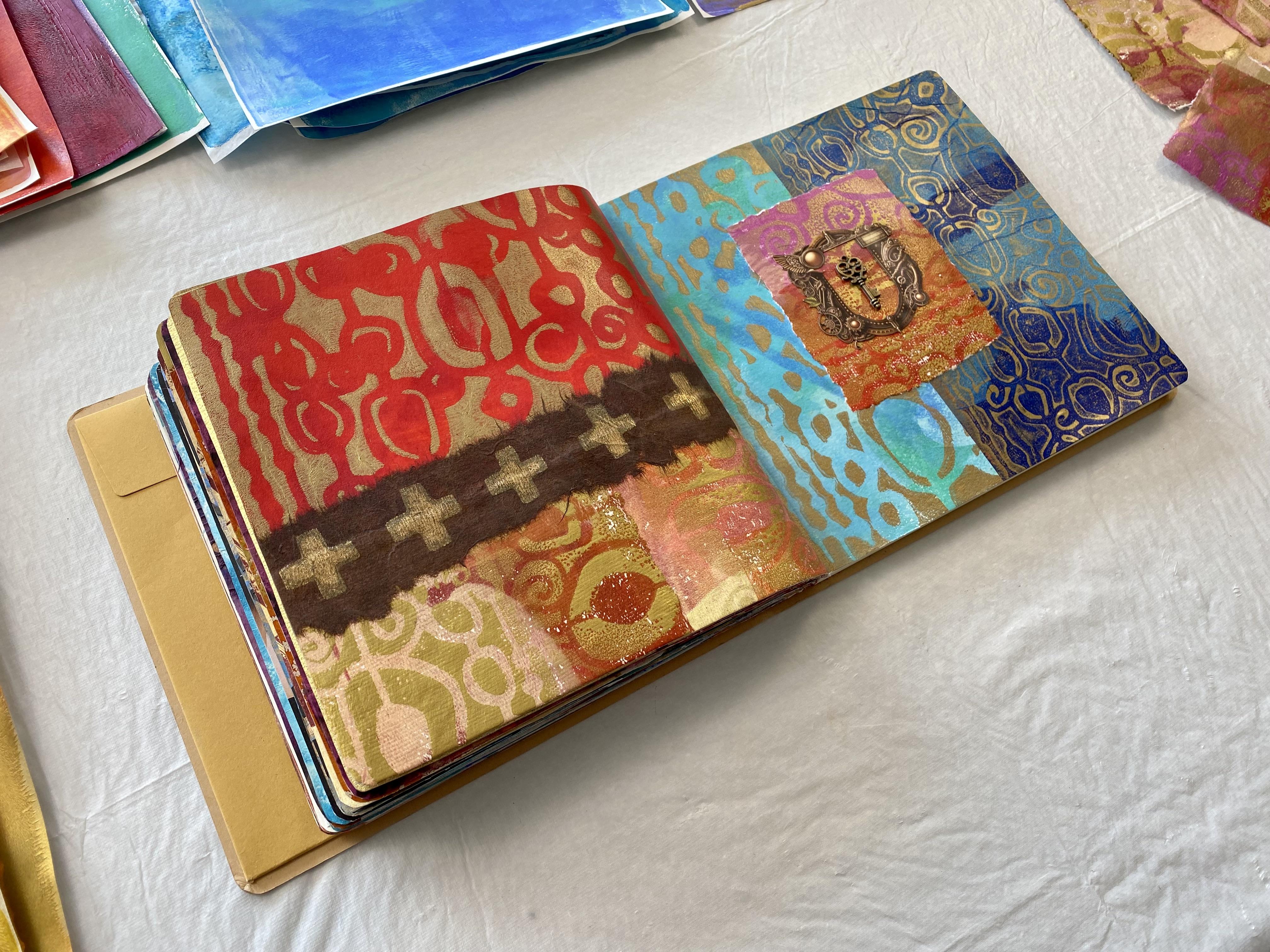
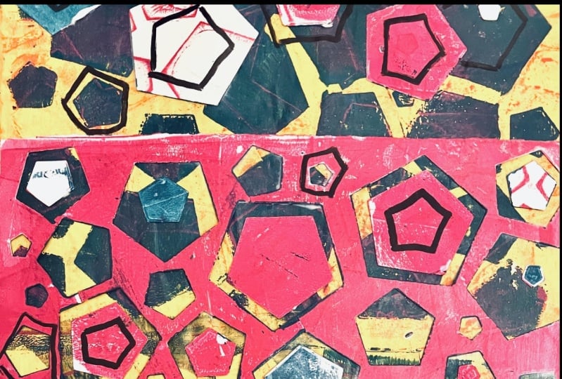
3. Day 50: Geometric Symphony: Class eight
transformative power of shapes in collagi Yay for us. And this is day 50. So we are now technically halfway through our
hundred days of collage. How are you feeling?
How's the journey going? I think it's such an
incredible epic adventure. How's your art
journal holding up? I've already finished
one completely, and I'm on to the second one. They do get a little fat. Sometimes the mound becomes quite huge by the time
I get to the end, but I really don't mind. I actually bought
three art journals exactly the same style
when I first started. I use the Dlusion
creative art journal, the 20 by 20 centimeter, and I'm really loving it. I like the square shape, and it seems to hold
up with all my loving. Don't forget you will find
all the information in your notes if you want to find out exactly what I'm using. Today we are looking
at geometric symmetry. Yay. And we're creating
collage with geometric shapes, triangles, circles,
squares, rectangles. What shapes do you
personally like? What do you gravitate to? What do you like to put in your compositions
or your collages? That's the question. Now, I
tend to use a lot of circles. I love circles. Maybe it's
the round, voluptuous shape. Or maybe it's the completeness. I like that, too. I think
curves are very friendly. You know, sharp edges and
angles can get a little sharp. It's but today I'm going to start with something
completely different. See, I tricked you. Today I'm starting
with triangles. I'm going to head in a
completely different direction. I pulled out some
black card stock and started cutting up some
triangles, really, really easy. It's not too thick
this card stock. It's quite lightweight, but I decided that's where
I was going to start. It didn't take me
very long to pull out my two centimeter hole punch and start creating
circles in a frenzy. I know I just can't help myself, but I figured I could use them. If not in this collage, then the next one or the one
after or the one after that. So no harm in creating shapes. Go on, make a bunch. And then you'll have some
to add to your collages. Then I pulled out the
even smaller hole punch and started punching holes
with it's a lot of fun. It gets a little
addictive, actually. You just want to stamp holes
in everything as you go. But I have a variety now of different colors
and textures, and that's what I love. So I pulled out
my big gel plate. Now, I'm using the 20 by
16 inch gel elf plate. It's a new one that I acquired recently because it's
such a big size. I absolutely love it. So I put that in
your notes, as well. That's a new addition to the notes because I
haven't used it before. And I'm using the Liquitex
acrylic spray paint. Now, this spray paint I brought into the lessons
in the last class, and I do hope that
you're journeying on with me consecutively through the lessons and the classes because they do keep compounding on each other and I use similar materials in the
next one or techniques. I like to repeat
them again, as well. Spraying on the gel plate. Have you tried it? Oh,
man. You just have to. This is an acrylic spray paint compatible with acrylic paints. So, yes, we can use it very successfully
on the gel plate. Now, I've pulled out Elizabeth
St. Hal's stencil here. Yes, I'll put that in the notes
if you want to find that. It's really fun. It's
triangle shapes. See, I started with triangles. I'm very proud of myself. For starting with a
completely different shape. They look fabulous
on the gel pan. I gave it a quick spray over
to cover all of the plate. Now, you do have to
let each layer dry. Don't forget that part.
Let the beautiful, iridescent antique gold dry and then put the next layers on. So the next layer, I put down my black
triangle pieces, and I'm running over
them with golden, transparent red iron
oxide, fabulous color. It's a transparent color. Beautiful. Straight over the
top of my card stock pieces. Now, you do have to be a
little careful that you don't knock them around or lift them up when
you're rolling over them, especially if they're
not very heavy. These weren't very heavy, but we're creating a
multi layered gel print. It doesn't matter if they move. All get bumped around. It's all in the
fun. And they look absolutely fabulous when I
took them off the plate. Now, you do have to wait
for this paint to dry. I added some posca pens just to outline the
triangle shaped bits. Actually, it was on the inside of the triangle shaped bits. It was just a bit
of fun. I thought I'd try it with another color, see if it shows up in the
print. Have a bit of fun. Try some different
mixed media elements into your prints and
see how it goes. We've used AposkaPenz before
in our material list, so hopefully you have some. They're really easy.
They're very direct, and they work quite
well on the gel plate. Then I put some more of
the black triangle shapes on the plate and ran over
it with quinaqudone, red violet, beautiful
color. Love this color. Actually, I think it's
one of my favorites. The triangle pieces just made
another layer on the plate, and when I pulled them off, look how fabulous it's
looking. I love it. I love doing the multi layers on the plates because
it's so interesting. The only drag is waiting
for each layer to dry, but I do have my little fan, my little helper on the table, and that works really well with the drying
stage of each layer. Then I put the final layer of
tighten buff on the plate, completely covered the
beautiful big jelly plate, and I put separate pieces on. I quite often just
put one big sheet of wet string tissue on the
plate and pull it Today, I was thinking, What about we put different shapes, hello. That's the theme and
different sizes of papers. And then when I look at them, I'll have different
sections of the print. Not a bad idea,
pretty fun, really. So I put down a
printmaking paper, not my usual paper, but it is one that I
had in the cupboard, and I do like using up art materials and supplies
that we have in the cupboard. So look at how beautiful the prints looked when I
pulled them off the plate. I absolutely love them. They turned out so well. They actually turned out
better than expected. And I do like the way I had
the smaller pieces of paper on the bigger gel plate because it just made the shapes
or more interesting. Of course, you can't do
this technique just once. I decided I was going
to do it again. This time, I thought I might use my black triangle pieces of card stock on
the gel plate first and spray them with the
paint because I decided I wanted some gold triangles to
go with my black triangles, which would add really
well to my prints. So on the gel plate, they went and a spray
the spray paint, which turned out
fabulous because the black triangles
got painted in gold, and they left fabulous marks
and shades on the paint. Doing it this way was really
interesting because more of the gel plate was painted
with the spray paint, and it'll be really interesting
to see how this pulls up. Will it pull up as easy? I do like the spray of the texture that's on the
gel plate from the paint. It really is a whole lot of fun. And a little experimental. So once that layer of
the spray paint was dry, I decided to use this stencil again with
the red violet color. So I'm using all
the same colours. I'm just trying them in
different combinations. This time, I'm
putting little shapes inside bigger shapes of the
triangles on the gel plate, having a little plate,
moving them around, and continuing my layers
in a different process. I put the transparent
red iron oxide on some sections of the gplint. I didn't cover it entirely
because I wanted to have different shapes and sections where the titanm buff
would show through. So I just rolled
on different parts of the gel plate with
the beautiful color. And then I put the titan buff
on all over the gel plate, and again, I put the separate
paper pieces on the plate. I liked it the first time. Pretty sure I'm gonna love
it just as much this time. It'll be interesting to see how different the
prints pull up with putting the bigger shapes with little triangles in them or putting the
little triangles on, and then the bigger
shapes around them. I've used all the same colours, but it's how the
shapes are going to be layered that's going to make
a difference in the prints. They pulled up beautiful and
they're looking fabulous. And yes, there really
is a difference with the different layering
compositions of the colors. Have a look and see this one is where the stencil went down first with the
little triangles, and then the bigger
triangles went over the top. That one is the first print, definitely. So is that one? And then you can see, this is the second print, where the bigger triangles
went down first, and the little ones
went over the top. Which ones do you like better? I don't know, man. I think
they both turned out great. I absolutely love
the spray paint. You can see much more
spray paint when I put the biggest triangles
down and then sprayed the whole plate
and the triangles. And I love the texture, and it pulls up
without a problem. I love this spray paint. It's definitely one
of my favorites. Does cost a little bit more than ordinary enamel paint from
maybe the hardware store, but it is an acrylic base, low odor, and it's compatible
with other acrylic paints. So I guess that's what
we're paying for. Anyway, loving,
loving the prints. This one turned out beautiful. That's a second print. Have
a look at this texture here. Love this. Now that's from the second layer of putting
the paint on, spraying it, maybe with a little
bit of water, and it creates that texture, and then there's
the stencil there. With the triangles, I'm
loving these prints. They actually turned out
better than expected, which is really nice, right, especially for
our first lesson. So I've got all of
these beautiful prints. I also have the circles. If I so desire to use
circles, I have them. And the little ones, as well, look how cute, these are
absolutely beautiful. I also have gold triangles to use and the black
triangles to use. I know I have so many options.
I'm a little excited. And, of course, have a look at the whole punch pieces of paper. I was using my digital
collage papers, stamping out these ones
with the whole punch. Pretty nice colors. They're working really well. And then this one I hole
punch a jelly print. Telling you, possibilities
are endless. Endless. I love it. Oh, that one's an art deco piece of
paper. That works well. So these are really interesting
shapes in themselves. I might even use that,
but I'm not sure. I'm a little bit excited
by my triangles today. So I think I might be definitely leaning
towards the triangles. In one or more of the prints and some of
the extra pieces as well. So I'll go and get
the art journal, which is clearly not going to fit all of these prints in it. And let's see what beautiful
collage we're going to make. Okay, well, it's not going to
be so easy choosing because my space is rather small and I have so many beautiful prints. I think I really like the second ones even more
than the first ones. This is one of the second ones. You can see all of
the spray paint, and then the colors are inside the bigger
triangles. I'm loving that. I think I love that even
more than these first ones, although this one
does look great. You can see the big shape
there with the little shapes, and you can see some
of the posca pens, and I do like the texture where the paint has beaded
up on the gel plate. That's pretty cool. I think all of these colors worked well, and I'm loving the spray paint. I know I've said that
a few times already, and I'm a little excited. But I'm thinking I like
these ones the best. These are the second prints. Can I put both of them in? I do like them the best. And then I'm thinking well, I like that section a lot. And I love this
section where I've got all of that texture,
maybe some of that. And then perhaps I know
they're gonna look the same, but I just have to have them. I'm thinking I
have to have them. Oh, I could put that one. That one works really well
with that color as well. Instead of them both
being the same. Okay. Maybe I'll keep that for another lesson, which
we can do, right? Because the last
lesson of every class, we use some from the
previous lessons. Okay, I'm going to do that.
I'm gonna keep this one. 'cause it's one of my favorites. And I'm going to put this one on here and this one on here. 'Cause I use the same
colors for both the prints. They're going to really
sit nicely together. I want that section in there
because I'm loving that. Give that a trim. Put that on. I can see my Posca pen in there, and you can see all of
the multiple layers. This has got the small
little triangles in the red violet. And this has got
the negative shape of the same stencil. Loving it. What about we put some Oh, yes. Let's get dramatic. Okay. Let's put
some of the black. Um, shapes on there. What about the gold? No,
we're kind of losing the gold in amongst the gold
paint, maybe not the gold. Definitely the black. What about if we hole punch a black? Triangle? Yes. You see
how much fun this is? I love it. I love it. I really doesn't take much
for me to get excited. But I'm loving that. That looks fabulous.
Yes, we're definitely doing that. All the way along? Oops. Yes, all the way
along. Loving that. I'm going to put that somewhere. Oh, but it's gonna take
up too much space. Maybe your whole
punch a smaller one. Okay, it's just too exciting. Oh, that looks
good. Look at that. Right putting that on, that might be a bit big.
What about this one? How many holes can we get in it? One To. Oh, that looks cute. Righto. Let's do
something with that. Maybe one of the gold ones. 'cause we can't leave out
the beautiful gold ones, you know, we have to put
circles on them, too. Looks like cheese
now. All right, maybe, baby, not convinced about the gold one because it
might just be getting lost. But definitely the black ones. Somewhere on there, I'm going to stick that
on there like that. Not sure if I'm putting
something on that one. I haven't decided, but we're
definitely going with that. Do we want to circle on there? Oh, now we're getting tricky. Alright, we'll look at that option with the
circles on that side. Triangles on that side. I'll stick the backgrounds
down and then we'll decide. And Right, so I'm definitely going with the little triangle
shapes on this side. I just have to decide
where I want them. I haven't decided yet, but I'll put them
down temporary. And I think I'll
do two black and one gold in these fabulous triangle
shapes with my whole punch. Just stick that
there. Put this one on here somewhere.
What about that? Do we like that there?
No, let's turn that round and put it like that. Mm, maybe like that. See, at least while the
matte medium is still wet, you can move the shapes around and decide
how you like them. Definitely gonna put
a gold one on there, because that's just fun. And the circle shapes
from the hole punch, you can see the colors coming
through that, like that. And maybe we'll tilt
that a little more. I like the way that's plain
and then that's textured. I know. It's so much fun. Pretty simple and a
whole lot of fun. Can of spray paint, some paint, a gel paint and some card stock. It's not rocket science, baby, but it does look good. I do like the layers of the
paint and the textures, and that's a whole lot of fun adding those triangle
bits on top. Right. This side, I'm thinking we need a
circle on this side. Absolutely. So which
one do we want? I'm really liking
this little bit of my dance move
shape on this one. But then I really do like the deco art deco
pattern as well. And I think the black would
really pop on this side, and it would connect with
the black on that side. Or I can do something completely controversial and add a
little turquoise into it. Nah. Okay. Nah. I think we just go with the art
deco pattern on that side, brings the black over
there, and then I'm done, baby, because I'm
loving these shapes. Who would have known
that I would have so much pleasure
today with triangles. Our beautiful circle shape
there in our art deco pattern, loving it, bringing the
black in on this side. That looks fabulous. We'll let the pages dry. I'll give you a close up, and we're already on
to the next lesson. It's going to be so much fun.
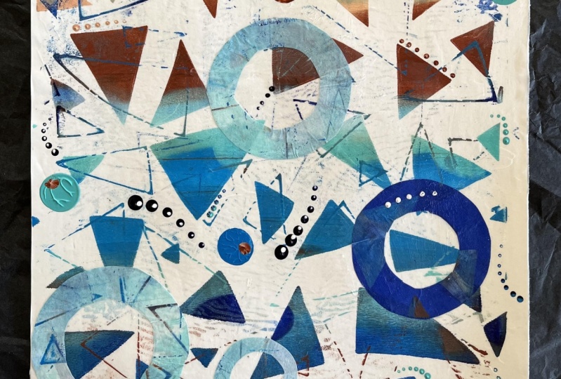
4. Day 51: Organic Abstract Design: Day 51 organic abstract design. I'm rather partial to
organic abstract patterns. I love creating
experimental mark making, especially on the gel plate. This is going to
be a lot of fun. So our task today is to use the organic patterns of water spray to create a
splattered background. You could use watercolor paints, fluid acrylics or spray
inks or even try using a straw to blow patterns and create different
textured patterns. Now, the first thing
I did was pull out my beautiful new big gel plate. And I really wanted to
make some gold coso paper. I love this coso paper, and I really wanted in gold
to add it to my collage. So I'm thinking,
what about we lay the coso paper on
the gel plate and spray it with my yes absolutely fabulous and
favorite spray paint. Right across the
beautiful paper, and all of those holes in this handmade textured
paper is going to allow the spray paint to create that organic pattern
on the plate, and look how fabulous it looks. I'm so excited. It worked amazingly. I love it. The spray paint
grips to the gel plate, and it comes off really easy. It's so good. So our
first layer is down. Now, remember, it has to dry. And then I decide to head into the blues and turquois with
a little bit of purple. So I pulled out cobalt blue, Cerlem blue and
ultramarine violet, golden colors
absolutely beautiful. I put different sections
on the plate with the colors because I want to create a few
different layers. Then I'm using my water spray, which is absolutely one of
my ultimate favorite ways of creating organic
textured patterns on the plate, gave it a spray. Doesn't it look amazing. And, yes, it has to dry. All of these colors are going to work really
well together. Now, my plate is pretty new. So the paint beads up
really, really easily. If yours is an older plate, it might not beat up
so quick or so fast. You can dab at it with a tissue or if you like me and you
put on too much water, you you can also dab with a tissue and
move some of that excess. It creates a fabulous
pattern doing this. I really do love it. Then I'm putting on some
acrylic spray inks. It kind of beads on the plate, but it does create
another texture and a little bit of splatter of
color on the plate, as well. You can see it in
the finished print. It really does contribute
because if you're putting it on first and then putting
other colors over the top, remember, when you
pull that print, whatever goes down first is going to be on
top of the paper. So I'm wanting to make something a little different
with this print, and I put on some interference, blue, and some
interference violet. The interference
colors look terribly creamy like nothing
when they first go on, and they really need to
sit over darker colors to shine with their beautiful
effervescent colors. So what I did was wait for the interference layer
to dry completely, and then I rolled on
some dioc purple because that dark dark
purple color on top of the interference colors
will make them shine. They're going to look amazing. I'm loving the multiple layers and the textures in this print. I think I'm going to pull
the whole thing with the wet strength tissue
because of all of the beautiful layers that
are going onto the plate. I ended up with a combination of the purple and with some
of the lo blue as well, made sure the plate
was nice and thick and covered before I put my
wet strength tissue down. Now, you do have to wait for
this to dry completely so that you can pull up all those
layers off the gel plate. And when it's dry, I pulled the print. Look how good it came up, and it came up really easy, all of the fabulous colors
and all of the textures and layers and patterns right down to the fabulous
spray paint. In the beautiful organic mark. The print looked
absolutely fabulous. I was so happy with how
the interference colors worked out underneath
the fabulous purple yet. So, of course, I wanted
to create some more, and I decided to do one
of my favorite ways to create collage paper is to put out the tissue on my table, throw on the inks and
spray them with water. You can't get any more
organic than this. This is one of the best ways
of creating organic marks. Now, I have showed you
this technique before. But I just wanted to remind you because
I love it so much. Today, I'm using my
absolute favorite colors. I'm using the muted violet and the muted pink of the
Liquitex acrylic inks, along with the FW pearlescent
ink in bird wing copper. I mean look at it.
Just look at it. The colours are beautiful
and rich and lush. The more you spray them
with the water spray, the more they run and bleed. If you don't spray them so much, you'll have more confined
areas of splattered pattern. But of course, I usually
drown everything, and I put a lot of
water on because I like the flowing marks that this
particular technique makes. The colors are
absolutely glorious. Dried up really beautiful. Now, don't forget
you have to have a plastic sheet
down on your table. I like to use the $2 plastic tablecloth
from the dollar shop. Put it on my table first because then when you
peel up that print, it comes off super easy. Make sure it's entirely dry. Before you try pulling
it up, otherwise, it will tear to pieces, and don't forget the plastic. Otherwise, you won't get
it back off your table. So now I have these
beautiful four sheets of glorious colour. It is really one of my
favorite techniques, and it's so super easy. Even if you've got the ends
of bottles of the inks, I love to use up the last remnants of colour
in bottles of ink and paints. You can do it with
the paints, as well. Or you can even use
watercolors or spray inks. Oh, man, it's endless
what you can do. You simply throw it
on the white tissue, spray it with water, ta ta ra. It's incredible makes
amazing collage paper. Now, while I was having an absolutely fabulous time
spraying the white tissue, I noticed that some of my spray
inks were a little stuck. The spraying bit
wouldn't come out. Oh, man, that so annoys me. But it did give me another idea. I poured out a piece
of printmaking paper, and I undid the spray inks, and then I decided to put the marks on the paper directly, because they weren't
spraying out anyway. Hit it with my little
handblower and went, Hello, Look at these fabulous
organic marks. Absolutely, beautiful. Now, I have done this before on the gel plate with alcohol inks, puffed them around,
spread them out. They do make a fabulous texture. Look how they blow out. They're absolutely glorious. Sprayed it with
some of the inks, and I had a fabulous time. The texture's
beautiful and organic. We love our abstract marks, and there's another
idea for you to try, especially if your sprayings are sticking and they're
not spraying out. There's other ways to
get them onto the paper. Now, if you don't have one of
these, absolutely fabulous. Little I don't know
what they're called. I bought it a really
long time ago. I've used it for
the alcohol inks. And it's absolutely fabulous. You can just use a straw. Of course, super easy. Blow it through a
straw and make all of the beautiful abstract marks. Can't wait to see what
you're going to do. There's so many possibilities. It's just endless. Right. So now I've got all
of these beautiful papers. What am I going to
put in my clase? Look how glorious
this one turned out. I've got some of the
metallic on there and look at all these
marks. It's so much fun. Of course, I'm loving
my gold coso paper. I'm definitely going to
have to use some of that. This beautiful print is so glorious in all of
its textured layers. Have a look at the beautiful
interference paint. You can see it now, and the textures of the
sprays work really well. And, of course, the
glorious gold marks. Have to put that in the collage. And then I had oodles. Of this beautiful
colored tissue. It's quite cunchy.
Now, you can use ordinary doll store tissue for
this particular technique. I think I used wet
strength tissue, but you don't need to. You can use recycled tissue, the tissue that comes around your packaging
when you buy something. With Christmas coming,
you need to keep all of the tissue that
comes wrapped around those presents because this is a perfect technique to use
up all that recycled tissue. I do it all the time.
It's fantastic. I also like to use the tissue from the dollar store.
That works really well. So I'm going to use
some of probably all of these because they're beautiful and I
just want them all. So I'll go and pull out Art journal and see how many of these pieces of paper I
can stick on the page. Now, I definitely
want some of all of these papers because
they're so beautiful. On my pages. And then what am I going
to use for a focal point? Hmm. Not sure. And which sections of
the paper do I want? Well, they're all
pretty beautiful, I don't think it's really
gonna matter too much. It's just going to be more about how much of the
paper I want to put on. Do I want to cover
the whole page? Well, let's just
start with that idea. And then see how we go. Perfect background. And it makes so much at once. It's so exciting. So I'm loving,
loving these colors. That would make a
beautiful background. And then what about if
you put some of the gold. Actually, I could
cut a circle out of my gold and put that on and then find something for a focal point
that's gonna work. And then what about this sign? We could definitely use
some of this print. Man, this prints beautiful. I'm thinking this section here. Oh, man, these
interference paint. That worked really
well. That was the first time I've tried that. I think that was a
rather brilliant idea. Put the interference paint down, and then let it dry and put the dark paint over it so that when you
pull it and flip it up, you can see the stunning
interference colors. Yes, I will be doing that
again at some stage. So I'm going to roughly put the print on that
somewhere like that. And maybe, baby, I could Oh, use a section of this
for my focal point, but what kind of shape
am I going to use? Mm, I think it's gonna need to be an organic shape,
don't you think? Because of all the
organic lines, it can't just be a circle. No, I'll have to cut
something out of this that's going to
have more of a mm, organic shape to go with the
beautiful patterned paper. Maybe, baby, something. Completely random like this. I think this is a
good place to start, although I will probably have
to trim it down some more. Otherwise, it's going to cover
all of my beautiful print, and we can't have
that now, can we? So we'll start with that. We've kept all the
best pieces in it. But, man, we're gonna have
to trim that down for sure. Right, oh. So I'll make some
decisions on which section I can't live without because the page is too small and
it's not all going to fit on. So I'm going to cut
some more of that. I'm going to cut a
shape out of there, stick the backgrounds down, and then we'll see if we need
anything else. Thank you. What I love about both of these papers is how easy they are to glue down
as a background. They go on super easy. They stick down fast, and they look
absolutely beautiful. Now, I've cut my
fabulous circle, which I'm definitely
going to put there, and I'm still thinking of maybe a little tiny
something for the center. But I cut this down some more, and I'm just not feeling it. I I don't know what kind of shape I want,
but I don't want that. So I think I might
use that another day. It's not working for me today. But I loving the colors. I like the blue and the turquoise and
definitely the purple. And it makes me think
of a new stencil that I got recently in a
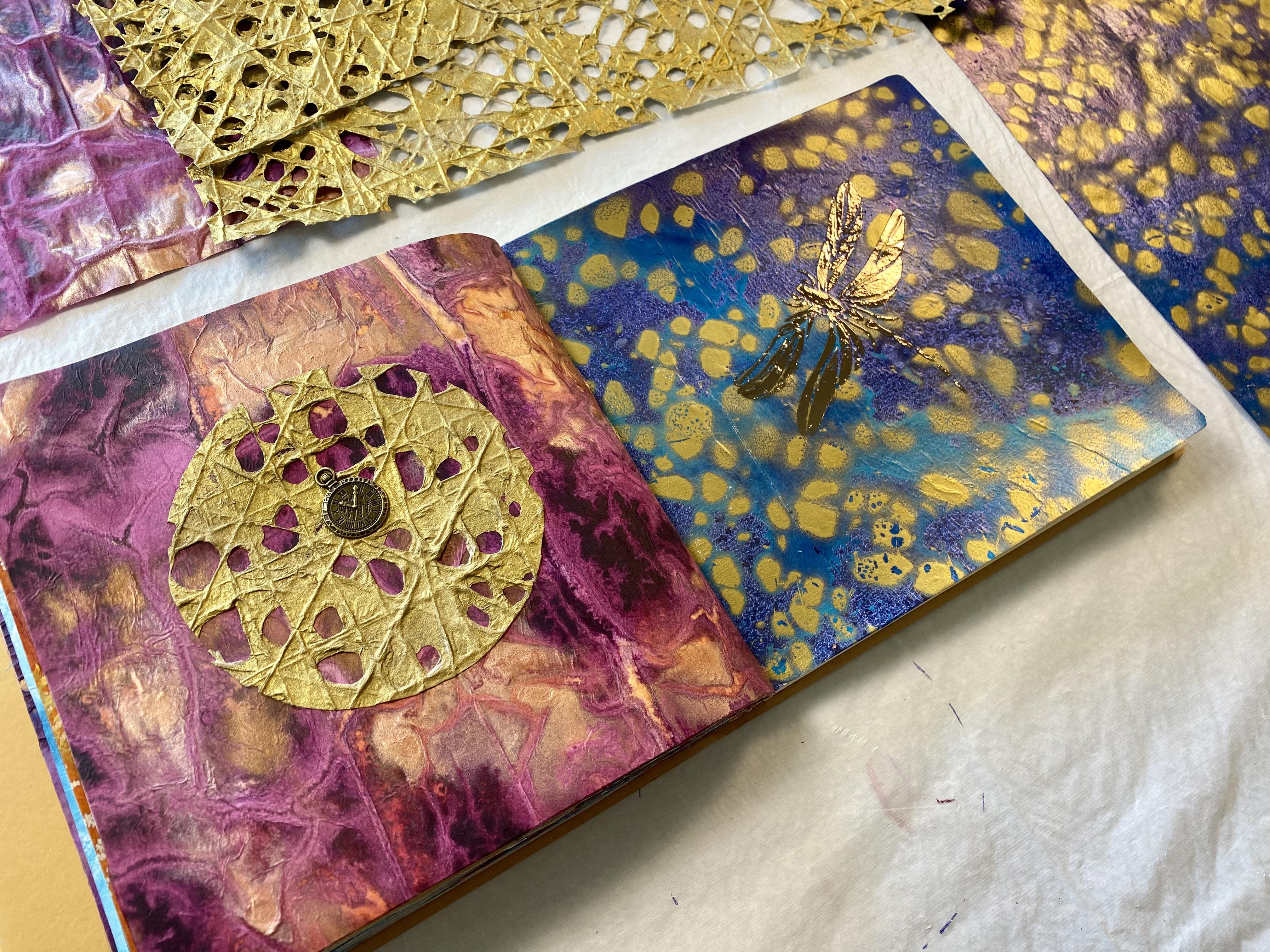
dragon fly shape. So I'm going to go and
pull out that stencil, and then I'm thinking, I'd like to put it on with
some beautiful deco foil. I know, right. We
have to bust it out. We have used the deco
foil in previous classes. I absolutely love it. You put the mixed and paste on, and then you put
the deco foil on. And it's really super easy, and I'm loving this idea because this kind of reminds
me of a watery effect, which hello, it's supposed to. It's our organic watery
textured patterns, so it's supposed to look watery. I'm thinking a dragonfly. On this side, I'm not sure. I want to add something to
my beautiful gold circle. Look how glorious that looks. This Coso paper, you can
actually spray it, paint it, use inks with any of the art supplies and mediums
that we've been using. It paints up really.
Well, it looks fabulous. I'm loving it, and
that is now on. What am I going to put there? I'm going to go and
have a little rummage. I might even look
in my scrap bag maybe or find something
from the class box. Hope you've got your
class box off trinkets and bits and pieces that we've
used in previous classes. Oh, maybe a key or a lock. Got some of those leftover from the steam punk class or
maybe one of the Yes, I'm going to have
a look with it. And I'm gonna let that
and find my stentu. Now, I did have quite
a few options with my trinket because when we were doing the steam punk class, which was in class five, I did get carried away buying all sorts of
little trinkets. But I knew I would want to
use them down the track. I'm happy that I did.
That's my excuse, anyway. I've got this cute
little clock face that's going to sit very happily in the center of my
beautiful gold coso paper, little bit of PVA,
and we're done. Now, you want to
make sure you give it a good dolop of PVA. It does dry perfectly clear, which is good because we want to make sure we've
got a good amount on there, just like that, tra, tra, maybe wipe off the excess. Leave it to dry. It's
going to look beautiful. Now, for this side, I'm going
with my dragonfly idea. Here's the stencil that
I bought recently. I'm thinking this
one's a good size. And what I found using
the deco foil is the mixed and relief
paste is the best. That's what I've
personally found. I tried the tacky when dry, but it wasn't tacky enough when it was dry and it didn't stick. Well, I always come
back to this one. It's the one I prefer the most. I've squeezed some onto a palette and I'm going to
run it through the stencil. And then oh, man, in a few hours, we have to wait for this
to dry completely. It's white when it's wet, perfectly clear when it's dry. And then we can put on
the beautiful deco foil. I'm thinking something in a
metallic blue and silver. I hope I've got some still left, but that's what I'm
thinking straight over the dragonfly, easy peasy. Now, if you're using mixed and paste on any of your stencils, make sure you rush off
to the laundry and give it a wash because otherwise it's going to
stay sticky forever, and nobody wants that. Whoopsis little Opsis there, baby wipe can fix
it. Easy, peasy. It's looking beautiful. The colors going to be great. Can't wait for it to dry. So my dragonfly has dried. Look how fabulous it is. Now, you can tell
it's completely dry because you can't see it. It's totally clear, white when it's wet,
clear when it's dry. It's ready to go
with the deco foil. This page is looking beautiful. It's dried up really well, all nice and clear with all the glue that
I stuck on there, and I'm loving the colors,
loving the texture. Did you like my
little Chinese bulb that I used for my circle maker? My son brought me, though, home from China one day
when he was visiting. Now, I was originally
thinking of this color, which I think it's called
watercolor, something. I can't remember. Transfer,
sheets, deco, foil. It's a pretty good
brand. I really like it. But I'm thinking now that it's going to blend in too
much with the background. So I think I'll go
with the bronze. I'm not sure what this
one's called either. I can't actually see where
the colors are written. Actually, that's fantastic. I just worked out
where the colors are. They're written on the
back with the bar code, but I've got them in different
packets, so No idea. I will find out the name
of the color if you like, and I'll put it in your notes. This one's particularly
beautiful. This is a kind of
pewter, I'm thinking, and I think that the
color will shine beautifully against the blue
and the aqua turquoise. And I think the other color would have blended in too much. So, beautiful sheet.
Look at that. Glorious, glorious. Metallic. I love them. And they're really affordable. I love using the deco foil. Silverside down, easy,
peasy lemon squeezy. Now, you can just
use your fingers, especially when it's something
as small as a dragonfly. If I'm using bigger areas, I do like to use, like, a dry cloth because it
saves your fingertips. But when it's this small, I don't think it
matters so much. Give it a good rub.
Make sure it's dry. Yes, I've done it before when it hasn't been completely
dry and it got stuck. And that was no fun. So make
sure it's completely dry, totally clear. Are you ready? Are you ready? Turn up. Tan up. Oh, man,
that's beautiful. I'm so glad I went with that
color. And look at this. I could use this as a
collage in something else. It's a perfect dragonfly. Right. There she is. Beautiful. I love it. Look at the way it
shines in the light. Absolutely fabulous. It makes me happy. I love bling. So there's a
beautiful dragonfly. Really happy with these
colors and textures. I love both these pages. They're beautiful. They're
opulent. They're shiny. I'll give you a close up, and then we're on to
minimalistic shapes. Now, Oh, man, I
might have a problem with the next lesson
because I'm a maximist. I love it all out
there on the pages. Lots of color, texture,
lots of bling. Look at that fabulous shine. So the next lesson, we're going to have to constrain ourselves with minimal shapes. I'm sure it's gonna
be a lot of fun.
5. Day 52: Minimalist Shapes: Day 52 minimalist shapes. Design a minimalist
collage using only a few select shapes in
a limited color palette. Embrace simplicity by using basic shapes to convey a
powerful visual message. Focus on clean lines,
precise placement, and negative space to
create a composition that speaks volumes
with minimal elements. Now, I might have mentioned at the end of the previous lesson that this could be
a struggle for me. Because I'm a self
confessed maximist. I like everything out there on the canvas or in the
collage or even with paint. I'm pouring it on now. So minimalist shapes
and minimal design is a bit of a challenge to leave it alone.
That's the challenge. So I've pulled out my
favorite art book. It's called the Art
Book. Yes, I know. But what it is is
an alphabetical, detailed descriptions of
artists through history. So it's really
fascinating, great to see. And because it's all
alphabeticalized, you can find people
you're looking for or styles in amongst
everything else. So we've got this
absolutely fabulous, minimal painting here right next to that kind
of figurative work. I love this book. I'll put the link in the notes
if you want to find it. So if we look at this one, we can see the shapes
are different sizes. There's different shapes. They're not really
full on geometric. They are kind of more organic. I'm liking this one. It's got a few little bit extra
bits down the bottom. And I think this is a
good place to start. I could do this. I. Some
of them not so much. This one here with the squares, when you do a little
bit of a reading of what the artist
has done and said, it's really quite fascinating. The artist has used a simple
mathematic calculation. The sides of each
square and the distance between them are half the
size of the preceding square. Oh, man, that's way
too much thinking and way too much mass. But this artist was calculating the size
and the shape and the placement on the
pitch of plane to make them very mathematical
and very geometric. What do you think? Can you see the tension in the artwork? This is Van Dosburg from 1931. Hm. Interesting, I'm thinking I couldn't actually
be that geometric. I'm definitely more of
an organic shape lover. This one's got more
organic shape. Patrick Hen, when was
this painted in 1963? And this artist is using delicate precision in order to create harmony of
form and color. That's kind of more where my
head space goes all about harmony and form and color
and more organic shape. Now, these are actual paintings, but it's the same for collage. These could be cutout shapes. They could be pieces of paper. They could be jelly bread, even. So looking at these artworks, I'm hoping it's
going to inspire you and me with our
minimalist collage today, let's have a look at a few more. Franz Kline. You got to
love France Klein, 1951. His paintings were a little more expressive in the brush
jokes, but extremely minimal. Look at the neutral color of
the background with black, strong, bold lines and
marks very France Klein. I don't think I could
leave all that space. I'd like to, but I really
don't think I could. Klein was inspired by the techniques of
graphic illustration and the massive sections of partly constructed or
demolished girders, Railways, scaffolding,
and bridges of New York. So that's where he's getting
his shapes and lines and construction feel to his paintings.
Pretty interesting. But I think if I
was doing a bridge, I'd probably do
the whole bridge. But it's a matter of
breaking it down into key elements of what you really just want to say in a few words, basically, with a few elements. Have a look at this one here. I mean, could you do
this? I couldn't do this. This painting here is all about the pure colors in the
lines on the sign. What about the metal bit? Where is the focal point? I couldn't leave a
canvas that bare. It says Louis had developed
in this work a new way of painting by rejecting shape and light in favor
of pure color. Well, that's really minimal. As the fabric of the canvas
is literally soaked in paint, that'd be I couldn't do it. It'd be too much of
a challenge for me. I would need a focal point. But I want to show
you these paintings to inspire you that
anything's possible. Don't get hung up on what you're creating and get like, Oh, it's not right or it's not like so and so or
it's not like this because when you
look at books like this and look at
the history of art, you're going to realize that everything's already been done, and it's all possible to do again in a different
way and in your way. What's the next one?
Oh, I like Malkovich. He's using geometric shapes
on the picture plane here. Pretty nice. I do
like this painting. This was 1915. I
mean, that's a while. And we could actually
reconstruct that collage really easy by putting pieces of paper across
overlapping the shapes. We could be inspired
by Malkovich in our minimalistic collage,
liking that idea. Let's remember that idea. Oh, Mondrian. I do
love Pierre Mondrian, absolutely very famous
for these lines and these straight edges and these squares and these
simple compositions. He liked to use certain
sections of the paintings in little elements of
colour not a whole lot. Very designer like, and there
was a lot of influence from other people who drew from
his particular style. 1929. Hm. Mondrian wished to
build his pictures from the simplest elements
straight lines and primary colors.
That's pretty cool. Like him could draw from that
influence quite happily. Shall we just look
at a couple more? Okay. What about Barnett Newman? Now, that is minimalistic. You can either look at this as three red rectangles or it's one picture plane with two
lines down the middle, straight, geometric,
concise, very minimal. Now, it says the arrangement
of the stripes encourages the viewer to concentrate on the spatial experience
of pure color. So there he's really
refining everything he's doing so that you're
focusing on the color. There definitely isn't
any movement in it. But it's really quite fascinating the effect
that it does have, especially this yellow
line down here. That creates a real
tension of the color. Oh, let's finish with a circle. Okay. Kenneth Noland, 1962. Concentric circles of
paint surrounded by bare canvas create the image of an apparently
spinning target. Do you think? Maybe. I guess if you look at it
enough, it kind of does. You could do this in
collage so easy peasy. Absolutely. He's actually left bare canvas on this artwork, and he was one of the first
to do that. I couldn't do it. There's nothing within me that would leave
that canvas bare. Or even the page. I wouldn't even
leave the page ba. But it's so incredibly
interesting how other people approach their
creative expression and their artistic style. I absolutely love it. I love looking at
the history of art, getting inspired by seeing
what other people have done, and then thinking of how
you can develop it and change it and create your
own beautiful expression. W. So I'm gonna pull
out some jelly prints. I might get that whole
punch that I was using yesterday because that
would make great circles. And maybe cut some
straight lines. I think I liked
malcovic the best in those shapes that
were overlapping, but I don't know if I
really want to do that. Maybe I'll go with
Barnett Newman and do simple lines on the page. I don't think I could do that, but let's see what we're inspired by and what
we're going to create today. Right, so I pulled
out my scrap bag and a ton of jelly
printing, baby. I don't know how I'm going
to be able to decide, especially as we're doing
a minimalist collage. I think I'm going
to start by cutting some lines off my black
piece of card stock paper. It's not very thick this one. I really like it. I used
it in yesterday's class, and it worked pretty well, so inspired by the
fabulous paintings, we saw I'm going to
start with this idea and cut myself some little strips
in various thicknesses. Am I going to use
them? I'm not sure. But I figure it's
a good place to start just in case I want to. I like the idea of the strips, and they work really well
in this particular paper. So there's a few of those. That's a good start. That's a good idea.
And then I'm thinking, What about the hole punch? Hm. So circles. Maybe I want to use the circles or maybe I might want
to use the space. Of the circles. Oh,
that could be possible. And then I could put maybe something underneath that shape. Oh. What about if we
make it not so obvious and they're not so
lined up? I know. Like that. Yes. I
like that idea. So we could put that on the page and then something
could go underneath it. Something could go on top of it. I'm liking this idea. I just have to decide out of all my hundreds of papers,
what we're going to use. And yesterday, I was punching
holes with this little one, and I've also got some black ones from
the other page where I was punching holes
with my black triangles. So I could maybe
use some of these. Oh, look, I've got
some gold, as well. That's fun. Okay? So
we might use those. We've got small circles, big circles, straight lines. What are we gonna put with
them? That's the question. I want something bright for
under my black circles. I'm definitely going
with this idea. So I'm thinking one
of these prints, that one or perhaps this one. I like this color, too. Either that one or that
one, it's the same color. I'm thinking that I
like that on there. What am I going to put on here? Not sure. And we want
some of these lines. I'm liking or we could
put them diagonal, even or else we could
put them straight. Or we could do both because we like that tension, don't we? I'm definitely not
going to mathematically calculate their distances.
That's not going to happen. But I do like the idea
of having one on the diagonal and three upright because that creates a tension. Within the shapes
of the composition. Yes, I like that idea. Okay. That's how we move along. Now, what other? Oh, man, I've got so
many jolly prints. I like this color. That could go underneath that
page. Maybe, baby. Oh, what about just a gold? Gold would look really
nice and very simple. Very minimal. I don't know
if I can really do it. Can I do it? Now how
did I have them? I liked the diagonal, and then we have the other
vertical line like that. And that's on the diagonal. Well, that is very minimal, and I love the idea, and the gold looks
rather snazzy. So we're definitely
gonna think about that. Now, this sides gonna have
to have something else. I do have so many other
prints and possibilities. I do like this one
with the deco for, but might be a bit
much on there. And then I have more scraps. In this scrap bag, as well, these ones coso scraps. Oh, maybe I like this idea better for underneath
the circles. Oh, that's a bit fun. And that kind of matches the
stripes from over there. What about if we did I
like that. I like that. That's a fun idea. And then what else have we
got? This one, maybe? Will it fit? Love that idea. Alright, so that's gonna
go under the circles, and then something's
going to go here. I have to have something. I can't just have the big black. Boy, I could do, maybe one of the dance moves. Shapes. That could work.
One of these could work. Like maybe. That's an option. Oh, that doesn't look too bad. Alright, we'll think about that. Oh, that one looks even better. We'll definitely
think about that. Oh, I could just go and
get the stencil and stencil it on maybe, baby. But that copper works nice
with those. I like that. It still needs something. Well, I'll have a
rummage around. I'm thinking it needs
something else. And I'll cut that down, and I'll put those under there, and I'll definitely
going with that. It's whether or not I can
actually leave it alone. It's so minimal. All right. I'll glug that down, and then I'll see where I'm at. Now the backgrounds are on, I have to decide what's going to be my dare I
say a focal point. Now, there's no way I could leave that big
black blank space. No, I can't be that minimal. I'm pretty minimal. Look, I've only got three
circles on that side. I'm thinking one of my
dance moves shapes, but I'm not sure which one. I do like the color of this one. I like the shape of this one, but maybe it might be better
off with some smaller ones. I could put this on
the edge like that. And then I've still got
all of that space there, so that's not too bad. Alright. I'm doing it. I'm doing it. I'm putting
this on that edge there, and then I'm going
to put the lines there of the black card stock, and my beautiful minimal
pages are going to be done. I definitely didn't
measure them. And I'm putting
them a little off. Not exactly the same distance
apart because, you know, we're doing that whole creating
tension with the shapes. I really liked that idea. So I'll put another
one on the end here. And I'm thinking it's looking pretty good for a
minimalist collage. Definitely glad I
did the diagonal. My page needs a
bit of a trim up, but we'll wait till it's dry. There's the edge there, so that's gonna
look pretty good. What about we add one of these
little circles in black? I think that'll push the tension even more. What do you think? What about that? I'm doing it. I do. That looks
fabulous. I love it. Enough, no, I might decide
to do more minimal collages. Mm. Probably not likely,
but it has been fun. Let's put a circle
right there to create more tension
with the shapes, loving that, and also it's connecting with the
circles over there. I ended up going with these dance moves
because I just like the little sizes
rather than sticking one big one on there
is what I decided, and the colors really nice. They're matching. I
can't help myself. These colors in the
background work beautiful. And this is one of my absolutely most favorite jelly prints. I wish I had more of it. I'm running out. I've
used it a few times. I put the masks
on the background on the gel plate with
these beautiful colors, and then I stenciled over the print once it was dried
with the dance moves. And, oh, man, I just loved it. You know how sometimes
it just works out. Well, that was that print, and I think I don't really have any more of it
left, which is sad. But that's what I love
about creating art in the art journal is that I can flick through it
and look at it and go, Yes, that was one of
my favorite prints. Maybe I'll try and
make some more. Or you just get some more ideas or I'll look at
this and go, Hmm, maybe I should try that
minimalist approach again, 'cause look how cool
these pages are. I'm really glad that I put the three different patterns
under those circles there. That's looking beautiful. Loving this tension, feeling the tension there. It's just beautiful. And I think it went a lot
better than I thought it would. I'm definitely
really glad that we looked at the art book
and were inspired by the other artists because
I think that actually helped put me in the mind space of what
I wanted to create. I'm feeling like Is are inspired by Malkovich
with this one. And then this one, I think
it's just beautiful. So I'll let the pages dry. I'll give them a trimer. And then what are we on to
next with our next lesson? Hmm. You'll have
to wait and see.
6. Day 53: Repetition & Rhythms: Day 53 repetition and Rhythm. Design a collage using
repeating patterns of shapes, both simple and complex. Play with this repetition
and arrangement of shapes to form
mesmerizing patterns. Experiment with
various scales and rotations to create a
dynamic visual rhythm. So I was a bit excited today, and I pulled out my
Medan 100 color back. This is such a
beautiful pack because all of the paints are in
little color palettes. It's really easy to use. The paint's nice and buttery. It works well on the gel plate. There's only one problem. The tubes are so small. So I got into a printing frenzy, and I'm creating
print after print. I'm pulling out the
beautiful colours, putting on different
shades on the gel plate. It's a bit of Russian roulette. I don't even know
what I'm going to get till I put it on the plate. And then a. It looks absolutely
amazing. I just loved. I kept the repetition and rhythm going by doing similar colors without having to
clean the plate, without stopping and
cleaning the brayer. I used a lot of warm tones, and then I switched
and used some of the blue and green tones, and they turned out
absolutely beautiful. So did you know
that jelly printing can be a little bit addictive? But we're all about
repetition today, so I just kept going. I had the thought that
I could possibly use some of these prints for
if not the next lesson, then definitely the
lesson after that. And our last lesson, we always use some of the papers from the
previous lesson. So I'm thinking, I
may as well stockpile when I'm on a roll and create
these beautiful prints. Then I pulled out a
couple of stencils. Now, these ones are Elizabeth
St. Hlai's stencils, and I'll put the link in your
notes if you want to find. First one turned out okay, but I wasn't in love with it, so I used the
second stencil and, oh, yes, I'm loving this. Because of the marks and the
patterns on this stencil, I'm thinking it's going
to work really well for that repetitive
line and those shapes. So, of course, I had to create quite a few
of these prints in different colours
pulling them up with different types
of paper as well. So now I have an absolutely
beautiful collection of papers on some
thicker print paper, also on some wet strength
tissue, glorious warm tones, beautiful blue tones, and a
few of the fabulous stencils. But wait, there's more. Then I hit on my best idea yet. I pulled out my gel elf plate, the beautiful beak
16 by 20 plate, and I decided I was
going to spray some of the fabulous liquitex iridescent antique gold onto the plate. Yes, it does pull
off very easily, and this is my favorite
technique at the moment. So I used the stencil, sprayed the shapes
onto the gel plate, covered the beautiful area. Look how fabulous it looks, but then you have to
wait for it to dry. Once it dried, I put on
some glorious colours, some of the different
beautiful shades of my medin 100 colour pack, rolled them over and pulled out this little pack
of watercolor paper. Now, I bought this
watercolor paper on Amazon a few years ago, and it wasn't the size that
I thought I was getting. These really small pieces, I decided to put
onto the big plate I think I end up with 14
covering the gel plate. I'm a bit excited because with
our repetition and rhythm, I'm hoping that each of
these little pieces of the fabulous watercolor paper is going to have a
section of the stencil, some of the idscent gold. And I know they're
going to be amazing. Right, so let's see how
this brilliant idea worked or didn't I haven't
actually tried this before. They were kind of cute
little watercolor papers in a pack that I bought
off Amazon like ages ago. Ah, maybe, baby, it
might just be okay. Look at that beautiful
little print. I'm liking it. We've got the repetition
and the rhythm happening. Mightn't be too bad. Sometimes you
wonder when you try different ideas if it's
actually a good one or not, but I think I'm loving the idea. I think it worked.
That spray paint always comes off really well, and I love this big
size gel plate. Ourse I've never tried putting this smaller piece on before, but for today's theme
of the repetition, I'm liking it because
each of these pieces is going to have a part
of this stencil, some of the stencil somewhere. So I'm thinking we did okay. If my colors worked out, I did get a little carried
away because the meat and pack is like a treasure
trove of possibilities. There's so many
colors to choose, and until I take the lid off
and put them on the plate, I'm not sure what the color even looks like. They're pretty nice. This is working okay. Why were you so worried? Woopss. That one
stuck a little bit. Not to worry, not to worry. I think we have
enough of them to compensate for the
ones that might stick. That was my tiny
little bit on the end. Now we're heading
into these colors. I think the idea was a success. Yippie. Now, of course, I have an absolute ton of possibilities with all
of these papers to use. That one's pretty nice with
a little bit of pink there. So I'm pretty sure I could
actually stop printing now. And pull out the art journal. The next agonizing part is
going to be just deciding which ones I'm going to fit on my way too small art journal. Right, I'm definitely going
to have to put in one or some of these because they
turned out rather beautiful. They've got that repetitive
pattern through it, and I'm thinking that we
definitely have Woopss. That one got stuck.
Enough printed material to move on to the
collage section. Yay. Right. So with all
my beautiful prints, how am I going to decide what
I'm putting on my journal? Well, I think I'm
going to start with one or some of these
beautiful prints. I'm loving the way
they turned out. They're absolutely beautiful. And, yes, my idea worked. There is repetition and rhythm
within all of the prints. Makes me happy. And I
just have to decide which ones I like
the best. Oh, man. Yes, I did get carried away, definitely using one
or some of those, but I also have some of these prints with a
fabulous pattern in it. So I'm definitely
using the pattern. I think I'll skip the first one, even though that
color is really nice. I wasn't really feeling
that particular design. So you might put
that to the side. That one looks pretty cool. That one's got the fabulous
spray paint on it. That one looks good, too. But, yes, as you
might have guessed, I do really like the red one. So I'm going to put some of this one on definitely
with some of these. Maybe some of the lighter ones. So it contrasts with that one. Oh, man. They're so beautiful. Oh, that one's pretty nice, too. That one's nice. They're
all really nice. And do I want to add a different color over
here? Yes, I think I do. I think I'll add, do
I want some purple? Oh, it's pretty nice. Although I don't mind
the turquoise one, too. Look at the fabulous gold. Idscent in that one
looks really nice. Maybe I could put
some of the turquoise on and some of this
pattern on like that. I'm thinking maybe with
a slither of the purple. Do we want any other
patterns in it, or is this all we want? Well, there's that
question as well. I could pull out some more
textures from my scrap bag, but maybe I better not get the scrap bag out because
we know how that will go. I mean, I'm liking this idea. Okay. I like the turquoise and the blue with one of these, probably this one because
the pink's working nice, and I'm going to go and find a little trinket for
the focal point. One of those glass bead skins from class
four would be nice. I'm gonna go and find that. On this side, I'm going to go with some of the red
for sure, for sure. And maybe a couple
of these pieces, 'cause they just look beautiful. Alright, I'm going to
have to make a decision, and I might get out my scrap bag and put something more dramatic, maybe something black and
daring on this side here. Alright, that's a good
place to start. Pretty. Right. So they're all stuck
down and looking beautiful. And when I put
this print on here in this glorious red
color, I almost stopped. It's such a beautiful color. I didn't want to cover it up, but then I've got so many of these beautiful prints,
I had to do it. And I like the repetition of the shapes coming
through in the stencil. That was such a good idea. So I'm thinking I'm gonna pull
out my scrap bag because I just want something across there to give it a little
bit more interest. Loving this, I'm going to find something for
the focal point. There's going to be a trinket to be found to put on there, but that needs
something across there. So I'm thinking maybe, maybe either some black
that could work for sure, for sure, or something
sparkly and pretty. Yes, that always works. Or maybe, maybe, what about
the crosses? They might work? In a single line, perhaps, let's have
a look at that. This is my cross
stencil that I've jelly printed onto the
beautiful Coso paper. Coso rice paper. It's beautiful and handmade. And just glorious. Look at it. So I'm thinking,
what about that one? One, two, three, four,
five. Oh, I like that. Yes. That one's a winner. Right oh, I'm going
to put that one. It just reaches right across. It's just the right size. I love scrap bags. It's just the right color. It works with my warm tones. Giving it a little bit more of an interest and
another focal point. That's going to finish it off. Absolutely. Beautiful. I'll
go and have a rummage through my class box and see what trinkets I can find
for the other page. I'm loving that I love these
stencils and these prints, and I love that I
have a whole stack of prints for the next lesson. All the one after that. We've got a couple more to go, so I'm figuring that those prints are going to
definitely get used up. Right, that's going
on like that. Easy peasy, got to
love a scrap bag. Oh, I love my scrap bag. I'll let all that dry or
got to find a trinket. So I pulled out one of my
little packets from taperology. I do have some fabulous
trinkets and things from there. I'll put the link in your notes if you want
to have a look. I did get a little
carried away when we were doing our steam punk theme. Look at these. This is
pretty cool date, you think? I think I should
use one of these. The trouble is going to be just deciding on which one 'cause
they're all pretty cool. I like this one with
the little wing there. That gives it a
good focal point. I like putting the two ends on the split in the
paper like that. I know it's all gonna be, you know, coordinated.
Love that pack. And then I'm thinking, What about one of these keys? Yes, did I mention that I went crazy buying things
when we were doing steam bank. Love these. Look at these. Aren't
they fabulous. Again, it's going to be
a matter of deciding. And what I like about these ones is they're nice and small. They're not too heavy,
'cause my pages get so fat, which I don't mind, but I'm liking this idea.
What do you think? Yes. That's what I think. I'm going to put that
key there like that, and I like the little
wing tip there. The symmetry is working
well on the page. Loving these colors. They're just beautiful. Love that red, but then the crosses work really
well on this side. It just needs a trim up. I'll stick that down,
give it a trim up, give you a close up, and then we're on
to the next lesson. And, you know, I do have quite
a few jolly prints to use.
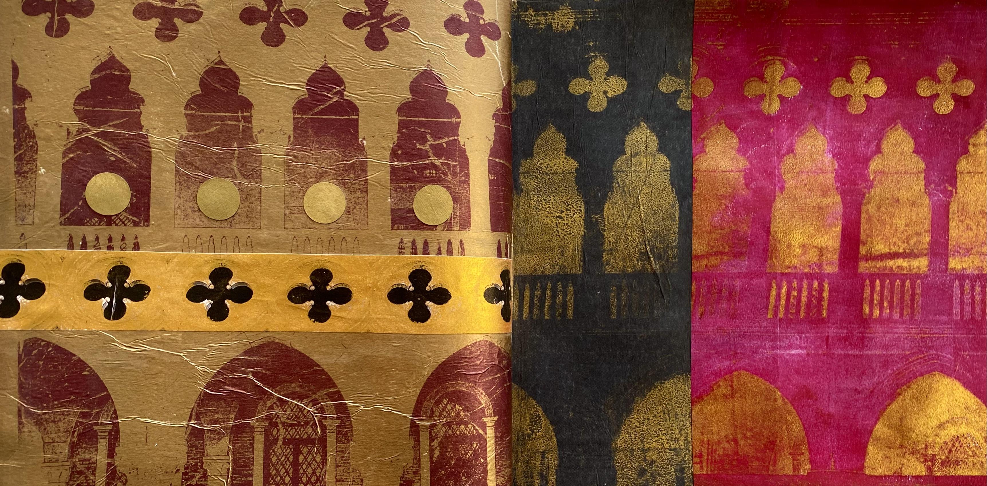
7. Day 54: Urban Geometry: Day 54 urban Geometry. Create a collage inspired by the geometric shapes found in urban architecture
and cityscapes, Incorporate elements like
building facades, windows, and skyscrapers to capture
the essence of the city. So I've pulled out
these fabulous images. Here they are laser copy prints. I took these photos in Venice of the Doge's Palace when
I was visiting there. Mm. Last year, or it
might be the year before. I was on a Viking
cruise with my son. We had an absolutely
fabulous time. What I love about these images is the incredible windows of the buildings and the arches and the like four leaf clover shape. They're just so beautiful
and they're going to print up so well to create
fabulous collage papers. The whole building is
rather fascinating, and this is the bridge of
size because in the Dogs, palace was the court, and the criminals that were charged with their crimes had to walk across a bridge to go to the other side
where the jail was. And when they
crossed that bridge, they stopped at the
window and sighed. It was their last look at beautiful Venice on
their way to jail. And let me tell you the
jail was terrifying. We had a fabulous tour
in the Doge's Palace. Look at all the gold and
opulence and murals. It was absolutely fabulous. And then we went across
to the jail section, which was not so fabulous. Some of the prisoners
actually didn't survive their sentences because of the state that they were
actually living in. And when the water
came into Venice, and if it flooded
during high tide, the cells at the bottom
of the building yes, they were standing
in ankle deep water, and they didn't really last very long in those conditions. The tour was
absolutely fabulous. I loved all the history. Of course, the beautiful gold and opulence of
the Doge's Palace is what's going to influence the jelly prince and
my collage today. So I'm starting with the
muted violet on the plate, beautiful, rich, opulent color. And when I put the image
down to take the transfer, I decided to wipe out some of the people that
were in my shot. Isn't it annoying how
many people are there? All of the tourists. But it's really easy to
manipulate your image transfers. Once you get them on the plate, you can rub out sections, change this, or add that. I absolutely love this process. I pulled the first print with my favorite gold and
iridescent bronze fine. It looks absolutely beautiful, but I'm thinking I want more. I want more of that opulent
gold. It was so rich. So I'm thinking we have to pull out the rich gold
for the next print. We're stepping it up
for the next print, and I took the image transfer with the beautiful
rich gold color, and it turned out really well. Look at the shapes on the plate. It's just so much fun. Then I pulled that print with
the same red violet color, and it turned out
absolutely beautiful. That's more of what I want. Those glorious window
shapes in the rich gold, I'm liking a lot better. Absolutely love the way the rich gold shines
of the transfer. It's absolutely fabulous. So I'm doing the next one. Again, with the rich gold. I'm liking this much more. This time, I pulled
the print with a little of the red violet, but also some transparent
red iron oxide, just to mix the color
up a little bit, make it a bit deeper, but also a bit brighter. Print turned out beautiful. Of course, I then had to
bust out the rich purple. We can't have rich opulent
colors and royalty and palaces without bringing in a little purple. It's tradition. So I'm using purple for
this image transfer, and then I pulled it with the beautiful rich
gold. I'm liking it. I'm thinking it's
turning out okay, and I'm loving the way all
of these prints will work together because
they've got all of the same similar shapes. So I've got all my prints
from the image transfers, and then I'm thinking, Why are we trying to do a second print? I was experimenting with this. Recently, I hadn't
tried it much before, and there isn't really
anything to lose. So I put the beautiful
rich gold on the plate. And it did transfer. It's a little bit smudgy. The print's not exactly right, but for a second
chance print transfer, it's not too bad. And I'm pulling it
with the black tissue. Now, this is dolostoe tissue, so you can't put
on too much paint, and you can't leave
it for too long. But it does pull up a really
interesting second print. I'm wanting to put it on the
black tissue because I need a little bit of drama to go with these other beautiful
opulent colors. So I put the other
prints on as well, gave them a second
chance pull just to see what would happen and what
would come off the plate. I tried silver. The silver
didn't work really well. Maybe I didn't have enough
paint on the plate or maybe it dried too much
before I pulled the print. Ma, they can't always all work. I'm doing pretty well,
and I'm on a roll. All the other prints have
turned out fabulous. But this one, not so
much. Not to worry. There's a little bit of
silver left on the plate. So I had one more print to
try the second chance with. So I put it straight
on the plate, and when I pulled it up
with my black tissue, it pulled up both a bit of a mirror smudgy image with
the silver and the gold. It looks pretty cool. I'm thinking a little ghostly, but definitely a lot of fun. Now I have an absolute plethora of beautiful image transfers of the Venice Doge's Palace to use today for
today's collage. So how am I gonna
put them together? And I'm thinking I'll probably need to pull
out the scrap bag, maybe add some other
shapes in between. Hmm. Not too sure. Better
grab the art journal. It's time for our college. Now, which ones am I going
to use? That's the question. I absolutely love this
one. I love the color. I love the gold. I
love the red violet. And the shapes worked out
really well with the print. So I'm thinking, I might
have to start with this one. This one looks good, too. It's got a lot of those
fabulous art shapes. I love that one, but
then look at the gold. That's from doing
the second print with the gold on the plate. Even that looks fabulous. And you can see the shapes
of the windows there. Oh, but Wayne. What about the fabulous
second chance prints? Don't they look great? On the beautiful black
tissue. Loving this. The gold works so good. This is the smudgy one that I took that has a little
bit of the silver on. Even this one looks good. I don't think I'm going
to need to add much to this collage because all of these prints turned
out really well. It's just going
to be a matter of deciding which ones I actually want to put
in my art journal. See, this is nice
and clear, too. Oh, man. So many decisions. Maybe, baby, this one, I do love the black one, but then I'm really partial
to this one, as well. So perhaps I'll start with
these two and then see, which other ones I want to squash into my 02
small art journal. This one here definitely
is my favorite, the shapes and the color. I love the gold and
the opulence of it, so I'm thinking I
have to have it, though I do really love the black version as well
with the second print. I mean, who knew you
could take two prints? Now, remember, these are colored laser copy prints
from warehouse stationery. That's where I get them from. I don't have my
own laser printer. So if you're having trouble with your image transfers and you're using your
own laser printer, try running the print copy
through twice because that might build up the toner
enough to get a better result. If you're getting
the prints from somewhere else and
they're not working, then definitely try different
shop because I have found that not every place
works well for the transfers, and you kind of have to shop around until you find
somewhere that does work. And then Eureka, it's
absolutely fabulous. So I'm thinking I
like both these, and they're the
same kind of size and shape just in the
different colors. So I'm thinking I'm going
to put both of them on this page because I want to get as many on here as possible. And have a look at
these pictures here. Now, this is standing inside the Doge's palace looking
towards the jail. I'm telling you, it wasn't
a good place to be. And there is the crossing
of the bridge of size. And standing there
watching all of those fabulous gondolas
pass underneath. Oh, man, it's another world. I absolutely loved it. This one is the window
that spot there, where you're looking out
your last view of Venice. This is from that window. That's the last thing
that the prisoners saw before they
entered the jail, probably never to
be seen from again. It was an absolutely
fabulous trip. Originally, I thought I might use that shape
in the collage, and I'm a little tempted, but my image transfers
are too beautiful. I think I'm gonna
stick with those. But it is fun, and it was
really fun sharing with you. So I'm thinking, I really do like the silver and gold one, even though it's
smudgy, I do like it. And I actually kind of love
these gold ones as well. But I'm not gonna fit them all on my page. What about this one? That's pretty nice, too, and that would work
well with this side. Huh, man. That's just deciding. Okay, well, I'm gonna make
some serious decisions, decide which ones I absolutely
can't live without, stick them down and then
see if I need anything else from the scrapbg to add
some other shapes to them. Not sure yet. Haven't decided. They're too beautiful,
and I want them all. Right, so my pages
are all stuck down, and this one was a
really tough decision because I have so
many possibilities. But why I chose this
particular print was because I really like all the detail
that you can see here, I think it was a
fabulous image transfer. It's on wet streak tissue. It's a little crinkly, but I like that about it because if you
noticed in the video, the building's really old, and it is all very crinkly. So I'm liking that. It's got a great feel about it definitely feels like
the Doge's palace, and this is just fun using both of these prints with
the different colors. Now, I want something
across there. I'm loving this. It's fabulous, but it just needs a little. Something I had a look in the scrap bag when I'm not convinced that that
is what I want. I'm thinking maybe of cutting
a section of these ones, either that one or maybe. That one, no, this one. I'm thinking, these
are the shapes that I absolutely love the most
for our urban geometry. So I'm just thinking maybe
I'll keep repeating them. 'cause that's a bit
of fun. We just did repetition and rhythm. I'm thinking, this could
work quite nicely. Putting this shape across there, it's repeating all
of the elements, and I think it's going
to work because I just need a little
bit more gold. Right. What about that? Going across there,
trim it there, trim it there, stick it down. I'm thinking that's
going to look beautiful. I can either put it up
there or just under. I like those marks there. Oh, man, under them maybe, baby, something like that. And am I going to be
finished with that? Perhaps, but there's
no guarantees. I might have a fiddle
with it a bit longer. I actually really liked the
punched out circles from. This was less than one. Maybe I just want some
punched out circles. Oh, see. You see how it goes. One idea leads to
the next, not there. Do I want some on this side? No, I think I'll leave
that side alone. But I might put some circles on. I'll think about it. It'll
be one or the other. And I'll give you a close up. You can see which one
I finally decided on. It's been a whole lot of fun. I love sharing my
travels with you. What's the next lesson? Mm. You'll have to wait and see. But I know it's going to
be a whole lot of fun. So I just glued
this strip on here. I'm thinking it looks fabulous. And as I'm wiping it, look, look at that. I'm actually wiping
the paint off because this was the laser print
with the image transfer, and it was the second print. So I'm loving this even more. I had to show you.
I just had to. I was just going to glue
it on and leave it. But look how fun this is. I'm wiping the paint off
with just a baby white, and I'm loving that so
much because now it's got that black element on
that page matches that page. It looks way, way better. See, now you don't have
to wait for the close up. Now you're going to
know what I did. Oh, that looks great. I'm thinking about putting these circles punched out
circle bits on there. I'm thinking they
look pretty cool, so I'm going to
add those as well, but I was a little hysterical
about my black shapes here. Oh, that looks amazing. Now I'm happier with it
because I do like contrast. That's just how I am. I do like my collages to have a
strong contrast element. I think I like the drama
and the impact of contrast. Look at that. That
looks way better. So excited about that. And, yes, I think I'm
going to put them on. I just sat them there
to think about it. But now that I've got those
fabulous black shapes, I'm adding the punched
out circle pieces. I think I like the gold side. I thought about doing
the black side, but no, I like the gold
side better because the gold is the Doge's palace. Oh. So I put those on there. Then now I'll let it dry. I'm much happier with that. Now, this could be
repetition and rhythm, as well, because look at
all the repetitive shapes. But it's urban geometry.
That works too. Loving these prompts
because you can take them in so many
different directions, and it really is all
personal interpretation how yours is created
and how you want to respond to the
different ideas. Right, let it dry. I'm pretty excited for
the next lesson. Yay.
8. Day 55: Inspiration of the Master Matisse: Day 55 inspiration
of the master Matis. Looking at the shapes Matis
created in his collages, cut out your own
organic forms and design them into
pleasing compositions. Which shapes do
you like the best? Which of his cut out
collages do you prefer? And what are you
going to create in your own art journal page? Henry Matis, born 31st
of December 18 69 and died 3 November 1954. He was a French artist, primarily known
for his paintings, although he was a draftsman,
printmaker, and sculptor. He was often regarded as the most important French
painter of the 20th century. Matis had a long and
creative career. But I want to focus today more towards the end of his life when he was creating these
fabulous collage cutouts. Toward the end of his
monumental career, an elderly, sickly Mattis was unable to stand and use a
paintbrush for long. In 1941, his health suffered a great blow and
he became wheelchair bound. But this did not stop his creative spirit
from expressing itself. He focused his creativity
on a new language, which he called
painting with scissors. He didn't see this as
stopping his painting, rather a continuation of
his creativity and art. He was almost 80 years
of age when he developed this new visual language
consisting of pieces of cut paper painted
in bright colors, and at a time when Europe was being overshadowed by
the Second World War, his assistants would
paint sheets of paper in brightly
colored gouache and following the artist's
orders would hang them on the walls of
his studio and bedroom. Mattis spent long
hours reflecting on the different
possible combinations before setting out
with the scissors. He executed numerous sketches and studied different points of view before deciding on a final composition
for his collage. He considered his
technique as carving into color or drawing
with scissors. Though dismissed by some
contemporary critics as the folly of a
senile old man, these gouache kata, in fact, represented a revolution
in modern art, a whole new medium
which would profoundly influence generations
of artists to come. You're never too old and
it's never too late. I think what I love about the story of Matis is in the
beginning of his career, he created an uproar
with the colors and the expressive
application of his paint, especially with the
woman with the hat. One of the critics who wrote
in the newspaper article declared it to be the Art
of wild beast or the Fog. And this particular
to stuck with Matis and created a
whole new art movement. And then, in his twilight years, very sick and confined
to a wheelchair, Matis is still pushing the
boundaries of modern art, creating another expression that the critics didn't like
and couldn't understand, but really established
a new revolution. I absolutely love it. These simplified shapes are a great inspiration for our
collage today, beautiful, bright colors, organic form and this is what we're going
to base today's lesson on. Which of these shapes
do you like and enjoy? Mattis created so many. He's quite endless. But if you look at the images, he's quite repetitive
in his patterns. Right. So I'm going
to pull out all of the fabulous brightly
colored jelly prints that I've already made. Get some scissors
and start cutting. Right. So I have an absolutely
plethora of beautiful, bright colored papers with all the jelly printing that I
did from the fourth lesson, I think it was, I did jelly
print like a crazy person. I now have fabulous, bright colored papers to use for cutting out the shapes.
Really exciting. I also have this piece that
I definitely want to use. This one is a jelly
print that I added some Deco foil to
in a crazy frenzy. Love it. I'm going to
definitely use that. I might even use some Coso paper just
to add a little bit of texture to my shapes
and so that they're not all just flat one type of paper. I'm liking this idea. And I've got a printout of
National Geographic page. That's one of my
digital collage papers. I really like using
these even more so than the actual original ones because they don't smell and
they don't bleed. And I've got this
print, as well. I'm liking the texture on that. That's a piece of Chinese rice paper that's
been jelly printed. And then I've added
the spray paint that I've used to
wipe off a stencil. I know. You see? Nothing
ever gets wasted. Make sure you're keeping
all your prints and your experiments
because one day, you just might need that particular texture or
color or type of paper. So this is what
I'm starting with. Oh, there's another one. That's one of my
digital collage papers. Loving that beautiful. Yes, I'm going to
use that as well. Now, to make my shapes, I'm actually going to
use some stencils. I've got these
stencils that have got fabulous organic
shapes. Am I cheating? Maybe, maybe. Maybe, baby. But look at them. They're
absolutely fabulous. They're great marks to
them, great shapes. And what I'm going to
do is just draw around those shapes from these
particular papers, cut them out. And Walla, I'll have beautiful
mats inspired shapes. Now, you can hand draw,
of course, absolutely. Pretty much that's what
you're supposed to do, but I am cheating because
I've got these stencils. So I'm using them. I'm just going to do this. Draw around them
like this, simple, and then I'm going to
cut out the shapes, and I'll have a whole heap
for creating my composition. We better do it fast or
else you'll be waiting for ages why I draw these
out and cut the shapes. Let's speed it up. Let's get it moving. I can't wait to get to
the collaging part. Now, I'm going to
use the stencils as a rough guide for
creating the shapes. They're not going to
be cut out exactly. But I think it's a great way
to start, that's for sure. It's definitely a
great way to help me decide what type
of shape I might want and to help me not
to use the same shapes. I think sometimes we tend to
stick to the same shapes, and bouncing off this particular
stencil will help me to branch out into completely different and totally
organic shapes. Right, so I'll do a few more of these fabulous
colored sheets, and then we'll see what
we have. Look at that. I'm liking that. That's the little piece
in between the shapes. Don't forget to look at
those shapes as well. The negative shapes in between the shapes that
you're cutting out. 'Cause you might find
something. Look at that. Really interesting in between the main shapes that you
decided you wanted to use. Okay. I'm going to
have quite a few, so I better get cutting. Right, so I finished cutting out all my
shapes and look at my fabulous piles of colors. He was actually quite
therapeutic sitting here just cutting away. I drew with the stencil
on some of the papers, and then some of them I just randomly started cutting shapes. I'm finding that I personally
really like round edges, organic kind of looking shapes. But I already did know that. I have quite a few neba
looking pieces that look like interesting
organic creatures, and all we can say. Now, I'm feeling a
little dramatic today, so I'm thinking I'd
like to start with a black background on
one side, at least. I've got this beautiful
piece of coso paper, and I'm thinking that
I'm going to put it on this side for
a background color. Beautiful handmade
textured mulberry paper. Oh, love it. I'm going to
stick that down right there. Let's just trim
this side a little. And then I'll decide on which of my neva looking shapes
I'm going to put on. Now, the Black's going
to look absolutely fabulous with the
Deco foil shape. Look at that.
Absolutely fabulous. And, of course, it's gonna look stunning with the
glorious orange. How are we going to arrange it? That's going to be
the tough part. I think I have to
have a piece of each one of the colors
that I've cut out, and that's really not
going to be very hard. And it's not going to take
much to fill up my page. Hey, I'm liking
this. This is okay. I'm liking that. Mm. What
about one of these pieces? We have to have a
piece of each of them. So let's go with maybe, baby. Now, what I find when
I'm gluing things on is that I change
my mind once I start, 'cause I'm gonna pull everything off to put the
background down first. And then when I put
it back on, oh, man, things never seem to go
back in the same place. Or we need some of this one. Look at that shape.
That's so weird. I like weird. Matis
would be so proud. Actually love it. So I'm going to now pull it
all back off, and you watch. As soon as I go to
put it back on again, it'll be completely different, but that was just a little
bit of a practice run. But I really like
it, so maybe I'll hang on to that there. I'm definitely using some of
each color pile of shapes. That'd be a good idea.
And I'm really thinking that only one's gonna
fit on my little page. What are we going to
do on the other side? I'm going to, yes, continue to be dramatic, and I'm going to put
a piece of silver. On this side, I know. I usually go with the gold, but today, I'm going to put
a base color of silver down. Tara. Look at that. That is stunning. How are
the colors going to look? Oh, I forgot this one. I've got two of these. It was one little piece
that I pulled out. It has to go on the black.
At least one of them. Maybe this one needs to
go on the black one. So what's gonna
go on the silver? Well, that's going to look
fabulous. Yes, loving that. Do we want some of this one? Yeah, I think we could, but
probably not that shape. Mm, maybe a smaller shape. Some of the orange. Oh, the orange looks
good on the silver. The blue is gonna look
nice on the silver, as well, especially
in that weird shape. So I think I'll just get moving, put the background colors down, and then decide
which shapes I want. On each page really is a lot of Right, so the background
colors are down. Yippie, now I just have to decide on which ones
I'm going to put on the page out of my quite a few piles of
beautiful and fabulous shapes. Right. So which ones
did I say I wanted? I definitely want a shape
with the deco fool. So let's go with this one. That's a cool shape. Look how good it looks on the
black. Loving it. And we're choosing a piece
from each of the piles. So it's just going
to be a matter of deciding which shape from
all of these fabulous piles? Do I want to put on each page? And there's so many options. That could be the problem, but oh, the blue looks
good. Yes, loving that. Do we want Let's
have maybe one of the purple ones from this pile. Liking these ones. Look at these shapes.
They're pretty cool. In that purple
color? I like that. Then you have to decide, is it going to connect with
your first shape? Is it just going to
float in the air? Or is it going to be hinged
on one of the other shapes? Oh, man. So many decisions. I'm going to move this one over, but I definitely want
that there taking the focal point of the page. I really do like the blue, and I think I had one
of these up here. I like that idea, too. Or, the shape could
go off the page. That's not a problem or
even right to the edge. I could put it off
the page even. I don't mind that idea. O. That's going there,
that's going there. This is going right to
the top of the page, but I still want it floating I like the idea of
floating in space. I definitely want
a purple color, but I don't know if
I like that shape. Well, I don't mind
that one. I don't. Let's think about that there. And then or we have
to have a blue one. Maybe one not so big, perhaps. Oh, that's nice. Okay. That one? Do we want that? That's a little
insipid down there. Let's change that. Oh, and put. I like that. Yes, we're winning. Now we need. One of the beautiful orangy red
ones, but which shape? What about one of the
long thin ones? Oh, yes. Yes, that's working.
I'm liking that. I'm just gonna sit with
that for a minute. Oh, I wanted this
on there, didn't I? Okay, well, it could sit on top of one of
these other shapes. There's no reason why it can't. It can be connected. Like that. Do we still
like that shape? Mm. Maybe we like
that shape better. Maybe we like it connected. They can be friends. Alright. That's how I like
it at the moment. Some of the shapes
are connected, some of them are free floating. Now, this side, that purple looks nice on
the silver, as well. So let's think about that. What color do we want for
our main focal piece? What about the blue? The blues pretty
nice on the silver? Yes. I like that idea. And then this would
work as well. We put this piece on, I think we should connect it. Like that. Oh, I
don't mind that idea. It's running off the
page. That's okay. What do we want to float it? Oh, no, I do like it floating. Right, oh. Right oh, oh. What about something
dramatic like that? Mm, not as fast on that idea, but we'll hang on to it. What about one of
these ones with more of the yellowy orange color? It looks like a boomerang. No, not happy with
that one. What about? It's that or that maybe, baby. We could swap that.
Hmm. I don't mind that. We definitely have to
have a purple one. What's gonna fit. Let's use that one because that's kind of connecting
to that, which I like. I do like connections, and we do have to
have a piece of the deco foil because it
just would be wrong not to. No. What about just
a little piece that we could put down the side. Maybe that one, maybe
baby or even smaller. Right, what haven't I got? I haven't got a piece
of this on there. Do we want that one on there?
I don't know if we do. Maybe. No. I don't know, man. It's a great texture, but the color's not
popping. We need to pop. Alright, we got
the purple. We got that. You've got a
little bit of that. We got that. We got that.
I think we're good, but we need something here. So which one are we
gonna put there? Maybe the darker? Red orange color? Oh, yeah, it's kind of
dramatic, isn't it? Oh, what about that little slither? Yeah, that could work. Let's put that
there and we'll put the purple on top
of it, like that. Don't mind that idea. Don't mind that idea, but we need a little something. We need a little
bit more of this, I'm thinking, but
only a little bit. There's a piece. I
was gonna cut one. There's one right there,
so let's use that. Okay? Yeah, I'm not happy with that. What about a? Cut this one down. That might be better. Yeah,
I don't mind that idea. I still want to put a
piece of this on there. Can I? No, it's not working. But this is looking good. I love the focal point the best. The others, I'm still
thinking about it, but this side I'm happy with. So I think I'm gonna glue this side down
while I think about this side because I just don't think it's got too
many little bits. I'm just not happy
with the little bits. Maybe if I push that up there, put something bigger down here. What about the deco foil? What about a different
shape of purple? No. Okay. I'm gonna
stick this side down. Why, think about what's
gonna go on the other side. Right? So I've got
that pasidesorted. Pretty happy with it with it. And I have this
side half sorted. I'm still in my dilemma about what I'm doing
with this section. I'm loving this. I like that
connection of that shape. That's too much the
same color as that. I think I need a
different color. And I really want to put some
of my deco foil on here. Somehow. Maybe? Oh, that's
not bad. That's not bad. We could run it off the page. Oh, man, I don't think that
I do. Oh, I like that. Okay. I like that. Quick, quick. Well
I like it. Ah. Quick, get it on before
I change my mind. Well, the shapes
have to be right, 'cause it's fairly minimal,
especially for me. So we've got to get it right. Alright, I'm liking that running off the
edge, definitely. And I want something there. Maybe I need another color. Abby I need some This
beautiful color? Okay. I'm need some of this. See, we're painting with
paper. It's so much fun. I need a color here. What size? Hm. In a kind of oval shape, I'm thinking needs to be there. I like that little bit
of pink. In this color? Yes, I do. Yes, I do. Oh, maybe I want it okay. I do. I'm gonna put it right
on the edge like that and like that. Dada, da. Oh, we need a little round one for there.
Okay. Do we want? No, we don't want that.
Oh, we want purple. Purple's not on there. Oh, man. We got to put the
purple on there. Ah, or we could use this
one. That's pretty nice. Mm. Options. Maybe it could go down there.
I don't know, man. It looks like an eye.
Creeping me out. I don't think I like that,
but I like it there. Okay. And maybe that goes there. Right. Well, that's how
it is for the moment. Whether or not I poke at it
some more is quite possible. I don't know that I like
this shape so stiff. Let's put an indentation in it and change it.
That's the fun part. It's a matter of just changing things, moving them around, switching up the colors, changing the shapes
until you're happy. Yeah, I like that better because then it's kind of mimicking. Those shapes there,
that's working. Beta it's not such a block
shape. I don't mind that. I'm loving that color, so we're keeping that and
whether or not we're finished? I'm not sure. Okay,
it's all stuck down. So what do you think of
my Mats inspired collage?
9. Day 56: Shapes in Style & Contrast: A 56 shapes in
style and contrast. I absolutely love the last
lesson of each class. It's one of my favorites
because we can use all of the fabulous papers and
textures and in this case, shapes from all the
previous lessons. Use any or all of this week's prompts to create your collage art journal page. Which shapes do
you like the best? Do you prefer hard edge shapes like the fabulous triangles that I was working with
or did you like more of the NibaRoundOganic. I think they're friendly shapes. So, which of the
lessons did you enjoy? Which of the techniques
did you like the best? Which of your pages
do you really like? Oh, that's the
question. So today, you get to use any or all of this class lessons,
papers, textures, shapes. Oh, man, I have so many jelly
prints and so many shapes. I'm not sure if I'm going to go geometric or more organic. I really enjoyed doing both. I loved using the triangles, and some of these
triangle prints are absolutely fabulous. But then I also really enjoyed
our Mattis inspiration, the organic shapes, and I loved the repetition
and rhythm as well. And I've got a few of
those prints left. I've even got some of these
small little miniatures. I'm loving those. I
might have to use those. So I think it's
going to depend on what color scheme I'm
going to go with and, of course, I still have some of my fabulous Doge's
Palace image transfers. I've got some of these
leftover, as well. I'm really liking
this smudgy one. With the silver and the gold. I might have to do that. Oh, man. I I'm not sure
how I'm going to decide. I've got so many. Absolutely. I love it.
It's been so much fun. Well, I know it's going
to be a tough decision. And it's going to come
down to what I feel like today because
every day changes you feel differently and different colors can
affect your mood and different shapes can
be determined by how you're feeling and where
your creativity is at. So today, I'm thinking I want something
bright on this side, complicated, maybe on this
side or textured Really? So I really, absolutely love my Doge's Palace
Image transfers, I think they're fabulous. And I'm really loving
the triangle print. That was so much fun. So I
think I'm going to start. I want this section in here. I'm going to cut it under the circle shapes
there to there. I just want that section
with those fabulous shapes, and then I'm going
to put a section of these glorious
triangles up here. But then I might see if I can fit somehow one of these
triangles on there, or maybe even two, I love these ones
that I hole punched. I think the shape looks
absolutely fabulous. I don't want to cover up
too much of my print, so I may only really, in all reality, get one of the triangle pieces on
there. But that'll be okay. I like the multiple layers. It looks quite complicated with all of its
textures and shapes, and that's what I
want for this side. Now, the other side,
I have to toss up, do I want to go with the blues and purples?
They're pretty nice. I could use a piece of
that organic print, and I'm really loving the color on that
one, that could work. And then I could put maybe some of these shapes
with it as well. But I do really
love this pattern. Do I want some of
this pattern on it? It sits quite nicely on
this purple tone here, so I could cut a
section of that out. I'm a little tempted OO. The other option is I could go really bright on this side, which is very possible. Then I could put some
of these shapes on I do have a ton leftover
of these shapes. I know. I had a lot of
fun cutting them out. So I could do that, or hold the phone, caller. There's more. I could
use this print, which I love, absolutely love. I could use a leftover
slither of that one. And then I could put one of these fabulous
little miniatures. Oh man. Which 1:00 A.M. I going to go with? All of
them are gonna look fabulous, and at least I'll have all of these prints for
maybe another day. That's the fun in having
so many leftovers. Well, hmm, okay. I could do all of that.
That looks fabulous. It absolutely does. They're all good possibilities, but I think I might go with the beautiful purples because that would be a nice
contrast to this side, which I'm definitely doing. And then I can decide if I
want to add this to it or if I want to add some of
these shapes instead, which would look
really nice, as well. So that's the question. But I'm pretty sure I want to
do this with this side. So I'm going to start
with this side. I'm going to stick
that piece down, cut a section out and put
my fabulous triangle. I'm really loving
that I did triangle, so I'm very proud of myself. Right. Let's get started. Right, so the papers
are stuck down, and I'm loving it. Now, this one, I absolutely love the splatter of the spray
paint on the gelprint. I love spray painting
on the gel plate. It's only a recent
technique that I've been using and
experimenting with. And look how great
it looks. I love it. I love the texture
that it makes, and with my triangle shapes,
it's looking beautiful. I love the little windows from the Doge's Palace.
That makes me happy. The colors match really well. And then I put this
fabulous triangle over the top with
my whole punch. Areas that you can see the underneath coming
through. Isn't that fun? It adds quite a dynamic shape because it's going that
way in the composition, and I've got another
triangle coming down here and all those
triangles underneath. It's working really well. I'm going to leave it
absolutely just as it is, because I think it's a finished
and beautiful collage, and it's making me happy. Now, on this side, I
went with the purple. I thought it would
be a great contrast with this other page. And I was putting this on. Then I remembered
my fabulous tissue. This is one of my absolute
favorite techniques, and look how stunning
the colors are. So we had to have a
piece of that, as well. It's always such
a tough decision when you've got so
many beautiful papers, but what a great problem
to have, don't you think? So the question is,
am I going to add an organic shape on this page? Because I could. I have quite a few. Well, that doesn't look too bad. Might trim it down
a little maybe. Or maybe we could put some
in the fabulous deco foil. I've got quite a few
of those shapes. The blue might be a little. Actually, the blue's not
too bad either. Oh, man. Now I'm gonna make it
harder for myself. We've got one of these in
the blue. That's pretty fun. Or we've got some
of the Coso paper, too. That might work. If we're not going to
use organic shapes, then I could put one of these beautiful silver
and gold shapes there from the Doge's Palace. Which one do I want? If I put this on, I think it's nice because it mirrors some of the
shapes that's on there. Oh, man. Alright, I'm going to go with the Doge's
palace and have a look. I'll cut a section of it off. And I think, really, that's the only way I'm going to know if that's what
I really want. Oh, that one's quite nice. Alright. I could put
this section on. It would sit nicely, being quite dramatic
on the black tissue. Always love a bit of drama. That could go on
there like that. Do we do we want the dome?
I'm thinking that we do. We could put it
right at the bottom, and we could take it
right to the top. Do we want that? Well, it's one option, but
there's only one. It's only one option. There's numerous
things we could do. We could also get
out the scrap bank and really confuse my brain. And put something else textured over those
sharp lines there. That's highly possible? You know that it could really be quite problematic pulling
out the scrap bag, but we have to look. Oh, white could be nice. Look how good that looks. The white on there
looks really nice. I actually really like that. Maybe we won't have
any other shapes. What about some of the gold? Gold looks good, too. We could put that on there.
Yes, that does look nice. You got to admit it does. What about if we add
one of the windows? We could so do that. We want the dome. I
really do like the dome. All right, what if
we just put one? We put one window, we
don't get a dome. Oh, man. Sacrifices must be made. If we put that on there. I don't mind this idea. This is kind of fun. That
could go on there. That goes over that because
we decided we like the white. It's fresh. And we still
like the gold idea, as well. Don't we? Do we still like the gold idea? I think we do. We just want everything. I just want it all. So that is totally
a high possibility. Let me just double check
in the scrap bag that something else doesn't take my fancy because you
just never know. Oh, man, there's so many nice papers and
textures in here. You don't know until you look. Maybe you shouldn't look. Oh,
that's kind of nice, too. What about that? No, it's getting all too
busy now. Too much too much. Right. I'm putting it down.
We're gonna go with that. I'm gonna put that on
there and that on there, and then we'll see
where we're at. Unexpected changes were made
during the gluing stage. And that's not uncommon. It actually happens
quite often with me. I start gluing something
down. I changed my mind. And because I'm so
surrounded by a sea of amazing textures and
papers and shapes, I get a little bit excited when I look over there and see, Oh, I might want that. So changes were made. I ended up putting two of my fabulous window shapes in because one looked a
bit lonely by itself. And I've got the white coso
paper. That looks beautiful. It just separates
those two areas, and I had to have
the gold bling. Now I decided I wanted
to add one more shape. It's a very mats looking shape. We have to have it. And this one is in the glorious Coso paper. Now, I put it on and I loved it, but I can't remember
how I had it. Yes, I know. I am
a bit of a worry, so I think it was like that. It kind of went across
the page, like that. I know that it
went off the page, and it was connecting those shapes underneath and the color is working
beautifully. This Coso paper is incredible. It works so well with my
amazing jelly prints. So that's how it's going to go. That's the edge of
the paper there. It's got a beautiful
bronze or brass or gold looking line through it and a copper and a silver. I mean, why would you
have one metallic when you can have all of them? So my page ended up a lot
more complicated and a lot more texted and layered than I originally thought I was going to do, but that's what happens. I think I was in
that mood today. Anyway, it started
with the triangles. But this triangle side
was a lot simpler. I'm loving these pages. What I love about this
particular lesson is especially being
in the art journal, because I can look back
and go, Oh, my gosh, that's my Doge's Palace
windows, love them. That's the jelly prints that
I did with my repetition, and there's my Mattis shapes. Absolutely, love. The triangles. The spray paint on the gel plate is definitely
one of my favors right now. And I can look through the
art journal and pick out the different
techniques that I've really enjoyed about
the different lessons, and I might want to repeat them, definitely repeating the spray. And, you know, I might be brave enough to try triangles again. That worked out.
Beautiful. I love it. So it's a great way in the last lesson to put
your favorite pieces or your favorite prints
or techniques onto the page because then it
becomes like this visual diary. You can flip back
and look at it and remember which elements you
really like the most. Right? I'll let the beautiful pages dry and I'll give
you a close up. I can't wait for you
to see how great they look without being
plastered with the mat medium.
10. Let's Celebrate: Thank you for joining me
on this epic adventure. I really hope you enjoyed
this class as much as I did. Who knew that you could have
so much fun with a triangle? I absolutely loved that lesson. Of course, I did have to bust out the circles a few times, but wasn't it a whole lot of fun creating the organic
shapes inspired by Mattis I loved sharing my favorite art books with you that really brought
me a lot of pleasure. I would love to see
what you've created, how you've responded
to the prompts, so don't forget to show
me pictures or photos of your beautiful collages
and art journal pages. You're so welcome to join me in my Facebook group and show
me your fabulous collages. I would love to see
what you've been doing creative
Adventures making art. It's a fabulous group. There's so many
encouraging people in it. Come and join us, and
then you get to show a whole lot of others how
amazing you really are. Don't forget to check your class notes for
all of the information. Remember, you don't have to
use exactly what I'm using. Pull out from your card all
of your art supplies first, and you might like
completely different colors. What shapes are
you going to use? What papers are
you going to try? And remember, jelly
printing can be addictive. So if you end up
knee deep in prints, just remember we're
all with you. Information is there
in your notes, and if you are looking for recommendations on papers or prints or stamps or stencils, don't forget the discount codes. If you want to
contact me directly, you have my email, and you can find
a whole lot more on my website, froula.com. Now, I hope you're
keeping all of your papers and prints
and the textures that you're finding because you don't know what we might need
for the next class. I seem to have pulled out a
few trinkets in this class. Class five. I have
a fabulous box in my art room that's just got the class bits
and pieces in it. So when I want something,
I know where to find it. Next, we're going to
be on to Class nine, exploring culture and
identity in collage. Oh, man, it's going to
be a whole lot of fun, but I think we're going
to get a little deep. I really hope you're
enjoying the course. I absolutely love making
these classes for you and I enjoy creating
these pages with you. Don't forget you can
download the treasure map. You can tick off the
lessons that you've done or even circle the ones that
you've really enjoyed. Then on another day, you could go back and
try them again. And if even using
the same prompt, you would definitely create completely different artworks. I can't wait to get
started on the next class, so I see you for the
next mighty adventure.
 Froyle Davies, Mixed Media Artist