Transcripts
1. Introduction: Welcome to the studio
I Froyle here, and I'm so excited that
you're joining me for this fabulous class on our creative adventure
of 100 Days of Collage. Now, we're up to class 11, and today we are inspired
by the elements. As a mixed media artist with over three
decades of experience, I'm passionate about two things. Number one, I'm passionate about creating rich layered artworks, my own creative expression
and number two, I'm passionate about
encouraging you to create your very own
unique artworks, because when we create from the core of who we are
and put it out there, as our creative expression, we can really express our own individuality and appreciate our sense
of self worth. It's not just about
creating art, it's really about
discovering who you are and developing your
unique, creative voice. In this class 11 of
our fabulous journey, turning into the
natural world for our inspiration and exploring
the four elements of earth, air, fire, and water. Each element carries
its own energy, its own rhythm, and its
own emotional language. And in this class,
we're going to translate that into
collage and mixed media. We're going to be exploring and experimenting with a
lot of creative play. We're going to be
making heaps of uniquely textured
papers that you'll be able to put together in
your own beautiful collage. Over the next seven lessons, you'll be guided through
seven creative prompts. Each one focused on a different
elemental energy will be working with jelly printing,
sencils, watery techniques, texture and metallic highlights, not to create literal images, but to explore how each
element feels through color, movement, and layered marks. This class is very much about
process over perfection. I'm leading you into a journey
to unlock your creativity. Now, who is this class for? Whether you're just beginning your creative journey or you've been making
art for years, you'll find plenty here to
inspire and challenge you. I'll be guiding you
every step of the way, sharing the exact materials, techniques, and creative
prompts that I'm using to help you create
stunning personal pieces. And if you're a more
advanced artist, this class will help stretch
your imagination and to encourage you to deepen
your artistic voice. By the end of the class, you'll have one or more collages inspired by the elements and hopefully a deeper connection to your own creative
rhythm, as well. Right. So now we need to
gather our materials. I'll show you exactly
what we're using. I can't wait to get started. So let's make art.
2. Material List: Right. So class 11. How absolutely exciting now you really should have
all or most of the items on the
material list and just remember this is
very, very important. Remember, This is just a
guide, not a checklist. You don't have to use all of the paints and
mediums that I'm using. You don't even have
to use the same colors, all the brands, and you definitely don't have to rush out and buy
a heap of things. Use what you've got already
in your cupboard and the particular colors and
mediums that you prefer best. Now, I don't think I've too many new items in
my list for this class, and you will find that
list in the class notes. Don't forget to have
a look there if you want to know exactly
what it is I'm using. Of course, we have our
fabulous art journal if you're using an art journal. Now, you don't have to. You could be working on paper. You could bind all
the pieces of paper together at the end and
create an art journal, or you might have made
your own art journal, or you might be
working on cards. Even on canvas, there's
no hard or fast rules. I'm using an art journal because I absolutely love having all of the lessons and the classes in one place where I can go
back and look through them, which I love doing and remember different techniques
or different tips or different color schemes or different textures that I might want to reproduce
again another day. It's like a treasure
trove of fabulous ideas. Now, of course, we're going
to use acrylic paints. Remember, you can use the
colors that you want to. Although we are using some fabulous
elemental inspiration, so that's going to lead the colors that we
choose for the class. I've got some beautiful
acrylic inks. I've also used the fabulous
moppa paska paint pens. Oh, man. That is
just so much fun. I can't wait to
show you that one. And, of course, we're doing
a heap of jelly printing. I absolutely love creating
the papers on the gel plate. Now we're using some
different mediums. I'm also pulling out
the beautiful gelatos. But we have used those before. So stencil panna
some of the e zinc, my absolutely
favorite spray inks. We're also using the
liquitex a spray paint, and I'm pulling out
lots of stencils. I've got my scrap bag
and the coso paper, and we're using the deco foil. Now, I've definitely used all of these fabulous art supplies and materials in
previous classes. Maybe except the Medan
gleaming paints. I use some of this
in this class, but you don't have to. It's totally optional.
They are a lot of fun. They look a little bit like
glitter in suspension. So you might actually have something else that you prefer. This is a great class. We're making a whole heap of
different textured papers. We're having so much fun. Very experimental.
A lot of play. Allow yourself to really create to express
your creativity, pull out all of your art
supplies from the cupboard. Just remember, it
doesn't last forever. Your mails will pull it out. I do love the
liquid spray paint, but you don't have to use
it if you don't want to. Also have a heap of
different papers. So for jelly printing,
some for the collage. Of course, we've
got the do paper, and don't forget
the discount code. I really hope you enjoy the
exploration of this class. I know I had a whole lot of fun putting these lessons
together for you. Right. So gather all your bits and pieces, your art supplies, your craft supplies,
dig them all out, get them all together
because we're going to have an
absolutely fabulous time.
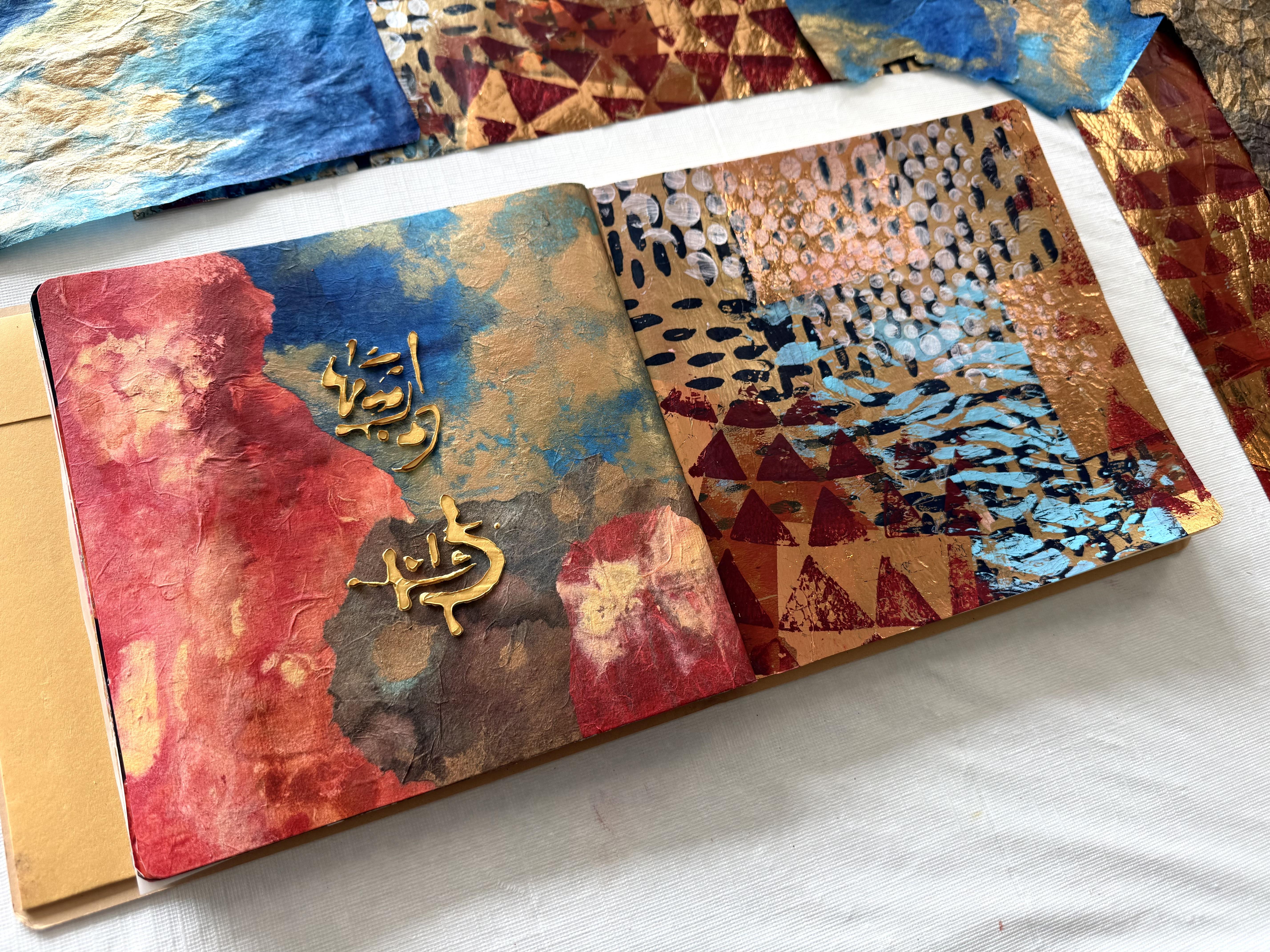
3. Day 71: Earth's Embrace: Welcome to class 11 for
100 Days of Collage. And in this class, we're inspired by the
elements, air, fire, water, and of course, the Earth
will be starting with our beautiful textured elements of the Earth today in day 71. A 71 Erst Embrace. Create a collage that captures the grounding and nurturing
energy of the Earth. Work with earthy tones,
textured papers, and even natural materials
like leaves and twigs. Alternatively, you could use various texture paste to add grit to your earthy composition. We're going to be creating quite a few fabulous
textured papers throughout the whole class. I'm so excited for
this very mixed media in our application, and it's going to
be so much fun. So first of all, I've pulled out this really large pad
of mixed media paper. Now I will put all of the information in
your class notes, so don't forget to check. There, I'm loving the size of this paper and
it's nice and thick, and I've pulled out
my scribble sticks. And of course, they're
scribble sticks. You have to scribble with them. That's the whole intention. They really are water
soluble crowns, technically. They're absolutely
beautiful, and they're a very nice set of
earthy colored pigments. So starting with some
scribbles on the paper, I did add a little bit of water spray to get the
movement of the pigments. The more water you add, the more they dissolve
and become paint like. If you don't add so much water, then you just get those
fabulous scribbly marks. Now, they may or may not still be on the
paper in the end. By the time I pile all my other elements
and paints on there. What I like about
the scribble sticks or really any crayon or pencil or mark making that you want to start with is
that it loosens you up. It gets you going. You put
the colour on the paper, especially if you've got a beautiful big sheet
you can stretch out, get some real movement
happening and just get going so that you're not scared of what you're going to
put on that paper. It's a really good way to start. Now, next, I added
some heavy gel gloss, and this is a great
idea if you're going to let your paper dry,
which I didn't. So my hemi gel gloss really became quite mixed up with the next paint
layer that I put on. But if you let the
gel gloss dry, you'll get those textured
areas onto your paper that your paint will then sit into instead of just getting
smushed together. But not to worry. I'm
in a creative frenzy. I'm so excited about working with these
beautiful paints and materials and starting fresh on my paper that I didn't want
to wait for it to dry. Then I'm putting in a few drops of raw umber and burnt sienna. And just wiping it across the
paper with a sponge brush. I'm really liking this
because it's making some absolutely fabulous
marks on the paper. And I'm just wanting to spread those beautiful
colors around. And then I picked up one of Linda's gang spray inks and
sprayed that onto the paper, spreading it around, having
an absolutely fabulous time. Oh, I also put on some Amsterdam
in the graphite color. Absolutely loving, picking
up these earthy tones, putting them on the
paper, making marks, adding some paint, a few
scratches here and there. What's not to love? It's all about getting our hands dirty,
playing in the mud. Allow your inner child to come out and play,
have some fun. Make sure you got a good
solid piece of paper, pull out the paints
and the colors from your cupboard and
just go for it. Now, next, I put on
some meadn paints in the gleaming paint brand, which is really funny that
it's called gleaming paint. I don't know about gleaming. I think it kind of looks more
like glitter in suspension, some kind of acrylic suspension, but I put that on
because I like it. It's like it's gritty
and kind of got little textured pigments in it. I've put some on in the black, and also I add
some of the green. And when it dries, the acrylic binder goes clear, and you just see the
little textured colour. Papers looking
absolutely fabulous. But to finish off, I
grabbed some of the i zinc, which is my favorite springs
in the coffee colour. What a glorious color that is. Now, when the paper
was fully dried, yes, I did wait this time, I pulled out the glass beads. And what I like about
the glass beads is it's got that fabulous, gritty, beautiful texture of the little beads, which
they're not beads. Suspended in the acrylic binder. When you put it on, it's really
thick and white looking, but when it dries, it goes completely clear and you just have all of the
fabulous texture. Now, the paper is fully
dry with the glass beads, and see how you can
just see a clear kind of gritty textured marks across
the surface of the paper. It does look fabulous. And there you can see the
medent in the gleaming paint. You can just see all of
those fabulous colours. I also put some of the gold on. I can see it now shine Oh, it looks absolutely fabulous. The paper turned out
really beautiful. I like the earthy tones. I like how textural it is. It feels absolutely fabulous. It is very gritty with all of those texture
paste on there. But you want to do
that. We're jumping into our very first lesson. Of our elements. And the Earth is a
great place to start. It's very grounding, the
nurturing energy of the Earth. So have some fun. Really, go for it with your
mark making and creating your papers and see where
your creativity leads you. Pull out of your cupboard all the different paints and textures and paste
that you've got, especially if you've got ones you haven't
used for a while. Now, of course, I couldn't just stick with one piece of paper. I did go on and
create another one. Now for my second
piece of paper, I started with the
same approach, started with the scribble
sticks. I just love them. Right across the paper, any kind of shape or mark or scribbly element that I felt
like I just let it loose. This time, I didn't add the water to move
around the pigment. I just went straight
for the spray inks, and I put on some
of the izincs in a color that's called morning
mist. I don't know, man. It doesn't really look
like morning mist to me. It's kind of a greeny color. I think it's working well for
my beautiful earthy tones. Then I put on my favorite
iridescent bronze fine. Of course, you knew that was going to have
to come out soon. I was still using the
sponge brush just to move around the paint to create
those marks on the paper. Then I decided to pull
out one of my stencils. It's a PMR a stencil. It's in like a leaf design, and I'm putting that on
the paper with, I think, some of the Amsterdam
in the graphite, running it straight
over the stencil with the sponge brush. And then I'm putting some of the beautiful idscent
copper onto the paper. Now, I'm using similar
paint for this sheet, as well, a little bit different. Beautiful earthy tones. I'm spraying on some more of the Lindisgang spray paint
to fill in some areas, and, of course, the beautiful
coffee colour in the izinc. I also added a spritzer
of the izinc in the bronze shimmer because we have to have a little
bit of bling, baby. It's looking
absolutely fabulous. Now, when it was dry, I added another layer of the
leaf estencil in the copper. I just wanted to add more of that beautiful
richness to the paper. And I also added some of the zinc in the coffee
and the bronze, just repeating some of
the beautiful spray inks because I wanted to
get that beautiful shimmer onto the surface of
the paper and look how beautiful it's come
up all perfectly dry. Now, you can see the leaf
shaped sedencil across here. I like it in the copper, and then this in the
graphite color as well. And with the beautiful
bronze in the background, all the colors are looking
very earthy and warm and rich. I'm absolutely loving this. I think the mixed media
paper is holding up okay. It does kind of wrinkle or buckle a little when you
saturate it with the water, but it's not too bad. And because we're just going to be cutting sections of it up, anyway, I think it's
going to work out okay. Now, I had an idea. I'm really liking the paper, but it is quite thick. So what I like to do with
my art journals is to use a lot more thin textured
papers that aren't going to make my journal
bust so quickly. So I pulled out another piece
of the mixed media paper, but then I put two pieces
rice paper sitting on top. And what I wanted to do was put all the paints and inks on
the rice paper and have that colour bleed through to the bottom sheet of
mixed media paper so that my beautiful
rice paper gets all saturated and covered
in the glorious colors. I'm using the same colors the ese ink in the morning
mist which is like a deep, kind of earthy green color and the coffee and
the Lindisgang one, and probably some of the
bronze Schumer as well. Then my fabulous
idscent bronze bottle of fluid paint was getting
really low to the bottom. So I filled it up with water, gave it a good shake
and splashed that onto the rice paper because all that beautiful goodness
of that bronze pigment, we've got to use it all up. We can't let it go to waste. And when you put
the water with it, it looks fabulous because it
releases the patina color, and I know it's going
to work well with the rice paper because
it's so absorbent. Then gave it a bit of a
scrunch up to see what kind of textural marks I could
create with that paper. It was a bit of fun, a
little bit of an experiment. I know these papers are going to turn out really beautiful. And then, of course,
when I moved them off my bottom sheet of the
mixed media paper, I had all of that leftover ink and watery mix
that's on the paper, so we can't waste that. We have to smoosh that around, and we'll add some more
colors to that piece as well. Now, this is how beautiful
the rice paper came up. I absolutely love
it. It looks great. The inks soak through to the
back side because it is so porous being this beautiful
fibrous textured rice paper. Look at that. I really love it. And if you scrunch it
up, you can make it. It just makes more. Texture. I think I'm really
loving this rice paper today. I mean, that's today. Who knows what I might like tomorrow.
But look at that. Look how good that looks just by scrunching
up the rice paper. Now, the colors are beautiful. I'm still using all
the same colors. That's working really well. And then this is the
piece that started with the leftover ink and watery mix that was
on the base paper. And I think it turned out rather beautiful added the same, the fabulous meadn
gleaming paint. Look how gleaming they are. They are quite gleaming. There's the gold,
and there's some m, some of the green
in there as well. What other color did
I use from my set? Let me have a look. Oh, I can
see more of the gold there. And then I splashed on that really watery
mix of the bronze, and that's how I got all of these beautiful
patterns and textures. I really love this
piece of paper, and I'm not a green person. So it's quite surprising how much I'm really loving
this green colour. I used this one, which
was gleaming green. I definitely used
the gleaming gold. That's all it says.
And gleaming black. I thought it might have
said something else, but no, it's just gleaming. I think it kind of
looks really glittery. But if they want to call it
gleaming, I'm fine with that. The paper looks fabulous. I'm thinking I really want to
use a section of this one, and I'm thinking at
the moment that I'm really loving the beautiful
rice paper, as well. But of course, we couldn't
stop there now, could we? No, we had to pull
out the gel plate. I've pulled out my 16 by
20 inch gel elf plate, and I'm using the same stencil, and I'm putting it on with idscent bronze in
the liquitex brand, which all of these
fabulous colours are a little bit different depending on which brand you're using. So I've got the stencil shape of the leaf right
across my gel plate. And once that layer was dry, then I put on a little
bit of a pale blue color. It's kind of a little turquoise, and I pour it out of my
medin 100 color pack. Thinking it's going to work well with this fabulous green. So I mixed up this
particular green color. I think I had, like,
the muted green. I add a bit of pains gray. Now, I put all of
these pieces of paper on because I love experimenting
with different papers. This one here, which is only going to print
that section there, but I am going to use it
again and take another print. This one is a new paper
that I bought from Amazon, and it's said teabag paper. There's my print. Look at that. But it's it feels more
like wet string tissue. It's thicker than
wet string tissue, but it's not as porous
as tea bag paper. So I'm going to put another print on and use
the rest of that piece. But I just wanted to put
a few different types of papers on because it's so much fun to see
how they respond. Now, this is a rice paper, and it might tear coming up
because rice paper is very soft and fibrous and not really what you would
use for jelly printing, but I did because I
love the softness and the flavors of the
beautiful softer papers. The rice papers, even if
they do tear coming up, it's okay because we're only going to collage
with them anyway. Well, that's not too bad. There it is. That's
a rice paper. You can see all the
soft fibers in it, and it hasn't pulled up too bad. This is the liquitex bronze with a what was that particular
blue from Medan, and then a green
that I mixed up. I mixed that color green up because I was really
excited with this one, and I'm not a green person. So it's quite surprising, but it's kind of a
smoky Green, I mixed, a muted green, some pins
gray and some white, which got that color there if you want to know
what color that was. But it's going to go well
with the other pieces of paper that are drying
nicely on the floor. And then this one is
a wet streng tissue, which usually comes up fine. It's just catching
on the edge because I ran the papers
together. That's okay. That'll come up and then
stuffed in the other paper. Not so worry. Not to
worry about that. Waxrenth tissue, fabulous. See how it's kind of thinner and more crinkly than this one. Just one's thicker.
So I'm going to do a full print with this
one. Just one more. Just one more piece of paper for the options for the collage. That bronze is really nice. I might do the next
one in copper. I'm liking these tones. They're going to work well
with the other papers. And then this one
is a tea bag paper. And I just like the
softness of these papers, especially when I'm
putting them in collage in my art journal because
then they're not so thick. Tara. Absolutely beautiful. I'm just going to
do one more print. Look at that. That's got that fabulous leaf design.
I like that sensilla. I think I'll do it again and
I'll do a pop of the copper. This one was the bronze. I think I might use the
same green and the blue. And I'm going to just use
up this piece of paper. Probably have to add something else on the end bit of
wet strength tissue. Or I might go and
find another piece of the fabulous soft and
luxurious tea bag paper. And all the papers turned
out absolutely beautiful. This is the rice paper. The print turned out quite nice. On it, you can see the bronze of the liquitex and my
green in the background. This is the new paper that I'm testing that said tea bag paper, but it really is more like
a wet strength tissue. This one is actual
tea bag paper. It's very, very soft, and that's how you can
tell that it's actual the tea bag paper
and very porous. But the stencils looking
nice on the bronze with the little light bluy
green behind it. This one is actually
wet drench tissue. Hear how crinkly that is. You can tell all of
the different papers. And I was really enjoying
exploring all of these different papers and
seeing how well they printed. Now, of course, I couldn't
stop at just one. C I? No. I did have to do another
print on the plate using the fabulous leaf design again and all of the
same colors some copper, some bronze and the
beautiful green. So these are the print
from the second gel print, and I put the fabulous
t bag paper on one side and the new paper that I'm testing on the other
side. I'm loving this. I think today I do
like the copper. More than the bronze, I think, maybe it's just a
little bit warm, and I really enjoyed putting the golden iridescent
bronze on there, as well. That was beautiful and my green. What can I say? I'm really
loving these prints. So now that I have an absolute, hugely abundant
supply of papers, I'm going to pull out my
brand new art journal for this class, which is very exciting and
put some of these into it. I might just take
little snippets of the ones I've
really liked the most. Now, if you do get on a bit of a creative frenzy like I did and making the papers
and the prints, make sure you keep everything because we might use some
more of these prints and papers in another
lesson to do with our fabulous elements
in this class. This class is going
to have a lot of experimental mark making and making papers because basically, baby, that's just what
I feel like doing. So that's what we're
going to be doing. And then we'll be
picking out some of our favorite pieces or the different ones that
you want to highlight which papers you used and putting them in our art journal. I really enjoyed
making these papers. Look at all my
earthy groundedness, especially this
beautiful green colour. Now, this is the glass beads. What I love about it is
it has these fabulous, little textured pieces in it, and you can feel it.
It's quite gritty. And it's suspended
in the acrylic. Binder so that when it dries, you just get that
fabulous texture of the beads. I call them beads. They're not beads,
of course, but they're an acrylic,
I think, texture. Anyway, you don't have to use exactly what I'm
using. Remember that? You might have
something else at home. Maybe you've got
some pums gel or some texture paste or don't have to rush
out and buy anything. Use what you have first. This is just an idea to create some texture
on your paper. Now, the isincs I totally love, and I'm having a bit of a cry because they're actually
being discontinued. So if you've got some of these, baby, they are literally gold. I don't know what I'll
do once they run out, but today I've got some. So yippy. I loved
the scribble sticks. The colors in this particular
pack are really beautiful. But again, you don't have
to use this product. Don't rush out and buy them. Whatever you've got just to start by drawing and
scribbling on the paper, I find it gets you moving. It gets your creativity flowing. It takes away all the
fear of the blank page. I mean, because look at it now. You can't even tell that I started with
scribbling on 'cause it's so totally covered
with paints and mediums and fabulous
gleaming colors. So don't be scared
to really go for it, just to get yourself
into that mood and into that energy of putting
those marks on the paper. Now, I've got a fabulous brand, a new art journal. This is exactly
the same brand and size and shape as the other two. Two already with this
100 Days of Collage. You know, 100 is a bunch, right? And we're up to class 11. So I have found that I can get five classes in each
of these art journals. So we're down to the last one. How exciting? I really like
the little square size of it. So I'm going to decide which of these pieces
I want to put in here. I think I'll just tear up a
few sections of some of them. I have to have some
of the copper and the bronze with the green
because I'm just loving it. But then I also want to have
some of this one, as well, and maybe a little sneaky peek
of my favorite rice paper. So well, have a little
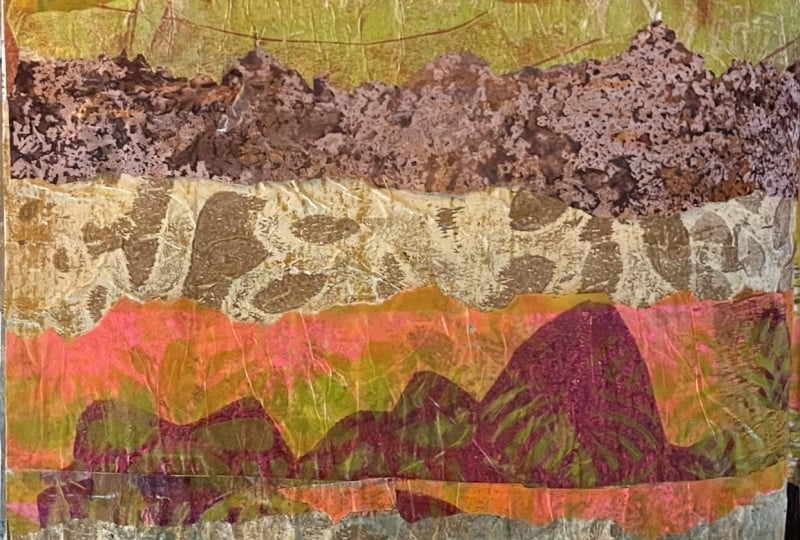
tear of the papers, find some pieces that I want, and then I'll put them in today's day 71 Earth Embrace for our beginning of
our fabulous class. So I've added my papers, and I scumbled on a little
bit of peacock blue. This is one of the Medan
100 color pack paints. They're so tiny, but there's
so many diverse colors, which I absolutely love because I just opened
it up and pull one out. Peacock blue, this one is, scumbled it over some areas, and then I put a little bit of the gleaming black
on there as well. Because I just absolutely love the texture of these
colours and these paints. I think they all sit
beautifully together. It was very hard to keep going
and cover the whole thing, but I am going to stop now. I'm going to let it
dry, and then I'll give you a close
up once it dries. All of these areas
go a little bit more transparent
once they're dry. Oh, look, you can
see a little bit of the gold on that section
there of the paper. These were my favourite
sections of the papers, but I have so many
to choose from. So don't forget, keep them in a pile for a lesson later on. And next we're on to Whispering Breeze the
beautiful expression of air. So I can't wait for that. Yes, we're going to be
making some more papers to start with and then putting
our collages together, and it's going to
be so much fun.
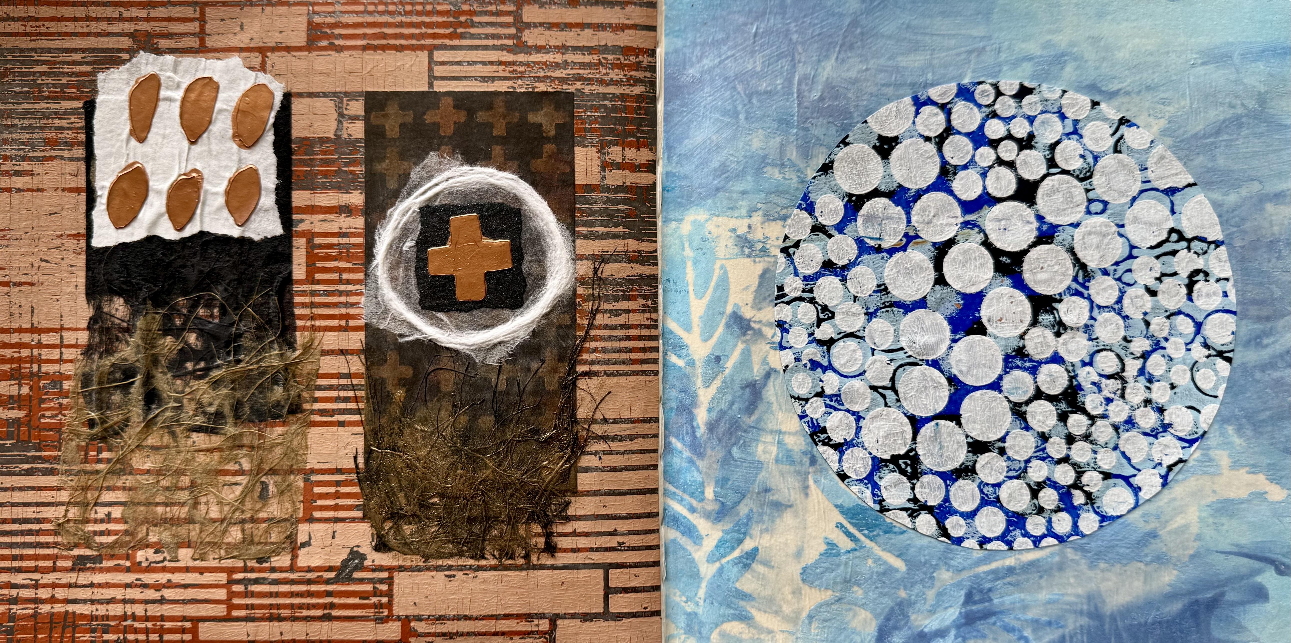
4. Day 72: Whispering Breeze: Day 72, and we're moving
on to the element of air. So today, we're going to design a collage that feels light
and full of movement, like air itself
using soft colors, delicate papers or
transparent layers to capture a sense of breath
flow and freedom. You could bring in
some feathers or some other symbolic elements. So I'm starting with
my large plate, my beautiful gell 16
by 20 inch plate, and I'm using beautiful
iridescent white, starting with a luminous
pearlescent shine with the pap. And then I'm adding
pastalrctic blue. I'm rolling it
onto the big plate with a really small
brayer because I want to get kind wispy
lines across the gel plate, and then I'm splashing on some
golden manganese blue hue. What a glorious color this
is rolling that along, and then I've got some FW
pearlescent ink in sky blue. Then I'm splashing on some glorious white ink and
some silver ink because I want it to be light and airy and beautiful and delicate
and soft pastel colors. I'm giving it a light
rollover on the gel plate, and then I'm putting
on a piece of this. It did say tea bag paper on the Amazon listing
when I bought it, but it does feel more like
a wet strength tissue. I do want to experiment with a few different papers
today and see how they respond with
my fabulous layers of these paints and
these watery inks. Now, it pulled up
absolutely beautiful. And, of course, there's all this goodness left on the plate. So I'm going to continue
adding the same colours, the pastel Arctic blue, the Manganese blue,
and the glorious inks. This time, I'm using actual tea bag paper to soak
up all the fabulous colours. And I want to see how
this paper is going to compare it to the first
paper that I tried. I want to try and get
it kind of thin and textural but wispy in
the beautiful bluey, white to pearlesc
pastely colors. I ran similar colors
over for a third time, and I used a different
paper that did say, again, it was tea bag paper and feels more like a
wet streak tissue. So now I've got three
different papers to compare to see which one
I actually like the best. And of course, I have to keep
making a few extra pieces because the colors are so beautiful and the
papers look so great. But then I pulled out
this feather stencil. Now I've got this one from
Timo I don't have a link, but if you want to go to that website and put
in feather stencil, you'll get a whole
heap of options. That's where I got this one
from. It's pretty nice. It's got a few varieties
of sizes and shapes. So I put that on the gel plate, and I roll through those
fabulous feather shapes with the pastel arctic blue
and a little bit of the manganese blue,
absolutely glorious colors. Pull the stencil up, and it's looking fabulous. Now, when I turned
the print over, I decided to add some more of the fabulous sky
blue in the ink, and I pulled out one of the
Isak sprays in antique pearl, soft, beautiful,
pearlescent donees. On my papers. Then I decided to get a little
bit more adventurous, and I pulled out some
actual feathers. I've put beautiful muted
turquoise on the plate, I put the feathers down, and I'm using just ordinary
doll store tissue to push the feathers down
into the paint and to remove all the paint from
around the feathers. Because I don't want
the silhouette print. I actually want the ghost print. And once I've pushed all around the feathers and pressed
them into the plate, I pulled off the paper. Tara tra, pulled off the feathers and have a look
at the beautiful print. Then I put some of
idscent white on the plate to pull this print
with wet strength tissue. Have a look at how
beautiful these papers are. I absolutely love them. Now, this is a really
interesting piece of paper. I've marked it so I can
remember which ones they are because I am experimenting
with a few different ones. It did say T bag paper, but it does feel more like
a wet strength tissue, and especially in the
way it's pulled up, which works really well
for jelly printing. It also works well for
multiple layers of paint, and it holds up well with all the splashy
water of the inks. So that winning, this
is the t bag paper, and it does feel a lot softer than this one that has
more of a plastic in it. But the only problem with this tea bag paper
is that look at the lines from where it's been folded and packaged.
I don't like that. That actually annoys me
because I would have to use this section within my artwork to not have that line down it. The colors are stunning
and the softness of the paper really is a
winner with the tea bag paper, but it has to remain
within that size, and that annoys me about it, which is why I like these
ones better they're bigger. So if I can find a tea
bag paper in this size, that's what I'm looking for. I mean, it'll work
right today because my art journal is
really only that size. Anyway, but I am
on the search for a tea bag paper that's bigger
than this particular size. But these pieces look beautiful. Look how gorgeous
those colors are. It's definitely got
that wind airy, wispy, wafty feeling to it floating along with the
beautiful pastel colors, and the iridescent white
pearl has worked really well. Now, these feathers
were quite fun. Have a look at the print. This has got the idscent white to pull the
print so you can see a shimmer of the white
pearl effect on the print. This is the wet strength tissue. That's why it's so large. The print turned out
quite good, really, considering I was just
playing with the idea. Here's the first print I
took on ordinary tissue. Now, I can easily drop
in some inks onto this and color these silhouette
shapes of the feathers. I'm definitely going to do that. And then that'll be another
print that I can use. It's pretty fun on the tissue. But this turned out alright. I think we could explore
this a little bit more. With the feathers on the
print, I think they're okay. I could possibly explore
that a little bit more. I do like all the detail. You can see them quite well. But I think I'm going to press on and play with
that sensil some more. So I put the stencil
back down on the plate, and I've run over it
with the idscent white, the pearlescent white, which
is really very beautiful. Now, it's a very thin paint, so it's probably hard to see, but it looks pretty
nice on the plate. And then I'm adding
my arctic blue and a little bit of the
fabulous sky blue. Acrylic ink and some of
the silver, as well. All of these colors are
looking beautiful for my airy, floating freedom type feeling that I'm wanting to
create in my prints. I've used one of my
wet strep tissue slash t bag paper that
I'm experimenting with, and I think it's printed up. Rather beautiful. Of course,
I couldn't stop there. Then I decided to pull
out the prints that I've already made and add some
of the stencils to them. I'm using the white pearl. And then after I
pulled up the stencil, I decided to add a
little bit of the ink, give it a bit of a splash, and just create a
little bit more texture with some of the
deeper blue colour. Then I put the stencil
down on the gel plate, and I used some white paint on it because I wanted it a
little bit more defined, a little bit more crispy, and I put the first
print over one of the painted papers
that had already made in all of those
luscious blue colors. I printed up beautiful. But also, there was quite
a lot left on the plate. So then I another idea. Have a look at how beautiful
these papers have come up. This was the first one that I put a little bit of
the Arctic blue and the manganese blue through the stencil and then put
some extra paint around it. It's quite soft. It's got a lovely spray
of this one, the pearl. Antique pearl in the eye zinc, it has a little spray of that on it. It
looks pretty good. This is the other
paper that I said, It's a T bag slash wet
strength tissue paper. I actually think it's softer than the first one I was using, and it held up really
well with the water. So I'll put both
of these papers in your class notes if you want to have a
look. It's on Amazon. I'm just experimenting
with quite a few to find a t bag paper
in a bigger slide. So this one at the moment, I think I'm liking more
than the other one. And then I put this one
onto the background. I'd already painted. So that was super, super easy. I spaced them out. Singularly, in case I wanted to rip up just like one
feather and put it on my page 'cause I'm not sure at this stage what I want
to do with my collage. I definitely want to add one of these feathers in or
a couple of them. Not sure. So I think
if I spaced them out, then it would give
me more options. And this is where I splashed
some of the blue ink on it. That created a
really nice effect. That worked really well.
What's this one got? This is the other paper. This is the second one, as well. I like this paper. I think I like this one more. This has got the pearlescent. Stencil on it, and it's beautiful and soft.
It's pretty nice. And this one is the
first print that I took with the white on the
gel plate. Put it on. It was already a
painted background, pushed it down, pulled it off. A tra. So super easy. We've got an immediate print, and it looks pretty nice. I'm liking this paper. It prints up well. The colors are
looking beautiful. So now what I've got is this
print still on the plate. There was quite a bit left still on the plate,
which was great. So I rolled over some silver. It's the beautiful golden
fluid paint in the silver. And then the manganese
blue. And I rolled that on. And I had this idea. I thought, What about
if I put on some of the coso paper to create some of the texture in between
the layers of the paint? Like a gel plate collage, I've been experimenting
with this idea recently, and I thought maybe it was a good time to give
it another try. So after I put on some
of the coso paper, I gave it a little
spray with water, so it softened down and
adhered more to the plate. Then I brushed on some covalt blue and
some Prussian blue. Now, I brushed it on because
I didn't want to pick up the paper and pull it
straight back off the plate. I'm not sure if this
idea is going to work because the coso
paper is fairly fine. It might not be strong enough to come through
those paint lagger but we'll have to
wait and see won't we now I have left it overnight. It was the last print
of the day yesterday, and now here we
are ready to pull the print to see how
this idea worked. If this idea worked. I do like the idea of the
collage paper on the gel plate. I just don't know if
this particular layering is going to work because the Coso paper is so fine.
But we'll give it a go. We've got nothing to lose. I've turned it over because
sometimes it's just easier to pull the gel plate off the paper rather than
the paper off the plate. And because it has been
sitting all night, it should should
come up fairly easy. Well, the metallic
silver's rather nice. I think I lost most of the
so in the paint layer, but I can add some on top now. That's not a problem. I've got it on the
wet strength tissue, so it should hold together pretty well.
It shouldn't tear. And I'm thinking
it's going to come off the plate pretty easily. Don't we just love
that. Tara, Tara. What do we think
about this print? Well, it didn't quite
turn out how I hoped I thought I might get more
texture with the coso paper. You can see it in little pieces if you look here in the texture. But I think the silver
paint, perhaps, was a little too opaque for the delicacy of this
particular coso paper. Maybe if I had used
a thicker one, it might have been better, but you don't know
until you try. It's still another
beautiful print and another option for my
Whispering Breeze theme today. Can you feel the
Whispering Breeze? A So let's have a look at all of the
fabulous prints I now have. I hope I've inspired you
with some ideas to try. You should try printing
real feathers or pull out a stencil or just do it
completely abstract, roll on your plate or
even just the paper. You don't have to
use a gel plate. If you don't want to, you can just make beautiful
painted papers. Whatever it is that you've
got at home to use, pull it out, have some fun, find some beautiful light
and airy and delicate colors and papers and see what it is that you
feel like creating. Which ones of these
beautiful papers? Well, I used today in
our fabulous collage. This one actually I used through the stencil with this Earl
White stencil butter. I forgot to mention
that. It's nice and thick and raised because
it's the stencil butter. So that's why it
looks so good when I drop the ink in and
sprayed it because it already had a good edge to it from the thickness
of the stencil butter. But then I really
do like this one. There's something really,
very beautiful and subtle about the iridescent white
that I used on there. I'm really liking it. The colors really pretty. But that one's nice, too, or do I want the
actual feathers? Oh, man, it's pretty hard to decide when you've got so
many beautiful prints, and the beautiful tea bag paper makes a fabulous background. So I'll have to make
some serious decisions. Pull out my new art journal. Continue on with the
fabulous collages, and I think I'll pull out that Coso paper and
have another go with that it was rather
beautiful in its textures. It just did get a little
lost underneath that silver. It's not an easy decision because they aren't
all really beautiful, but I think on one side
of my art journal, I might put one of these ones, I do like the idea
of the feather. By itself floating this way. I think I'll put one
of these on here and add some beautiful coso paper
to it to give it texture. Think I'm liking
this one the best. And I could add some
white or even some blue in that beautiful
Agora lace coso paper. That could work, so perhaps. I'll make a decision. I'm
going to make a decision. I'm going to do
that. Exactly that. I'm going to put this one on
there, this section here. And then it'll also
give me a chance to test how good this
particular paper glues down because that one
is the second one on my testing list that
I've been trying today. So I'm liking this one. I'm going to put that there,
and I'm going to add some of the beautiful texted coso
paper on the page as well. Do I want to add it in
the white for the blue? I don't know, Whispering Breeze. I'm thinking probably the white, but I haven't decided. And then on this
other side, oh, man. There's so many options.
These are beautiful. I love the subtle look of those. I do like this one, as well. I like the texture of it. There's just so many options
and so many possibilities, especially when you
make so many prints. So I'm thinking perhaps one of these ones I do like the
darker tone of this paper. And this section up here, you can actually see some of that Coso paper
coming through. And I like the way these
feathers are vertical. I think it will sit nicely next to the one.
That's horizontal. So, that's where I'm headed. That's what I'm going to do. Let's see if I
stick to the plan. Right, so the papers
are down on the pages. And yes, I did add some of the beautiful Coso paper for a little bit more texture
of that Whispering Breeze. A This side, I'm thinking
I'm going to leave it alone because it does have some nice texture
and color in it. And if I put something over it, I'm thinking I'm just going to lose the way
it kind of feels. And I like that one.
That one worked out. Well, it didn't work out
exactly how I had in my mind, and I'm going to try
that idea again, but it did work out rather well, and I do like the
silvery blue color and the fabulous feather shape. So I'm thinking this side, just a little few drops of this glorious ink that I've been using in all of the papers. Just a little like that. This one is the sky blue. I love this brand, the
FW pearlescent inks. They have the most
incredible colors. The color range is amazing. So let's just put a little
bit of that on there and get out Whispering Breeze
movement happening. Across there like that, that's going to sit nicely on those colors and on that
beautiful Coso paper. Just give it a little bit
more of a move around, perhaps a little bit more water. Everything dries eventually. Especially when it's
quite warm here today in beautiful New Zealand. It won't be a problem. Oh, maybe just a
little sprinkle of this fabulous antique pearl in the icinks. Oh, yeah, baby. That finishes it
off beautifully. Very happy with that. So I'll give you a close
up when the paint is dry and then next we're
moving on to fire. I think I'm pretty
excited about that. You know I'm gonna get carried away making some papers, right? 'Cause red is my favorite color, and I just can't wait.
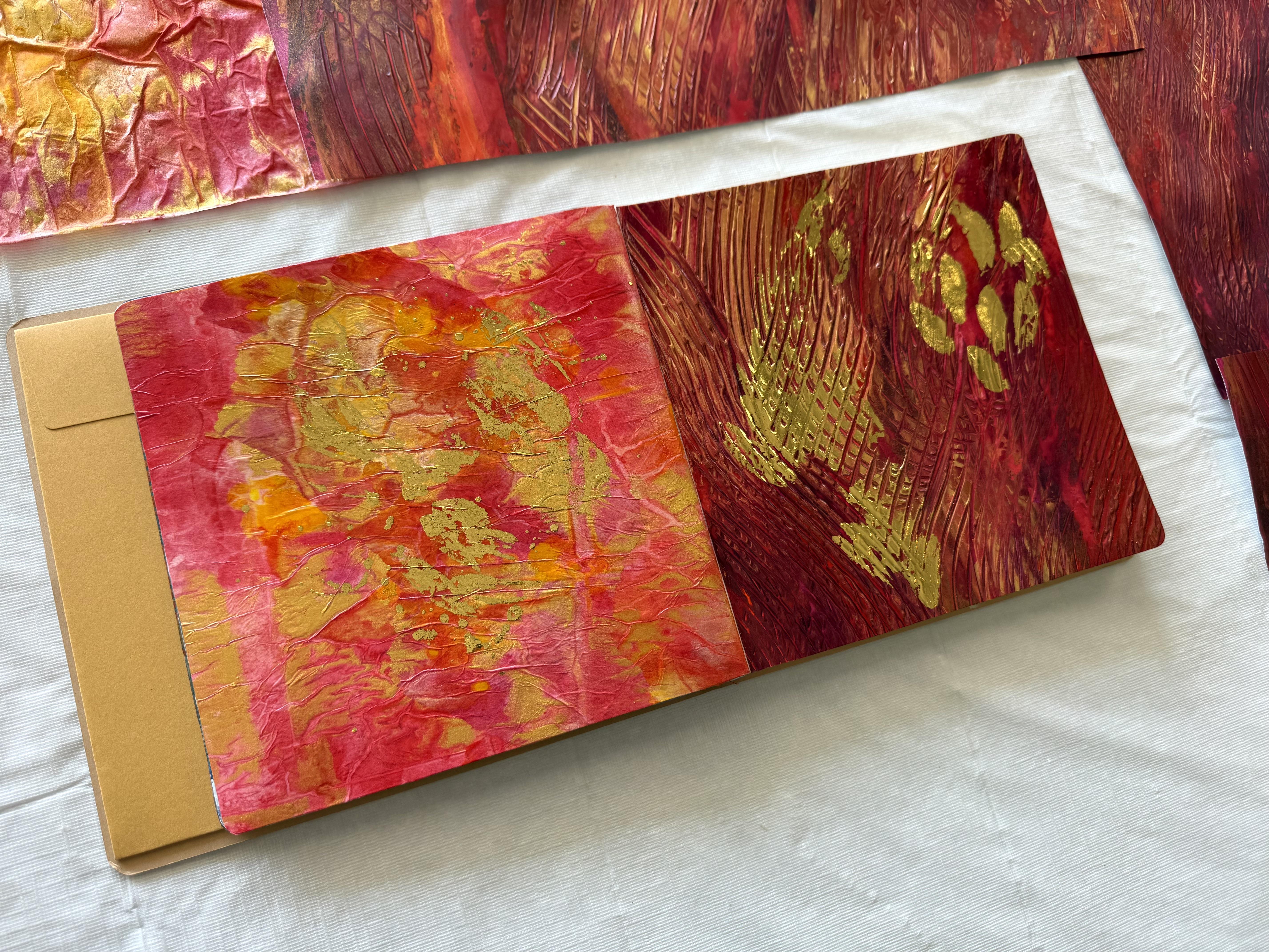
5. Day 73: Fiery Passion: Day 73 Fiery Passion. Now, you know I'm going
to love these colors. Today, we're going to craft
a collage that embodies the intense and
transformative nature of the fire element. Use vibrant reds,
oranges, and warm tones, along with dynamic textures
to create a collage that ignites the spirit and
captures the energy of fire. It's going to be so exciting. Now, first of all, I pulled out my Canson mixed media pad
ripped off a piece of paper because what I'm wanting to do is grab my acrylic paints and my inks and really just layer these beautiful
colors onto this paper. So I'm starting with the
mop up Posca paint marker. It is beautiful and fiick. It's got a lovely paint to it, and this is a glorious color. And look how much fun I had. I started in the middle, and then I created more and more lines
because I was imagining the fire burning bright
and expanding outwards. So much fun. I mean, I could tell you that I was very seriously considering
the composition. But really, I was having a lot of fun with
this paint marker. Then I added some Cacrido
red violet onto that color. It's a beautiful. It's actually one of my favorite colors. And I'm using a
palette knife because we want to get some
nice lines and some free flowing patterns and textures for our
fire composition. I threw on some pyro
orange in the fluid paint, the beautiful golden,
fabulous pigmented color. Look how glorious it
looks when I mix it with the palette knife on top of
those other beautiful colors. Of course, we had to
have some gold next. The liquitex gold in
the basics range. It's a beautiful metallic gold. And all of these paints
blend so beautifully. Then I added some of the
transparent red iron oxide. I'm filling up the page now wanting to just get a
layer of the thick, glorious acrylic paint onto it because I'm thinking
I'd like to build up some thickness in the
texture so I can then add in some other lines
with some scratching. So I picked up the
catalyst blade. Love this one. That's
this one here. It's got a fabulous
tooth edge to it. And I ran that
through the paint, and because my paint
was nice and thick from knifing it with
the palette knife and all those beautiful colours, it created absolute
fabulous texture. Then I threw on
some of the FW ink in the beautiful metallic
gold and some of the liquitex acrylic ink in the PirollRdFre hot and intense. Spraying it with the water
splashes the inks around, but it also makes them run, creating those organic
marks and patterns, and they then sit
into the crevices of the grooves that I've carved
out from the catalyst tool. It really is a lot of fun. I'm telling you, I could
have done this all day. Now I wanted to add some
more highlights of the gold. So I pulled out
this Chinese ink. Now, this is a calligraphy ink from China. It's very thick. It's very lush. Oh, the
metallic gold is amazing. I've squirted it on my paper, but then I'm flicking it around with a silicon pastry brush. This is one of my absolute
favorite paint brushes. But let me warn you. Disclaimer, it does tend
to flick everywhere. When you're splashing
the paint around, it does tend to go up
the walls, just a tad. So you do have to be a little careful, but
it's so much fun. It creates that fabulous flick texture on the
top of the paint, especially when
you've got the gold. You want to have that
glorious metallic shine. Now, once I had fully
covered my paper with all of that glorious
texture and thick lush, paint and inks and water, I did move it onto the floor behind me onto a plastic sheet, and I poured out
another piece of paper because I do
like to make two. When I'm on a roll, I find the first one is pretty
much just warm up. So the second piece of paper, I'm starting again with the Posca marker paint pen
in that glorious red color, and I'm creating a
different composition for the beginning more of the sweeping lines of the
upward draft of the fire. It really is so much fun. And then what I did next was add the transparent red iron oxide. I wanted more of that kind
of orangy warmth to it, and I pulled in
some deep violet. This time, instead of
going with the hot and bright of the red colors, I'm going with the deep the deep and intense
burn of the fire, bringing in those
deeper elements, the violet and also
put in some magenta. Again, I'm using
the palette knife. It's looking beautiful. The paints all mix
really well together. Don't forget I will have a
list in your class notes of the exact colors if you want
to know what I'm using. I put on some of the
same quin red violet and the beautiful
liquid text gold. I've got all the paints here, squeezing them out
onto the paper, knifing them with
the palette knife, and creating beautiful
upward kind of stroking movements to
create that fire flow. Added some more magenta to it, and I also put in some
of the liquitex bronze. Now, the liquitex bronze is a little bit brownier compared
to the other bronzes. And I figured it would
sit well amongst the deeper tones that I'm using for this particular painting. So what I found that I had built up so many layers of
the beautiful thick, luscious paints that when I
put the catalyst tool on it, it worked out even better. It created fabulous
marks and textures, a little cross hatching, where the swirls crossed
over each other. I really liked this texture, even more than the first piece
of paper that I painted. Then, of course, I
had to splash on some of the beautiful
acrylic red ink, and I also put in some of the zinc in the
gold mine shimmer, gave it a spray with some water to get that movement flowing, the organic pattern it sits in the beautiful deep
grooves that I had created from
the catalyst blade. Have a look at how
beautiful the paper looks. I think I like this even
more than the first one. It has more shade, more depth, definitely more texture to it, and it's got a great element of the gold sitting
right on the top. So now I have two
beautiful pieces of paper. I moved them on the
floor to let them dry. The second one, actually, while it was drying
on the floor, I dropped in a little
powdered pigment just to add a little more bling. And now I'll show
you how they dried. Have a look at how glorious
these papers have dried up. This was the first
one that I did. See here, I dropped in a little
of the powdered pigment. When the paper was drying
on the floor there, you can see a little bit of it. There floating in
that wet paint. Oh, isn't it beautiful? The tinese ink that I
flicked all over it looks glorious and
the different shades of the red and the orange. Yes, I know. They're
my favorite colors. Now, the second piece I
love even more because of this incredible texture
from the catalyst blade, the way the movement sweeps up, and then crosses over it, where I went that way. And I'm just really loving
that I think it looks good. I also really love the depth of the deep violet that I
added into this one, and I love the way you can
see the different mix of the plain areas of the paper and then the cross hatching
of the texture, yes. I like this one better. I'm
definitely going to cut a section of this piece of paper out for my collage today. I'm not sure if I'm going
to add anymore to it. I haven't decided,
but I'm definitely going to be cutting out
a section from here, 'cause I'm just loving this one. Now, I see this as the burning, intense heat of the bush fire raging through, almost
destroying everything. So I'm thinking, What
about if we create some fire that's a little more
subtle little more gentle, like the soft glow
of the campfire. That's what I'm thinking next. So I decided I wanted to create some of the
beautiful colored tissue. So onto my work table, I've put two pieces of
doll store tissue and one piece of wet strength tissue because that's
what I had to use. And I wanted to use
up the bottom of the median soft bodied paints that I have in the
little tube bottles. They're almost finished. So I filled them with water, the red, the orange, and the yellow because I'm going to tip that
onto my tissue, allow all that organic flow
happening with the water, and then see how beautiful
the tissue can dry up. I love using the leftovers
in the bottom of the bottles because then you get every
part of that paint pigment. Now, also, in doing this, there isn't a strong
element of pigment in these particular paints
because they are more on the affordable end
and putting a lot of water in them will make
them dry a lot lighter. But that was what I was wanting. I was wanting a little bit of softness in our fire colors just to have a contrast against
my raging bushfire. And all the intensity that
I had already created. So I'm tipping the beautiful
colors onto the tissue, spreading it out with
lots and lots of water. I have it spread right across the full
length of my table. I'm filling up the
bottles and just continuously pouring
them on the tissue. Then I did the same with
the Chinese ink bottle. It had some left in the bottom, filled it half with water, gave it a good shake and
squirted it on, as well. That's going to create
that beautiful, iridescent gold metallic shine. The tissue looks
absolutely stunning when it's saturated with the
paint and the inks. And all of the water, but I do know it's going to dry a lot light up because there was less pigment and
a lot more water. But the water creates that
beautiful organic pattern. And remembering, I'm using doll store tissue and one
piece of wet strength tissue. So it'll be interesting to
see how different it dries. Don't move the tissue. Do not move it. Don't try and put it on the floor or
put it anywhere else. You'll have to leave it wherever you created it because it will tear to shreds
if you try and shift it when there's
so much water on it. Don't touch it until
it is completely dry. Then when it's completely dry, it peels off the
plastic tablecloth that hopefully you put
on your table first. Very, very easily, and it
looks absolutely stunning. Have a look at how stunning
my tissue paper has dried up. Now I have showed
you this before. I do love making it. It's one of my absolute favorite
collage papers. So easy. Doll spall tissue and
leftover bottles of paint, whatever's left in the bottle, your inks, your acrylic
paint, your fluid paint. Well, these ones were
soft bodies, easy, peasy. Fill the bottle with water, give it a good shake, and literally throw
it on the tissue. Now, plastic tablecloth
on your table first, in case I forgot to say that. Otherwise, you're never going
to get this off your table. Look at that.
Absolutely glorious. You can use it for collage. You could use it for
wrapping paper, simple as, but I love it for the collage and see how much the colors have faded in the drawing because there was more water
and less pigment. But also, look at the
glorious and metallic shine of that Chinese calligraphy
ink. I love it. I will use whatever I have that needs to be literally
rinsed out onto the tissue. So those paints
worked really well. That's the first time I've
tried this technique with that particular brand of
not a problem at all. I've also used some of
the acrylic ink as well, splashing them out from
emptying those bottles. I might have even sprayed
a little zinc on it. You know, I get carried
away when I'm creating. This is the wet streak Hsu. And let's face it, the Dolste
tissue looks just as good. No problem at all. They both held up really
well as long as you wait for them to dry completely before you peel them
off the plastic. Right. Absolutely glorious. This is my soft glow
of the campfire. And putting that next
to the raging bushfire, I think I've got some beautiful representation of our fiery passion for today. Right, so I have my two
favorite pieces of paper. Really, all of the colored
tissue was very similar. It didn't matter if it was the cheap one or the expensive one. So that's really good to know. This one has a lot of
more pattern on it, so maybe I sprayed
more water on it. The amount of water does kind of create the different
organic line from putting that ink and paint and colour
onto the tissue. So you do have to put a fair amount of water.
Don't be scared. It does dry eventually because spraying it
spreads out that color, especially if you're using
watery acrylics or inks. And it sits in all of the
beautiful grooves and crevices. So I am absolutely
loving this piece, and I don't even
know which section I love the most because
I'm loving all of it. So I might just cut
a piece of here. And then I might put a
couple of sections on it. Layering them on top of
each other just to deepen the color and create more
texture on my collage. So that's going to
go on this side, but I probably won't
just stick it like that. I think I'll tear it
to create more line and then lay out some pieces
on top of each other, just to create more of a texture and pattern on the
page, something like that. Putting it like that so
it creates more movement. That's what I'm
liking the idea of. Yes, that's a brilliant idea. I'm going to do that
like that and put like that and see how that
looks once it's glued down. And then I can think about whether or not I want
to add anything else. At this stage, I don't
think I will because I just love the color and texture of
my warm, glowing campfire. And then on this side, now I really love this section, I want the middle piece. What can I say?
I'm so like that. But I love the way it's
shooting up there, and I love this really
textured element here. So I'm going to cut this section like this because
that's my favorite bit. Somewhere, of course,
in the middle here. That's what I want
that bit there. And then I think what
I'm going to do is put a gloss medium
over this side, just so it looks all wet and shiny rather than dull
because it's fire. There's got to be some
movement. Oh, oh. We could think about putting some deco foil on it just
there. Or we could do both. So thinking about
a little bit of deco foil on this
side. Right oh. Well, I'll start with cutting
the section that I want. Of course, it has to be
right out of the middle. And then I'm going to glue that down and then think
about putting some deco foil on it just for a little bit more
of a metallic dye. Right, so both sides are glued down. And look how fabulous
they look with the beautiful reds and
golds and metallic effects. Now, I can leave
them just like this. But you know what? I'm like, go. I've pulled
out the mixed gilding paste. Now, it's not a paste. It is actually a liquid, this one, even though it
says paste, it's fluid. This one is the other product. I use also says
mixed and relief. This one says gilding paste. This one says mixed and relief, and this one is an actual paste. So when you're doing
maybe stencils, or you want something
thicker that you're putting your deco foil onto,
use the thicker one. If you're just wanting brush
something on and create a little bit of glimmering
goodness from the deco foil, then this one works
really well with a brush. So I'm going to add just just a little bit here to add some flickering
gold to my fire. Now, you do have to wait, of course, for this to dry. And depending on how
thick you've put it on, you'll have to wait longer, but I'm just going to add just a little bit of
flickering fire just there. Who up. Nellie Ah. Do I want some on
the other side? Oh, you know, I have to. So a little bit of flickering
fire over here as well. Now, it's going to be hard
to see because, of course, once it's actually dry, it's
completely transparent. So it'll be a bit of a guess. How about we just flick it on as to where it's going to be? But that's my campfire.
I'm liking this idea. There's my campfire. And this is my raging
bush fire over here. Both elements are quite transformative
because, of course, once the bush fires
gone through, you get all the new life
and the new growth. Ooh, yeah, baby. We're getting a
little bit deep now. So that's a little bit of that. Now I will wait probably
2 hours for sure for this beautiful fluid mixed in hibio gilding paste
to actually dry, and then I'll put
the deco foul on. It's going to look stunning. I just know it is, and I
can't wait to show you. I'll give you a close
up when it is dry. I'll show you how to put on the fabulous deco foil
super, super easy. And then we'll be into the deep waters of
fluid reflections. Right, so when the mixed
and paste is completely and totally invisible,
absolutely transparent. You can't see any
white elements in it. Then, you know, it's dry. So I've got the eye
craft deco foil. One of the sheets is
going to have some on it. I just know it. There should be enough good foil
bits left on this one. Let's try it here. Now,
you can use your fingers, easy peasy, or you can get a
scrunched up piece of cloth. Or if you really want to get some serious heavy
duty pressure, you can use something like
that if you wanted to. But I'm finding
because this one has the deco foil on a lot
of the textured grooves, I'm thinking that probably using the scrunched up piece of kitchen cloth
will be best ta ta. Look how sunning that is, man. Do I love gold? What can I say? What can I say, Hey, I just love it. So you've got to find where you put your adhesive because
you can't see it. It can be a little tricky. Oh, my gosh, it's too exciting. Just too exciting. Rubbing it on easy, peasy. Make sure you're putting
the silver side down, so you've got that lovely golden goodness and
have a look at that. Look how fabulous that beautiful metallic deco foil
is on my glorious fire. Let's put some on this side. Just like that, easy
PV and on this side, you can see all of the splashy bits where I literally flicked
it off the brush, a little bit of the
sparks of the fire. Going up there, yes, I love it. It looks so fabulous when
the light catches it. My pages are beautiful. I'm loving the added deco foil. Now I'm going to put a little
bit of gloss medium onto this side I want this to be shiny instead of
dull, matte flat. And then I'll give you a
close up when it's dry, really happy with my fire
inspired collage pages. Of course I am. They're
my favorite colors.
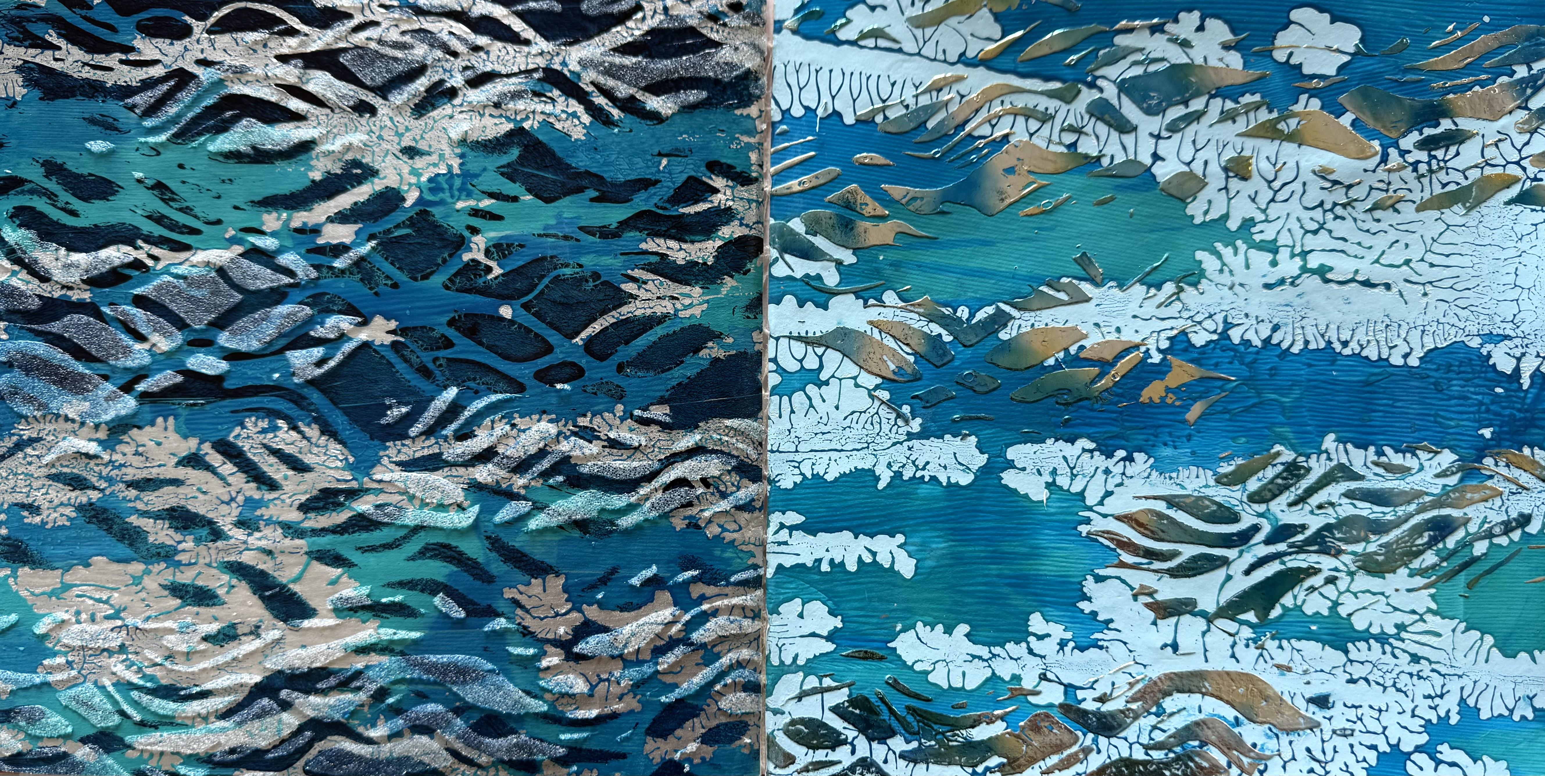
6. Day 74: Fluid Reflections: Day 74 Fluid Reflections. Today we're going deep, deep into the waters. Create a collage that mirrors the fluidity and the adaptability
of the water element. Experiment with materials that represent the flowing
nature of water, such as transparent layers, reflective surfaces
and shades of blue to evoke the emotions
associated with water. Now, this is going
to be a lot of fun. I really do like water
on the gel plate. It creates the most
incredible texture. Now I'm starting with a
stencil from Pm artist studio, and it's called Choppy Waters. This is a fabulous
one if you want to get your this
particular stencil, I'll leave the link in your class notes because I've had so much
fun with this one, and I'm using it for
all the prints today. First of all, I'm using the muted turquoise straight
over the top of the stencil, straight onto the gel plate. Now, you've got
to let this layer dry before you move
on to the fun part. Next, I'm rolling on
some manganese blue and some cobalt teal of the golden fluid paint with a small little roll up so I can get into those grooves
of that fabulous, watery shape of the stencil, and I'm giving it a bit of a spritter of our
fabulous water. Now, when that layer was dry, I added the golden
idscent silver. I know this is going to look
stunning with these colors. And when I poured
the print, ta, ta. Look how fabulous it is. I absolutely love this print. I really love how
beautiful you can see the colors coming through the fabulous choppy
water stencil. I've got the deep turquoise and the cobot teal and some
of the manganese blue. You can see it all, and it does look very fluid reflections. So once the print was dry, I decided I wanted to
add some glass beads, just to create another texture. Another element on the print, and I put the stencil in
different places to where I had previously put the paint just so I could
create those layers, add a bit of movement
across my print. And when the glass beads
as dried, Tata, tada. It looks absolutely fabulous. Look how glorious my print is. I'm just loving it. Now, it might be
hard for you to see, but you can see all of the little wave
movement patterns from the stencil in
the glass beads. And, of course, once they're dried, they're completely clear. But you can see the
texture of them, and it adds another layer and
a little bit of shininess. And with the
metallic silver from pulling the print it
all looks fabulous. I'm loving it. Of course, I had to do it again. Now, with the second print, I'm starting with the
iridescent silver and putting that on the
plate with the same stencil. Then I'm rolling on
little sections of the manganese blue
and the cobalt teal. This little roller is
really working well today to get the
movement of those waves. And I also put on some cobalt blue onto this
print just to deepen the colors to make it more layered in the way
I'm putting the shapes on. And once this layer was dry, I added the silver for the pickup paint
to pull the print. Now, this print, I was
pulling onto tea bag paper, actual tea bag paper
because I wanted to see if I could pull it onto something really
soft and fibrous, maybe even transparent, but
definitely something thin, but it had to also be strong. So pour the print.
It looks fabulous. And look how great it
looks when you catch the silver in the light,
definitely fluid reflections. I like all the
shapes that you can see from the different
areas of the colors, the turquoise and the two
different shades of blue. And the silver pickup
paint looks fabulous. Now, the Tabag paper has held up really well,
very happy with it. It's light, but
it's very strong, and that's what we like
about the tbg paper. And it was a great
exercise to do. This particular type of
paper, I'm loving it. This is definitely an option
for my collage today. Now I have two beautiful prints. And for the next
one, I'm thinking, What about I don't put the
stencil on to start with, and I just put the watery
paint on the plate. So I'm using the manganese
blue and the cobalt teal, putting it on the plate, and
spraying it with the water. I love this technique. It creates the most
incredible organic patterns and lines and marks, and you can't get that kind
of mark making any other now, if you spray on too much water, you disperse your
paint too much. You can just wait a few minutes and roll
on a little bit extra. Mmm. I may have done
that myself a few times. The patterns look so pretty, especially in these colors. And then I'm putting on the pastel Arctic blue
to pull the print, and I'm using my favorite Japanese sketchpad rice
paper with this one. I'm absolutely
loving this print. Didn't it turn out well? All of these colors
are so pretty and they sit so well together. So I'm looking at it,
and I'm thinking, maybe now I'll add the stencil, pulled out the stencil, and I pulled out the
PBO mixed and relief, the one that you want to use for thicker applications for your deco foil,
which is this one. I'll put both of them
into your class notes, but this is a thicker one. I'm putting it through the
stencil with a palette knife. Now, you have to wait
for the paste to dry completely before you
put your deco foil on. So I did actually leave it overnight, and
then this morning, I added the beautiful lapses
watercolor deco foil, which is this color here. Absolutely magnificent
color. Have a look. I've put it on the print, given it a rub over, and tara tara it looks
absolutely magnificent. Look at the way the deco
foil is catching the light. My prints just keep
getting better and better. I was on a roll. I
absolutely love it. What I love about
this particular color of the deco foil is
that it's variegated. So it has that beautiful
turquoise blue and silver. So depending on which part
of the sheet you put on, you get that lovely tone of
the mix of the two colors, and I think this is
absolutely spectacular. I love the textures here in the patterning of the
water that we did first. And then the fabulous
wave shape over the top. Yes, I did have a
lot of fun with a simple stencil and some art supplies
bringing me so much joy. Now, what I wanted to
do also was to create some rice paper with the beautiful blue
and the bronze color. So I put two pieces onto
the mixed media paper and then splattered on some of the beautiful pho
blue in the ink, and my favorite
idscent bronze fine. Now, the bronze paint
I had watered down. So there were some left in
the bottom of the bottle, and I added water to it so I could squirt it
on really easily. And what I love about is the paint and the ink
and the water is going to soak through the
fabulous rice paper onto the mixed media
paper underneath. So when I finished spraying
the beautiful colors with the water spray and allowed
that ink to soak through, I picked the pieces up, moved them off my table, and put them onto the
floor onto plastic. Then I'm left with the mixed media paper with all of that paint and
ink and water on it. So I moved it around, smudged it with my hands, and allowed the beautiful
inks and the pigment of the bronze to flow because we don't want
to waste anything, and doing it this
way means we get another sheet of paper of a mixed media
experiment, as well. So then I splashed on
some more of the bronze because I wanted to create
more pattern on my paper. Hm. I wanted to see where
I might head with it. I really didn't have any idea what mediums
I wanted to add to it. I just wanted to collect all of that gorgeous color onto
that mixed media paper. So I moved it around,
tipped it about, and then gave it a
spray with some water, which created some texture
on the surface of the paper. I decided to throw on
some powdered pigment. I wanted to see
what that would do. I wanted to create some
texture in amongst the beautiful bronzi
deep blue color. Gave that a spray. And now I'm thinking, I
really need to let this dry and then decide what I
might want to do with it. So once the paper was dry, I decided to turn it
around the other way. So it was up this way and then put the fabulous
stencil on it. I told you this stencil
is a winner today, pulled out my liquitex
acrylic spray plate in turquoise and sprayed
it across the paper. Now, I'm wanting to
just capture some of those elements and some of
those shapes of the stencil, some of that wave movement. So I'm just putting it on in
little patches on my paper. Then I pulled out the silver in the liquitex acrylic spray
paint and did the same. But I turned the stencil over, so it would create
different marks, and I would be putting
on the shape in different places because I wanted to get that
kind of you know, that kind of reflective
look when you're looking at the water and the light
bouncing off the waves. That's what I was
kind of thinking about when I was
creating this paper. Turned out pretty good. What do you think? Not
too bad, not too bad. I did have a lot
of fun with this, and it was pretty much like
a roll off sheet of paper. It was catching all of
the water and the inks and the beautiful iridescent
bronze from the first layer. And I don't think it's
turned out too bad. Have a look at the
powdered pigment. You can see some of
the texture of that. And also the beautiful
movement from the stencils through
with the spray paint, creating these areas.
I really like it. I think it's turned out
nice and I can see under a little reflection of the
bronze color coming through, and then the different
shades of the turquoise. How fun was that? That's
a really good idea. Oh, where's my rice paper? You've got to see how
fabulous this turned out. What Look at the paper. This is how it turned out the
beautiful rice paper that I had put on my mixed media
paper sitting like that. So a really good idea. If you're going to dye or
stain or paint papers that are going to seep through or that are transparent or
that are very porous, put them on something else that you can capture all the paint and ink and the overflow and then create that
into something. These papers turned
out stunning. I love rice paper
because it does this. It bleeds right through, and it's got that fabulous, beautiful texture, the
fibrous element to it. This was the T blue ink and
the idscent bronze, fine. Both these pieces of
paper look magnificent. And this one turned
out pretty good. So I've got all of
these beautiful prints. Which ones am I going to put in my art journal today
for the collage? Shall I rip them up and put
parts of them or shall I just put the whole print in because the prints are pretty
stunning, actually. I'm pretty happy
with these ones. I think that one
might be my favorite, but I do really love the
shiny deco foil as well. Although, the texture of the
rice paper is pretty nice. I'm gonna get the art journal. Then I'm going to have to decide if I'm going
to tear them into pieces or use the whole
prints in my collage. Oh, man. Okay, so, which one of these starning
prints am I going to use, and am I going to chop them
up to put into my art journal or am I going to just
enjoy the magnificent, beautiful quality
of the gel brrint? Well, I'm thinking that they really are too beautiful
to rip into shreds. So I'm going to choose
a part of this one. I'm just loving it with its reflection of that
deco foil, stunning color. And the watery techniques
is one of my favorites. So I have to keep it
as a whole piece. I'm going to stick the
whole thing on like this. I'm thinking section like that. And then on this side,
I think I really love this one with
the glass beads. I love the feel of it. I love the layers of
it and the texture, and I think the print
really worked well. Almost surprised me
how well it worked. So I'm not going to rip it up. I just can't bring myself
to rip it to pieces. I'm going to put that
section on there like that, and this one on there like that because I
love them so much. Now, I do also love
these other papers, but because I know
what's coming up next, we're combining all our
forces of the elements. I'm thinking that I'm going to use this beautiful stunning
paper for the next lesson in a collage that we'll
be putting together all of the beautiful colors and textures and
papers and elements. So that's what I'm thinking. I'm going to keep this for the next lesson and
the next collage, and then I'm just going to put these two prints as they are straight into my
art journal like that because I think they
were very successful. I love them so much, and they really do definitely express the fluid
reflections theme. So I'll cut them up.
I'll stick them down. I'll give you a close up, and now I am busting and super excited to get to
our next lesson, which is the Unity
of the Elements. Mmm.
7. Day 75: Unity of the Elements: Day 75 Unity of the Elements. I'm so excited
because today we get to use all of these
fabulous colors and textures together combined in a gelprint maybe
definitely in a collage. Bring Earth, air, fire, and water together in
one harmonious collage. Use colors, textures and imagery inspired
by each element, weaving them into a
single composition. Think about how these forces interact, sometimes in balance, sometimes in contrast and let your artwork reflect the
interconnectedness of nature. It sounds so exciting. So, of course, I set
myself the challenge. I had to create one
incredible big gel print with all of the four elements. I started with my 16
20 inch gel elf plate, and I put on the meden
gleaming paint in the black. I wanted to add that gritty
texture first on the plate, in a section on the top left that's going to
represent the Earth. Then I'm putting on some
cacrodo magenta and some cadmium red onto the
right side of the gel plate, and I'm using the
fabulous catalyst blade to create those
fabulous lines and textures that I was
really enjoying about creating
that fire feeling. I'm thinking that
I'm going to do four separate areas
on my gel plate, and I hope this idea
is going to work. Next, I sprayed on some of my favorite liquitex
spray paint in the turquoise through
that fabulous stencil that I've already
used. I'm loving it. Choppy waters, I
think it's called. And then when that layer dried, I put on the fabulous manganese
blue and the cobalt teal. All these paints we've
already used, nothing new. And these are my favorite
expressions of the elements. I'm going to put them all
on the plate at once. Then in the bottom
section of the plate, where I'm going to put the air. So I've got the earth, the fire, the
water, and the air. I decided to paint
some of the feathers I know I've already taken a
gel print with the feathers, and that turned out okay. But this time, I'm thinking, What about if we paint
the feathers and push that onto the plate
to create a print? What's that going to look like? First one looked pretty good, so I gave it another go a little bit more
paint next time. I'm using the fluid paint
in those fabulous colors, but I'm thinking next
time I try this idea, I'm going to use a
full body paint. I think the thicker paint
might have printed better, but it looks okay. It looks okay. I think
we're doing okay. Now I've got all my other
sections nicely covered. So then I went back to
the Earth area and added some transparent red iron
oxide and some raw umber. I'm using the
really small roller just to add little
bits of the color. I don't want it to be
overall blocky colour. I want it to be broken
up a little I'm thinking I might pull the whole print with the iridescent bronze fine, and where you see it peeking through the areas
around my elements, I think that could work
right for an overall color. Then I added some of the
magnificent artillery rich gold onto my fire element. Now remember, all of these
layers on the plate needs to be dried before you put
the next paint layer on. Otherwise, if you're
rolling the plate, and it's picking up the paint
instead of putting it on, your paint still wet. Wait for it to dry, then
put the next layer on. I put some silver over the waves that had the beautiful
turquoise and manganese blue, creating that beautiful
layer of color. And then I put the pastal
arctic blue over the feathers. So each section has the element, and it does have a
paint color backing it. But then, overall, I put the iridescent bronze
fine and I laid down. The fabulous wet
strength tissue. Now I'm going to leave it
overnight to dry because I have found it really does turn out a lot
better when I wait. Okay. Are you ready
for the big reveal? It's pretty exciting. I've never done a gel brint before with all of
the element on it. Tara, Tata. So exciting. Now I'm going to pull the plate
off the paper rather than the paper off the
plate because I have found when it's thick
and textured like this, it does work a little better and comes off
a little easier, especially if you've waited all night to let that
print dry properly, then it should come up
without any trouble at all. And that's what we really love. The question is, is my mead and gleaming paint going to come up off the plate? Turn up. Tara. Have a look at
how fabulous the print is. Yes, I'm a little excited. Can you tell? Where's the Earth. There's the Earth,
the earthy color. And I think I can see some of
that meden gleaming paint, the little speckly black
textured areas under there. Then we have the fire. Of course, I love the fire. We have the air with
our feather print and the deep oceans of the waters
and the fluid reflections. I love it. I just love it. Look at the feather print. Turned out quite good, really. So my idea of the overall
bronze to pull the print, I think, was a really good idea. I think it's worked
well. It looks nice behind these feathers. I actually really
like the feathers. That Arctic pastel blue works
well with the bronze color. We knew the fire
colours would work, and the earth looks nice and grungy and gritty and earthy. And look, that mean and gleaming paint pulled
up. No problem at all. I love trying new things. Yes, and I love this estencil. It looks great in
our deep ocean. Now, we've got all
of the elements. I've got this fabulous print. I'm going to go and get
the other papers and decide which ones I'm using
today for the collage. Now, the choice is
pretty tough because I have so many fabulous prints. I love this new one of my
combined Unity of the Elements. It's fabulous. Look, it's
even got the shiny gold coming through there in
all of the grand layers. But I think for
the fire element, I'm still really in love with
the very first piece that I did in the number one
lesson of fiery passion. I love this one. I think it's got some great
movement and of course the incredible metallic so I'm leaning towards ripping
a piece out of this, a small section to
add into the collage. And then the Earth one's
pretty nice on here. I'm very impressed with way the median gleaming
paints did actually pull up off the plant and created those layers in that
fabulous, gritty texture. Good to know. I'll
be doing that again. But I think I might
pull a section from this fabulous one
with the Earth colors. I'm loving it. That was
a great lesson, too. They've all been
fabulous lessons. I've really enjoyed
this class so much. This has got the medant
gleaming paint on it as well. And I put a little bit of
blue that I had leftovers. I just scumbled it on the paper. So it looks rather beautiful. I'm going to pull
a section out of this particular piece because
I just love the texture. I love the grittiness.
I love the earthiness. What can I say?
It feels amazing. And then what about the air? Well, I'm really loving
these feather prints. I think they turned out
better than I expected. And I wouldn't mind trying
that again another day. So I think I'll use some
of the feather section. And do I want some of this? Not sure, because I'm totally
in love with my rice paper. These are the ones
I dropped the color on with the beautiful
Palo blue ink, and then the iridescent
bronze fine. Look how beautiful they look. So I'm definitely more partial to these
particular papers. I'm going to use that section
and these two, as well. But of course, I can only cut small pieces I haven't got
a very big art journal. It was actually
really challenging trying to decide which part of each paper that I wanted to put on because they're
all so beautiful. And that print with my
combined elements. Oh, man. That was just a
whole lot of fun. Now, I do really want to
put these feathers on, so I'm going to
trim up this piece, which is my wet strength tissue, and I'll cut it as wide as I can fit it on my art journal. So that's a good place to
start because that has to have the full length
of the beautiful fea. I'm glad I put the bronze behind the beautiful
Arctic blue. I think those colors sit
really well together. So that's going to go
on there like that. I could trim this.
Just a little Right. One decision is made. All these tough decisions. And I definitely want the earth. I do like the little bit
of blue that I added, and it was just because I
had some leftover paint. But it works really
well in these colors, and I ripped this
piece because it's got the fabulous glass beads, which I love and some of the med and gleaming
paints, as well. So, oh, it almost
makes it across. Now, do I want maybe I
want the feathers to sit up there and then the
earth to sit there, okay? Don't really get to
fit much on, do I? Oh, man. Right, well, that's how that side's gonna
go. Something like that. We've got to squish
the feathers on there. I'm liking that.
That looks good. And then we'll put that we'll leave that
rugged edge there, and I'll neaten up
these sides here. But then it only goes
to there, but oh, well, that's how
it goes, I guess. That's as much as we
can fit on the page. But just think of all the
incredible leftover pieces, so make sure you're keeping all your prints all the papers
that you're making because you might want to use
them down the track definitely for another
lesson in this class, but even another class, you might want to pull them out. You just never know what
we're going to be creating. Right. That's going
to go like that, and that's going
to go like that, and I'm very happy with
the air and the Earth. So this time, we're
going with the fire. The fire and the water I'm
liking this piece here. I can trim, man, can't fit much of it on
there. Can trim that off. I might put it on top
of the beautiful blue, something like that or. Do I want the blue
on top and the red underneath like that? I don't mind that idea, as well. Something like that
once I actually decide, or do I want it across this way? Oh, that's not a bad idea. Maybe that'll be
better 'cause it's a little different composition then from that side, right, oh. Let's put that on there, like
that. And that on there. Like that. Then we've got all
of the fabulous elements. Unity of the Elements together, looking beautiful, highly
textured, so much fun. I'm just gonna
stick it all down. Mm oh. Have a look at how beautiful my collage looks now
that it's all finished. I really think these elements
work very well together. I love the feather
print of the air, and then the earthy
textures here. I really like that med
and gleaming paint and the glass bead
texture on it. I just think it looks fabulous. And then this side
with my fiery colors and my deep water fluid
reflections on there, I added a little of
the med gleaming gold onto my fire just to give
it a little bit of sparkle. Just a little golden texture, and it looks like the Emvas that are flying up in the air. Oh, I just love it. I just love it. What can I say? I had so much fun
with these papers and putting these prints
and collages together. It really has been so much fun. Now, I'll give you a close up, and then we're on
to the next lesson, and we're taking the fabulous
colors and textures of our elements and breaking them
down into abstract shapes. I know it's going
to be a lot of fun, maybe a little challenging, but I'm pretty sure after all of these fabulous prints and papers and textures and collage, we're ready for the challenge
of Abstract Elements.
8. Day 76: Abstract Elements: Are you ready for
your next challenge? Date 76 Abstract Elements. Create an abstract collage
that distills the essence of each element into shapes,
colors and textures. Experiment with non
representational forms to capture the
elemental energies. Sounds pretty fun. We're
breaking it down two shapes. Now, some of your shapes can be quite representational
in that. I'm thinking for the air, we could use, like,
circles or dots. And some of the shapes can
be completely contrast. I'm going to use straight
lines for the earth instead of the more texture organic
shapes that I've been using so far because I think that'll
be a whole lot of fun. Now, of course, I'm starting
with jelly printing, and I'm starting with
my favorite colors. We're going with the fire. And I've decided to use triangles to represent
my fire element. So I'm putting this
stencil on the plate, and I'm running through it
with the Atilia paint in the permanent lern putting
that on the gel plate first. Then I decided I wanted to
really spice things up. Bring out the metallic shine of the beautiful fire element, and I'm putting gold
leaf on the plate. Now, these are small squares
of imitation gold leaf. I'll leave you a link
in your class notes. What I like about this idea is we're creating a
second layer of shape. So I've got the
triangle shape and then the square shape
of the gold leaf. They're a little
tricky to put on. They don't go exactly to plan. And if you put them on when the paint's really wet
and poke them, your finger goes through them. So the paint has to be a little bit dry underneath if you
want to push them down. But you do want that paint
to be a little bit wet, so it adheres to the gold leaf. I know it's a little tricky, but I had a whole lot of fun, and the metallic shine is
really worth the effort. Now, continuing with my shapes, once the gold leaf was down, I put on some circle
masks because I wanted to create another layer of
those fabulous shape idea. Using the Prussian blue, it's a very deep color, and I'm figuring it's
going to contrast beautifully against the
Did I say gold leaf? This one's actually copper. And when I pulled
the mask shapes off, you can see my fabulous circles. So I've got the triangles, the shapes, and now the circles. Then I'm putting on another Atiler pap brand
in the red gold, beautiful burnt orange color. And I'm using my favorite
Japanese Sketchpad, rice paper to pull this print. Now, make sure you
give it enough time to dry so that it can pull
up all those layers, especially if you're getting adventurous and putting the
gold leaf on your plate. And when you pull it up, ta, ta. Look how fabulous it looks. I'm loving it. I
love the triangles. I love my squares
of gold leaves. I love that Prussian blue, and the burnt orange, red gold color looks
fabulous, as well. Now, when I pulled
it off the plate, there was a little bit
still left on there. So I'm thinking, I really do need to have to
create another one. So again, I'm putting the triangle stencil on the plate with the
permanent alizarin. And then this time, I did use the gold leaf sheets. I wanted to see
how much different the beautiful gold would
look compared to the copper, although I did like the
warm color of the copper, but we'll have to wait and
see how this print turns out. Now, the gold leaf
sheets are on, and what I like to do is just lift the gel plate and
crack it a little bit, stretch it, move it, expand it so that those
gold leaf sheets break up, and then you can get
the paint into them, and they are much more successful for pulling
off the plate. I have experimented a little
bit with the gold leaf, and I found cracking it
up or pulling it apart, makes it come off the plate
onto your print much better. So that is a secret
tip just for you. And then because
I really did love the intensity of
that Prussian blue, I'm putting it through
another diamond stasil because I wanted to
repeat that pattern, and the areas around
the gold leaf are going to show through
with that intense color. Loving this pattern
on the plate. We've got the triangles. We've got the squares
of the gold leaf, and then we've got the
diamond pattern, as well. What a great way to represent the fluidity of fire
with the metallic tones. I'm pulling the print
with the red gold color, and you should be able to see little sneaky bits of that coming through
the print, as well. Again, you do have to
wait for this print to dry completely before you
pull it off the plate. Ah, ta, ta. Such incredibly
satisfying feeling. Look how good it looks, how glamorous it
is with the gold, and that red gold color
behind it on the background. That was such a good choice. So, which one do
you like better? I'm loving both these prints. My raging fire broken down into geometric shapes and
abstract design, to. I love it. Well, I
really do love Abstract, and of course, I started
with my favorite colors. I think I'm really
liking the copper. It's got such a warm color tone, but I do like the Prussian blue diamonds in
the background of this one. I think it's quite dramatic. And you can see all that Prussian blue coming
through the gold. Beautiful metallic gold leaf. This really was a lot of fun. I loved creating these and experimenting with
the gold leaf. So if you're feeling
brave, give it a go. Right, I've got
my fire elements, and now I'm onto the air. I decided to do the air element next because I had
a strong idea. I want to go with the
small dots or the circles, and I've got a fabulous stencil. Put that on the plate first, and I'm starting with white. It looks absolutely fantastic, and I'm thinking all those
little round circles or dots look like air
particles floating. So then I'm thinking, Let's add another shape behind them. I put on the second stencil
in the pastal Arctic blue, and I'm figuring
it's going to be a repetitive circle shape, but this one's got some
lines through it, as well, so it will create more kind of shadow behind my
fabulous white circles. Then I wanted to increase my circular movement
within this print, and I pulled out
my favorite today. Prussian blue ran this over
this particular stencil, so it gave it another shape. But it's all in the
circular movement. And I'm pulling the print this
time with the cobalt blue. Allow each layer
to dry when you're adding the stencils
onto your gel print. They do turn out a lot better. So once the print was dry, ta, ta, pull it up. I absolutely love it. I think it's fabulous. It's definitely air droplets,
particles floating around. What do you think? I really love the layers of this print. You can see one, two,
three, different, four different combinations
of layers and colors. But it's got that
strong circular bubble like texture of the print. Now, I'm thinking what I might do with this one in the collage. I might just cut a circle out of it and put it on my page
in my art journal with one of those beautiful
pastel blue prints that I already took in the Whispering Breeze
lesson when I did a whole heap of the ones
on that teabag paper. Hm. Thinking that I'll
make a great background, and I could put a circle shape cut out of this print onto that. So note to self. That's what I'm thinking
for this collage using my air elements in
my abstract shape. Right, so then I
was onto the Earth. Now, I wanted the Earth to be contrasting because I've used so many organic
patterns and shapes so far from my
representation of Earth, I'm thinking, What about
if we did straight lines? So I've pulled out this stencil
and I've put it on with one of my Medan
100 colour colors. I grabbed a few of
these beautiful tubes. These colours are stunning. The first one I'm
using is coca brown, even though it
doesn't look brown. It's a beautiful pastel color, and I'm running it straight
over this stencil. Then when that layer was dry, I pulled out this stencil, which is a lot of
straight lines, and I'm running over these
shapes with Mars orange. It's a lot darker, a lot warmer. And I'm thinking
both the vertical and horizontal lines on top of the other print is
going to create a cute cross hatching
pattern on it. I'm liking this idea. And then I decided I needed to pull the print with
something deeper, more earthy and intense so those other beautiful
warm earthy colors would be able to really show up with their patterns and
their abstract marks. I'm using Amsterdam graphite, and the print turned out
absolutely fabulous. Have a look. What do you think? What do you think? I like the way it's got the cross
hatching of the colors. You can see all the
different shapes and elements from the
different stencils. It worked really well. I really love the color of this. Very earthy, and
I'm thinking for my collage using my
abstract elements. I think I might put
it on my art journal with some other pieces
out of my scrap bag. That's what I'm thinking for this print because I know I've got some other
beautiful earthy tones of papers in scraps, and I could put some extra rectangle shapes
onto the collage as well. That's what I'm thinking
at the moment for My Earth element in
abstract design. So we've got fire, air, Earth, one more to do, and we're
doing the beautiful water. Now, I've already used a
wave stencil to represent water elements in the papers and the prints for this class. So I don't want
to do that again. This time, I've pulled
out this stencil, which is like little dashes. I like this idea. Little dashes or even
little droplets, and I'm using, again, a couple of the tubes from my med and 100 color pack because they're beautiful and
they're really nice paints. It's just a shame the
tubes are so small. I'm starting with peacock blue, and then the second stencil I'm putting over that one,
I'm using ultramarine. Now the second stencil is
still in abstract shapes, but they're bigger shapes. So you're going to see
the smaller shapes on top of the print and then the
bigger shapes behind them. And this is the
best way to create layers when you're creating
your jelly prints. The layers are
looking beautiful, but you can't fail with blue. Now, the color I've pulled
the print with is sky blue, another one of the beautiful
Medan 100 color paints. And when I pulled it up, Terra Terra, it's looking
absolutely gorgeous. I love the different sizes of the shapes on my
print, the small ones, and then the bigger ones,
and then you can see that glorious sky
blue behind them. I think this one turned
out really good. I like the representation of water because it's
like little droplets, and then there's, like,
little pools of water, but it's completely abstract. Abstract Elements in its finest. Now, what will I
do with this one? I think I'll pull out
my scrap bag and add some more shapes onto the
print in the art journal. So I have four beautiful prints except for my fire ones
because I did two. And now I'm going to pull out the art journal and
put them all together. I think I'm going to put a separate page for
the fire and the air. I'm going to do a separate
page for all of them. What can I say? My art
journal's pretty small, and the prints are beautiful. And I've got some
great ideas for pulling papers
from my scrap bag. So let me just go and get them. Right, so I'm thinking that the Earth one would sit
really well with the air. The Earth and the
air, I'm thinking. And I absolutely love the contrast of the red
and the blue. In it. I think I've loved
that the most so far. So I have to decide if
I'm going to use some of each of these prints
or just one of them. Haven't quite
decided on that one. I'm definitely
putting this print in and I'm adding some
scrap bad with that. So some of the decisions
have been made. I think I'll start
with a section of this the earth one
will cut it off there, and then I'm going
to stick that in and then pull out some bits and
pieces from my scrap bag. That will be just a matter of deciding what I
want to add to it. I think I should
definitely stick with the kind of
rectangular shape, like all lines
that are on there. I'm liking that idea. So that's going to go there. Now, this one, I really like the idea of cutting
a circle shape. That's going to fit on my page. So I'm going to
cut a circle shape from what about like that? Okay. It might be easier
to see if I turn it over. So I want it about
there. Right. Like that. Something like that.
Something about there with my fabulous
circle shape. I'm thank you. And that
could look quite good. And then I'm going to pull out one of the beautiful prints
that I've already taken. I did a whole heap of beautiful
blue ones in those light pastely colors for our
Whispering Breeze lesson. That was a whole lot of fun. Actually, all of these lessons
have been a lot of fun. I really enjoyed making
these beautiful papers and prints Definitely my
favorite class so far. I probably said that
last time. Right. See? See how good that looks? We're just cutting
the circle out. So that's gonna go on there. And then I'm going to
pick a section of this, probably that section there. That'd work on there, like that. Like that. Let's
cut across there. Out there. Am I there,
yep, I'm thinking so. Thinking so. Cut
it down like that. Beautiful, beautiful
Whispering Breeze color. Oh, I love that. So that's
gonna go there like that. And my fabulous air droplets can go in the center like that. That's gonna go on there with
some more scrap bag pieces. And then I just have to figure
out the next two pages, I'm going to do the same. So I think I'll do these first before I move on to the
fire and the water. When that was a
little challenging, it sounded like
such a simple idea. I pull out my scrap bag, have a look through,
pick some pieces. As soon as I opened
my scrap bag, I started picking
out some pieces, and then I got completely
overwhelmed because there's so many beautiful
pieces in this scrap bag. I was looking at this one and then that one, and
then another one. And before I knew it,
my whole art journal was covered in scrap bag piece. But I seem to have
made some decisions. I've stuck some pieces down now, and this is what I have. Oh, man. That was rough. But you do have to laugh. Sometimes it's not good to
have so many beautiful pieces. But I've made my decisions. I've put these pieces
down 'cause they're such earthy and textual pieces of beautiful coso paper there and some other bits
and pieces and some prints. And I'm pretty happy
with how it looks. The colors are earthy and
textural, and I'm loving it. I might actually
find something for the middle of that circle yet, but I don't know, man. I'm a little scared to go
back in that scare bag. Now, this side is looking
absolutely beautiful. I love this simple background, and you can see a little bit
of the feather print there, as well, representing the
fabulous air element now. We've got the Earth and the air. And the Earth moves. You can't help yourself. So next, I'm going to do
the fire and the water, and I'm thinking
with the fire one, what I might do is because I
love both of these prints. What about if I first of all, I have to trim the
top and the bottom, so it fits on the page. Wait until you see
this brilliant idea. I'm telling you,
I'm going to roll today about there on
the bottom, right? So that's going to fit the
page. That's the plan, Stan. And then I'm thinking,
I didn't really. Hang on. Hang on. Hold the phone caller. We're gonna get that one. And then because I want both of these magnificent
prints on my page, what about if I do this? Now, I'm trying to hold
them both together. That's my plan because I'm thinking if I do it
like this, right. Now, I have to wait
till these pages dry because then I'm going to turn it over and stick it on. But I could use one of
these top pieces on here. And then the bottom piece should fit perfectly because I cut
them together like that. Yes. And it looks beautiful. Then I've got the
copper leaf and the gold leaf with my fabulous
triangle fire shapes, the Prussian blue behind there, a little bit of the circle mask and more of the little
diamond shape in there. I've got it all. I got it all on one page so happy with
myself with that. That's gonna be
on the next page. And then the water. Well, I need to do the same
with the water. I need to bull out my scrap bag. I don't know, man. That last time was a
little overwhelming, but maybe the blue
one won't be so bad. Will it? Will it be so mad? Oh, man, it could be as bad. There's some beautiful pieces. So, if that's gonna
be stuck on my page, I might just put a
few other pieces without getting myself
too overwhelmed. That was just really funny. Or the white looks nice, too. Oh, man. Maybe
some of the white. That looks pretty nice
and fresh on there. I think it should definitely
be in that kind of a shape. So I'll have a rummage through the blue scrap bag
without getting myself too carried away and find some pieces
for that page, as well. That's what I'm
gonna do for that. A few pieces on there. Absolute. You fabulous had so much fun making these
fabulous Abstract Elements. Now, I'll give you a closer when it's all dry and
everything's stuck down, and then we'll be on to the
final lesson of this class, which is combined of forces. So you get to choose one of the elements that
you've enjoyed the most or a technique or a different print style or
a different color or shape. Or you could put them all
together in the collage. So what are you gonna do? Think about which ones you've
really loved the most. I can't quite decide, but you know what colour I'll probably start with. Just say.
9. Day 77: Combined Forces: Are you ready for it? Gay 77 Combined Forces. Choose the element or
mix of elements that speaks to you most and create a final
collage for the week. Reflect on which colors, textures or ideas felt strongest
and bring them together into one piece that represents your personal connection
to the elements. So which of the elements do
you respond to personally? I bet you can't guess
which is my favorite. And how are we going to
combine them all together? Also, which of the
techniques or papers or styles or applications did
you really enjoy the most? Hmm. That's a really
good question. I loved quite a few of them, but I absolutely
adored the feeling and the texture and the
absorbency of the rice paper. When we put the rice paper on top of the mixed media paper and splashed all the paint
and inks on that, I loved it. So because the fire element is my personal favorite and I loved the textual
elements of the rice paper. I'm going to start with that. I'm going to make some more
pieces because I thought that was just a really fun
exercise very creative. But also the papers
ended up stunning. So I've got my mixed
media sheet of paper and two of the rice
papers sitting on top, and I've pulled out the
Chinese calligraphy red ink. It's stunning. So pigmented, scribbling
across my rice papers, and then added red orange
in the acrylic inks, and I've also got some of
the transparent red onox. I put some in a little
bottle and added some water just so it would be
a little more fluid and flow a lot better. I want it to soak
into the rice paper. I just love how stunning
this always looks, especially in these
fabulous colors. I've sprayed it with water. You've got to get
it to move around. You want it to soak
through the paper. And then I've splashed on some pearlescent FW acrylic ink, and also some gold in
the golden high flow. Put some of that on
all these colors. They look stunning together. They mix so beautifully. And, of course, they're
all acrylic and water based, so they all flow. Together, in my fire
colour elements, I love it so much. Then I added to some
fabulous gold mine, which really is a gold mine because it's hard
to find these days. It's been discontinued
heartbreak. My papers are looking
stunning, fully, fully saturated with all of
that beautiful paint and ink. So I give them an
additional spray with water, and of course, now they're dripping,
literally dripping, and I need to move
them off my table. I put them behind
me on the floor on a plastic tablecloth where
they will eventually dry. And looking at my fabulous
mixed media paper now, look how much paint and ink has soaked through
the rice paper. It really is a two for one deal. But I wasn't quite ready
to be done just yet. I pulled out some more of
the fabulous rice paper, put it straight on the top, soaking up some of that fabulous underneath
paint and ink color, and, of course,
hit it again with my beautiful acrylic
inks and paints. This time, I added
the deeper shade of the naple red in
the acrylic inks, some more transparent
red iron oxide, just a little bit
deeper this time, but I'm still using the
same or similar colors. I've splashed on the gold, sprayed it with the zinc
and lashings of water. You can't go wrong. I just had to make more because
I so love these papers. Now, when I finish saturating these fabulous
rice papers, pick them up, move them off my table, and then smudged around what was left on that
mixed media paper. From all of the
fabulous papers and textures that we've been
experimenting this week, I really loved putting on the thick gold and scraping through it with
the cantalys blade. So I had to do that with this paper because I thought
it looked stunning on those other pieces
that I created in the fire colour when you swirl it this way and
then swirl it that way, the cross hatching creates
a fabulous texture, and it's just so super easy. Now, then I waited
for the paper to dry, and I pulled out my
bag of posca pens, posca markers and decided to scribble on my paper
because it was so fun. Pulling in some beautiful
purple and orange, and then a little softer tone. I'm literally scribbling
on the paper. It is so much fun. I'm just wanting to create some marks and some
textures because I know I'm going to cover it and splatter it and add
some more paints to it. But the buildup of
the textures and marks really does look
fantastic in the end, when the papers are dry. It's really good for
your creativity, just to allow yourself to bust loose and to
have a good scribble. Especially with the
paska markers because they'll go nicely over the
top of my paint layers. Then I pulled out the
mop up posca marker, the big fat one with the real flowing paint
and squeeze that across the paper in
a beautiful bright yellow because we
are doing fireclors. I absolutely love
this paint marker. It's so liberating, and it's
so easy to get the paint flowing in those fabulous
lines that you can create. Of course, then I had to add some of the ink,
some of the red, some of the gold,
splash that on, spray it with the water, and now it's all flowing. Have a look at how rich
and lush my paper is. It's holding up
well, considering I did saturate it completely
with the water. But you can see
all the layers of the posca pens and
the paper markers and the inks and the cold and the textural underneath
with the catalyst blade. I love it, absolutely love it. I know it's going to look
fabulous when it dries. And here it is all dried
up and looking fabulous. You can see all of
the textures in it. I love it. It's held
up really well. This mixed media paper,
quite happy with it. There's my fabulous
cross hatching texture and the glorious Posca marker. You can see the purple of the posca pin under
there and all of this texture and flow from the inks in the shades
of red and the gold. What's not to love? It's absolutely
fabulous technique, especially pretty much it's a roll off page because
you're catching the underneath paint
and inks and all of those beautiful colors from the initial rice papers that
you put on to start with. So how much fun is that? It's just a two for one deal. Here's the beautiful
rice papers. Man, I love this paper. Have a look at that.
That's the texture of it. That's the lighter one. I put the red orange on thirst. Look at the beautiful gold. Oh. There's the transparent red iron oxide a little bit deeper, and this one's got
the red on it, the Napole red in that
fabulous acrylic ink. I love these papers.
I love the texture. I love the beautiful
fibers in it. So I'm definitely
going to create a collage with some
of these papers. I also might bring in some
of the other rice papers. This was the first one that
I did in the earthy tones. Look how beautiful this is
with the glorious bronze. So I've got some
leftovers of this one. That could go in it as well. And, of course, the blue,
which looks stunning. This rice paper really is
a bit of a favorite today. But that's just today. So I'm going to put
at least one side of my art journal with some
of my newly made red, glorious pieces.
What do you think? What do you think? Now,
Combined Forces theme. Maybe some of this
one or this one, that's got some pretty
nice texture in it. And then some of
the blue on it and definitely a little snippet of the fabulous
earthy tones as well. I'm thinking something like that on the page with the red, the blue, and the earthy tones. In my fabulous rice paper,
saturated, glorious colors. Love it. Love it,
love it, love it. Now, of course, I
couldn't stop there. I did have to keep going, and I decided to pull
out the gel plate. Now, I really had
a lot of fun in the previous lesson with doing the shapes, the
Abstract Elements. I just thought that
was just fantastic. So I'm thinking I want to
continue with that idea, but I want to create it
on my big gel plate, all in one combined
forces gel print. Do you think I can do it?
It's quite a challenge, but I'm going to start
with my favorite. The triangles with the red. I loved that in the last print. Let's put that on first. Right. So we've got
the fire element on. Then I'm going to
go with the air. Those little circles,
little dots in the white. That looks fabulous for the air. So let's put some
air on the plate. And, of course, I have to
have some of that gold leaf. Man, that was so much fun. So I'm putting the
little squares of the gold leaf on a lot
of them over my fire Triangles, but also
over the aired circles, as well, because I think the copper leaf is going to look stunning against the white. Next, I pulled out some of that beautiful blue with
the medent 100 color pack. I think it was the peacock blue. I'm putting it on
with that stencil I totally loved for the waves. What a great shape
that is straight onto the plate straight
over some areas. In between the air and the fire, I might even run over some areas and create
those fabulous layers. Next, I put on some of that
beautiful red gold color around my fabulous copper
leaf and over my triangles, bringing in those layers of
those beautiful fire colors. Now I have to add some
droplets of water. So I've got this fabulous
densil and the Prussian blue. Actually running it over
quite a lot of the section of the gel plate right over
the fire, right over the air. We've got the water rushing
over all the other elements. I'm thinking it's going to
look pretty cool having those shapes on top of each
other. So I've got the fire. I've got the air.
I've got the water. I need the Earth. So I've pulled out my favorite
iridescent bronze. Fine, beautiful, earthy
tone and the bronze, and I'm going to put it all over background on the print
as the pickup color, it's going to come through in and behind the other shapes
and the other colors, and it's going to
ground the whole print in an earthy tone. What do you think of my
Combined Forces gel print? Now I'm using wet strength
tissue to pull the print, and I'm going to leave it for quite a few hours so that it dries enough to be able to pick up all those
fabulous layers of paint. Right. So I gave the print
quite a few hours to dry. I then turned it over because I have found that
pulling the gel plate off the paper pulls away a little bit easier than pulling
the paper off the plate. Slowly, slowly, we go. Caught a little on the
end. Not to worry. You just have to be
a bit more careful. And then, tra, tra, we have the print. What do you think of my
beautiful masterpiece, my combined forces gel plate print of all
of the elements? It actually turned
out pretty good, considering we had all those
layers and all those colors. We've got the fabulous fire here with the triangle shapes. I really enjoyed
that the abstract. I think it's because
I like abstract art and the glorious copper leaf. Then we've got the
beautiful air in the fabulous pearlescent
white circles. We have the water
all over the print. Actually looks really good covering all of
those other shapes and the earthy tone of the iridescent bronze
in the background, pulling it all together to make a unanimous color and creating a bit of harmony,
grounding the print. I really like it. I'm actually surprised it
turned out as good as it did. I like this section of the
air and the copper leaf. Good to know how
good that looks. You got to remember these things because you might want
to do them again. You might want to repeat
something in the print. Now, so for today's
collage in my art journal, I'm definitely going to use those fabulous rice paper
pieces for a collage. And then I might just stick a section of this because
I really like it. I'm thinking maybe
this section here. Like that, putting it
in my art journal. It's got all of the elements all four elements,
lay it on each other. A good presentation of their
colors and their shapes. And I just love it. So I'll get the art journal. Let's stick some collage down. And oh, man, I can't believe how fast this class
has gone through. I've loved making these papers. I want to make some more. Right, I'm definitely going
ahead with this idea of the combined forces with the fabulous rice
paper. I just love it. What I love about doing this class in the art
journal is you can look back over maybe six months down a track from the different
classes and the lessons, and you can see ideas
or techniques or even color schemes
that you really liked, and you can do it again or try a different idea or
look back and go, Oh, that was the rice paper. I need to make some homes. Or the fabulous deco foil
that looks stunning. Oh, what about that? Watercolor? The lapsus
watercolor one. That looked amazing. Or even the gold leaf
on the gel plate. That is so much fun
to experiment with. So I think it's a treasure trove actually
of techniques and ideas that you can
always come back to another day because
you'll know where they are. They'll be in the art journal. Now, I'm liking this
section of the red. I definitely, definitely have to have a section of the blue, and I'm going to put
a little snippet of the earthy one, as well. Which piece do I like? Well, I like all of them.
Probably some of that one. And then on this side, I'm going to cut this section
here and I'm going to stick it on like that because I think the print
turned out fabulous. Makes me happy. So that's
what I'm going to do. Going to do that like
that, cut that out. Just like that, I'm thinking. Actually, I should mark it in. I like it on that edge. It goes to there, it
comes up to there, and it runs to there like that. Then I've got the fire, the air, the water, and the
earth all on my page. That turned out
absolutely fabulous. I'm just gonna cut that, stick it down, stick that down. I'll give you a close up, and I'll show you how
stunning they look. And then we're up
to our final words. We'll have completed another
class in the series. So much closer to the 100. It's been such a fabulous
journey. I just love it. I love making the papers and the prints and the collages.
I've learned so much. I really hope you're enjoying this journey as much as I am. Right, oh. Let's cut
that section out. Let's put that on,
and I can't wait to see how you're going
with your ideas. It. Right. All the papers
are stuck down, and I'm pretty happy with
this collection of collages. Now, my paints do look
absolutely fabulous. I really love this beautiful
texture of the rice paper, but I've decided at
the last minute, I want to add a little something a little symbol of
something personal, perhaps just right there, I'm going to add a couple
of the dance moves in the champagne, gold
stencil butter. Look at that magnificent colour. Straight through the
stencil just like that. Ta ta. I think that's
absolutely fabulous. And look how thick it is because I used the
beautiful stencil butter. You can see how raised
it is on the page. That finishes it
off beautifully.
10. Lets Celebrate: Congratulations to us
and a round of applause. And we've completed class
11 for 100 days of class. You know, that's a bunch. And I think we deserve a
fairly good pat on the back. I had so much fun
with this class. I absolutely loved creating from the inspiration
of the elements. What about you? Which element
did you like the best? I know you could guess
which one I liked the best. I think my pages are fabulous, and what I really enjoyed about this class was all of
the papers that we made, all of the textual papers and the experiments and the
collages that we put together. I thought it was so much fun and all of those
layered elements. I started a brand
new art journal with this class,
which is fabulous. Look, this is the last one
for the series of 100 days, and I've enjoyed it so much. Picking out which of the
beautiful papers I like the best was probably the hardest because I really
love all of them. I had a lot of fun with
all of the elements. Which ones did you
like the best? Yes. Look at my fire. Look how much it shines
with that deco foil. Don't you just love
the deco foil. Although I do think that
these pages are probably my favorite of all of the papers that we
made during the class. I really love the
design of them. It was so simple with
that watery technique, and then the beautiful glass
beads and the deco foil. Oh, man, I just love these ones. And what I love
about having it in an art journal is I can
come back to it another day and be reminded about how much I really loved making these
papers and these prints, and I could make some more. I could put this onto a
canvas very, very happily. I loved combining
the papers together. That was a lot of fun, too. And that meten gleaming paint, that was really fun, just to create that little
bit of glittery goodness. I really loved
using those paints, and I hadn't used them before. So, what how did you
go with your pages? Oh, I love this one, as well. Of course, I do. It's
all shiny and beautiful. Which ones did you like the
best? I'd love to know. So don't forget you can put a photo into the
project section. I'd love to see what
you've done with your fabulous collages
inspired by the elements. And don't forget you can put photos into my Facebook group, creative Adventures making
art. I'd love to see that. And there's so many others
in that group that would also love to see the
fabulous artworks that you're making don't forget you can check your
class notes if you want to find out exactly
the materials that I use to
create these pages. There's also the
discount codes on there. Don't forget the discount codes. And you can download the
treasure map to find out where you're up to in
this fabulous adventure. I love the treasure
map because you can kind of mark
out which ones you really like the best and
cross out the ones that you finished in case you
skip some along the way. We're heading for
100 days of collage. That's not a small feed. That is a great achievement. Thank you so much for joining me on this incredible adventure, I've absolutely loved creating these classes and
these lessons for you. I've learned so much
in preparing and creating all of these
are fabulous techniques. Now, if you have any questions, you can leave them
here on the platform, or you can email me
directly fro frolt.com. You can also find out more
who I am on my website. Now, if you jumped into this class to have a look
and to give it a try, don't forget you can
go back and check out all the other classes
leading up to this one. Each one is a different theme, and all of the techniques
are building on each other. By the time we get to the
end of 100 days of college, you're going to know
everything that I know. Right, so I hope you've enjoyed the class
as much as I have. I'd love to hear from you, so leave me a comment. Show me some photos of
your fabulous artwork, and I can't wait till we get
started on the next class.
 Froyle Davies, Mixed Media Artist